Do you want to draw something cute and simple? In this tutorial I
will show you how to draw a bunny from scratch, step by step. You don’t
need any reference and you can use any tools you want. This will be
simple and fun!
Before You Start
Let’s take a look at some
bunnies first, shall we? You may know what a bunny looks like, but it’s
always good to refresh your memory before you start drawing.
Draw
an oval—this will be the forehead. Draw it very lightly, because it’s
just a guide line for later. The smaller it is, the smaller the whole
drawing will be, and drawing small is a good way to keep the proportions
right! Also, you don’t need to draw the whole oval with one continuous
line—draw it with short, subtle lines, and then connect them.
Step 2
Draw a circle below. Keep sketching, and don’t press too hard!
Step 3
Cross the circle with a „smile”. This will help us place the cheeks properly.
Step 4
Draw two circles on the sides—these will be the fluffy cheeks.
Step 5
Draw a smaller circle inside the middle circle. This will help us with the chin.
Step 6
Draw two other circles on top. Can you see a bunny smile already?
Step 7
To give the eyes a cartoon cuteness, draw „butterfly wings” where the eyes will be.
Step 8
Draw two narrow ovals inside the „wings”.
Step 9
Outline the shape of the head going around the circles.
Step 10
Draw the cute mouth and nose.
2. How to Draw Bunny Ears
Step 1
Draw two ovals on top of the bunny’s head. This will be the base of the ears.
Step 2
Draw two lines from the outer edge of the circles, going towards the central line of the head.
Step 3
Now turn outside with shorter lines.
Step 4
Draw a similar short line at the base of the ears.
Step 5
Close the shape with subtle curves.
Step 6
That’s not all! Draw small curves at the tips of the ears.
Step 7
Draw a line towards the inner side of the base circles.
3. How to Draw a Bunny Body
Step 1
Add
a body to the head. You can choose any shape and size you wish. I
decided to use a fat egg shape for a half-realistic, half-cartoon style.
Step 2
Draw the oval paws under the body.
Step 3
Draw horizontal lines under the paws.
Step 4
Draw curves around the paws to make their shape less basic.
Step 5
Draw ovals over the paws to create a part of the leg.
Step 6
Draw an oval behind the hind paw to create a foot.
Step 7
Draw a fluffy tail out of a few circles.
Step 8
You can a little fluffy ruff around the head to cover the neck.
Step 9
Additionally, you can draw a curve around the body to better see its 3D form.
4. How to Finish the Drawing of a Bunny
Step 1
Time
to finish the drawing! If you’ve been drawing digitally, create a new
layer for these final lines. If you’ve been drawing traditionally,
either take a darker tool to cover the lightly drawn sketch, or put a
new sheet of paper on top to draw the final lines here.
Outline the shape of the eyes.
Step 2
Outline the shine dots inside them.
Step 3
Draw smaller shine dots on the opposite side.
Step 4
Fill the eyes with dark shading.
Step 5
Subtly darken the smaller shine dots.
Step 6
Outline the mouth…
… and the fluffy muzzle.
Step 7
Don’t outline the whole shape around the eyes. Instead, sketch a suggestion of fur without closing the shape.
Step 8
Outline the ears with quick, short lines.
Step 9
Outline the whole head, but don’t close the shape entirely.
Step 10
Outline the rest of the fluff.
Step 11
Add the whiskers!
Step 12
Finally, add a darker outline to the body and make some lines thicker for a more interesting look.
So Cute!
Congratulations!
You have learned how to draw a cute little bunny! If you want to learn
more about real rabbits and hares, don’t forget to check this tutorial:
I remember a year ago I was having so much trouble vectoring my letterforms. I had a decent understanding of the Pen Tool, but had no idea that there are minor techniques that do wonders for your type to create those smooth curves you’re looking for.
This tutorial will hopefully answer all your questions regarding vectoring letterforms and vectoring nearly anything for that matter. The same process can be utilized for anything you compose within Illustrator. In the case of lettering, the key is to have relatively few anchor points while utilizing proper point placement and a variety of other tricks to perfect those curves, angles, widths, etc.
Three things to note before we get started:
First, the process below is utilizing some work I already created in a previous tutorial. For your practice and experience, I suggest creating/using your own piece of lettering, rather than recreating mine. It’s truly the best way to learn! I want you to take the information below and apply it to your very own lettering so you’ll have a finished piece that you can truly call yours!
Second, this tutorial isn’t about teaching you how to use/understand the Pen Tool. If you don’t understand how it works or its functionality, I suggest reading up on that before you begin—it’ll only make things easier later on.
Third, I want you all to know that this tutorial might seem a bit jumbled up and all over the place, but I promise it’s for the sake of teaching! I just want to share everything and anything to help your vectoring process. Long story short, it won’t be a streamlined beginning and end. There will be a beginning and there will be an end, but it’ll take us some time to get there!
Keep an open mind, and I promise we’ll create great things. Let’s begin!
1. Preparing the Tools You Will Need
Computer—PC or Mac. Either one will get the job done!
Adobe Illustrator
Initial sketch/scan of the lettering you want to vector
Pen or pencil
For this tutorial, you’re going to use a sketch of some previous lettering you may have done from the previous tutorials. We’re going to focus on taking that sketch and redrawing it in vector format.
2. Plotting Your Points on the Extrema
Before we begin working on the computer, we’re going to practice vectoring by hand! With paper! Crazy, right? I promise you it’ll give you a much larger understanding and appreciation for the wonderful Pen Tool.
Now, what does „extrema” mean? Firstly, it’s plural for extremum. In mathematics, that generally means the maximum or minimum. In the case of lettering, we’re talking about the extreme opposites of the letter to compose it with bezier handles. For example, the extrema of the letter „O” would be the north and south anchor points that form the curve. The east and west anchor points on the side allow you to distribute weight and width.
Take a look at this circle below. You can see the shape is being evenly created by four main points. Those are the „extrema” of the letter „O”.
Notice that the handles are evenly balanced and distributed as well. This same technique should be applied within your lettering. Make sure your handles are all balancing the workload and not allowing just one handle to be extremely long and carrying all of the weight.
Step 1
Download the attached lettering if you’d like to use mine. If not, feel free to use your own! From here, let’s begin drawing where the anchor points would go. Go ahead and use a pencil or pen anddraw circles wherever you think you would place those anchor pointsin Adobe Illustrator.
Don’t worry about if you’re right or wrong—just go for it and see what you currently think may be right. Later throughout this tutorial and further practice, you’ll be amazed at your growth / new knowledge.
Step 2
Next, take that same piece of lettering and begin to draw rectangles around each letterform. We’re using an easy trick to understand where you’ll plot your points on the „extrema” of your letterforms. Wherever the rectangles touches your letter is where the anchor point should lie. Now, that’s not to say that your letterform should only have four anchor points since there are four sides to a rectangle. This just gives you a great starting point.
Later on, we will begin with plotting the extrema in Illustrator, and then adding additional anchor points for particular curves or maybe increasing some weight in your letterform. Every letterform will differ, so this process isn’t set in stone. Ultimately it’ll give you a head start in the right direction, and then it’s up to you to determine what looks „good” or what looks „correct”.
3. 0°, 45°, 90°: Handle Angles
Now, before we get too deep into this section of the tutorial, I want to say that 0°, 45° and 90° aren’t necessarily the only angles you should place your handles at. Again, it all comes down to what looks good and using your own judgement to determine if it could use a random angle of 15°, for example.
So, what’s so special about horizontal, vertical, and diagonal (45 degree) angles? First, utilizing similar angles keeps things consistent across your lettering. Second, those angles are key to forming the smoothest curves. Ever noticed little points or edges in your lettering that are caused by anchor points? Well, that can easily be fixed with proper anchor point placement and the proper angle of your handles.
Let’s get to work!
Step 1
This simple process below will show the importance of horizontal and vertical anchor point handles. This process should be used for nearly any vectoring project you have from here on out. Let’s start out by vectoring the below „The”. I want to break down the vectoring process so you can see how I would normally go about vectoring a simple word such as this.
If you’d like, you can begin by applying the „rectangle” technique with your lettering before you begin so you can determine where your extrema should be placed.
Step 2
After drawing out your „The” lettering, we’re now going to begin taking it apart piece by piece to vector.
I’m going to start with the stem of the „T”. As you can tell, I’m utilizing those horizontal anchor point handles as well as two not so mathematical angles. Remember, not every handle needs to be horizontal. It’s truly what you think may look best. For this stem, I started with all of the handles horizontal, and then tweaked the two to fit my liking.
All in all, this entire stem was created with just four anchor points and a little trial and error.
Step 3
This is where things get a little crazy. For this particular example, I decided to vector the „Th” connection together to create one single shape. Each anchor point is equally balanced and equally distributing the curvature. As for where to begin plotting your anchor points, it’s all a matter of preference. The letterforms generally dictate where to begin. For me, I work left to right, so I began bydrawing the loop connection of the „T” and ended at the stem of the „h”.
Let’s keep pushing forward!
Step 4
Next,I formed the shoulder of the „h”(the second stem if you will). Every piece of this lettering is broken down into separate shapes so you can later make edits to individual pieces rather than the entire piece.
Step 5
The last step is to create the „e”.Utilizing just eight anchor points, I was able to create the right form without adding more points to adjust the width, contrast, etc.
Begin wherever you’d like, but for me personally, I began by forming the crossbar of the „e”, circled that shape around to form the bowl, and finished it off with the tail.
And there we have it! Our finished „The”. Remember to plot those points on the extrema, finesse those handles until perfection, and you’re golden! Patience is key!
I’ve included the below example as well, so you can see a completely different style of the word „The” while still using similar horizontal and vertical handles.
4. Additional Vectoring Tips & Tricks
Vectoring sure is time-consuming even for a master. No matter what, it’s a lot of fine-tuning and correcting those curves, anchor points, etc.
In this section of the tutorial, I hope to shed some more wisdom to speed up the process just a bit more. For simplicity, I’m going to be utilizing the letter „O” or a circle shape to demonstrate a lot of these tricks. Even though it’s a simple shape, the methodology and practice behind the tip can be used for every single letter.
Step 1
I call this technique the crossover. As you begin to vector your lettering, you may find it easier to apply this crossover technique to control the widths and angles of parts of your letterforms. In the example below, you can see I created an extra anchor point to allow me to control what is called the „crotch” of the „N”. Essentially, it allows you to move and alter one portion of your letterform without disturbing another.
In the bottom gif example, this shows exactly what I mean by altering one side without disturbing another. Now, this „A” construction definitely isn’t correct by any means. It’s just a perfect way to display what the crossover technique can accomplish.
Step 2
The Ellipse Tool and Rectangle Tool within Illustrator can become your best friends if you just think about what shapes are composing each letterform. For example, the letter „O” has two ellipses: one for the width and another ellipse on the inside to form weight. So, if you just create two ellipses, stacked on top of each other, you can form the letter „O” within seconds.
Additionally, if you wanted to continue and create another letter such as an „H”, you can utilize the Rectangle Tool. Each stem and the crossbar of the below „H” was formed with three separate rectangles. You can later expand and merge them if you’d like one complete shape.
Hopefully the sped-up gif process below shows exactly what I mean. I’m just using simple shapes to form these letters.
Step 3
In the below example, I utilized the Width Tool within Illustrator. It definitely can come in handy at times. With this tool, you’re essentially plotting where you want your width to be distributed. In this example, I wanted the left and right sides of the stroke to be .525in while the top and bottom remained .125in. This distributed the weight evenly and formed a nice high contrasted letter „O”.
As you can see from the example, the left is just a stroke—that was before I applied the Width Tool, while the right is after the Width Tool has been applied.
This tool can definitely help speed up vectoring certain letterforms, especially script. Just remember to draw with „strokes” and add the contrast to your letterforms with the Width Tool after.
The downside to the Width Tool is that when you go to expand your stroke, it forms a massive amount of extra anchor points that you don’t need. You can see what I mean in the image below. All those tiny red dots are anchor points!
So if you wanted to make edits after it was expanded, it would be rather difficult if you didn’t have the original stroke to edit.
5. Final Vector Piece
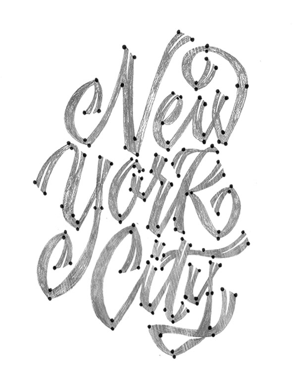
Alright guys, it’s time to knock out the final vectoring project since we just learned all about how to vector! We’re going to begin where we left off earlier in the tutorial and take this New York City piece to completion.
Step 1
Taking this piece by piece, begin vectoring your letterforms one at a time. Utilize the crossover technique to be able to adjust an area of your lettering without disturbing another part of it. For this particular piece of lettering, I had very few vertical and horizontal handles. But I still plotted my points on the extrema which allowed me to create the shapes you see.
Step 2
After vectoring the „New”, let’s start the next word: „York”. Use the same process and vector each piece by piece. You can probably see the collection of anchor points within the „K”. That is because I drew each part of the „K” as separate shapes to edit later if need be. So the stem and the two legs are all individually drawn, creating a total of three shapes to form the „K”.
Note that it’s okay if everything overlaps, since we’ll be filling these shapes later on.
Step 3
The last word to vector, „City”. You know what to do: begin plotting those points and carefully finesse your handles to your liking. Draw each letter separately as you can see below—it’ll help the editing process later on.
Step 4
There we have it! After you’ve completed vectoring the whole piece, you can give the lettering a fill instead of a stroke so you can see how the positive and negative space are interacting.
Step 5
Even after you think you’re done vectoring, you’re probably not!
There’s tons of editing to do after you „fill” the shapes because you can then see what needs more contrast, more kerning, etc. In this instance, I made lots of minor edits to help the overall color. Additionally, I altered the shape of the „Y” to extend into the negative space of the „N”.
Step 6
The last step! For this piece, I added little „notches” to the enter and exit strokes of the letterforms. How would one vector something like this? Just remember to break things down into simple shapes or strokes again. For me, I knew it would be perfect to utilize some simple strokes created with the Pen Tool, but I changed the „Variable Width Profile” of the stroke to create the triangular shape. You can see what I mean in the process below.
Conclusion
I took the liberty of filming a very sped-up video of the whole lettering process. It took me a good two hours to complete this piece. Again, patience is key if you want your vector lettering to look exactly how you sketched it out! Feel free to watch the process below and see the extra step I took to take the vectored lettering to the next level.
The below New York City piece is the finished vector after adding lots of extra details. If you’re curious as to how to create depth, texture, color combinations, etc., then my next tutorial will be perfect for you! Stay tuned for that in the next month or two.
I’m sure at this point you’ve practiced a good amount to hopefully become even more comfortable with vectoring than you already were. We’ve covered a lot of material, and now it’s time for you to put this knowledge to the test. Keep practicing what you’ve learned because it only gets better with time, I promise! Keep it up!
As always, if you have any issues or questions, feel free to leave a comment below and I’ll be able to help you out. Good luck!
Extra Resources
If you’re interested in getting some help with your lettering, Envato Studio has a great collection of Lettering & Calligraphy Specialists that you might like to explore.
Logo design just got a whole lot easier! Mix and match your favorite logo elements for a new custom design using free templates from Envato Logokit.
What Is a Logo Design Template Kit?
Your brand matters. That’s why we’ve developed a system to make the logo design process faster and more affordable.
A logo design template kit gives you high-quality vector elements to build the perfect logo. And the awesome part is that all our kits are completely free!
Envato Logokit is the best DIY logo solution for professional results! Our designers have created exceptional, high-quality logo kits featuring a wide range of text treatments, icons, and unique color combinations.
Explore a variety of categories to find a kit that fits your style. With a wide selection running from brilliant monograms to creative mascots, we’re sure you’ll be satisfied with our striking selection of modern logos.
Then download and unzip the kit. We’ll provide the main vector EPS files, which can be opened in a variety of vector-based programs.
Open the file for the logo combination you prefer in Adobe Illustrator. I chose the M letter file, which represents all the two-letter combinations for „M.” To match my name, Melody Nieves, with a logo, I’ll decide between these „MN” design styles. Use the Group Selection Tool to select the combination, and then Cut and Paste it onto a New Layer. Hide the other combinations.
Step 2
Put your imagination to the test as you mix and match elements to create the perfect logo. Scale the main shapes to a bigger size using the Selection Tool (V). Or add and change text with the Type Tool (T).
Continue modifying your logo with new colors and more. Then choose a color Fill you’d like to apply, like a vibrant solid color or a beautiful cool gradient.
Step 3
Once you’re through, Save your file with the appropriate extensions (.ai, .eps, .jpg, .pdf, etc.) to use your custom logo right away. It’s that simple!
Get Help From the Pros
Need help customizing your logo kit? Go with a professional! Choose from hundreds of designers at Envato Studio to help build the logo of your dreams.
Browse Our Free Logo Design Template Kits
Here is a current selection of all the fantastic kits now available on Envato Logokit. We also release new ones each week! So subscribe to our email newsletter to get notified when a new logo kit drops next!
Create an elite brand with this vintage monogram kit. This kit features 676 elegant letter pairings in a variety of minimalist styles. Turn your logo into an epic badge by adding a simple circle or finish it with the tagline of your choice.
Need a new mascot for your company? Then try this awesome stickman logo kit. Designed with a faceless character for more flexibility, this mascot cooks, fishes, and even has a great green thumb. And since he’s a mascot with many trades, we just know he’ll be a great addition to any service-based business.
For a more corporate look, check out this pack of modern gradient designs. With multi-layered shapes and symbols, this template lets you choose from a selection of premade gradients to adorn your special emblem.
The epitome of professional design, this corporate logo kit features minimalist icons with clean, bold lines. This diverse selection of icons covers many business themes and categories. Add vibrant colors to finalize your design or keep it monochromatic for an even sharper look.
Create a striking logo that employs the trendy use of negative space. Exude exceptional style with cutout designs that are sure to make your brand stand out. Choose from many text arrangement options for a versatile logo.
Design a monogram with class and sophistication with this incredible logo kit. This kit features 676 combinations of every letter pairing in the English alphabet! Choose from multiple styles to make the most out of your logo design.
Or enlist the help of a furry friend for greater logo impact! This brilliant kit features various animals that fit many industries. Enjoy the simplicity of the overall emblem design with clean vector lines and solid colors.
Add a charming mascot to your brand with this awesome logo kit. This flexible mascot can be altered to fit your needs by changing the skin color, outfit, and accessories. Choose from high-quality elements to create a personalized chef, businessman, and more!
This comprehensive suite of 676 letter combinations features every letter
pairing imaginable! And to make your logos truly one of a kind, this suite
also comes with a bonus set of embellishments for that extra special touch.
Follow your passion with this beautiful barber shop logo kit. Great for hairdressers and salons of all kinds, this kit includes hipster vector elements that fit a variety of grooming needs. Just replace the colors and text with the help of any vector design program.
Design a little guy mascot for your business! This set of interchangeable characters provides the perfect way to customize your brand. Switch up body positions or change the outfit colors for more options.
Turn your logo into an epic badge with this outdoor-themed kit. This kit features many badges and emblems that are great for nature-based organizations. Use the colorful options available or pick your own for a more personalized logo.
Celebrate your favorite team with a custom logo to match! Included in this kit is a full system of flexible icons suitable for a wide range of sport clubs and associations. Simply choose your favorite sports symbol, and then arrange the logo to fit your design needs.
Highlight your hospitality skills with a beautiful new logo! This logo kit is an amazing DIY solution for any food or hospitality business. Choose from dozens of stunning line art combinations for a sleek, modern vibe.
Share Your Logos With Us!
Found a design you love? Share your results with us! And let us know how you like Envato Logokit in the comments below.
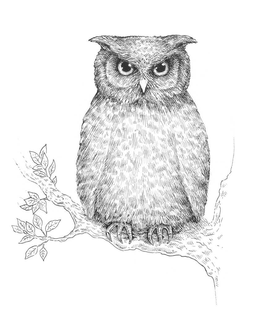
An owl is a symbol of wisdom and mystery. Aren’t these birds gorgeous?
But drawing an owl may seem overwhelming: it 's hard to decide where to start and how to find the right proportions. In this tutorial, I’ll show you an easy way to draw an owl with a graphite pencil and ink liners.
We’ll also consider the principles of layering ink hatches, and observe how to create a beautiful effect of fading in our artwork.
As a result, we’ll get an impressive nature-inspired drawing!
A graphite pencil (I recommend using a B or HB type)
A sheet of thick drawing paper
1. How to Draw an Owl With a Graphite Pencil
Step 1
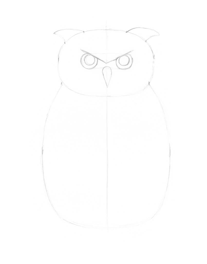
I draw a vertical core line that divides the future owl’s figure into halves; it will be our reference point for the measurements. Then I mark the side borders of the bird’s head and body.
It is useful to follow the principles of symmetry when you are drawing animals. Just keep in mind that there is nothing perfectly symmetrical in the natural world.
Step 2
I draw the rough shapes of the head and body, using light pencil lines.
Step 3
The eyes are located on a line that is slightly below the central point of the owl’s head. The core line helps me to measure the equal distance.
The interval between the eyes is close to the width of one eye.
Step 4
I draw a rough shape of the beak. It looks similar to a triangle with two rounded corners.
Step 5
I add the prominent shapes that resemble stylized ears (the ear tufts).
Step 6
I draw the pupils and add the divergent lines of feathers above the eyes.
Step 7
I refine the feathery pattern on the owl’s face, also known as the facial disc.
Step 8
I draw the smaller details of the beak and the ear tufts.
Step 9
I add the wings to the body.
Step 10
I draw the framework of the feet.
The feet have four fingers each, but the back fingers hide behind; they help the bird to take up a stable position.
Step 11
I add the hooked claws and refine the shapes of the fingers.
Step 12
I draw the contours of the tree using varying, organic lines.
Step 13
I add three groups of leaves. They will make the composition more interesting.
Step 14
I add the groups of pencil hatches to mark the pattern of the owl’s feathering.
2. How to Create Layers of Hatching With Ink
Step 1
In this part of the tutorial, we’ll pay particular attention to the hatching techniques.
Creating layers of hatches is an excellent way to make an illusion of texture, increase the contrast and accentuate the three-dimensional look of the objects in the drawing.
Here is a sample of the inclined hatching, made with the 0.1 ink liner; this will be our base.
Step 2
I add a new layer of hatching with the 0.05 liner. The lines can overlap the existing hatches, or they can be located in the gaps between them.
The lines of different widths combined in one drawing always look attractive.
Step 3
With the 0.05 liner, I add the rounded cross-hatches. You are not limited by the number of hatching layers!
Step 4
With the 0.3 liner, I apply horizontal hatches. As you can see, the more layers of lines I use, the more contrasting and intense my sample becomes.
3. How to Draw an Owl With Ink Liners
Step 1
With the 0.3 ink liner, I mark the dark sports of the feathering.
Step 2
I continue to add the groups of short lines, using the 0.3 liner.
Step 3
With the 0.3 liner, I draw the pupils. The eyes become dark and contrasting.
I also mark the shadows in the plumage.
Step 4
I add the thin hatches, using the 0.05 ink liner. The lines go from the center of the bird’s face to its sides.
Step 5
I mark the outer circles in the eyes, using the 0.05 liner.
Small dots and short hatches help me to accentuate the eyes without oversaturating the artwork.
Step 6
I work on the feathering, using the 0.05 ink liner. I place new hatches in the gaps between the existing ones.
Step 7
With the 0.3 liner, I make the contours of the owl’s feet and outline the tree.
Step 8
I draw the pattern of the bark, using the 0.3 liner. I also add groups of hatches to create shadows.
Step 9
I draw the leaves with the 0.1 ink liner. I use thin, light lines so that the leaves won’t distract the viewers’ attention from the owl.
I also add some hatching to the tree to make it look more three-dimensional.
Step 10
I add short hatches to the sides of the bird’s fingers and strengthen the shadow near the feet. We get an instant three-dimensional look!
I also add more hatches to the owl’s body, using the 0.1 ink liner.
Step 11
I increase the contrast in my drawing. With the 0.1 liner, I add groups of hatches, paying special attention to the sides of the bird, and mark the contours.
Step 12
I work on the owl’s head, making it more realistic. With the 0.05 ink liner, I accentuate the facial disk with an additional layer of hatching.
Step 13
I accentuate the shadow under the bird’s beak, using the 0.05 liner. I also add short hatches to the sides of the beak.
Step 14
I add a layer of the cross-hatching to the owl’s body, using the 0.05 ink liner.
Step 15
With the 0.3 liner, I create the dark accents in the feathering.
Step 16
I increase the contrast in the lower part of the drawing and strengthen the shadows there, using the 0.1 liner.
Step 17
I apply the cross-hatching to the tree, using the 0.1 liner.
Step 18
With the 0.05 liner, I add one more layer of hatching to the bark.
As a final touch, I emphasize the contour of the branch with a wider line.
Your Artwork Is Complete!
Congratulations, you’ve finished the drawing! I hope you enjoyed both the process and the result. Please share your artwork in the comments!
I wish you much joy and success in mastering ink techniques!
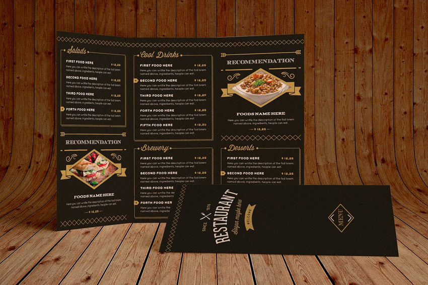
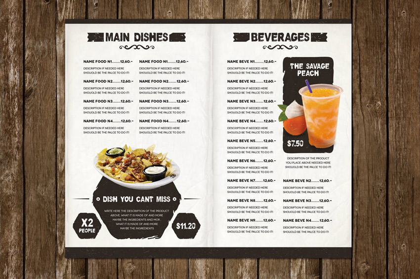
Hungry for more amazing templates? Check out this exciting collection of delicious menus perfect for any restaurant or cafe business.
29 Delicious Restaurant & Cafe Menus
Going out to eat is always a treat! And you can make your customers feel like royalty by displaying your menu items on delicious, professional designs.
Dive into this collection of 28 premium templates curated from Envato Elements. Get all the templates you need for one affordable monthly fee!
Use these menus for your restaurant business, or enlist the help of a talented professional from Envato Studio for all your creative needs.
Are you drooling yet? This delicious template will have you smelling the fresh scent of lobster and warm butter sitting on your plate. Created for both Photoshop and Illustrator lovers, this template features a high-quality design at 300 dpi, with free fonts also included.
Extra! Extra! Read all about it! This clever menu features a wonderful newspaper theme. The front cover highlights your delicious dishes, with plenty of room on the back for official menu items. And with fully editable text, images, and colors, you’ll be able to customize it fast!
Next
up is this mouthwatering burger menu design. This template includes two
Photoshop files with 100% vector elements and well-organized layers. Get the best of both worlds with vintage-inspired graphic elements on a modern menu template.
Did someone say brunch? Serve your customers a warm cup of Joe with this brilliant brunch and cafe menu. This design features a modern take on retro chalkboard illustrations with plenty of room for your menu items. Enjoy two color variations and completely free fonts in this awesome download.
Create a sizzling menu that matches your delicious steaks! This incredible template features an elegant and modern design that is 100% print ready. Showcase your menu in its best light with a minimalist design that is sure to impress customers.
Sit back and relax with a gorgeous menu that will make you feel as if you’re on vacation! This exciting template features a beautiful island vibe, perfect for any beach restaurant, bar, or club. It also contains two Photoshop files that are print ready, with bleed lines and all!
Enjoy the finer things in life with this sleek and sophisticated restaurant menu. This menu features a 100% customizable design with two elegant fonts to choose from. Compatible with Photoshop versions over CS3, this template can be customized fast to make it your own!
Download a modern menu for a clean and sophisticated feel. This premium menu template features one page cover with two back-page designs. A print-ready design, this template also includes premade bleed lines for your convenience. Download it today!
Reflect
the style of your restaurant with a menu template that highlights that
theme. Take this Mexican-style template, for instance. It’s created with
vibrant colors and a fun Spanish vibe, and you’ll get access to print-ready files and so much more!
Your
menu should look as sleek and sophisticated as your business. And with this
classy food menu, you’ll have just that! Enjoy six A4 pages with front
and back covers and alternative trifold styles. It also includes easily customizable layers so you can create infinite color variations to reflect
your amazing brand.
Get a slice of delicious design with this clean, modern menu. Perfect for pizza businesses with that extra retro flair, this brilliant template features fully editable Photoshop files and so much more. Download it today to get access to more unique options.
Become the next fast food giant with this delicious menu template. Great for featuring pictures of your favorite items, this template comes complete with fully editable files, organized layers, and even some helpful documentation for further instruction.
Tackle your dreams of owning a brand new restaurant with this modern menu template. This template features a fun chalkboard-inspired design available in several industry formats. Also included is a convenient help file to walk you through the editing process.
Who can say „no” to pizza? Get your customers to praise your flaky crusts with this pizza-inspired trifold design. This template includes well-organized layers you can easily update with your own menu items. Just switch out the photos for pictures of your own food to enjoy this template fast!
Less
is more. And some of the best food comes from small menus. Try out this
simple template, for instance. Available in A4 size, this template is
ready to print! It’s great for those familiar with either Adobe Photoshop or
Illustrator, and you can easily modify any text and add even more fancy
elements to customize your design.
A classic burger menu, this download features print ready files at a resolution of 300 dpi. Choose from fun free fonts like Cardenio Modern, Wicked Grit, and Great Vibes to complete your menu. Or edit the text yourself using the fully editable text layers.
Inspired by retro chalkboard illustrations, this template features a beautiful modern design we’re sure you’ll love! Download this file today to get access to several print formats available at 300 dpi for the best resolution possible.
Need a menu fast? Then check out this elegant Illustrator template. This template includes a stunning black and yellow color palette, with print-ready files available in different sizes. Download this file today to get the bonus logo also included!
Wouldn’t you like to take a refreshing sip of a fresh warm brew from this cool menu? Boost sales with an exquisite chalkboard design inspired by retro illustrations. Get the most out of your menu with fully editable layers, free fonts, and bonus coffee doodles.
Or try out a classic menu style like this one! This amazing download is jam-packed with wonderful additions. From a full eight-page menu to table tents and more, you’ll definitely want to add this cool template to the list. Just open Adobe Illustrator to get started right away!
If simple designs are more your style then check out this sleek and sophisticated trifold menu. This template includes two different menu sizes available in both Illustrator and Photoshop formats. Take advantage of the easy-to-use Smart Objects to update your photos in seconds!
Help your customers seek relief from the sweltering hot sun with this awesome ice cream menu. Designed with vibrant colors and a unique vintage feel, this template features all free fonts, high-resolution graphics, and print-ready formats available for both Photoshop and Illustrator.
Feeling festive? Then celebrate the holidays at your restaurant with a special Christmas-inspired theme. Download this file to get access to this colorful menu complete with high-resolution graphics, free fonts, and easy-to-follow guidelines.
Ever wanted your own restaurant by the ocean? Make that dream happen with this rustic template. This template features a clean, nautical-inspired design with six full pages ready for your menu list. So sail onward to success with this stunning, modern menu!
Health equates to mental and physical wealth. And you can inspire your customers to eat better with this vibrant juice bar menu. This template features several convenient formats perfect for those familiar with Adobe Photoshop or Illustrator. Just update your menu with your favorite items to enjoy this template right away!
Open your next Japanese bistro with this inspiring menu design! Created with Adobe Photoshop, this template includes two Photoshop files, fully editable layers, and smart objects for your convenience. Feel free to take a glance at the handy help file for more instruction.
You can never go wrong with this classic food menu. Display your menu items with plenty of room for descriptions and prices, and even include a nifty section for chef recommendations. Included in this download are A3 and A4 menus compatible with Adobe InDesign.
Have a large menu? Then try out this brilliant trifold template. This download comes complete with fully layered Photoshop files and completely editable text and graphics. A stunning template optimized for printing, it also includes free fonts you can easily update.
Last but not least, we present you with this elegant layout. A minimalist design with a rustic, textured feel, this sophisticated template includes a seven-page menu, table tents, and so much more! Add your own text easily to personalize this template with information about your restaurant.
Conclusion
This list features exciting
resources for the avid designer
familiar with Adobe Illustrator, Photoshop, and InDesign. For
additional help with all your menu needs, enlist the skills of a
talented
professional by choosing one of the amazing designers from Envato Studio.
And with loads of restaurant and cafe menus available at your fingertips, chances are we’ve missed a few to add to your personal collection. Be sure to browse Envato Elements for more resources, and let us know your favorites in the comments below!
The future is near. Are you ready for a world of cybernetic organisms?
Learn how to transform your photos into cool cyborgs in the tutorial below. I’ll show you how to use techniques like Frequency Separation to remove skin imperfections before bringing our cyborg to life!
Every great photo manipulation needs a collection of good stocks on deck as well as some inspiring reference art. For this cyborg, I was inspired by the popular style of manipulation seen in work from artists like Michael Oswald.
So to complete our cyborg, we’ll need to keep a few important notes in mind:
Cyborgs have clear, human features…
… though their bodies are usually broken down into several bionic components.
They’ll integrate modern technology into their design.
They can come in any race.
And they sometimes take over the world. Simple right?
Be deliberate about your stock choices. For our subject I’ve chosen this Woman Stock. Though the image is no longer available, you can find many incredible stocks like it on Envato Market.
The reason why I chose this stock is because of the woman’s intense gaze. So try to find images with commanding body language that you can easily manipulate down the line. Beauty and glamor photography work great for this, although you may have to deal with simple edits later (like removing skin cream from her face).
2. How to Airbrush Your Photo
The cyborgs we’ve come to know in the movies have smooth, perfect-looking skin, most likely because they’re made out of metals or other advanced materials. So to achieve this look in photography, we’ll turn to the
technique of Frequency Separation.
Step 1
Open your reference into Photoshop, changing the dpi to 300. Create a New Group named Retouching. Control-J to Duplicate your reference, placing the copy into the group.
Step 2
Before we smooth out her skin, we’ll need to remove the white dots of skin cream on her face. So select the Polygonal Tool (L) and make a selection on the left side of her face.
Copy and Paste that selection onto a New Layer, and Flip it by going to Edit > Transform Flip Horizontal. Place the skin copy over the white dots, using the Eraser Tool (E) to erase any harsh edges.
Merge the layers together. Clean up the skin with the Stamp Tool (S). First select the tool and hold Alt to source the skin, and then use the sourced skin at 30-50% Opacity to blend it into the skin area. We’ll clean up any other imperfections next.
Control-J to Duplicate the revised stock. Name the top layer High Frequency and the bottom layer Low Frequency. Turn Off the Visibility of the High Frequency layer, and then select the Low Frequency layer and go to Filter > Blur > Gaussian Blur, setting the Radius to any number that blurs the details of your portrait. Here, I set mine to 7.
Turn the VisibilityOn for the High Frequency layer. With this layer selected, go to Image > Apply Image and enter the following settings:
Make sure the Blending is set to Subtract and the Layer is set to Low Frequency. Then plug in the numbers above for the Scale and Offset. After you hit OK, set the Layer Blend Mode for the Low Frequency layer to Linear Light.
Step 4
What we have done is separated the texture (high frequency) from the tones and colors (low frequency). Now we can airbrush the skin to make it look smoother.
With the High Frequency layer selected, grab the Polygonal Lasso Tool (L) and create a selection of the skin, making sure that the selection’s Feather is set to 25-30. Go to Filter > Blur > Gaussian Blur, and blur the skin. Continue doing this all around her face, changing the Radius each time depending on how much you want to soften the skin and lessen the look of pores.
Merge the frequency layers together when you’re finished.
Here is the model with much smoother skin. We’ll continue to adjust it as we proceed.
3. How to Create the Cyborg Sketch
Step 1
Let’s move on to the sketch! It’s important to note that you’ll need a Graphics Tablet as we’ll be employing some important digital drawing/painting techniques later down the line.
Select the Brush Tool (B) and use a Hard Round Pressure Opacity Brush to begin drawing your cyborg details. Keep the Flow and Opacity set at 100% but make sure the Pen Pressure for Opacity option is checked.
Draw simple gray lines over the model indicating the areas where you would like to break down her robotic components. Try to be cognizant of how the human body relates to certain parts moving or connecting together.
Study other cyborg references or look up robots for indications of where it might be a good idea to place these lines.
Step 2
Switch over to a much harder brush, with an Opacity and Hardness of 100%. Starting with the face and hand, make those lines much crisper.
Continue to push forward by making some of those lines thicker. This is when we begin to fully develop the model as an actual robot.
The hands and neck, for instance, have components that are painted black to represent the spaces needed for those moving pieces. Try to understand the possible functions behind your details for a more believable result.
Use the Eraser Tool (E) to erase the parts of the gray sketch that are still showing through underneath. Concentrate on creating super clean lines to the best of your ability because this is a machine after all.
To create more of a robotic expression, fill in the eyes with some black as well, using the Brush Tool (B).
Here is the cyborg so far. Let’s move on to the background scene.
4. How to Build the Cyborg Background
Step 1
Use the Magic Wand Tool (W) to select the white background of the original reference and hit Delete on your keyboard to remove it.
Then Copy and Paste your Metal Texture onto a New Layer below the woman layer. Adjust the position so that the circular part fits behind the model’s head.
With the texture selected, go to Filter > Blur > Gaussian Blur and blur the background with a Radius of 5 pixels.
Step 2
Copy and Paste the Electric Circuit Stock onto a New Layer. Adjust the position so that the lines flow from behind her head, and set the Layer Blend Mode to Overlay.
Just like before, blur the circuit stock by going to Filter > Blur > Gaussian Blur, with a Radius of 5 pixels.
5. How to Add Details and Color to the Cyborg
Step 1
For a more cohesive look, let’s get rid of her blonde hair. Create a New Layer and select the Brush Tool (B). Set the Hardness to 50-80% and start to paint black all over the hair using the same brush as before. Set the Layer Blend Mode to Color Burn and adjust the Opacity to 87%.
Step 2
Let’s tackle the skin again. Create a New Layer and use a Soft Round Brush with 30-50% Opacity and 0% Hardness to soften her skin with more color. Hold the Alt key over her skin to set that color as your Foreground Color, and then begin painting with it in the nearby areas.
Continue to do this with the rest of her face and body. Imagine that her skin is made out of hard, reflective materials. Try to make her skin as silky as possible without losing too many details.
Step 3
Incorporate more technology. Use the Polygonal Lasso Tool (L) to cut out the USB portfrom its reference. Paste it onto the canvas on a New Layer and create two more copies. Position each port side by side and Merge the layers together.
Step 4
Let’s add color! Add a New Adjustment Layer of Color Lookup above all your other layers. Set the 3DLUT File to Crisp_Winter.look.
Next, add a Levels Adjustment Layer with the following settings for the RGB and Blue Channels to intensify the lighting and give a blue tint to the scene.
Add another Color Lookup Adjustment Layer. This time set the 3DLUT File to Crisp_Warm.look. Place it above the Levels layer for more contrast. Lower the Opacity to 70% and set the Blend Mode to Darken.
Things are getting pretty intense.
Step 5
Use the Rectangular Marquee Tool (M) to select an area of the Blue Gem Stock and Paste it onto a New Layer. Position the stone over the triangle and onto her forehead. Add a Layer Mask to the gem layer and paint black onto it to shape the stone into a triangle.
Set a New Layer as a Clipping Mask to the stone. Use a dark blue color #00197a to paint an inner shadow along the edges of the triangle.
Step 6
Fill in the rest of the metal details with solid color. Feel free to experiment with which colors you like best.
6. How to Finish the Cyborg Manipulation
Step 1
This next series of steps involves a lot of painting, so a graphics tablet is necessary. Dedicate New Layers to highlights and shadows.
Here’s a side-by-side look as the cyborg gets highlights and then shadows.
Step 2
Start using a Hard Round Brush with an Opacity of 80-100% to make your details crisper.
Notice that I’ve added light tan highlights #ece6f0 around the black robotic components. This will help give them more volume and sheen. Continue to evolve the shading of your cyborg by paying attention to the edges of the skin surface.
Paint darker skin tones, #6a4f65 particularly within the dark spaces of her fingers, to make them look as if there’s real thickness in the material used to create her. Continue this effect with the rest of the body, especially with her chest and arm.
Step 3
Add more character with unique details. Create bolts for her forehead, make the stone more 3D, and even draw the symbols for the USB port.
Step 4
Add a New Adjustment Layer of Curves. Adjust the curves for the RGB and BlueChannels to bump up the intensity of the lighting.
Let’s add some warmth. Follow up with a Color Lookup Adjustment Layer. Set the 3DLUT File to FallColors.look and lower the Opacity to 25%.
Step 5
Finish your manipulation by diving back into the details. Fix the neck and collar bone areas to give them more volume.
Switch over to a Hard Round Brush with 100% Hardness to clean up the edges of your manipulation.
I also elaborated on the robotic details found in the black spaces of her neck and fingers. Sometimes you can make up components like this as long as they generally make sense.
Step 6
Finish with one more layer of highlight. Set a New Layer to Overlay and use a light pink color #cfc0e1 to paint soft highlights onto her chest, shoulders, and hand. The arrows indicate the areas that were affected the most.
Check out the final result below!
Congratulations, You’ve Made It!
This tutorial requires you to put all your Photoshop knowledge to the test! By incorporating photo retouching, photo manipulation, and finally, digital painting techniques you can achieve an incredibly realistic human cyborg.
The key to this project is to stay patient so that you can fine tune the results as much as possible. Make your lines super sharp so that she appears more like a machine than a human.
I hope you’ve enjoyed this tutorial. Feel free to leave me any questions in the comments and post your results, no matter your skill level.
And tackle more exciting photo manipulations like this one by checking out some of my other tutorials below:
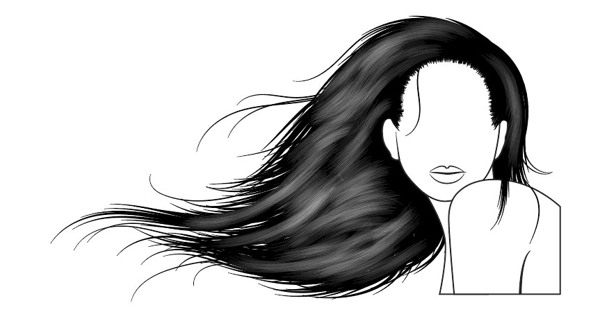
Vectoring hair on portraits can be a time-consuming process and is sometimes difficult to master in a short space of time. A few years back, I wanted to help solve this issue by creating a set of brushes in Adobe Illustrator. Since then, they have become the third best-selling AI brush on GraphicRiver!
In this tutorial, I’m going to show you how to create one set of brushes (four individual brushes) and then how to create a free-flowing, detailed hairstyle with them. You can easily adapt this process to create further brushes and hairstyles. Alternatively, you can purchase the full set of vector Hair Brushes on GraphicRiver.
1. How to Create a Tapered Art Brush
Let’s start by creating a basic tapered brush. This is the base shape for this set of brushes but also a handy brush for drawing individual hairs.
Step 1
Using the Ellipse Tool (L), click once on your canvas, and in the popup, set the Width to 30 px and the Height to 2 px. Click on OK. Make sure your ellipse is filled black.
Step 2
Using the Direct Selection Tool (A), select the rightmost point on the shape. Then click on the Convert selected anchor points to corner button to turn the curve into a point. This will give you one tapered point.
Repeat this with the leftmost point. This will complete your tapered shape.
Step 3
With the shape selected, in the Brushes panel click on the button Create New Brush. Select Art Brush from the popup, and you’ll be presented with the Art Brush Options window.
The key setting you’ll need to change is the Colorization Method to Tints. As your shape is black, it means it will take on the 100% saturation of the colour you select. Therefore, whatever your stroke colour will be, your brush will take on this colour.
I’ve named this brush Tapered Brush and then I click on OK.
2. How to Create a Hairline Brush
The hairline of any portrait is often neglected and often missing in vector portraits. This is mainly because it’s time-consuming and difficult to perfect. However, by creating a scatter brush, you can create a near realistic hairline effect. So instead of drawing one stroke per hair, you’re only creating one stroke for the entire hairline!
Step 1
You should still have your tapered shape. So for now, Copy and Paste it and hide the original.
Select your duplicate and go to Object > Transform > Rotate. Let’s rotate the shape by 90 degrees and click on OK.
Step 2
With the shape still selected, in the Brushes panel, click on Create New Brush and then select Scatter Brush.
The settings I want you to change are:
The Spacing to 5%. This is so the brush will overlap on itself.
The Scatter to Random and then 25%/0%. This is so the brush alters its placement above and below where the line is placed.
The Rotation relative to: Path as I want the brush to stay perpendicular to the direction of the path you’re drawing.
Finally, good old Colorization Method to Tints.
Then click on OK.
3. How to Create a Hair Shine Brush
The hair shine brush can be used for multiple things, depending on how you tailor the brush. This specific version will help you create a textured shine on the hair. When layered at different Opacities, it can give a realistic touch to a silhouette design.
Step 1
You should still have your vertical tapered shape. Copy and Paste this and, using the Selection Tool (V), move it to the side of the first. Repeat this until you’ve got five to eight shapes as shown below.
Step 2
With the shapes selected, let’s create a New Art Brush. The main settings to pay attention to are:
Direction is vertical (up/down or down/up doesn’t matter with this one)
Colorization Method: Tints.
Click on OK once you’re done.
4. How to Create a Hair Piece Brush
This particular brush is useful for drawing multiple clumps of strands in one stroke. This is a great time-saving brush and can be useful for long or short styles of hair.
Step 1
First, remove your vertical tapered shape, and let’s go back to the original horizontal shape.
Using the Rectangle Tool (M), draw over half of the shape. With Smart Guides (Control-U) enabled, you’ll be able to find the midpoint of the tapered shape more easily.
Select both shapes, and with the Pathfinder panel, select Minus Front. You’ll be left with half of the tapered shape.
Step 2
Let’s start by Copying the tapered shape. Using the Direct Selection Tool (A), click on the rightmost point and drag it out.
Paste in Front (Control-F), and then drag out the rightmost point again but this time pulling it to the side.
Paste in Front, drag out the rightmost point again, and place it in a new location. Continue doing this until you’ve got a fanned-out collection of tapered shapes, with the two vertical points at the left remaining in place.
Step 3
Select all of the fanned-out, tapered points, and create a New Art Brush. The settings to pay attention to are the Direction to be left to right (so your starting point is the root of the clump of hair) and the Colorization Method to Tints. Then click on OK.
5. How to Use Vector Hair Brushes
Let’s look at the four brushes you’ve created. These are all the same Stroke Weight, apart from the clump of hair, which is 3 pt. They’ve been applied to a straight horizontal line.
For this exercise, I’m going to be using a blank head shape which is included in the Easy Hair Brushes pack so you can practice. However, you can apply these to any head base you wish!
Step 1
This hairstyle is going to be in silhouette, with some added shine in greyscale. With the Pen Tool (P), draw a line which traces along the hairline. Don’t bring this completely to the bottom of the sideburns on a feminine face. You can, however, do this on a more masculine face to create trendy, 70s-style sideburns.
Step 2
Using the tapered brush and the Paintbrush Tool (B), add some hairs to merge the sideburns into the hairline.
Step 3
With the Pen Tool (P), draw an arched shape with a black fill for the mass of hair which covers the rest of the head. This completed hairstyle is an overall great base to practice further hairstyles on. So if you’re not keen on the free-flowing style that’s coming, you can go back to this point and start again.
Step 4
Create a New Layer behind your portrait to add hair with the Hair Piece Brush with the Paintbrush Tool. The smaller the Stroke Weight, the more detailed the hair strokes will be.
My advice is to start with a larger stroke (such as 8 pt) to create the main structure of the hair, and then come down gradually to a 1 pt to add finer strands for a more realistic look.
Step 5
With the original Tapered Brush, you can add smaller individual hairs which flow away from clumps of hair. This helps to break any patterns you may have created with the Hair Piece Brush.
It’s also great to have individual hairs overlapping onto the face or shoulder as that adds effortless detail.
Step 6
With the Hair Shine Brush, draw long and short strokes within the mass of hair set to Blending Mode Normal, Opacity 10%, and with a white stroke.
Overlap the strokes to create more intense shines in the hair.
Step 7
Finally, with the tapered brush by adding white strokes to add further realistic shines. Set these to Opacity 20% to stand out.
Awesome Work, You’re Done!
You’d be surprised how quickly you can create hairstyles with these brushes and how realistic you can make them. With practice, it will take you minutes rather than hours!
By creating several different brushes to fit different hair length, textures and styles, you can create many different looks.
For this article in the international artist series, we turn to Hungary,
featuring seven artists who create fantastic work, from awesome manga illustrations to brilliant graphic design and more! I asked each artist how their
country and
culture inspired their work, and they delivered fantastic answers.
Enjoy!
Peter Nagy
Peter is an illustrator, motion designer, and 3D artist based in Budapest, Hungary. His work features brilliant digital illustrations with great atmosphere and lighting. Check out
a small selection of his work below, or see more in his portfolio.
Contact
The
scenery in Hungary has always fascinated me. I have a strong connection with
nature, and in Hungary, there are
beautiful forests and parks where I can become inspired. I live in Budapest and the character of the city is vibrant. I love
the differences between the two sides, Buda and Pest.
When I started my interest in art, the first classic Hungarian
artworks I saw were from Mihály Munácsy, László Pál and Színyei.
They inspired me to study the atmosphere, and to try plein air
painting. In my artwork, I put the focus on the atmosphere and try to bring
about a special mood, just like my favorite Hungarian painters.
The culture is vibrant in Hungary, and in Budapest there are a lot
of exhibitions and programs, both sub-cultural and mainstream-themed. There
are a lot of art spaces in Budapest where young talent can introduce
themselves, as well as many festivals and programs where you can meet fellow creatives
and their artwork.
Luleiya is an artist based in Budapest, Hungary. Her work features delightful illustrations in a colorful Manga style. Check out
a small selection of her work below, or see more in her portfolio.
King That Never Was
I definitely love the nature and forests in Hungary. There are great
hiking trails all around, so there is always a possibility to „get
away.” But on the other hand, I love living in Budapest because the center of the city
is bustling and full of energy, with tons of cute cafés and parks where
you can go hang out with friends.
If anything, it’s definitely the nature of Hungary that
has influenced my work. I used to walk in the forests and imagine all kinds
of stories with elves and other fantastical creatures.
I’m not sure about the art community here. I know there is one but I’m
not really a participant. I’m more active in global online art
communities where I can get to know artists from all around the world
and be inspired by them.
Daniel is an artist based in Szeged, Hungary. His work features amazing character designs inspired by his love of fantasy and sci-fi. Check out
a small selection of his work below, or see more in his portfolio.
Characters/Creatures
I am a native Hungarian. I’ve always felt a strong calling to entertainment design, but this sounded like a crazy career and something a Hungarian could
only achieve with great connections or tremendous risk taking. Needless
to say, I didn’t have any good connections but I am currently involved in freelance indie projects. Even in
Hungary, opportunities arise for entertainment artists who gravitate more
towards film and game design.
Hungary is an interesting place. It is cold in the winter and hot in
the summer. Life is cheap but the entertainment is costly. We pride
ourselves on being inventive in all sorts of ways. Perhaps too much at
times.
To be honest, the biggest influences in my life were none other than Hungarians
like Johann Sebastian Bach, Wernher von Braun, Vermeer, George Lucas, Syd Mead and many others.
For an artist, Hungary can be many things. You can find
jobs and opportunities, but art is somewhat a luxury for most. There
is definitely a growing market though. New
technologies are accessible now more than ever, so artists of many
trades can experiment or pioneer new ways to
create. I would
say Hungarian artists have great potential.
Aliz is a graphic designer based in Budapest, Hungary. Her work features playful, illustrative designs inspired by Budapest and more. Check out
a small selection of her work below, or see more in her portfolio.
Budapest Posters
I love the buildings of Budapest and the local architecture. The city
has lots of amazing hidden wonders, and despite living here for
several years, Budapest still surprises me every time. I like that the city is also not too huge, so I can get anywhere easily. The
different districts have diverse atmospheres but
generally they are all very friendly.
Some of my work has been influenced by the region and the local culture.
For example, recently I created designs dealing with transportation and
different districts in Budapest. I wanted to increase the overall attention for the local events, and the beautiful sights to see.
I graduated at the Moholy-Nagy University of Art and Design in
Budapest. The students here built quite a large and cohesive art
community. In addition, there are many pubs in the city where
artists can meet up with each other during the evenings.
Márton is an illustrator and graphic
designer based in Budapest, Hungary. His work features stunning digital
paintings of vast landscapes and fantasy characters. Check out
a small selection of his work below, or see more in his portfolio.
Shore 2
Honestly
I have never lived abroad, so It’s hard to compare it to
other countries, but I believe we are lucky to live in a climate with
all four seasons. The scale and measurements of the buildings as they fit into the environment, all give me the impression
of being at home. As a citizen of the capital, I am still amazed by all of
the highlights the city has to offer. Budapest is not a
place where you can easily get lost. It’s a very lively and colorful
Hungary’s history draws back a very long time, so there could
easily be many things that inspire me both historically and culturally. We are in an advantageous
position because most of our historical monuments have survived throughout the centuries and can be used to inspire artists today.
Being a small country, this profession has its own limits in
Hungary, especially because it’s influenced by the capital in every segment
of life. Certain artists may not know each other
personally but they know each other’s work. There is the
existence of the online art communities, but a lot of clubs,
competitions, and exhibitions are formed to
feed our creative interests. I believe there is still a
lot to learn about solidarity, innovation, and community building in Hungary.
Erika is a graphic and web designer based in Budapest, Hungary. Her work features her love for all things geek, transformed into gorgeous seamless patterns. Check out
a small selection of her work below, or see more in her portfolio.
Catstronauts
I love the diversity in Hungary. There is so much to look at and feel. Hungarian people are also very diverse. We have a lot of culture and our nation has been mixed throughout the centuries. This mixing gives us a very
enchanting and bohemian-like feeling.
I think the mix of cultures here helps me to be open minded. I’m using motifs from a lot of different nations
depending on the purpose and the topic of the project I’m working on. There is inspiration everywhere!
There are several art universities and colleges in Hungary. This is the reason that there are many
small, design-related groups with enthusiastic members who know each other well and work together even after graduating.
We used to say, that the designers in Hungary are a small group. You
can reach one person through two or three mutual friends. There are meetups
and big events for us where we can chat about art, work, clients and
the meaning of life.
And above all this, there are design and fashion markets every month, as well as different design weeks and exhibitions too.
László is a graphic designer based in Békéscsaba, Hungary. His work features a unique cartoon style used to draw crazy characters and colorful background illustrations. Check out
a small selection of his work below, or see more in his portfolio.
Cursed Knight
Hungary is really calm, well, at least in the city where I live. And there are no large distances between two places.
I’d say that the local culture hasn’t really
influenced me—though maybe a few Hungarian cartoons have, but nothing special. I
draw my main inspiration from a lot of different foreign cartoons, comic
books, novels and movies.
Unfortunately, I know only a few people personally who do this
sort of thing, whether it’s digital or traditional art. But they are all
really awesome and talented in their areas and I feel lucky to know
them.
Many thanks to the artists who took time to answer my questions
and share a bit about themselves and how their country and/or culture
has affected their work. You can check out more of their work in the
links below:
Summer heat in a tropical paradise! What
could be better? In this tutorial we’ll create our own tropical pattern, making
it seamless and discovering several ways of applying our pattern! We’ll be
using basic geometric shapes as well as some default custom shapes, creating
fancy objects in a few clicks and making them detailed with the help of texture
brushes.
Patterns and textures surround us
everywhere in our daily life. They are used in web design and for print
materials, they decorate our clothes and walls, and they are used for wrapping
paper and many other purposes.
In this tutorial we’ll be creating a
nature-inspired texture. By the end of the lesson you’ll be able to
create any other kind of pattern in the same style, whether it is a floral seamless pattern or birthday pattern, food wrapping pattern, or anything else.
If you wish to enhance your skills by creating a variety of textures, be sure
to check out Envato Market for inspiration, and then be ready to start!
1. Use Basic and Custom Shapes to Draw
Tropical Elements
Step 1
Let’s start by making a New File of 2000 x 2000 px size. We’re making the file big enough to be used for print, if needed.
Step 2
Let’s take the Ellipse Tool (U) and start making a pineapple. Make a 550 x 660 px bright oval of yellow color.
You can adjust the size of the shape and its fill color in the Properties panel (Window > Properties).
Use the Direct Selection Tool (A) to select the bottom anchor point and
drag the anchor handles, making them longer and so making the bottom of
the pineapple a bit flatter.
Step 3
Now we’ll shape the top, or the “crown”, of
the pineapple. Continue using the Ellipse
Tool (U) to make a 70 x 400 px
oval, filling it with turquoise-green color.
Take the Convert Point Tool (in the same drop-down menu as the Pen Tool) and click the bottom and
top anchor points to make the tips of the shape pointed.
Step 4
Now let’s bend the shape. Press Control-T for Free Transform Path. Click the right mouse button and select Warp. Head
to the control panel on top and open the drop-down menu to select the Arc effect. We need our shape to be
bent to the left, so let’s click Change
the warp orientation and set the Bend value to 30.
Looking good! Press Enter to apply the effect.
Step 5
Press Control-T
for Free Transform Path and rotate
the leaf, attaching it to the pineapple. Apply the transformation and press Control-J to make a copy of the leaf
layer. Make it a bit larger, using Free
Transform Path, and attach it above the first leaf. Make another leaf,
changing its size as well.
Select all three leaves, duplicate(Control-J) them and apply Edit
> Transform > Flip Horizontal to mirror the shapes to the opposite
side. Finish up with the top of the pineapple, attaching the leaves to each
other and putting a vertical leaf in the center.
Step 6
Now we need to make our pineapple editable
in order to add details to it. Select the yellow shape layer in the Layers panel, click the right mouse button and RasterizeLayer. After rasterizing the
shape, we won’t be able to change its size without quality loss anymore. However, it allows us to work with brushes and the Eraser Tool (E).
Step 7
Let’s depict stylized scales or segments
above our pineapple. We’ll be using a Clipping
Mask so that we can easily undo or redo any action, working in a
non-destructive way.
Select the yellow shape layer in the Layers panel and click Add vector mask at the bottom of the
panel.
Now arm yourself with the Pen Tool (P) and make a diagonal line across
the pineapple while holding Shift.
Step 8
Select the Clipping Mask in the Layers
panel and select black Fill color in
the Color panel.
Take the Brush Tool (B) and click the right mouse button to open the list of
brushes. Select any round textured brush to your liking. I’m using the Hard Round 9 #1 brush from the default M Brushes set.
Switch back to the Pen Tool (P), click the right
mouse button on the Artboard and select Stroke Path. Set the Tool
to Brush and click OK to make a textured stroke. As you can
see, the vector line made with the Pen Tool
(P) is still visible too.
This way we’re actually making a gap,
erasing a part of the pineapple, using the Clipping
Mask.
Step 9
Draw a new diagonal line with the Pen Tool (P) or select the existing vector path with the Move Tool (V) and press Control-T for Free Transform Path. Move the line down. Press Enter
to apply the transformation, and then take the Pen
Tool (P) and click the right mouse
button to Stroke Path.
Continue moving the line down and Stroke Path, adding more blank textured
strokes across the pineapple.
Step 10
When you’ve finished covering the pineapple with
strokes, select our vector path and Edit
> Transform Points > Flip Horizontal to mirror it horizontally.
Now
repeat the same action with Stroke Path
to add overlapping lines across the pineapple.
Step 11
Switch to the Brush Tool (B) and use the same brush to add short strokes or dots
in every cell. Remember to draw on the Clipping
Mask layer.
Now that the base of our pineapple is
ready, Group (Control-G) the elements.
Step 12
Now let’s shape a simple palm leaf for our
tropical pattern. Take the Ellipse Tool
(U) and make an 80 x 700 px oval
on a new layer. Use the Convert Point
Tool to make the top and bottom parts of the oval pointed.
Step 13
Now press Alt-Control-T for Free
Transform Path. Click the pivot point in the center of the leaf and drag it
down, placing it on the bottom tip of the shape. As you may notice, a copy
of the shape will be created in the Layers
panel after you move the pivot point. That’s exactly what we need, and it works
only when you use Alt-Control-T for
transformation.
Now we can rotate the copy of the leaf.
Press Enter to apply the
transformation, and keep pressing Shift-Control-Alt-T
to make more rotated copies. This is the fastest way to create equally rotated
and transformed copies automatically.
Step 14
Select all the shapes and duplicate (Control-J) them. Apply Edit > Transform > Flip Horizontal
to mirror the shapes to the opposite side, forming a big palm leaf. You can add
a few smaller pieces at the bottom to fill the blank spaces. Group (Control-G) all the parts in
order to keep your layers neat and organized.
Step 15
Now that we have a couple of elements for
our tropical pattern, let’s see the easiest way of adding more of those. Take
the Custom Shape Tool (U) and open
the drop-down list of shapes in the control panel on top. Here you can find a
great variety of flowers and leaves, which suit our theme perfectly. Pick shapes to your liking and combine them with each other, varying their colors and
sizes.
2. Apply Textures to the Elements
Step 1
Let’s start with our pineapple. Select the
yellow shape layer in the Layers
panel and Lock transparent pixels on
top of the panel. This allows us to paint over the shape with the brush,
without affecting any blank areas inside or outside the object. Let’s see how
it works!
Select a dry grungy brush, such as Dry Brush 1#2 from the
default M Brushes set, or try some textured brushes from the Envato Market, for example these Chalk Scattering Brushes.
Select orange color and start painting over
the bottom of the pineapple, gradually making it darker.
Step 2
Let’s do the same for the crown or top of
the pineapple. First of all, Merge (Control-E) the green leaves of the crown together and Rasterize them by clicking the merged
layer with right mouse button in the Layers panel.
Now we can Lock transparent pixels and paint over the shape, making it
slightly textured by adding a touch of dark green at the bottom and making its
top lighter.
Step 3
Let’s apply the same technique to the palm
leaf. Select the group of green elements and Layer > Merge Group. Be sure that the layer is rasterized and Lock transparent pixels in the Layers
panel. Use a dry textured brush to make the leaf more detailed and intricate.
Step 4
Now let’s color one of the flowers, using a different technique. We won’t be rasterizing it this time. Let’s select the
flower layer in the Layers panel,
hold Alt and click Create a new layer.
In the pop-up dialog window, tick the Use Previous Layer to Create Clipping Mask
checkbox to link a new layer to the flower layer.
Now we can use a
linked layer to paint over the flower, without crossing its edges.
Group (Control-G) the
flower layers together, keeping your artwork organized.
Step 5
Use one of the previous techniques to your
liking to color all the rest of the elements, making them textured and detailed.
3. Compose a Seamless Pattern With Tropical
Elements
Step 1
Select the Background layer in the Layers
panel and fill it with light blue. Let’s start arranging our elements
around the canvas.
Step 2
Duplicate
(Control-J) the elements, rotate them and mirror (Edit
> Transform > Flip Horizontal) to make the pattern versatile, adding a playful rhythm to it. Use the Custom Shape
Tool (U) to add more flowers in order to make the elements look different.
Step 3
Now let’s see how we can actually make our
pattern seamless. As you may notice, some of the elements cross the left edge of the Artboard. Select the
element (or group of elements) that is crossing the edge, duplicate (Control-J) it and press Control-T for Free Transform.
Head to the control panel on top and find the Horizontal and Vertical positions, marked as X and Y. You will see some
values, defining the position of our objects. Click the triangle button to Use relative positioning for reference
point, this way setting the values to zero. Now type 2000 (which is equal to the width of our Artboard) in the Horizontal
position value, thus moving the selected objects 2000 px to the right. Press Enter
to apply the transformation.
Step 4
Do the same for the objects, crossing the top edge of the canvas. Duplicate (Control-J) the elements,
press Control-T and type 2000 (which is the height of our
Artboard) in the Vertical position
value, this way moving the element 2000
px down.
If you need to move the objects in opposite directions, use negative values (-2000) to move the elements from bottom to the top or from the right side to the left.
Step 5
Add some minor custom shapes to fill the
blank spaces of our pattern. I’ve used contrast color combinations for new
elements, such as green with a touch of pink or red and yellow. I like how it looks with a
dry textured brush, adding a playful and diverse look to our pattern.
Step 6
Try adding textured colorful stains to
other elements of our pattern: palm leaves, the top of the pineapple, flowers, and so on. This will make your pattern look unique.
Step 7
Now that we’re happy with our pattern, with
the position of the elements and their colors, let’s see how we can save our
pattern and apply it to any custom shape.
Go to Edit
> Define Pattern and give your pattern a proper name in the pop-up
dialog box.
Step 8
Now, if we take the Paint Bucket Tool (G) and head to the control panel on top, we can
set the fill option to Pattern and
find our pattern in the drop-down list. From here, we can either click the tiny
cog icon and use Save Patterns or
open the Preset Manager and Save our pattern from there.
Step 9
Now there are several options that we can
use to apply our newly created pattern. We can use the Rectangular or Elliptical
Marquee Tool (M) to define a selected area and apply a Pattern Fill with the help of the Paint Bucket Tool (G).
Apart from that, we can use the Custom Shape Tool (U) to create any
custom shape and apply a Pattern Fill
from the control panel on top. From here, we can also adjust the Scale of our pattern.
Step 10
Last but not least, we can create a New File of larger size, make a New Layer and use the Paint Bucket Tool (G)
to fill all the Artboard with our tropical pattern!
Voila! Our Tropical Seamless Pattern Is
Ready!
Great job! We’ve finished
creating our fancy summer textured pattern with tropical elements. I hope this
tutorial brought you a sunny mood and helped you to discover some new tips and
tricks which will be useful for your future artworks!
Feel free to apply these simple techniques,
creating new patterns and textures, which can be used as web backgrounds, for
print, fabric, wrapping paper and any other purpose!
Photoshop comes with a large and varied set of different brushes and brush tips, but one of the most useful features of the tool is the ability to use custom brushes. Custom brush tips allow for much more creative effects that simply are not possible with the default brushes. Using the custom brushes gives absolute control over the color and placement of the brush appearance. Learning how to use custom brushes is one of those necessary steps for increasing the quality of your digital artwork. The use and application of custom brushes feels almost limitless!
30+ Premium Photoshop Brushes
Creating your own custom brushes is a skill that has a lot of value and can be quite rewarding. But if you are a little short on time, resources, or inspiration there are a host of high-quality custom brushes available on Envato Market and Envato Elements.
30 Particle Photoshop Brushes
Let’s kick start this selection with this lovely particle pack. 30 Particle Photoshop Brushes comes with an awesome collection of 30 handcrafted particle brushes. Create an Envato Elements account today to unlock unlimited assets for one monthly fee!
30 Particle Photoshop Brushes
Flame Wings Brushes
The Flame Wings Brushes from market author DreamWarrior contains 20 beautiful wing flame fractals brushes for Photoshop. This product is available for $6.
Flame Wings Brushes
69 Watercolor Brushes for Photoshop
This wonderful set of Watercolor Photoshop Brushes contains 69 total brushes hand crafted with incredible textures. Enjoy 11 total textures included with this download.
69 Watercolor Brushes for Photoshop
9 Massive Grunge Brushes
The 9 Massive Grunge Brushes from market author scarab13 contains 9 massive grunge brushes at 2000×2000 resolution. This product is available for $7.
9 Massive Grunge Brushes
Nebula Photoshop Brushes
The Nebula Photoshop Brush pack contains 16 Photoshop brushes great for wallpapers, print, and photo effects. This pack is fully customizable, so you’ll be able to adjust the settings easily.
Nebula Photoshop Brushes
12 High Resolution Cloud Brushes
The 12 High Resolution Cloud Brushes from market author Folksnet contains 12 high-resolution cloud brushes with shapes and forms and with fine details. This product is available for $6.
12 High Resolution Cloud Brushes
Watercolor Brushes for Photoshop
This set of Watercolor Photoshop Brushes contains 30 gorgeous watercolor brushes for all your creative projects. A simple text file is also included with further instruction.
Watercolor Brushes for Photoshop
Bokeh Brushes
Bokeh Brushes from market author editingninja contains 13 bokeh brushes. This product is available for $4.
Bokeh Brushes
Natural Shades Brushes for Adobe Photoshop
This awesome set of Natural Shade Brushes contains 40 total brushes to paint over your work! Enjoy pressure sensitive brushes that work perfectly with any drawing tablet.
Natural Shades Brushes for Adobe Photoshop
8 Line Burn Photoshop Brushes
The 8 Line Burn Photoshop Brushes from market author fawwaz contains 8 brushes of high-quality line burns. This product is available for $4.
8 Line Burn Photoshop Brushes
40 Halftone Illustration Brushes for Photoshop
This epic set of Halftone Illustration Brushes contains 40 high quality Photoshop brushes you’ll want to download! Enjoy these amazing brushes to add a unique texture to your digital shading.
40 Halftone Illustration Brushes for Photoshop
Brush Pack Professional
The Brush Pack Professional from market author kirk3d contains a classic art brush pack of realistic art tools for PS. This product is available for $9.
Brush Pack Professional
Machine Washed Photoshop Brush Presets
This lovely set of Machine Washed Photoshop Brush Presets contains 18 brushes inspired by natural textures. You’ll also receive a handy instructional guide for more help.
This set of Photoshop Splatter Brushes contains 20 various splatters perfect for any messy project. Add a beautiful splatter element to your designs with this remarkable download.
20 Splatter Brushes
30 Shattered Glass Brushes
The 30 Shattered Glass Brushes from market author kirk3d contains 30 Hi-Res Shattered Glass Brushes files. This product is available for $5.
30 Shattered Glass Brushes
Lens Flare & Stars Photoshop Brushes
This Lens Flare and Star Photoshop Brush pack contains 42 amazing brushes perfect for adding a little shine to your work. Get great results with these easy-to-use brushes and download today!
Lens Flare & Stars Photoshop Brushes
30 Optical Flare Brushes
The 30 Optical Flare Brushes from market author nada-images contains 30 optical flare brushes and transparent .png files. This product is available for $6.
30 Optical Flare Brushes
Subtlecraft – Brushes
In this mega pack of Subtle Craft Photoshop Brushes, you’ll get a wonderful collection of 50 high resolution brushes. Also included is an awesome set of 50 textures perfect for retro effects.
Subtlecraft – Brushes
Spotlight Brushes
The Spotlight Brushes from market author Codevz contains 15 spotlight brushes. This product is available for $5.
Spotlight Brushes
PSD Survival Brush Pack
Or get this super cool PSD Survival Brush Pack. This pack contains over 100 high quality Photoshop brushes perfect for any creative scenario. Enjoy fabulous textures and incredible creativity all in one download!
PSD Survival Brush Pack
30 Hi-Res Custom Brushes – Nature
The 30 Hi-Res Custom Brushes – Nature from market author PrismaDesign contains a set of professional Photoshop brushes perfect for graphic designers and illustrators. This product is available for $6.
30 Hi-Res Custom Brushes – Nature
25 Soft Waves Photoshop Brushes
The 25 Soft Waves Photoshop Brushes from market author env1ro contains 25 abstract soft waves/smokes/flows in high resolution. This product is available for $4.
25 Soft Waves Photoshop Brushes
74 Handcrafted Splatter Brushes
Add some splashes to your designs with this set of 74 Handcrafted Splatter Brushes. This set contains incredible, detailed brushes you’ll definitely want in your arsenal. Download to access this pack today!
74 Handcrafted Splatter Brushes
Snow & Rain Brushes
The Snow & Rain Brushes from market author nada-images contains 30 high-quality snow and rain brushes. This product is available for $6.
Snow & Rain Brushes
Metal Sparks – 20 Photoshop Brushes
The Real Fireball Brush Resource Kit from market author kirk3d contains 30 brushes, 30 high-quality jpg and 30 transparent png files of actual fireballs. This product is available for $6.
Photoshop Space Brushes
This cool set of Photoshop Space Brushes contains 10 photo realistic starscape brushes. Create a beautiful night sky with this easy-to-use set today!
This beautiful set of Photoshop Stroke Brushes contains 30 artful brushes crafted from traditional media. Feel free to download the companion ink set for more incredible effects!
30 Stroke Brushes
40 Halftone Photoshop Brushes
The 40 Halftone Photoshop Brushes from market author env1ro contains 40 halftone in high-resolution brushes. This product is available for $4.
40 Halftone Photoshop Brushes
Gouache & Acrylic Photoshop Brushes
The Gouache & Acrylic Photoshop Brushes from market author M-e-f contains 30 Photoshop brushes that imitate traditional acrylic and gouache tools! This product is available for $4.
Gouache & Acrylic Photoshop Brushes
Againts Alphabethical Brushes
This set of Against Alphabethical Brushes contains a wicked selection of 11 watercolor brushes we’re sure you’ll love. Dive into a grunge-inspired project with this collection today!
Againts Alphabethical Brushes
Abstraktt Shapes V2
The Abstraktt Shapes V2 from market author Shemul contains a collection of some smoky lines or random lines or just abstract brushes. This product is available for $5.
In full disclosure, I pull double duty as an article writer and content developer for Envato Market. The following are brush packs of my own that are available on Envato Market, and I would ask that you might consider them as well as the brushes that are featured above.
The Real Fireball Brush Resource Kit from market author kirk3d contains 30 brushes, 30 high-quality jpg and 30 transparent png files of actual fireballs. This product is available for $6.
Real Fireball Brush Resource Kit
50 Vintage Woodblock Brushes
Last but not least, enjoy this amazing set of 50 Vintage Woodblock Brushes. Made from scratch, these textures reflect actual high quality woodblock textures. Download this set today to add a retro flair to your designs.
50 Vintage Woodblock Brushes
Photoshop Brush Tutorials on Envato Tuts+
Creating your very own custom brushes in Photoshop gives you ultimate control over your own resources. These tutorials will walk you through that process of crafting your very own creative custom brushes.
In this tutorial you’ll learn an easy technique to create your own custom sun ray brushes. To do that, you’ll use different filters and color adjustments.
How to Create Your Own Light Ray Brushes From Scratch in Adobe Photoshop
Adding shattered glass to a design is a great way to introduce drama and interest. The visual depiction of broken glass is very evocative and full of energy and conflict. Creating it is full of technical challenges. Illustrating it is difficult and time consuming, but photographing it well is no easy task! In this Quick Tip, we will give you a great technique for safely generating shattered glass brushes in Adobe Photoshop.
How to Create Custom Shattered Glass Brushes in Adobe Photoshop
In this tutorial we’ll create a small set of custom brushes from scratch and learn how to render animal fur with them. We’ll focus on rendering a fox tail in grayscale, using custom brushes and the Smudge Tool to create both soft and coarse fur, and using Blending Modes to add color and warmth to the rendered piece.
How to Create Custom Brushes to Render Fur in Adobe Photoshop
Smoke trails are elegant, beautiful, and amazing to watch. Thin wisps of smoke dancing through the air reveal just how fluid our atmosphere really is. The effect is deceptively simple, and the dynamics of it are dizzyingly complex.
Recreating believable smoke in a digital environment is no easy task. However, capturing the practical effect is a much easier prospect. In this quick tip, I’ll share a technique that I use to create stunningly beautiful custom smoke brushes in Adobe Photoshop.
How to Create Custom Smoke Brushes in Adobe Photoshop
It’s a fairly easy feat to create custom sets of grunge brushes in Adobe Photoshop once you have a couple of techniques down. The main ideas are to have a textured source and to play around with filters that manipulate the look of sketched-out lines and doodles. Join me below in creating a custom set of brushes, ready for painting with, using three sources of texture: scanned paper and objects, a stock photo, and manipulated doodles within Photoshop itself.
Water splashes are a beautiful phenomenon. The randomness of liquid physics ensures that every splash is unique. The result is a natural struggle of the fluid as an external force flings it around and gravity insists it return to a resting state. This struggle takes place in the span of a fraction of a second, and it often happens too quickly for us to be able to capture and appreciate the simple majesty of the effect.
Because water splashes are so familiar, yet elusive, they make for excellent compositional elements. The image of a splash also conveys movement and mood. If you want to use them in your own designs, you probably consider purchasing stock images as your only option. This Quick Tip is here to show you that with a bit of effort, you too can create your own beautiful water splashes to use!
How to Create Custom Water Splash Brushes in Adobe Photoshop
Rust. That beautifully terrible oxidation of iron elements. It’s a fact of life in our world filled with metal and machines. Time and moisture take their toll, and even our most magnificent machines deteriorate. For digital artists who focus on photo manipulations, rust is a reliable way of adding realistic grunge, texture and realism to a piece.
In this Quick Tip we will explore a method of rusting metal without having to wait for nature to do it for us!
Create Your Own Rust Brushes From Scratch in Adobe Photoshop
Creating custom watercolor brushes is as easy as dripping ink or watercolor paint onto paper. You will have custom, ready-to-paint brushes in no time thanks to this simple tutorial. Download the attached watercolor scans and follow the steps below to create your own set of drippy, splashy, and splattered brushes.
How to Make Your Own Watercolor Brushes in Adobe Photoshop
Brushes, Beloved Brushes
As you begin to explore the wonders of Photoshop Brushes, one of the things you should keep in mind is that having a massive selection of brushes loaded in Photoshop will soak up memory. It’s not unmanageable, but it can get out of hand if Photoshop has to load thousands of high-resolution brushes every time it starts. Consider keeping your .abr files stored in a separate folder and then loading that brush set as needed.
Custom Brushes in Photoshop are one of the most fun and interesting ways to add visual flavor and authentic texture to any digital work. Learn to love them and they will love you back.
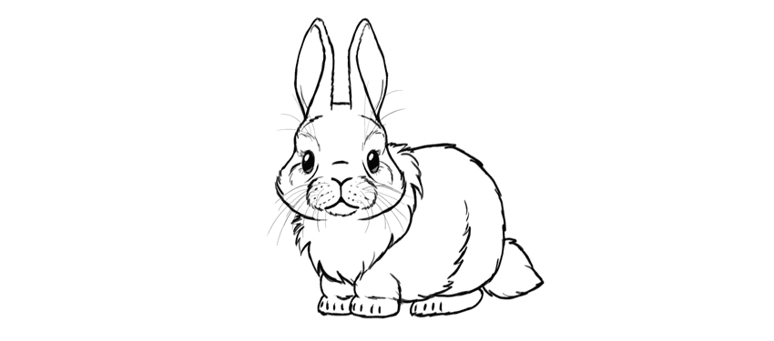








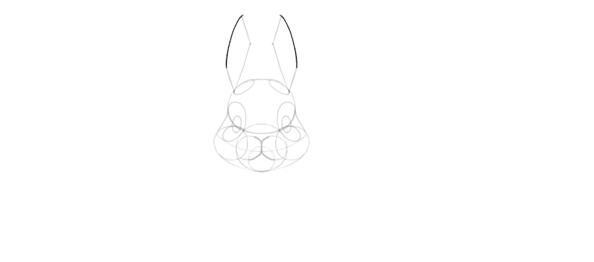


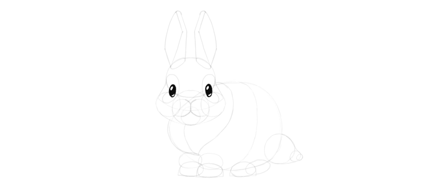


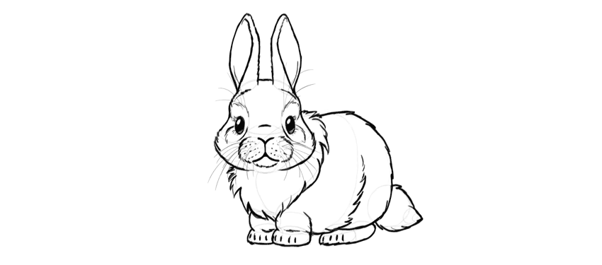

 DrawingHow to Draw a Super Cute Kitten Step by StepMonika Zagrobelna
 DrawingHow to Draw Simple Cute Animals in Chibi Style (With Videos!)Monika Zagrobelna
 AnimalsHow to Draw a Dalmatian DogEugenia Hauss