Archiwum kategorii: Web Tools

Envato Tuts+ Community Challenge: Created by You, June 2017 Edition

Post pobrano z: Envato Tuts+ Community Challenge: Created by You, June 2017 Edition

Welcome to our monthly feature of fantastic tutorial results created by
you, the Envato Tuts+ community! Every day, visitors like you take the
time not only to read our tutorials but also to try them out. This is an
assortment of those comment submissions found throughout the Design
& Illustration section. Check out this set of results and join in
for the next roundup, published next month!

Vector Tutorial Results

Taken from the
comments section of your favorite tutorials, these first pieces are an
assortment of results created with vector drawing programs. Check out
these amazing results!

How to Create a Tropical Bungalow on a Palm Beach in Adobe Illustrator

Ilia Dov created this vibrant Tropical Bungalow from a tutorial by . She commented:

Thanks for an awesome tutorial! I really enjoyed making that one.

Tropical Bungalow Illustration Illustrator Tutorial

How to Create a Bodega Shop Illustration in Adobe Illustrator

Inspired by this Bodega Illustration from instructor , Arjen van der Velde recreated the illustration perfectly, commenting:

Thank you for this tutorial!

Bodega Shop Illustration Adobe Illustrator Tutorial

How to Create a Road Text Effect in Adobe Illustrator

Lwardi Abdo achieved success from this awesome Road Text Effect tutorial by . He commented:

This was an amazing tutorial! As a beginner I enjoyed learning new tricks. Thanks for sharing Andrei, here is my result applied to the word, „Nascar.”

Road Text Effect Adobe Illustrator Tutorial

How to Create a Space Observatory Badge in Adobe Illustrator

User Kinzee_fr created an awesome result inspired by this Space Badge tutorial by , commenting:

Here it is. Well, it has some flaws but I tried my best! Thanks for the great tutorial.

Space Badge Adobe Illustrator Tutorial

Create a 3D Paper Bird With Geometric Shapes in Adobe Illustrator

Shamus Tobin created a lovely Paper Bird inspired by a tutorial from . He commented:

Here’s a humming bird from my yard.

Paper Bird Adobe Illustrator Tutorial

Create Detailed Tulips With Gradient Mesh, Without the Mesh Tool in Illustrator

Camila Fedarkova just loved this Tulip Gradient Mesh tutorial from . She commented:

Thank you for this great tutorial! It’s very easy to follow, even for beginners like myself!

Tulip Illustration Adobe Illustrator Mesh Tool

How to Create a Unicorn Illustration in Adobe Illustrator

Anna did a wonderful job with this Unicorn Illustration from . She commented:

You are such a great teacher! All your tutorials are easy to do and are full of useful advice. Please keep it up! Thank you!

Unicorn Illustration Adobe Illustrator Tutorial

How to Create a Super Kawaii Collage in Adobe Illustrator

Dolphin Trang achieved amazing results with this Super Kawaii Collage from . She commented:

Thank you so much! This was very useful. Here’s my result.

Kawaii Fruit Collage Adobe Illustrator Tutorial

How to Design a Naw-Rúz Floral Card in Adobe Illustrator

Captivated by this Naw-Rúz Floral Card from , Dilara Isis Yavuz created a fantastic card of her own. She said:

Inspired by your tutorial, I created a Pokemon-themed spring postcard!

Naw-Rz Floral Card Illustrator Tutorial

How to Create a Stylish Deer With Brushes and Graphic Styles in Adobe Illustrator

Christopher Hoffmann Jacob did an incredible job with this Stylish Deer tutorial from . He commented:

Great tutorial! I will be using the tips for sure, but I need some more practice because I’m a little rusty!

Stylish Deer Illustration Adobe Illustrator Tutorial

Adobe Photoshop Tutorial Results

Let’s
take a look at this next set of results inspired by Adobe Photoshop
tutorials published here on Envato Tuts+. Contributions range from photo
effects to icons and more! Check out these wicked results below!

How to Create a Fur Action Text Effect in Adobe Photoshop

Hiba recreated this Fur Text Effect from perfectly! They commented:

Thank you very much, this is my result.

Fur Text Effect Adobe Photoshop Tutorial

Learn How to Paint a Realistic Nose in Adobe Photoshop

User SZoeter achieved an amazing result with this Realistic Nose Painting tutorial from , commenting

Nice tutorial! Here’s my result!

Paint a Realistic Nose in Adobe Photoshop

How to Add Texture to a Flat Illustration in Adobe Photoshop

Aisha Khan created her own refreshing Flat Drink Illustration with help from a tutorial by . She commented:

Thank you so much for your tutorial. It really helped me improve my Photoshop skills. I really love your work and I hope to use more of these techniques in making works of my own.

Flat Lemon Drink Illustration Photoshop Tutorial

Create a Funny Surreal Underground Scene With Adobe Photoshop

User bao007fei just loved this Surreal Underground Scene from instructor , commenting:

Amazing tutorial! Love you Jenny Le!

Surreal Underground Manipulation Photoshop Tutorial

Quick Tip: Create a Glass Text Effect in Photoshop Using Layer Styles

Naveed Mirza achieved beautiful success with this Glass Text Effect from . He commented:

Thanks, I love this!

Glass Text Effect Photoshop Tutorial

How to Create an Energetic Paint Splashing Effect in Adobe Photoshop

Franck Beaume did a job well done with this Paint Splashing Effect from instructor . He commented:

Thanks Melody for this great tutorial. Very inspiring and well explained. I could not miss the opportunity to use one of my favorite techniques, so here’s my version. Best regards.

Paint Splashing Shoe Effect Photoshop Tutorial

How to Create a Cute Baby Dragon Photo Manipulation in Adobe Photoshop

Liya Rybakova created her own adorable Baby Dragon Photo Manipulation from a tutorial by . She commented simply:

Thank you!

Dragon Photo Manipulation Photoshop Tutorial

Design Tutorial Results

These final
pieces are inspired by an assorted of design tutorials that don’t quite
fit the previous categories. They include everything from print design
to drawing and more! Enjoy these beautiful pieces created by the
community below!

How to Draw a T-Rex Dinosaur

Atka Kaa created a ferocious T-Rex Dinosaur Illustration from a thorough tutorial by , commenting:

Thanks. It was a bit difficult for me, really. His legs are not very good.

T-Rex Dinosaur Drawing Tutorial

How to Create a Vintage Wedding Invitation in Adobe InDesign

Jael did a superb job with this Wedding Invitation tutorial from and commented:

Thanks Grace, I decided to use a different font!

Wedding Invitaion Adobe InDesign Tutorial

Cartoon Fundamentals: How to Draw a Cartoon Body

Spencer Price showed off his amazing talent using this Cartoon Fundamentals tutorial from . He said:

Stumbled across these tutorials, and I have to say, I love them. Thanks for sharing your talent with others. You helped me come up with this one. Here’s my attempt.

How to Draw a Cartoon Body Tutorial Result

How to Be Involved in the Next Showcase

Have
you created a piece based on one of our tutorials here in the Design
& Illustration section of Envato Tuts+? We’re keen for you to share
your results with us! Check out the general guidelines below to join in
with our community:

  • Your artwork should be similar in some
    way to the tutorial that you followed or that inspired it. The aim of
    these showcases is to share what readers have created after following
    the tutorial.
  • Comment on the tutorial you used, attaching an
    image of your result. We’re keen on all levels of ability: from beginner
    to advanced!
  • Include a comment about your result, yourself, or your process. We like knowing about you and what you’re sharing.
  • Share
    the tutorial when you share that artwork elsewhere on the web. If
    you’ve posted your piece on sites like Facebook, Tumblr or Behance, link
    back to the tutorial so that other users know your source and can join
    in on the fun.

Thanks to everyone who was highlighted above for sharing your results with the Envato Tuts+ community. We look forward
to checking out your brilliant versions of our tutorials in the near
future, and welcome users new and old to participate in upcoming
showcases.

Win $250 in Envato Market Credits!

Jump over to the Envato community forums to show off your creation from one of the many Tuts+ tutorials. Read more about it over here.

How to Create 'Eid Mubarak’ Money Cards for Kids in Adobe Illustrator

Post pobrano z: How to Create 'Eid Mubarak’ Money Cards for Kids in Adobe Illustrator

Final product image
What You’ll Be Creating

Money cards are a fabulous idea to present the spirit of Eid and to make giving money to others a little bit more special.

Handing out money or gift cards to children is a common Eid tradition. For a fun way to take it up a notch, in this tutorial we will learn to custom make money cards, by using basic Illustrator tools and some handy shortcuts.

You can find many Eid-themed graphics and templates over on GraphicRiver.

1. How to Set Up the File

Step 1

To begin, sketch out your concept.

The sketch below is the concept I had in mind: two card designs, one for girls and the other for boys. There will be a cutout along the arms to slip the money through.

Sketch your concept, scan it, and save as JPG, to upload it onto Adobe Illustrator.

If you are short on time, you can always head over to GraphicRiver to find a selection of illustrated graphics to use.

fitr Eid card sketch concept

Step 2

Open Adobe Illustrator CC. Let’s set up a New Document (File > New or Command-N).

For this project, use the following settings:

Select Print. 

Preset Details: Eid_Money_Cards

  • Number of Artboards: 1
  • Width: 10 cm
  • Height: 15 cm
  • Units: Centimeters

And click Create.

adobe illustrator create new document

Step 3

Place one side of the sketch onto the Artboard.

Place (Command-Shift-P) and drag the image bounding box to take its place on the artboard. Open the Layers panel: Window > Layers.

Open the sub-menu of the Layers panel:

  1. NameSketch
  2. Select Lock
  3. Dim Images to: 20%
  4. OK

Create New Layer, on top of the ’Sketch’, and name it ’Outline’File > Save (Command-S).

illustrator layers lock sketch dim images

2. How to Create the Borders & Artwork Outlines

Step 1

We begin by laying out our card’s border.

Select the Pen Tool (P), with a Fill of null and black Stroke of 1 pt, and draw half the border.

  1. Then, with the object selected, select the Reflect Tool (O), which is located under the Rotate Tool in the Tools panel.
  2. Click on the center edge of the object to set one point
    of the axis
    . Hold down OptionAlt and click to set.
 pen too reflect panel axis point

Step 2

Next we need to join the borders to create one compound shape, and create a border outline.

Select both borders with the Direct Selection Tool (V). Open the Pathfinder panel: Window > Pathfinder. Select Unite to create a compound shape.

window pathfinder panel create compound shape

After creating our compound shape, with the border selected, we need to create the inner and outer border lining.

First, to create the outer border:

From the Main Menu: Object > Path > Offset Path:

  • Set Offset at 0.2cm
  • Joins: Miter
  • Check Preview, to view
  • OK.
Object Path Offset border

Second, create the inner border:

Select the original border, with the Selection Tool (V).

Main Menu: Object > Path > Offset Path. To offset inwards, use the minus sign (-), set the Offset to -0.35 cm, and click OK.

Path Offset border illustrator

Step 3

Let’s continue by drawing the other symmetrical elements within our design, like the head features and body.

Use the Pen Tool (P), with a black Stroke of 1 pt, and freehand draw half the head, Taqiyah (Islamic Prayer Head Wear), the eye outline, eyebrow, ear and body shape.

Pen tool draw elements

Then select the Ellipse Tool (L) and draw in the pupils and cheeks, as well as the neck area.

Ellipse Tool Pen tool draw

Step 4

Let’s mirror the illustrated parts.

  1. Select the head, Taqiyah Cap, eye, eyebrow, cheeks, ear and body shapes.
  2. Select the Reflect Tool (O), from the Tools panel.
  3. Set the light blue, Reflect axis point, on the edge, as shown.
  4. Hold down Option-Alt, and click to reflect the objects.
select objects reflect shapes mirror axis point

Then we need to select each shape and its respective reflection and Unite them, using the Unite option from the Pathfinder panel to create a single compound shape.

pathfinder panel unite object compound join

Last, select the body shape with the inner border lining and Minus Front, from the Pathfinder panel, so it lines up along the edges.

minus front pathfinder panel compound subtract

Step 5

Next we need to add in the text, but by drawing it.

Instead of working with Arabic fonts and getting lost in letters and rigid-looking font styles, I prefer to draw in the text, for a more personal feel.

Select the Blob Brush Tool (Shift-B) from the Tools panel. The Blob Brush is similar to a thick pen. Select a black Stroke, no Fill. Set the blob size you want to draw the text with, and draw in the text.

  • A shortcut to manage Blob Brush Tool size: Click the left square bracket key ([) to shrink the brush size and the right square bracket (]) to enlarge.
  • Select a smaller blob brush, to add in the Arabic pronunciation marks.
  • You can use the Eraser Tool (Shift-E) to erase any mistakes with the blob shapes, if needed.
blob brush tool draw arabic font

Step 6

Now that the initial basics are laid out, we need to duplicate the artboard for the girl money-card, since they both share similar borders and features.

Select the boy’s Taqiyah Cap, and Lock it using the Command-2 shortcut, so it’s not duplicated with the Artboard.

From the Main Menu: File > Document Setup.

The Document Setup dialog box will open.

Select Edit Artboards.

Hold down the ShiftAlt keys and drag our Artboard onto the girl card sketch, to duplicate it.

duplicate artboard elements vector illustration

Step 7

The girl is wearing a dress, so we need to adjust her outline and widen the bottom part to form a dress.

Select the Direct Selection Tool (A), select each anchor point separately, hold the Shift key down to constrain movement to a 90° angle, and drag along, as so.

Direct selection tool anchor point

Step 8

Let’s fill in the remaining details, using some basic tools.

First use the Pen Tool (P), with a Fill to null and black Stroke of 1 pt, and trace in the main line work, as so:

Pen tool adobe illustrator trace illustration

Step 9

Lock (Command-2) everything except the ears, head hair, and borders.

adobe illustrator lock elements

What we will do is duplicate our elements to create a color fill layer.

In the Layers panel sub-menu, select Duplicate 'Outlines’.

Layers panel duplicate options outline layer

This will create the layer ’Outline Copy’ over the ’Outlines’ layer.

  1. Position the ’Outline Copy’ under the ’Outlines’ layer, for us to create our fills under the line work.
  2. Rename 'Outline Copy’ to ’Fill’.
  3. Lock the ’Outlines’ layer.
  4. File > Save (Command-S), to save your Illustrator file.
vector tutorial duplicate layers file color

Step 10

In the ’Fill’ layer, let’s give a color fill to the unlocked shapes.

You may need to Arrange objects, as you color along. Use the following shortcuts:

  • Arrange > Bring to Front (Command-Shift-])
  • Arrange > Bring Forward (Command-])
  • Arrange > Send Backward (Command-[)
  • Arrange > Send to Back (Command-Shift-[)
color backgrounds fills arrange elements

Unlock All (Command-Option-2) the rest of our elements. Give each one a color Fill of your choice.

unlock elements color fills strokes

Step 11

Next, with the Selection Tool (V), select the lines that have no fills and Delete, since they will not need a fill.

Selection Objects tutorial eid money card illustrator

Lock the ’Fill’ layer, and Unlock 'Outlines’ layer.

Unlock All (Command-Option-2) elements within the Outlines’ layer.

Delete all elements whose outlines we don’t need, like the ears, cheeks, hair, patterns, etc. I left a few, as shown below.

dlete linework artwork  fill eid mubarak money cards

Step 12

Open the Stroke panel (Window > Stroke), and alter the stroke width of the remaining black strokes to create variance in the artwork.

stroke panel variation color linework eid

Next we need to combine the head outline with the body.

Select both the head and body shape of the boy with the Selection Tool (V), and from the Pathfinder panel, Minus Front to subtract from the shape area.

Selection tool Pathfinder panel minus front subtract

Repeat the same steps, with the girl’s head and body shapes.

Then select the Scissors Tool (C) to cut the away the top anchor points that meet with the boy’s cap and head as well as the girl’s hair and head.

 Scissor tool cut anchor point Pathfinder panel minus front

3. How to Add Detail & Flair to the Illustration

Step 1

Let’s start by coloring in our black strokes.

color strokes ramadan eid fitr

Unlock the 'Fill’ layer, and color in all the shapes and arrange the artwork elements so they look harmonious together.

color strokes arrange shapes eid mubarak

Step 2

Let’s create the moon crescent for our background.

Make sure you are on the ’Fill’ layer. Select the Ellipse Tool (L), with a black Stroke, and Fill null. Draw two ellipses, overlapping each other.

ellipse create crecent moon background

Next, select both ellipses, and from the Pathfinder panel, Minus Front to subtract from the shape area, and you’ve got yourself a moon!

Give it a yellowish color Fill and place it somewhere on the background setting.

Create another crescent for the girl’s background.

color fill moon crescent minus front pathfinder

Step 3

Let’s add stars!

Select the Star Tool under the Rectangle Tool menu, and select a yellowish fill.

  • Drag until the star is the desired size.
  • You can drag the pointer to rotate the star.
  • A cool trick is to press the Up Arrow and Down Arrow to add and
    decrease points of the star!

Draw stars on both card backgrounds.

star tool draw stars yellow

Step 4

Next, we need to create small starlight points.

Select the Blob Brush Tool (Shift-B), from the Tools panel.

Chose light and dark blue stroke colors, for the boy’s background, and draw in blob points of various sizes.

  • Remember the shortcut to manage the size of the Blob Brush: Click the left square bracket key ([) to shrink the brush size and the right square bracket (]) to enlarge.

Repeat the process with the girl’s card background, but use white and dark green strokes.

blob brush tool strokes color starlight

Step 5

For the final touches, we need to add lighter tones of highlights to some of the elements to give it some pizzazz.

Continue to use the Blob Brush Tool (Shift-B), using a light blue stroke color, and draw in the boy’s thobe (dress) neck tie, and place some highlights on his thobe, a pattern on his hat, and highlights on his face.

Blob Brush Tool add detail

Step 6

Again, use the Blob Brush Tool (Shift-B), and draw in light tone highlights on the girl’s hair and a pattern on the dress. You can even throw in some lip color.

Blob Brush Tool Shift-B highlights

Step 7

Finally, from the Layers panel, trash the ’Sketch’ layer. File > Save (Command-S) the file.

Print it out on nice semi-glossy thick paper, cut the borders and cut along the outer lining of the arms, and slide the Eid gift money through, and you are done!

Hand out the holiday treats to all the little ones for the Eid holiday.

You can even make them more personalized by writing their names on each card!

Eid Mubarak! Our Colorful Eid Money-Card Illustrations Are Finished!

Great job! I hope you enjoyed the tutorial, and don’t forget to share your results!

For more fun tutorials like this one, check out my tutorials via my profile (Miss ChatZ) on Envato Tuts+. Have a wonderful Eid!

print money card ramadan eid mubarak fitr kids misschatz

How to Create a Vector T-Shirt Template and Apply a Pattern to It With Adobe Illustrator

Post pobrano z: How to Create a Vector T-Shirt Template and Apply a Pattern to It With Adobe Illustrator

Final product image
What You’ll Be Creating

In this tutorial, you will learn how to use the Mesh Tool in Adobe Illustrator to create a vector T-shirt!

If you want to skip the tutorial and just use this shirt with lots of other awesome designs, purchase the Collection of Various Soccer Jerseys from GraphicRiver!

Collection of Various Soccer Jerseys

1. How to Draw a T-Shirt With the Mesh Tool

Step 1

Let’s learn how to use the Mesh Tool while creating a photo-realistic T-shirt!

Begin by drawing the shape of half of a shirt with the Pen Tool (P). Fill it in with #FDFDFD.

Create a copy of the shape! Put it aside—we will need it later.

Let’s start using a Mesh! Take the Mesh Tool (U) and start creating a Mesh grid on the object by placing nodes. Afterwards, select the nodes on the top left edge of the shirt and change their color to #D5D5D5.

Add some more nodes, as indicated in the screenshot below, and color the bottom two-thirds of the shirt with #F1F1F1.

see above

Step 2

Continue similarly, now using these colors:

  1. #DFDFDF
  2. #B7B7B7
  3. #7E7E7E
shadow on the left side

Step 3

Create more shadows and folds in this step, using these colors:

  1. #7E7E7E
  2. #B4B4B4
  3. #C9C9C9
folds on the left middle

Step 4

Add some more Mesh nodes and apply the final colors:

  1. #AAAAAA
  2. #DADADA
  3. #D1D1D1
more folds now on the bottom

Step 5

Add a final fold with #BCBCBC and now create a reflected copy of the object by right-clicking, and then choosing Transform > Reflect.

Choose Vertical reflection and click Copy instead of OK.

Put the two copies together as well as you can—make sure the mesh nodes in the middle line up. You can Group both objects (Control-G) for ease of use.

see above

Step 6

Next, let’s draw the sleeves! Draw an outline and save a copy for later. Continue using the Mesh Tool (U) with these colors:

  1. #DCDCDC
  2. #949494
  3. #FCFCFC
dark on the right white on the left and create folds

Step 7

Apply finishing touches to the sleeve with:

  1. #F4F4F4
  2. #606060
  3. #FBFBFB
create more folds with white highlights

Step 8

Draw the inside of the shirt with these colors:

  1. #A6A6A6
  2. #676767
  3. #8D8D8D

Save a copy of the outline of the shape!

grey with darker on the edges

Step 9

Draw some more folds with:

  1. #898989
  2. #919191
  3. #B7B7B7
single fold in the middle

Step 10

Draw the outline of the shape and save a copy of it for later.

Finish off the shirt by coloring its collar using these:

  1. #F4F4F4
  2. #D0D0D0
  3. #DDDDDD
  4. #CECECE
collar with dark on the edges

Step 11

Now, put all the elements together! (Create the second sleeve by recreating Step 5).

Our shirt is done!

put it together

2. How to Apply a Pattern to the Shirt

Step 1

Draw a sample pattern made with red (#E81010) stripes on a white background. You can use any other pattern you want!

see above

Step 2

Grab the copy of the outline we made back in Step 1, create a reflected copy and, using the Pathfinder panel, Unite both shapes into one.

see above

Step 3

Place the pattern we made before over the top of the white shape. Select both and, after right-clicking, choose Make Clipping Mask.

see above

Step 4

Grab the other copies of outlines we made in the previous section of the tutorial and add them to our shirt pattern. You can Group them.

Next, take the Mesh T-shirt and, in the Transparency panel, change the Transparency mode to Multiply. Place the Mesh T-shirt over the top of the pattern and it’s ready!

see above

Step 5

Our T-shirt with the pattern is done! You can apply any other pattern you’d like in exactly the same fashion.

result

Awesome Work, You’re Now Done!

What now? You can try any of my other tutorials from my profile, or check out my portfolio on GraphicRiver, as well as the original shirts collection we recreated in this tutorial.

I hope you enjoyed the tutorial, and I’ll be extremely happy to see your results in the comments below!

Collection of Various Soccer Jerseys

Now Available on Envato Elements: Unlimited Stock Photos

Post pobrano z: Now Available on Envato Elements: Unlimited Stock Photos

Welcome to unlimited stock photos on Envato Elements!

If you’re already an Elements subscriber, you’ll now see that, along with all the graphics, fonts, web templates, 3D models and everything else you’ve been used to downloading, you have unlimited access to over 240,000 high-quality stock images. Enjoy!

If you’re not an Elements subscriber, here’s how it works. For a single monthly subscription of US$29, you get unlimited downloads from a broad and highly curated selection of:

  • graphics (vectors, icons, patterns, textures, illustrations and more)
  • add-ons (think Photoshop and Illustrator actions, Lightroom presets, etc.)
  • fonts
  • graphic templates (logos, infographics, product mockups, etc.)
  • presentation templates (Keynote and PowerPoint)
  • web templates (landing pages, full websites, email newsletters, etc.)
  • CMS templates (Shopify, Magento, OpenCart, and a lot more)
  • 3D models

Oh, and you also get free access to over 1,000 courses and 170 eBooks here on Envato Tuts+, as well as free AND CO membership to help you with invoicing and contracts. 

And because all of that just wasn’t enough, now you get almost a quarter of a million stock photos too.

Stock photo on Envato Elements
Workplace image from Envato Elements

Why Envato Elements?

Of course, there are loads of stock photo sites out there already, both free and paid. So why should you bother with Envato Elements? Here are a few reasons:

1. Get Premium Quality

On some other stock photo sites, the emphasis is on quantity: thousands of people uploading millions of images, with little quality control. On Envato Elements, the collection is carefully curated to make sure you have access to the very best images, without having to wade through tons of mediocre ones.

Photography image on Envato Elements

2. Get Broad Commercial Rights

No matter whether you’re using photos for a website, an artwork, a client project or a professional document, you need to know that you have the right to use those images and won’t get sued for copyright infringement. All the items on Envato Elements come with a simple, easy-to-understand commercial license, so that you can use them in your projects with confidence—and without having to squint at a mass of small print.

Happy couple image on Envato Elements

3. Find Exactly What You Need

Elements offers some useful filters to help you find what you need quickly and effectively. You can search by subject, of course, but you can also filter for image orientation (landscape, portrait, or square) and for the predominant colours in the image. So you can find images that not only convey the right message, but also fit seamlessly with your overall design.

Image of Tuscany from Envato Elements

4. Get a Lot of Other Stuff Too

As I mentioned above, you get a ton of other useful things bundled with an Elements subscription. There are no usage limits, no credits to keep track of. You just use as many photos, templates, fonts and graphics as you need for the projects you’re working on. So whether you’re a web designer, a developer, an artist a businessperson or a freelancer in a number of creative fields, you’ll be able to get good value out of an Elements subscription.

Food image on Envato Elements

What to Do Next

To learn more about the new selection of photos, head over to Envato Elements. You can browse the full selection of items even if you don’t have an account, so take a look around to get an idea of what’s on offer and decide whether it would be useful for you.

Keep in mind that Envato Elements is expanding all the time, both in terms of the number of categories being offered and the number of items in each category. So this is a subscription that’s only going to get more valuable over time.

How to Draw a Wolf Step by Step

Post pobrano z: How to Draw a Wolf Step by Step

Final product image
What You’ll Be Creating

Do you want to draw a beautiful, realistic wolf? In this tutorial I will show you how to do it step by step, without any reference. You’ll learn how to plan the pose, how to add the body, how to create the correct proportions of the head, and how to cover it all with fur. You can use any tools you want!

Before You Start

To get in the right mood for drawing wolves and to remind yourself what the goal is, first take a look at some wolf photos:

1. How to Start Drawing a Wolf

Step 1

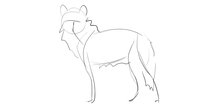
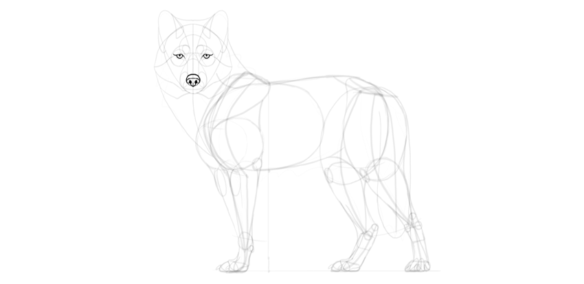
When you want to draw something from scratch, it’s very important to create a base first. This way it will be easier to keep the correct proportions and pose during the process. Such a base may take the form of a very simple sketch, a shadow of the final drawing you have in mind.

wolf basic sketch

Step 2

Let’s build the basic skeleton for this sketch now. First, the chest.

wolf torso

Step 3

Draw the back and turn gently to create the outline of the fluffy rump.

wolf rump

Step 4

Add the shoulder blade in the front.

wolf drawing shoulders

Step 5

Correct proportions are very important if you want to draw a specific animal. Wolves have long legs, so the distance between the chest and the ground should be slightly longer than the height of the chest.

wolf drawing proportions

Step 6

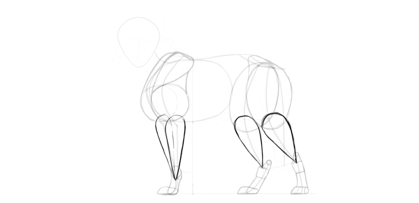
Once you have the ground established, you can build the limbs out of simple lines:

wolf drawing scapula
wolf drawing front leg
wolf drawing hips
wolf drawing hind legs
wolf drawing feet

Step 7

The other pair of limbs must have the same proportions, even if they have a different position. To achieve this, create curvy paths across the joints.

wolf drawing two pairs of legs

Step 8

The joints of the other pair of limbs must follow these paths.

wolf drawing four legs

Step 9

Add the general shape of the head.

wolf drawing head shape

Step 10

Add the neck and the tail in a typical wolf position.

wolf drawing tail position

2. How to Draw a Wolf’s Body

Step 1

Time to add some body to this skeleton. First, the big muscle mass of the arm: the biceps and triceps.

wolf drawing arm muscles

Step 2

Add the mass of the shoulder above it.

wolf drawing shoulder muscles

Step 3

Close the shape of this mass with a gentle curve.

wolf drawing full shoulder

Step 4

The shoulders seem to be slightly rotated, so we should see another one, too.

wolf drawing two shulders

Step 5

Draw an oval in place of the thigh. No muscles needed—they would be covered with fluff anyway!

wolf drawing fluffy thigh
wolf drawing other thigh

Step 6

Connect the thigh with the hips.

wolf drawing hips muscles

Step 7

Give a special, detailed shape to the wrist and ankle joints.

wolf drawing joint details
wolf drawing ankles

Step 8

Time for the paws. Wolves have them quite big and flat.

wolf drawing paws base

Step 9

The upper part („hands” and feet) should be slim, because they’re not very furry.

wolf drawing feet and hands

Step 10

Add some muscle mass between the upper body and the paws.

wolf drawing calves and forearms

Step 11

Some more details will be useful here.

wolf drawing muscle details

Step 12

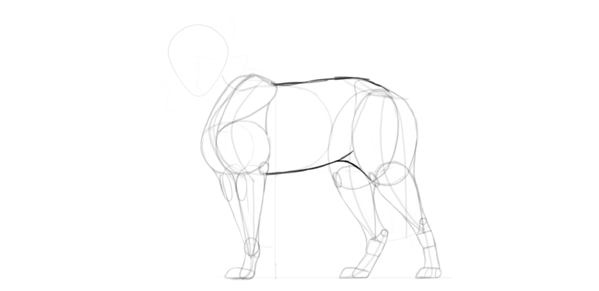
Finish the outline around these simple shapes to create a nice outline of the limbs.

wolf drawing leg outline

Step 13

Outline the main body, too.

wolf drawing main body

3. How to Draw a Wolf’s Head

Step 1

The proportions of the head are even more important than those of the body, because we’re very good at recognizing faces. We have a clear image of a wolf’s face in our mind, and the drawing must match it! Let’s add the details of the head carefully then.

Draw a cross on the head to show the middle and the eyebrow line.

wolf drawing head proportions

Step 2

Draw a teardrop shape under the eyebrow line for the muzzle.

wolf drawing muzzle

Step 3

Mark the front of the muzzle. This will add a little perspective.

wolf drawing muzzle front

Step 4

Put „upside-down glasses” on top of the wolf’s nose. This will be the space for the eyes.

wolf drawing eye sockets

Step 5

Draw the nasal bridge.

wolf drawing nasal bridge

Step 6

Draw the forehead.

wolf drawing forehead

Step 7

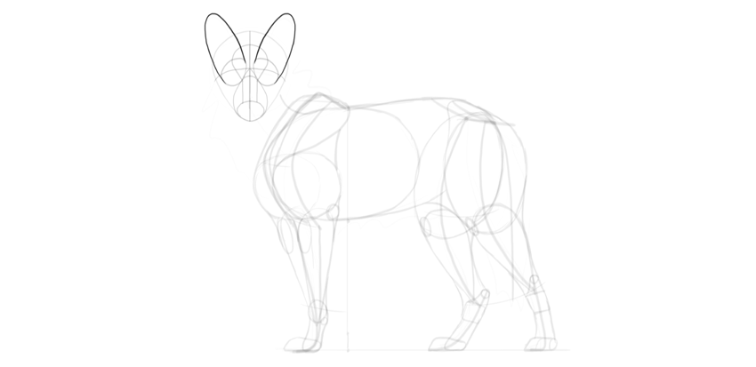
Draw the ears behind the eyes. They’re long and rounded on tips.

wolf drawing ears

Step 8

Draw the nose.

wolf drawing nose

Step 9

Draw the circular eyes.

wolf drawing eyes shape

Step 10

Draw the mouth.

wolf drawing mouth

Step 11

The eyes need some more details to be fully wolf-like:

wolf drawing angry look
wolf drawing eyebrows
wolf drawing eye almond shape
wolf drawing pupils

Step 12

Add more detail to the nose as well.

wolf drawing nose details
wolf drawing nose shape

Step 13

Give a detailed shape to the ears.

wolf drawing ears detailed

Step 14

Don’t forget about the fur! It really adds to a wolf’s head shape.

wolf drawing mane cheeks
wolf drawing ear fluff
wolf drawing fur on the head
wolf drawing cheekmane
wolf drawing ruff

Step 15

Add fur to other places, too.

wolf drawing mane
wolf drawing tail fur

4. How to Draw a Wolf’s Paws

Step 1

We already have the base for the paws, so now we need to add the details. First, draw the middle toe (there are two toes in the middle, but in this perspective only one is visible).

wolf drawing middle toes

Step 2

Draw the outer toes. In wolves, the middle toes are visibly longer than the outer ones.

wolf drawing outer toes

Step 3

Connect them with the rest of the limb, creating a little hump right before the toes. This will give them a more accurate look.

wolf drawing top paws

Step 4

Draw the paw pads.

wolf drawing paw pads

Step 5

Draw the claws. They’re long, slightly curved, and blunt.

wolf drawing claws

Step 6

Draw the back of each paw with the big pad beneath.

wolf drawing back paws

Step 7

That third paw is in perspective, so it needs a different treatment. Draw all the toes…

wolf drawing paw in perspective

… then the paw pads…

wolf drawing paw pads in perspective

… and the claws.

wolf drawing claws in perspective

Step 8

There are special „wrist pads” on the front legs as well, and dew claws (thumb claws) which are not visible in this pose.

wolf drawing carpal pad

5. How to Finish a Drawing of a Wolf

Step 1

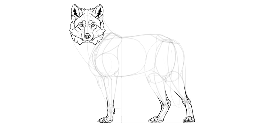
The guide lines are all drawn, and we can create the final lines now. If you’ve been drawing traditionally, you can use a darker tool for this final outline, or put a new sheet of paper over the sketch.

Outline the nose.

wolf drawing nose details

Step 2

Outline the eyes.

wolf drawing eyes details
wolf drawing eyes outline
wolf drawing eyes dark outline

Step 3

The eyes get their special wolf expression mainly from the details around them.

wolf drawing expression

Step 4

Draw the muzzle.

wolf drawing muzzle details

Step 5

Draw the ears.

wolf drawing ears details
wolf drawing ears fur

Step 6

Outline the fur around the face. Don’t try to draw all the single hairs—instead, focus on the clumps and tufts.

wolf drawing head fur

Step 7

Outline the paws.

wolf drawing paws details

Step 8

Outline the feet. Can you see how the guide lines can be used to create additional detail?

wolf drawing feet details

Step 9

Cover the neck with fur.

wolf drawing neck perspective
wolf drawing neck fur
wolf drawing back mane

Step 10

The forelegs are skinny, so we need to add more details to them.

wolf drawing front leg fur
wolf drawing front leg details

Step 11

Add the fluff on the thigh…

wolf drawing thigh fur

… and the belly.

wolf drawing belly fur

Step 12

Add some fur here and there.

wolf drawing fur details

Step 13

When you’re done, darken the outer outline and thicken some lines to give them variety.

wolf drawing dark outline

Good Job!

You’ve learned how to draw a wolf! If you want to keep drawing, don’t forget to check these out:

how to draw a wolf step by step

Create an Illustrative Logo From a Photograph

Post pobrano z: Create an Illustrative Logo From a Photograph

Final product image
What You’ll Be Creating

This tutorial was originally published in July 2012 as a Tuts+
Premium tutorial. It is now available free to view. Although this
tutorial does not use the latest version of Adobe Photoshop, its
techniques and process are still relevant.

In this tutorial, we’ll start with a photographic reference, then through some manipulation in Photoshop and careful tracing by hand, pare it down to its essential elements. The result is a stylized mark that is representative, yet bold and graphic. Let’s get started!

Do you love animal logos? Then we’re sure you’ll love our Animal Logo Designs available through GraphicRiver. Or enlist the help of a design professional from Envato Studio for custom logo designs.

1. How to Create the Initial Concept

Step 1

When approaching any logo assignment, it’s best to do a fair amount of research before you even put pencil to paper. Sometimes you’ll get a detailed creative brief, and other times, the client will have a vague notion of what they’re after, and let you do the rest. Regardless of the scenario, research should be the first step in the process. Even if the client already has as logo basically done and wants you to polish it, I believe that the more knowledge you bring to the job, the more successful it will be.

For this imaginary assignment, the client wanted a lion’s head for their logo. Lions often represent royalty, pride, strength and leadership. I decided on a proud lion in profile, and made a few very rough thumbnail sketches. I decided to do something that was more realistic than stylized, yet bold and graphic.

Create the Initial Concept

My sketches looked like a cross between a sheep and a kitten, so it was time to do some research. I hit up the usual image searches for a lion in profile. At this point, I was just looking at images and absorbing visual information. I wanted to get a good sense of what a lion actually looks like, and carry that with me when working on the logo.

In order to make a realistic vector logo, I wanted to find a good photograph on which to base my design. I want to state emphatically that you should always get the photographer’s permission when using a photo as a source image. Even though your end result will be quite stylized, it’s simply not OK to use a copyrighted photo without permission. There was a case several years ago regarding the logo used on the Kentucky license plates. A German photographer claimed the logo was based on his photograph. He sued and the license plates had to be changed. So stay on the right side of the law and get permission.


Step 2

The other aspect of logo research involves seeing what’s already been done. It can be tricky to look at lots of logos and try not to be influenced by them, but it’s also good to know what’s already out there. You don’t want to spend hours on a logo only to find that it looks very similar to another one. I first did a Google image search for „lion head logo.” It’s a popular motif, and the designs run the gamut from realistic and detailed to stylistic or cartoony.

Create the Initial Concept

I didn’t see anything quite like what I had in mind, so it was on to the initial prep work.


2. How to Prepare the Reference Image


Step 1

I found an excellent source photo at PhotoDune, and got permission to use it. Since this is an imaginary assignment and no money is changing hands, the photographer was kind enough to let me use it for demonstration.

Big Male African Lion by EcoSound


Step 2

Since my logo will be high contrast, I first want to adjust the photo so I can more easily see the highlights and shadows.

Open the photo in Photoshop, and go to Image > Adjustments > Black & White. Since my image consisted of mainly yellow tones, I chose the Yellow Filter preset. Using the Black & White Adjustment rather than simply converting to Grayscale gives you more control over how the gray tones will look. You can start with a preset and fine tune the color sliders.

Prepare the Reference

Step 3

Now convert the image to grayscale. Go to Image > Adjustments > Levels. Adjust the sliders to add contrast to the image.

Prepare the Reference

Step 4

Now that your image is prepared, print it, then use tracing paper to draw out the lines and shapes by hand with pencil. You may think it would be faster to just start drawing in Illustrator, but drawing by hand allows you to make decisions about which shapes and lines are important to keep and which can be discarded. Keep your pencil strokes smooth and deliberate. In my tracing, I’ve added hatch marks to larger areas of black, just as a reminder when I’m creating the vector shapes later. The finished pencil trace is below.

Prepare the Reference

3. How to Draw Vector Shapes


Step 1

Begin drawing the lines and shapes with the Pen Tool. You could use the Pencil Tool, the Brush tool, or even the Blob Brush Tool, but we’re going for precise paths, with only the essential points.

It can help to increase the line weight of your paths. Doing so can help you more easily see potential problems. In the examples below, sharp angles and points stand out better on a thicker stroke. Carefully adjust the handles to correct issues like this.

Draw Vector Shapes

Step 2

Continue working in this manner, smoothing and simplifying paths along the way.

Draw Vector Shapes

4. How to Add Color

Step 1

Fill in the shapes with solid color. Keep simplifying paths where necessary, and smoothing points.

Draw Vector Shapes

Step 2

Draw a path for the white area. This will eventually be cut out of the overall logo, or will be filled with a different color. The path is shown in green below.

Draw Vector Shapes

Step 3

Draw in the highlights. Again, these may be eventually cut out, but for now keep them a lighter color.

Draw Vector Shapes

5. How to Refine the Logo


Step 1

At this point, it’s down to miniscule decisions. Take away everything that’s not necessary for the image to read as a lion. Simplify!

Some changes I made were simplifying the ear shape and removing some of the shapes on the mane. I also enlarged the eye a bit so it would still be visible at smaller sizes, and I made the dots on the muzzle larger and more uniform.

Refine the Logo
Refine the Logo

Step 2

When you’ve made all of the tweaks and refinement and you’re certain it’s done, you can reduce the illustration to only the paths that make up the highlights. Use the Divide function on the Pathfinder panel, or the Shape Builder tool to remove all but the lighter colors, creating one compound path. The finished logo is shown in Outline mode below. This step is optional, you can always keep bother colors. WIth a highlights-only vector shape, however, you can easily place the object on a differently-colored background to create different color schemes.

Refine the Logo
Refine the Logo

Conclusion

Tweaking and perfecting each path is important and can take hours to get everything in its optimum place. Be sure to view the image at different sizes along the way. Building a solid foundation through hand drawing can make the process a little easier and faster.

Lion Logo Adobe Photoshop Tutorial

Stunning Animal Logos From GraphicRiver

Are you a budding entrepreneur in need of a good logo? Then browse our selection of incredible Animal Logos right on GraphicRiver. These amazing designs have been handcrafted by a community of talented designers. And check out one of the gorgeous designs below!

Valiant Lion Logo

Enjoy this stunning lion logo design full of vibrant colors. This design is inspired by modern geometric logos that slice up the lion for an interesting style. Download this logo today to get access to this 100% fully editable and scalable design.

Valiant Lion Logo

How to Create an Easy Digital Glitch Text Effect in Adobe Photoshop

Post pobrano z: How to Create an Easy Digital Glitch Text Effect in Adobe Photoshop

Final product image
What You’ll Be Creating

This tutorial will show you how to use Photoshop’s layer styles, filters, and layer masks to create a quick and easy digital glitch text effect. Let’s get started!

This text effect was inspired by the many Layer Styles available on GraphicRiver.

Tutorial Assets

The following assets were used during the production of this tutorial:

1. How to Create the Background and Text Layers

Step 1

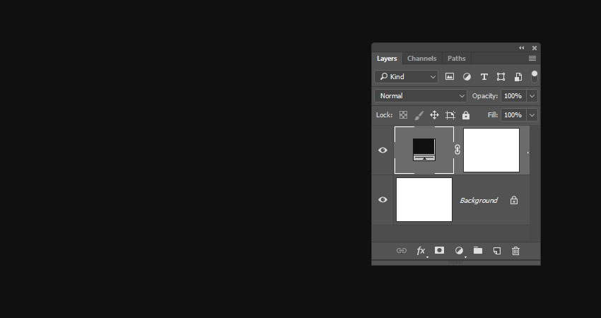
Create a 900 x 700 px New Document, click the Create new fill or adjustment layer icon at the bottom of the Layers panel, choose Solid Color, and use the Color #101010.

Solid Color Layer

Step 2

Create the text in White using the font Pixel Digivolve, and set the Size to 170 pt.

Create the Text

Step 3

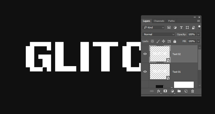
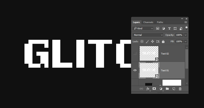
Rename the text layer to Text 01, right-click it, and choose Convert to Smart Object.

Convert to Smart Object

Step 4

Duplicate the Text 01 layer, and rename the copy to Text 02.

Duplicate the Text Layer

Step 5

Hide the Text 02 layer by clicking the eye icon next to it.

Hide the Layer

2. How to Apply Layer Styles

Double-click the Text 01 layer to apply the following Layer Style:

Step 1

Under Blending Options go to Advanced Blending, and uncheck the G and B Channels’ boxes.

Advanced Blending

Step 2

Add an Outer Glow with these settings:

  • Opacity: 50%
  • Color: #ffffff
  • Size: 10
Outer Glow Layer Style

This will style the red part of the text.

Styled Text 1

Show the Text 02 layer, and double-click to apply the following Layer Style:

Step 3

Under Blending Options, go to Advanced Blending, and uncheck the R Channels box.

Advanced Blending Options

Step 4

Add an Outer Glow with these settings:

  • Opacity: 50%
  • Color: #ffffff
  • Size: 10
Outer Glow Layer Style

This will style the blue part, which will not be visible now, but we’ll work on it next.

Styled Text 2

3. How to Create a Basic Glitch Effect

Step 1

Pick the Move Tool, and use the Arrow Keys to slightly nudge the Text 01 and Text 02 layers in opposite directions to show the red and blue colors, and get a result you like.

Nudge the Text Layers

Step 2

Duplicate both the Text 01 and Text 02 layers.

Duplicate Layers

Step 3

Create a New Layer on top of all layers, name it Filters 01, and press the Option-Command-Shift-E keys to create a stamp of all the layers you have.

Right-click the Filters 01 layer, and choose Convert to Smart Object.

Convert to Smart Object

Step 4

Press-hold the Option key and click the Add layer mask icon at the bottom of the Layers panel to add an inverted layer mask.

Add a Layer Mask

Step 5

Duplicate the Filters 01 layer and rename the copy to Filters 02.

Duplicate the Layer

4. How to Work With Layer Masks

Step 1

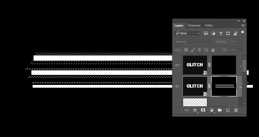
Pick the Rectangular Marquee Tool, create some random selections that cover parts of the text, and make sure to extend the selections to reach outside the left and right sides of the text.

Keep enough vertical space between the selections as we’re going to create some more selections between them.

Create Selections

Step 2

Select the Filters 01 layer mask’s thumbnail, and Fill the selection with White.

Press Command-D to Deselect.

Fill the Selection

Step 3

Press-hold the Option key and click the Filters 01 layer mask’s thumbnail to show it. We will use this as a reference to create the selections between the lines we already have.

Show the Layer Mask

Step 4

Use the Rectangular Marquee Tool again to create narrower lines between the ones you have, but keep some unselected areas as well.

Create More Selections

Step 5

Press-hold the Option key and click the Filters 01 layer mask’s thumbnail again to get the original content, select the Filters 02 layer mask’s thumbnail, and Fill the new selection with White.

Deselect when you’re done.

Fill the Selection

5. How to Apply Glitch Effect Filters

Step 1

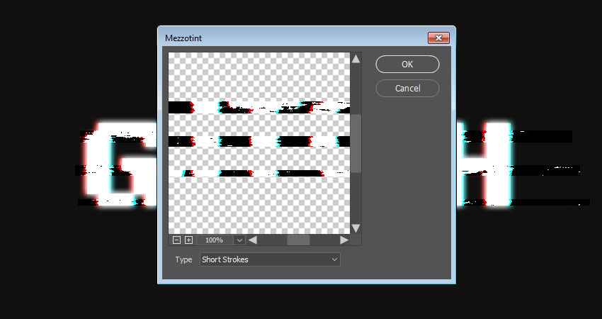
Select the Filters 01 layer, go to Filter > Pixelate > Mezzotint, and set the Type to Short Strokes.

Mezzotint Filter

Step 2

Select the Filters 02 layer, and go to Filter > Distort > Wave. This can be a tricky filter to apply, so you might need to try different values until you get a result you like.

The values used here are:

  • Number of Generators: 1
  • Wavelength:
    • Min. 1
    • Max. 106
  • Amplitude:
    • Min. 90
    • Max. 133
  • Scale:
    • Horiz. 6
    • Vert. 1
  • Type: Sine
  • Undefined Areas: Repeat Edges Pixels
Wave Filter Settings

Step 3

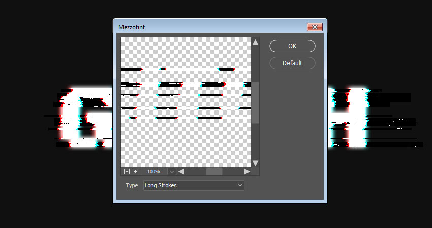
Go to Filter > Pixelate > Mezzotint, and set the Type to Long Strokes.

Mezzotint Filter

Step 4

Go to Filter > Stylize > Wind, set the Method to Wind, and the Direction to From the Right.

Wind Filter

Step 5

If you need to remove any unwanted parts, select the layer mask’s thumbnail, pick the Brush Tool, and choose a soft round tip.

Set the Foreground Color to Black, and paint over the unwanted areas to hide them.

Hide Unwanted Areas

6. How to Add Scanlines

Step 1

Click the Create new fill or adjustment layer icon at the bottom of the Layers panel, and choose Color Lookup.

Choose the Fuji ETERNA 250D Fuji 3510 (by Adobe).cube table from the 3DLUT File menu.

Color Lookup

Step 2

Create a New Layer on top of all layers, Fill it with White, name it Scanlines, and convert it to a Smart Object.

Make sure that the Foreground and Background Colors are set to Black and White.

Create the Scanlines Layer

Step 3

Go to Filter > Filter Gallery > Sketch > Halftone Pattern, and use these settings:

  • Size: 1
  • Contrast: 5
  • Pattern Type: Line
Halftone Pattern Filter

Step 4

Change the Scanlines layer’s Blend Mode to Soft Light and its Opacity to 50%.

Layer Settings

Step 5

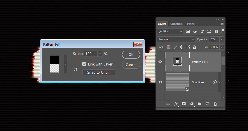
Click the Create new fill or adjustment layer icon at the bottom of the Layers panel, choose Pattern, and use the Pattern 1 Fill from the basic scanline patterns pack.

Change the layer’s Opacity to 25%.

Pattern Fill Layer

7. How to Create a Noise Overlay

Step 1

Create a New Layer on top of all layers, fill it with Black, name it Noise, and convert it to a Smart Object.

Create the Noise Layer

Step 2

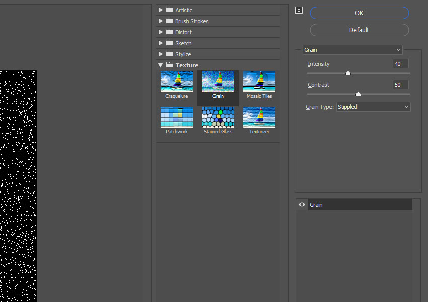
Go to Filter > Texture > Grain, and use these settings:

  • Intensity: 40
  • Contrast: 50
  • Grain Type: Stippled
Grain Texture Filter

Step 3

Click OK, and go again to Filter > Texture > Grain and use the same values as the previous step.

Grain Filter Settings

Step 4

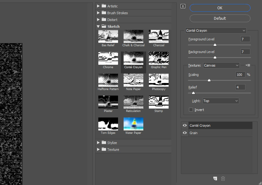
Click the New effect layer icon in the bottom right corner, go to Sketch > Conté Crayon, and use these settings:

  • Foreground Level: 7
  • Background Level: 7
  • Texture: Canvas
  • Scaling: 100%
  • Relief: 4
  • Light: Top
Conte Crayon Filter

Step 5

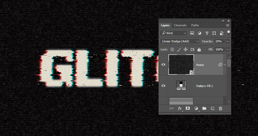
Change the Noise layer’s Blend Mode to Linear Dodge (Add), and its Opacity to 20%.

Set Blend Mode to Linear Dodge

Step 6

Use the Rectangular Marquee Tool to create random selections all over the document, but try to avoid creating big selections over the text.

Create Random Selections

Step 7

Press Command-J to Duplicate the selection in a New Layer, rename it to Noise Lines, and change its Blend Mode to Color Dodge.

Add Noise Lines

Congratulations! You’re Done

In this tutorial, we created a couple of text layer smart objects, and used blending options and layer styles to create the main glitch effect.

Then, we created filter layers, and adjusted their layer masks.

Finally, we used a bunch of filters to finish off the glitch effect, as well as added a quick noise overlay to make it more realistic.

Please feel free to leave your comments, suggestions, and outcomes below.

Glitch Text Effect Photoshop Tutorial

Shopify VS WooCommerce – Best eCommerce Solution for WordPress

Post pobrano z: Shopify VS WooCommerce – Best eCommerce Solution for WordPress

Are you thinking about setting up an eCommerce website? Are you familiar with WordPress? Do you want to be able to set up the website on your own? If your answer is yes to all these questions, then things just got a little less complicated for you. You want to know how to make a […]

The post Shopify VS WooCommerce – Best eCommerce Solution for WordPress appeared first on Web Resources Depot.

Adobe Alternatives: Broadening Our Horizons

Post pobrano z: Adobe Alternatives: Broadening Our Horizons

I’ve been using Adobe software in earnest since they acquired Macromedia back in 2005, (I miss you Fireworks), and in that time I’ve done some awesome things with their software. During many periods I’ve relied on it to make a living, and it has served me well.

However, despite how familiar and comfortable virtually anyone in creative professions is with Adobe software, it’s always a good idea to know as much as possible about all the tools at your disposal. With a little exploration you might find there is a tool out there that is perfect for the specific tasks that form part of your daily workflows.

Affinity Designer by Ben the Illustrator

This Series

In this series we’ll be exploring the alternative software that occupies the same space as some of the most beloved Adobe applications. We’re keeping the focus on low or no cost applications so trying out some new toys won’t break the bank–everything will either be fully free, have a functional free version, or a price tag of less than $100. Because, let’s be honest, sometimes we’re just at a point in our careers where we need options that are going to be gentle on our hip pockets.

Your Work, Your Software

This is far from the first time someone has put together a list of alternatives to Adobe software, but in my experience a list alone is not helpful enough. For a given project you don’t just need any old application. You need an application with tools honed for the particular kind of work you need to do.

Welcome panel from Affinity Photo

The image editing tools you need when doing photo manipulation are different from those you need when doing digital painting or pixel art. The video editing tools you need for a quick video on your YouTube channel are different from those you need for your short film or your motion comic.  What really matters is the specifics of where applications are strong, what they specialize in, and any unique features they may have.

As such we’re breaking this series into six specialty groups. They are:

  • Photo Editing
  • Digital Painting
  • Vector Art
  • Video Editing
  • Pixel Art
  • Animation

I have personally tried out every single application you’ll read about in this series, and I will endeavor to give you as much pertinent information on each as I can fit into the articles. As you go through this series you might find there’s an application you know to be great that isn’t in the list. If it’s under our series price cap of $100 and not included, it’s more than likely just because I haven’t personally tested it. As such, please do go ahead and shout out in the comments about programs you’ve discovered so other people can learn more about the options available to them.

Coming up..

Up first, alternatives to Photoshop for working with photo manipulation and raster-based design. Thanks for joining me, and I hope to connect you with some of your new favorite software!

How to Create an Ice-Cream Scoop Text Effect in Adobe Photoshop

Post pobrano z: How to Create an Ice-Cream Scoop Text Effect in Adobe Photoshop

Final product image
What You’ll Be Creating

This tutorial will show you how to use textures, layer styles, and brushes to create a colorful, delicious ice-cream scoop text effect. Let’s get started!

This text effect was inspired by the many Layer Styles available on GraphicRiver.

Tutorial Assets

The following assets were used during the production of this tutorial:

1. How to Create the Background and Text Layers

Step 1

Create a 1000 x 800px New Document, click the Create new fill or adjustment layer icon at the bottom of the Layers panel, and choose Gradient.

Create the Gradient Fill using the Colors #7e4569 to the left, #5a1961 in the middle, and #311737 to the right.

Change the Style to Radial and the Scale to 150%, and check the Dither box.

Gradient Fill

Step 2

Create the text, each letter in a separate layer, in All Caps using the font Neretto Sans. Set the Size to 150 pt and the Color to White.

Create the Text

Step 3

For each letter you have, select its layer, and press Command-T to enter Free Transform Mode.

Rotate and move the letters slightly to create a dynamic result, and hit the Return key to accept the changes.

Transform the Letters

Step 4

In order to keep things organized, match each layer’s name with its letter, and add numbers for any repeated ones.

Rename the Layers

Step 5

For each letter’s layer you have, Duplicate it, and change the copy’s Fill value to 0.

Duplicate and Change the Fill Values

2. How to Select and Add Texture Images

Step 1

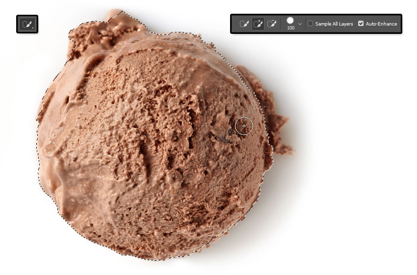
Open the Ice cream scoop images, and pick the Quick Selection Tool.

Click the Add to selection icon in the Options bar, and check the Auto-Enhance box if you want to get a precise selection, though this is optional as it might slow things down a little bit.

Click-drag to select a scoop image, and go to Edit > Copy.

Select and Copy the Scoop Image

Step 2

Back to the original document, go to Edit > Paste.

Right-click the pasted image’s layer and choose Convert to Smart Object.

Place the scoop image on top of the letter you want to add it to, right-click the scoop image’s layer again, and choose Create Clipping Mask to clip the image to the letter.

Add the Scoop Image to the Letter

Step 3

Press Command-T, and Transform the scoop image until you like how it looks inside the letter.

Hit the Return key to accept the changes.

Transform the Scoop Image

Step 4

Repeat the same steps to select the other scoop images and add them to the rest of the letters you have.

You can use the same image more than once, but Transform it to make it look different.

Add More Scoop Images

3. How to Style a Text Layer

Double-click the first letter’s original text layer to apply the following Layer Style:

Step 1

Add a Bevel and Emboss with these settings:

  • Size: 35
  • Check the Anti-aliased box
  • Highlight Mode:
    • Color: #ff988a
  • Shadow Mode: Color Burn
    • Color: #daaf98
    • Opacity: 35%
Bevel and Emboss

Step 2

Add a Contour with these settings:

  • Contour: Half Round
  • Check the Anti-aliased box.
Contour layer style

Step 3

Add a Texture with these settings:

  • Pattern: Ant Farm
Texture layer style

Step 4

Add an Inner Shadow with these settings:

  • Blend Mode: Linear Burn
  • Color: #b27a67
  • Opacity: 35%
  • Distance: 0
  • Choke: 13
  • Size: 24
Add an Inner Shadow

Step 5

Right-click the styled layer, choose Copy Layer Style, select the remaining original text layers, right-click any of them, and choose Paste Layer Style.

Copy and Paste the Layer Style

Step 6

You might notice that the style doesn’t look good for all the different colors.

So you can double-click each letter’s layer, and adjust its Bevel and Emboss’s Highlight Mode and Shadow Mode Colors, as well as its Inner Shadow Color.

Match those colors to the letter’s texture colors, and you can even sample the colors from the texture itself. No specific values are needed, just whichever ones look good.

Adjust the Effect Colors

4. How to Add Dimension

Step 1

Double-click the first letter’s copy text layer to apply a Bevel and Emboss effect with these settings:

  • Size: 24
  • Uncheck the Use Global Light box
  • Angle: 164
  • Altitude: 53
  • Check the Anti-aliased box
  • Highlight Mode: Soft Light
    • Color: #ffe9e9
  • Shadow Mode:
    • Opacity: 0%
Bevel and Emboss layer style

Step 2

Copy and Paste the Layer Style to the rest of the copy text layers you have.

Copy and Paste the Layer Style

Step 3

Place each letter’s layers in a Group with its name.

Group the Letter Layers

5. How to Create Stroke Layers

Step 1

Create a New Layer on top of all the first letter’s layers inside its group, and name it Stroke.

Add a Stroke Layer

Step 2

Press-hold the Option key, and click-drag the letter’s scoop image to create a Copy and place it on top of the Stroke layer.

Duplicate the Scoop Image

Step 3

Clip the copy scoop image’s layer to the Stroke layer.

Repeat the same steps to create the other letter’s Stroke layers.

Clip the Scoop Image

6. How to Stroke a Work Path With a Modified Brush Tip

Step 1

Pick the Brush Tool, and open the Brush panel.

Choose a Hard Round Tip, and use these settings for the Brush Tip Shape and Shape Dynamics tabs.

Brush Tip Settings

Step 2

Right-click the first letter’s text layer, and choose Create Work Path.

Make sure to select the Stroke layer afterwards.

Create Work Path

Step 3

With the Brush Tool active, hit the Return key once to Stroke the path.

Pick the Direct Selection Tool (A), and hit the Return key one more time to get rid of the work path.

Stroke the Work Path

Step 4

Repeat to create the rest of the letters’ strokes.

Repeat for the Other Letters

7. How to Style a Stroke Layer

Double-click the first letter’s Stroke layer to apply the following Layer Style:

Step 1

Add a Bevel and Emboss with these settings:

  • Size: 7
  • Uncheck the Use Global Light box
  • Angle: 167
  • Altitude: 21
  • Check the Anti-aliased box
  • Shadow Mode: Linear Burn
    • Color: #d5ccb9
    • Opacity: 65%
Bevel and Emboss layer style

Step 2

Add a Drop Shadow with these settings:

  • Blend Mode: Linear Burn
  • Color: #6e6e6e
  • Opacity: 10%
  • Distance: 0
  • Size: 10
Drop Shadow layer style

Step 3

Copy and Paste the Layer Style to all the Stroke layers.

Copy and Paste the Layer Style

8. How to Create a Sprinkles Brush Tip

Step 1

Create a 100 x 100px New Document with a White Background, pick the Rounded Rectangle Tool, and set the Radius in the Options bar to 15.

Click once anywhere in the document to get the Create Rectangle box, change the Width to 15 and the Height to 35, and click OK.

Make sure that the shape’s Fill Color is Black, and place it in the center of the document.

Create a Rounded Rectangle Shape

Step 2

Go to Edit > Define Brush Preset, change the Name to Sprinkles, and click OK.

Define Brush Preset

Step 3

Go back to the original document, pick the Brush Tool and open the Brush panel.

Choose the Sprinkles tip and use these settings:

Brush Tip Shape

Brush Tip Shape

Shape Dynamics

Shape Dynamics

Scattering

Scattering

Color Dynamics

Color Dynamics

9. How to Use a Sprinkles Brush Tip

Step 1

Create a New Layer on top of all layers and call it Sprinkles.

Set the Foreground Color to #fe0000 and the Background Color to #1b9be6.

Click-drag slightly inside the text area to add the sprinkles.

You can change the color outcome by changing the Foreground and/or Background Colors.

Add the Sprinkles

Double-click the Sprinkles layer to apply the following Layer Style:

Step 2

Add a Bevel and Emboss with these settings:

  • Size: 1
  • Uncheck the Use Global Light box
  • Angle: 128
  • Altitude: 37
  • Check the Anti-aliased box
  • Highlight Mode: Vivid Light
Bevel and Emboss layer style

Step 3

Add a Drop Shadow with these settings:

  • Blend Mode: Color Burn
  • Color: #010101
  • Opacity: 10%
  • Distance: 3
  • Size: 5
Drop Shadow layer style

Step 4

Click the Add layer mask icon at the bottom of the Layers panel, and select the mask’s thumbnail.

Add a Layer Mask

10. How to Create a Mask’s Texture Fill

Step 1

Set the Foreground and Background Colors to Black and White, and go to Filter > Render > Clouds.

Render Clouds

Step 2

Go to Filter > Filter Gallery > Sketch > Reticulation, and use these settings:

  • Density: 12
  • Foreground Level: 40
  • Background Level: 5
Reticulation Filter Settings

Step 3

Click the New effect layer icon in the bottom right corner, and apply the Photocopy filter with these settings:

  • Detail: 7
  • Darkness: 8
Photocopy Filter Settings

Step 4

Add another New effect layer, and apply the Bas Relief filter with these settings:

  • Detail: 13
  • Smoothness: 3
  • Light: Bottom
Bas Relief Filter Settings

This will apply a Layer Mask that blends the sprinkles with the scoops to make the effect look more realistic.

Layer Mask Texture

11. How to Add More Sprinkles

Step 1

Create a New Layer on top of the Sprinkles layer, name it Sprinkles 2, and Copy and Paste the Sprinkles layer’s Layer Style to it.

Set the Foreground Color to #fe0000 and the Background Color to #01ffe5, and add some more sprinkles to the text.

Add More Sprinkles

Step 2

Add another New Layer on top of all layers, name it Sprinkles 3, Paste the same Layer Style to it, and add some more sprinkles around the text.

Add Sprinkles Around the Text

Step 3

Put all the sprinkle layers in a Sprinkles group.

Sprinkles Group

12. How to Style a Drip Layer

Step 1

Create a New Layer on top of all the first letter’s layers, and name it Drip.

Press-hold the Option key to click-drag the letter’s scoop image on top of the Drip layer, and Clip it to it.

Right-click the scoop image and choose Convert to Smart Object.

Create a Drip Layer

Double-click the Drip layer to apply the following Layer Style:

Step 2

Add a Bevel and Emboss with these settings:

  • Size: 16
  • Soften: 1
  • Uncheck the Use Global Light box
  • Angle: 30
  • Altitude: 48
  • Gloss Contour: Cone
  • Check the Anti-aliased box
  • Shadow Mode: Vivid Light
    • Color: #a1a1a1
Bevel and Emboss layer style

Step 3

Add a Contour with these settings:

  • Contour: Rounded Steps
  • Check the Anti-aliased box.
Contour layer style

Step 4

Add an Inner Shadow with these settings:

  • Blend Mode: Color Burn
  • Opacity: 35%
  • Uncheck the Use Global Light box
  • Angle: 90
  • Distance: 3
  • Choke: 33
  • Size: 3
Inner Shadow layer style

Step 5

Select the Drip layer’s scoop image, go to Filter > Noise > Median, and change the Radius to 5.

Median Filter

Step 6

Go to Filter > Blur > Gaussian Blur, and change the Radius to 2.

Gaussian Blur

13. How to Paint Drips

Step 1

Pick the Brush Tool, use the same settings of the stroke brush tip, but change the Spacing value under the Brush Tip Shape tab to 1%.

Brush Tip Shape

Step 2

Select the Drip layer, and start painting the drips by slowly dragging the brush into the shape you like.

Paint the Drips

Step 3

Use the Eraser Tool to get rid of any areas you don’t like.

Erase Unwanted Areas

Step 4

Repeat all the steps to add drips to the rest of the letters you have.

Add More Drips

14. How to Add Shadows and a Background Texture

Step 1

Double-click the first letter group you have to apply a Drop Shadow effect with these settings:

  • Blend Mode: Color Burn
  • Opacity: 7%
  • Distance: 45
  • Size: 20
Drop Shadow layer style

Step 2

Copy and Paste the Layer Style to the rest of the letter groups.

Copy and Paste the Layer Style

Step 3

Place the MGrunge005 image on top of the Gradient Fill layer, resize it as needed, and change its layer’s Blend Mode to Soft Light and its Opacity to 25%.

Add the Background Texture

15. How to Make Global Adjustments

Step 1

Create a New Layer on top of all layers, name it High Pass, and press the Shift-Option-Command-E keys to create a stamp layer.

Right-click the High Pass layer and choose Convert to Smart Object.

Create a High Pass Layer

Step 2

Go to Filter > Other > High Pass, and change the Radius to 1.5.

High Pass Filter

Step 3

Change the High Pass layer’s Blend Mode to Soft Light and its Opacity to 50%.

High Pass Layer Settings

Step 4

Add a Gradient Map layer on top of all layers, and create the Gradient Fill using the Colors #55456b to the left, #79566e in the middle, and #d4977c to the right.

Check the Dither box, and change the Gradient Map layer’s Blend Mode to Soft Light and its Opacity to 50%.

Gradient Map adjustment layer

Congratulations! You’re Done

In this tutorial, we created a couple of text layers, and added ice-cream scoop textures to them.

Then, we used brushes and layer styles to style the textured letters and add strokes, drips, and sprinkles to them.

Finally, we used textures and adjustment layers to finish off the effect.

Please feel free to leave your comments, suggestions, and outcomes below.

Ice Cream Scoop Text Effect Photoshop Tutorial