The zesty, green-yellow shade is fun and inviting, and has been received well by many designers. With a shift in focus towards healthier foods, and growing concerns over the environment, the vibrant green lends itself as a refreshing symbol of rebirth and new beginnings.
So what else is in store for this year? Let’s dive into some of the hottest trends currently hitting the industry.
Who knew there could be a more winning combination of color and texture than rose gold and marble? The simplicity of this light stone texture against the elegance of rose gold makes for one sublime team.
Back in its day, marble was the quintessential material used by sculptors during the Age of Enlightenment. Greco-Roman artists continued to use this luxurious stone as a cultural symbol of refined taste.
And of course, you can’t have luxury without a little gold! Going back several centuries, the value of gold remains a distinct reflection of extraordinary taste and style.
Not sure how to work with texture? Instructor Grace Fussell shows you how to apply lovely gold foiling to your print designs in the tutorial below.
One way to utilize this trend is for a modern set of business cards. This template, for example, showcases a stunning combination of marble and gold elements for a chic, minimalist vibe.
You can also create classy designs for your restaurant menu. The clean aesthetic of marble provides a great background accent for any project. Sprinkle in a few rose gold titles as a lovely accessory like this delightful menu design.
Or elevate your logos with a stunning rose gold text effect instead. With layer styles, you can achieve professional quality graphics in only a fraction of the time. This package, for instance, includes eight fully layered Photoshop files to transform any text or smart object.
Pair the rose gold text above with this set of marble textures for a brilliant result! Featuring six high-resolution images at 3000 x 2000 pixels, this pack contains several common marble textures for more variety.
Or why not just combine the two together? Go for bold design with this jaw-dropping texture pack featuring 12 gold marble textures. Perfect for labels, packaging, and brand identities, this awesome pack is one we’re sure you’ll love.
Kick off your summer design essentials by incorporating some tropical leaves into your work. This trend has recently popped up in many unique poster designs, highlighting the beauty of tropical plants.
The types of plant most commonly seen are birds of paradise, areca palms, or lovely philodendrons. These healthy plants provide exceptional, inspiring colors that add life to your creative projects.
Nature-based design always has a refreshing quality to it, and this tropical pattern is no different! Just imagine the lovely breeze as it shuffles through the vibrant green leaves. Need some project inspiration? This pattern works great for posters, websites, and more.
If you’d prefer to have the leaves as separate design elements instead, then check out this awesome pack! This pack includes a mix of watercolor tropical leaves to beautify any design. Designed in Adobe Illustrator, this file is already print ready for fast results.
Learn how to create a tropical pattern yourself in this tutorial by Yulia Sokolova.
Make a bold statement by mixing stunning typography with tropical elements. This exotic poster design features a tropical aesthetic that is definitely on trend, with two high-resolution Photoshop files for easy editing.
In this awesome bundle, you’ll get access to 30 seamless tropical patterns. Ideal for stationery and design projects, these patterns will help bring paradise to you!
Become the hero of summer! Throw a luau party your guests won’t forget! This sweet party invitation features a few tropical leaves alongside colorful fruit. Just switch out the text by clicking on the fully editable text holders.
Some of your favorite mythical creatures are also in full effect for 2017. Unicorns and mermaids are legendary creatures commonly known from ancient folklore. Even today, they captivate the imagination of designers around the world.
Unicorns symbolize purity and innocence. Try pairing them with a rainbow to show off their whimsical humor and overall bright energy.
Mermaids are seductive and charming. They help you create enticing designs with the help of allure and mystery.
Love mermaids too? Monika Zagrobelna shows you how to magically change any vacation selfie into a beautiful mermaid in this detailed Photoshop tutorial.
Launch your brand with an adorable mermaid character reminiscent of a delightful Disney movie. This design features a fully editable vector mermaid with several flat ocean elements in the background. It’s super trendy and insanely pretty!
Or add realistic scale textures to your work. With 100% vector files, you can resize these scales without any loss of quality. Use them as a great accessory to a mermaid-inspired design or feature them alone for a fantastic piece.
Show the strength of the unicorn symbol with a powerful logo. This exemplary design features bold lines and solid details. It’s great for any service-based business or official organization.
Unicorns plus rainbows equals awesome design, always. And you can satisfy all your whimsical needs with this delightful pack of seamless patterns. Follow this trend to create pretty designs that please your followers.
Or learn how to create a unicorn illustration in this tutorial by Nataliya Dolotko.
Make 2017 a memorable year with a fabulous unicorn celebration! This party invitation is great for many ages and features a fantastical rainbow design.
It was a time of funky colors and loud patterns, but the 90s will never die. Twenty years later, designers still find ways to honor this fun time with nostalgic designs.
So what are a few of the key characteristics of 90s revival design?
Chunky Text
Neon Colors
Abstract Shapes
Seamless Patterns
Minimalists love this style for its simple, clean lines and pleasing abstract shapes. Beginners to design can learn a lot by studying the simplicity of retro poster templates.
Feeling a little nostalgic? Test out your Photoshop skills with a 90s-inspired text effect!
Throw a rocking music festival this summer with an epic 90s poster template. This design features bold black and white lines with early MTV-esque colors. Create a real throwback Thursday with this awesome and fun design.
Creating individual abstract shapes can take a long time. Cut the time in half by opting for this abstract shape generator. This generator creates an infinite number of random shapes to apply to your designs. Try it out today!
Nothing says the 90s more than an awesome retro font. This Thunderstorm Typeface screams the style of an epic 1990s sitcom everyone loves. Throw back to a truly epic era with this wonderful typeface.
Keep in mind that some space graphics are often more conceptual than literal. This space flyer, for instance, has bursting 3D abstract shapes with stunning deep colors.
Create a compelling design with a galaxy background. This extraordinary bundle features beautiful bokeh effects and light flares. Use it to elevate any website or poster design.
Whenever a large brand makes a major change, the design industry usually follows suit. And with the boom of gradient colors across major platforms like Instagram and more, designers have fallen back in love with this vibrant transition.
When designing with gradients, consider the symbolic qualities of the colors you choose. Mix and match color arrangements and even experiment with different types of gradient styles (radial, linear, etc.).
Want to create a gradient icon similar to Instagram’s official logo? Then check out this awesome tutorial by Mary Winkler.
Match your social media across several networks with a set of flat gradient icons. Flat graphics are hugely popular because of their clean aesthetics and simplistic design.
Also on trend is the duotone look for Instagram filter-like aesthetics.
Gorgeous gradients are applied to your photos with the help of an amazing Photoshop action. This duotone action includes 50 total gradients with amazing combinations.
Love this effect? Learn how to create a pride rainbow overlay in this tutorial by Sharon Milne.
Sometimes you only need a little color to pack a punch. So try out a gradient magazine template to launch your new brand. Know when to incorporate bold colors for an elegant layout.
For the ultimate modern logo, consider adding a bold gradient. This diamond template, for example, features lovely purple hues that transition well into text. Create a smart logo that will stand out from the crowd.
This last resource includes 500 colorful gradients for your desktop backgrounds, websites, and more. Inspire yourself with the gorgeous color schemes that translate to inspiring, happy colors.
This tutorial will show you how to use layer styles, textures, brushes, with a bunch of tools and adjustments to create a text effect inspired by the Aquaman movie poster. Let’s get started!
Create a new 3000 x 2071 px document, click the Create new fill or adjustment layer icon at the bottom of the Layers panel, and choose Gradient.
Create the gradient fill using the Colors#297f82 to the left, #1a3344 in the middle, and #0d1018 to the right.
Change the Style to Radial, and click-drag the center of the gradient to place it at the top of the document.
Increase the Scale value to 200, and check the Dither box.
Step 2
Go to File > Place Linked, open the Under water texture image, and go to Image > Adjustments > Hue/Saturation to change the Saturation value to -100.
Step 3
Change the texture layer’s Blend Mode to Color Dodge.
Step 4
Go to Edit > Transform > Warp, choose Arc from the Warp menu in the Options bar, and click-drag the control point to get a result you like.
Step 5
Hit the Return key to commit the changes, and click the Add layer mask icon at the bottom of the Layers panel.
Step 6
Pick the Gradient Tool, set the Foreground and Background Colors to White and Black, choose the Foreground to Background gradient fill, and click the Radial Gradient icon in the Options bar.
Select the mask’s thumbnail, and click-drag from the document’s top to its bottom to create a gradient mask.
2. How to Add a Light Rays Brush
Step 1
Pick the Brush Tool, and create a new layer and name it Light Rays.
Change the layer’s Blend Mode to Overlay and its Opacity to 50%.
Step 2
Hold the Option key, and click-drag the texture layer mask’s thumbnail to the Light Rays layer to duplicate it.
Step 3
Unlink the mask by clicking the link icon between the layer and mask thumbnails.
Select the layer’s thumbnail, and add a light rays brush from the Light Rays pack. You can then press Command-T to enter Free Transform Mode and rotate, resize, and warp the rays.
3. How to Add a Fizz Texture
Step 1
Open the Phineas F. Texture Stock image, and go to Image > Calculations.
Change both Channel values to Red, the Blending to Overlay, and the Result to Selection. Click OK, and go to Edit > Copy.
Step 2
Back to the original document, go to Edit > Paste, rename the layer to Top Fizz, and change its Fill value to 0%.
Place the texture at the top of the document and resize it as needed.
Double-click the Top Fizz layer to apply the following layer style:
Step 3
Add a Bevel and Emboss with these settings:
Size: 2
Uncheck the Use Global Light box
Angle: 122
Altitude: 42
Gloss Contour: Ring
Check the Anti-aliased box
Highlight Mode: Linear Light
Shadow Mode:
Opacity: 35%
Step 4
Add a Contour with these settings:
Contour: Ring – Double
Check the Anti-aliased box.
Step 5
Lower the Opacity to 50%.
Step 6
Put all the layers except for the Background layer in a group and name it Background.
4. How to Create a Smart Object Text Layer
Step 1
Create the text in All Caps using the font Lato Heavy. Set the Size to 250 pt and the Tracking to 645.
Step 2
Rename the text layer to Text, right-click it, and choose Convert to Smart Object.
5. How to Record a Simple Extrusion Action
Step 1
Open the Actions panel, click the Create new set icon at the bottom of the panel, type Extrusion in the Name field, and click OK.
Step 2
Click the Create new action icon at the bottom of the panel, type Action in the Name field, and click Record.
Step 3
Press Command-J to duplicate the Text layer.
Step 4
Press Command-T to enter Free Transform Mode.
In the Options bar, click the Maintain aspect ratio icon between the W and H fields, and set their values to 99.9%.
Hit the Return key to commit the changes. You should see all the steps recorded and added to the action you’ve created.
Step 5
Click the Stop recording icon at the bottom of the Actions panel.
6. How to Create an Extrusion
Step 1
Click the Play selection icon at the bottom of the Actions panel ten times to create ten more copies with the transformation.
Step 2
Select all the Text layers, and go to Layer > Arrange > Reverse. This will place the last copy layer at the bottom and bring the original to the top.
Step 3
Deselect the first and last Text layers, and place the rest in a group and name it Center.
Step 4
Rename the top Text layer to Front and the last to Back.
Step 5
Duplicate the Front layer twice.
Step 6
Drag the Front layer on top of all layers inside the Center group.
7. How to Style the Front Text Layers
Double-click the Front copy 2 layer to apply the following layer style:
Step 1
Add a Bevel and Emboss with these settings:
Style: Stroke Emboss
Depth: 300
Size: 5
Uncheck the Use Global Light box
Angle: -176
Altitude: 21
Gloss Contour: Gaussian
Check the Anti-aliased box
Step 2
Add a Contour with these settings:
Contour: Cone – Asymmetrical
Check the Anti-aliased box.
Step 3
Add a Stroke with these settings:
Size: 3
Position: Inside
Fill Type: Gradient
Style: Reflected
Create the Gradient using the Colors#7e662e to the left, and #cfb765 with a Location value around 86%.
Step 4
Change the Fill value to 0%.
Step 5
Convert the layer to a Smart Object.
Step 6
Double-click the Front copy layer to apply a Pattern Overlay effect with these settings:
Pattern: 1.jpg (Open the image from the Metal seamless textures pack, and go to Edit > Define Pattern to add it to the preset)
Scale: 50%
This will style the front part of the text.
8. How to Style the Extrusion
Double-click the Front layer to apply the following layer style:
Step 1
Add a Bevel and Emboss with these settings:
Style: Stroke Emboss
Depth: 230
Size: 5
Uncheck the Use Global Light box
Angle: -90
Altitude: 50
Gloss Contour: Cove – Deep
Check the Anti-aliased box
Step 2
Add a Contour with these settings:
Contour: Rolling Slope – Descending
Check the Anti-aliased box.
Step 3
Add a Stroke with these settings:
Size: 3
Position: Center
Fill Type: Gradient
Style: Linear
Create the Gradient using the Colors#7e662e to the left and right, and #d4c591 in the middle.
Step 4
Change the Front layer’s Fill value to 0%, right-click it, and choose Copy Layer Style.
Step 5
Select the other layers inside the Center group, right-click any of them, and choose Paste Layer Style.
9. How to Style the Back Text Layer
Double-click the Back text layer to apply the following layer style:
Step 1
Add a Bevel and Emboss with these settings:
Style: Stroke Emboss
Size: 4
Uncheck the Use Global Light box
Angle: -164
Altitude: 53
Gloss Contour: Gaussian
Check the Anti-aliased box
Step 2
Add a Contour with these settings:
Contour: Cone – Asymmetrical
Check the Anti-aliased box.
Step 3
Add a Stroke with these settings:
Size: 2
Position: Outside
Fill Type: Gradient
Style: Reflected
Create the Gradient using the Colors#7e662e to the left and right, and #fdcb1c in the middle.
Step 4
Change the Back layer’s Fill value to 0%.
Step 5
Double-click the Center group to apply a Gradient Overlay effect with these settings:
Check the Dither box
Blend Mode: Color Burn
Style: Reflected
Use the Silver 30 gradient fill
This will finish styling the text.
10. How to Create a Simple Texture Using Filters
Step 1
Create a new layer on top of all layers, fill it with Black, name it Extrusion Texture, and convert it to a Smart Object.
Step 2
Set the Foreground and Background Colors to Black and White, and go to Filter > Render > Fibers.
Change the Vibrance to 20 and the Strength to 5.
Step 3
Go to Filter > Blur > Motion Blur, and change the Angle to 90 and the Distance to 25.
Step 4
Use the Rectangular Marquee Tool to select a random small area of the texture.
Step 5
Press Command-J to duplicate the selected area in a new layer, and hide the Extrusion Texture layer.
11. How to Add the Extrusion Texture
Step 1
Move the duplicated texture layer on top of the Center group, right-click it, and choose Create Clipping Mask.
Step 2
Place the clipped texture on top of the letter you want to apply it to, and press the Command-T keys to transform the texture so that it matches the part you want it to cover.
Step 3
You can add a mask and use a round brush tip to remove any areas you don’t like.
Step 4
Once you’re done, change the texture layer’s Blend Mode to Soft Light.
Step 5
For rounded letter parts, you can use the Warp mode to adjust the texture.
Step 6
Show the Extrusion Texture layer, select a new area, and repeat the steps to add the texture to all the letters you have.
Once you’re done, put the Center group and its texture layers in another group with the name Center + Textures.
12. How to Add Highlights and a Color Texture
Step 1
Create a new layer on top of all the layers inside the Center + Textures group, name it Highlights, and clip it to the Center group.
Change the Highlights layer’s Blend Mode to Linear Light, and its Opacity to 30%.
Set the Foreground Color to #b5aa98, and use a soft round brush tip to paint some highlights over the bright areas of the extrusion.
Step 2
Create a new layer on top of the Front copy 2 layer, name it Stroke Highlights, and change its Blend Mode to Vivid Light.
Clip the Stroke Highlights layer to the Front copy 2 layer, and add some highlights to the stroke.
Step 3
Place the out of the blue image on top of the Front copy layer, resize it as needed, rename its layer to Color Texture, and change its Blend Mode to Color.
Command-click the Front copy layer to create a selection.
Step 4
Click the Add layer mask icon.
Step 5
Put all the front layers in a group and name it Front.
13. How to Add Texture Overlays
Step 1
Place the grunge-background8 image from the Grunge-Backgrounds pack on top of the Front group, clip it to it, change its layer’s Blend Mode to Soft Light, and resize it as needed.
Step 2
Go to Image > Adjustments > Hue/Saturation, and change the Saturation value to -100.
Step 3
If you like a smaller texture overlay, you can create copies to cover the whole text instead of scaling the texture up.
Step 4
Add the Ur gravel texture on top of the grunge-background8 layers, and go to Image > Adjustments > Levels.
Change the Input Levels Shadows’ value to 50 and the Output Levels Highlights’ value to 150.
Step 5
Clip the layer to the Front group, change its Blend Mode to Soft Light, and resize the texture to cover the first letter.
Step 6
Duplicate to add the texture to each of the remaining letters, and then put the Front group and its texture layers in another group and name it Front + Texture.
14. How to Add a Lens Flare
Step 1
Place the Lens Flare 02 image from the 30 Awsome Lens Flare pack on top of all layers, and go to Edit > Transform > Rotate 90° Clockwise.
Step 2
Double-click the lens flare layer’s thumbnail to open its original file. Create a new layer under the flare’s layer and fill it with Black.
Step 3
Select both layers and press Command-E to merge them, and save and close the file.
Step 4
Change the flare layer’s Blend Mode to Screen and its Opacity to 70%. Place the flare on top of one of the letters in the center of the text, and resize it as needed.
Step 5
Go to Image > Adjustments > Hue/Saturation, check the Colorize box, and change the Hue to 180 and the Saturation to 50.
Step 6
Go to Image > Adjustments > Levels, and change the Gamma value to 0.61.
15. How to Add Water Splashes
Step 1
Create a new layer on top of the flare layer and name it Water Splash 01, and change its Fill value to 0%.
Double-click the Water Splash 01 layer to apply the following layer style:
Step 2
Add a Bevel and Emboss with these settings:
Size: 3
Uncheck the Use Global Light box
Angle: -48
Altitude: 21
Gloss Contour: Ring
Check the Anti-aliased box
Highlight Mode: Linear Light
Opacity: 35%
Shadow Mode:
Opacity: 20%
Step 3
Add a Contour with these settings:
Contour: Ring – Double
Check the Anti-aliased box.
Step 4
Use the Free Water Splash Photoshop Brushes and Water Splash Brushes packs’ brush tips to add water splashes to the letter with the flare.
For better results, add each splash in a separate layer, and copy and paste the layer style to each copy.
Step 5
You can also add some splashes to the background behind the text.
16. How to Make Global Adjustments
Step 1
Place the Concrete Rough 5 texture on top of all layers, rename its layer to Texture Overlay, and change its Blend Mode to Soft Light and its Opacity to 10%.
Step 2
Add a Photo Filter adjustment layer on top of all layers, and use the default values.
Step 3
Save the file as an image, open the image, and go to Image > Image Size to change the size to 1500 x 1063 px.
Step 4
You can also use the Crop Tool to control the final size even more.
Congratulations! You’re Done!
In this tutorial, we created a simple background and a text smart object layer. After that, we recorded an action to create the extrusion, and styled all parts of the text.
Then, we created and added a bunch of different texture overlays, flare, and adjustment layers to the text. Finally, we added some water splash brushes to finish off the effect.
Please feel free to leave your comments, suggestions, and outcomes below.
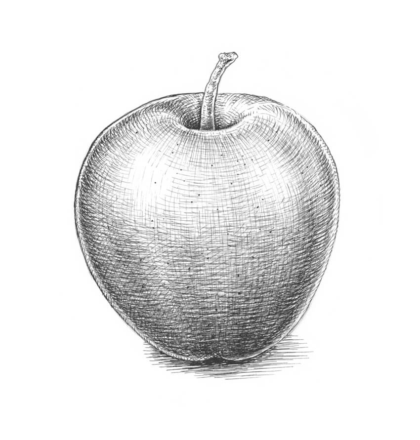
In this short tutorial, I’ll show you how to draw an apple. We’ll create two illustrations: one of a whole fruit and one of an apple cut in half.
Drawing an apple is an excellent opportunity to practice your shading skills. We’ll be using a graphite pencil and ink liners; these tools are a great choice for quick sketching exercises.
What You Will Need
an ink liner number 0.3
an ink liner number 0.1
an ink liner number 0.05
a graphite pencil (I recommend using an HB or B type)
a sheet of thick drawing paper
1. How to Draw an Apple
Step 1
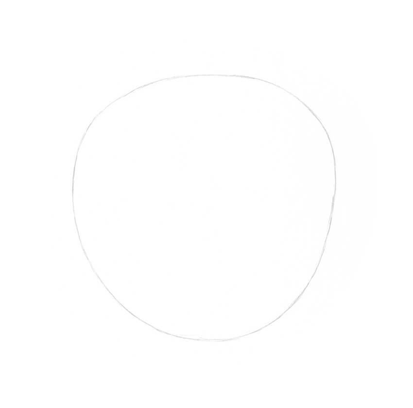
I draw a rounded shape, using a graphite pencil. This shape doesn’t have to be perfectly symmetrical, so I make it taper towards the bottom.
Step 2
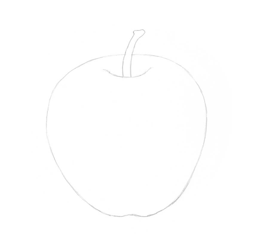
I slightly refine this shape and add a hollow with a stem.
Step 3
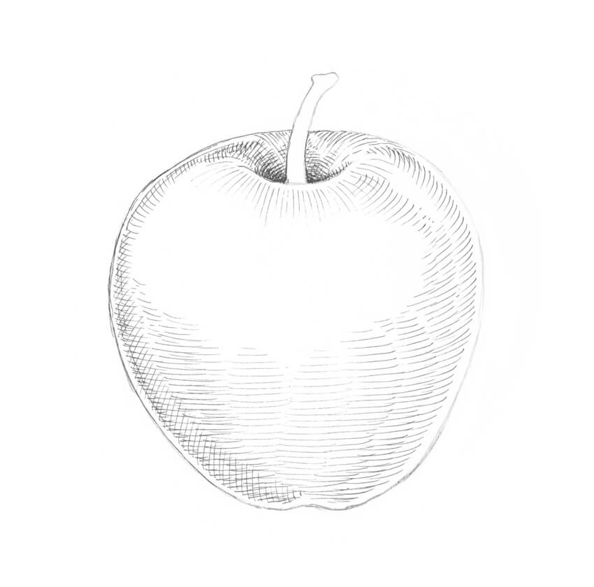
I add rounded ink hatches that repeat the contours of the apple. The 0.05 ink liner is an excellent tool for that.
I leave a thin line of the reflected light near the contour; without it, the shape will look flat.
Step 4
I add more hatches to the bottom part of the fruit, using the 0.05 liner.
Step 5
With the 0.05 liner, I create an additional layer of hatching that crosses the existing lines.
Step 6
I add some vertical hatches, using the 0.05 ink liner. Please note that the lines should conform to the contours of the object.
I also leave two spots of reflected light on the top of the apple.
Step 7
With the 0.05 liner, I accentuate the three-dimensional look of the apple, applying long hatches to its sides.
These lines are thicker, so it’s simple to increase the contrast in our drawing in no time.
Step 8
With the 0.1 liner, I continue working on the core shadows, adding groups of rounded hatches to the sides of the apple.
Step 9
I darken the lower part of the apple even more, applying thin, rounded hatches with the 0.05 ink liner.
Step 10
I tone down the highlights in the upper part of the object, using the 0.05 ink liner.
Step 11
With the 0.1 liner, I create a drop shadow under the apple.
Step 12
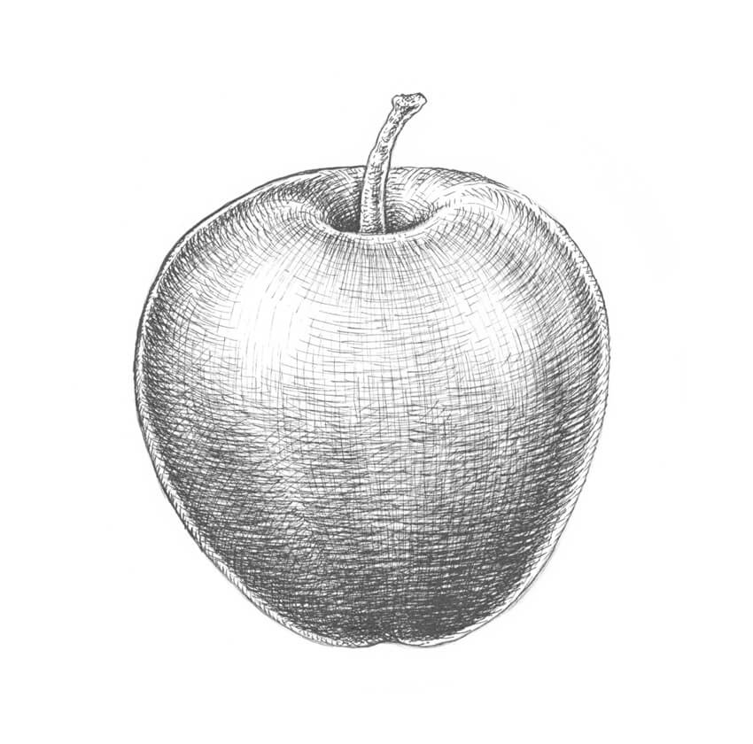
To make the texture of the apple more interesting, I add dots with the 0.3 liner in a random order.
2. How to Draw a Half of an Apple
Step 1
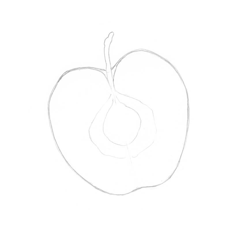
I draw a core line and add two halves of a distinctive apple-like form, using a graphite pencil. There is no need to make the shapes identical; let them be slightly different.
Step 2
I mark the skin of the apple and add a long shape for the stem.
Step 3
I refine the relief of the central part of the apple’s half.
Step 4
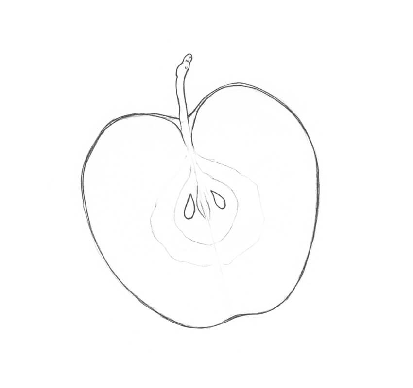
I add two seeds to the core of the apple. This pencil sketch is ready for inking!
Step 5
I outline the main contours of the objects, using the 0.3 ink liner.
Step 6
With the 0.3 liner, I add groups of short hatches to the stem and darken the seeds.
Step 7
I work on the central part of the apple, accentuating the shadows with groups of thin hatches. The 0.05 ink liner is a great tool for that.
Step 8
I add thin hatches to the inner boundary of the object, using the 0.05 ink liner.
Step 9
I work on the inner texture of the apple. I draw small circles and dots, using the 0.05 liner.
Step 10
As a finishing touch, I add some bigger dots to the apple’s texture, using the 0.3 liner.
Your Artwork Is Complete!
Congratulations! Now you know how to draw beautiful, realistic apples. I hope enjoyed both the process and the result!
Welcome to our Photoshop in 60 Seconds series, in which you can
learn a Photoshop skill, feature, or technique in just a minute!
Photoshop in 60 Seconds: Bokeh Effect
That beautiful bokeh effect achieved by out-of-focus photography can now be applied to any photo! Recreate the look with a quick Photoshop Action for all your portrait or landscape photography. Browse our incredible selection of Photoshop Actions available on GraphicRiver and Envato Elements for more great effects.
In this quick video, learn how to create a Photoshop Action that produces a warm bokeh effect. Use a custom brush, layer styles, and more to achieve this look!
How to Create a Bokeh Photoshop Action
Start by creating a custom brush. Hit F5 to bring up the Brush panel. Using a Hard Round Brush, adjust the Scatter to 1000%, and then Save your custom brush so that we can use it later for the action.
Now go to Window > Actions and set up a new bokeh Action in the Actions panel. When you’re ready, click Record to begin recording the next steps.
Open your photo in Photoshop. Here I’ll be using this Woman Stock.
Quick tip! Build layers of blurred bokeh with various levels of depth or choose a photo with a background that’s already blurred.
Copy and Paste two backgrounds from this Noise Blurred Backgrounds set above your image. Select both layers and lower the Opacity to 20%, and then set the Blend Mode of the first one to Hard Light and the second one to Screen.
Create a New Layer and use the custom Bokeh Brush we created earlier to apply a few bokeh. Set the Layer Blend Mode to Overlay, and then Right-click and go to Blending Options, adding a quick Inner Glow with the following settings:
Duplicate (Control-J) the layer, bringing the copy down slightly, before going to Filter >Blur > Gaussian Blur and blurring it with a Radius of 5 pixels.
Set a New Layer to Color Dodge. Paint soft brown colors (or use the Eyedropper Tool to select dark colors from the photo) for more intensity. Lower the Opacity to 22%. Follow up with a New Adjustment Layer for Exposure, setting the Exposure to 1 and the Opacity to 20%.
When you’re finished, remember to click the Stop button on the Actions panel to use this action for future photos.
Here is the final effect.
Experiment with this action on more images for awesome results!
This is part of a series of quick video tutorials on
Envato Tuts+ in which we introduce a range of subjects, all in 60
seconds—just enough to whet your appetite. Let us know in the comments
what you thought of this video and what else you’d like to see explained
in 60 seconds!
Welcome to another entry in our series exploring the wide world of software created by developers other than Adobe! In this article we’ll be going through a collection of awesome vector art applications, with something to suit you whether you’re a high end graphic artist, a web designer creating SVG for sites, or someone newer to vectors looking for something simple and clean.
Just as with all the software we’ve looked at in our series thus far, every application on this list is available without needing a subscription, and is also under $100. In fact, every application on this list, with the exception Affinity Designer, is completely free. So if you’re looking to do vector work on a budget the going is good!
These programs are also fully cross platform, (except Affinity Designer), with great software for Linux, Mac, Windows and even ChromeOS, so whatever your setup is there’s something here for you.
On a side note, you won’t see the popular Mac-only application Sketch here I’m afraid, and that’s not because it isn’t an excellent program. At the moment it’s widely praised as being the leading solution for UI design. However as I said at the start of this series, I’m only including an application if I have personally tested its latest version, and as I chose to retire my Mac earlier this year that’s not going to happen any time soon with Sketch. However if you are on Mac and working heavily with UI you should definitely check it out.
And now let’s get underway with our Adobe alternative vector applications!
1. Affinity Designer
In the same way Affinity Photo is currently the leading Adobe alternative in the photo editing space, so too is Affinity Designer the leader in the vector editing space. If you’re a professional who leans hard on Illustrator and you’re looking for other applications with comparable power, right now Affinity Designer is, in my opinion, unsurpassed.
Like Affinity Photo, Affinity Designer has the uncanny ability to just
allow you to pick it up and start being productive almost instantly.
Everything in the interface is intuitive, clearly and accessibly placed,
yet powerful. When using Affinity Designer I feel like all the speed
bumps have been cleared and I can just race ahead. If you have any
experience at all creating vector art chances are high you’ll be able to
go in blind and be productive right away.
It’s also my feeling that Affinity Designer is currently the application that’s most in tune with what creative professionals need in their day to day workflows, and by a pretty large margin. If you haven’t looked into Affinity Designer yet, watch this video on the latest version 1.5 to take a peek at what this awesome software can do:
At the core of any vector application is its pen tool, and Affinity Designer’s is excellent. It has four modes: pen mode for straight lines and bezier curves, smart mode for automated smooth rounding of curves around nodes, polygon mode for straight lines only, and line mode for, well, lines. It’s also very easy to convert any node into any one of the aforementioned node types by just selecting it and hitting the desired node type button on the UI.
When it comes to keeping an eye on your work Affinity Designer has some excellent features. It has an incredible zoom function that can move in by up to 1,000,000% – essentially infinite for all intents and purposes. It allows you to preview your work in the default of vector mode, but also in 1x pixel mode, 2x pixel mode, and outline mode as well. Additionally you can split your screen and view it in two modes at once, with a divider you can scrub left and right to transition between views:
Affinity Designer also has an advanced grid system that allows you to setup grids however you like, but with more than just standard square grids. You also get: isometric, 2:1 isometric, dimetric, oblique, trimetric left, trimetric right, triangular, horizontal triangular, 2:1 triangular, and two types of custom grids you can fine tune even further with control over spacing, divisions, gutter, angle and snapping. This is probably the best grid system I’ve seen in any software to date.
Just about everything in Affinity Designer is live and non-destructive. Boolean actions are non-destructive and shapes can be moved around and adjusted afterwards. Adjustment layers are non-destructive and can be stacked, sorted and edited after the fact too. Blending modes are instantly previewed the moment you hover over them in the dropdown list. These are the types of features that really smooth out and speed up a workflow.
Unique to Affinity Designer is its system of “Personas”, of which it has three: vector, pixel and export. You start in “Vector Persona” by default, which is where you find all your vector tools, but if you hit the “Pixel Persona” button you’ll find yourself in a full featured raster editor all within the same program. This ability to use advanced vector and raster tools in a single application is a phenomenal feature that makes Affinity Designer hard to beat.
For example, Affinity Designer has brilliant vector brushes, allowing you to create a real hand painted look and retain all the precision of vector work. However it also has raster brushes you can use in its “Pixel” mode to give you the essentials of digital painting. You get the best of both worlds.
Recently, Affinity Designer been making moves to allow for professional level UI / UX development, something that will be welcome news for Windows based web and app designers. It now includes artboards, symbols, and constraints to give you semi-responsive layout adjustment, among other features that help the process along. The devs have put together a presentation page where you can check out all the details: Affinity Designer for UI / UX.
For professionals depending on high level software, Affinity Designer is rising fast as the number one contender. As would be expected with a top tier application there are plenty more features than can be described in a single article, so you might also find it helpful to follow along with our Affinity Designer Quick Start course, where I step you through all the essential features of the software.
Affinity Designer is $49.99 and offers a 30 day trial which, particularly with the help of our course, is definitely ample time to play with all its awesome features.
As can often be the case with software
from the Linux / open source world, Inkscape contains a lot of power
that may at first seem hidden behind a user interface that takes some
time to learn. You won’t instantly pick up and run with Inkscape like
you will Affinity Designer, but don’t let that allow you to miss out on the punch being packed by this application.
Even if you’ve used Inkscape in the past and didn’t take to it, it’s time to take another look because some great new features have been added in version 0.92, released in January this year. Check it out:
There is a long list of new inclusions, as you will have seen in the incredibly fast video above. One of the standout additions is the new and much sought after gradient meshes. At present, among the applications on this list, only Inkscape has this feature. The devs behind
Affinity Designer did say they plan to add it, however that comment was a couple of years ago and while they assure it’s on the roadmap, there’s no ETA at the moment. So
if you love mesh gradients and want to try some new software without spending hundreds of dollars, or any dollars at all in this case, Inkscape
is your ticket.
Another significant new feature for anyone creating SVG for web is the switch from 90dpi to 96dpi to match the CSS standard. Additionally you can directly edit your SVG’s XML structure directly inside the interface, making Inkscape a strong prospect for web graphics creation. And further to that point, the 0.92 release notes also say:
“Many SVG2 and CSS3 properties are now supported (e.g. paint-order, mix-blend-mode). Not all are available from the GUI.”
BSplines make an entry in version 0.92 too, making the laying out of controlled smooth curves a breeze. And the freehand drawing / pencil tool now has smoothing and real time path simplification making Inkscape a great drawing tool.
And in another addition there are now live on-canvas gradient editing tools, where previously gradients had to be edited via the UI. Now you can just double-click anywhere on a line that represents the gradient to add a new stop, select stops and shift or recolor them, and drag around the end points to control where the gradient applies.
When it comes to the toolkit, Inkscape has everything you’d expect to find in a vector application, as well as some things that are not all that common.
The pen tool is excellent, and very powerful. It has the
regular functionality of placing straight line nodes and bezier curves, but it also has a “spiro” mode
for automating the creation of smoothly rounded shapes, version 0.92’s “bspline” mode for
creating soft curves and waves, and “paraxial” mode to create shapes using only right angles.
It has a fantastic sculpting tool which allows you to modify your
shapes by pushing and pulling near nodes to modify the edges of shapes, which is a very organic
editing process. If you’ve ever done 3D sculpting of terrain or
meshes, this tool feels very similar just in 2D form.
There’s also a
nice calligraphic brush stroke tool, the standard rectangle and ellipse tools, and several other shape tools.
And perhaps on the less serious side, though certainly useful as well, Inkscape’s spray tool is a lot of fun. Select any shape you’ve created in your document
then you can spray that shape repeatedly around your canvas, or single click to stamp it.
Once you have all your paths down there is the ability to add “Path
Effects” which are live alterations to paths that can be tweaked or
removed at any time. And the path simplification feature works very well, which is particularly helpful when
used to clean up messy vectors that were created with the freehand tool or by using the “Trace bitmap” function.
To help speed up your workflows Inkscape has a symbols library in which you can create a drag-n-drop
collection of reusable assets. It also has a system of clones that allow
you to duplicate an object then edit all instances of it simultaneously
in real time.
The community driven process behind Inkscape shows through in the degree to which it can bring in external components. On top of its in built tools Inkscape has a robust extension system and ships with some useful extensions out of the box, with the ability to install more should you like. It can also have custom scripts written to control its behavior.
One thing I definitely
appreciate in Inkscape, and this seems to be another running theme with
Linux / open
source tools, is the extensive list of settings you can use to get the
software setup to best suit your preferences. You have control over UI
layout, keyboard shortcuts and tool defaults to name a few things. And
yet another thing Inkscape
has in common with its FOSS peers is its extensive documentation and
wiki
content to help you along. You might need to put in a little time while
picking up this tool, but you won’t want for information as you go.
If you want a tonne of power but don’t mind a learning curve to get it, and you like to have a lot of control over your software, Inkscape could be the right tool for you. And if you’re on Linux, bringing this tool into your workflows is a no brainer.
Gravit Designer is a serious up and comer in the vector art space. It might not quite be on the same level as the very top players just yet, but it’s already very powerful and developing fast. Between the time I started on this article and the time I finished it a whole new release came out with a laundry list of excellent new features, including cloud save & sync, placing linked images, measurement guides, Sketch file imports, a new gradient editing system, international text support, a localized Chinese version, improved SVG export, and a new API providing support for plugins.
Gravit has a reputation for being the most powerful browser based vector editing program available today, and that it is, however it also provides desktop versions so you can work in whichever mode you prefer. Generally speaking, my experience was the desktop versions seemed to be more stable, but the web versions ran faster.
And by the way if Gravit’s default purple interface is not your thing, never fear,
in the latest version there is the option to use a light or dark theme
instead.
Right from the moment you start using, Gravit has some cool features. For example, it gives you the option of working with an infinite canvas. Just
leave the page height and width fields empty when you create a new document and you’re away. The only
restriction in this mode is you can’t set a canvas background given Gravit
won’t know what size said background needs to be drawn at.
And while we’re on the topic of creating new documents, one of the latest features is that when you do so you can select “New from template”, which shows you a selection of template categories. After choosing one you are presented with numerous existing templates you can grab from the cloud and iterate on. Even though this feature is new it’s already well populated. I look forward to seeing where it will be a little ways down the track.
Once you’re into your document there is more content ready for use in the new Library section. It already has a sizable library of in built shapes, illustrations, icons, emojis, stickers and decorative lines. All of these are freely accessible and can be dragged and dropped into your document.
When you move into designing the first thing you’re likely to look for is the pen tool, and the one in Gravit works as expected, providing straight line and bezier curve functionality. However the bezigon tool is a little different, and allows you to create curves a little more easily on the fly by holding ALT when you place points–the bezigon tool will then automatically create smooth curves between these points for you.
When working on the canvas Gravit has very good snapping guidelines making it quite easy to place objects aligned properly. The color picker magnifies the area you’re selecting it from, making it quite easy to hone in on the color you want. Selecting shapes is easy as you will get a clear outline of shapes as you hover over them, making them stand out from one another.
Gravit also supports multiple fills & strokes, and the feature is very neat and well
done. Each fill or stroke behaves much like an individual layer. They
each have their own blending mode and opacity settings, can be stacked
in any order, and can be shown or hidden.
Gravit’s multiple fills, and it’s color „mixes” tab
One thing I absolutely love in Gravit is the color management system. You get your regular run of the mill color picker and swatches, but you also get an automatically generated collection of swatches showing all the colors in your current document, and an excellent “Mixes” tab that provides you with several tints, shades, tones and mixes based on your current color.
Instead of artboards in Gravit you have pages, each of which can be individually sized; a feature very useful for complex designs and UI work. Speaking of pages, Gravit also has a feature that stands out among
vector programs, and that is it has a Powerpoint / Keynote style
presentation system built right in. You just create each of your slides as pages, then go to View > Play/Presentation and use the arrow keys to proceed.
Sadly I did encounter a couple of little glitches. There is a “background fill” feature demonstrated on one of Gravit’s tutorials that allows your document background to show through any shape no matter what is stacked below it. However it would not work for me, and I tried every combination of app version, browser and GPU I could come up with because that seems like a really cool feature. I also
had a strange offset on transparent fills, where the shapes behind them appeared out of position, and some flickering on the background fill.
I also had a little trouble with documentation as Gravit has gone through a transition from an old website and app name to a new one, and the docs don’t seem to have made the same journey just yet. That made it a bit hard to find out what all the tools in the software actually do. This is a fast moving software and to a degree some issues are to be expected, so just be aware little things might pop up for you too.
Gravit is completely free to use, and the dev team behind it have said they fully intend to keep it that way, without of any type of intrusive monetization. Rather they plan to go with features along the lines of attaching a marketplace you can dig into for resources should you choose. They also already license their software’s engine to third parties, which is part of why they say they have been able to keep the software free and clean thus far.
If you want an intuitive interface, powerful tools you can access online or on any OS including ChromeOS, and you like the idea of accessing integrated collections of usable assets, try out Gravit Designer.
Boxy SVG is a web-based tool that is squarely focused on working with SVG, so if you need to create SVG assets to use in websites it might be the vector application for you. It’s a relatively simple program, but if you need web friendly graphics I feel that can actually be a positive. The reason is you can’t accidentally do something in Boxy that won’t translate well to SVG, because every tool available to you is designed for creating SVG. And because Boxy is browser-based displaying SVG right on the canvas, you’re already seeing the way your designs are going to look in a live site.
Boxy SVG may be web-based, however when you install it in either Chrome or Chromium, (and possibly Vivaldi), it will look on your system just like a regular application. You’ll be able to launch it as you would a native program, and though it will be running a browser instance it will look just like a normal program too.
That said, if you’d rather just run Boxy straight out of a browser window you can do so via the live demo.
This live demo currently seems to have some differences to the version on the Chrome app store. For example, the demo has masking tools while the Chrome app doesn’t, and the Chrome app has a library of drag and drop assets while the live demo doesn’t, so you might find you want to use each one a little bit.
In the Boxy toolkit you get all the regular tools: straight line, bezier curve, freehand, text, rectangle, ellipse, triangle and other assorted shapes.
On the SVG specific side of things there is a “View” a panel designed to let you directly control the view box, as well as settings for the preserveAspectRatio property including alignment settings and toggling between meet or slice.
The “Arrangement” panel allows you to control alignment of objects relative to the view box, or to other objects. Here you can also control object rotation, flipping, ordering, as well as grouping objects.
There are some solid path modification tools including boolean operations, (unite, intersect, subtract, exclude), compound path tools for joining or splitting, push button object to path conversion, and push button opening, closing and reversing paths.
And to help you speed up your work, there’s a library containing a collection of drag and drop
assets you can make use of, or you might like to just check them out in order to see what Boxy
SVG can do.
When it comes to exporting, Boxy SVG might be SVG focused, but you can still output your work as PNG, JPEG or WebP. You can also output in HTML instead of SVG if you choose, though the code produced is only marginally different.
If you’re looking for a highly accessible tool, and particularly if you create SVG for the web, Boxy SVG might be a great new additional to your arsenal.
Vectr is a very simple application. It doesn’t have a lot of bells and whistles, and what you find in the interface is very clean and straight forward to use. I’d describe it as all the essentials in a compact package.
When you first jump into Vectr it takes you through an excellent series of interactive tutorials to get oriented
with the software, though most of what is covered will already be
familiar to users of other vector design applications.
In
the toolkit is a bezier curve pen, a freehand pencil, a text tool,
image uploader, rectangle tool, rounded rectangle, ellipse and a
collection of extra shapes. You also get the ability to create multiple
pages within a single document.
All paths and shapes in a Vectr document can
have multiple backgrounds, borders, outer shadows and inner shadows
applied to them, as well as have their opacity controlled. Backgrounds
can be set to flat fill, image, linear gradient or radial gradient.
When working directly on path adjustment, converting points from straight to curved or vice versa is a simple matter of double-clicking on the point. There is also a very accessible corner radius tool on every point. And Vectr has some super quick to use on-canvas contextual tools with which you can flip shapes,
bring them forward / backward, or perform boolean actions. These kind of helpful little features are great for getting a flow while designing.
Of particular interest is that Vectr has a plugin you can install into a WordPress site to
get a fully fledged image editor embedded in your post and page editing
screens. Any image you create using Vectr inside of WordPress will
automatically get its own URL on your site you can share with others.
Vectr being used via WordPress
Vectr is free, however you are required to create and sign into an
account with them in order to save your work. There aren’t any local
save options, all saving is pushed to the cloud. The only local option
is to export in either SVG, PNG or JPG format, but there doesn’t seem to
be any way to save your work and preserve pages, layers and so on. I
hope they decide to add a local save feature at a later date because not
having access to source files to create backups could be problematic.
The upside is that
whatever you work on will be available from any web browser you can use
to sign into your Vectr account. On their roadmap is the plan to attach a
marketplace to Vectr where you can both sell your work and buy from
others, so it might be fair to assume this is how Vectr plans to fund
itself, meaning the software is likely to remain free.
If you’re looking for a light tool to get some work done fast, or when you’re on the move, check out Vectr.
We’ve covered five awesome vector applications and while all of them will let you create great vector art, each one is probably a little stronger for different kinds of use cases. My best summary of how to choose would be as follows:
If you’re a pro working in a design studio Affinity Designer will almost certainly be the right fit for you. It’s high level software that’s under active development, and it will get you productive fast.
If you don’t mind a learning curve to get at some power Inkscape might be your software of choice. If you’re on Linux, this is undoubtedly for you. Probably best for freelancers and solo artists who can pick their own software.
Gravit Designer is the most powerful web based vector editor, and is rapidly increasing its feature set. If you’re looking for an intuitive UI and a strong web based / cross platform vector editor definitely check this out. Just be aware you might need to work around the occasional glitch.
If you’re a web designer creating SVG for websites, Boxy SVG might be your perfect fit. It’s totally focused on SVG, and being browser based you can feel confident what you see on the canvas is what you’ll get in your live sites.
For a simple program that has all the basics, if you don’t mind cloud-only saves, and if you’d like to able to do a little graphics editing directly inside WordPress while working on content, Vectr could be great for you.
Of course, there are still a lot more features in each application than I can cover in one article, so be sure to go check them all out for yourself!
One this is certain, the choices for vector art are very strong right now, so there is likely more than one tool you’re going to love using.
Coming Up Next: Video Editing
In my personal opinion, probably the strongest software in Adobe’s suite right now is Premiere Pro, making it the most difficult to identify realistic alternatives to that will suit everyone. However the landscape is changing and there is a collection of video editors now available that are getting better and better all the time. In our next entry in this series we’re going to check out the top contenders, once again all budget friendly software.
It’s undoubtedly possible for people with certain workflows to take on new NLEs, and I’ve heard several accounts from people who have done just that and transitioned to one of the applications in our upcoming article. It’s not going to be feasible for everyone just yet, but depending on exactly what you do it’s very possible you could be one of the people who now have multiple options to choose from.
And whether you can bring more choice of software into your video editing life yet or not, there are some applications whose feature sets are rapidly expanding to accommodate more and more use cases. That means it’s a great idea to start keeping tabs right now and be on top of new options as they become available in the near future.
We’ll be covering these applications and what they already include in the next article. I’ll see you there!
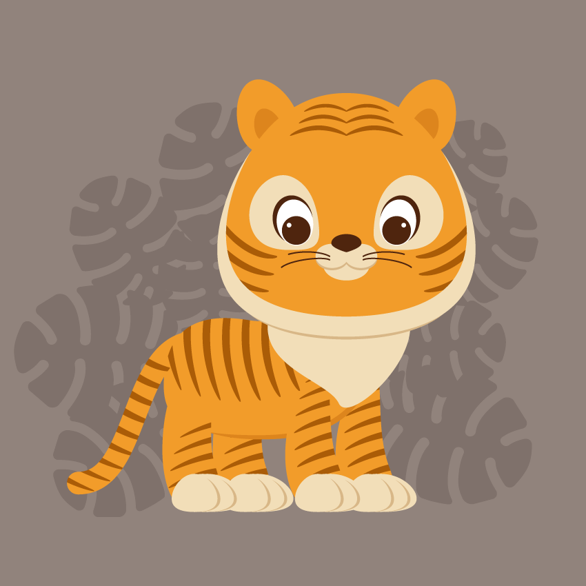
Did you know that July 29th is International Tiger Day? According to Days of the Year, Tiger Day aims to protect and expand tigers’ habitats and raise awareness of the need for conservation.
In
this tutorial, you will learn how to create a cute tiger illustration.
I’m sure by now, all my followers can probably predict which tools and
methods we’ll use in today’s tutorial. This means that you’ve become
more professional, and maybe one day you’ll also become a tutorial
instructor! So… getting back on track—yes, we will use basic shapes and
warp effects. As always, in the end, you will get a very sweet and cute
illustration.
And feel free to browse GraphicRiver to get more Tiger ideas and inspiration.
Once you’re ready, let’s get started!
1. How to Create the Tiger’s Head
Step 1
Create a New Document (File > New) with 850 px Width and 850 px Height.
Let’s
start with the head. Take the Ellipse Tool (L) and create an orange
ellipse that almost resembles a circle. Next, we will apply the Inflate
effect to this ellipse. Go to Effect > Warp > Inflate. Enter the
options you see below. Expand this shape (Object > Expand
Appearance).
Step 2
Let’s add some depth to the head.
Create a Copy of this shape in the back of the original one (Control-C,
Control-B) and shift it down a little bit. Make this copy slightly
bigger and change its color to beige. Select the new shape, make another Copy of it again in the back (Control-C, Control-B), shift it slightly
down, and change the color to dark beige.
Step 3
For the
ears, let’s start by drawing another ellipse. The Fill color is the same
as the head. To use the same color, select the oval, then select the Eyedropper Tool (I) and click on the tiger’s head. The color of the
selected object will change to the one you clicked with the
Eyedropper Tool (I).
Using the Direct Selection Tool (A), move
down the left and right anchor points of the ear. Make another Copy of
this shape, change it to a slightly darker color, make it a bit smaller,
and place it inside the larger one.
Step 4
Place the ear on the
left side of the head. Rotate it a bit to the left. Take the Reflect
Tool (O) and while holding down the Alt key, click the forehead. In the
new dialogue window, select Vertical, Angle 90 degrees and press Copy.
You should now have two ears on the tiger’s head.
Step 5
For
the eye, first, create a brown circle. To make an even circle, use the Ellipse Tool (L) while holding down the Shift key. Then create a white
oval behind the brown circle and rotate it slightly to the left.
In the
image below, this white oval has a black stroke for the tutorial purpose
only (for better visibility), so you don’t need this stroke. Make a Copy of the oval in the back, slightly enlarge it, shift it up, and
change the color to brown (the same fill color as the pupil).
Finish the
eye with a tiny white circle as a highlight. Group the whole eye
(right-click > Group), and you’ll thank me later, as it will be more
convenient for you in the following steps.
Step 6
Place the
eye on the head. Make a reflection of this eye to create the right eye,
similar to the steps you took to make the second copy of the ear. You
will need to select the whole eye and, using the Reflect Tool (O) while
holding down the Alt key, click in the middle of the head. Then check
Vertical and press Copy. You should have two eyes now.
Step 7
Let’s
add some “tiger-like” features on our tiger. Draw an ellipse on the
left side of the head, behind the left eye. To place this beige spot
behind the eye, select the eye and place it over the beige spot (Control-X,
Control-F). Take the Direct Selection Tool (A) and move the handles of
the anchor points to achieve the result you see in the second
image. And now, make a reflected vertical copy of this shape and place
it behind the right eye.
Step 8
For the nose, create a dark
brown ellipse (the same fill color as the pupil) and make a sharp base
using the Convert Anchor Point Tool (Shift-C) by clicking on the bottom
anchor point.
For the snout, create a beige ellipse behind the nose.
Make another Copy of this oval and place it as shown in the image below. Now
make the shadow of these beige ellipses: create a slightly larger Copy
of these ellipses behind (Control-C, Control-B), make them darker, and
move down a little bit. Finally, add another large light brown ellipse
below.
Step 9
For the whiskers, we will use the Arc Tool.
First, remove the Fill color and set a brown Stroke color. Draw two
whiskers on the left side of the snout. Keep the whiskers selected and
hit the Reflect Tool (O). Make a vertical reflection as you did before
with the ears and eyes.
Place the snout on the head of our tiger.
2. How to Create the Tiger’s Body
Step 1
Let’s
create the chest. Using the Ellipse Tool (L), draw an oval. Take the Direct Selection Tool (A) and move the handles of the anchor points to
create an upside-down pear-like shape. Place the chest under the head
(Control-X, Control-B).
Step 2
Let’s continue creating the
body with another orange oval. Deform this oval shape by using the Direct Selection Tool (A). Place the orange shape behind the chest.
Step 3
To
draw the legs, start with an oval again (Guess how many times I’ve said
„start with an oval”?). First, a large vertical orange oval, and then a
smaller horizontal beige oval. Select the left and right anchor points
of the smaller oval with the Direct Selection Tool (A), and move them
down using the Down Arrow key on the keyboard. Next, move the anchor
points of the orange oval to create a shape similar to the image
below.
Step 4
Now let’s create the paw. Make a Copy of the
beige shape behind, make it darker, and shift it slightly to the right.
Make a third Copy of the light brown shape behind and shift it further
to the right. Repeat this step twice more: first making a darker
copy and slightly shifting to the right, and then shifting the new light
brown copy to the right. As a result, you’ll end up with a paw similar
to the image below.
Step 5
Give this leg to the tiger. Then
make three more copies and give these to him as well. To divide the body
from the paws, make a Copy of the body behind and shift it down. Finally,
change the Fill color to a darker orange (take the same fill color as the
inside part of the ear).
Step 6
For the tail, we will use
the Arc Tool again. Do not forget to remove the Fill color, set the
orange Stroke color, and check Round Cap on the Stroke panel. Draw a
line and deform its shape by adjusting handles. Attach the tail to our
predator.
If you like how the tail looks, Expand it (Object > Expand).
3. How to Create the Tiger’s Stripes
Step 1
In this next step, we will add stripes to the tiger’s body.
Draw
a thin vertical oval. While keeping it selected, hold down the Alt and Shift keys and move the oval to the right. You will see that you just
created a copy of the original oval. Then press Control-D a few times to
repeat your last action. Group all the stripes together (right-click
> Group) and go to Effect > Warp > Arc. Enter the options you
see in the image below.
After this, apply another effect to
this group of stripes: go to Effect > Warp > Arc Lower and enter the presented options. Expand the stripes (Object > Expand Appearance).
You can make a few copies of this set of stripes, as we will use them
later for the body, tail, legs and head as well. Group all the stripes (right-click
> Group).
Step 2
Let’s
place these stripes on the body. Create a Copy of the orange part of
the body in front (Control-C, Control-F), Cut it off (Control-X), and
place in front of everything (Control-F).
A little explanation here:
when you create a copy in front of the orange body, this copy will
appear just in front of the original shape, not in front of the stripes
which we created. Then we need to cut off the copy and place it in front
of everything, now in front of the orange shape and stripes. Keeping
this copy and the stripes selected, press Crop in the Pathfinder panel
(Window > Pathfinder).
Step 3
Now we will place stripes
on the tail. Just repeat the same actions as you did for the body.
Place the stripes on the tail. Make a Copy of the tail in front of
everything (Control-C, Control-F and Control-X, Control-F). Keeping the
stripes selected and the copy of the tail in front, hit Crop in the Pathfinder panel (Window > Pathfinder).
Step 4
Similarly, place the stripes on all four legs.
Step 5
Now
select only three stripes from the created set of stripes. To select
just three of them, you first need to Ungroup this set (right-click
> Ungroup), select three of them, and Group them back (right-click
> Group). Place three stripes from each side of the head and repeat
the same action with the Crop button as you have done for the body,
tail and legs.
Step 6
Let’s continue to give more stripes to
our tiger. Take another three stripes and adjust their sizes and
position them as shown in the image below.
Next, make a reflected copy of this
set of stripes: right-click your mouse and select Transform >
Reflect. In the dialogue box, select Axis Vertical, Angle 90 degrees,
and hit Copy. Move this copy to the right until they’re attached.
Place these stripes on the forehead. Our tiger is ready!
4. How to Create the Background
Step 1
Since
our predator likes to hunt at night, let’s give it a dark background.
Create a grey-violet square behind the tiger, with 850 px Width and Height.
Step 2
Let’s add some leaves from the jungle’s
forest. First, add an oval with a color darker than the background. To
transform this oval to a leaf, we will use the Eraser Tool (Shift-E). To
set the Eraser Tool options, double-click on the Eraser Tool and enter Angle 0 degrees, Roundness 100%, Size 10 pt, and then hit OK.
Now
start erasing the parts of the oval from the side to the middle, as shown
by the arrows in the image below. Do this on both sides of the oval. The
erased lines do not have to be exactly symmetrical. When you are
finished with erasing, apply the Round Corners effect: go to Effect >
Stylize > Round Corners and select a radius value close to 10
px. Expand this leaf (Object > Expand Appearance).
Step 3
Make
many Copies of this leaf, Rotate them in different directions, and
resize them to different sizes. Place the created copies behind the
tiger and in front of the background.
Conclusion
Now our
predator is ready to hunt! You did a great job! Do you think you can
transform this tiger into a lion? Or even a cat? Why not try it out?
Have fun with it!!
Welcome to the second installment in our series exploring the world of creative software that lies beyond the realm of Adobe. In the last entry we went over tools available for those who use Photoshop as a photo manipulation program. In this article we’re moving into another specialized area of Photoshop use, and that is digital painting.
This article will stick with applications that check off a few boxes. Firstly, they all follow our series theme of being low or no cost–every piece of software in this list is either free or less than $100. Secondly, they all provide the option to secure a permanent license. And thirdly, they all have digital painting as their number one priority. There are several applications that can be used for digital painting as a secondary function, like Affinity Photo for example, but we won’t be touching on those here.
As I mentioned in our series intro, I have personally tried every application in this series in order to fill you in on included features as best I can. I’m sure there are other applications out there I haven’t yet encountered though, so if you use a great digital painting program not mentioned here, please do go ahead and let us know in the comments so others can check it out too.
1. Krita
Krita is an incredibly feature rich, dedicated digital painting application that also happens to be fully free, open source and cross platform. It’s developed as part of the incredible KDE project (who also make an entire operating system, by the way).
Krita has actually been in development for a very long time, originally as a general graphic design program, but once it started tightening its focus on painting it began to attract more and more artists and is now one of the most popular applications of its kind.
The real strength of Krita, as well as a workflow paradigm you’ll likely not be used to, comes from its powerful set of brush engines. The engines are fully accessible to allow you to create virtually any type of brush you could possibly require. Whether you want to sketch in pencil or charcoal, emulate traditional media or auto-paint in some special effects and textures, there’s a brush for that.
Krita’s currently available brush engines, through which you can also create your own brushes, are:
Bristle
Chalk
Clone
Color Smudge
Curve
Deform
Dyna
Filter
Grid
Hatching
Particle
Pixel
Quick Brush
Shape
Sketch
Spray
Tangent Normal
Where Krita is a little different to other software is that these brushes can also be made to take the place of tools you’d usually grab out of a typical application’s toolbar. Need to do clone stamping? There’s a brush for that. Need to blend, smear or deform? There’s a brush for that. Need to multiply in some shadows, lighten in some highlights, or dodge in some glow? There’s a brush for that too. In Krita there’s a brush for just about everything.
Krita’s in depth brush engine system
This brush engine also allows you to finely customize absolutely every aspect of the tools you use, as well as to create your own brushes for anything you might need. This level of control allows for a wonderful array of possibilities.
There is one thing I struggled to get used to with Krita’s brushes though: there is no setting for hardness (at least not that I’ve found) and varied brush hardness is something I use heavily in other applications. There is a blur setting, and you can work in other ways to achieve similar ends, but it’s different, and for that reason I found it to be a bit of a jolt to the system.
As a side note, a good tip to be aware of when painting in Krita is to open up the brush settings panel and check the box labelled “Temporarily save tweaks to presets” at the bottom (seen in the screenshot above). This way, when you select a brush preset then choose the brush size, opacity and angle you want, it will be remembered for the duration of the session. Otherwise when you switch to another brush and back you’ll have to set your brush size and so on all over again.
One of the most useful elements of Krita’s workflow is its excellent right-click pop up widget. Hit the rocker on your tablet’s pen and you’ll get an in-place color wheel, a history of your recently used colors, a selection of brushes, and control over your brush’s attributes.
Seen in this screenshot: Krita’s incredibly handy pop up widget and its awesome wrap around mode for seamless texture creation.
Probably my favorite part of the entire program, as someone who likes to create textures for games, is Krita’s wrap around feature for seamless tiling. By hitting the W key you’ll see your image tiled in both directions, then you can actually paint anywhere you like and your strokes will be recorded to the canvas accurately. So this means no more offsetting a texture by 50% and trying to paint out the seams. You can just freely paint right over the top of the seams as you go, making perfect tiling a breeze to create.
Another thing I look for in a digital painting application is some type of smoothing or stabilizing function. Krita delivers here with the ability to choose between basic smoothing, weighted smoothing and a stabilizer of varying strength. I feel it’s not quite as smooth as the stabilizers in Paint Tool SAI or MyPaint, (more on those later), but I’m sure that’s something that comes down to personal taste. Either way, Krita’s smoothing and stablizing functions are very helpful for people like me who may not have the world’s most stable drawing hand.
I could keep going on about how awesome Krita is, but then I’d never get to the rest of the software we’ll be talking about in this article! So here’s a quick list of some of Krita’s other awesome features:
Nine drawing assistant types including vanishing point, fisheye, perspective and others (these are great!)
PSD load and save support
HDR support
Mirroring
Multiple masks per layer
Clone layers (edit the source and the clones update in real time)
Command line exporter (great for batch exports at different sizes and in different formats)
If you’d like to give Krita a run I highly recommend trying out the awesome free brush set created by well known Krita artist David Revoy.
On a side note, Krita is working on further developing its vector tools, so look out, this might be a contender for all kinds of work in the future!
Rebelle is an incredibly intriguing and fun painting application, and by far its stand out feature is the amazing way it simulates wet media. It also includes dry media, but whether wet or dry the focus across the board is squarely on giving you as close as possible an experience to painting in the real world. You won’t find special effects brushes in Reblle – the categories of available brush all represent physical media:
Watercolor
Acrylic
Pastel
Pencil
Ink Pen
Marker
Airbrush
Eraser
What makes Rebelle so special is its ability to physically simulate the behaviour of liquid, or the lack thereof, on your piece. When you paint a stroke with a watercolor
brush you actually see the paint soaking into the paper and
blending naturally with nearby strokes as it would in real life. There’s
even a water tool you can use to lay down a wash and further control
how paints soak in, a “blow” tool with which you can blow water across
the paper, and a drying sponge to remove water once you’re done
Watercolor paint tipping across a page and soaking in as it goes
There’s also a “tilt” tool (depicted in the image above) you can use to simulate tipping your paper in different directions, so you can make your wet paints or water run down the page, up the page or in any direction you please. It’s
quite fascinating to watch taking effect on your screen, and not a little bit addictive.
If you use a display tablet things get even cooler. If your tablet has an accelerometer in it you can tip it around and Rebelle will respond to it like you’re moving a piece of paper in the real world. And while we’re used to the icon for “smudge” being a finger, in Rebelle that’s taken a step further because on a display tablet with the smudge tool active you can actually push paint around with your finger. It will feel like you’re back in your very earliest art classes doing finger painting.
And the simulation doesn’t stop there. When working with watercolor, acrylic and ink you have the option to set a “water” slider, to decide how dilute you want your paint or ink to be. When you use pastels it will build up layer on layer until you get a thick coating, just like with real pastels. And you can then smear around the excess pastel pigment, again just like the real thing. If you tap your pen on your tablet it will give you the same effect as that motion would with a brush and the bristles will be clearly visible in the mark left on the canvas, while moving in a stroke looks like a real brush stroke.
There’s also blending, smudging, transforming and selecting tools, as well as some handy stencils you can use to paint specific shapes.
If you are a lover of traditional wet media, you might be hard pressed to find another application that emulates them more realistically. And wow, is this thing fun to play with. I would say no matter what your painting style, you should at least experience the glee of taking Rebelle’s free trial out for a run.
ArtRage and Rebelle are comparable in that the focus of both is emulation of real world media. Like Rebelle, ArtRage provides a relatively short list of brushes, each one correlating with a physical counterpart:
Oil brush
Watercolor
Palette knife
Airbrush
Ink Pen
Pencil
Paint Roller
Felt Pen
Gloop Pen
Glitter Tube (yup!)
Paint Tube
Pastel
Artrage also uses a type of simulation in its painting style, however where the great strength of Rebelle is the simulation of liquid, I would say a great strength of Artrage is the simulation of three dimensional depth. This is particularly striking in the way its oil painting works, which is an absolute delight.
Artrage adds light and shadow to your piece, so you get the impression of layers of paint building up on the canvas. When you lay out oil painting brush strokes you can actually see the highs and lows left by the bristles of the brush. Those little peaks and valleys that are something of a hallmark of oil painting can be faithfully recreated here
You can even put great big globs of paint on your canvas with the Paint
Tube tool then smear them all around with the Palette Knife tool. You can see this blending of “globs” used as the basis for a painting
in the YouTube video above, and pictured in the top half of the screenshot below.
Globs
Top left: Globs of oil paint laid down with the Paint Tube tool. Top center: Two paint globs blended with the Palette Knife tool. Bottom right: Colors painted in with the Oil Brush. Note the light and shadow simulating brush strokes and the color variation where paints of different color have mixed together in a natural way.
ArtRage’s interface is very simple, yet everything you need is easily within reach in handy corner widgets. This is not trying to be a complicated application with panels chock full of tools. It’s aiming to give you the digital version of the kind of tools you’d pick up at an art supply store, and it does this very well.
However even though the interface is kept compact, behind the scenes is the ability to create custom brushes, with a great deal of options to work with. So you can start simply with the tools you see the first time you open up the program, but then you can get into as much depth as you like tweaking and customizing your tools as you go along.
If you are a fan of oil paints, or you love to see texture in art, ArtRage is a must try.
Paint Tool SAI is a very straight forward application with a simple interface that’s easy for artists with any experience level to pick up. But while it’s simple it’s also very good at what it does, which is support a drawing style with a leaning towards cartoons, comics and manga.
When you visit the Paint Tool Sai website you’ll see something that looks like it’s straight out of the nineties, and from that first impression it can be easy to suspect the application itself isn’t worth your while. But as much as web designer in me squirms, this is one case where judging the book by its cover would certainly lead to missing out!
Paint Tool SAI is a widely beloved art application, and for good reason. There’s something about drawing in this software that just feels right. When I first tried it I said, “I think this just made me ten percent better at drawing!” It has a very smooth feeling that makes sketching seem like a very natural process.
I was first compelled to try Paint Tool SAI after researching software for doing line art. Over and over, everywhere I looked, it seemed people had the same answer for their favorite application for line art, and that was Paint Tool SAI. After using the application I could see why: it has one of the best stabilizer functions available, and a fluent and intuitive vector drawing system.
When it comes to stablizers, several digital painting applications have them but each one feels a little different. The best one for you will likely come down to personal preference because everyone’s hand and drawing style is different. However for me, Paint Tool SAI’s stabilizer is my second favorite, and it’s at the top of the list for many artists.
The stabilizer helps to smooth out your raster drawing, but for an additional type of fine tuned control there is also SAI’s vector system. These aren’t really vectors like you would be used to in a typical vector drawing program like Illustrator or Affinity Designer. Rather, they are more geared towards making line art and sketching an easier process. When you use SAI’s vector tools they look very much like regular sketching lines, meaning you can draw naturally but with the ability to precisely adjust everything as required.
When you’re done drawing out lines with the vector tools you can easily go in and edit the position and curvature around points, and use a simple click and drag tool to adjust the “pressure” at each point, thereby making the line thicker or thinner there and achieving finely controlled tapering effects.
There are also several painting tools for coloring your work, including an airbrush, generic brush, watercolor brush, acrylic on canvas, acrylic on paper, and crayon.
There are some tricky points to working with SAI though. For example, there are no circle drawing tools in SAI so you have to find hackish ways to create circles, like pasting in images of circles and modifying them, or keeping your pen in one place while you rotate the canvas around it, or combining multiple curves together.
However, if you don’t mind the occasional work around, and you’re into sketching, line art, comics or Manga, Paint Tool SAI should definitely be on your list of prospects.
Price: 5400 Japanese Yen, which converts to about USD $48.50
Platforms: Windows
5. Clip Studio Paint Pro (Formerly Manga Studio)
You could arguably think of Clip Studio Paint as Paint Tool SAI’s big brother. It’s a very similar application, with a leaning towards Manga and comic art, and it has just about every tool SAI has. However it also has a series of extra tools as well.
Clip Studio Paint changed its name from Manga Studio as a way to communicate its suitability for more than Manga alone. However if you do happen to be involved in Manga or comic production there are a lot of great tools here to help you along. For example, there is a tool to create comic frames in your document that act like individual canvases. There are also specialized tools for drawing speech and thought bubbles.
On top of that it also has a large collection of ready made, drag and drop comic page layouts and speech bubbles, motion and explosion lines, colored and monochromatic background patterns, clip art style image props, and full 3D models and scenes that can be positioned, scaled and rotated in your document.
The comic panels in this image were dragged and dropped from Clip Studio Paint’s library of ready made comic pages
An outstanding feature of Clip Studio Paint is the ability to
bring in 3D body pose references to help with your sketching. There are
pre-existing poses, but any body reference you add can subsequently be
posed into whatever stance you need to draw.
Like SAI, Clip Studio Paint has vector tools that are focused on drawing and line art. It also gives you the ability to adjust line weight at each point–I would say here SAI’s adjustment tool is easier to use, but Clip Studio’s gives you more settings to control the effect. Clip Studio Paint also has stabilizer functionality, though for my tastes SAI’s feels a little smoother. But where SAI leaves you to find workarounds to draw circles, Clip Studio Paint does have circle (and square) drawing tools.
Clip Studio Paint also has a larger number of painting tools out of the box than SAI, with a wider variety of painting styles available without the need for custom brush creation. Additionally, creating custom brushes is very easy in Clip Studio Paint. You just create some type of raster drawing on a transparent background, then go to Edit > Register as Material and specify some defaults. This is a very useful function you can use to create all kinds of interesting effects.
If you are creating comics or Manga, Clip Studio Paint is probably at the top of the heap, despite its name change. And if you want easy access to 3D body models as reference, this might be the drawing application for you.
MyPaint, in my opinion, is a seriously underrated painting application. To be honest I hadn’t even heard of it until I started looking into Linux compatible applications, but once I started using it, I loved it.
For my hand, MyPaint’s smoothing function is the best of
all the applications I’ve tried. I love SAI’s stabilizer, but I never feel more comfortable sketching than I do in this software. Another factor that makes it perfect for sketching, i.e. the earliest part of your art workflow, is its infinite canvas. You can start anywhere and are free to improvise in any
direction you please.
MyPaint also has a massive array of brush types from traditional media emulators to special effects brushes. It has pencil, charcoal, dry brush, knife, ink, calligraphy, wet knife, glow, leaves, fur, pixel, blur, blend, pastel, sponge smudging, acrylic, oil, watercolor, and several more.
A little sketch and painted “flame tree” I did while getting familiar with MyPaint’s brushes
The interface is designed to be very drawing tablet friendly. Everything is laid out so as to be an easy pen tap away, meaning keyboard shortcuts are not necessary. So if you don’t use a display tablet but you feel like sitting back on the couch with a laptop, holding your tablet like a drawing pad, you can do so without the awkwardness of trying to reach for keys to pan, zoom, undo, color pick and so on.
I find MyPaint to be the perfect place to dump all my ideas. I jot down notes, sketch out thumbnails, draw up diagrams and map out concepts. And there’s something about MyPaint that might sound a little wishy washy, but when I use it I feel more relaxed than with any other software. It gets out of your way and just lets you run with whatever is in your mind.
Even if MyPaint doesn’t become an application you use for end-to-end workflows, there’s a pretty good chance you’re going to find it useful in one way or another. And with it being free, open source and cross platform there’s nothing to stop anyone from slotting it into their workflow wherever it proves helpful.
There is definitely some cross over in the features of every single application we’ve covered in this list. But though they can all be used to create wonderful drawings and paintings, they seem to group themselves into pairs in the way they are strongest. Rebelle and ArtRage for emulating physical media. Paint Tool SAI and Clip Studio Paint for Manga and comics. Krita and MyPaint as digital painting „multi tools”, both free and open source.
If you’re choosing between Rebelle and ArtRage, there are many
points on which both have pretty much equal footing. So to my mind the real separator is watercolor vs oils. If you love watercolors go with
Rebelle, and if you love oils go with ArtRage.
If you’re choosing between Paint Tool SAI and Clip Studio Paint, for effectively the same price Clip Studio Paint has pretty much everything SAI does plus a number
of extra features. However the drawing feel of Paint Tool SAI keeps a
lot of people swearing by it. In my opinion the only real way to choose is to put the feature set aside for a moment, download trials for both and see how you take to drawing and using vectors in each. You may love SAI’s feel enough that it outweighs the relatively limited tools, or you might prefer the simplicity of that smaller tool set. But if you enjoy the drawing
feel in Clip Studio Paint just as much you might go for the extra features instead.
And finally Krita and MyPaint. They’re both completely free so there’s really no need to choose between them. Rather, I feel they work well together at different points in your workflow. I like to use MyPaint and the conceptual and planning stage, then move on to Krita for the full production. But I’ve seen other artists who like to reverse that, starting their pieces in Krita then moving to MyPaint for finishing. Have a play around with them and you’ll soon figure out where they fit into your style.
Up Next: Vector Art
We’ve covered two of the specialty areas Photoshop is often used for: photo editing and digital painting. We still have one more group of specialists to touch on that is perhaps less populous, but equally awesome: pixel art.
However, before we get to that, we’re going to talk about applications for what is probably a larger group of artists at present, and that is vector artists. We mentioned a small amount of vector functionality in some of the applications in this article, but for serious vector work you’re going to need something a little extra.
You might be surprised just how many fantastic alternatives there are out there for vector art, each with their own unique perks and features. I’ll tell you all about them in the next article.
Fantastic creatures may not be real, but it doesn’t mean they can’t be drawn in a realistic way. If you want to learn how to draw a dragon, in this tutorial I will lead you step by step. You can also use the tutorial to create a base for your own dragon, with the details of your own choosing. Muscles, wings, claws, scales—this tutorial has it all!
1. How to Draw the Pose of a Dragon
Step 1
It’s nearly impossible to draw something from imagination step by step without a base. Try to quickly sketch your idea without any details—just the pose and general proportions.
Creating a sketchy base will help you keep the drawing consistent.
Step 2
We’re going to build upon this sketch now. Draw a big oval in the chest area. Dragons have huge chests, because they need powerful breast muscles for their wings.
Step 3
Attach the shoulder blade to the front of the chest.
Step 4
Define the back of the body.
Step 5
We need to make sure we know where the ground level is. Draw a line towards it.
Step 6
Draw the legs now, paying attention to all the joints.
Step 7
The default pose of the legs is easy, but also boring. Let’s create the other pair of legs to make it more dynamic. Imagine every part of the leg is like the hand of a clock, with the joint at the center. Draw the path on which it would go.
Step 8
Draw the other pair of legs using these paths.
Step 9
Add a circle at the end of the neck. This will be the whole width of the head, not just the brain case.
Step 10
Add the shape of the muzzle.
Step 11
Add the rest of the spine: the neck and the tail.
Step 12
Time for the wings. This will be a rather unnatural pose for the wings, but all the other poses require perspective, and I want to keep it easy. If you want, you can try to pose the wings in some other way.
Let’s place these new shoulder blades on the back, as with birds. Then add the arm and the forearm.
Step 13
Add all the parts of the fingers, one by one. The second one should be the longest.
Step 14
Because of our simple perspective, the other wing is hidden. However, a dragon with one wing would look weird, so feel free to add a part of the other one.
2. How to Draw a Dragon’s Body
Step 1
The pose is ready, so now let’s add some body to this bare skeleton. Draw a circle around the arm—this will be the triceps and biceps all in one.
Step 2
Cover the shoulder with one long mass.
Step 3
Connect it to the arm with a line. This whole area will make the shoulder mass.
Step 4
Add the shoulder muscles to the other leg.
Step 5
Add a big oval for the thigh.
Step 6
Connect the thigh to the hips.
Step 7
Add the other leg as well. This one will be in the front.
Step 8
The wrists and ankles have a special bony shape, so it’s important to make this area distinguishable.
Step 9
Add the paws. Front or back, they should have roughly the same shape.
Step 10
Add the other part of the paws: the „palms” and „feet”.
Step 11
There’s one more muscle mass needed to make the legs complete:
Step 12
Finally, some minor details…
Step 13
… and the final outline of the limbs.
3. How to Draw Dragon Wings
Step 1
Wings need muscles, too—they’re arms, after all. Start with a huge shoulder muscle right at the base.
Step 2
Then some biceps…
Step 3
… and some mass on the forearm.
Step 4
Let’s add some shape to the elbow and the wrist as well.
Step 5
You can now outline the muscles in a fancy way.
Step 6
Add the muscles to the other wing as well.
Step 7
Don’t forget about the wing-finger—it gives the wing some of its arm functionality back.
Step 8
Add the joints to the wing-fingers.
Step 9
Outline the fingers.
Step 10
Finally, add the membrane.
4. How to Draw Other Dragon Parts
Step 1
Time for more details of the head. The best way to start the head is to create a simplified skull for a base. First, the brain case…
… the eye socket…
… the upper jaw…
… the jaw joint…
… the cheek bone…
… and the lower jaw. Simple, isn’t it?
Step 2
The chest is slightly rotated towards us, so draw the muscles connecting the arms and the „hole” for the neck.
Step 3
Draw the neck muscles attached to the back of the skull.
Step 4
To create a realistic dragon neck, don’t forget to place the larynx behind the skull.
This will let you create this neat triangle with a space for the throat, the windpipe, and the flame tube.
Step 5
Attach a powerful chest muscle to the wings.
Step 6
Finish the shape of the main body.
Step 7
If the dragon is related to dinosaurs, it will look nice with dinosaur hips. Add this shape to the base of the tail to make it more solid.
Step 8
Finally, finish the tail.
5. How to Draw Dragon Feet
Step 1
There are a couple more details we need to add before the body is fully shaped: the toes and claws. First, draw the tip of the middle toe. Leave some space for the claw, and flatten the pad as it’s pressed to the ground.
Step 2
Draw the curved claw.
Step 3
Draw the other toe, shorter this time.
Step 4
Many animals have a „thumb” called a dew claw on their front legs. This is helpful for holding the prey while eating, and, in the case of dragons, for catching prey in flight.
Step 5
Outline the full length of the toes. Create a hump right between the tips—this will suggest the joints beneath.
Step 6
Add the big pads under the paws.
Step 7
Don’t forget about adding details to the wing-fingers as well!
6. How to Draw Dragon Scales and Other Details
The base of the body is done, so you can now finish it any way you want! I will show you my way, but feel free to create your own details. If you’re drawing traditionally, you can put a new sheet of paper over the sketch to draw the clean final lines, or use a darker tool to make the sketch less visible.
Step 1
Draw the eye and the nose. The smaller the eye, the bigger the dragon will seem.
Step 2
Draw the wrinkles under the eye.
Step 3
It’s hard to make any facial expression when you have hard scales on your face, but the scales themselves may create a false expression. If you want to make your dragon look angry or badass, put some bigger scales along its brow.
Step 4
Create an outline of the head out of big scales.
Step 5
Give the lips smaller scales to make them more elastic.
Step 6
What’s a dragon without horns? Make sure you attach them to the upper part of the skull, not to the lower jaw by accident (I have nothing against horns on the lower jaw, but it’s harder to make them functional).
Step 7
Draw rows of smaller scales in the other areas.
Step 8
Outline the feet.
Step 9
Time for the body scales! Draw rows all over the body, adjusting their shape to the 3D form beneath. Imagine that you’re trying to cover the body with parallel rows of tape.
Step 10
Cross the rows now, creating a pattern of roof tiles—each line of one row should be placed between two lines of its side rows.
Step 11
You can cross some of the bigger parts with lines to make these scales more detailed later.
Step 12
Connect the lines in rows with curves to create an outline of the scales.
Step 13
Outline the scales in a detailed way.
Step 14
The wings don’t need too many scales, so just sketch a few of them at the base. Outline the fingers as well.
Step 15
Outline the membrane.
Step 16
Finish the drawing by thickening the outer outline and adding some details.
Step 17
If you want to turn this piece of line art into a finished artwork without coloring, you can add simple, sketchy shading. This will add some volume to the dragon’s body.
Good Job!
You have drawn a beautiful dragon! Do you want some other simple, step-by-step drawing tutorials? Check out one of these:
In this article, we’ll be talking about fonts! Have you ever tried making one? Even if you haven’t ever thought about this, you might get inspired after reading my story.
I’ll tell you how I decided to try my hand at font design, how I prepared to create my very first font, and why you should try and make your own font too! The process is really challenging and calming at the same time. You will learn so many new things while digging through a new creative field.
If you’re not going to create a font yourself but you need one for your designs, then feel free to jump right to the Bananito Font Duo page on GraphicRiver and get it there!
We can’t help but notice a vast variety of fonts surrounding us in our everyday life. Any product you pick up in the shop, any website you look through on the internet, and any advertisement banner you stumble upon in the street will usually contain at least one word or phrase typed with a heavy sans-serif font or a playful handwritten script typeface.
Fonts can be of any kind, depending on the purpose of the design. They can be geometrically perfect or curvy with bouncing letters. A font can even be something apart from letters, such as a symbols font with icons or doodles instead of letters.
An example of a Symbols Font with doodles instead of letters
Looking at all this feast of typefaces around me, I noticed hand-written display fonts and whimsy script fonts becoming more and more trendy, making any design look fresh and unique. You can easily spot such fonts on GraphicRiver, for example, or check out the following article about stunning handwritten fonts:
This collection of incredible premium assets features 30 stunning handwritten fonts you’ll want to download today!
I became really inspired by the idea of trying something new after working as an illustrator for many years. So why not channel my passion for drawing… into drawing letters?
How I Created My First Font
After reading several books about typography and studying the theory of font design, I moved on to practicing my calligraphy skill. At this point, the endless drills began. I printed tons of practicing sheets and practiced those upstrokes and downstrokes whenever I had a free minute. I can’t help but notice how calming this process is. Apart from making your hand firm, it helps you to focus and get rid of the unwanted thoughts, just the same as if you were meditating.
Digital version of the calligraphy practice sheets. Making drills on an iPad.
As I became more acquainted with the typography, calligraphy and lettering world, I finally decided to make an actual typeface, one you could install on your PC and use in programs like Adobe CC, Affinity Designer and Corel Draw for designing or Microsoft Office and Pages for typing and formatting documents.
This is what differentiates a font from a set of vector letters or alphabet—you can just install it like any usual font that you download from the web, and work with it in any software instead of constructing a word from single letters in a graphic program.
To start off, I decided to create a font duo consisting of a simple uppercase display font and a set of doodle symbols for decoration. Such a font duo is great for making fancy designs in a few clicks as you already have everything you need included. Apart from that, such a playful hand-drawn font goes perfectly with other serif or sans serif fonts if you need a heading and a subheading.
And this is how the Bananito Font Duo was born!
After the font went online, it was handpicked for a promotional email newsletter and also got included in a big font bundle.
Example of how the Bananito Font Duo can be used
Inspired by the first results, I decided to continue developing my skills in this field and try something more sophisticated: a script font.
Script fonts look really elegant when involved in a design. Here is an inspiring article about stylish cursive fonts:
One of the quickest ways to elevate your designs is with a stylish, cursive font. Check out this collection of 30 incredible script fonts you’ll want to…
Here is a quick tip if you’re thinking of creating a font but don’t know how to start. Yes, the amount of work to be done may scare you away, but only if everything is disorganized and done in a chaotic order.
Start with a simple font, and don’t try to add all the bells and whistles in your very first typeface if you’re not sure whether you’ll have enough strength and motivation to finish it. In any case, it is better to try and make at least one simple font than to give up in the middle of making a more complex one.
Designing a bouncy script textured font. First steps.
So let me tell you about the process of how I designed and created the Bananito Font Duo, from scratch to finish.
How to Create a Symbols Font
How to Draw Out the Letters
To start with, we need to draw all the letters. I was going to make only the uppercase version of the font, so I needed to depict the 26 letters of the English alphabet. The style of your font is fully optional and depends on many factors. While thinking up a new font, try to keep in mind that it should be:
trendy (look through the top fonts on GraphicRiver, for example, in order to realize what is trending at the moment and which fonts have a higher rating or were handpicked by the Envato staff)
easy to read in both big and small scale
useful for various types of design, hence, multipurpose
It doesn’t have to look like your own handwriting, but it certainly can if you want it to (besides, handwritten fonts are one of the hot trends).
If you prefer a brush pen and paper, go for it! You may also prefer to use a pencil as it is easy to correct with the help of the eraser. When you’ve finished drawing out all the letters on paper, go on and scan it or use your phone to make a photo.
It’s better to draw everything in one take, without postponing the work for the following day as the letters might look a bit different. I noticed that my hand behaves differently each time I draw—sometimes it feels more tired and firm, and another day it’s easier to make light, swirly lines. In fact, it will be much easier to draw all letters in a consistent style if we draw them all one by one. And don’t forget about the figures and punctuation marks! Sometimes people need them for designing as well, so why not add them to our typeface?
Take a look at Calligraphr (formerly known as MyScriptFont.com), where you can find a very useful template containing all the glyphs for our future font. Just print it out and use it as a guide, or import into your programs if you’re working digitally.
By the way, a few words about working digitally. At first, I started practicing calligraphy on paper. However, later on, I moved to drawing everything on iPad, using the Apple Pencil and the Procreate app. You can find some really great brushes for lettering and calligraphy, or even make your own as I did. I spent a few hours playing with settings and textures until I created a perfect brush that behaved like a real brush-pen, making the whole process smoother and faster.
There are some advantages in drawing letters digitally, such as the opportunity to undo and edit anything, change the scale and colors of the elements, and transfer the completed image into your computer just in one click.
However, the option of drawing digitally is not for everyone: there are many people who enjoy drawing on paper because it gives you a pleasant tactile feeling of the real paper texture and more control over the strokes. On the contrary, the glass of the digital screen might feel too slick and slippery for drawing, and the strokes of the digital pen are not so precise as those of the real brush pen. However, drawing digitally may turn out to be much easier because of the automatic smoothing of the lines, so that you don’t have those wobbly, shaky strokes.
Drawing letters on iPad using the grid
How to Transfer Your Drawing Onto the Computer
Once you are happy with your hand-drawn letters, it’s time to open them in Adobe Illustrator and use the Image Trace function to turn them into nice clean vectors!
Your Image Trace settings may be different from mine, depending on the thickness and size of the letters and on the brightness and contrast of your letters if you’re drawing on paper. I usually keep the Threshold somewhere between 120 and 170 if I want the letters to be more or less detailed. I also set the Paths and Corners to 75%, leaving all other options as default.
Once you’ve finished, click the Expand button in the control panel on top to turn the letters into curves. Remember to delete the white background by clicking it with the Magic Wand Tool (Y).
It may require some time to clean up the letters after tracing, making the lines smoother and getting rid of the unneeded elements and stray points.
As soon as we’re happy with the result, we can place each symbol in its own cell and prepare for export.
The rest of the process depends on the software you’ll be using for making fonts. It may be either FontLab or, for example, Glyphs.
If you’re a Windows user, I would suggest trying out FontLab, a very powerful program for creating fonts! This set of tutorials will be very useful for creating your first font from zero up to the very end:
Lets get one thing straight, there is a difference between 'lettering’ and 'type design’, this can be some serious stuff. There are people who strictly…
In this installment of Designing a Typeface we will be continuing on with the artwork from Part 1. So you’ve got the framework for some lovely letters worked…
In Parts 1 and 2 of this tutorial we designed out buts off, now its time to bring it all together. FontLab is a powerful program, in the right hands, and can…
I prefer using Glyphs. However, it is only for macOS, and that is its only drawback so far. The program itself is very easy and fun to use with its user-friendly interface and descriptive guides and tutorials. So if you’re a Mac user, try its free 30-day trial and go for it.
The Glyphs interface
If you’re not sure whether you want to study new software and create more fonts in future, you can try something simpler for starters. For example, Calligraphr, which I mentioned earlier in the article, is a great chance to check how your font functions. Just follow the comprehensive instructions on the website and create your font quickly and easily!
This is my favorite moment, when the font is finally tested and exported and it goes live! Now you can use it in your own designs, creating banners, flyers and whimsy postcards much faster and easier than if you were combining the letters into words one by one.
Also, here are a couple of descriptive and comprehensive step-by-step tutorials about creating a font from scratch up to the very end. Check them out!
If you’re a designer or illustrator who’s more comfortable creating glyphs in Adobe Illustrator, this tutorial is right up your alley! We’ll plan out our…
This tutorial is the second part of our simple font creation in Adobe Illustrator project! In this tutorial we’ll explore two fantastic methods of creating a…
Why You Should Try to Create Your Own Font
Still hesitating whether you should go for it or not? Here is a list of reasons that come to mind instantly after I’ve decided to dive into such an engrossing process as font making.
This is a great opportunity to try something new. If you’re stuck in the middle of your way and feel as if you’re losing the creativity and motivation of doing the things you’ve got used to doing, making fonts can be a breath of fresh air. The process of creating fonts is very interesting and challenging. You may also find it meditative and calming.
Designing a font is a good way to try both traditional and digital media. Some of us enjoy drawing letters on paper, using various brush-pens, brushes, and calligraphy pens. Others choose digital calligraphy on PC or iPad, trying out various brushes and creating our own to find a perfect combination of size, tilt, opacity, and texture.
Your drawing skills will improve. While completing drills, making all those upstrokes, downstrokes and circles day by day, you will find that your hand becomes steadier and that you’re now drawing long, straight strokes with firmness and confidence. No more shaky lines here! This skill will also be helpful for other fields of illustration as it is always great to have a firm hand while drawing.
A curious fact about the chemical aspect of our body is that learning new skills makes your brain work more, causing it to create new connections between neurons, replacing some of those we lose over time. Isn’t that awesome? Apart from that, new experiences increase your level of dopamine, giving you a feeling of joy.
It is always a plus to add some new skills to your CV. This will obviously score you more points in the eyes of your future boss or client, whether you’re looking for a job or freelancing.
You will become more proficient in design by learning how to pair and combine fonts. Beautiful font combinations make any design look better, while inappropriate fonts can spoil any good design.
It is convenient to use your own fonts in your designs without caring about what type of license you need depending on the purpose of your end product.
An example of the packaging design using the Bananito Font Duo
To Sell or Not to Sell?
Another point of creating fonts that’s worth being mentioned here is the opportunity to make some money. Although there are many free fonts, you can still sell a good-quality font.
Once you’ve spent enough time learning and finally created an outstanding product, try uploading it to the Fonts section of GraphicRiver and promote it by making a presentation in your portfolio. Hand-drawn and script fonts are top trends in modern design—you can find them almost anywhere in product design, package design, clothing, advertisement, and in the interior design of shops and cafes. What’s more, such fonts make a product unique, whereas free fonts tend to become overused among designers.
On the other hand, competition among font designers is rising and more great free fonts are appearing, so people don’t have to spend a lot of money to make a stylish poster or flyer. Apart from that, making a free font has its own advantages too:
It is a good way to promote yourself by distributing freebies and showcasing your other projects at the same time.
It is a great opportunity to increase the quality of your future fonts by practicing.
It will help you to become a better font designer while trying out new styles of writing and sharing them with the world.
To sum up these two points, you can actually make a difference between a font that you give out for free and one that you sell. A free font might not have all the features like ligatures, letter alternatives, enhanced punctuation, webfont or multilingual support. All these features may be added to the full version of the font.
The last but not the least thing to mention here is licensing. If you want to make fonts to sell, you should definitely study all the types of licenses and the differences between them in order to know how the price varies and for what purposes people might need your font.
Although most online markets have descriptive FAQs about all types of licenses or even have the relevant type of license already selected for you, knowing this information for yourself is very important anyway. Some of your customers may have questions or doubts whether they can use your font or not, and in that case, you’ll be able to resolve any question without hesitation.
Give It a Try!
And that’s it! I hope you’ve found out some new interesting information about creating fonts and gathered enough inspiration to try it out yourself! It’s not as difficult or scary as it might seem, in fact. Just remember that you can start with something simple, gradually moving to something more complicated step by step. If you find this process bringing you joy and relaxation, you won’t be able to stop, that’s for sure.
And remember that if you liked the Bananito Font Duo which is mentioned in this article and you want to use it in your designs, you can get it right from GraphicRiver just in a few clicks.
Summer is here, and with it come long, laid-back days flipping burgers on the BBQ. If you’re planning a big BBQ event over the coming months, you can promote it in style with this chalkboard poster.
Aimed at beginners to print design, this tutorial will focus on building up textures to create that authentic chalky look. You’ll need access to Adobe InDesign and Adobe Illustrator for this tutorial, and it’s super simple to adapt the design to your own event details.
Can you pick up that wonderful smoky smell in the air? Let’s dive right in…
What You’ll Need to Create Your Poster
You’ll need to have access to both InDesign and Illustrator for this tutorial. You can pick up a free trial of both apps from the Adobe website. You’ll also need to download the following images and fonts:
Once you’ve saved the images to the same folder and installed the fonts, you’re ready to get started with designing your poster. Let’s go!
1. How to Create a Chalkboard Background
Step 1
Open up Adobe InDesign and go to File > New > Document.
Keep the Intent set to Print, Number of Pages to 1, and deselect Facing Pages, in order to create a single-page layout. Set the Width to 24 in and Height to 36 in, which will create a standard ‘Architectural D’ poster size.
Add Margins of 0.5 in and a Bleed of 1 in on all sides, before clicking OK.
Step 2
Expand the Layers panel (Window > Layers) and double-click on the Layer 1 name to open up the Layer Options window. Rename the layer Background.
Use the Rectangle Frame Tool (F) to create an image frame that extends across the whole page, up to the edges of the bleed on all sides. Go to File > Place, choose the blackboard background image and Open. Allow the image to fill the whole frame (you can click on the Fill Frame Proportionally button in the Controls panel at the top of the workspace).
Step 3
Expand the Swatches panel (Window > Color > Swatches) and click on New Color Swatch in the panel’s drop-down menu. Name the new swatch Board Black, setting the Type to Process and Mode to CMYK. Set the percentage levels to C=91 M=79 Y=62 K=97. Click Add, and then OK.
Take the Rectangle Tool (M), and drag across the page to create a shape to match the dimensions of the image frame below. From the Swatches panel, set the Fill to Board Black.
Step 4
Select the Board Black rectangle and go to Object > Effects > Gradient Feather. Select Radial for the Type, and adjust the direction of the gradient so that the lighter area extends outwards from the center of the page.
Click OK to exit the Effects window. And there we have it—a chalkboard background with a subtle gradient effect, which is going to showcase your typography beautifully.
2. How to Add Texture to Your Poster
Step 1
Lock the Background layer and click on the Create New Layer button at the bottom of the Layers panel. Rename this layer Black. We can add a slightly darker area to the central point of the page to allow the main text title to really stand out.
Take the Ellipse Tool (L) and drag onto the center of the page to create a rough circle. Set the Fill to Board Black and the Stroke Color to [None].
Go to Object > Effects > Transparency and choose a Multiply Mode. Bring the Opacity down to 70%.
Click on Gradient Feather at the bottom of the left-hand menu and create a Radial gradient, with the darkest part at the center of the shape. Click OK.
Step 2
Open up the wall texture EPS file in Adobe Illustrator. Select the image and Right-Click > Ungroup.
Select the exclamation marks in the corner of the image and delete them, leaving just the plain texture behind.
Step 3
Go to the Swatches panel (Window > Swatches) and create a New Swatch. Name it Cream, and set the CMYK levels to C=12 M=10 Y=31 K=0.
Apply the Cream swatch to the texture; then head up to File > Save As and save the texture as an EPS file, giving it the name ‘Texture Cream.eps’.
Step 4
Return to your InDesign document and lock the Black layer. Create a new layer above, naming it Texture A.
Use the Rectangle Frame Tool (F) to create a frame across the whole page, and File > Place your Texture Cream.eps image, allowing it to fill the whole frame.
With the frame selected, go to Object > Effects > Transparency. Set the Mode to Overlay and the Opacity to 20%, before clicking OK.
3. How to Create Chalky Typography for Your Poster
Step 1
With the rulers visible (View > Show Rulers), pull out a guide from the left-hand ruler to a central position on the page, 12 in.
Then pull out two more vertical guides to around 4 in and 20 in, splitting the layout into four columns.
Step 2
Create a new CMYK swatch, C=15 M=11 Y=33 K=0, naming it Cream.
Take the Type Tool (T) and drag onto the page, just above the center, creating a rectangular text frame. Type in ‘B’ and ‘G’, with a space between the two letters.
From either the Character Formatting Controls panel running along the top of the workspace or the Character panel and Paragraph panel (Window > Type & Tables), set the Font to Charlevoix Pro Bold, Size 747 pt, and text to Align Center. Adjust the Font Color to Cream.
We want the letters to meet the guides on either side, so increase the Kerning (space between individual letters) if necessary.
Step 3
Select the text frame and Edit > Copy, Edit > Paste it, positioning it below the first frame. Adjust the text to read ‘BBQ’ and reduce the Font Size to match up the alignment to the guides on either side, here 575 pt.
Select both text frames with your Selection Tool (V, Escape) cursor and head up to Object > Effects > Outer Glow. Adding a slight glow to your text will give it much more of an authentic chalky look, as if some of the chalk dust has extended past the edge of the text itself.
Adjust the Mode to Normal, and bring the Opacity down to around 43%. Click on the colored square to open the Effect Color window. From here, you can select Swatches and choose a matching Cream swatch for the glow effect. Click OK.
Back in the Effects window, set the Technique to Softer, Size to around 0.4 in, Noise to 12% and Spread to 17%. Click OK.
Step 4
Open the barbecue silhouettes vector in Illustrator. Isolate the spatula, and Edit > Copy it.
Head straight back to your InDesign layout and Edit > Paste the vector directly onto the poster.
Position the spatula directly between the ‘B’ and ‘G’, scaling the image while holding Shift to match the height of the letters. Change the Fill Color to Cream, and apply a similar glow effect (Object > Effects > Outer Glow).
Step 5
Create a new swatch, C=77 M=25 Y=30 K=0, and name it Blue.
Create a new text frame above the ‘BIG’ text frame, using the Type Tool (T). Type in an introduction to the main title, like ‘Bill’s Annual’, setting the Font to Heavyweight. Increase the Size and Tracking (space between all letters) until the text meets the guides on either side. Adjust the Font Color to Blue.
Go to Object > Effects > Outer Glow to add a glow effect to the text frame, selecting the Blue swatch for the Effect Color.
Step 6
Copy and Paste the text frame, moving this below the ‘BBQ’ frame. Adjust the text to read the date and time of the event, and again alter the Font Size and Tracking to allow the text to stretch to meet the guides.
Step 7
Use the Type Tool (T) to create three small text frames at the bottom of the layout, typing in individual snippets about the event in two-word pairs, set in Heavyweight. Adjust the Font Size and Tracking of each individual word to create a neat, square effect in each text frame. Change the Font Color to Cream.
Use the Line Tool (\) to create vertical dividers between the text frame, holding Shift to create a perfectly straight line. Set the Stroke Color to Cream. From the Stroke panel (Window > Stroke), change the Stroke Weight to 5 mm, and add a Round Cap to soften the ends of the lines.
Step 8
Take the Ellipse Tool (L) and draw a rough oval towards the top of the layout. We’re going to use this as a basis for creating a curved text sub-heading.
From the Type Tool’s drop-down menu in the Tools panel, you’ll find the Type on a Path Tool (Shift-T). Click once towards the top-left corner of the oval to transform the shape into a text path. You can now type in your sub-heading (here, ‘Come along to’), and format the text as you would for any other text frame.
Set the Font to Heavyweight and Color to Cream, and move the vertical lines criss-crossing the oval to maneuver the position of the text. You want it to curve perfectly over the top of the other text frames.
Step 9
Return to Illustrator and your barbecue silhouettes vector. Isolate the fork, and Edit > Copy it.
Return to InDesign and Edit > Paste it onto the page. Right-Click > Transform > Rotate 90 Degrees CW, and adjust the Fill to Blue. Go to Object > Effects > Outer Glow to add a glow effect. Position it just below the curved text frame, centrally on the page.
4. How to Frame Your Poster and Add a Chalky Texture
Our poster’s looking great so far, but we can just add a few more touches to make it feel more complete and give it more of a grungy, chalky texture.
Step 1
Ensure that all the text on the page is sitting centrally on the page. If not, select all the frames with your cursor and use the arrows on your keyboard to shift the frames up or down a little. When you’re happy with the result, lock the Type layer.
Create a new layer and name it Border. Then take the Rectangle Tool (M) and drag onto the page, allowing it to sit against the margin line on all sides. Set the Stroke Color to Cream, and from the Stroke panel set the Weight to 15 mm. Adjust the Type to Thick – Thick.
With the border selected, go to Object > Effects > Transparency and set the Mode to Overlay.
Step 2
Lock the Border layer and create a final new layer above, calling it Texture B.
Return briefly to Illustrator, and to your Texture Cream EPS file. Add a new swatch, name it Board Black, and set the levels to C=91 M=79 Y=62 K=97. Apply this to the texture, before going to File > Save As and saving it as Texture Black.eps.
Step 3
Return to your InDesign poster and create a new image frame across only the main title. File > Place and Open your Texture Black.eps image.
With the image frame selected, go to Object > Effects > Transparency, adjusting the Mode to Multiply and bringing the Opacity down to 20%.
To soften the effect further, you can also add a subtle Gradient Feather to the frame, setting the Type to Linear. Click OK to exit the Effects window.
Step 4
Congratulations, your poster artwork is finished! Make sure to head up to File > Save to keep all your hard work intact. If you’re printing your poster from home, you can simply head up to File > Print. If you’re sharing your poster online or via email, you can save your artwork as an Interactive PDF, JPEG or PNG by going to File > Export and choosing the file type you prefer from the Format drop-down menu.
If you’re sending your artwork off for professional printing, go to File > Export and choose Adobe PDF (Print) from the Format menu at the bottom of the window. Hit Save to open the Export Adobe PDF window. Choose [Press Quality] from the Preset menu at the top of the window.
Click on Marks and Bleeds in the window’s left-hand menu. Check All Printer’s Marks (optional, depending on your chosen printer’s preferences) and Use Document Bleed Settings.
Then hit OK to create your exported PDF. This is ready for sending straight off to the printers—great work!
Let’s Get the Grill On!
You’ve finished your BBQ poster, and it’s looking fantastic. Awesome job! Before you get started on the other preparations for your event, take a moment to recap what skills and techniques you’ve picked up over the course of this tutorial. You should now feel more confident with:
Creating print-ready poster layouts in Adobe InDesign.
Building up background textures and gradients to create a pro-standard backdrop for your design.
Formatting advanced typography and adding glow effects to replicate chalky textures.
Adding finishing touches like borders and overlay textures to take your poster to the next level.