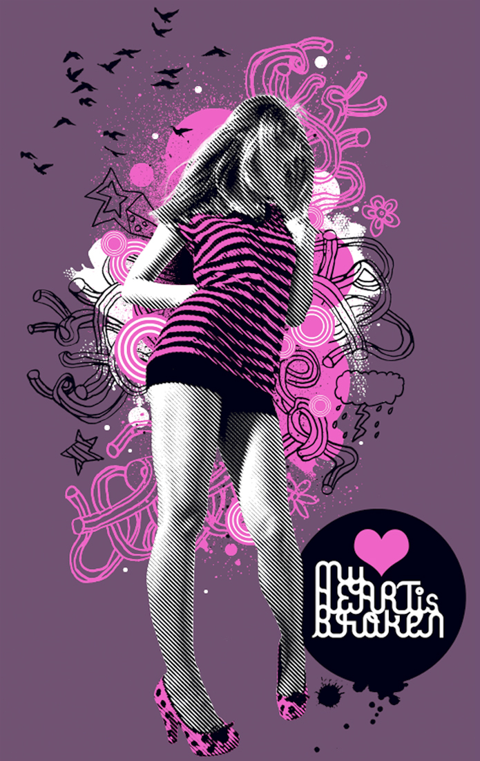
Nothing grabs you more than an awesome movie title. And you can achieve the same dramatic effect with a Photoshop layer style. Explore this amazing selection of unique text effects from GraphicRiver and Envato Elements.
22 Photoshop Text Effects
Photoshop’s layer styles help you apply one or more effects to a particular layer or layer group. These effects translate to mind-blowing results like 3D text and more.
Need a fun way to bump up your marketing? Check out this collection of Photoshop text effects from Envato Market and Envato Elements. Subscribe to unlock unlimited, high-quality templates, photos, and actions for one monthly fee!
Some projects need a more hands-on approach. Enlist the help of a professional from Envato Studio for all your text effect needs.
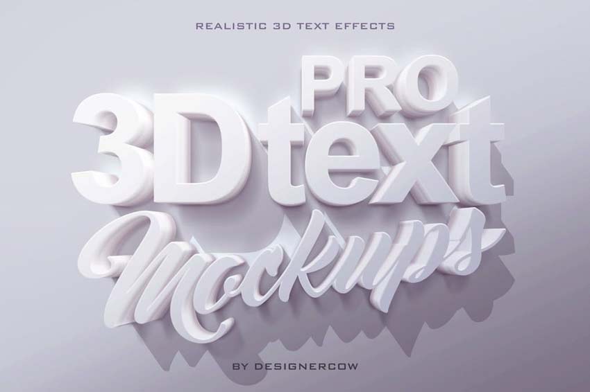
Create professional designs with this 3D text mockup kit. This kit includes four Photoshop files with Smart Objects already prepared with the right settings. Just drop your text into the respective smart object for a customized design fast.
Mimic the look of realistic embroidery for a beautiful text effect. Decorate your stationery or website with lovely gold threads and multi-colored combinations. This suite contains four separate actions with varying materials and styles.
Get 3D text effects fast with this professional 3D generator. This generator gives you a one-click shortcut to easy text effects. It works with just about anything from text to vector shapes, but supports only Photoshop CS5 and under.
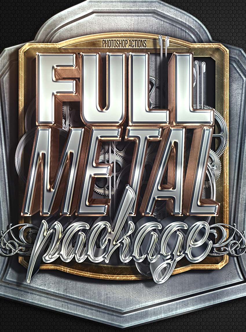
Create epic metal text effects with the click of a button! A supreme Photoshop Action with insane details, this full metal package allows for realistic metal text effects. Enjoy premium effects without all the extra hassle.
Or choose a pressed or embossed look for your designs! This is the type of effect that looks great on just about anything. For everything from apps to websites and more, you’ll definitely want this download. Grab it today to access ten professional letterpress and embossed styles.
One of the hottest trends dominating the design industry is 80s-inspired design. And you can get super nostalgic with this text mockup kit. This package contains ten Photoshop files with various 80s text effects. A help file is also included for more instruction.
Celebrate your favorite vintage styles with these awesome retro text effects. Choose from ten vintage styles to apply retro effects to your text in Adobe Photoshop. Also included are well-organized layers that are easy to customize.
Become the life of the party with these balloon-inspired text effects. Create funny quotes and banners with these impressive smart objects. Simply insert your text into the appropriate smart object to enjoy this effect right away!
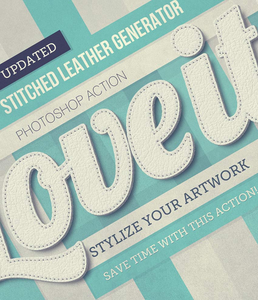
Stitch together your favorite quotes with this realistic stitched leather generator. It features unlimited color options, interactive actions, and so much more. Apply a realistic leather texture to your designs for amazing results!
Turn your text layers into frozen icicles with this awesome pack of layer styles. No expertise is required—just download the file, and then load the layer styles to get ice-cold effects with one click! Experiment with texture and color for more options.
Upgrade your futuristic designs with epic chrome and crystal text effects. Great for movie trailers, game titles and more, this set of Photoshop layer styles contains hyper-realistic details made with incredible precision. You’ll absolutely love the realistic shine!
Create jaw-dropping headlines reminiscent of your favorite movies with this set of cinematic text effects. From Marvel movie titles to HBO shows and more, this pack contains eight fully layered Photoshop files with each separate effect. Download it today to see how your favorite movie titles were made!
Recreate the look of fire and chrome with these helpful layer styles. Inspired by medieval designs, this pack contains 15 amazing Photoshop layer styles that are exclusive to the marketplace. Create unique text effects that will wow any audience.
Apply a 3D metal or gold effect to your text for a fantastic result. Get ten amazing effects when you subscribe to Envato Elements. Not only do they work well at high resolution, but they truly shine with stunning rose gold and metal textures.
Take advantage of incredible mockup kits for your headlines and logos. Included with this kit is a super convenient pack of 20 bonus text effects. Create 3D effects fast with Photoshop layer styles made by the best professionals.
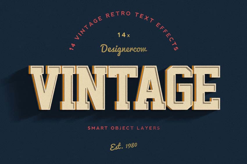
Creating retro-inspired text effects just got a whole lot easier! In only a few seconds, you’ll step back in time with this set of vintage text effects. Inspired by years like 1980 and 2014, this pack features 14 cool text effects we know you’ll love.
Recreate your favorite comic book styles with this amazing download! Smash into this fantastic pack of 12 text styles that are fully editable. Customize your text easily by adjusting the well-organized smart objects. Test it out today!
Are you a budding game developer? Save time creating a custom logo with these game-inspired layer styles. Perfect for graphic designers and app developers, this pack contains 12 game logos in completely different styles. Just pick a genre and enjoy the effect!
Achieve the look of traditional watercolor paintings with this pack of Photoshop layer styles. Ideal for wedding invitations, greeting cards, or any pretty stationery, this pack contains 15 layer styles created by hand. Each style is made up of carefully scanned watercolor strokes converted into layer styles.
Or add a phenomenal abstract marbling effect to your work. Marble is a huge trend in the industry, although many trends only feature the white and gray versions. Stand out from the crowd with this set of six marbling text effects packed with color.
Things might get a little messy with this salt and sugar text generator. Created to mimic the look of realistic condiments, this generator lets you apply wicked texture in a matter of moments. It’s super fun and easy to use for any headline or logo.
Concrete is a material that many designers adore. And you can incorporate this material into your work with a cool Photoshop layer style. Choose from three different high-quality concrete textures for any creative project.
Conclusion
This list features exciting
resources for the avid designer
familiar with Adobe Photoshop. For
additional help with all your text effect needs, enlist the skills of a
talented
professional by choosing one of the amazing designers from Envato Studio.
And with loads of text effects available at your fingertips, chances are we’ve missed a few to add to your personal collection. Be sure to browse Envato Elements and Envato Market for more resources, and let us know your favorites in the comments below!
You’ll need the following resources in order to complete this tutorial project:
Two sheets of paper
A graphite pencil (I recommend an HB or B type)
An eraser
And pencils of different colors:
Light grey
Medium brown
Light green
Bright blue
Medium blue
Dark blue
Dark brown
Black
1. How to Draw a Bird With a Graphite Pencil
Step 1
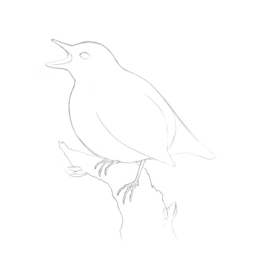
I start with a graphite pencil sketch. I draw two rounded shapes for the bird’s head and body.
Step 2
I draw the rough shape of the beak.
Step 3
I draw the stylized framework of the feet, marking the joints with small circles and adding the claws.
Step 4
I draw the rough shape of the tail; it resembles a triangle.
Step 5
I add the stylized figure of the tree, imagining that the bird is sitting on it. Then I mark the eye of the bird.
Step 6
I refine the bird, joining the head and the body with a smooth, curved line. I also mark the wing and add the back side of the open beak.
Step 7
I refine the shapes of the bird’s feet, based on the framework.
Step 8
I create an outline of the tree, using irregular, organic lines.
I also add two groups of small leaves; they will vary the composition and make the drawing more interesting.
Step 9
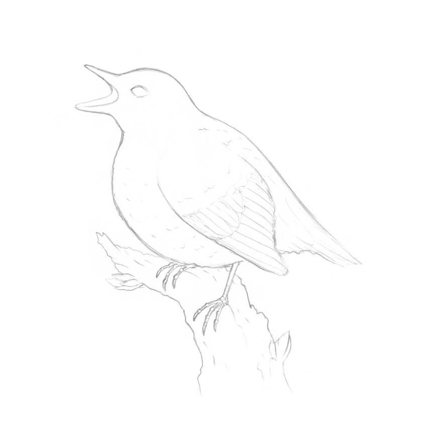
I add some details to my sketch, like the feathers in the wing and the nuances of the bark.
This is not an obligatory step; it’s just useful to think over the drawing before delving into the colored pencil part.
2. How to Draw a Bird With Colored Pencils
Step 1
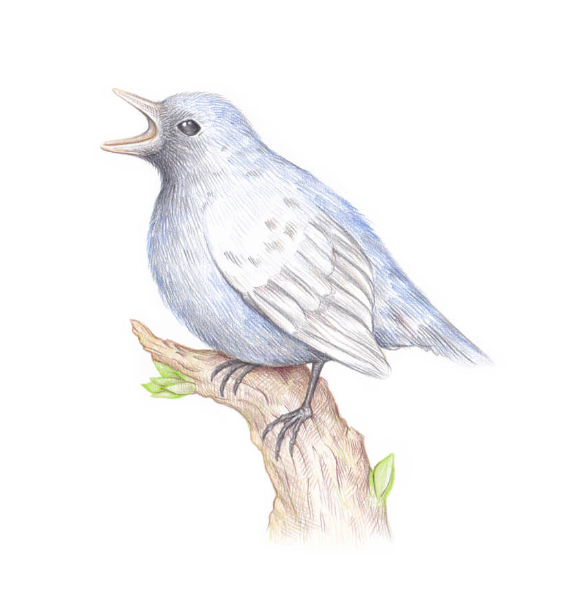
I transfer the main contours of the drawing onto a blank sheet of paper, using a window.
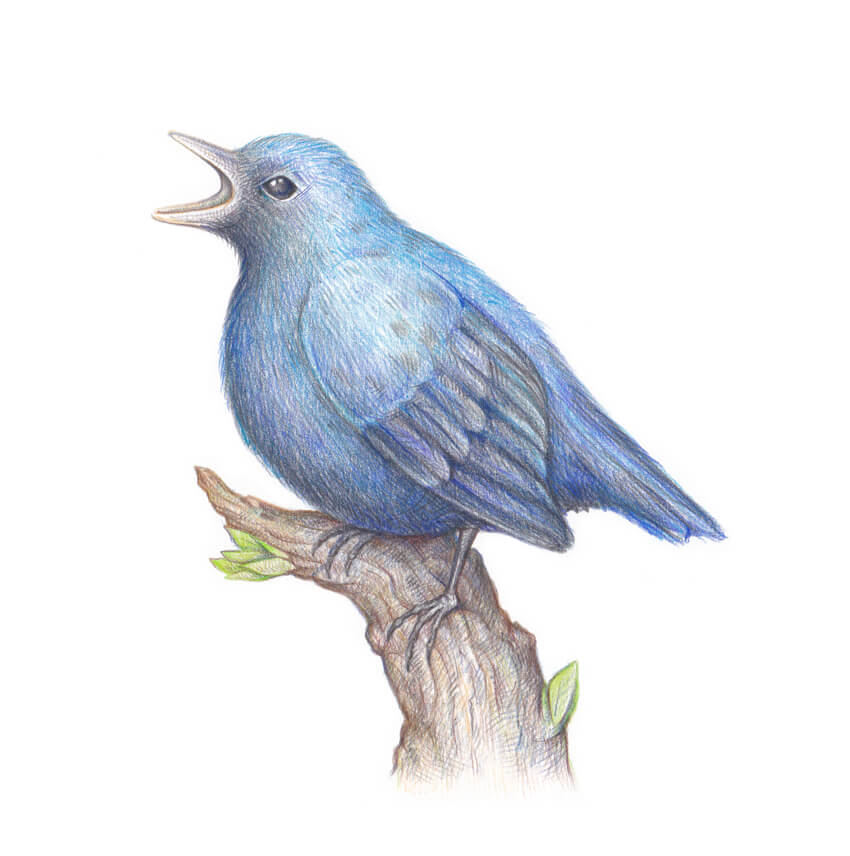
For this step, I recommend using a light grey pencil from your colored pencils set; this will help to keep the hues in your artwork clean, without the impurity of the graphite strokes.
The lines of the underdrawing are barely visible.
Step 2
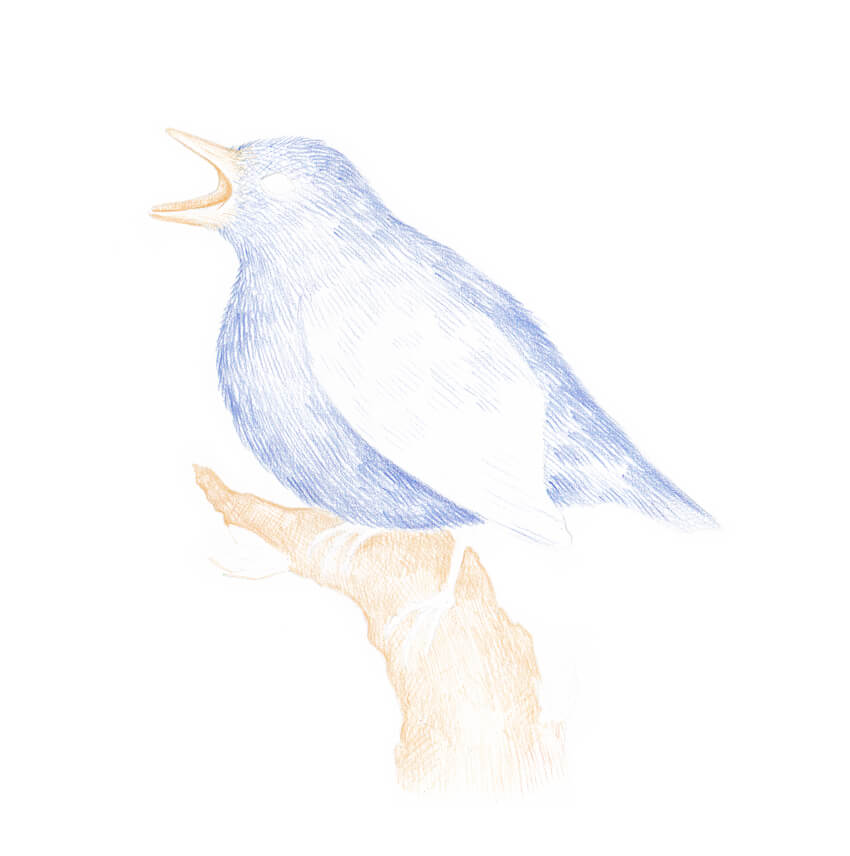
With the medium blue pencil, I create the base color layer of the bird’s feathering. I draw long hatches resembling hair or fur.
Step 3
I mark the figure of the tree, using the medium brown pencil. I also add some strokes to the bird’s beak, accenting the inner part of the mouth.
Step 4
I draw the leaves, using the light green pencil. To create a unified look for the artwork, I also add several green hatches to the tree.
Step 5
I use the black pencil to refine the head of the bird, darkening the eye and the area of the mouth.
I also accent the wing’s feathers and the feet, and add some black hatches to the tail. The drawing instantly looks as if we’ve already worked on it for a long time!
Step 6
With the dark brown pencil, I add hatches to the tree, accenting the sides and creating the drop shadow under the bird.
Step 7
I use the bright blue pencil to create beautiful nuances of the feathering. I add the strokes to the bird’s head, back, wing, and tail.
Step 8
I add strokes to the feathering and the drop shadow on the tree, using the dark blue pencil.
Step 9
Using the black pencil again, I add the hatches to the sides of the bird, accenting its three-dimensional look.
I also accentuate the details of the bark and the shadow under the bird’s wing.
Step 10
I add more dark blue strokes to the bird’s feathering to make the color layer thicker.
Step 11
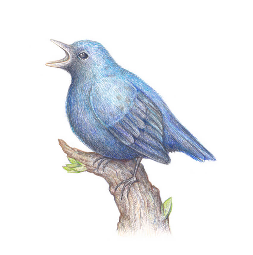
With the dark brown pencil, I add the finishing touches to the artwork, accenting the sides of the tree.
Your Drawing Is Complete
Congratulations! You’ve created an amazing artwork, and I hope you enjoyed the process. May good luck and inspiration always be with you!
In this tutorial I’ll show you how to use photo manipulation techniques in Adobe Photoshop to create a dreamy scene featuring a medieval woman with a dove carrying a letter.
First we’ll add the sky and landscape, import the bridge, model and castle and blend all of these elements together using adjustment layers, masking, and brushes. After that, we’ll work with the flowers, dove, rose, and scroll using a similar method. Later, we’ll create some flying petals and paint some dreamy light using brushes and blending modes. We’ll use several adjustment layers to enhance the final result.
Tutorial Assets
The following assets were used during the production of this tutorial:
Create a new 2000 x 1333 px document in Photoshop with the given settings:
Step 2
Open the sky image. Use the Rectangular Marquee Tool (M) to select the
sky only and drag it into the white canvas using the Move Tool (V).
Place it in the upper half.
Step 3
Go to Layer > New Adjustment Layer > Color Balance and change the Midtones settings:
Step 4
Create a Photo Filter adjustment layer and pick the color #00ecd3. On
this layer mask, activate the Brush Tool (B) and choose a soft round
brush with black color and opacity about 40-45% to reduce the effect on
the top.
Step 5
Make a Curves adjustment layer to brighten the sky a bit. On this layer
mask, use a soft black brush with a lowered opacity (30-35%) to paint on both sides of the canvas.
Step 6
Open the landscape image and place it over the canvas using the Move Tool.
Use a layer mask to erase its sky and reveal the existing one.
Step 7
Go to Filter > Blur > Gaussian Blur and set the Radius to 14 px:
Step 8
Create a Color Balance adjustment layer and set it as Clipping Mask.
Change the Midtones settings to match the landscape’s color with the
sky.
Step 9
Use a Curves adjustment layer to make the landscape a bit brighter:
2. How to Import the Bridge
Step 1
Cut out the bridge from the background and place it in the lower half of the canvas.
Step 2
Add a Color Balance adjustment layer and alter the Midtones values:
Step 3
Use a Photo Filter adjustment layer and pick the color #fb5757. This is to
give some pink light reflected on the surface of the bridge.
Step 4
Make a Curves adjustment layer and increase the lightness. Paint on the
lower area of the bridge to remove the light effect there as it’s hidden
from the sky.
Step 5
Use another Curves adjustment layer to decrease the contrast and sharpness of the bridge to fit the dreamy light of the sky.
Step 6
To make a shadow for the lower part of the right parapet, use the Lasso
Tool (L) to make a long shape below this area following its shape and
then fill this selection with black.
Lower the Opacity of this layer to 60% and apply a Gaussian Blur of 6 px to it.
Step 7
Add a mask to this layer to reduce the shadow on the lower area.
3. How to Add the Model
Step 1
Isolate the model and place her above the bridge.
Step 2
Use a layer mask to remove the bottom of her dress, making her look as if she’s standing on the bridge.
Step 3
Create a new layer and set it as Clipping Mask. Activate the Clone Tool (S) to remove the tattoo on her back and arm.
Step 4
Make a Color Balance adjustment layer and change the Midtones settings:
Step 5
Add a Curves adjustment layer to brighten the model as she looks too dark at the moment.
Step 6
Make a new layer, change the mode to Overlay 100%, and fill with 50% gray:
Select the Dodge and Burn Tool (O) with Midtones Range, Exposure about 15-20% to refine the light and shadow on the model. You can see how I
did it with Normal mode and the result with Overlay mode:
4. How to Add the Castle
Step 1
Cut out the castle from the background and add it to the left side of the canvas. Set this layer below the bridge layer.
Step 2
Apply a Gaussian Blur of 12 px as it’s in the blurred area.
Step 3
Make a Hue/Saturation adjustment layer and change the Master settings:
Step 4
Use a Color Balance adjustment layer and alter the Midtones values:
Step 5
Create another Hue/Saturation adjustment layer to change the castle’s color.
Step 6
Make a Curves adjustment layer to increase the light on the castle. On
this layer mask, use a soft black brush to reduce the effect on the
shadow areas (to lighten them).
Step 7
Create a new layer, change the mode to Overlay 100%, and fill with 50%
gray. Use the Dodge and Burn Tool to refine the light and shadow on the
castle, especially to lighten the shadow and reduce the contrast.
5. How to Add the Flower Branches
Step 1
Cut out the flowers 1 image and add it to the top right of the canvas.
Step 2
Apply a Gaussian Blur of 4 px to these flowers.
Step 3
Use a Hue/Saturation adjustment layer to change the flowers’ color:
Step 4
Add a Curves adjustment layer to make the flowers brighter.
Step 5
Place the flowers 2 image in the bottom left of the scene after isolating, and
apply a Gaussian Blur of 14 px to it. Set this layer above the model’s
one.
Step 6
Use a Hue/Saturation to desaturate the flowers.
Step 7
The flowers look too dark, so use a Curves adjustment layer to brighten them.
Step 8
Create a Levels adjustment layer to increase the light more for these
flowers. Paint on the details which are too bright (the front).
Step 9
Add the flowers 3 image to the bottom right of the bridge and apply a Gaussian Blur of 14 px to this layer.
Step 10
Match the flowers’ color with the rest using a Hue/Saturation adjustment layer.
Step 11
Make a Curves adjustment layer and decrease the lightness. The aim is to
create some shadow on these flowers. On the layer mask, use a soft
black brush to erase the front of the petals which are illuminated by
the light.
6. How to Add the Dove, Rose, and Scroll
Step 1
Cut out the dove and place her in line with the direction of the model’s look.
Step 2
Make a Hue/Saturation adjustment layer and reduce the Saturation value to nearly the minimum.
Step 3
Use a Color Balance adjustment layer to add some pink to the dove.
Step 4
Create a Curves adjustment layer to decrease the light on the dove.
Paint on the top of the wings so it won’t be affected by this adjustment
layer.
Step 5
Activate the Dodge and Burn Tool on a new layer and refine the light and shadow of the dove.
Step 6
Extract the rose from the dark background and place it in the area of
the dove’s beak. Use a layer mask to remove some of the leaves and
detail to make the rose branch clean and put it in the dove’s beak.
Step 7
Make a Hue/Saturation adjustment layer to alter the rose’s color. Adjust the Reds and Yellows settings:
Step 8
Add a Curves adjustment layer to brighten the rose’s branch.
Step 9
Place the scroll below the claws of the dove after cutting it out from the white background.
Step 10
Use a Color Balance adjustment layer to change the scroll’s color:
Step 11
Make a Curves adjustment layer to give some light for the scroll. Paint
on the lower part of the scroll as it’s hidden from the main light
source.
Step 12
Create another Curves adjustment layer to increase the shadow for the
lower part of the scroll. Paint on the upper part so it won’t be
affected by this adjustment layer.
7. How to Make the Flying Petals
Step 1
Open the petal image. Use the Quick Selection Tool (W) to select one petal in
the middle and add it to the lower corner on the right. Use the Free
Transform Tool (Control-T) with the Warp mode to bend it a little as shown below:
Step 2
Apply a Gaussian Blur of 8 px to this petal:
Step 3
Duplicate this layer many times and arrange them over the canvas. Make
some bigger petals on the foreground and vary the size of the petal as
well as the Radius of the Gaussian Blur filter to increase the depth of
field.
Step 4
Select all the petals layers and hit Control-G to make a group for them.
Change the group mode to Normal 100% and use a Hue/Saturation
adjustment layer within this group to change the petals’ color.
Step 5
Make a Curves adjustment layer to give the petals some shaded details.
Paint on some of their front and left so they won’t be affected by this adjustment layer.
Step 6
Create another Curves adjustment layer to brighten the petals. The dark areas show where to paint on the layer mask.
8. How to Paint the Light
Step 1
Make a new layer on top of the layers and use a dark brush with the
color #2a011d to paint on the top right of the sky where the light is located, and also paint on the front of the model and the surfaces of the castle and bridge.
Change this layer mode to Linear Dodge 100%, and use a layer mask to
reduce the light on the castle.
Step 2
Use another color for the brush (#eba498) to paint more warm light for
the model, castle, and some other details. Change this layer mode to Screen 100%. You can use a layer mask to refine the light effect on the unwanted details.
9. How to Make the Final Adjustments
Step 1
Create a Photo Filter adjustment layer on top of the layers and pick the color #fff373:
Step 2
Make a Color Fill layer and pick the color #280404. Alter this layer mode to Exclusion 100%.
Step 3
Add a Color Balance adjustment layer and alter the Midtones and Highlights values:
Step 4
Use a Vibrance adjustment layer to enhance the final effect. On the
layer mask, use a soft black brush to paint on the skin of the model’s
back so it won’t be too saturated.
Congratulations, You’re Done!
I hope that you’ve enjoyed my tutorial and learned something new. Feel
free to share your ideas or comments in the box below—I’d love to see
them. Enjoy Photoshopping!
The humble post box has been our connection to people around the world for decades. They come in all different shapes and sizes, but the pillar shape is arguably the most iconic. In this tutorial, you will learn the step-by-step process of how to create the classic pillar-shaped red post box.
Some of the skills you will learn will include creating basic 2D shapes, manipulating anchor points, and using the Pathfinder tool. I hope you enjoy the process and learn something new along the way. Let’s begin!
Open up your Adobe Illustrator and create a New Document (File > New). For this tutorial we’ll create a custom document at 700 x 1000 px, but you can choose different dimensions for your own project.
Step 2
Now that we have the new document open, we can begin to create the body of the post box. Start by selecting the Rectangle Tool (M). Choose a nice red color to fill your rectangle with.
Step 3
Using the Rectangle Tool (M), draw a rectangular shape. We will use this rectangle as the main body for our post box.
Step 4
Using the Color Picker Tool again, select a new color for the base of your post box.
Step 5
Use the Rectangle Tool (M) again to create the base of our post box. Make a box shape slightly wider than the width of the red rectangle, and place it at the bottom.
2. How to Create the Post Box Head
Step 1
Using the same red color as before, select the Pen Tool (P) and start to create the wave shape on the right, which will make up part of the top of your post box. You can use the Direct Selection Tool (A) to manipulate your anchor points and handles to create the shape you want.
Step 2
Use the Selection Tool (V) and make sure that your new shape has been selected. Duplicate the shape and Paste it in place by using the shortcut keys Control-C (Copy) and then Control-Shift-V (Paste in Place). This will place your new shape directly on top of the previous one.
Move the new shape over to the left (you can hold the Shift key on your keyboard while you move the shape to ensure that it moves in a straight line).
Step 3
Right-click on the duplicate shape, and choose Transform and then Reflect. Then make sure you have Vertical selected and click OK. This will flip the shape.
Step 4
Using the Selection Tool (V), move the flipped shape so that it lines up correctly with your previous shape. With both shapes selected, press Control-G to Group the shapes together. This will make moving your shapes around easier.
Step 5
Choose a brighter red color and use the Rectangle Tool (M) to create a thin rectangle. Place it on top of your new shape.
Step 6
Choose the previous red color again and use the Ellipse Tool (L) to create a long red circular shape.
Step 7
Using the Rectangle Tool (M), draw a rectangle on top of the circular shape and place it just after the horizontal mid-section.
Step 8
Use the Selection Tool (V) and, making sure both shapes are selected, use the Pathfinder paneland select Minus Front. This will remove the top shape and anything else that it was overlapping (in this case, the bottom of the circular shape).
Step 9
Now use a combination of the Rectangle Tool (M) and the Ellipse Tool (L) to create a thin rectangle to place on the bottom and a small circle to place on top.
To make an even circle, draw an oval using the Ellipse Tool (L) while holding down the Shift key.
Step 10
Now combine all the shapes together to create the base shape for the top of the post box. Place this new shape on top of the body.
3. How to Create the Post Box Letter Hole
Step 1
For the letter hole, we will create the right side first and then mirror it to create the left side. This will make sure that our final shapes are symmetrical. Let’s start by creating choosing a new dark grey color for the hole using the Color Picker.
Step 2
Use the Rectangle Tool (M) to create the small rectangle. This will be the left side of our letter hole.
Step 3
Now using Rectangle Tool (M) creating two small rectangles on the top and on the right-hand side of the box. Then, using the Direct Selection Tool (A), move the bottom corners of the rectangles so that they match with the dark grey box.
Step 4
Using the same steps above, create a pink shape at the bottom. Select all these shapes and press Control-G to Group them all together.
Step 5
Create a new bright red box and use the Add Anchor Point Tool (+) to add a new anchor point on the bottom edge of the box. This will allow you to use the Direct Selection Tool (A) to pull down the bottom right corner and create a small triangle.
Step 6
Now combine both shapes by placing the first group of objects on top of this one. Make sure you right click the bright red object and send it to back (Right Click > Arrange > Send to Back).
Step 7
Now, with all the shapes in the correct order, select them all and Control-G to Group them. Now Duplicate the group and Flip the second group horizontally. Line them up to create the letter hole.
Step 8
Use the Rectangle Tool (M) to create the notice plate. To do this you can create two rectangles where one is larger than the other. Then place the smaller rectangle on top of the larger rectangle. Press Control-G to combine all the shapes together.
Step 9
Place the new group of objects on top of the post box body.
4. How to Create the Details of the Post Box
Step 1
Using the Rectangle Tool (M) create some thin shadow lines between the shapes to add some depth to the top of the post box. Use a dark red color. You can also add a slight opacity if you want to.
Step 2
Use the Rectangle Tool (M) again to create some dark grey grooves on the bottom of the post box.
To make an even square, draw a rectangle using the Rectangle Tool (M) while holding down the Shift key.
Step 3
Select the Rounded Rectangle Tool and create a row of capsule shapes. Then Delete the bottom half of all of them using the Direct Selection Tool (A). To do this, make sure that only the bottom half anchor points have been selected before hitting the Delete button.Select them all and press Control-G to Group them all together.
Remember that you can make the corners of your rounded rectangle curvier by pressing the up or down arrow keys on your keyboard while you are drawing the shape.
Step 4
Now place the group on top of your post box to create some grooves.
5. How to Create the Royal Crown
Step 1
Now let’s create the crown! Using the Rounded Rectangle Tool, create the bottom of the crown.
Step 2
Use the Pen Tool (P) to create the middle portion of the crown. You can use a Stroke for this and choose a thickness that you like.
Step 3
Use a combination of the Ellipse Tool and the Rectangle Tool (M) to complete the top of the crown and place it on the post box.
To create the cross of the crown, choose the Star Tool. Click and drag on the canvas to create the star, but before you release the mouse button, press the Down button on the keyboard a few times to create a triangle.
Step 4
Create a circle using the Ellipse Tool and place the triangle over it. Duplicate the triangle so that you end up with one on top and one at the bottom.
To make an even circle, draw an oval using the Ellipse Tool (L) while holding down the Shift key.
Step 5
Select all the shapes and group them together. Duplicate this new shape and Paste it in place (Control-Shift-V). Rotate it by 90 Degrees.
Step 6
Create another circle using the Ellipse Tool and place the cross on top. Place the new cross and circle on top of the crown.
6. How to Create the Post Box Highlights
Step 1
Now that you have all the details on your post box, select all your shapes and press Control-G to Group everything together.
Step 2
Press Control-C to Copy the whole group and then press Control-Shift-V to Paste it in place. With the duplicate post box selected, go to the Pathfinder paneland select Unite. This will combine all the shapes into a single shape.
Step 3
Now, using the Direct Selection Tool (A), Delete half of the duplicate post box. To do this, use the mouse to click and drag the selection across only half the shape (making sure that half of the anchor points have been selected). If you have missed some points, simply select them and delete them.
Once you have deleted half of the shape, choose a bright pink color for it using the color picker.
Step 4
With the pink shape selected, go to Transparency and select an Opacity of 30%. Then on the drop-down menu select Overlay.
7. How to Create a Postcard & Stamp
Step 1
For the postcard, let’s start by using the Rectangle Tool (M). Create a light grey boxin the shape of a postcard. You can also create a 2 pt grey Stroke to prepare for the postcard details.
Step 2
Next, you’ll need to use the Pen Tool (P) or the Line Segment Tool (\) to create the lines of the postcard.
Step 3
For the stamp, create two squares using the Rectangle Tool (M), one smaller than the other, and place them on top of each other. Then use the Ellipse Tool to create small circles around the outer square. Once that is done, select all the circles and Group them together by pressing Control-G.
Step 4
Select both the group of circles and the white square underneath. Making sure that they are both selected, go to Pathfinder and select Minus Front.
Step 5
Create a dashed line on top of the grey box. You can do this by Duplicating the grey box, removing the grey fill, and keeping the stroked line (as mentioned in previous steps). Then go inside the Stroke options and choose Dashed Line 4 pt.
Step 6
Select the dashed line and go to the top menu. Then select Object > Expand. Make sure both Fill and Stroke is selected. This will create shapes out of your dashed line.
Step 7
Use the Direct Selection Tool (A) to select the shapes of your dashed line. Right-click and select Isolate Selected Group.
Step 8
You can now use the Direct Selection Tool (A) to select the shapes individually. Select the shapes you want and use the color picker to change the color.
8. How to Create the Background
Step 1
Now it’s time to wrap up our illustration! Let’s create a New Layer for our background so that it is separate from our post box. You can do this by clicking on the New Layer button on the bottom right of the Layers tab.
Step 2
Create a background using a color of your choice by using the Rectangle Tool (M) and drawing it around the artboard.
Step 3
Then use the Ellipse Tool to create a shadow underneath your post box.
Awesome! You’re Finished!
Congratulations! You have successfully completed this tutorial. Feel free to share your own creations below! I hope you found this tutorial helpful and that you’ve learned many new tips and tricks that you can use for your future illustrations. See you next time!
Welcome
back to our series on art history! From the lands of Africa, we
now venture onward to experience art from the Neoclassical era and Romantic period.
Let’s see how history significantly affected the art of this time.
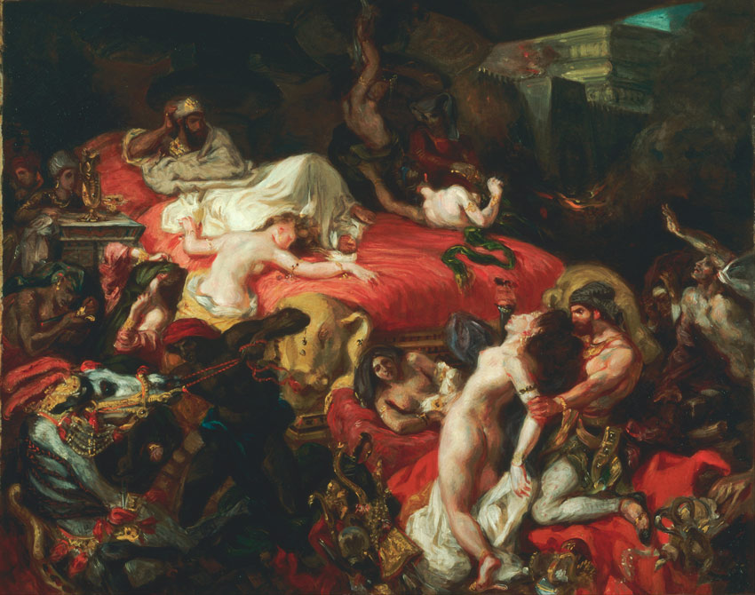
During the 18th century, a new movement swept through Europe and created a radical change in politics, science, and art. The Age of Enlightenment was partially a reaction to the Industrial Revolution, as the world witnessed the importance of technological innovation for the advancement of humankind.
This age of reason and enlightened thinking dominated Europe, inevitably birthing two important eras in philosophy and visual art. Neoclassicism and Romanticism competed side by side, bringing creatives together to express emotion as well as a love for the classics.
While Neoclassical art was more rooted in paying homage to classical Greco-Roman art, the Romantic era placed the emphasis on encapsulating emotions like fear and horror in visual form.
Even today, both periods have influenced many contemporary artists for their exceptional beauty, exquisite details, and elaborate drama. So let’s check out a few notable artists and innovators from this time.
Often considered the direct opposite of the Romantic era, Neoclassical art had a huge hold on Europe for many years. At the root of its philosophy, Neoclassicism revived the „true style” of classical art the world had come to know from Ancient Greece and Rome.
Painters like Jacques-Louis David made this style famous through the symbolic painting of the Oath of the Horatii. It depicted a Roman legend of two warring cities and stressed the importance of sacrifice for one’s country.
The main characteristics of Neoclassical paintings were de-emphasized backgrounds, organizing the composition around symbolic numbers, and telling idealistic stories of moral triumph and civic duty.
German painter Caspar David Friedrich once said, „The artists’ feeling is his law.” And it was in early landscape paintings like his that the Romantic era began. You see, Romantics believed in expressing the brutalities of human emotion through art.
Powerful compositions erupted during this time, with artists often painting mythical, landscape, or historical scenes focused around a particular message. Romantics rejected the rational ways of Neoclassical artists, and upheld their love of individual expression over the restraints of traditional customs.
Most of what we see in sculpture during this time lends itself to the Neoclassical side of art. The rigidity of marble meant that expressive and expansive gestures were far too limiting for Romantic artists.
Even with very few examples of Greek sculpture still available at this time, sculptors reveled in the classic beauty of an art form they believed to be superior to its Roman counterpart. Successful excavations meant that more people were collecting antique sculptures, not only for museums but also for their own private collections.
At the core of Neoclassical sculpture was this massive belief in a sense of decorum. Idealized faces adorned the bodies of classical heroes dressed in their preferred uniforms. Gestures and emotions were always restrained to place more focus on the idea of „calm grandeur,” beautiful forms, and spiritual nobility.
We can see evidence of this in work from Jean-Pierre Cortot, who created Le Triomphe de 1810. This bas-relief sculpture resides on the famous Arc de Triomphe de l’Étoile in Paris, featuring Napoleon being crowned by the goddess of Victory.
Neoclassical art also saw a wave of interest in the area of decorative arts and pottery. Deemed the Greek Revival, many Greek-inspired etchings and engravings appeared on the walls of famous buildings and homes.
Large columns reminiscent of ancient Greek architecture also became prevalent during this time. And with the discovery that Greeks painted the inside of their temples, many of Europe’s elite drew on this notion for creative inspiration.
This sense of Greek-inspired grandeur also spilled over into the pottery. Napoleon’s reign saw an influx of over-the-top ceramics and decor. Gorgeous gold vases matched the Empire Style interiors to reflect the opulence of the privileged few.
Though different in style, the eras of Neoclassical and Romantic art both became embedded in Europe’s history. Their wide range of culture and influence is a
true testament to
the evolution of art. And I hope you continue to learn more about these
amazing timelines on your own.
For more incredible tales of Neoclassical or Romantic art history, dive into the links below for further reading. And
join me next month when we discuss Impressionism.
Sloths
are amazing creatures, so different from everything we know. The seem
to have a very chill attitude towards life, and they’re definitely not
lazy—they just don’t see the need to hurry! Sloths are also unbelievably
cute, so we’re going to draw one today. It will be a simple
illustration perfect for beginners, and later you can use it to create a
colorful vector illustration with Nataliya Dolotko!
1. How to Draw a Sloth’s Body
Step 1
Our sloth will be hanging from a tree branch, and its back will be neatly curved. So start the drawing with this clear curve.
Step 2
To draw a uniform curve of the body, we may feel it with circles. First a big circle…
… then a smaller one…
… an even smaller one…
… and a similar one on top for the head.
Step 3
You can now outline the body.
2. How to Draw a Sloth’s Legs
Step 1
Draw the limbs that are the closest to us first. To keep the illustration simple, draw them as simple curves.
Step 2
Draw a tree branch above the sloth. Feel free to use a ruler for this, but it’s not necessary.
Step 3
Draw the foot holding the branch.
Step 4
Draw the outline of the leg going from the foot towards the body.
Step 5
Draw the hand—it will be more rounded than the foot.
Step 6
Use the same technique as before to outline the arm.
Step 7
There’s another pair of limbs we need to draw. It should be easy—just mirror the curves:
Step 8
Make the other leg complete the same way as before:
Step 9
And another arm, too:
Step 10
Finally, add the long claws holding the branch.
3. How to Draw a Sloth’s Face
Step 1
Draw the outline of the sloth’s flat face.
Step 2
Add some basic guidelines to see the proportions better.
Step 3
Draw the circle in the lower half—this will be the muzzle.
Step 4
Draw the smile across the muzzle.
Step 5
Add some details to the smile.
Step 6
Draw the nose.
Step 7
Draw the eyes.
Step 8
Draw the dark pattern along the face.
Step 9
Draw the cute fringe on the forehead.
4. How to Finish the Drawing of a Sloth
We’re
going to draw the final lines now. If you’re drawing traditionally, use
a darker tool for it, or place a new sheet of paper over the sketch.
Step 1
Outline parts of the limbs, leaving space for other outlines.
Step 2
Outline the nose.
Step 3
Draw the details of the eyes. First, plan the shine dots…
… then fill everything outside of the shine dots…
… and slightly darken the lower dots (they come from reflected light).
Step 4
Outline the cute mouth.
Step 5
Add the „mask”.
Step 6
Outline the whole face.
Step 7
Outline the claws. Try to make them all very similar.
Step 8
Outline the whole body and the branch.
Step 9
Finally, thicken some of the lines to make the drawing visually more interesting without any colors or shading.
So Cute!
Good
job! You can now take your drawing and turn it into a vector
illustration. And if you’re interested in other tutorials like this,
check one of these:
Let’s create a magical photo manipulation using basic tools in Adobe Photoshop.
In today’s tutorial, we’ll create an enchanted rose inspired by the classic Disney movie Beauty and the Beast. I’ll show you how to build the entire scene from scratch just by keeping an eye out for the right stocks.
To create this scene, I did a basic search on Google and Pinterest for enchanted rose images. Taking a few notes in the beginning is a good way to have a game plan before you attempt this manipulation. Here are some important ideas to keep in mind for a composition that reflects the original Disney movie.
The enchanted rose is often in front of a large window.
The window has stained glass panels reminiscent of the time period.
The table used to hold the rose is made of stone.
The glass case can work with or without a base.
The rose sparkles with magic from the enchantment spell.
Just knowing these few tidbits helps me understand the kind of stocks I need to choose. Bookmark plenty of alternative images to experiment with what works best.
Now let’s move on to the manipulation!
1. How to Set Up the Stained Glass Window
Step 1
Open your Stained Glass Window reference in Adobe Photoshop. We’ll be using its normal dimension size (1280 x 1280 pixels) to build this magical scene.
Since the window is a little crooked, let’s straighten it out. Control-T to Free Transform the window, Rotating the window until it’s straight. Then adjust the Scale and Perspective so that it’s much taller and the top of the window stretches a little outside of the canvas.
Control-J to create a Duplicate of the window. Adjust the size of the duplicate so that there’s more wall space on the left and right sides of the composition. Since the window is just an accessory to this composition, we need to make sure it’s not placed too far forward in the scene.
Don’t worry if there’s a little excess window from the image underneath it—we’ll cover that later!
Step 2
Now blur the window to create depth of field. Go to Filter > Blur Gallery > Field Blur, and add a Blur of 5 pixels.
Desaturate the blurred image. Go to Image > Adjustments > Hue & Saturation. Lower the Saturation to -49.
Step 3
Before we add more elements to the scene, let’s blur the window again. Go to Filter > Blur Gallery > Field Blur. Now add a blur of 8 pixels, but this time make sure that the Light Bokeh is set to 25%.
Finish the window adjustments by applying some color. With the blurred image selected, go to Image > Adjustments > Color Lookup. Set the 3DLUT File to FuturisticBleak.3DL.
2. How to Add the Table
Step 1
Adding the table is quite simple. Just use the Polygonal Lasso Tool (L) to extract it from the Stone Table reference. Then Copy and Paste it onto a New Layer above the background.
To clean up the edges, add a Layer Mask to the table. Select the mask and Fill it with black using the Paint Bucket Tool (G). Then use a Hard Round Brush with 100% Hardness to paint white onto the areas where you want to reveal the table.
Also make sure any excess leaves and debris are removed from its surface by using the CloneStamp Tool (S).
Step 2
Now desaturate the table. Select the layer and go to Image > Adjustments > Hue & Saturation. Lower the Saturation to -75.
Step 3
Create a New Layer and Fill it with gray #b9b9b9 using the Paint Bucket Tool (G). Right-click to set this layer as a Clipping Mask to the table. Then set the Layer Blend Mode to Multiply.
Clip a New Adjustment Layer of Curves above the layer fill to adjust the lighting even further. Bring down the curve for the RGB Channel slightly to darken the table.
3. How to Create the Glass Case
Step 1
Already the scene is starting to come together! How exciting!
Now let’s create the glass case from scratch. To do this, first extract the bottom of this Cake Stand with the Polygonal Lasso Tool (L).
Adjust the size and perspective with the Free Transform Tool (Control-T). Then use the Eraser Tool (E) to clean up the edges of the base.
Step 2
Select the Ellipse Tool (U) and create a white circle with No Stroke at the top of the base.
Right-click the ellipse layer and go to Blending Options. Apply a reflected gold Linear Gradient Overlay with the following settings and colors:
Dark gold: #967242
Light gold: #bd9053
Step 3
Merge the shape and cake stand layers together. Control-T to adjust the size of the stand, making it slightly larger before placing it in the center of the table. Then Right-click to go to BlendingOptions again, this time adding a Drop Shadow with the following settings:
Step 4
Change the gold base to a rich brown color. Do this by setting a New Adjustment Layer of Hue & Saturation as a Clipping Mask to the cake stand. Adjust the settings to the following numbers:
Hue: -25
Saturation: -41
Lightness: -68
Step 5
Time for the dome glass details! Open your Wine Glass reference in Photoshop. Use the Magic Wand Tool (W) to select the background, and then hit Delete to remove it. Do the same for the center of the glass, making sure that the shine stays in place.
Once you’re finished, Copy and Paste the image into your composition and go to Edit > Transform > Flip Vertical. Adjust the shape of the glass with the Free Transform Tool(Control-T) and fit it onto the brown stand.
Continue adjusting the shape with the Free Transform Tool’s Warp and Scale options until you’re happy with the result. Try to make it as close to the movie’s dome shape as possible. Add a Layer Mask to this layer and paint black onto it with a HardRound Brush to remove any excess glass.
Now use the Eraser Tool (E) to erase the bottom of the glass as well as any harsh edges. Try to make the case seem as realistic as possible.
Finish the case by using the Ellipse Tool (U) to create an ellipse at the bottom of the case with a white Stroke and No Fill. Right-click the shape layer to go to Blending Options, adding a brown #372e2bDrop Shadow with the following settings:
4. How to Create the Enchanted Rose
Step 1
To create the enchanted rose, we’ll first add a little color to the glass case. Create a New Layer below the glass layers but above the stand layer.
With a Soft Round Brush, paint soft shades of green #0e624f and blue #2b809a onto the case, and then set the Layer Blend Mode to Divide. Lower the Opacity to 70%.
Here is how the layers should appear.
Step 2
You may notice that the original enchanted rose sits at an angle in the glass. So before we add our own rose to the case, we need to adjust its shape. Open your Pink Rose reference in Photoshop. Use the Magic Wand Tool (W) to select the white background and hit Delete to remove it.
Dissect the rose using the Polygonal Lasso Tool (L). Create individual selections around the rose, stem, and leaves. Copy and Paste each component onto its own layer, and then Rotate each section with the Free Transform Tool(Control-T).
Here is a before and after comparison. Make the top of the rose seem much larger than the stem. Rotate it at a slight angle before removing any excess leaves. Then erase the end of the stem with the Eraser Tool (E).
Now that the rose is all set, Copy and Paste it onto a New Layer underneath the glass layers. Adjust the size so that it fits within the glass perfectly.
Step 3
Set a New Adjustment Layer of Hue & Saturation as a Clipping Mask to the rose. Lower the Saturation to -50.
Step 4
Let’s add some color! Set another New Layer as a Clipping Mask to the rose. Use a Hard Round Brush to paint red #811522 all over the rose. Then set the Layer Blend Mode to Color Burn and the Opacity to 80%.
Clip a New Adjustment Layer of Color Lookup to the rose to modify the colors. Set the 3DLUT File to 2Strip.look, and then set the Layer Blend Mode to Multiply and the Opacity to 70%.
Step 5
Don’t forget to add the handle to the top of the glass dome! Extract the top portion from this Glass Top reference and Copy and Paste it into the scene. Use a combination of the Free Transform Tool (Control-T) and a Layer Mask to make the shape rounder.
Then go to Image > Adjustments > Hue and Saturation, and lower the Saturation to -64.
Step 6
Cover the bottom of the glass base with rose petals. First open the Rose Petal reference in Photoshop and use the Magic Wand Tool (W) to select and Delete the white background.
Select only a few of the petals with the Polygonal Lasso Tool (L), and then Copy and Paste them onto a New Layer underneath the glass.
Create movement by making twocopiesof one of the rose petals. Position them as though they are floating down the case.
Now create a New Layer underneath the petals layer and set it to Multiply. Paint red #890100 shadow underneath the rose petals and don’t forget to deepen the main rose. Use a Soft Round Brush to blend the shadows well.
5. How to Adjust the Final Colors and Lighting
Step 1
Almost done! To make the scene as realistic as possible, we’ll need to create a harmonious lighting and color scheme.
First create a New Layer above all the others. Use a Soft Round Brush (at 10-40% Opacity) to paint light gray #c7c4c1 mist around the right and left sides of the case. Lower the Opacity of the layer to 25%.
Create another New Layer and set it to Multiply. Use a Soft Round Brush (at 30-70% Opacity) to paint medium gray #6a6a6a around the edges of the scene. This will create more focus on the rose while adding a nice vignette effect.
Step 2
Go to Layer > New Adjustment Layer > Color Balance. Change the settings for the Shadows, Midtones, and Highlights to make the overall scene more blue.
Here is the result once you’re through.
Step 3
Create a New Layer above the last adjustment and set it to Overlay. Use a Hard Round Brush to paint solid pink #d8c7de in the middle of the canvas. Lower the Opacity to 32%.
To brighten the rose petals with more color, set a New Layer to Overlay. Use a Soft Round Brush to paint pink #d85670 on the petals for a bold effect. Lower the Opacity to 83%.
Step 4
For even more color, create a New Layer set to Linear Light. Paint a bright pink color #c93e96 all over the rose and rose petals. Lower the Opacity to 11%.
Step 5
To create a sense of atmosphere, we’ll be applying dust and sparkles to the composition. So load your Nebula Brushes and create a New Layer. Using Nebula Brush 7, click once to apply the brush, making sure the Foreground Color is set to white. Lower the Opacity if needed.
Step 6
Then load your Lens Flare and Star Brushes. Use a combination of Star Brushes and Flare Brushes to paint white lens flares at the top of the glass case and a few star bursts within it. This will help the scene appear as though there’s light coming in from the window.
Set a New Layer to Overlay and use a Soft Round Brush to paint yellow #d9dfcf highlights onto the table and case. Change the Brush Hardness to 100% to add a few cleaner lines of highlight around the table’s ornate details.
Step 7
Create a New Layer and use it to paint crisp white highlights on the glass, case, and rose. Add white dots to the air to show how some dust particles are catching light.
Take this opportunity to clean up the scene as much as possible.
Step 8
The majority of our editing is now complete! All we have left to do is add a few more color adjustments. Add a New Adjustment Layer for Curves. Adjust the curves for the RGB, Blue, and Green Channels to balance the lighting. Lower the Opacity to 68%.
Next, add a New Adjustment Layer for Brightness & Contrast. Adjust the Brightness to 9 and the Contrast to 8.
Finally, add one more Adjustment Layer for Color Balance. Change the settings for the Midtones and Highlights to the following numbers:
The result should have a slightly purple hue to mimic the colors from the movie. This is technically the end of the manipulation, but I’ll sharpen the image even further in the next steps.
6. How to Sharpen Your Manipulation
For more visual impact, consider sharpening your photo manipulations for the final step. Merge all the layers together. Hold Control-J to Duplicate the merged layer.
With the merged copy selected, go to Filter > Other > High Pass, setting the Radius to 2 pixels. Then set the Layer Blend Mode to Overlay.
That’s it! Check out the final result below.
Congratulations! You’re All Done!
You can create Disney magic using a few well-placed images in Adobe Photoshop. Explore the possibilities with fantastic settings like Adjustment Layers, Blend Modes, and more.
I hope you’ve enjoyed this tutorial! Feel free to add your comments and share your results with us below.
For more fun photo manipulations, check out these great tutorials:
In the following steps you will learn how to create a casino text effect in Adobe Illustrator. For starters, you will learn how to set up a simple grid and how to create the main shapes using a free font and basic vector shape-building techniques.
Taking full advantage of the Appearance panel, you will learn how to stylize shapes and compound paths. You will also learn how to save gradients and graphic styles and how to easily apply them later.
Moving on, you will learn how to add subtle highlights using simple effects and basic blending techniques. Finally, you will learn how to add a subtle texture for the entire illustration.
For more inspiration on how to adjust or improve your final text effect, you can find plenty of resources at GraphicRiver.
1. How to Create a New Document and Set Up a Grid
Hit Control-N to create a New Document. Select Pixels from the Units drop-down menu, enter 850 in the Width box and 610 in the Height box, and then click that More Settings button. Select RGB for the Color Mode, set the Raster Effects to Screen (72 ppi) and then click the Create Document button.
Enable the Grid (View > Show Grid) and the Snap to Grid (View > Snap to Grid). You will need a grid every 5 px, so simply go to Edit > Preferences > Guides > Grid, and enter 5 in the Gridline every box and 1 in the Subdivisions box. Try not to get discouraged by all that grid—it will make your work easier, and keep in mind that you can easily enable or disable it using the Control-„ keyboard shortcut.
You should also open the Info panel (Window > Info) for a live preview with the size and position of your shapes. Don’t forget to set the unit of measurement to Pixels from Edit > Preferences > Units. All these options will significantly increase your work speed.
2. How to Create the Background and Add Text
Step 1
Pick the Rectangle Tool (M) and focus on your toolbar. Remove the color from the Stroke and then select the Fill and set its color to R=42 G=47 B=66. Move to your artboard and simply create an 860 x 620 px rectangle—the grid and the Snap to Grid should make this easier.
Make sure that your rectangle stays selected and open the Align panel (Window > Align). Select Align to Artboard from that drop-down menu and then click the Horizontal Align Center and Vertical Align Center buttons to easily center your selection.
Move to the Layers panel (Window > Layers), select the existing layer, and simply Lock your shape to make sure that you don’t accidentally select/move it.
Step 2
Pick the Type Tool (T) and open the Character panel (Window > Type > Character). Select the BudmoJiggler-Regular font, and set the Size to 150 px and the Tracking to 30. Add the „CASINO SLOTS” text, set the color to white, and center it.
3. How to Create the Main Shapes
Step 1
Make sure that your text stays selected and go to Type > Create Outlines (Shift-Control-O). Open the Pathfinder panel (Window > Pathfinder), click the Divide button, and then Ungroup your group using the Shift-Control-G keyboard shortcut.
Step 2
Focus on the Layers panel, open the existing layer, and you should find a bunch of shapes that do not have a color set for Fill or Stroke (basically invisible). Select one of these shapes from the Layers panel and then go to Select > Same > Appearance to easily select all the shapes with identical Appearance attributes. Fill these shapes with a random blue.
Step 3
Select the three shapes highlighted in the first image and remove them using the Delete key.
Step 4
Select all those blue shapes and Group them (Control-G). Make sure that this new group is selected and add a Copy in Front (Control-C > Control-F). Select this group copy along with the white shapes and click the Unite button from the Pathfinder panel.
Ungroup (Shift-Control-G) the resulting white shapes. Move to the Layers panel, select the remaining group of blue shapes, and bring it to front (Shift-Control-]).
Step 5
Select the six white shapes that make up your top word and hit Control-8 (or go to Object > Compound Path > Make) to turn them into a compound path. Move to the bottom word, select the white shapes, and turn them into a second compound path.
4. How to Create and Use the First Graphic Style
Step 1
Make sure that your bottom compound path stays selected and focus on the Appearance panel (Window > Appearance). Select the Fill and simply replace the color with the Linear Gradient shown below.
Step 2
Make sure that your bottom compound path stays selected, keep focusing on the Appearance panel, and add a second Fill using the Add New Fill button.
Drag your new fill below the existing one, apply the Linear Gradient shown below, and then go to Effect > Path > Offset Path. Enter a 2 px Offset, set the Joins to Round, and click OK. Keep in mind that the blue numbers from the Gradient window stand for Location percentage. With this bottom fill still selected, go to Effect > Distort & Transform > Transform. Drag the Move-Vertical slider to 0.2 px, enter 60 in that Copies box, and then click the OK button.
Step 3
Make sure that your bottom compound path stays selected, keep focusing on the Appearance panel, and add a third Fill using that same Add New Fill button.
Drag your new fill below the existing ones, apply the Linear Gradient shown below, and then go to Effect > Path > Offset Path. Enter a 2 px Offset, set the Joins to Round, and click that OK button. Next, go to Effect > Distort & Transform > Transform. Drag the Move-Vertical slider to 13 px and then click OK.
With this bottom fill still selected, go to the Swatches panel (Window > Swatches), and click New Swatch to quickly save your yellow Linear Gradient.
Step 4
Make sure that your bottom compound path stays selected, keep focusing on the Appearance panel, and add a fourth Fill.
Drag this new fill below the existing ones, set the color to R=24 G=27 B=36, and then go to Effect > Path > Offset Path. Enter a 2 px Offset, set the Joins to Round, and click that OK button. Next, go to Effect > Distort & Transform > Transform. Drag the Move-Vertical slider to 15 px, click OK, and then go to Effect > Stylize > Drop Shadow. Enter the attributes shown in the following image and then click OK.
Step 5
Make sure that your bottom compound path stays selected, keep focusing on the Appearance panel and add a fifth Fill.
Drag this new fill below the existing ones and set the color to black (R=0 G=0 B=0). Lower its Opacity to 15%, change the Blending Mode to Soft Light, and then go to Effect > Path > Offset Path. Enter a 7 px Offset, set the Joins to Round, and click OK. Next, go to Effect > Distort & Transform > Transform. Drag the Move-Vertical slider to 14 px and click OK.
Step 6
Make sure that your bottom compound path stays selected, keep focusing on the Appearance panel, and add a sixth Fill.
Drag this new fill below the existing ones and apply the linear gradient shown below. Lower its Opacity to 75%, change the Blending Mode to Soft Light, and keep in mind that the yellow zero stands for Opacity percentage. With this bottom fill still selected, go to Effect > Path > Offset Path. Enter a 2 px Offset, click the OK button, and then go to Effect > Distort & Transform > Transform. Drag the Move-Vertical slider to 50 px, click the OK button, and then go to Effect > Blur > Gaussian Blur. Enter an 8 px Radius and click OK.
Step 7
Make sure that your bottom compound path stays selected, keep focusing on the Appearance panel and select the existing Stroke. Set the color to R=35 G=31 B=32, lower its Opacity to 70%, change the Blending Mode to Soft Light, and then click that „Stroke” piece of text to open the Stroke fly-out panel. Set the Weight to 2 px and then check the Round Join and Align Stroke to Inside buttons.
Step 8
Make sure that your bottom compound path stays selected, keep focusing on the Appearance panel and add a second Stroke using the Add New Stroke button.
Select this new stroke, apply your yellow Linear Gradient from the Swatches panel, and then open the Stroke fly-out panel. Set the Weight to 1 px and then check the Round Join and Align Stroke to Outside buttons.
Step 9
Make sure that your bottom compound path is still selected, open the Graphic Styles panel (Window > Graphic Styles), and click New Graphic Style. Move to your top compound path, select it, and simply apply your graphic style from the Graphic Styles panel.
5. How to Create and Use the Second Graphic Style
Step 1
Reselect your group of blue circles and Ungroup it (Shift-Control-G). Focus on one of those blue circles, select it, and replace the blue with the Radial Gradient shown in the following image. Use the Gradient Tool (G) to adjust the size and position of your gradient as shown below.
Step 2
Make sure that your yellow circle stays selected and keep focusing on the Appearance panel. Select the Fill and Duplicate it using the Duplicate Selected Item button.
Select the newly added fill and go to Effect > Stylize > Drop Shadow. Enter the attributes shown in the left window (in the following image), click the OK button, and then go again to Effect > Stylize > Drop Shadow. Enter the attributes shown in the other window and then click OK.
Step 3
Make sure that your yellow circle stays selected and keep focusing on the Appearance panel. Select the bottom fill and go to Effect > Stylize > Outer Glow. Enter the attributes shown in the following image and then click OK.
Step 4
Make sure that your yellow circle stays selected and keep focusing on the Appearance panel.
Select the stroke, set the color to R=35 G=31 B=32, and open the Stroke fly-out panel. Be sure that the Weight is set to 1 px and check the Align Stroke to Outside button. Lower its Opacity to 50% and change the Blending Mode to Soft Light and then go to Effect > Distort & Transform > Transform. Drag the Move-Vertical slider to 1 px and then click OK.
Step 5
Make sure that your yellow circle is still selected, go to the Graphic Styles panel, and save your second graphic style. Select all your blue circles and apply this second graphic style.
6. How to Add Subtle Highlights
Step 1
Using the Ellipse Tool (L), create a 10 px circle and fill it with white (R=255 G=255 B=255). Lower its Opacity to 80%, change the Blending Mode to Overlay, and then go to Effect > Distort & Transform > Pucker & Bloat. Drag that slider to -80% and then click that OK button. Multiply this tiny circle (Control-C > Control-F) and spread the copies as shown in the second image.
Step 2
Using the Ellipse Tool (L), create an 80 px circle and place it roughly as shown in the first image. Fill it with the Radial Gradient shown below and focus on the Appearance panel. Don’t forget that the yellow zero from the Gradient image stands for Opacity percentage. Select the fill, change its Blending Mode to Overlay, and go to Effect > Blur > Gaussian Blur. Enter an 18 px Radius and then click OK.
Step 3
Make sure that your fresh circle stays selected, keep focusing on the Appearance panel, and Duplicate the existing Fill. Select this new fill, lower its Opacity to 80%, and click the existing Gaussian Blur effect to open it. Lower the Radius to 9 px and then go to Effect > Path > Offset Path. Enter a -10 px Offset and then click OK.
Step 4
Make sure that your fresh circle stays selected, keep focusing on the Appearance panel, and Duplicate the top Fill. Select this new fill, lower its Opacity to 60%, and open the existing Gaussian Blur effect. Lower the Radius to 5 px and then open the existing Offset Path effect. Enter a -20 px Offset and then click OK.
Duplicate this circle and place the copy as shown in the second image.
7. How to Add Shading and a Subtle Texture
Step 1
Using the Rectangle Tool (M), create a new 860 x 620 px shape, and center it. Fill it with the Radial Gradient shown below and change the Blending Mode to Soft Light. Remember that the yellow zero from the Gradient image stands for Opacity percentage, and use the Gradient Tool (G) to stretch your gradient roughly as shown in the following image.
Step 2
Make sure that your newest rectangle stays selected and keep focusing on the Appearance panel. Add a second Fill and select it. Set the color to black, lower its Opacity to 10%, and change the Blending Mode to Soft Light. Then go to Effect > Artistic > Film Grain. Enter the attributes shown in the following image and click OK.
Congratulations! You’re Done!
Here’s how it should look. I hope you’ve enjoyed this tutorial and can apply these techniques in your future projects.
Feel free to adjust the final design and make it your own. You can find some great sources of inspiration at GraphicRiver with interesting solutions to improve your design.
In today’s tutorial we’re going to take an in-depth look at the
process of creating a transportation-themed icon pack, using some geometric
shapes and tools that you probably already work with on a daily basis.
Don’t forget, you can always expand the pack
by heading over to GraphicRiver where you’ll find a great selection of transportation icons just waiting to be snatched.
That being said, grab
a fresh cup of that yummy mocha latte and let’s get started!
1. How to Set Up a New Project File
Since I’m sure that you already
have Illustrator up and running in the background, bring it up and let’s set up
a New Document (File > New or Control-N)
using the following settings:
Number
of Artboards: 1
Width: 800
px
Height: 600
px
Units: Pixels
And from the Advanced tab:
Color
Mode: RGB
Raster
Effects: Screen (72ppi)
Preview Mode: Default
2. How to Set Up a Custom Grid
Since we’re going to be creating the icons
using a pixel-perfect workflow, we’ll want to set up a nice little Grid so that we can have full control
over our shapes.
Step 1
Go to the Edit > Preferences > Guides & Grid submenu, and adjust
the following settings:
Once we’ve set up our custom grid, all we
need to do in order to make sure our shapes look crisp is enable the Snap to Grid and Snap to Pixel options found under the View menu.
Now, if you’re new to
the whole “pixel-perfect workflow”, I strongly recommend you go through my How
to Create Pixel-Perfect Artwork tutorial, which will help you widen your
technical skills in no time.
3. How to Set Up the Layers
With the new document created, it would be
a good idea to structure our project using a couple of layers, since this way
we can maintain a steady workflow by focusing on one icon at a time.
That being said, bring up the Layers panel, and create a total of
four layers, which we will rename as follows:
layer
1: reference grids
layer
2: train
layer
3: bus
layer 4: tram
4. How to Create the Reference Grids
The reference grids (or base grids)
are a set of precisely delimited reference surfaces, which allow us to build
our icons by focusing on size and consistency.
Usually, the size of the grids determines
the size of the actual icons, and they should always be the first decision you
make once you start a new project, since you’ll always want to start from the
smallest possible size and build on that.
Now, in our case, we’re going to be
creating the icon pack using just one size, more exactly 128 x 128 px, which is a fairly large one.
Step 1
Start by locking all
but the “reference grids” layer, and then grab the Rectangle Tool (M) and create a 128 x 128 px orange (#F15A24) square, which will help define the
overall size of our icons.
Step 2
Add a smaller 120 x 120 px one (#FFFFFF) which we
will position on top of the previous shape, since it will act as our active
drawing area, thus giving us an all-around 4
px padding to work with.
Step 3
Select and group the
two squares together using the Control-G keyboard shortcut, center aligning them to the underlying Artboard
afterwards. Create the remaining grids using two copies (Control-C > Control-F) at a horizontal distance of 40 px from the original, locking
the current layer before moving on to the next section.
5. How to Create the Train Icon
Assuming you’ve successfully managed to
create the little reference grids, move on to the next layer (that would be the
second one), and let’s kick off the project by creating our first icon.
Step 1
Start by creating the
circular background using a 120 x 120 px circle, which we will color using #FF8D60 and then center align to the
first active drawing area.
Step 2
Create the upper section of the train using a 60 x 60 px square, which we will color using #CBF7EC and then
center align to the larger circle, positioning it 20 px from its top edge.
Step 3
Adjust the shape that we’ve just created by setting the Radius of its top corners to 20 px from within the Transform panel’s Rectangle Properties.
Step 4
Give the resulting shape an outline using the Stroke method, by creating a copy of it (Control-C), which we will paste in front (Control-F) and then adjust by first changing its color to #3F3330 and
then flipping its Fill with its Stroke (Shift-X). Set the resulting outline’s Weight to 4 px,
selecting and grouping the two shapes together afterwards using the Control-G keyboard shortcut.
Step 5
Create the little roof section using a 12 x 4 px rectangle (#3F3330) which we will position on top of the
larger outline, as seen in the reference image.
Step 6
Start working on the door using a 20
x 42 px rectangle (#55AA9A) which we will adjust by setting the Radius of its top corners to 4 px from within the Transform panel’s Rectangle Properties. Give the resulting shape a 4 px thick outline (#3F3330), grouping
(Control-G) and then aligning the
two to the center of the larger body’s bottom edge.
Step 7
Add the little window using an 8 x 10 px rounded rectangle (#3F3330)
with a 2 px Corner Radius, which we
will center align to the door, positioning it at a distance of 4 px from its top edge.
Step 8
Add the rectangular side insertions using two 4 x 8 px rectangles (#3F3330), which we will position at a distance
of 6 px from the door’s top edge.
Step 9
Create the little handle using a 4 x 4 px square (#3F3330), which we will position onto the left side of the door, right
underneath the window itself. Once you’re done, select and group (Control-G) all of the current section’s
composing shapes together before moving on to the next step.
Step 10
Start working on the protective string sections using three 2 x 4 px rectangles (#3F3330), which we
will vertically stack at a distance of 2
px from one another, grouping (Control-G)
and then positioning them at a distance of 2
px from the center of the door’s bottom edge.
Step 11
Turn on Pixel Preview
mode (Alt-Control-Y), and then use a 2 px thick Stroke with the color set to #3F3330 to draw the three rope sections.
Once you’re done, switch back to the Default
Preview mode (Alt-Control-Y),
selecting and grouping (Control-G)
them to the smaller insertion rectangles, doing the same for the entire door
afterwards.
Step 12
Create the left window using an 8
x 14 px rounded rectangle (#3F3330) with a 2 px Corner Radius, which we will position on the left side of
the door, making sure to bottom align it to the smaller center window.
Step 13
Add the small rectangular insertion using a 4 x 2 px rectangle (#3F3330), which we will position above the
window, at a distance of just 6 px.
Step 14
Create the circular lights using two 4 x 4 px circles (#3F3330) vertically stacked 2 px from one another, which we will
group (Control-G) and then position
below the left window, at a distance of 4
px.
Step 15
Start working on the left bumper by creating a 4 x 24 px rounded rectangle (#3F3330)
with a 2 px Corner Radius, which we
will align to the bottom of the larger body, positioning it at a
distance of just 2 px from its left
edge.
Step 16
Create two 6 x 4 px rectangles
(#3F3330), which we will vertically stack at a distance of 6 px, grouping (Control-G)
and then positioning them on top of the bumper, at a distance of 4 px from its top edge. Once you’re
done, select and group (Control-G)
all of the bumper’s composing shapes before moving on to the next step.
Step 17
Add the bottom rectangular insertion using a 6 x 4 px rectangle (#3F3330), which we will bottom align to the
train’s larger body. Once you’re done, select and group (Control-G) all of the details that we’ve added so far, since we
will use them to fill up the larger body’s right side.
Step 18
Create a copy (Control-C > Control-F) of the details that we’ve just finished working on, which we will vertically reflect (right click > Transform > Reflect
> Vertical) and then position onto the train’s opposite side. Once
you’re done, select and group (Control-G)
all of the train’s composing sections before moving on to the next step.
Step 19
Start working on the train’s bottom section by creating a 64 x 6 px rectangle (#55AA9A) with a 4 px thick outline (#3F3330), which we
will group (Control-G) and then
position below the train’s larger body.
Step 20
Next, create an 8 x 6 px rectangle
(#3F3330), which we will center align to the two shapes that we’ve just
grouped.
Step 21
Add the side pieces using two 4 x
6 px rectangles (#3F3330), which we will position onto the outer edges of
the wider section.
Step 22
Finish off the train’s bottom section by adding a 60 x 6 px rectangle (#3F3330) followed by a slightly smaller 24 x 4 px one (#3F3330), to the center
of its bottom edge. Once you’re done, select and group (Control-G) all of the current section’s composing shapes together,
doing the same for the entire train afterwards.
Step 23
Finish off the train, and with it the icon
itself, by drawing the small railroad section from underneath using a 4 px thick Stroke (#3F3330). Take your time and, once you’re done,
select and group (Control-G) all of
its composing sections together.
6. How to Create the Bus Icon
Assuming you’ve finished working on the
first icon, lock its layer and then move on up to the next one (that would be
the third one) where we’ll start working on the iconic New York bus.
Step 1
As we did with the
previous icon, start by creating the circular background using a 120 x 120 px circle, which we will
color using #FF8D60 and then center align to the second active drawing area.
Step 2
Create the vehicle’s roof section using a 70 x 12 px rounded rectangle (#55AA9A)
with a 6 px Corner Radius and a 4 px thick outline (#3F3330), which we
will group (Control-G) and then
center align to the larger circle, positioning them at a distance of 20 px from its top edge.
Step 3
Add the center detail piece using a 42 x 4 px rounded rectangle (#3F3330)
with a 2 px Corner Radius, which we
will center align to the shapes that we’ve just grouped.
Step 4
Create the circular front lights using two 4 x 4 px circles (#3F3330), which we will
position onto the sides of the larger center piece, at a distance of just 4 px from it.
Step 5
Add the bottom insertion using a 12
x 3 px rectangle (#3F3330), which we will center align to its bottom edge.
Step 6
Create the smaller insertions using two 4 x 3 px rectangles (#3F3330), which we
will position at a distance of 2 px from
the larger insertion’s side edges.
Step 7
Finish off the roof by creating a 50 x 6 px rectangle (#3F3330), which we
will adjust by individually selecting and pushing its top anchor points to the
inside by a distance of 4 px (right click > Transform > Move >
Horizontal > + / – 4 px depending on which side you start with). Once
you’re done, position the resulting shape on top of the larger shapes,
selecting and grouping (Control-G)
all of them together afterwards.
Step 8
Create the bus’s main body using a 66 x 44 px rectangle (#CBF7EC) with a 4 px thick outline (#3F3330), which we
will group (Control-G) and then
position below the roof that we’ve just finished working on.
Step 9
Create the windows using two 28 x 20 px rounded rectangles (#3F3330)
with a 4 px Corner Radius, which we
will horizontally distance at 2 px from
one another, which we will group (Control-G)
and then center align at a distance of 2
px from the larger body’s top edge.
Step 10
Add the horizontal divider line using a 74 x 2 px rectangle (#3F3330), which we
will position at a distance of just 2 px from the bus’s windows, making sure to center align it to
them before moving on to the next step.
Step 11
Create the smaller detail segments using fourteen 2 x 1 px rectangles (#3F3330), which we will place at a horizontal distance of 2 px from
one another, grouping (Control-G)
and then positioning them below the shape from the previous step.
Step 12
Add the smaller rectangular light using a 2 x 4 px rectangle (#3F3330), which we will position at a distance
of 2 px from the larger body’s
bottom-left corner.
Step 13
Create the larger light using a 12
x 4 px rectangle (#3F3330), which we will position at a distance of 2 px from the smaller one’s right edge.
Step 14
Add the circular light using a 2
x 2 px circle (#3F3330), which we will position above the gap created by
the two rectangular lights, at a distance of just 2 px.
Step 15
Star working on the left windshield wiper by creating the base using a 6 x 2 px rectangle (#3F3330), which we
will position above the larger rectangular light, at a distance of just 2 px from its top and right edges.
Step 16
Create the wiper’s end section using a 2 x 12 px rectangle (#3F3330), which we will position onto the
right side of the bus, at a distance of 8
px from its base.
Step 17
Finish off the wiper by drawing the diagonal body using a 2 px thick Stroke (#3F3330) starting from the center of the base all the way
up to the top of the end piece. Once you’re done, select and group all of the
current section’s composing shapes together using the Control-G keyboard shortcut.
Step 18
Select and group (Control-G)
all the left-sided details, and then use a copy (Control-C > Control-F) of them to add the right-sided ones, making sure to vertically reflect them once you have them in place (right click > Transform > Reflect
> Vertical).
Step 19
Add the side lights using two 4 x 4 px squares (#3F3330), which we
will position onto the outside of the bus’s larger body, so that they’re in line with the inner rectangular lights.
Step 20
Start working on the left side mirror by
creating its main body using a 6 x 12 px rectangle (#3F3330), which we will position at a distance of 2 px from the vehicle’s main body and 4 px from its roof.
Step 21
Finish off the mirror by adding an 8 x 2 px rectangle (#3F3330) on top of
it, followed by a smaller 4 x 2 px one
(#3F3330) towards its bottom. Once you’re done, select and group all three
shapes together using the Control-G
keyboard shortcut.
Step 22
Create the right mirror’s main body using a 6 x 8 px rectangle (#3F3330), which we
will position at a distance of 2 px from
the larger body and 10 px from its
roof.
Step 23
Add the support arms by positioning an 8 x 2 px rectangle (#3F3330) underneath
the mirror’s main body, followed by a smaller 4 x 2 px one (#3F3330) towards its top. Once you’re done, select
and group (Control-G) all of the
mirror’s composing shapes together, doing the same for the larger body
afterwards.
Step 24
Create the main shapes for the vehicle’s front
bumper using a 70 x 8 px rectangle
(#55AA9A) with a 4 px thick outline
(#3F3330), which we will group (Control-G)
and then position below its larger body so that their outlines end up
overlapping.
Step 25
Start adding details to the bumper by creating a 26 x 2 px rectangle (#3F3330), which
we will center align to its larger composing shapes.
Step 26
Add the vertical delimiters using two 4 x 8 px rectangles (#3F3330), which we
will position at a distance of 4 px from
the center piece’s side edges.
Step 27
Create the side insertions using two 8 x 2 px rectangles (#3F3330), which we will position in the center
of the space created by the bumper and the vertical delimiters.
Step 28
Add the bumper’s side sections using two 4 x 8 px rectangles (#3F3330), which we will position on the
outside of its main body.
Step 29
Create another larger 66 x 6 px rectangle,
which we will color using #3F3330 and then position below the bumper’s main
body.
Step 30
Add the wheels using two 12 x 8
px rounded rectangles (#3F3330) with a 2
px Corner Radius, which we will position as seen in the reference image, at
a distance of 4 px from its sides.
Step 31
Finish off the current section by adding an 18 x 2 px rectangle, which we will color using #3F3330 and then
position below the bumper’s bottom detail rectangle. Once you’re done, select
and group (Control-G) all of the
current section’s composing shapes together, doing the same for the entire bus
afterwards.
Step 32
Finish off the icon by adding the little road strip, using an 8 x 12 px rectangle (#3F3330), which we
will adjust by individually selecting and pushing its top anchor points to the
inside by a distance of 2 px (right click > Transform > Move >
Horizontal > + / – 2 px depending on which side you start with). Once
you’re done, position the resulting shape at a distance of 2 px from the bus’s bottom, selecting and grouping (Control-G) all its composing sections
together before moving on to the next icon.
7. How to Create the Tram Icon
We are now down to
our third and last icon, so without wasting any more time, make sure you’re on
the right layer (that would be the fourth one) and let’s finish this.
Step 1
Kick things off by creating the circular background using a 120 x 120 px circle, which we will
color using #FF8D60 and then center align to the third active drawing area.
Step 2
Start working on the vehicle’s pantograph by creating an 18 x 6 px rectangle (#55AA9A) with a 4 px thick outline (#3F3330), which we
will group (Control-G) and then
center align to the circular background, positioning them at a distance of 20 px from its top edge.
Step 3
Add the little rectangular insertion using a 6 x 3 px rectangle (#3F3330), which we will center align to the two
shapes’ bottom edge.
Step 4
Create another slightly larger 14
x 4 px rectangle, which we will color using #3F3330 and then position on
top of the roof section, making sure to center align it to the larger shapes.
Step 5
Take a couple of moments and draw the pantograph’s rail using a 2 px thick Stroke line (#3F3330), using the reference image as your main guide.
Once you’re done, select and group (Control-G)
all of the current section’s composing shapes together before moving on to the
next step.
Step 6
Create the tram’s roof using a 50 x 6 px rectangle (#CBF7EC) with a 4 px thick outline (#3F3330), and a 30 x 3 px rectangle (#3F3330) aligned
to their top edge, grouping and positioning all three shapes right underneath
the pantograph.
Step 7
Add the body’s upper section using a 42 x 26 px rectangle (#55AA9A) with a 4 px thick outline (#3F3330), which we will group (Control-G) and then position below its roof.
Step 8
Add the front windows using three 10
x 18 px rectangles (#3F3330) with a 4
px top CornerRadius and a 2 px bottom one, which we will horizontally stack 2 px from one another, grouping (Control-G) and then positioning them in the center of the larger rectangles. Once you’re done, select and group (Control-G) all of the current section’s
shapes as well before moving on to the next step.
Step 9
Create the tram’s bottom section using a 42 x 20 px rectangle (#CBF7EC) with a 4 px thick outline (#3F3330), which we will group (Control-G)
and then position below the previously grouped shapes.
Step 10
Add the smaller center section using a 12 x 20 px rectangle with a 4 px thick Stroke (#3F3330), which we will center align to the
shapes from the previous step.
Step 11
Add the center lights using two 4 x 4 px circles (#3F3330), vertically
stacked 2 px from one another,
which we will group (Control-G) and
then position at a distance of 2 px from
the center section’s top edge.
Step 12
Create the bottom rectangular insertion using a 4 x 4 px square (#3F3330), which we
will center align to the center section’s bottom edge.
Step 13
Add the side insertions using two 4 x 4 px squares (#3F3330), which we
will position on the outer edges of the center section, at a distance of just 2 px from its bottom edge.
Step 14
Create the left and right horizontal detail
lines using two sets of two 15 x 2 px rectangles
(#3F3330) vertically stacked 2 px from
one another, which we will group (Control-G)
and then position onto the sides, at a distance of just 2 px of the larger section’s top edge.
Step 15
Finish off the current section by adding the
smaller circular lights using two 2 x 2
px circles (#3F3330), which we will individually position at a distance of 2 px from the larger outline’s bottom
corners. Once you’re done, select and group (Control-G) all its composing shapes before moving on to the next
step.
Step 16
Start working on the bumper by creating a 50 x 8 px rectangle (#55AA9A) with a 4 px thick outline (#3F3330), which we
will group (Control-G) and then
position below the previous section.
Step 17
Add the center detail using an 18 x 2 px rectangle, which we will
color using #3F3330 and then center align to the shapes that we’ve just
grouped.
Step 18
Create the bumper’s bottom insertions using two 6 x 4 px rectangles (#3F3330), which we
will position at a distance of 2 px from
its outer edges.
Step 19
Add the bumper’s side pieces using two 4 x 8 px rectangles (#3F3330), which we
will position onto the outer edges of the larger rectangles, as seen in the
reference image.
Step 20
Move a few pixels towards the bottom and create
a 46 x 4 px rectangle (#3F3330),
which we will position below the bumper itself.
Step 21
Create another smaller 54 x 2 px rectangle, which we will color using #3F3330 and then
position below the one from the previous step.
Step 22
Finish off the current section by creating a 38 x 4 px rectangle (#3F3330) with a 2 px bottom corner Radius, which we will position below the tram’s bottom section.
Once you’re done, select and group (Control-G)
all its composing shapes before moving on to the next step.
Step 23
Create the left handrail using a 2 x 46 px rectangle (#3F3330), which we
will position onto the side of the tram, between its roof and front bumper.
Step 24
Add the handrail’s support arms using two 4 x 2 px rectangles (#3F3330), which we
will position onto its right side, at a distance of 6 px from its top and bottom edges. Once you’re done, select and
group all three shapes together using the Control-G
keyboard shortcut.
Step 25
Create the right handrail using a copy (Control-C > Control-F) of the one
that we’ve just finished working on, which we will vertically reflect (right click > Transform > Reflect
> Vertical) and then position on the opposite side of the tram’s body.
Once you’re done, select and group (Control-G)
all of the tram’s composing sections before moving on to the next step.
Step 26
Finish off the tram, and with it the icon itself,
by taking a couple of moments and drawing the three rail segments using a 4 px thick Stroke with the color set to #3F3330. Once you’re done, select and
group (Control-G) all of the icon’s
composing sections before saving the finished project.
It’s a Wrap!
There you have it, fellow icon lovers—a nice little pack created using
the most basic geometric shapes and tools that one can find within Illustrator.
As always, I hope you’ve enjoyed the tutorial and managed to learn something new
and useful along the way.
This tutorial was originally published in February 2009 as a Tuts+ Premium
tutorial. It is now available free to view. Although this tutorial does
not use the latest version of Adobe Photoshop, its techniques and
process are still relevant.
This tutorial shows step by step how to create separated artwork for a screen-printed T-shirt. Screen printing is regarded as the best method of printing onto apparel because of the quality it produces. It should not be confused with the inferior four-color heat transfer printing, which does not look as good or last as long.
The tutorial also demystifies how to manage special or spot colors using Photoshop’s channels.
To start off, you’ll assemble a CMYK illustration, and then create a convincing mockup on a T-shirt. You’ll then make full use of Photoshop’s selection tools to create the necessary channels for screen printing, and you’ll discover how certain colors will maintain their vivacity by under-printing with white. Finally, you’ll apply the often misunderstood concept of trapping to your artwork to counteract any slight misalignment that may occur on press.
Want to add cool effects to your images? Browse our incredible selection of Photoshop Actions from GraphicRiver and Envato Elements to add artistic effects like the ones below.
1. How to Edit the Initial Image
Step 1
Note: The images included with this tutorial are no longer available, so feel free to use your own stocks.
Open a girl image. You’ll be isolating the figure next, so trim the excess background with the Crop Tool (C) as shown.
Step 2
Choose the Pen Tool (P) with it set to the Paths option to carefully plot your paths around the girl—don’t sweat over the hair because you’ll fix that later. I’ve stroked the path with red for clarity in the screengrab. Now select the Subtract From Path Area option to create the inner path on her right arm.
Remember to use the Alt, Command and Shift modifier keys as you work. You can also fine-tune your path by holding the Command key to access the Direct Selection Tool to adjust the direction/anchor points.
Step 3
Now we’ll make a density mask for the hair. Switch to the Channels palette and cycle through each one in turn to determine which holds the most contrast for the hair—in this instance it’s the „Blue” one. Duplicate it by dragging its thumbnail onto the Create New Channel icon, and then hit Command-L to access the Levels dialogue box. Increase the contrast by setting the Midpoint to 0.25 and the Whitepoint to 235.
Step 4
Switch to the Paths palette and Command-click your path thumbnail to generate a selection. Now, back in your Channels palette, target the „Blue copy.” Ensure white is set as your Foreground Color, and hit Delete to fill the selection with black. Don’t deselect just yet.
It’s worth remembering that you can fill channel selections with white by switching the foreground color to black (press X) and hitting Delete.
Step 5
The mask is looking good apart from the right-hand shadow. Hit Shift-Command-I to Inverse the selection, and then enable the visibility of the top composite channel (you can also Double-click the channel thumbnail to adjust its opacity to suit). Use a large, white Hard Brush to Erase the right-hand shadow and hair.
Step 6
Zoom in and continue Erasing the hair using a smaller brush to create a clean edge. Remember to toggle the visibility of the composite channel as you work.
Step 7
Now go to Image > Adjustments > Black and White and use the drop-down menu to select the High Contrast Red Filter preset.
2. How to Create the Background
Switch to the Channels palette and Command-click the „Blue copy” thumbnail to generate a selection. Inverse, and then target the top composite channel and Copy it to the clipboard. Now use the Color Picker to select 63C, 76M, 38Y, and 22K as your background color. Create a New Document7.5″ wide x 12″ high, with a Resolution of 300 dpi (print resolution). Set the Color Mode to CMYK and the Background Contents to Background Color.
Now Paste your selection as a New Layer, and go to Layer > Matting > Defringe by 2 px to erase the white halo and Transform as shown. This purple background is only a visual representation of the T-shirt color.
3. How to Create the Halftone Effect
Step 1
Generate a Selection from the layer by Command-clicking its thumbnail, and then switch to the Channels palette. Click on the Create New Channel icon and then Fill the selection with white, labeling it „Girl Alpha.” It’s always a good idea to store commonly used selections as alpha channels, as you’ll see later.
Step 2
Screen inks tend to spread a little—this is one of the reasons why screen printing doesn’t do a very good job of printing fine halftones, at least compared to other printing methods. When dots increase in size, they cause the tints in the image to grow darker, which is technically known as dot gain.
To combat this, we’ll integrate a coarse line halftone to the girl as part of the design, but first we need to bump the contrast by adding a Levels Adjustment, setting the Blackpoint to 64, the Midpoint to 0.88, and the Whitepoint to 216.
Step 3
Add a white filled New Layer below the girl, highlight both layers, and hit Command-E to Merge them. We now need to make a bitmap halftone of the girl—the best way to achieve this is in a new document, so Select All and Copy to the clipboard.
Step 4
Create the New Document using the clipboard as the preset and setting the Color Mode to Greyscale. Paste your selection and Merge Down. Now go to Image > Mode > Bitmap, and under Method choose Halftone Screen. In the next dialogue box, use the following settings: Frequency: 22, Angle: 45, and Shape: Line.
4. How to Create the Line Art
Step 1
Select All and Copy > Paste into your working document and label it „Girl lineart.” Next, set the Blending Mode to Multiply and Delete the original girl layer.
Step 2
Make a Selection from the „Girl Alpha” channel, add a New Layer beneath the girl, and Fill the selection with white. Label the layer „White fill.” Now place the „Girl lineart” and „White fill” layers into a Group folder labelled „GIRL.”
Step 3
We’re now going to Fill the girl’s shirt and shoes with pink; first draw some closed paths (indicated in red on the screengrab) that extend outside the figure as shown—you’ll be using the extra channel to fix these areas next.
5. How to Add Color
Click on your Foreground Color to access the Color Picker, and select Color Libraries. In the next dialogue box, select PANTONE solid uncoated, then PANTONE 238—rather than using the slider, you can access it by typing 238 swiftly. We’ll be using this four-color equivalent to create the CMYK illustration before using the spot color channels in the final steps.
Generate a path-based Selection, add a New Layer above the „White fill”, and label it „Pink clothes.” Now Fill the selection with the Foreground Color. Next, make a Selection from the „Girl Alpha” channel, ensure the new layer is targeted, Inverse and hit Delete to trim away the excess.
6. How to Add Graphics
Step 1
Note: The images included with this tutorial are no longer available, so feel free to use your own stocks.
Open a brushstroke image and choose the Magic Wand Tool (W), setting the Tolerance to 44 and Unchecking the Contiguous option. Now click within the black area to generate a Selection, fill with white, and Copy to the clipboard. Close, but don’t save the file as you’ll be needing it later.
Add a New Group folder within your working document below the Girl and label it „WHITE GRAPHICS.” Paste the selection within the folder, label it „Paint 1”, and Transform as shown. Follow the same procedure using another brushstroke image, and then feel free to Duplicate/Transform and label accordingly.
You’ll be Pasting a lot of elements throughout this tutorial, so remember to use the Defringe command. A setting of 1-2 pixels is usually enough to remove any white halo.
Step 2
Add a New Group folder below the Girl and label it „PINK GRAPHICS.” Open a line-based graphic and convert to CMYK mode, and then use the same selection techniques to Fill with PANTONE 238.
Now Copy > Paste into the new group folder, Transform as shown and label it „Squiggle 1.”
Step 3
Paste the same graphic using the same method. Feel free to Duplicate and Transform as required. Next, open a spray image and use the same technique again, positioning it behind the figure. Remember to name your layers—this will make things much easier later.
Step 4
With PANTONE 238 as your Foreground Color, use the Custom Shape Tool (U) with the Ellipse and Fill Pixels options selected to add some circles behind the girl. When using the Fill Pixels option, you need to add a New Layer beforehand, so the shapes will be drawn on independent layers. This way they can be positioned and resized as required.
Step 5
Create a new 600 px by 600 px sized CMYK Document, with a Resolution of 300 dpi and the Background Contents set to Transparent. We now need to add some central guides; a quick way to do this is to work in Full Screen Mode, and then snap the Crop Tool (C) to the document bounds. Now drag in your guides, which will snap to the crop tool’s centre points, and then cancel the crop prompt.
Next, make sure PANTONE 238 is set as the Foreground Color. Select the Custom Shape Tool using the same Ellipse and Fill Pixels options as before. Use the drop-down menu to select Fixed Size and type 550 px in the Width and Height fields, and then check the From Center option. Now click in the centre of your canvas to create the shape.
Step 6
Switch your Foreground Color to white and add another circle set to 500 px by 500 px on the same layer. Continue adding alternating color circles, each one Decreasing in size by 50 px. When you’ve completed the last white circle, use the Magic Wand Tool (set to Contiguous) to select it and hit Delete.
Step 7
Drag and Drop the graphic at the top of the layer stack within the „PINK GRAPHICS” folder. Next, Duplicate, Resize and Position as required. Feel free to add variations of the circles (I created a version with a pink fill). When you’re happy, highlight their layer thumbnails and Merge. You can now label the resulting layer „Bullseyes.”
Step 8
Open the second brushstroke image again and Convert it to CMYK mode. Fill with PANTONE 238 and Copy > Paste at the top of the layer stack within the „PINK GRAPHICS” folder.
Step 9
Follow the same techniques with flower images and position as shown.
Step 10
Now open the line files again and use the same selection techniques to Copy > Paste into a New Group folder labelled „BLACK GRAPHICS.” Ensure this folder is positioned above the „PINK GRAPHICS” folder.
Step 11
Open the spray file again, make a Selection and Copy > Paste at the top of the stack within the „BLACK GRAPHICS” folder, and position it behind the girl as shown.
Step 12
Use the same method to add the remaining hand-drawn elements; they’ll include additional clouds and stars.
Step 13
Download and open the birds image, select the birds with the Magic Wand Tool (with Contiguous Unchecked), and Copy > Paste at the top of the layer stack within the „BLACK GRAPHICS” folder. Now resize and position to the left—also feel free to delete individual birds with the Eraser Tool (E).
Next, generate a Selection from the „Bullseyes” layer and, with the „BLACK GRAPHICS” folder targeted, go to Layer > Layer Mask > Hide Selection.
Step 14
Add a New Layer at the top in the „BLACK GRAPHICS” folder, and draw a black circle as shown with the Elliptical Custom Shape Tool (using Fill Pixels). Next, open a splash image and use the Magic Wand Tool (with Contiguous Unchecked) to select, Copy > Paste above the circle later, and then Transform and Merge Down.
7. How to Add Lettering
Create your own lettering and Drag/Drop above the circle. Then add a PANTONE 238 heart on a New Layer using the Custom Shape Tool (set to Fill pixels). Now’s the time to scrutinize your image and carry out any amendments: I added some small white circles on a new layer within the „WHITE GRAPHICS” folder. Once you’re happy, Save but don’t close it.
8. How to Create a T-Shirt Mockup
Step 1
Now we’ll mock the finished design onto a T-shirt. I drew inspiration from this Go Media tutorial.
Download and open the wood image, and then go to Image > Rotate Canvas > 90 Degrees CW. Next, create a new 300 dpi, RGB document10 cm by 10 cm, and then Drag/Drop the wood as a New Layer, Transform and Merge Down.
Step 2
Download and open the T-shirt image, and Crop it. Make a Selection and Copy > Paste as a new layer in your working document. Give it some depth by adding a Drop Shadow. I used the following settings: Blending Mode: Multiply, Opacity: 75, Angle: 50, Distance 6, and Size: 21.
Step 3
To alter the T-shirt color; click Create New Fill or Adjustment Layer and use the drop-down menu to select Color Fill, and then pick the same purple used in your CMYK illustration (63C, 76M, 38Y and 22K). Don’t worry about this altering the color of the wood—we’ll fix that later.
Step 4
Back in your CMYK illustration, access the History palette (Window > History) and use the pull-out menu to create a New Snapshot. Delete the purple background layer and target the „Girl lineart” layer.
Next, use the Magic Wand Tool (set to Contiguous) to select the white background (it’s there, just not visible because the layer’s Blending Mode is set to Multiply) and hit Delete. Finally, press Shift-Command-E to Merge Visible.
Step 5
Drag/Drop the resulting layer into your T-shirt document above the Color Fill, and label it „Illustration.” Resize to fit the T-shirt—this is best done in stages, adding small amounts of Smart Blur each time to retain the sharpness. Now switch to your CMYK illustration and click on the Snapshot you created in the previous step to restore its saved state.
Step 6
To make the print look realistic, Duplicate the T-shirt layer and position it at the top of the layer stack, and label it „T-shirt multiply.” Now set the Blending Mode to Multiply and drop the Opacity to 70%.
Step 7
Target the T-shirt multiply layer and Alt-click between the Illustration, Color fill and the original T-shirt layer icons to create a clipping group. This has now made the non-transparent areas of the uppermost layer serve as a Mask for the clipped layers. Because clipping groups use one mask, there is no edge interference from underlying layers.
Step 8
As a finishing touch, drop in the original illustration at full size above the „Wood” layer. Duplicate and position either edge of the canvas. Now set both layers’ Blending Mode to Soft Light so as not to overpower the illustration.
Step 9
That’s the T-shirt mockup complete. Remember it’s also very quick to visualize how your design will look on different colored material by simply adding Color Fill Adjustment Layers and toggling their Visibility. Your screen printer will also be able to supply various material swatches, so it’s just a case of matching them on-screen.
9. How to Set Up Your Art for Screen Printing
Step 1
In the final part of this tutorial you’ll be creating the artwork for screen printing. Revisit your CMYK illustration and hit Shift-Command-S to Save As, giving it a memorable name such as „Spot_col_artwork.”
The white ink will be printed first, followed by the pink and then the black. To optimize the pink ink, it’s best to add white beneath it. Sometimes your printer will add a double pass of white ink, depending on the darkness of the material being printed.
The thing to bear in mind is that you need to build in a certain amount of trapping to these white areas. This means contracting (choking) or expanding (spreading) areas to compensate for any slight shift which may occur when the T-shirt is printed. The diagram bottom left shows what may happen with no trapping—as you can see, the T-shirt material is showing through. You’ll learn more about this later.
Step 2
Disable the Visibility of all folders except for the „WHITE GRAPHICS” folder and the colored „Background” layer. With the „WHITE GRAPHICS” folder targeted, hit Command-E to Merge Group.
Step 3
Generate a Selection from the resulting layer and switch to the Channels palette. Use the fly-out menu to select New Spot Channel, label it „White”, and then click the Color Swatch to access the Color Picker. Now set the CMYK values to 0 and click OK—the active selection will now appear as black on the new channel.
You’ll notice that by toggling the visibility of the „CMYK” composite channel, the „White” channel appears either black or white, which is correct—all artwork on spot channels is represented in black, regardless of its actual printing color.
Step 4
Move the „Bullseyes” layer out of the „PINK GRAPHICS” folder so it sits beneath the „BLACK GRAPHICS” folder, and then Merge the „PINK GRAPHICS” folder. We now need to add this layer content to the „White” channel, but first we need to choke or shrink it. Most printers work in points, and I was given a trap value of half a point (0.5 pt), but different printers’ trap requirements will vary, so it’s vital to check beforehand.
Here’s a little equation to convert points into pixels: There are 72 points to an inch, so to find out how many half points there are to the inch, divide 72 by 0.5, which equals 144. Now divide the document resolution, (which is 300) by 144, which makes a trap value of 2.
Generate a Selection from the merged pink layer and go to Select > Modify > Contract by2 px. Now target the „White” channel and Fill the selection with black.
Step 5
Generate a Selection from the „Bullseyes” layer, Contract by 2 px, and then Fill the active selection with black on the „White” channel. Next, generate a Selection from the „Girl Alpha” channel and Fill with black on the „White” channel also.
Step 6
Make a Selection from the „Pink clothes” layer, Contract by 2 px, and then Inverse. Now pick a small, white Hard Brush and carefully paint out the outer shoe edges on the „White” channel.
Step 7
Generate a Selection from the „Lettering” layer and Expand by 2 px. Now fill this with black on the „White” channel. Do the same using an Expanded selection from the „Heart” layer. These areas are now spread, to run fractionally behind the black circle.
Step 8
Make a Selection from the merged „Pink graphics” layer, and then add another spot channel. Select PANTONE 238 as you did before and label it „PANTONE 238.” The active selection will now appear as black on the new channel—you can check this by disabling the visibility of the „White” channel.
Step 9
Generate a Selection from the „Bullseyes” layer and Fill with white on the „PANTONE 238” channel.
Step 10
Zoom in and use the Magic Wand Tool (with Contiguous Unchecked) to select just the pink areas from the „Bullseyes” layer. You’ll need to have the Visibility of the „Bullseyes” layer as well as the composite „CMYK” channel targeted to do this. Now Fill this selection with black on the „PANTONE 238” channel.
Step 11
Fill a Selection from the „Girl Alpha” channel with white on the „PANTONE 238” channel.
Step 12
Now Fill a Selection from the „Pink clothes” layer with black on the „PANTONE 238” channel.
Step 13
Generate a Selection from the „Heart” layer. This area needs spreading behind the black circle, so Expand by 2 px and Fill with black on the „PANTONE 238” channel.
Step 14
Merge the „BLACK GRAPHICS” folder and generate a Selection. Add another Spot Channel, label it „Black,” and click the Color Swatch to access the Color Picker. Set the CMYK values to 70c, 70m, 100k. Using a CMYK setting for spot black ink will not affect the ink color—it’s only an on-screen representation. As long as your channels are clearly labelled, that’s all that matters.
The active selection should now be filled with black on the new channel. Next, Fill the „Black” channel with white using a selection from the „Bullseyes” layer.
Step 15
Now Fill the „Black” channel with white using a selection from the „Girl Alpha” channel. As the black ink overprints print last, there’s no need to apply any trapping.
Step 16
Fill a Selection from the „Circle” layer with black on the „Black” channel. Now make a selection from the „Lettering” layer and fill with white. Repeat using a Selection from the „Heart” layer.
Step 17
Generate a Selection from the „Girl Alpha” channel, and then target the „Black” channel. Now use a white Hard Brush and paint within the selection to reveal her left leg.
Step 18
Now use the Magic Wand Tool (with Contiguous Unchecked) to make a Selection of the black areas on the „Girl lineart” layer. Now Fill with black on your „Black” channel.
Step 19
You can check the trapping by Enabling the Visibility of the three spot channels, and then Zooming in to 200%. Now generate Selections from your „White” and „PANTONE 238” channels in turn. The screengrab below shows a selection from the „White” channel—the white lettering and the base white (under the pink heart) have both been spread under the black.
Step 20
All you need to do now is Enable the „CMYK” composite channel and Delete all your layers apart from the background, which you can rename „T-shirt color.” Finally, Save, ensuring that you check the Spot Color option. That’s it—your PSD file is good to go.
Conclusion
I hope this tutorial has cleared up some common misconceptions a lot of designers have about using spot colors for screen printing, as well as how and when to apply trapping to your artwork. I would like to credit my daughter Chloe for drawing the doodles, as well as a big thanks to Steve at Advertees who always offers great technical support, and for casting his expert eye over my final artwork to ensure it was error-free!
If this has inspired you to make your own T-shirt designs, remember it’s good practice to involve your printer at the initial design stage to see what’s achievable. Have fun!
The final image is below. Or you can view the large version.
Halftone Effects From GraphicRiver
Want to create a cool halftone effect for your photo? Then download one of the amazing Halftone Photoshop Actions from GraphicRiver to jazz up your photos today. Check out one of our favorites below!
Create an awesome halftone effect in only a few seconds with this awesome Photoshop action. This action is fully editable and allows you to play with additional effects to add dots, lines, or swirls to your photo. Transform your photos with this super fun Photoshop action!
Agregator najlepszych postów o designie, webdesignie, cssie i Internecie