Recently, I showed you how to draw a skull in profile. This time, I’ll show you the more interesting view, perfect for tattoos and scary illustrations. This view is also very simple, so you don’t need to be a skilled artist to follow this tutorial!
A hint before you start: it’s easier to keep the proportions right when you’re drawing small.
1. How to Draw a Base for a Human Skull Drawing
Step 1
Draw a circle. It doesn’t need to be perfect, and feel free to draw it with many lines. Find its center, too.
Step 2
Draw a line under the circle, using the length of its radius.
Step 3
Divide this line into three sections.
Step 4
Draw a square „bucket” under the circle.
Step 5
Draw two ovals in the bottom third of this line. This will be the chin.
Step 6
Connect the ovals with the rest of the lines.
Step 7
Draw two huge leaning ovals in the lower half of the circle.
Step 8
These ovals are not eye sockets yet—their shape is too simple for this. Let’s fix it. Draw a curve crossing both ovals, leaving some space for the eyebrow area.
Step 9
Connect this curve with the sides of the skull.
Step 10
Draw another curve on the bottom, leaving a similar amount of space below.
Step 11
You can outline the eye sockets now by giving them some space on the sides.
Step 12
Draw a curve from the corner of the eye socket towards the other socket, going through the chin. This will be the mouth area.
2. How to Draw Human Skull Details
Step 1
Draw a teardrop shape between the eye sockets, at the bottom of the circle. This will be the nose.
Step 2
Make the nose more detailed.
Step 3
Draw a curve across the mouth, through the mark between the first two thirds.
Step 4
We need to add more details to the mouth. First, define the front of the upper jaw with two curves.
Step 5
Draw the border of the lower teeth.
Step 6
Connect the teeth area to the chin.
Step 7
Draw the border of the upper teeth now.
Step 8
Finish the borders of the teeth area with these curves.
Step 9
We need to add the details to the lower jaw, too.
Step 10
Add the final curves to the skull.
Step 11
Divide the teeth area into separate teeth.
3. How to Finish and Shade a Skull
Step 1
Let’s finish the drawing. If you’re drawing traditionally, you can put a new sheet of paper over it, or simply draw with a darker medium now.
Outline the eye sockets.
Step 2
Outline the nose. Don’t forget about the nasal bridge on top.
Step 3
Add more detail to the edges of the eye sockets.
Step 4
Outline the teeth. They’re slightly tapered towards the bone.
Step 5
Add some details under and over the teeth.
Step 6
Outline the lower jaw.
Step 7
Outline the upper part of the skull.
Step 8
Add more fancy details, if you want to be even more accurate.
Step 9
You can shade the drawing, if you want. Start by darkening the darkest parts…
… then cross-hatch the shadow areas.
Finally, thicken some of the lines to make the effect more interesting.
Good Job!
Do you want to try some other simple drawing tutorials? We’ve got you covered:
Glitch effects are still popular these days and appear in many variations. Using the animation feature in Photoshop, we are going to turn a simple image into a short movie.
In this tutorial, I will teach you how to lift an object from its background using the automated Content Aware Fill and the good old copy and paste technique. Finally, we will add subtle animation into the scene.
Let’s start by analyzing the image. We have a bus and two trucks in the scene. Before we can animate them, we need to lift them from their background. We can do it using the old way, i.e. manual Clone Stamp Tool, or using the automated Content Aware Fill feature. For better results, I suggest you use the biggest image resolution available. With a larger image, you can see all the detail and make the cloning process easier.
Step 2
First, we are going to cut the furthest truck from the background. Duplicate the background by pressing Control-J. Make a selection around the truck using the Lasso Tool. Click Edit > Fill. Select Contents: Content-Aware.
Step 3
Click OK to let Photoshop automatically fill the selection with suitable pixels. Photoshop did a nice job, but not perfect. If you look closer, there are some flaws that we have to fix.
Step 4
We’ll continue using a simple copy and paste technique. Copy (Control-C) a part of the road, and paste (Control-V) it on top of the previous road segment made by the Content-Aware Fill. You may need to rotate and transform its shape. You can also bend the new road shape to match the road perspective by right clicking inside the transformation bounding box and selecting Warp.
Step 5
Add a layer mask into the new road segment. Activate the Brush Tool with low Hardness (0%) and set the foreground color to black.
Step 6
Paint the edge of the road until it fades into the background.
Step 7
We also need to add road markings to keep it identical to the other road segment. Select the road marking and copy it using the shortcut Control-Shift-C. Paste it (Control-V) on the desired area. You can use a warp transformation to bend the road marking shape. Pull one of the boxes to change the direction of the road marking.
Step 8
Add a mask into the layer and then paint its edge with black using a soft Brush Tool until it fades naturally into the background.
Step 9
Next, we need to reveal the truck again. We can simply copy the truck from the original background onto a new layer and place it on top.
Step 10
Add a layer mask and paint its edge with black until the truck fades into the background.
Step 11
Let’s continue with the second truck. Start by making a path around the truck. Hit Control-Enter to convert the path into a selection. Hit Control-J to duplicate it as a new layer.
Step 12
Next, we need to cover the truck. Select part of the road segment and copy it. You can directly copy the content of the selection using the shortcut Control-Shift-C. If you want to use regular Control-C, you will need to activate the corresponding layer first.
Step 13
Move it until the truck is covered. Obviously, you will need to use the Stamp Tool to remove the electricity pole.
Step 14
Load the previous selection covering the truck and save it as a layer mask. As you can see, we still need to fix its edge.
Step 15
Add another copy of the road segment and delete its edge using a soft Brush Tool.
Step 16
Make a new layer. Use the BrushTool to draw a thin line for the electricity cable. For its color, sample the available cable by Alt-clicking it while the BrushTool is active.
Step 17
Copy the truck and paste it between the cable and the road.
Step 18
We are going to move the truck through the street above it. So select the street and copy it to a new layer (Control-C and then Control-V).
Step 19
The road segment should be placed above the truck so that when it moves, it is hidden by the road. For now, place the truck in its original place.
Step 20
Next, we’ll work on the bus. Duplicate the background and select the bus manually using the Lasso Tool. We’ll try to remove the bus automatically using the Content-Aware Fill feature. Click Edit > Fill and select Contents: Content-Aware. Click OK.
Step 21
In this case, Content Aware Fill isn’t good enough. You will need to polish the result.
Step 22
Depending on your situation, you may want to try manual cloning. Here, I select some parts of the road behind the bus and then copy (Control-Shift-C). Then, paste the road segment on top of the bus. Hit Control-T and then rotate it until it matches the road perspective. Right click and select Warp for a more advanced transformation. Pull the corresponding boxes until the new road aligns nicely to the original one.
Step 23
Add a layer mask and paint its edge with black until the new road blends seamlessly into the original road.
Step 24
Try to remove any similarity to the original clone source by making it overlap with another part of the image.
Step 25
Reveal the original bus image again by duplicating it onto a new layer. Place it on top of the new road.
2. How to Animate an Object and Add a Glitch
Step 1
Let’s move on to prepare the glitch animation. We don’t want to have a huge-sized GIF animation. It’s just not effective. We need to scale down its size. Click Image > Image Size. In the next dialog box, make sure the Resample checkbox is activated. Set the image width to 800 pixels. Click the OK button.
Step 2
Our glitch animation will be very short, only half a second. For this, we only need 5 or at most 6 frames, with each frame lasting for 0.1 second. Duplicate the bus layer five times and keep them in a separate group layer.
Step 3
Activate one of the bus layers and apply a Wave filter. Click Filter > Distort > Wave. In this tutorial, we set a short Wavelength with minimum Vertical Scale:1%.
Step 4
Move on to the next bus layer. Apply the same Wave filter. Hit Control-Alt-F. To differentiate the result, hit Randomize. You can also change some of the available settings if needed.
Step 5
Keep on adding this to the other buses on different layers.
Step 6
Repeat the same steps on the furthest truck. Duplicate it five times and then apply the Wave filter, but this time with lower settings to keep its result subtle.
Step 7
We are now ready to start animating the scene. Open up the Timeline panel. Click Create Frame Animation. We will make the animation frame by frame.
Step 8
For the first frame, return the scene to its original position. Every truck and bus should be stationary in its place. Set the frame duration to 1 second.
Step 9
Click the New Frame button in the lower part of the panel to add the next frame. In this frame, make sure that the layer which has the truck going under the street is active. Hit the Down Arrow and then the Left Arrow button once to move its position one pixel down and one pixel left. Set its duration to 0.1 second.
Step 10
Make another frame. Again, move the truck one pixel down and one pixel left. As in the last frame, set its frame duration to 0.1 second.
Step 11
You already know the drill. Add a new frame and then move the truck one pixel down and one pixel left. Keep on doing this until the truck is hidden out of sight, covered by the street. To see the result, click the Plays animation button. Below, you can see the animation.
Step 12
Let’s move on to the bus animation. Add another frame. Hide the original bus layer and reveal one of the layers that contains the bus altered with the wave filter. Set its duration to 0.1 second.
Step 13
Add another frame. Hide the previous layer and reveal another layer that contains the bus altered with the wave layer. The duration should be 0.1 second.
Step 14
Another new frame and another layer. Go on, you know the drill.
Step 15
After half a second, put back the original bus.
Step 16
Set its frame duration to 2.0 seconds. This will add another „silence” into the scene. Below, you can see the animation we have so far.
Step 17
Add another frame. This time, we’re going to animate the furthest truck. Hide the original truck and reveal the one that has been altered with the Wave filter. Set the frame duration to 0.1 second.
Step 18
Add another frame. Hide the last layer that contains the altered truck and reveal the next. Continue doing this until we have half a second animation of the truck glitching.
3. How to Export an Animation as a GIF File or Video
Step 1
Our final step is exporting the animation. You can use the Save for Web command to save the animation as a GIF file. Make sure you have selected Looping Options: Forever to keep the animation running.
To save file size, try to decrease the number of colors used in the final file. By decreasing the number of colors, you may risk losing contrast, brightness, and so on. So keep experimenting to get a sensible proportion between file size and image quality.
Step 2
You can also export the animation directly from Photoshop as a video by clicking File > Export > Render Video.
Awesome Work, You’re Done!
As you can see in this tutorial, we can get unlimited variations of glitch effects by combining them using different types of distortion. Check out other Envato Tuts+ tutorials on glitcheffects for more inspiration.
If you follow this tutorial, don’t forget to share your final result in the comment section below. I’d love to see it.
If you’re an aspiring creature artist, you may know the struggle of trying to draw a head in a specific view from imagination. It’s so easy to lose the proportions when adding all the details to some crazy 3D view! Even if you study hundreds of photos, you may still have trouble imagining the 3D form of what you’re drawing.
That’s why it’s good to study skulls—you can hold them in your hand, you can touch and rotate them, and this way you can find the set of guide lines that will work for every view. In this tutorial, I will show you how to study skulls to become better at drawing animals from imagination.
What You Will Need
Obviously, a skull. You can buy a real skull from a local hunter, but be careful. Some animals are hunted as a part of the population control (in Poland, that’s foxes) or as an effort to get rid of invasive species (in Poland, raccoon dogs), so getting a skull acquired this way is fine.
However, some animals are hunted illegally, and by buying a skull from this kind of hunter you support this practice. Before you buy a skull, do some research to find out if the animal you want to study is under protection in your area. In that case, even buying such a skull may be illegal!
In many cases, the safest way is to buy a high-quality replica. The only difference lies in the smallest details, so they’re perfectly fine to study, and they’re also often much cheaper than the real thing!
Here’s a photo of my fox skull. I won’t copy it—I will just use it to show what parts to pay attention to.
1. How to Draw the Upper Jaw
Step 1
We want to establish the proportions as completely and as early as possible, to create a support for more lines. I prefer to start with the width of the forehead—it’s a part of the „top cross” that creates an impression of a plane with only two lines.
Step 2
The other arm of the cross is the line going along the longer axis of the skull. It should bend according to the profile of the head.
See? Only two lines, and we already see the top of the skull.
Step 3
The eyes are another important element that should be established early. Attach the eye sockets to the shorter arm of the cross, paying attention to the perspective.
Step 4
The nose is another thing that captures our attention, and it can be simplified to a nice, regular shape. Its position will help us imagine the end of the muzzle.
Step 5
The basic proportions are established, and now we can slowly build the form on them. First, the top of the muzzle. The nasal bridge is usually flat, keeping a constant width on its way towards the forehead. You can also elongate it to create the front of the muzzle, slightly protruding to close on the food.
Step 6
The muzzle has a variable width along its length, so it’s important to divide it into simpler parts. For example, the very front of the muzzle has a pretty constant width. Sketch it as a simple three-dimensional form.
Step 7
Here’s where things get slightly more difficult, because we can’t draw everything as simple forms. But we can try! There’s a wide part in front of the eye sockets—define its width, and then connect it to that simple front form.
Step 8
That was only the upper part of the skull, but there’s also another part below, with the teeth attached to it. Sketch its side, turning a bit towards the middle line.
Step 9
Outline the side. It’s hard to see it in the photo, but the part right below the eye socket turns towards the skull and, in many cases, away from the view.
Step 10
Time for the actual forehead. This will give the eye sockets some more definition as well.
Step 11
We’ve drawn the eye sockets as simple ovals, but they’re a little more complicated than that. Fix their shape now.
Step 12
The zygomatic arch—the cheekbone—can be tricky to draw because of its curvy shape. In most cases, it helps to imagine it like this:
Step 13
Finish the form of the bone by adding some width to it.
Step 14
The braincase is not simply a sphere on the back of the skull—it has the shape of a teardrop attached under the forehead.
Step 15
The eye sockets are not hollow. Draw a wall between the muzzle and the braincase (it’s very hard to explain it with a photo only, but if you have a skull in front of you, you’ll know what I mean!).
Step 16
Time for the canines! Foxes have them very long and curved.
Step 17
Sketch all the teeth—just their general form, without any details.
2. How to Draw the Lower Jaw
Step 1
The upper jaw is finished, so we can take care of the lower one now. Studying them separately like this will help you draw the jaws open in the future.
Start by finding the jaw joint—the point of attachment and rotation.
Step 2
Sketch the line of the lower jaw, keeping it in proportion to the upper one.
Step 3
The lower jaw has a width and a special shape. Sketch it.
Step 4
Outline the front part of the lower jaw.
Step 5
The back of the lower jaw has a complex shape. Start with a gentle arch coming towards the joint.
Step 6
Create a smaller arch between these two parts.
Step 7
Draw a line between the joint and the bottom line of the jaw.
Step 8
There’s an additional structure to the back of the lower jaw. Add it by drawing a line going away from the rhythm of the jaw.
Step 9
Finish its shape.
Step 10
Add the shape of the lower canines, fitting right between the upper incisors and upper canines.
Step 11
Outline the rest of the teeth.
3. How to Finish Drawing a 3D Study of a Skull
Step 1
Our sketch is done, and now we only need to stress some lines to make the form clearer. Start with the nasal bridge.
Step 2
Add the forehead.
Step 3
Outline the form of the muzzle, with all its 2D planes.
Step 4
Outline the teeth in the front.
Step 5
Outline the cheekbones.
Step 6
Outline the teeth, giving them only a basic form.
Step 7
Outline the lower jaw.
Step 8
Define the hollow in the back of the lower jaw.
Step 9
Draw lines on the side of the lower jaw to show its 3D form.
Step 10
Outline the lower teeth.
Step 11
Add some form lines to the back of the head as well.
Step 12
When you’re done, you can darken some of the main lines to make them stand out among all these form-establishing ones.
Step 13
You can also shade the skull to make its 3D form even more pronounced.
Good Job!
You have drawn your first skull study! But that’s not all. Studying is about practicing and experimenting. Draw the same skull in other views, testing your set of guide lines on each of them, until you are ready to draw such a skull entirely from imagination. This will help you draw the head of the animal in all the views you wish without any reference, and will be also helpful for designing new, realistic creatures.
Want a new fresh look for your Facebook profile? In this tutorial, we’ll design a template to create a custom Facebook cover photo and profile picture that interact seamlessly with each other. We’re going to do this by making your profile and cover photos overlap so the two appear as one whole image. Many have tried to achieve this polished look, but they don’t always succeed due to sizing issues. Well, let’s see if we can get this right.
Feel lazy? Check out my plugin for Photoshop to get an amazing result in seconds! “Seamless Identity Action for Facebook” is a Photoshop plugin that allows you to create an eye-catching cover and profile picture for your Facebook page.
Tutorial Asset
The following asset has been used during the production of this tutorial:
Create a new document specifying the following options for the selected preset:
Width and Height: Specify the size of the document. Type 1630 px for width and 734 px for height.
Orientation: Specify a page orientation for the document. Select Landscape.
Color Mode: Specify a color mode for the document. Select RGB.
Resolution: Specify the fineness of detail in a bitmap image measured in pixels/inch or pixels/centimetre. Since we’re using this template for web images, the resolution is irrelevant. Keep the default resolution 72 Pixel/Inch.
Background contents: Specify a background color for the document. Select White.
Step 2
With the Rectangle Tool (U), click somewhere on the canvas to create a new 1630 x 605 px rectangle.
Open the Properties panel by selecting in the top menu Window > Properties, and set the rectangle position to 0 for X and Y axis, and then set the Stroke and the Fill to No color.
In the Layers panel,rename the layer just created by double-clicking on the layer’s name and typing „Cover Photo„.
Step 3
With the Rectangle Tool (U), click somewhere on the canvas to create a new 307 x 307 px rectangle. In the Properties panel, set its position to 38 for X and 341 for Y axis and then set the Stroke and the Fill to No color.
In the Layers panel, rename the layer just created by double-clicking on the layer’s name and typing „Profile Picture„.
Step 4
Right-click on the layer „Profile Picture” and choose Duplicate Layer and then press OK. Rename this new layer „Frame„.
Step 5
Add a new Layer Style to the „Frame” layer by double-clicking on the layer, outside the layer name or thumbnail.
Add a new Stroke effect. This outlines the object on the current layer using color, a gradient, or a pattern.
Set Size to 8 px, Position to Outside, and Fill Type to White Color. Keep Opacity to 100% and Blend Mode to Normal.
Now add a new Drop Shadow. This adds a shadow that falls behind the contents on the layer. Set Blend Mode to Normal, ColorBlack, Opacity22 px, Distance 0, Spread100%, Size10 px. Keep the other options like the image below:
Step 6
Select the layer „Profile Picture” and then with the Rectangle Tool (U) click somewhere on the canvas to create a new 1630 x 129 px rectangle. In the Properties panel, set its position to 0 for X and 605 for Y axis and then set the shape Fill to White and the Stroke to No color.
Rename this new layer „Base„.
Step 7
Select the layer „Profile Picture” and choose in the top menu Layer > New Fill Layer > Solid Color. Press OK and choose any color. Rename this layer „Fill„.
Step 8
Now we’re going to add some new anchor points to modify the path.
In the Layers panel, select the layer „Base” and then, to select the path, choose the Path Selection tool, and click anywhere inside the path component.
Selecting a path component or path segment displays all of the anchor points on the selected portion. Selected anchor points appear as filled squares and unselected anchor points as hollow squares.
Select the Add Anchor Point Tool.
To add an anchor point, position the pointer over the path segment and click. Add four anchor points like the image below:
Step 9
Select the Convert Point Tool and click on each of the four points we just created to convert them.
Step 10
Select the Direct Selection Tool.
Click on point 2 and drag the segment to its new position behind the frame. Do the same with point 3. Now the path of the „Base” layer should be similar to this:
Step 11
Double-click on the „Base” layer, outside the layer name or thumbnail, and add a new Layer Style. Add a new Drop Shadow, setting the Blend Mode to Normal, Opacity to 35%, Color to Black, Angle to 90°, Distance to 0 px, Spread to 40%, and Size to 200 px.
Step 12
Now we need to edit the „Base” effect separately from the layer. To do this, we can ask Photoshop to put the layer style on its own separate layer (or layers if necessary). Click on the „Base” layer, and then move down your mouse on the „Drop Shadow” effect, open the contextual menu by right-clicking on it, and choose Create Layers. Your effect will now appear on its own layer beneath the „Base” layer.
A message may alert you that: „Some aspects of the Effects cannot be reproduced with layers„. If so, press OK.
Step 13
In the Layers panel, select the layer just created. For an English version of Photoshop, its name should be „Base’s Drop Shadow„. With the layer selected, Command-Click (Mac)on the thumbnail of the layer „Frame” to select the shape.
Step 14
Our purpose now is to delete the shadow inside the profile picture frame. Choose Edit > Cut (Command-X) and deselect by choosing Select > Deselect.
Step 15
Select the layers „Base’s Drop Shadow„, „Base„, and „Frame„. To select multiple contiguous layers, click the „Frame” layer and then Shift-click the „Base’s Drop Shadow” layer.
Right-click on one of the layers and select „Merge Layers” to combine them all into one.
Step 16
It’s time to save our progress. Choose File > Save As. Choose the PSD format from the Format menu. Specify a filename (Facebook-Frame.psd) and location and click Save.
Your Facebook frame is ready! Go forward and discover how to add a photo to the Facebook frame, and save a new ready-to-upload profile picture and cover photo!
2. How to Add a Photo to the Template
Step 1
Locate the Layers panel on the right side of your workspace and notice that we made four layers:
„Frame”: This layer is the preview of the real Facebook page and will help you to position correctly your photo and see how your profile will look once uploaded to Facebook.
„Fill”: This layer contains a placeholder fill. Position your photo above it.
„Profile picture”: This layer will be used to crop and export your profile picture.
„Cover Photo”: This layer will be used to crop and export your cover photo.
Step 2
Select a photo that you want to use as your profile picture and cover photo. If you’re following along with the sample photo, download this. Open it with Photoshop.
Try to use a photo that is at least 2,000 pixels wide so that you can easily place it into the template.
Learn to choose the best photo for this purpose. The profile picture will be in the bottom left corner of the photo. In the photo I’m using for this tutorial, the subject is in the bottom left corner of the composition so that it’s easier to reposition. A good photo will have the subject small or in the distance. Perfect for this purpose are photos with a landscape behind the subject.
Step 3
Locate the file tabs at the top of the workspace and click on the photo file. Go to Select > All. Press Command-C (Mac) on your keyboard to copy the photo.
Go back to the template by clicking on „Facebook-Frame.psd” from the file tabs at the top of the workspace. Click the „Fill” layer from the Layers panel to make it active, and press Command-V (Mac)on your keyboard. This will paste the photo above the Facebook frame layer.
Step 4
Click on the layer with the photo just imported in the Layers panel to make it active.
Go to Edit > Free Transform, or press Command-T (Mac) on your keyboard. A bounding box will appear around the edges of the photo.
To Scale, drag a handle on the bounding box. Press Shift as you drag a corner handle to scale proportionately. When positioned over a handle, the pointer becomes a double arrow.
To Reposition, click and drag anywhere within the bounding box.
To Rotate, move the pointer outside the bounding border (it becomes a curved, two-sided arrow), and then drag. Press Shift to constrain the rotation to 15° increments.
You can also flip your photo by choosing Edit > Transform > Flip Horizontal.
When you transform a bitmap image (versus a shape or path), the image becomes slightly less sharp each time you commit a transformation; therefore, performing multiple commands before applying the cumulative transformation is preferable to applying each transformation separately.
Make sure to position the photo so that it fills both the cover photo and profile picture areas. When you’re done, press Enter on your keyboard.
Step 5
Once you’ve positioned the photo, click on the small eye icon to the left of the „Frame” layer in the Layers panel to hide the layer.
3. How to Save the Profile and Cover Image
Step 1
In the Layers panel, locate the „Profile picture” layer thumbnail. Hold down Command (Mac) on your keyboard and click on the layer thumbnail. This will select the area of the profile picture, a square image of 307 x 307 px.
Go to Image > Crop to crop the image to the profile picture area.
Step 2
Go to File > Export > Save for Web (Photoshop CC 2015) or File > Save for Web & Device (before Photoshop CC 2015).
From the Format dropdown, choose JPEG. From the Quality dropdown, choose Very High.
When you’re done, click Save. Choose a name for the profile picture and click OK.
Step 3
Click on the History panel from the right side of your workspace. If you can’t see it, go to Window > History.
Click on the previous step in the History panel. This will reload the uncropped image.
Step 4
In the Layers panel, locate the„Cover Photo” layer thumbnail. Hold down Command (Mac) on your keyboard and click on the layer thumbnail. This will select the area of the Cover Photo, a rectangular image of 1630 x 605 px. Go to Image > Crop to crop the image to the cover photo area.
Step 5
After cropping, go to File > Export > Save for Web (Photoshop CC 2015) or File > Save for Web & Device (before Photoshop CC 2015).
From the Format dropdown, choose JPEG. From the Quality dropdown, choose Very High.
When you’re done, click Save. Choose a name for the cover photo and click OK.
4. How to Upload Your Photos to Facebook
Step 1
To add a profile picture or change your current profile picture:
Go to your profile and hover over your profile picture. Click Update Profile Picture. Now you can:
Upload a photo from your computer.
Take a new photo.
Select a photo you’ve already uploaded or one you’re tagged in.
Choose „Upload a photo from your computer„. Select the Profile Picture just created. Don’t crop your photo!Click Skip Cropping in the bottom left, and click Save.
Step 2
To add or change your cover photo:
Go to your profile.
Hover over Update Cover Photo in the top-left of your current cover photo.
Click Update Cover Photo. If you don’t currently have a cover photo, click Add Cover Photo.
Select Choose from my photo and navigate to the cover photo just created.
Once you choose the photo, you could reposition it by clicking the image and dragging it up or down. Don’t reposition the photo, don’t drag the image in this step!
Click Save Changes.
Remember that the images created with this tutorial are sized in proportion to the display dimensions on Facebook, so you don’t need to reposition or crop the images when uploading them.
5. Facebook Pages and Mobile Layout
Unfortunately, Facebook made bold changes to the layout for pages, and the images created with this tutorial won’t work with Facebook pages. Facebook has removed the profile picture from the cover image territory. Now the profile picture has moved to the left-hand column of the layout. At the moment, it is possible to create a seamless profile picture and cover photo only for personal profiles.
The same problem exists with the mobile layout. If you’ve visited any Facebook pages on your iPhone, you might have noticed that the cover photo isn’t displayed the same way it is on desktop—only the middle section will appear on mobile, while the profile picture will move significantly towards the centre.
Anyway, we can optimize our images to look good on mobile devices.
In order to avoid ugly discrepancies, don’t place important information on the right of the profile picture, especially if you know that the majority of your page users are mobile users.
Congratulations, You’re Now Done!
Great job! Our seamless profile picture and cover photo are finished. You can use your imagination and continue playing around and adding details until you are fully satisfied with the result. I hope you’ve discovered some new tips and tricks that you can use for creating wonderful projects in future. Feel free to share your results in the comments below!
If you need more control over your images, my advice is to download the “Seamless Identity Action for Facebook”, a Photoshop plugin that allows you to create an eye-catching cover and profile picture for your Facebook profile with some premium options such as bigger profile images, parallel updates with the Facebook layout changes, and more.
Would you like to know how to create this breath-taking fantasy landscape in Adobe Photoshop? Join our new course, An Introduction to Digital Matte Painting, to get detailed step-by-step instructions in over two hours of video.
What You’ll Learn
In this course, you’ll learn how to create a seamless fantasy landscape using the techniques of digital matte painting and photo manipulation.
Envato Tuts+ instructor Ed Lopez will take you through the process of creating a digital matte painting using classic techniques in Adobe Photoshop, from editing and composing an image to finishing a fully photorealistic painting.
Some of the techniques in the course are quite advanced, so if you’re more of a Photoshop beginner, you might like to try our earlier course, Digital Matte Painting for Beginners.
Watch the Introduction
Take the Course
You can take our new course straight away with a subscription to Envato Elements. For a single low monthly fee, you get access not only to this course, but also to our growing library of over 1,000 video courses and industry-leading eBooks on Envato Tuts+.
Plus you now get unlimited downloads from the huge Envato Elements library of 200,000+ photos and 26,000+ design assets and templates. Create with unique fonts, photos, graphics and templates, and deliver better projects faster.
And if you’re serious about improving your digital painting in Photoshop, why not check out the wide range of Photoshop brushes on Envato Market? They’ll help you create any effect you want, from watercolor to smoke and from optical flares to cracked ink.
8th August is International Cat Day… in celebration, we’ve republished one of our favourite cat themed tutorials from our archives. This was originally published in March 2014, but the process and tools are still relevant now. Enjoy!
In this tutorial I’m going to show you how to create a unique background texture for my slam dunking cat, as well as some great tips along the way to improve your illustration work in Adobe Illustrator.
Tutorial Assets
In order to complete this tutorial, you will need the following image:
I first begin sketching my concept. I use the Pencil Tool (N) and use a fine Stroke Weight for this, about 0.001in.
Due to the thickness of the strokes, it shouldn’t distract when it is used when adding colors and volume to your render, even when zoomed in.
For convenience, I put the drawing in it’s own layer and it will be placed above all my new layers. When the picture is ready, you can delete the sketch.
Step 2
Group together the line work (Control-G) and then change the Blending Mode to Multiply. This will make it easier to see on top of your rendering.
2. Use a Photograph to Create a Background Texture
Step 1
Although I want the cat to be the focus of the viewers attention, I’d like to introduce a subtle crowd texture in the background. So after searching for an appropriate image, I’ve found this great image by Jmrosenfeld on Flickr. I will be Live Tracing this image to help with the texture.
Step 2
After applying Live Trace, go to Object > Live Trace > Tracing Options. I’ve used the settings below to create a low fidelity trace of the photo.
Step 3
Let’s release the image from the Live Trace object by going to Object > Expand. Tick all options available and click on OK.
Step 4
Using the Magic Wand Tool with the tolerance set to 3 to 10, select colors which are similar to each other. Then in the Pathfinder panel, select Unite. This will not only free some RAM on your computer but will also create a texture of minimalist light and shadow silhouettes, while still keeping a rough edge to your shapes.
Step 5
Using the Magic Wand Tool again, select areas which contain unnecessary detailing and delete them.
I’ve then changed the colors for some of the shapes so we’re left with minimal colors in the texture.
3. Render Your Illustration
Step 1
I like to add gradients to my backgrounds and then use the Eraser Tool to remove any parts I don’t want from the texture.
I want the center of the texture to be a lot more focused, with it fading out towards the top. This will help create a greater sense of depth. I’ll be doing this with Radial Gradients.
Step 2
To create a more dynamic background, I’m going to use sharp contrasts on the paw and tail in front of the image. In order to bring more focus to this, I’m going to delete any distracting details and use gradients to soften the texture.
Step 3
I then use a light gradient with Blending Mode Screen to emphasis the back board to create further focus on the cat.
Step 4
I copied the crowd texture from the layers below. Then I delete some unnecessary parts, put the crowd texture to the front and apply Blending Mode Hard Light. Now the crowd has got more volume and looks more lively.
Step 5
You don’t always have to draw everything from scratch. I’m using a basketball from a previous illustration I’ve done and added it to this illustration.
Step 6
Decide where the light is coming from and how this will affect your character. From this begin adding light and shadowed areas to the illustration.
Step 7
I defined the body parts that are not lit with a medium shadow color. One of the main painting principles is that the light areas should be warm, then the shadows should be expressed through cold colors. And vise versa; if the light is cold, then the colors used for the shadows should be warm.
When coloring, don’t be afraid to go beyond the lines of the drawing, paint freely and with expression. Later you can just separate the layer with the cat from the background and the crowd texture and delete everything you don’t need with the Eraser Tool.
Step 8
To make the work with Eraser Tool easier and less time-consuming, just adjust the setting to make it more sensitive to the touch if you’re using a graphics tablet.
Step 9
Mistakes are more obvious from a distance. From time to time, zoom out from your illustration and observe the composition as a whole rather than loads of zoomed in parts.
I found by doing this, my illustration is too bright in contrast and lacking in other colors. So to correct this I go to Edit > Edit Colors > Adjust Color Balance. I then adjusted the shades and color saturation.
Step 10
Now I begin working on the details. To put the paw and the tail forward, I gave them more contrast through the use of gradients. This helps them stand out more. I’ve used a contrasting blue-green color on the tail and foot to help differ the color in comparison to the colors used in the body.
Step 11
I’m going to create a brush to use when drawing the contours and when creating clean lines. So go to the Brushes panel and click on New Brush > New Calligraphic Brush. Use the settings below and click on OK.
Step 12
Continue adding colors to your composition. Be careful when using shades of blue as this will pull a lot of attention due to it’s contrast to the other colors in the illustration. When using this contrasting color, opt for gradient fills as these have a much softer edge to them.
Step 13
When working with a vector which is as complex as this, you should always arrange your layers and keep them organized so you can hide the ones not required when focusing on another. This will help cut down on your file being so heavy to work with.
Step 14
Focus the detailing on objects which are closer to the viewer, in terms of perspective. Any details in the background will be lost and only clutter the foreground.
Step 15
Illustrator has a lot of great free brushes within it’s libraries. I’ve used the ink splatter Art and Scatter brushes over the top of this composition to add a subtle grungy texture.
Awesome Work!
There we have our slam dunk cat! I hope you’ve enjoyed this tutorial and picked up some great tips to improve your own work.
In today’s tutorial, we’re going to explore the process of creating a
nice little summer illustration, using some of the most geometric shapes and
tools that Illustrator has to offer.
Before we start, don’t forget that you can
always add new features to the final result by heading over to GraphicRiver,
where you’ll find a great selection of summer-themed vector items.
That being said, let’s
jump straight into it!
1. How to Set Up a New Project File
Since I’m hoping you already have
Illustrator up and running in the background, bring it up and let’s set up a New Document (File > New or Control-N)
for our project using the following settings:
Number
of Artboards: 1
Width: 1200
px
Height: 600
px
Units: Pixels
And from the Advanced tab:
Color
Mode: RGB
Raster
Effects: Screen (72ppi)
Preview Mode: Default
2. How to Set Up a Custom Grid
Even though today we’re not working on
icons, we’ll still want to create the illustration using a pixel-perfect
workflow, by setting up a nice little Grid so that we can have full control
over our shapes.
Step 1
Go to the Edit > Preferences > Guides & Grid submenu, and adjust
the following settings:
Once we’ve set up our custom grid, all we
need to do in order to make sure our shapes look crisp is enable the Snap to Grid option found under the View menu (that’s if you’re using an
older version of Illustrator).
Now, if you’re new to
the whole “pixel-perfect workflow”, I strongly recommend you go through my How
to Create Pixel-Perfect Artwork tutorial, which will help you widen your
technical skills in no time.
3. How to Set Up the Layers
Once we’ve finished setting up our project
file, it would be a good idea to structure our document using several layers, since this way we can maintain a steady workflow by focusing on one
section of the illustration at a time.
So bring up the Layers panel, and create a total of six
layers, which we will rename as follows:
layer 1: background
layer 2: water
layer 3: horizon details
layer 4: clouds
layer 5: circular highlight
layer 6: texture
Quick tip: I’ve colored all of my layers using the same
green value, since it’s the easiest one to view when used to highlight your
selected shapes (whether closed or open paths).
4. How to Create
the Background
We’re going to kick off the
project by creating the sunset background, so make sure you’re on the right
layer (that would be the first one), and then lock all the other layers so that
we can get started.
Step 1
Create a 480 x 480 px circle,
to which we will apply a subtle linear gradient, using #EFFF56 for the left
color and #EF6B43 for the right one. Set the angle to 90º, center aligning the shape to the larger Artboard.
Step 2
Start working on the sun’s glow, by creating a smaller 384
x 384 px circle (#ED7743), which we will adjust by lowering its Opacity to 40%, center aligning the resulting shape to the background.
Step 3
Add the second glow section using an even smaller 288 x 288 px circle (#ED7743) with a 48% Opacity level, which we will center align to the one from the
previous step.
Step 4
Create the sun using a 192 x 192
px circle, which we will color using #E87243 and then center align to the
previously created shape. Take your time, and once you’re done, select and group
all four shapes using the Control-G
keyboard shortcut, locking the current layer before moving on to the next step.
5. How to Create
the Water Section
Assuming you’ve
finished working on the background, make sure you’re on the right layer (that
would be the second one) and let’s start working on the illustration’s next
section.
Step 1
Create a 512 x 512 px rectangle
with a linear gradient (left color: #6FA0CD; right color: #7DDBCD; angle: 90º), which we will position over the
lower half of the background’s larger circle.
Quick tip: you might notice that we gave the rectangle a 16 px padding to its left, right and
bottom sides in order to foolproof our design, since we’re going to mask it in
the following step.
Step 2
Mask the shape that we’ve just created, using a copy (Control-C) of the background, which we
will paste onto the current layer (Control-F),
by selecting both it and the copy and then right
clicking > Make Clipping Mask.
Step 3
Start working on the water’s outer reflection by creating a 240
x 32 px rounded rectangle (#FFFFFF) with a 16 px Corner Radius, followed by a narrower 176 x 32 px one (#FFFFFF), which we will vertically stack at a
distance of 32 px from one another,
positioning them 32 px from
the water’s top edge (since we’re going to be adding two new rectangles over
those empty spaces).
Step 4
Start filling up the empty spaces created by the shapes from the
previous step, by creating a 192 x 32 px rectangle (#FFFFFF), which we will position onto the first gap, and a
smaller 128 x 32 px one (#FFFFFF)
which will go onto the second one.
Step 5
Adjust the rectangles that we’ve just created by cutting out a 32 x 32 px circle (highlighted with
red) from each of its side sections using Pathfinder’s Minus Front Shape Mode.
Step 6
Add the final section using a 64 x 48 px rectangle (#FFFFFF), which
we will position below the smaller rounded rectangle as seen in the reference
image. Once you have the shape in place, select and unite all of the
reflection’s composing shapes into a single larger shape using Pathfinder’s Unite Shape Mode.
Step 7
Adjust the resulting shape by individually
selecting each of its bottom-center corners using the Direct Selection Tool (A), and then setting their Radius to 32 px with the help of the Live
Corners tool. Repeat the same process for the square corners, using a
smaller value (16 px) for their Radius.
Step 8
Add the little side sections using two 48 x 32 px rounded rectangles (#FFFFFF) with a 16 px Corner Radius, which we will position at a distance of 16 px from the reflection’s first and
second rounded sections.
Step 9
Since we’ll want the larger reflection and side sections to act as a single larger shape, we’ll have to select them and then use Pathfinder to create a Compound Shape.
Step 10
Once we’ve created our compound shape, we can apply a nice smooth white
linear gradient, with a 20% Opacity
for the left color stop and 60% for
the right one, making sure to set the Angle
to 90º.
Step 11
Add the smaller reflection using a copy (Control-C > Control-F) of the larger one, which we will scale
down using the Scale tool (right click > Transform > Scale >
Uniform > 50%).
Step 12
Position the resulting shape on the upper edge of the larger reflection,
selecting and grouping (Control-G)
all the shapes together before moving on to the next step.
6. How to Create the Horizon Details
Make sure you’re on the right layer (that would be the third one) and let’s
start adding a few details to the illustration’s center section.
Step 1
Grab the Pen
Tool (P), and use it to draw the little island using #C4583B as your main Fill color. Take your time, and once
you’re done, move on to the next step.
Step 2
Give the island some depth by adding a couple
of darker sections using #AA4531 as your Fill color, making sure to select and group (Control-G) all its composing shapes afterwards.
Step 3
Create the little cruise ship using a few rectangles (#C4583B), which we will adjust by pushing some of their anchor
points to the inside. Take your time, and once you’re done, make sure to select
and group all of its composing shapes together using the Control-G keyboard shortcut.
Step 4
Since the right section of the island will most likely go outside of the
background’s surface, we’ll want to mask it using a copy (Control-C) of the larger circle, which we will paste (Control-F) onto the current layer (right click > Make Clipping Mask).
7. How to Create the Clouds Section
Assuming you’ve finished working on
the previous section, jump on up to the next layer (that would be the fourth
one), where we will quickly create the clouds.
Step 1
Start working on the first set of clouds by creating an 80 x 16 px rounded rectangle (#FFFFFF)
with an 8 px Corner Radius, which we
will position at a distance of 56 px from
the background’s left edge and 102 px from
its top one.
Step 2
Create another 80 x 16 px rounded
rectangle (#FFFFFF) with an 8 px Corner
Radius, which we will position underneath, at a distance of 88 px from the background’s left edge and 16 px from the previous cloud
segment.
Step 3
Create the inner segment using a smaller 32 x 16 px rectangle (#FFFFFF) which we will adjust by cutting out
a 16 x 16 px circle from each of its
side sections using Pathfinder’s Minus Front Shape Mode.
Step 4
Create smaller side segment using a 32
x 16 px rounded rectangle (#FFFFFF) with an 8 px Corner Radius, which we will position at a distance of 16 px from the wider lower segment.
Once you’re done, select and group all four shapes together using the Control-G keyboard shortcut.
Step 5
Create the second cloud group using the same process, but this
time take a couple of moments and play a little with the segments’ length
values, positioning the resulting shapes on the right side of the background.
Step 6
Select both cloud groups and turn them into a larger Compound Shape, applying a white linear
gradient with a 90º over them, using
an 80% Opacity for the first color
stop and 20% for the
second one.
Step 7
Finish off the current section by adding the plane trails using two 80 x 4 px rectangles (#FFFFFF) with 2 px left corner Radius, which we will vertically stack 12 px from one another, applying a subtle linear gradient (60% Opacity for the left color stop; 10% Opacity for the right color stop)
to them.
8. How to Create
the Circular Highlight
Make sure you’re
on the right layer (that would be the fifth one), and then quickly create the
circular highlight.
Step 1
Create a copy (Control-C) of
the background’s larger circle, which we will paste (Control-F) onto the current layer, and then adjust by first setting
its color to white (#FFFFFF) and then removing a smaller 448 x 448 px circle (highlighted with red) from its center.
Step 2
Finish off the highlight by setting the
resulting shape’s Opacity to 30%.
9. How to Create
the Texture
We are now down to
our illustration’s last section, so assuming you’ve locked the previous layer
and positioned yourself onto the next one (that would be the sixth one), let’s
wrap things up!
Step 1
Paste another copy (Control-F)
of the background’s larger circle onto the current layer, making sure to change
its color to black (#000000).
Step 2
Select the circle and then apply a Grain
texture over it, by going over to Effect
> Photoshop Effects > Texture > Grain and setting its Intensity to 11, its Contrast to 100, and its Grain Type to Sprinkles.
Step 3
Adjust the resulting texture by setting its Blending Mode to Soft Light
and its Opacity to 20% from within the Transparency panel.
Step 4
Finish off the illustration by selecting and masking its texture so
that it will remain constrained to the background’s surface.
It’s a Wrap!
There you have it—a short and simple tutorial on how to create
your very own summer illustration. I hope you’ve managed to keep up with each
and every step, and learned something new during the process.
People use Envato Tuts+ for all kinds of reasons. Sometimes it’s just for fun or to pick up some creative skills as a hobby. But many people also use the site to help them in their careers.
We ran a reader survey earlier this year, and some of the responses were quite inspiring. Here’s a look at how some of your fellow learners have used the site to help them make progress in their careers.
Landing Their First Job
Quite a few of our learners are students who use Envato Tuts+ to help them supplement their formal school or university education with some extra practical skills.
Bartłomiej Szubert was one of those people. He started to learn web development from our courses and eBooks while studying, and after a few months he prepared his CV and applied for a web developer position at a company in his city. And he got the job!
Right now I’m a Mid-Level PHP Programmer / Senior Web Developer in another company, while my colleagues from university often haven’t even found their first job. And that’s all thanks to Envato Tuts+.
For Pouya Rezaei, it was after graduating from university in Economics & Finance that he realised he wanted to work in a different field. So he set out to teach himself everything he needed to know about designing websites.
Two years later I began freelancing, six years on I am creating websites, design work, PHP, HTML, JavaScript … Everything I learnt and all the CMS plugins I used for my clients when I first started, it ALL was with the help of you guys. I’m living my life doing what I LOVE.
Pouya Rezaei
Humaira Mahinur only started on the site a few months ago, but has already learned a lot and is moving towards a freelance career.
I am a learner of web design and development, graphic design and other skills … After completing some projects, by the will of Allah, I will start my career with Envato Studio and some freelance marketplace.
And Michelle Silva is a graphic design student about to graduate and now working in a printing job to gain some experience.
This website has definitely helped me improve in areas that I didn’t understand or weren’t covered in class and need to learn quickly to complete a job. Tuts+ guarantees that the ONE course you watch will help you learn what you need.
Michelle Silva
Finding Better Job Opportunities
Sometimes, people are already on the career ladder, but are not satisfied with the opportunities available to them in their current roles.
Jenny Yamada, for example, says:
I’m using it to refresh my memory and apply for jobs I wouldn’t qualify for otherwise. I was able to build out my website in WordPress from taking Adi’s course.
But you don’t always need to move on to move up. Alexander Kozhurkin was already working as a full-time developer, but felt stuck at a junior level. By learning new skills, he was able to start working on more fulfilling projects.
Now I’m working on an enterprise-level business app. I realized that my success depends on my own efforts, and quality education is the key for this. Envato courses let me grow fast, it’s like watching an expert coding over his shoulder.
Making a Career Change
Envato Tuts+ is also helping people retrain so that they can make the career change they’ve always dreamed of.
Some, like Dave Perlman, are still in the early stages of a career change, but have accumulated skills that are moving them towards a dream job:
I’m closer now than I ever have been to having a career as a web developer and I’ve only put in about a year learning code.
Others are further along. Treighton Mauldin took a big risk several years ago by quitting his job in the construction industry to pursue a career in web development.
I had no experience, and no clue where to start. When I found Tuts+ I was able to start learning rapidly, going through the free courses and tutorials, and within a year I had my first full-time job as a developer. Now I am a back end developer and am helping lead a development team of four people.
Treighton Mauldin
Another person who switched careers with the help of Tuts+ is Traci Brinling. After being laid off three years ago, she decided to follow her passion for animation and break into a new career. She used our online courses and tutorials to help her make the change.
I did something right because I am working as an in-house animator and now just trying to build up my freelance client base.
Meanwhile, Neeru Mokha is using the site to help her get back into work after a career break.
It’s really helpful in updating my resume as I took 4 years of break but now I am getting very close to filling my gap. Videos posted are very knowledgeable and very helpful in improving your basic to advanced level skills.
And so is George Millard:
I have got back into software development after a number of years working in a different field. I am using it to get back up to speed and learn the new languages that are now popular.
Being More Effective as a Freelancer
Many freelancers use Envato Tuts+ to brush up on their skills and land better contracts. When Christian Nazha had a client ask for a Laravel site, he tried various other sites to get the information he needed, but none could help him. Some had bad English, poor sound quality, or even skipped the basics.
Here I found the perfect combination of explanatory and quality videos.
Meanwhile, self-taught web developer Tracey Niblett is using Tuts+ to improve the quality of her work, resulting in big cost savings.
Tuts+ has really helped to fill in the gaps in my knowledge so that my code has become more efficient and reliable. Reliable code means happy customers and less time supporting and more time developing new stuff so the money I have saved in time supporting has more than covered the cost of my subscription.
Being Their Own Boss
Lisette Marie McGrath has been struggling to set up an online business while grappling with health issues. The online courses and tutorials have helped her to keep her skills updated while working at her own pace. Now her health is improving and she’s able to devote more time to her business, using the skills she’s acquired.
Envato Tuts+ has kept me going for the last few years, keeping me interested, inspired and focussed on what matters the most to me.
Meanwhile, Martine Kerr says she went from 813 to over 10,000 Instagram followers in just over a year with videos she’s created using skills learned on Tuts+, and now she’s ready to design and film her own courses.
The skills allowed me to save a huge amount of time in filming and basic editing workflow. I’m now confident enough to create my own online courses.
Doing a Better Job
And finally, what better way to enhance your career than just being better at the day-to-day job you do?
Cassie Porcella got her first job as a corporate web developer/designer five years ago, and she used Tuts+ to help her thrive in the new role. When she started, the company website was very basic, and she used our courses and tutorials to learn the skills she needed to overhaul it.
I quickly started using Tuts+ and it helped me take my coding from basic HTML and CSS to full PHP, MySQL and JavaScript/jQuery. After a full redesign of the site design and architecture to align with our business objectives, I started using Tuts+ to refine the site and add user-friendly features.
This course helped me to transform our site and its usability and help future-proof the design structure for the multitude of device sizes. Additionally, it really encouraged me to see a female coder getting recognition in a field where us gals are often the minority. Thanks for providing such helpful tutorials that have helped me excel in my job, which benefits my company, our team members and our customers! I look forward to refining my craft and boosting my skills with your help!
Cassie Porcella
Over to You
How have you used Envato Tuts+ tutorials and courses? Have they helped you in your career? Let us know in the comments below.
If you haven’t tried our full membership yet, why not give it a go? As you can tell from these stories, many people enjoy the kind of career progress that quickly pays for the cost of the subscription. Try our new combined subscription to Envato Tuts+ and Envato Elements. For just $29 a month, you get unlimited video courses and eBooks, plus unlimited downloads from a huge library of professional-quality graphics, photos, web templates, and much more.
Welcome to the final entry in our series exploring the creative software we have at our disposal outside the familiar world of Adobe. In this article we’ll be going over some awesome alternatives to Animate CC, formerly known as Flash.
Animation in Flash has been used heavily in both game dev and in animated shorts and shows, so we’ll be taking a little look at software you can use for both these purposes. Most of these programs have a strong focus on “skeletal animation”.
For that reason, in case you’re just getting into animation and deciding which tools to use, we’ll start with a quick rundown of skeletal animation to help you better assess the features of each application and which is most suited to you and your projects. Let’s go!
Quick Skeletal Animation Rundown
External Art Creation
The first step in the skeletal animation process is typically using an external
application to create artwork comprised of multiple pieces on different layers. For example, you might create a character with separate limbs, torso and head.
When your art is finished you import it in pieces into your animation software and reassemble it. Some tools provide means to automate this import process, saving you the trouble of individual layer exports and manual reassembly.
Bones and Rigging
Once your art is laid out on the canvas correctly you then create a skeleton for
your character. Skeletons are comprised of “bones”, and bones get attached to each of the
pieces in your character art. This process is typically referred to as “rigging”.
Now when you move a bone the attached images move and rotate along with it, and by manipulating the position and rotation of the bones you can set your character
into various poses. Animations are created by putting your character in various poses at different points on the timeline and allowing the software to “tween”, (automatically create frames in between), those poses.
If that doesn’t fully make sense just yet don’t worry, as you’ll see some videos of this process below.
Meshes
Some software takes the skeletal animation process a step further with the addition of “meshes”. Normal bones typically only adjust the position and rotation of attached images. Meshes on the other hand add a series of points over the top of each image, and if any of those points are moved the image’s nearby pixels move too. Through manipulating these points, either manually or via attached bones, you can perform sophisticated bending and warping of shapes, allowing for effects like pseudo 3D rotation or cloth moving in the wind.
Runtimes
Many skeletal animation softwares provide something called “runtimes”, which are libraries of code that allow animation to be rendered at run time in certain game engines or other code based environments. Using runtimes has a couple of benefits.
Firstly, you can dramatically reduce the file size your animations take up because rather than needing an image to represent every frame of a prerendered animation all you need is your artwork in its original pieces and the data on your skeleton and its poses over time.
Secondly, you have the ability to change how the animation works at run time. For example, you might switch out the images associated with your skeleton so you can change your character’s appearance or attachments on the fly. It also allows for smooth transitions between one animation and the next, such as gradually coming to a stop from a running state rather than the body suddenly switching its pose.
That covers the fundamentals of skeletal animation, so now you know what to look for let’s jump into looking at our software!
1. Spine
Spine is a skeletal animation application focused on character animation for game development. It’s one of the most popular tools of its kind, and for good reason. It’s packed with features, has a smooth user experience, and includes a comprehensive list of official and third party runtimes that cover 19 game engines & toolkits and 7 programming languages. Among leading game engines provided for are Unity, Unreal Engine, GameMaker, Construct 2 and Phaser.
Spine comes in two flavors: the “Essential” version for $69 and the “Professional” version with more features at $299. However, the inclusions in the “Essential” version are strong and will take you a long way. You’ll be missing out on meshes, free form deformation, clipping, and constraints, but you’ll have everything else.
I find working with Spine to be a very smooth experience and its rigging process is, in my opinion, probably the fastest most efficient among applications of its kind. Once rigged, posing
characters is intuitive and straight forward. And from there you can
activate the auto key function which allows you to just move the playhead to a
particular time, pose your skeleton, and all the appropriate keys will
be added for position, rotation and so on. Alternatively you can set keys manually if you’d rather have finer control.
Spine has a skin system that allows you to create animations with one
set of attached images, then use the same animations again with a
totally different set of images. You can use this to create different
versions of the same character or creature, such as switching gender for
example, or changing the clothing or weapon images being used. These
differing skins then provide either an easy way to render out multiple
spritesheets or, if using a runtime, the ability to change these things
on the fly
In another feature helpful to game developers, Spine allows you to set bounding boxes that can be used for collision and physics in games. This means you can still have accurate collision even as your character’s shape changes throughout their animation cycle.
With the addition of scripts to Spine, images for animating can have their import automated from GIMP and Inkscape. And if you’re working with both Affinity Designer or Photo you can use its built-in Spine batch export feature. With any of these processes you can start with all your body pieces arranged where they should be, as opposed to manually placing them.
Spine also has the ability to export to video, (AVI and Quicktime), meaning you can use it for all kinds of animation purposes as well as game graphics.
Price: $69 for “Essential” version (no meshes, deformation or constraints), $299 for “Professional” version
2. DragonBones
DragonBones a completely free program that is very much like Spine. It doesn’t have full feature parity, but it is quite close and given you don’t pay a penny to use it that makes a pretty compelling case. In Spine you’ll need the “Pro” version to access meshes, IK constraints and free form deformation, but these things are included out of the box in DragonBones.
DragonBones, however, doesn’t have as many runtimes as does Spine. It currently caters for C# (can be used with Unity), JS/TypeScript (use with Pixi, Egret), C++ (use with Cocos2d), ActionScript (use with Flash, Starling), SpriteKit and Java.
One of my favorite features in Spine is the “skins” system, and the same type of functionality is available in DragonBones too, it’s just referred to as an “avatar system” instead.
The fact that DragonBones gives free access to all its features features, including meshes and free form deformation, (the ability to stretch and warp images), means you can create some very cool effects with zero cost software:
Setting
up bones is a pretty straight forward experience in DragonBones. It has an auto
binding feature where with the “create bone” tool you can just click in
the image you want a bone to be bound to then drag out to the desired
length. This doesn’t work flawlessly for every image you need to bind, but it
certainly gets you part of the way there.
The dev team behind
DragonBones is Chinese, and while there are English docs you might just
have to read a little carefully as English is the second language of
the writers. However I haven’t found any significant difficulty in
understanding how things work, which I think is helped along by the fact that
tools are placed in the UI in a way that is quite intuitive.
If you’re on Mac or Windows and want to get your skeletal animations rolling with a free application this will be a superb place to start. Note that you will, however, need to login to a free account in order to save your work. Other than that, it’s all open access.
Spriter is another application in the vein of Spine and DragonBones, being focused on creating animations for games. It’s a little different to the above two options however in that it doesn’t include any meshes, but it does include some interesting features that can help with pixel art assets.
Spriter, like DragonBones, doesn’t have as many runtimes as does Spine. But it does cover the major 2D engines with runtimes for Unity, Construct 2 & Game Maker Studio, and language specific runtimes for C#, C++ and JavaScript.
If you’re a pixel artist looking for a way to speed up animations Spriter is a stand out option for you due to its “Pixel art mode”. With this mode active you can only move sprites in whole pixel increments, preventing any blurred half pixels. Additionally, no sampling happens between pixels as they move, so throughout animations your sprites will always retain crisp, blur free pixels.
There is also a great color palette swapping feature that can be used with art in indexed mode, i.e. restricted to a palette with a fixed number of colors, as is most pixel art. With the help of a runtime this makes it possible to provide players with the ability to change a character’s clothing color, hair color, skin color, eye color and so on.
As with Spine and DragonBones, Spriter also offers the ability to swap out the images associated with your bones when using a runtime. In this case the feature is referred to as “character maps”.
And if using Spriter for game development, you can use it to create collision boxes that can be used in game, again as long as you’re using a runtime.
For Linux users a Spriter build is available, however it’s targeted at Ubuntu 14 and relies on Gstreamer 0.10 which isn’t bundled with the software. On older distros or anything based on Ubuntu 16.04 you should be able to easily install the required Gstreamer version manually. However on later distros you may find only Gstreamer 1.0 or higher is in your repos, making Spriter use problematic. Hopefully the developer will be able to update their Linux version soon, otherwise just be aware you may have to work around this issue.
Spriter has both a free version and a “Pro” version for $69, making it an affordable application among its peers.
That said, the free version of Spriter is a solid tool even without the full
feature set of the “Pro” version. It allows you to create skeletal
animations with basic easing control and basic IK so you can really get a
strong feel for the software before deciding whether or not to grab the “Pro” version.
In Creature we have another skeletal animation tool focused on game development. However this one is a little different to the above applications because not only does it include meshes in both its versions, in actual fact everything is a mesh.
In Creature as soon as you import an image it becomes a mesh, as opposed to meshes being something optional you can add if you choose. As everything is mesh-based it means all parts of your image can be deformed, and bones can be used to affect any portion of the mesh as well. Through these features you get the ability to create graphics that have a 3D look to them even when done entirely in 2D.
The standout features of Creature are, in my opinion, in its bone motors and force fields. Bone motors give you ways to control the positioning of your bones procedurally, rather than solely through manual posing. And force fields create environmental influences that can further impact how your motor-driven bones move.
For example, to make hair that can blow in the wind you would add bones to the image meshes that make up the hair on a character, then apply a “bend motor” that would apply the physical properties of real hair, e.g. adding the effect of gravity on the hair, determining how stiff the hair is and so on.
Then once you give the hair appropriate physical properties you can add a force field that simulates wind. This will interact with the bend motor on the hair to create the effect of the hair blowing in the breeze. The same process can be used to make clothing, flags and other flexible materials behave with flowing, physical realism.
On top of in-application force fields, another incredibly cool feature Creature has is the ability to add live bend
physics into a game. This allows elements of your images to bend in a
realistic way according to their movement in game. For example, you might create a fox character whose tail and ears bounce around naturally when they move:
When it comes to runtimes, Creature’s current list includes: C++ (Cocod2d-x, Unreal Engine 4, Godot Engine), Objective-C (Cocod2D), C# (Unity, Monogame), Haxe (Haxe to Flash, HaxeFlixel), Java (libGDX), and JavaScript (Three.js, Babylon.js, Pixi.js, Phaser).
As for what you get in the $99 “Basic” version, you get mesh creation, but not mesh sculpting, optimization and refinement. You get bone motors that can drive bend physics, rope physics, rotation cycles and walking, but you don’t get mesh deformation motors. There’s no path use, but there is spline use. In the “Basic” version you can also swap the sprites associated with meshes, referred to as “skin swapping”.
Right now Creature is available on Mac and Windows, though the lead dev has said Linux support should be coming in the future. Creature has a lot of powerful features that other animation software does not, so it’s definitely an application to try.
OpenToonz is different to the other animation software we’ve covered in that it’s not focused on game dev, but rather on traditional animation for video. Also unlike our other applications OpenToonz is designed for you to be able to draw directly inside the software. OpenToonz is most well known for being the primary software used by beloved animation house Studio Ghibli, as well as being used in Futurama, The Maxx and other popular animated shows and movies.
The animation method in OpenToonz is a different paradigm to the software we’ve talked about so far. There is quite a bit of emphasis on drawing animations frame by frame, though an “auto in-between” tool is available for filling in gaps in your timeline. However, skeletal animation tools are available too, with support for both regular bones as well as meshes.
The included drawing and painting tools are quite robust, with included smoothing / stabilizing and pen pressure support. It also has support for vector based drawing with the ability to modify your art after laying down strokes. Even when working with vectors here the drawing process feels very natural, with no noticeable difference to drawing with raster strokes.
OpenToonz used to be known as Toonz, and since 1993 was a closed source, paid, enterprise level application. Luckily for all of us, it was released as free and open source software in March of 2016. If you’re animating for video it’s a must try.
Platforms: Mac and Windows official, plus community Linux build
Price: Free
Wrapping Up
That’s five awesome alternatives to Adobe software in the animation space, each one with a version available for a one time purchase of under $100, (or free). Let’s quickly summary our applications, and crunch down how to decide which fits you best.
Spine right now is the leader in 2D skeletal animation due to its smooth
workflow, stack of features, and runtimes for just about everything. The full feature set in the “Pro” version would cost you more than our series price cap, and is more expensive than the highest price point on any of our other software. However the “Essentials” version gives you well enough to get on your way animating. If you’re in game dev there’s a good chance this might be the right animation software for you.
If you’re considering Spine and don’t need Linux support, you should
definitely check out DragonBones as part of your decision making
process. It’s not quite as smooth to use as Spine but it is very close.
It doesn’t have all the features of Spine, but it has several of them.
And of course it’s completely free. It does have fewer runtimes available however, so your choice may come down to how important Spine’s extra features are to you, and whether a
runtime is available for your chosen engine and / or coding language.
Spriter is has a free version, and also a “Pro” version that’s cheaper than
Spine’s “Essential” version, so price-wise it stacks up well against Spine. On the other hand its paid version doesn’t have some of features that
DragonBones offers free, which may make it tough to choose over DragonBones. However Spriter does have some great pixel art specific tools that aren’t in other applications and could be very useful for pixel artists. It also has Linux support, which DragonBones does not. So Spriter might be for you if you want those pixel art features, and / or if you’re on Linux and looking for a lower price point than Spine.
Creature is different to the other skeletal animation software we covered in that everything
you work with is a mesh, and it has powerful bone motors and force fields. This means you can do all sorts of cool things like warping images to create pseudo 3D, adding realistic physics effects to images so they look like they’re blowing in the wind or being naturally effected by movement. Creature might be for you if you’re on Mac or Windows and the mesh based animation style appeals to you.
OpenToonz is the standout option if the animation you are producing is for rendered video rather than for games. You can paint directly inside the software in either raster or vector format, with stabilizers and pen pressure support. You can’t do much better than the software used by Studio Ghibli, available completely free of charge.
Of course every one of these applications has a massive list of features that is too long to cover completely in this article, so be sure to try each one out for yourself to see everything they have to offer.
That’s a Series Wrap!
And with that, we’re also wrapping up our series exploring the realms beyond our well
known Adobe applications, looking to see what other cool software might
be out there. Hopefully you’ve found not just some new animation software,
but a whole slew of new software to enjoy. Have fun being creative!
This tutorial will show you how to use an image texture, with clipping and layer masks as well as simple brushes and filters, to create a mirrored landscape text effect. Let’s get started!
Choosing the right image is essential for this effect to work. A good image will have two contrasting areas that can be mirrored to achieve the effect, and one of those areas should have little to no detail.
Open the Foggy Germany image, or any other image you choose, in Photoshop. The image is quite big, so you can adjust its dimensions by going to Image > Image Size, and use any values you like.
Step 2
Create the text using the font Sumac Typeface, press the Command-T keys to enter Free Transform Mode, and change the text’s size to fit it within the document.
Hit the Return key to commit the changes.
2. How to Clip a Texture to Text
Step 1
Duplicate the Background layer, drag the copy on top of the text layer, right-click it, and choose Create Clipping Mask.
Step 2
Go to Edit > Transform > Flip Vertical, and Edit > Transform > Flip Horizontal.
Step 3
Pick the Move Tool, and use the Arrow Keys to slightly nudge the texture until you like how it looks inside the text.
3. How to Create a Gradient Layer Mask
Step 1
Select the copy texture layer, and click the Add layer mask icon at the bottom of the Layers panel.
Step 2
Pick the Gradient Tool, choose the Black, White fill in the Options bar, and click the Linear Gradient icon.
Select the layer mask’s thumbnail, and click-drag from a point close to the outside of the text’s bottom edge to a point close to its inside.
This will slightly fade the lower part of the text.
4. How to Add the Finishing Touches
Step 1
Create a new layer on top of all layers, name it Brush, and pick the Brush Tool.
Set the Foreground Color to White, and use the UNRESTRICTED – Real Smoke Brushes brush tips to add some smoke around the text so that it blends a bit more with the background.
An important part of this step is using different Opacity values for the Brush layer itself and for the Brush tip in the Options bar.
Here, I changed the layer’s Opacity value to 50%, and used different Brush Opacity values in the Options bar for the brush tips I added.
Step 2
Create another new layer on top of all layers, name it Noise, and go to Edit > Fill. Change the Contents to 50% Gray and click OK.
Step 3
Right-click the Noise layer, choose Convert to Smart Object, and change its Blend Mode to Soft Light.
Step 4
Set the Foreground and Background Colors to Black and White, and go to Filter > Noise > Add Noise.
Change the Amount to 15 and the Distribution to Uniform, and check the Monochromatic box. You can use other Amount values, especially if you changed the texture’s Image Size.
Congratulations! You’re Done
In this tutorial, we used an image texture, with clipping and layer masks as well as simple brushes and filters, to create a mirrored landscape text effect.
Please feel free to leave your comments, suggestions, and outcomes below.
Agregator najlepszych postów o designie, webdesignie, cssie i Internecie
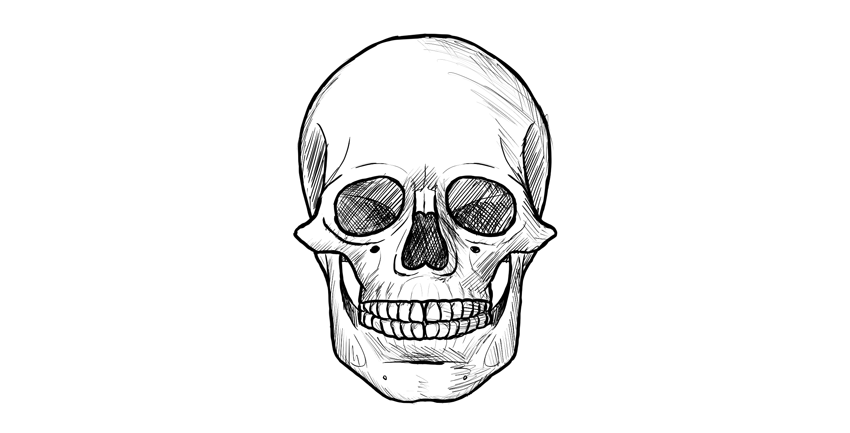


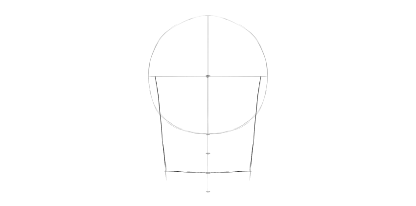


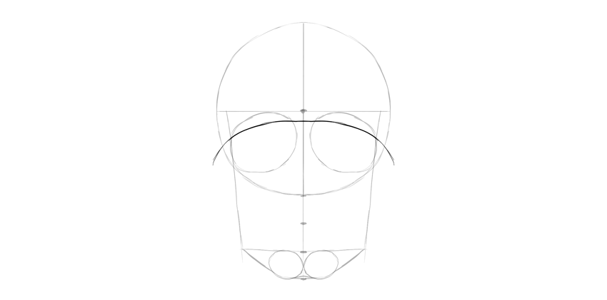


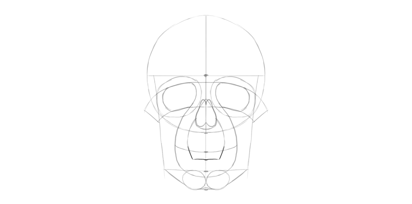


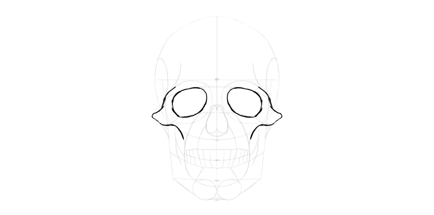


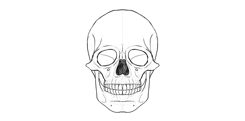
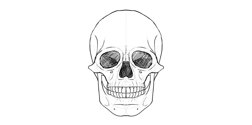


 DrawingHow to Draw a Wolf Step by StepMonika Zagrobelna
 AnimalsHow to Draw a Cute Bunny Step by StepMonika Zagrobelna
 AnimalsHow to Draw a Dolphin Step by StepMonika Zagrobelna