If you’re on the hunt for a source for free stock photos for your website or other projects, FreePhotos.cc allows you to download as many as you need. This free resource ties into the application program interfaces of several leading providers of Creative Common photos. It gathers these images in one place, categorizes them, and […]
Recently I saw an old romantic movie called „Roman Holiday” for the hundredth time, and a great idea came to my mind. After that, I decided to create a modern illustration of a boy on a scooter. Then I browsed many scooter images on GraphicRiver to remind myself (actually to learn) how this form of transportation looks. After adapting the illustration to a beginner’s level, I came up with this idea.
In this tutorial, you will learn how to create a boy on his scooter using basic shapes and warp effects.
Let’s have a look and get started.
1. How to Create the Scooter
Step 1
After opening Adobe Illustrator, create a New Document with 850 x 850 px Width and Height. Using the Ellipse Tool (L), draw an oval. In the image below, you can see which Fill color you need. Behind the oval, create the same colored rounded rectangle by using the Rounded Rectangle Tool.
To align these two shapes, open the Align panel (Window > Align). Set Align To:Align to Selection (open the fly-out menu and go to Show Options if you don’t see the Align To: section shown here), make sure that your shapes are selected, and click the Horizontal Align Center and Vertical Align Center buttons. In the end, your rounded rectangle should be in the middle of the oval.
Create a grey rectangle using the Rectangle Tool (M). Place it behind (Control-X, Control-B) the existing shapes.
For the handles, create a pink rectangle with the Rectangle Tool (M) and place it in front of the grey rectangle on the left side. Create a Copy of this rectangle: select it and while holding the Shift and Alt keys, drag it to the right. This way, you’ll create a second copy of this rectangle which will be horizontally aligned. Group the two handles (right-click > Group) and Align all the shapes by pressing the Horizontal Align Center and Vertical Align Center buttons.
Finally, add a grey oval in the middle of the dark yellow one.
Step 2
Create a new rectangle and attach it below the existing shapes. Next, add a large rounded rectangle by using the Rounded Rectangle Tool, and slightly deform it. Select the large rounded rectangle and go to Effect > Warp > Inflate. Enter the options you see below. This is the front of our scooter.
Step 3
This may seem like a lot of text, but it’s not too hard to do if you read it carefully.
Let’s add the front wheel. First, create a small dark grey rectangle. In the first image you can see the zoomed in shape. In the middle of the top and bottom sides of the rectangle, add two new anchor points. To do this, select the Pen Tool (P) and simply click on the middle of each side of the rectangle.
Next, we need to move these anchor points down. Select these anchor points with the Direct Selection Tool (A), and move them down using the Down Arrow key on your keyboard until you get a result similar to the one in the second image below.
Create a grey rounded rectangle and place the V-shape on top of it.
Next, we will make a Copy of the V-shape. Select it and drag it down while holding the Shift and Alt keys. While the newly created V-shape is selected, press the Control-D buttons the required amount of times (in my case it is six) to repeat the previous step to create a new group of these shapes exactly the same distance from each other.
Now we need to cut off the unnecessary parts of the V-shapes, which are out of the boundaries of the rounded rectangle. Make a Copy of this rounded rectangle in front (Control-C, Control-F), cut it off (Control-X), and place it in front of everything (Control-F).
Here is a short explanation of such manipulations: when you create a copy in front of the rounded rectangle, this copy will appear just in front of the original. Keep in mind that it’s not in front of the V-shapes we already created. Then we need to cut off the copy and place it in front of everything so that it now appears in front of the original rounded rectangle and V-shapes.
Keeping this copy and all V-shapes selected, press the Crop button on the Pathfinder panel (Window > Pathfinder).
Step 4
Now we will add a cover above the front wheel. For this purpose we will need a rounded rectangle, which will have exactly the same shape as the wheel, but slightly larger in its size. If we simply enlarge it, the rounded corners will be not proportional. Therefore we will use the Offset Path.
So, keeping this copy selected, go to Object > Path > Offset Path. Set the parameters Offset: around 10 px, Joins: Miter; Miter limit: 4. All these values are approximate, and it depends on the size of your original shape. Set the color of the newly created rounded rectangle to light brown. Next, place it in front of the image (Control-X, Control-F).
We will need just the upper part of this shape, so cover its lower part with any color rectangle. Keeping these two shapes selected, go to the Pathfinder panel and press the Minus Front button. There you go! You have just created the front wheel.
Step 5
Place the wheel in front of the scooter. Then we will add one more detail. Using the Rectangle Tool (M), create a thin dark yellow rectangle and place it in front of the scooter as shown in the image below. Make a Copy of this rectangle (drag it down while holding the Shift and Alt keys) and use the Control-D buttons to repeat copying this shape three more times.
Step 6
And now for the final detail for our scooter—the mirror. For the mirror holder, we will use a thin grey rectangle, slightly inclined to the left and attached to the left handle of the scooter. Attach the mirror (yellow ellipse) slightly rotated clockwise.
To make a Copy of this mirror select the mirror with its holder, right-click your mouse and select Transform > Reflect. Once you get a dialogue box, select Axis Vertical, Angle 90 degrees, and press Copy. Move the newly created mirror to the right.
Our cool scooter is ready to ride!
2. How to Create the Boy’s Head
Step 1
Let’s begin illustrating the boy’s head. Using the Ellipse Tool (L), draw an oval. In the image below, you can see which Fill color you need. Then go to Effect > Warp > Inflate. Enter the options you see below.
Step 2
Using the Ellipse Tool (L), create a small ellipse and Rotate it to the left. This is the left ear, so we’ll put it on the left side of the head. While it’s selected, take the Reflect Tool (O), hold down the Alt key, and click the forehead in the center of the face. In the new dialogue window, select Vertical, Angle 90 degrees and press Copy. Voila! We have two ears now.
Step 3
Now let’s create the neck. Using the Rectangle Tool (M), draw a small rectangle under the head. While it’s selected, go to Effect > Warp > Arc Lower and enter the following options:
Step 4
To create the mouth, draw a white ellipse. Cover the upper half of this ellipse with any Fill color rectangle. While keeping the rectangle and ellipse selected, go to the Pathfinder panel and press the Minus Front button. The boy is smiling now!
Step 5
Select the head, and make a Copy behind (Control-C, Control-B). Make this copy bigger and change its Fill color. Add an ellipse onto the top of the head with the same Fill color.
We will use the Warp Tool (Shift-R) to style his hair. Double-click on the Warp Tool (Shift-R) and enter the options you see below in the second image. Note that the arrows in the first image show how to move your mouse, but you can actually create any hairstyle you want. It is very important to select the object before you use the Warp Tool (Shift-R)—otherwise you will affect other objects surrounding it.
This way you can also create a woman with a girlish hairstyle.
Step 6
Since the boy rides his scooter during the summer, let’s give him a pair of sunglasses. Create an oval with a dark grey Fill color. To create the sunglasses shape shown below, go to Effect > Warp > Arch and enter the options shown. Expand this shape (Object > Expand Appearance).
Make a vertical reflection of this shape. Then add an arc using the Arc Tool between the two glasses as a bridge.
With the help of the Arc Tool again, draw the left temple of the sunglasses. Be sure to check the Round Cap on the Stroke panel.
Create a vertical reflection of the left temple to get the right temple. The sunglasses are ready!
Then place the sunglasses on.
3. How to Create the Boy’s Body
Step 1
Using the Rounded Rectangle Tool, create a pink rounded rectangle and attach it to his head. Place it behind the image of the scooter.
Step 2
To create the arms, we will start with an arc. First, Delete the Fill color and set the Stroke color the same as the body color (Shift-X). Check the Round Cap on the Stroke panel and make the Weight of this stroke very thick (around 30-40 px).
Now, using the Arc Tool, draw the boy’s left arm. Move the handles of the anchor points using the Direct Selection Tool (A) to achieve the result you need. Make a Copy of the arm through Transform > Reflect. Move the newly created arm to the right.
Step 3
To add the boy’s fingers, Delete the Stroke color and set the same Fill color as the face (use the Eye Dropper Tool (I)). Draw a rounded rectangle which will be multiplied with the Shift and Alt keys as well as the Control-D button. We just created the fingers for his right hand.
Make another Copy of the fingers. Simply hold the Shift and Alt keys and drag them to the right to place them on the right handle of the scooter. This is his left hand.
Step 4
Let’s create the boy’s legs. Here we will use the Line Segment Tool (\). Draw a grey horizontal line. To get it straight, hold down the Shift key as you draw the line. Remember to Delete the Fill color and choose a Stroke color similar to the one shown in the image below. Before drawing, be sure to check the Round Cap button on the Stroke panel and adjust the appropriate Weight of the stroke.
The next thing we’ll do is bend this line. While keeping it selected, go to Effect > Warp > Arc. In the new dialogue window, adjust the options you see in the second image below. Place it behind the scooter.
Step 5
To finish creating the legs, add another line on the left side by using the Line Segment Tool (\). Make a Copy of this line by using the vertical reflection options we previously used for the creation of the arms.
4. How to Create the Background
Draw a square behind everything at 850 px Width and Height. That’s all we want!
Awesome Work, You’re Done!
Great job, you’re done! I hope you had fun creating this illustration of a boy who’s hurrying somewhere in a good mood. I also hope you learned some new tricks for creating your own illustration. Let’s see what you can create!
This tutorial will show you a very easy and useful tip to create colorful illuminated letters using Photoshop’s 3D material settings. Let’s get started!
Then create the text in All Caps using the font Primal, setting the Size to 90 pt and the Tracking value to 30.
Step 2
Go to 3D > New 3D Extrusion from Selected Layer. This will create a 3D mesh from the text layer.
To access the 3D mesh settings and properties, you’ll need to open two panels: the 3D panel and the Properties panel (both found under the Window menu).
The 3D panel has all the components of the 3D scene, and when you click the name of any of those, you’ll be able to access its settings in the Properties panel. So make sure to always select the tab of the element you want to modify in the 3D panel before you change its settings in the Properties panel.
Step 3
If you select the Move Tool, you’ll find a set of 3D Modes for it to the right of the Options bar.
When you choose one of those, you can then click and drag to perform changes (on the selected element in the 3D panel).
Use those modes to change the Current View to an angle you like.
2. How to Adjust the 3D Mesh and Cap Settings
Step 1
Select the 3D mesh tab in the 3D panel, and change its Extrusion Depth in the Properties panel to 15 px.
Step 2
Click the Cap icon at the top of the Properties panel, and change the Bevel Width to 1.
3. How to Modify the 3D Material Settings
Step 1
Select all the Material tabs except for the Extrusion Material’s, and use these settings (the color values used are in RGB):
Diffuse: 211, 211, 211
Specular: 180, 180, 180
Shine: 80%
Step 2
Select the Extrusion Material tab, and use these settings:
Diffuse: 121, 222, 209
Specular: 20, 41, 42
Shine: 80%
Step 3
Click the Illumination icon, and choose New Texture.
Step 4
Set the Width to 1300 px and the Height to 300 px, and click OK.
This should open the new file, but if it doesn’t, click the Illumination texture icon, and choose Edit Texture.
4. How to Create a Colorful Illuminated Texture
Step 1
Duplicate the Background layer you have in the new file.
Step 2
Double-click the copy layer to apply a Gradient Overlay effect with these settings:
Check the Dither box
Angle: 0
Use the SpectrumGradient Fill, or you can create your own colorful gradient fill that you like.
Step 3
Click the Create new fill or adjustment layer icon at the bottom of the Layers panel, and choose Levels.
Change the Levels layer’s Blend Mode to Luminosity, and change the Gamma value to 0.75.
Save and close the file.
This will create the colorful illumination material texture.
5. How to Add a 3D Shape Background
Step 1
Pick the Rectangle Tool, and click once anywhere inside the document to get the Create Rectangle box.
Set the Width to 1560 px and the Height to 1750 px, click OK, and make sure to set the rectangle’s Fill Color to White.
Step 2
Once the rectangle shape is created, go to 3D > New 3D Extrusion from Selected Path, and change the Extrusion Depth to 1.
Step 3
Click the Current View tab in the 3D panel, and choose the text’s 3D layer’s name from the View menu in the Properties panel.
Step 4
Select both 3D layers you have, and go to 3D > Merge 3D Layers.
Pick the Move Tool, select the rectangle mesh, and use the 3D Axis to move it behind the text.
The arrows at the ends of the axis move the mesh, the part below them is used for rotation, and the cubes are used for scaling. The cube in the center is used to scale the object uniformly. All you need to do is click and drag the part you want.
Step 5
Select the rectangle mesh’s Front Inflation Material tab, and change its Specular color to (51, 51, 51) and its Shine value to 90%.
6. How to Adjust a 3D Scene’s Lighting
Step 1
Select the Infinite Light 1 tab, and change both its Intensity and Shadow Softness values to 30%.
Step 2
Use the Move Tool to move the light so that it’s facing the text, and tilt it upwards a little bit.
You can also click the Coordinates icon at the top of the Properties panel to enter numerical values.
Step 3
Select the Environment tab, click the IBL texture icon, and choose Replace Texture to open the Building Interior image.
Step 4
Click the IBL texture icon and choose Edit Texture.
Add a Hue/SaturationAdjustment Layer, and change the Saturation to -60 and the Lightness to 15.
Save and close the file.
Step 5
Change the Intensity to 65%, and set the Ground Plane Shadows Opacity to 0.
Use the Move Tool to move the texture around to get a result you like.
Step 6
Use the Move Tool’s 3D Modes to change the Current View to an angle you like, and make sure that the rectangle mesh’s edges are not visible.
Step 7
Go to 3D > Render 3D Layer. The rendering might take a while, but you can stop it any time by pressing the Esc key.
You can also stop the rendering to adjust the lighting, the camera view, or anything else you think needs tweaking, and render again until you get a result you like.
Congratulations! You’re Done
In this tutorial, we created 3D meshes from text and shape layers, adjusted their material settings, and used a gradient fill for the illumination texture to create the colorful illuminating effect.
Then, we adjusted the lighting of the scene, as well as the camera view, to render the final result.
Please feel free to leave your comments, suggestions, and outcomes below.
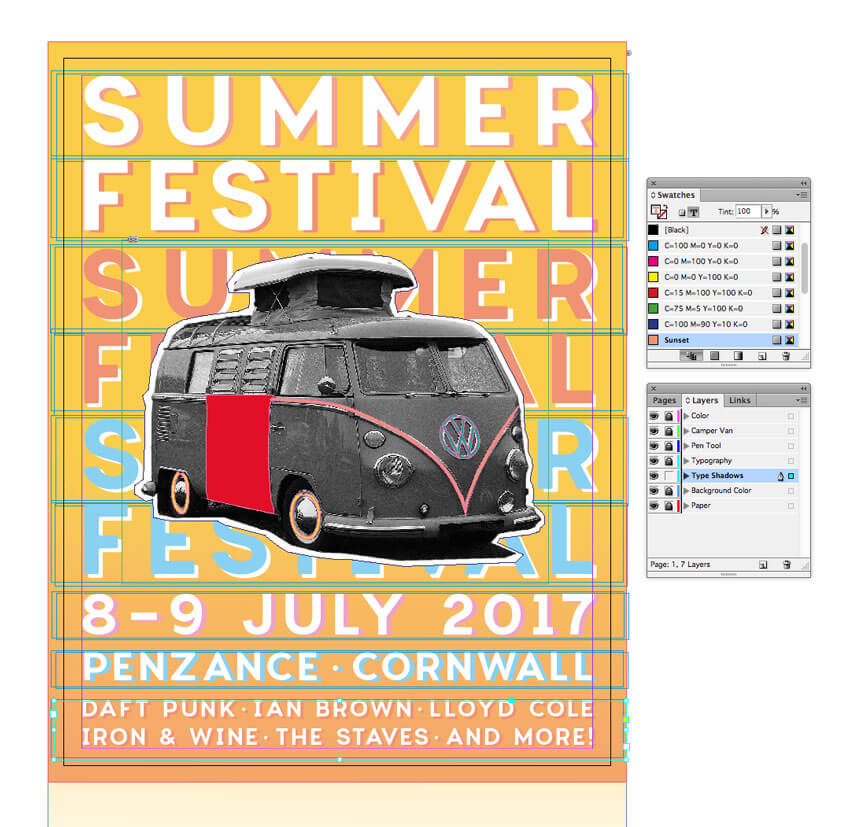
Summer is here, and festival season is in full swing. If you’re promoting a festival event this year, you can give your publicity a vintage twist with this groovy flyer design. It’s simple to create and will make a fantastic summery statement.
We’ll be putting together the flyer layout in Adobe InDesign, and using Photoshop and Illustrator to do some colorful image editing. If you’re a relative beginner to Adobe software, this is a great all-round introduction to creating layouts for print or circulating online.
Need a festival flyer quickly? You’ll find an awesome selection of easy-to-customize flyer templates on GraphicRiver.
OK, are you ready for the best summer ever? Great! Let’s get started…
What You’ll Need to Create Your Flyer
To put together the flyer, you’ll need access to the classic trio of Adobe applications: InDesign, Photoshop and Illustrator. If you’re not quite ready to commit to a software purchase, you can get a free 30-day trial of all these apps over at adobe.com.
You’ll also need to download the following images and font files:
Make sure the font is installed on your system before starting the tutorial. When you’re ready, we can dive right in to setting up our layout.
1. How to Set Up Your Layout in InDesign
Step 1
Open up InDesign and go to File > New > Document.
In the window that opens, keep the Intent set to Print and Number of Pages to 1, and uncheck Facing Pages.
From the Page Size drop-down menu, choose Flyer 8.5×11 or manually type in a Width of 8.5 in and a Height of 11 in.
Add a Margin of 0.2756 in (7 mm) and a Bleed of 0.25 in around all the edges of the page. When you’ve done that, go ahead and click OK.
Step 2
Expand the Layers panel (Window > Layers) and double-click on the Layer 1 name. Rename it Paper and click OK.
Take the Rectangle Frame Tool (F) from the Tools panel and drag onto the page, creating a frame that extends up to the edge of the bleed on all sides. Go to File > Place, choose your paper texture image, and click Open.
Allow the image to fill the whole frame by scaling it, holding Shift while you do, and rotating (Right-Click > Transform > Rotate) if necessary.
3. How to Add a Sunset Background to Your Flyer
Step 1
Return to the Layers panel and click on the Create New Layer button at the bottom. Double-click the layer to open Layer Options. Rename the layer Background Color.
Lock the Paper layer below, activating the Background Color layer.
Step 2
Expand the Swatches panel (Window > Color > Swatches) and click on the New Swatch button at the bottom.
Double-click the swatch to open the Swatch Options window. Name the swatch Sunset, set the Type to Process and Mode to CMYK, and adjust the percentage levels to C=0 M=53 Y=55 K=0. Click OK.
Step 3
Select the Rectangle Tool (M) and create a shape that covers the bottom half of the page. Set the Fill to Sunset and Stroke to [None].
With the shape selected, head up to Object on the top menu and Effects > Gradient Feather.
Give the shape a 90 degree gradient, pulling the dark slider along to the right.
Step 4
Create a second New Swatch, naming it Sunrise. Set the levels to C=2 M=19 Y=83 K=0.
Use the Rectangle Tool (M) to create a new shape, extending it across the whole of the page, and pulling it down past the bottom edge of the page by about a quarter-page.
Go to Object > Effects > Gradient Feather, and apply a -90 degree Gradient. This will create a subtle sunset effect.
4. How to Create a Collage Effect for Your Design
Step 1
File > Save your InDesign document, and minimize the window for now. We’ll be coming back to it a bit later.
Open up your camper van image in Photoshop, and Duplicate and then Lock the background layer to keep a copy of the original image. We want to separate the van in the foreground from its background, but we can do this in a rough way which will add to the cut-out collage effect.
Use the Polygonal Lasso Tool (L) to trace around the edges of the van, looping off sections and clicking on the Refine Edge button at the top of the workspace.
Use the Shift Edge slider to make the selection as tight as possible, before hitting OK once you’re happy. Then Delete the selection.
Work your way around the whole van, including the shadow below, until you have isolated it. Then head up to File > Save As, and Save your image as a Photoshop (PSD) file.
Step 2
Minimize the Photoshop window and head back into InDesign.
Create a New Layer and name it Camper Van. Lock the two layers sitting below.
Use the Rectangle Frame Tool (F) to create a frame in the center of the page and File > Place, choosing your camper van Photoshop image. Center it nicely within the frame.
Step 3
Create a New Layer and name it Pen Tool. Drag this down to sit below the Camper Van layer and above Background Color.
Take the Pen Tool (P) and click around the edge of the van, leaving a little gap between the edge of the photo and the line.
Continue to trace your way around, joining the shape up at the first anchor point.
From the Swatches panel, change the Fill of the shape to [Paper] (white) and the Stroke to [None].
This creates a great little cut-out collage effect.
Step 4
Create a New Swatch, name it Cherry, and set the levels to C=0 M=130 Y=94 K=0.
Create a New Layer at the top of the layer sequence and name it Color. Lock the other layers below.
Use the Pen Tool (P) to pull out a part of the van in your Cherry swatch. Here, I’ve traced the central door, but you could try a window if you like.
Step 5
Minimize the InDesign window for a minute. You can also create playful colored elements for your collage using Illustrator.
Open up Illustrator, and File > Place your camper van image. Lock this onto its own layer, creating a New Layer above to work on.
Select the Paintbrush Tool (B) and click on the Brush Definition drop-down menu at the top of the workspace. Click on the Brush Libraries Menu and choose Artistic > Artistic_ChalkCharcoalPencil.
Select Chalk – Blunt from the brush window that opens. Draw around the VW logo, tracing the outside edge.
Then trace the inside details too.
Step 6
You can trace other elements too, like the nice V-shaped swoop across the front of the van…
… and the wheels as well.
Don’t worry about perfecting color here—I’ve just used a bright yellow to show you the shapes clearly. For now, select the VW shape only and Edit > Copy, before minimizing the Illustrator window.
Step 7
Head back to your InDesign document and create a New CMYK Swatch. Name it Turquoise, and set it as C=79 M=11 Y=48 K=1.
Edit > Paste your VW vector shape onto the page, and scale using Shift to match the proportions of the image below. Adjust the Fill to Turquoise.
Return to Illustrator, select the V swoop, and Edit > Copy; head back to InDesign and Edit > Paste. Set the Fill to Sunset.
Finally, Copy and Paste over your wheel shapes. Set the Fill of these to Sunrise.
Great work so far—your camper van’s looking groovy!
5. How to Create Letterpress-Style Typography
Step 1
Create a New Layer. Name it Typography and sit it above the Background Color layer and below Pen Tool.
Use the Type Tool (T) to create a text frame at the top of the page. Type in ‘SUMMER’ and from either the top Controls panel or the Character panel (Window > Type & Tables > Character) set the Font to Charlevoix Pro SemiBold, Size 110 pt, Tracking 160. Set the text to Align Center from the Controls panel, and adjust the Font Color to [Paper].
Edit > Copy, Edit > Paste the text frame, moving the copy below the first. Adjust the text to read ‘FESTIVAL’ and adjust the Tracking to line up the far edges of the text with the text above.
Step 2
Select both text frames, and Copy and Paste below, adjusting the Font Color to Sunset.
Repeat the paste, this time creating a New Swatch, called Sky Blue, C=49 M=0 Y=2 K=0, and move below.
Step 3
Use the Type Tool (T) to create a series of text frames at the bottom of the page. Here you can put details like the date, location and what’s on at your event. Set all the text in Charlevoix Pro SemiBold and a [Paper] Font Color.
You can use the Glyphs panel (Window > Type & Tables > Glyphs) to insert bullets between acts.
Step 4
Make sure that you’re happy with the final layout and content of the text. We’ll be duplicating all the text to create a shadow effect, so it needs to be kept the same to look right. This is the time to do a spell check!
Head over to the Layers panel and right-click on the Typography layer. Select Duplicate Layer “Typography”.
Then drag the duplicate layer down to sit below Typography. Rename this layer Type Shadows. Lock the Typography layer above.
Step 5
Drag your mouse across the whole page to select all the text frames on the Type Shadows layer, and press the arrow keys to move the text a little to the right and down.
Select each pair of ‘SUMMER FESTIVAL’ text frames and adjust the Font Color to a contrasting shade, creating a cool letterpress-style shadow effect.
Work your way down the page, adding a [Paper] color to some text, or your custom swatch colors to others.
Eventually you’ll end up with a very nice letterpress effect, which looks great paired with your camper van collage.
6. How to Export Your Flyer for Circulation
Exporting Your Flyer for Online Circulation
If you want to circulate your flyer as an email attachment or get it ready for web upload, you’ve got a couple of options.
Head up to File > Export. Choose Adobe PDF (Interactive) from the Format menu if you want to attach the flyer to an email.
Alternatively, choose JPEG or PNG if you’d like to prep an image for uploading online.
Exporting Your Flyer for Printing
If you’re planning to get your flyer printed professionally at a print shop, you’ll need to make sure to include your bleed in the final export.
Go to File > Export, and choose Adobe PDF (Print) from the Format menu. Click Save.
In the window that opens, choose [Press Quality] from the Preset menu at the top.
Click on the Marks and Bleeds option in the left-hand menu, and check All Printer’s Marks and Use Document Bleed Settings. Then hit Export to create your print-ready PDF—you can send this straight off to the printers!
Conclusion: You’ve Created One Groovy Flyer
Congratulations, your festival flyer is finished! Now all you need to do is sit back and watch the ticket sales roll in.
Before you chill out with some awesome live music, let’s take a quick recap of some of the key skills you’ve picked up in this tutorial, which you can apply to other flyer design projects. You now know how to:
Set up a standard flyer layout in Adobe InDesign.
Create a professional backdrop of color and texture to your layout.
Edit collage-style images in Photoshop and add vector details using Illustrator.
Format letterpress-style typography to a high standard, adding an on-trend look to your design.
Export your flyer for circulating online or in print format.
That’s a lot of work—great job! If you want to explore even more festival flyer ideas, you can find a range of easy-to-customize flyer templates over on GraphicRiver. Check it out!
In this tutorial, you will learn how to use the Mesh Tool and the
Gradient Tool in Adobe Illustrator to create a spring background with a bright white fence!
Let’s start off by „painting” the background with the Mesh Tool (U).
Just create a rectangle, Fill it with a gray color #F5F3EA and, using the Mesh Tool, create a grid in the rectangle.
Continue by coloring the nodes, as indicated in the picture below.
Here are the colors you will need for each step:
#F5F3EA
#399F92
#AAD2C9
#52531A
#D7D483
#CCD8C1
#E0E6C8
#BFD9C7
Step 2
Let’s move on to creating the grassy hills! The process is very similar to Step 1, but in the end you will have to bend your hill with the Mesh Tool.
Just create a couple more nodes and make the shape wavy by dragging them!
Here are the colors you will need:
#E7E3AB
#C5CD60
#95A542
#5B6D1C
Step 3
Using the Mesh Tool again, similarly create another hill with the following colors:
#DFDFA8
#BAC569
#6C8427
Step 4
Place both hills on top of our previously created background. The smaller hill should be partly hidden under the bigger hill.
Step 5
Now, create a rectangle with No Fill over the top of the background, „framing” the picture. Make sure every element you want to be visible is inside the rectangle.
Then, select all of the elements and after right-clicking, choose Make Clipping Mask.
We will be using this tool a couple more times in the tutorial, so don’t forget it!
Step 6
With the Clipping Mask created, our first part of the picture is done!
2. How to Create the Fence
Step 1
Let’s begin by drawing the shape of the fence boards.
Grab the Pen Tool (P) and draw a half of a fence board. Once you’ve finished the outline, right-click on it and choose Transform > Reflect. Select the Vertical Axis and click Copy to create the second half of the shape.
Step 2
Now, move the second half so it perfectly mirrors the original half (the colors below are just for illustration).
After you’ve managed it, select both parts and in the Pathfinder menu, choose Unite. This will create a full, symmetrical outline!
Step 3
Fill the shape with a grey color (it doesn’t matter which for now).
Grab the Lasso Tool (L) and select the two middle nodes on the bottom of the shape. Press Delete to get rid of them.
This will be very important later, so don’t skip this step!
Step 4
As there is now a gap at the bottom of the shape, use Object > Path > Join to unify it again.
Create a Copy of the outline and put it aside!We will need it later.
Step 5
Let’s add some depth to our fence board! Go to Effect > 3D > Extrude and Bevel and fill in the following settings for the Rotation:
-7°
19°
-2°
The Extrude Depth should be about 5 px.
Step 6
After applying the effect to the shape, create paths out of it by going to Object > Expand Appearance.
Ungroup the result a couple of times until you get three separate paths.
Step 7
Select the two paths forming the side of the fence post and Unite them in the Pathfinder panel.
Step 8
Color the front of the fence with #F1EBE1 and the side with #D8CFC2.
Step 9
For this step, you will need a photo of a wooden plank with a texture.
I recommend using my own photo, which you can download as an attachment for this tutorial (texture.jpg).
Move the photo into the file with your spring background and open the Image Trace panel (Window > Image Trace).
After selecting the object with the texture, input the settings I chose into the panel (you might need to click Advanced to show the rest of the settings) and click Trace.
Image Trace Settings:
Mode: Black and White
Threshold: 164
Paths: 50%
Corners: 75%
Noises: 25px
Create: Fills
Ignore White: Checked
Step 10
Select the result of the trace and go to Object > Expand.
Step 11
In the Transparency panel, set the Opacity to 30% and the Transparency Mode to Overlay.
Step 12
Grab the outline we created in Step 4 of this section and place it over the top of the texture. Make a Clipping Mask out of the two shapes.
Lay the result over our fence post.
Step 13
Drag the post a bit to the right while holding Shift and Alt, creating a Copy of it at a reasonable distance.
Continue by pressing Control-D to repeat your last action, effectively creating as many boards as you want. Stop at your preferred fence length.
Step 14
Now let’s create a back board for our fence!
First, draw a rectangle a bit longer than your fence. Color it with #EEE7DE. Add another, much narrower rectangle on top and color it with #E2DCD2.
Step 15
In this step, we will be making shadows that are being cast by the fence posts.
Draw two vertical rectangles side by side, coloring them with #7B6F5B (the left one) and #DEDBD2 (the right one). The right rectangle should be a bit wider.
Next, set the right rectangle’s Opacity to 0% and continue to Object > Blend > Blend Options. Set the Spacing to Specified Steps and choose 30 for the amount.
Finally, select both rectangles and go to Object > Blend > Make.
Step 16
Move the blend onto the board we created. Just like before, use Control-D to Duplicate the shadow across the whole board.
Step 17
Move the board with the shadows behind the fence. Try to line up the shadows perfectly!
Step 18
Finally, we will create the screws that hold our fence in place.
Use the Mesh Tool (U) to recreate the likeness of a screw, following the steps below.
Here are the colors you will need:
#D1D0C7
#535044
#AAA99F
#B0AFA5
#000000
Step 19
Use two circles for the shadow. Create a smaller one inside the bigger one but slightly off center. Color the bigger circle with #D8D4C9 and the smaller one with #6C6557.
Set the light circle’s Opacity to 0%, and then proceed with Object > Blend > Make.
Step 20
Place the Mesh on top of the shadow and turn it slightly. Our screw is done!
Step 21
Place the screw on top of the finished fence in the middle of each intersection.
Use Control-D to Duplicate the screws after moving one (while holding Alt and Shift).
3. How to Create Clouds and Grass
Step 1
Now that our fence is done, the image needs just a couple of finishing touches!
After you’ve finished your grass vector, return to the fence we made in the previous section. Place it over the top of your grass banner so that the bottom part of the fence is sticking out a bit.
Next, create a Copy of the grass and move it on top of the fence. Make sure to place it lower so that you can actually still see the fence!
Step 5
All that’s left is to move the fence and the grass onto our background! Don’t forget to use a Clipping Mask to „crop” your image!
Creating and launching a website is a great deal. However, if you think that once you launch a website, you’re done, you’re likely to miss quite a lot. A website requires constant care and regular updates. Why is updating a website important? There are several quite important factors why you should consider regular investments to […]
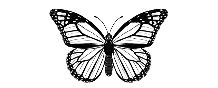
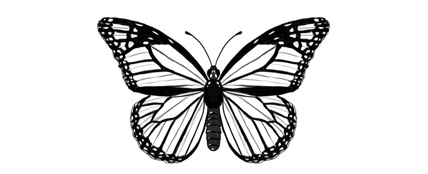
Butterflies are a wonderful drawing subject—their wings have a certain pattern that can be reduced to a few rules. Once you know the rules, you can draw a realistic-looking butterfly without any special drawing skills.
In this tutorial I will show you how to draw a monarch butterfly step by step, right from scratch. You can also modify my method to draw any other butterfly!
Before You Start
But what is it, this monarch butterfly? Let’s take a look before we start drawing:
Cross the torso in half with a vertical line. This will be the length of the body.
Step 3
Draw a longer oval below; this will be the abdomen.
Step 4
Connect the abdomen to the torso with a slim waist.
Step 5
Draw a circle on top of the body—this will be the head.
Step 6
Add two ovals on the sides of the head.
Step 7
Add two tiny ovals on the front of the head. These will be the short, furry antennae called palpi.
Step 8
Draw a pair of curves for the big antennae.
Step 9
End each antenna with tiny „beans.”
Step 10
You can now outline the body and add all the necessary details. The torso is fluffy, and the abdomen is segmented.
2. How to Draw Butterfly Wings
Step 1
Mark a dot in the upper part of the torso. This will be our point of reference for placing the wings.
Step 2
Draw a horizontal line across the point. Each half should be roughly as long as the whole body (antennae excluded).
Step 3
Draw two longer lines about 30 degrees over the previous line. You don’t need to measure anything—just eyeball it.
Step 4
Draw elongated teardrop shapes around these lines, as if it were a dragonfly.
Step 5
Draw a line from the end of the horizontal line to about 60% of length of that „dragonfly wing.”
Step 6
Gently outline the shape of the upper wing.
Step 7
The lower wing can be created in a similar way. Draw two lines down from the point, slightly below the abdomen.
Step 8
Draw a line between each end of the lines and the upper wings.
Step 9
Draw a line from the torso point to close the triangular shape of the wing right under the upper wing.
Step 10
Mark a point in the center of the farthest line of the triangle.
Step 11
Cross each point with a line coming from the torso.
Step 12
Outline the shape of the lower wing.
3. How to Draw the Cells of Butterfly Wings
Step 1
Now we’re going to divide each wing area into smaller areas called „cells.” First, mark three points in the area shown below.
Step 2
Draw an elongated cell through these marks.
Step 3
Use the same trick to draw a similar cell in the lower wing.
Step 4
There will be more cells starting here. Mark their starting points.
Step 5
Draw gentle curves from these points to the edge of the wing. Have them slightly falling down.
Step 6
The uppermost cell is divided into more cells:
Step 7
The lower wing has similar cells, going out radially from the middle:
Step 8
Each cell has a subtle „wrinkle” in the center, and it will be a useful guideline for us. Mark it subtly, to make it distinguishable from the veins.
4. How to Draw Patterns on Butterfly Wings
Step 1
Now we have plain butterfly wings, but it’s their pattern that makes them so beautiful! Let’s add a pattern specific for the monarch butterfly.
Create a margin for each wing, drawing curves between the veins.
Step 2
Mark the area where the wrinkle is—this place will be slightly less dark.
Step 3
Outline the edges of the wings, making them „bumpy” around the ends of the veins.
Step 4
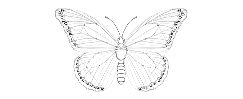
There is a pattern of bright dots in the margin. Outline them.
Step 5
The edges of the wings may look slightly ragged because of white lines placed between the veins and the wrinkles. This is a subtle effect, but it will add to the realism of the wings.
Step 6
Draw some markings in the upper part of the upper wings.
Step 7
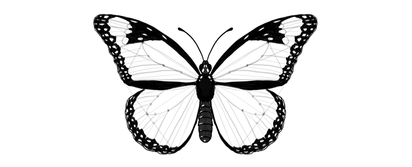
The pattern is created not by lines only, but mostly by contrast. So we need to darken certain parts to achieve realistic results. First, darken the body. It may have some pattern on it as well!
Step 8
Darken the side margins, leaving brightness where the markings are.
Step 9
Darken the margins, moving carefully around the little markings.
Step 10
Darken the area around the markings in the upper wing.
Step 11
The veins have a dark outline, so mark it. You can also subtly mark the wrinkles to make the drawing more detailed.
Beautiful!
Good job, you have drawn a beautiful butterfly! If you want to learn more about butterflies, their anatomy, and other species, make sure you check this tutorial as well:
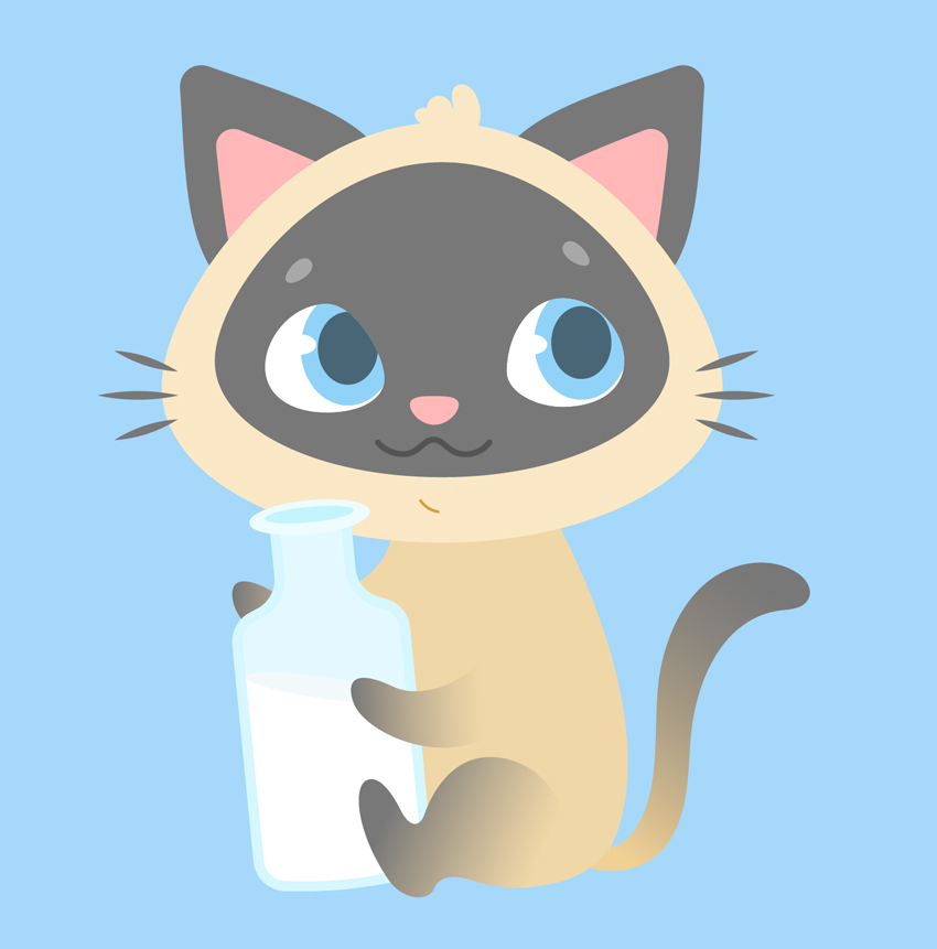
Ever wanted to illustrate a kid’s book or learn to design cute cartoon characters? This tutorial might be interesting for you! We’ll go through a fun and easy process of creating a cute Siamese kitten in Adobe Illustrator, using simple shapes, Warp Effects and the Pencil Tool with a bit of freehand drawing. Ready to begin?
By the end of this tutorial, you’ll have discovered new tips and tricks that you can apply to your future works, creating more characters like these Cute Cartoon Animals from GraphicRiver.
1. How to Draw the Cat’s Head
Step 1
Let’s start by creating a New Document of 600 x 600 px size and RGB Color Mode. Use the Rectangle Tool (M) to make a rectangle of the same size and Fill it with a light blue color for the background.
Step 2
We’ll start with the base of the head. Use the Ellipse Tool (L) to make a 285 x 215 px light beige oval. Selects its side anchor points with the Direct Selection Tool (A) and drag them a few pixels down, making the bottom of the shape somewhat flatter. You can move them by holding down Shift and either clicking and dragging with your mouse or by using the Down Arrow key of your keyboard.
Copy (Control-C) the shape and Paste in Place (Shift-Control-V). Hold down Alt-Shift and make the copy smaller. Change its color to pale grey.
Step 3
Let’s attach a couple of ears to the kitten’s head. Firstly, take the Polygon Tool (it is located in the same drop-down menu as the Rectangle Tool (M)) and single click anywhere on the Artboard to open the Options menu.
Set the Sides value to 3 and create a triangle of the same pale grey shape as we have for the face. You can use the Eyedropper Tool (I) to pick and apply the color if it isn’t selected in the Colors panel.
Now let’s transform the shape to make it look more like an ear. Keeping it selected, go to Effect > Warp > Bulge and set the Vertical Bend value to 40%;Horizontal Distortion to -10%. In this way, we’re bulging our shape and bending it to the left.
Object > Expand Appearance to apply the effect. Select its top anchor point with the Direct Selection Tool (A) and drag the circle marker of the Live Corners down, making the top of the shape rounded. We can also adjust the Corner Radius from the control panel on top, if needed.
Step 4
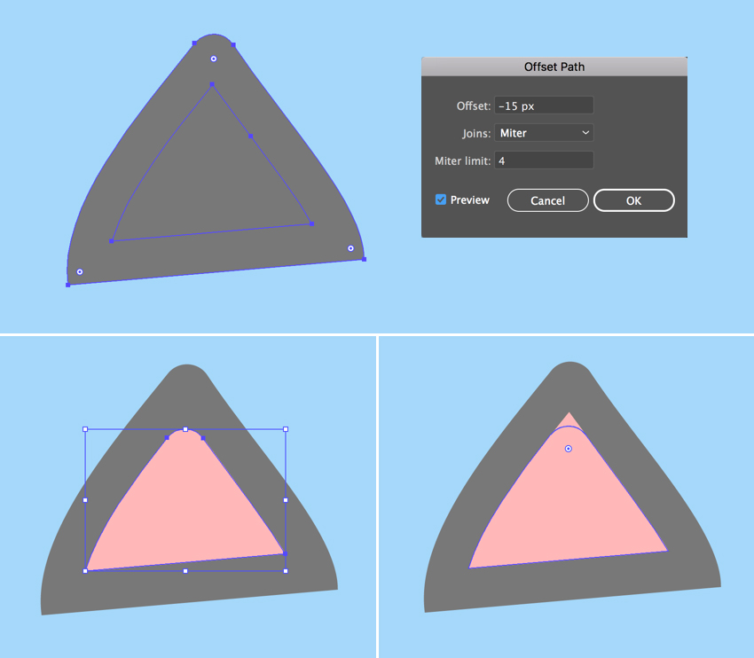
Keeping the shape selected, go to Object > Path > Offset Path and set the Offset value to -15 px, leaving all other options as Default. Click OK to create a smaller triangle and Fill it with rose pink color, thus creating the inner part of the ear.
Make the top of the pink shape rounded as well, using the Direct Selection Tool (A) and the Live Corners feature.
Step 5
Group (Control-G) both elements of the ear and attach them to the head, Rotating and resizing the ear to make it fit the head.
Double-click the Reflect Tool (O), select the Vertical Axis and click Copy to make a mirrored copy of the ear. Attach it to the opposite part of the head.
Step 6
Let’s go on and draw the face of our character. Use the Ellipse Tool (L) to make a 65 x 55 px white ellipse for the eyeball. Use the Direct Selection Tool (A) to shorten the right handle of the top anchor point and the top handle of the right anchor point, making the right edge of the eye more slanted.
Now add a 50 x 60 px light blue oval for the iris and a 30 x 37 px dark blue ellipse for the pupil. Place the shapes as shown in the screenshot below, covering the right half of the eyeball.
Step 7
Add a tiny white ellipse for the highlight, and let’s see how we can hide the unneeded parts of the iris.
Copy (Control-C) the white eyeball, Paste in Front (Control-F) and Bring to Front (Shift-Control-]). Now select all the elements of the eye, click the right mouse button, and Make Clipping Mask, thus placing everything inside the top copy, which serves as an imaginary container. All the shapes inside this container are still editable. You can find the Clip Group in the Layers panel, unfold it, and move, edit and rearrange the objects.
Step 8
Use the Reflect Tool (O) to Flip the eye over the Vertical Axis and make a Copy. Move the iris and its elements inside the Clipping Mask to fix the kitten’s gaze.
Step 9
Now let’s draw the nose. Make a 25 x 15 px light pink ellipse and reshape it a bit with the Direct Selection Tool (A), moving its top and bottom anchor points down to make it look more like a rounded upside-down triangle.
Make another ellipse of 13 x 12 px for the brow, Fill it with light grey color, and reshape it slightly. Rotate the brow and use the Reflect Tool (O) to add a second one.
Step 10
Let’s move on and depict a mouth. Use the Line Segment Tool (\) while holding down Shift to draw a straight horizontal line. Apply a dark gray Stroke color from the Color panel. Adjust the thickness of the line either from the control panel on top or from the Stroke panel (Window > Stroke) by setting the Weight to 3 pt and Cap to Round Cap.
Go to Effect > Distort & Transform > Zig Zag. From here, set the Size to 4 px, Ridges per segment to 3, and Points to Smooth. Adjust the Ridges per segment value if your result differs from the one presented in the image below.
Step 11
Object > Expand Appearance to apply the effect. Now we can edit the tips of the line using the Direct Selection Tool (A). Rotate the anchor handles down to make the corners of the mouth rounded.
Step 12
Let’s draw the whiskers using the Ellipse Tool (L). Make a 40 x 3 px dark-grey circle, select its side anchor points with the Direct Selection Tool (A), and Convert selected anchor points to corner from the control panel on top, making the tips of the ellipse sharp.
Duplicate (Control-C > Control-F) the shape a few times, making the copies smaller and Rotating them to add more whiskers.
Step 13
Finish off the kitten’s head by adding a funny tuft of hair on top, using the Pencil Tool (N). You can adjust the tool’s settings by double-clicking it to open the Pencil Tool Options window. From here, move the Fidelity slider further right if you want to make the lines smoother or further left if you’re using a graphic tablet and have a firm hand.
2. How to Draw the Kitten’s Body With the Pencil Tool
Step 1
Let’s start making the body with an ellipse. Create a 160 x 210 px ellipse of dark beige color. Use the Direct Selection Tool (A) to select both side anchor points and drag them down, making the shape look more like an egg.
Send the ellipse to Back (Shift-Control-[), beneath the head.
Step 2
Now grab the Pencil Tool (N) and let’s practice our hand drawing a bit. Draw a front right paw and attach it to the body, as shown below.
Let’s apply a simple Linear Gradient to the paw, making the kitten look more like a Siamese one. Use the Gradient panel (Window > Gradient) to apply a dark-grey color to the left slider and the Gradient Tool (G) to adjust the direction of the gradient, so that it blends nicely with the body.
Duplicate the paw and place the copy as shown in the screenshot below.
Step 3
Now let’s add the back paws. Use the Pencil Tool (N) to draw the desired shape of the paw, Send to Back (Shift-Control-[), and make it slightly darker than the body in order to separate the elements from each other. You can either apply the same gradient to this paw or not, because it will be hidden behind the bottle. In case you want to animate your character or change some of its details later, make sure you’ve applied the same gradient to all the paws. Just select the paws and use the Eyedropper Tool (I) to pick and apply the appearance.
Finish up with the body parts by adding a funny curled tail using the Pencil Tool (N), and Fill it with the same Linear Gradient.
Great! Looks like our kitten is ready! Let’s add a final detail to it.
3. How to Draw a Bottle of Milk
Step 1
As you might already know, cats are actually lactose intolerant and, hence, indifferent to milk. However, as we’re creating a kid’s illustration with an imaginary character, we can draw anything we want, whether it’s a milkshake or a green smoothie or a can of soda, depending on the purpose of the image. In our case, let’s make our kitten a milkshake lover!
So let’s start building our bottle from a 90 x 150 px light blue rectangle. Add a 40 x 65 px rectangle and place it over the top of the first one, forming a bottleneck.
You can Align both shapes either to the Artboard or to the Key Object, using the Align panel (Window > Align). Select both shapes and click Horizontal Align Center to Align to Artboard. If you want to align to one of the objects, click both shapes and click one of them once again. You will see a thicker selection around it, indicating that this is the Key Object.
Once you’re happy with the result, select both shapes and Unite them in the Pathfinder panel, merging them into one silhouette.
Step 2
Let’s select the corners of the bottle with the Direct Selection Tool (A) and make them rounded by pulling the circle marker of the Live Corners. Select the inner corners between the body of the bottle and the bottleneck, and smooth them out as well. You can adjust the Corner Radius from the control panel on top if you like round numbers, or you may leave it as it is if it looks good.
Grab the Curvature Tool (Shift-‘) and make the bottom of the bottle slightly rounded by bending its edge down.
Step 3
Go to Object > Path > Offset Path and set the Offset value to -5 px, creating a smaller silhouette inside. Fill it with the lighter blue color to make the glass edges of the bottle thick. Duplicate (Control-C > Control-F) the new shape and Fill the copy with white for the milk.
Step 4
Let’s make the bottle half-empty! Create an ellipse, Rotate it, and resize it, making it fit the inner part of the bottle. Select both the ellipse and the milk shape. Now grab the Shape Builder Tool (Shift-M), hold down Alt and, as soon as you see a tiny minus sign next to your mouse cursor, hover it over the top half of the milk shape. Once it becomes gray, single click it in order to Delete this piece. Great! Half of the milk is gone!
Step 5
Let’s form the top of the bottleneck. Make a 60 x 20 px ellipse and Fill it with a blue color slightly lighter than the body of the bottle. Create a smaller ellipse inside the first one to form a hole, either making it manually or using the Offset Path function.
Step 6
Now that the bottle is finished, let’s Group (Control-G) all of its elements and place it in the kitty’s paws. We can do it by positioning the bottle in the desired place and then either Sending it Backward (Control-[) a few times or dragging it down manually in the Layers panel.
Step 7
Let’s add a straw, making the image more detailed. Use the Pen Tool (P) to draw a polyline. Apply pink color for the Stroke in the Colors panel. Then open the Stroke panel and set the Weight to 4 pt, making the straw thicker.
As with geometric shapes, we can use the Live Corners function for the polylines. Just select the corner anchor point with the Direct Selection Tool (A) and make it slightly rounded.
Once you’re happy with how it looks, Object > Expand the line to turn it into a shape.
Step 8
Since the bottom part of the straw is located inside the bottle, its color should differ from the top part, as it is dimmed behind the glass.
Let’s see how we can achieve this effect. Select the straw and the inner ellipse of the bottleneck. Take the Shape Builder Tool (Shift-M) and single-click the bottom part of the straw once it becomes gray. Notice that this time we’re not holding down Alt or any other key because we want to divide the shape, slicing the straw into two parts.
Fill the bottom part with lighter pink color and Send Backward (Control-[) a few times, partially hiding it beneath the bottleneck.
Step 9
This is how it looks now all together. Don’t forget to Bring the mouth shape to Front (Shift-Control-]), covering the tip of the straw.
Step 10
Let’s finish our illustration by adding any minor details to our liking. For example, here I’ve speckled a group of dark blue ellipses, placing a shadow beneath the kitten.
Meow! Our Cute Kitten Illustration Is Finished!
And there we have it! Great job!
If you want the check out the source file to see all the details, or if you need the whole set of fancy characters for your designs, you can grab these Cute Cartoon Animals on GraphicRiver.
I hope you enjoyed following this tutorial and learned some simple tips and tricks that will help you speed up your work to create more fancy cartoon character illustrations!
In the next part, Lewis Moorhead will show you how to finish the main composition by adjusting the landscape and sky elements. Then you’ll learn how to create the realistic lava effect by using a simple lava pattern.
How to Use Perspective Tools
In order for the lava to blend into the rock elements, we’ll need to adjust the perspective. Using the Free Transform Tool (Control-T), adjust the shape and position of the lava pattern with options like Distort, Warp, and Perspective.
How to Use Color Dodge
Brighten up the lava by using a New Layer set to Color Dodge. This will help make the lava pop for an incredible effect. Follow up this effect by creating the central rock element and covering it with more lava.
Want More?
Continue this manipulation in our next lesson, where we’ll add realistic cracks and smoke to the composition.
And for more amazing lessons, check out these articles:
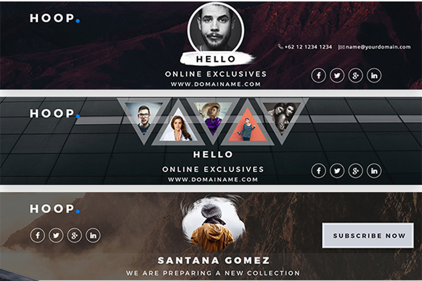
Every budding YouTube star needs a professional banner that matches their awesome channel. So explore these 41 creative premium templates to find the one that works for you!
41 YouTube Banner Templates
Want to be the next best YouTube sensation? Build your brand with an exciting banner that fits your unique style. Boost your social media game with a banner template that’s fun and easy to use!
In this collection of premium assets, we’re presenting you with 41 creative YouTube banner templates curated from GraphicRiver and Envato Elements.
Modify these templates yourself or enlist the help of a design professional from Envato Studio for all your social media needs.
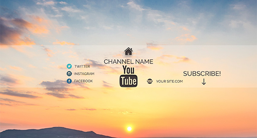
Make the most out of your social media presence with beautiful covers that show off your creative side! Suitable for any corporate, creative, or music business, this download features six amazing layouts that can be customized in Photoshop.
Stay on trend with elegant YouTube cover designs that are simply phenomenal. Offering you a range of designs to fit your personal needs, this pack features four Photoshop files with elements you can easily update. Set your own image as the main background to leave a lasting impression.
Launch your YouTube channel with a stunning modern design everyone will love! This package features four gorgeous designs with beautiful, fashionable elements. Enjoy the clean, minimalist theme to get the most out of your top banner.
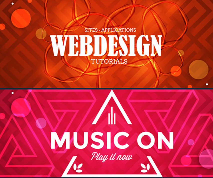
Create stunning cover art that matches your creative music. This design is great for any musician or DJ hoping to launch their brand on YouTube. Download this file to get access to three incredible layouts with fully editable layers and a simple instructional guide.
Stop your audience dead in their tracks with this brilliant YouTube cover art. This design features five amazing layouts to choose from, with a wide range of colors and themes. This template was created with a large 2120×1192 document size, so you’ll also get access to high-resolution images and amazing details.
Are you into fashion? Then you’ll want to take advantage of this stylish YouTube cover art. This template features a polished, modern design with minimalist elements to highlight your brand. Also included are detailed instructions to make your life a whole lot easier!
You’ll be destined for success with this stunning pack of Youtube channel covers. This pack features three exquisite designs with bold backgrounds and geometric elements. Switch out the main images for stocks you love for an out-of-this-world cover design!
From Justin Bieber to Tori Kelly, many incredible musicians get their start on YouTube. And you can achieve the look of a music professional with a modern banner template. This template features high-resolution images created at 300 dpi with multipurpose layouts to let your imagination run wild.
Keep up with the latest trends in banner design! Feature a YouTube cover that highlights your channel in a creative, professional way. This epic template, for instance, includes eight Photoshop files with free fonts and a polished layout. Customize this template with your own landscape photography for a pretty wicked upgrade.
Sit back and relax with a beautiful set of YouTube covers featuring sublime color schemes. The idea behind this template is to center your design around a gorgeous image with simplistic elements added for social media links and more. Subscribe to this design for an awesome layout today!
Multipurpose styles allow your brand to grow with your
channel. So check out this wicked template, featuring five professional
designs all created in Adobe Photoshop. Plug in your details and images
to get started with your new channel right away!
Change the YouTube game with impressive cover art that highlights your personality. This cool design comes complete with two different layouts, smart objects, and fully editable text layers. It’s a high-quality template that is sure to stand out, so download this cover art today!
Become an industry expert with a gorgeous YouTube
banner that matches your expertise! This incredible bundle features six
vibrant YouTube covers bursting with stylish colors and layouts.
They also include fully responsive designs that work with any device, and
free fonts you can download easily.
Step up your marketing game with this brilliant
business-themed banner package. This pack includes three high-quality
YouTube banner designs created in their own separate Photoshop files.
Use the handy smart objects to update your templates, and enjoy the
clean, fully responsive design.
Can’t get enough of these templates? Then feast your eyes on the next exciting design. This cover art is perfect for the avid photographer or any other expert creative. Included in this template are three bold color schemes with easy-to-use smart objects for your personal photos.
Teach
your viewers the latest tips and tricks in photography or gaming! This
wicked bundle features 27 amazing themes for two creative industries.
Whether you love shooting photos or conquering a wild adventure, you
can dive into these fun templates with fully editable layers and colors.
Create
a royal banner design that reflects your personal style. This unique
template features a vivid red and green color scheme with social media
icons and so much more! Enjoy the awesome minimalist background and
customize the center image with one of your own.
Upload a YouTube cover with a minimal and laid-back
design. With this simple template, you get access to three creative
layouts you can customize for more design options. Download the clean
design and enjoy the vibrant colors for your special channel.
Banner bundles are the perfect way for you to get many design options for one low price! And this pack features five elegant designs we’re sure you’ll love! They’re created as multipurpose layouts that work with a variety of industries, so download this pack today to get started!
Win over your viewers with a fun photo collage featuring your favorite moments! This collection of YouTube banners includes four colorful designs that will instantly uplift the appearance of your channel. Download this bundle today to get access to high-resolution elements and fully responsive designs.
Become the next big name in fitness! Upload a phenomenal YouTube cover design that is as intense as your workouts! This set features files that are 100% editable and fully responsive. Enjoy a beautiful design that looks great no matter which device you use.
Step out of the box with this minimalist design inspired by traditional brush strokes. This pack features two phenomenal YouTube cover styles with a light and dark version available for your convenience. Choose a stock that best complements the design, or switch it for one of your own for optimal impact!
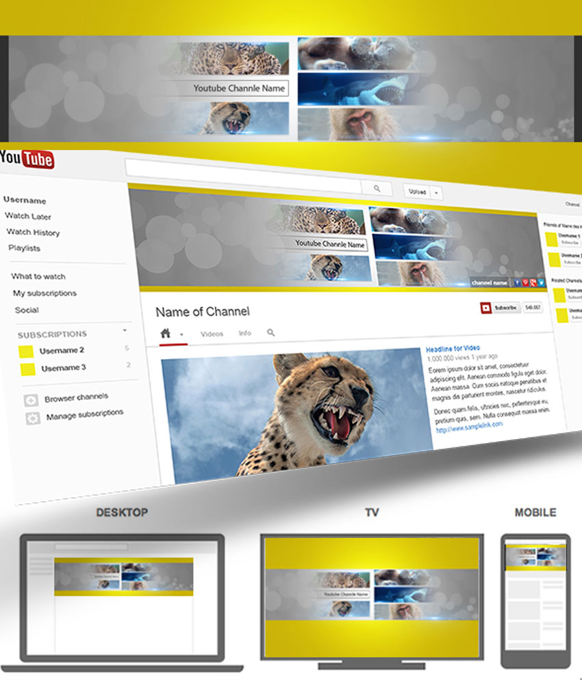
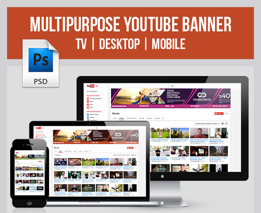
Still looking for the right cover? Then check out this ultimate YouTube banner. This banner features a fully responsive design with three color variations to choose from. Enjoy stunning banners that look great on your TV, desktop, or mobile devices.
Fill your banner with a brilliant photo collage with this amazing template! This design features organized smart objects that were created in an easy-to-use file that supports RGB mode. Though the preview images are not included, you can modify them yourself with all new stocks.
Create a minimalist YouTube banner inspired by your favorite video games! This download includes three incredible design variations with beautiful blurred backgrounds for more visual impact. Also included are free Google fonts and free icons to make your design experience so much better!
Kick off your gaming channel with an incredible background featuring your favorite video game art! This template features five striking designs with creative layouts that are sure to make you stand out. Download this pack today to get access to fully editable files and even free badges!
Or download 10 brilliant Youtube banners for one
affordable price! This bundle is packed with amazing designs featuring
multipurpose layouts, free icons, and so much more! Make the most of your
wallet with a banner bundle that is suitable for any industry!
Hungry for results? Step up your culinary game
with a YouTube channel banner that fits your brand. This tasty template
features two incredible styles created at a high resolution so that you
don’t miss out on any yummy details. Enjoy the free fonts included in
this ready-to-use file.
Get the most bang for your buck with this collection of 10 vintage-themed YouTube banners. Enjoy vivid colors that look attractive across many devices and fully editable files that are easy to use. Suitable for any business or personal channel, this pack will set you up with official cover art in no time at all!
A creative YouTube banner can turn you into an
instant professional. Try out this lovely red template, for instance,
which features a modern design you can easily edit. Simply drag and drop
your photo into the appropriate smart objects and edit the text layers
with your information.
Love the color red? Then check out this bold collection of three YouTube banners. This pack includes fully editable layers where you can modify the text or colors easily. Also included are social media icons to link to your personal profiles.
Upgrade your boring corporate YouTube covers with a clean, modern design. Set up links for direct contact to your services with this resourceful template. This template features an elegant blue theme with cool geometric lines for that added edge.
Make sure your banner works perfectly across all devices! This classic template features a professional design that is suitable for multiple Photoshop versions. Customize the main image with one of your own and update the text fast!
Set out on your next travel adventure inspired by
these banner designs. This template includes six retina-ready YouTube
banner covers with free fonts packaged into fully editable files. Update
your cover quickly in Photoshop or dive into the convenient help files
for more instruction.
Rock out with some of the best YouTube covers the market has to offer! This download includes 10 extraordinary layouts featuring beautiful colors and stylish elements. Replace the images with just one click to enjoy your template right away!
Branding is important, so make sure all your social
media profiles stand out with a clean, corporate layout. This
professional template features a fully editable file created in RGB mode
in Photoshop. Update the layers with facts about your business, and
enjoy this template in just a few short clicks!
Soccer, or football, is the world’s most popular
sport. And if you’re a die-hard fan then you’ll love to celebrate your
fandom with this incredible YouTube cover art. Get access to one modern
design with an amazing beehive design inspired by the classic soccer
ball.
Does your current banner miss the mark? Upgrade it with an awesome template that features three multipurpose layouts. This template also includes a set of vectorized elements and fully editable layers for one affordable package.
Explore wonderful, creative possibilities with this set of YouTube banners. This design is centered around a cool 3D city with six amazing color options to choose from. Use the original multi-colored version or choose a brilliant monochromatic palette instead.
One of the hottest trends in design today is the glitch effect. And you can get a cool tech-inspired YouTube banner with this amazing download. This template features one high-resolution banner design that incorporates geometric elements and vibrant colors. Keep the free font used or switch it out for one of your favorites.
Download a vibrant banner design that packs a powerful punch! This epic template features a colorful retro theme with three incredible designs to choose from. Also included are free fonts and photos so you know you’ll pay for exactly what you see!
Conclusion
This list features exciting resources for the avid designer
familiar with Adobe Photoshop. For additional help with all your social media needs, enlist the skills of a talented
professional by choosing one of the amazing designers from Envato Studio.
And with hundreds of YouTube banners available at your fingertips, chances are we’ve missed a few to add to your personal collection. Be sure to browse GraphicRiver and Envato Elements for more resources, and let us know your favorites in the comments below!
Agregator najlepszych postów o designie, webdesignie, cssie i Internecie