Archiwum kategorii: Web Tools

50+ Amazing Photo Manipulation Tutorials

Post pobrano z: 50+ Amazing Photo Manipulation Tutorials

Unleash your creativity with a fun photo manipulation. Great for beginners, these tutorials will help you brush up on your Adobe Photoshop skills while learning new and exciting techniques.

Get inspired! Browse Envato Market for incredible Photo Manipulation resources.

Easy Step-by-Step Photo Manipulation Tutorials

Master your favorite photo manipulation techniques with these step-by-step tutorials. From surreal photo manipulations to abstract and even fan art themes, we’ve got a selection you don’t want to miss out on! Get fantastic, easy-to-follow lessons from our Photoshop professionals.

  • Flying Owl Photo Manipulation

    How to Create a Flying Owl Photo Manipulation for Beginners With Photoshop

    Not sure where to begin? Try this beginner photo manipulation tutorial using just three stock photos. Learn how to build a serene forest with this quick tutorial.

    Visit Tutorial

  • Dark Gothic Portrait Photo Manipulation
    How to Create a Dark Gothic Portrait Photo Manipulation With Adobe Photoshop

    Gothic photo manipulations are always hugely popular! In this tutorial, you’ll learn how to create a dark gothic portrait by importing your images while doing some light retouching. Finish by blending them together for a wicked result!

    Visit Tutorial

  • Frankensteins Monster Photo Manipulation
    How to Create a Frankenstein’s Monster Photo Manipulation in Adobe Photoshop

    Create this classic character! Inspired by the 1931 movie, this tutorial shows you how to transform a simple photo into Frankenstein’s famous monster. Learn important techniques for manipulating expressions, as well as how to tackle eerie colors in this fun tutorial.

    Visit Tutorial

  • Cute Baby Dragon Photo Manipulation
    How to Create a Cute Baby Dragon Photo Manipulation in Adobe Photoshop

    What if you could have your very own dragon? Well with this tutorial, you’ll get just that! Create a cute baby dragon as an adorable fantasy pet! Learn how to build the dragon from real animal photos before placing it on a human hand.

    Visit Tutorial

  • Queen of Hearts Photo Manipulation
    How to Create a Queen of Hearts Photo Manipulation With Adobe Photoshop

    In this tutorial, you’ll learn how to create a Queen of Hearts manipulation inspired by the classic movie, Alice in Wonderland. First build the ornamental background, and then add the model and cards!

    Visit Tutorial

  • Dark Surreal Photo Manipulation

    How to Create a Dark Surreal Photo Manipulation in Adobe Photoshop

    One of the best styles of art out there is surreal photo manipulation. And in this tutorial, you’ll get to learn how to compose a dark abstract manipulation. Create a powerful scene that features a man with a tree head in an open, stormy field.

    Visit Tutorial

  • Realistic Feet-Inspired Hiking Boots

    How to Create Realistic Feet-Inspired Hiking Boots in Adobe Photoshop

    Before shoes were ever invented, humans relied on their bare feet to get around. In this tutorial, learn how to create a wacky pair of boots from actual foot images.

    Visit Tutorial

  •  Abstract Psychedelic Portrait Photo Manipulation

    How to Create an Abstract, Psychedelic Portrait Photo Manipulation in Photoshop

    Step out of the box with this psychedelic tutorial. With this photo manipulation, you’ll learn how to create flowy effects using the Liquify Tool in Adobe Photoshop. Explore a unique composition while learning the importance of details.

    Visit Tutorial

  • Howling Werewolf Photo Manipulation

    How to Create a Howling Werewolf Photo Manipulation in Adobe Photoshop

    Based on the 80s classic, An American Werewolf in London, this tutorial takes you along the journey of creating a custom werewolf design. Create a ferocious effect with simple images in this fun tutorial.

    Visit Tutorial

  • Fantasy Sci-Fi Portrait Photo Manipulation

    How to Create a Fantasy, Sci-Fi Portrait Photo Manipulation in Adobe Photoshop

    This tutorial is a fabulous mix of fantasy and sci-fi! You’ll learn amazing techniques for achieving a galactic fantasy portrait. Create an exceptional result that blends a model’s photo into a colorful space background.

    Visit Tutorial

  • Apocalypse-Inspired Photo Manipulation

    How to Create an Apocalypse-Inspired Photo Manipulation in Adobe Photoshop

    Are you a huge fan of the X-Men movies? In this tutorial, learn how to create the infamous Apocalypse character from the comic. Use a mixture of photo manipulation and digital painting techniques for one awesome super-villain.

    Visit Tutorial

  • Dragon Landscape Photo Manipulation

    How to Create a Dragon Landscape Photo Manipulation With Adobe Photoshop

    Dive into a fantasy world full of beautiful dragons with this fun photo manipulation. In this tutorial, you’ll learn how to create a misty mountainous landscape with a flying dragon in the background. 

    Visit Tutorial

  • Devastating Twister With Photo Manipulation

    Create a Devastating Twister With Photo Manipulation Techniques

    Mother Nature is known for wreaking havoc upon the earth. And you can illustrate this easily with this simple twister photo manipulation. Create a devastating effect that combines several photos for an intense look.

    Visit Tutorial

  • Winter Landscape Photo Manipulation

    How to Create a Winter Landscape Photo Manipulation With Adobe Photoshop

    Stay warm as you tackle this wintry landscape. In this tutorial, you’ll be able to build a cohesive landscape scene by combining several winter photos. Use Adjustment Layers, Masks, and more to complete this winter wonderland.

    Visit Tutorial

  • Endless Picture Within a Picture Illusion

    How to Create an Endless Picture Within a Picture Illusion in Adobe Photoshop

    Test out your Photoshop skills with an exciting optical illusion! Create a mind-boggling experience with this endless photo illusion that uses a simple picture frame to achieve the effect.

    Visit Tutorial

  • Surreal Photo Manipulation in Adobe Photoshop

    How to Create a Surreal Photo Manipulation in Adobe Photoshop

    The possibilities are endless with creative photo manipulations. And in this tutorial, you’ll learn how to combine several sky photos to create a surreal background perfect for a realistic light portal.

    Visit Tutorial

  •  Glamorous Calavera Portrait in Adobe Photoshop

    How to Create a Glamorous Calavera Portrait in Adobe Photoshop

    Calaveras are gorgeous skull portraits used to celebrate the Mexican holiday, the „Day of the Dead.” And you can create a glamorous portrait of your own with this easy-to-follow Photoshop tutorial.

    Visit Tutorial

  •  How to Create a Mermaid in Adobe Photoshop

    How to Create a Mermaid in Adobe Photoshop

    Learn how to turn your vacation photos into stunning mermaid portraits! This fun tutorial shows you how to create a realistic mermaid effect using just two stock photos!

    Visit Tutorial

  • Emotional Molten Shattered Statue

    How to Create an Emotional, Molten, Shattered Statue in Photoshop

    Or give our most popular photo manipulation tutorial a try! In this tutorial, learn how to take a regular stock photo and transform it into a statue. Then combine amazing molten effects for an explosive, emotional scene.

    Visit Tutorial

  • Create Origami Birds Using One Dollar Bills

    How to Create Origami Birds Using One Dollar Bills in Adobe Photoshop

    Origami takes impeccable skill. It’s a cool paper folding technique that has been around for many years. And in this tutorial, you’ll learn how to create an origami bird using stocks of any currency. 

    Visit Tutorial

  • Floral Portrait Photo Manipulation

    How to Create a Floral Portrait Photo Manipulation in Adobe Photoshop

    Add lovely flowers to your favorite selfies! In this tutorial, you’ll learn how to use the Liquify Tool as well as basic photo manipulation techniques to create an extraordinary portrait.

    Visit Tutorial

  • Fantasy Landscape Photo Manipulation

    How to Create a Fantasy Landscape Photo Manipulation in Adobe Photoshop

    Take the afternoon to build a fantasy landscape in Adobe Photoshop. In this tutorial, you’ll learn advanced blending techniques in order to create inspiring compositions, color tones, and so much more!

    Visit Tutorial

  • Abstract Portrait Photo Manipulation

    Create an Abstract Portrait Photo Manipulation With Adobe Photoshop

    Enhance your Photoshop knowledge with this abstract photo manipulation. This tutorial shows you how to take abstract elements and combine them with several stock images. Learn how to use Adjustment Layers, Masks, and Brushes to create an epic effect.

    Visit Tutorial

  • How to Make Someone Look Older

    How to Make Someone Look Older in Adobe Photoshop

    You can’t prevent age from happening. And in this tutorial, we explore how to add aging to the face with incredible photo manipulation techniques. Add age spots, wrinkles, and more with a few simple tools in Photoshop.

    Visit Tutorial

  •  Vibrant Fantasy Lake Scene With Adobe Photoshop

    Create a Relaxing, Vibrant, Fantasy Lake Scene With Adobe Photoshop

    Explore your zen side with this relaxing photo manipulation. This tutorial shows you how to create a vibrant fantasy lake scene using Adjustment Layers and the Displacement Map settings in Adobe Photoshop.

    Visit Tutorial

  • Beautiful Abstract Portrait in Photoshop

    How to Create a Beautiful Abstract Portrait in Photoshop

    Create an artistic portrait that is sure to impress! In this Photoshop tutorial, you’ll learn how to apply brilliant ornamental images to a glamorous photo.

    Visit Tutorial

  • Energetic Paint Splashing Effect

    How to Create an Energetic Paint Splashing Effect in Adobe Photoshop

    Splash around with this energetic tutorial. Inspired by trendy sneaker ads, this tutorial shows you how to apply several acrylic paint splashes to a colorful shoe. Learn how to blend them together using Layer Blend Modes and so much more!

    Visit Tutorial

  • City Destruction Scene Photo Manipulation

    Create a City Destruction Scene Photo Manipulation in Adobe Photoshop

    Cause destruction with this extensive Photoshop tutorial. This tutorial shows you how to destroy a city with broken and damaged elements. You’ll also learn simple tips to make your city look more grunge for a realistic effect.

    Visit Tutorial

  • Turn a Landscape Photograph Into an Isometric Icon

    How to Turn a Landscape Photograph Into an Isometric Icon in Adobe Photoshop

    Create custom isometric icons with just a few simple steps! This tutorial shows you how to create a 3D isometric map using only basic landscape photos. No 3D software is required.

    Visit Tutorial

  • Abstract Vietnamese Woman Portrait

    How to Create an Abstract Vietnamese Woman Portrait in Adobe Photoshop

    Learn about traditional Vietnamese culture in this Photoshop tutorial. Build a background first using various textures before importing the model and bamboo elements. Create a fantastic design today!

    Visit Tutorial

  • Trendy Double Exposure Effect in Adobe Photoshop

    Make a Trendy Double Exposure Effect in Adobe Photoshop

    The double exposure photo effect is one of the hottest trends going around today. And you can achieve an amazing result of your own with the help of this Photoshop tutorial.

    Visit Tutorial

  • Hot Air Balloon Scene From The Wizard of Oz

    Create a Hot Air Balloon Scene From The Wizard of Oz in Adobe Photoshop

    Inspired by the classic movie, The Wizard of Oz, this tutorial teaches you how to create an iconic hot air balloon scene. Work with Photoshop’s 3D tools to create a dream-like photo manipulation.

    Visit Tutorial

  • Fantasy Landscape Matte Painting

    Create a Fantasy Landscape Matte Painting in Adobe Photoshop

    Ever wanted to create a matte painting? Learn how in this awesome tutorial. Start with the initial concept and sketch before diving into the details to create a fantasy landscape we’re sure you’ll love!

    Visit Tutorial

  • Sci-Fi Outer Space Scene With Adobe Photoshop

    How to Create a Sci-Fi Outer Space Scene With Adobe Photoshop

    Blast into space with this Photoshop tutorial! In this tutorial, you’ll learn how to create a space background from scratch as well as how to make a simple planet.

    Visit Tutorial

  • Fantasy Flaming Deer With Adobe Photoshop

    How to Create a Fantasy Flaming Deer With Adobe Photoshop

    Create an impressive flaming deer using basic photo manipulation techniques. In this tutorial, you’ll learn how to work with fire to create this fiery effect. 

    Visit Tutorial

  • Dory-Inspired Photo Manipulation

    How to Create a Dory-Inspired Photo Manipulation in Adobe Photoshop

    Finding Nemo is a family favorite everyone loves! And in this tutorial, you can create that same fantastic charm by creating the character Dory from the movie. Learn how to make your fictional character look real by incorporating actual fish images.

    Visit Tutorial

  • Elephant Sundae Using Photo Manipulation Techniques

    Create an Elephant Sundae Using Photo Manipulation Techniques

    Elephants are known for their wisdom and exceptional contorting skills! In this wacky tutorial, learn how to stuff an elephant into a giant sundae cup using basic photo manipulation techniques.

    Visit Tutorial

  • Gothic Crow Lady Photo Manipulation

    How to Create a Gothic Crow Lady Photo Manipulation With Adobe Photoshop

    Command a flock of crows with this powerful photo manipulation. Build the scene from the floor up with a custom surreal background, elegant wardrobe, and so much more!

    Visit Tutorial

  • Fantasy Fairy Photo Manipulation

    How to Create a Fantasy Fairy Photo Manipulation With Adobe Photoshop

    Fairies are a popular subject for many fantasy manipulations. And with this tutorial, you’ll learn how to create a colorful flowery background, incredible lighting effects, and enhanced depth of field.

    Visit Tutorial

  • Apocalypse Angel Photo Manipulation

    How to Create an Apocalypse Angel Photo Manipulation Scene With Adobe Photoshop

    Photo manipulations are a great way to shape your own original characters. In this tutorial, learn how to create a post-apocalyptic scene with an angel warrior in Photoshop.

    Visit Tutorial

  • Fun Underwater Photo Manipulation

    How to Create a Fun Underwater Photo Manipulation With Adobe Photoshop

    Go for a swim with this fun underwater manipulation. This Photoshop tutorial features a creative look at a surrealistic underwater scene. Learn cool tricks like painting bubbles and more!

    Visit Tutorial

  • Create a Pearl Necklace With the Mixer Brush

    Photoshop in 60 Seconds: Create a Pearl Necklace With the Mixer Brush in Photoshop

    Add your favorite types of jewelry to your own images in seconds! In this quick video, learn how to create a string of pearls using Adobe Photoshop’s Mixer Brush Tool.

    Visit Tutorial

  • Fantasy Snail Photo Manipulation

    How to Create a Fantasy Snail Photo Manipulation With Adobe Photoshop

    Snails need homes too! Create a tiny fantasy scene of a snail carrying a house in Adobe Photoshop. Blend several nature stocks together for a dreamy effect!

    Visit Tutorial

  • Desolate Wasteland in Adobe Photoshop

    How to Create a Desolate Wasteland in Adobe Photoshop

    Or give this desolate wasteland tutorial a shot! In this tutorial, learn how to build the environment, add cracks to the road, and add the rest of the broken-down elements for a realistic wasteland scene.

    Visit Tutorial

  •  Easy Rippled Reflection in Adobe Photoshop

    How to Create an Easy Rippled Reflection in Adobe Photoshop

    Add more drama to your photos with an easy ripple effect! This tutorial shows you the step-by-step process to achieve this effect with fiber textures and filters.

    Visit Tutorial

  •  Fantasy Photo Manipulation in Adobe Photoshop

    How to Create a Fantasy Photo Manipulation in Adobe Photoshop

    Voyage into a new world with this fantasy photo manipulation. Create a unique pathway scene using simple assets. Then treat your images with new lights and colors for a cohesive result.

    Visit Tutorial

  • Moonlight Scene Photo Manipulation

    How to Create a Moonlight Scene Photo Manipulation With Adobe Photoshop

    This photo manipulation tutorial is what romance novels are made of. Create a romantic moonlit scene with an elegantly dressed woman and vibrant flowers.

    Visit Tutorial

  • Dark Lady Photo Manipulation

    How to Create a Dark Lady Photo Manipulation With Adobe Photoshop

    Conjure up a spell with this photo manipulation. In this tutorial, you’ll learn how to compose a dark and eerie atmosphere perfect for any Halloween poster or graphic.

    Visit Tutorial

  • Floral Sugar Skull Photo Manipulation

    How to Create a Floral Sugar Skull Photo Manipulation With Adobe Photoshop

    Celebrate Dia de los Muertos with style. Try this beginner photo manipulation to dress up a sacred skull with flowers, colorful decorations, and makeup.

    Visit Tutorial

  • Dark Batman Photo Manipulation

    How to Create a Dark Batman Photo Manipulation in Adobe Photoshop

    Or call on a superhero to help you with your Photoshop needs. In this fun tutorial, try out this epic fan art photo manipulation featuring the one and only Batman.

    Visit Tutorial

  • Mysterious Forest Scene With Adobe Photoshop

    How to Create a Mysterious Forest Scene With Adobe Photoshop

    Last but not least, create a mysterious forest with the help of a few photos. Build an incredible atmosphere using Adjustment Layers, Layer Blend Modes, and more!

    Visit Tutorial

Conclusion

I hope this list has inspired you to take on a new photo manipulation challenge today! Find incredible Premium Stocks for all your photo manipulation needs only on Envato Market.

Want to be featured? Then share your results with us! After you complete one of these tutorials, don’t forget to post it into the comments section for the chance to be featured in our monthly Community Challenge right here on Envato Tuts+.

Let us know your favorites in the comments and tell us which tutorials you would like to see next!

How to Draw a Dolphin Step by Step

Post pobrano z: How to Draw a Dolphin Step by Step

Final product image
What You’ll Be Creating

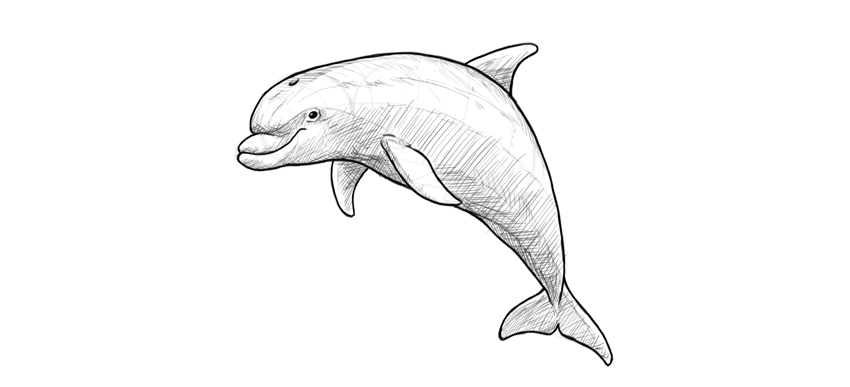
In this tutorial I will show you how to draw a cute dolphin step by step, from the silhouette and the details of the head to the fins. You will learn how to plan the drawing of an animal body, how to make it look 3D with some basic rules of perspective, and how to shade in a basic way. You can use any tools you want!

Before You Start

It’s important to draw what we see, not what we think we see. So let’s take a look at real dolphins to prepare for the task:

1. How to Draw a Dolphin’s Body

Step 1

Sketch the basic curve of the body.

dolphin body curve

Step 2

Find the middle of this curve. Don’t use any special tools—just estimate it.

dolphin body divide in half

Step 3

Divide each half of the curve into halves. This will help us with proportions.

dolphin body segments

Step 4

Draw a circle in the first quarter of the curve. It doesn’t need to be a perfect circle!

dolphin head sketch

Step 5

Draw an oval across another two quarters. Make it rotated, so that the curve is going right through it.

dolphin torso sketch

Step 6

Draw a row of circles, like beads on a string, until you reach the end of the curve. Make each gradually smaller than the previous one.

dolphin tail thickness
dolphin caudal part
dolphin tail silhouette

Step 7

Let’s add some perspective to the body to make it more realistic. Don’t worry, it won’t hurt! Draw an oval on the front of the head, creating a flat „face”.

dolphin face

Step 8

Cross the face in the middle to see this flatness better.

dolphin face perspective

Step 9

Can you see the form of the body? Draw a line along its side. Remember it’s you who decides where the side is!

dolphin body perspective

Step 10

Draw a line going through the bottom of the body. It must follow the rhythm defined by the side line.

dolphin body bottom

Step 11

Outline the whole form of the body, following this rhythm.

dolphin body outline

Step 12

You can add more form-creating lines along the body. They make it easier to see the depth of the drawing.

dolphin in perspective

2. How to Draw a Dolphin’s Head

Step 1

Draw an oval on the front of the face.

dolphin mouth

Step 2

Draw a small circle attached to that oval.

dolphin snout

Step 3

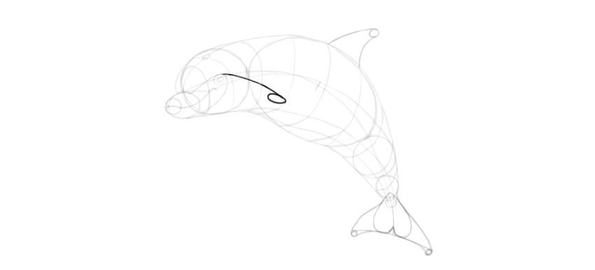
Find the position of the eye with a curve ending with an oval.

dolphin eye position

Step 4

Place the eye inside the oval. It should be shaped like an oval as well.

dolphin eye oval

Step 5

Time for the smile! Cross the small circle on the tip of the mouth with a curve.

dolphin smile

Step 6

From here, draw a curve towards the eye, and turn down right before it.

dolphin smile sketch

Step 7

You now have enough guide lines to outline the details of the head.

dolphin head details

3. How to Draw Dolphin Fins

Step 1

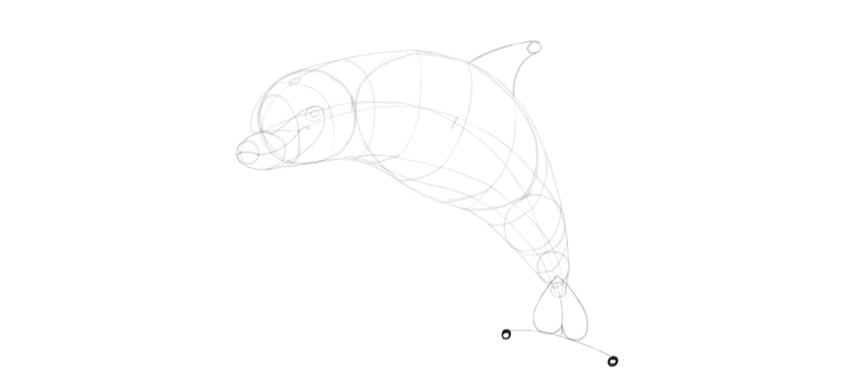
Draw a curve ending with a tiny circle on the back of the dolphin. It should start roughly in the middle of the body.

dolphin dorsal fin

Step 2

Draw a curve between the circle and the body.

dolphin dorsal fin drawing

Step 3

Attach an upside-down „T” to the tail.

dolphin caudal fin

Step 4

Draw an upside-down heart in this area.

dolphin tail fins

Step 5

Draw two tiny circles under the „T”.

dolphin tail caudal fin drawing

Step 6

Outline the shape suggested by the guide lines.

dolphin tail fins how to draw

Step 7

Again, use a curve ended with an oval to find a perfect spot for the pectoral fin.

dolphin pectoral fin position

Step 8

Another curve with a circle will create a part of the outline for the fin.

dolphin flipper sketch

Step 9

The fin is slightly wider than its base. Define this width with a flat curve.

dolphin flipper drawing

Step 10

Now you can outline the whole fin.

dolphin flipper outline

Step 11

Use the same method to draw the other fin.

dolphin pectoral fins
dolphin pair of flippers
dolphin flippers how to draw

4. How to Finish the Drawing of a Dolphin

Step 1

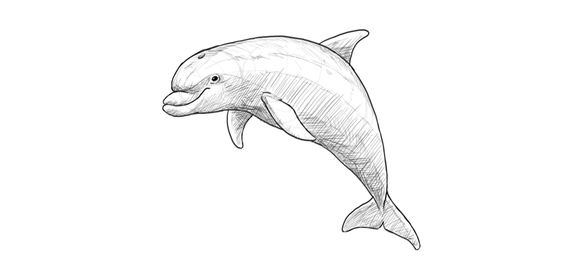
Now you have all the guide lines, so we just need to put the final lines over them. You can take a clean sheet of paper and put it over the sketch if you’re drawing traditionally. You can also try to erase most of the guide lines and darken the ones you want to keep with a darker tool.

Outline the basic lines of the dolphin body.

dolphin body outline

Step 2

Fill the oval of the eye with dark shade, leaving a dot of shine.

dolphin eye

Step 3

Use gentler, lighter strokes to show some less prominent features, like wrinkles of the skin.

dolphin details

Step 4

Gently accentuate the lines of perspective to keep the body 3D.

dolphin 3d body

Step 5

Let’s shade the dolphin now. Imagine the light source over its body and fill the shadowed area with strokes of one direction.

dolphin basic shading

Step 6

To create more levels of shade, change the direction of the strokes.

dolphin cross hatch shading
dolphin simple drawing

Step 7

The perspective guide lines can be turned into rough details on the skin to keep their depth-defining function.

dolphin drawing details

Step 8

Finally, outline the silhouette with dark strokes to make it pop.

dolphin dark outline

Good Job!

You have drawn a cute dolphin! If you want to learn more about these beautiful animals, as well as their relatives, check out this tutorial as well:

how to draw a cute dolphin step by step

25+ Logo and Branding Mockups

Post pobrano z: 25+ Logo and Branding Mockups

Stand out in any market with professional branding mockups. Enjoy this fantastic collection of professional mockup templates designed to highlight your work in its best light.

25+ Logo and Branding Mockups

Images rule the internet. They satisfy our short attention spans by filling our minds with satisfying visuals. And you can win over any client by harnessing this important marketing angle with a product mockup.

A
product mockup is a template created with professional images to display your logo, brand, or design. And you can easily insert your work into editable smart
objects to preview your designs on any product.

Today we present you with
over 25 incredible branding and logo mockups curated from GraphicRiver and Envato Elements.

Need a custom mockup for your business? Enlist the help of a professional from Envato Studio for all your branding needs. And let us know your favorites in the comments below!

Stationery / Branding Mock-Up Bundle

Let’s kick things off with this super luxurious branding bundle. Included in this download are 25 high-quality items you can easily change for an effective marketing campaign. With eight premade scenes, separated object layers, and advanced lighting, this powerful bundle will blow any client away. 

Stationery  Branding Mock-Up Bundle

50 Signs Mockups

A brilliantly designed sign will make anyone notice you. So take advantage of these gorgeous designs with this pack of 50 professional sign mockups. It includes a wide variety of signs to choose from, with high-quality surroundings and elegant buildings.

50 Signs Mockups

Logo Mockup

Sell your premium logo services to loyal customers with this wicked mockup bundle. Inspired by several real-life brand scenarios, this download includes eight Photoshop templates that allow for fast editing. And with a detailed user guide on hand, you’re bound for success with this amazing template.

Logo Mockup

Alternative Logo Mockups Vol.01

Need a cool way to display your professional logo work? Then check out this awesome mockup set. This set features six realistic logo mockups with interesting backgrounds to choose from. An additional help file is available if you need more instruction.

Alternative Logo Mockups Vol01

Craft Beer Package & Branding Mock-up – Vintage

Complement a beautiful craft beer with a gorgeous brand label. This product mockup features ten original Photoshop files with eight branding mockups and three different bottles. Utilize the six background textures included, or switch it out for a custom solid color.

Craft Beer Package  Branding Mock-up - Vintage

Cafe Branding Mockup

Take advantage of a professional mockup template to display your brand on several objects. This template, for example, features a delightful cafe theme with 14 Photoshop files. Explore the different angles available and easily customize the scene even further in Photoshop.

Cafe Branding Mockup

Branding / Identity Mockup

With over 1,700 sales, it’s no wonder why this identity mockup is a top seller! A sleek design that features a clean color palette, this template includes 12 presentations conveniently laid out in their own Photoshop files. Download today to present your work in an elegant way!

Branding  Identity Mockup

Coffee Branding Mockup

Bring
the refreshing warmth of a morning cup of joe to your business. This
product mockup features 12 professional photography scenes with a clean
coffee theme. Each scene is ready to use, and you can easily transfer
your brand images with flexible smart objects.

Coffee Branding Mockup

Office Interior Branding Mockups

Rock your next presentation with an impressive interior mockup. Designed specifically to present your work within a welcoming office interior, this template features nine premade scenes for an outstanding composition. Also included is an awesome logo simulator to make your logos 3D!

Office Interior Branding Mockups

Food Box Branding Mockup

Dinner, anyone? Show off your creativity for unique package design with this beautiful food box mockup. Created with real photography, this template features eight realistic scenes with an Asian takeout theme. Just paste your design onto the marked layer to enjoy your work in seconds!

Food Box Branding Mockup

Corporate Logo Mockups V1

It’s the subtle details that inspire clients to hire you as their designer. And this corporate mockup creates a clear vision with the logo as the centerpiece. Create an exciting elevator detail with five premade mockup files at high resolutions. Incorporate unique lighting effects and more for one cohesive presentation.

Corporate Logo Mockups V1

3D Signage Mockups

Help your clients visualize their business with a beautiful 3D sign. This wonderful template turns their logo into a glorious 3D sign that’s highly detailed. Enjoy ten Photoshop files complete with organized layers, high-resolution images, and more!

3D Signage Mockups

Van & Delivery Cars Branding Mockup

Professional car decals are an exciting way to elevate your current marketing strategy. And in this set you get access to five high-quality van and delivery cars that are printable on a standard A4 sheet. Change the background to one you prefer or keep the original for a seamless design.

Van  Delivery Cars Branding Mockup

Corporate Identity – Branding Mockups

Establish an instant sense of professionalism with this divine corporate identity mockup. Included in this download are 19 Photoshop files with everything you need to impress your clients. Enjoy fabulous letterheads, company signs, and more, for an incredible professional package.

Corporate Identity - Branding Mockups

Cupcake Mockup

Got a sweet tooth? Explore your love of cupcakeries with this super cute cupcake mockup. Ideal for any bakery owner, this template includes high-quality photography with business cards, cupcake toppers, and even a carton box. Peruse the 11 realistic mockups to find one that fits your brand.

Cupcake Mockup

Glasses Logo Mockup

One quick way to boost a restaurant or bar business is to add a signature logo to your glassware. And with this mockup template you can do just that! With this high-quality Photoshop file that allows you to control the shadows, you can easily preview your designs on a refreshing casual beverage.

Glasses Logo Mockup

Burger Store Mockup Creator

Or give this delicious burger mockup a shot! Created to showcase your branding on generic fast food packaging, this template features nine amazing scenes with a variety of paper textures. It works perfectly at multiple angles and looks great in both isometric and top view perspectives.

Burger Store Mockup Creator

Coffee With Cocoa Logo Mockup

Coffee baristas are super skilled with some espresso and milk. And you can achieve that famous coffee art effect with this delightful logo mockup. This template features four Photoshop files with four distinct angles to choose from.

Coffee With Cocoa Logo Mockup

Wax Seal Logo Mockup

Wax seals remind us of that romantic time in history when everything was written by hand. And you can emulate the look of a wax seal for your business with this awesome logo mockup. Included in this template is one Photoshop file you can quickly modify. Change the colors easily by experimenting with the Hue slider for more options.

Wax Seal Logo Mockup

3D Logo Mockup – 5 Styles

3D effects have a way of making your logos look more stylish and professional. And with this logo mockup, you get to enjoy five amazing styles that are all well organized with fully editable layers. Simply double-click a smart object layer to insert your logo before saving! It’s really that simple!

3D Logo Mockup - 5 Styles

Stationery / Branding Mockup

The secret to selling your work as a graphic designer is to enlist the help of a stationery mockup. This particular template includes 14 incredible presentations all in one convenient Photoshop file. Easily edit the layers to fit your project for an amazing photo-realistic finish.

Stationery  Branding Mockup

Store Logo Mockups

Bring your designs to life with exciting store mockups. This template features five Photoshop files that will automatically correct the angle of your logo to fit the side of the building. Create a winning combination that is sure to get you tons of referrals!

Store Logo Mockups

Chocolate Bar Packaging Mockup

Create a brand package you don’t have to spend too much time on! This wonderful package features two packaging types with 18 professional presentations to choose from. Experiment with the reflection and shadows for more realism, or change the background to one you prefer.

Chocolate Bar Packaging Mockup

Logo Label Mock-Up Set

Display the behind-the-scenes details of your business with this glorious label mockup. This template places your branding on a rustic label design and features seven high-quality presentations with more angles. Available for Photoshop CS4 and after, this template also includes a help file for more instruction.

Logo Label Mock-Up Set

Four 3D Logo Mockups

Create
a stunning logo that glistens in all its 3D glory. This premium mockup
template features four high-quality logo scenes to present your brand in
a fabulously unique way. It’s great for beginners to design, and you can enjoy a
professional result for one low price!

Four 3D Logo Mockups

Logo Mockup Set

And before you go, check out this brilliant bundle of logo mockups! Shot at different angles, this template includes 11 Photoshop files that are super easy to edit. Simple drag and drop your logo into the appropriate smart object and presto! You’ve got a beautiful logo display in no time!

Logo Mockup Set

Conclusion

This list is jam-packed with exciting resources for the avid designer
familiar with Photoshop and more. If you need additional
help creating custom branding mockups, enlist the skills of a talented
professional by choosing one of the amazing designers from Envato Studio.

And with thousands of logo and branding mockups to choose from, chances are we’ve missed a few to add to your personal collection. Be sure to browse Envato Market and Envato Elements for more resources, and let us know your favorites in the comments below!

How to Create a Sketch Effect Action in Adobe Photoshop

Post pobrano z: How to Create a Sketch Effect Action in Adobe Photoshop

Final product image
What You’ll Be Creating

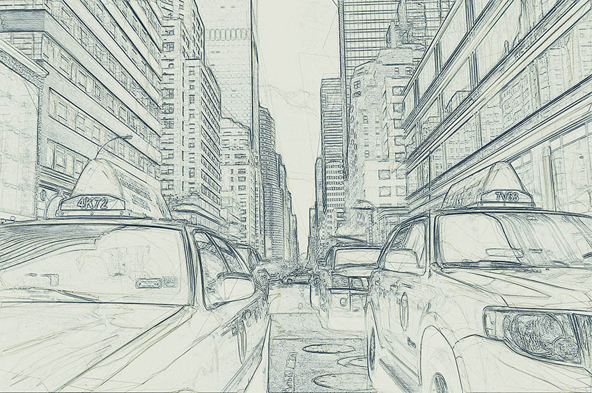
In this tutorial you will learn how to turn your photos into amazing, advanced sketches. I will try to explain everything in so much detail that everyone can create it, even those who have just opened Photoshop for the first time.

The effect shown on the left is the one I will show you how to create here in this tutorial. If you would like to create the effect shown on the right, a sketch with a paint effect, and just using a single click, then check out my TechnicalArt Photoshop Action.

Action final results

What You’ll Need

To recreate the design above, you will need the following photo:

1. Let’s Get Started

First, open the photo that you want to work with. To open your photo, go to File > Open, choose your photo, and click Open. Now, before we get started, just check a couple of things:

  1. Your photo should be in RGB Color mode, 8 Bits/Channel. To check this, go to Image > Mode.
  2. For best results, your photo size should be between 1500–4000 px wide/high. To check this, go to Image > Image Size.
  3. Your photo should be the Background layer. If it is not, go to Layer > New > Background from Layer.
  4. To make some auto-corrections to your photo tone, contrast, and color, go to Image > Auto Tone, Image > Auto Contrast and then Image > Auto Color.

Checking image size mode and making auto corrections

2. How to Create the Background

For the background we are going to use a solid color fill. Go to Layer > New Fill Layer > Solid Color to create a new solid color fill layer, name it ’Background Color’ and enter the settings below:

Creating new solid color fill layer

3. How to Create the Base Sketch

Step 1

Now we are going to create the base sketch. Select Background layer and go to Layer > New > Layer Via Copy to duplicate the Background layer and then drag that new layer to the top of the layers in the Layers panel. Press D on your keyboard to reset the swatches and go to Filter > Filter Gallery > Sketch > Photocopy and choose the settings below:

Adding the sketch photocopy filter

Step 2

Name this layer Base Sketch and change its blending mode to Multiply.

Renaming layer to Base Sketch and changing its blending mode

4. How to Create a Draft Sketch

Step 1

Now we are going to create a draft sketch. Go to Layer > New > Layer Via Copy to duplicate the Base Sketch layer. Pick the Lasso Tool (L), click anywhere inside the canvas, choose Free Transform, and increase the width and height to 105% as shown below:

Transforming draft sketch layer

Step 2

Name this layer Large Draft Sketch and set its Opacity to 14%.

Renaming layer to Large Draft Sketch and changing its opacity

Step 3

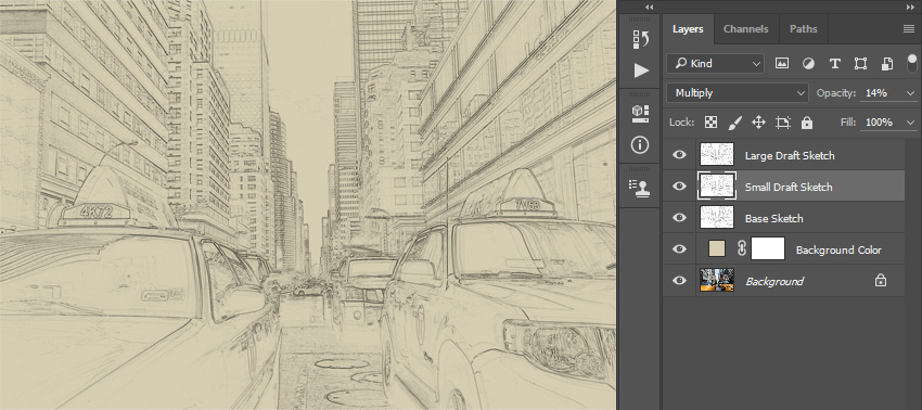
Select the Base Sketch layer and go to Layer > New > Layer Via Copy to duplicate the Base Sketch layer again. Pick the Lasso Tool (L), click anywhere inside the canvas, choose Free Transform, and decrease the width and height to 95% as shown below:

Transforming draft sketch layer

Step 4

Name this layer Small Draft Sketch and set its opacity to 14%.

Renaming layer to Small Draft Sketch and changing its opacity

5. How to Create a Rough Sketch

Step 1

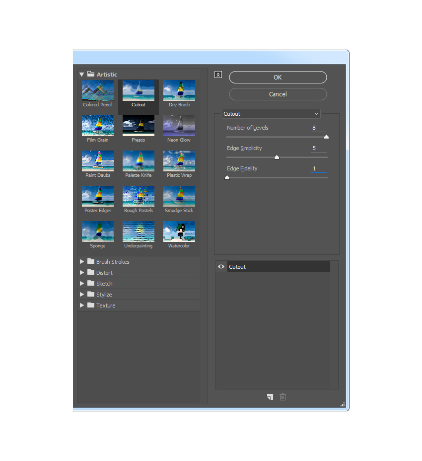
Now we are going to create a rough sketch. Select the Background layer and go to Layer > New > Layer Via Copy to duplicate the Background layer, and then drag that new layer to the top of the layers in the Layers panel. Go to Filter > Filter Gallery > Artistic > Cutout and choose the settings below:

Adding the artistic cutout filter

Step 2

Go to Filter > Stylize > Find Edges and then go to Image > Adjustments > Desaturate.

Stylizing and desaturating layer

Step 3

Name this layer RS_1, change its blending mode to Color Burn, and drop its Opacity to 30%.

Renaming layer to RS_1 and changing its blending mode and opacity

Step 4

Now we are going to create more rough sketch layers using the same method. So repeat Step 1 and Step 2 in this section, but in Step 1 instead of using the settings we used the previous time, use the new settings below:

Adding the artistic cutout filter

Step 5

Name this layer RS_2, change its blending mode to Color Burn, drop its Opacity to 25%, and drag it under the RS_1 layer to keep the proper layer order.

Renaming layer to RS_2 and changing its blending mode opacity and order

Step 6

Repeat again Step 1 and Step 2 in this chapter, but in Step 1 instead of using the settings we used previously, use the new settings below:

Adding the artistic cutout filter

Step 7

Name this layer RS_3, change its blending mode to Color Burn, drop its Opacity to 20%, and drag it under the RS_2 layer to keep the proper layer order.

Renaming layer to RS_3 and changing its blending mode opacity and order

Step 8

Repeat again Step 1 and Step 2 in this chapter, but in Step 1 instead of using the settings we used previously, use the new settings below:

Adding the artistic cutout filter

Step 9

Name this layer RS_4, change its blending mode to Color Burn, drop its Opacity to 20%, and drag it under the RS_3 layer to keep the proper layer order.

Renaming layer to RS_4 and changing its blending mode opacity and order

Step 10

Repeat again Step 1 and Step 2 in this chapter, but in Step 1 instead of using the settings we used previously, use the new settings below:

Adding the artistic cutout filter

Step 11

Name this layer RS_5, change its blending mode to Color Burn, drop its Opacity to 18%, and drag it under the RS_4 layer to keep the proper layer order.

Step 12

Repeat again for the last time Step 1 and Step 2 in this chapter, but in Step 1 instead of using the settings we used previously, use the new settings below:

Adding the artistic cutout filter

Step 13

Name this layer RS_6, change its blending mode to Color Burn, drop its Opacity to 7%, and drag it under the RS_54 layer to keep the proper layer order.

Renaming layer to RS_6 and changing its blending mode opacity and order

Step 14

Now we are going to group all these rough sketch layers. While the layer RS_6 is selected, Shift-click on the RS_1 layer to select these two layers and all other layers between them. Then go to Layer > New > Group from Layers to create a new group from the selected layers and name it Rough Sketch.

Creating new group from selected layers named Rough Sketch

6. How to Create Shading

Step 1

Now we are going to create some subtle shading. Select the Background layer and go to Layer > New > Layer Via Copy to duplicate the Background layer, and then drag that new layer to the top of the layers in the Layers panel. Go to Filter > Stylize > Find Edges and then go to Image > Adjustments > Desaturate.

Stylizing and desaturating layer

Step 2

Go to Filter > Filter Gallery > Brush Strokes > Angled Strokes and select the settings below:

Adding the brush strokes angled strokes filter

Step 3

Name this layer Shading_1, change its blending mode to Multiply, and drop its Opacity to 12%.

Renaming layer to Shading_1 and changing its blending mode and opacity

Step 4

Now repeat Step 1 in this chapter, and then go to Filter > Brush Strokes > Crosshatch and enter the settings below:

Adding the brush strokes crosshatch filter

Step 5

Name this layer Shading_2, change its blending mode to Multiply, drop its Opacity to 5%, and drag it under the Shading_1 layer to keep the proper layer order.

Renaming layer to Shading_2 and changing its blending mode and opacity

7. How to Add Noise

Step 1

In this step we are going to add some noise to our sketch. Select the Shading_1 layer and go to Layer > New > Layer to create a new layer and name it Noise.

Creating new layer named Noise

Step 2

Now press D on your keyboard to reset the swatches, go to Edit > Fill and enter the settings below:

Filling Noise layer with foreground color

Step 3

Go to Filter > Noise > Add Noise and choose the settings below:

Adding noise filter to the noise layer

Step 4

Now change this layer blending mode to Screen and drop its Opacity to 64%.

Changing Noise layer blending mode and opacity

8. How to Create the Color Look

Step 1

Now we are going to add a nice color look to our sketch. Go to Layer > New Adjustment Layer > Curves to create a new curves adjustment layer and name it Color Look.

Creating new curves adjustment layer

Step 2

Double click on this layer thumbnail and enter the following settings:

Changing settings of Color Look layer

9. How to Make the Final Adjustments

Step 1

Now we are going to make final adjustments to our sketch. Go to Layer > New Adjustment Layer > Photo Filter to create a new photo filter adjustment layer and name it Photo Tint.

Creating new photo filter adjustment layer

Step 2

Double click on this layer thumbnail and select the following settings:

Changing settings of Photo Tint layer

Step 3

Now we are going to add contrast. Press D on your keyboard to reset the swatches and go to Layer > New Adjustment Layer > Gradient Map to create a new gradient map adjustment layer and name it Overall Contrast.

Creating new gradient map adjustment layer

Step 4

Change this layer blending mode to Soft Light and drop the Opacity to 18%.

Changing overall contrast layer blending mode and opacity

Step 5

Now we are going to add vibrance and saturation. Go to Layer > New Adjustment Layer > Vibrance to create a new vibrance adjustment layer and name it Overall Vibrance/Saturation.

Creating new vibrance adjustment layer

Step 6

Double click on this layer thumbnail and choose the following settings:

Changing settings of Overall VibranceSaturation layer

Step 7

Now we are going to boost the highlights slightly. Go to Layer > New > Levels to create a new levels adjustment layer and name it Overall Brightness.

Creating new levels adjustment layer

Step 8

Double click on this layer thumbnail and choose the following settings:

Changing settings of Overall Brightnes layer

Step 9

Now we are going to add sharpening. Press Control-Alt-Shift-E on your keyboard to make a snapshot. Go to Filter > Other > High Pass and enter the settings below:

Adding high pass filter

Step 10

Name this layer Overall Sharpening, change its blending mode to Hard Light, and drop the Opacity to 76%.

Renaming layer to overall sharpening and changing its blending mode and opacity

You Made It!

Congratulations, you have succeeded! Here is our final result:

Final result

Customize Your Results

You can now customize the final effect. I will give you a few tips:

  • Select the Background Color layer, double-click on its thumbnail, and inside the Color Picker panel choose some other color. Click OK.
  • Select some of the sketch layers and play with their opacities to create different sketch effects.
  • Select the Color Look layer, double-click on its thumbnail, and inside the Properties panel change the settings for a different color look.
  • Select the Photo Tint layer, double-click on its thumbnail, and inside the Properties panel change the settings for a different color look.
  • Select the layer Overall Contrast and change its opacity to adjust the contrast.
  • Select the layer Overall Vibrance/Saturation, double-click on its thumbnail, and inside the Properties panel play with the Vibrance and Saturation values to create different results.
  • Select the layer Overall Brightness, double-click on its thumbnail, and change the settings to adjust the brightness.
  • Select the layer Overall Sharpening, and change its opacity to adjust the amount of sharpening.

Here is what I got:

Customized final result

Awesome Work!

If you would like to create an even more advanced sketch with a paint effect as shown below, and just by using a single click, then check out my TechnicalArt Photoshop Action.

Action final result

The action works so that you just brush over the areas that you want to remain in paint, play the
action, and the action will do everything for you, giving you fully
layered and customizable results. 

Every time you run the action, you will get a unique paint variation even if you use the same brushed area. The action will create 15 preset
color looks for you, as well as canvas, halftone, and grid textures. It comes with a detailed video tutorial that demonstrates how to use and customize the look of your action to get the most out of the effect.

Action final results

How to Create a Retro Science-Themed Icon Pack in Adobe Illustrator

Post pobrano z: How to Create a Retro Science-Themed Icon Pack in Adobe Illustrator

Final product image
What You’ll Be Creating

Ever wondered what it must feel like to be
a mad scientist creating all sort of mysterious inventions?  If that’s the case, wonder no more, since in today’s tutorial we’re going to get our geek on and create a little retro science-themed icon pack using some of the most basic shapes and tools that Illustrator has to offer.

Also, don’t forget you can always expand the project by checking out GraphicRiver where you’ll find literally pages upon pages of science-themed icon packs.

1. How to Set Up a New Document

Since I’m hoping that you already have
Illustrator up and running in the background, bring it up and let’s set up a New Document (File > New or Control-N)
using the following settings:

  • Number
    of Artboards:
    1
  • Width:
    800
    px
  • Height:
    600
    px
  • Units:
    Pixels

And from the Advanced tab:

  • Color
    Mode:
    RGB
  • Raster
    Effects:
    Screen (72ppi)
  • Preview Mode: Default
setting up a new document

2. How to Set Up a Custom Grid

Since we’re going to be creating the icons
using a pixel-perfect workflow, we’ll want to set up a nice little Grid so that we can have full control
over our shapes.

Step 1

Go to the Edit > Preferences > Guides & Grid submenu, and adjust
the following settings:

  • Gridline
    every:
    1 px
  • Subdivisions: 1
setting up a custom grid

Quick
tip:
you can learn more about grids by reading this
in-depth piece on how Illustrator’s Grid System works.

Step 2

Once we’ve set up our custom grid, all we
need to do in order to make sure our shapes look crisp is enable the Snap to Grid option found under the View menu, which will transform into Snap to Pixel each time you enter Pixel Preview mode.

Now, if you’re new to
the whole “pixel-perfect workflow”, I strongly recommend you go through my how
to create pixel-perfect artwork
tutorial, which will help you widen your
technical skills in no time.

3. How to Set Up the Layers

With the New Document created, it would be
a good idea to structure our project using a couple of layers, since this way
we can maintain a steady workflow by focusing on one icon at a time.

That being said, bring up the Layers panel, and create a total of four
layers, which we will rename as follows:

  • layer
    1
    : reference grids
  • layer
    2
    : glassware
  • layer
    3
    : microscope
  • layer 4: lamp checker
setting up the layers

4. How to Create the Reference Grids

The
reference grids (or base grids)
are a set of precisely delimited reference surfaces, which allow us to build
our icons by focusing on size and consistency.

Usually, the size of the grids determines
the size of the actual icons, and they should always be the first decision you
make on you start a new project, since you’ll always want to start from the
smallest possible size and build on that.

Now, in our case, we’re going to be
creating the icon pack using just one size, more exactly 128 x 128 px, which is a fairly large one.

Step 1

Start by locking all
but the “reference grids” layer, and then grab the Rectangle Tool (M) and create a 128 x 128 px orange (#F15A24) square, which will help define the
overall size of our icons.

creating and positioning the main shape for the reference grid

Step 2

Add another smaller 120 x 120 px one (#FFFFFF) which will
act as our active drawing area, thus giving us an all-around 4 px padding.

creating and positioning the main shape for the active drawing area

Step 3

Group the two squares composing the
reference grid using the Control-G keyboard
shortcut, and then create three copies at a distance of 40 px from one another, making sure to align them to the center of
the Artboard.

Once you’re done,
lock the current layer and move on to the next one where we’ll start working on
our first icon.

creating and positioning the remaining reference grids

5. How to Create
the Glassware Icon

Assuming you’ve
already moved on to the next layer (that would be the second one) after
creating the reference grids, let’s kick off the project by zooming in on our
first reference grid, where we will start working on the little stand of glass test tubes.

Step 1

Start working on the first tube by creating a 12 x 88 px rectangle, which we will color using #56C1AD and then
position at a distance of 2 px from
the active drawing area’s top edge and 30
px
from its left one.

creating and positioning the main shape for the glassware icons first tube

Step 2

Adjust the shape that we’ve just created by setting the Radius of its bottom corners to 6 px from within the Transform panel’s Rectangle Properties.

adjusting the shape of the glassware icons first tube

Step 3

Give the resulting shape an outline using the Stroke method, by creating a copy of it (Control-C) which we will paste in front (Control-F) and then adjust by first changing its color to #5B4032
and then flipping its Fill with its Stroke (Shift-X), making sure to set its Weight to 4 px.

adding the outline to the glassware icons first tube

Step 4

Add the tube’s lip using a 20 x 4
px
rectangle (#5B4032), which we will position onto the upper section of
its outline, center aligning it to the previously created shapes.

adding the lip to the glassware icons first tube

Step 5

Give the tube a hard shadow using a 12
x 6 px
rectangle (#5B4032) which we will center align to the larger fill
shape’s top edge. Once you’re done, select and group all four shapes together
using the Control-G keyboard
shortcut.

adding the hard shadow to the upper section of the glassware icons first tube

Step 6

Create two copies of the tube that we’ve just finished working on (Control-C > Control-F twice),
and then distribute them on its right side, positioning them at a distance of
4 px from one another. Once you’re
done, select and group all of them together using the Control-G keyboard shortcut.

creating and positioning the remaining glassware icons tubes

Step 7

Start working on the wooden rack by creating its base using a 104 x 16 px rectangle (#C48755) with a 4 px thick outline (#5B4032), which we
will center align to the active drawing area’s bottom edge.

creating and positioning the main shapes for the bottom section of the glassware icons wooden rack

Step 8

Add the little label using a 20 x
8 px
rectangle (#5B4032) to the sides of which we will add two smaller 8 x 4 px ones (#5B4032). Select and
group (Control-G) all three shapes
together, center aligning them to the larger wooden section, making sure to
create another group afterwards.

adding the label to the bottom section of the glassware icons wooden rack

Step 9

Create the rack’s side sections using two 10 x 64 px rectangles (#AF7245) with a 4 px thick outline (#5B4032), which we will individually group (Control-G) and then position on top of
the previous section, aligning them to its outer edges.

creating and positioning the side sections for the glassware icons wooden rack

Step 10

Add the rack’s upper section using a 104 x 12 px rectangle (#C48755) with a 4 px thick outline (#5B4032), which we will group (Control-G) and then position on top of
the previously created shapes.

creating and positioning the main shapes for the upper section of the glassware icons wooden rack

Step 11

Add the little screws using two 4
x 4 px
circles (#5B4032) which we will position on top so that they align
with the rack’s side sections. Once you have them in place, select and group (Control-G) them to the underlying
section.

adding the little screws to the upper section of the glassware icons wooden rack

Step 12

Next, take a couple of moments and add in the hard shadows using two 10 x 6 px rectangles (#5B4032) for the
wooden rack’s side sections, followed by three 12 x 6 px ones (#5B4032) for the suspended glass tubes.

adding the hard shadows to the glassware icons wooden rack

Step 13

Create the horizontal section holding the tubes using a 108 px wide 4 px thick Stroke line
(#5B4032), which we will center align to the rack, positioning it at a distance
of 20 px from its upper section,
making sure to send it to the back afterwards (right click > Arrange > Send to Back).

adding the horizontal tube holding section to the glassware icons wooden rack

Step 14

Finish off the rack, and with it the icon itself, by drawing in the
little diagonal structural arms using a 4
px
thick Stroke with the color
set to #5B4032. Once you’re done, select and group (Control-G) all of its composing sections together, doing the same
for the entire icon afterwards.

finishing off the glassware icon

6. How to Create
the Microscope Icon

Assuming you’ve
finished working on the first icon, lock its layer and then move on up to the
next one (that would be the third one) where we will start working on the
little microscope.

Step 1

Create the lower section of the base using an 80 x 12 px rectangle (#6B5B51) with a 4 px thick outline (#5B4032), which we will group (Control-G) and then center align to the
underlying active drawing area’s bottom edge.

creating and positioning the main shapes for the bottom section of the microscopes base

Step 2

Add the base’s upper section using a 96 x 12 px rectangle (#C48755) with a 4 px thick outline (#5B4032), which we will group (Control-G) and then position on top of
the previously created shapes.

creating and positioning the main shapes for the upper section of the microscopes base

Step 3

Create two 108 px wide 4 px thick Stroke lines (#5B4032) which we will position over the top and
bottom edges of the outline, adding one more to the center of the fill shape
afterwards. Once you’re done, select and group all of the upper section’s
shapes together using the Control-G
keyboard shortcut.

adding the horizontal detail lines to the upper section of the microscopes base

Step 4

Cast a hard shadow over the bottom section of the base, using an 80 x 6 px rectangle (#5B4032), which we
will center align to its upper edge. Once you’re done, group (Control-G) the shadow to its section,
doing the same for the entire base afterwards.

adding the hard shadow to the bottom section of the microscopes base

Step 5

Start working on the arm by creating a 12 x 72 px rectangle, which we will
color using #82756C and then position over the base at a distance of 30 px from its left edge.

creating and positioning the main shape for the vertical section of the microscopes arm

Step 6

Create a smaller 12 x 14 px rectangle
(#82756C) and position it onto the left side of
the taller one from the previous step, uniting the two into a single larger
shape using Pathfinder’s Unite Shape Mode.

uniting the main shapes of the microscopes arm into a single larger shape

Step 7

Select the lower section’s top-left anchor point
using the Direct Selection Tool (A)
and then push it to the bottom by a distance of 6 px using the Move tool
(right click > Transform > Move
> Vertical > 6 px
).

adjusting the lower section of the microscopes arm

Step 8

Give the resulting shape a 4 px thick outline using the Stroke
method, making sure to set its color to #5B4032.

adding the outline to the microscopes arm

Step 9

Add the little screw using a 4 x
4 px
circle (#5B4032), which we will position at the bottom of the arm, leaving a 4 px gap
around it. Once you’re done, select all three shapes and group them together
using the Control-G keyboard
shortcut.

adding the little screw to the base of the microscopes arm

Step 10

Start working on the upper tightening screw by creating an 8 x 8 px rectangle (#5B4032), which we
will position on top of the microscope’s arm.

creating and positioning the bottom section of the microscopes tightening screw

Step 11

Create the screw’s thinner section using a 4 x 2 px rectangle (#5B4032) (2), on top of which we will add a 16 x 4 px rectangle (#5B4032) (3) followed
by a slightly narrower 12 x 4 px one
(#5B4032) (4). Position all three shapes on top of the rectangle from the
previous step, selecting and grouping (Control-G)
them together afterwards.

adding details to the microscopes tightening screw

Step 12

Create a 16 x 8 px rectangle
(#5B4032), which we will position onto the left side of the microscope’s arm,
at a distance of 12 px from its
upper edge.

adding the horizontal connector segment to the microscopes arm

Step 13

Add the support rod using a 4 x
68 px
rectangle (#5B4032), which we will also position onto the left side
of the arm, making sure to send it to the back of all the other shapes
afterwards (right click > Arrange
> Send to Back
).

adding the support rod to the microscopes arm

Step 14

Add the little adjustment wheel using a 16 x 16 px circle (#C48755) with a 4 px thick outline (#5B4032), on top of which we will add a smaller
4 x 4 px circle (#5B4032). Group (Control-G) all three shapes together
and then position them in the center of the microscope’s arm, at a distance of 22 px from the larger base.

adding the adjustment wheel to the microscopes arm

Step 15

Give the wheel a hard shadow by creating a 14 x 14 px square (#5B4032) which we
will adjust by setting the Radius of
its bottom-right corner to 14 px from
within the Transform panel’s Rectangle Properties.
Position the resulting shape over the wheel’s lower half, making sure to align
it to its right side.

adding the hard shadow to the microscopes adjustment wheel

Step 16

Mask the shadow using a copy (Control-C)
of the arm’s fill shape as a Clipping
Mask
, which we will paste in front (Control-F)
and then right click > Make Clipping
Mask
. Once you’re done, send the shadow to the back of the wheel using the Arrange > Send Backward, selecting
and grouping (Control-G) all of the
arm’s composing sections together.

adding the hard shadow to the back of the microscopes adjustment wheel

Step 17

Start working on the microscope’s main body, by creating an 18 x 40 px rectangle (#6B5B51) with a 4 px thick outline (#5B4032), which we
will group (Control-G) and then
position at a distance of 16 px from
the arm and 36 px from the larger
base.

creating and positioning the main shapes for the microscopes main body

Step 18

Create the observation tube using a 10
x 10 px
square (#5B4032) on top of which we will add a smaller 6 x 4 px rectangle (#5B4032) followed
by a slightly wider 14 x 4 px rectangle
(#5B4032). Group (Control-G) all
three shapes together, positioning them on top of the tube’s larger body.

adding the observation tube to the microscopes main body

Step 19

Give the larger body a small insertion by creating a 6 x 6 px square (#5B4032) which we will
center align to its bottom edge.

adding the rectangular insertion to the bottom of the microscopes main body

Step 20

Create the upper section of the objective using a 10 x 10 px square (#D8A466) with a 4 px thick outline (#5B4032) to the bottom of which we will add a
slightly wider 18 x 4 px rectangle
(#5B4032) followed by a 10 x 6 px hard
shadow on the top (#5B4032). Group (Control-G)
all four shapes together, and then position them at the bottom of the
microscope’s larger body.

creating and positioning the main shapes for the upper section of the microscopes objective

Step 21

Add the objective’s bottom section
using a 10 x 2 px rectangle (#5B4032), underneath which we will add a wider 22
x 4 px
one (#5B4032). Group (Control-G)
both shapes together and then position them below the previous section.

adding the bottom section to the microscopes objective

Step 22

Create the actual lens using a 10
x 8 px
ellipse (#56C1AD) with a 4 px
thick outline (#5B4032), which we will group (Control-G) and then position onto the previous section, so that its upper half ends up overlapping it. Once you have it in place, make sure to send
it behind the wider section by right
clicking > Arrange > Send to Back
, selecting and grouping (Control-G) all of the microscope’s
lower sections together.

adding the lens section to the microscopes objective

Step 23

Add the little adjustment wheel using a 4 x 4 px square (#5B4032), to the side of which we will add a 4 x 8 px rectangle (#5B4032). Group (Control-G) and position the two shapes
onto the lower right side of the microscope’s larger body, selecting and
grouping (Control-G) all of its
composing sections afterwards.

adding the side adjustment wheel to the microscopes main body

Step 24

Start working on the right section of the arm by creating a 32 x 12 px rectangle (#C48755), which we will
adjust by setting the Radius of its
right corners to 6 px from within
the Transform panel’s Rectangle Properties. Once you’re done,
position the resulting shape at a distance of 52 px from the microscope’s base.

creating and positioning the main shape for the upper section of the microscopes right extending arm

Step 25

Create a smaller 14 x 12 px rectangle
(#C48755) and position it underneath the previously created section, uniting
the two into a single larger shape using Pathfinder’s
Unite Shape Mode.

creating and positioning the bottom section of the microscopes right extending arm

Step 26

Adjust the resulting shape by first selecting its bottom-right corner
using the Direct Selection Tool (A) and
then removing it by pressing Delete.
Press Control-J to close up the
resulting path, and then give it a 4 px thick
outline (#5B4032), making sure to select and group (Control-G) the two together afterwards.

adding the outline to the microscopes right extending arm

Step 27

Finish off the extending arm by adding the little screw using a 4 x 4 px circle (#5B4032), followed by
an 8 x 4 px rectangular insertion (#5B4032)
afterwards. Once you’re done, select and group (Control-G) all its composing shapes together.

adding details to the microscopes right extending arm

Step 28

Cast the hard shadow onto the microscope using a 14 x 12 px rectangle (#5B4032) which we will adjust by setting the Radius of its bottom-right corner to 12 px from within the Transform panel’s Rectangle Properties. Position the resulting shape onto the bottom
half of the extending arm, making sure to send it to the back by selecting both
it and the larger microscope and then right
click > Arrange > Send to Back
.

adding the hard shadow to the microscopes right extending arm

Step 29

Finish off the microscope, and with it the icon itself, by adding the
stage using a 48 x 4 px rectangle (#5B4032)
which we will position onto the right side of the microscope’s arm, at a
distance of 4 px from its larger
base. Once you’re done, select and group (Control-G)
all of the icon’s composing sections before moving on to the next step.

finishing off the microscope icon

7. How to Create
the Lamp Checker Icon

We are now down to
our third and last icon, so assuming you’ve moved on to the next layer, zoom in
on its reference grid and let’s wrap things up!

Step 1

Create the lower section of the device’s base using an 88 x 12 px rectangle (#AF7245) with a 4 px thick outline (#5B4032), which we
will center align to the active drawing area’s bottom edge.

creating and positioning the main shapes for the bottom section of the lamp checkers base

Step 2

Add the little side segments using two 6 x 4 px rectangles (#5B4032), which we will bottom align to the
visual section of the fill shape. Once you’re done, select and group all four
shapes together using the Control-G
keyboard shortcut.

adding the little side segments to the lamp checkers base

Step 3

Create the base’s upper section using a 104 x 28 px rectangle (#C48755) with a 4 px thick outline (#5B4032), which we will group (Control-G) and then position on top of
the previous shapes.

creating and positioning the main shapes for the upper section of the lamp checkers base

Step 4

Add the little screws using four 4
x 4 px
circles (#5B4032), which we will position at a distance of 4 px from each of the larger section’s
corners.

adding the little screws to the upper section of the lamp checkers base

Step 5

Add the label using 28 x 16 px rectangle
(#5B4032), to the sides of which we will add two smaller 8 x 8 px squares (#5B4032). Group (Control-G) all three shapes together and then center align them to
the larger section, selecting and grouping (Control-G) all its composing shapes as well.

adding the label to the upper section of the lamp checkers base

Step 6

Add the hard shadow to the bottom section of the
base, using an 88 x 6 px rectangle
(#5B4032) which we will center align to its top
edge. Once you’re done, select and group all the shapes that we have so far
using the Control-G keyboard
shortcut.

adding the hard shadow to the bottom section of the lamp checkers base

Step 7

Start working on the device’s upper body by
creating a 72 x 12 px rectangle (#82756C)
with a 4 px thick outline (#5B4032), which we will group (Control-G)
and then position on top of the larger base.

creating and positioning the main shapes for the upper section of the lamp checkers body

Step 8

Add the horizontal detail lines using two 84 px wide 4 px thick Stroke lines
(#5B4032), which we will position onto the top and
center section of the section’s outline. Once you have them in place, select
and group (Control-G) them and the
larger rectangles together before moving on to the next step.

adding the horizontal detail lines to the upper section of the lamp checkers body

Step 9

Create the little button using a 12 x 6 px rectangle (#C48755) with a 4 px thick outline (#5B4032), on top of which we will add another slightly narrower 8 x 6 px rectangle (#5B4032). Group (Control-G) all three shapes together
and then position them on top of the previous section, at a distance of 12 px from its left edge.

creating and positioning the main shapes for the lamp checkers button

Step 10

Add the device’s socket using a 24 x 12 px rectangle (#6B5B51) with a 4 px thick outline (#5B4032), to the bottom of which we will add a smaller 8 x 6 px rectangle (#5B4032). Group (Control-G) all three shapes together,
and then position them onto the right side of the button, at a distance of 12 px from it.

creating and positioning the main shapes for the lamp checkers bulb socket

Step 11

Create the light bulb’s base using a 16 x 12 px rectangle (#D8A466) with a 4 px thick outline (#5B4032) to the center of which we will add another 16 x 4 px rectangle (#5B4032). Group (Control-G) all three shapes together, and then position them over
the previously created section.

creating and positioning the main shapes for the light bulbs base

Step 12

Start working on the bulb’s glass section by creating a 16 x 4 px rectangle (#56C1AD), which we
will position on top of the base from the previous step.

creating and positioning the main shape for the bottom section of the light bulbs glass section

Step 13

Next, create a 32 x 32 px circle (#56C1AD) which we will position above the
smaller rectangle, at a distance of 4 px
from its top edge.

creating and positioning the main shape for the upper section of the light bulbs glass section

Step 14

Open up the circle’s path by selecting
its bottom anchor point using the Direct Selection Tool (A) and then
pressing Delete. Do the same for the
rectangle by adding a new anchor point to the center of its top edge with the
help of the Add Anchor Point Tool (+),
and then removing it by pressing Delete.

opening up the paths of the light bulbs glass composing shapes

Step 15

Unite the two paths into a single larger shape
by selecting them both and then pressing Control-J
twice.

uniting the light bulbs glass paths into a single larger shape

Step 16

Smoothen up the resulting shape’s transitions by adjusting its curvatures with the help of its anchor’s handles while in Pixel Preview mode (Alt-Control-Y). Take your time, and
once you’re done, move on to the next step.

adjusting the overall shape of the light bulbs glass section

Step 17

Give the resulting shape a 4 px thick outline (#5B4032) using the Stroke method, selecting
and grouping (Control-G) both it and
the underlying fill shape together afterwards.

adding the outline to the light bulbs glass section

Step 18

Start working on the filament by creating two 8 x 8 px circles with a 4 px thick Stroke (#5B4032) at a horizontal distance of 2 px from one another, which we
will position in the center of the bulb, at a distance of 10 px from its upper edge.

creating and positioning the main shapes for the circular section of the light bulbs filament

Step 19

Open up the inner-bottom sections of each circle’s path by adding a new
anchor point using the Add Anchor Point
Tool (+)
, and then removing it by selecting and pressing Delete.

opening up the paths of the circular section of the light bulbs filament

Step 20

Finish off the filament, and with it the icon itself, by selecting and
uniting the bottom anchor points using the Control-J
keyboard shortcut, drawing the vertical sections using the Pen Tool (P). Once you’re done, select and group all of the bulb’s
composing shapes, doing the same for the entire icon afterwards.

finishing off the lamp checker icon

It’s a Wrap!

Great job! I hope you’ve found the tutorial interesting enough to
follow it until the end—since it was a long one—and most importantly
learned something new and useful along the way.

finished project preview

How to Draw an Orchid With Pastel Pencils

Post pobrano z: How to Draw an Orchid With Pastel Pencils

Final product image
What You’ll Be Creating

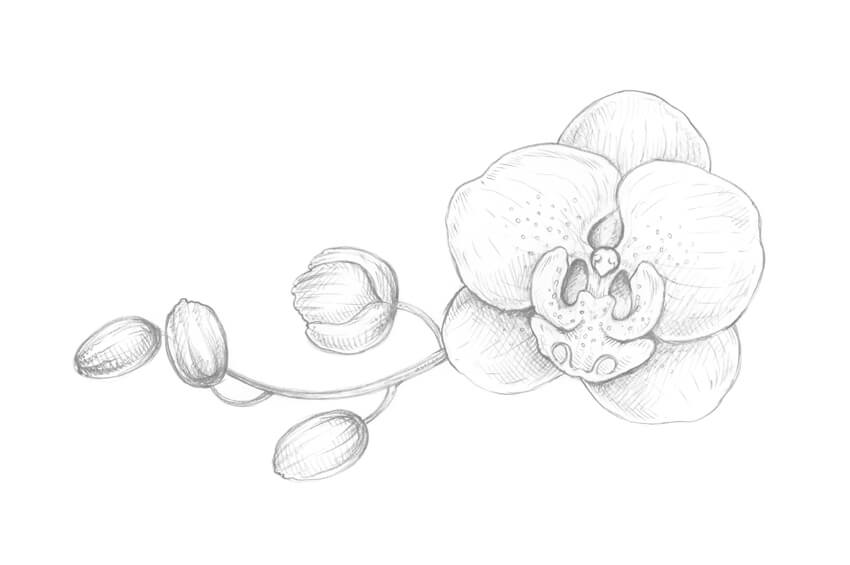
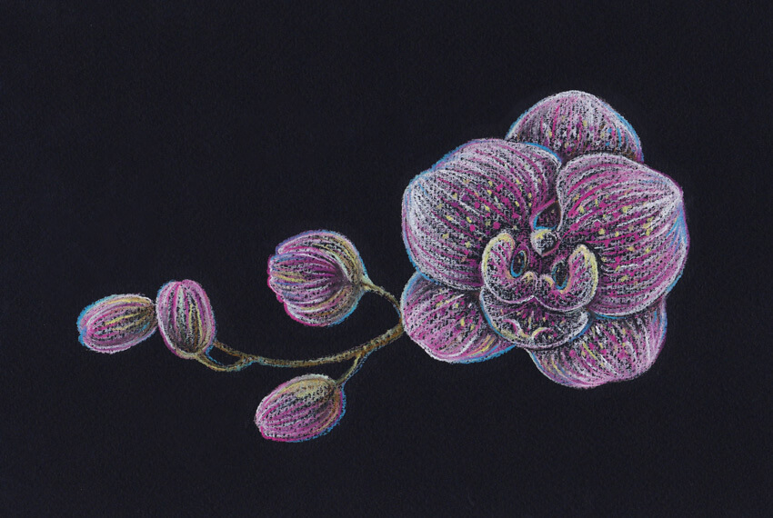
In this tutorial, I’ll show you how to draw an orchid. We will be using pastel pencils and black paper; this extraordinary combination of art supplies provides a broad space for experiments.

Orchids are wonderful, but drawing these flowers may seem challenging. I’ll show you an easy way to draw an orchid from scratch.

Our goal is to create a beautiful, expressive and emotional drawing, and have fun exploring the principles of making pastel sketches! 

What You Will Need

Pastel pencils of different colors:

  • White
  • Light yellow
  • Light rosy
  • Pink
  • Dark violet
  • Blue
  • Light green
  • Medium green
  • Dark green
  • Brown
  • Grey
  • Black

And additional supplies:

  • Black pastel paper (smooth or with a subtle texture)
  • A graphite pencil 
  • An eraser
  • A sharpener

The art supplies I will be using

1. How to Draw an Orchid With a Graphite Pencil

Step 1

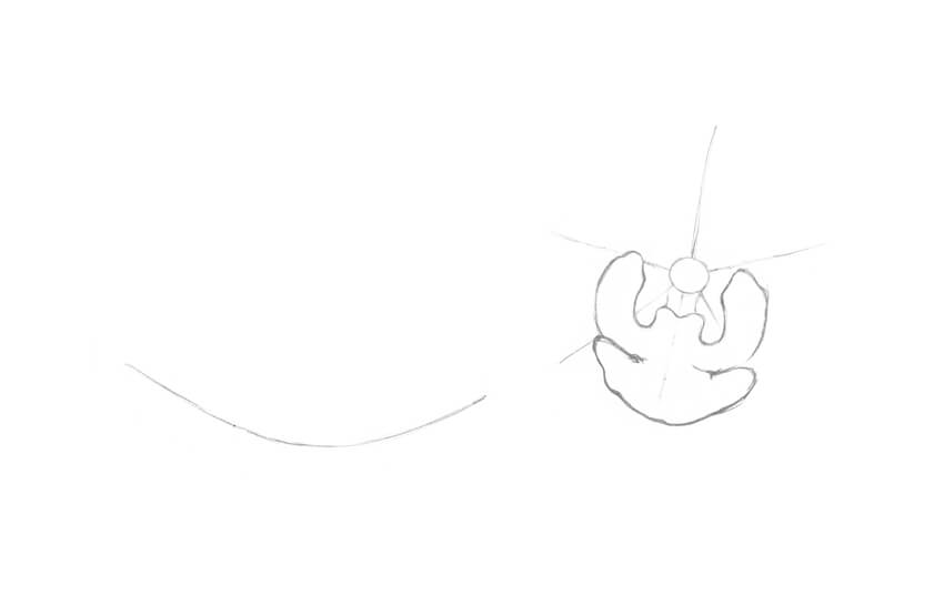
In this part of the tutorial, I’ll show you how to draw an orchid from scratch, using a graphite pencil.

I mark the center of the flower with a small circle and add five divergent lines for the petal shapes. Then I draw a curved line to mark the core of the twig.

Drawing the framework of the twig and the flower

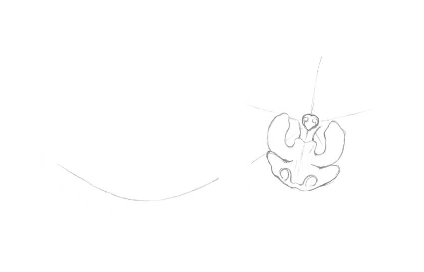
Step 2

In the central part of the flower, I draw two small vertical shapes that look like narrow petals.

Adding the first petals of the flower

Step 3

I add the lower petal of the orchid; it is also called a lip.

Adding the lower petal of the orchid

Step 4

It’s time to add details. I refine the central structure of the orchid (known as a column) and add two tendril-like elements to the lip of the flower.

Adding the details to the flower

Step 5

I add two large petals. The lines are slightly irregular; this way of drawing lines helps to emphasize the organic nature of the object. 

Drawing the petals

Step 6

I mark the sepals, which are three petal-like structures of approximately equal size.

Drawing the sepals

Step 7

I refine the twig, making it wider and adding the rough shapes of the buds.

Adding the twig and buds

Step 8

I outline the buds. They are facing in slightly different directions; this simple trick makes the floral composition more interesting.

Refining the shapes of the buds

Step 9

I draw a pattern of small circles on the orchid, and then add thin lines that mark the direction from the central point of the flower to the periphery. The flower looks more realistic now. 

Adding the pattern of the orchid

Step 10

I create a value sketch, marking the places in my drawing that I consider the darkest: under the top petals, between the details of the flowers, and at the sides of the buds.

With regard to working on black paper in future steps, this action becomes especially important. When we are drawing on a dark surface, we have to pay the most attention to the lightest and brightest areas of the drawing. That is why we need to know where they are beforehand.

Creating a value drawing

2. How to Draw With Pastel Pencils

Step 1

It’s time to try our tools and observe how the pastel pencils and black paper work together.

I draw small hatches and dots. As you can see, the strokes look uneven and spontaneous; it’s a perfect fit for the expressive floral sketch.

An example of short hatches made with a pastel pencil

Step 2

I create a basic hatching, varying the line width and the tilt of the pencil.

An example of long hatches made with a pastel pencil

Step 3

I incline the pencil and cover the paper with a layer of color. Just relax your hand and make a continuous line with soft rubbing movements.

My paper has a subtle texture, so the result of applying pencil strokes looks fascinating.

An example of a stroke made with a pastel pencil

Step 4

I draw the same type of a stroke that we’ve tried in the previous step and shade it with my finger. The colors of the pencil and the paper sheet are blending with a blurry effect.

You can also use additional supplies, such as special shading stumps or just an ordinary cotton bud. The choice is entirely up to you. 

An example of shading and blending the color

3. How to Draw an Orchid Twig With Pastel Pencils

Step 1

I outline the main contours of my drawing, trying to keep it visually close to the pencil sketch that I’m using as a reference. I leave very light lines with the grey pastel pencil.

In this step, you can change some elements of your composition if you wish to make your pastel drawing slightly different from the graphite pencil sketch.

Creating contours with a pastel pencil

Step 2

I apply soft strokes with the white pastel pencil to the orchid flower and buds. The lines are going from the center of the flower to the edges of its petals.

Drawing with the white pencil

Step 3

I shade the white strokes with my finger. Avoid going outside the contours of the shapes because this will cause a messy effect.

Shading the white strokes

Step 4

I add another layer of long hatches, using the white pencil. 

Now we have a base for applying bright colors and creating the pattern of the flower.

Applying another layer of the white color

Step 5

I add lines with the light rosy pastel pencil to the flower and buds.

Drawing with the light rosy color

Step 6

With the pink pastel pencil, I add more bright hatches and dots to reveal the pattern of the flower.

Adding nuances with the pink pencil

Step 7

To make the flower and the buds more contrasting, I add more hatches with the white color. 

It’s important to work on your drawing gradually and press on the pencils lightly because pastel paper can hold only a limited amount of the color pigment. 

Increasing the contrast with the white pencil

Step 8

I mark the twig with the brown pastel pencil. To keep the color unity of the artwork, I also add brown strokes to the central part of the flower and the buds.

Drawing the twig with the brown pencil

Step 9

I add dots and short hatches to the twig with the dark green pencil.

It is also a good idea to leave just a couple of hatches of this color within the buds’ shapes.

Adding the dark green color to the drawing

Step 10

I intensify the brightness of the orchid, using the pencil of the dark violet color.

The lines are visually blending with the existing pink and light rosy strokes, so the result looks vivid and colorful.

Adding the dark violet drawing

Step 11

It’s time to vary the coloring of the drawing. I add dots and hatches with the light yellow pencil.

The goal of this step is to set up the light accents and emphasize the pattern of the flower.

Adding dots and hatches with the light yellow color

Step 12

I add more bright, illuminated spots, applying the light green color.

You may notice that the light colors of the pastel pencils look closer to the white color when you are drawing on a dark surface.

Applying the light green strokes

Step 13

To make the drawing feel aerial, I add strokes and outline the contours with the blue pencil.

Such nuances of a cool color work great in shady areas of the drawing.

Drawing with the blue pencil

Step 14

Using the black pastel pencil, I make the borders between the elements in my drawing more accurate. 

I also strengthen the shadows in the area of the flower buds, giving the objects more volume and contrast.

Refining the drawing with the black pencil

Step 15

I use the white pencil once again to accent the details, especially in the central part of the orchid.

Accenting the details with the white pencil

Step 16

I add bright nuances with the pencil of the medium green color, slightly touching the contours of the flower and the buds.

Such tiny details always help to make the drawing more vivid.

Creating bright details with the green color

Step 17

I add more hatches with the light rosy pencil.

Accenting the pattern of the orchid with the light rosy color

Step 18

I evaluate my drawing and accent the tips of the petals even more, using the white pencil.

Final touches with the white pencil

Your Drawing Is Complete

Congratulations—you’ve created a beautiful artwork! I hope you’ve enjoyed the process of working with pastel pencils and black paper.

I wish you much success with this wonderful technique and your creative projects!

The final result

An Open Discussion About Art and Mental Health

Post pobrano z: An Open Discussion About Art and Mental Health

Does Pain + Art = Greatness?

Artists are masochists. We revel in the beauty of pain more than any other profession in the world. It’s an experience we create for our viewers that is almost palpable. And it is in this experience that we connect to each other, creating everlasting bonds with our audience.

Some of the world’s greatest artists have documented their own struggles with mental health. From depression and anxiety to a wide range of psychological disorders, these are all real themes that will always remain in art.

Vincent Van Gogh Self Portrait
Self-Portrait by Vincent van Gogh

So why does pain make for some of the best art ever created? Let’s explore this topic, as I dive a little into some art history while featuring the work of a few of today’s talented artists.

A Not So Starry Night

From mouse pads to laptop skins and even desktop wallpapers, it’s safe to say that The Starry Night is one of the most widely known and reproduced works of art. But did you know that its beloved creator, Vincent van Gogh, struggled with depression and psychotic episodes for most of his life?

The Starry Night by Vincent van Gogh
The Starry Night by Vincent van Gogh.

In fact, The Starry Night was created after a massive breakdown where he mutilated his own ear. He admitted himself to the Saint-Paul de Mausole asylum where he would later create the famous painting from his bedroom window.

But to him, the painting was a failure.

Today, it is estimated to be worth well over $100 million, and yet Van Gogh died poor.

Many artists today struggle with this profound realization. Must we die in order for our art to live? It’s a thought that weighs heavy on our hearts because it mixes our passion and sense of purpose with our ability to take care of basic human needs.

A Hard Existence

The world doesn’t make it easy to be an artist. It never has. And yet, we prevail. Despite the naysayers and nonbelievers, artists are still changing the lives of people around them with their beautiful creations.

Burnt Out

But even with their never ending persistence, many artists find it hard to making a living through their work, often taking little to no pay at all. This can, in turn, lead to mental health problems or intensify an ongoing battle if you’re not able to seek treatment.

That leads me to wonder… could we have saved Vincent van Gogh, and the many artists like him, by making art a more sustainable profession? And can art be a guiding light to understanding more mental health problems?

This inner battle of being overwhelmed when things get too tough is perfectly depicted in Burn Out, an illustration by artist Thomas Gutteridge.

Burn Out by Thomas Gutteridge
Burn Out. Art by Thomas Gutteridge.

Thomas writes:

I’ve seen firsthand the struggle of depression of one of my closest friends and it has really left an impression on me on how fragile the mind is. I created a piece that wasn’t a cliche of a struggle against yourself, but rather something that we could all easily relate to, having had those times when it all gets to be too much. Every thought and emotion cannot be contained and we all experience these moments in one way or another.

Depression is a serious condition that many face. And artist Yi Pan illustrates the dangers of this illness in her work, Holding onto Depression.

Holding Onto Depression by Yi Pan
Holding Onto Depression. Art by Yi Pan.

The setup for this piece is actually from a story about Aladdin where he ventures into an underground castle to retrieve a magical lamp, only to get diverted by an evil treasure. Riddled with greed, he picks up the treasure and the castle collapses. Yi shaped her symbolization of depression around this story, saying:

A hand holds the poison diamond
within a dark atmosphere, indicating that people’s hearts erode and
become vulnerable if they can’t let the sorrow go.

The True Costs of Mental Illness

Once a person finally seeks help, it becomes a juggle to retain treatment. And with the ever growing addictions associated with common pharmaceutical drugs, it often seems as if they’re exchanging one illness for another.

Dutch artist and designer Van Lieshout Vl does a wonderful job of shedding light on this topic with her piece, Mandala of Pills.

Mandala of Pills by Van Lieshout VI
Mandala of Pills. Art by Van Lieshout VI.

She writes:

I’m currently working on several pieces with medicine on them. A mandala, or „wheel of life” is used for ritual ceremonies. It has a geometric pattern that depicts the cosmos and symbolizes the quest for inner peace and mental stability.

Medication is at odds with this idea; the naive look of this mandala shows how easily we ignore the fact that pills are not as innocent as they seem to be.

Fighting Back With Art

After experiencing the frustrations of a creative block, Damir Martic painted Soul Alchemy, a painting depicting his own battle with anxiety and depression.

Damir said:

Feeling alone and lost, I forced myself to create anything. This is nothing like a self portrait, but rather a portrait of my soul.
A soul that is looking for peace, and a soul that is full of fears but still hoping for
the best. For the first time I can say out loud that I am an artist, and I was born to create and express my emotions.

But to do this I have to be my own best friend first. And even if I fall many times I have to keep going, not just for
me but for people I love. Just keep going, and do the best you can. 

Soul Alchemy by Damir Martic
Soul Alchemy. Art by Damir Martic.

But taking care of mental health concerns as a community also means that you’re working towards a more peaceful nation.

Shattering
Inner Journeys
by Tayfun Pekdemir is a series of paintings that
studies the psychological phenomena behind wars and destruction. He
notes:

Each society has a different way of evaluating types of
aggression due to cultural differences. Supported by arguments of some
personality theories and social
psychology, this study discusses the reasons why the aggressive nature of man leads to wars and destruction, and tries to find responses as to how phenomena such as peace and tolerance can finally emerge.

Shattering Inner Journeys by Tayfun Pekdemir
Shattering Inner Journeys. Art by Tayfun Pekdemir.

The Healing Power of Art

Frida Kahlo became my „art idol” at 13. Her work is not for the faint of heart, as it depicts her struggles with physical and mental health as well as a failing marriage to a fellow artist.

Even so, I connected to her then and still do today. I grew up surrounded by the beauty of eastern Long Island, NY, in a low-income household plagued with substance and domestic abuse. Art, for me, became my therapy long before I ever imagined it as a career.

So in homage to Frida, I’ve painted several self-portraits throughout my life depicting my various experiences. In one painting, I’ll Save You, I illustrate my own struggles with mental health and loneliness. Since I often depict myself as a sailboat, the painting becomes a two-part self-portrait, where the theme symbolizes, in a sense, that I must save myself.

Ill Save You by Melody Nieves
I’ll Save You. Art by Melody Nieves.

Despite the sad undertones, I find art to be incredibly cathartic, allowing me to fully process my experiences in a healthier, more productive manner.

Remembering the Fallen

But when I think of my own journey, I am reminded of many artists with similar struggles. One of our very own instructors here at Envato Tuts+, Marinke Slump, also known as Wink, documented her battle with Asperger’s Syndrome and depression. Unfortunately, she lost her battle to the disease when she took her own life in June 2015.

How to Crochet a Flower by Marinke Slump
How to Make a Crochet Flower. Tutorial by Wink.

Marinke often shared how the art of crocheting saved her life, and I think this idea is true for many artists. But her story, just like Vincent van Gogh’s, shows us how important it is to bring mental health awareness to the forefront of our discussions.

Supporting a Noble Cause

One of the best ways you can support the efforts towards mental health awareness is by creating art, of course!

Artist Dina Blokhina created this mock cover for The New York Times, stating:

Emotions, such as sadness, are just as beautiful and valuable as our positive experiences. This image invites the viewer to put him or herself in the same position,
facing an invisible struggle.
I
am a strong advocate for ending social stigmas against mental illness.
Thus, I painted this piece in honor of mental health awareness.

The Value of Mental Health by Dina Blokhina
The Value of Mental Health. Art by Dina Blokhina.

Dedicated to bringing out a meaningful experience behind this year’s 36 Days of Type, graphic designer Debarpan Das created a list of Alphabetical Disorders featuring artwork with themes of different mental health illnesses. He said:

It all started with this one idea that I had for the letter 'M’ when I
saw some kids playing on swings. I could instantly relate it to a
problem that I had as a teenager and I still suffer from, mood swings.
What I realized later was that it’s such a common problem that if I made
an illustration of it, a lot of people would actually connect to it. So
then I went on and made a list of all the common problems that I faced
as a teenager and what I had seen my younger roommate go through in the
past few years.

Alphabetical Disorders by Debarpan Das
Alphabetical Disorders. Art by Debarpan Das.

To highlight the ever-growing concerns of the mental health of youth today, Mariana Ikuta created this beautiful comic titled Self Zine.

She explains:

It is incredibly difficult not to become entangled in our impossible beauty standards and the subconscious necessity to fit in. We need to learn how to love ourselves as a whole and to not judge
people around us so harshly. I feel that, with support, we can grow our self-confidence, and maybe
the struggles of not loving ourselves might be a little bit
less common.

Self Zine by Mariana Ikuta
Self Zine. Art by Mariana Ikuta.

It Gets Better…

Some of the world’s most beautiful artworks are rooted in tragedy. Art remains a cathartic medium that allows us to process our emotions, but it is still very important to take care of yourself.

I’ll end with this piece, Take Care of Your Head, from artist Theo Payne, who writes:

Mental health isn’t a finite accomplishment. Sure, you can reach a place where you feel good, but it takes work to keep yourself there.

Take Care of Your Head by Theo Payne
Take Care of Your Head. Art by Theo Payne.

Nurture your mind like a farmer would take care of his garden. So if you or someone you know is struggling with mental health issues, please seek out professional help as soon as possible.

A Special Thank You

I’d also like to extend a warm thank you to all of the artists who were kind enough to lend me their art for this article. Feel free to check out their work by browsing their incredible portfolios below.

How to Create a Bodega Shop Illustration in Adobe Illustrator

Post pobrano z: How to Create a Bodega Shop Illustration in Adobe Illustrator

Final product image
What You’ll Be Creating

In this tutorial we will create a complete shop with all the details, in addition to some shrubs and a street with its lampposts, using the most basic shapes and tools of Adobe Illustrator.

Find more inspiration for your vector illustrations over on GraphicRiver.

1. How to Create a New Document 

Press Control-N to make a New Document. Set the Units to Pixels, and enter 800 x 600 for the width and height of the document. Then in the Advanced options, select RGBScreen (72 ppi), and make sure to uncheck the Align New Objects to Pixel Grid box before clicking OK.

Go to the Preferences (Control-K) and enter 1 px for the Keyboard increment. Press OK.

You can activate the Info panel (Window > Info) in order to have a preview of the size and position of your shapes. Remember to set the measuring unit to Pixels from Edit > Preferences > Units. This will greatly increase the speed of your work.

New Document and Set Keyboard increment

2. How to Create a Road

We’ll start with the road and the sidewalk of our shop.

Start by creating an 800 x 120 px rectangle using the Rectangle Tool (M). Use #706B79 as the fill color.

Now create the sidewalk using one 704 x 10 px rectangle (#A8A5AA) and one 704 x 6 px rectangle (#706B79). 

Creating the road street

3. How to Create a Store

Now for the most time-consuming step, the store.

Step 1

Start by creating the shop floor. Create a 314 x 7 px rectangle (#9D9588) with the Rectangle Tool (M).

Then create a column using a 36 x 256 px rectangle (#E9E7DC) and add details with two 22 x 53 px rectangles (#F9F6E6) and a 22 x 125 px rectangle (#F9F6E6). Set Inverted Round corners with a 5 px radius from the Transform panel.

Adding a column

Step 2

Now duplicate the internal forms of the column twice (Control-C followed by Control-F) and move them 2 px downwards with the keyboard’s arrow keys. Apply Minus Front from the Pathfinder panel to every copy.

Change the fill color to #D6D4C3. Group the column together (Control-G) and duplicate it (Control-C > Control-F) at the other end.

Adding details on the column

Step 3

Let’s create the door using a 90 x 180 px rectangle (#EAAB61). Then add another 62 x 34 px rectangle (#DB9747) and create a shadow by duplicating twice (Control-C followed by Control-F). Move the last copy 4 px downwards and 4 px to the right.

Set Minus Front from the Pathfinder panel.

Creating the door of the store

Step 4

Create the door’s window using a 62 x 112 px rectangle (#78C4ED). Now add a 5 x 112 px rectangle (#64ABD5) to act as a shadow.

Now create a pair of rectangles (#FFFFFF) and rotate them 45º with the Rotate Tool (R). Set a 30% Opacity in the top bar and with the Shape Builder Tool (Shift-M) remove the remaining forms.

Adding details in the window of the door

Step 5

Now, create a sign using a 30 x 20 px rectangle (#FFFFFF). Add two 2 x 18 px rectangles (#EAAB61), rotate them until they have a 45º angle using the Rotate Tool (R), and place them under the sign (right click > Arrange > Send Backward).

Then create a 6 x 6 px ellipse (#FFFFFF) using the Ellipse Tool (L). Draw two rectangles (#F7DDC0) on the sign.

Group the sign (Control-G) and duplicate it (Control-C > Control-F). Use #64ABD5 as fill color for the copy, move it 2 px downwards and to the right, and then send it behind the sign (Control-[).

Adding a sign

Step 6

Now create the handle using a 7 x 7 px ellipse (#BB7B33).

Now add a 224 x 27 px rectangle (#EAAB61) for the wall of the store and a 224 x 153 px rectangle (#78C4ED) for the window.

Duplicate the rectangle of the wall twice (Control-C followed by Control-F), and move the second copy 3 px downwards and 3 px to the right. Set Minus Front from the Pathfinder panel. Change the fill color to #DB9747.

Creating the wall and windows of the store

Step 7

Create some setoffs in the wall with a 3 x 16 px rectangle and a 61 x 3 px rectangle (#DB9747), grouping them together (Control-G) to form an inverted L. Then duplicate it twice (Control-C > Control-F).

Adding setoffs in the wall

Step 8

We will create some details in the window. Take the Pen Tool (P) and draw the top of a bar using the fill color #6BAFE2.

Then draw the seat’s shadows and some glasses on the table using the fill color  #5789C3. Round the seats’ corners using Live Corners with the Direct Selection Tool (A).

Creating the details in the window

Step 9

Now create the lamps using one 2 x 44 px rectangle (#5789C3) and one 22 x 12 px rectangle (#5789C3). Move the upper nodes of the last rectangle inwards by 4 px with the Direct Selection Tool (A).

Add an 8 x 8 px ellipse (#5789C3) under the hood of the lamp and group everything together (Control-G). Duplicate it (Control-C > Control-F) and place them far from each other.

Adding the lamps in the store

Step 10

Add reflections on the window, drawing three rectangles with the Rectangle Tool (M). Use #FFFFFF as the fill color and set a 30% Opacity in the top bar.

Rotate the rectangles 45° and use the Shape Builder Tool (Shift-M) to remove the rest of the form of the window.

Adding highlights on the window

Step 11

Now add the window divisions using one 7 x 180 px rectangle, one 217 x 7 px rectangle, and one 7 x 146 px rectangle. Use #F9F6E6 as the fill color.

Then add two 4 x 146 px rectangles (#64ABD5) and place them under the reflections (Control-[) as shown in the image below.

Windows divisions

Step 12

In this step we will create the blind. To do this, create a 24.15 x 74 px rectangle (#EAAB61) and round its lower corners. Duplicate the rectangle (Control-C > Control-F) three times and alternate the use of the fill color #EDEEF0.

Adding the blind on the store

Step 13

Now draw a rectangle (#EAAB61) one-third away from the lower part of the blind and remove the remaining shape with the Shape Builder Tool (Shift-M). Set the Blending Mode to Multiply and the Opacity to 35% using the Appearance panel.

Add a 314 x 4 px rectangle (#FFFDEF) in the fold of the blind, and from the Appearance panel set the Blending Mode to Soft Light and the Opacity to 50%. Group everything together (Control-G) and duplicate it (Control-C > Control-F).

Creating details on the blind

Step 14

Send the blind copy backwards (Control-[) and apply the fill color #000000. Set the Opacity to 10% in the top bar.

Move the copy downwards just once by pressing the Shift key.

More details and shadows

Step 15

Add a lintel by creating a 314 x 34 px rectangle (#E9E1C4). Then create a 296 x 168 px rectangle (#D6D0B5) and set Inverted Round corners with a 4 px radius from the Transform panel.

Afterwards, duplicate it twice (Control-C followed by Control-F) and move the last copy 2 px downwards. Then apply Minus Front with the previous copy using the Pathfinder panel. Use #C2BCA4 as the fill color.

Adding a lintel on the blind

Step 16

Create a 314 x 35 px rectangle (#D6D0B5) over the lintel. Then create a 4 x 28 px rectangle (#C2BCA4) and round the lower corners.

Duplicate it and place it at the other end of the lintel. Select both rectangles and go to Object > Blend > Make to merge. Then establish a 40 step separation from Object > Blend > Blend Options.

Another lintel and details on it

Step 17

Make some shadows on the columns using two 36 x 4 px rectangles (#D6D4C3). Afterwards, add a 314 x 7 px rectangle (#C2BCA4) above the lintel, and set the Blending Mode to Multiply with a 40% Opacity using the Appearance panel. 

Adding some shadows on the lintel and columns

Step 18

Let’s finish the roof, using a 405 x 27 px rectangle (#F9F6E6). Then, add one 351 x 14 px rectangle (#D6D0B5) and one 351 x 4 px rectangle (#C2BCA4). Finally, add a 360 x 7 px rectangle (#F9F6E6). 

Adding the ceiling

Step 19

Create some bushes with two 54 x 54 px ellipses and use #7FBB86 and #68A96A as the fill colors. Then, duplicate the bushes (Control-C > Control-F) and place the copy at the other end.

Be sure to place them behind the shop (Shift-Control-[).

Adding some bushes

4. How to Create a Lamppost

Step 1

In this step, we are going to create the lampposts on the street. To do this, use an 18 x 18 px rectangle (#7C7C7C) and move the upper nodes 2 px inwards with the Direct Selection Tool (A).

Then add a 7 x 194 px rectangle (#6B6B6B) and move the upper nodes 2 px inwards. Afterwards, draw a rectangle at the top and delete the rest with the Shape Builder Tool (Shift-M).

Creating the base for the lampposts

Step 2

Now create a 26 x 3 px rectangle (#6B6B6B) over the post and a 36 x 3 px rectangle (#6B6B6B) above the last rectangle. Create a 3 x 26 px rectangle and place it in the middle, make a copy (#424242) and change its height to 4 px in the Transform panel.

Then take the Pen Tool (P) and draw a trapezoid for the lamp using the fill color #F2F2F2. Place it below the rectangle (Control-[).

Adding the post and the base of the lamp

Step 3

Create a 36 x 3 px rectangle (#6B6B6B) and place it in the middle of the lamp. Use the Shape Builder Tool (Shift-M) to remove the ends with the shape of the lamp.

Now create a 26 x 26 px ellipse (#7C7C7C) and remove the lower node. Place it on the top of the lamp. Group the lamppost together (Control-G), duplicate it (Control-C > Control-F), and place it at the other end of the store.

Creating details on the lamp

Step 4

To finish, let’s create the sky. Create an 800 x 600 px rectangle (#80C3EA) and send it to the back of the canvas (Object > Arrange > Send to Back).

Duplicating the lampposts

Perfect, You’re Finished!

The result is commendable! Congratulations on reaching this point. I hope you enjoyed it as much as I did and that you have learnt a lot. I’ll be watching the comments!

Final result

3 Winners. 6 Premium WordPress and HTML Themes. 1 Week Only

Post pobrano z: 3 Winners. 6 Premium WordPress and HTML Themes. 1 Week Only

Do you enjoy web design as much as we do? Do you appreciate building websites on the basis of ready-made website templates? How many of them do you already have in your collection? And now imagine that you can download a premium WordPress or HTML template of the last generation at absolutely no cost! Sounds […]

The post 3 Winners. 6 Premium WordPress and HTML Themes. 1 Week Only appeared first on Web Resources Depot.

How to Create a Summer Picnic Community Event Flyer in Adobe InDesign

Post pobrano z: How to Create a Summer Picnic Community Event Flyer in Adobe InDesign

Final product image
What You’ll Be Creating

Planning a town fair, family picnic or summer BBQ? This summery flyer is super simple to put together and would be a great fit for any family foodie event. Suitable for beginners to Adobe InDesign, this tutorial will show you how to set up a single-page layout which is ready to print or circulate online.

Find even more cool flyer templates for summer events on GraphicRiver, to ensure your next event draws in the crowds. 

Ready for summer? Fantastic, let’s go…

What You’ll Need to Create Your Flyer

You’ll need access to Adobe InDesign to put together your flyer design. If you don’t have an InDesign subscription, that’s no problem—you can download a 30-day free trial of the software from Adobe

If you’d like to add optional items to your tablecloth, like the plate shown here, you will also need to have access to Adobe Photoshop, for removing the backgrounds of your images. This is a completely optional step, so you can still create the flyer without adding objects to your tablecloth.

You’ll also need to download the following images and fonts:

Save the images to a folder you can easily find, and install the font files. 

1. How to Set Up a Flyer Document in InDesign

We’ll be setting up the flyer to a standard size, 8.5 by 11 inches. If you want to design to a different size you can either tweak the proportions of elements as we go, or export the final design as an image and scale it up or down.

Step 1

Open InDesign and go to File > New > Document. Keep the Intent set to Print, Number of Pages to 1, and uncheck Facing Pages.

Under Page Size, choose Flyer 8.5×11 from the list of presaved sizes, or type in 8.5 in (or 215.9 mm) for the Width and 11 in (or 279.4 mm) for the Height.

flyer page size

Step 2

Set the Top and Bottom Margins to 26 mm and the Left and Right Margins to 33 mm.

Add a Bleed of 5 mm to all edges of the page if you’re intending to send the flyer to print; if not, you can leave the bleed set to 0. Then head up and click OK.

new document

2. Lay Out Your Picnic Cloth Background

Step 1

Expand the Layers panel (Window > Layers) and double-click on the default Layer 1 name in the layers list.

Rename the layer Tablecloth and click OK.

layer options

Step 2

Take the Rectangle Frame Tool (F) from the Tools panel and drag across the page, extending the frame up to the edge of the bleed on all sides. 

Go to File > Place, navigate to your tablecloth image, and click Open. Double-click inside the image frame to directly select the image. Hold down Shift and drag to enlarge the image, until the checks are large and generous.

gingham photo

3. How to Create a Border on Your Layout

Step 1

Expand the Swatches panel (Window > Color > Swatches) and click on the New Swatch button at the bottom of the panel. 

Name the swatch Lemon, and set the Type to Process and Mode to CMYK. Set the percentage levels to C=7 M=1 Y=68 K=3, click Add, and then click OK to exit the window.

lemon swatch

Step 2

Return to the Layers panel and lock the Tablecloth layer. Click on the Create New Layer button at the bottom of the panel, and rename this new layer Border.

border layer

Select the Rectangle Tool (M) and drag onto the page to create a shape that extends up to the margin line. 

From the Swatches panel, set the Fill of the shape to your new Lemon swatch, and the Stroke of the rectangle to [Paper] (white). 

rectangle tool

Step 3

Expand the Stroke panel (Window > Stroke) and increase the Weight of the shape’s stroke to 23 pt. From the Align Stroke options, choose the central option, Align Stroke to Inside. 

rectangle with white border

With the shape still selected, head up to Object on the top menu and choose Corner Options. In the window that opens, set the Size of all corners to 29 mm, and the Shape to Inverse Rounded.

corner options

Step 4

With the rectangle selected, go to Object > Effects > Transparency. Decrease the Opacity to around 93% to bring through some of the gingham pattern below. 

effects

Then click on Drop Shadow in the left-hand menu of the panel. Set the Mode to Multiply, Opacity to around 22%, Distance to 2 mm, Angle to 65 Degrees, and Size to 7 mm. Click OK to apply the effects and exit the window. 

drop shadow
final border

4. How to Format Typography on Your Flyer

Step 1

Back in the Layers panel, lock the Border layer and create a new layer above, calling it Typography.

layers panel

Take the Type Tool (T) and drag onto the yellow border to create a text frame. Here we’re going to type in the name of the event, so here ‘Family’. 

From either the Character panel (Window > Type & Tables > Character) or the Character Formatting Controls panel running along the top of the workspace, adjust the Font to Nicoline, Size 160 pt, and Align Center. 

From the Swatches panel, adjust the Font Color to [Paper].

family text

Step 2

Select the text frame and Edit > Copy, Edit > Paste it, moving it below the original text frame. Adjust the text to read the second part of your event title, here ‘Picnic’.

layers panel

Select both text frames and go to Object > Effects > Outer Glow. Next to the Mode drop-down menu, click on the colored square to open the Effect Color window. Choose the red swatch in the list of default swatches, and click OK.

outer glow

Bring down the Opacity to 7%, and set the Technique to Softer and the Size to around 2.5 mm. Set Noise to 30% and Spread to 38%, before clicking OK

final text effect

Step 3

Create a new CMYK color swatch from the Swatches panel, naming it Sky and setting the levels to C=70 M=14 Y=0 K=0.

sky swatch

Zoom into the top half of the yellow border. Create a new text frame using the Type Tool (T) and type in an introductory sentence, like ‘Come along to Sunnydale’s’.

Set the Font to Charlevoix Pro Medium, Size 16.5 pt, Tracking 90 and Align Center. You might want to pull out a key detail like the place in Charlevoix Pro Semibold. 

color text

Step 4

Select the text frame and Edit > Copy, Edit > Paste. Drag it down to the bottom of the border, and adjust the text to read the date and time of the event. Increase the Font Size to 22 pt, and set the Weight to Semibold

From the Glyphs panel (Window > Type & Tables > Glyphs) you can insert a bullet to separate the information by double-clicking on the glyph in the panel.

glyphs panel

Step 5

Edit > Paste the text frame again, moving it below the date and time frame. Adjust the text to list some of the things people can expect on the day. You could also put info about ticket pricing and release dates.

Bring the Font Size down to around 14 pt. 

glyphs panel

5. How to Add a Ribbon to Your Flyer

Step 1

Head back to the Swatches panel and create a new CMYK swatch. Name it Brown and set the levels to C=79 M=78 Y=81 K=0.

brown swatch

Create a new layer called Ribbon, and place this below the Border layer and above the bottom layer, Tablecloth. Lock all the other layers while you work on Ribbon.

Create a small rectangle using the Rectangle Tool (M) which bridges the gap between the left edge of the yellow border and the edge of the bleed on the left side of the page.  

brown shape

Step 2

Select the brown shape and head up to Object > Effects > Drop Shadow. Add a Multiply shadow, adjusting the Opacity and other options until you’ve created a subtle wash of shadow beneath the ribbon.

drop shadow

Take the Line Tool (\) and, holding Shift, drag to create a short horizontal line along the top part of the brown shape. From the Swatches panel, set the Stroke Color to [Paper]. From the Stroke panel, set the Weight to 3 pt and Type to Dashed (3 and 2). 

dashed stroke

With the dashed line selected go to Object > Effects > Transparency and bring the Opacity down to 65%, before clicking OK.

transparency effect

Copy and Paste the line, dragging the copy down into a mirrored position along the bottom edge of the brown shape. 

pasted line

Step 3

With your mouse, select the brown shape and both dashed lines, before Right-Clicking > Group. 

group

Select the group, Edit > Copy and Edit > Paste. Maneuver this pasted group over to the right side of the flyer, so it appears as if a ribbon is wrapping around the layout. 

pasted graphic

6. Add Optional Objects to Your Tablecloth

This is a completely optional step of the tutorial. If you’d like to add items like plates, cutlery or anything else to the top of your tablecloth, you will need access to Photoshop and a selection of photos of items with a white background.

Step 1

Open the plate with a blue rim image in Photoshop

Select the Elliptical Marquee Tool from the Tools panel and, holding Shift, drag to create a perfect circle on the page, matching the dimensions of the plate as best you can. Use the arrow keys to shuffle the position of the marquee.

marquee tool

Then click on the Refine Edge button at the top of the workspace. Adjust the sliders until the marquee has a tight selection around the edge of the plate, and then click OK.

refine edge

Edit > Copy, Edit > Paste the selection, moving it onto a new layer above. Switch off the visibility of the original layer.

pasted plate

Step 2

As well as removing the background of your photo, you can also adjust the color levels to better suit the scheme used on your flyer design.

Add a new Color Balance Adjustment layer from the bottom of the Layers panel. Here I’ve tweaked the Cyan and Blue sliders to give the plate a more vivid sky blue hue.

color levels

When you’ve finished editing your image, go to File > Save As, saving the image as a Photoshop (PSD) file. 

Step 3

Return to your InDesign flyer document and create a new layer (here called Plates) above the Ribbon layer and below the Border layer.

layers panel

Use the Rectangle Frame Tool (F) to create a new image frame in one corner of the page. File > Place your object image and adjust the scale to create a flat-lay effect. 

You can also add a shadow for more realism by going to Object > Effects > Drop Shadow. 

drop shadow
final design

Your flyer artwork is finished—awesome job! If you want to circulate your flyer online, you can head up to File > Export and choose Adobe PDF (Interactive), JPEG or PNG from the Format drop-down menu. If you’re planning to send off your flyer for professional printing, read on to find out how best to export your design…

7. How to Export Your Flyer for Printing

Step 1

First up, File > Save your flyer artwork. 

Then head back to the File menu and choose Export. From the Format drop-down menu in the window that opens, choose Adobe PDF (Print), and click Save

In the Export window that opens, choose Press Quality from the Preset menu at the top of the window. Check the box that reads View PDF after Exporting.

press quality

Step 2

Click on Marks and Bleeds in the window’s left-hand menu. Check All Printer’s Marks and Use Document Bleed Settings.

marks and bleed

Then click Export to create your print-ready PDF file. 

print marks

Conclusion: Your Finished Flyer

Congratulations, your flyer is finished and is ready for circulating. You’ve picked up lots of great techniques for creating layouts for print in InDesign, so let’s recap a few of the main skills you can take forward to other projects. You now know how to:

  • Create a standard flyer layout using Adobe InDesign.
  • Build up a photographic background and colorful border to create a layered, 3D effect.
  • Create your own basic graphics, such as ribbon shapes, directly in InDesign.
  • Format typography to a professional standard.
  • Edit and place images into your layout to create an on-trend flat-lay look.
  • Export your completed artwork as a print-ready PDF.

You can find even more great flyer templates for summer events over on GraphicRiver, so make sure to check them out! 

final flyer