Archiwum kategorii: Web Tools

How to Create Traditional Romanian Objects in Adobe Illustrator

Post pobrano z: How to Create Traditional Romanian Objects in Adobe Illustrator

Final product image
What You’ll Be Creating

In today’s
tutorial, we’re going to take a close look at the process of creating a particularly
interesting icon pack, since we’re going to illustrate some Romanian traditional
objects that are the living definition of what “home” was back before the
digital age. As always, we’re going to use and abuse Illustrator’s geometric
shapes, in combination with some basic tools such as the Align panel and
Pathfinder.

That being said, grab a fresh batch of coffee and let’s dive in!

Also, if you’re
looking to expand the project, you can do so by heading over to GraphicRiver
and checking out some of their home-themed icons.

1. How to Set Up a New Document

Since I’m hoping that you already have
Illustrator up and running in the background, bring it up and let’s set up a New Document (File > New or Control-N)
using the following settings:

  • Number
    of Artboards:
    1
  • Width:
    800
    px
  • Height:
    600
    px
  • Units:
    Pixels

And from the Advanced tab:

  • Color
    Mode:
    RGB
  • Raster
    Effects:
    Screen (72ppi)
  • Preview Mode: Default
setting up a new document

2. How to Set Up a Custom Grid

Since we’re going to be creating the icons
using a pixel-perfect workflow, we’ll want to set up a nice little Grid so that we can have full control
over our shapes.

Step 1

Go to the Edit > Preferences > Guides & Grid submenu, and adjust
the following settings:

  • Gridline
    every:
    1 px
  • Subdivisions: 1
setting up a custom grid

Quick
tip:
you can learn more about grids by reading this
in-depth piece on how Illustrator’s Grid System works.

Step 2

Once we’ve set up our custom grid, all we
need to do in order to make sure our shapes look crisp is enable the Snap to Grid option found under the View menu, which will transform into Snap to Pixel each time you enter Pixel Preview mode.

Now, if you’re new to
the whole “pixel-perfect workflow”, I strongly recommend you go through my how
to create pixel-perfect artwork
tutorial, which will help you widen your
technical skills in no time.

3. How to Set Up the Layers

With the New Document created, it would be
a good idea to structure our project using a couple of layers, since this way
we can maintain a steady workflow by focusing on one icon at a time.

That being said, bring up the Layers panel, and create a total of four
layers, which we will rename as follows:

  • layer
    1
    : reference grids
  • layer
    2
    : pan flute
  • layer 3: sewing frame
  • layer 4: wooden spoons
setting up the layers

4. How to Create the Reference Grids

The
reference grids (or base grids)
are a set of precisely delimited reference surfaces, which allow us to build
our icons by focusing on size and consistency.

Usually, the size of the grids determines
the size of the actual icons, and they should always be the first decision you
make on you start a new project, since you’ll always want to start from the
smallest possible size and build on that.

Now, in our case, we’re going to be
creating the icon pack using just one size, more exactly 128 x 128 px, which is a fairly large one.

Step 1

Start by locking all
but the “reference grids” layer, and then grab the Rectangle Tool (M) and create a 128 x 128 px orange (#F15A24) square, which will help define the
overall size of our icons.

creating the main shape for the reference grid

Step 2

Add a smaller 120 x 120 px one (#FFFFFF) which will
act as our active drawing area, thus giving us an all-around 4 px padding.

creating the main shape for the active drawing area

Step 3

Group the two squares composing the
reference grid using the Control-G keyboard
shortcut, and then create three copies at a distance of 40 px from one another, making sure to align them to the center of
the Artboard.

Once you’re done,
lock the current layer and move on to the next one where we’ll start working on
our first icon.

creating and positioning the remaining reference grids

5. How to Create
the Pan Flute

The pan flute,
also known as panpipes, is a simple yet interesting musical instrument dating all
the way back to the ancient Greeks. It takes its name from Pan, the god of
nature and protector of shepherds. The name itself is a derivative of the word “paein”
which means “to pasture”, which is probably the reason why so many cultures,
including mine, have associated the instrument with the act of herding.

To me, this little
object has a special meaning, since it manages to take me back to a time and
place when life was simpler, and home wasn’t all about the place, but the
people that made it home.

Now, without wasting any more time, make sure you’re on the right layer
(that would be the second one) and let’s get kick off the project by recreating
it.

Step 1

Start working on the pan flute’s upper section, by creating an 8 x 6 px rectangle, which we will color
using #899E47 and then align to the top edge of the active drawing area,
positioning it at a distance of 4 px from
its top edge and 20 px from its left
one.

creating and positioning the main shape for the upper section of the pan flutes body

Step 2

Give the shape an outline using the Stroke method, by creating a copy of it
(Control-C) which we will paste in
front (Control-F) and then adjust by
changing its color to #2B3249 and then flipping its Fill with its Stroke (Shift-X). Set the Stroke’s Weight to 4 px, selecting and grouping both
shapes together afterwards using the Control-G
keyboard shortcut.

adding the outline to the main shape of the pan flutes upper body

Step 3

Create nine copies of the shape that we’ve just
grouped (Control-C > Control-F nine
times), and then horizontally distribute them onto the original’s right side,
using the Align panel so that their
outlines end up overlapping.

creating and positioning the remaining shapes for the pan flutes upper section

Step 4

Create the pipes using ten rectangles (#A8755A—see the dimensions
below) with a 4 px thick outline (#2B3249),
which we will horizontally stack next to one another, grouping (Control-G) and then positioning them
underneath the smaller rectangles.

  • first pipe: 8 x 110 px
  • second pipe: 8 x 102 px
  • third pipe: 8 x 94 px
  • fourth pipe: 8 x 82 px
  • fifth pipe: 8 x 74 px
  • sixth pipe: 8 x 66 px
  • seventh pipe: 8 x 54 px
  • eighth pipe: 8 x 46 px
  • ninth pipe: 8 x 38 px
  • tenth pipe: 8
    x 30 px
creating and positioning the main shapes for the pan flutes pipes

Step 5

Add an 8
px
wide 4 px thick Stroke line (#2B3249) to the first,
fourth and seventh pipe’s lower section, positioning it at a distance of 2 px from their outlines. Once you’re done, select and group all the shapes that we have so far using the Control-G keyboard shortcut.

adding the horizontal detail lines to the pan flutes pipes

Step 6

Create the horizontal section holding all the
pipes together using a 92 x 16 px rectangle
(#CE9D78) with a 4 px thick outline
(#2B3249), which we will group (Control-G)
and then center align to the pipes, positioning it at a distance of 12 px from the active drawing area’s
top edge.

creating and positioning the main shapes for the section holding the pan flutes pipes together

Step 7

Start adding details to the section from the
previous step, by creating the center flower using eight 2
x 2 px
circles (#2B3249), which we will position around another 2 x 2 px one (2B3249). Once you have
them in place, don’t forget to select and group (Control-G) them together so that they won’t get separated by
accident.

creating and positioning the main shapes for the pan flutes center flower

Quick tip: for the current and
following step I recommend you turn on Pixel
Preview
mode (Alt-Control-Y)
since it will give you the ability to carefully position each and every circle
as seen in the reference image. Once you’re
done, exit the mode by pressing Alt-Control-Y
again.

Step 8

Start working on the left decorative wave
pattern using a couple of 2 x 2 px circles
(#2B3249), which we will position as seen in the reference image. Once you’re
done, select and group (Control-G)
all the circles together before moving on to the next step.

creating and positioning the main shapes for the pan flutes left decorative pattern

Step 9

Finish off the current icon by adding the right
segment of the decorative pattern, using a copy of the one from the previous
step (Control-C > Control-F),
which we will position onto the opposite side of the flower, making sure to
vertically reflect it once we have it in place (right click > Transform > Reflect > Vertical). Once you’re
done, select and group (Control-G)
the decorative pattern to the underlying section, doing the same for all of the
icon’s composing shapes afterwards.

finishing off the pan flute icon

6. How to Create the Sewing Frame

Living in a digital age can really erase some of the older arts from one’s
mind, especially if that person never encountered them in real life. Sewing,
which is thought to have originated way back in the Stone Age, was and in some
places still is a powerful part of the Romanian culture and tradition, since it
has been used as a means of decoration of both the home and the clothes and
tools used back in the day.

To me personally, sewing brings back so many fond
memories from my childhood, when I used to sit next to my grandmother and watch
her spend hours creating beautiful art pieces to decorate her
home.

That being said, let’s get back to our own art, by first making sure we’re on
the right layer (that would be the third one) and then creating our
second icon.

Step 1

Start working on the frame’s main body by
creating a 106 x 106 px circle (#CE9D78)
with a 4 px thick outline (#2B3249),
which we will group (Control-G) and
then center align to the underlying active drawing area’s top edge.

creating and positioning the main shapes for the sewing frames larger body

Step 2

Create a smaller 90 x 90 px circle (#A8755A) with a 4 px thick outline (#2B3249), which we will group (Control-G) and then center align to the
one from the previous step.

creating and positioning the main shapes for the sewing frames inner body

Step 3

Add the canvas using a 78 x 78 px circle (#EFD4C5) with a 4 px thick outline (#2B3249), which we will group (Control-G) and then center align to the
previous section. Once you’re done, select and group (Control-G) all three sections together as well.

creating and positioning the main shapes for the sewing frames canvas

Step 4

Start working on the frame’s bottom section by
creating its outline using a 20 x 18 px rectangle
(#2B3249), which we will center align to the active drawing area’s bottom edge,
making sure to send it to the back of the larger circles (right click > Transform > Arrange > Send to Back).

creating and positioning the main shape for the outline of the sewing frames bottom section

Step 5

Add the fill section using a smaller 12 x 14 px rectangle (#CE9D78) which we
will center align to the top edge of the previously created shape.

adding the fill shape to the bottom section of the sewing frame

Step 6

Create an 18
px
tall 4 px thick Stroke line (#2B3249), which we will
center align to the shape from the previous step.

adding the vertical detail line to the sewing frames bottom section

Step 7

Start working on the little tightening screw, by creating its main body
using a 44 px wide 4 px thick Stroke line (#2B3249), which we will
position towards the bottom section of the frame, leaving a 2 px gap between it and the larger
outline.

creating and positioning the main shape for the body of the sewing frames tightening screw

Step 8

Add the screw’s cap using an 8 x
8 px
square (#2B3249), which we will center align to the
body’s right anchor point. Once you’re done, select and group (Control-G) the two shapes together,
sending them to the back of the bottom section afterwards (right click > Transform > Arrange > Send to Back).

adding the head to the sewing frames tightening screw

Step 9

Start working on the actual decorative flower by creating the center
section using four 2 x 2 px squares
(#2B3249) which we will position so that they end
up forming a plus sign. Group (Control-G)
the shapes and then center align them to the canvas.

creating and positioning the main shapes for the center section of the sewing frames decorative flower

Step 10

Turn on the Pixel
Preview
mode (Alt-Control-Y) and
create the upper section of the flower’s top-left petal,
using three sets of four 2 x 2 px squares
(#E56F5C) which we will position next to one another, pushing each set 2 px up so that they end up forming a
stair set. Group (Control-G) the
squares and then position them onto the left side of the plus sign, making sure
to leave a 2 px gap between them.

creating and positioning the main shapes for the upper section of the sewing frames top left petal

Step 11

Create a copy of the section from the previous step (Control-C > Control-F), which we
will rotate (right click > Transform
> Rotate > 90º
) and then horizontally reflect (right click > Transform > Reflect > Horizontal),
positioning the resulting shape underneath the original.

creating and positioning the main shapes for the bottom section of the sewing frames left petal

Step 12

Give the petal an outline, by adding a couple of 2 x 2 px squares (#2B3249) around its two composing sections,
making sure to select and group (Control-G)
all of them together once you’re done.

adding the outline to the sewing frames top left petal

Step 13

Create the other petals using three copies (Control-C > Control-F three times) of the one that we’ve just
finished working on, which we will position around the center plus sign,
reflecting them as needed.

adding the remaining petals to the sewing frames flower

Step 14

Continue adding details to the flower by creating four copies (Control-C > Control-F four times) of
its center plus sign, which we will position on the outer edge of space found
between each pair of petals.

adding the remaining plus signs to the sewing frames flower

Step 15

Finish off the flower, and with it the icon itself, by adding diagonal lines to each of its petals, using four sets of 2 x 2 px squares (#2B3249). Once you’re done, select and group (Control-G) all of the flower’s
composing shapes together, doing the same for the entire icon afterwards.

finishing off the sewing frame icon

7. How to Create
the Wooden Spoons

We are now down to
our third and last icon, which is composed of a set of traditional handmade
spoons, which are another powerful means of expression of Romanian people’s minds, used not only to decorate but also as a tool within their households.

I’m not even going
to talk all that much about this art form, since I’m really hoping that by
creating this little icon you’ll gain a powerful enough curiosity to search for more information on it.

That being said, make sure you’re on the right layer (that would be the
fourth one) and let’s finish this.

Step 1

Start working on the first spoon by creating an 8 x 8 px circle (#D3685E) with a 4 px thick outline (#2B3249), which we will group (Control-G) and then position at a
distance of 16 px from the active
drawing area’s left edge, making sure to align it to its top edge afterwards.

creating and positioning the upper circular section of the first wooden spoon

Step 2

Create a slightly larger 12
x 12 px
circle (#CE9D78) with a 4 px
thick outline (#2B3249) on top of which we will add another 4 x 4 px circle (#2B3249). Group (Control-G) all three shapes together,
and then position them below the previous section.

adding the second circular section to the first wooden spoons handle

Step 3

Create the spoon’s first set of petals using two 10 x 10 px rectangles (#CE9D78), which we will adjust by setting
the Radius of their lower outer
corners to 8 px and their upper
inner ones to 4 px from within the Transform panel’s Rectangle Properties. Give the resulting shapes a 4 px thick outline (#2B3249),
individually grouping (Control-G)
each petal, and then positioning them below the previous section.

adding the first set of petals to the first wooden spoons handle

Step 4

Create the remaining sets of petals using three
copies (Control-C > Control-F three times) of the ones that we already have, vertically
stacking them underneath one another.

adding the remaining sets of petals to the first wooden spoons handle

Step 5

Adjust the color of some of the petals by
carefully selecting them using the Direct
Selection Tool (A)
and then changing the color to #A8755A.

adjusting the color of some of the first wooden spoons petals

Step 6

Create a copy (Control-C > Control-F) of the spoon’s two circular sections, which we will position below its petals,
making sure to horizontally reflect them (right
click > Transform > Reflect > Horizontal
) and change the color of
the larger one’s fill shape to #A8755A.

adding the bottom circular sections to the first wooden spoons body

Step 7

Create the section connecting the small bowl to
the spoon’s handle using an 8 x 16 px rectangle (#A8755A) (1),
which we will adjust by adding a pair of side anchor points at a distance of 4 px from its top edge using the Add Anchor Point Tool (+) (2). 

Then,
individually select and push the shape’s top anchors to the inside by a
distance of 2 px (right click > Transform > Move >
Horizontal > + / – 4 px
depending on which side you start with) (3) giving
the resulting shape a 4 px thick
outline (#2B3249) (4).

creating the main shapes for the section connecting the first wooden spoons body to its bowl

Step 8

Add two 8
px
wide 2 px thick Stroke lines (#2B3249) vertically stacked 3
px
from one another, grouping (Control-G)
and then positioning the current section below the smaller circle.

positioning the connecting section onto the first wooden spoons body

Step 9

Finish off the spoon by creating its bowl using
a 16 x 16 px circle (#CE9D78), which we will
adjust by selecting and pushing its lower anchor point to the bottom by a
distance of 6 px (right click > Transform > Move > Vertical > 6 px). Give the resulting shape a 4
px
thick outline (#2B3249), grouping (Control-G)
and then positioning the two shapes onto the previous section. Once you’re
done, select and group (Control-G)
all of the spoon’s composing shapes together, before moving on to the next one.

finishing off the first wooden spoon

Step 10

Start working on the icon’s second spoon by
creating an 8 x 20 px rectangle (#A8755A)
which we will adjust by setting the Radius
of its top corners to 4 px from
within the Transform panel’s Rectangle Properties. Give the
resulting shape a 4 px thick outline
(#2B3249) followed by three 2 x 2 px circles (#2B3249) vertically stacked at 2 px from one another, grouping (Control-G) and then positioning the
shapes onto the right side of the first spoon, at a distance of 24 px.

creating and positioning the main shapes for the upper section of the second wooden spoons body

Step 11

Add the circular section using a 12 x 12 px circle (#A8755A) with a 4 px outline (#2B3249) on top of which we will add a smaller 4 x 4 px circle (#2B3249), grouping (Control-G) and then positioning the shapes below the previously
created section, so they end up slightly overlapping them.

adding the circular section to the upper section of the second wooden spoons body

Step 12

Create a 12 x 16 px rectangle
(#CE9D78) which we will turn into a diamond by adding a new anchor point to the
center of each of its edges using the Add
Anchor Point Tool (+)
, removing the corner ones afterwards using the Delete Anchor Point Tool (-). Give the
resulting shape a 4 px thick outline
(#2B3249), grouping (Control-G) and
then positioning them both at the back of the circular section (right click > Transform > Arrange
> Send to Back
).

adding the diamond section to the second wooden spoons body

Step 13

Create two 8 x 8 px circles
(#899E47) with a 4 px thick outline
(#2B3249), individually grouping (Control-G)
and then positioning them onto each side of the upper section of the diamond.

adding the two side circular sections to the upper section of the second wooden spoons body

Step 14

Start working on the spoon’s main body by creating an 8 x 10 px rectangle (#A8755A), followed
by a larger 12 x 34 px one (#A8755A),
which we will unite and then position below the previous sections.

creating and positioning the main shapes for the second wooden spoons main body

Step 15

Adjust the shape by setting the Radius
of its top corners to 4 px, adding a
pair of side anchor points at a distance of 14 px from its bottom edge. Then, individually select and push the
bottom anchor points to the inside by a distance of 4 px (right click >
Transform > Move > Horizontal > + / – 4 px
depending on which side
you start with).

adjusting the shape of the second wooden spoons main body

Step 16

Create the body’s lighter section using a 12 x 12 px square (#CE9D78) which we will center align to the
larger shape, positioning it at a distance of 15 px from its top edge.

adding the lighter section to the second wooden spoons body

Step 17

Give the larger body a 4 px thick
outline (#2B3249), followed by five 12
px
wide 2 px thick Stroke lines (#2B3249) vertically
stacked 3 px from one another,
which we will group (Control-G) and
then center align to the section’s lighter rectangle.

adding the outline and the horizontal detail lines to the second wooden spoons main body

Step 18

Add two pairs of two 2 x 2 px circles
(#2B3249) vertically stacked 2 px from
one another, positioning one on the upper section of the body and the other
one on the bottom. Once you’re done, select and group all of the current
section’s composing shapes together using the Control-G keyboard shortcut.

adding the little circles to the second wooden spoons main body

Step 19

Add an 8
x 8 px
circle (#899E47) with a 4 px thick
outline (#2B3249), which we will group (Control-G) and then position on top of
the previous section, at a distance of 22
px
from the active drawing area’s bottom edge.

adding the circular section to the bottom of the second wooden spoons body

Step 20

Finish off the spoon, by adding the bowl using a
16 x 22 px ellipse (#A8755A) with a 4 px thick outline (#2B3249), which we will group (Control-G)
and then position below the smaller circle. Once you’re done, select and group
(Control-G) all of its composing
sections together as well, before moving on to the third and last spoon.

finishing off the second wooden spoon

Step 21

Start working on the third spoon, by creating a 12 x 16 px ellipse (#CE9D78) with a 4 px thick outline (#2B3249) on top of which we will add a 4 x 4 px circle (#2B3249), grouping (Control-G) and then positioning all three shapes at a distance of 20 px from the second spoon’s right
edge.

creating and positioning the main shapes for the upper circular section of the third wooden spoons body

Step 22

Create an 8 x 8 px circle (#CE9D78)
with a 4 px thick outline (#2B3249)
which we will group (Control-G) and
then position below the previous section, at a distance of just 3 px.

adding the smaller circular section to the third wooden spoons body

Step 23

Create two more 8 x 8 px circles (#D3685E) with a 4 px thick outline (#2B3249), which we
will individually group (Control-G)
and then position onto the sides of the two sections that we have so far.

adding the side circular sections to the third wooden spoons body

Step 24

Create a slightly larger 12 x 12 px circle (#A8755A) with a 4 px thick outline (#2B3249) on top of
which we will add a 4 x 4 px circle
(#2B3249). Group (Control-G) all
three shapes together and then position them below the smaller circular
section.

adding the larger circular section to the third wooden spoons body

Step 25

Start working on the spoon’s flower by creating its petals using four 10 x 10 px squares (#CE9D78), which we will adjust by setting the Radius of two of its corners to 6 px from within the Transform panel’s Rectangle Properties. Give the resulting shapes a 4 px thick outline (#2B3249), and then
position them slightly over the previous section, selecting and grouping (Control-G) all four of them together.

creating and positioning the main shapes for the third wooden spoons flower petals

Step 26

Change the color of the bottom-left and
top-right petals to #A8755A, and then add an 8 x 8 px circle (#D3685E) with a 4 px thick outline (#2B3249) in their
center, grouping all of them together afterwards using the Control-G keyboard shortcut.

adding the circular section to the third wooden spoons flower

Step 27

Create a copy (Control-C >
Control-F
) of the circular section found above the spoon’s flower, and
position it below it, making sure to change the color of its fill shape to #CE9D78.

adding the bottom circular section to the third wooden spoons body

Step 28

Create the spoon’s lower body using a 20 x 32 px rectangle (#A8755A), from the bottom of which we will remove
two 14 x 24 px ellipses (highlighted
with red) using Pathfinder’s Minus Front Shape Mode. Once you’re
done, position the resulting shape below the previous section.

creating and positioning the lower section of the third wooden spoons body

Step 29

Set the Radius of the
resulting shape’s top corners to 10 px (2),
adding a lighter 20 x 12 px rectangle
(#CE9D78) which we will position at a distance of 6 px from its top edge (3). Then, add five 20 px wide 2 px thick Stroke lines (#2B3249) vertically
stacked 3 px from one another,
which we will group (Control-G) and
then center align to the smaller shape’s center (4). 

Add a 4 x 4 px circle (#2B3249) to the top of the larger shape (5),
followed by a 4 px thick outline (#2B3249)
(6), selecting and grouping (Control-G)
all the shapes together afterwards.

adding details to the lower section of the third wooden spoons body

Step 30

Finish off the spoon, and with it the icon itself, by adding its little
bowl using a 16 x 22 px rectangle (#CE9D78)
which we will adjust by setting the Radius
of its top corners to 8 px from
within the Transform panel’s Rectangle Properties. Give the resulting
shape a 4 px thick outline (#2B3249),
grouping (Control-G) and then
positioning the two below the previously created section. Once you’re done,
select and group (Control-G) all of
the icon’s composing sections as well.

finishing off the wooden spoons icon

It’s a Wrap!

Great work! I hope that you’ve managed to
follow and understand each and every step, and most importantly learned something
new and useful along the way.

finished project preview

How to Create a 3D Stuffed Letters Text Effect in Adobe Photoshop

Post pobrano z: How to Create a 3D Stuffed Letters Text Effect in Adobe Photoshop

Final product image
What You’ll Be Creating

This tutorial will show you how to use Adobe Photoshop’s 3D tools and settings, along with a couple of patterns and stock images, to create a lovely stuffed letters text effect. Let’s get started!

This text effect was inspired by the many Layer Styles available on GraphicRiver.

Tutorial Assets

The following assets were used during the production of this tutorial:

1. How to Modify and Save Pattern Images

Step 1

Go to File > Open to open the Free EPS file Vector set of floral seamless pattern 01 file. This will bring up the Rasterize EPS Format box, where we’ll change the Mode to RGB Color, and uncheck the Anti-aliased box.

Unchecking the Anti-aliased box will give us crisp results, so that we can easily select the patterns without having to deal with blurry edges.

Rasterize EPS Format

Step 2

Once the file opens, zoom in a bit to the top left corner, and you can see that the first pattern has some transparent parts, which will create discontinuity issues if used as it is.

So the next couple of steps will be only to fix this pattern’s issue. For the other patterns, you’ll just need to select and save them as images.

Transparent Part

Step 3

Pick the Rectangular Marquee Tool, and create a selection around the first pattern’s image. The selection doesn’t have to be precise as we’ll fix it in the next step.

Create a Selection

Step 4

Right-click the selection and choose Transform Selection. Zoom in to each edge and drag the selection on top of it, so that you have an exact selection of the pattern image.

Once you’re done, hit the Return key to accept the changes, and go to Edit > Copy.

Transform Selection

Step 5

Create a new file with the Clipboard dimensions, and go to Edit > Paste.

Pick the Move Tool, press-hold the Shift key, and drag the pasted image down to the center of the document.

Paste and Drag the Image

Step 6

Duplicate the pattern image’s layer, and drag the copy upwards to the center of the document, so that its bottom edge touches the original image’s top edge.

Duplicate and Move

Step 7

Use the Rectangular Marquee Tool to create a selection over the empty areas, and use the Paint Bucket Tool to fill it with the pink color around it.

Fill the Empty Areas

Step 8

Select both layers and press Command-E to merge them.

Go to File > Save, and save the pattern as an image (jpg) file. It’s better to give each pattern a number to make it easier to use them later on.

Save the Pattern Image

Step 9

For the rest of the patterns, just select, copy and paste, and save them as images.

2. How to Create Text Shape Layers

Step 1

Create a new 1000 x 626px document with a White Background.

Then, create the text in All Caps using the font HWT Artz. Set the Size to 350 pt and the Tracking to 50.

Create the Text

Step 2

Rename the text layer to Text, right-click it, and choose Convert to Shape.

Convert to Shape

3. How to Create Stroke Shape Layers

Step 1

Duplicate the Text layer, and rename the copy to Back Piping.

Back Piping Layer

Step 2

Pick the Direct Selection Tool (A). In the Options bar, change the Fill to None, the Stroke Color to #e9e7e2, and its Size to 5.

Click the Set shape stroke type icon to change the Align to Outside.

Shape Stroke Settings

Step 3

Duplicate the Back Piping layer twice. Rename the first copy to Sides, and the second to Front Piping. Then, change the SidesStroke Size to 2.5.

Sides and Front Piping Layers

4. How to Create a Simple Curved Shape

Step 1

Pick the Rectangle Tool, click anywhere in the document, and type in 5 for the Width and 600 for the Height.

Create a Rectangle

Step 2

Pick the Add Anchor Point Tool, and click somewhere near the middle of each of the rectangle’s vertical sides, to add two anchor points.

Rename the shape layer to Back as we will use it for the back shadows.

Add Anchor Points

Step 3

Click-drag to select both anchor points, and use the Right Arrow key to nudge them a little bit to the right.

Nudge the Anchor Points

5. How to Create 3D Layers

Step 1

For each shape layer you have, select it, and go to 3D > New 3D Extrusion from Selected Path.

New 3D Extrusion

Step 2

Select all 3D layers you have, and then go to 3D > Merge 3D Layers.

Merge 3D Layers

6. How to Work With the 3D Scene

Step 1

To access the 3D mesh settings and properties, you’ll need to open two panels: the 3D panel and the Properties panel (both found under the Window menu).

The 3D panel has all the components of the 3D scene, and when you click the name of any of those, you’ll be able to access its settings in the Properties panel. So make sure to always select the tab of the element you want to modify in the 3D panel before you change its settings in the Properties panel.

3D and Properties Panels

Step 2

If you select the Move Tool, you’ll find a set of 3D Modes for it to the right of the Options bar.

When you choose one of those, you can then click and drag to perform changes (on the selected element in the 3D panel).

Use those modes to change the Current View into an angle you like.

Move Tool 3D Modes

7. How to Adjust 3D Mesh and Cap Settings

Step 1

Select the Text and Sides mesh tabs in the 3D panel, and change their Extrusion Depth in the Properties panel to 30.

Extrusion Depth

Step 2

Select the Back Piping and Front Piping mesh tabs, and change their Extrusion Depth to 3.

Extrusion Depth

Step 3

Select the Text mesh tab, and click the Cap icon at the top of the Properties panel.

Change the Sides to Front and Back, the Bevel Width to 1, the Contour to Half Round, the Inflate Angle to 90, and the Strength to 7.

Text Cap Settings

Step 4

Select the Back Piping and Front Piping mesh tabs, and click the Cap icon again.

Change the Sides to Front and Back, the Bevel Width to 15, the Contour to Half Round, and the Inflate Strength to 10.

Piping Meshes Cap Settings

8. How to Move 3D Meshes and Change Camera Views

Step 1

Pick the Move Tool, and use the 3D Axis to move the Back Piping mesh to the back of the text.

The arrows at the ends of the axis move the mesh, the part below them is used for rotation, and the cubes are used for scaling. The cube in the center is used to scale the object uniformly. All you need to do is click and drag the part you want.

3D Axis

Step 2

You can change the Current View to better see what you’re doing, by choosing a preset from the View menu in the Properties panel.

Change the Current View

9. How to Create Pattern Materials

Step 1

Select all the Text Mesh Material tabs.

In the Properties panel, change the Specular Color to (24, 15, 7), and the Shine to 100%.

Text Mesh Material

Step 2

Select the Text mesh tab, and go to 3D > Split Extrusion. This will separate the letters.

Select and split all the other meshes you have, except for the Back mesh.

Split Extrusion

Step 3

Select the first Text Front Inflation Material tab, click its Diffuse texture icon, choose Replace Texture, and open the first pattern image you want to use from the ones you saved at the beginning of this tutorial.

Replace Texture

Step 4

Click the Diffuse texture icon again, and choose Edit UV Properties.

Edit UV Properties

Step 5

Adjust the Tile and Offset values to get a result you like.

Edit UV Properties Settings

10. How to Add a Bump Texture

Step 1

Click the Bump folder icon and choose New Texture.

New Texture

Step 2

Set the Width and Height values to 512, and the Resolution to 300.

New Texture Settings

Step 3

This will open the new texture file. If it does not, click the Bump texture icon and choose Edit Texture.

When the file opens, duplicate the Background layer.

Edit the Texture

Step 4

Double-click the copy layer to apply a Pattern Overlay effect with these settings:

  • Pattern: denim 7
  • Scale: 50%

Save and close the file to go back to the 3D Scene.

Pattern Overlay

Step 5

Edit the Bump texture’s UV Properties, and zoom in to better see the effect.

UV Properties

Step 6

Change the Bump value to 5, or any other value you like.

The Bump Value

11. How to Save and Reapply a Material

Step 1

With the Front Inflation Material tab still active, click the Material Picker box, click the pop-up menu icon, and choose New Material.

New Material

Step 2

Type in a name for the material, and then click OK.

New Material Name

Step 3

Select the rest of the first Text Material tabs except for the Extrusion. Then, open the Material Picker, scroll down to the material icon you’ve just saved, and click it to apply it to the selected materials.

Reapply Saved Material

12. How to Replace Material Textures

Step 1

Apply the saved material to the second Text Front Inflation, Front Bevel, Back Bevel, and Back Inflation Materials.

Apply to the Second Text Mesh

Step 2

Select the second Text Front Inflation Material tab, click its Diffuse texture icon, and choose Replace Texture to open another pattern image.

Replace Texture

Step 3

Select the second Text Front Bevel, Back Bevel, and Back Inflation Material tabs, click the Diffuse texture icon, and choose the name of the pattern used from the list you get, instead of replacing it separately for each material.

You might need to change the UV Properties for the new texture, so just keep that in mind after adding each new one.

Replace Texture and Edit UV Properties

Step 4

Repeat the same steps for the rest of the letters you have.

Replace the Rest of the Letters Textures

13. How to Create Simple Piping Material

Step 1

Select the Front Inflation Material tab of the first Front Piping mesh, click the Diffuse texture icon, and choose Remove Texture.

Remove Texture

Step 2

Change the Diffuse Color to (233, 231, 226).

Diffuse Color

Step 3

Click the Bump folder icon, and choose the Text Front Inflation Material – Bump texture from the list.

Zoom in to edit the UV Properties, and change the Bump value to 2.

Add the Bump Texture

Step 4

Save the material and apply it to the rest of the Piping Materials.

In order to tile the Extrusion Material, you need to select all the Piping mesh tabs, and set the Texture Mapping to Tile.

Texture Mapping

Step 5

Go back to any of the Piping Extrusion Material tabs, edit its UV Properties, save the material, and apply it to the rest of the Piping Extrusion Materials you have.

Piping Extrusion Materials

14. How to Reposition the Letters

Step 1

Select the Text, Front Piping, Sides, and Back Piping mesh tabs of the first letter.

Use the 3D Axis or the Coordinates values in the Properties panel to rotate and move the letter.

Move the Letter Meshes

Step 2

Repeat that for the other letter meshes you have. You can always go back to any letter and adjust it.

Move the Other Letter Meshes

Step 3

Select the first letter’s mesh tabs again, click the 3D panel menu icon, and choose Move Object to Ground Plane.

Repeat that for the rest of the letters.

Move Object to Ground Plane

Step 4

Select all the mesh group tabs, and nudge them just a little bit downwards along the Y Axis. This will help create the illusion of the letters’ weight on the sofa, by pushing them into the ground plane.

Move along the Y Axis

15. How to Create a Background

Step 1

Go to File > Place Linked, and open the Empty clean white room with branches decor 3D rendering image.

Resize it as needed, and rename its layer to Background Image.

Background Image

Step 2

Place the Plant (Epipremnum pinnatum) image on top of the Background Image layer, and rename its layer to Plant.

Hide the 3D layer to focus on the background elements if you like.

Add the Plant

Step 3

Resize, rotate, and move the plant image to place it over the vase’s sticks in the Background Image. You can stamp-clone the sticks, but we are going to blur the background anyway, so you can skip that.

Place the Plant

Step 4

Select the Background Image layer, go to Filter > Blur > Gaussian Blur, and set the Radius to 5.

Gaussian Blur

Step 5

Repeat that to blur the Plant image.

Gaussian Blur

16. How to Select and Isolate an Image

Step 1

Open the White sofa isolated on white image, pick the Quick Selection Tool, and you can check the Auto-Enhance box in the Options bar if you like. It might slow down the process a bit, but can create cleaner selections.

Click-drag slightly to select the sofa.

Quick Selection

Step 2

You can press-hold the Option key, and click-drag to deselect any unwanted areas. Just make sure to drag slightly over small areas to get the best result.

Deselect Unwanted Areas

Step 3

Once the sofa is selected, click the Select and Mask button in the Options bar.

Change the View to On Black, and increase the Opacity to 100%.

Play around with the Smooth and Shift Edge values under the Global Refinements tab to get the best selection.

Select and Mask

Step 4

Click OK when you’re done, and go to Edit > Copy.

Copy the Selected Sofa

Step 5

Go back to the 3D document, go to Edit > Paste, and rename the layer to Sofa.

Right-click the Sofa layer, choose Convert to Smart Object, and resize the sofa to fit within the scene.

Add the Sofa

Step 6

Make the 3D layer visible, and adjust the Camera View to place the letters on top of the sofa.

Adjust the Camera View

17. How to Adjust a 3D Scene’s Lighting

Step 1

Select the Infinite Light 1 tab, and change the Intensity to 45% and the Shadow Softness to 30%.

Infinite Light 1

Step 2

Use the Move Tool or the Coordinates values to move the light to the window in the background image.

Move Infinite Light 1

Step 3

Click the Add new Light to Scene icon at the bottom of the 3D panel, and choose New Infinite Light.

New Infinite Light

Step 4

Change the Infinite Light 2’s Intensity to 30%, and uncheck the Shadow box.

Infinite Light 2

Step 5

Move the light so that it illuminates the upper part of the text.

Move Infinite Light 2

Step 6

Click the Environment tab, click the IBL texture icon to choose Replace Texture, and open the Bedroom image.

Environment IBL

Step 7

Change the Intensity to 90%, and move the light around to get a lighting you like.

Environment Light

18. How to Add Invisible Elements and Render a 3D Scene

Step 1

Show the Back mesh, rotate it -90° around the Y Axis, and scale it until it fills the sofa’s back.

Adjust the Back Mesh

Step 2

Move and rotate the Back mesh until it touches all the letters.

Move the Back Mesh

Step 3

Make sure to set the Current View to the final angle you want to render.

Select the Back mesh tab, uncheck its Cast Shadows box, and check the Invisible box. This will help create a surface that catches the shadows without being visible in the scene.

Back Mesh Settings

Step 4

Once you’re done modifying the 3D scene, go to 3D > Render to render it. The rendering might take a while, but you can stop it any time by pressing the Esc key.

You can also stop the rendering to adjust the lighting, the meshes, or anything else you think needs tweaking, and render again, until you get a result you like.

When you’re done rendering, convert the 3D layer into a smart object to avoid making any accidental changes.

Render the 3D Scene

Step 5

Right-click the 3D layer, and choose Create Clipping Mask. This will clip the Back mesh shadows to the sofa.

Create Clipping Mask

Step 6

Click the Add layer mask icon at the bottom of the Layers panel.

Set the Foreground Color to Black, pick the Brush Tool, choose a soft round tip, and paint over any unwanted areas to hide them.

Mask Unwanted Areas

19. How to Add Shadows

Step 1

Create a new layer below the 3D layer, call it Back Shadow, and change its Blend Mode to Linear Burn.

Set the Foreground Color to #848285, and start painting shadows where the letters touch the sofa’s back to intensify the effect.

Add Back Shadows

Step 2

Change the Back Shadow layer’s Opacity to a value you like, and use the Eraser Tool to get rid of any unwanted parts of the shadow.

Back Shadow Settings

Step 3

Create a new layer under the Back Shadow layer, call it Drop Shadow, and change its Blend Mode to Linear Burn.

Add shadows where the letters touch the sofa. Then, press Command-T to enter the Free Transform Mode, scale them down vertically, and place them right below the letters.

Hit the Return key to accept the changes, and repeat if necessary.

Add Drop Shadows

20. How to Add Finishing Touches

Step 1

Place the Bokeh – Golden Lights 5184 x 3456 Pixels image on top of the Plant layer, and rename its layer to Bokeh.

Change the Bokeh layer’s Blend Mode to Screen, and resize it as needed to fit within the scene.

Go to Filter > Blur > Gaussian Blur, and set the Radius to 3.

Add the Bokeh Texture

Step 2

Click the Create new fill or adjustment layer icon at the bottom of the Layers panel, and choose Gradient Map.

Create the gradient fill using the colors #44386e to the left, #716d7c in the middle, and #d4a987 to the right.

Check the Dither box, and change the layer’s Blend Mode to Soft Light, and its Opacity to 35%.

Gradient Map

Step 3

Select the Plant layer, and go to Image > Adjustments > Vibrance.

Change the Vibrance to -35 and the Saturation to -10.

Vibrance

Step 4

If the sofa looks very sharp, apply a Gaussian Blur with a Radius value around 0.25.

Sofa Gaussian Blur

Congratulations, You’re Done!

In this tutorial, we saved pattern images, created a bunch of shape layers, converted them to 3D meshes, and created their materials.

Then, we started adding background elements and adjusting the 3D scene’s lighting and camera view accordingly, to render the final result.

Finally, we added some more shadows and adjusted the coloring of the final result.

Please feel free to leave your comments, suggestions, and outcomes below.

Final Result

40 Professional Real Estate Flyer Templates

Post pobrano z: 40 Professional Real Estate Flyer Templates

Need a winning combination for your next open house? Check out this selection of 40 amazing real estate flyers for clean, professional designs.

40 Professional Real Estate Flyers

Rule the area in your local real estate market with an exceptional flyer. Feature your gorgeous listings with a phenomenal print design to match!

In this collection of incredible premium assets, we’re showcasing 40 professional real estate flyers curated from both GraphicRiver and Envato Elements.

Use these flyers to sell your next house, or enlist the help of a talented professional from Envato Studio for all your creative needs.

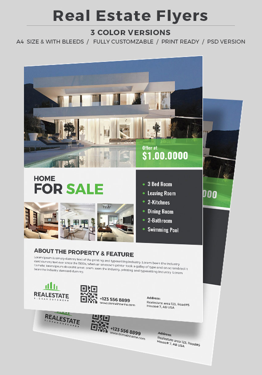
Simple Real Estate Flyer

Let’s kick things off with this stunning and sophisticated real estate flyer. This flyer includes a unique square-based design, with easily editable text and smart objects. An alternative design is also included for when you want to change things up!

Simple Real Estate Flyer

Griyo Real Estate Flyer

Enjoy a sleek and professional flyer design with this awesome Griyo template. This template features a print-ready design created in A4 format, with four photo placeholders you can easily modify with your own images.

Griyo Real Estate Flyer

Corporate Real Estate Flyer

Make your properties the star of your next flyer! This gorgeous template features a clean, modern design with plenty of room to highlight your listing’s most important information. Select from three distinct color versions to put your business on the map!

Corporate Real Estate Flyer

Real Estate Flyer

Impress your future clients with this stunning flyer design. This template features a clean, minimalist theme with three unique layouts to choose from. Available in both Photoshop and Illustrator formats, this template works perfectly in standard design software.

Real Estate Flyer

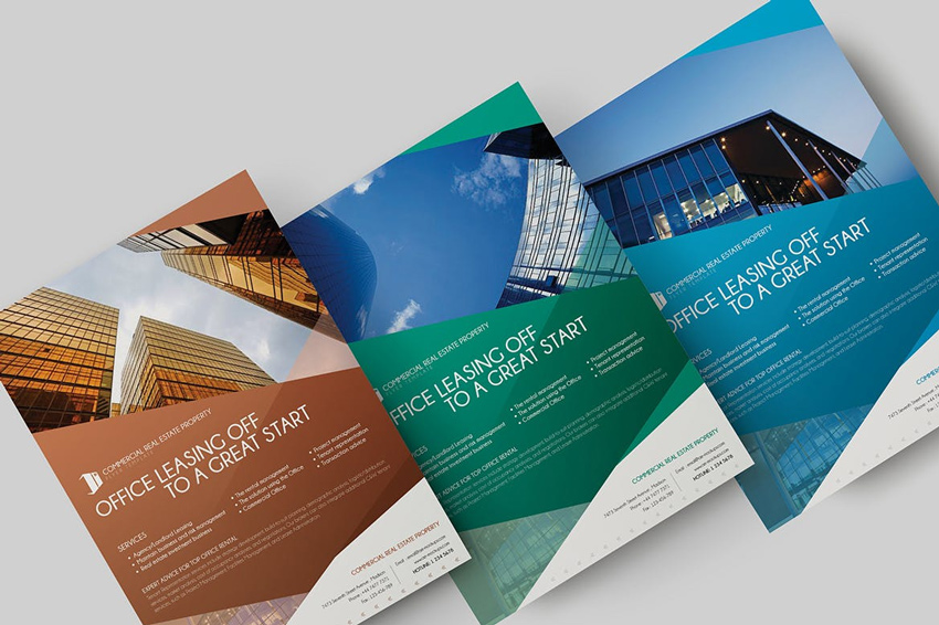
Commercial Real Estate Property Flyer

Be the king or queen of real estate in your town with this amazing real estate flyer. Great for commercial companies, this template features a bold, colorful design with stylish details and fully editable layers. Create the success you want with a winning flyer design.

Commercial Real Estate Property Flyer

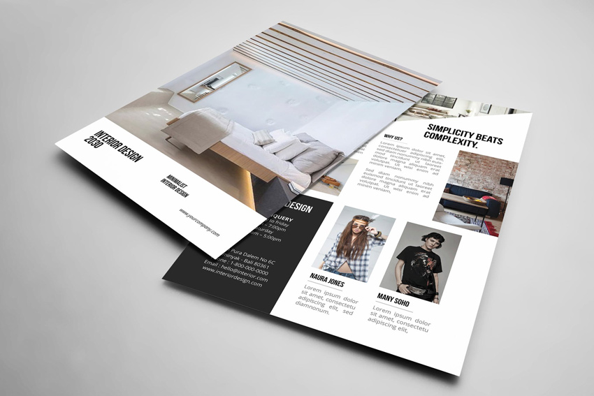
Interior Design Flyer

Calling all interior decorators! Put your creativity and craft on display with this awesome flyer template. This template features a sleek, modern style with plenty of white spacing for text and more. Showcase your best work and gain new clients with this extraordinary template.

Interior Design Flyer

Real Estate Flyer- 5 Layouts

Need a quick solution for your next listing? Then check out this awesome flyer set! This set includes five beautiful layout options to make your flyers shine! A great choice for when you’re on a budget, this set gives you five amazing flyers that are ready to go whenever you are.

Real Estate Flyer- 5 Layouts

Urban Real Estate Flyer

Download a trendy flyer design to promote your property in style. Designed in the US Letter size with plenty of bleed, this template features a clean, modern design with fully editable vector elements. It’s also available in both Photoshop and Illustrator formats for your convenience.

Urban Real Estate Flyer

Construction Real Estate Flyers

Are you in the construction business? Meet the clients and contractors that need you with this awesome set of real estate flyers. This simple template is easy to use and perfect for beginners to Adobe Illustrator. Find fully editable vector and text elements with two design alternatives for more options.

Construction Flyers

Premium Real Estate Flyer

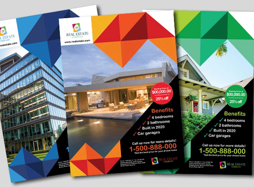
Ready to sell your first home? Then feast your eyes on this gorgeous pack of three unique flyers. Inspired by trendy geometric design, these flyers show your listings in a whole new light! Included in this download are three A4 format templates, designed with a high resolution and in CMYK mode.

Premium Real Estate Flyer

Simple and Elegant Real Estate Flyer

Enjoy a beautiful and elegant flyer that screams sophistication! This premium flyer design features a minimalist theme with eight total Photoshop files. It’s great for beginners to design—you can let this flyer do all the selling for you!

Simple and Elegant Real Estate Flyer

Real Estate Flyer V2

Your beautiful listings should have equally beautiful flyers to match! And with this template you’ll get just that! Included with this stunning design are three color variations in orange, green, and magenta. Find this file easy to edit with completely organized layers.

Real Estate Flyer V2

Minimal Real Estate Flyer

Promote your real estate with this stylish minimalist design. This design was created in the standard US Letter format, with fully editable text and images. Replace the placeholder images with favorites from your listings and get ready for endless business!

Minimal Real Estate Flyer

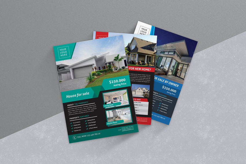
Colorful Real Estate Flyers

Get three incredible designs all in one simple download! This awesome template pack features three professional real estate flyers with bold, vibrant colors. Choose a template according to your mood or listing, and customize it with just a few short clicks!

Colorful Real Estate Flyers

Real Estate Business Flyer

Why look like every other listing when you can make them your own? This unique business flyer features an exquisite circular design with room for your company details, contact, and listing information. With a help file also included, you can edit any text or design element easily in this simple download.

Real Estate Business Flyer

Multipurpose Real Estate Flyers

Create the perfect flyer for your real estate business. This impeccably designed flyer features your real estate front and center followed by a selection of important information. Expand your business and enjoy access to three alternate colors in an easy-to-use A4 file.

Multipurpose Real Estate Flyers

Real Estate Flyer Vol.5

There’s nothing more beautiful than an elegantly designed flyer. And you’re sure to knock the socks off any client with this incredible template. Volume five of this set was designed exclusively for corporate and small scale companies and features fully layered files that are easy to customize.

Real Estate Flyer Vol5

Real Estate Flyer

Real estate flyers are the perfect companion to your marketing campaigns. This modern design features a polaroid-like photo scheme with plenty of room for your listing’s details. Enjoy fully editable vector elements and three alternative designs to find one that fits your needs.

Real Estate Flyer

Perfect Home Real Estate Flyer

Help your buyers find the perfect home with this awesome flyer design. This flyer features a professional design that highlights your real estate business with style. Enjoy the beautiful blue color scheme or choose from three others to match to your official brand.

Perfect Home Real Estate Flyer

Real Estate Flyer Template

Show your buyers that they’re in the right hands with a professional flyer! This template features a beautiful minimalist design with two color variations, all within an easy-to-edit file. Download this file to get access to this clean, modern design with an additional help file included.

Real Estate Flyer Template

Circular Real Estate Business Flyer

Provide the best home shopping experience for your buyers with this professional real estate flyer. This template features a curvy design with unique vector banners and a modern color scheme. Plug in the images and customize the text to get started with this flyer today!

Circular Real Estate Business Flyer

Premium Real Estate Flyers

Sell your best listings fast with this set of premium flyer designs. These templates feature two different style options with a unique layout that is sure to grab buyers’ attention. Edit the text easily or change the colors to fit your business.

Premium Real Estate Flyers

Corporate Real Estate Flyer

Sell stunning high-rises and premiere luxury condos with this exquisite set of real estate flyers. Replace the main image with one of your own before editing the text easily in this fully customizable template. Enjoy additional colors for more lovely options.

Corporate Real Estate Flyer

Real Estate Flyer

Get ready to sell your next listing with this awesome real estate flyer. This flyer features a simple box-themed design, with two separate layout options available. And not only is it very easy to edit but you’ll also find six incredible designs to choose from!

Real Estate Flyer

Real Estate Flyer and AD

Take on a beautiful modern perspective with this set of real estate flyers. This template includes an amazing geometric-inspired design that frames your listings perfectly. Take your marketing to the next level with this super stylish design.

Real Estate Flyer and AD

Professional Real Estate Flyer Template

Attract prospective clients with this gorgeous real estate flyer. This flyer features a modern, professional design that can be used to highlight a listing or your entire business. Download this package to get access to fully layered Photoshop and InDesign files with easily editable vector elements.

Professional Real Estate Flyer Template

Real Estate Agent Flyer

This real estate flyer just might be the perfect match for your business! This template includes a clean, professional design in a high-resolution format. Great for users of Adobe InDesign, this template is print-ready for immediate use!

Real Estate Agent Flyer

Pro Real Estate Flyer Template

Rock the industry like the professional you are with this modern flyer template. This design features a fully editable file with room for four unique images. Find links to free fonts within your download before updating this template with your own amazing copy.

Pro Real Estate Flyer Template

Real Estate Flyer Bundle

Be a smart shopper with incredible design bundles. This bundle features three exquisite flyer designs that are completely print-ready for your immediate use. Choose from multiple color variations and three creative layout options to sell your properties.

Real Estate Flyer Bundle

Premium Real Estate Flyers

Here’s another great bundle you definitely don’t want to miss! In this selection of premium flyers, you’ll find four Photoshop files with plenty of smart objects to change the images easily. They’re compatible with Photoshop CS2 and later versions, so download these templates today!

Premium Real Estate Flyers

2 Real Estate Flyers

For more incredible deals, check out this set out of two sophisticated flyer designs. These flyers include two creative layouts that highlight your gorgeous properties. Great for waterfront properties and more, these awesome flyers will help you feature the best points of your listings.

2 Real Estate Flyers

Real Estate Open House Flyer

Give your open house the most stylish flyer in the neighborhood. With this flyer template, you will enjoy a vibrant and sophisticated design that is simple and straight to the point. Easily edit the tagline and property details, or choose from four different color schemes to fit your individual style.

Real Estate Open House Flyer

Real Estate Flyer Template

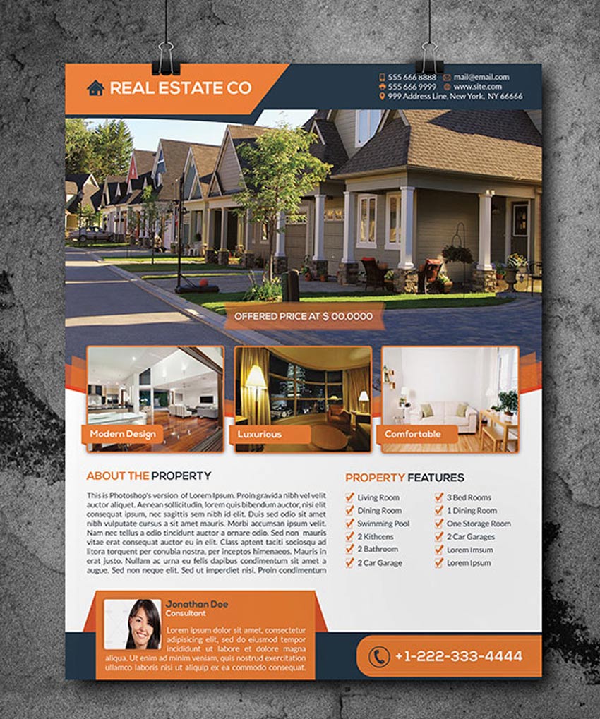
If you’re a realtor or agent in need of a new flyer then check out this fabulous design. This template features a detailed flyer designed in a print-ready A4 format. With room for the listing’s most important details, you can even add a short bio of yourself to connect with potential buyers.

Real Estate Flyer Template

Simple Real Estate Flyer

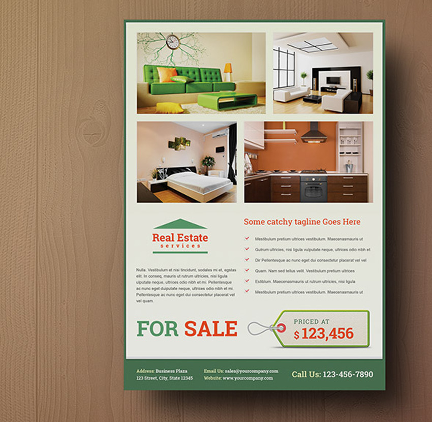
Sell any condo or apartment fast! Use this simple real estate flyer with all the elements you need for the perfect flyer design. Included in this template are two layout versions with three separate color options and a quirky sales tag to make your flyer stand out.

Simple Real Estate Flyer

Real Estate Flyer – Magazine AD

Sell your buyers their dream home with this simple real estate flyer. A flyer that also doubles as a quick and easy magazine ad, this template features a high-quality minimalist design with room to display several listings.

Real Estate Flyer - Magazine AD

Real Estate Company Flyers

Choose a flyer that complements your professional business. This set of flyers features designs created in A4 format that are completely compatible with all Adobe Illustrator CS versions. Download this file today to enjoy three creative versions.

Real Estate Company Flyers

Minimal Real Estate Flyer

Kick start your new job as a realtor with a minimalist real estate flyer. This sophisticated design features simple rectangular elements that are super easy to use. Customize the text to your needs and replace the images with your favorite listings.

Minimal Real Estate Flyer

Modern Real Estate Flyer

The real estate industry is not an easy business, but maybe it can get a little better with the perfect flyer template. This flyer features a modern design aesthetic, with 3D-like vector elements and great sections to feature your listing. Highlight the best parts of your property with this awesome real estate template!

Modern Real Estate Flyer

Real Estate Flyers

Who says pink is too girly? Feature an incredible apartment listing for students and young professionals with this modern real estate flyer. This flyer template includes two layered Photoshop files that are easily customizable and also come print-ready!

Real Estate Flyers

Elegant Real Estate Flyer Set

Love minimal, elegant designs? Then you’ll definitely love this flyer set! This set features four unique layouts all for the price of one. Get the most out of your money with these easily customizable templates, featuring the latest industry trends in print design.

Elegant Real Estate Flyer Set

Conclusion

This list features exciting resources for the avid designer
familiar with Adobe Illustrator, Photoshop, and InDesign. For additional help with all your flyer needs, enlist the skills of a talented
professional by choosing one of the amazing designers from Envato Studio.

And with loads of real estate flyer templates available at your fingertips, chances are we’ve missed a few to add to your personal collection. Be sure to browse GraphicRiver and Envato Elements for more resources, and let us know your favorites in the comments below!

Best of the Design Web: March 2017

Post pobrano z: Best of the Design Web: March 2017

Welcome back to Best of the Design Web, where we feature some of the
best design tutorials of this past month! Tackle new and exciting
projects from across the web, and let us know your favorites in the
comments!

10 Amazing Tutorials From Across the Web

  • Vector Burger in Adobe Illustrator

    How to Create a Cartoon Style Vector Burger in Adobe Illustrator

    In this tutorial, illustrator Alexandra Onica shows you how to create a fun vector burger in Illustrator. Learn how to ink the initial lines before coloring the full design in a few simple steps.

    Visit Tutorial

  • Realistic Wood Textures Using Photoshop Tools

    How to Create Realistic Wood Textures Using Photoshop Tools

    In this tutorial, our very own Jenny Le shows you how to create awesome wood textures from scratch. Learn how to use Photoshop’s unique filters to create realistic wood for any project.

    Visit Tutorial

  • School Bus Illustration in Adobe Illustrator

    How to Create a School Bus Illustration in Adobe Illustrator

    Instructor Bao Nguyen takes you along the journey of creating this wonderful school bus illustration. Learn how to use fast tools in Illustrator to build a bus from simple shapes and gradients.

    Visit Tutorial

  • Realistic Chalk Lettering Effect

    How to Create a Realistic Chalk Lettering Effect

    Love chalk art? In this tutorial, expert Chris Spooner shows you how to create exquisite chalk lettering in Adobe Illustrator. Learn how to plan out the initial typography before experimenting with realistic chalk effects.

    Visit Tutorial

  • Beautiful Portrait in Adobe Photoshop

    Digitally Color a Delicate, Beautiful Portrait in Adobe Photoshop

    Create a stunning portrait inspired by Emma Leonard’s great tips! In this tutorial, Emma shows us how to start a portrait with a pencil drawing before moving onto color in Photoshop.

    Visit Tutorial

  • Mixed Inks with Adobe InDesign

    Create Mixed Inks with Adobe InDesign

    Learn great InDesign tips from instructor Jo Gulliver! In this tutorial, Jo shows us how to create new ink swatches and groups using Adobe InDesign.

    Visit Tutorial

  • 7 Steps to Great Character Design

    Video Tutorial: 7 Steps to Great Character Design

    Disney artist Aaron Blaise shows you his incredible process behind the character designs of some of your favorite classic movies. Learn the importance of creating a story for your characters as well as how to draw them out in Adobe Photoshop.

    Visit Tutorial

  • Pans Labyrinth-Style Monster

    How to Create a Pan’s Labyrinth-Style Monster Painting

    In this tutorial, Jana Heidersdorf shows you how to create an atmospheric, mixed media painting inspired by the horror movie from Guillermo del Toro. Follow her process and get an inside look with a bonus video.

    Visit Tutorial

  • Double Exposure Effect in Photoshop

    How to Make a Double Exposure Effect in Photoshop

    Learn how to make a trendy double exposure effect from Adobe Creative Cloud’s official YouTube channel. In this quick video, learn how to blend two images together using a variety of Photoshop tools.

    Visit Tutorial

  • Neon Nightclub Music Poster in Photoshop CC

    How to Create a Neon Nightclub Music Poster in Photoshop CC

    In this quick video, instructor Nathaniel Dodson shows you how to create a wicked neon music poster in Photoshop. Learn how to create the initial geometric elements before finalizing the overall design.

    Visit Tutorial

Top 15 Tutorials From Envato Tuts+ Design & Illustration

Our
experts have provided you with many great tutorials this month! Here
are 15 of our most tried, tested, and shared tutorials from the Design and Illustration section here at Envato Tuts+.

And see entries from our latest Envato Tuts+ Community Challenge: Created By You, celebrating the incredible efforts of our talented community.

10 Premium Design Resources

Before you go, be sure to pick up some amazing premium design assets from GraphicRiver and Envato Elements. Browse their incredible collections of Photoshop Actions, vector elements, and more for high-quality designs. And check out a few of our favorites below!

MixArt – Sketch Painting Photoshop Action

Download one of the best-selling Photoshop actions Envato Market has to offer! This brilliant action lets you create a stunning sketch effect with just a few simple clicks. Simplify your workflow and save countless hours with this effective Photoshop action.

MixArt - Sketch Painting Photoshop Action

Animated Retro Vintage Film – Photoshop Actions

Love vintage films? Then you’ll definitely love this Photoshop action! This action allows you to generate a video sequence of animated vintage effects to apply to your photos or videos. Choose from 24 brilliant color options for easy, non-destructive editing.

Animated Retro Vintage Film - Photoshop Actions

Retro Vintage Text Effects

Retro effects will always be a popular staple in the graphic design industry. And with this incredible package, you’ll get access to 10 amazing layer styles that are fully editable. Create stunning retro-inspired headers and more with this Photoshop package.

Retro Vintage Text Effects

Stitched Leather Generator

Create the gorgeous look of realistic stitched leather with this awesome generator. This package features unlimited color options, interactive dialogs for selecting colors, and smart objects you can easily edit.

Stitched Leather Generator

8 Tileable Paper Texture Photoshop Patterns

Need a paper texture for your next project? Then enjoy this package of eight tileable paper textures. This download includes one pattern file with 16 different patterns to choose from. Explore these incredible textures at two different resolution sizes for amazing possibilities.

8 Tileable Paper Texture Photoshop Patterns

Galaxy Backgrounds

Make your designs sparkle with this set of galaxy backgrounds. Great for wallpapers, website backgrounds, and more, this pack includes eight exclusive galaxy backgrounds perfect for your creative needs.

Galaxy Backgrounds

The Ultimate 1001 Text Effects

Upgrade your design arsenal with this ultimate pack of 1001 text effects. With effects ranging from stamp effects to gold foiling and more, you’ll wonder why you didn’t download this package sooner! Enjoy access to 1001 text and logo effects all in one convenient file.

The Ultimate 1001 Text Effects

Flat Creative Workspace Tools

Vector workspace designs are great for hero images, social media profiles, and so much more! And with this great set, you’ll get access to six different layouts for your creative backgrounds. Customize your layouts with these 100% vector graphics that are also fully editable!

Flat Creative Workspace Tools

Astronout Signature Typeface

Take your designs to a whole new world with this luxurious signature typeface. Give your designs that authentic, handwritten feel with an elegant script font like this one. Upgrade your designs with this glorious font, which is great for stationery and logos.

Astronout Signature Typeface

Brave Typeface

Feeling a little brave? Dive into a new design adventure with this exquisite typeface. A futuristic design that is sure to stand out, this font is designed with minimal lines for an artistic, modern effect. Enjoy 317+ glyphs and foreign characters included in this download.

Brave Typeface

How to Create an Instagram Filter Photoshop Action in 60 Seconds

Post pobrano z: How to Create an Instagram Filter Photoshop Action in 60 Seconds

Final product image
What You’ll Be Creating

Welcome to our Photoshop in 60 Seconds series, in which you can
learn a Photoshop skill, feature, or technique in just a minute!

Photoshop in 60 Seconds: Instagram Filter

Have you ever wondered how to create your own Instagram filter? Well, with a few simple adjustments you can achieve a cool photo effect like your favorite app in Adobe Photoshop. And in this quick tutorial, I’ll show you how to make a Photoshop action that recreates the famous Hudson filter for any future project.


How to Create an Instagram Filter in Photoshop

Open your photo into Photoshop. I’ll be using this Woman Stock.

Woman Stock From Pixabay
Woman Stock

Start with the action. Go to Window > Action to bring up the Actions palette. Click on the folder icon to create a New Set. Name the set „Instagram,” and then select New Action and name it „Hudson.” Once you hit Record, the action will automatically record your steps.

Create an Instagram Photoshop Action

Then go to Layer > New Adjustment Layer > Color Lookup. Set the settings for the 3D LUT File to Fuji F125 Kodak 2395, and then set the Layer Blend Mode to Luminosity.

Color Lookup Adjustment

Now create a New Layer and Fill it with a pale yellow color #fef3d5 using the Paint Bucket Tool (G). Set this layer to Divide.

Yellow Fill Layer Set to Divide

Finish with a vignette. Fill a New Layer with black. Use the Elliptical Marquee Tool (M) to create a large circle, and then hit Delete to remove the center. Now go to Filter > Blur > Gaussian Blur and blur the edges with a Radius of 65 px. Lower the final Opacity to 40%.

When you’re done, hit the Stop button on the Actions palette to use this new action for other photos.

Create a Vignette

Here is the final effect.

Hudson Instagram Filter Photoshop Action Tutorial

Want to see this in action? Check out the quick video above to see this lesson at work!

5 Instagram-Inspired Photoshop Actions

Want to create awesome Instagram-inspired effects fast? Check out these premium Photoshop actions from GraphicRiver and Envato Elements.

Instagram Filter – Photoshop Action

Achieve the look of your favorite filters with these amazing actions! Included in this download are 47 Instagram-inspired Photoshop actions that are super easy to edit. Simply apply any filter to your photo and use the additional workflow actions for more options.

Instagram Filter - Photoshop Action

22 Popular Instagram Filter Photoshop Actions

This awesome Photoshop action package includes 22 of the most popular filters Instagram has to offer. Get access to cool effects like Mayfair, Clarendon and more for easy, non-destructive photo editing.

22 Popular Instagram Filter Photoshop Actions

Full Size for Instagram Photoshop Action

Sizing your photos for Instagram can be tricky. Make the process easier with this Photoshop action. This download includes one action file with a five-step tutorial that is easy to follow. Transition your photos to Instagram easily with this awesome action.

Full Size for Instagram Photoshop Action

Ash Photoshop Action

Create beautiful photo effects inspired by an elegant carbon ash tone. This Photoshop action features two separate actions with plenty of variations for intensity and color. Get access to free sharpening and noise actions included in this download!

Ash Photoshop Action

Chocolate Photoshop Action

Or test out different flavors of deliciously chocolate photo effects with this set of premium actions. Included in this set are eight elegant retro effects that work with a wide range of photos.

Chocolate Photoshop Action

60 Seconds?!

This is part of a series of quick video tutorials on
Envato Tuts+ in which we introduce a range of subjects, all in 60
seconds—just enough to whet your appetite. Let us know in the comments
what you thought of this video and what else you’d like to see explained
in 60 seconds!

How to Create a Galaxy Text Effect in Adobe Photoshop

Post pobrano z: How to Create a Galaxy Text Effect in Adobe Photoshop

Final product image
What You’ll Be Creating

This tutorial will show you how to use a couple of layer styles, textures, and brush settings to create a bright, galaxy-inspired text effect. Let’s get started!

This text effect was inspired by the many Layer Styles available on GraphicRiver.

Tutorial Assets

The following assets were used during the production of this tutorial:

1. How to Create a Background

Step 1

Create a new 960 x 720 px document. Click the Create new fill or adjustment layer icon at the bottom of the Layers panel, choose Solid Color, and use the Color #0c0e22.

Solid Color Layer

Step 2

Go to File > Place Linked to open the Cosmos image. Resize it as needed, and rename its layer to Background Image.

Add the Background Image

Step 3

Add a Hue/Saturation adjustment layer and change its Blend Mode to Color

Change the Hue value to 23, and the Saturation to -45.

HueSaturation

2. How to Create Text Layers

Step 1

Create the text in All Caps using the font Bungee. Set the Size to 230 pt, and if you use more than one line of text, change the Leading value to 210.

Create the Text

Step 2

Change the text layer’s Fill value to 0.

Fill Value

Step 3

Duplicate the text layer twice.

Duplicate the Text Layer

3. How to Style the First Text Layer

Double-click the original text layer to apply the following layer style:

Step 1

Add a Bevel and Emboss with these settings:

  • Size: 20
  • Check the Anti-aliased box
  • Shadow Mode: Color Dodge
    • Color: #47fcc7
    • Opacity: 70%
Bevel and Emboss

Step 2

Add a Contour with these settings:

  • Contour: Rolling Slope – Descending
  • Check the Anti-aliased box.
Contour

Step 3

Add a Stroke with these settings:

  • Size: 1
  • Fill Type: Gradient
  • Use the faucet 30 gradient fill
Stroke

Step 4

Add a Drop Shadow with these settings:

  • Opacity: 100%
  • Distance: 5
  • Spread: 30
  • Size: 10
Drop Shadow

This will style the first text layer.

Styled Text Layer 1

4. How to Style the Second Text Layer

Double-click the first copy text layer to apply the following layer style:

Step 1

Add a Bevel and Emboss with these settings:

  • Size: 35
  • Uncheck the Use Global Light box
  • Angle: 107
  • Altitude: 37
  • Gloss Contour: Ring – Double
  • Check the Anti-aliased box
  • Highlight Mode:
    • Color: #ef1d58
    • Opacity: 70%
  • Shadow Mode: Color Dodge
    • Color: #a81227
    • Opacity: 70%
Bevel and Emboss

Step 2

Add a Contour with these settings:

  • Contour: Cone – Inverted
  • Check the Anti-aliased box.
Contour

Step 3

Add an Inner Shadow with these settings:

  • Blend Mode: Screen
  • Color: #b2b412
  • Opacity: 50%
  • Uncheck the Use Global Light box
  • Angle: 90
  • Distance: 25
  • Size: 30
Inner Shadow

Step 4

Add an Inner Glow with these settings:

  • Blend Mode: Lighter Color
  • Opacity: 25%
  • Gradient: Create the gradient fill using the Colors #4c1061 to the left, #3e2b6a in the middle, and #504b71 to the right.
  • Size: 18
Inner Glow

This will style the second text layer.

Styled Text Layer 2

5. How to Style the Third Text Layer

Double-click the second copy text layer to apply the following layer style:

Step 1

Add a Bevel and Emboss with these settings:

  • Size: 55
  • Uncheck the Use Global Light box
  • Angle: -39
  • Altitude: 58
  • Gloss Contour: Ring
  • Check the Anti-aliased box
  • Highlight Mode: Overlay
    • Color: #e3dc26
  • Shadow Mode: Color Dodge
    • Color: #0eb483
    • Opacity: 70%
Bevel and Emboss

Step 2

Add a Contour with these settings:

  • Contour: Rolling Slope – Descending
  • Check the Anti-aliased box.
Contour

Step 3

Add an Inner Shadow with these settings:

  • Blend Mode: Color Dodge
  • Color: #ab60f1
  • Opacity: 35%
  • Distance: 10
  • Size: 20
Inner Shadow

Step 4

Add an Inner Glow with these settings:

  • Opacity: 35%
  • Color: #ff1d48
  • Source: Center
  • Size: 65
  • Contour: Cone – Inverted
Inner Glow

Step 5

Add a Satin effect with these settings:

  • Blend Mode: Color Dodge
  • Color: #ae8010
  • Opacity: 10%
  • Angle: 90
  • Distance: 143
  • Size: 95
  • Contour: Ring – Double
  • Check the Anti-aliased box
  • Check the Invert box
Satin

Step 6

Add an Outer Glow with these settings:

  • Blend Mode: Linear Dodge (Add)
  • Opacity: 25%
  • Color: #53abde
  • Size: 25
Outer Glow

This will style the final text layer.

Styles Text Layer 3

6. How to Stroke a Work Path

Step 1

Right-click any text layer and choose Create Work Path.

Pick the Brush Tool and open the Brush panel (Window > Brush). It is important to do all the work inside the Brush panel, especially choosing the tips.

Create Work Path

Step 2

Pick a soft round tip, and use these settings under the Brush Tip Shape and Shape Dynamics tabs:

Brush Settings

Step 3

Create a new layer on top of all layers, call it Fade Stroke, and set the Foreground Color to #29ecee.

Hit the Return key once to stroke the work path. If you want a different result, you can change the Size of the tip, or the Fade value under the Shape Dynamics tab.

Stroke the Work Path

Step 4

Change the Fade Stroke layer’s Blend Mode to Overlay.

Change the Blend Mode

7. How to Create a Texture Stroke Layer and Brush Tip

Step 1

Place the Stars texture on top of all layers, resize it as needed, rename its layer to Texture Stroke, and change its Blend Mode to Linear Dodge (Add).

Add the Texture

Step 2

Option-click the Add layer mask icon at the bottom of the Layers panel to add an inverted mask that hides the layer’s contents.

Add an Inverted Layer Mask

Step 3

With the Brush Tool active, pick the Flat Angle 32px tip, and use these settings for the Brush Tip Shape and Shape Dynamics tabs:

Brush Settings

8. How to Stroke a Work Path on a Layer Mask

Step 1

Select the Texture Stroke layer’s thumbnail, set the Foreground Color to White, and pick the Direct Selection Tool (A).

Right-click the work path and choose Stroke Path. Set the Tool to Brush, check the Simulate Pressure box, and click OK.

Stroke the Work Path

We will repeat this step to stroke the rest of the textures in this tutorial, but with the Simulate Pressure box unchecked.

Stroked Mask

Step 2

Command-click any text layer’s thumbnail to create a selection.

Create a Selection

Step 3

Make sure that the Texture Stroke layer’s thumbnail is still selected and that the Background Color is Black, and press Command-Backspace to fill the selection with Black.

Press Command-D to deselect.

Fill the Layer Mask Selection

9. How to Create a Stroke Texture Group

Step 1

Place the Galaxy image below the original text layer, resize it as needed, and rename its layer to BG Stroke 1.

Add the Stroke Texture

Step 2

Add an inverted mask to the BG Stroke 1 layer, and then place the layer in a group and call it BG Stroke.

BG Stroke Group

Step 3

Duplicate the BG Stroke 1 layer three times, and rename the copies to add the numbers 23, and 4.

Duplicate the BG Stroke Layer

10. How to Create Big Particles Brush Tips

Step 1

Pick the Brush Tool, choose the Erodible Point 9px tip, and use these settings:

Brush Tip Shape

Brush Tip Shape

Shape Dynamics

Shape Dynamics

Scattering

Scattering

Step 2

Select the BG Stroke 2 layer mask’s thumbnail, and stroke the path using the Direct Selection Tool.

Make sure to uncheck the Simulate Pressure box for all the BG Stroke layers.

Stroke the BG Stroke 1 Layer Mask

Step 3

Change the settings of the same brush tip to get a different outcome, by unchecking the Shape Dynamics tab, and using these settings for the Brush Tip Shape and Scattering:

Brush Settings

Step 4

Use the modified tip to stroke the path on the BG Stroke 2 layer mask, and change the layer’s Blend Mode to Lighter Color.

Stroke the BG Stroke 2 Layer Mask

11. How to Create Dust Brush Tips

Step 1

Choose the Airbrush tip below, and use these Brush Tip Shape and Scattering settings:

Brush Settings

Step 2

Click the Create new brush icon in the bottom right corner of the Brush panel, set the Name to Dust Brush, and click OK.

Save the Brush Tip

Step 3

Select the BG Stroke 3 layer mask’s thumbnail, stroke the work path with the Dust Brush tip, and change the layer’s Blend Mode to Color Dodge.

Stroke the BG Stroke 3 Layer Mask

Step 4

Change the Brush Tip Shape and Scattering settings of the same brush tip as below:

Brush Settings

Step 5

Stroke the work path on the BG Stroke 4 layer’s thumbnail, and change the layer’s Blend Mode to Color Dodge.

With the Direct Selection Tool active, hit the Return key to get rid of the work path.

Stroke the BG Stroke 4 Layer Mask

12. How to Add Light Streaks

Step 1

Place one of the P-Series.Black-BG – C4D Set images on top of the Texture Stroke layer, resize it as needed, and change its layer’s Blend Mode to Screen.

Add a Light Image

Step 2

Press Command-T to enter the Free Transform Mode, and click the Warp icon in the Options bar.

Click-drag the points and/or the sections to warp the light into a shape you like. When you’re done, hit the Return key to accept the changes.

You can also resize, rotate, and adjust the image while in the Free Transform Mode.

Warp the Light

Step 3

You can add a layer mask, and use a soft round brush tip, with the Foreground Color set to Black, to paint over any unwanted areas and hide them.

Hide Unwanted Areas

Step 4

Add more images and warp them.

If the light’s background is visible, you can go to Image > Adjustments > Levels, click the Sample in image to set black point icon, and click the background area you want to make black.

Adjust the Lights Background

Step 5

Add as many images as needed, and place them anywhere you like.

Add More Light Images

13. How to Adjust a Background and the Global Coloring

Step 1

Add a layer mask to the Background Image layer, pick the Brush Tool, choose the Dust Brush you saved earlier, and click-drag slightly in the center of the document to erase a part of the image’s center.

Mask Out the Background Image Center

Step 2

Add a Gradient Map on top of all layers, check the Dither box, and create the gradient fill using the Colors #5c3d69 to the left, #94516a in the middle, and #e8977a to the left.

Change the Gradient Map layer’s Blend Mode to Soft Light, and its Opacity to 30%.

Gradient Map

Step 3

Add a Color Lookup adjustment layer on top of all layers, and use the FoggyNight.3DL table from the 3DLUT File menu.

Color Lookup

Step 4

Press Command-A to select all, go to Edit > Copy Merged, and Edit > Paste Special > Paste in Place.

Rename the pasted layer to Overlay, and hide the Color Lookup layer.

Create the Overlay Layer

Step 5

Decrease the Overlay layer’s Opacity to a value you like.

Decrease the Opacity

Congratulations! You’re Done

In this tutorial, we used a simple texture for the background, and created a couple of text layers. Then, we styled the text layers to create the main effect. 

After that, we used textures and brush settings to create a couple of stroke layers. Finally, we used adjustment layers to enhance the final result.

Please feel free to leave your comments, suggestions, and outcomes below.

Final Result

How to Draw Leather

Post pobrano z: How to Draw Leather

Final product image
What You’ll Be Creating

Leather is a very durable and pretty material, and it’s been used widely from the earliest days of humankind. In this tutorial I will show you how to draw a beautiful, shiny leather dress and an old leather belt. You can use the techniques shown here for other objects as well, for example for a leather jacket or a piece of leather armor.

What You Will Need

  • HB pencil
  • 2B pencil
  • 3B pencil
  • 8B pencil
  • Ballpoint pen (or, better, an empty ballpoint pen!)
  • Blending stump
  • Kneaded eraser
  • Pencil sharpener
  • 3 sheets of paper
drawing tools

1. How to Draw a Shiny Leather Dress

Step 1

Take the HB pencil and gently sketch the body. You can use a drawing manikin as a reference for this.

manikin torso

Step 2

Add the details of the body: breasts and belly.

how to draw female torso

Step 3

Draw guide lines across the body to define its 3D form, and sketch the outline of the tight-fitting dress.

how to sketch female dress

Step 4

Draw „waves” in the places where the material creases and stretches. You can learn more about drawing folds from this tutorial:

how to draw folds
how to draw creases

Step 5

Tilt your pencil and shade the side of the dress, leaving some place for a „shine band” in the middle.

how to shade side of body

Step 6

Draw a darker seam across the dress—it will be an eye-catching detail breaking the smoothness of the material.

how to draw seam

Step 7

Shade the front of the dress as well. Leave a shine band on the side of the seam.

how to shade a dress

Step 8

Take the blending stump and gently blend the shading, giving a soft edge to the shine in the process. Once the stump is dirtied with graphite, you can use it to „draw” some soft shade between the folds.

how to blend pencils

Step 9

Take the 3B pencil and shade the side of the dress. Be careful around the creasing! Leave a tiny border between the shade and the outline, to create an area of reflected light here.

how to draw shiny material

Step 10

Blend it with the blending stump.

how to blend shiny material

Step 11

Shade and blend the rest of the side, leaving some space for the previous shade around the shine.

how to draw shiny cloth

Step 12

Darken the seam to adjust its shade to the current contrast.

how to draw dark leather seam

Step 13

Darken the front of the dress, leaving some space for a reflected shine. Without it the dress would lose its 3D form.

how to draw leather creases
how to draw leather folds

how to draw leather dress

Step 14

Take the 8B pencil and add the final shade. Press very hard, but don’t ignore the shading that’s already there.

how to draw with soft pencils
how to draw leather with pencils
how to draw shiny black material
Notice how the creases create shadows for the seam

Step 15

Take your kneaded eraser and „draw” some shine with it. Don’t overuse white shine, or it will look like latex!

how to draw latex

Step 16

Finish the drawing by using the 8B pencil even stronger, filling all the unnecessary white spots created by the texture of the paper.

how to draw shiny black leather dress with pencils

2. How to Draw an Old Leather Belt

Step 1

Take the HB pencil and sketch the belt with a buckle.

how to draw buckle

Step 2

Drag the other end of the belt through the buckle.

how to draw leather strap

Step 3

Add the „band” and the holes.

how to draw belt

Step 4

Take another sheet of paper and place it over the drawing. Make sure you can see at least the outline of the sketch beneath—if you can’t, use a thinner sheet or place them both on the window. Take the ballpoint pen and draw long, horizontal 'X’s all over the belt to simulate a leather texture. If you have an empty ballpoint pen, you can „draw” directly on the drawing. Push hard to make sure you’re making marks.

how to draw leather texture easily

Step 5

Take the HB pencil again, tilt it, and shade the belt. You’ll see the texture emerging in the process.

leather texture with pencils

Step 6

Draw lines for the seams along the belt.

how to sketch seam

Step 7

Take the 3B pencil and draw the outline of the seams.

how to draw seams

Step 8

Shade the seams carefully. Keep the pencil sharpened!

how to shade seams

Step 9

Take the 2B pencil and shade the belt once again, this time going around the seams. Shade the holes as well. Give each part of the belt a darkened edge.

how to shade old leather

Step 10

Gently shade the side of the belt, giving it a slightly brighter shade.

how to draw old leather

Step 11

Take the 3B pencil and shade the belt in a more detailed way: create shadows under the band and the buckle, and accentuate some wrinkles of the leather.

how to draw leather texture in detail

Step 12

Take the 8B pencil and add some darker accents. Don’t overuse it!

how to draw old leather strap

Step 13

Finish the drawing by adding the metal buckle. You can learn how to draw metal from this tutorial:

how to draw old leather texture with pencils

Good Job!

Now you know how to draw both new, shiny leather, and old, used leather. If you enjoyed this tutorial and want to learn more about drawing various materials with pencils, check our other tutorials from this series:

how to draw leather texture with pencils

How to Create a Woodwork Tools Illustration in Adobe Illustrator

Post pobrano z: How to Create a Woodwork Tools Illustration in Adobe Illustrator

Final product image
What You’ll Be Creating

In today’s tutorial, we’re going to take a look at the process of creating a set of woodwork tools, using nothing more than the basic geometric shapes and tools that we probably work with on a regular basis. Grab a bigger than usual mug of coffee, since this is going to be a long one.

Oh, and don’t forget you can always expand
the project by checking out GraphicRiver, where you can find tons of tool-themed vector packs ready to be clicked on.

1. How to Set Up a New Project File

Since I’m assuming you already have
Illustrator up and running in the background, bring it up and let’s set up a New Document (File > New or Control-N)
for our project using the following settings:

  • Number
    of Artboards:
    1
  • Width:
    1200
    px
  • Height:
    600
    px
  • Units:
    Pixels

And from the Advanced tab:

  • Color
    Mode:
    RGB
  • Raster
    Effects:
    Screen (72ppi)
  • Preview Mode: Default
setting up a new document

2. How to Set Up a Custom Grid

Now, I know we’re not working on icons
today, but since we’re going to be creating the illustration using a pixel-perfect
workflow, we’ll want to set up a nice little grid so that we can have full
control over our shapes.

Step 1

Go to the Edit > Preferences > Guides & Grid submenu, and adjust
the following settings:

  • Gridline
    every:
    1 px
  • Subdivisions: 1
setting up a custom grid

Quick
tip:
you can learn more about grids by reading this
in-depth piece on how Illustrator’s Grid System works.

Step 2

Once we’ve set up our custom grid, all we
need to do in order to make sure our shapes look crisp is enable the Snap to Grid option found under the View menu, which will transform into Snap to Pixel each time you enter Pixel Preview mode.

Now, if you’re new to
the whole “Pixel-Perfect workflow”, I strongly recommend you go through my how
to create pixel-perfect artwork
tutorial, which will help you widen your
technical skills in no time.

3. How to Set Up the Layers

Once we’ve finished setting up our project
file, it would be a good idea to structure our document using a couple of
layers, since this way we can maintain a steady workflow by focusing on one
section of the illustration at a time.

That being said, bring up the Layers panel, and create a total of
three layers, which we will rename as follows:

  • layer
    1
    : background
  • layer
    2
    : carving tools
  • layer
    3
    : measuring tools
  • layer 4: adjustment tools
setting up the layers

Quick
tip:

I’ve colored all of my layers using the same green value, since it’s the
easiest one to view when used to highlight your selected shapes (whether they’re closed
or open paths).

4. How to Create the Background

We’re going to kick off the project by
creating the little sunset background, so make sure you’re on the right layer
(that would be the first one), and then lock all the other layers and let’s get
started.

Step 1

Create the
background’s fill section using a 368 x
148 px
rectangle, which we will color using #EBEFF7 and then center align
to the underlying Artboard.

creating and positioning the main shape for the backgrounds fill section

Step 2

Create the
outline section using a slightly larger 380
x 160 px
rectangle (#2D2020) which we will center align to the Artboard as we did with the smaller
one, adjusting it by flipping its Fill
with its Stroke (Shift-X) and setting its weight to 4 px.

Once you’re done,
select and group the two shapes together using the Control-G keyboard shortcut before moving on to the next section of
the tutorial.

creating and positioning the main shape for the backgrounds outline section

5. How to Create the Narrower Chisel

With the background in place, we’re going
to start working on the first carving tool. So, assuming you’re on the right
layer (that would be the second one), zoom in on the background and let’s jump into
it. 

Step 1 

Create the handle
using a 30 x 12 px rectangle, which
we will color using #E8B15B and then position in the upper-left section of
the background, at a distance of 20 px from
its outline’s top edge and 32 px from
its left one.

creating and positioning the main shape for the narrower chisels handle

Step 2

Give the shape an outline, by
creating a copy (Control-C) of it
which we will paste in front (Control-F)
and then adjust by first changing its color to #2D2020 and then flipping its Fill with its Stroke (Shift-X), making
sure to set its Stroke’s Weight to 4 px afterwards.

adding the outline to the narrower chisels handle

Step 3

Give the handle its
wooden texture by taking a couple of moments and drawing it using a couple of 2 px thick Stroke lines (#2D2020) with a Round
Cap
, making sure to group (Control-G)
them all together once you’re done.

adding the wooden textures to the narrower chisels handle

Step 4

Mask the texture
lines that we’ve just grouped by creating a copy (Control-C) of the underlying yellow shape, which we will paste on
top of them (Control-F) and then
use as a Clipping Mask by right clicking > Make Clipping Mask.
Once you’re done, select and group all of the shapes that we have so far using the Control-G
keyboard shortcut.

masking the narrower chisels handle texture

Step 5

Start working on the
upper section of the metal body by creating a 12 x 26 px rectangle (#9DA3B2) which we will position below the
handle, making sure to center align the two.

creating and positioning the upper section for the narrower chisels metal body

Step 6

Adjust the shape that we’ve just created
by adding a pair of side anchor points, positioned at a distance of 4 px from its upper edge using the Add Anchor Point Tool (+).

For this step, I recommend
you turn on the Pixel Preview mode (Alt-Shift-Y) so that you can have a
better view of the process.

adding the side anchor points to the upper section of the narrower chisels handle

Step 7

Continue adjusting
the shape by individually selecting and pushing its bottom anchor points to the
inside by a distance of 3 px using the Move tool (right click > Transform > Move > Horizontal > + / – 3 px depending
on which side you start with).

adjusting the shape of the upper section of the narrower chisels metal body

Step 8

Give the resulting
shape a 4 px thick outline using the
Stroke method, making sure to set
its color to #2D2020.

adding the outline to the upper section of the narrower chisels metal body

Step 9

Using the Pen Tool (P) draw a 12 px wide 2 px thick detail Stroke
line (#2D2020) that connects the metal section’s two side anchor points that
we added a few steps ago.

adding the horizontal detail line to the upper section of the narrower chisels metal body

Step 10

Create a 4 x 6 px rectangle (#2D2020) which we
will center align to the detail line from the previous step. Once you’re done, select and
group all of the current section’s composing shapes together using the Control-G keyboard shortcut.

adding the detail rectangle to the upper section of the narrower chisels metal body

Step 11

Create the center
section of the chisel’s metal body using a 6
x 52 px
rectangle (#C0C6D8) with a 4
px
thick outline (#2D2020) which we will group (Control-G) and then position below the section that we’ve just
finished working on in the previous step.

creating and positioning the center section for the narrower chisels metal body

Step 12

Add the chisel’s
cutting edge using a 6 x 8 px rectangle
(#9DA3B2) with a 4 px thick outline
(#2D2020) which we will group (Control-G)
and then position below the previously created section. Since we’re done
working on the current object, you can select and group (Control-G) all its composing sections as well.

finishing off the narrower chisel

6. How to Create
the Wider Chisel

Once you’ve
finished working on the narrower chisel, you can move a few pixels towards the
right and start working on the second one.

Step 1

Create the tool’s
handle using the same 12 x 30 px rectangle
(#E8B15B) with a 4 px thick outline
(#2D2020) and 2 px thick wooden
texture lines, which we will group (Control-G)
and then position on the right side of the previous chisel, at a distance of 16 px from it.

creating and positioning the main shapes for the wider chisels handle

Step 2

Create the metal
body’s upper section using the same process, only this time reposition
the main shape’s bottom anchor points towards the inside by a distance of just 2 px. Once you’re done, group (Control-G) and position the shapes
below the handle.

creating and positioning the upper section for the wider chisels metal body

Step 3

Start working on the
chisel’s center metal section by creating an 8 x 16 px rectangle, which we will color using #C0C6D8 and then
center align to the previous section, positioning it so that it overlaps the surface by 4 px.

creating and positioning the main shape for the center section of the wider chisels metal body

Step 4

Create a larger 20 x 48 px rectangle (#C0C6D8) which we will
position below the smaller one, making sure to center align the two.

creating and positioning the larger rectangle for the center section of the wider chisels metal body

Step 5

Select and then unite
the two rectangles into a single larger shape using Pathfinder’s Unite Shape
Mode
.

uniting the two rectangles of the wider chisels metal body into a single larger shape

Step 6

Adjust the resulting
shape by setting the Radius of its
top corners to 4 px from within the Live Corners input value box.

adjusting the top two corners of the wider chisels metal body

Step 7

Select the two anchor points created during the unification process of the two rectangles, and adjust those as well by setting their Radius to 4 px.

adjusting the center corners to the wider chisels metal body

Step 8

Give the resulting
shape a 4 px thick outline using the
Stroke method, making sure to set
its color to #2D2020.

adding the outline to the wider chisels metal body

Step 9

Connect the chisel’s
lower metal section to its upper one, using a 2 x 2 px circle (#2D2020) which we will position towards the
rounded section of its larger shape. Once you’re done, select and group all
three shapes together using the Control-G
keyboard shortcut.

connecting the wider chisels metal sections

Step 10

Add the blade section
using a 20 x 10 px rectangle, which
we will color using #9DA3B2 and then center align to the metal body’s bottom
edge.

creating and positioning the main shape for the bottom section of the wider chisels metal body

Step 11

Adjust the shape that
we’ve just created by adding a pair of anchor points at a distance of 2 px from its bottom edge, and then
individually selecting and pushing its top ones to the inside by a distance of 6 px using the Move tool (right click >
Transform > Move > Horizontal > + / – 6 px
depending on which side
you start with).

adjusting the bottom section of the wider chisels metal body

Step 12

Give the resulting
shape a 4 px thick outline using the
Stroke method, making sure to set
its color to #2D2020.

adding the outline to the bottom section of the wider chisels metal body

Step 13

Finish off the current
section, and with it the tool itself, by creating a 20 px wide 2 px thick Stroke line (#2D2020) which we will
center align to the chisel’s blade, selecting and grouping (Control-G) all three shapes together
afterwards. Once you’re done, select and group (Control-G) all of the chisel’s composing sections as well.

finishing off the wider chisel

7. How to Create
the Hammer

With both
chisels finished, move a few pixels towards the right and then start working on
the wooden hammer.

Step 1

Create the upper section
sticking out of the hammer’s head using an 8 x 6 px rectangle (#CC8550) with a 4 px thick outline (#2D2020), which we will group (Control-G) and then position on the
right side of the wider chisel, at a distance of 30 px from it.

creating and positioning the main shapes for the upper section of the hammers head

Step 2

Add the hammer’s head
using a 36 x 28 px rounded rectangle
(#E59A5C) with a 4 px Corner Radius
and a 4 px thick Stroke (#2D2020), on top of which we
will add the wooden texture using 2 px thick
Stroke lines (#2D2020). Group (Control-G) all the shapes together, and
then position them below the previously created section.

creating and positioning the main shapes for the hammers head

Step 3

Create the handle using
an 8 x 48 px rectangle (#CC8550)
with a 4 px thick outline (#2D2020),
on top of which we will draw the wooden texture, grouping (Control-G) and then positioning the shapes below the hammer’s head.

creating and positioning the main shapes for the hammers handle

Step 4

Add the hammer’s grip using a 16 x 34 px rounded rectangle (#E59A5C)
with a 4 px Corner Radius and a 4 px thick Stroke (#2D2020), which we will group (Control-G) and then center align to the bottom of its handle.

creating and positioning the main shapes for the hammers grip

Step 5

Create the horizontal
detail lines using six 16 px wide 2 px thick Strokes (#2D2020), which we will vertically stack at a distance of 4 px from one another using the Align panel’s Vertical Distribute Space option. Group (Control-G) the lines and then center align them to the grip,
positioning them at a distance of 2 px from
its outline’s top edge.

adding the horizontal detail lines to the hammers grip

Step 6

Finish off the grip, and
with it the hammer itself, by adding a 4
x 4 px
circle (#2D2020) to the center of the surface delimited by the horizontal stroke
lines and the thicker outline. Once you’re done, group (Control-G) all of the current section’s shapes together, doing the
same for the entire tool afterwards.

finishing off the hammer

8. How to Create
the Blades

As you’ve
probably noticed, the hammer has two little blades positioned around it, which
we will quickly add in the following moments.

Step 1

Create the blade’s body
using a 6 x 22 px rectangle (#C0C6D8)
with a 4 px thick Stroke (#2D2020) which we will group (Control-G) and then position on the
left side of the hammer’s handle, at a distance of 12 px from it.

creating and positioning the main shapes for the left blades body

Step 2

Create another smaller 3 x 10 px rectangle (#2D2020) which we
will center align to the left edge of the blade’s body, selecting and grouping (Control-G) them together afterwards.

adding the detail rectangle to the left blades body

Step 3

Create the second blade
using a copy (Control-C > Control-F)
of the left one, which we will position on the opposite side of the hammer’s
handle, maintaining the same 12 px distance.

creating and positioning the main shapes for the right blade

9. How to Create the Level

Since we’re pretty much done working on
the carving tools, we can lock their layer and move on up to the next one (that
would be the third one), where we will start working on the measuring ones, the
first one being the level.

Step 1

Create the tool’s
main body using a 20 x 104 px rectangle,
which we will color using #E8B15B and then center align to the hammer,
positioning it on its right side at a distance of 16 px.

creating and positioning the main shape for the levels body

Step 2

Adjust the shape by
creating an 8 x 24 px rectangle
(highlighted with red) which we will center align to its right edge and then
remove using Pathfinder’s Minus Front Shape Mode in order to
create the little cutout.

cutting out the smaller rectangle from the levels body

Step 3

Create two 10 x 10 px circles (highlighted with
red) vertically stacked 52 px from
one another, which we will group (Control-G) and then center align to the level’s body, removing them afterwards using the Minus Front Shape Mode.

cutting out the smaller circles from the levels main body

Step 4

Give the resulting
shape a 4 px thick outline (#2D2020)
using the Stroke method, selecting
and grouping the two together afterwards using the Control-G keyboard shortcut.

adding the outline to the levels main body

Step 5

Create the level’s
top section using a 20 x 6 px rectangle
(#C0C6D8) with a 4 px thick outline
(#2D2020), which we will group (Control-G)
and then position above its larger body.

creating and positioning the main shapes for the levels upper section

Step 6

Add the little
vertical detail lines using two 6 px tall
4 px thick Strokes (#2D2020) which we will position 10 px from one another, grouping (Control-G) and then center aligning them to the level’s upper
section. Once you have them in place, select and group (Control-G) them and the larger rectangles together as well.

adding the vertical detail lines to the levels upper section

Step 7

Create the level’s
bottom section using a copy (Control-C
> Control-F
) of its top one, which we will position on the opposite
side of its larger body.

creating and positioning the main shapes for the levels bottom section

Step 8

Start working on its
center balance tube by creating two 6 x
7 px
rectangles (#C0C6D8) with a 4
px
thick outline (#2D2020), which we will position inside the rectangular cutout
created a few steps ago.

creating and positioning the main shapes for the levels center balance tube

Step 9

Unite the two
sections that we’ve just created using a 10
px
tall 4 px thick Stroke line (#2D2020), selecting and
grouping all of them together afterwards using the Control-G keyboard shortcut.

adding the vertical detail line to the levels center balance tube

Step 10

Finish off the level by adding a 10 px wide 4 px thick Stroke line (#2D2020) to the center of each of its circular
cutouts, selecting and grouping all its composing sections together afterwards
using the Control-G keyboard
shortcut.

finishing off the level

10. How to Create the Ruler

The second object on our measuring tools
list is the ruler, which is without a shadow of doubt one of the most useful
tools that any craftsman can ask for.

Step 1

Start by creating the
tool’s main body using a 20 x 20 px rounded
rectangle (#DB6A42) with a 4 px Corner
Radius
, which we will position on the right side of the level, at a
distance of 12 px from its right
edge and 12 px from its bottom one.

creating and positioning the main shape for the rulers body

Step 2

Adjust the shape of
the ruler’s body by setting the Radius
of its top-right corner to 8 px from
within the Transform panel’s Rectangle Properties.

adjusting the shape of the rulers main body

Step 3

Give the resulting
shape a 4 px thick outline (#2D2020), selecting and
grouping the two together afterwards using the Control-G keyboard shortcut.

adding the outline to the rulers main body

Step 4

Create the ruler’s
center section using an 8 x 8 px circle
(#E8B15B) with a 4 px thick outline
(#2D2020), which we will group (Control-G)
and then center align to its larger body.

creating and positioning the main shapes for the rulers center section

Step 5

Add in the little screws
using two 2 x 2 px circles (#2D2020), which we will
position onto the top-left and bottom-right corner of the ruler’s body. Once you
have them in place, select and group all of the shapes together using the Control-G keyboard shortcut.

adding the two screws to the rulers main body

Step 6

Add the ruler’s
tongue using a 6 x 87 px rectangle
with a 2 px thick Stroke (#2D2020), which we will
position on top of its main body, at a distance of 6 px from its outline’s left edge.

creating and positioning the main shapes for the rulers tongue

Step 7

Adjust the shape that
we’ve just created by selecting its bottom-right anchor point with the help of
the Direct Selection Tool (A), and
then removing it by pressing Delete
in order to open up its path.

adjusting the shape of the rulers tongue

Step 8

Finish off the ruler by adding its bottom
anchor, which we will create using an 8 x
12 px
rounded rectangle with a 2 px
Corner Radius
and a 2 px thick Stroke (#2D2020), which we will position over the larger body’s
bottom-right corner.

Once you’re done, select
and group all of the tool’s composing sections using the Control-G keyboard shortcut.

finishing off the ruler

11. How to Create the Caliper

The next tool off our list is the caliper,
so grab another cup of coffee and let’s jump into it.

Step 1

Start working on the
caliper’s head by creating a 36 x 12 px
rectangle (#C0C6D8) which we will position on the right side of the
ruler, at a distance of 6 px from
its tongue and 20 px from the top
edge of the background’s outline.

creating and positioning the main shape for the calipers head

Step 2

Create another
smaller 26 x 6 px rectangle (#C0C6D8)
and position it towards the bottom of the larger one, so that its top section
overlaps 2 px from its height, and
its right one sticks out just 8 px from
its surface.

creating and positioning the main shape for the calipers top inner jaw

Step 3

Create the tool’s
main body using a 12 x 90 px rectangle
(#C0C6D8) which we will position underneath the smaller rectangle, aligning it
to its left edge.

creating and positioning the main shape for the calipers body

Step 4

Select all three
rectangles, and then unite them into a single larger shape using Pathfinder’s Unite Shape Mode. Then, take a couple of moments and remove the
extra anchor point created during the process (highlighted in the reference
image) by clicking on it using the Delete
Anchor Point Tool (-)
.

uniting the calipers three rectangles into a single larger shape

Step 5

Continue adjusting
the shape by selecting its outer jaw’s top-right anchor point using the Direct Selection Tool (A), and then pushing
it to the bottom by a distance of 6 px
using the Move Tool (right click > Transform > Move >
Vertical > 6 px
).

adjusting the shape of the calipers outer jaw

Step 6

Give the resulting shape
a 4 px thick outline using the Stroke method, making sure to set its
color to #2D2020.

adding the outline to the calipers main body

Step 7

Take a couple of
moments and create the tool’s main scale using a couple of 6 px wide and 4 px wide,
4 px thick Stroke lines (#2D2020), which we will vertically stack at a
distance of 4 px from one another,
grouping (Control-G) and then
positioning them onto the larger body’s left side.

adding the measuring scale to the calipers main body

Step 8

Add an 8 px tall 2 px thick Stroke line
(#2D2020) to the edge of the outer jaw, leaving a 2 px gap between it and the thicker outline.

adding the vertical detail line onto the calipers top outer jaw

Step 9

Create a 4 x 4 px circle (#2D2020) and position it
onto the lower bottom of the caliper’s body, selecting and grouping all its
composing shapes together afterwards using the Control-G keyboard shortcut.

adding the little circle to the bottom of the calipers body

Step 10

Start working on the
bottom outer jaw, by creating a 22 x 12
px
rectangle (#9DA3B2) which we will position at a distance of 14 px from the top one’s outline.

creating and positioning the main shape for the upper section of the calipers bottom outer jaw

Step 11

Create the lower section
of the jaw using a 10 x 14 px rectangle
(#9DA3B2) which we will
position below the wider one, selecting and then uniting the two into a single
larger shape using Pathfinder’s Unite Shape Mode.

creating and positioning the bottom section of the calipers bottom outer jaw

Step 12

Adjust the resulting
shape by selecting its bottom-left anchor point and pushing it to the top by a
distance of 6 px using the Move tool (right click > Transform > Move > Vertical > -6 px).

adjusting the shape of the calipers bottom outer jaw

Step 13

Give the jaw a 4 px thick outline using the Stroke method, making sure to set its
color to #2D2020.

adding the outline to the calipers bottom outer jaw

Step 14

Take a couple of moments and add in the measuring scale and the nose detail line using a couple of 2 px thick Stroke lines (#2D2020). Once you’re done, select and group (Control-G) all of the jaw’s composing
shapes together.

adding details to the calipers bottom outer jaw

Step 15

Start working on the
bottom inner jaw by creating a 14 x 6
px
rectangle (#9DA3B2) followed by a smaller 6 x 26 px one (#9DA3B2) underneath, which we will unite, giving the
resulting shape a 4 px thick outline
(#2D2020). Once you’re done, position the two shapes onto the right side of the
caliper, at a distance of 2 px from
the top jaw.

creating and positioning the main shapes for the calipers bottom inner jaw

Step 16

Create the secondary
measurement scale using four 3 px wide
2 px thick Stroke lines (#2D2020) vertically stacked 4 px from one another, which we will group (Control-G) and then position onto the right side of the jaw’s
larger body.

adding the secondary measurement scale to the calipers bottom inner jaw

Step 17

Add the clamping block
using a 6 px wide 2 px thick Stroke line (#2D2020) on top of which we will add a 4 x 4 px square (#2D2020), grouping (Control-G) and then positioning the two
onto the jaw’s bottom section. Once you’re done, select and group (Control-G) all of the current section’s
composing shapes together as well.

adding the clamping block to the calipers bottom inner jaw

Step 18

Finish off the caliper by creating its stem using a 6 x 10 px rectangle
(#9DA3B2) with a 4 px thick outline
(#2D2020), which we will group (Control-G)
and then position below its larger body. Then, before you move on, select and
group (Control-G) all of the tool’s
composing sections together as well.

finishing off the caliper

12. How to
Create the Pencil

Since no
measuring process is complete without precise notes, the next tool that we’re
going to work on is the simple yet powerful pencil.

Step 1

Create the pencil’s main
body using a 6 x 34 px rectangle (#E8B15B)
with a 4 px thick outline (#2D2020), which we will group (Control-G) and
then position on the lower right side of the caliper.

creating and positioning the main shapes for the pencils body

Step 2

Create two 6 px wide 2 px thick Stroke lines
(#2D2020), and position each one at a distance of 2 px from the pencil’s outline, making sure to select and group (Control-G) all the shapes together
afterwards.

adding the little detail lines to the pencils body

Step 3

Create the tip using a 6 x 10 px rectangle (#C0C6D8) which we
will adjust by adding a pair of side anchor points at a distance of 4 px from its top edge, and another one
to its center using the Add Anchor Point
Tool (+)
. Remove the top side anchor points using the Delete Anchor Point Tool (-),
and then position the adjusted shape on top of the pencil’s body.

creating and positioning the main shape for the pencils tip

Step 4

Give the resulting shape
a 4 px thick outline (#2D2020) with
a Round Join, selecting and grouping
(Control-G) the two shapes together,
doing the same for the entire pencil afterwards.

finishing off the pencil

13. How to Create the Manual Drill

We are now down to the last group of tools, so
assuming you’ve already locked the previous layer, move on up to the next one (that
would be the fourth one) and let’s start working on the drill.

Step 1

Create the drill’s
handle using a 12 x 26 px rectangle
(#E8B15B) with a 4 px thick outline
(#2D2020), which we will group (Control-G)
and then position onto the right side of the pencil, at a distance of 16 px.

creating and positioning the main shapes for the drills handle

Step 2

Give the handle some
details by adding a set of five 12 px wide
4 px thick Stroke lines (#2D2020) vertically stacked at a distance of 4 px from one another, which we will
group (Control-G) and then center
align to the larger rectangles. Once you’re done, select and group all the
shapes together using the Control-G
keyboard shortcut.

adding the horizontal detail lines to the drills handle

Step 3

Create a 6 x 8 px rectangle (#9DA3B2) with a 4 px thick outline (#2D2020), which we
will group (Control-G) and then
position above the handle, center aligning the two.

creating and positioning the main shapes for the section above the drills handle

Step 4

Add the drive wheel
using a 20 x 20 px circle (#C0C6D8)
with a 4 px thick outline (#2D2020), on top of
which we will add a smaller 8 x 8 px circle
(#2D2020). Group (Control-G) all
three shapes together and then center align them to the previous shapes, so
that their outlines overlap.

creating and positioning the main shapes for the drills circular section

Step 5

Create the turning arm
using a 22 x 8 px rectangle with a 4 px thick Stroke (#2D2020), which we will adjust by selecting and then
removing its bottom-left anchor point, positioning the resulting shape onto the
right side of the drive wheel.

adding the turning handle to the drills drive wheel

Step 6

Give the arm a handle,
using an 8 x 14 px rectangle (#E8B15B)
with a 4 px thick outline (#2D2020),
on top of which we will add a set of two 8
px
wide 2 px thick Stroke lines (#2D2020) vertically
stacked 4 px from one another.
Group (Control-G) the lines, doing
the same for all of the handle’s shapes, and then position them onto the
bottom-right end of the arm.

adding the handle to the drills turning arm

Step 7

Create the drill’s neck
using a 6 x 28 px rectangle (#9DA3B2)
with a 4 px thick outline (#2D2020),
which we will group (Control-G) and
then position above the turning wheel.

creating and positioning the main shapes for the drills neck

Step 8

Start working on the
tool’s jaw by creating a 10 x 12 px rectangle
(#C0C6D8), which we will adjust by adding a set of anchor points at a distance
of 4 px from its top edge,
individually selecting and pushing its top ones to the inside by a distance of 2 px using the Move tool (right click >
Transform > Move > Vertical > + / – 4 px
depending on which side
you start with). Give the resulting shape a 4 px thick outline (#2D2020), followed by a 10 px wide 2 px thick Stroke line (#2D2020), grouping (Control-G) and then positioning them
onto the upper section of the neck.

creating and positioning the main shapes for the drills jaw

Step 9

Finish off the drill
by creating and positioning a 26 px tall
4 px thick Stroke line (#2D2020) on top of its jaw. Once you’re done, select
and group all its composing sections together using the Control-G keyboard shortcut.

finishing off the drill

14. How to
Create the Electric Saw

We are now down
to our last tool, so move a few pixels to the right and let’s
finish this!

Step 1

Start working on the
saw’s main body by creating a 28 x 44
px
rectangle, which we will color using #DB6A42 and then position on the
right side of the drill, at a distance of 24
px
from its jaw and 28 px from
the background outline’s top edge.

creating and positioning the main shape for the upper section of the electric saws body

Step 2

Create a smaller 18 x 28 px rectangle (#DB6A42), which we will
position below the larger one, making sure to align it to its right side. Once
you have it in place, unite the shapes into a single larger one using Pathfinder’s Unite Shape Mode.

creating and positioning the smaller rectangle for the electric saws main body

Step 3

Adjust the new shape by
selecting and then setting the Radius
of its top corners and the one created during the unification process to 4 px using the Live Corners input value field. Give the resulting shape a 4 px thick outline (#2D2020), and then
group (Control-G) the two
together.

adding the outline to the electric saws main body

Step 4

Create a 28 px wide 4 px thick Stroke line (#2D2020), which we will
position at a distance of 2 px from the upper section of the larger body’s
outline.

adding the horizontal detail line to the upper section of the electric saws main body

Step 5

Add the screws using
two 2 x 2 px circles (#2D2020),
which we will group (Control-G) and
then position above the detail line
from the previous step, leaving an all-around 2 px gap around them.

adding the screws to the upper section of the electric saws main body

Step 6

Start working on the
tool’s side section, by creating an 18 x
22 px
rectangle with a 4 px thick
outline (#2D2020) which we will align to the larger body’s left edge,
positioning it at a distance of 18 px from
its horizontal detail line.

creating and positioning the main shape for the electric saws side section

Step 7

Adjust the shape that
we’ve just created, by setting the Radius
of its right corners to 4 px and
then adding a new anchor point to its bottom edge (where the two outlines
overlap), removing its bottom-right one.

adjusting the shape of the electric saws side section

Step 8

Add another set of
screws using two 2 x 2 px circles (#2D2020),
which we will group (Control-G) and
then position next to the side section’s upper edge, maintaining the same 2 px gap around them.

adding the screws to the electric saws side section

Step 9

Create a larger 4 x 4 px circle (#2D2020) and position it
in the bottom-left corner of the saw’s side section.

adding the larger circle to the electric saws side section

Step 10

Add the ventilation
insertions using three 8 px tall 2 px thick Stroke lines (#2D2020) positioned 4 px from one another, which we will group (Control-G) and then position onto the upper edge of the saw’s side section.
Once you’re done, select and group (Control-G)
all of the current section’s composing shapes together.

adding the ventilation insertions to the electric saws side section

Step 11

Create a 6 px tall 4 px thick Stroke line
(#2D2020), and position it onto the inner section of the electric saw’s left
side. Then, add another 6 px wide 4 px thick one (#2D2020) onto its
body’s right side.

adding the little detail lines to the electric saws outline

Step 12

Add the circular button
using an 8 x 8 px circle (#9DA3B2)
with a 2 px thick outline (#2D2020),
on top of which we will add a smaller 4
x 4 px
circle (#2D2020). Group (Control-G)
all three shapes together, and then position them onto the lower section of the
saw’s body.

adding the circular button to the electric saws main body

Step 13

Create another screw
using a 2 x 2 px circle (#2D2020),
which we will position below the circular button, at a distance of 2 px from the saw’s bottom left
corner.

adding the little screw to the electric saws circular button

Step 14

Create the two side
buttons using a 4 x 8 px rectangle
(#2D2020), followed by a 4 x 4 px square
(#2D2020), which we will vertically stack at a distance of 2 px from one another, grouping (Control-G) and then positioning them onto the larger outline’s right edge.

adding the side buttons to the electric saws main body

Step 15

Create the front guard
using a 10 x 5 px rectangle with a 2 px thick Stroke (#2D2020), on top of which we will add a smaller 4 x 3 px one (#2D2020), grouping (Control-G) and then positioning them
onto the upper edge of the saw’s outline. Once you’re done, select and group
all of the current shapes together using the Control-G keyboard shortcut.

creating and positioning the main shapes for the electric saws front guard

Step 16

Start working on the
handle by creating its horizontal section using a 22 x 10 px rectangle, which we will color using #CC5C3A and then
position onto the saw’s right side, at a distance of 14 px from its outline’s top edge.

creating and positioning the main shape for the horizontal section of the electric saws handle

Step 17

Create the handle’s
vertical section using a 10 x 20 px rectangle
(#CC5C3A), which we will position below the previous shape, aligning it to its
right edge. Unite the two shapes using Pathfinder’s
Unite Shape Mode, and then adjust
the resulting shape by setting the Radius
of its outer corner to 14 px and its inner one to 4 px.

adjusting the shape of the electric saws handle

Step 18

Give the resulting shape
a 4 px thick outline (#2D2020),
followed by two 2 x 2 px circles (#2D2020)
and a 10 px wide 2 px thick Stroke line (#2D2020) positioned towards the bottom. Once
you’re done, select and group all the shapes together using the Control-G keyboard shortcut.

adding details to the upper section of the electric saws handle

Step 19

Create the handle’s
bottom section using a 6 x 26 px rectangle
with a 4 px thick outline (#2D2020),
on top of which we will add a stack of five 6 px wide 2 px thick Stroke lines (#2D2020) positioned 4 px from one another. Once you have
all the shapes, group (Control-G)
them together and then position them below the previously created section.

creating and positioning the main shapes for the bottom section of the electric saws handle

Step 20

Create the rectangular
button using a 6 x 12 px rectangle
(#E8B15B) with a 4 px thick outline
(#2D2020), on top of which we will add a smaller 3 x 4 px one (#E8B15B), grouping (Control-G)
and then positioning them onto the left side of the previous section. Once
you’re done, select and group (Control-G)
all of the handle’s composing sections as well.

adding the rectangular button to the electric saws handle

Step 21

Create the little
section connecting the saw’s upper body to its rear end, using a 10 x 12 px rectangle (#9DA3B2) with a 4 px thick outline (#2D2020), which we will
position below its lower section.

adding the little section connecting the electric saws upper body to its rear end

Step 22

Add a 4 x 4 px circle (#2D2020) to each side of
the shapes that we’ve just created, followed by a 2 x 4 px rectangle (#2D2020) positioned over its top edge. Once
you’re done, select and group all of the current section’s shapes together
using the Control-G keyboard
shortcut.

adding details to the electric saws connecting section

Step 23

Start working on the
tool’s bottom section by creating an 18
x 20 px
rectangle (#DB6A42), which we will adjust by setting the Radius of its bottom corners to 9 px. Give the resulting shape a 4 px thick outline (#2D2020), followed by two
2 x 2 px circles (#2D2020) positioned towards its upper edge. Once you’re done, select and group (Control-G) all of them together,
positioning them below the previous section.

adding details to the bottom section of the electric saws body

Step 24

Add the cable guard
using a 22 x 14 px rounded rectangle
with a 2 px thick Stroke (#2D2020) and a 4 px Corner Radius, which we will
adjust by setting its bottom-left one to 10
px
. Position the resulting shape below the previous section, making sure
to send it to the back afterwards (right
click
> Arrange > Send to Back).

adding the cable guard to the bottom section of the electric saws body

Step 25

Create the little
section connecting the saw’s body to its shoe, using an 8 x 20 px rectangle (#9DA3B2) with a 4 px thick outline (#2D2020), which we will group (Control-G) and then position at a
distance of 16 px from the larger
body’s upper-left side.

creating and positioning the main shapes for the little section connecting the electric saws body to its shoe

Step 26

Add two 4 x 4 px squares (#2D2020) onto the larger
rectangle’s left side, and a 4 x 4 px circle
(#2D2020) onto its left one, selecting and grouping (Control-G) all of the current section’s composing shapes together
afterwards.

adding details to the little section connecting the electric saws body to its shoe

Step 27

Create the blade
using a 22 x 4 px rectangle (#2D2020) which we will
adjust by selecting its bottom-left anchor point and pushing it to the inside
by a distance of 4 px (right click > Transform > Move >
Horizontal > 4 px
). Position the resulting shape above the previously
created section, at a distance of 4 px,
adding the teeth using two 4 x 4 px squares
(#2D2020). Once you’re done, don’t forget to select and group (Control-G) all its composing shapes
together.

creating and positioning the main shapes for the electric saws blade

Step 28

Finish off the tool, and with it the illustration itself, by creating the shoe using a 6 x 60 px rectangle (#C0C6D8) with a 4 px thick outline (#2D2020), which we will
position over the blade, aligning it to the top edge of the drill. Once you’re done,
select and group all of the saw’s composing shapes together using the Control-G keyboard shortcut.

finishing off the electric saw

It’s
a Wrap!

This might have been
one of longest tutorials that I’ve ever written, but I really believe the end
result is all worth it. That being said, I hope you’ve had the patience to
follow it through and most importantly learned some new tricks along the way.

finished project preview

What is an Infographic? Design in 60 Seconds

Post pobrano z: What is an Infographic? Design in 60 Seconds

Final product image
What You’ll Be Creating

Welcome to our Design in 60 Seconds series, in which you can
learn a new design skill, feature, or technique in just a minute!

Design in 60 Seconds: Infographics

Infographics connect you to the world by allowing you to share interesting facts and information with beautiful visuals. Engage your readers and expand your reach across social media with exciting designs.

In this quick video, learn more about infographics and how to customize a simple template from Envato Market. Check out the infographics used in this video from GraphicRiver.


Customize an Infographic Template in Photoshop

Depending on the template you download, you’ll need to use either Photoshop or Illustrator to edit the designs. Here we’ll be using Photoshop. Start by adjusting the titles, numbers, and all your important information with the Type Tool (T).

Change Infographic Titles with the Type Tool

Move on to customizing the colors. Use the Selection Tool (A) to select one of the shapes and adjust the Color Fill.

Customize Infographic Elements with Color Fill

Lastly, switch up the layout and organization by selecting each Layer Group to move the elements around with the Move Tool (V).

Adjust An Infographic Composition with the Move Tool

Want to see this in action? Check out the video above to see this lesson at work! Or enlist the help of a design professional from Envato Studio for all your infographic needs.

A Bit More Detail

Want to learn more about design and Adobe Photoshop’s vast tools and settings? Check out these tutorials below:

60 Seconds?!

This is part of a series of quick video tutorials on
Envato Tuts+ in which we introduce a range of subjects, all in 60
seconds—just enough to whet your appetite. Let us know in the comments
what you thought of this video and what else you’d like to see explained
in 60 seconds!

25 Premium Crest Logos

Post pobrano z: 25 Premium Crest Logos

Your logo should be as royal as your brand. Get inspired with this beautiful collection of 25 crest logos, and find the perfect match for your company.

25 Premium Crest Logos

Crest logos are rooted in deep symbolism. Often designed after the elaborate crests made in medieval Europe, their basic makeup usually involves a shield, scroll, or two mirrored animals. Designs may also vary, with elaborate curves or any swash details to accompany the main insignia.

And in this collection of incredible premium assets, we’re featuring 25 stunning crest logos curated from both GraphicRiver and Envato Elements.

Grab one of these great logos to kick-start your new brand, or enlist the help of a talented professional from Envato Studio for all your logo design needs.

Royal Brand Crest Logo

Show the world you’re the king or queen of your industry with this exquisite crest logo. Designed with a perfect balance of angular and curvy details, this logo is sure to impress all future clients. Kick-start your next business with an awesome brand by downloading this package.

Royal Brand Crest Logo

Moscovita Crest Logo

Exude an air of elegance and class with this divine Moscovita logo. A simple design for those who love circular logos, these unique elements can be open to almost any interpretation. Create a lovely backstory to match your new brand and download this vector logo today!

Moscovita Crest Logo

Classy Royal Eagle Bird

Create an elite brand with this classy bird logo. This design features a fierce eagle mascot soaring out of a crowned shield. A reflection of supreme elegance and sophistication, this logo is perfect for your real estate, fashion, or luxury business.

Classy Royal Eagle Bird

Alexandria Letter Crest Logo

If the town of Alexandria needed a logo in The Walking Dead, then perhaps this would be their brand! Featuring a gorgeous minimalist design, this crest highlights the first letter of your company and surrounds it with fluid wreath details. It’s a great symbol of power and authority, so enjoy this high-resolution logo for your business.

Alexandria Letter Crest Logo

Elegance Letter Crest Logo

Need an elegant logo for your business? Then check out this pretty crest logo featuring a fluid, curvy design. Use this identity in either horizontal or vertical orientation, and update the wording with your brand name for a print-ready logo design.

Elegance Letter Crest Logo

D Vintage Label Logo Template

This super-fresh D vintage logo is a perfect mix of street and classic crest aesthetics. Use it as the trademark for your tattoo shop or creative business and customize it easily with the fully layered Illustrator file. Keep the bold yellow color or switch it up with a new one to make it your own.

D Vintage Label Logo Template

Lion Crest Logo

Rule the kingdom with this powerful lion crest logo. Front and center is a ferocious lion with minimalist crest details to complement the overall design. Download this package to get access to alternative black and white versions, including an inverted white logo.

Lion Crest Logo

Military Crest Logo Template

Show off your patriotism with this military-inspired crest logo. Designed with several red stars and a bold wingspan, this logo is perfect for any nonprofit or military-affiliated business. Enjoy three separate colored versions and completely resizable vector details.

Military Crest Logo Template

Legend Sword Logo

Create a legendary brand with this awesome logo design. Great for creative companies and more, this logo features a subtle color palette with an alternative brown version. Celebrate your creative talents with a brand that matches your interests!

Legend Sword Logo

Monroe Letter Crest Logo

Dominate the local real estate industry with this super professional crest logo. Featuring fluid, curvy lines, this logo will add instant grandeur to all your marketing materials. Download this template to get a high-resolution file with fully resizable vector elements.

Monroe Letter Crest Logo

Purasaish Logo

Crown your new business with an amazing brand identity. This stunning logo is the perfect mix of classic crest aesthetics paired with modern, fluid lines. Included in this package is a 100% free font that can be used for commercial use and alternative colored versions to make your brand stand out.
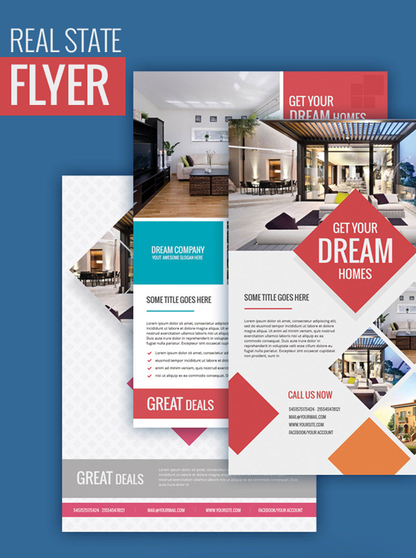
Purasaish Logo

Elegant Boutique Letter Crest Logo

Launch your new boutique with a beautiful logo to match! This lovely crest features a simple centered letter, balanced out with circular details for the ultimate in elegance and style. Easily change the size, text, or colors to make the most out of this brand identity.

Elegant Boutique Letter Crest Logo

Hubberts Royal Crest Logo

Whoever Hubbert is, he certainly has great taste in logos! This awesome logo design features a modern take on a traditional crest. With delicately designed lions and beautiful shield details, you’ll definitely want to have this logo to represent your brand. Ideal for any restaurant or real estate business.

Hubberts Royal Crest Logo

Soccer Crest Logo Template

Are you a huge sports fan? Then launch a fun sports club with this awesome soccer crest logo. It’s designed with a bright green shield, soccer ball, and simplistic typefaces, so you’ll definitely rule the area with this cool brand. Download this vector file to get access to an alternative black and white version.

Soccer Crest Logo Template

Adventure Crest Logo

Do you have an adventurous brand? Take your clients on a journey with this wickedly colorful crest logo. This brand identity features a unique design with three bold hot air balloons hovering over an evergreen landscape. Simply update the company name and add a clever brand slogan to make your company memorable!

Adventure Crest Logo

Royale Logo Template

Perfect for the luxury industry, this elegant logo template exudes great taste and style. It can be easily applied to many genres of business including restaurants, hotels, and luxury stores. Enjoy the clean, elegant design that can be easily customized with your favorite colors!

Royale Logo Template

Serpent Snake Crest Logo 

Need a logo with some bite? Then check out this awesome snake design. This design features a fierce serpent mascot surrounded by classic crest details. Included in this download are several Illustrator and EPS files with six color variations to choose from.

Serpent Snake Crest Logo

Washington Warriors – Team Logo

Create an awesome brand identity that the locals will love to rep! Introducing this wicked team logo, a package that includes a soccer-themed design with bold shield details and clean sans-serif fonts. Customize this logo easily to represent your local team.

Washington Warriors - Team Logo

Knight Crest Logo

Inspired by the strong gladiator helmets used in medieval Europe, this logo features a minimalist design with standard crest details. A crown, shield, banner, and pair of swords accompany this design for an overall logo that exudes power and status.

Knight Crest Logo

Heraldic Crest Logos Vol.1

This wonderful logo series packs a punch, with ten incredible crest logos we’re sure you’ll love. Mix and match your favorite elements to create the logo of your dreams. And because it’s super easy to customize, you’ll be able to edit these vector files in no time at all!

Heraldic Crest Logos Vol1

Chevalerie Logo Template

Dominate any industry with this sublime logo design. This beautiful logo features a bold, gold color scheme that also looks great in black and white! Get access to additional font links and more in this quick download.

Chevalerie Logo Template

Heraldic Crest Logo Badges

Get six amazing crest logos for the price of one! Featuring stunning minimalist designs, these logos highlight your company’s name and tagline with style. Enjoy clean vector details you can easily edit in an easy-to-use Adobe Illustrator file.

Heraldic Crest Logo Badges

Royal Shield Logo Template

Who wouldn’t want a dragon in their logo? This awesome design features a powerful red dragon with simple shield and crown details. This print-ready file can be updated easily with any text, colors, or tagline you desire!

Royal Shield Logo Template

Monroe Place Crest Logo

Or keep it simple with this minimalist Monroe crest logo. Switch out the center letter for the one that matches your brand, and enjoy this beautiful logo complete with two-toned colors and curvy swashes.

Monroe Crest Logo

Aramid Logo

Become an industry leader with this bold Aramid logo. The perfect logo for any consultant, investment, or marketing business, this brand exudes strength and power. Enjoy the incredible metallic design with customizable elements in one easy-to-use Illustrator file.

Aramid Logo

Conclusion

This list features exciting resources for the avid designer
familiar with Adobe Illustrator. For additional help with all your logo needs, enlist the skills of a talented
professional by choosing one of the amazing designers from Envato Studio.

And with thousands of crest logos available at your fingertips, chances are we’ve missed a few to add to your personal collection. Be sure to browse GraphicRiver and Envato Elements for more resources, and let us know your favorites in the comments below!