In this tutorial I’ll show you how to create a fantasy, sci-fi portrait. You’ll learn how to blend a model portrait with a space background, make some special effects using light and nebula textures, manage blending modes, enhance color, paint light, and more.
Tutorial Assets
The following assets were used during the production of this tutorial:
Create a new 1500 x 900 px document in Photoshop with the given settings:
The background color should be #010e27.
Step 2
Go to Layer > New Adjustment Layer > Curves and reduce the
lightness. Select the layer mask and activate the Brush Tool (B). Use
a soft round brush with black color (soft black brush) to paint on both sides of the canvas. It’s to avoid both sides becoming black
and to show the details there later.
Step 3
Drag the space background onto the dark canvas and change the layer mode to Screen 100%:
Click the second icon at the bottom of the Layers panel to add a mask to
this layer. Use a soft black brush to clear some areas around the
middle and both sides.
Step 4
Create a Curves adjustment layer and set it as Clipping Mask. Decrease the lightness to make the effect appear more subtle.
2. How to Add the Model
Step 1
Isolate the model using the Polygonal Lasso Tool (L) and add her to the middle of the canvas using the Move Tool (V).
Use a layer mask and a soft black brush to erase the neck, shoulders, hair, and forehead.
Step 2
Make a new layer and set it as Clipping Mask. Select the Clone Tool (S) to remove the earring:
Step 3
Create a Curves adjustment layer to lower the lightness of the lower edge of the chin and the cheek. Use a soft black brush to paint on the other areas so they won’t be affected by this adjustment layer.
Step 4
Add a Hue/Saturation adjustment layer and bring the Saturation value down to -16:
Step 5
Use a Color Balance adjustment layer to match the color of the model’s face with the background. Change the Midtones settings:
Step 6
Use the Lasso Tool to select the mouth only, and then go to Layer > New Adjustment Layer > Curves. Increase the lightness to make this area brighter.
3. How to Do the Eye Makeup
Step 1
Open the ring light image and add it to the main document using the Move Tool. Change this layer mode to Screen 100%.
Step 2
Select Filter > Liquify and activate the Twirl Clockwise Tool
(C). Tweak the ring until it gets a similar result to the one shown below, or at
least until it has the eye-like part shown in the small screenshot. Use it to cover
the left eye.
Use a layer mask to erase the areas around this eye-like part.
Step 3
Duplicate this layer and flip it horizontally (Edit > Transform > Flip Horizontal). Move it to the other eye.
Step 4
Select the two eye layers and press Control-G to make a group for them.
Change this group’s mode to Screen 100% and add a Hue/Saturation
adjustment layer to alter the eyes’ color:
Step 5
Create a Color Balance adjustment layer and change the Midtones values:
4. How to Add the Nebula Effect
Step 1
Drag the nebula 1 image on top of the head and change its mode to Screen
100%. Use the Free Transform Tool (Control-T) with the Warp mode to
tweak the form of the nebula to fit the perspective of the head and
eyes.
Use a layer mask to remove the hard edges.
Step 2
Duplicate this layer several times and move them around the head and
face, especially trying to leave some visible effect on the cheeks. Use a
layer mask if needed to clear any unneccessary details and get your desired look.
Step 3
Make a group for these nebula layers and alter its mode to Screen 100%.
Add a Color Balance adjustment layer and change the Midtones and Highlights values:
Step 4
Use a Levels adjustment layer to hide all the remaining edges and make the effect more subtle.
Step 5
Place the nebula 2 image in the lower part of the canvas and use Control-T to
rotate it as shown below. Change the layer mode to Screen 100%.
Step 6
Create a Levels adjustment layer to remove the edges and make a subtle effect.
Step 7
Make a Color Balance adjustment layer and change the Midtones settings:
5. How to Add the Fantasy Light
Step 1
Drag the fantasy light image onto the top of the head and alter the mode to Screen 100%.
Use the Liquify Tool (the Forward Warp Tool) to tweak the light to get a similar result to the one shown below:
Step 2
Duplicate this layer twice and move them onto the face and to the right. Use a layer mask to erase any details you don’t want to see.
Step 3
Use the Lasso Tool to select a left area from the fantasy light image
and add it to the lower left of the model. Turn it into a curve using
the Forward Warp Tool.
Erase the hard edge of this result using a layer mask.
Step 4
Select another part from the light image and do the same technique. Add it to the other side of the model.
Step 5
Add more small details using a similar method.
Step 6
Make a group for these light layers and create a Color Balance adjustment layer within this group. Change the Midtones values:
Step 7
Use a Hue/Saturation adjustment layer and reduce the Blue saturation value to -81:
Step 8
Create a Levels adjustment layer to make the remaining edges completely disappear:
6. How to Do the Face Makeup
Step 1
Create
a new layer and use the Elliptical Marquee Tool (M) to grab a circle
and then activate the Gradient Tool (G). Use Radial Gradient with the
colors #f8b2f2 and #834115 to fill this circle.
Tweak this circle using the Forward Warp Tool and place it along the contour of the model’s face.
Step 2
Change this layer mode to Color Dodge 100% and use a layer mask to make the effect appear subtle along the lower part of the cheek.
Step 3
Duplicate this layer twice. Move one to a higher position on the
cheek, and flip the other horizontally and then place it on the other cheek.
7. How to Paint the Light
Step 1
Make a new layer on top of the layers and use a soft brush with the
color #746482 to paint around the model’s face. Change this layer mode
to Color Dodge 100%:
Step 2
Use a soft brush with the color #81a3ef to paint on the top of the head, cheek, and chin. Alter this layer mode to Overlay 100%.
Step 3
On a new layer, use a soft brush with the color #8c8dcb to paint on the
lower section of the canvas. Set this layer mode to Hard Light 30%.
Step 4
Change the brush color to #a797c1 and paint on the top left of the model. Keep this layer mode at Hard Light 30%.
8. How to Do the Final Adjustment
Step 1
Create a Gradient Map adjustment layer on top of the layers and pick the
colors #912d1d and #004460. Lower the Opacity of this layer to 20%.
Step 2
Add a Color Balance adjustment layer and change the Midtones and Highlights values:
Step 3
Use a Photo Filter adjustment layer and pick the color #ecde00.
Step 4
Make a Curves adjustment layer to add a warm tone and increase the contrast of the image.
Step 5
Create another Photo Filter adjustment layer and change the color to #dab9f4.
Step 6
Use a Vibrance adjustment layer to enhance the final effect.
Congratulations, You’re Done!
I hope that you’ve enjoyed my tutorial and learned something new. Feel
free to share your ideas or comments in the box below—I’d love to see
them. Enjoy Photoshopping!
This tutorial was originally published in April 2011 as a Tuts+ Premium tutorial. It is now available free to view. Although this tutorial does not use the latest version of Adobe Photoshop, its techniques and process are still relevant.
If you’ve ever attempted to write words using traditional light painting photography techniques, you probably know how challenging it can be to create words that are easy to read. In this tutorial, we will demonstrate how you can create a similar look without a camera and tripod. Let’s get started!
And for more insane lighting effects, check out our awesome selection of Light Painting Photoshop Actions from GraphicRiver. Or enlist the help of one of the talented professionals from Envato Studio for your custom typography needs.
1. How to Sketch Out Your Composition
Step 1
Let’s start in Photoshop. Launch the program and create a new document. When creating everything from scratch, it’s always a good idea to make it really big. That way an A2 format can later be chopped up and cropped in any other format desired. We’re going to create a borderless illustration for an A2 and later crop it into an A3. So create a new document with these sizes: W: 42.5cm, H: 59.4cm, 300 dpi, CMYK.
We want the overall shape to form a heart, so draw a heart really quickly.
Step 2
Use the guideline to draw in your text with a tablet. Consider this a sketch. If you’re more comfortable doing this on paper, do it and scan it.
Step 3
For this single step, I’m going to switch to Illustrator. I’m more comfortable with ol’ Illy when it comes to lettering, but it’s entirely doable in Photoshop too. Once you’re done, Copy it (Command/Control-C).
2. How to Create the Multiple Lines
Step 1
Paste it in Photoshop as a Path (Command/Control-V, select Path in the pop-up dialog).
Step 2
Select the Brush Tool (B) and change your brush to a 100% soft edged, 10 px diameter brush. Grab the Pen Tool (P), right-click and select Stroke Path. In the pop-up dialog, make sure Simulate Pressure is not checked and press OK.
Step 3
Go to Filter > Blur > Motion Blur. Change the direction to a 60 degree angle and strength to 20. Press OK.
Step 4
Reduce the Opacity by approx. 50% and Duplicate it. Apply a Layer Mask (Layer > Layer Mask > Reveal All) and start to hide away portions with a large, black, soft brush.
Step 5
Grab the Pen Tool and trace your first light streak in Path Mode.
Step 6
Just as you did before, stroke the path with a 10 px brush. You need to do this individually in order to keep the appearance realistic. Alternate between 5, 10 and 15 px brushes and various levels of Opacity.
Step 7
After you’ve applied it, you need to hide both ends of the line. Use a Layer Mask and draw with black on each end.
Step 8
Use the original lines only as a guide. Start to add thickness to the letters, but preserve a classic typeface look by keeping the top and bottom of the bowls thin, and the sides thick.
Step 9
As you progress with the words, try to thicken the left side of each letter. Doing so will preserve the spacing between the letters.
Step 10
Remember to fade out each end of the lines, otherwise they won’t look real.
Step 11
Work your way through the letters until you have reached a similar result.
3. How to Add Color
Step 1
By now, it’s a good idea to nail the colors of the project. Above all other layers, create a Gradient Map Adjustment Layer (Layer > New Adjustment Layer > Gradient Map) Use these colors: #000000; #54000c; #d69f0a; #fffee9.
Step 2
Leave the Adjustment Layer always on top. Now that we’ve finished the lines, it’s time to add glows. Repeat the path creation process, but this time use a very large size (100–200 px) and enable Pressure Simulation. As a color, use a 50% gray (#8c8c8c). Change the Layer Style to Screen.
Step 3
Cover all the thicker portions of the letters with similar glows.
Step 4
It’s time to add even thicker lines, but with Pressure Simulation enabled and white color. Use lines of varying widths (25–75 px).
Step 5
Add thicker, soft white lines all over the letters.
4. How to Add Flares to the Letters
Step 1
Download this flare image and place it in your project. Rotate it until the angles of the rays are at 90 degrees. Set the Layer Style to Screen.
Step 2
Duplicate the flare, and double its size. Rotate it by 45 degrees.
Step 3
Go to Filter > Blur > Gaussian Blur, and use approx. 30 px to soften the secondary flare.
Step 4
Duplicate this flare (both layers) and place it around the scene in points of interest.
Step 5
Repeat the previous steps to achieve the same effect for the bottom text.
Step 6
Create a few more lines around the scene that follow the original path only to a certain point. Make them white, and of different Opacity levels.
5. How to Add Bokeh
Step 1
Open the blurry lights image and place it in the document. Set its Layer Style to Screen.
Step 2
Apply a Layer Mask and mask out portions of the image that have lights under the crop of the image. Make sure all the lights that are left aren’t sliced.
6. How to Enhance the Light
Step 1
In order to add a bit of contrast to the lights image, add a Black and White Gradient Map Adjustment Layer and make it a Clipping Mask for the lights image. Set its Layer Style to Overlay.
Step 2
Duplicate the lights image and apply it to different parts of the image. Use composites where you combine large dots with small.
Step 3
Apply the image to different points of interest. Try not to make it too heavy.
Step 4
We’re now going to combine these lights with a custom brush to make our own. Create a new brush, and change the settings as seen below.
Step 5
Keep Shape Dynamics on and change the Scatter to 550.
Step 6
Enable Other Dynamics and change the settings.
Step 7
Use this brush to draw much finer blurry lights along the letters.
Step 8
Repeat this process.
7. How to Add Noise
Step 1
We’re now going to add some noise without damaging the colors and lighting. Choose a 50% gray and fill an entire blank layer with it. It will appear brown because it is underneath the Gradient Map Layer.
Step 2
Go to Filter > Noise > Add Noise and add a max amount noise filter.
Step 3
Blur it by 0.8 px (Filter > Blur > Gaussian Blur).
Step 4
Change the Layer Style to Vivid Light and Opacity to 5%.
Step 5
And as one last adjustment, go to Layer > New Adjustment Layer > Photo Filter. Choose the red one.
Awesome Work, You’re Now Done!
Great work! Feel free to share your own end results in the comments to show others.
Light Painting Photoshop Actions From GraphicRiver
Love typography and light paintings? Create super awesome text effects yourself by downloading one of the awesome Light Painting Photoshop Actions from GraphicRiver. Try these on your favorite quotes and more and check out one of our best sellers below!
Create wicked light effects in a matter of seconds with this cool Photoshop action. A fully customizable action that allows you to make light effects out of any shape or raster, this download comes complete with light brushes. Create stunning effects in no time with this one-click Photoshop action.
In today’s tutorial, we’re going to pull
out our architect hats and learn how to “build” our very own miniaturized set
of New York’s most iconic buildings, using nothing more than the basic shapes
and tools that we work with on a daily basis.
So, assuming you’ve
already refilled your coffee mug, let’s get to it!
And don’t forget, you can always expand your collection by going over to GraphicRiver, where you’ll find tons of awesome vector buildings.
1. How to Set Up a New Document
Since I’m hoping that you already have
Illustrator up and running in the background, bring it up and let’s set up a New Document (File > New or Control-N)
using the following settings:
Number
of Artboards: 1
Width: 800
px
Height: 600
px
Units: Pixels
And from the Advanced tab:
Color
Mode: RGB
Raster
Effects: Screen (72ppi)
Preview Mode: Default
Quick
tip: some of you might have noticed that the Align New Objects to Pixel Grid option
is missing, which is because I’m running the new CC 2017 version of the
software, where great changes have been made to the way Illustratorhandles the way shapes snap to the underlying Pixel Grid.
2. How to Set Up a Custom Grid
Since we’re going to be creating the icons
using a pixel-perfect workflow, we’ll want to set up a nice little grid so that we can have full control
over our shapes, that is if we’re running the older version of the software.
Step 1
Go to the Edit > Preferences > Guides & Grid submenu, and adjust
the following settings:
Once we’ve set up our custom grid, all we
need to do in order to make sure our shapes look crisp is enable the Snap to Grid option found under the View menu, which will transform into Snap to Pixel each time you enter Pixel Preview mode.
Now, if you’re new to
the whole “pixel-perfect workflow”, I strongly recommend you go through my how
to create pixel-perfect artwork tutorial, which will help you widen your
technical skills in no time.
3. How to Set Up the Layers
With the New Document created, it would be
a good idea to structure our project using a couple of layers, since this way
we can maintain a steady workflow by focusing on one icon at a time.
That being said, bring up the Layers panel, and create a total of four
layers, which we will rename as follows:
layer 1: reference grids
layer 2: empire state building
layer 3: chrysler building
layer 4: world
trade center building
4. How to Create the Reference Grids
The
Reference Grids (or Base Grids)
are a set of precisely delimited reference surfaces, which allow us to build
our icons by focusing on size and consistency.
Usually, the size of the grids determines
the size of the actual icons, and they should always be the first decision you
make when you start a new project, since you’ll always want to start from the
smallest possible size and build on that.
Now, in our case, we’re going to be
creating the icon pack using just one size, more exactly 128 x 128 px, which is a fairly large one.
Step 1
Start by locking all
but the reference grid layer, and then grab the Rectangle Tool (M) and create a 128 x 128 px orange (#F15A24) square, which will help define the
overall size of our icons.
Step 2
Add a smaller 120 x 120 px one (#FFFFFF) which will
act as our active drawing area, thus giving us an all-around 4 px padding.
Step 3
Group the two squares composing the
reference grid using the Control-G keyboard
shortcut, and then create three copies at a distance of 40 px from one another, making sure to align them to the center of
the Artboard.
Once you’re done,
lock the current layer and move on to the next one where we’ll start working on
our first icon.
5. How to Create the Stamp Frame
Let’s kick off the project by creating the stamp-like frame which will be
the repeating element for each of our icons. That being said, make sure you’re
on the right layer (that would be the first one) and then zoom in on the first
reference grid.
Step 1
Create the frame’s outer section using a 100 x 116 px rectangle, which we will
color using #45576B and then center align to the underlying active drawing
area.
Step 2
Adjust the shape that we’ve just created by
positioning a couple of 8 x 8 px circles
(highlighted with red) exactly 8 px from one another both horizontally and vertically, which we will then
cut out from the larger rectangle using Pathfinder’s Minus Front Shape Mode.
Step 3
Continue adjusting the resulting shape by
flipping its Fill with its Stroke (Shift-X), and then setting its Weight to 4 px from within the Stroke panel.
Step 4
Create the frame’s colored fill section using a 76 x 92 px rectangle (#EFA28B), which
we will center align to the larger outline.
Step 5
Finish off the frame by adding an outline to
the colored fill section using the Stroke method. Create a copy of it (Control-C)
which we will paste in front (Control-F)
and then adjust by changing its color to #45576B and then flipping its Fill with its Stroke (Shift-X). Set
the path’s Weight to 4 px, and then select and group all
three shapes together using the Control-G keyboard shortcut.
Step 6
Once we’ve finished working on the frame, we can
create two copies of it (Control-C >
Control-F) and position them onto the remaining reference grids, making
sure to paste each one of them onto their respective layer (that would be the
third and the fourth). Then before you lock the layers back, change the color
of the second frame’s fill section to #8CC1ED and the third one’s to #8CEAC8.
6. How to Create the Empire State Building
With the frames in place, we can now begin working on the actual buildings,
so make sure you’re back on the right layer (that would be the second one) and
zoom in on the first reference grid so that you can have a better view of the
shapes.
Step 1
Start working on the Empire State Building’s
base by creating a 22 x 18 px rectangle
with a 4 px thick Stroke (#45576B) which we will bottom
align to the fill section’s outline, positioning it at a distance of 5 px from its left edge.
Step 2
Create another slightly taller 14
20 px rectangle with the same 4
px thick Stroke (#45576B), which
we will position on top of the one from the previous step.
Step 3
Create the right section of the building’s base by placing a copy (Control-C > Control-F) of the two
shapes that we have onto the opposite side of the frame, keeping the same 5 px gap between them and the larger
outline.
Step 4
Start working on the building’s center section,
by creating a 38 x 10 px rectangle
with a 4 px thick Stroke (#45576B) which we will center
align to the frame, positioning it on top of the base shapes.
Step 5
Adjust the shape that we’ve just created by
opening up its path, by adding a new anchor point to the center of its bottom
edge using the Add Anchor Point Tool (+) and then removing it by pressing Delete.
Step 6
Continue working your way up by creating a 30 x 12 px rectangle with a 4 px thick Stroke (#45576B), which we will center align to the previous shape,
positioning it on top.
Step 7
Start working on the building’s upper section by creating a 22 x 6 px rectangle
with a 4 px thick Stroke (#45576B), which, as you’ve
probably already guessed, we’ll position on top of the previous shape.
Step 8
Add another 6
x 12 px rectangle with a 4 px thick Stroke (#45576B) on top of the shape
that we’ve just created, making sure to center align the two afterwards.
Step 9
Finish off the building’s structure, by adding
the antenna using a 14 px tall 4 px thick Stroke (#45576B), which we will of course position on top of all
the other shapes.
Step 10
Next, we’re going to take a
small detour and add in the little highlights before starting work on the
windows themselves. So, using the Rectangle
Tool (M), create a bunch of 2 px tall
white (#FFFFFF) rectangles, which will cover the upper visible section of most
of the building’s composing sections.
Step 11
Adjust the shapes that we’ve just created so that they turn up looking
like actual highlights, by selecting them all and then lowering their Opacity to just 60%.
Step 12
With the highlights in place, it’s time to start working on the windows,
which we will create by drawing them using a couple of 2 px thick vertical Stroke
lines (#45576B) positioned 4 px from
one another (if you’re using the Align
panel’s Distribute options). Take
your time, and add the lines to each section of the building, selecting and
grouping (Control-G) both them and
the larger composing shapes together as you go along.
Step 13
Add the hard shadows by creating a couple of
rectangles (#45576B) which we will position so that they overlap the path of each building’s outline.
Step 14
Adjust the shadows (all except the top center
one) by individually selecting their top inner anchor points and then pushing
them to the bottom by a distance of 1 px for the top ones and 2 px for
the rest. You can use the Move Tool (right click > Transform > Move > Vertical > + / -2 px depending on which side you start with).
Step 15
Finish off the icon by drawing in the sky using a couple of 2 px thick Stroke lines (#45576B). Take your time, and once you’re done, group
all the lines together using the Control-G keyboard shortcut, doing the same for all of the icon’s composing sections
afterwards.
7. How to Create
the Chrysler Building
Assuming you’ve already
finished working on the first icon, move on up to the next layer (that would be
the third one), locking the previous one, and then zoom in on the second
reference grid so that we can get started.
Step 1
Start working on the building’s bottom section by creating a 48 x 16 px rectangle with a 4 px thick Stroke (#45576B) which we will center align to the bottom of the
colored fill section’s outline.
Step 2
Create a smaller 32 x 10 px rectangle with a 4 px thick Stroke (#45576B) which we will position
on top of the previous shape, making sure to center align the two.
Step 3
Finish off this section by adding a 16
x 20 px rectangle with a 4 px thick Stroke (#45576B), which we will
adjust by setting the Radius of its
top corners to 8 px from within the Transform panel’s Rectangle Properties.
Step 4
Select all three shapes, and turn them into a single larger path by
uniting them using Pathfinder’s Unite Shape Mode.
Step 5
Start working on the building’s left side section by creating a 6 x 18 px rectangle with a 4 px thick Stroke (#45576B), which we will position onto the first step of the
larger shape.
Step 6
Add a little ledge to the shape that we’ve
just created, using a 4 px wide 4 px thick Stroke line (#45576B) which we will position onto its top-left
corner. Once you’re done, select and group the two together using the Control-G keyboard shortcut.
Step 7
Create the building’s right-lower section using
a copy (Control-C > Control-F) of
the one that we’ve just finished working on, which we will vertically reflect (right click > Transform > Reflect
> Vertical) and then position onto the opposite side of the building.
Step 8
Create the building’s center section using a 32 x 28
px rectangle with a 4 px thick Stroke (#45576B) which we will position
on top of its base.
Step 9
Adjust the shape that we’ve just created by setting the Radius
of its top corners to 16 px from
within the Transform panel’s Rectangle Properties.
Step 10
Continue adjusting the resulting shape by adding a new anchor point to
the center of its bottom edge using the Add
Anchor Point Tool (+), and then removing (Delete) in order to open up its path.
Step 11
Continue working your way up by creating a 24 x 14 px rectangle with a 4
px thick Stroke (#45576B) which
we will adjust by setting the Radius
of its top corners to 12 px and then
opening up its bottom path. Once you’re done, position the resulting shape on
top of the previously created one.
Step 12
Add another 16 x 12 px rectangle
with a 4 px thick Stroke (#45576B), which we will adjust
by setting the Radius of its top
corners to 8 px, opening up its
bottom path as we did with the previous shape. Then, once you’re done, position
the resulting shape on top of the building’s center section.
Step 13
Start working on the building’s upper section by creating a smaller 8 x 6 px rectangle with a 4 px thick Stroke (#45576B), which we will adjust by setting the Radius of its top corners to 4 px, positioning the resulting shape
on top of the previous shape, making sure to open up its bottom path.
Step 14
Create the final piece of the building’s upper section using a 6 x 16 px ellipse with a 4 px thick Stroke (#45576B) which we will adjust by cutting it in half by
selecting and then removing its bottom anchor point. Center align the resulting
shape at a distance of 4 px from the
active drawing area’s top edge, making sure to extend its bottom section onto
the previous shape, using the Pen Tool
(P).
Step 15
Add the antenna using an 8 px tall 4 px thick Stroke line (#45576B), which we will center align to the previously
created shape.
Step 16
As we did with the previous building, start adding the little highlights
using white (#FFFFFF) as your main fill color, lowering their Opacity to 60% once you’re done. Create the straight highlights using regular
rectangles, while using cutouts for the arched ones, making sure to send them
to the back of the building afterwards (right
click > Arrange > Send Backward).
Step 17
Start adding details to the upper section of the building by creating a 2 x 2 px circle, which we will color
using #45576B and then position in the center of its second shape.
Step 18
Create three 2 x 4 px ellipses (#45576B) which we will position 1 px from
one another, moving the center one to the top by 1 px. Group (Control-G)
the shapes and then position them in the center of the top section’s third shape.
Step 19
Create a second set of 2 x 4 px ellipses
(#45576B), which we will distance at 2
px from one another, grouping (Control-G)
and then positioning them towards the center of the top section’s fourth shape.
Step 20
Using nine 2 x 2 px squares
(#45576B), add the little windows to the arched section of the building,
grouping them together afterwards using the Control-G keyboard shortcut.
Step 21
Create a 6 x 41 px rectangle
with a 2 px thick Stroke line (#45576B), which we will
adjust by setting the Radius of its
top corners to 3 px, center aligning
the resulting shape to the bottom of the colored fill section’s outline.
Step 22
As we did with the first building, take your time and draw in the
windows using a couple of 2 px thick Stroke lines (#45576B) positioned 2 px from one another, selecting and
then grouping (Control-G) them
together once you’re done.
Step 23
Add the shadows using a couple of rectangles which we will position so
that they follow the path of the building’s composing sections.
Step 24
Adjust the shadows, by individually selecting
their top inner anchor points, and then pushing them to the bottom by a
distance of 2 px using the Move Tool (right click > Transform > Move > Vertical > 2 px.
Step 25
Finish off the icon by drawing in the sky using a couple of 2 px thick Stroke lines (#45576B). Take your time, and once you’re done, group
all the lines together using the Control-G keyboard shortcut, doing the same for all of the icon’s composing sections
afterwards.
8. How to Create
the World Trade Center Building
We are now down to
our third and last icon, so assuming you’ve already moved on up to the next
layer (that would be the fourth one), zoom in onto its reference grid, and let’s
finish this.
Step 1
Create the building’s main shape using a 36 x 56 px rectangle with a 4 px thick Stroke (#45576B) which we will center align to the bottom edge of
the colored fill section’s outline.
Step 2
Start working on the building’s upper section by creating the antenna using a 36 px tall 4 px thick Stroke (#45576B), which we will position on top of the larger shape.
Step 3
Create the bottom section of the roof platform
using a 28 px wide 4 px thick Stroke (#45576B), which we will center align to the building’s main
shape, positioning it at a distance of 6
px from it.
Step 4
Add the platform’s support legs using a 16 x 6 px rectangle with a 4 px thick Stroke (#45576B), which we will center align to the larger rectangle’s
top edge.
Step 5
Create the upper section of the platform using
another 28 px wide 4 px thick Stroke (#45576B), which we will center align to the bottom section,
positioning it at a distance of 6 px from
it.
Step 6
Connect the platform’s two sections using two
sets of 6 px tall 4 px thick Stroke lines (#45576B), which we will position 4 px from one another using the Align panel’s Distribute options, placing one on each side of the antenna.
Step 7
Quickly grab the Pen Tool (P), and then draw in the diagonal support rods using a 2 px thick Stroke line (#45576B), starting from the top section of the
platform and going up onto the center section of the antenna.
Step 8
Finish off the upper section of the building by
adding an 8 px wide 4 px thick Stroke line (#45576B) which we will center align to the antenna.
Then, once you’re done, select and group all of the current section’s shapes
together using the Control-G keyboard
shortcut.
Step 9
Add the main highlights using seven 32 x 2 px rectangles (color: white; Opacity: 60%) which we will vertically stack 6 px from one another, grouping (Control-G) and then center aligning
them to the building’s main body.
Step 10
Start working on the front section of the
building by creating the windows using twelve 20 px wide 2 px thick Stroke lines (#45576B) vertically
stacked 4 px from one another.
Once you have the lines, group (Control-G)
and then center align them to the tower’s main body, at a distance of 4 px from its top edge.
Step 11
Add the front section highlights using six 20 x 2 px rectangles (color: white; Opacity: 60%) vertically stacked 6 px from
one another, which we will group (Control-G)
and then center align to the windows, positioning them underneath the first Stroke line. Then, once you’re done,
select and group both the windows and highlights together using the Control-G keyboard shortcut.
Step 12
Create the front section’s main outline using a 20 x 56 px rectangle with a 4 px thick Stroke (#45576B), which we will center align to the building’s main
body.
Step 13
Adjust the rectangle by individually selecting
its top anchor points and pushing them to the inside by a distance of 8 px using the Move tool (right click >
Transform > Move > Horizontal > + / – 8 px depending on which side
you start with).
Step 14
Create a copy (Control-C > Control-F) of the resulting shape, and then use it
to mask the front section’s windows and highlights (right click > Make Clipping Mask), making sure to send them to
the back afterwards (right click >
Arrange > Send Backward).
Step 15
Add the background windows using a couple of 2 px thick Stroke lines (#45576B), vertically stacked 4 px from one another. Start from the outer edge of the larger
outline and go all the way to the front section’s one. Then, once you’re done, select and group all of the building’s shapes together using the Control-G keyboard shortcut.
Step 16
Finish off the icon by drawing in the sky using
a couple of 2 px thick Stroke lines (#45576B). Once you’re
done, group (Control-G) all the lines
together, doing the same for all of the icon’s composing sections.
Hats Down!
Great work! Our little icon pack is completely finished!
I hope you’ve managed to follow each and every step,
and as always learned something new and useful during the process.
Editor’s Note: Envato Tuts+ does not endorse any particular political belief in the publishing of this article. This article intends to offer insight into art and politics in modern times.
Before History Was Tweetable
Long before the first photograph or dissolving SnapChat story, and certainly before the first presidential tweet, there was always the 2D illustration.
And when you think about it, it’s a shame really. Because the role that art plays in history far surpasses our modern, late night awake-a-thons, sourcing endless Wikipedia pages in support of our arguments or papers.
We have, in a sense, trivialized what was once the definitive snapshot of our culture.
And even with the currency we keep in our pocket, we still often forget how important artists are to encapsulating moments and people in time.
How else would we have related to the clenched jaw expression of the first US president if it weren’t for the iconic oil paintings of artist Gilbert Stuart?
Or that the U.S. Capitol once lay in ruins, following British attacks that nearly cost the country everything during the War of 1812.
Ink and watercolor painting of the U.S. Capitol during the War of 1812 by George Munger.
You see, artists like George Munger and Gilbert Stuart embarked on creative solo missions so that these pivotal scenes would never be forgotten.
Today, technology has, no doubt, played an important role in shaping how we get information and the legitimacy of our sources.
But art is still andwill always be an important reflection of the issues and people that matter most. And no matter how subtle or cheeky or controversial a piece may be, artists continue to band together in fighting the world’s battles one brush stroke at a time.
So today I’ll shed light on 12 amazing artists whose work speaks incredible volumes.
What’s set to become the next iconic image in history? Who knows…
Let’s learn the political, economic, and social issues of the world through the eyes of artists.
Who Is the Winner… Really?
The 2016 US election was, for some, like ripping off an old band aid. And as quickly as it passed, we inevitably winced at the outcome. Some rejoiced in a monumental change for American history, while others continued to pick at the scab, unconvinced that the world was now in a new time of healing.
And in the daze of January 20th, 2017, the feelings of the American public were hugely divided. This can’t be felt any more clearly than in the art that surrounded both the election and the results.
Hillary Clinton for Politico Magazine
Like any election, we were bombarded with beautiful pre-iconic pieces of both candidates. This Politico Magazine Cover by Tracey Ching, for instance, was one of two incredible vector illustrations she created for the Democratic and Republican National Conventions (she did an equally gorgeous Donald Trump Cover you should definitely check out).
Perched in a romantic parking spot, we see presidential hopefuls Donald Trump and Hillary Clinton in a gentle embrace as destruction ravages the American landscape. A mysterious shadow lingers on with an even shadier agenda.
How would you interpret this piece? And what would you take away from the third shadowy figure?
If I could sum up the 2016 election with one quote, it would probably be, „Can we just get a do over?” This is a common sentiment among many Americans, and it seemed like we were in a lose-lose situation no matter the outcome.
Dark Times of America
But once Trump was finally elected, the narrative shifted yet again. A somber attitude wafted into the air as people stood by with unclear feelings towards the impending future.
This piece was from an article about how this might be one of the darkest periods in America, according to the policies being considered by Donald Trump.
I led
the eye to focus on emotions only so the work had to be
in black and white. Then I thought about what creates an absence of light and wanted to make people understand that this absence was caused by Donald Trump.
But before you think that’s all there is to this illustration, he pauses before continuing:
On
one side of the illustration, I created
a beam of light―as if to say that the
light still exists outside.
This is my way to stay positive!
And this subtle detail, this gentle reminder of our everlasting hope to always remain positive amidst adversity becomes what I think is the most valuable symbol in this piece.
The Disappointer in Chief
But Republicans weren’t the only party to feel the heat of criticism. Even before the election, 44th President Barack Obama faced immense criticism and frustration from all parties alike.
It was published with the story running in the Sunday paper (The
Washington Post) about President Barack Obama, and how he just hasn’t
lived up to the expectations of many people.
It was a very short deadline―like 2 days. One day for sketches and another one for the finished work. I managed to create this on such a short notice.
In this cramped and claustrophobic image, headlines swarm Obama’s head, shouting clips of campaign promises and more. The viewer can’t help but feel a sense of helplessness as it becomes apparent that power isn’t always at the hand of one individual.
Artists on Immigration Policies
There is this weird thing
that happens with developed nations. It’s the appearance of being
welcoming to outsiders without actually meaning it. Their open arms and welcoming smiles are often contradicted by complicated immigration policies.
Radical Islam
We see this even in the current narrative. It’s a controversial topic for many, and we’re forced to come face to face with humanizing people who don’t look like us or practice the same religion.
Artist Gerhard Human created an incredibly poignant piece that lends itself to this very conversation. Radical Islam, a hand printed four-color silkscreen, shows us a side of Islam we never see.
Gerhard added:
I don’t really like explaining my artworks
too much. I want them to speak for themselves. Often the viewer’s
outtake is unique and I don’t like robbing them of their conclusions.
This philosophy is common among artists because art is subjective. When coupled with the title, though, the meaning of this illustration can certainly be perceived as obvious. But what are some of the underlying issues that can be seen here?
And how can we, as a society, learn from such openness in art?
Offlife Comics – Yellow Series
Speaking of warm, open embraces, illustrator Eva Bee offers a hand to those in need in her illustration for Offlife Comics. She said:
I produced this piece for Offlife Comics, for a book they
published last year called, „Yellow.” The idea behind the book was to ask
52 artists to illustrate a different week of news from 2015. This was the only brief given, and I was given free license to do whatever I
wanted with the top events that happened in my week.
Here is what she wrote to accompany her illustration in the book:
The migrant crisis made a resurgence in the news this week. My
piece reflects on the fragility of the migrants’ situation as they
arrive in countries across Europe by boat.
The power is in European
hands to either help or squash their hopes, as we’ve seen over the last
few days with the violence faced by migrants trying to enter Macedonia.
Even powerful words can fall upon deaf ears. But the sincerity and heart behind an illustration like this create a much-needed dialogue about immigration.
Artists on International Issues
If you sail out into international waters, you will be greeted with some of the same political, economic, and social issues found in your very own backyard. And artists from around the globe actively take on the task to voice their opinions through their work.
Greetings from Russia depicts Vladimir Putin’s fuck-you attitude
towards Europe and the rest of the world. Regardless of whether this is
justified or not, I can only judge Russia’s situation from a
European/Dutch point of view.
In reality, Bart sounds like any of us when faced with a passionate topic. He goes on to say:
I made this picture on the occasion of the MH17 disaster, and the
continuous denial of Vladimir Putin that Russia had nothing to do with
it during the several investigations that followed this plane
crash.
Great comedy often comes from incredible anguish, and art is certainly no different. Putin’s blasé attitude as he stands alongside missiles is emphasized with a classic „selfie pose”, signaling that the days of „Is this really happening?” are far from over.
Bullfighting
Another important issue faced by people around the world often involves an attitude of the people vs. the government or major corporations.
This Bullfighting illustration by Ricardo Nunez Suarez features a cool double meaning. Ricardo explains the symbolism behind this piece below:
For this piece I wanted to create a beautiful image that hides an insightful message.
The woman in the scene has a glance of superiority. She represents
the upper class of society. Behind her are fruits and food that
represent abundance. She waits for the bull to come. The bull is huge
and mighty, however submissive and tamed. The bull represents the
working class. Fruits and abundance also surround him and are brought to
serve the woman. She touches its head with one hand and sings a song of gratitude
for the food he brought. However, with the other hand she is holding a
dagger, and she
will kill the bull after being served.
An analogy for the politics in his country of Colombia, the bull represents the people and the woman his governors.
Bullfighting is an event where not many people assist while the
spectators are usually of the upper class in society. The last time
this event happened, thousands of
people protested against the killing of an innocent animal for the amusement of just a few.
In the end, the government favored the views of the majority, dispersing thousands of police officers to contain the
protestors, and neglecting the rest of the city where police might be needed. Once again, power and money had the last word.
And as strong and resilient as the bull may appear to be, he will always be at the mercy of his governor, a tragic reminder from the eyes of Ricardo.
Mosquito
Of course, the huge connection between big money and politics becomes a topic for artists too. As powerful corporations lend their hand in major policy reform, everything from sports to climate change becomes severely affected.
„Mosquito” is part of a series of small
drawings I started in 2015. All these works feature a politician as the central character. I use this character as an archetype for specific narratives, to transform him, and morph him in order to tell a compelling and
vivid story.
This particular piece sees the politician as a
blood-sucking creature, probing the Earth for its „blood,” and exploiting
its resources as much as possible. I use a lot of dark humor and pop culture references. I try to tell
stories in such a way so that they can transcend the present moment whilst incorporating
surrealism and common symbols to make up my own
symbolic language.
When things go wrong, we often want someone to blame—a physical embodiment of our anger and frustration. Aleksandar does this effectively by symbolizing the political world as one bloodsucking central figure.
Big Politics, Money, and Football
Even sports can become a victim of political change.
This illustration is about the relationship between football and politics. I created this artwork for the football magazine called Kopalnia. It was illustrating an article
that was about how modern football is ruled by money coming
from sources that are „immoral.” While the journalist analyzes the situation, they also point to its origins, and
why there’s no one trying to change the current situation.
Politics has the power to affect every fabric of our daily existence. From the food we eat to the sports we watch, there’s no end in sight to its reach. Though cleverly illustrated, this piece tragically shows how even our most innocent daily activities are steamrolled by big money and politics.
Me & EU
Needless to say, the world went into a frenzy over Brexit. And the confusion surrounding the UK’s withdrawal from the EU provided a great subject for UK artists.
My relationship with politics is a bit of a funny one, I try to shut my
eyes to as much of it as possible as a
sort of emotional self-preservation. Everything seems so bleak and so
hopeless at the moment that just reading the news can be quite the
overwhelming experience and really affects my creative impulses.
The driving intention behind this illustration
isn’t so much resistance or protest, but rather my absolute exasperation
with the hyperbole, hypocrisy, untruths, and us-vs-them mentality that
seems to have dominated all political debate in the last few years.
He goes on to say:
I tried to articulate this exasperation, and in working through
my thoughts, the phrase that kept sticking
out in my head was a bit of an idiom: 'cutting off your nose to spite your
face.’
And Chester makes a great point here. In today’s age of political rivalry, it’s not uncommon to feel overwhelmed by chaos. Terms like „alternative facts” are being coined every day, while mass hysteria for opposing political views usually ends in the melodramatic „unfriending” of family, friends, and neighbors.
This is a political illustration I created for the Brexit event, which I highly applaud and support. The illustration is based on a famous Prometheus legend, the titan who was captured by Zeus and the eagle who ate his liver.
In my version, the eagle represents the high German state (politicians), which destroys European nations due to its aggressive financial behavior. Through Brexit, Great Britain (depicted as Athena), snaps her slavery chains to claim her freedom against her suppressor, the EU/German bureaucracy.
Ilias’s illustration offers an interesting perspective on a narrative we don’t often hear. It is through art that we are able to shed new light on old topics, allowing us to learn from one another.
Conclusion
Art teaches us that we can either navigate the sea of politics carefully or convey our ideas with passion. Which route you decide to take is ultimately up to you, but if you document it through art, it may last for generations to come.
Create a window to the present with your own political illustrations.
Do you have a piece expressing your political views? Feel free to share it with us in the comments! Or tackle a fun poster project in Adobe Illustrator, like the iconic Obama-inspired poster seen in: Create an Inspirational Vector Political Poster.
I’d also like to extend a warm thank you to all the artists who allowed me to feature their work. Check out the following links below to see their amazing portfolios:
It’s always exciting to see new or upgraded website building tools and platforms. Newer isn’t necessarily better of course, and upgrades do not always mean game-changing changes have taken place. The very best tools and platforms are out there of course, but it often takes some serious digging to locate them. It helps to know […]
Spring has arrived! Let’s greet this amazing season with a
beautiful lettering illustration. Of course, we’ll add some floral
decorations, love, passion, and creativity!
Today, you’ll learn
how to create digital writing in Adobe Illustrator to make some elegant
lettering with floral elements for our gentle, ornamental composition.
Ideally, it would be great to have a pen tablet for this tutorial for
your convenience. We will also use the Width Tool, the Pen Tool, and the
Arc and Line Segment Tool.
After
opening your Adobe Illustrator, create a new document with 850 x 850 px
Width and Height. Our illustration will be placed on a dark grey
background. So let’s create a dark-grey rectangle with the Rectangle
Tool (M).
Step 2
Now, let’s start writing. Remember that
it doesn’t have to be perfect because we just need to mark where the
real letters will appear.
So that we can write legibly, let’s
get some help: the Rulers. To make them appear, go to View > Rulers > Show Rulers (Control-R). Take
the upper ruler and drag it down to the place where you want to write.
Repeat this action to make another ruler appear, so that you have two
lines between which you can place your letters.
Now that
you’ve prepared where you want to write, let’s begin writing using the Pencil Tool (N) with no fill color. If you make a mistake, you can
always erase it using the Eraser Tool (Shift-E). It’s easier if you can
see the whole artboard (Control-0), because the smaller the letters you
write, the less your hand will shake.
Step 3
Lower the
Opacity on the Transparency panel of this layer, close it, and create a
new layer.
On the new layer, take the Pen Tool (P) and outline the word
„Hello”. I recommend the Pen Tool because you won’t have a lot of anchor
points which make your file heavier, as you would with the Brush Tool (B).
Write each letter separately, since it will be easier for you to manipulate the letters later. Begin by writing simple letters and then
add some curly decorations later.
Now you can add some curls by
manipulating the handles of the anchor points. If you want to connect
two letters, select the anchor points that you want to connect using the Direct Selection Tool (A), right-click the mouse, and select Join.
Step 4
Now it’s time for the next word, “Spring”.
Close
the upper layer, where you wrote using the Pen Tool (P), and unlock the
bottom one, where you will write the new text. Make sure that you’re in
the bottom layer and create another couple of rulers below the first two
rulers that you made, where you want the second word to be placed.
Simply take the upper ruler and drag it down. Do this action twice to
get a pair of rulers as boundaries for your letters. Using the Pencil
Tool (N) with no fill color, write the word “Spring”.
For better visibility, you can increase the bottom layer Opacity.
Step 5
Similar
to what we did before with the word “Hello”, lock this layer, lower the Opacity, and go to
the upper layer. Next, select the light-cream or yellowish stroke color, and by using the Pen Tool (P), outline the word „Spring”. When you are
finished, add some curls to the letters by manipulating the handles of the
anchor points.
This is my result. Feel free to do something similar to this.
Step 6
Look
at the Layers panel, take the layer where we drafted the letters (the
non-decorative letter layer), and drag it to the trash icon (Delete Selection). Press
Control-R to hide the Rulers. Select the lines on your artboard (you placed letters between them) and press Delete on the keyboard.
This is what our lettering now looks like:
2. How to Create Floral Details
Step 1
Now we’ll add some spring floral details. Let’s make the first type of leaves.
Set
the stroke color to green with no fill color. Using the Arc Tool, draw
the stem of our leaf. Add a few lines from both sides of the stem by
using the Line Segment Tool (\) or the Arc Tool, if you prefer. Make sure to check Round Cap on the Stroke panel.
We’ll transform these
lines into leaves by using the Width Tool (Shift-W).
Hit the Width Tool (Shift-W) and place your mouse/pen tablet over the
“prospective” leaf. Stretch where the leaf should be thicker. Repeat
with the rest of the leaves.
Make a few of these leaf branches.
Finally, we need to expand the lines which were transformed. Select
them and go to Object > Expand Appearance, and then Object >
Expand. (The first time you expanded just the leaves, and then the second time the stem).
Step 2
For the second type of leaves, we’ll use
the Arc Tool again to draw lines in two colors: lighter green on the back
and darker green over it. Change the width of these lighter lines with
the Width Tool (Shift-W). Expand all lines (Object > Expand
Appearance, Object > Expand) and make the leaf edges sharper by
moving the handles of the anchor points (use the Direct Selection Tool (A)).
Step 3
Now
we will create a rose. Add a pink circle with no stroke color and pink
fill color (feel free to choose any shade of pink). To make an even
circle, draw an oval using the Ellipse Tool (L) while holding down the
Shift key.
Now add some outer petals. Remove the fill color and make the
same stroke color (Shift-X) as used for the circle. On the Stroke panel, increase the Weight of the stroke and check Round Cap. Grab the
Pencil Tool (N) and start drawing curly petals, which will be the
outside of the circle.
To make the inner petals, decrease the
Weight of the stroke, and make the stroke color slightly darker. Using
the Pencil Tool (N), create inner petals as shown in the image below. Add
some lighter petals as well.
Step 4
In this step, we will
create a flower bud. Add a pink circle with no stroke color and pink
fill color. Make two copies of this circle with slightly darker
color and place them behind the first circle (Control-X, Control-B).
Add the fourth copy of the circle behind and make it darkest. Add a few
black lines with the Pencil Tool (N) (just grey stroke color), behind
the first circle as stamens. And finally, create a green oval behind all
petals of the bud as a receptacle.
Expand the stamens. You can select the whole bud, go to Object > Expand, and in the new dialogue window select Stroke and press OK.
Step 5
For the third type
of flowers, let’s use the Line Segment Tool (\) again and draw a few
petals as lines. Use the Width Tool (Shift-W) to change the width of
these lines and create petals. Add a tiny circle inside the flower.
Yellow fill color with no stroke. Isn’t it easy? Finally, expand these
lines. Go to Object > Expand.
Step 6
Create a similar but
smaller, white colored flower using the steps we just took. Use the
Line Segment Tool (\) for the white petals, deform the lines with the Width
Tool (Shift-W), add the yellow circle inside, and finally, expand these
lines (Object > Expand).
Step 7
Here are all the floral
elements that we just created. Before moving on to the next step, make
sure that you have expanded all of them (Object > Expand Appearance,
Object > Expand).
3. How to Arrange the Floral Elements
Step 1
Make a few copies of the dark green leaves and spread them over and under the letters.
Step 2
Select the other leaves that we created, make a few copies, and place them also around the text.
Step 3
Now it is time to place a few copies of our beautiful rose.
Step 4
Add some of the flower buds.
Step 5
Scatter a few small red flowers.
Awesome Work, You’re Done!
And last but not least, let’s not forget to place our tiny white flowers. With this, we will finish our illustration.
Congratulations! Our spring lettering card is ready! Great job! I hope you’ve enjoyed following this inspirational tutorial and discovered some new tips and tricks that will help you to design more lettering designs and floral compositions. Enjoy the spring, and have fun!
Logos will always remain one of the most important aspects of any corporate identity. And you can bypass all the headache and hassle by downloading professional logos to fit your business needs. Check out this collection of incredible abstract logos below!
25 Beautiful Abstract Logos
How would you like to represent your business? With a beautiful swash or an eye-catching symbol? Or perhaps a stylized popular symbol will do?
No matter your preferences, abstract logos are great for building your new brand. And in this collection of incredible assets, we feature 25 stunning abstract logos curated from the design sections of GraphicRiver and Envato Elements.
Kick off your business with one of these unique designs, or enlist the help of the good folks from Envato Studio for custom brand identities.
Your logo should be as luxurious as your brand. With this crest logo, you can enjoy a stunning, modern design featuring a beautiful geometric design. Download this file to get access to six color variations and 100% resizable vector elements.
Create a brand identity that matches your impressive style. This premium logo design is ideal for any corporate business, apparel brand, and more. It features a sleek „A” letter design with additional color variations.
Get royal with this luxurious abstract logo. This logo features a beautiful wreath design, with minimalist leaves and swirls you’ll definitely love. Elevate your name in any industry with the perfect logo by downloading this identity today!
Kick off your production company with the stylish Connecto logo. This logo features a beautiful „C” design, with fluid curves and a gorgeous gradient color scheme. Enjoy a fully editable vector logo with several color variations to choose from.
There are many cookie cutter logo designs, but this one is truly unique. The Vivacity logo template features a stunning, colorful design with a water drop theme. Take your organization to the next level with this gorgeous logo design.
Abstract logos can be applied to almost any business. And this is definitely the case with this powerful box office design. This design features a minimal, square aesthetic with all vector elements that can be edited to fit your personal needs.
Geometric designs are a huge staple in the industry today, and this logo design is no different. It features a beautiful minimal design, inspired by both an arrow and a rocket. Make your brand stand out with this cool and unique identity.
Need a beautiful logo for your non-profit? Then feast your eyes on this gorgeous design. This logo template features a clever design that creates a colorful flower out of minimalist people. Show how much you love the community with this high-impact logo design.
Create a sense of mystery with this abstract vector logo. This logo design features a rainbow-like color palette with four parts. Impress your audience with a professional design available in four color variations.
Plug into your new business with this high-impact logo design. This logo features a gorgeous blue color scheme with a literal connection design that is easy to understand. Let your customers know exactly what industry you deal in with this powerful identity.
Flat design is all the rage in the design industry today. Take advantage of this popular trend with this set of real estate logos. These logos feature completely vector elements that you can interchange for a unique, custom design.
Show off your love of architecture and geometric design with the stunning Affilitizer logo. This template features a clean, minimalist design, with linear elements creating the letter „A.” It’s perfect for any construction business, and you can impress your clients with this stunning professional logo.
Launch your new business with a colorful logo! This logo features a 100% vectorized logo design that can be edited easily. Great for any brand looking to be a globally recognized company, this logo features a variety of color variations for your convenience.
Master your inner zen with this charming logo. This logo features a distinctive yoga-inspired theme with beautiful linear elements. 100% editable and resizable, this logo is perfect for any budding yogi looking to open a new studio.
Become the next big hit in the music industry with this gorgeous logo design. This design features a clean, minimalist design inspired by sound waves. This file also includes an easy-to-use vector format for simple customization.
Represent your new company with an excellent logo. Inspired by a simple brush stroke, this colorful design comes in many color variations and looks great in black and white. Use it as a horizontal or vertical display for the perfect logo for your business.
Let your business soar with this stunning logo. It features an origami-inspired design that comes in four different color schemes. Upgrade your brand with a sleek and sophisticated design and download this logo today!
Show off your artistic side with this creative pencil logo design. This unique take on a traditional pencil design features a cool geometric upgrade that is sure to make your business stand out. A colorful logo that also looks great in black and white, this charming design is one we’re sure you’ll love.
Show your customers you’re the brains of the business with this awesome tech identity. This logo features a cool brain design made out of creative motherboard parts. And with unlimited color variations possible, you can simply plug in the colors you love best!
Kick start your new life as an entrepreneur with a cool design. This pixel box logo has a fun geometric aesthetic that is completely print ready. Fully customizable, this logo is perfect for media agencies, tech companies, and so much more!
If you need a solution for your corporate identity then feast your eyes on this stunning logo. Inspired by a creative ribbon design, this logo features fully editable text and multiple file formats, with both horizontal and vertical variations included.
Need a fiery logo design? This pretty, minimal logo features a straight-to-the-point circular design with a pointed top to represent fire. Switch out the color with six other variations to perfect this design for your company.
Does your brand name start with an „S?” Make your logo stand out with the clever Sasline logo. This logo features a unique and colorful design that is completely print ready with 300 dpi resolution. It’s available in both AI and EPS formats, so get started using this lovely logo today!
This sleek and sophisticated design makes for the perfect logo! The Recitalia logo features a lovely geometric design with a minimal color palette and subtle details. Customize this template easily in Adobe Illustrator.
Don’t you want your business cards to look as beautiful as this design? This logo features a gloriously gold aesthetic, but you can change the colors if you’d prefer. Download this file to get access to a completely resizable vector design.
Conclusion
This list is jam-packed with exciting resources for the avid designer
familiar with OpenType and more. If you need additional
help creating graffiti-inspired street art, enlist the skills of a talented
professional by choosing one of the amazing designers from Envato Studio.
And with thousands of abstract logos to choose from, chances are we’ve missed a few to add to your personal collection. Be sure to browse Envato Market and Envato Elements for more resources, and let us know your favorites in the comments below!
If applying for that dream job is on your to-do list this year, you’ll want to dust off your resume and give it a refresh. The design of your resume is, some would argue, just as important as the content, and especially if you’re applying for a creative role, the layout and typography can speak volumes about your professional prowess.
Here I’ll break down the key building blocks of a perfectly tuned resume design. The sample resume design pictured here would make a great application for a graphic or web designer, but you’ll find you can apply the same key design techniques to other job applications and always end up with a resume that will showcase your credentials in their best light.
Read on to find out how to make an employer go ‘Oooh!’ when they open up your application envelope.
This may not be the most exciting thing to think about when designing your spectacular resume, but page size is absolutely key to guaranteeing your resume gets circulated around the office.
There is absolutely nothing more off-putting than a resume that’s been designed on a non-standard page size. If your resume’s too big, your potential employer might struggle to fit it in their photocopier or scanner. Too small? It’s not going to look good when photocopied onto a sheet of A4 (plus don’t even get me onto the eye-wincingly small font size—see Tip 4, below).
If you’re designing your resume in a design program like InDesign or Photoshop, make sure to set the document or canvas to a widely accepted standard page size. That’s Letter(215.9 x 279.4 mm) if you’re in the US, or widely accepted A4(210 × 297 mm) if you’re in Europe or Australia.
In Adobe InDesign, you can select Letter or A4 from the Page Size drop-down menu when you go to File > New > Document.
If you’re going to design your resume with color or details that extend past the trim edge of the page, you should also bear in mind from the beginning that you will need to have your resume professionally printed. To prepare for this at the document setup stage, you should make sure to add a Bleed around the edges of the page, which will minimize the visual impact of any slight trimming errors. A Bleed Width between 3 and 5 mm will do the trick.
2. A Strong Grid Layout
Once you have your basic document ready, you can get started with designing the layout of your resume. You have to be able to fit quite a large amount of information on a single page, including your name and contact details, previous job titles and descriptions, qualifications, and other details that might be relevant to the role, such as software proficiency and languages.
Before you even begin designing, take a look at the older version of your resume and try to assess if there’s any information that could be trimmed down. For example, you could try editing job descriptions down to a sentence or two.
Once you’ve done a bit of copy editing with your text content, you will need to work out how to fit the remaining text on the page.
If you’re working in a simple word-processing application like Word or Pages, the temptation is to place all your content into one continuous column of text.
For many reasons, this is not the best route to take. For one, this doesn’t make the most of the space you have available on the page. You may well find that using this technique forces you to flow text onto a second page, which immediately brings up the disadvantage of the interviewer not noticing this second page of text (they are busy people, after all) when they are sifting through a mass of applications.
By restricting your text to just one column on the page, you are also limiting the potential visual interest of the page. Breaking your text into a couple of columns is a great way of keeping the eye engaged, as it moves back and forth from one column to the next.
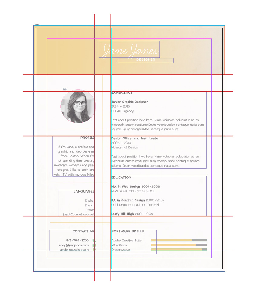
With this in mind, you need to establish a strong grid layout for your page, which will help guide the eye over the information and give the resume both visual interest and a natural hierarchy, leading the reader from one section of information to the next.
I think this is a great failsafe grid for a resume. You’ll see this grid layout repeated in subtle variations across many professionally designed CVs.
Let’s look at how to recreate it.
First, you’ll notice that this grid is bottom heavy, with over two-thirds of the lower part of the page set aside for text information. At the top of the layout, the grid allows a decent amount of space for a header, which can be colored or filled with an image, and, most importantly, will showcase your name. This instantly makes your name the most visually arresting element on the page, which is essential for building memorability with the employer.
The grid is split into two columns of unequal width, which adds an element of asymmetry and visual interest to the layout. The left column is narrow, punchy and easy to digest, which makes it perfect for placing those vital pieces of information that can translate to an interview, such as your photo, contact details, and bio.
The grid is ultimately simple in its design, allowing for a clear hierarchy of information to be read, starting with the name header at the top, followed by the key information in the left-hand column, and ending with the meatier details of your credentials in the right-hand column.
I’m not saying this is the only grid layout that works for resumes—explore other great resume designs online and you’ll find other variations on a grid design. But in general it’s safe to say that this three-part grid, which is then divided further into rectangular sections, is a failsafe technique for creating an easy-to-read, visually engaging page.
In this tutorial, you’ll hear what creative directors and recruiters are looking for when they step into the interview room and sit down opposite you. You’ll…
3. A Bit of Breathing Space
Put yourself into the reader’s shoes—after sifting through dozens of resumes, would you want to be faced with an overcrowded page? Nope, what you’d really like to see is a calming, balanced page which puts you in a really good mood for reading the content.
It can be seriously tempting to cram that one-page resume with everything you’ve ever done… ever! But don’t fall into the trap of showcasing everything about what you’ve done—after all, you’re going to want to hold some things back for the interview stage. Allow the very best of what you’ve done to shine on the page.
In terms of the design of the resume, this is also a wise move. Less text content means you can afford to have more white space on the page, promoting a sense of calm and serenity. This will not only make the page look much more attractive, but it will also make the reader feel more at ease. A minimal resume design makes you appear confident and self-assured, which communicates to the interviewer that you’ll be a well-organized and decisive member of their team.
As well as generous portions of white space, you should also allow for wide margins on your resume, which always look much nicer than tight, restricted margins. You can set up wide margins from the New Document window in InDesign, or head up to Layout > Margins and Columns at the top of the workspace to tweak your margins while you work.
Are you applying for a creative job? If so, you may need a creative resume template. We have a number of the best resume designs presented here that you can…
4. A Professional, Legible Font
Good typography is the backbone of a well-designed CV, but it’s easy to get carried away. Even though there are now thousands of commercially free fonts available online for download, you should think long and hard before picking a novelty typeface for use on your resume design.
Tried-and-tested fonts which have stood the test of time have done so for a reason—they are legible and attractive at any size, whether in headers or body text, which makes for an altogether pleasant reading experience.
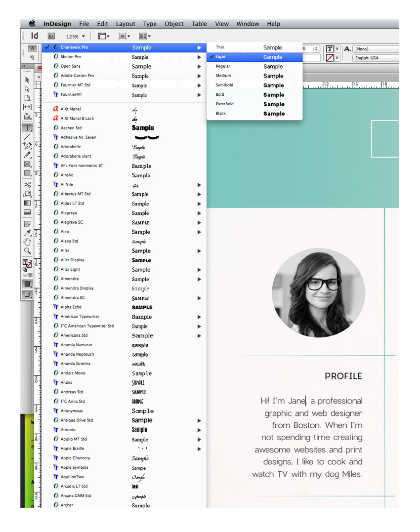
Whether you opt for a more traditional serif or a cleaner sans serif will also depend on the type of role you are applying for (applicants for more senior roles can command respect and authority with a solid serif, for example) and the culture of the company. Applying to a trendy young start-up? A contemporary sans serif like Charlevoix Pro will look youthful and forward-thinking.
Going for a business with a more formal structure? A humanist serif like Garamond is both attractive and communicates that you’ll mesh well with the existing company culture.
Other fonts that are failsafe picks for beautiful resume typography are:
If you’re applying for a job in a creative industry, you should be aware that your future employer will know their Garamond from their Caslon! Creative employers will be interested in seeing which font you’ve chosen, and they’ll make judgements about your design knowledge and taste from this seemingly minor feature. That means avoid Comic Sans like the plague, and perhaps opt for a typeface which is a design classic for maximum brownie points.
In InDesign you can adjust the Font and Font Weight (e.g. Bold, Italic, etc.) from either the Character Formatting Controls panel at the top of the workspace when you have the Type Tool (T) selected, or from the Character panel (Window > Type & Tables > Character).
5. Introduce a Typographic Hierarchy
Hierarchy is a key typographic technique for designing any layout, whether it be a webpage, a poster or a business card. The idea is that you create a graduated hierarchy of type on the page, leading the eye to read items in order, and splitting up sections into manageable chunks.
To create a basic typographic hierarchy on your resume, you will need a basic trio of type styles, made up of heading, sub-heading, and body text styles. The main element you need to tweak is the Font Size, which you can adjust from the Character Formatting Controls panel in InDesign. Graduate the size down from larger for the header (your name at the top), medium for the sub-headings (e.g. ‘Education’), and small (between 10 and 11 pt) for the body text.
Next, work on bringing in some different weights to the trio. A heftier Bold or Black weight will suit a header, while a Bold or Bold Italic will help your sub-headings to stand-out. Stick with a Regular weight for body text, and avoid Light weights altogether, as these can be difficult to read in print.
Then look at bringing in extra formatting to further differentiate the styles. Setting headers and sub-headings in uppercase letters (in InDesign, click on the All Caps button in the Character Formatting Controls panel), as well as increasing the Tracking (space between all letters) is a subtle way to make your headings look more professional and clear to read.
Consider also the alignment of your text. Is all your text by default flushed left? Tweaking a heading or sub-heading to Align Center can make a huge difference to the layout, adding more interest and balancing out the left-leaning bulk of text.
6. An Attention-Grabbing Name
What’s in a name? Well, if you’re a time-stretched interviewer, it can certainly mean a lot. Because you’re not able to present yourself in person at the resume review stage, it’s important that the CV works hard to make your name lasting and memorable.
You should prioritize your name on the page, and make sure it is the single most dominant element on the layout. You can do this without setting your name in a WordArt-style font, and instead maintaining a simple, classic type style.
The secret to memorability is all in the staging. Allow your name plenty of breathing space at the top of the page. This forces the eye to digest that information alone, without being distracted by other content.
Aligning your name centrally is also a good technique for making your name the focal point of the layout, standing to attention at the top of the page. These two techniques also ensure that your name is easily found when the interviewer wants to refer to you quickly and easily in a meeting environment.
Choice of typeface can also help to make your name stand out, and help to build a sort of personal brand at the same time. Styling your name consistently across other parts of your application, such as your cover letter, business card, and portfolio website, will help to reinforce memorability and make a showcase of your knack for branding design too.
A script or handwritten font is also a lovely way of styling your name that mimics the look of a signature in a more legible way, making your resume appear at once more personal and warm. Here, I’ve used Learning Curve Pro, but Vellesa or Sharpen Script make great alternatives.
7. A Natural Photo
In recent years, applicants looking to stand out amongst their competitors have turned to using a portrait photo on their resumes. For some industries this can feel a little informal, but for creative companies like graphic design and web design agencies, a well-chosen photo can be a great finishing touch to a CV. Photos help you to build a personal relationship with the reader, and have the benefit of making you more memorable.
Having said that, some photos are simply not OK to use. Abandon that Facebook picture from last year’s summer holiday, and stage a professional-style shoot instead. Ask a trusted camera-savvy friend or hire a photographer to take some shots in a studio environment (or simply standing against a blank wall will do).
Natural, confident shots look best, so try to relax and picture how you would like your employer to view you. You want to look friendly but not hyper! If you’re struggling to relax, fold your arms in front of you and lift your shoulders back, which will immediately make you feel more confident and improve your posture.
Once you have your perfect shot, upload it to your computer and open the image up in Adobe Photoshop. Here’s my simple step-by-step process for editing your photo to get it ready to use in your resume design:
Step 1
Expand the Layers panel (Window > Layers) and drag the Background layer down onto the Create a New Layer button at the bottom of the panel to duplicate the layer.
Step 2
From the Create a New Adjustment Layer drop-down menu in the Layers panel, choose Black & White.
You can move the sliders around until you’re happy with the result. Try to keep the area of the face nice and bright. When you’re finished, you can close the Properties window.
Step 3
Use the Crop Tool (C) to pull the edges of the image in, until you have just the shoulders and head of the person remaining, and then hit Enter.
File > Save As the image as a JPEG file, ready to be placed into your resume document.
A black and white photo is a great choice for a resume, as it won’t distract from the color scheme of your design and always looks exceptionally professional compared to a full-color portrait.
Place your photo inside a circular or shaped image frame to give it a bit of interest and prevent it from looking just ‘stuck on’ to the page.
If you’re hunting for that dream role at a creative company you’re going to want to dust off your old resume and give it a modern refresh. But how can you…
8. A Dash of Infographics
Infographics have officially taken over the design world, successfully bridging the gap between data and visual design. If you’re applying for a design or tech role, no doubt the company will have dabbled in or be familiar with infographics, which makes them a great talking point for your resume.
Bring in subtle infographic references by using app-inspired icons in your contact details. You can download vector icons from flaticon.com. Open them in Adobe Illustrator, and Edit > Copy, Edit > Paste them directly into your InDesign layout. You can adjust the color and size of your icons directly from here.
Extra infographic details like flags or maps to illustrate language proficiency, or charts to visualise your level of skill relating to certain software, are fantastic ways of breaking up the monotony of text on your resume. Your interviewer will appreciate both your ingenious way of presenting information and the relevance the style has to the company’s projects and interests.
Simple chart bars and arrows are easy to create in InDesign directly, by using the shape tools. Check out this infographics tutorial to find out more about creating simple infographic elements in InDesign:
Adobe Photoshop and Illustrator are often used by infographic pros to create their statistical concepts, but here we’ll show how you can create a super…
9. Build a Whole Resume Package
Once you’ve finished up your resume and incorporated some of the elements and tips we’ve looked at in this article, it should be looking fabulous and ready for printing or sending off over email.
But wait up… there’s one more thing to consider before you hastily hit the Send button. More and more agencies are looking for something extra-special in applications, to help prioritise candidates who demonstrate creativity in their resume as well as their portfolio. A great way of making your application extra-special is to expand it into a complete resume package.
A cover letter is a traditional part of a job application, but think about how you can extend the design of the resume across to the letter too. Can you lift the style of your name and turn that into a personal logo, creating an interesting letterhead design?
Can you extend the style across to a business card too?
In this quick video, Melody Nieves will show you how to easily customize a business card template from Envato Market.
If you want to go that one step further, you can even create a digital version of your application which combines your CV, portfolio, and extra elements like video content. You can use your print application as a stepping stone to a more detailed digital application, which you direct the employer to visit in your cover letter.
Whether you’re looking for a position with a new company or looking to collaborate on big projects as a specialist, one thing’s for sure: You’re going to…
Creating a complete resume package really does show you are willing to go the extra mile with your application, which tells the employer that you really want to work for them and also demonstrates how you would approach projects when working for them. It may sound like a lot of work, but if you really want that dream creative job, you won’t regret putting in the extra effort.
Conclusion: You’re Ready to Send Off Your Application!
With your awesome resume ready to print or send off on email, you’ve done a fantastic job. Fingers crossed for getting to the interview stage!
In this article we’ve looked at nine top tips for designing a fantastic-looking resume. Let’s take a quick recap:
Set your resume to a widely accepted (and cheap to post!) standard page size, like Letter or A4.
Create a strong grid layout for your resume.
Allow for generous white space and wide margins to create a balanced, calming layout.
Use a professional and, above all else, legible font.
Introduce a typographic hierarchy to lead the reader from A to B.
Format your nameto make it the centre of attention on the layout.
Use a natural, confident portrait photo, and keep it black and white for extra brownie points.
Experiment with infographic-inspired elements like icons and charts to add a playful touch.
Build a whole resume package, including a branded cover letter, business card and online application to really blow the socks off your employer.
Stick to these nine helpful tips whenever you want to give your resume a refresh and you really can’t go wrong. Have some of your own tips for designing great job applications? We’d love to hear about them in the comments below.
In this tutorial, I will show you how to create a realistic rubber stamp effect in Photoshop. Turn any photo into a rubber stamp in just a few quick steps.
Create a new 850 x 550px document. You can, of course, use another size for your PSD file,but you have to proportionally adjust all the sizes used in this tutorial.
Add the Grunge Stained Paper Texture in a new layer.
Step 2
Go to Layer > New Adjustment Layer and add a Gradient Map adjustment. The colors used for the gradient map are #7a6849 and #fffbf7.
2. How to Create the Rubber Stamp Shape
Step 1
Pick the Ellipse Tool. Keep the Shift key pressed while you draw, to create a perfect round circle. Call this layer Circle 1.
Step 2
Hit Command/Control-Jto duplicate the Circle 1 layerthree times, and call the layers Circle 2, Circle 3, andCircle 4.
Set the Fill of the Circle 1 layer to 0% and also add a Stroke of 6 px, color #000000.
Step 3
For the Circle 2 layer hit Command/Control-T to scale the shape. Make sure to click on the Maintain Aspect Ratio button and set the scale to 95%.
Set the Fill of the Circle 2 layer to 0% and also add a Stroke of 4px, color #000000.
Step 4
For the Circle 3 layer, hit Command/Control-T to scale the shape. Make sure to click on the Maintain Aspect Ratio button and set the scale to 75%.
Set the Fill of the Circle 3 layer to 0% and also add a Stroke of 6px, color #000000.
Step 5
For the Circle 4 layer, hit Command/Control-T to scale the shape. Make sure to click on the Maintain Aspect Ratio button and set the scale to 75%.
Set the Fill of the Circle 4 layer to 0% and also add a Stroke of 4px, color #000000.
Step 6
Download the Circle Photoshop Shapes and load the CSH file in Photoshop. Go to Edit > Preset Manager and choose Preset Type > Custom Shapes. Click the Load button to load the CSH file.
Set the Foreground color to #000000. Pick the Custom Shape Tool and make sure you have the Defined Proportions option checked. For this tutorial, I used shape no.17, but you can use any shape you like.
3. How to Add Text on the Rubber Stamp
Click on the Vector Mask Thumbnail of theCircle 3 layer. Pick the Horizontal Type Tool and move directly over the circle path. The cursor will change to an I-beam with a dotted wavy line through it.
I used the Intro font and color#000000 for the text. You can use another font type and another color.
4. How to Create the Photo Stamp Effect
Step 1
Add the Man Portrait stock image on a new layer.
Step 2
Keep the Control key pressed and click on the Vector MaskThumbnail of the Circle 4 layer to make a selection.
Click on the Add Layer Mask button from the Layers tab to add a mask for the Man Portrait layer.
Step 3
Make sure the Foreground color is set to #000000 and the Background color is set to #ffffff, otherwise the next photo effect will not look right.
Go to Filter > Sketch > Stamp and set the Light/Dark Balance to 4 and the Smoothness to 1.
Step 4
Open the Layer Style window of the Man Portrait layer. The Blend If sliders are at the foot of this dialog. Use the sliders called This Layer to remove the white color. Simply drag the right slider to 180 to hide the white color.
Right-click on the Man Portrait layer and choose Convert to Smart Object.
5. How to Add a Grungy Effect
Step 1
Select all the stamp layers (the Circle layers, the Text layer and the Man Portrait layer), right-click on the layers, and choose Convert to Smart Object.
Add a Layer Mask to the Man Portrait Smart Object. Pick the Brush Tool and set the Brush Size to around 800 px. Also set the Foreground Color to #000000. Use the Grunge Photoshop Brushes to create grungy stamp effects; use different brushes.
Step 2
Create a new layer and call it Stamp Lines. Pick the Brush Tool and from the Rubber Stamp Photoshop Brushes, use the stamp-lines brush.
Add a Layer Mask to the Stamp Lines layer. Again, use the Grunge Photoshop Brushes to create grungy stamp effects and also to hide some parts of the stamp lines that cover the stamp.
6. How to Create a Multi-Colored Rubber Stamp
If you want to create a multi-colored rubber stamp, you can add a Color Overlay layer style to the Man Portrait Smart Object using color #d9a4ae, or you can add different colors for the layers inside the Smart Object.
For the final touches, create a new layer and call it Old Envelope Stamp Brushes. You can use the Old Envelope Stamp Brushes to add a realistic old envelope effect. Use color #b24659 and color #b24659 to add different stamps.
Congratulations! You’re Done!
In this tutorial, you’ve learned how to create a rubber stamp effect in Photoshop from scratch using brushes and textures. I hope you’ve enjoyed this tutorial.
Whether you’re looking to get a tattoo for the first time or you’re a total tattoo snob, choosing the right font for your designs takes patience. So today we present you with 50 insanely epic tattoo fonts we’re sure you’ll love.
With a selection of fonts curated from GraphicRiver and Envato Elements, this collection features 50 awesome tattoo fonts you’ll definitely want to incorporate into your next ink.
Want that extra personalized touch? Enlist the help of the professional designers at Envato Studio to create a custom tattoo design just for you!
50 Insanely Epic Tattoo Fonts
Do you love tattoo design? We sure do! From wild decorative fonts to stunning handwritten scripts, we’ve got a font to cover all of your tattoo needs.
Enjoy this eclectic collection below and let us know your favorites in the comments!
What better way to start off this collection than with an amazing tattoo font? This awesome script font was inspired by the swirls of traditional tattoos and a unique hand lettering style. Find packaged into this typeface a complete set of uppercase and lowercase letters, numbers, and even a bonus set of borders for your convenience.
Named after the famous Captain James Cook who stumbled across the wonders of tattooed people in the South Pacific, this font features a cool decorative style perfect for a sailor or pirate. Its recommended size is at 36 pt or higher for a great design ideal for your next tattoo project.
If you’re looking for a unique font with that traditional vintage flair, then try the Aseina typeface for your designs. This font features a beautiful elegant feel, with the perfect mix of letters, numbers, and glyphs for that one-of-a-kind vintage style.
Inspired by tattoo lettering, this all caps font features a bold style that is sure to stand out. Download this set to get access to a complete collection of uppercase letters, numbers, and punctuation.
Tattoo lovers, beware. This font will turn you into a badass in no time. Inspired by the west coast style of tattoos, this font type features an aggressive, gothic design. Included in this set is a complete package of letters, numbers, and punctuation.
Do you have a vision of black for your next tattoo? Well, try this Black Vision font on for style. This set includes an elegant vintage feel, and features a full set of letters, numbers, and punctuation to complete your designs.
Sail across the seas with this November Script font. Hand-crafted and then digitized for a beautiful calligraphic design, this font features a full set of letters, numbers, and some nice ligatures for tricky letter combinations.
A decorative copperplate script with a modern twist, this Bodega Script font is a stunning typeface with an elegant style. It’s perfect for print work, tattoos, and so much more, so highlight your favorite passages with this unique typeface.
Inspired by old western design, this typeface features a modern twist for creative tattoo lovers. Included in this set are several font files with a helpful video for using the alternative glyph characters.
Suitable for print designs and creative tattoo art, this typeface features a modern script design that was handcrafted for that handwritten look. Included in this package is a full set of letters, numbers, and even multi-language support.
Looking for a beautiful script for your next tattoo? Well, look no further! This gorgeous Mashetta typeface features a stunning handmade calligraphic style. Included in this set are all the letters and numbers you need, with access to 473 glyphs for additional stylish options.
Sharpen up your next tattoo design with this awesome handwritten font. A new modern calligraphy typeface, this font combines copperplate and contemporary design for a unique and elegant touch.
This modern handwritten font was designed using high-quality ink markers. Perfect for simple branding projects or even your next tattoo, this elegant font offers sublime versatility and style.
Designed with a traditional Victorian aesthetic in mind, this typeface incorporates that clean vintage look with unique swirls and glyphs. Included in this package is a full set of letters, multi-language support, and access to 350 glyphs.
Want a tattoo that is unique yet simple? Give this awesome Typewriter font a try. Inspired by the cool mechanical look of classic typewriter lettering, this font features 187 unique glyphs and all the letters and numbers you need for your next project.
A classic Victorian serif font that is simple and easy to use, Victoriandeco is a font you’ll definitely want to incorporate into an awesome tattoo design. Inspired by the Victorian era of British history, this font features all your essential characters with bonus ornamental elements for additional decoration.
Inspired by the unique style of handwritten signatures, this font features a modern calligraphic design and all your essential characters. Download this package to gain access to a full set of letters, numbers, and a large glyph set.
Calligraphy is huge in tattoo design. So show off your favorite quotes with this elegant Alexandra script font. This font features a modern design with smooth lines and delicious curves, with all the characters you need for a fantastic tattoo design.
Black Heat is a modern typeface inspired by the Victorian era of design. Download this package to gain access to a full set of numbers, letters, and additional support for international symbols.
Inspired by handwritten letters and the cool side of street life, this modern typeface features a wild curvy design with all the characters you could ask for. This font is perfect for graffiti lovers, and you can incorporate it into your next ink for a cool, edgy style.
March into an awesome tattoo design with this gorgeous script typeface. Marchy was designed to illustrate a unique calligraphic style with stunning loops and clean lines. Featured in this download is access to a full range of letters and numbers with over 430 glyphs to incorporate into your designs.
With three unique styles—clean, inline, and inline-shadow—this energetic typeface features an ornamental design that is sure to make you stand out. Be the envy of all your tattooed friends with this awesome vintage style.
If you’re a fan of horror, metal, or gothic design, you’ll definitely love this Bekelakar typeface. Available in regular and an all-caps style, this font features a full set of letters, numbers, and basic punctuation.
Create drama with this insane Dramaga typeface. Inspired by the design behind the Posthardcore Band, this font features an intense Gothic vibe with unique angular accents. Download this font to feature this awesome style for your next tattoo.
If you’re feeling a little crazy, throw this Sadis font into the tattoo mix. A black letter font inspired by that epic Gothic look, this font features a complete set of letters, numbers, and punctuation we’re sure you’ll love.
Although this typeface is perfect for logos, you can also mix it into an awesome tattoo design. This unique serif typeface features a cool retro design that works perfectly in a variety of programs for further customization.
This cool vintage font is perfect for your next ink design. Featuring a grungy design with interesting loops and curves, this package comes complete with four font files and so much more!
Bring out your inner genius with this awesome Einstein font. A sophisticated script with a playful baseline, this font features a full set of letters, numbers, and basic punctuation. Download this package to gain access to a bonus swash set!
Twenty Nine is a playful marker typeface featuring a simple curvy style. With a bouncy baseline and a few sweet bonuses included, you’ll be happy you downloaded this set. An additional set of handcrafted ornaments is also included for that extra awesome touch!
Script fonts are super popular in tattoo designs nowadays. And this Jimmy font family includes a handcrafted script font designed to reflect the modern vintage trend sweeping the nation. Incorporate it into your next ink designs for that magical retro look.
A modern typeface handcrafted with brushes, the SokaQola font features an elegant design suitable for print work, tattoo art, and so much more. Included in this set is a full range of characters with additional stylistic ligatures for more design options.
Get dainty with this sweet Amorie Modella font family. Featuring a skinny, hand-drawn style, this font would work perfectly for a simple quote or even a unique name. Mix it up with flowers for an additional pretty element or keep it simple for a classic handmade design.
Get rude with this delicious typeface. A hand-drawn font designed with unique character, this file includes two serif fonts along with two script fonts. These fonts are created to work perfectly together, so you can mix them for interesting tattoo designs.
You’ll be saying „Hello Lary” with this lovely handmade font type. A modern typeface created with brushes, this font features a full set of letters, numbers, and basic punctuation for all your tattoo needs.
Simple design can be some of the most gorgeous design around. So incorporate this elegant font into your next ink for a clean and polished alternative. Included in this package is a full set of letters, numbers, and punctuation suitable for almost any art project.
Get reckless with this awesome font trio. Reckless is a handwritten brush font made with elegant curves and a unique style. Download this set to gain access to three handwritten fonts with all the characters you need for the ultimate design of elegance.
Balham to Brooklyn is a modern monoline script font that emulates hand-drawn letter forms. It’s inspired by American pop culture and features a stunning cursive design that works perfectly for simple tattoo designs and so much more.
Start singing the blues with this handmade Roadhouse Blues font. Inspired by an early American style, its decorative swashes give it a friendly retro vibe. Download this package for a full set of letters, numbers, and basic punctuation.
Delicate with organic curly serifs, this Petit Jardin font is divinely lovable. Designed for that sweet, dainty look, this font package includes letters, symbols, numbers, and more! Use it for your tattoo designs for that gorgeous Art Nouveau look.
Get crafty with this unique Food Craft font. Designed with an unusual ribbon aesthetic in mind, this font would be the perfect addition to a standalone tattoo design. Included in this package is a full range of letters and more to fulfill your tattoo needs.
Enjoy the sacred geometric shapes of this unique and inspiring font type. Inspired by sacred symbols, this font features letters, numbers, and basic punctuation. Incorporate it into your tattoo designs for that sacred personalized touch.
Get glamorous with this gorgeous font. A freestyle handmade signature type, this Glamour font is perfect for that awesome handwritten element. Included in this package are all the characters you need as well as 100 total freebies for more design experimentation.
Enjoy the adorable qualities of this stunning, elegant font. A modern script with a looping calligraphic style, this font is perfect for a meaningful personal quote or a name-based tattoo design.
Stay alive with this edgy font type. Inspired by the Victorian era and the posters of the 1800s, this font type features a full set of characters, numbers, and basic symbols. Use it for print work or that special ink you’ve been dying to get!
Enjoy the beauty of this classically designed typeface. Combining elements of copperplate and contemporary design, this font is perfect for a stunning yet simple tattoo. Included in this set are 300 glyphs and 118 alternate characters to complement your work.
If you’re looking for a bold design, considering using this Zenzero Sans font for your tattoo art. An industrial-based font created with regular and round styles, this unique font type gives you endless possibilities.
Explore the rustic Neo-Gothic elements of this Haext font for impressive tattoo designs. Part rune craft, part sacred goddess, this font is sure to put a spell on you with its spellbinding features.
A mono-weight script font, this type is heavily based on the modern era of traditional logo design. Make your tattoos stand out with this impressive font complete with letters, numbers, and so much more!
Enjoy the fancy yet flirty elements of this delicious Honeycomb font. Designed with fat-to-thin brush strokes and an imperfect baseline, this font would work gorgeously for a simple tattoo design. Download this package to gain access to a complete set of characters and stunning bonus extras.
To finish this collection of amazing tattoo fonts, I present you with this beautiful Mochafloat typeface. Created to emulate a modern calligraphic style, this package features 300 glyphs and 200 alternative characters.
10 Amazing Tattoo Tutorials from Envato Tuts+
Inspired by this wonderful collection? Put your skills to the test with these awesome tattoo-based tutorials from Envato Tuts+.
This list is jam-packed with exciting resources for the avid designer
familiar with OpenType and more. If you need additional
help creating a personal tattoo design, enlist the skills of a talented
professional by choosing one of the amazing designers from Envato Studio.
And with hundreds of glorious handwritten and script fonts to choose from, chances are we’ve missed a few to add to your personal collection. Be sure to browse Envato Market and Envato Elements for more resources, and let us know your favorites in the comments below!
Agregator najlepszych postów o designie, webdesignie, cssie i Internecie