In this tutorial I will show you how to create a camouflage or „camo” fabric text effect in Adobe Photoshop. You will learn how to use some Photoshop filters and create patterns with them. Then you will learn how to use the patterns with layer styles to create the final result.
If you’d like to skip this tutorial but still wish to buy the text effect, you can head over to GraphicRiver and buy Fabric Styles.
The complete pack has eight different text effects and works with shapes and text.
Background and Contour inside the zip file attached to this tutorial.
1. How to Create the Fabric Pattern
Step 1
Open Photoshop and create a new 18 x 18px document.
Step 2
Change the foreground color to #6b6b6b.
Step 3
Press Control-Shift-N to create a new layer. Then pick the Rectangle Tool and draw a 6 x 6 px square in the top left corner (You can zoom in on the image with Control-Space-Left-Click).
We need a texture just like the image below. Note that we have three different colors on the image: #6b6b6b for the light color, #3f3f3f for the medium color, and #121212 for the dark color. Keep doing 6 x 6px squares on separate layers until you fill the entire 18 x 18 px document.
Step 4
Go to Edit > Define Pattern and name the pattern Fabric Texture Tutorial. Then click OK to save the pattern.
2. How to Create the Camo Texture
Step 1
Create a new 486 x 486 px document.
Step 2
Press D to reset the foreground and background colors. Then go to Filter > Render > Clouds.
Step 3
Go to Filter > Pixelate > Mosaic, set the Cell Size to 18 square, and click OK.
Step 4
Go to Filter > Filter Gallery. Then select Cutout in the Artistic category with these settings:
Number of Levels: 4 or 5 (test and see which one you like more)
Edge Simplicity: 1
Edge Fidelity: 1
Step 5
Now double-click on the Background layer to unlock the layer. Then rename it Base Camo and click OK.
Step 6
Double-click the layer Base Camo to open the Layer Style window. Add a Pattern Overlay with these settings:
Blend Mode: Hard Light
Opacity: 52%
Pattern: Select the pattern that we created before (Fabric Texture Tutorial)
Scale: 100%
Link with Layer: Checked
Click OK.
Your image should look like this:
Step 7
Go to Window > Adjustments to open the Adjustments panel.
Step 8
Add a Gradient Map by clicking on the last icon of the panel.
Step 9
Double-click on the gradient icon of the layer Gradient Map 1. The Properties panel will pop up.
Step 10
Click on the gradient bar of the Properties panel to open the Gradient Editor.
You can play with this next step and make different colors. I’m going to create a green texture.
Create a gradient with these settings:
First Stop Color: #0c1005
First Stop Position: 0%
Second Stop Color: #8aa269
Second Stop Position: 51%
Third Stop Color: #e3efcc
Third Stop Position: 100%
Step 11
Select the layer Base Camo and go to Edit > Define Pattern, and then name the pattern Camo Fabric and click OK.
3. How to Create the Texture of the Border
Step 1
Create a new 4 x 4 px document with a black background.
Step 2
Zoom in on the image until you see the individual pixels. Then pick the Pencil Tool with a size of 1 px and draw a diagonal white line as shown in the image below.
Step 3
Go to Edit > Define Pattern and name it Border Texture.
4. How to Create the Layer Styles
Step 1
Open the Background image that is inside the zip attached to this tutorial.
Step 2
Pick the Type Tool (T) with the font Aller Display and size of 179 pt and write FABRIC. Then place it on the shelf of the background.
Step 3
Double-click on the text layer to open the Layer Style window.
Let’s start with the Pattern Overlay so that we will be able to see what is happening on the image.
Add the Pattern Overlay with these settings:
Blend Mode: Normal
Opacity: 100%
Pattern: Select the texture that we created (Camo Fabric)
Scale: 25%
Link with Layer: Checked
Step 4
Add a Bevel & Emboss with these settings:
Style: Emboss
Technique: Smooth
Depth: 174%
Direction: Up
Size: 4 px
Soften: 0 px
Use Global Light: Unchecked
Angle: 90º
Altitude: 48º
Gloss Contour: Click on the box and Load to install the contour file that is inside the zip
Highlight Mode: Screen
Highlight Mode Color: #ffffff
Highlight Mode Opacity: 10%
Shadow Mode: Normal
Shadow Mode Color: #364928
Shadow Mode Opacity: 81%
Step 5
Add a Stroke with these settings:
Size: 4 px
Position: Outside
Blend Mode: Normal
Opacity: 100%
Overprint: Unchecked
Fill Type: Pattern
Pattern: Select the pattern Camo Fabric
Scale: 25%
Link with Layer: Checked
Step 6
Add an Inner Shadow with these settings:
Blend Mode: Linear Light
Opacity: 2%
Use Global Light: Unchecked
Angle: -27º
Distance: 6 px
Choke: 6%
Size: 8 px
Contour: Linear
Anti-Aliased: Unchecked
Noise: 0%
Step 7
Add an Inner Glow with these settings:
Blend Mode: Overlay
Opacity: 20%
Noise: 0%
Color: #ffffff
Technique: Softer
Source: Center
Choke: 39%
Size: 27 px
Contour: Linear
Anti-Aliased: Unchecked
Range: 85%
Jitter: 0%
Step 8
Add an Outer Glow with these settings:
Blend Mode: Linear Light
Opacity: 100%
Noise: 59%
Color: #969c8e
Technique: Softer
Spread: 100%
Size: 4 px
Contour: Linear
Anti-Aliased: Checked
Range: 100%
Jitter: 0%
Step 9
Add a Drop Shadow with these settings:
Blend Mode: Normal
Color: #000000
Opacity: 100%
Use Global Light: Unchecked
Angle: 146º
Distance: 1 px
Spread: 26%
Size: 10 px
Contour: Linear
Anti-Aliased: Unchecked
Noise: 0%
Layer Knocks Out Drop Shadow: Checked
Step 10
Select the text layer and press Control-J to duplicate it. Then rename the copy to Camo TOP.
Step 11
Right-click on the layer Camo Top and choose Clear layer style. Then double-click it to open the Layer Style window.
Add a Bevel & Emboss with these settings:
Style: Emboss
Technique: Smooth
Depth: 174%
Direction: Up
Size: 4 px
Soften: 0 px
Use Global Light: Unchecked
Angle: 90º
Altitude: 48º
Gloss Contour: Select the contour that we installed before (Fabric Custom)
Anti-Aliased: Checked
Highlight Mode: Screen
Highlight Mode Color: #ffffff
Highlight Mode Opacity: 0%
Shadow Mode: Normal
Shadow Mode Color: #4d6326
Shadow Mode Opacity: 15%
Step 12
Add a Stroke with these settings:
Size: 2 px
Position: Outside
Blend Mode: Linear Dodge (Add)
Opacity: 45%
Overprint: Unchecked
Fill Type: Pattern
Pattern: Select Border Texture (This will create the illusion of stitching on the edges)
Scale: 200%
Link with Layer: Checked
Step 13
Add an Inner Shadow with these settings:
Blend Mode: Soft Light
Color: #000000
Opacity: 20%
Use Global Light: Unchecked
Angle: -27º
Distance: 0 px
Choke: 62%
Size: 10 px
Contour: Linear
Anti-Aliased: Unchecked
Noise: 0%
Step 14
Add an Inner Glow with these settings:
Blend Mode: Overlay
Opacity: 4%
Noise: 0%
Color: #ffffff
Technique: Softer
Source: Center
Choke: 53%
Size: 16 px
Contour: Linear
Anti-Aliased: Unchecked
Range: 85%
Jitter: 0%
After that, click OK.
Congratulations, You’re Now Done!
In this tutorial, you learned how to create a camo fabric text effect in Adobe Photoshop.
We started out by creating a fabric texture, then we created a camo texture and merged both textures. Then we created a third texture for the border of the text. After that, we created two layer styles using all three textures.
Don’t forget to save the styles, so you can use it with other things.
I hope you have enjoyed this tutorial, and feel free to leave your comments below.
This text effect we just created is part of Fabric Styles.
Easter is a lovely spring holiday, which is
well known for its tradition of painting eggs. It’s usually associated with
gentle, vivid colors and a spring mood. In this tutorial, we’ll go through a
descriptive process of creating of flat Easter icons, using basic shapes, the
Pathfinder panel and some of the new Adobe Illustrator tools.
If you’re interested, you can purchase these icons as well as many others as part of an Easter Icon Set on GraphicRiver.
1. Make Festive Easter Egg Icons
Step 1
Let’s start by making the base of the egg.
Take the Ellipse Tool (L) and make a 70 x 70 px circle. Select its side anchor points with the Direct Selection Tool (A) and drag them down a bit, making the
bottom of the shape bulged. Then select the upper anchor point and drag it up,
making the top of the egg pointed.
Step 2
We’ll be using a bright spring palette with
gentle colors that you can pick up directly from the screenshot below with the Eyedropper Tool (I) while holding the Shift key.
Fill the base of the egg with yellow and
keep a copy in back(Control-C > Control-B), as we may
need it later.
Now let’s depict the decorative ornament above the egg. Take the Rectangle Tool
(M) and make a 70 x 15 px blue shape.
Step 3
Take the Line Segment Tool (\), hold Shift
and make a horizontal shape with pink Stroke
of 3 pt Stroke Weight.
Let’s align all the shapes to the egg. Select everything (Control-A) and click
the egg while holding Alt in order
to make it a Key Object (you
will see a thick selection around it). Head to the Align panel and click Horizontal
Align Center.
Step 4
Now let’s modify the pink line. Select it
and go to Effect > Distort & Transform > Zig Zag. Set the Size to 5 px, Ridges per segment to 7
and Points to Smooth.
Object
> Expand the shape to apply the effect.
Step 5
Add another rectangle to the bottom of the
egg and fill it with green color. Now let’s delete those parts of the
rectangles outside the egg. We’ll be using one of the new Adobe Illustrator
tools: the Shaper Tool (Shift-N). Take
the Shaper Tool (Shift-N) and just
scribble above the piece that you want to delete. Repeat the same with other unwanted parts.
If you’re working with earlier versions of
Adobe Illustrator, try using the Shape
Builder Tool (Shift-M) instead. It works almost the same—just select
everything and click the unwanted pieces while holding Alt.
We will also try another way of hiding the
unneeded parts a few steps later, when we’ll be making another egg.
Step 6
Select the modified egg and Object > Expand it. Then select the
yellow middle of the egg together with the pink zigzagged line and Divide them in the Pathfinder panel, breaking the shape into two equal
halves.
Step 7
Fill the upper piece of the divided shape
in a nice pink color. Take the Ellipse
Tool (L) and make a 5 x 5 px
circle. Hold Alt-Shift and drag the
circle to the right, creating a couple of copies.
Step 8
Now that the basic view of the egg is ready,
let’s add a flat-style shadow, covering one half of the egg. Group (Control-G) all parts of the egg, Copy and Paste in Front (Control-C > Control-F). Keeping the copy
selected, Unite it in the Pathfinder, merging it into one
silhouette.
Draw a vertical line across the egg, using
the Line Segment Tool (\). Align the
line to the egg silhouette, making the egg a Key Object.
Keeping the line and the egg silhouette
selected, Divide them in the Pathfinder.
Delete one of the pieces and switch the
remaining half to Multiply mode,
making it semi-transparent.
Step 9
Now let’s make another egg!
We already have a base, as we’ve made a
copy of it in the very first step. Move it aside and fill with orange color. Add
decorative elements on top and let’s see another way in which we can hide the
unneeded pieces. Duplicate the basic
shape once again (Control-C >
Control-F) and Bring it to Front (Shift-Control-]).
Select all the elements, right click and Make Clipping Mask. Here you have it!
Step 10
Let’s add a few more decorative elements to
the egg. Make two 5 x 5 px circles
above the yellow stripe of the egg, placing them closer to the edges. Select
both circles and either use the Blend
Tool (W) or go to Object > Blend
> Make. Then open the Blend
Options window (Object > Blend
> Blend Options) and set the Spacing
to Specified Steps with a value of 3.
Object
> Expand the Blend group and add more circles in
the upper part of the egg, filling them with yellow color.
Step 11
When you’re satisfied with the result, add a
semi-transparent flat shadow to one half of the egg.
Combine the eggs. Use the Rounded Rectangle Tool to make a
light-green background for our icon.
Make a square with the Rectangle Tool (M) and rotate it by 45 degrees with the Selection
Tool (V) while holding Shift.
Fill the rectangle with linear gradient
from light-green to white and switch it to Multiply
Blending Mode, making a semi-transparent long shadow.
Step 12
Duplicate the light-green background and
place the shadow between the copies. Use a Clipping
Mask to hide the unwanted piece of the long shadow.
Great! Our first icon is ready! Let’s move
on to the next one.
2. Make a Cute Bunny Icon
Step 1
Make a 70 x 70
px grey circle for the bunny’s head. Move the side anchor points
down a bit with the Direct Selection
Tool (A) to make the head slightly squashed.
Now let’s form the ears. Take the Ellipse Tool (L) and make a 15 x 50 px oval. Move its side anchor
points up a bit, making the top of the ear wider. Keeping the shape selected,
go to Object > Path > Offset Path
and set the Offset value to -5 px, leaving all other options as
default. This way we create a smaller shape for the inner part of the ear.
Step 2
Fill the inner part of the year with pink
color, group both parts of the ear and Send
to Back (Shift-Control-[). Double-click the Rotate Tool (R) to open the options window and set the Rotate Angle value to -20 degrees.
Step 3
Use the Reflect Tool (O) to flip the ear over the Vertical Axis and click Copy
to form the second ear on the opposite side of the head. You can group both
ears and Align them to the head,
making the whole set perfectly centered.
Squash the head base a bit more.
Step 4
Use the Ellipse Tool (L) to form a pair of dark glossy eyes with white
highlights and a circle for the nose. Take the Scissors Tool (C) and click both side anchor points of the nose in
order to split the shape into two halves.
Step 5
Delete the upper half and turn the
remaining part into a cute bunny nose. Press X to swap Fill and Stroke colors. Set the Stroke Weight to 2 px
and change the Variable Width Profile
in the control panel on top. Create two copies of the nose and make them
somewhat thinner and lighter, forming a mouth as shown in the screenshot below.
Step 6
Let’s finish up with our bunny by adding
tiny whiskers to his head. Make a 9 px
horizontal stroke of 1 pt, using the Line Segment Tool (\). Rotate the
whiskers a bit and add them to both sides of the face.
Step 7
Add a flat shadow to one half of the
bunny’s head, as we did previously. Form a rounded rectangle for the background
and create a semi-transparent long shadow to finish up with the icon.
If you feel any difficulty in adding a long shadow to a complex object, check out the following tutorial from Part 7, Step 1 and onwards in order to find out how to give our long shadow the desired shape.
This time we’ll depict a funny little
chicken popping out of the egg. First of all, make a striped egg with a few stripes
or other decorative elements to your liking, using the techniques that we’ve
learned in previous steps.
We need to remove the top part of the egg,
creating a cracked edge. Keep a copy of the egg’s base somewhere in the bottom, because we will need it later to form our chicken.
Make a horizontal line across the egg and
apply Effect > Distort &
Transform > Zig Zag. Set the Size
to 4 px,Ridges per segment to 7
and Points to Corner in order to
make the cracked edges sharp.
Step 2
Object
> Expand the zigzagged line and position it
across the egg, in the center of it. Copy the blue base of the egg, Paste
in Front (Control-C > Control-F) and Bring it all the way to
Front (Shift-Control-]), placing it on top of all the elements.
Select the zigzag and the egg base and Divide them in Pathfinder. Delete the upper part of the divided shape.
Finally, select everything, right click and Make Clipping Mask. Great! The cracked
piece of the egg is ready. Let’s put a chicken into it.
Step 3
Reveal the copy of the egg base that we’ve
created previously and fill it with gentle yellow color for the chicken’s body.
Shrink the shape to 60 x 75 px, making
it smaller. Select the side anchor points with the Direct Selection Tool (A) and drag them up a bit, making the
chicken rounder.
Step 4
Take the Polygon Tool and single-click
anywhere on the Artboard to open the pop-up options window. Make a 15 x 10 px triangle for the beak and fill
it with orange color.
Combine two triangles to form a beak and
squash them to form the proper shape. Don’t forget to add a pair of shiny eyes.
We can copy them from our bunny icon.
Step 5
Add a couple of oval wings, using the Ellipse Tool (L). Place the copy of the
chicken’s body above the wings and Make
Clipping Mask to hide the unneeded elements inside the mask.
Step 6
Finish up with the icon by adding all the
necessary elements like shadows and background. Awesome!
Let’s move on to our last icon and finish
our Easter set!
4. Make a Gift Box Icon
Step 1
Let’s start shaping our box from a 60 x 40 px green rectangle. Form a top of the box from a 65 x 15 px orange rectangle.
Step 2
Now let’s create a ribbon across the box.
Select both parts of the box and remember the mutual height of the shapes. You can find it in the Transform
panel. In our case, it is 55 px.
Make a blue ribbon of 5 x 55 px size,
placing it right in the center of the box. Add a smaller 5 x 15 px piece of ribbon at the top of the box, filling it with
darker blue color.
Step 3
Use the Pencil Tool (N) to make a bow with blue Stroke of 2 pt Weight.
Step 4
Let’s decorate our box with some ornament
or pattern. Copy the base of the box
and Paste it in Front (Control-C > Control-F).
Head to the Swatches panel, open the Swatch Libraries menu > Patterns > Basic
Graphics > Basic Graphics_Lines. Find the 10 lpi 30% swatch and click to apply a pattern with horizontal lines.
Step 5
Keeping the textured shape selected, double-click the Rotate Tool (R) and set the Angle
to 45 degrees. Deselect the Transform Objects checkbox and click OK, changing the direction of
the stripes.
Step 6
Let’s change the color of the stripes to
make them match our overall palette. Double-click
the applied pattern in the Swatches
panel to isolate it in the Pattern Mode.
Apply a light-green color to the Strokes
in the Color panel and click Done in the upper part of the working
area.
Step 7
Finish up with the icon by adding depth
with the help of the shadows and simple background.
Our Set of Icons Is Finished! Happy Easter!
Congratulations! We’ve done a great job, learning how to use the Shaper Tool and how to use work with basic shapes and the Pathfinder
panel. We can use these simple techniques to expand our set and create
more festive flat Easter icons!
If you’re interested, you can purchase these icons as well as many others as part of an Easter Icon Set on GraphicRiver.
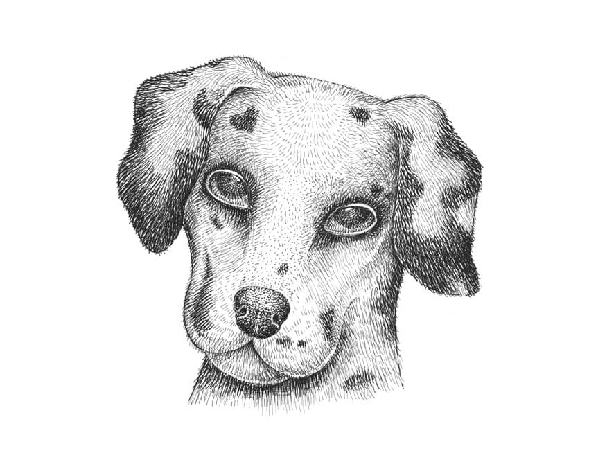
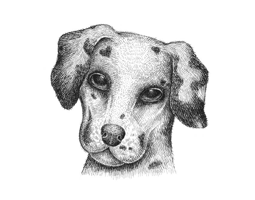
In this tutorial, I’ll show you how to draw a Dalmatian dog with ink liners. Creating a black and white artwork with a high contrast may seem challenging. This step-by-step process will give you an example of how to use the basic principles of drawing to create impressive ink artworks.
We will also explore effective methods of depicting hair and making the texture look credible.
This is a stylized drawing of a dog. If you’re looking for how to draw a dog step by step, which is more anatomically correct, we have you covered.
What You Will Need
Two sheets of paper
Ink liners number 0.05, 0.1 and 0.3
A pencil (I recommend using an HB type)
1. How to Draw a Pencil Sketch
Step 1
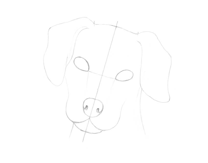
First, we need to construct the dog’s head and think over the details. I draw an axis line and mark the upper and lower borders of the head.
Having an axis line is very useful because you can use it for checking the symmetry in your drawing.
Step 2
I mark the shapes of the eyes; they are located slightly above the center of the head.
I also outline the general shape of the dog’s nose and mark the side borders of the head.
Step 3
I outline the jaw and the bottom part of the snout.
Step 4
I draw the nostrils.
Step 5
I add the ears. To make this process easier, I imagine that I’m drawing two pieces of thick cloth at the sides of the dog’s head.
Step 6
I mark the neck of the animal with two vertical lines.
Step 7
I create shaded areas of the black spots. I draw them anywhere I feel appropriate, accentuating the eyes and ears. A small spot in a shape of a heart on the forehead looks like a lovely addition.
Step 8
I also mark the small highlights in the dog’s eyes.
2. How to Draw Hair
Step 1
To create an illusion of hair, I usually use hatching. The lines can be long or short; sometimes they even turn to dots.
Step 2
I create a simple hatching; the lines slightly differ from each other. It is a basic pattern for the light-colored hair.
Step 3
Another way of drawing hair is by creating layers of hatching. It is also a great method for darkening and increasing the value.
Additional lines may be located between the existing ones and repeat their direction, or they may cross the base hatches at an angle.
Step 4
It is possible to add rounded lines to create an illusion of volume. This method of drawing is also known as contour hatching because it repeats the real shape of an object.
3. How to Draw a Dog With Ink Liners
Step 1
I make a clean copy of my drawing with a pencil, transferring the main contours onto a blank sheet of paper.
You can use a light table of just a window during the day for performing this step. Try to create light lines so that they won’t interfere with your future ink drawing.
Step 2
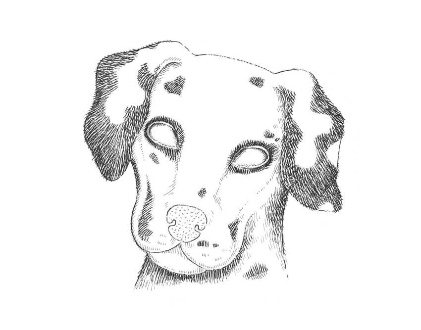
With the 0.3 ink liner, I outline the contours.
I recommend drawing interrupted lines; they seem more organic and allow you to achieve an illusion of diversity.
Step 3
I use the 0.1 liner to mark the black spots. I imagine that the hatches are going from the center of the snout to the periphery.
Step 4
With the 0.05 ink liner, I add thin hatches to create shady areas.
Step 5
I use the 0.05 liner to create the texture of the dog’s nose, drawing small, rounded lines.
Step 6
With the 0.05 liner, I apply the contour hatching to the eyes, accentuating their volume.
Step 7
I use the 0.3 ink liner to darken the black spots. Wider lines seem to be darker than thin ones, so this tool is perfect for creating black areas.
Please note that the lines are going beyond the contours that we outlined previously.
Step 8
I draw the white hair of the ears and neck with the 0.05 liner.
Step 9
I continue creating an illusion of light-colored hair on the dog’s snout, using the 0.05 liner.
Step 10
With the 0.05 ink liner, I work on the central part of the snout, the nose, and the forehead.
Step 11
I add dots to the nose, using the 0.3 ink liner. The upper part of the nose is lighted, so I add only one layer of dots there.
Step 12
With the 0.1 liner, I draw rounded hatches on the sides of the nose, emphasizing its volume.
Step 13
I use the 0.1 ink liner to apply cross-hatching to the eyes, marking the pupils.
Step 14
With the 0.1 ink liner, I work on the eyes and expand the hatching there. Please be sure to leave small areas of blank paper for the highlights.
Step 15
With the 0.05 ink liner, I accent the shady areas, adding groups of thin hatches.
While working on the light-colored textures like hair, it is necessary to be accurate with the value in the drawing and increase it gradually.
Step 16
The drawing needs higher contrast, so I use the 0.3 ink liner to accent the black spots.
Step 17
With the 0.3 liner, I add another layer of hatching to the darkest areas of the eyes.
Step 18
I use the 0.3 ink liner to model the eyelids. I darken the outer corners of the eyes and leave only a thin line of blank paper on the upper eyelid.
Step 19
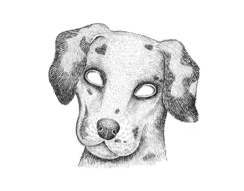
I add hatching to the nose, the jaw, and all the shady areas, using the 0.1 liner.
Step 20
As final touches, I add more cross-hatching to the sides of the head with the 0.05 liner.
Your Drawing Is Complete
Congratulations! I hope you enjoyed both the process and the result.
Understanding the principles of conveying the light-and-shadow relationships is the core of successful drawing with ink. If you add it to the skill of observation, you will be able to depict anything you wish.
The logo is that magical symbol that visually represents your company’s brand. As a graphic representation of your company’s main message and values, the logo stands at the core of the brand’s identity, and it is the element that makes a business easily memorable for the public, along with the company’s name. Needless to say, […]
Let’s celebrate International Women’s Day by making a dedication! Follow this tutorial and let’s learn together how to design fancy women avatars.
I’ll show you how to use and transform simple geometric shapes in order to create a variety of portraits, making them as diverse as possible! We’ll be using various warp effects, the Shaper Tool, the Pathfinder panel, and other tools and functions to vary the age, nationality, complexion and style of the characters.
By the end of this tutorial, you’ll be able to create hundreds of fancy avatars by simply mixing and combining the elements of the characters that we’ll be creating here. Want to see how it works? Check out this Flat Women Avatar Constructor and try it yourself—it’s really fun!
Apart from that, you can apply these techniques to create any other type of flat avatars, vary the appearance of the character, and try out various styles of flat portraits. For example, check out these profession avatars at GraphicRiver. Feel inspired? Let’s get started!
1. How to Create a Woman With Cornrows
Step 1
Let’s start off by creating a face from a rounded rectangle. You can use either the Rounded Rectangle Tool or the Rectangle Tool (M) to make an 80 x 110 px dark-brown shape with 30 px Corner Radius.
You can find the Corners option panel in the control toolbar on top while the shape is selected with the Direct Selection Tool (A). Another way to adjust the Corners value is either to set it in the Transform panel (Window > Transform) or to do it manually by pulling the circle markers of the Live Corners of the shape with the Direct Selection Tool (A).
Make a rounded rectangle of 14 x 22 px for the nose and place it right in the center of the face. In order to make sure that we’ve centered everything perfectly, select both shapes and click the face shape once again to make it a Key Object. Click the Horizontal Align Center and—voila!—the nose is exactly where it should be.
Step 2
Take the Ellipse Tool (L) and make a 13 x 13 px dark-brown circle for the eye. Select its bottom anchor point with the Direct Selection Tool (A) and delete it by pressing the Delete key (or Backspace if you’re on Mac). Now we have this cheerful look!
Select the eye, hold down Alt-Shift, and drag it to the opposite side of the face, thus creating a copy of the second one.
Let’s work on the eyes a bit more. Use the Rectangle Tool (M) to make a 5 x 2 px shape for the eyelashes. Place it by the outer corner of the eye and align both shapes to the bottom edge. Do the same for the opposite eye.
Step 3
Let’s make another ellipse for the mouth. Create a 25 x 12 px shape and use the Scissors Tool (C) to click the left and right anchor points and split the shape apart.
Step 4
Use the Anchor Point Tool (Shift-C) to move the anchor handles, forming the upper lip.
Step 5
Make a 12 x 25 px dark-brown rounded rectangle for the ear and Send it to Back (Shift-Control-[), beneath the head.
Group (Control-G) the ears and use the Align panel to center the ears to the head, using the head shape as the Key Object.
Step 6
It’s time to add those cornrows! Grab the Rounded Rectangle Tool and form a 5 x 25 px black shape with fully rounded corners. Align the cornrow to the center of the head.
Hold Alt-Shift and drag the shape to the left, creating a copy. Move the new cornrow a few pixels down.
Step 7
Create more cornrows on the left side of the head, placing each new one a bit lower than the previous one.
Now select all the cornrows (except the very first one) and double-click the Reflect Tool (O) to open its options window. Flip the cornrows over the Vertical Axis and click the Copy button. Hold down Shift and move them to the opposite side of the head.
Step 8
Let’s move on and make a 22 x 38 px rounded rectangle for the neck. Don’t forget to vary the brightness of the elements in order to visually separate one part of the body from another as we’re working with solid colors without shadows and highlights. Pick the dark-brown color from the ears using the Eyedropper Tool (I).
Create an 85 x 105 px bright-green rectangle for the body. Make the corners rounded enough (about 37 pt) to form the shoulders.
Step 9
We can also make the cornrows longer by adding some more rounded rectangles of 5 x 55 px size and placing them at the back of the head (Shift-Control-[).
Now Group (Control-G) everything together and let’s finish off our first avatar!
Step 10
Make a 195 x 195 px blue circle for the icon base and Send to Back (Shift-Control-[).Align the character and the icon base to Horizontal Align Center, and let’s see how we can put the character inside the circle, as if inside a container.
Copy the circle and Paste in Front (Control-C > Control-F). Bring to Front (Shift-Control-]), placing the copy on top of everything. In the image below you can see a copy as a circle with black Stroke and no Fill.
Select everything, click the right mouse button, and Make Clipping Mask. There you go! Our first icon is ready. Let’s move on to the next one!
2. How to Create a Woman With Buns
Step 1
Let’s copy the character from our first avatar and modify it to create the second lady! Let’s change her skin color. Use the Select Similar Objects feature from the control panel on top to select the elements filled with the same color faster.
Step 2
Make the face more rounded by increasing the value of the Corner Radius. We can also do this by pulling the circle markers of the Live Corners with the Direct Selection Tool (A).
Now select the bottom anchor point with the Direct Selection Tool (A) and make the chin pointed by Converting selected anchor points to corner from the control panel on top. Adjust the shape of the jaw by moving both side anchor points down.
Step 3
Change the shape of the nose, by making it narrower (11 x 22 px) and more rounded. And recolor it so that it fits the overall color scheme of the face.
Step 4
Use the Ellipse Tool (L) to create a 10 x 10 px black circle and add a 12 x 4 px rounded rectangle for the eyelash to give the impression of a single-fold eyelid. Select both shapes and click the eye once again to make it a Key Object. Use the Align panel to Vertical Align Top, combining the edges of the shape.
Step 5
Let’s add some lipstick there! Make a 15 x 12 px rose-pink ellipse and delete its bottom anchor point to form the upper lip. Keeping the shape selected, double-click the Reflect Tool (O), flip the shape over the Horizontal Axis, and click Copy to create the lower lip. Make the copy slightly larger and make its Fill color lighter.
Add a horizontal stripe between the lips using the Rectangle Tool (M) and make the corners of the mouth by adding a couple of tiny circles there.
Step 6
Now let’s make a stylish haircut. Duplicate (Control-C > Control-F) the head shape and change the color of the copy to black. Keeping the shape selected, double-click the Scale Tool (S) and set the Uniform Scale value to 105% and click OK to make the copy a bit larger.
Now grab the Eraser Tool (Shift-E), hold Alt and erase the bottom part of the shape, leaving only a straight-cut fringe.
Step 7
Let’s use the Shaper Tool (Shift-N) to create a small triangle in the center of the forehead. Just draw a freehand triangle silhouette and it will automatically transform into a real vector shape.
Now select both the triangle and the hair and scribble above the triangle with the Shaper Tool (Shift-N) to cut it out. As you may notice, a black stroke from the triangle may remain on the hair. In this case, just select it and set the Stroke color to none in the Color panel.
Step 8
Let’s add some buns! Use the Rounded Rectangle Tool to make a 20 x 7 px lilac shape for the hair band.
Place a 26 x 26 px black circle on top of the band and Send to Back (Shift-Control-[).
Group the parts of the bun and rotate it about 45 degrees, attaching the bun to the head.
Use the Reflect Tool (O) to flip and copy the bun and attach it to the opposite side of the head.
Step 9
Now let’s change the color of the shirt to the same color as we have for the face and duplicate it (Control-C > Control-F). Change the color of the top copy to pink.
Create a 50 x 65 px rounded rectangle of any color on top of the body and place it as shown in the image below. Select both the new rectangle and the pink shape beneath it and use the Shaper Tool (Shift-N) to scribble above the shape that we want to cut out in order to create the neck of the shirt.
Step 10
This is how the new shirt looks!
Step 11
Let’s copy the icon base from our previous icon and place our fancy woman with buns inside. I’ve tweaked the colors a bit to make them match, changing the color of the circle to pink and the woman’s shift to lilac.
Great work! Let’s move on and create our third avatar!
3. How to Design a Cheerful Young Woman Avatar
Step 1
Let’s use the copy of our first character and change its appearance. First of all, delete the elements of the mouth and create a 35 x 25 px ellipse with dark-brown stroke and no fill. Use the Scissors Tool (C) to click both side anchor points and split the shape apart. Open the Stroke panel (Window > Stroke), and set the Weight to 3 pt, Cap to Round Cap.
Step 2
Replace the eyes with circles and add the eyelashes by creating a small rounded rectangle and rotating it 45 degrees.
Step 3
Let’s rotate the eyebrows as well, creating a cheerful and slightly surprised facial expression. Select the brow and double-click the Rotate Tool (R) to open the options panel. Set the Angle to 30 degrees and click OK.
Do the same for the opposite brow, rotating it -30 degrees.
Make the skin color lighter and add a bindi to the forehead with the Ellipse Tool (L).
Use the Live Corners function to make the face more rounded.
Step 4
How about adding some more accessories? Create a 9 x 9 px ellipse with yellow Stroke and no Fill, depicting a golden ring. Attach it to the right side of the nose and place it behind the nose by dragging the shape down in the Layers panel.
Step 5
Now we’ll draw the hair. Copy the face shape and Paste in Back (Control-C > Control-B). Fill the bottom copy with dark-brown color for the hair.
Drag the top copy (which is for the face) down a bit, making the top part of the hair visible.
Now that the chin is too low, select both copies and use the Shaper Tool (Shift-N) to scribble above the bottom part of the face in order to delete it.
And there we have it, some nice slick hair! Let’s add details to the hairdo.
Step 6
Use the Rectangle Tool (M) to add a narrow part in the center of the hair shape. Select both the hair shape and the rectangle part and scratch out the unneeded piece. Change the color of the rectangle to the same skin color as we have for the face.
Step 7
Let’s zoom out and take a look at our character. Everything looks fine at this stage; however, I’ve decided to make the parting a bit narrower. The shape is still easily editable and accessible from the Layers panel.
Step 8
Now let’s add a low ponytail to the hairdo. Here is a quick and easy way to make it from a rectangle. Create a 30 x 84 px shape on the right side of the head. Select the bottom left and the top right anchor points of the rectangle using the Direct Selection Tool (A) and pull the Live Corners marker to make both corners fully rounded.
Now we can Send the ponytail to Back (Shift-Control-[) and position it as we need.
Step 9
Let’s also change the dress of our character. Copy (Control-C) and Paste in Place (Shift-Control-V) the body shape. Change the color of the copies to skin color.
Now grab the Shaper Tool (Shift-N) and draw an upside down triangle above the body for the V-neck. Once your freehand triangle turns into a vector shape, select it together with the top body shape and use the body as the Key Object to Horizontal Align Center of both shapes.
Step 10
While both shapes are still selected, use the Shaper Tool (Shift-N) and scribble over the triangle to cut it out.
Now we can change the color of the top copy to bright orange for the dress.
Step 11
Use the copy of the circle icon base from our previous icon to replace the character inside the Clipping Mask. Change the color of the icon to green—and there we have it!
Our fashionable young woman avatar is ready!
Just a few more words before we finish…
Step 12
So, let’s take a look at all the variety of facial shapes and forms that we can create using just a rectangle. We can make the face wide and angular if we round the corners just a bit. Otherwise, we can make the face fully rounded by setting the Corner Radius to its maximum.
We can also vary the shape of the chin by making it less or more pointed. Moreover, we can change the shape of the jaw by changing the position of the side anchor points of the shape.
We can also edit the top and bottom parts of the face separately from each other, making the head shape look even more interesting. If we take a look at the bottom example, the forehead is far more rounded than the jaw.
And this is just a small part of all the variations that we can build from one shape. There are round faces, oval faces, square, triangular… Use your imagination and photo references, or look at the people around you to see how really different they are!
Step 13
The last but not the least thing I want to mention here is the age of the characters. We can easily depict women of different generations by just adding such minor details as wrinkles.
Use the Arc Tool (or the Pen Tool (P) or the Pencil Tool (N) if you find it more comfortable to work with) to make some tiny arched lines for the eyes, the corners of the mouth and the chin. Vary the Weight in the Stroke panel to make the wrinkles thicker or thinner and apply them to the face, making the person look older.
Don’t forget the change the facial expressions to make our characters more diverse. Change the position of the lips, the angle of the brows and the eyes to make the person look cheerful or grumpy.
Congratulations! Our Flat Women Avatars Are All Done!
Great job! Our fancy avatars are finished!
I hope you’ve discovered some new interesting tips and tricks while following this tutorial that will help you with your future illustrations.
Try to draw as many different flat portraits as you can come up with!
Don’t forget that you can get a Flat Women Avatar Constructor with premade elements that will help you to get hundreds of combinations just in a few clicks. Apart from that, you’ll get the whole pack of fancy avatars that were demonstrated in this tutorial.
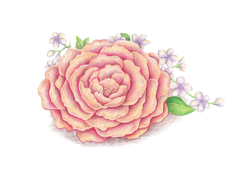
In this tutorial, I’ll show you the process of creating a nature-inspired artwork that depicts a peony and cherry blossoms, popular symbols of spring and flourishing.
To draw this beautiful floral composition, we will use colored pencils. They are a powerful artistic tool, and the great news is that pencils are very simple to use.
What You Will Need
Two sheets of paper
A graphite pencil (I recommend an HB type)
A sharpener
And pencils of different colors:
Chocolate brown
Medium grey
Raspberry red
Rosy
Lilac
Rich blue
Emerald green
Light green
Yellow
Creamy (or light beige)
White
My colored pencils are aquarelle, but this feature doesn’t really matter. We’ll work without washing the strokes.
1. How to Make a Pencil Sketch of the Flowers
Step 1
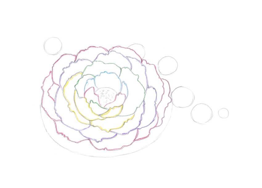
I outline the composition in a general way. With a pencil, I sketch an oval shape for the peony and smaller round shapes for the cherry flowers.
Step 2
I outline the core of the peony and fill it with small circles to mark the texture.
Step 3
I draw the first central petals of the peony. I also outline them with a blue pencil; I will be applying a new color to each new group of petals so you can easily differentiate them.
The option of adding any colors to your sketch is entirely up to you.
Step 4
I draw a couple of new petals in front of the existing ones and outline them with a red pencil.
Step 5
I draw an overlapping petal and a group of several rear petals. I mark them with the green color.
Step 6
I add several foreground petals and outline them with yellow.
Step 7
I imagine that the petals arrange themselves around the core of the flower, and add another layer. Then I mark the new group with a lilac pencil.
Step 8
One more layer of petals, and this time I outline them with red.
Step 9
The peony is almost complete. I add several more petals that hide underneath and outline them with a blue pencil.
Step 10
It’s time to mark the central parts of the cherry blossoms. I draw small circles with a pencil.
It is not necessary to put these circles exactly into the geometrical centers of the flowers. The blossoms are facing in slightly different directions; moreover, they are organic objects that can’t look equal.
Step 11
Each cherry flower has five petals, and I add them with pencil lines. It is also a great trick to diversify our floral composition with a small cherry bud.
Step 12
I add new details, such as a twig line, a couple of leaves, and new flowers.
Step 13
I draw a peony leaf in the foreground. I also add stamens of the cherry blossoms; they look like small circles.
Our pencil sketch is complete. You can leave it as it is now or mark shady areas, as I did for the central part of the peony, separating the petals with shadows.
2. How to Apply Pencil Strokes
Step 1
Colored pencils can help you achieve amazing results. There are several principles to remember, and one of them is the importance of creating layers of color. An overlap of tints and shades creates a much more interesting, impressive result than just one color.
The first way you can apply your tool is by making lines with soft rubbing strokes, holding your pencil at an angle. The lines can be directional…
… or rounded. This kind of stroke is perfect for smooth textures and a base color layer.
Step 2
Another excellent method is hatching. It is very similar to drawing with an ordinary pencil or pen; the point of your colored pencil should be sharp.
Hatching works best for adding details and drawing refined objects or textures.
3. How to Draw Flowers With Colored Pencils
Step 1
I make a clean copy of my pencil sketch, transferring only general contours with very light lines.
For this step, I recommend using a grey pencil from your colored pencils set, and not a graphite pencil. Lines made with a graphite pencil can mix with the color and make it seem dirty.
The lines that you see in the image below are barely visible in real life. I intensified them while editing the scan so you could see them distinctly.
Step 2
I use a pencil of the creamy color to cover the peony shape with soft rubbing strokes.
Step 3
With the lilac pencil, I add color to the central parts of the cherry flowers. I draw the hatches from the core to the petals.
Step 4
I apply the light green color to the leaves and the twig.
Step 5
I create an additional layer of the yellow color on the peony, accenting the upper parts of the petals.
Step 6
I add the rosy color, aiming at the dark places of the flower. It helps me in separating the petals one from another.
The point is about applying a body of color, not just a single line.
Step 7
I continue increasing the contrast with the rosy color.
The bending parts of the petals are spotlit, so I avoid making them too bright.
Step 8
I complete the process of applying strokes with the rosy pencil.
To create a unified look for the artwork, I also add several hatches to the cherry flowers.
Step 9
It is time to increase the contrast even more. I add the raspberry red color to the peony, accentuating the shadows between the petals.
Step 10
I apply hatches with the emerald green pencil to add details.
Step 11
I use the grey pencil to mark the contours of the cherry flowers. It’s important not to overdo the drawing; the cherry blossoms should stay light.
Step 12
It is time for blending with the white pencil. I apply it on top of the grey strokes and shade them. The result is a smoother color transition.
This method is also known as burnishing, and I highly recommend using it in your drawings.
Step 13
I make my artwork feel more natural by adding thin hatches made with the brown pencil to the shadows. I also create a drop shadow under the peony.
Step 14
I apply an additional layer of the creamy color to the peony. It looks more warm-colored now.
Step 15
I add some yellow strokes to the core of the peony and to the drop shadow.
Step 16
To make my artwork more interesting, I vary the range of colors with an inclusion of blue strokes.
I add thin hatches to the petals of the flowers and to the drop shadow.
Step 17
With the medium grey, I intensify the drop shadow.
It is also great to add thin hatches to the petals to balance this bright artwork.
Step 18
I evaluate my drawing. It looks nice enough, but I feel that adding several strokes of the blue color to the upper parts of the peony’s petals is a great final touch.
Your Artwork Is Complete
Congratulations, we’ve created a beautiful spring artwork! I hope you became inspired by the flowers and enjoyed the process of drawing with colored pencils.
I wish you much success with this wonderful technique and your creative projects!
How do I master color? It’s a question all artists ask themselves throughout their careers. And knowing how to challenge yourself is the first step to your answer. So in this tutorial, we’ll be exploring a unique technique of using rich, vibrant colors to paint a portrait in Adobe Photoshop.
Love digital painting? Browse the amazing selection of Adobe Photoshop Brushes from GraphicRiver to find brushes like the ones used in this tutorial. Or enlist the help of the talented folks at Envato Studio for custom digital portraits.
Tutorial Assets
The following assets were used in the production of this tutorial:
Here is the Woman Stock I’ll be using for this portrait.
Now take a look at this before and after comparison of the reference next to the final painting. Notice how the colors aren’t the same?
For this painting I was inspired by traditional artists who paint portraits with colors not normally found in their references. A quick search on Google will pull up tons of colorful portraits using bold, vibrant colors to replace the ones usually representing skin, hair, and other normal details.
So to achieve something similar I’ll need to edit the color scheme of the original reference to match one that I prefer instead.
Step 2
Open your reference into Photoshop. We’ll need to use several Adjustment Layers to switch up the color scheme and lighting. First go to Layer > New Adjustment Layer > Hue and Saturation, and edit the settings as follows:
For this painting I wanted the colors to be very rich in purple, red, and blue hues, so I switched up the color scheme by applying a New Adjustment Layer of Color Lookup with the following settings:
3D LUT File: Late Sunset.3DL
Step 3
Although I was immediately excited by this change, I wanted to push the colors even further. So I added three more Adjustment Layers.
First add a New Adjustment Layer for Curves, altering the curve for the Green Channel.
Follow up with another New Curves Adjustment Layer, this time altering the curves for the Blue, Red, and Green Channels. The settings might look a little crazy, but this helps to achieve a unique color effect.
Finally, I’ll finish with a New Adjustment Layer for Color Balance. Bring out more hue and purple tones by altering the settings for the Shadows, Midtones, and Highlights.
Here is the final reference below. The colors are overly saturated so that I can make out areas that are different colors, like blue or purple. This will make for an interesting starter reference to my color palette. And although we’ve changed the color scheme completely, the rich colors and tones still indicate that the painting will be of an African-American woman.
The reference before and after color adjustments.
2. How to Sketch the Portrait
Step 1
Now that we understand which colors we want to use, we can move on to sketching the portrait. You may notice that the model’s body language in the final painting is a little different. That is because I also referenced a second version of this picture where I found the model’s head in a much more coy position.
Create a New Document at 1717 x 2656 pixels at 150 dpi (the standard is 300, but I like a smaller file size). I always start with the Hard Round Pressure Opacity Brush at 100%Hardness to begin laying down the skeleton of my sketch.
At this stage, the details aren’t important. Just get the body position down and draw some quick guidelines for the position of the eyes, lips, and nose on a New Layer. Feel free to use any color you’d like—I chose a nice purple.
Now lowerthe Opacity of the rough sketch and guidelines to around 30%. Create a New Layer and use a smaller brush to draw a much cleaner sketch with all the details you need. Be as meticulous as you can about the clarity of each detail to avoid messing your painting up in the future.
It helps if you start with the face and body.
The evolution of this sketch. Start with simpler details first.
Then move on to additional details like her bold necklace on another New Layer. Here is the final sketch of our subject. Feel free to Delete the guidelines layer when you’re through.
Step 2
Before we move on to the actual painting, we need to figure out the background. Just like the original reference, I love the geometric details of the pattern behind our subject. So to achieve a similar result, I’ll create my own background using the Custom Shape Tool (U).
First select the Custom Shape Tool (U). To make sure you can browse all the shapes available, go to the drop-down menu and select All. When you’re prompted to replace or append, select Append.
Now select the diamond shape from the list. Create one large purple diamond with the color #4b3862 on the same document.
Step 3
Now Control-J to Duplicate the diamond layer several times, stacking the diamonds on top of one another to create a single row. Select all the shape layers and Right-click to go to Merge Shapes. Then Control-J to Duplicate the merged row several times to create a pattern for the background. There will be seven rows total.
Again, Merge the shapes together. Position the background so that there is generally a good sense of balance in the portrait. Now create a New Layer and use the PolygonalLasso Tool (L) to create a Selection around your subject. Fill the selection with white and set it as a Clipping Mask to the diamond background. Separating the layers like this will allow you to paint details without the diamonds affecting the face.
When you’re finished, the final sketch should look like this:
4. How to Paint the Base Colors
Step 1
Now let’s move on to the painting! Create a Duplicate of that masked white layer from the last step and use it as the base for the face layer. Set the Blending Mode for the sketch to Soft Light, and then select the Paint Bucket Tool (G) and fill the face layer with a cranberry color #883640. Use the same color to fill the background as well.
Step 2
For this painting I’ll be mainly using the Hard Round Pressure OpacityBrush and the Dry Brush 20 Pixels available under the Natural Brushes 2 option.
With the Dry Brush selected, paint a bright golden color #c66333 on two New Layers set to Clipping Masks to the background and face base.
With your reference close by for help, try to establish the shadows next.
Each time that you’re experimenting with a new color, create a New Layer. Here I’ll be painting this deep magenta color#520525onto both the background and the subject.
Continue to paint more shadows. Paint black for the shirt and hair, and start to incorporate blue and purple tones into the painting to represent the shadows as well.
Step 3
As you start painting more details, especially for the face, switch over to a Soft Round Brush to begin smoothing out the skin. Don’t forget to paint the base colors for the necklace as well.
5. How to Tweak the Colors
Step 1
Digital paintings that are heavily reliant on experimentation like this, often need Adjustment Layers to tweak the color scheme before you proceed. And since the painting currently looks dark and overly saturated with red, we’ll need to brighten it up a bit.
Start with a New Adjustment Layer for Curves. Adjust the curves forthe RGB, Red, Green, and Blue Channels as follows:
Step 2
Next, add a New Adjustment Layer for Color Balance. Tweak the settings for the Shadows,Midtones, and Highlights like the ones below.
The effect I’m trying to go for here is to have rich, red, magenta, and blueish colors to represent the shadows. On the opposite side of the spectrum, vibrant colors like gold and yellow will represent the midtones and highlights.
Step 3
We’re not quite through with the color tweaking just yet. Let’s add one more NewAdjustment Layer for Curves. This time we need to concentrate on making the scene brighter, so for the RGB, Blue,and Green Channels, add the following curves.
6. How to Paint the Portrait Details
Step 1
If I’m not sure about a color scheme, I’ll continue using Adjustment Layers to tweak the colors until it looks closer to what I need. So now that the colors work well together, we can move on to painting the rest of the portrait.
Switch over to the Hard Round Pressure Opacity Brush. With an 80-100% Hardness, begin painting cleaner details for the necklace and face. Try to avoid blurry edges as much as possible as you continue to detail this portrait.
Step 2
Create a New Layer and change the Blend Mode to Linear Dodge (Add). Use the Eyedropper Tool (I) to select areas of skin and body as the Foreground Color. Use that sampled color to paint highlights automatically created because of the Blend Mode.
Instantly the face should look more three-dimensional and vibrant. Need help understanding this step? Check out my tutorial on How to Shade Easily With Layer Blend Modes.
Step 3
Continue using a Hard Round Brush to clean up your edges. The only way to make sure your details get cleaner is to use a smaller Brush Size and to Zoom in to your portrait.
Start to incorporate random strokes of green, blue, and red to make your subject more dynamic.
Step 4
Time to create some texture! You can create texture two ways: either by hand or with a special brush. Here, I used the Rolled Rag Brush loaded from the Faux Finish Brushes in your tool menu. I also took a regular Hard Round Brush and painted tiny dots to represent pores and shine.
Step 5
You can still incorporate Adjustment Layers into your painting no matter which step you’re currently on. Here I’ll use a quick Levels layer to bring more blue out of the painting using the following settings for the RGB and Blue Channels below:
Here is the result after these changes. The painting is really starting to pop with color!
Step 6
As you get a better handle on your color scheme, you become more confident with hammering in the final details. Zoom in to the face, body, and necklace to carve clean lines and shapes with a Hard Round Brush. For the cleanest edges possible, make sure that the Pen Pressure Sensitivity and Transfer option is not selected within the Brush panel.
Study the shine in your model’s face and feel free to exaggerate it in the painting. Even though I’m using other colors to represent the shadows and midtones, I still use colors close to white for the highlights.
The most tedious part of this painting is the necklace. Not only are there so many components to it, but they also need their own attention and love. Clean up the lines with a Hard Round Brush and experiment with pops of color for extra pizazz.
Here is a quick comparison of the necklace from the start of the detailing process until now.
Remember, digital realism has a lot to do with mimicking environmental color. So make sure the necklace has pops of green, blue, and purple for where other details may shadow or reflect onto those pieces.
7. How to Create Depth of Field
For the final step of this painting, I’ll address the background pattern one last time. One technique that is a popular trend among digital artists today is the use of depth of field for portraits.
So to create depth of field, we’ll need to apply a Gaussian Blur. First, select the diamond shape layer as well as the white mask that’s been clipped to it. Merge both layers together.
Then select the merged layer and go to Filter > Blur > Gaussian Blur, adding a Radius of 9.2 pixels before hitting OK. Apply this effect on the diamond layer only.
And that’s it! This effect will instantly make your paintings look more realistic and three-dimensional. Check out the final painting below.
Awesome Work, You’re Done!
I hope this tutorial inspires you to take more risks with your digital paintings.
By changing the color scheme for the original photo, we’re able to create a reliable example for which colors work best for this portrait. Not only does this allow us to plan more effectively, but it also gives us more free rein when experimenting later down the line.
Good luck with your painting, and feel free to leave me any questions in the comments below!
Everybody has their own way of relaxing and enjoying their life. One of
my favorite times of the day is taking a sip of morning coffee—this is
pretty much the only time when I can sit back and read some books
because once that time’s over, I’m in my Wonder Woman gear trying to get
everything done.
In this tutorial, I want to share this special
moment by illustrating a lady who is relaxing with her coffee. While
creating this illustration, you’ll learn to manipulate shapes and also
get acquainted with the Width Tool, which I haven’t used before in my
previous tutorials. As usual, we will use basic shapes and the Warp Effect.
Why don’t you browse through GraphicRiver and find more characters? Maybe you will decide to make another hair style or even clothes, who knows…
1. How to Create the Head
Step 1
After
opening the Adobe Illustrator, create a new document with 850 x 850 px
Width and Height. We’ll begin by illustrating the head.
Using
the Ellipse Tool (L), draw an oval. In the image below, you can see
which fill color you need. To give the head an irregular shape, go to Effect > Warp > Inflate. Enter the options you see below.
Step 2
Let’s
start by drawing the top part of the hair. Draw two cream ovals with
the Ellipse Tool (L). Take the Direct Selection Tool (A) and move the
handles of the anchor points to create the shape you want.
Step 3
To
create long hair, make another cream oval and change its shape: go to Effect > Warp > Inflate. Enter the options shown below. Be sure
to place this oval behind the head (Control-C, Control-B).
Step 4
Let’s
make a hair band. Create two more circles by using the Ellipse Tool
(L), and make them overlap as in the image below. Go to the
Pathfinder panel and press the Minus Front button.
Step 5
Place this hair band on the hair.
Now
we will add the ears. Make another small oval and rotate it to the
left. Place this ear on the left side of the head. While keeping the
left ear selected, right-click your mouse and select Transform >
Reflect. Once you get a dialogue box, select Axis Vertical, Angle 90 degrees, and press Copy. Move the new ear to the right.
Step 6
For
the dreamy, relaxed eyes, create an oval. Then grab the Scissors Tool
(C) and click on the left and right sides of the ellipse. Delete the
upper part of the ellipse by pressing the Delete button on your
keyboard. You should be left with an arc. Increase the stroke Weight and
check Round Cap on the Stroke panel.
To add the eyelashes, make a copy
of this arc, decrease the stroke weight, and attach it to the left corner
of the larger arc. Make another copy of this small arc. Our romantic
eye is ready.
Step 7
Place the left eye on the face and
create the right eye. Right-click your mouse and select Transform >
Reflect. Once you get a dialogue box, select Axis Vertical, Angle 90
degrees, and press Copy. Move the new eye to the right.
Step 8
Now
the lips. Let’s create a little matte red ellipse and by using the Convert Anchor Point Tool (Shift-C), make the left and right anchor
points sharp by clicking them. After that, select those two anchor
points again (with the Direct Selection Tool (A)) and move them up by
pressing the Up Arrow on your keyboard.
For the upper lip,
create another small red ellipse. Select the top and bottom anchor points
with the Direct Selection Tool (A)) and move to the right by pressing
the Right Arrow on your keyboard. Make a reflected copy of this shape:
right-click your mouse and select Transform > Reflect. In the
dialogue box, select Axis Vertical, Angle 90 degrees, and hit Copy. Move
this copy to the right. The lips are ready.
(Note: You don’t need the
black strokes—it’s just to show you the shape and the placement).
Place the lips on the face.
Step 9
Let’s give the lady a pair of glasses.
Create
an oval with a dark gray stroke color and no fill. To create the shape
shown below, move the handles of the anchor points by using the Direct
Selection Tool (A). Add a line from the left side of this shape using
the Line Segment Tool (\).
Then create the right part of the glasses, just as we’ve been doing in the previous steps: right-click, Transform > Reflect. In the dialogue box, select Axis
Vertical, Angle 90 degrees, and hit Copy. Move this copy to the right.
Use the Arc Tool to make the middle part of the glasses and attach the
lenses together. An elegant pair of glasses is ready. You can play with
the shape of the frames to create a unique pair of glasses you
like.
Now place the pair of glasses on the face.
2. How to Create the Body
Step 1
Let’s
start by creating the neck and the shoulders. For the neck, create a
rectangle using the Rectangle Tool (M) and attach it to the head. After
that, create a horizontal oval (use the Ellipse Tool (L)) and attach it
to the neck.
Step 2
In this step, we will create the lady’s
body. Using the Rounded Rectangle Tool, create a gray rounded rectangle.
Let’s modify the bottom part of this shape. We’ll use the Fish effect:
go to Effect > Warp > Fish and enter the options below.
Step 3
To
create the arms, we will start with an arc. First, delete the fill
color and set the stroke color similar to the body color. Check Round Cap on the Stroke panel and make the Weight of this stroke very
thick. Now, using the Arc Tool, draw the woman’s arms. Move the handles
of the anchor points to achieve the result you need.
Step 4
Let’s continue drawing the arms.
Using the Line Segment Tool (/), create the lower part of the right arm. Then using the Arc Tool, create the left arm.
Now
we will modify these shapes so that this part is a bit thinner than the upper
arm. Select the Width Tool (Shift-W) and when you place the mouse over
the woman’s wrist, you will see new handles. If you move these
handles outside the line, the width of the line will increase on one
end. If you move anchor points inside the line, the width will decrease.
So go ahead and make the arms a little thinner around the wrist area.
Step 5
For the hands, we will use two ovals, which will be modified by manipulating
their handles. Remember to delete the stroke color and set the fill
color.
Here’s a closer look at the handle positions for the lady’s right hand.
Step 6
Now
we will create the cup. Pick the Rectangle Tool (M) and create a
rectangle. Keep it selected and go to Effect > Warp > Bulge.
Adjust the options as shown in the image below. Remove the fill color
and make the same stroke. Increase the stroke on the Stroke panel and
draw a circle (for a nice round circle you need to hold down the Shift key). That’s the handle.
Place the cup under the lady’s right hand, but over the body.
3. How to Create the Hips and Legs
Step 1
Using
the Ellipse Tool (L), make an oval and attach it to the bottom part of
the body. Using the Direct Selection Tool (A), move both side anchor
points down. That’s the hips.
Step 2
Let’s make the legs.
Grab
the Line Segment Tool (\), and draw two vertical lines. To get a straight
line, hold the Shift key as you draw the line. Remember to remove
the fill color and choose the same stroke color as the skin color.
Before drawing, be sure to check the Round Cap button on the Stroke panel and adjust the appropriate Weight of the stroke. To change the
thickness of the legs, select the Width Tool (Shift-W) and move the handles to make the upper part of the leg thicker and the bottom
ankle part a bit thinner.
Step 3
For the shoes, draw an oval
with the Ellipse Tool (L) and place it behind the leg. Using the Direct
Selection Tool (A), move the handles of the oval to create the shape
which will look like a shoe. Feel free to design your favorite shoes!
4. How to Create the Background and the Table
Step 1
Create a light blue square behind the woman, 850 px Width and Height, by using the Rectangle Tool (M).
Step 2
For the table top, add a white rounded rectangle by using the Rounded Rectangle Tool.
Step 3
Add two vertical rectangles by using the Rectangle Tool (M), for the table legs.
Step 4
For
the table decoration, add two spirals next to the table legs by using
the Spiral Tool. If you don’t see this tool, hold the Line Segment Tool
(\) for a few seconds, and a pop-up menu will appear—then you can select the
Spiral Tool.
Click on your artboard and a new dialogue window
will appear, asking you about the Radius of your spiral, Decay and Segments.
I recommend playing with different Decay and Segments to find out what
you like the most. Select the Round Cap button on the Stroke panel and
adjust the appropriate stroke Weight for this spiral. Create one spiral
and make another vertical copy of it.
5. How to Create the Chair
Step 1
For the seat of the chair, create a rounded rectangle using the Rounded Rectangle Tool.
Step 2
For
the back of the chair, create an oval with no fill and white stroke by
using the Ellipse Tool (L). Place this oval behind the table and the
lady. Slightly modify the oval shape by moving up its bottom anchor
point.
Step 3
To add the chair legs, create a vertical
rectangle using the Rectangle Tool (M) and a horizontal rounded rectangle
with the Rounded Rectangle Tool.
Step 4
To decorate the
chair, add two spirals on the bottom part of the chair’s leg. Create one
spiral by using the Spiral Tool and make a vertical copy with the
Reflect Tool (O).
Awesome Work, You’re Done!
We are done! Great job! I
hope you’ve enjoyed the process of illustrating using Adobe
Illustrator and learned some new tips and tricks, which you can use in
the future! Now it’s time to relax and grab a cup of coffee. Enjoy, have
fun, and don’t forget to share your art with us!
This tutorial was originally published in May 2012 as a Tuts+
Premium tutorial. It is now available free to view. Although this
tutorial does not use the latest version of Adobe Photoshop, its
techniques and process are still relevant.
If you’ve got a sweet tooth, then we’ve got a mouth-watering treat for you. In this tutorial we will show you how Photoshop CS6 Extended’s new 3D tools can be utilized to create a typographic illustration. We will also use plenty of free stock images and make full use of Photoshop’s non-destructive features, such as Adjustment Layers and Masks. Let’s get started!
Want an easier way to create tasty text? Browse the incredible selection of Candy Text Effects from GraphicRiver. Or enlist the help of a design professional from Envato Studio for all your typography needs.
Tutorial Assets
Note: The following references have been updated with workable links similar to the originals. But feel free to collect and experiment with your own.
Create a new canvas 14.85cm wide x 10.5cm high with the Resolution at 300dpi. Set the Color Mode to RGB and the Background Contents as White.
Step 2
Grab the Type Tool (T) and add the first character at 160pt in this font, then click the color chip in the Character tab and recolor it to #5d1e0f.
Step 3
Choose 3D > New Extrusion from Selected Layer. If you’ve not got the 3D workspace active, the following prompt will appear.
Step 4
If you ever used CS5’s 3D Repousse Tool, you’ll know how far it was from being user-friendly. The 3D experience in CS6 has been totally overhauled and is much more intuitive as everything is built into your workspace. Grab the Move Tool (V), drag to reposition the 3d plane as shown.
Step 5
You’ll see the Properties panel on the right. Click the Cap icon (1) and copy the settings shown. Now activate the Deform icon (2) and Copy these settings too. Now activate the Mesh icon and turn off both shadow options.
Step 6
Duplicate your first 3D text layer. To modify text while still in 3D Mode, click the Edit Source button in the Properties panel. This will open a „child document”, Edit, Save, then close and your text will automatically update. Now Drag the new 3D layer along the X-Axis in 3D space to reposition it.
Repeat this until each word is complete, then place each character clearly labelled in a separate word folder as shown.
Step 7
Now use the 3D Tools to Rotate/Move each character. Be careful not to use the Z-Axis, as this will move the object towards or away, making it appear larger or smaller.
Step 8
When you’re happy with the lettering arrangement, choose 3D > Render, then and sit back while until the render process is complete.
2. How to Create the Background
Step 1
At this point I decided I would need a little more space at the top for the hand/strawberry. To do this, press Alt-Control-I to access the Canvas Size window, set the anchor point to bottom centre and increase the Height to 11.85cm.
Step 2
Place a new layer called „Pink solid” above the „Background”. Use the Color Picker to set your Foreground Color to #e2b4c1, then hit Alt-Delete to fill the layer with pink.
Step 3
Add a New Layer called „Floor shadow” above the previous one, change the Blend Mode to Multiply and reduce the Opacity to 94%. Choose the Gradient Tool (G) and set it to Linear and Foreground to Transparent in the Options bar. Set your Foreground to a slightly darker pink of #c18088. Now press Shift and Drag as indicated by the length and direction of the arrow.
Step 4
Add another layer called „Top shadow”. Keep the Blend Mode as Default, then set your Foreground Color to #e38da4. Shift-Drag a short Linear Gradient from the top, then change the Gradient to Radial and add two further gradients from both top corners.
Step 5
Change your Foreground Color to #f9f5f7 and add a central Radial Gradient on a new layer called „Inner glow”.
3. How to Create a Ground Shadow
Step 1
Now we’ll add a ground shadow. Grab the Elliptical Marquee Tool (M) and draw a selection below the text as shown. Add a new layer in Multiply Mode above the „Inner glow” and name it „Shadow 1”. Set your Foreground Color to #d0879c and Fill the active selection.
Step 2
Go to Filter > Blur > Motion Blur, set the Angle to 0 Degrees and change the Distance to 531px. Next, use the same menu to choose Gaussian Blur and enter a Radius of 15px.
Step 3
Reduce the „Shadow 1” layer to 53% Opacity. Now Duplicate and rename it „Shadow 2”. Nudge the layer content up slightly, then hit Control-T to access Transform and reduce in size as well. Finally, drop the Opacity of this layer to 31%.
Step 4
To reduce the intensity of the background, add an unclipped Hue/Saturation Adjustment Layer, Copy these settings, then reduce the adjustment to 27% Opacity.
Step 5
To break up the gradient banding and the solid pink, target the „Shadow 2” thumbnail and choose Filter > Noise > Add Noise, enter 3px and activate the Uniform button. Target the remaining layers in turn (as indicated) and hit Control-F to reapply the filter. Now place all these layers within a group folder called „BACKGROUND”.
4. How to Add Texture to the First Letter
Step 1
Now we’ll move onto texturing the first letter. Use the Lasso Tool (L) to create a rough Selection of a chocolate image. Copy > Paste as a new layer above the type folders, then Duplicate and reposition next to the original. Use a soft-edged Eraser (E) to blend the hard edge of the duplicate, then hit Conrol-E to Merge Down and name the layer „Texture 1”.
Transform/position over the letter, then Control-Click the corresponding text layer to generate a layer-based selection. Ensure your new layer is targeted, then click on the Add layer mask icon located at the foot of the Layers tab.
Step 2
This first layer will appear over the darker extruded areas of the letterform, so add a clipped (to affect this layer only) Levels Adjustment and set the whitepoint Output slider to 94.
Step 3
Now we’ll add a toffee and chocolate topping. Use the Quick Selection Tool (W) to extract this a cookie. Place as a new top layer and Transform/Position as shown. Add a Layer Mask, then use an assortment of Soft and Hard brushes to blend into the top and front face of the letterform. Name this layer „Texture 2”.
Step 4
Clip a Color BalanceAdjustment to „Texture 2” and boost the Reds to +23.
Step 5
Extract the same entire choc ice (as used on Step 19), then Rotate, Scale and Position as a new layer. Name this layer „Texture 3”,add a Mask, then hit Control-I to Invert the mask to black. Now use a selection of white brushes to reinstate the area as shown.
Step 6
Clip a Levels Adjustment with these settings to the „Texture 3” layer to Darken the midtones.
Step 7
Add the same entire choc ice again as a new top layer and label it „Texture 4”. Position over the bottom of the letterform, then repeat the masking technique as used the previous layer.
Step 8
Clip another Levels Adjustment and increase the Midtones on „Texture 4” as well.
Step 9
Place the same choc ice as a final layer and label it „Texture 5”, then mask as shown.
Step 10
Place all these floating layers within a Group folder called „LETTER S”, then add a mask to the folder. Now Paint within a Selection from the letter „W” to hide the overlap.
5. How to Add Texture to the Letter W
Step 1
Extract the chocolate bar from its background, with the select active, hit Control-J to Copy as a new layer and Disable the Visibility of the original layer. Target the new layer, activate the Move Tool (V), then hold Control and drag out the top anchor points to remove the perspective.
Add this as a top layer called „Texture 1” and Resize/Position over the second letterform. Reduce the Opacity to 32%, then use a selection from its corresponding type layer to create a mask.
Step 2
Duplicate this layer, rename it „Texture 2” and change the Opacity to 95%. Drag the mask into the trash icon and click Delete in the following window. Temporarily Switch Off the Visibility of both texture layers, then use the Magic Wand (W) to select the front face from the corresponding type layer (shown by the marching ants in the screenshot). Now press Shift-F6 and Feather by 3px, then Select > Modify > Expand By 5px. Finally, click the Add Layer Mask icon.
Step 3
Clip a Color Balance Adjustment to „Texture 2” and increase the Reds and Yellows.
Step 4
Now clip a Levels Adjustment to the same layer to boost the Contrast.
Step 5
Now Clip a Hue/Saturation Adjustment to the same layer and adjust the Master, then the Reds and Yellows as shown.
Step 6
As a final modification, clip a Selective Color Adjustment to the same layer and increase the Blacks to +72. Add all these floating layers into a group folder called „LETTER W”
6. How to Add Texture to the Letter E
Step 1
Repeat the process as before toaddand Mask the reference image. This texture only need to cover the extruded areas, so don’t worry if it falls short on the left. Name this layer „Texture 1”
Step 2
Clip a Levels Adjustment to the „Texture 1” layer and set the Output whitepoint value to 59 to darken it.
Step 3
Add the same image again and name it „Texture 2”. Now apply the same masking technique as before.
Step 4
Clip a Levels Adjustment to „Texture 2” and copy these settings. Place these layers within a group folder called „LETTER E1”.
Step 5
Now clip a Hue/Saturation Adjustment to the same layer and reduce the Reds Saturation to -15.
Step 6
Extract and Place a cookie image over the next letterform. Mask, then lower the Opacity to 45% and name it „Texture 1”.
Step 7
Modify the Mask with a black-filled Selection from the face of the corresponding text layer.
Step 8
Clip a Levels Adjustment to the „Texture 1” layer and adjust the Midpoint slider to 0.84.
Step 9
Add the same texture as a New Layer, label it „Texture 2” and Mask as shown, including the top bite mark.
Step 10
Clip a Levels Adjustment to the „Texture 2” layer and Copy these settings.
Step 11
Now clip a Color Balance Adjustment to the same layer.
Step 12
Extract the right-hand broken portion from an eaten portion of a candy bar. Position over the bite, then access Warp (via the Transform menu) to bend it into shape. Add a mask and gently blend the edges into the underlying texture. Name this layer „Texture 3”.
Step 13
Clip a Hue/Saturation Adjustment to this layer and modify the Reds and Yellows as shown. Now place all your floating layers into a Group folder called „LETTER E2”
Step 14
Finally, add a Mask the original type layer and hide the area interfering with the bite mark.
7. Add Texture to the Letter T
Step 1
Extract and add a cake image as a New Layer and name it „Texture 1”. Use the same masking technique so only the extruded areas are visible, then reduce the Opacity to 90%.
Step 2
Clip a Levels Adjustment to this layer and Copy these settings.
Step 3
Add the same cake texture as another layer and label it „Texture 2”. Now mask, so just the front face is visible.
Step 4
Clip a Color Balance Adjustment to the „Texture 2” layer and apply the following settings.
Step 5
Now Clip a Levels Adjustment to the same layer.
Step 6
Add the same cookie texture as used on the very first letterform and name it „Texture 3”. Position as shown, then blend with a mask.
Step 7
Clip a Color Balance adjustment to this layer, then increase the Red to +17 and the Yellow to+7. Now clip a Levels Adjustment to the same layer and change the midpoint to 0.67 and the whitepoint to 215. You can now place these layers into a group folder called „LETTER T”.
8. How to Add Texture to the Rest of the Letters
Step 1
The letter „O” will be more straightforward. Extract and place a glazed chocolate image as a New Layer.Resize to cover the letterform and label it „Texture 1”. Use a Selection from the corresponding text layer to create a Mask, then deselect and carefully paint back areas as required around the outer edge and centre hole.
Step 2
Clip a Levels Adjustment to this layer and Copy these settings to darken the texture. Place these two layers into a Group folder called „LETTER O1”.
Step 3
Lasso a rough Selection from the darker edge of a chocolate image. Copy > Paste several times and position over the extruded areas of the next letterform. When you’re happy Merge them and name the layer „Texture 1”. Now use the original type layer to create a Mask.
Step 4
Clip a Levels Adjustment to the „Texture 1” layer and set the Midpoint to 0.86 and the Whitepoint to 236. Extract the same cake image from it’s background, then duplicate, Offset and Merge as you did with the very first letterform texture. Add as a New Layer, then position and mask as shown. Name this layer „Texture 2”. Place all these layers into a group folder called „LETTER N”.
Step 5
Repeat the process to add merged segments from this image as a New Layer over the next letterform. Mask as shown, then name this layer „Texture 1”.
Step 6
Clip a Levels Adjustment to this layer and set the Whitepoint Output slider to 148. Next, clip a Color Balance Adjustment to the same layer and copy these settings.
Step 7
Roughly Extract the same cake from its background and place as a new layer. Duplicate a feathered central portion and enlarge/stretch as shown. Merge both layers, then Mask so only the front face is visible. Name this layer „Texture 2”.
Step 8
Clip a Color Balance Adjustment to this layer and apply the following settings. Add these layer into their own Group folder called „LETTER Y”.
Step 9
The next letterform will be fairly easy to create. Open a donut reference and Extract it from its background. Place as a New Layer, then Transform to fit. Name this layer „Texture 1”, then disable the visibility of the original type layer.
Now Clip two adjustments to this layer: Levels and Color Balance with the following settings. Place these layers within a Group folder called „LETTER O2”.
Step 10
Extract and add a pie image and position over the final letterform. Transform and Mask to reveal the extruded type area, then name the layer „Texture 1”.
Step 11
Clip a Levels Adjustment to this layer and Copy these settings to darken it.
Step 12
Place the same cake texture as another layer and label it „Texture 2”. Resize and Position, then reduce the Opacity to 48%. Now Mask so just the front face is visible.
Step 13
Clip a Color Balance Adjustment to this layer and Copy the following settings.
Step 14
Extract and place a bitten chocolate bar as a New Layer and label it „Texture 3”. Flip Horizontal, Rotate, Resize and Position as shown, then blend with a Mask as shown.
Step 15
Clip a Levels Adjustment to this layer and Copy these settings to darken it.
Step 16
Clip a Color Balance Adjustment to the same layer, then mask the original type layer to reveal the bite mark. Finally, add all these layers into a Group folder called „LETTER U”.
9. How to Add the Strawberry and Hand
Step 1
Next, we’ll move onto creating the hand/strawberry layered file. Open a hand image and Crop (C) the excess background.
Step 2
For this image we’ll need an accurate selection, so grab the Quick Selection Tool (W) and select the white background.
Step 3
Hit Shift-Control-I to Inverse your selection, then click the Refine Edge button in the Options bar. In the next window choose On Layers (L) from the View Mode drop-down menu, Copy these settings and click OK.
Step 4
You’ll now see a masked duplicate layer appear and the visibility of the original layer disabled. Drag the mask into the trash icon and click Apply in the next window, then delete the original layer.
The existing strawberry less than photogenic, luckily this is easy to fix. Open a strawberyy image and use the same Selection/Refine Edge workflow to extract it. Delete/Apply the mask, then add as a New Layer and Resize, Position over the hand.
Step 5
Now Add a Mask and carefully blend the new strawberry into hand.
Step 6
Clip a Hue/Saturation Adjustment to the „Hand” layer and slightly increase the Saturation levels as shown.
Step 7
Now Clip a Levels Adjustment to the „Strawberry” layer to increase the Contrast.
Step 8
Set the Clone Stamp Tool (S) to Current & Below, then fix any minor flaws in the hand on a New Layer above the Hue/Saturation Adjustment Layer.
Step 9
Add another layer in Overlay Mode („Nails”) above the „Hand retouch” layer. Sample a color from the nail varnish (I used #814564) and Paint over the nails to accentuate them. To remove any overpainting, create a layer-based Selection from the „Hand”, Inverse and hit Delete on the new layer.
Step 10
Clone over the white edges of the nails as indicated on a New Layer („Nails retouch”) and use the same method as the previous step to delete any excess. Now place all these layers into a Group folder called „HAND”.
Step 11
Drag the folder thumbnail into your project file and Resize/Position as shown. If you notice any edge halos on the „Hand” layer, target it and go to Layer > Matting > Defringe and enter a pixel or two.
At this stage you may want to clip some more adjustments to the „Hand” and „Strawberry” layers so they sit more comfortably in the composition.
10. How to Finish Your Text
Step 1
Use the Selection/Refine Edge extraction workflow on the melted chocolate images to add some puddles of chocolate. Use the techniques you’ve learnt to clip relevant Adjustment Layers and also recolor some to resemble drops of jelly. Place these layers within a new Group folder called „ELEMENTS”.
Step 2
Extract and add some white chocolate, then Warp over the donut and Mask accordingly. Clip a Levels Adjustment to boost the contrast and a Hue/Saturation Adjustment to recolor it pink. Next, select a a small area from a cookie image and place as a small cookie crumb within the „ELEMENTS” folder.
Add a New Layer in Multiply Mode at the bottom of the stack within the same folder. Now Fill selections from all your drips and crumb with dark brown. Transform as shown, then apply the same blurring and noise as you did at the start of the tutorial for the main shadow. Finally, reduce the Opacity to 90% and Mask with some black to transparent gradients.
Step 3
Place a New Layer above all the group folders and name it „Retouch”. Now grab the CloneStamp Tool (S) and use a small brush at around 50% Hardness to clone around the edge of the lettering to make it less uniform.
Step 4
To wrap up, we’ll add some overall sharpening. Place an New Layer at the top, then go to Image > Apply Image. Set the Blending to Normal in the following window and hit OK (This command creates a composite from all visible layers). Name this layer „High pass”. Choose Filter > Other > High Pass and enter 3px. Change the Blend Mode to Overlay to render the grey invisible, then place both floating layers into a Group folder called „FINAL RETOUCH”.
Conclusion
I hope you’ve enjoyed this tutorial and discovered some new techniques along the way. I also hope it inspires you to create your own 3D typographic illustrations!
Yummy Candy Text Effects from GraphicRiver
Want to create an awesome sweet-inspired text effect like the one above? Choose from the incredible selection of Candy Text Effects and Layer Styles from GraphicRiver to satisfy your sweet tooth. And check out one of our favorites below!
Sink your teeth into this incredible selection of sweet layer styles. This package features 10 delicious layer styles ranging from sweet ginger cookies to a yummy birthday cake. Easy to use, simply add this layer style to the text or shape you want to apply the effect.
Welcome back to Best of the Design Web, where we feature some of the best design tutorials of this past month! Tackle new and exciting projects from across the web and let us know your favorites in the comments!
10 Amazing Tutorials From Across the Web
How to Create a Valentine’s Sweater Illustration in Adobe Illustrator
In this tutorial, our very own Ivan Petrusevski teaches you how to create a charming Valentine’s sweater. Learn how to create a lovely illustration using simple shapes, brushes, and colors.
Create a Wood Cut Text Treatment With Graphic Styles in Illustrator
In this tutorial, our very own Mary Winkler teaches you how to create an awesome wood-cut effect for your text in illustrator. Learn how to create a simple wood pattern first before turning it into an amazing graphic style.
How to Create a Big Bear Photo Manipulation in Photoshop
In this video, Rafy A shows you how to composite several images together to create a big bear photo manipulation. Learn how to use Layer Masks effectively as well as how to adjust colors using Adjustment Layers.
In this tutorial, Christian Krammer breaks down the steps of creating a realistic clock in Sketch. Achieve your own detailed clock with simple gradients and borders and add it to your forever growing icon collection.
How to Create an Editable Retro Text Style in Adobe Illustrator
In this tutorial, Chris Spooner shows you how to create an awesome retro text style to use in your designs. Learn some useful tricks using the Appearance panel to create a graphic style that works with live text.
How to Create the Orange and Teal Look in Adobe Lightroom Effect and Camera Raw
Learn how to create stunning photo effects with this Photoshop tutorial. In this tutorial, Denny Tang shows you how to create that popular orange and teal look in Adobe Lightroom and Camera Raw.
In this tutorial, learn how to draw, color, and detail fabulously colorful hair in the popular manga style. Michelle Hoefener teaches you how to lay down the basic shapes before finishing up with the final details and color.
Create gorgeous portraits of your own with this Photoshop tutorial. In this tutorial, KittoZutto taps into the glory of 80s posters to show you how to create a beautiful airbrushed portrait.
Step out of the norm of flat design graphics with this 3D Illustrator tutorial. In this tutorial, Thomas Burden teaches you how to use Illustrator’s 3D extrusions and Map Art function to create stunning illustrations.
How to Make Your Pictures Come to Life Using a Cinemagraph in Photoshop
In this video, learn how to create an awesome cinemagraph in Adobe Photoshop. Expert Peter McKinnon will walk you through the steps of creating a living photograph from video footage.
Top 5 Tutorials From Envato Tuts+ Design & Illustration
Our
experts have provided you with many great tutorials this month! Here
are five of our most tried and tested tutorials from the Design and Illustration section here at Envato Tuts+.
Before you go, be sure to pick up some amazing premium design assets from GraphicRiver and Envato Elements. Browse the incredible selections of design graphics, fonts, and so much more for high-quality design.
Create a cool glitch effect with this awesome Photoshop template. This template features a fully layered, high-resolution file that lets you turn any photo into a glitch-inspired GIF animation. Step up your photo game and download this package to get instant results!
Create stunning sketch effects with this professional Photoshop action. This action allows you to simply brush over any image where you would like to apply the effect before pressing play. Turn any photo into a modern architectural sketch instantly! Helpful instructions are also included.
Create havoc in just a few short clicks with this explosive Photoshop action. This action contains four different effect directions, a fully layered file, and a helpful video tutorial for further instruction.
Create a Facebook timeline cover that is simply one of a kind. This set of timeline covers features 11 different covers with unique textural effects. Also included in this package are additional design elements like banners, ribbons, and logos that are completely customizable.
Need a professional YouTube cover for your channel? Then check out this stylish bundle pack. This pack features six creative YouTube covers that will instantly upgrade your channel. Get access to high-resolution files, professional designs, and free icons all in one awesome download.
Design incredible vector illustrations with this set of neon brushes. This set includes 19 flexible neon tube brushes you can easily adjust in Adobe Illustrator. Illuminate your designs with this awesome pack today! A quick reference guide is also available.
Or splash around with this amazing set of watercolor Photoshop brushes. This brush set includes 69 high-quality watercolor brushes along with 11 bonus textures. Incorporate these brushes into your next creative project to add gorgeous textures.
Create awesome infographics with this premium design package. This package features 40 fully layered and well-organized files with all the elements you need to design the perfect infographic. Every file is super easy to edit with versions available in both Photoshop and Illustrator formats.
Ice cream anyone? Take a big bite out of this delicious ice-cream-inspired menu template. Great for little shops looking to improve their marketing materials, this template features a clean, modern design with vibrant colors. It’s available in both Photoshop and Illustrator files, and we just know you’ll love this menu!
Infographics are a creative way to educate the world. So use this incredible modern infographics package to add that special pizazz to your presentations today! Included in this package are editable vector graphs, bars, and so much more!
Agregator najlepszych postów o designie, webdesignie, cssie i Internecie