Archiwum kategorii: Web Tools

How to Create a Computer Peripherals Icon Set in Adobe Illustrator

Post pobrano z: How to Create a Computer Peripherals Icon Set in Adobe Illustrator

Final product image
What You’ll Be Creating

In today’s
tutorial we’re going to learn how to create a set of four computer peripherals,
using the same body as the central structure to which we will add all the key features that make each object stand out. As always, we’re
going to rely on the use of some basic geometric shapes, combined with the
power of the Align panel.

That being said, grab that old coffee mug, and let’s get started!

Oh, and before I forget, you can always expand the project by checking
out GraphicRiver where you can find
tons of computer-themed icons.

1. How to Set Up a New Document

Since I’m hoping that you already have
Illustrator up and running in the background, bring it up and let’s set up a New Document (File > New or Control-N)
using the following settings:

  • Number
    of Artboards:
    1
  • Width:
    800
    px
  • Height:
    600
    px
  • Units:
    Pixels

And from the Advanced tab:

  • Color
    Mode:
    RGB
  • Raster
    Effects:
    Screen (72ppi)
  • Preview Mode: Default
setting up a new document

Quick
tip:
some of you might have noticed that the Align New Objects to Pixel Grid option
is missing. That’s because I’m running the new CC 2017 version of the
software, where great changes have been made to the way Illustrator handles the way shapes snap to the underlying Pixel Grid.

2. How to Set Up a Custom Grid

Since we’re going to be creating the icons
using a pixel-perfect workflow, we’ll want to set up a nice little grid so that we can have full control
over our shapes—that is if we’re running the older version of the software.

Step 1

Go to the Edit > Preferences > Guides & Grid submenu, and adjust
the following settings:

  • Gridline
    every:
    1 px
  • Subdivisions: 1
setting up a custom grid

Quick
tip:
you can learn more about grids by reading this
in-depth piece on how Illustrator’s Grid System works.

Step 2

Once we’ve set up our custom grid, all we
need to do in order to make sure our shapes look crisp is enable the Snap to Grid option found under the View menu, which will transform into Snap to Pixel each time you enter Pixel Preview mode.

Now, if you’re new to
the whole “pixel-perfect workflow”, I strongly recommend you go through my how
to create pixel-perfect artwork
tutorial, which will help you widen your
technical skills in no time.

3. How to Set Up the Layers

With the new document created, it would be
a good idea to structure our project using a couple of layers, since this way
we can maintain a steady workflow by focusing on one icon at a time.

That being said, bring up the Layers panel, and create a total of five
layers, which we will rename as follows:

  • layer 1: reference grids
  • layer 2: tablet
  • layer 3: mouse
  • layer 4: keyboard
  • layer 5: midi
    controller
setting up the layers

4. How to Create the Reference Grids

The
Reference Grids
(or Base Grids)
are a set of precisely delimited reference surfaces, which allow us to build
our icons by focusing on size and consistency.

Usually, the size of the grids determines
the size of the actual icons, and they should always be the first decision you
make when you start a new project, since you’ll always want to start from the
smallest possible size and build on that.

Now, in our case, we’re going to be
creating the icon pack using just one size, more exactly 128 x 128 px, which is a fairly large one.

Step 1

Start by locking all
but the reference grid layer, and then grab the Rectangle Tool (M) and create a 128 x 128 px orange (#F15A24) square, which will help define the
overall size of our icons.

creating the main shape for the reference grid

Step 2

Add a smaller 120 x 120 px one (#FFFFFF) which will
act as our active drawing area, thus giving us an all-around 4 px padding.

creating the main shape for the active drawing area

Step 3

Group the two squares composing the
reference grid using the Control-G keyboard
shortcut, and then create three copies at a distance of 40 px from one another, making sure to align them to the center of
the Artboard.

Once you’re done,
lock the current layer and move on to the next one where we’ll start working on
our first icon.

creating and positioning the remaining reference grids

5. How to Create the Repeating Body

As I’ve already pointed out, we’re going
to create all four icons using the same body, onto which we will
gradually add the key features that give them their “identity”. That
being said, make sure you’re on the right layer (that would be the second one)
and then zoom in the first reference grid so that we can have a better view of the shapes.

Step 1

Start by creating a 112 x 100 px rounded rectangle with an 8 px Corner Radius, which we will
color using #60677C, and then center align to the underlying active drawing
area, at a distance of 4 px from its
bottom edge.

creating and positioning the repeating bodys main shape

Step 2

Give the shape that
we’ve just created an outline using the Stroke
method, by creating a copy of it (Control-C
> Control-F
) which we will adjust by first changing its color to #2B3249,
and then flipping its Fill with its Stroke (Shift-X), making sure to set its Weight to 8 px afterwards.

adding the outline to the repeating bodys main shape

Step 3

Using the Pen Tool (P) draw a 16 px tall 8 px thick Stroke line
(#2B3249) starting from the center of the outline’s top edge, and going all the
way to the outer limit of the active drawing area. Once you’re done, you
can select and group all three shapes together using the Control-G keyboard shortcut.

adding the little cable segment to the repeating bodys main shape

Step 4

Now that we have our repeating body, all
we have to do is create three copies of it (Control-C > Control-F three times), and position one onto each
of the empty reference grids.

Once you have them
all in place, you can start locking the layers so that you can keep your focus
on the first icon.

creating and positioning the repeating body copies onto the empty reference grids

6. How to Create
the Tablet Icon

The first icon
that we’re going to tackle is the little graphics tablet, so make sure you’re
on the right layer (that would be the second one) and then zoom in on its
reference grid so that we can get started.

Step 1 

Create the tablet’s display using an 80 x 60 px rectangle, which we will color using white (#FFFFFF) and
then center align to the repeating body, at a distance of 12 px from its top edge.

creating and positioning the main shape for the tablet icons display

Step 2

Give the shape that we’ve just created an 8 px thick
outline (#2B3249) using the Stroke
method, selecting and grouping the two together afterwards using the Control-G keyboard shortcut.

adding the outline to the tablet icons display

Step 3

Using the Pen
Tool (P)
, draw three 8 px thick
diagonal Stroke lines (#2B3249),
which we will adjust by lowering their Opacity
to just 20%. Once you’re done, select and group them together (Control-G) center aligning them to the underlying display afterwards.

adding the reflection lines to the tablet icons display

Step 4

Start working on the tablet’s first button, by creating a 16 x 16 px square (#BAC0CE) with an 8 px thick outline (#2B3249) which we
will group (Control-G) and then
position onto the left side of the display, at a distance of 16 px from the larger outline’s top
edge.

creating and positioning the main shapes for the tablet icons top-left button

Step 5

Create the second left-sided button using a copy (Control-C > Control-F) of the one that we’ve just made, which we
will position underneath, making sure to change the fill shape’s color to white
(#FFFFFF) once we have it in place. Once you have both buttons, group them (Control-G) since we’ll be using them to
create the right-sided ones.

creating and positioning the tablet icons second left-sided button

Step 6

Create the right-sided buttons using a copy (Control-C > Control-F) of the ones
that we’ve just grouped, which we will position onto the opposite side of the
tablet’s display.

creating and positioning the tablets right-sided buttons

Step 7

Finish off the icon by adding the little pen,
which we will create using a 40 px wide
8 px thick Stroke line (#2B3249) with a Round
Cap
, which we will center align to the tablet’s lower section. Once you’re
done, don’t forget to select and group all of the icon’s composing shapes
together using the Control-G
keyboard shortcut.

finishing off the tablet icon

7. How to Create the
Mouse Icon

Assuming you’ve already moved on up to the next layer (that would be the
third one) and locked the previous one, zoom in on the second reference grid and
let’s start working on the mouse icon.

Step 1

Create the mouse’s main body using a 44 x 68 px rectangle, which we will
color using white (#FFFFFF) and then center align to the underlying repeating
body’s main fill shape.

creating and positioning the mouse icons main shape

Step 2

Adjust the shape that we’ve just created by
setting the Radius of its top Corners to 4 px and its bottom ones to 22
px
from within the Transform panel’s
Rectangle Properties.

adjusting the corner radius of the mouse icons main shape

Step 3

Create the left-click button using a 22 x 20 px rectangle, which we will
color using #BAC0CE and then align to the larger shape’s top-left corner.

creating and positioning the main shape for the mouse icons left button

Step 4

Give the mouse an 8 px thick outline (#2B3249) using the Stroke method, making sure to position it on top of its two fill
shapes (right click > Arrange >
Bring to Front
).

adding the outline to the mouse icons main shape

Step 5

Add the bottom button delimiter line using a 44 px wide 8 px thick Stroke (#2B3249) which we will center align to the mouse’s body, positioning it at a
distance of 12 px from the outline’s
top edge.

creating and positioning the main shape for the mouse icons bottom button delimiter

Step 6

Finish off the icon by adding the vertical
detail line separating the mouse’s two buttons, which
we will create using a 36 px tall 8 px thick Stroke line (#2B3249). Once you’re done, group (Control-G) all of the mouse’s composing
shapes together, doing the same for all of the icon’s sections afterwards.

finishing off the mouse icon

8. How to Create
the Keyboard Icon

I’m guessing that
by now you already know the drill, so make sure you’re on the right layer (that
would be the fourth one) and zoom in on the third reference grid so that we can
get started.

Step 1

Start working on the top row’s first key by creating a 14 x 14 px square (#FFFFFF) with an 8 px thick outline (#2B3249) which we
will group (Control-G) and then
position towards the repeating body’s top-left corner, at a distance of 6 px from the larger outline.

creating and positioning the main shapes for the keyboard icons first key

Step 2

Create the top row’s remaining keys by selecting the one that we’ve
just made and then dragging it to the right side while holding down the Alt (to create the copy) and
Shift keys (to drag in a perfect
straight line), to create the first instance. 

Make sure that the duplicate’s outline overlaps the original one’s, and then simply press Control-D four times, which will repeat the last action and thus create the remaining duplicates,
grouping (Control-G) all the row’s
buttons together afterwards.

adding the remaining keys to the keyboard icons top row

Step 3

Create the second row of keys using the same Alt-Shift-Drag method, only this time repeat
the process by pulling down on the mouse until the copy overlaps the original’s outline.

adding the keyboard icons second row of keys

Step 4

Start working on the third row’s first key by creating a 20 x 14 px rectangle (#FFFFFF) with an 8 px thick outline (#2B3249) which we
will group (Control-G) and then
position underneath the shapes from the previous step, left aligning it to
them.

creating and positioning the main shapes for the keyboard icons third row key

Step 5

Create the spacebar using a 44 x
14 px
rectangle (#FFFFFF) with an 8
px
thick outline (#2B3249), which we will group (Control-G) and then position onto the
right side of the previously created button.

creating and positioning the main shapes for the keyboard icons spacebar

Step 6

Add the third row’s last button using a copy (Control-C > Control-F) of its first one, which we will position
onto the opposite side of the spacebar. Once you’re done, group (Control-G) all of the row’s shapes
together, doing the same for all the buttons afterwards.

finishing off the keyboard icons third row of keys

Step 7

Create the trackpad using a 28 x 20 px rectangle (#BAC0CE) with an 8 px thick outline (#2B3249), which we will group (Control-G) and then center align to the
lower section of the keyboard, positioning it at a distance of 12 px from the smaller buttons that we’ve just grouped.

creating and positioning the main shapes for the keyboard icons trackpad

Step 8

Finish off the icon, by adding the little
fingerprint reader using a 12 px wide
8 px thick Stroke line (#2B3249) which we will position onto the repeating
body’s bottom-right corner, at a distance of 20 px from the trackpad. Once you’re
done, select and group all of the icon’s composing shapes together using the Control-G keyboard shortcut.

finishing off the keyboard icon

9. How to Create the Midi Controller Icon

We are now down to our fourth and last icon, so make sure you’re on the
right layer (that would be the fifth one) and let’s wrap things up!

Step 1

Create the first out of the three adjustment
knobs, using an 8 x 8 px circle
which we will color using #2B3249, and then position onto the repeating body’s
top-left corner, at a distance of 8 px from
its left side and 6 px from its
top.

creating and positioning the main shape for the midi controller icons first adjustment knob

Step 2

Create the remaining knobs using two 8 x 8 px circles (#2B3249) which we
will vertically stack on the one from the previous step, distributing them at a
distance of 6 px from one another.
Then, once you’re done, don’t forget to select and group them
together using the Control-G keyboard
shortcut.

adding the remaining adjustment knobs to the midi controller icon

Step 3

Create the volume slider using a 12
x 28 px
rectangle (#FFFFFF) with an 8
px
thick Stroke (#2B3249) on top
of which we will add a 12 px wide 8 px thick state indicator line (#2B3249),
which we will position in its bottom section. Group (Control-G) all three shapes together and then position them onto
the right side of the adjustment knobs, at a distance of 8 px.

creating and positioning the main shapes for the midi controller icons volume slider

Step 4

Start working on the little D-pad buttons by
creating a 14 x 14 px square (#BAC0CE)
with an 8 px thick outline (#2B3249)
which we will group (Control-G) and
then position onto the right side of the volume slider, at a distance of 14 px.

creating and positioning the main shapes for the midi controller icons first d pad button

Step 5

Finish off the first row of D-pads by adding two
copies of the one that we’ve just made, using the Alt-Shift-Drag method, making sure to select and group (Control-G) all three of them
afterwards.

adding the first row of d pads to the midi controller icon

Step 6

Create the second row of pads using a copy (Control-C > Control-F) of the one
that we’ve just finished working on, which we will position just underneath,
selecting and grouping (Control-G)
them both together afterwards.

adding the second row of d pads to the midi controller icon

Step 7

Start working on the controller’s keys by creating a 16 x 44 px rectangle (#FFFFFF) with an 8 px thick outline (#2B3249), which we
will group (Control-G) and then
align to the bottom edge of the repeating body, at a distance of 8 px from its left edge.

creating and positioning the main shapes for the midi controller icons first key

Step 8

Create the remaining keys using four copies (Control-C > Control-F four times) of the one that we’ve just
made, which we will distribute along its right side.

adding the midi controller icons remaining keys

Step 9

Finish off the keyboard, and with it the icon itself, by adding a 16 x 22 px rectangle (#2B3249) to the
center of the first two set of keys, selecting and grouping all of them
together afterwards. Then, once you’re done, don’t forget to select and group (Control-G) all of the icon’s composing
shapes as well.

finishing off the midi controller icon

Awesome Work, You’re Done!

There you have it—a nice and easy tutorial on how to create your
very own computer peripherals using nothing more than some simple shapes and
tools. I hope you’ve managed to keep up with each and every step and most
importantly learned something new along the way.

finished project preview

22 Illustrator Tutorials for Creating Isometric Illustrations

Post pobrano z: 22 Illustrator Tutorials for Creating Isometric Illustrations

We’re all looking to improve our vector illustration skills, and if your focus is on learning illustration or icon design, then getting familiar with how to use Adobe Illustrator to create isometric drawings will improve your technical illustration skills greatly. Learning how to use Illustrator to create isometric diagrams, set up isometric grids, and design isometric cubes are fundamental skills that you can build upon.

We’ve assembled a collection of tutorials that will teach you the basics of creating isometric illustrations in Illustrator, as well as intermediate tutorials that teach you how to create complex technical illustrations, and then a few tutorials that show you how to get creative with isometric in Illustrator (such as building isometric retro illustrations and vibrant pattern-based isometric cityscapes). Get ready to take your skills with vector drawing at an angle to the next level.

If you’re looking for some great-looking assets to add to your designs, you can find a fantastic selection of isometric vectors over on Envato Elements. 

isometric vectors over on Envato Elements
Isometric vectors on Envato Elements

Bump Up Your Technical Illustrator Skills With These Isometric Tutorials

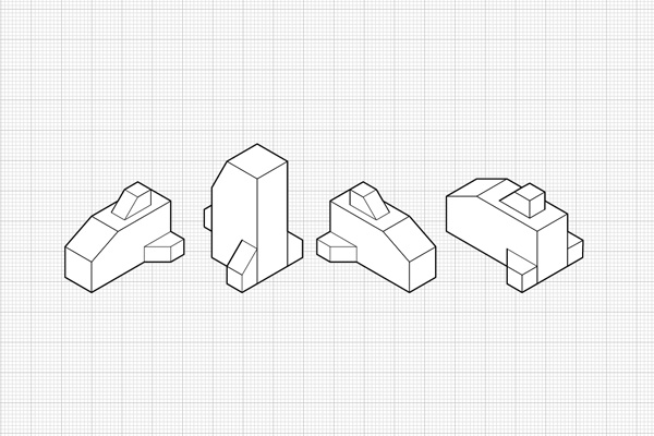
Working with Orthographic Projections and Basic Isometrics

This is the first in a series of tutorials Cody Walker wrote for us here on Vectortuts+ on isometric illustration. Isometric projects allow artists to quickly draw objects accurately without having to use perspective. They are often used in technical illustrations. Learn how to get started with isometric in illustrator by creating some simple objects on an isometric grid that demonstrate technical illustration techniques.

Orthographic Projections and Basic Isometrics

How to Create Advanced Isometric Illustrations Using the SSR Method

This is the second in a series of tutorials Cody Walker wrote for us here on Vectortuts+ on isometric illustration. The method demonstrated here is more advanced and shows how to build complex objects that are curved without the need for an isometric grid. Learn how to use the method scale, shear, rotate, or SSR. This tutorial follows a solid technical illustration process and demonstrates how to create a detailed, exploded diagram of an electric guitar in Adobe Illustrator.

Create Advanced Isometric Illustrations

How to Create Exploded Isometrics

This is the final post in a series of tutorials Cody Walker wrote for us here on Vectortuts+ on isometric illustration. Learn how to create exploded isometrics, which are referred to more commonly as assembly drawings. This type of vector drawing is often used in manuals to show how parts of complex objects fit together. This is an advanced technical illustration tutorial for creating complex, isometric diagrams in Illustrator.

Create Exploded Isometrics

Illustrator Tutorial: Design Retro Isometric Illustrations

Mark Oliver shows us how to create retro illustrations on isometric planes. This work is gorgeous. Learn how he works from sketch through vector in Illustrator, and then adds a worn image for the final vintage graphic touch. In this tutorial you’ll take a creative drawing and work it through an isometric grid in Illustrator, as well as vector build techniques, to create this stylized isometric illustration.

Design Retro Isometric Illustrations

Isometric Vector Art Made Easy

Aaron Miller shows us how to use Illustrator’s 3D tools to make a character-based scene that is full of happiness and creativity. Learn to bring dimension to flat imagery. Using this technique makes creating isometric illustrations easy. He shows how you can create isometric characters and scenes in Illustrator that are full of life. Learn to plan the scene, build the vector shapes, map art to the 3D shapes, and more.

Isometric Vector Art Made Easy

How to Create an Isometric Grid in Adobe Illustrator

This tutorial over on TechnicalIllustrators.org is great for beginners. It shows how to quickly set up an isometric grid in Illustrator. This allows you to print out and sketch isometric illustrations on them, using them directly in Illustrator or even another vector program. Sample grids are available for free download as well.

Create an Isometric Grid in Adobe Illustrator

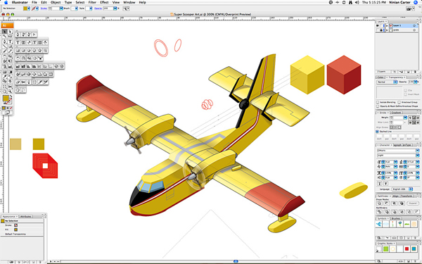
Complex Isometric Illustration Process of an Aircraft in Adobe Illustrator

Ninian Carter shares his processes for producing a complex isometric illustration of a water-bomber aircraft in Adobe Illustrator. This advanced Illustrator tutorial demonstrates a professional technical illustration workflow. Learn to skew graphics on an isometric plane, and build up the details of the vector work step by step.

Complex Isometric Illustration Process

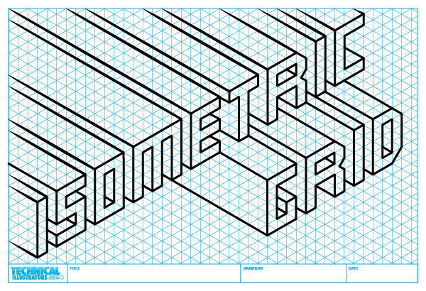
Create Isometric Grid-Based 3D Lettering

Learn how to use Adobe Illustrator to create a custom 3D typeface based on an isometric grid. Isometric-based letters are the perfect way to reflect structure in a display typeface, as Steven Bonner discovered with a commission for a magazine feature on contemporary architecture. He shows you how to draw, color and light your letters to create a three-dimensional architectural scene. This tutorial is an excellent blend of technical illustration and creative techniques.

Create Isometric Grid-Based 3D Lettering

Photoshop & Illustrator Tutorial: Build a Vibrant, Pattern-Based Isometric Cityscape

The design agency 2xanadu shows us how to create a complex repeating pattern that combines an interesting mix of technical illustration, isometric Illustrator methods, and creative ingenuity. It’s made up of modern cityscape elements, as well as anime style characters strewn about. The process covers working with an isometric grid, starting with a sketch, creating the linework in Illustrator, and finishing by coloring vibrantly in Photoshop.

 Build a Vibrant Pattern-Based Isometric Cityscape

Illustrator Tutorial: Lego Bricks Typeface

Mac Krebernik shows us how to use a slightly modified isometric grid in Illustrator to compose a small lego brick. You’ll then learn how to create a typeface by snapping the bricks together, much like when you were a kid playing with the real blocks themselves.

Illustrator Tutorial Lego Bricks Typeface

Creating 3D Maps Using Isometric Projection in Illustrator CS5

In this video tutorial from Digitaltutors.com, learn how to create an isometric grid and draw objects based on it. This is a great Illustrator tutorial for beginners to get started with the basics of technical illustration skills utilizing isometric Illustrator techniques.

Creating 3D Maps Using Isometric Projection

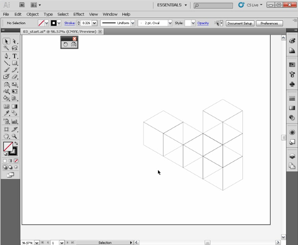
Illustrator CS4 – Isometric Cube

Learn how to create an isometric cube in Illustrator without the help of 3D tools. You’ll learn how to use basic shapes and the Pathfinder to make more complex structures, such as tables and bookcases. No need for advanced understanding of isometric projection or technical illustration skills. You can get started now with this beginner Illustrator video tutorial on isometric cube construction.

Illustrator CS4 - Isometric Cube

More Isometric Tutorials From Envato Tuts+

Can’t get enough? Check out more tutorials from the Design & Illustration section here on Envato Tuts+ dedicated to teaching you about the incredible world of isometric art. Or check out our series on creating Isometric Pixel Art in Adobe Photoshop.

Additional Illustrator Tutorial Collections Here on Envato Tuts+

Jump into more comprehensive roundups on various type of Illustrator tutorials. Learn how to advance your self-promotional work, Illustrator brush work, poster design skills, master InDesign tools, and boost your artistic skills.

5 Isometric Sets From Envato Elements

Need a faster solution? Browse our amazing selection of Isometric Elements and Generators available through Envato Elements. Create awesome maps and infographics quickly and check out some of our favorites listed below!

Isometric Map Generator

Create insane 3D worlds with just a few short clicks. This incredible isometric map generator features realistic buildings, roads, and other design elements to create your own amazing maps. Download this package to explore the vast library of real-world add-ons.

Isometric Map Generator

Modern Isometric City Template

If you prefer a city with a more modern design then check out this isometric city template instead. This pack features colorful houses, cars, and trees with a sleek, minimalist design. Use these graphics for websites, infographics, or games, and enjoy customizing these well-organized vector files.

Modern Isometric City Template

Flat 3D Isometric Icon Set

Need a few icons to jazz up your designs? Then check out this super cool set of 100% vector isometric icons. These icons feature 15 different realistic icons you can use for your websites, social media accounts, and so much more!

Flat 3D Isometric Icon Set

Flat 3D Isometric Business Concept

Step up your game with this awesome package of seven different business-themed isometric designs. These designs feature several business concepts you can use for your presentations, infographics, and more. Create exciting presentations for school or work and impress your coworkers with these incredible graphics.

Flat 3D Isometric Business Concept

2D Isometric Game Asset – City Build Vol 1

Build the city of your dreams for your awesome games with this cool isometric set. This package features 25 icons with all the buildings, landmarks, and shops you need to make your environment shine. It’s suitable for games and more, and you’ll want to take advantage of this set right away!

2D Isometric Game Asset - City Build Vol 1

How to Create a Vector Portrait With Curly Hair in Adobe Illustrator

Post pobrano z: How to Create a Vector Portrait With Curly Hair in Adobe Illustrator

Final product image
What You’ll Be Creating

This tutorial was originally published in November 2012 as a Tuts+ Premium tutorial. It is now available free to view. Although this tutorial does not use the latest version of Adobe Illustrator, its techniques and process are still relevant. 

I’ve created several vector portrait tutorials in the past, but one request is made several times and that is how to create curly hair. In today’s tutorial, I’m going to show you one of the easiest ways of creating detailed curly hair. So let’s jump in and begin creating!

To create gorgeous portraits of your own, consider one of our amazing Adobe Illustrator Hair Brushes from GraphicRiver. Or enlist the help of a design professional to create your very own portraits from Envato Studio.

1. How to Prepare the Document

Step 1

I start by creating a New document and then File > Place my stock image onto the canvas. As I want the hair to be one of the biggest features of this composition, I want to make sure that it has enough space to garnish the attention from the viewer. 

I then set up my layers as shown in the Layers panel below. In the layer „BG” I have placed a white fill Rectangle (M) over the stock image set to 50% Opacity. This is to make the edges of my shapes more prominent against the stock image when I’m tracing shapes.

Prepare the layers

Step 2

I often use the default „Skintones” palette from Adobe Illustrator. You can access these by clicking on the drill-down menu in the Swatches panel > Open Swatch Library > Skintones. For Caucasian skin, I select the top four palettes so I can mix them to create multi-tone shading. Skin isn’t all one color—there are different shades depending on the area of the face/skin, which I’ll go into later on. By clicking on the folder to the left of the palette, you can automatically add them to your Swatches panel.

Adding palettes to the Swatches panel

I’ve then selected a mid tone and used the Pen Tool (P) to trace my overall skin base shape.

Trace with the pen tool

2. How to Render the Skin

Step 1

For the initial skin shading shapes, I’ve used the same skin tone as the base and traced areas of highlight on the face with the Pen Tool (P). I’ve then created a Compound Path (Control-8) with the first set of shapes and used Pathfinder > Minus Front from a duplicate of the skin base shape.

Skin shading

I use the same process several times. Once done, I set the shapes to Blending Mode Multiply, Opacity 10%, and then Group them (Control-G).

Skin shading

Step 2

Using a slightly darker skin tone, I trace areas of shadow with the Pen Tool (P). Again after one set is created, I’ll add it to its own Compound Path (Control-8). Each Compound Path is then set to Blending Mode Multiply, Opacity 10% and then Grouped together (Control-G).

Add darker shadows

Step 3

As you may have noticed the shapes go beyond the base shape. I’ve duplicated the base shape and Grouped the two groups of skin shading shapes (Control-G) and then created a Clipping Mask (Control-7). All future skin shading shapes will be added to this Clipping Mask to keep a clean edge.

Create a Clipping Mask

Step 4

Using an even darker shade, I add darker shadows with the Pen Tool (P) using the same process. Typically the darker the area, the smaller the shapes created. These shapes are set to Blending Mode Multiply, Opacity 10%.

Add further shading

Step 5

Now to add the highlights. I create a transparent radial gradient using the lightest skin tone. I then use it to fill shapes highlighting areas of the skin. These shapes aren’t added to a Compound Path.

Add highlights

Instead each set of shapes is Grouped together (Control-G). Each set is set to Blending Mode Screen, Opacity 15%.

Add further highlights

Step 6

There are areas which are in deeper shadow than anywhere else. Typically it’s areas where the skin folds (eyelids, lips, nose crease), but also near the hairline, along the nose to help it stand out, and around the nostrils. These shapes are much darker and are set to Blending Mode Multiply, Opacity 15%.

Add darker shadows

Step 7

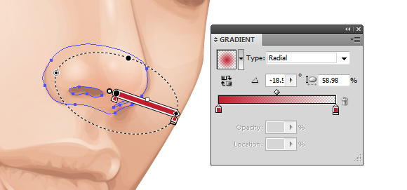
From the more pink hue skin tones, I’m going to add a light pink transparent radial gradient to the skin, first to just below the cheekbone within an Ellipse (L).

Add pink tones to the cheek

The next is on the shoulder. These shapes are set to Blending Mode Multiply, Opacity 60%. I’ve added the cheek coloring above the other skin shading, whereas the shoulder is below the skin shading.

add pink tones to the shoulder

Step 8

To modify the overall base of the skin shading, I’m going to add gradients below the rendered skin shading shapes. Duplicate the original base shape and first add transparent radial gradients with the highlight gradient. Using the Gradient Tool (G) move the sources of the gradients over the face and over the shoulder/arm. These are set to Blending Mode Screen, Opacity 30%.

Modify the base underneath the shading

I’ve then added a transparent linear gradient under the skin shading set to Blending Mode Color Burn, Opacity 100%.

Add shadows underneath the shading

Step 9

Using the skin highlighting radial gradient, I’ve then added more intense highlights to the eyeball and skin. These are set to Blending Mode Screen, Opacity 60%.

Add further highlights

Step 10

Skin isn’t all one color—there are a variety of tones throughout. Typically you’ll find a hint of grey towards the corner of the eyes. Use a transparent radial gradient set to Blending Mode Color to add a grey tint. Reduce the Opacity accordingly, although keep in mind that the more prominent the grey, the more aged a person will appear.

Add grey to the corner of the eyes

The tip of the nose typically is more rosy. So use a red radial gradient set to Blending Mode Color Burn, Opacity 20% to add a hint to the nose.

Add red to the nose

To make the cheekbones stand out more, add shading underneath them. I’ve added more color to the cheekbone with a purple transparent radial gradient. This is set to Blending Mode Color Burn, Opacity 10%.

Add more redpurple tones to the cheek

Step 11

To show the creases in the neck, I’ve added further highlights using the highlighting skin gradient. These are set to Blending Mode Screen, Opacity 30%.

Add further highlights to the neck

3. How to Render the Lips

Step 1

When I begin skin shading, I always treat the lips as if they have no color and shade them with the skin. This is because I don’t want the lips to look as if they are floating independently on top of the skin. 

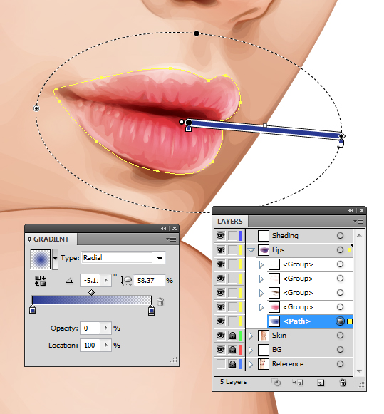
I then use gradients to add color to the lips. I’ve used a pink transparent radial gradient on the three shapes I’ve created for the lips: one for the overall lips shape and one each for the top and bottom lips. They overlap in the center to help darken this area which is in shadow. These shapes are then set to Blending Mode Color Burn, Opacity 40%.

Add reds to the lips

Step 2

I use a brown transparent radial gradient to add shadow and creases to the lips. These shapes are set to Blending Mode Color Burn, Opacity 50%.

Add shadow to the lips

Due to the contrast created with these shapes, I’ve added further shading to the face with the same gradient. These shapes are set to Blending Mode Color Burn, Opacity 100%.

Balance the contrast

Step 3

With the Pencil Tool (N) and a light pink transparent radial gradient, add highlights to the lips. The Pencil Tool (N) will allow you to add many shapes much quicker than using the Pen Tool (P). These shapes are then set to Blending Mode Overlay, Opacity 30%.

Add highlights to the lips

Then using the highlighting skin gradient, add further more intense shapes. These are set to Blending Mode Color Dodge, Opacity 40%.

Add further highlights

Step 4

I want the lips to appear more pink than red/orange, so I duplicate the shape covering the whole of the lips area and add a dark blue transparent radial gradient. Set it to Blending Mode Soft Light, Opacity 100%. This helps „neutralise” the red/orange tone.

Use blue to make the lips more pink

4. How to Render the Eyes

Step 1

Using a similar theory, I’m going to „neutralize” the red/orange tones on the eyeballs slightly by using a light blue radial gradient. This will be set to Blending Mode Color and Opacity 30%.

Neutralise the eyes

Then I’m going to add highlights to the eyeball using the highlighting skin gradient set to Blending Mode Screen, Opacity 40%.

Add highlights to the eyes

Step 2

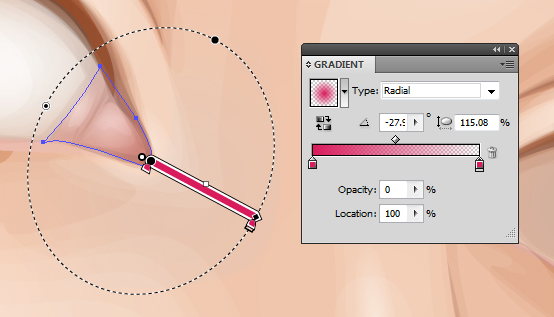
I’m going to add a pink tint to the water line with a rose transparent radial gradient set to Blending Mode Color, Opacity 100%.

Add pink to the waterline

Then add a bolder and darker gradient in the corner of the eyes set to Blending Mode Multiply, Opacity 30%.

Add pink to the corner of the eyes

Step 3

With a golden brown fill color, use the Pencil Tool (N) to add shading around the waterline and corner of the eye. These shapes are set to Blending Mode Multiply, Opacity 10%.

Add details to the eyes

Then with a light pink, add highlights with the Pencil Tool (N) set to Blending Mode Screen, Opacity 40%.

Add details to the eyes

Step 4

I’m going to use Clipping Masks (Control-7) for the iris. First duplicate the largest shape for the eyeball. Then draw an even circle with the Ellipse Tool (L).

Create the eye

Create a Clipping Mask: first a duplicate of the iris and then a Clipping Mask containing this iris mask, with the eyeball duplicated shape. This will give you a Clipping Mask within a Clipping Mask. You will see the benefit of this soon.

Create a clipping mask

Step 5

I’ll be adding the detailing to the eyes via the Appearance panel. I’ve used a mid brown for the iris. The first fill is set to 60% Opacity, and the second from bottom fill is Offset Path by -1 pt and 100% Opacity. This gives the iris a soft edge. 

Then the pupil is made from two dark brown fills. One is Offset Path by -12 pt with a Blending Mode of Multiply, Opacity 40%. The next is Offset Path by -13 pt and with a Blending Mode of Multiply, Opacity 80%. Again this is to create a soft edge.

Create a soft edge to the eye

Step 6

Gradients are then added to the iris. These are Offset Path by -1 pt. An inverted dark brown radial gradient is applied to give a vignette effect around the iris.

Use gradients for the eyes

This is then duplicated and with the Gradient Tool (G) is enlarged and brought down towards the bottom of the iris. This gives a slight shadow at the top of the iris.

Add further gradients

Then a green to orange radial gradient is applied to the bottom of the iris. This is to give a golden brown tone to the eyes.

Adding further gradients

Step 7

Duplicate Item and give an Offset Path -1 pt and a dark brown transparent radial gradient fill. Then go to Effect > Transform & Distort > Zig-Zag and use the settings below. If the two Clipping Masks were not applied, the zig-zag effect would overlap onto the eyelid and onto the eyeball. Once done, go into the Graphic Styles panel and Add New Graphic Style and apply it to the other eye so you’ve got the same effects on both.

Use the Zig-Zag effect

Step 8

Using the Pen Tool (P) and a dark brown fill, draw shapes around the eye and eyelid crease. This is to help build upon a base for the eyelashes and to define the eyelids. These shapes are set to Blending Mode Multiply, Opacity 30%.

Add shading around the eyes

Further, more subtle shapes are added with a black fill, set to Blending Mode Multiply, Opacity 10%. These help to add shadow onto the eyeball.

Push the contrast

Step 9

Using the skin highlighting gradient, add a light reflection along the waterline and over the pupil. These are set to Blending Mode Screen, Opacity 70% to 100%.

Add highlights

Step 10

Eyelashes are added using the Width Profile 1 brush I’ve created in a previous tutorial. Both lashes use a dark brown stroke color, but the top are set to Blending Mode Multiply, Opacity 70%, and the bottom are set to Blending Mode Multiply, Opacity 40%.

Create the eyelashes

5. How to Render the Hair

Step 1

Before I begin adding the hair, I decide to sketch out ideas. I use the Blob Brush Tool (Shift-B) to sketch with. I Create New Layer above and below the core elements of the portrait to sketch hair on top and underneath the portrait. I’ve decided in this case I’m going to fill all the negative space with hair.

Sketching out the hair

Step 2

For curly hair, you need to treat each curl as its own entity. Each curl should cover any hair which is underneath it to create a mane of healthy, thick curls. One of the easiest ways of going about this is to create an Art Brush of a curl. Of course we’re not drawing an actual curl, but imagine pulling a curl straight.

Using the Rounded Rectangle Tool, draw out a shape and use the Direct Selection Tool (A) to select the end points of the shape. Then use the Free Transform Tool (E) to reduce the size at the end of the shape to create a tapered effect. I want to give the portrait a mass of green hair.

Create the base of a brush

Step 3

As you can’t include a gradient or a Clipping Mask with an Art Brush, I’m going to create a gradient effect using a Blend. Duplicate the tapered shape twice. Use the Free Transform Tool (E) to reduce the size of the shape on top. For the larger one, set it to 0% Opacity. Then with both shapes selected create a Blend (Control-Alt-B) with Specified Distance Spacing of 4 pt. Set the Blend to Blending Mode Multiply.

Use a blend instead of a gradient

Step 4

Using the Width Profile 3 brush, add strokes using the Line Segment Tool (\) at the tip of the tapered end with a 2 pt Stroke Weight. These strokes should be the same green as the original tapered shape and placed below the Blend.

Add additional strokes

Step 5

With the Width Profile 1 brush, add 2 pt Strokes with the Line Segment Tool (\) on top of the shape with Blending Mode Screen, Opacity 30% to add highlights. Then using the same settings, add darker strokes with a Blending Mode of Multiply, Opacity 30%. Group all the elements once done (Control-G).

Add additional strokes

While the group is selected, in the Brush panel create a New Brush > Art Brush and click on OK.

Create a New Art Brush

Step 6

Using the Pen Tool (P) for a smoother curve, add curls around the face underneath the face elements. Group them together once you’ve applied the initial curls (Control-G).

Begin using the Brush

Add the curls in groups so you can place them underneath the previous ones. The curls in front should be above all the others and the curls at the back should be at the bottom of the layer.

Build up the layers of curls

Step 7

While layering the curls, for any gaps present I use a dark green shape to block the gaps.

Fill in the gaps

Then when I’ve finished the layering of curls, I add a dark green Rectangle (M) behind all the curls.

Create a background

Step 8

Using the Width Profile 1 brush and the Paintbrush Tool (B), I add strokes with a medium green along the sides of the curls and at the tip. As each curl is identical, I want to make them look more individual. So adding additional strokes helps me achieve this. These strokes are set to Opacity 80%.

Add strokes to make the curls more unique

I repeat this same method for the curls at the back and add them in stages.

Add further strokes

Step 9

With a lime green, I add 4 pt Stroke Weight, Width Profile 1 strokes to the curls. These are set to Blending Mode Color Dodge, Opacity 40%. These strokes add a highlight to the curls and give them further definition.

Add highlights

I then add 2 pt Stroke Weight strands to add more detail to the highlights. These are set to Blending Mode Screen, Opacity 40%.

Add further highlights

Step 10

Using the Pencil Tool (N), I add lime green transparent radial gradients over the top of the highlighted areas of the curls. This adds a smoother highlight to them. These are set to Blending Mode Color Dodge, Opacity 25%.

Use gradients to create highlights

6. How to Create the Eyebrows

The finishing touches are to add eyebrows. I’ve used the Width Profile 1 brush to add 1 pt strokes to the brow bone. The initial strokes are set to Blending Mode Normal, Opacity 80%.

Add the initial strokes

Finishing off with some strokes set to Blending Mode Multiply, Opacity 50%.

Add darker further strokes

Awesome Work, You’re Now Done!

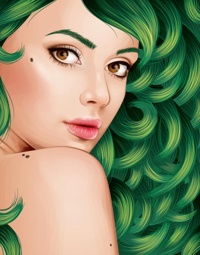
If you’ve followed my tutorials in the past, you’ll know I finish off with a couple of moles to the face and skin. These are created using two-layered brown transparent radial gradients set to Blending Mode Multiply. I hope you’ve enjoyed this tutorial and learnt one of the methods possible for creating curly hair.

Vector Curly Hair Tutorial by Sharon Milne

Adobe Illustrator Hair Brushes From GraphicRiver

To help save time with your next fabulous portrait, consider using one of the amazing Adobe Illustrator Hair Brushes from GraphicRiver to speed up time. Check out one of these helpful brush packs below!

Easy Hair Brushes for Adobe Illustrator

Create quick hairstyles like a pro with this amazing brush pack! Designed with 17 easy hair brushes, simply drag and drop the brushes into the preset folder to begin creating realistic hair of your own in no time! Ideal for use with the Pen Tool, you can also use these brushes with a mouse or graphics tablet!

Easy Hair Brushes for Adobe Illustrator

How to Create Realistic Feet-Inspired Hiking Boots in Adobe Photoshop

Post pobrano z: How to Create Realistic Feet-Inspired Hiking Boots in Adobe Photoshop

Final product image
What You’ll Be Creating

Do you love hiking? Upgrade your footwear with a unique pair of foot-inspired boots! In this tutorial, we’ll go over how to manipulate a regular pair of feet to create an overall hiking scene using basic photo manipulation techniques.

Want to add that natural earthy look to all your photos? Browse the incredible selection of Natural Photoshop Actions on GraphicRiver to retouch your work. Or enlist the help of a design professional from Envato Studio for all your photo manipulation needs. 

Tutorial Assets

The following assets were used in the production of this tutorial:

1. How to Extract the Feet

Step 1

For the purpose of this tutorial, I’ll be using the original dimensions supported by my Foot Reference to create the composition. Currently it’s 2200 x 2635 pixels, but later on we will crop it down to fit the scene.

Original Foot on Scale Photo via PhotoDune
Foot reference via PhotoDune.

Open your photo into Photoshop. Double-Click the background layer to change it to Layer 0. Use the Magic Wand Tool (W) to select the white areas of the background, and hit Delete to get rid of them. 

Delete the White Background

Step 2

Using the Magnetic Lasso Tool (L), begin creating a selection around each foot. Control-J to Duplicate each foot onto its own new layer. When you’re through, you should have two separate layers for each foot. Save file space by Deleting the layer with the scale still on it, and feel free to organize these layers into a new Group.

Separate the Feet Layers

2. How to Sketch Guidelines for the Boots

Step 1

Use the Move Tool (V) to position the feet lower onto the canvas.

Position the Feet Lower

Feel free to experiment with the position of the feet. You can move one slightly back or keep them aligned as I did. Changing the position may make the manipulation a little harder, so just keep that in mind.

Experiment with Different Foot Positions

Step 2

The next few steps are optional. Feel free to move on without a sketch if necessary. To help me understand how to situate the boots, I’ll need to draw a quick sketch over the feet. This will help me understand the perspective, and where to place the laces, hooks, and collars correctly.

Create a New Layer underneath the feet group and Fill it with white using the Paint Bucket Tool (G). Select a basic Hard Round Brush (B) to sketch two circles located above the ankle on another New Layer.

Draw Circle on the Feet

Merge the two feet layers together. Add a Layer Mask to the merged layer and begin painting black onto the layer mask to hide the top half of the leg. Do this for each foot.

Mask the Leg Away

Step 3

The feet are looking a little thin. Select each foot with the Rectangular Marquee Tool (M) and use the Free Transform Tool (Control-T) to make both wider. Adjust the Layer Mask and sketch accordingly.

Make the Feet Wider with Free Transform

Step 4

On the sketch layer, draw a basic outline of the boot’s tongue. This will help give us a guideline for where to place the boot reference later.

Draw the Boot Outline

3. How to Manipulate the Boot Reference

Step 1

Now that we’ve got a good guideline going, we can incorporate the actual boots. First, open your Boot Reference into a separate document and use the Magic Wand Tool (W) to Delete the white background.

Delete the Boot Background
Hiking boots stock via PhotoDune.

Step 2

Use the Polygonal Lasso Tool (L) to make a selection around the left boot’s tongue, collar, and laces. Copy and Paste it into your photo manipulation document. Lower the Opacity slightly so that you can still see the feet underneath.

Position the boot over the left foot, Resizing it and Warping it to fit the foot with the Free Transform Tool (Control-T). Toggle the Visibility of the sketch layer on and off so that it’s not distracting.

Manipulate the Left Boot

Continue manipulating the stock until you’re happy with how the boot fits the foot. Then add a Layer Mask to the boot layer and paint black onto the mask to hide any parts of the boot that you don’t want, using both Hard and Soft Round Brushes.

Mask the Left Boot

Step 3

Let’s move on to the right foot. Just like before, make a Selection over the right boot with the Polygonal Lasso Tool (L). Copy and Paste the selection onto a New Layer above the right foot.

Copy and Paste the Boot Reference

This foot is a little tricky, so I’ll slow the process down. Control-T to Free Transform the boot, scaling it down to fit along the right foot. Try your best to match the size of the left one.

Scale the Boot Smaller

While holding the Control key, grab the corners of the Free Transform box and tweak the perspective slightly.

Tweak the Boots Perspective

Now Free Transform again, selecting Warp to mold the boot to the foot. Don’t worry about making it fit the leg completely, otherwise you may distort the stock too much.

Warp the Right Boot

Step 4

Because the right leg is still showing, we’ll need to mask it out. So select the Layer Mask for the right foot and paint black to hide the rest of the leg.

Just like before, continue to mask any parts of the boot you don’t want. And feel free to clean up the edges by painting on a New Layer with the Brush Tool (B).

Completed Boot Feet Manipulation

4. How to Create the Forest Ground

Step 1

Now that we have the most difficult steps out the way, we can concentrate on the forest ground. Delete the white background layer. Copy and Paste the Grass Reference onto a New Layer beneath the boots. Adjust the Scale and Perspective to make it appear much larger with the Free Transform Tool (Control-T).

Add the Grass

Create a New Adjustment Layer of Hue and Saturation, and Right-Click to set it as a Clipping Mask to the grass layer. Desaturate the grass to match the feet with the following settings:

  • Hue: 0
  • Saturation: -67
  • Lightness: -12
Desaturate the Grass with Hue and Saturation

Step 2

Merge the layers for the boot and feet together. Control-J to Duplicate the layer, positioning it slightly underneath the first layer.

Duplicate the Boot Feet

Go to Image > Adjustments > Hue and Saturation. Bring down the Lightness to 0 to turn the duplicate black.

Then Blur the shadow by going to Filter > Blur > Gaussian Blur, and adding a Radius of 48.4 pixels. Keep the shadow around 54% Opacity when you’re finished.

Blur the Boot Shadow

Step 3

Let’s make the grass look a little more realistic. Add a Layer Mask to the boot layer. Paint black onto the Layer Mask with a Hard Round Brush to reveal the grass underneath the feet.

Reveal the Grass Underneath

Step 4

Now Copy and Paste the Ground Reference onto the canvas to add some shrubbery to the scene.

Add the Shrubbery

Control-J to Duplicate it, and Flip the copy by going to Edit > Transform > Flip Horizontal. Position the second stock behind the right foot.

Add the Second Stock

Add a Layer Mask to each layer of shrubbery. Paint black onto the white Layer Mask with a Soft Round Brush to hide any harsh lines. Try to blend the shrubbery with the grass as much as possible.

Mask the Shrubbery Stock

Step 5

The shrubbery is a little too bright for the scene. So set a New Adjustment Layer of Hue and Saturation as a Clipping Mask to both layers. Adjust the Lightness to -16.

Desaturate the Shrubbery

Step 6

Before we move on to the final details, let’s change the color of the boot collar. First, create a selection on the collar using the Polygonal Lasso Tool (L). Then go to Layer > New Adjustment Layer > Hue and Saturation to create a Layer Mask of just the collar.

Change the color from orange to purplish-blue by adjusting the Hue to -108.

Change the Boot Collar Color

Repeat the process with the left foot.

Change the Left Boot Collar

5. How to Create Realistic Lighting and Details

Step 1

Now that we have the boot and ground floor ready, we can move on to the finishing details to really make this pop! Start by adding a New Adjustment Layer of Curves as a Clipping Mask to the boot layer. Adjust the Curves for the RGB and Blue channels slightly.

Add a Curves Adjustment Layer

Extract one of the ladybugs from the Ladybug Reference and Paste it onto the canvas. Make it overlap one of the feet for a quirky effect.

Add a Ladybug

Step 2

Now we need to work on the lighting and overall color scheme. Add a New Layer set to Multiply with an Opacity of 55%. Use a dark green color to Paint shadow on the left side to knock out some of the bright greens coming through with a large Soft Round Brush. 

Add Shadows to the Scene with Multiply

Increase the Brush Hardness to 100%. Now paint more shadow all around the boots. Ground them to the forest floor by painting shadow underneath them, and add extra shadow to the laces and boot tongue for more dimension.

Paint More Shadow onto the Boot

Here is a before and after animation of this process. Notice how grounded the boots look now that the shadows have been applied.

Shadow Animation GIF

Step 3

Let’s change the colors next. To create an overall tint of green, add a New Adjustment Layer of Color Lookup with the following settings:

  • 3DLUT File: TensionGreen.3DL
Add a Color Lookup Adjustment Layer

Follow up with another New Adjustment Layer of Brightness and Contrast with the following settings:

  • Brightness:-27
  • Contrast:15
Add an Adjustment Layer of Brightness and Contrast

Step 4

Always try to leave highlights for towards the end, when you have a better understanding of the lighting scheme. Now add a New Layer set to Overlay. Paint white onto the right side of the scene with a large Soft Round Brush.

Add Highlights with Overlay

Continue to add more highlights to the boot and ground. Here I added them to the boot tongue and lower left region.

Add Highlights to the Boot

Boots are known for having a shiny, leathery texture. Add some sheen to the boots by painting more highlights onto the foot, toes, and boot details. Make those hooks sparkle! Take note of the subtle difference with this animation below.

Highlight Animation GIF
Bright white highlights, before and after.

6. How to Sharpen and Add Dirt

Step 1

Time for the last details! Boots in the forest won’t look this clean. So add dirt by creating a New Layer and using the Chalk Brush to paint dark brown dirt all over the boots.

Paint dirt onto the Boots

Step 2

Next, select the Crop Tool (C) to Crop the composition and make it slightly smaller. This will help draw the eye to the center while reinforcing the perspective.

Crop the Composition with the Crop Tool

Step 3

For crisp, clear details, we’ll sharpen this photo manipulation with a High Pass Filter. First, select all your layers and Merge them together. Control-J to create a Duplicate of your merge.

Go to Filter > Other > High Pass, adding a Radius of 3.4 pixels. Set the Layer Blend Mode to Soft Light when you’re through. 

Sharpen Your Photo Manipulation with High Pass

Step 4

Continue to play with Adjustment Layers to tweak the colors and lighting. To finish things up, I’ll be using this last Color Lookup Adjustment Layer with the following settings:

  • 3DLUT File: Fuji F125 Kodak 2395
Add a Final Color Lookup Adjustment Layer

And that’s it! Check out the final result below!

All Done! Let’s Go Hiking!

Finding photo references that can blend easily together are a huge part of great photo manipulation. And with a little patience, basic Photoshop tools, and a creative eye, you too can manipulate stocks with finesse and ease.

Browse the amazing selection of Natural Photoshop Actions on
GraphicRiver to apply natural, forest floor colors to any photo manipulation
instantly.

I really hope you enjoyed this tutorial. Feel free to leave any questions in the comments below.

Boot Feet Photo Manipulation Photoshop Tutorial

New Course: Designing Covers for Children’s Books

Post pobrano z: New Course: Designing Covers for Children’s Books

Final product image
What You’ll Be Creating

Do you want to know how to create a fantastic children’s book cover?

Our new course, Designing Covers for Children’s Books, will teach you the essential skills and take you through a practical design project from start to finish. 

What’s even better is that this short course consists of just seven bite-sized video lessons with a total viewing time of under an hour, so no matter how busy your life is right now, you can easily fit it in around your other commitments.

What You’ll Learn

In this course, experienced designer Tyrus Goshay will be discussing the steps any artist or designer can take to create an engaging and noticeable cover for children’s books. You will learn about composition, the Golden Mean, how to create quick thumbnails, and the power of negative space vs. positive space. 

You will pretend that you are designing for the client, and you will follow the steps that you would normally use when freelancing.

Watch the Introduction


Take the Course

You can take our new course straight away with a free 10-day trial of our monthly subscription, which gives you unlimited access to our full library of hundreds of courses. If you decide to continue, it costs just $15 a month.

And if you need a head start with your designs, you can find tons of graphics for kid-friendly illustrations over on Envato Market.

How to Create a Set of Divider Elements in Adobe Illustrator

Post pobrano z: How to Create a Set of Divider Elements in Adobe Illustrator

Final product image
What You’ll Be Creating

In today’s
tutorial we’re going to try something new both to me and probably some of you,
and learn how to create a set of stylized divider elements, using the Pen Tool in combination with some basic
shapes which we will adjust here and there.

So assuming you already have Illustrator running in the background,
bring it up and let’s get started!

Oh, and don’t forget you can always find more vector divider elements over on GraphicRiver.

1. How to Set Up a
New Project File

As with any other
project, we’ll have to create a New
Document
(File > New or Control-N) and tailor that according to our needs:

  • Number
    of Artboards:
    1
  • Width:
    800
    px
  • Height:
    600
    px
  • Units:
    Pixels

And from the Advanced tab:

  • Color
    Mode:
    RGB
  • Raster
    Effects:
    Screen (72ppi)
  • Preview Mode: Default
setting up a new document

2. How to Set Up a
Custom Grid

Now, I know we’re not working on icons
today, but since we’re going to be creating the dividers using a pixel-perfect
workflow, we’ll want to set up a nice little grid so that we can have full
control over our shapes.

Step 1

Go to the Edit > Preferences > Guides & Grid submenu, and adjust
the following settings:

  • Gridline
    every:
    1 px
  • Subdivisions: 1
setting up a custom grid

Quick
tip:
you can learn more about grids by reading this
in-depth piece on how Illustrator’s Grid System works.

Step 2

Once we’ve set up our custom grid, all we
need to do in order to make sure our shapes look crisp is enable the Snap to Grid option found under the View menu, which will transform into Snap to Pixel each time you enter Pixel Preview mode.

Now, if you’re new to
the whole “pixel-perfect workflow”, I strongly recommend you go through my how
to create pixel-perfect artwork
tutorial, which will help you widen your
technical skills in no time.

3. How to Create the Middle Divider

We’re going to kick things off by creating
the middle divider, so that we can create and position the other two in
relation to it.

Step 1

Using the Rectangle Tool (L), create a 16 x 16 px square, which we will color
using #4adbc8 and then center align to the Artboard
using the Align panel’s Horizontal and Vertical Align Center options.

creating and positioning the main shape for the middle dividers center section

Step 2

Turn the square that
we’ve just created into a diamond, by selecting the Add Anchor Point Tool (+) and using it to add a new anchor to the
center of each of its sides, removing the corner ones (highlighted with red)
using the Delete Anchor Point Tool (-).

adjusting the main shape of the middle dividers center section

Step 3

Give the resulting shape
an outline using the Stroke method,
by creating a copy of it (Control-C > Control-F) which we will adjust by first changing its
color to #352f2f and flipping its Fill with
its Stroke (Shift-X). After that, make sure to set its Weight to 4 px and its Corner to Round Join, selecting and grouping both shapes together using the Control-G keyboard shortcut.

adding the outline to the main shape of the middle dividers center section

Step 4

Create the outer
diamond using a 40 x 28 px rectangle
(#352f2f) which we will adjust using the same process of adding the new
anchor points to the center of its sides, and then removing its corner ones.
Turn the resulting shape into an outline by flipping its Fill with its Stroke (Shift-X), making sure to set its Weight to 4 px and its Corner to Round Join, center aligning it to the
previously grouped shapes afterwards.

creating and positioning the main shape for the middle dividers second center diamond

Step 5

Add the top circular
piece using a 6 x 12 px ellipse (#4adbc8)
with a 4 px thick outline (#352f2f), which we will group (Control-G) and
then position above the smaller diamond, center aligning the two.

creating and positioning the main shapes for the middle dividers top decorative ellipse

Step 6

Create a copy (Control-C > Control-F) of the shapes
that we’ve just grouped, and position it on the opposite side of the smaller
diamond piece, selecting and grouping all the sections that we have so far
together using the Control-G keyboard
shortcut.

creating and positioning the main shapes for the middle dividers bottom decorative ellipse

Step 7

Start working on the
divider’s left arm by creating the elongated diamond using a 58 x 14 px rectangle (#4adbc8), which we
will adjust by first turning on Pixel
Preview
mode (Alt-Control-Y) and
then adding a set of anchor points to the center of its side sections. Add
another set to its top and bottom sides, only this time make sure to position
them at a distance of 18 px from its
left edge, removing all the corner ones once you’re done.

creating and positioning the main shape for the middle dividers left elongated diamond

Step 8

Give the resulting
shape a 4 px thick outline (#352f2f)
with a Round Join, grouping (Control-G) and then positioning the two
shapes on the left side of the divider’s center section, at a distance of 8 px from its smaller diamond.

adding the outline to the middle dividers elongated diamond

Step 9

Using the Pen Tool (P), connect the elongated diamond to the smaller center one by drawing
an 8 px wide 4 px thick Stroke line
(#352f2f).

connecting the middle dividers elongated diamond to the smaller center one

Step 10

Continue working on
the arm by creating a 10 x 10 px square
(#352f2f) which we will adjust by turning it into a diamond with a 4 px thick outline and a Round Join. Once you’re done, position
the resulting shape on the left side of the elongated diamond, Vertically Center Aligning the two
using the Align panel.

adding the outline diamond to the middle dividers left arm

Step 11

Add the little
circular piece using a 12 x 6 px ellipse
(#4adbc8) with a 4 px thick outline
(#352f2f), which we will group (Control-G)
and then position on the left side of the previously created shape.

adding the decorative ellipse to the middle dividers left arm

Step 12

Using the Pen Tool (P), draw a 64 px wide 4 px thick Stroke line
(#352f2f), which we will position on the left side of the circular piece that
we’ve just created.

creating and positioning the horizontal stroke line onto the middle dividers left arm

Step 13

Create a 12 x 8 px ellipse, which we will color
using #352f2f and then position on the left end of the stroke line, center
aligning it to the anchor itself.

adding the ellipse onto the left side of the middle dividers left arm

Step 14

Create a 12 x 12 px circle with a 4 px thick Stroke (#352f2f) and a Round
Join
, which we will position on the left side of the previously created ellipse.

creating and positioning the larger circle onto the middle dividers left arm

Step 15

Adjust the shape that
we’ve just created by pinching its left anchor point using the Anchor Point Tool (Shift-C), and then selecting and pushing it to the left by a
distance of 10 px using the Move Tool (right click > Transform > Move > Horizontal > -10 px).

adjusting the shape of the middle dividers larger circle

Step 16

Make a copy (Control-C > Control-F) of the arm’s
elliptical piece, and position it on the left side of the circle that we’ve
just finished adjusting.

adding the second decorative ellipse to the middle dividers left arm

Step 17

Using the Rectangle Tool (M), create an 18 x 8 px shape (#4adbc8) which we will
turn into a diamond, selecting and then pushing its top and bottom anchors to
the right side by a distance of 4 px
(right click > Transform > Move
> Horizontal > 4 px
). Give the resulting shape a 4 px thick outline (#352f2f) with a Round Join, grouping (Control-G) and then positioning the two shapes
on the left side of the smaller ellipse.

adding the pointed decorative piece to the middle dividers left arm

Step 18

Finish off the left
arm by creating a 4 x 4 px circle,
which we will color using #352f2f and then position on the left side of the
pointed diamond, at a distance of 4 px.
Once you’re done, select and group all of the arm’s composing sections together
using the Control-G keyboard
shortcut.

finishing off the middle dividers left arm

Step 19

Finish off the
current divider by creating a copy (Control-C
> Control-F
) of its left arm, which we will vertically reflect (right click > Transform > Reflect
> Vertical
) and then position on the opposite side of the center diamond.

finishing off the middle divider

4. How to Create the Top Divider

Assuming you’ve managed to finish off the
middle divider, move a few pixels towards the top, and let’s start working on
the top one.

Step 1

Create the flower’s
center element using a 6 x 6 px circle,
which we will color using #352f2f and then center align to the Artboard, positioning it at a distance
of 44 px from the middle divider.

creating and positioning the main shape for the top dividers center section

Step 2

Start working on the
flower’s petals by creating
a 12 x 12 px circle, which we will
color using #4adbc8 and then position on top of the previously created shape,
at a distance of 2 px from it.

creating and positioning the main shape for the top dividers top petal

Step 3

Adjust the shape that
we’ve just created, by pinching its top anchor point using the Anchor Point Tool (Shift-C), and then selecting and pushing it to the top by a
distance of 2 px using the Move Tool (right click > Transform > Move > Vertical > -2 px).

adjusting the shape of the top dividers top petal

Step 4

Finish off the petal
by giving the shape a 4 px thick
outline (#352f2f) with a Round Join
followed by a 6 x 6 px circle (#352f2f)
which we will center align to its bottom edge, positioning it at a distance of
just 1 px. Once you’re done, select
and group all three shapes together using the Control-G keyboard shortcut.

finishing off the top dividers first petal

Step 5

Create the bottom
petal using a copy (Control-C >
Control-F
) of the one that we’ve just finished working on, which we will
horizontally reflect (right click >
Transform > Reflect > Horizontal
) and then position on the opposite
side of the smaller circle.

creating and positioning the main shapes for the top dividers bottom petal

Step 6

Add the remaining petals
using a copy (Control-C > Control-F) of the two that we
already have, which we will then rotate at a 90º angle using the Rotate
tool (right click > Transform >
Rotate > 90
).

creating and positioning the main shapes for the top dividers remaining petals

Step 7

Finish off the divider’s
center section by creating four 10 x 10
px
circles with a 4 px thick Stroke (#352f2f), which we will use to
form a square by positioning them at a distance of 8 px from one another, both horizontally and vertically. Once
you’re done, send all four shapes to the back of the flower (right click > Arrange > Send to Back),
grouping them and the remaining shapes together using the Control-G keyboard shortcut.

adding the decorative circles to the top dividers flower

Step 8

Start working on the
divider’s left arm by creating two 6 x 6
px
circles (#352f2f) which we will vertically stack 12 px from one another, grouping (Control-G) and then positioning them at a distance of 2 px from the flower’s decorative
circles.

creating and positioning the two decorative circle onto the top dividers left arm

Step 9

Continue working on the
arm by creating a 12 x 6 px ellipse
(#4adbc8) with a 4 px thick outline
(#352f2f), which we will group (Control-G)
and then center align to the larger flower, positioning them at a distance of 6 px from it.

adding the first decorative ellipse to the top dividers left arm

Step 10

Create another 6 x 6 px circle (#352f2f) and position
it on the left side of the decorative ellipse, at a distance of just 4 px.

adding the third decorative circle to the top dividers left arm

Step 11

Using the Pen Tool (P), draw a 116 px wide 4 px thick Stroke line
(#352f2f) with a Round Cap, and then
center align it to the decorative circle that we’ve just created, positioning
it at a distance of 4 px from it.

creating and positioning the horizontal stroke line onto the top dividers left arm

Step 12

Add the little right-facing arrows by drawing them using a 4
px
thick Stroke (#352f2f) with a
Round Cap. Once you’re done, select
and group (Control-G) all three
shapes together, aligning them to the right side of the horizontal divider line
afterwards.

adding the three right facing arrows onto the top dividers left arm

Step 13

Create a fourth 6 x 6 px decorative circle (#352f2f)
and position it on the left side of the horizontal stroke line, at a distance
of just 4 px.

creating and positioning the fourth decorative circle onto the top dividers left arm

Step 14

Move a few pixels
towards the left and create a 12 x 8 px ellipse
(#4adbc8) with a 4 px thick outline
(#352f2f) which we will group (Control-G),
and then position on the left side of the previously created circle, at a
distance of 4 px.

adding the second decorative ellipse onto the top dividers left arm

Step 15

Next, create two 6 x 6 px circles with a 4 px thick Stroke (#352f2f) which we will vertically stack, group (Control-G) and then position on the
left side of the decorative ellipse.

adding the vertically stacked circles onto the top dividers left arm

Step 16

Create another set of
10 x 10 px circles with a 4 px thick Stroke (#352f2f) and a 2 x 2
px
circle (#352f2f) in the center of each one, which we will group (Control-G) and then center align to the
previous set.

adding the second set of vertically stacked circles onto the top dividers left arm

Step 17

Start working on the
left-facing petal by creating its main body using a 14 x 14 px circle (#4adbc8) (1) which we will adjust by pinching
its left anchor point using the Anchor
Point Tool
(Shift-C) and then
pushing it to the left by a distance of 2
px
(right click > Transform >
Move > Horizontal > -2 px
) (2). 

Give the resulting shape a 4 px thick outline (#352f2f) with a Round Join followed by a 6 x 6 px circle with a 4 px thick Stroke (#352f2f) (3), grouping (Control-G) and positioning all three shapes on the left side of
the previously created shapes (4). Once you’re done, select all of the left
arm’s composing sections and group (Control-G)
those together as well.

finishing off the top dividers left arm

Step 18

Finish off the divider by creating its
right arm using a copy (Control-C >
Control-F
) of the one that we’ve just finished working on, which we will
vertically reflect (right click >
Transform > Reflect > Vertical
) and then position on the opposite
side of the center flower.

Once you’re done,
don’t forget to select and group all of the divider’s composing sections using
the Control-G keyboard shortcut.

finishing off the top divider

5. How to Create the Bottom Divider

We are now down to our third and last
divider, so without wasting any more time, let’s wrap things up!

Step 1

Start working on the
center section by creating a 14 x 32 px rectangle,
which we will color using #4adbc8 and then center align to the middle divider,
positioning it at a distance of 28 px from
it.

creating and positioning the main shape for the bottom dividers center section

Step 2

Turn the rectangle
into a diamond by adding a new anchor point to the center of each of its edges
with the help of the Add Anchor Point
Tool (+)
, removing the corner ones afterwards using the Delete Anchor Point Tool (-). Give the
resulting shape a 4 px thick outline
(#352f2f) with a Round Join, and
then group the two together using the Control-G
keyboard shortcut.

adding the outline to the main shape of the bottom dividers center section

Step 3

Create a 36 x 24 px ellipse with a 4 px thick outline (#352f2f) and a Round Join, which we will adjust by
pinching its side anchor points using the Anchor
Point Tool
(Shift-C), center
aligning the resulting shape to the previously created diamond, making sure to
position it underneath it (right click
> Arrange > Send to Back
). Once you’re done, select and group both it
and the diamond together using the Control-G
keyboard shortcut.

finishing off the bottom dividers center section

Step 4

Start working on the
divider’s left arm by creating a 10 x
10 px
ellipse (#4adbc8) which we will adjust by pinching its side anchors
using the Anchor Point Tool (Shift-C). Give the resulting shape a 4 px outline (#352f2f) with a Round Join, followed by an 8 x 8 px circle with a 4 px thick Stroke (#352f2f) towards its right side, grouping (Control-G) and then positioning all
three shapes on the left side of the center section.

creating and positioning the main shapes for the bottom dividers left petal

Step 5

Add two 8 x 8 px circles with a 4 px thick Stroke (352f2f) which we will vertically stack at a distance of 6 px from one another, grouping (Control-G) and then positioning them between the center section and the petal that we’ve just created.

adding the two vertically stacked circles to the bottom dividers left arm

Step 6

Create a 6 x 6 px circle, which we will color
using #352f2f and then position on the left side of the divider’s petal, at a
distance of 5 px.

adding the first decorative circle to the bottom dividers left arm

Step 7

Add the decorative bean
by creating a 12 x 8 px ellipse (#4adbc8)
with a 4 px thick outline (#352f2f),
which we will group (Control-G) and
then position on the left side of the previously created shape, at a distance
of just 4 px.

creating and positioning the main shapes for the bottom dividers first decorative bean

Step 8

Add the second
decorative circle using a 6 x 6 px shape
(#352f2f), which we will position on the left side of the bean, at a distance
of 4 px.

adding the second decorative circle to the bottom dividers left arm

Step 9

Using the Pen Tool (P), draw a 102 px wide 4 px thick Stroke line
(#352f2f) with a Round Cap, and then
center align it to the decorative circle that we’ve just created, positioning
it at a distance of 4 px from it.

creating and positioning the horizontal stroke line onto the bottom dividers left arm

Step 10

Add the little right-facing arrows by drawing them using a 4
px
thick Stroke (#352f2f) with a
Round Cap. Once you’re done, select
and group (Control-G) all three
shapes together, positioning them on the left side of the horizontal divider
line.

adding the three little right facing arrows to the bottom dividers left arm

Step 11

Create a 16 x 10 px rectangle (#4adbc8), which we
will turn into an elongated diamond by adding a set of new anchor points to
its sides, removing all the corner ones. 

Then, adjust the new shape by
selecting its top and bottom anchors and pushing them to the right by a
distance of 2 px (right click > Transform > Move >
Horizontal > 2 px
). Give the resulting shape a 4 px thick outline (#352f2f) with a Round Join, grouping (Control-G)
and then positioning the two shapes on the left side of the arrows, at a
distance of 5 px.

finishing off the bottom dividers left arm

Step 12

Finish off the divider by selecting and
grouping (Control-G) all of its left
arm’s composing sections together, and then creating a copy of them which we
will vertically reflect (right click
Transform > Reflect > Vertical
) and then position on the opposite
side of its center section.

Once you’re done,
don’t forget to group (Control-G)
all of the divider’s composing sections as well, so that they won’t get
separated if you move them.

finishing off the bottom divider

It’s a Wrap!

There you have it: a sweet-looking divider set created using some basic shapes and tools. I
hope that you’ve managed to keep up with each and every step, and learned
something new and helpful along the way.

How to Draw Stone and Rock Textures

Post pobrano z: How to Draw Stone and Rock Textures

Final product image
What You’ll Be Creating

The texture of rock is deceptively simple, but it gets quite complicated when you try to get it right. In this tutorial I will show you how to draw a texture of a single rock or stone, and a texture of a structure made of stones, like a road or the wall of a medieval castle.

What You Will Need

  • HB pencil
  • 2B pencil
  • 4B pencil
  • 6B pencil
  • Pencil sharpener
  • Kneaded (or normal) eraser
  • Blending stump (optional)
drawing tools

It’s very hard to draw a rock texture from imagination. You may do better if you take a look at some photo references first, for example:

1. How to Draw a Rock

Step 1

Draw a top of the rock using the HB pencil. It should be roughly an oval, but not round at all.

drawing rock first step

Step 2

Add a side of the rock by drawing the bottom and connecting both parts.

rock basic form

Step 3

Gently sketch the edge of the rock to make it blunter. The wider these edge, the rounder the rock. You can even go all the way to the top, to create a dome shape.

rock 3d form blunt edge

Step 4

Add more guide lines to see the 3D form of the rock before you start shading. Use the eraser to make them barely visible.

rock sketch

Step 5

Slightly tilt your pencil and shade a side of the rock. Don’t cover the guide lines completely—leave a suggestion of them by pressing harder.

rock shaded side

Step 6

Take the 2B pencil and shade the part of the rock that won’t be directly illuminated. This time, don’t tilt your pencil so much, but try to draw little details: shadows between the „layers” of the rocks. You can create a very convincing texture just by drawing long, horizontal X shapes.

rock more shades

Step 7

Take the HB pencil again, tilt it, and draw rough „waves” on top of the rock. A rock surface is never smooth, and this will help us show this.

rock top texture

rock pencil texture

Step 8

Add more details to both the top and the side using the 2B pencil. The texture of rock is all about chaos that can’t be planned, so you need to be really creative with your strokes here.

rock side details
rock top details

Step 9

Take the eraser and brighten the illuminated edge with it. A bright edge is a great way to accentuate the shape of the rock.

rock bright edge

Step 10

Take the 4B pencil and use it to draw fine crevices and scratches. Think about this part of the drawing as negative space—you don’t want to draw dark lines, you want to accentuate the bright parts.

rock crevices
rock scratches

Step 11

Use the 2B pencil for the details on top. This is the illuminated side, and we don’t want too much contrast here.

draw rock details

Step 12

Look at your drawing from a distance and try to see what else can be improved by seeing the whole rock, not a set of strokes. Good shading does wonders, but don’t use too many details—they may drag attention from the rock as a whole.

how to draw a realistic rock

2. How to Draw a Stone Wall/Road

Step 1

Just like with the rock, draw the top of the structure first. Since it’s man-made, it should have a rather regular shape. Feel free to use a ruler for this, and draw using the HB pencil.

start drawing a wall

Draw the height of the structure…

draw a stone road

… and connect it with the bottom.

draw a stone structure

Step 2

Divide the height into as many parts as you need. The height of each part will be the height of a stone.

how to draw stone bricks

Step 3

Draw the rows on every side. The stones in this structure will not be as neatly placed as bricks, but they still should follow this rhythm as well as possible.

how to divide stone

Step 4

Imagine the stones are already on the side. Draw the width of their top.

stone wall how it works

Step 5

Sketch the rhythm of the stones. Again, they won’t be as regular as bricks, but a regular placement is required for durability of the structure.

bricks made of stone

Step 6

Luckily, such regularity is not required within the first row. First, sketch a chaotic rhythm on top…

castle wall structure

… then draw the outline of the rocks inside. Here they don’t need to be as regular. Instead, try to place them very tight, with small rocks between the big ones.

castle wall structure detail

Step 7

Time to add some form to each stone. Follow the perspective of the whole structure to decide which sides of the stone should be visible. Also, don’t forget to make the edge blunt—this will make it more primitive in look.

stone wall sketch

Step 8

Fill the spaces between the stones by pressing harder. Don’t make it too regular, but rather use it to „cut” some parts of the stones for a more natural look.

filling between stones

Step 9

Take the 2B pencil (sharpen it well) to make the filling between the stones less uniform.

shading of the filling

Step 10

Take the HB pencil again, tilt it, and shade the top of the stones. Don’t fill the sides by accident!

stone wall top shading

Step 11

Shade the sides of the construction, keeping the edges white.

stone wall side shading

Step 12

Take the 2B pencil and make the shadowed sides darker, both of the whole structure…

how to shade stone structure

… and of each stone on top.

how to shade stones

Step 13

Take the 4B pencil to darken the sides even more and accentuate the details during the process.

how to make stone structure

Step 14

Take the 6B pencil and shade the stones on the shadowed side with more detail. Pay attention to the crevices that have no way to be illuminated.

how to draw crevices in stones

Step 15

Shade the side of each top stone with the same pencil. This will increase the contrast of the whole structure.

how to shade road stones

Step 16

The illuminated side must stay light, but not without any details. Use the 2B pencil to add some.

how to draw details of castle wall

Step 17

Finally, take two steps back and look at the drawing as a whole. How can it be improved? In my case, I’ve used the blending stump to remove any trace of whiteness on the shadowed side, brightened the front with the eraser, and darkened the back of the top.

how to draw realistic stone castle wall with pencil

Good Job!

You did it! If you enjoyed learning this way, check out other tutorials from this series:

  • How to Draw Fur

    Fur can be very simple to draw, if you just learn one secret of it! In this tutorial I will show you how to draw long and short fur, but you can use these…
  • How to Draw Glass

    Transparent glass is incredibly hard to draw from imagination. That’s because we know it’s "invisible", so what is there to draw? But the correct…
how to draw realistic stone rock texture with pencils

How to Create a Brazil-Inspired Text Effect in Adobe Photoshop

Post pobrano z: How to Create a Brazil-Inspired Text Effect in Adobe Photoshop

Final product image
What You’ll Be Creating

In this tutorial I will show you how to create a Brazil-inspired text effect in Photoshop, using a layer style with a pattern that we will create. In the process, you will learn basic things about the Pen Tool and Convert Point Tool, and some keyboard shortcuts that I use every day.

If you’d like to skip this tutorial but still wish to buy the style, you can head over to GraphicRiver and buy Countries Styles.

Promo Image
Countries Styles

Tutorial Asset

The following font was used during this tutorial:

1. How to Create the Pattern

Step 1

Download the zip that is attached to this tutorial and open the Draft Pattern in Photoshop. If you already know how to use the Pen Tool and want to skip some steps, you can use this draft to continue with the tutorial. Just open it in Photoshop and then skip to step 12.

A draft of the pattern

Step 2

Press Control-Shift-N to create a new layer, and name it Shape 1. Then pick the Pen Tool (P) to start drawing.

Pen tool and a new layer

Step 3

Zoom in on the image to make it easier to work with it. You can do that by pressing Control-Space-Click (to zoom out press Alt-Space-Click). 

There are many ways to use the Shape Tool. I’m going to show you how to make one shape using a very simple technique, and then you can use the same technique for the other shapes. 

In order to better see what we are drawing, we need to change the color of the shape. So with the Pen Tool selected, change the color of the Fill to blue #130eef. Then select the layer Shape 1 and change its Opacity to 50%.

Changing the color of the fill

Step 4

Start clicking on the edges of the shape with the Pen Tool (don’t drag the mouse, just click). This will create anchor points. We have to place them on every sharp corner and where there is a curve. Keep doing that until you close the shape.

Drawing a shape

Step 5

Now pick the Convert Point Tool and click and drag on every anchor point that is on a curve, but don’t touch on the ones that are on sharp corners. It doesn’t have to be 100% like the original shape because it is an abstract thing, but try to do it as in the original image.

Here are some tips for this step.

  • If you need to move an anchor point, you need to hold Space while you are clicking on the anchor point, and then move it where you think it will fit better.
  • To remove an unnecessary anchor point, you have to click on it with the Pen Tool (P). To add a new one, just click with the Pen Tool where you need it. 
  • To select an anchor point with the Convert Point Tool, hold Control and click on it. Same thing for the Pen Tool (P).
  • When you select an anchor point, two handlers appear. You can hold Alt and click and drag to change only one handler.
Refining the shape with the Convert Point Tool

Step 6

After all shapes are completed, change the Opacity of every layer to 100%.

Changing the opacity of the layers to 100

Step 7

Create a new layer and name it BG. Then place it below the shapes. 

Creating a new background

Step 8

Change the Foreground color to #e2e2e2 and press Alt-Backspace to fill the layer BG with that color.

Changing the foreground color and applying it to the image

Step 9

Now pick the Pen Tool (P) again to change the color of the shapes to the correct color. You can use the original image and the Eyedropper Tool to pick the colors, or copy from the image below. Select the layer of the shape for which you want to change the color, and change the color just like in step 3.

Colors of the shapes

Step 10

Select all the layers except the Background layer, and then press Control-G to group them. 

Selecting all layers and grouping them

Step 11

Select the Group layer and press Control-Alt-Shift-E to merge everything into a new layer. Then rename this new layer to Base Pattern and hide the other layers by clicking on the eye icon.

Merging the layers

Step 12

Go to Image > Canvas Size and change the Width to 512 px.

Changing the canvas size

Step 13

Pick the Move Tool (V) and move the layer Base Pattern 128 px to the left.

Moving the layer

Step 14

Duplicate the layer Base Pattern by pressing Control-J. Then press Control-T to activate the Free Transform. Then move the layer 256 px to the right. After that, right-click the image and choose Flip Horizontal and press Enter.

Duplicating a layer and moving the copy

Step 15

Select the layers Base Pattern and Base Pattern copy, and press Control-E to merge them. Then rename this layer to Base.

Selecting the layers and merging them

Step 16

Go to Image > Canvas size and change the Height to 994 px.

Changing canvas size again

Step 17

Move the layer Base down by 249 px. Then make a copy of the layer Base and press Control-T to activate Free Transform again. Then right-click on the image and choose Flip Vertical. After that, move the layer Base copy up by 497 px and left by 256 px, and press Enter.

Moving the layer and flipping it

Step 18

Now make a copy of the layer Base copy and move it 512 px to the right.

Moving a copy of the layer

Step 19

Go to Edit > Define Pattern… and name it Abstract – Brazil Pattern, and then press OK. After that, save and close the document.

Saving the pattern

2. How to Create the Layer Style

Step 1

Go to File > Open... and open the background image that is in the zip.

Background image

Step 2

Pick the Type Tool (T) and write BRAZIL using the font Ash

Background image with BRAZIL written on it

Step 3

Right-click the text layer and choose Blending Options to create the Layer Style.

Let’s start with Bevel & Emboss:

  • Style: Inner Bevel
  • Technique: Smooth
  • Depth: 1000%
  • Direction: Down
  • Size: 250 px
  • Soften: 0 px
  • Use Global Light: Unchecked
  • Angle: 90º
  • Altitude: 50º
  • Gloss Contour: Choose the Brazil Contour (zip file)
  • Anti-aliased: Unchecked
  • Highlight Mode: Screen
  • Highlight Mode Color: #ffffff
  • Highlight Mode Opacity: 93%
  • Shadow Mode: Multiply
  • Shadow Mode Color: #0084ff
  • Shadow Mode Opacity: 100%
Bevel and Emboss settings

Step 4

Now add a Stroke:

  • Size: 1 px
  • Position: Inside
  • Blend Mode: Normal
  • Opacity: 100%
  • Overprint: Unchecked
  • Fill Type: Gradient
  • Style: Linear
  • Reverse: Unchecked
  • Align with Layer: Checked
  • Angle: -90º
  • Dither: Unchecked
  • Scale: 100%

Now click on the gradient bar and add a gradient with these settings:

  • First Stop Color: #106a00
  • First Stop Position: 0%
  • Second Stop Color: #7cdc00
  • Second Stop Position: 49%
  • Third Stop Color: #ffffff
  • Third Stop Position: 100%
Stroke settings

Step 5

Add an Inner Shadow:

  • Blend Mode: Overlay
  • Color: #000000
  • Opacity: 88%
  • Use Global Light: Unchecked
  • Angle: 90º
  • Distance: 0 px
  • Choke: 12%
  • Size: 21 px
  • Contour: Linear
  • Anti-aliased: Unchecked
  • Noise: 0%
Inner Shadow settings

Step 6

Add an Inner Glow:

  • Blend Mode: Linear Dodge (Add)
  • Opacity: 48%
  • Noise: 0%
  • Color: #ffffbe
  • Technique: Softer
  • Source: Edge
  • Choke: 0%
  • Size: 5 px
  • Contour: Linear
  • Anti-aliased: Unchecked
  • Range: 50%
  • Jitter: 0%
Inner Glow settings

Step 7

Add a Gradient Overlay:

  • Blend Mode: Vivid Light
  • Dither: Unchecked
  • Opacity: 100%
  • Reverse: Unchecked
  • Style: Linear
  • Align with Layer: Checked
  • Angle: 90º
  • Scale: 100%

Now click on the gradient bar and add a gradient with these settings:

  • First Stop Color: #00688e
  • First Stop Position: 0%
  • Second Stop Color: #ffde00
  • Second Stop Position: 51%
  • Third Stop Color: #53ba00
  • Third Stop Position: 100%
Gradient Overlay settings

Step 8

Add a Pattern Overlay:

  • Blend Mode: Normal
  • Opacity: 100%
  • Pattern: Choose the pattern that we created (Abstract – Brazil Pattern)
  • Scale: 25%
  • Link with Layer: Checked

At this point, you can move the Layer Style window to the side and left-click on the image and drag the mouse to move the pattern.

Pattern Overlay settings

Step 9

Add a Drop Shadow:

  • Blend Mode: Normal
  • Color: #00233a
  • Use Global Light: Checked
  • Angle: 90º
  • Distance: 4 px
  • Spread: 52%
  • Size: 3 px
  • Contour: Linear
  • Anti-aliased: Unchecked
  • Noise: 0%
  • Layer Knocks Out Drop Shadow: Checked
Drop Shadow settings

Step 10

Click on New Style… to save the layer style. Name it Brazil Layer Style and check the Include Layer Style Effect and Include Layer Blending Options boxes. After that, click OK to close the Layer Style window.

Saving the layer style

Congratulations, You’re Now Done!

In this tutorial, you learned how to create an abstract pattern and use it in a layer style in Adobe Photoshop. We started out by creating the pattern, and then we created a layer style.

I hope you have enjoyed this tutorial, and feel free to leave your comments below.

Result of the tutorial

This text effect that we just created is part of Countries Styles.

Promo image
Countries Styles

How to Photograph Textures for Designers

Post pobrano z: How to Photograph Textures for Designers

As a designer, you might be looking to photograph textures in a different way than a photographer would. While a photographer might be focused on things like composition and visual interest, you may be looking for versatility and symmetry. It might be a mix of these things, but whatever your need for photographing textures, this article will give you all the information you need to go out and start making your own.

All About Textures

Why Use Textures?

Textures come in useful for a whole range of work in both design and photography. You might want to include textures in your own designs, for use as a background, or as part of a mock-up, for example.

peeling paint
Textures are useful for so many things and make really interesting photographs too. 

Finding Textures

You might decide not to start photographing textures until you actually need one, but if you can, then it’s often useful to snap them out and about as you find them and build yourself a little stock library.

screws and shavings
Shavings, bits of metal work and rust can usually be found at any workshop or junkyard

As you’d expect, texture is everywhere, and once you’ve photographed the everyday stuff, like brick walls, tree bark and the like, then you may want to start thinking about capturing some unusual textures or ones that aren’t around all the time, like ice crystals.

Some unusual places often turn up great, original-looking textures. I once visited a train station which has a reclamation yard behind it, full of rusting trains and other paraphernalia. It was a texture photographer’s paradise, so hunting for places like that in your local area can pay dividends.

How to Photograph Textures

ground
Sometimes finding a great texture can be as simple as looking down, like this shot of the ground

A DSLR and Macro Lens

One of the most important things you’ll need to do to photograph a texture is get up close. With DSLRs, the minimum focus distance to your subject is between that and the focal plane on the camera body, so a lens can’t focus at distances shorter than the minimum focus distance. Don’t worry, you won’t need to do epic amounts of maths to work it out, as, usefully, it’s written on the lens.

Macro lenses are designed to let you focus up close. They’re also what’s known as flat field lenses, meaning that when you’re close to an object to photograph it, you shouldn’t see your image curve as you would if you used a regular lens. This should mean sharper focus right across your photograph.

Macro lenses tend to be prime lenses, at a fixed focal length, rather than a zoom lens. This means they’re generally sharper, faster, and tend to break less often! For a budget macro lens, I highly recommend the Tamron 90mm f/2.8. A 50mm is even cheaper and will do a nice job, but you won’t get as close to your subject as you would with a macro lens.

Macro Setting on Your Camera

If you’re not ready to purchase a DSLR and/or macro lens just yet, then you’ll probably want to investigate macro mode on your camera. This is usually denoted by a small flower icon and will allow you to focus closer than you usually would. Be wary, though—it usually also tells your camera to shoot at a lower aperture, and that could result in softer images. I’ll go into this further, shortly.

Get Your Lighting Right

As with just about all aspects of photography, lighting is crucial in getting a good image. There are some key points to consider with lighting.

water
Water can be tricky due to reflections and movement

Is There Enough of It?

If your subject isn’t adequately lit, then your camera may bump up the ISO, creating noise. You might need to think about using an off-camera light, particularly when photographing indoors.

Which Direction Is It Coming From?

If you’re shooting something reflective, you’d need to avoid direct sunlight shining on it and also unwanted reflections.

If you’re indoors and there’s a lack of light, then set up any external lights to the side, at an angle, to replicate natural sunlight as closely as possible. A single light source is enough for much of the time, but if you find yourself creating harsh shadows, then you may need to place an additional light to balance it out.

How Good Is the Light?

This may all depend on what you want, but if you’re shooting during golden hour, for example, it may cause your texture to differ in colour. Golden hour is generally a photographer’s favourite time to make photographs, as the quality of light is lovely.

Harsh light may bring out the texture of rust or bricks nicely, but wouldn’t work as well for water.

Avoid using your flash, as harsh, direct light like this is rarely flattering and will create a dull, flat look to your texture. Although certain shadowing should be avoided, you still need an element of shadow/shade in your image to avoid it looking flat.

Getting Sharp Shots

Macro mode may not work well for you if your camera opts to shoot wide open, i.e. at a lower aperture. If you’re not comfortable shooting with the camera on Manual, then getting used to Aperture Priority mode (usually denoted with an A) is the next best bet.

wall
This shot is slightly soft around the edges. Shooting at narrow apertures will put more of your image in focus, but it will restrict your light, too.

Try to shoot at least at f/8 or above to keep everything in focus and avoid a shallow depth of field. This does have a knock-on effect with other settings, though. For example, if you’re in fairly low light and you use a low aperture, your camera may adjust the shutter speed, slowing it down and thereby blurring your shot, or hike up the ISO and add noise to your image. You can combat this by using a tripod and experimenting with a longer shutter speed. 

When using a tripod, touching the camera to trigger the shutter can itself cause shake. If you don’t have a remote shutter release, then try using your camera’s timer to delay the picture being taken.

Try Different Angles

Mostly, designers will require the shooting of a subject to be straight on, to be the most useful. Don’t limit yourself, though, and don’t be afraid to experiment with different angles. You can always fall back to your straight-on shot if that works best, but at least you’ll have the choice. You’ll learn over time which angles work best with which textures.

wood
Wood is great because it can be all different colours, textures, and tones. Planks are useful as you can flip them around and have your leading lines going the other way.

As a designer, you’ll know how valuable it is to have packages of similar items to use as textures or even brushes. If you see a great texture, shooting it from different angles or even at different times of day could make a nice package item later on.

Take Your Shots at the Highest Quality

If your camera can shoot in RAW, then it’s always advisable to do that. RAW retains a lot more of the image data than a JPEG, but you may need to install additional software in order to process your RAW files.

Compact cameras sometimes have a RAW + JPEG setting, which means you can shoot in both formats and then decide which to process later.

Post-Processing

When it comes to post-processing, as much or as little as you’re comfortable with is fine. You’re not trying to turn the texture into something it’s not. If you’ve taken your shots in RAW, they can look a little flat and boring, so you might want to think about boosting things like saturation, contrast, and sharpness.

Hopefully, you’ll have got enough right in-camera to mean your shot is good to go and you can simply tidy up any imperfections with spot removal or clone tools.

If you’re fairly confident with post-processing photographs, then you might start to mix it up a little by swapping out colours, enhancing reflections, or even combining multiple textures. 

How much or how little you do all depends on what you want to achieve as your final result.

Leave It to Someone Else

If you really don’t feel like photographing your own textures, or there are things that are tricky to photograph for you, then not to worry. There are plenty of great images available from stock sites like our sister site GraphicRiver.

Jeans Texture Backgrounds by Ufydesign

Jeans
Jeans Texture Backgrounds by Ufydesign and Envato Market

Jeans can look faded really quickly. This selection of denim textures gives you a variety of options, all in high resolution. 

6 Packs Artificial Grass Texture by Keattikorn

Grass
6 Packs Artificial Grass Texture by Keattikorn and Envato Market

If you want neat, patterned grass then you ideally need to find somewhere that takes good care of their lawn, like a golf course, and then shoot from above. This pack offers a selection of grass patterns—much easier!

6 High Resolution Metal Textures by Riddy

6 High Resolution Metal Textures by Riddy and Envato Market

Metals are really hard to photograph well. Unwanted reflections, blemishes, and shine make it tricky to get a picture suitable for use as a texture, so you can take the effort out of it with this handy pack of six.

Conclusion

Photography and design go hand in hand in many ways, and photographing your own textures is a great way to increase your skill set, try something new, or even just to give you complete control and inspiration.

Here are some key points to remember when photographing your own material:

  • Check out the macro mode on your camera, or invest in a budget macro lens.
  • Make sure your light is right. If there isn’t enough, add your own.
  • Shoot at a fairly narrow aperture (f/8 or above) to ensure everything is in sharp focus.
  • Use a tripod to avoid camera shake and to allow you to shoot in lower light without compromising.
  • Try different angles or even shooting the same thing at different times of the day, to give you options and the possibility of creating ‘packages’.
  • Shoot in RAW for the best quality, if you feel comfortable doing so. If not, make sure your image type and size is set to the best your camera can take.
  • Do as much or as little post-processing as you feel confident doing. Usually, a tidy-up of imperfections, saturation boost and some sharpening will do the job.

How to Create a Valentine’s Piglet Illustration in Adobe Illustrator

Post pobrano z: How to Create a Valentine’s Piglet Illustration in Adobe Illustrator

Final product image
What You’ll Be Creating

In this tutorial, we’ll go through the process of
creating a lovely illustration for Valentine’s Day. We’ll create an
adorable piglet angel character, which you can later even turn into
another animal. You may want to browse GraphicRiver to see
different characters and be inspired!

We will use basic
shapes and apply various effects for modification. In the end, we’ll
have a sweet illustration, which you can send to your Valentine! Let’s
get started!

1. How to Create the Head

Step 1

Create a new document (File > New) with 850 px width and 850 px height.

Let’s
start with the head. Take the Ellipse Tool (L) and create a pink
ellipse that almost resembles a circle shape. Next, we will apply the
Inflate effect to this ellipse. Go to Effect > Warp > Inflate.
Enter the options you see below.

creating the head

Step 2

Now, let’s create
those lovely googly eyes. Create a white ellipse with a black stroke
using the Ellipse Tool (L). This black stroke will later be removed, but
for now, let’s keep it black so we can see better. Add a brown circle
inside this oval. To make an even circle, draw an oval using the Ellipse
Tool (L)
while holding down the Shift key. Rotate the white ellipse
slightly to the left. Rotating is totally optional—I just like the way it
looks!

creating the eye

Step 3

For the bright spots on the pig’s eyes, let’s add some heart shapes.

You
can start by creating a rounded rectangle by using the Rounded
Rectangle Tool
. But let me show you how to make it with the Corner
Widget
, which is available in the later versions of the Illustrator. It
will be easier to adjust the roundness of corners by using this tool.

So
create a regular rectangle by using the Rectangle Tool (M). Be sure to
check View > Show Corner Widget. Now, near each corner of the
rectangle, you have a tiny circle. Move these circles to the middle of
shape and the corners of the rectangle will gradually become round.
(Just as a practice, try moving the circles out, and the corners of the
rectangle will be sharp again.)

While keeping the rounded
rectangle selected, press the Rotate Tool (R). In the pop-up window,
enter 90 degrees and hit Copy. Arrange these two shapes as shown below.
The red shaded area on the image will show the heart area. Next, take
the Shape Builder Tool (Shift-M), select the two rounded rectangles, and
swipe on the red marked areas, thus forming the heart shape. Using the same
tool and holding the Alt key, click on the unmarked areas to delete
them.

For older versions of Illustrator: select both rounded
rectangles and press Divide on the Pathfinder panel. After that,
right-click
your mouse and hit Ungroup. Select those three parts of the
rectangles marked red in the image below, and press the Unite button in
Pathfinder. Now just simply delete the excess to have the heart shape.

Your heart is ready!

creating the heart

Step 4

Place
the googly eye on the left side of the head and delete the stroke from
the white ellipse. Don’t forget to place the white heart above the
brown circle.

Let’s finish the eyes. Keeping the left eye
selected, take the Reflect Tool (O). Hold down the Alt key and click in
the middle of the head. In the new dialogue window, select Vertical,
Angle 90 degrees, and press Copy. For the right eye, move the white
heart to the right side, because the highlights should always be on one
side. You should now have two of those adorable googly eyes.

placing the eye

Step 5

Let’s
create the snout. Copy the shape of the head and make this shape
smaller and lighter. You may also slightly flatten the top of this
shape. Add two tiny dark circles for the nostrils. 

Select the snout, make another copy of it and place it behind the
original one (Control-C, Control-B). Turn this copy upside down (stretch
it in the opposite direction using the Selection Tool (V)), shift it down
slightly and make it darker. The pig’s snout is ready.

creating the snout

Step 6

For
the ears, let’s start by drawing another ellipse. Using the Direct
Selection Tool (A)
, move down the left and right anchor points. To
create the shape shown below, move the handles by using the Direct Selection
Tool (A)
. Make another copy of this shape, change it to a slightly
darker color, make it a bit smaller, and place it inside the larger
one.

creating the ear

Step 7

Place the ear on the left side of the head.
Rotate it a bit to the left. Take the Reflect Tool (O) and while holding
down the Alt key, click the forehead. In the new dialogue window,
select Vertical, Angle 90 degrees and press Copy. Our pig’s head is
ready!

placing the ear

2. How to Create the Bow

Step 1

Start with a blue
rectangle, which you need to create with the help of the Rectangle Tool
(M)
. Go to Effect > Warp > Arc and enter the following settings:

creating the left loop of the bow

Step 2


Expand
the shape (Object > Expand Appearance) and draw an overlapping
rectangle as shown in the image. Select the two shapes and on the
Pathfinder
panel, press the Intersect button.

creating the left loop of the bow 2

Step 3

Hit the
Reflect Tool (O) and click on your artboard while holding the Alt key.
In the new dialogue window, check Vertical and press Copy.

creating the right loop of the bow

Step 4

A
slightly lighter blue rectangle will make up the middle part of the
bow. Enter the Warp Options (Effect > Warp > Bulge) with the
settings you see below:

creating the middle part of the bow

Step 5

Using the Reflect Tool (O),
make a Horizontal reflection of the bow wings and set the fill color
presented below. Don’t forget to put them behind (Control-X, Control-B).

continue creating the bow

Step 6

Take
one of the bow wings and make it slightly bigger. Rotate the wing to
the left. Then place it behind everything (Control-C, Control-B) and
change the fill color. Make a vertical reflection with the Reflect Tool
(O)
. Now our bow is ready. Set it aside for now.

creating the ends of the ribbon

3. How to Create the Body, Arm, and Leg

Step 1

Using
the Ellipse Tool (L), draw an oval. Take the Direct Selection Tool (A)
and move the handles of the anchor points to create a pear-like shape
for the body. Place the body under the head (Control-X, Control-B).

creating the body

Step 2

To
draw the arm, start with an oval again. Using the Direct Selection Tool
(A)
, move the handles to create the shape shown below. To show the
boundaries of the arm, create another copy of it behind the original one
(Control-C, Control-B) and make it darker.

creating the arm

Step 3

Let’s
draw the leg. Create another ellipse. Using the Direct Selection Tool
(A)
, move the handles to create the shape shown below. Make another
darker copy in the back (Control-C, Control-B) to create the boundaries.

creating the leg

Step 4

Next,
we will make the hoof. First, we need two brown ovals, which overlap in a vertical direction. After that, go to the Pathfinder
panel, press Unite, and you will get one shape from these two ovals. 

Then
remove the anchor point located between the two ovals. To remove the
anchor point, you need to use the Delete Anchor Point Tool (-). After
that, delete the two top anchor points, and you’ll end up with one shape
which resembles a hoof!

creating the hoof

Step 5

Place the hoof on the pig’s foreleg and adjust its size. Now put the hoof on the hind leg and make it slightly bigger.

Let’s
draw a tail. For this, we will use the Pencil Tool (N). But first, we
need to get the same pink color as we did for the body and set it as the
stroke color. Click on the pink fill color, and then click on your
artboard, because nothing has to be selected. 

You will notice that on
the Tools panel (Windows > Tools), you still have this fill color.
Click on the button called Swap Fill and Stroke (Shift-X)—you’ll get a
pink stroke color. On the Stroke panel, adjust the Weight of the stroke
and check Round Cap. Grab the Pencil Tool (N) and start drawing a curly
tail.

placing the hoof

Step 6

Take the bow that you set aside before, and place it on the piggy. Our pig is almost ready!

placing the bow

4. How to Create the Wing

Draw
a set of blue ovals, which are positioned as shown in the image below.
Select all of them and on the Pathfinder panel, press the Unite button.
You will get a single shape, which looks like an angel’s wing. 

creating the wing

Place the wing behind the image of the pig (Control-X, Control-B).

placing the wing

5. How to Add the Heart

What’s a Valentine’s image without a heart! Let’s take a copy of the heart which
you created for the eyes. Make it bigger and change the color. Place it
behind the pig so that it looks as if our piggy is holding the heart! Add
two white circles as highlights.

adding the heart

6. How to Add the Background

Step 1

Let’s draw a large square by using the Rectangle Tool (M). Click on your artboard and enter the Width and Height at 850 px.

creating the background

Step 2

Place the Piglet Angel with the heart on the background. We are done!

placing the pig on the background

Awesome Work, You’re Done!

Great
job! I hope you’re very happy with the results, and perhaps you’re already
thinking about sending this image to your Valentine!
Remember, you can also transform the pig into other cute animals. Happy
Valentine’s Day!

final image