To complete a large and complex design project, a diversity of skills is generally necessary. The team leader’s challenge, is to take a diverse set of individuals, each with their own skill set and degree of experience, and get them working toward the same goal. recognizing that a good team is greater than the sum of its […]
We’ve all heard about why we should be using responsive design (beyond the fact that it’s current design trend). But the decision to go responsive raises a number of development questions. One of the biggest issues is handling media. And one of the most common features on a media-heavy website is a featured content carousel (or image slider, image rotator, etc). This post will help you find a solution for your responsive slider needs. We’ve gathered a number of the best jQuery responsive image sliders to compare and share.
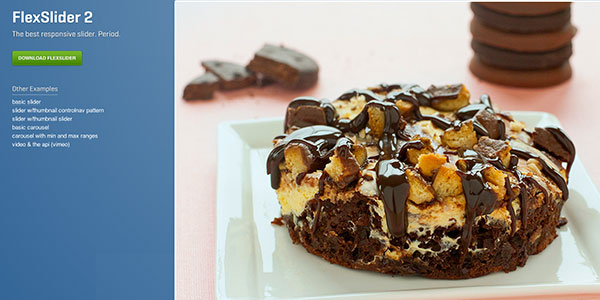
I use Flexslider more than any other image slider (responsive or not) so it’s a great place to start. Flexslider offers a fullly skin-able and customizable slider that works great across all screen sizes. I use it with both images and images with text/calls to action. It also offers both horizontal and vertical sliding as well as multiple slider support so you can have multiple image sliders on a single page. Definitely gets my vote!
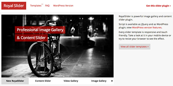
Another great slider that I have personal experience with. Royal Slider has a myriad of configuration options (my favorites being the “Gallery with Visible Nearby Images” or the “Video Slider”). The only thing keeping this plugin from the top spot is that it isn’t free (Flexslider is). However, a very affordable and super-powerful plugin awaits. There’s also a great wordpress version.
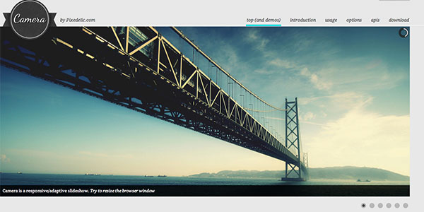
Camera slideshow is an open source project, based on Diapo slideshow and offers a variety of skin and customizable options. I’ve never personally used Camera but the documentation looks thorough and the sampel they provide in the demo looks really nice and clean.
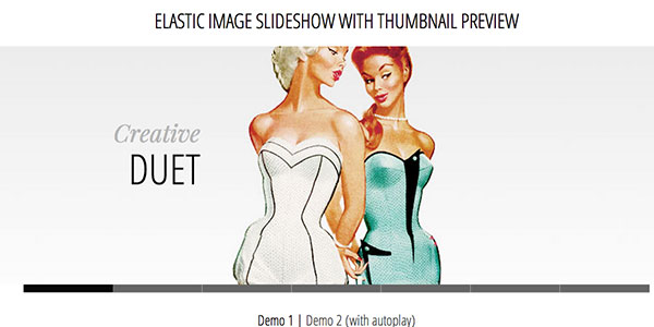
Elastic is presented in a tutorial fashion and includes the downloadable code to get you started using it on your site. This plugin has a much more specific look than some of the other plugins mentioned but there are some cool javascript animations being used.
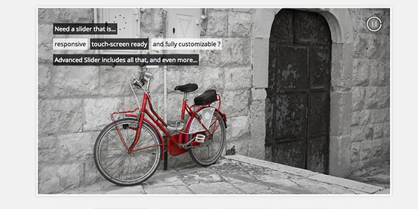
Another premium slider, Advanced Slider is fully responsive, mobile-ready, and can be used with either HTML markup or XML. The plugin also provides an easy to use API to customize it to your specific site. It comes with various pre-built styles that look nice out of the box.
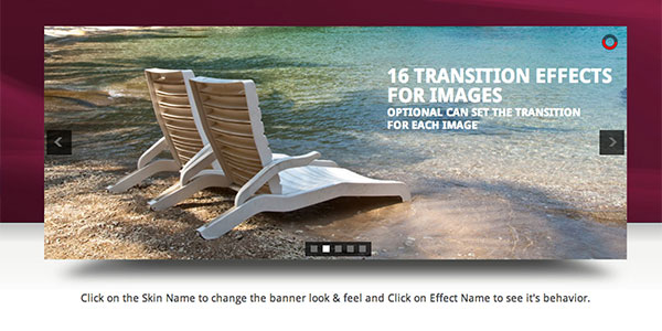
All In One is an Advanced Jquery Slider which comes in 5 flavors: Banner Rotator, Thumbnails Banner, Banner with Playlist, Content Slider, Carousel. It allows you to easily create powerful sliders with animated text using HTML standard tags, making the slider very easy to setup and maintain.
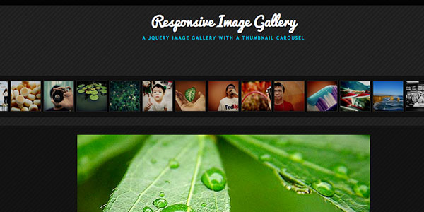
Another tutorial by Codrops on how to create a responsive image gallery with a thumbnail carousel using Elastislide. This slider is inspired by Twitter’s “user gallery” and is more useful for image galleries than a featured content carousel. But a free and great plugin nonetheless.
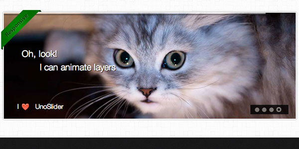
UnoSlider is a premium jQuery content slider plugin that’s core feature is the number of transition animations offered (the plugin developer claims “unlimited transition animations”). It’s also touch enabled, and offers a variety of other features similar to what’s been mentioned before.
Another great freebie by Codrops (sensing a trend here?). This responsive slider mixes in a little parallax effect (another popular trend). A parallax and responsive site? This plugin is for the ambitious designers out there.
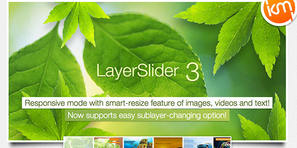
We’ll end with another parallax/responsive combo (this time a premium plugin). Layer Slider offers something really cool and unique: the ability to control an unlimited number of layers with individual animations. Combing this cool functionality with the responsive aspect and you have yourself a pretty powerful and extensible tool. I’ve had quite a bit of fun playing around with this on a few websites.
What other plugins do you use?
I’m sure I’ve left off some really great plugins and tutorials. But that’s where you come in. Let me know what I’ve missed and what plugins are your favorites. Feel free to post links to examples of these plugins in action. We’d love to see your great work!
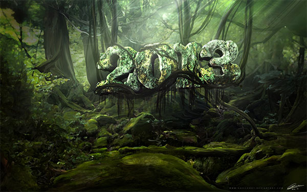
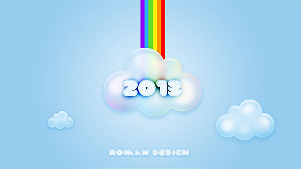
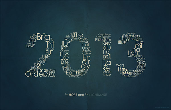
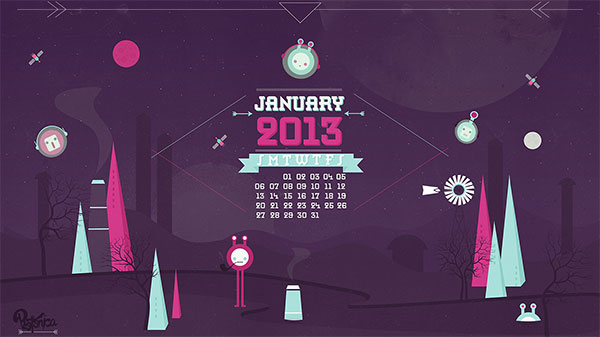
Welcome to 2013! To kick off another great year I’ve rounded up 13 of the best 2013 wallpapers. Start off the new year by making a plan to clean up your desktop. Once it’s clean, you’ll want to decorate with one of these great wallpaper designs. And if you’re looking for monthly calendars for January, head over to Smashing Magazine to see some really great January 2013 calendars. So find the wallpaper that fits your resolutions (pun intended) and here’s to a happy and productive New Years!
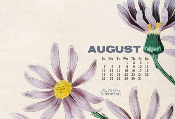
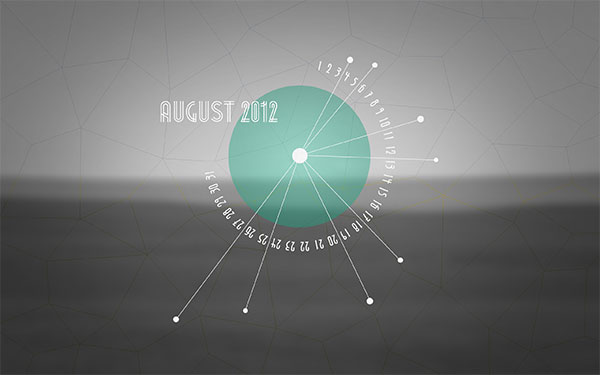
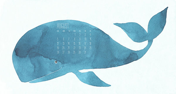
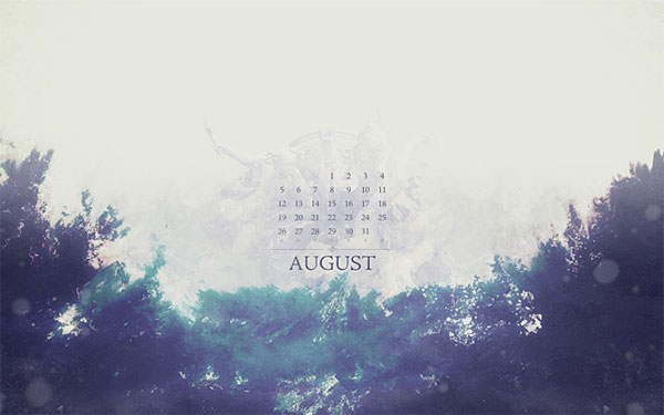
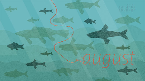
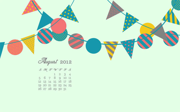
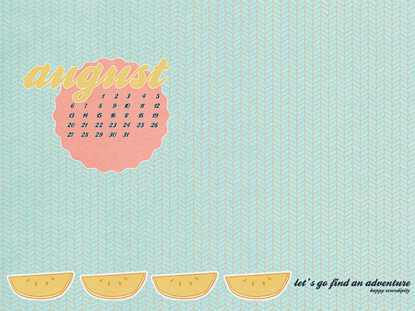
August desktop calendars just a couple days late. This collection of desktop calendar wallpapers will help keep your desktops fresh as we roll through the rest of the summer. As always, I’ve hand-picked wallpapers from talented artists and designers around the web. Feel free to share your favorites and check back next month for some great new desktop calendars. As always, if you’d like to include your own design in future roundups, let me know.
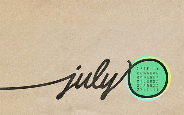
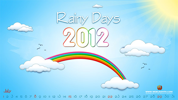
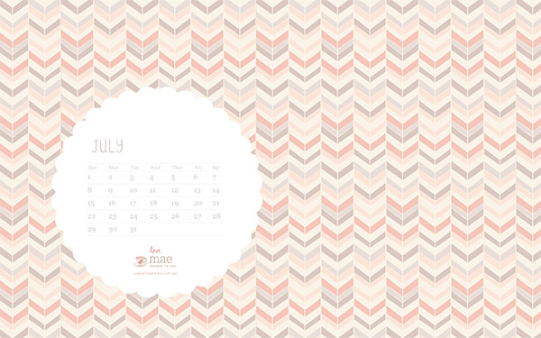
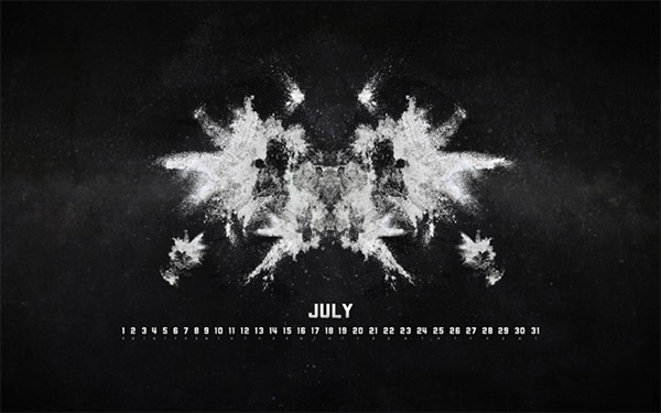
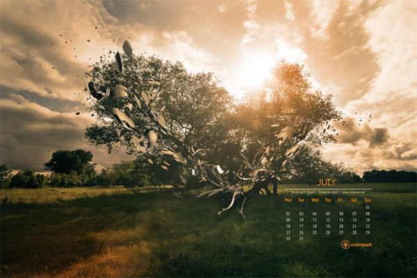
July desktop calendars are hot off the press. 2012 is halfway gone but these fun and inspiring calendar wallpapers will surely help you get through the dog-days of summer. These fine wallpapers have been hand-picked from talented artists and designers from around the web. Feel free to share your favorites and check back next month for some great new desktop calendars. As always, if you’d like to include your own design in future roundups, let me know.
Rainy days may be a title better served for the spring (depending on your location) but regardless, this illustrated desktop calendar provides some optimism for what is typically a scorchingly hot time of year.
Studio of Mae has another nice patterned wallpaper ready for July. As always the fonts and minimal calendar go nicely with the lovely background. Enjoy!
Abstract shapes bursting from an evening view of the shade tree on a farm. I absolutely love the color scheme. There’s also iPad and iPhone versions available.
That’s the roundup. Please let us know which calendar is your favorite by leaving a comment below.
Who else loves brushes in Adobe Illustrator? They’re fun to create and play with. As part of „Love Week”, I’m going to show you how to create a wedding confetti scatter brush. This is ideal for beginners as it doesn’t use the Pen Tool.
I’ll then show you how to use the brush to create a simple Graphic Style which can be used to create a stylish plaque or frame within wedding stationery.
There are many ways to create a heart shape in Illustrator. This is my preferred method as it gives an even shape, and it will introduce you to some handy features in the program.
Using the Ellipse Tool (L), create a circle. Use the Selection Tool (V) and Alt-Drag the circle to duplicate it so it’s slightly overlapping the original shape.
Step 2
Let’s combine the shapes by using the Pathfinder panel (Window > Pathfinder). Select both of the shapes and then click on the Unite button to make them one shape.
Step 3
The top of the heart is taking shape, so it’s time to form the bottom. You’ve got three anchor points at the bottom of the shape… let’s remove the ones either side of the central lower point using the Delete Anchor Point Tool (-). Mouse over the point you wish to remove with the tool and click it.
Step 4
The handles for the lowest point are creating an acute angle inwards to the shape. We can’t reverse that, but we can flatten it out.
With the Direct Selection Tool (A), click on the offending point. Along the top of the UI, you’ll see the options for Anchor Points. Select the first option, Convert selected anchor point to corner.
Step 5
With the point still selected, use the Down Arrow key on your keyboard to nudge the point down 30 points.
Then with the Direct Selection Tool (A), click on one of the side points. Plug the downward pointing handle bar halfway between the point and the bottom of the heart, making sure that the handle bars are still pointing in the same direction. Repeat this on the other side. This will complete your heart shape.
2. How to Create a Series of Colourful Hearts
Step 1
I’m going to be using a colour process by Beto Garza. He creates palettes by creating Blends between two shapes. I highly recommend his self-portrait tutorial.
So let’s first duplicate the original heart shape in the same manner as we duplicated the circles. Select the heart with the Selection Tool (V) and then hold-Alt-drag the shape alongside it, with enough space to fit say three further hearts in between.
Step 2
Select both hearts and create a Blend by going to Object > Blend > Mark or using Control-Alt-B. You’ll then get several hearts between each of your shapes.
To ensure you’ve got a total of five hearts, keep the blend selected and go to Object > Blend > Blend Options and select the spacing of Specified Steps and the value 3, as we want three original shapes on top of the two we have.
Step 3
When you look at the Blend group in the Layers panel, you’ll notice that when you drill into the group you’ll see three elements: the path (the line in which the blend follows) and the two original shapes. You can now select the two original shapes and alter their colours until you’ve got the gradient in colours you wish to use for your confetti. I’ve opted for a pastel pink (#f2a7cb) and indigo (#2e3192).
3. How to Arrange the Hearts
Step 1
Before we arrange the shapes in a circle-ish shape, let’s release them from the Blend. Select the Blend in the Layers panel and go to Object > Expand. This will turn the Blend into a group of five individual shapes.
Then let’s release the shapes from the group by keeping it selected and going to Object > Ungroup. You’ll see the shapes are now ungrouped in the Layers panel.
Step 2
Using the Selection Tool (V), arrange the shapes in a circle… it doesn’t have to be perfect as this will be skewed later on.
Step 3
Then using the Free Transform Tool (E), rotate each one of the hearts. The effect of the brush is to have the confetti randomised, so having the hearts at different angles plays to this effect.
Step 4
Let’s resize the hearts so they’re more randomised. With the Selection Tool (V), select a couple of the hearts. Then go to Object > Transform > Scale. I’ve reduced the size to 50%.
I then reduce the size of the other hearts to 40%, so there is a slight variation.
You’ll be left with something similar to the below before we create the brush.
4. How to Create a Scatter Brush
Step 1
Let’s get creating this brush. Select All (Control-A) and then open the Brushes panel (Window > Brushes). Click on the New Brush button along the bottom of the panel.
Step 2
You’ll be presented with a pop-up window asking which brush you wish to create; select Scatter Brush and click on OK. You’ll now have the Scatter Brush Options window.
Name your brush, and then let’s go through each one of these settings so you know why you’re selecting them.
Random: They’re all set to random, because we don’t want a uniform appearance to the scattered confetti. When selecting this option, you’ll get to set the parameters between specific values.
Size: As I created the hearts rather large, I’m giving the Size a small range and not varying it too much. The reason is that the confetti is not being viewed in perspective.
Spacing: This value is as low as it can be with a small variation. This is because the confetti will appear bunched together.
Scatter: Scatter refers to how much the shapes deviate from the path drawn… I want it relatively tidy.
Rotation: The shapes need to fall in random directions… therefore the rotation is set at both extremes.
Click on OK once you’re done.
Step 3
You can now apply your confetti brush to any path you wish… here it is on a straight line.
5. How to Create a Basic Frame
Step 1
So let’s use this brush to create a basic graphic. I’m going to add a fancy confetti frame around the names of our fictional couple, Gwen and Karen.
Using the Ellipse Tool (L), draw a circle behind the names so we know that the frame won’t overlap the names. Open up the Appearance panel (Window > Appearance).
Step 2
Click on the Stroke line where it has the brush and you’ll get a dropdown showing you the brushes in your Brushes panel. Select your confetti brush. By default, this will have a 1 pt Stroke Weight, which you can double check by clicking on the Stroke link (which takes you to the Stroke panel settings).
Step 3
Let’s add more confetti. With the Stroke line highlighted, click into the drilldown menu in the top-right corner and select Duplicate Item. This will duplicate all the values and settings in the Stroke line. We’re going to edit this slightly by clicking on the Stroke link and changing the Stroke Weight to 0.75 pt.
Step 4
Now drag the Fill line to the top of the Appearance panel and change the fill colour to white. This finishes our frame.
Step 5
If you want to save this pretty frame for future use, open the Graphic Styles panel while the design is selected and click on New Graphic Style. This will save it for future use to apply it to other shapes.
Awesome Work, You’re Done!
I hope you’ve enjoyed creating this multi-object confetti brush. If you’ve got any questions on creating this or you’ve completed the project, please shout off in the comments!
Making confetti brushes or scatter brushes in general can be a lot of fun. Knowing the settings to make these brushes is the key to making awesome creations. Why not check out more of the many scatter brush tutorials we have here on Envato Tuts+.
Designing wedding invitations can be scary—which style to choose? Which font to use? Go for pared-back elegance or flashy decadence? Vintage florals or modern minimalism? And above all, how to make it personal and special for the couple in question?
In this article, I’ll give you 10 top tips for designing wedding invitations, using some gorgeous templates as examples. Read on, and get inspired to create your own!
1. Choose a Style
Every invitation design will fall into a style category, or perhaps borrow from a couple of styles. Staying true to a particular style, especially if the couple are having a themed wedding, or love a particular period or genre, can be a great way of giving your invitation project a strong focus.
These are just a few of the design styles that work well for wedding invitations, and the qualities that each style brings to the design…
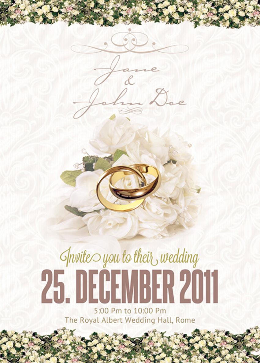
Traditional and Elegant: This style is classic, timeless and appropriate for both formal and informal weddings. You won’t risk offending any older members of the wedding party with this beautiful, tasteful style choice. Achieve the look of a traditional wedding invitation with script fonts, floral borders and dainty colors.
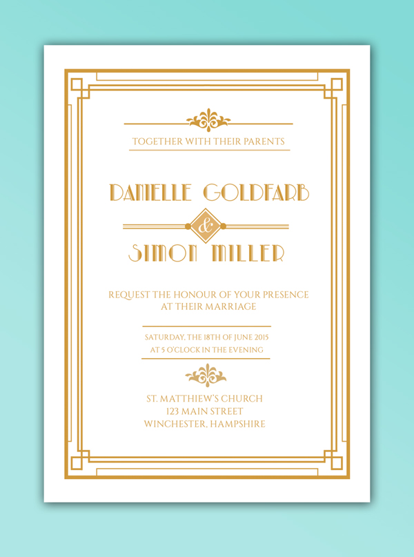
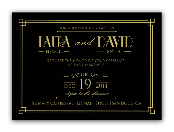
Art Deco: Another old-school style, but one that gives off a stronger vintage vibe, which can feel hip and on-trend. An Art Deco invitation style brings a lovely, symmetrical quality to your designs, like in the invitation example below, and adds a distinctly glamorous edge with lavish geometric designs and luxe colors, like gold, silver and jet black. You might want to allow for metallic foiling if you go with an Art Deco look.
Mid-Century Retro: This style borrows from 1950s design, but gives it a hip twist, making it look very relevant and ‘now’. Pastel colors, Americana-inspired typefaces and vintage-inspired graphics, like ribbons and badges, bring a fun, informal twist to this wedding invitation.
Choosing a style is a great place to get started with your designs. Even if you start out traditional, and add a twist of Art Deco with a 1920s-inspired font, mixing some of the main style genres will give your invitations an instantly recognisable and distinctive character.
2. Go for Timeless Typefaces
A font can make or break an invitation design. Step away from novelty, ‘out-there’ type styles, and choose typefaces that have lasting longevity.
Formal classics like Fournier and Caslon will prove to be timeless when the couple pulls out their wedding invitations decades later, and elegant scripts like Allura or Manglayang Script will always look occasion-appropriate.
Unless it’s a themed wedding, this might not be the time to experiment with a novelty font. Stay well away from grunge, marker-pen, and distressed fonts that might look cool, but will make your designs look too informal and flyer-like.
Look for typefaces that have a variety of weights too—you might fall in love with a particular font in a regular weight, but make sure there are italic and bold weights available too. Pulling out names and venues in different weights can divide up bulky text, and make the design appear more balanced. This Vakia font, for instance, is an elegant script with a timeless design.
Before you dive into designing your invitation, you need to consider a couple of practical issues. Yawn, I know, but nonetheless absolutely essential!
Firstly, what will the dimensions of your invitation be, and will it be oriented portrait or landscape?
Most invitations are designed to fit inside a standard envelope. If you’re sending your design to a professional printer, they may use their own standard-size envelopes for invitations, so your first task should be to get in touch with your printer and seek their advice on sizing. If you’re planning to save money and source the envelopes yourself, you should do this first, and size your invitation to fit your chosen envelope size. This wedding invitation stationery set features several card sizes that are sure to fit standard envelopes.
One more tip—don’t match the size of the invitation to the size of the envelope, as it will be too large to fit inside! Allow a few millimetres extra at least around the edge of the envelope.
Once you are happy with the dimensions of the invitation, you can decide whether to give the design a portrait or landscape orientation. Both can look lovely, but if you’re dealing with a lot of text (e.g. lengthy names or venue address) a portrait design might be more sensible. You won’t risk cramming text as easily as you might on a landscape design (Note: Save the Date and RSVP cards look especially lovely in landscape format).
Secondly, you need to consider how and where your invitation is going to be printed.
Dreaming of a letterpress finish? You’ll need to track down a letterpress specialist who is happy to produce the designs to the time restriction, quantity and price that you’re looking for.
Special printing effects like foiling and gloss printing can also stretch the purse strings, so make sure to not get too carried away (remember, often simple is best!) and shop around for the best deal if you do want something out of the ordinary.
4. News Alert! Florals Can Look Modern
Floral designs have a bad rep, and are often associated with old-fashioned, fusty styles.
I assure you, florals can look modern, and, when done well, strike that perfect (and sometimes elusive) balance of romance and modernity.
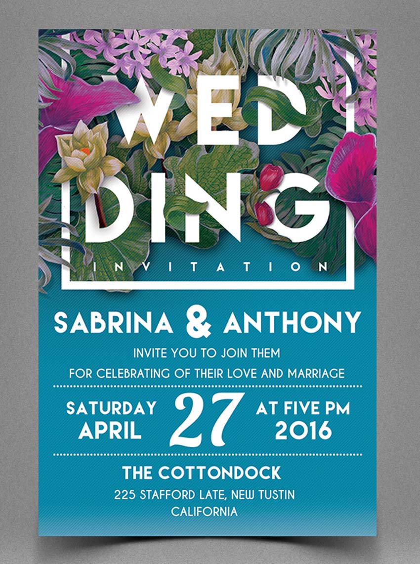
This floral wedding invitation unites modern typography with beautiful, watercolor-like flowers. And the blue background becomes a perfect contrast against the remaining subtle colors.
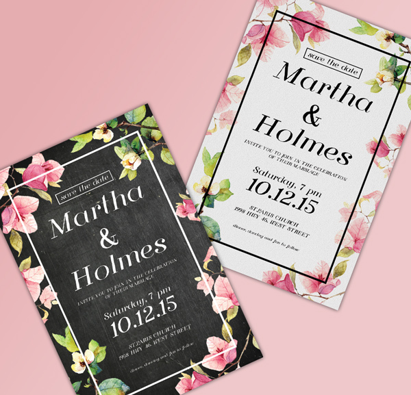
And this stylish wedding invitation is a perfect example of florals executed with a modern twist. The black background provides a stylish contrast to watercolor-style flowers in soft pinks and greens. The feature that makes it modern, not stuffy? Note the minimal white frame around the border of the design.
Photography is very under-used on wedding invitations. Designs tend to have a typographic or illustrative focus instead.
To give your wedding invitation a unique look, consider introducing photos onto the layout. This can also make your invitations look modern and fresh—ideal if you’d rather not go down the vintage route. You can even incorporate photos of the bride and groom to be, for an alternative photo-based wedding invitation.
To keep your design looking contemporary, set the photo as a background or border, like in this simple wedding invitation design below. This also allows you to make the invite customizable and unique—why not drop in different photos across a batch of invites, so guests receive their own unique invitation design?
When it comes to typesetting the text for your invitation, it’s best to follow a traditional, tried-and-tested formula. Even if your invites have a modern, unconventional design, you should still align your text centrally like this nautical-inspired wedding invitation.
Why? Aligning text centrally makes text appear instantly more formal and important, and distinguishes the invitation as something important and notable. Smaller chunks of text (e.g. names and dates) also look more organized and more elegant when aligned centrally. Flushing the text off-center can make headers look a little messy.
So when you come to arrange the text on your design, make sure to drag a vertical guide out to the dead-center of the page, whichever software you choose to use, and ensure that all text frames are aligned absolutely centrally.
You can also impose a hierarchy on the text by applying a variety of weights and font sizes to different sections. Try setting the names of the couple in a large size italic, the date and time of the event in bold (you don’t want anyone to forget this!) and extra items like dress code in a smaller size and a light or regular weight.
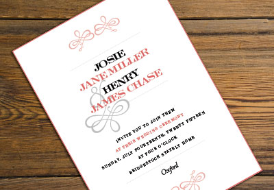
Consider separating different sections of the text using dividers (try ribbon banners for vintage styles, or elegant scripted flourishes for a traditional design, like in the elegant wedding invitation shown below) to make the information more digestible too.
The humble ampersand, the squiggly ‘&’ used to indicate ‘and’, is your new best friend when it comes to designing wedding invitations.
Particularly when sandwiched between the names of the couple, an ampersand looks elegant, dramatic and interesting, without distracting from the text around it. Replace a useless and sorry-looking ’and’ with a decorative substitute instead! This Risthi Script provides a gorgeous ampersand perfect for wedding designs like the one below.
You’d be amazed at how simple changes to color on your design can transform the whole look and feel of the invitation. I’m a big believer in the effectiveness of simple, minimal designs, and color is a great way of adding personality and theme to an otherwise classic, functional layout.
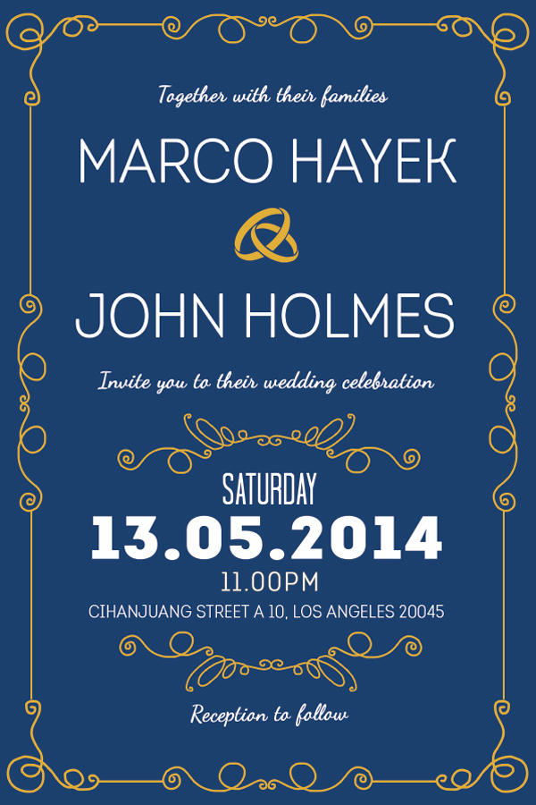
Take this winter-worthy example of a wedding invitation. The moody, deep blue background and crisp white text is a world away from the traditional white/cream background with dark text.
The invitation’s dramatic colors are perfectly suited for a winter wedding, but the design could easily be switched up to lighter pastel shades to create an entirely different look.
Don’t underestimate the high-contrast impact of monochrome designs too. A black and white palette can look glamorous, classic and fashionable all at the same time. Drop in a touch of gold or silver foiling for an extra-special color combination.
Once you’re happy with the basic layout of your invitation, including text, graphics and borders, experiment with different color combinations, and consider showing these options to the couple to help them feel involved in the process. This colorful wedding invitation shows that this unique style is successful with many different color combinations.
Color is an easy thing to change, but the core elements of the design might be more tricky to rethink; choosing color is an easy gateway into the design process if you’re designing for a client or friend.
9. If in Doubt, Keep It Classic
Classic invitation designs will always be in style, and suit a broad range of events and personal tastes. Unless the wedding has a strong theme, a traditional design will work really well, and, if designed beautifully, be treasured forever by the couple and their guests. This classy wedding invitation features gorgeous script fonts with floral elements that work perfectly for any wedding.
To keep your classic design looking modern, not stuffy, try to balance the design’s feminine and masculine elements. Straight, fuss-free line dividers and a geometric border give this design a masculine edge, while the scripted italics bring a feminine touch.
Why not introduce just one unconventional element to an otherwise classic design? In this example of a classic wedding invite, the typeface has a distinctly vintage vibe, and the dark background keeps it looking glamorous, not staid.
Whatever style of invitation you choose for your design, try to keep in mind who the couple are, and what their personal tastes are like.
If you’re designing an invitation for your own wedding, this is unlikely to be a problem. But if you’re designing for a relative, a friend, or a client, try not to get carried away. People commission designers as they want expertise and advice, but wedding invitations are particularly personal, and couples can be deeply disappointed if they wanted a folksy floral design and received a flashy Art Deco creation in its place!
One certain way to avoid this clash of tastes is to have the couple give you a set brief from the very beginning. Ask them what styles they like (e.g. vintage, elegant, contemporary), and show them some examples to fire their interest and give you a better idea of what they’re looking for. A couple that loves vintage-inspired fashion and furniture might also love something like this fun retro wedding invitation design.
You’ll never know a person’s individual preferences unless you ask! It’s also really useful to ask the couple what they definitely don’t like too. There’s no point spending ages perfecting a floral border if flowers just aren’t their thing.
Another important practical issue to consider is the couple’s budget, and take this into account when you put together the design—gold foil can look lovely, but it can also be expensive for bargain-hunting couples. Try a simple pattern design instead, like this retro wedding invitation that features unique pattern elements.
To conclude, I’ve covered a number of helpful tips and tricks to get you started with creating your own wedding invitation designs. To get started with designing your own invitations, you can:
Choose a Style: Pick a well-known design style, such as Art Deco or Traditional, to help steer your ideas and give the design focus
Go for Timeless Typefaces: Classic fonts that have stood the test of time will always look great on invitations, and will ensure your design never goes out of style.
Think About the Practicalities: Consider important issues like sizing, orientation and print finish before getting stuck into designing. You won’t regret it later!
Keep Floral Designs Modern: Floral designs are a romantic, traditional choice for wedding invitations, but they don’t need to look stuffy. Try out abstract illustrations, and contrast against dramatic background color for a design that looks thoroughly contemporary.
Consider Using Photography: If you’re looking for a unique design that looks fresh and modern, introducing photography into a background or border might be the way to go.
Align Your Type Centrally: Sure, you can flush your type left or right if you want to, but 99% of the time, aligning your text centrally is going to make your typography look way better.
Embrace the Ampersand: Replace clumsy ands with decorative ampersands (&) for elegance and added interest.
Use Color to Transform Your Designs: Avoid reinventing the wheel all the time by switching up the colors of your design instead of changing the main elements of the layout.
If in Doubt, Keep It Classic: Personal tastes can differ, and design trends may come and go, but classic designs will always have an appeal in wedding invitation design. Add a modern twist to traditional designs to inject a bit of personality.
Above All… Always Make It Personal: Get to know the couple’s tastes and the vision they have for their wedding day. Can you bring those two factors together into one unified design? Keep the couple involved in the design process without compromising your creative ideas, by allowing them to choose a color scheme for the invitations from a selection you prepare for them.
If you use these ten tips as a starting point for your invitation design, you are well on your way to creating an invitation that’s going to be super-special.
If you’re still feeling a bit lost and in the dark (it happens to us all!), take a look again at some of the great templates featured in the article above, and see if one of those will fit the bill. You can also browse a wider selection of wedding invitation templates to find the perfect style for your event.
Wedding Invitation Tutorials From Envato Tuts+
Need more inspiration? Check out these amazing wedding invitation tutorials below, featuring incredible print designs for elegant, modern weddings. Try them out for fun, or incorporate these designs into your special day!
Since this week is all about love, we’re going to continue the theme and create a „Share the Love” icon pack to explore the different ways in which you can express
your feelings in the digital era.
We’re going to be creating
all three icons using basic geometric shapes combined with some of the primary
tools that you probably already work with on a daily basis.
So, without wasting any more time, grab a
cup of that sweet coffee and let’s get started!
Oh, and before I forget, you can always
expand the project by checking out GraphicRiver, where you can find tons of love-themed icons.
1. How to Set Up a New Document
Since I’m pretty sure you already have
Illustrator up and running in the background, bring it up and let’s set up a New Document (File > New or Control-N)
using the following settings:
Number
of Artboards: 1
Width: 800
px
Height: 600
px
Units: Pixels
And from the Advanced tab:
Color
Mode: RGB
Raster
Effects: Screen (72ppi)
Preview Mode: Default
Quick
tip: some of you might have noticed that the Align New Objects to Pixel Grid option
is missing. That’s because I’m running the new CC 2017 version of the
software, where great changes have been made to the way Illustratorhandles the way shapes snap to the underlying pixel grid.
2. How to Set Up a Custom Grid
Since we’re going to be creating the icons
using a pixel-perfect workflow, we’ll want to set up a nice little grid so that we can have full control
over our shapes—that is if we’re running the older version of the software.
Step 1
Go to the Edit > Preferences > Guides &
Grid submenu, and adjust the following settings:
Once we’ve set up our
custom grid, all we need to do in order to make sure our shapes look crisp is
enable the Snap to Grid option found
under the View menu, which will
transform into Snap to Pixel each
time you enter Pixel Preview mode.
Now, if you’re new to the whole
“pixel-perfect workflow”, I strongly recommend you go through my how to create
pixel-perfect artwork tutorial, which will help you widen your technical skills
in no time.
3. How to Set Up the Layers
With the New Document created, it would be
a good idea to structure our project using a couple of layers, since this way
we can maintain a steady workflow by focusing on one icon at a time.
That being said, bring up the Layers panel, and create a total of
four layers, which we will rename as follows:
layer 1: reference grids
layer 2: phone sharing
layer 3: email sharing
layer 4: im
sharing
4. How to Create the Reference Grids
The reference grids(or base grids)
are a set of precisely delimited reference surfaces, which allow us to build
our icons by focusing on size and consistency.
Usually, the size of the grids determines
the size of the actual icons, and they should always be the first decision you
make on you start a new project, since you’ll always want to start from the
smallest possible size and build on that.
Now, in our case,
we’re going to be creating the icon pack using just one size, more exactly 128 x 128 px, which is a fairly large
one.
Step 1
Start by locking all
but the reference grid layer, and then grab the Rectangle Tool (M) and create a 128 x 128 px orange (#F15A24) square, which will help define the
overall size of our icons.
Step 2
Add another smaller 120 x 120 px one (#FFFFFF) which will
act as our active drawing area, thus giving us an all-around 4 px padding.
Step 3
Group the two squares composing the
reference grid using the Control-G keyboard
shortcut, and then create two copies at a distance of 40 px from one another, making sure to align them to the center of
the Artboard.
Once you’re done, lock
the current layer and move on to the next one, where we’ll start working on our
first icon.
5. How to Create the Phone Sharing Icon
With the document all set up, let’s kick
off the project by making sure that we’re on the right layer (that would be the
second one) and then zooming in on the first reference grid so that we can have
a better view of our icon’s shapes.
Step 1
Start working on the
left phone by creating its body using a 56
x 94 px rounded rectangle with an 8
px Corner Radius, which we will color using #C4CEE8 and then position in the underlying active drawing area’s bottom-left corner, making sure to leave a 4 px gap for its outline.
Step 2
Give the shape
that we’ve
just created an outline, by creating a copy of it (Control-C) which we will paste in front (Control-F) and then adjust by changing its color to #2B3249, and
then setting its Weight to 8 px.
Once you’re done,
select and group both shapes together using the Control-G keyboard shortcut.
Step 3
Start working on the
phone’s display by creating a 32 x 58
px rectangle, which we will color using #8195C1 and then horizontally center
align to the two shapes that we’ve just grouped, at a distance of 12 px from the top edge of the fill
shape’s visible surface.
Step 4
Give the display an 8 px thick outline (#2B3249) using the Stroke method, selecting and grouping (Control-G) both shapes together
afterwards.
Step 5
Create the phone’s
bottom circular button, using an 8 x 8
px circle which we will color using #2B3249 and then center align.
Step 6
Turn on Pixel Preview mode, and using the Pen Tool (P) draw in the front-facing
speaker unit, using a 12 px wide, 4 px thick Stroke with a Round Cap,
which we will color using #2B3249 and then center align to the visible surface
of the phone’s upper section.
Step 7
Create the phone’s
power button using a 12 x 4 px rectangle,
which we will color using #2B3249 and then position onto the larger outline, at
a distance of 12 px from the active
drawing area’s left edge.
Step 8
Adjust the shape that
we’ve just created by setting the Radius of its top corners to 2 px from
within the Transform panel’s Rectangle Properties, selecting and
grouping (Control-G) all of the phone’s
composing shapes together afterwards.
Step 9
Create the second
phone using a copy (Control-C >
Control-F) of the one that we’ve just finished working on, which we will
reflect both horizontally and vertically (right
click > Transform > Reflect > Horizontal / Vertical), and then
position onto the right side of the active drawing area, aligning it to its top
edge.
Step 10
Start working on the
little heart by creating a 20 x 20 px circle,
which we will color using #ED664C and then position onto the left phone’s display, at a distance
of 9 px from its top edge and 6 px from its left edge.
Step 11
Continue working on the
heart by creating two more 20 x 20 px circles
(#ED664C), positioning one on the right side so that it ends up overlapping the surface of the first one by 4 px,
and the last one at the bottom, so that it overlaps the surface of the other two by 8 px.
Step 12
Once you have all three
circles in place, select and then unite them into a single larger shape using Pathfinder’s Unite Shape Mode.
Step 13
Adjust the resulting shape
by removing the center anchor points created during the uniting process, by
simply clicking on them using the Delete
Anchor Point Tool (-).
Step 14
Continue adjusting the
new shape by selecting its anchor’s handles and dragging them so that you get a
nice curvature on each of its sides. Once you’re done, give the resulting shape
an 8 px thick outline (#2B3249) with
a Round Join, selecting and grouping
both shapes together afterwards.
Step 15
Since we’ll want the
heart to remain within the visible surface of the phone’s display, we’ll have
to mask it using a 24 x 50 px rectangle
(highlighted with yellow), which we will center align to the display. Then,
simply select both the heart and the rectangle, right-click and select Make
Clipping Mask, making sure to group it and the left phone together using the Control-G keyboard shortcut.
Step 16
Finish off the icon by creating a copy of
the masked heart and then center aligning it to the right phone’s display,
making sure to flip it vertically (right
click > Transform > Reflect > Vertical).
Once you have it in
place, group (Control-G) it along
with the phone, doing the same for all of the icon’s composing sections
afterwards.
6. How to Create the Email Sharing Icon
Assuming you’ve
already moved on up to the next layer (that would be the third one), zoom in on
the second reference grid and let’s get started.
Step 1
Create the envelope’s
main body using a 96 x 64 px rectangle,
which we will color using #ED664C and then center align to the underlying
active drawing area, at a distance of 4
px from its bottom edge.
Step 2
Adjust the shape that
we’ve just created by setting the Radius
of its bottom corners to 8 px from
within the Transform panel’s Rectangle Properties.
Step 3
Give the resulting shape
an 8 px thick outline (#2B3249)
using the Stroke method, only this
time set its Corner to Round Join, making sure to select and
group (Control-G) both shapes
together afterwards.
Step 4
Create the envelope’s
upper section using a 96 x 64 px rectangle,
which we will color using #BF402E and then center align to its bottom section,
positioning it so that its lower half overlaps it.
Step 5
Turn the shape that
we’ve just created into a diamond by adding a new anchor point to the center of
each of its edges using the Add Anchor
Point Tool (+), and then removing its corner ones (highlighted in the
reference image) using the Delete Anchor
Point Tool (-).
Step 6
Give the resulting
shape an 8 px thick outline (#2B3249)
making sure to set the Stroke’s Corner to Round Join, selecting and grouping (Control-G) the two shapes together afterwards.
Step 7
Select the Pen Tool (P) anddraw in the envelope’s two diagonal detail lines using an 8 px thick Stroke (#2B3249) with a Round Cap.
Step 8
Create the letter’s
main body using a 64 x 80 px rounded
rectangle with an 8 px Corner Radius,
which we will color using #F4E9E9 and then center align to the underlying
active drawing area, at a distance of 4
px from its top edge.
Step 9
Give the shape that
we’ve just created an 8 px thick
outline (#2B3249), selecting and grouping both shapes afterwards using
the Control-G keyboard shortcut.
Step 10
Quickly unlock
the previous layer, and create a copy (Control-C)
of the heart that we’ve masked and paste it back (Control-F) onto the current layer,
center aligning it to the envelope’s letter, positioning it at a distance of 8 px from the fill shape’s visible
surface.
Then, once you’re
done, select and group them both using the Control-G keyboard shortcut.
Step 11
Mask the two shapes that
we’ve just grouped by creating a copy (Control-C)
of the envelope’s upper section, which we will paste in front (Control-F) and then adjust by removing
its top anchor point. Then close up the path so that it follows the width
of the envelope itself.
Step 12
Now, as you can probably already see, we’ll
need to isolate the mask by double-clicking on it, and then add a copy of the
pocket outline’s downward-facing section in order to correctly mask the surface of
the letter.
Once you’re done, you
can then select the masked shapes and the envelope’s upper section and group (Control-G) them so that they
won’t get separated by accident.
Step 13
Select the Pen Tool (P) and, using a 4
px thick Stroke (#2B3249), draw
the front section of the arrow, making sure to set the Cap and Corner of the
head section to Round.
Take your time, and
once you’re done, select and group the two paths using the Control-G keyboard shortcut.
Step 14
Draw in the back
section of the arrow using a 28 px wide 4 px thick Stroke (#2B3249) which we will position between the active
drawing area’s left edge and the letter’s outline.
Step 15
Create the little fletches using a 12 x 12 px square, which we
will color using #EAA74E and then center align to the arrow’s back section, at a
distance of 2 px from the active
drawing area’s left edge.
Step 16
Adjust the shape that we’ve
just created by adding a new anchor point to the center of each of its side
edges using the Add Anchor Point Tool
(A),and then selecting and
pushing them to the right by a distance of 6
px using the Move tool (right click > Transform > Move >
Horizontal > 6 px).
Step 17
Finish off the
icon by giving the resulting shape a 4
px thick outline (#2B3249) with a Round
Join, grouping (Control-G) and
then sending them both to the back of the arrow’s back section (right click > Transform > Arrange
> Send to Back).
Once you’re done, don’t
forget to select and group all of the icon’s composing sections using
the Control-G keyboard shortcut.
7. How to Create the IM Sharing Icon
We’re now down to our third and last icon,
so assuming you’ve already moved on up to the last layer, zoom in on its
reference grid and let’s finish this.
Step 1
Create the left text
box’s main body using an 88 x 68 px rectangle,
which we will color using #C2A6DD and then position in the top-left corner of
the underlying active drawing area, leaving a 4 px gap around it for its outline.
Step 2
Adjust the shape that
we’ve just created by setting the Radius of its top and bottom-right corners to 8
px from within the Transform panel’s Rectangle Properties.
Step 3
Switch over to Pixel Preview Mode (Alt-Control-Y) and then using the Add Anchor Point Tool (+) add a new
anchor point to the text box’s bottom edge, positioning it at a distance of 20 px from its left side.
Step 4
Continue adjusting the
shape by selecting its bottom-left anchor point using the Direct Selection Tool (A), and then pushing it to the bottom by 16 px using the Move tool (right click > Transform >
Move > Vertical > 16 px).
Step 5
Give the resulting
shape an 8 px thick outline (#2B3249)
with a Round Join, and then select
and group both of them together using the Control-G keyboard shortcut.
Step 6
Create a copy (Control-C) of the little heart from one
of the previous icons, and then paste (Control-F)
it onto the current layer, center aligning it to the text box’s body.
Step 7
Create the
little dots using three 6 x 6 px circles at a distance of 2 px from one another,
which we will color using #2B3249, group (Control-G), and then position onto the bottom-right corner of the text box, leaving a 4 px gap around them.
Once you’re done, select and
group all the shapes that we’ve created so far using the Control-G keyboard shortcut.
Step 8
Create a copy (Control-C > Control-F) of the left
text box’s fill and outline, and align them to the underlying active drawing
area’s bottom-right corner, making sure to horizontally flip them afterwards (right click > Transform > Reflect
> Horizontal), changing the fill shape’s color to #9F88BA.
Step 9
Turn on Pixel Preview mode (Alt-Control-Y) and draw the little
text lines using an 18 px wide, 4 px thick Stroke line (#2B3249) followed by another 34 px wide, 4 px thick
line at a distance of 4 px from it.
Group (Control-G) the two shapes and
then position them at a distance of 8 px from the text box’s left and bottom edges.
Step 10
Finish off the icon by selecting and
grouping (Control-G) all of the
right text box’s composing shapes together, sending them to the back afterwards
(right click > Arrange > Send to
Back).
Oh, and don’t forget to group
all of the icon’s composing sections as well since you don’t want them flying
around.
It’s a Wrap!
There you have it—a nice little icon pack that you can use to share your love
with that special someone. I hope you’ve managed to follow each and every step
and had as much fun as I did during the process.
Go to Edit > Presets > Preset Manager, and choose Patterns from the Preset Type drop-down menu.
Then, click the little arrow to the right of the Preset Type drop-down menu, and click the Nature Patterns set. When the dialog box appears after that, just click Append.
Step 2
Create a new 1000 x 1000 px document, and duplicate the Background layer.
Rename the copy layer to Texture, and then right-click it, and choose Convert to Smart Object.
2. How to Create a Foil Texture Using Filters
Step 1
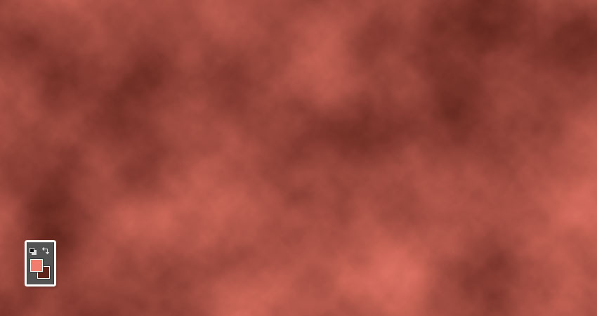
Set the Foreground Color to #f07d6d and the Background Color to #5e231b, and go to Filter > Render > Clouds.
These colors will help create a copper texture, but you can choose other colors if you like to get different results as well.
Step 2
Go to Filter > Filter Gallery > Distort > Glass, and use these settings:
Distortion: 15
Smoothness: 3
Texture: Frosted
Scaling: 100
Step 3
Click the New effect layer icon at the bottom right corner of the Filter Gallery window.
Step 4
Choose the Glass filter again, but this time, use these settings:
Distortion: 20
Smoothness: 3
Texture: Canvas
Scaling: 100
3. How to Adjust a Texture’s Coloring
Step 1
If you’re working with older versions of Photoshop, you’ll need to add adjustment layers, by clicking the Create new fill or adjustment layer icon at the bottom of the Layers panel.
Step 2
For newer versions, however, you can apply the adjustments directly to the smart object layer.
So go to Image > Adjustments > Hue/Saturation, and change the Hue to 15.
Step 3
Go to Image > Adjustments > Levels, and change the Highlights to 13 and the Shadows to 201.
You can save this file to keep a copy of the original texture.
4. How to Convert a Texture Into a Pattern
Step 1
Right-click the Texture layer and choose Rasterize Layer.
Step 2
Pick the Rectangular Marquee Tool, and then create a selection that covers about 1/3 to 1/2 of the upper part of the texture.
Step 3
Press the Command-Shift-J keys to cut and paste the selected area in a new layer.
Step 4
Use the Move Tool to place the duplicated part right below the original. You can hold the Shift key while doing so to avoid moving the rectangle to the sides.
Step 5
Go to Image > Reveal All, and make sure that there are no spaces between both rectangles.
Step 6
Go to Image > Trim, and then choose the Top Left Pixel Color option under the Based On tab, check all the Trim Away tab boxes, and click OK.
Step 7
Press Command-E to merge both layers together.
5. How to Create and Define a Seamless Pattern
Step 1
Pick the Healing Brush Tool, and then hold the Option key to sample an area near the line where both rectangles meet.
Then use a round brush tip, with Size and Hardness values depending on the result you want, and paint over the line to get rid of it.
It is better to keep sampling and painting over small portions of the line, to make sure you get a neater result.
Step 2
You can use any other healing tools you like. Just make sure to stay as close to the line as possible, and not alter the texture to the point where it gets blurry and pixelated.
Step 3
Repeat the same steps for the vertical side of the texture.
So create a selection that covers about 1/3 to 1/2 of the left side of the texture, press Command-Shift-J, move the duplicated part until it meets the right side’s edge, and then Reveal All, Trim, and merge.
Step 4
Use the healing tools to make the edge seamless.
Step 5
Go to Edit > Define Pattern, and type Foil for the Name.
6. How to Create Text
Step 1
Create a new 1000 x 1000 px document, and then place the Black Paper Texture image on top of the Background layer, and resize it as needed.
Step 2
Create the text using the font Hensa, and set the Size to 150 pt.
Step 3
If you have more than one line of text, you might need to adjust the Leading values for each of the lines to get evenly spaced text.
Step 4
Duplicate the text layer, and change the copy’s Fill value to 0.
7. How to Create Frame Shapes
Step 1
Pick the Rectangle Tool, and then create a rectangle or a square around the text you have.
Step 2
In the Options bar, set the Fill to None and the Stroke Size to 7. Then, click the Set shape stroke type icon, and change the Align to Center.
Step 3
Duplicate the rectangle shape layer, and then press Command-T to enter Free Transform Mode, and scale the copy rectangle up to create an outer frame.
When done, hit the Return key to accept the changes.
Step 4
Rename the original rectangle layer to Inner, and the copy’s to Outer.
Step 5
Duplicate both shape layers, and change the copies’ Fill value to 20.
8. How to Style a Foil Effect
Double-click the original text layer to apply the following layer style:
Step 1
Add a Bevel and Emboss with these settings:
Style: Emboss
Size: 0
Check the Anti-aliased box
Highlight Mode: Linear Light
Opacity: 20%
Shadow Mode:
Opacity: 0%
Step 2
Add a Contour with these settings:
Contour: Cone
Check the Anti-aliased box.
Range: 100%
Step 3
Add a Texture with these settings:
Pattern: Spiky Bush
Depth: 50%
Step 4
Add a Gradient Overlay with these settings:
Check the Dither box
Blend Mode: Multiply
Opacity: 20%
Angle: 22
Use the aluminum 130 gradient fill
Step 5
Add a Pattern Overlay with these settings:
Pattern: Foil
Scale: 50%
Step 6
This will style the main foil effect.
Right-click the styled text layer, choose Copy Layer Style, and then select the Inner and Outer shape layers, right-click any of them, and choose Paste Layer Style.
9. How to Create a Subtle Embossed Effect
Step 1
Double-click the copy text layer to apply a Bevel and Emboss effect with these settings:
Size: 1
Check the Anti-aliased box
Highlight Mode: Overlay
Opacity: 50%
Shadow Mode:
Opacity: 30%
Step 2
Copy and paste the layer style to the copy Inner and Outer layers.
Congratulations! You’re Done
In this tutorial, we used a couple of filters and adjustments to create a foil texture. Then, we worked on turning the texture into a seamless pattern, using healing tools. Finally, we created text and frame layers, and styled them to achieve the foil effect.
Please feel free to leave your comments, suggestions, and outcomes below.
Looking for the right WordPress theme can be a chore. One looks better than the last one; and, after a while, they all begin to look alike. If this has been your experience, look no further. To get the New Year off to a great start, we’ve listed several features you should be looking for […]