Archiwum kategorii: Web Tools

How to Create a Set of Flat Clock Icons in Adobe Illustrator

Post pobrano z: How to Create a Set of Flat Clock Icons in Adobe Illustrator

Final product image
What You’ll Be Creating

Despite the fact that many people nowadays use their smartphones to check the time, the clock remains one of the most popular items of the interior. There is a huge
variety of shapes and colors and types of clock around us: kitchen timers, alarm
clocks, flip clocks, wall clocks, cabinet clocks, and many other kinds of clock.

In this
tutorial we’ll be creating three different types of clock in a trendy flat
style, applying solid colors and geometric shapes. We’ll learn to design the
clock face, working with the Rotate Tool
and using other handy tools and functions of Adobe Illustrator.

By the end
of this tutorial, you’ll be able to create any kind of flat objects, whether
those are flat clock icons or cooking icons or anything else. Make sure you’ve
browsed the vector section of GraphicRiver for more inspiration. And let’s
start! 

1. How to
Design a Kitchen Timer

Step 1

We’ll start
by making the clock face. Use the Ellipse
Tool (L)
to create a 95 x 95 px
light-beige circle.

Copy the circle and Paste in Back (Control-C > Control-B). Scale the copy up to 175 x 175 px, setting its new size either
in the control panel on top or in the Transform
panel. Make the Fill color a bit
darker.

make the clock face from ellipse

Step 2

Let’s
depict the minute and second graduation marks of the clock face, starting from the top.
Grab the Line Segment Tool (\) or
the Pen Tool (P), hold Shift and make a short line with red Stroke color. Head to the Stroke panel and set the Weight to 2 pt and Cap to Round Cap, making the line thick enough
and rounded at the tips.

create strokes for the graduation

Step 3

Select the stroke with the Selection Tool (V), hold Alt-Shift and drag down to make a copy at the bottom of the clock face. Group (Control-G) the created strokes. 

Make sure
that both strokes are centered perfectly. To do this, select the strokes together
with the circle and click the circle once again to make it a Key Object. Open the Align panel and click Horizontal Align Center.

Duplicate (Control-C > Control-F) our group of strokes and rotate the copy 90 degrees.

align and add more strokes

Step 4

Now we’ll
be adding minor graduations for 60 seconds. Duplicate
those vertical red strokes that we created earlier, change the Stroke color to brown, and set the Weight to 1 pt. You can make the red strokes invisible by clicking the eye icon in the Layers panel in order not to be distracted by them.

add minor graduation

Step 5

Keeping our
group of strokes selected, double-click
the Rotate Tool (R) and set the Angle to 360/60 in order to calculate the value automatically. Click Copy to create a new pair of strokes.
Press Control-D to repeat the last
action and continue pressing Control-D
to add all 30 pairs of strokes.

Now we can make the red strokes visible again and Bring
them to Front (Shift-Control-]),
above the brown strokes.

use the rotate tool to add graduation

Step 6

Now we’ll
move on to the body or the case of our timer. Take the Rectangle Tool (M) and make a 140 x 145
px
red rectangle. Send it to Back (Shift-Control-[), beneath the clock face.

Select both the left and right top anchor points of the rectangle with the Direct Selection Tool (A) and pull the circle markers of the Live Corners to make the top of the
shape fully rounded.

make the case from the rectangle

Step 7

We can
also set the Corner Radius of the
top corners to 15 pt in the control
panel on top, while keeping them selected with the Direct Selection Tool (A).

Now we’ll
add some dimension to our shape, creating a rim around the clock case.
Select the case and go to Object >
Path > Offset Path
and set the Offset
value to 5 px, leaving all other
options as default. Make the new shape a bit darker.

apply offset path to add dimension

Step 8

Take the Rounded Rectangle Tool and let’s add a
small stand in the bottom of the case. Create a 115 x 15 px dark-red shape with 7.5
px Corners.

add a rectangular stand to the clock

Step 9

Let’s add a
hand to our timer. Take the Ellipse
Tool (L)
and make a 25 x 90 px red
oval. Pick the color from the case of the clock using the Eyedropper Tool (I).

Duplicate the oval and squash it to 9 x 88 px, making the top shape a bit
lighter.

add an oval tumbler to the timer

Step 10

Switch to
the Rectangle Tool (M) and make a 33 x 55 px dark-red shape. Send it Backward, beneath the hand, by pressing Control-[ twice.

Make the
top corners of the shape slightly rounded, setting the Radius to 9 px.

add details to the tumbler

Step 11

We need to
make the bottom of the shape slightly arched to make it fit the clock face.
Take the Curvature Tool (Shift-‘)
and pull the bottom edge down to bend it.

use the curvature tool to bend the shape

Step 12

Let’s add a
final detail to our timer: a gentle highlight over the plastic case. Use the Rectangle Tool (M) to make a 55 x 190 px shape of a slightly lighter
red color than we have for the case.

Select both
the case and the rectangle and take the Shape
Builder Tool (Shift-M)
. Hold Alt
and click the top piece of the rectangle to delete it.

use the shape builder tool to delete the unwanted part

Step 13

Delete the
bottom piece of the rectangle using the same method—and there we have it! Our
kitchen timer is finished!

Let’s move
on to the next clock.

kitchen timer is finished

2. How to
Create a Flip Clock

Step 1

We’ll start
designing our flip clock from its screen. Arm yourself with the Rounded Rectangle Tool and make a 170 x 85 px light-yellow shape with 8 px Corner Radius.

Keeping the
shape selected, go to Object > Path
> Offset Path
and apply 10 px
Offset
value. Fill the new shape with dark-green color.

make a screen from rectangle and offset path

Step 2

This time
either apply Offset Path once again
or just create a new rectangle of 210 x 130
px
size beneath the previous two. Fill it with vivid turquoise color and
set the Corner Radius to 25 px, thus depicting a plastic clock case.

Add a
darker rim to the turquoise shape by either adding a 3 px Offset Path or by creating a 220 x 140 px rectangle with rounded corners.

add a clock case

Step 3

Create a 170 x 10 px dark-turquoise rounded
rectangle for the stand and Send it to Back (Shift-Control-[).

Let’s make
some buttons. Add another rounded rectangle of 120 x 25 px size on top of the clock, filling it with the same
dark-green color as we have for the edge of the screen. Place the button beneath the clock
case. Add another button on the right side of the clock, applying a
dark-turquoise color.

add rectangular buttons to the clock

Step 4

Now it’s
time to add the figures! I’m using the Type
Tool (T)
and Bebas free font to set the time to 19:30.

Object > Expand the text, turning it into editable curves.

add time to the display using type tool

Step 5

Move each
figure separately, if needed, so that the spacing between 9 and 3 is slightly
larger than the rest of the gaps.

Take the Rounded Rectangle Tool and let’s add 37 x 76 px dark-green shapes for the
flipping elements beneath each figure.

You can
create one rectangle on the left and then just drag it to the right while
holding Alt-Shift to create a copy.
Then press Control-D twice to
repeat your last action.

Use the Align panel to align the
rectangles to the Horizontal Center
of the figures.

add flipping rectangles

Step 6

Use the Line Segment Tool (\) or the Pen Tool (P) to add a divider. Hold Shift and make a vertical dark-green
line across the center of clock face. Set the Weight to 2 pt in the Stroke panel.

And now
let’s split the figures apart as well. Take the Rectangle Tool (M) and make a narrow horizontal stripe across the
display (I filled it with red color to make it clearly visible).

Now select
only the figures and Object >
Compound Path > Make (Conrol-8)
, uniting separate elements into a
single object.

add dividers to the clock face using stroke and rectangle tool

Step 7

Select the
compound path together with the red rectangle and apply the Minus Front function of
the Pathfinder to cut the stripe out, leaving a horizontal gap across all the
figures.

use minus front in the pathfinder to cut out the shape

Step 8

There we
have it! Our flip clock is finished. Now we can move on to the next one!

flip clock is finished

3. How to
Make a Modern Wall Clock

Step 1

As previously,
we start by designing the clock face. Take the Rounded Rectangle Tool and make a 120 x 120 px light-beige square. Apply Object > Path > Offset Path with 5 px Offset value and make the new shape somewhat darker.

make the clock face from rounded rectangle

Step 2

Now either
use Offset Path again or create a
new 150 x 150 px rectangle with 13 px Corner Radius. Fill the new shape
with vivid orange color and Align it
to the clock face (as to the Key Object),
if needed, clicking Horizontal Align
Center
and Vertical Align Center.

Apply a 5 px Offset Path to the orange shape
and make the rim slightly darker, adding dimension to the clock.

create a bright orange rectangular case

Step 3

Let’s start
adding the graduation marks to the clock face. Use the Ellipse Tool (L) and hold Shift
to make a 12 x 12 px orange circle on
top of the face. Hold Alt-Shift and
drag the circle down, creating a copy at the bottom of the face.

Group (Control-G) both circles and Align them to the clock face.

add circular graduation to the clock face

Step 4

Duplicate (Control-C > Control-F) our group of circles and rotate the
copy 90 degrees.

Duplicate the vertical group once again and let’s add
other type of graduation mark. Set the Fill
color of the copy to None and the Stroke color to dark-blue. Set the Weight to 2 pt in the Stroke
panel.

add another type of circles

Step 5

Double-click the Rotate
Tool (R)
and set the Angle value
to 30 degrees. Click Copy and continue by pressing Control-D multiple times to add all 12
circles to the clock face.

use the rotate tool to add more circles

Step 6

Bring the orange circles of the graduation to Front (Control-]) to cover the
dark-blue circles.

Now let’s add the hands of the clock! Start by
making a red circle in the center and Align
it to the clock face.

Make a short vertical dark-blue stroke using
the Line Segment Tool (\), and set the Weight to 7 pt and the Cap to Round Cap, this way creating an hour
hand. Send it Backward (Control-[), beneath the red circle.

make an hour hand from stroke

Step 7

Add a
minute hand, making it longer and decreasing the Stroke Weight to 4 pt.

Finally,
depict the second hand, changing the Stroke
color to red and the Weight to 3 pt.

add minute and second hands to the clock

Step 8

Let’s add
minor details to the clock face. Use the Ellipse
Tool (L)
to create a large oval over the bottom half of the clock face. Now
select both the clock face and the oval, switch to the Shape Builder Tool (Shift-M), and single-click the top part of the clock face to split it apart. Make
the top part slightly darker, creating an overtone.

add reflection to the clock face

Step 9

Voila! Our
wall clock is completed!

wall clock is completed

Tick-Tock
on the Clock! Our Clock Icons Set Is Finished!

Great job! I hope you’ve enjoyed following this tutorial and discovered some useful new tips and tricks.

Clock Icons Set

You can
continue expanding this set and create more clock icons, like those in the image
below.

Flat Clock Icons Set in Adobe Illustrator

How to Create a Dragon Landscape Photo Manipulation With Adobe Photoshop

Post pobrano z: How to Create a Dragon Landscape Photo Manipulation With Adobe Photoshop

Final product image
What You’ll Be Creating

In this tutorial I’ll show you how to use Adobe Photoshop to create a mountainous landscape with flying dragons. 

First we’ll build the misty background using three stock images. After that we’ll import the rocks and clone over them using the rock texture. Later we’ll add the towers and dragons and blend them together using adjustment layers, masking, dodge/burn, and brushes. We’ll also create a misty atmosphere using the sky image. Finally we’ll make several adjustment layers to complete the final effect.

Tutorial Assets

The following assets were used during the production of this tutorial:

1. How to Build the Misty Background

Step 1

Create a new 2000 x 798 px document in Adobe Photoshop with the given settings:

new file

Step 2

Open the sky image. Drag this image into the white canvas using the Move Tool (V).

add sky

Step 3

Import the misty mountains image 1 and add it to the left of the canvas.

add mountains 1

Click the second icon at the bottom of the Layers panel to add a mask to
this layer. Use a soft round brush with black color (soft black brush)
to remove the hard edges of the image.

mountains 1 masking

Step 4

Duplicate
this layer and move it to the right edge of the canvas. Use a layer
mask with a soft black brush to blend it with the first layer.

duplicate mountains 1

Step 5

Select the mountain layers and press Control-G to make a group for them.
Change this group mode to Normal 100%. Go to Layer > New Adjustment
Layer > Curves
and decrease the lightness.

mountains 1 curves

Step 6

Use a Hue/Saturation adjustment layer and bring the Saturation value down to -82:

mountains 1 hue saturation

Step 7

Add the mountains 2 image and lower the Opacity to 30%:

add mountains 2

Add a mask to this layer and use a soft black brush to remove the sky of this mountain image and make it blend more smoothly with the existing background.

mountains 2 masking

Step 8

Create a Hue/Saturation adjustment layer and set it as Clipping Mask. Change the Saturation value to -85:

mountains 2 hue saturation

Step 9

Use
a Curves adjustment layer to darken the mountains a bit. These
mountains are nearer to the foreground so they should be hazier than the
ones farther away.

mountains 2 curves

2. How to Add the Rocks

Step 1

Open the rocks 1 image and isolate the rocks from the background. Add two rocks to the left side and another to the middle. We’re aiming to create the light in the top middle, so arrange the rocks to fit this source.

add rocks 1

Step 2

Create a new layer above the small rock on the left (behind the big
rock). Load the selection of the big rock on the left by clicking its
thumbnail layer while holding Control:

select big rock

Press Control-C to copy the rock selection and then select the clipped
layer above the small rock one. Hit Control-V to paste the selection
into it. Now the small rock has similar textures to the big rock. Use a
layer mask with a lowered opacity brush to paint over the top so it appears slightly different from the original.

copy big rock texture

Step 3

Create a Color Fill layer for the small rock and pick the color #787a7a.
Lower the Opacity of this layer to 50%. We’re aiming to make this rock in the
mist area so it should be less visible.

small rock color fill

Step 4

Create a new layer, change the mode to Overlay 100%, and fill it with 50% gray.

small rock DB new layer

Select the Dodge and Burn Tool (O) with Midtones Range, Exposure about
15-20% to paint more details and enhance the light/shadow of the rock.
You can see how I did it with Normal mode and the result with Overlay
mode.

DB result

Step 5

Create a Curves adjustment layer above the middle rock to darken it,
especially the right. On this layer mask, use a soft black brush to
erase the left where it gets light from the sky.

middle rock curves

Step 6

Make a group for all the rock layers. Create a Hue/Saturation adjustment layer and set the Saturation value to minimum (-100).

Step 7

Use a Color Balance adjustment layer and change the Midtones settings:

rocks 1 color balance

Step 8

Add a Curves adjustment layer and reduce the lightness. On this layer
mask, use a soft black brush to lower the effect of this adjustment
layer on the bright details of the rocks, especially the big rock and
the middle one.

rocks 1 curves

Step 9

Open the rock 2 image. Select the bigger rock on the left and place it on the right side of our main canvas.

add rock 2

Step 10

Add the texture of the rock 1 to the rock 2 using the same techniques
as in step 2. Flip it horizontally by choosing Edit > Transform
> Flip Horizontal
:

add texture to rocck 2

Step 11

Create a new layer and activate the Clone Tool (S) to fill the missing
areas of the rock 2 using the existing texture. Try to clone the
bright details over the front of the rock to fit the light source.

rock 2 cloning

Step 12

Add a Hue/Saturation adjustment and bring the Saturation value down to -78:

rock 2 hue saturation

Step 13

Use a Color Balance adjustment layer and change the Midtones values:

rock 2 color balance

Step 14

Make a Curves adjustment layer to darken the rock. Paint on the bright details on the top of the rock to keep their lightness.

rock 2 curves

Step 15

Create a new layer, change the mode to Overlay 100% and fill with 50%
gray. Use the Dodge and Burn Tool to refine the light and shadow on the
rock.

rock 2 D  B

3. How to Import the Towers

Step 1

Open the towers 1 image. Cut out the towers and place them above the big
rock on the left. You can duplicate and resize the towers and place them at different distances and positions.

add towers 1

Add a mask to each of these layers and use a soft black brush to blend their bottom with the top of the rock.

towers 1 masking

Step 2

Make a group for these towers and use a Hue/Saturation adjustment layer to desaturate them.

towers 1 hue saturation

Step 3

Create a Color Balance adjustment layer and change the Midtones settings:

towers 1 color balance

Step 4

Make a Curves adjustment layer to darken the hidden side of the towers (the left). Paint on the right to keep their lightness.

towers 1 curves 1

Step 5

Use another Curves adjustment layer to increase the light on the right
of the tower. The selected areas show where to paint on the layer mask.

towers 1 curves 2

Step 6

Place the tower 2 above the middle rock after isolating it from the
background and blend its bottom with the rock using a layer mask.

add tower 2

Step 7

Use a Hue/Saturation adjustment layer and reduce the Saturation value to -81:

tower 2 hue saturation

Step 8

Make a Color Balance adjustment layer and alter the Midtones settings:

tower 2 color balance

Step 9

Create a Curves adjustment layer and decrease the lightness. Paint on the left side, which is exposed under the light.

tower 2 curves

Step 10

Make a new layer, change the mode to Overlay 100% and fill with 50%
gray. Use the Dodge and Burn Tool to enhance the details, especially the
light/shadow of the tower.

tower 2 DB

Step 11

Use a Color Fill layer and pick the color #4b4c4c. Lower the Opacity of this layer to 40% to give it a hazy effect.

tower 2 color fill

4. How to Add the Dragons

Step 1

Cut
out the dragons from the background and add the dragon 1 to the top
left and the second to the top of the right rock. Make the first much
bigger and the second much smaller.

add dragons

Step 2

Select
the wing of the dragon 1 using the Lasso Tool (L) and place it in the
lower part of the space between the middle and the right rocks.

add dragon wing

Step 3

To create some depth for the scene, on the dragon 1 layer, go to Filter > Blur > Gaussian Blur and set the Radius to 8 px:

dragon 1 gaussian blur

Apply a Gaussian Blur of 12 px to the dragon’s wing as it’s nearer the foreground than the dragon 1.

wing gaussian blur

Step 4

Create a new layer above the dragon 2 layer, change the mode to Overlay
100%
, and fill with 50% gray. Use the Dodge and Burn Tool to refine the
details on this dragon.

dragon 2 DB

Step 5

Make a group for the dragons and use a Hue/Saturation adjustment layer to desaturate the dragons’ color.

dragons hue saturation

Step 6

Add a Color Balance adjustment layer and change the Midtones values:

dragon color balance

Step 7

Create a Curves adjustment layer to darken the dragons. Paint on the outer details to keep them still bright.

dragons curves 1

Step 8

Use another Curves adjustment layer to increase the light on the outer details. Paint on the rest to keep them still in shade.

dragons curves 2

5. How to Create the Mist

Step 1

Duplicate the sky layer and move it on top of the layers. Use the Free
Transform Tool (Control-T)
to reduce its size and place it between the
middle and the left rocks.

add mist using sky

Use a layer mask to reduce the mist intensity and clear the hard edges.

mist masking

Step 2

Duplicate the sky layer several times and move the copies around the space
between the rocks. Apply a layer mask to each of these layers. Don’t overdo it as it would look unnatural.

add more mist
mist result

Step 3

Make a group for the sky layers and use a Curves adjustment layer to
decrease the visibility of the mist, making it appear more subtle.

mist curves

6. How to Make the Final Adjustments

Step 1

Create a Photo Filter adjustment layer on top of the layers and pick the color #7da4fe.

whole scene photo filter 1

Step 2

Make another Photo Filter adjustment layer and pick the color #00ecb7.

whole scene photo filter 2

Step 3

Create a Curves adjustment layer and increase the lightness a bit. Paint
on the lower edges and sides to make the light visible only on the top
middle.

whole scene curves 1

Step 4

Use another Curves adjustment layer to change the color and contrast of the whole scene.

whole scene curves 2

Step 5

Make a Vibrance adjustment layer to enhance the final effect.

whole scene vibrance

Congratulations, You’re Done!

I hope that you’ve enjoyed my tutorial and learned something new. Feel
free to share your ideas or comments in the box below—I’d love to see
them. Enjoy Photoshopping!

final result

How to Create a Pixel Heart With Inkscape

Post pobrano z: How to Create a Pixel Heart With Inkscape

Final product image
What You’ll Be Creating

In today’s tutorial I’ll be demonstrating how you can design a vector isometric-style heart that looks as if it’s made of pixels, using Inkscape. 

If you’re looking for premade logo templates, you can purchase one over on GraphicRiver.

1. How to Set Up a New Document

Step 1

Go to View and make sure you have Custom selected.

Inkscape view custom

Step 2

Go to View > Zoom and select Zoom 1:1 to make sure you’re zoomed in at 100%.

Inkscape view zoom

Step 3

Click on the Align and distribute objects icon in the top toolbar to open up the alignment panel. Then click on the Fill & Stroke icon in the top toolbar to open up the Colors, gradients and strokes menu.

Inkscape opened panels

Step 4

Go to File > Document Properties (Control-Shift-D) and deselect the boxes that read Show page border and Show border shadow, and then close out of that window.

Assign document properties in Inkscape

2. How to Create the Base Shape

Step 1

Grab the Create Stars and Polygons (*) tool and set the parameters in the toolbar up top to the following specs: 

  • Regular Polygon
  • Corners: 6
  • Rounded: 0.000
  • Randomized: 0.000
Inkscape stars and polygons tool

Step 2

Hold down the Control and Shift keys on your keyboard and click and drag on the canvas to create a polygon where the corners are pointing vertically as depicted below. 

Creating a polygon in Inkscape

Step 3

Change the color of the polygon to red and bring down the Opacity to 50% using the Opacity Percentage tool in the Fill and Stroke panel.

Make the polygon red

Step 4

Grab the Select tool (F1) and turn on the lock icon between the W and H fields in the top toolbar. Then, change the value of the W box to 300 and press Enter to establish the width of the polygon as 300 pixels. After that, turn on the Snap to cusp nodes box in the Enable snapping toolbar at the very top of the window. 

Lock the proportions and set the width

Step 5

Right-click on the polygon and select Duplicate (Control-D) to create another copy. Make that copy blue, and then click and drag the new polygon and snap the corners of it to the lower left corners of the red polygon.

Make duplicate copy and turn it blue

Step 6

Right-click the blue copy and select Duplicate (Control-D) to create another copy. Make that copy green, and then snap the corners of it to the lower right corners of the red polygon.

All 3 polygons

Step 7

Right-click the green polygon and select Duplicate (Control-D) to create one more copy. Change the color to black, and snap the corners of it to the center of the three colored polygons as depicted below.

All 4 copies of the polygons

3. How to Trim Down the Base Shape

Step 1

Right-click on the black polygon and select Duplicate (Control-D) to create another copy, and with that copy selected, hold Shift on the keyboard and click on the blue polygon. With them both selected, go to Path > Intersection. You should end up with the following:

Intersection of the black and blue polygons

Step 2

Now we have to do the same with the red and green polygons. So right-click on the black polygon again and select Duplicate (Control-D), hold Shift and click on the red polygon, and then again go to Path > Intersection.

Intersected area of the black and red polygons

Step 3

Click on the black polygon, hold Shift and click on the green polygon, and then go to Path > Intersection. You should end up with a three-part polygon in three different colors.

Three piece polygon

4. How to Color the Shapes

Step 1

Click and drag over all three shapes to select all objects (Control-Alt-A), and then use the Opacity % slider to bring the opacity back up to 100%.

Solid fill polygon

Step 2

Click off of the objects to deselect everything, and then select the blue portion of the polygon. With it selected, go over to the Fill and stroke panel, and under the Fill tab, change the RGBA value to ff2a2aff.

Change the color to red
Changed color to red

Step 3

Select the red object at the top of the polygon, and then go over to the Fill and stroke panel, and under the Fill tab, change the RGBA value to ffaaaaff.

Updated polygon color

Step 4

Select the green object on the right side of the polygon, and then go over to the Fill and stroke panel, and under the Fill tab, change the RGBA value to 800000ff.

Fully colored in polygon

Step 5

Click and drag over all three shapes to select all objects (Control-Alt-A), and then Group (Control-G) them together and change the value of the W box to 100 and press Enter to establish the width of the polygon as 100 pixels. 

Polygon size changed to 100 pixels

5. How to Create the Heart Shape

Step 1

With the polygon selected, Right-click on it and select Duplicate (Control-D), and then snap it onto the top left corners of the original polygon.

Snap polygon number 1

Step 2

Repeat the process with the duplicated polygon so that you have three polygons stacked in the following order:

Snap polygon number 2

Step 3

Repeat the process one more time with the most recently duplicated polygon, and then Duplicate (Control-D) it one more time and snap it directly above the previous polygon.

Snap polygon number 3

Step 4

Duplicate (Control-D) the most recently selected polygon and snap it onto the upper right corners of the previous polygon.

Snap polygon step number 4

Step 5

Duplicate (Control-D) that polygon and snap it onto the lower right corners of the previous polygon.

Snap polygon step number 5

Step 6

Duplicate (Control-D) the most recent polygon, and then snap it onto the bottom right corners of the polygon beneath it.

The heart is now halfway completed

We now have half of the heart completed. 

Step 7

Returning to the original polygon at the very bottom, Duplicate (Control-D) that three times and snap the copies onto the top right corners of each other in ascending order.

Beginning to construct the right side of the heart

Step 8

With the most recently duplicated polygon still selected, Duplicate (Control-D) it and snap it directly above the original polygon.

Snap polygon step number 8

Step 9

Duplicate (Control-D) that polygon again and snap it onto the upper right corners of the polygon on the left side.

Snap polygon step number 9

Step 10

Finally, Duplicate (Control-D) the polygon one more time and snap it onto the lower right corners of the previous polygon.

Awesome Work, You’re Now Done!

And with that, our design is complete! We’ve successfully created a pixel heart using Inkscape.

Completed pixel heart design with Inkscape

International Artist Feature: Chile

Post pobrano z: International Artist Feature: Chile

For this article in the international artist series, we turn to Chile,
featuring six artists who create fantastic work, from illustrations to graphic design and more! I asked each artist how their country and
culture inspired their work, and they delivered fantastic answers.
Enjoy!

Sergio Edwards

Sergio is an art director and freelance illustrator based in Santiago, Chile. His work features incredibly detailed illustrations with amazing character designs. Check
out a small selection of his work below, or see more in his portfolio.

Cafe Caribe

I think what I love
the most about living in Chile is that this an inspiring country. For instance, it’s a country with diverse climates: from the driest desert
in the world, Atacama desert, to the beautiful green forests of the
southern region. That’s enough reason for me
to love this place and to feel inspired.

Cafe Caribe Art by Sergio Edwards
Cafe Caribe

There’s Always A Bigger Fish

When I think about
my influences, I think about foreign influences like Disney animated movies, Asterix comics, and
Marvel-DC comics. Some of my influences are also Chilean classics, like „Condorito,” a humorous comic with funny and
expressive drawings.

Theres Always A Bigger Fish Art by Sergio Edwards
There’s Always A Bigger Fish

There’s Always a Bigger Fish 2.0

Theres Always a Bigger Fish 2 by Sergio Edwards
There’s Always a Bigger Fish 2.0

Thief!

I feel pretty amateur in terms of knowing the art industry in
Chile. But the
art community in general has many artists who are very positive people.
All the artists I know are very open to share their knowledge. It’s something that always impressed me because it helped me grow as an
artist. And now I try to do the same with people who are just starting out.

Thief Art by Sergio Edwards
Thief!

Daniela Lobos

Daniela is an illustrator based in Santiago, Chile. Her work features charming illustrations with whimsical animals and gorgeous colors. Check out a small selection of her work below, or see more in her portfolio.

Fenix

The wonderful thing about Chile is that we have deserts, mountains, forests, and glacier landscapes. You never get bored or uninspired with places like that!

Fenix Art by Daniela Lobos
Fenix

Husk

Right now I live in Santiago but I was born in Antofagasta, and the
north of Chile has always been very influenced by Peruvian and Bolivian
culture. The bright colors and figures of the Diablada and the mysticism
of the desert are huge sources of inspiration to me.

Husk Art by Daniela Lobos
Husk

Snow Day

Snow Day Art by Daniela Lobos
Snow Day

Pet Plant

We have a lot of variety in the art community. Everybody here does their own thing, and I
absolutely love that. We all have different styles and different techniques. I also feel that the artists are very down to earth here so there’s no oversized egos,
which is awesome.

Pet Plant Art by Daniela Lobos
Pet Plant

Pablo Aburto

Pablo is an art director and digital artist based in Santiago, Chile. His work features exciting and inspiring designs for some of your favorite brands.
Check out a small selection of his work below, or see more in his portfolio.

Inteligencia Emocional

What I love about living in
Chile is its vast landscapes. It is a small country, but it has a desert in the north and glaciers in the south. I think the landscape
is what inspires many artists in my country.

Inteligencia Emocional Design by Pablo Aburto
Inteligencia Emocional

Bayer Aspirin

In Chile there are still many artisans who try to maintain their
ancestral roots by doing things by hand and in clay. I think this has influenced my work since I like to create my graphic pieces by hand. Some
have been made with Plasticine, others are modeled with
paper and cardboard. Most of what is done today
is digital, however, so I try to escape from the norm by doing things also by hand.

Bayer Aspirin Design by Pablo Aburto
Bayer Aspirin

Menta Fuerte – Dentyne

Menta Fuerte - Dentyne Design by Pablo Aburto
Menta Fuerte – Dentyne

Lanzamiento – Farox

The art community in my country is not very large. Many artists are dedicated to art as part of a
hobby, and must work on other things to support their love for art. Artists take to the
streets to show their talent rather than in the great art galleries.

Lanzamiento - Farox
Lanzamiento – Farox

Paula Castro

Paula is an art director and experimental illustrator based in Santiago, Chile. Her work features gorgeous geometric designs with powerful, vivid colors.
Check out a small selection of her work below, or see more in her portfolio.

The Space River

One of the things that I love about living here is that Chile is very
rich in nature and culture. It also possesses incredible and inspiring landscapes from the north and
south. I live in Santiago, it’s the
capital of Chile, and a variety of cultures exists here.

The Space River Art by Paula Castro
The Space River

The Path of Mind

Santiago is a cosmopolitan city. The art here is set upon diverse stages, where architecture, cultural norms, and lifestyle are a fundamental role in
acquiring knowledge that contributes
to an artist’s growth.
Also, I am surrounded by many graphic artists where I work, so there is always a great feedback.

The Path of Mind Art by Paula Castro
The Path of Mind

Deep Metal Sea

Deep Metal Sea Art by Paula Castro
Deep Metal Sea

Aura Melt

The art community in this city is small but there are many spaces for artists and varied cultural centers that allow us to gain recognition here. Though it has had an exponential
growth in the last few years, I feel that Chile as an artistic community that is still under
development.

Aura Melt Art by Paula Castro
Aura Melt

Marcelo Moya Ochoa

Marcelo is a graphic designer based in Santiago, Chile. His work features incredible digital retouching and powerful graphics for notable brands. Check out a small selection of his work below, or see more in his portfolio.

Mercedes Benz Viewpoints – BBDO Chile

Chile is a very big country. In a couple of hours of travel you can be in another region
and it’s almost like a completely different country. What I love the most is that there’s still a lot of work to do in
Chile in terms of design. It has a huge role it can play in making a better
society, starting with educating clients about the benefits of great
design.

Mercedes Benz Viewpoints - BBDO Chile by Marcelo Moya Ochoa
Mercedes Benz Viewpoints – BBDO Chile

Pepsi Skydive

When it comes to graphic design, it’s very hard to pinpoint a Chilean
identity. In the northern region
there’s a lot of Inca empire influences in the culture, but in the south there’s a deep
connection with the terrain and the cold climate. In the last 10 years or
so, the capital has become very multicultural.

My work has been influenced in two ways. I try to come up with
results that appeal to a larger audience than just my country. And very
recently, I’ve also tried to incorporate elements of a broader, Latin American
vibe.

Pepsi Skydive Design by Marcelo Moya Ochoa
Pepsi Skydive

Like a Ghost

Like a Ghost Design by Marcelo Moya Ochoa
Like a Ghost

Merrell Advertising

I think the art community here is becoming more accessible to new players. It slowly morphed
into a state where every weekend there’s a
fair showcasing emerging artists to common people in the
streets. There’s still a long way to go because Chile is not a place that
puts art in the same priority as more developed countries, but the
communities that are forming, especially the younger generations, have a
lot to say in that development. We just have to come together.

Merrell Advertising Design by Marcelo Moya Ochoa
Merrell Advertising

Caterina Pinto Lumio

Caterina is a designer based in Santiago, Chile. Her work features unique designs full of culture and charm.
Check out a small selection of her work below, or see more in her portfolio.

Film Festival – Go San Cris

What I really like about my country is the diversity in people and landscapes. It inspires me to have different points of
view and makes me feel alive. I think that it’s very important for
creative people to know their land well because we are ultimately a part of it.

Film Festival - Go San Cris Art by Caterina Pinto Lumio
Film Festival – Go San Cris

Let’s Connect – Fiis Chile

I really appreciate having lots of friends all over the country because they help me understand Chilean ways. I’ve learned to respect the different cultures more and now I think I have become more open-minded to my huge cultural background.

Lets Connect - Fiis Chile by Caterina Pinto Lumio
Let’s Connect – Fiis Chile

Cocktail Glass – Greenglass

Cocktail Glass - Greenglass by Caterina Pinto Lumio
Cocktail Glass – Greenglass

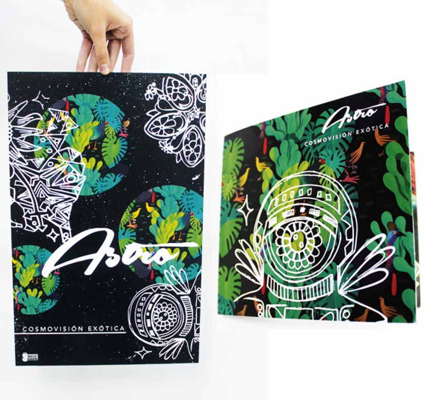
Astro CD

The art community has grown a lot in the past few years. It is very difficult here in
Chile, but we have a job to educate the people so that they may respect our artistic expressions. The new
generation is more open-minded and this has also helped us share more
about the true experiences of people living here.

Astro CD by Caterina Pinto Lumio
Astro CD

Many thanks to the artists who took time to answer my questions
and share a bit about themselves and how their country and/or culture
has affected their work. You can check out more of their work in the
links below:

How to Create a Set of Emoticons in Adobe Illustrator

Post pobrano z: How to Create a Set of Emoticons in Adobe Illustrator

Final product image
What You’ll Be Creating

This tutorial was originally published in January 2013 as a Envato Tuts+ Premium tutorial. It is now available free to view. Although this tutorial does not use the latest version of Adobe Illustrator, its techniques and process are still relevant. 

In this tutorial we are going to draw a set of Emoticons or Smileys by using gradients and basics shapes that, combined with the Pathfinder panel, will give the emoticons life. So let’s begin.

Want an awesome emoticon pack for your next design project? Then check out our wicked selection of Premium Emoticon Packs from GraphicRiver and Envato Elements.

1. How to Create the Emoticon Base

Step 1

First open a New document (Command-N) and add layers in this order: on top it’s the „Faces” layer, then the „Faces Sketch” layer and the „Base” layer (in here we are going to draw our base shape of the emoticons) and finally the „Base Sketch” layer.

Create the Emoticon Base

Step 2

In the „Base Sketch” layer we draw our base figure of the emoticons by using the Blob Brush Tool (Shift-B). In this case it’s just a circle with some lines to define shadows and lights. Lower the Opacity of the sketch to 40% and lock the „Base Sketch” layer. We are going to begin to draw in the „Base” layer.

Create the Emoticon Base

Step 3

Our circle (L) size is 300 x 300 px. This is the basic shape, so draw it with a 1 pt black stroke.

Create the Emoticon Base

Step 4

Select the circle and apply the Offset Path option (Object > Path > Offset Path) with a -10 px Offset value. With this we get a circle a little smaller than our original circle (you can also do it by duplicating it and scale it).

Create the Emoticon Base

Step 5

Now duplicate the circle (the blue one in the image) with Command-C to Copy and Command-F to Paste in Front, and drag it like the magenta circle in the image. Duplicate the blue circle again, select both circles, and apply Intersect in the Pathfinder panel.

Create the Emoticon Base

And we get this figure (yellow one)—this is the light area of the emoticon.

Create the Emoticon Base

Step 6

Now repeat the process—Duplicate the circle again. Drag it like the magenta circle in the image, duplicate the blue circle in the image again, select both, and apply Intersect in the Pathfinder panel again.

Create the Emoticon Base

And we get this figure (yellow one)—this is the darker area of the emoticon.

Create the Emoticon Base

Step 7

Select all the shapes and press D. This is our emoticon’s base shape without color. With the color application we are going to detail a little bit more. Now you can Delete your „Base Sketch” layer.

Create the Emoticon Base

Step 8

This is our color palette:

  • White #FFFFFF
  • Yellow #FCF17C
  • Red #F05850
  • Blue #67CDF5
  • Brown #641912

With these colors we are going to generate all the gradient combinations to have a more complete palette (all the gradients we are going to use are linear gradients). To save your palette colors, select the colors and click the New Color Group icon in the Swatches panel.

Create the Emoticon Base

Just give a name to your palette and click OK.

Create the Emoticon Base

Step 9

Now we add the gradients of each color, first from an Opacity of 100% to 0% for each one. To change colors in the gradient window, just double click on the color and you get your Swatches panel, and there you change the colors.

Create the Emoticon Base

Step 10

Now the gradients with all the colors with white.

Create the Emoticon Base

Now with the yellow color.

Create the Emoticon Base

The red color.

Create the Emoticon Base

And finally the blue. Now we have all the gradient combinations of these colors, and this will be our color palette. To add gradients to the Swatches panel, you need to drag them from the color window.

Create the Emoticon Base

Step 11

For applying the colors, I recommend having your colors near your illustration and applying them with the Eyedropper Tool (I). If you click with this tool, you get the color value of the figure you click, and if you press Alt you use that color to paint. We start with the yellow color.

Create the Emoticon Base

Step 12

Now apply the red and yellow gradient; however, in the Gradient panel we will select Radial instead of Linear. This will be the only gradient that we use in Radial mode.

Create the Emoticon Base

Step 13

For the shadow, we use the red gradient like in the image.

Create the Emoticon Base

Step 14

For the light, we use the white gradient. Now we are starting to see some depth in our shape.

Create the Emoticon Base

Step 15

Add more detail to our base, and now we are ready to start drawing the faces of our emoticons.

Create the Emoticon Base

2. How to Create the Crying Emoticon

Step 1

We copy five circles of our base shape for the emoticons and in our „Faces Sketch” layer. We draw the sketches—sad, angry, surprised, happy and in love expressions—by using the Blob Brush Tool (Shift-B). We put the Opacity to 40% to redraw more easily, lock this layer, and we start to redraw in our „Faces” layer.

Create the Crying Emoticon

Step 2

For the sad emoticon, we begin by drawing the eyes. The shapes we are going to use are a Rectangle (M) and a Rounded Rectangle. Remember to align the sketch to our emoticon base shape.

Create the Crying Emoticon

Step 3

Now, to add more detail like the shine of the tears, we draw a figure made of triangles with the Polygon Tool. Intersect it with the Pathfinder panel into the rectangle shape.

Create the Crying Emoticon

Step 4

To draw the shine, draw a triangle with the Polygon Tool. To do it, draw a Polygon and with the arrow keys up and down you can add or remove sides to the polygon. Make a triangle and then duplicate it by dragging it and pressing Alt. Then Command-D to duplicate a copy at the same distance, and then duplicate the three triangles and rotate them with the Rotate Tool (R) like in the image. Finally apply Unite in the Pathfinder panel.

Create the Crying Emoticon

Step 5

To start the mouth, we begin by drawing a Rounded Rectangle. Select it, and then with the Eraser Tool (Shift-E) by pressing Alt we make a drag and erase half of the shape. Then we duplicate our shape and again with the Eraser Tool make another drag to get the teeth. 

Add some rectangles for more detail. First draw one and then duplicate it. To do this select it and then press Alt-Shift and drag it to get a copy of your rectangle figure. Then press Command-D to do your last step and you get a copy of it at the same distance. Then select the three. Apply Unite in the Pathfinder panel, and finally apply Intersect in the Pathfinder panel with the tooth shape (remember to duplicate your base shape).

Create the Crying Emoticon

Step 6

Now to add the shape of the shadow of the teeth. Use your base shape and duplicate it and drag it down a little, and then duplicate again and you get the shadow shape. To make the tongue you can use your mouth base shape and scale it and then duplicate it and apply Unite in the Pathfinder panel. Finally Duplicate your mouth base shape and Intersect the shapes.

Create the Crying Emoticon

Step 7

Once you have created the tongue, to give more detail to the mouth you can use a circle and Crop it with our mouth base figure. Then just draw a little circle and apply Minus Front in the Pathfinder panel. Now our sad emoticon mouth is done.

Create the Crying Emoticon

This is the look of the emoticon Sad face. Remember to group everything and Align it to the center.

Create the Crying Emoticon

Step 8

Select the face and press D to set it with the basic Black line and White fill. If you need to send something to front or back, just select the object and Cut it (Command-X) and select the object where you want to Paste in Front (Command-F) or Paste in Back (Command-B). Use the Pathfinder panel to paste the tears inside our emoticon base shape, and align all to center. Now we are going to begin to add some colors.

Create the Crying Emoticon

Step 9

For the eyes we use our brown solid color, for the tears the yellow and blue gradient, and for the shine the white gradient. Apply them like in the image.

Create the Crying Emoticon

To paint the mouth we use the brown and red gradient, for the tongue the yellow and red, and the brown gradient to the last detail. You can play with the values of the gradients as you wish, or you can apply them like in the image.

Create the Crying Emoticon

For the teeth we use the blue color for the lines and our blue and white gradient for the tooth base. For the shadow we use our brown gradient, and now our sad emoticon is finished.

Create the Crying Emoticon

3. How to Create the Angry Emoticon

Step 1

Now with the angry emoticon, we begin with a circle for the eye.

Create the Angry Emoticon

Step 2

To draw the eye, first use the Eraser Tool (Shift-E) and erase with a drag by pressing Alt and drag to cut the circle to the half. Then Duplicate your figure and drag it and use Minus Front in the Pathfinder panel to make the eyelid. Finally Duplicate your eye’s shape and erase with a drag to make the shadow.

Create the Angry Emoticon

Step 3

To the eyebrow we only need to draw a triangle and transform it like in the image. Then just Rotate it and add it to the eye as shown.

Create the Angry Emoticon

Step 4

To make the horns, we start with a circle and then grab the upper node and drag it like in the image. Then remove the anchor points of the node with the Convert Anchor Point Tool (Shift-C) and click on the node. With this tool you can add or remove anchor points. Finally just rotate the horn as shown in the image.

Create the Angry Emoticon

Step 5

To make the mouth we start with a triangle, and then remove the nodes with the Scissors Tool (C). Just click on the nodes and remove the segment. Another way to cut anchor points is by selecting them and on the application bar clicking on the scissors icon. The cut will be exactly in the node(s) you select. Then, after removing the nodes, add some points to the line and apply Outline Stroke (Object > Path > Outline Stroke), and finally with the Eraser Tool erase with a drag and we’ve got the mouth.

Create the Angry Emoticon

Our Angry emoticon’s face will look something like this.

Create the Angry Emoticon

Step 6

We align to the center our angry face to the emoticon base, and now we are going to begin with the color. And we erase a part of the shine (in magenta) because of the horns.

Create the Angry Emoticon

Step 7

First we color the horns with our yellow and red gradient and the eyebrows with brown color.

Create the Angry Emoticon

For the eyes and mouth use red, for the eyes’ shadow the brown gradient, and for the eyelids the yellow and red gradient. Our angry face is almost done.

Create the Angry Emoticon

Add some details like the shine in the horns with white gradient and the shadow behind them with red gradient, remembering to apply the Pathfinder to Crop the objects. Our angry emoticon is done.

Create the Angry Emoticon

4. How to Create the Surprised Emoticon

Step 1

For the surprised emoticon we begin with a rounded rectangle for the eyes.

Create the Surprised Emoticon

Step 2

You can do the eye by using the Offset Path and then duplicating the figure and erasing with a drag with the Eraser Tool like the magenta figure in the image. Finally add some circles for the shine in the eyes.

Create the Surprised Emoticon

Step 3

For the mouth, we begin with a simple circle, and for the teeth two rounded rectangles. Apply Unite in the Pathfinder and Crop them inside the circle, and then generate a smaller circle by selecting the object and applying Offset Path.

Create the Surprised Emoticon

Step 4

Duplicate the teeth and use Minus Front in Pathfinder to generate the shadows. To make the tongue, add two circles and apply Unite and then crop with the main circle of the mouth.

Create the Surprised Emoticon

Step 5

To add more detail to the mouth, you can draw the throat with a circle for the base and combine a rectangle and a circle for the uvula. Apply Unite in the Pathfinder, select the nodes as you see in the image (green dashed line), and in the Toolbar convert them to rounded to give a smoother look. Finally apply Minus Front.

Create the Surprised Emoticon

Our Surprised face is done. Remember to press D and arrange the objects where they belong by cutting them and pasting them in front or behind the part where they should be. When you get used to this, it’s faster than using the arrange commands.

Create the Surprised Emoticon

Step 6

Align the surprised face to the emoticon’s base shape, and let’s begin with the colors.

Create the Surprised Emoticon

Step 7

For the eyes we use the brown color, for the eyes’ shines we use the yellow and white gradients, and for the detail in the eyes the yellow and red gradient.

Create the Surprised Emoticon

For the cheeks we use the red color, for the teeth the white and blue gradient, and for the shadow the brown and blue gradient.

Create the Surprised Emoticon

For the mouth we use the yellow and red gradient to add color to the tongue, the brown and red gradient for the mouth, and for the throat the brown color. Our surprised emoticon is finished.

Create the Surprised Emoticon

5. How to Create the Happy Emoticon

Step 1

We can start the happy emoticon with a circle to draw a big smile.

Create the Happy Emoticon

Step 2

First apply the Eraser Tool and erase half of the circle with a drag.

Create the Happy Emoticon

Step 3

To create the teeth, first draw a Rounded Rectangle and then duplicate it like in the image. Then use the Eraser Tool, and finally duplicate them and use the Reflection Tool (O).

Create the Happy Emoticon

Step 4

Align the teeth to the mouth shape, and then remove one of the teeth.

Create the Happy Emoticon

Step 5

For the tongue and throat we can use the same as in the surprised face—just crop it in the mouth’s base shape.

Create the Happy Emoticon

Step 6

For the eye, draw a circle, remove some nodes and add some points to the line, and make the values of the line Round Cap and Round Join. Finally apply Outline Stroke.

Create the Happy Emoticon

Our happy face is done, and now we can color it.

Create the Happy Emoticon

Step 7

As with the previous emoticons, align the face to the center, and now let’s begin with colors.

Create the Happy Emoticon

For the eyes we use our yellow and brown gradient, and for the cheeks the red color.

Create the Happy Emoticon

For the teeth we use the white and blue gradient and for the shadow the brown gradient. To separate the teeth in different planes, just adjust the gradient to give volume and a sensation of depth in the teeth.

Create the Happy Emoticon

The colors of the mouth are the same as the surprised face—just the light in the tongue is a white gradient. Our happy emoticon is finished.

Create the Happy Emoticon

6. How to Create the Love Emoticon

Step 1

Finally the in love emoticon. As with all of the previous emoticons, align the sketch to the center and start the re-drawing.

Create the Love Emoticon

Step 2

To draw the heart, the base is two circles. Apply Unite in the Pathfinder and drag the node in the middle, as shown in the picture.

Create the Love Emoticon

Step 3

Select the node in the middle and remove the anchor points. You can do it by clicking on the icon in the application bar and converting to corner, or you can convert it to corner with the Convert Anchor Point Tool (Shift-C). After this, adjust the nodes to make the heart more rounded, and finally apply Offset Path.

Create the Love Emoticon

Step 4

To make the mouth, we start with a circle, remove some anchor points, and duplicate and drag like in the image. Then add more points to the stroke, apply Outline Stroke, and finally apply Unite to convert it into one path.

Create the Love Emoticon

Our in love emoticon face is done.

Create the Love Emoticon

Step 5

Align the face to our emoticon’s base.

Create the Love Emoticon

For the hearts we use the red and brown gradient, and for the light the white gradient.

Create the Love Emoticon

For the mouth and cheeks we use the red color, and our in love emoticon is finished.

Create the Love Emoticon

Awesome Work!

This is our last result. Hope you have enjoyed this tutorial! If you make some emoticons, share them with us. Saludos to everyone!

Adobe Illustrator Emoticon Tutorial by Beto Garza

Premium Emoticon Packs from GraphicRiver

Whether you need a great emoticon set for your next web design project or an exciting app, check out these amazing Premium Emoticons Sets from GraphicRiver. Download them to get access to fun and unique designs and check out one of our favorites below.

16 Non-Rasterized Emoticons Pack + Bonus

In this awesome pack of emotions, get 16 essential designs featuring your favorite emotions. Well organized with 100% vector shapes, also included in this file are two PSD files and 32 PNG files for your convenience.

16 Non-Rasterized Emoticons Pack  Bonus

Get Inked With 50 Insanely Epic Tattoo Fonts

Post pobrano z: Get Inked With 50 Insanely Epic Tattoo Fonts

Whether you’re looking to get a tattoo for the first time or you’re a total tattoo snob, choosing the right font for your designs takes patience. So today we present you with 50 insanely epic tattoo fonts we’re sure you’ll love.

With a selection of fonts curated from GraphicRiver and Envato Elements, this collection features 50 awesome tattoo fonts you’ll definitely want to incorporate into your next ink.

Want that extra personalized touch? Enlist the help of the professional designers at Envato Studio to create a custom tattoo design just for you!

50 Insanely Epic Tattoo Fonts

Do you love tattoo design? We sure do! From wild decorative fonts to stunning handwritten scripts, we’ve got a font to cover all of your tattoo needs.

Enjoy this eclectic collection below and let us know your favorites in the comments!

Tattoo Script Font

What better way to start off this collection than with an amazing tattoo font? This awesome script font was inspired by the swirls of traditional tattoos and a unique hand lettering style. Find packaged into this typeface a complete set of uppercase and lowercase letters, numbers, and even a bonus set of borders for your convenience.

Tattoo Script Font

Captain Cook Tattoo Font

Named after the famous Captain James Cook who stumbled across the wonders of tattooed people in the South Pacific, this font features a cool decorative style perfect for a sailor or pirate. Its recommended size is at 36 pt or higher for a great design ideal for your next tattoo project.

Captain Cook Tattoo Font

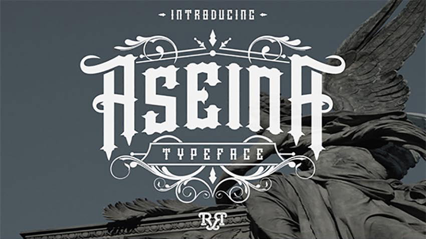
Aseina Typeface

If you’re looking for a unique font with that traditional vintage flair, then try the Aseina typeface for your designs. This font features a beautiful elegant feel, with the perfect mix of letters, numbers, and glyphs for that one-of-a-kind vintage style.

Aseina Typeface

Conchita Typeface

Inspired by tattoo lettering, this all caps font features a bold style that is sure to stand out. Download this set to get access to a complete collection of uppercase letters, numbers, and punctuation.

Conchita Typeface

BloodOnMyBlade Font

Tattoo lovers, beware. This font will turn you into a badass in no time. Inspired by the west coast style of tattoos, this font type features an aggressive, gothic design. Included in this set is a complete package of letters, numbers, and punctuation.

BloodOnMyBlade Font

Black Vision Font

Do you have a vision of black for your next tattoo? Well, try this Black Vision font on for style. This set includes an elegant vintage feel, and features a full set of letters, numbers, and punctuation to complete your designs.

Black Vision Font

November Script Font

Sail across the seas with this November Script font. Hand-crafted and then digitized for a beautiful calligraphic design, this font features a full set of letters, numbers, and some nice ligatures for tricky letter combinations.

November Script Font

Bodega Script Font

A decorative copperplate script with a modern twist, this Bodega Script font is a stunning typeface with an elegant style. It’s perfect for print work, tattoos, and so much more, so highlight your favorite passages with this unique typeface.

Bodega Script Font

Alitide Typeface

Inspired by old western design, this typeface features a modern twist for creative tattoo lovers. Included in this set are several font files with a helpful video for using the alternative glyph characters.

Alitide Typeface

Brushgyo Typeface

Suitable for print designs and creative tattoo art, this typeface features a modern script design that was handcrafted for that handwritten look. Included in this package is a full set of letters, numbers, and even multi-language support.

Brushgyo Typeface

Mahsetta Script Font

Looking for a beautiful script for your next tattoo? Well, look no further! This gorgeous Mashetta typeface features a stunning handmade calligraphic style. Included in this set are all the letters and numbers you need, with access to 473 glyphs for additional stylish options.

Mahsetta Script Font

Sharpen Script Font

Sharpen up your next tattoo design with this awesome handwritten font. A new modern calligraphy typeface, this font combines copperplate and contemporary design for a unique and elegant touch.

Sharpen Script Font

Victh Font

This modern handwritten font was designed using high-quality ink markers. Perfect for simple branding projects or even your next tattoo, this elegant font offers sublime versatility and style.

Victh Font

Victorian Parlor Font

Designed with a traditional Victorian aesthetic in mind, this typeface incorporates that clean vintage look with unique swirls and glyphs. Included in this package is a full set of letters, multi-language support, and access to 350 glyphs.

Victorian Parlor Fon

Typewriter Font

Want a tattoo that is unique yet simple? Give this awesome Typewriter font a try. Inspired by the cool mechanical look of classic typewriter lettering, this font features 187 unique glyphs and all the letters and numbers you need for your next project.

Typewriter Font

Victoriandeco Font

A classic Victorian serif font that is simple and easy to use, Victoriandeco is a font you’ll definitely want to incorporate into an awesome tattoo design. Inspired by the Victorian era of British history, this font features all your essential characters with bonus ornamental elements for additional decoration. 

Victoriandeco Font

Truvaway Script Font

Inspired by the unique style of handwritten signatures, this font features a modern calligraphic design and all your essential characters. Download this package to gain access to a full set of letters, numbers, and a large glyph set.

Truvaway Script Font

Alexandra Script Font

Calligraphy is huge in tattoo design. So show off your favorite quotes with this elegant Alexandra script font. This font features a modern design with smooth lines and delicious curves, with all the characters you need for a fantastic tattoo design.

Alexandra Script Font

Black Heat Font

Black Heat is a modern typeface inspired by the Victorian era of design. Download this package to gain access to a full set of numbers, letters, and additional support for international symbols.

Black Heat Font

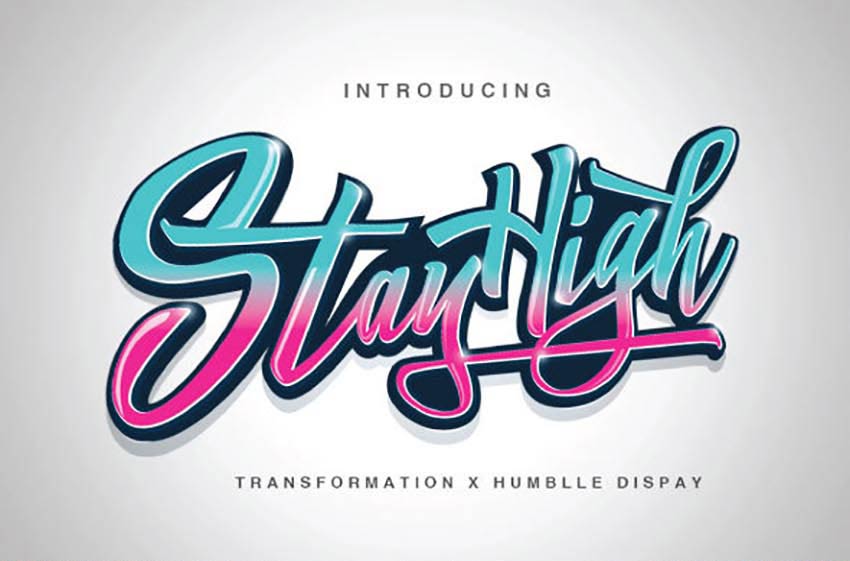
Stay High Typeface

Inspired by handwritten letters and the cool side of street life, this modern typeface features a wild curvy design with all the characters you could ask for. This font is perfect for graffiti lovers, and you can incorporate it into your next ink for a cool, edgy style.

Stay High Typeface

Marchy Script Font

March into an awesome tattoo design with this gorgeous script typeface. Marchy was designed to illustrate a unique calligraphic style with stunning loops and clean lines. Featured in this download is access to a full range of letters and numbers with over 430 glyphs to incorporate into your designs.

Marchy Script Font

Sekatoan Typeface

With three unique styles—clean, inline, and inline-shadow—this energetic typeface features an ornamental design that is sure to make you stand out. Be the envy of all your tattooed friends with this awesome vintage style.

Sekatoan Typeface

Bekelakar Typeface

If you’re a fan of horror, metal, or gothic design, you’ll definitely love this Bekelakar typeface. Available in regular and an all-caps style, this font features a full set of letters, numbers, and basic punctuation.

Bekelakar Typeface

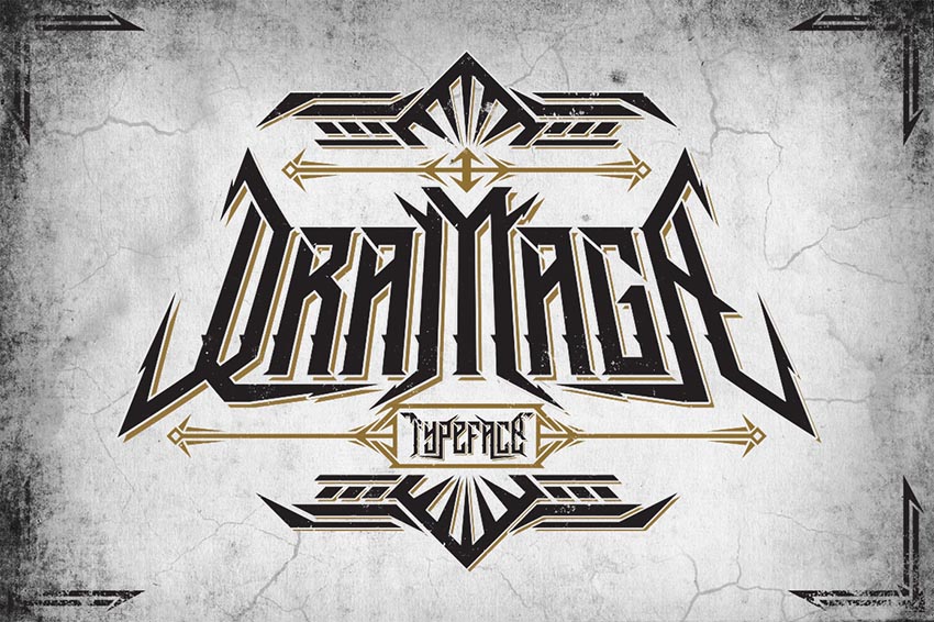
Dramaga Typeface

Create drama with this insane Dramaga typeface. Inspired by the design behind the Posthardcore Band, this font features an intense Gothic vibe with unique angular accents. Download this font to feature this awesome style for your next tattoo.

Dramaga Typeface

Sadis Typeface

If you’re feeling a little crazy, throw this Sadis font into the tattoo mix. A black letter font inspired by that epic Gothic look, this font features a complete set of letters, numbers, and punctuation we’re sure you’ll love.

Sadis Typeface

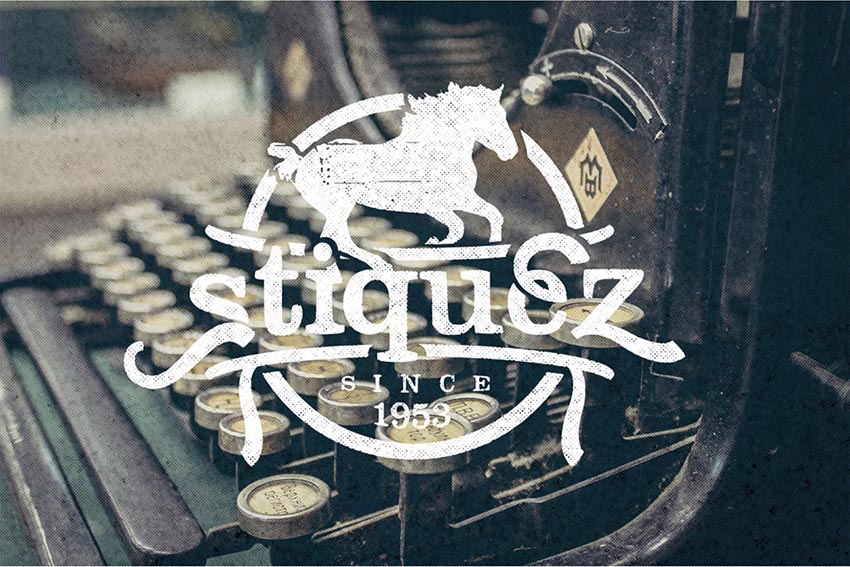
Stiquez Font

Although this typeface is perfect for logos, you can also mix it into an awesome tattoo design. This unique serif typeface features a cool retro design that works perfectly in a variety of programs for further customization.

Stiquez Font

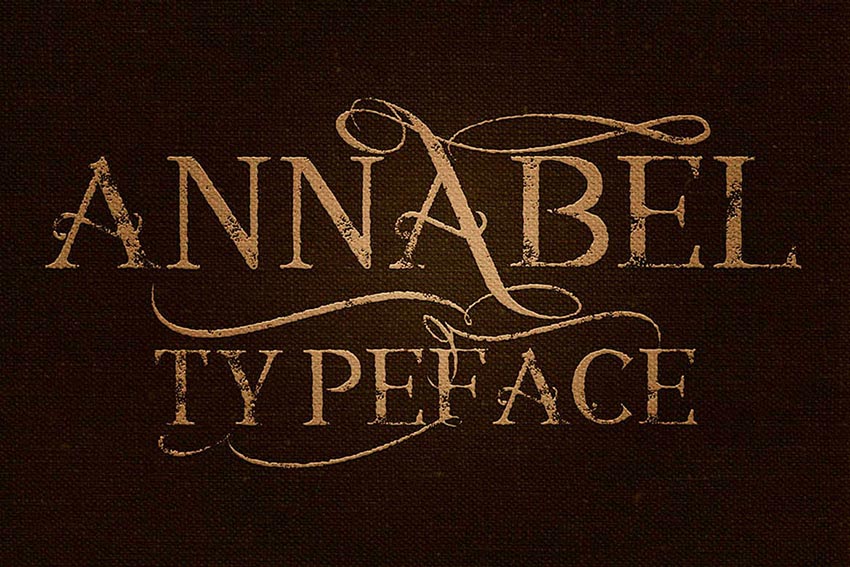
Annabel Font

This cool vintage font is perfect for your next ink design. Featuring a grungy design with interesting loops and curves, this package comes complete with four font files and so much more!

Annabel Font

Einstein Font

Bring out your inner genius with this awesome Einstein font. A sophisticated script with a playful baseline, this font features a full set of letters, numbers, and basic punctuation. Download this package to gain access to a bonus swash set!

Einstein Font

Twenty Nine Font

Twenty Nine is a playful marker typeface featuring a simple curvy style. With a bouncy baseline and a few sweet bonuses included, you’ll be happy you downloaded this set. An additional set of handcrafted ornaments is also included for that extra awesome touch!

Twenty Nine Font

Jimmy Font Duo

Script fonts are super popular in tattoo designs nowadays. And this Jimmy font family includes a handcrafted script font designed to reflect the modern vintage trend sweeping the nation. Incorporate it into your next ink designs for that magical retro look.

Jimmy Font Duo

SokaQola Font

A modern typeface handcrafted with brushes, the SokaQola font features an elegant design suitable for print work, tattoo art, and so much more. Included in this set is a full range of characters with additional stylistic ligatures for more design options.

SokaQola Font

Amorie Modella Font Family

Get dainty with this sweet Amorie Modella font family. Featuring a skinny, hand-drawn style, this font would work perfectly for a simple quote or even a unique name. Mix it up with flowers for an additional pretty element or keep it simple for a classic handmade design.

Amorie Modella Font Family

Rude Cookie Font

Get rude with this delicious typeface. A hand-drawn font designed with unique character, this file includes two serif fonts along with two script fonts. These fonts are created to work perfectly together, so you can mix them for interesting tattoo designs.

Rude Cookie Font

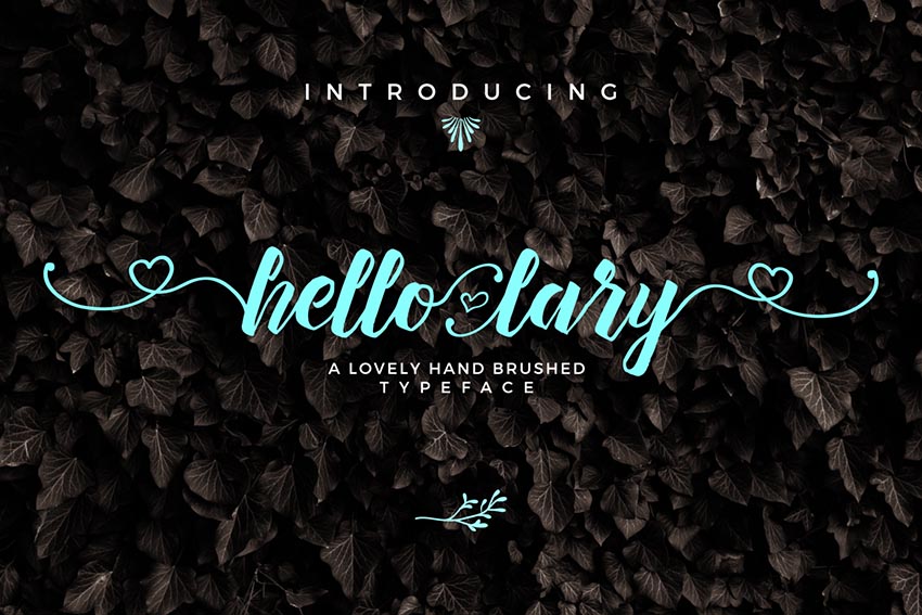
Hello Lary Font

You’ll be saying „Hello Lary” with this lovely handmade font type. A modern typeface created with brushes, this font features a full set of letters, numbers, and basic punctuation for all your tattoo needs.

Hello Lary Font

N78 Thin Font

Simple design can be some of the most gorgeous design around. So incorporate this elegant font into your next ink for a clean and polished alternative. Included in this package is a full set of letters, numbers, and punctuation suitable for almost any art project.

N78 Thin Font

Reckless Font Trio

Get reckless with this awesome font trio. Reckless is a handwritten brush font made with elegant curves and a unique style. Download this set to gain access to three handwritten fonts with all the characters you need for the ultimate design of elegance.

Reckless Font Trio

Balham to Brooklyn Font

Balham to Brooklyn is a modern monoline script font that emulates hand-drawn letter forms. It’s inspired by American pop culture and features a stunning cursive design that works perfectly for simple tattoo designs and so much more.

Balham to Brooklyn Font

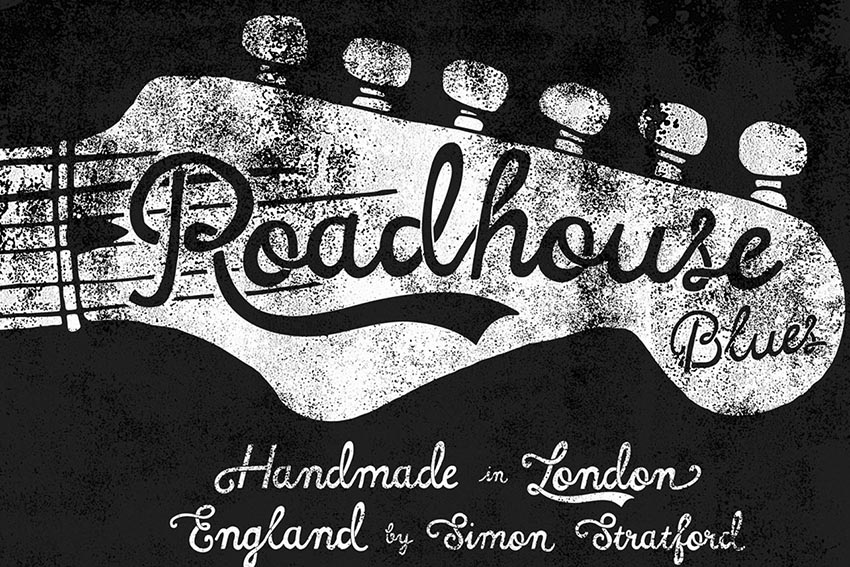
Roadhouse Blues Font

Start singing the blues with this handmade Roadhouse Blues font. Inspired by an early American style, its decorative swashes give it a friendly retro vibe. Download this package for a full set of letters, numbers, and basic punctuation.

Roadhouse Blues Font

Petit Jardin Font

Delicate with organic curly serifs, this Petit Jardin font is divinely lovable. Designed for that sweet, dainty look, this font package includes letters, symbols, numbers, and more! Use it for your tattoo designs for that gorgeous Art Nouveau look.

Petit Jardin Font

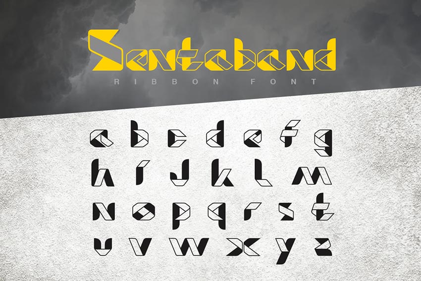
Food Craft Font

Get crafty with this unique Food Craft font. Designed with an unusual ribbon aesthetic in mind, this font would be the perfect addition to a standalone tattoo design. Included in this package is a full range of letters and more to fulfill your tattoo needs.

Food Craft Font

Sacred Geometry Font

Enjoy the sacred geometric shapes of this unique and inspiring font type. Inspired by sacred symbols, this font features letters, numbers, and basic punctuation. Incorporate it into your tattoo designs for that sacred personalized touch.

Sacred Geometry Font

Glamour Font

Get glamorous with this gorgeous font. A freestyle handmade signature type, this Glamour font is perfect for that awesome handwritten element. Included in this package are all the characters you need as well as 100 total freebies for more design experimentation.

Glamour Font

Adorabelle Font

Enjoy the adorable qualities of this stunning, elegant font. A modern script with a looping calligraphic style, this font is perfect for a meaningful personal quote or a name-based tattoo design.

Adorabelle Font

Stay Alive Font

Stay alive with this edgy font type. Inspired by the Victorian era and the posters of the 1800s, this font type features a full set of characters, numbers, and basic symbols. Use it for print work or that special ink you’ve been dying to get!

Stay Alive Font

Beautylove Script Font

Enjoy the beauty of this classically designed typeface. Combining elements of copperplate and contemporary design, this font is perfect for a stunning yet simple tattoo. Included in this set are 300 glyphs and 118 alternate characters to complement your work.

Beautylove Script Font

Zenzero Sans Font

If you’re looking for a bold design, considering using this Zenzero Sans font for your tattoo art. An industrial-based font created with regular and round styles, this unique font type gives you endless possibilities.

Zenzero Sans Font

Haext Regular Font

Explore the rustic Neo-Gothic elements of this Haext font for impressive tattoo designs. Part rune craft, part sacred goddess, this font is sure to put a spell on you with its spellbinding features.

Haext Regular Font

Growler Script Font

A mono-weight script font, this type is heavily based on the modern era of traditional logo design. Make your tattoos stand out with this impressive font complete with letters, numbers, and so much more!

Growler Script Font

Honeycomb Font

Enjoy the fancy yet flirty elements of this delicious Honeycomb font. Designed with fat-to-thin brush strokes and an imperfect baseline, this font would work gorgeously for a simple tattoo design. Download this package to gain access to a complete set of characters and stunning bonus extras.

Honeycomb Font

Mochafloat Script Font

To finish this collection of amazing tattoo fonts, I present you with this beautiful Mochafloat typeface. Created to emulate a modern calligraphic style, this package features 300 glyphs and 200 alternative characters.

Mochafloat Script Font

10 Amazing Tattoo Tutorials from Envato Tuts+

Inspired by this wonderful collection? Put your skills to the test with these awesome tattoo-based tutorials from Envato Tuts+.

Conclusion

This list is jam-packed with exciting resources for the avid designer
familiar with OpenType and more. If you need additional
help creating a personal tattoo design, enlist the skills of a talented
professional by choosing one of the amazing designers from Envato Studio.

And with hundreds of glorious handwritten and script fonts to choose from, chances are we’ve missed a few to add to your personal collection. Be sure to browse Envato Market and Envato Elements for more resources, and let us know your favorites in the comments below!

How to Create Flat Bride & Groom Characters in Adobe Illustrator

Post pobrano z: How to Create Flat Bride & Groom Characters in Adobe Illustrator

Final product image
What You’ll Be Creating

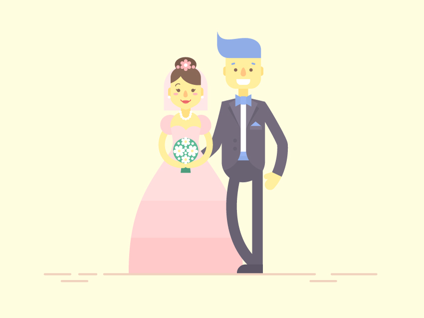
In this tutorial we’ll be designing stylized flat characters, depicting a happy couple getting married. We’ll be modifying a lot of basic geometric shapes, applying various warp effects and using handy tools and functions of Adobe Illustrator to make the characters look fancy and lively.

By the end
of this tutorial you’ll be able to design a bride and a groom in fancy flat style and change their
appearance to your liking, varying hairdos, suits, skin color and other
details. What is more, we can combine the characters, depicting both heterosexual and
same-sex wedding couples!

If you want to take a closer look at how each character was designed or to use it for your designs of wedding invitations, postcards or other, make sure
you’ve check out these 9 Wedding Couples with Flat Characters on GraphicRiver
to discover all the numerous combinations of happy couples and all the variety of
their appearance!

Wedding Couples on GraphicRiver

Let’s
start!

1. How to
Create the Face of a Flat Groom Character

Step 1

Start by
making the head with the help of the Rectangle
Tool (M)
or the Rounded Rectangle
Tool
, which you can find in the same drop-down menu of the Tools panel. Make a 65 x 80 px yellow shape and set the Corner Radius to 20 px. We can do this by selecting our shape with the Direct Selection Tool (A) and then either using the Live Corners feature (by pulling the tiny circle markers) or from the control panel on top.

make the head with the help of the Rectangle Tool

Step 2

Let’s add
the eyes. Take the Ellipse Tool (L),
hold down Shift and make a 6 x 6 px brown circle. Select it with the
Selection Tool (V), hold Alt-Shift and drag to the side,
creating a copy for the second eye.

In order to
keep everything organized and aligned, select both eyes and Group (Control-G) them. Then select
both the eye group and the head and click the head once again to make it a Key Object. You will notice a thicker
selection outline around the head, indicating that all other objects will now
be aligned to the Key Object. Let’s
open the Align panel and click Horizontal Align Center to make the
eyes perfectly centered.

Keep the
eyes closer to the lower half of the face, forming a large forehead.

make the eyes with the ellipse tool

Step 3

Now let’s
depict the eyebrows in order to give the face a lively expression. Use the Rounded Rectangle Tool to make a 7 x 3 px blue shape with fully rounded
corners. 

Keeping the brow selected, double-click
the Rotate Tool (R) and set the Angle value to 15 degrees. Click OK to
apply the changes. 

Double-click
the Reflect Tool (O). Flip the brow
over the Vertical Axis and click Copy to create a second brow.

Use the Rounded Rectangle Tool to make the brows

Step 4

Take the Ellipse Tool (L) and let’s make a nose.
Hold Shift and create a 10 x 10 px yellowish-orange circle.
Select its top anchor point with the Direct
Selection Tool (A)
, hold Shift
and drag the point up, creating a drop-like shape for the nose.

Remember to
use the Align panel to center the
nose to the face, using the head shape as a Key Object.

make the nose from the ellipse

Step 5

Now we’ll form
a wide, smiling mouth using the Rectangle
Tool (M).
Create a 25 x 10 px
white shape. Select its bottom anchor points with the Direct Selection Tool and pull the circle markers of the Live Corners, making the corners 6 px rounded.

make a smiling mouth using the Rectangle Tool

Step 6

Switch to
the Rounded Rectangle Tool and let’s draw the ear. Make a 10 x 20 px
shape of a slightly darker color than the face. Hold Alt-Shift and drag the ear to the right, creating a copy for the
opposite side of the head.

Finally,
select both ears, Group (Control-G)
them and right-mouse click > Arrange
> Send to Back
or simply Shift-Control-[
to place the ears behind the head.

make the ear from rounded rectangles

Step 7

Now let’s
style a fancy hairdo for our groom. Arm yourself with the Rectangle Tool (M) and create an 85 x 50 px blue shape. Select both the rectangle and the head shape
and Horizontal Align Right, using
the head as the Key Object to snap the hair to the right part of the head.

Take the Anchor Point Tool (Shift-C), hold Shift, and pull and position the handles of
the top left anchor point vertically, as shown in the screenshot below.

Now let’s
select the opposite (top right) anchor point with the Direct Selection Tool (A) and pull the Live Corner marker to make this part of the shape really smooth and
rounded.

Repeat the
same for the bottom left corner, making it rounded to create a stylish fringe.

make a hairdo from rectangle

Step 8

We can fix
the hair shape, using the Direct
Selection Tool (A)
while pulling the anchor handles on top of the hair, making it flat to preserve the overall geometric style with straight lines.

edit the anchor handles

Step 9

Let’s add a
neck before we proceed to build the body. Use the Rounded Rectangle Tool to create a 20 x 35 px shape with full rounded corners. Press Shift-Control-[ to Send
the shape to Back, beneath the head.

make the neck with the rounded rectangle tool

2. How to
Design the Body of the Flat Groom Character

Step 1

Take the Rectangle Tool (M) and let’s start
drawing the body from the shirt. Make an 80 x 150
px
white shape, select its bottom anchor points with the Direct Selection Tool (A) and make the
corners fully rounded, setting the Corner
Radius
to 40 px in the control
panel on top.

Take the Add Anchor Point Tool (+), place a
new anchor point in the middle of the top edge, and drag it up, using the Direct Selection Tool (A).

make a white shirt from rectangle

Step 2

Let’s form
the top part of the trousers. Place a dark-grey rectangle over the bottom of
the body, as shown in the image below.

Select both
the body shape and the rectangle and switch to the Shape Builder Tool (Shift-M). Hold Alt and click the piece of the rectangle outside the edges of the
body. This way we can delete the unwanted parts of the shapes.

Add a
couple of blue stripes on top of the trousers, using the same technique with
the Shape Builder Tool (Shift-M) to
delete the unwanted pieces outside the body shape.

form the top part of the trousers

Step 3

Let’s move
on to the groom’s jacket. Create a grey rectangle (of a slightly lighter color
than the trousers) and make it cover the left part of the character’s body.
Select both the rectangle and the body shape and delete the unneeded part, using
the Shape Builder Tool (Shift-M).

make a jacket from rectangle

Step 4

Select the bottom right anchor point of the rectangle with the Direct Selection Tool (A) and
make it rounded.

Now let’s
add a second half of the jacket. Select the created half and double-click the Reflect Tool (O) to mirror the shape over the Vertical Axis and click Copy.

We need to Align the created part to the opposite
side of the body. In order to do this precisely and easily, select both the
mirrored piece and the body and click the body shape once again to make it a Key Object. Head to the Align panel and click Horizontal Align Left to snap the
jacket to the left edge of the body. Easy as that!

add and align the second half of the jacket

Step 5

Let’s add
lapels to the suit. Grab the Polygon
Tool
and single-click anywhere on the Artboard to open the pop-up options window. Set
the Sides value to 3 and draw a triangle. Select its side
anchor point with the Direct Selection
Tool (A)
and shrink the shape, making it much narrower.

Attach the lapel to the left half of the suit and use the Align function to Horizontal Align Right and Vertical Align Top, using the suit as
the Key Object in order to snap the lapel to the edge.

Let’s add a
shadow beneath the lapel. Copy the lapel and Paste in
Back (Control-C > Control-B).
Move the side anchor point of the bottom
copy down and to the left, making the shape a bit wider, and make its Fill color somewhat darker as well.

Group (Control-G) the lapel and its shadow and use the Reflect Tool (O) to flip the lapel
group to the opposite half of the suit and snap it to the edge, using the Align panel.

make the lapel from triangle using the polygon tool

Step 6

Let’s
depict a bow tie to make our groom look elegant. Use the Rounded Rectangle Tool to create a 10 x 15 px shape with 2 px
Corner Radius
and fill it with the same blue color as the hair. Use
the Eyedropper Tool (I) to pick the
color from one shape and apply it to the other.

Attach a 10 x 12 px rectangle of a slightly darker
blue color to the left edge and use the Direct
Selection Tool (A)
to select the top and bottom left anchor points and move
them in opposite directions with the help of the arrow keys in order to make the shape wider.  

Use the Reflect Tool (O) to add a second half
of the bow tie.

make a bow tie from blue rectangles

Step 7

Use the Rectangle Tool (M) and the Polygon Tool to add a tiny pocket with
a blue triangular handkerchief inside.

add details to the jacket

Step 8

Add two
round dark-grey buttons to the jacket, and let’s proceed to the arms of our
character. 

Use the Arc Tool (you can
find it in the same menu as the Line
Segment Tool (\)
) or the Pencil Tool
(N)
to draw a smooth arched line for the right arm.

Set the Stroke color to the same tint of yellow
as we have for the face. Open the Stroke
panel and set the Weight to 20 pt, making the line really thick.
Set the Cap to Round Cap in order to make the tips of the line fully rounded.

Find an
anchor point in the middle of the arm or, if you don’t have one, create it using the Add Anchor Point Tool (+). Select it with the Direct Selection
Tool (A)
and make the anchor handles a bit shorter in order to bend the
elbow in a more realistic manner.

Add a short
stroke for the thumb, setting the Weight
to 10 pt.

make an arm from a thick arched stroke

Step 9

Let’s add a
sleeve to the jacket. Select the arm with the Selection Tool (V), Copy it and Paste in Front (Control-C >
Control-F).
Change the Stroke
color to the same dark grey as we have for the jacket. Switch the Cap to Butt Cap, making the tips straight. Move the top and bottom anchor
points of the arm together with the sleeve to make them fit the
shoulder of the jacket.

Add and
remove the anchor points of the tips of the lines to make the strokes shorter,
if needed, but try to keep both lines combined with each other, so that the
yellow stroke is right beneath the grey stroke.

add a sleeve of the jacket

Step 10

Add the second
arm, using the same technique, but this time change its position as shown in
the image below.

Add the second arm

Step 11

Now let’s
draw the legs. Use the Line Segment Tool
(\)
or the Pen Tool (P) while
holding down Shift to make a straight vertical line. Apply a dark-grey color
for the Stroke and set the Weight to 20 pt and Cap to Round Cap, making a thick line.

use the Line Segment Tool to make the leg

Step 12

Take the Rectangle Tool (M) and make a 50 x 16 px dark-grey shape for the boot.
Select its top left anchor point with the Direct
Selection Tool (A)
and make the corner fully rounded, setting the Corner Radius to 16 px.

make a boot from the rectangle

Step 13

Use the Arc Tool to create a smooth arched line
to the second leg, making it look slightly bent.

Looks like
our groom is finished! Let’s move on to the bride!

Use the Arc Tool to make a leg

3. How to Draw
the Head of a Flat Bride Character

Step 1

Let’s start
by forming the head from a 55 x 80 px
yellow rectangle. Select both top anchor points and make the corners rounded,
setting the Corner Radius to 20 px.

Make the
bottom of the rectangle, which is for the chin, fully rounded.

make a head from the rectangle

Step 2

Select the
bottom anchor point in the middle of the chin with the Direct Selection Tool (A) and click Convert selected anchor points to corner in the Convert menu of the control panel on
top to make the chin pointed.

We can also
drag the chin point up a bit to make the face shorter.

make the chin pointed

Step 3

Add the
eyes, nose and neck in the same way as we did for our previous character with
the only difference that we also need to draw eyelashes. Use the Arc Tool to make a tiny arch with 1.5 pt Stroke Weight and Round
Cap.

Add the eyes nose and neck

Step 4

Let’s add a
smiling mouth. Continue using the Arc
Tool
to make an arched red line with 1.5
pt Weight
and Round Cap.

Take the Ellipse Tool (L) and make a 15 x 6 px light-pink shape for the lips. Send Backward (Control-[), beneath the
stroke.

Select both
side anchor points of the ellipse and move them a few pixels up using the Up Arrow key to make the lips fit the red
stroke.

add a smiling mouth with stroke and ellipse

Step 5

Add two
pinkish ovals on the cheeks for the blush, and let’s move on to the hairdo. 

Place two brown ovals over the forehead and make them overlap, as shown in the
image below. Select both ovals and Unite
them in the Pathfinder, merging them
into a single shape.

Now we need
to delete the unwanted part of the hair, which is outside the
head. Select both the hair shape and the head and use the Shape Builder Tool (Shift-M) while holding Alt to click and delete the piece.

There we
have it! An elegant hairdo is ready!

make a hairdo from ellipses

Step 6

Make a 40 x 30 px ellipse for the bun and Send to Back (Shift-Control-[), beneath
the head. Make the color slightly darker than the overall color of the hair.

Add two 5 x 5 px white circles for the pearl
earrings. Use the Pencil Tool (N) to
draw an arched line at the bottom of the neck for the necklace, and let’s see
how we can add pearls here in a few clicks. 

Apply white color for the Stroke and open the Stroke panel. Set the Weight to 5 px, Cap to Round Cap
and tick the Dashed Line checkbox.
Set the dash value to 0 px and the
gap value to 4.5. This way we’re
forming a nice necklace with round pearls. If you happen to have some gaps
between the pearls, try adjusting the gap
value, thus eliminating the unwanted spaces.

add a bun pearl earrings and necklace

Step 7

Now we’ll
be adding flowers to make the hairdo more festive. Take the Polygon Tool and set the Sides
value to 6, creating a pink hexagon.
Place it in front of the bun, and let’s see how we can actually turn it into a
flower. Go to Effects > Distort &
Transform > Pucker & Bloat
and move the slider to the Bloat side, setting it to 60%.

Go to Object > Expand Appearance in order
apply the effect, making the flower editable.

make a flower with pucker and bloat effect

Step 8

Use the Ellipse Tool (L) to add a few minor details to the flower.

Finally,
let’s add a veil to finish off the hairdo. Create an 85 x 85 px light-pink rectangle and make its top part fully rounded
by using the Live Corners feature
and the Direct Selection Tool (A).

Now we can
move on to the body!

make a veil from the rectangle

4. How to
Draw the Body & Dress of the Flat Bride Character

Step 1

Create a 60 x 105 px yellow rectangle for the body
and make its corners fully rounded, using the Direct Selection Tool (A) and the Live Corners feature.

make a body from rounded rectangle

Step 2

Let’s add a
couple of anchor points in the middle of both sides of the rectangle with the help of the Add Anchor Point Tool (+). Select the
point on the left and press Enter to
open the Move options window.

Set the Horizontal value to 5 px and the Vertical value to 0 px.
Click OK to move the point 5 px to the right.

Repeat the
same for the opposite point, but this time apply a negative value (-5 px) in order to move the point in
the opposite direction, forming a wavy waistline.

form the waistline

Step 3

Keeping
both points selected, click Convert
selected anchor points to smooth
in the control panel on top, making the edges
smoother.

convert selected anchor points to smooth

Step 4

Now let’s
design the dress!

Place a
light-pink rectangle over the body, select both shapes and use the Shape Builder Tool (Shift-M) while
holding Alt to delete the unneeded
piece outside the body.

Add two
overlapping circles for the bust and Unite
them in the Pathfinder. Delete the
unwanted parts, using the Shape Builder
Tool (Shift-M).

design the wedding dress

Step 5

Let’s add
two more circles (40 x 40 px each) for
the sleeves, applying a slightly darker color. And now we need to cut the
circles to make them fit the body.

We could
just move the shapes beneath the body, but we actually need these shapes to
remain on top of the body shape in the Layers
panel, as they will be covering the top parts of the arms.

So, let’s
select the body shape, Copy and Paste in Front twice (Control-C >
Control-F > Control-F).
Then select the top body copy and the right sleeve
and use Minus Front function of the Pathfinder to cut off the left half of the
circle.

Repeat the
same for the left sleeve, using the second copy of the body shape.

make sleeves from circles

Step 6

Now let’s draw a long puffy skirt. Start by attaching a 55 x 230 px rectangle to the body. Select its bottom right anchor
point with the Direct Selection Tool (A)
and hit the Enter key to open the Move window. Set the Horizontal value to 80 px and the Vertical value to 0 px.
Click OK, moving the point 80 px to the right.

Repeat the
same for the opposite point, applying a negative value (-80 px), thus making the skirt wide at the bottom.

make a long skirt from rectangle

Step 7

Keeping the
skirt selected, go to Effect > Warp
> Bulge.
Set the Vertical Bend value to 40% and click OK. Continue by using Object > Expand Appearance to apply the effect.

Finish up
with the skirt by adding two darker wide stripes in the bottom.

apply bulge effect to make the skirt puffy

Step 8

Let’s
design a festive bridal bouquet, using the flowers that we’ve already created
for the hairdo.

Make a 47 x 47 px green circle and fill it with
white flowers and tiny circles. Add a darker green rectangle under the bouquet,
making the bottom part of the shape somewhat wider.

Use the Arc Tool or the Pencil Tool (N) to add the arms holding the bouquet. Set the Stroke color to yellow, Weight to 12 px and Cap to Round Cap.

Position
the arms beneath the sleeves in the Layers
panel.

design a bridal bouquet and add strokes for the arms

Step 9

There we
have it! Our happy couple is ready to get married! Put our characters next to
each other and add any minor details to your liking. For example, here I’ve
used the Line Segment Tool (\) to
add some horizontal lines for the floor.

happy couple is ready to get married

Congratulations!
Our Flat Wedding Characters Are Finished!

I hope
you’ve enjoyed following this tutorial and designing fancy characters. You can
actually change their appearance to your liking and even depict
yourself together with your other half or someone from your friends and family in a stylized flat manner!

Flat Wedding Characters are Finished

Take a look
at the variety of couples that we can create using our characters and varying their
hairdos, skin color and suits. What is more, we can depict both heterosexual and
same-sex happy couples! If you wish to discover how the characters
were made or you want to get a full set for your designs in various formats
(both vector and raster), make sure you check out these 9 Wedding Couples with
Flat Characters on GraphicRiver.

Wedding Couples on GraphicRiver

The Best and Smartest WordPress Themes for 2017

Post pobrano z: The Best and Smartest WordPress Themes for 2017

Looking for the right WordPress theme can be a chore. One looks better than the last one; and, after a while, they all begin to look alike. If this has been your experience, look no further. To get the New Year off to a great start, we’ve listed several features you should be looking for […]

The post The Best and Smartest WordPress Themes for 2017 appeared first on Web Resources Depot.

Awesome Deal: 30 Sparkling Glitter Brushes from The Artifex Forge

Post pobrano z: Awesome Deal: 30 Sparkling Glitter Brushes from The Artifex Forge

Your designs are about to get a whole lot shinier. With this sparktacular Mighty Deal, you’ll get yourself 30 Sparkling Glitter Brushes that feature some amazing levels of detail. Created from real glitter designs, each of these brushes are easy to customize and cover a wide range of different brush strokes. Highlights: 30 Sparkling Glitter […]

The post Awesome Deal: 30 Sparkling Glitter Brushes from The Artifex Forge appeared first on Web Resources Depot.

3 Reasons to Invest in Great Web Design

Post pobrano z: 3 Reasons to Invest in Great Web Design

Web design is the core of the digital web experience. Web design determines how sites look, how they function, how they relate to the overall brand narrative, and so much more. Companies like WSI are the best web designers Northern Ireland has to offer, but many people are tempted to forego professional web design services […]

The post 3 Reasons to Invest in Great Web Design appeared first on Web Resources Depot.