Post pobrano z: The Best Landing Page Builders of 2021
If your main aims are to make sales or build a following online, your landing pages are probably the most…
The post The Best Landing Page Builders of 2021 appeared first on Design Bombs.
Post pobrano z: The Best Landing Page Builders of 2021
If your main aims are to make sales or build a following online, your landing pages are probably the most…
The post The Best Landing Page Builders of 2021 appeared first on Design Bombs.
Post pobrano z: Nexcess Review 2021: The Good & Bad on WordPress Hosting (Honest Thoughts)
Considering using Nexcess managed WordPress hosting for your WordPress site? Nexcess is a subsidiary of Liquid Web, a popular host…
The post Nexcess Review 2021: The Good & Bad on WordPress Hosting (Honest Thoughts) appeared first on Design Bombs.
Post pobrano z: How to Create a Colorful and Shiny Text Effect in Adobe Photoshop


If you want to learn how to make glossy text in Photoshop, in this tutorial I’ll show you how to make use of the Layer Style panel to create shiny letters. You don’t need a special shiny font—just follow these steps!
And if you want to save time, you can use Envato Elements to find other shiny effects, for example this one:


Follow along with us over on our Envato Tuts+ YouTube channel:
The following assets were used during this tutorial:
Go to File > Open, and open the background image.


Pick the Horizontal Type Tool (T) with these settings:
#ffffff


Write „Shiny” and place it in the center of the document.
To center a layer, press Control-A to select the document, and then pick the Move Tool (V) and click on the Align Vertical Center and Align Horizontal Center icons.


Double-click the Shiny layer to open the Layer Style window.
Feel free to turn on and off the following effects to see what’s changed. Let’s start with the Gradient Overlay; this way you will be able to see better what is happening.
Add a Gradient Overlay with these settings:
Click on the Gradient Bar and make a gradient with these settings:
#ffc600
#f8e45f


Add a Bevel & Emboss with these settings:
#ffee93
#190a20


Add a Stroke with these settings:
#7344ac


Add a Drop Shadow with these settings:
#ae00f6


Your image should look like this:


Select the Shiny layer and press Control-J to duplicate it. Then right-click and choose to rename it to Shiny TOP.


Right-click the Shiny TOP layer and choose Clear Layer Style. Then double-click the layer to open the Layer Style window.
Add a Bevel & Emboss with these settings:
#ffee93
#190a20


Add an Inner Shadow with these settings:
#bf8c01


Add a Gradient Overlay with these settings:
Click on the Gradient Bar and make a gradient with these settings:
#a5a5a5
#ffffff
#e2e2e2
#b2b2b2


Add an Outer Glow with these settings:
#eac919


Add a Drop Shadow with these settings:
#1eff00
After that, click OK


Now hold Control and click on the Shiny and Shiny TOP layers to select both. Then press Control-G to group the layers.


Double-click the group layer to open the Layer Style window.
Add a Drop Shadow with these settings:
#000000
After that, click OK.
And the result is:


In this tutorial, you learned how to create a colorful and shiny text effect in Adobe Photoshop. We started out by creating a layer style, and then we added another layer style on top of that to complement the effect. And now you know how to make a glossy effect in Photoshop!
Don’t forget to save the styles, so you can use them for other projects!
There are many ways to make shiny letters in Photoshop, so if you want a different effect, here are a couple of propositions available on Envato Elements:
This effect is quite similar to the one we’ve been creating in the tutorial—the letters seem 3D, and they have nice shiny edges. To use this effect, you just need to replace the text with your own!


If you need real shine, this advanced effect will make your text look unique! You don’t need a special shiny font—just use any font you like and replace the text with your own.


If you want to add a beautiful shine to your text logo, this action will give you the most realistic effect possible—like real chrome, your letters will reflect the colors of the environment (that is, the background you use!). It’s customizable and very easy to use, but if you need extra help, use the attached video instructions.


You don’t have to know how to make something glossy in Photoshop to achieve an effect like this—just replace the text in this file and you’ll get a colorful, sparkling text effect in seconds!


And if you want the same effect as we’ve created in this tutorial, this set on GraphicRiver contains seven shiny styles in different colors—perfect for every occasion!
If you enjoyed this glossy text tutorial, you may also like these ones:


Post pobrano z: What Makes for the Best Movie Poster Font?
Type plays a starring role in movie poster design, with movie poster fonts enticing audiences into cinemas from the earliest days of cinema. From classic blockbuster fonts to modern-day indie flicks, great movie fonts have always helped to set a cinematic mood and foster a brand identity for studio releases.


Movie fonts are most recognisable from posters and marketing campaigns, but they can also feature throughout movies in captions or chapter headings, and on opening and closing credits too.
Here, you’ll discover the secrets behind some of the most iconic movie fonts, pick up tips for designing your own movie type, and find recommendations for great movie poster fonts to use in your designs.
Create a suitably cinematic vibe for your typography with these awesome movie fonts on Envato Elements.

Early in the 20th century, movie studios realised that the memorability of a film title and its accompanying poster were key to enticing audiences into cinemas. They created eye-catching movie titles for posters and credits, often themed on the genre and narrative of the film.
By the 1970s, movie fonts had become bigger, bolder, and brighter, designed to make movies more memorable and exciting for potential audiences. Today, movie fonts are an important part of movie branding and marketing, with bespoke typefaces and titles often created to make a film appear more distinct and attractive than its competitors.
Fonts have become such an integral part of cinema that many directors and franchises have become defined by their use of typography, making the titles instantly recognisable to fans. Star Wars is known for its authoritative sans serif logo type (which was inspired by 1930s fascist-era fonts, as requested by George Lucas), while indie director Wes Anderson uses typography as an intrinsic part of his beautifully styled movies, with design favourites Helvetica and Futura being used particularly frequently.

While movie poster fonts are hugely diverse, there are a few key features that every great movie font has in common:
When these three features combine in perfect unison, you’ve got a winning formula for a blockbuster poster font.
Read on to discover the fonts used on the posters of some of the best-known movies of all time, including Blade Runner, Indiana Jones, and Jurassic Park. You’ll also get some top tips and font suggestions for a wide range of movie genres.
It all started with the classics—before digital fonts were invented, movie poster designers created type and titling by hand, resulting in some of the most iconic and trailblazing movie typefaces that still influence poster designers today.
Classic movie poster fonts created during the 1940s were designed with heavy shadowing and chunky lettering, to allow titles to stand out just as well on black-and-white opening credits as on lithographic-printed colour posters. By the advent of Technicolor in the 50s, movie poster fonts had evolved into ultra-vivid, 3D-style designs, with the epic titling for major releases like Ben Hur setting the bar for movie type of the future.

While these early titles established many of the rules of movie typography, it wasn’t until later that movie poster type became an intrinsic part of a movie’s brand identity. Some of the most recognisable and enduring movie fonts and movie brands were created during the 1970s and 1980s. This was the era of the big-budget blockbuster, with adventures like Star Wars, The Goonies, Jaws, and Indiana Jones sparking a trend for comic-inspired type styles.
Unique, novelty fonts, such as Jurassic Park’s stencilled logo (designed by John Alvin, who also created iconic titles for E.T., Blade Runner, and Gremlins), helped to craft bespoke branded identities for movies, cementing them in popular culture for decades to come.
Discover faithful and quirky alternatives to some of the most iconic old movie poster fonts, from vintage horror font Fright Night to Hitchcock-tribute Hitchcut.
The perfect font for channelling a retro Hammer Horror vibe, Fright Night is full of vintage character.

A futuristic font with a gritty, industrial edge, Derelict is reminiscent of classic dystopian movies like Mad Max and Terminator.

Hitchcut is a fitting tribute to the 1960s poster types designed by Saul Bass for Alfred Hitchcock movies, such as Vertigo and Anatomy of a Murder.

Axeon is influenced by the neon-retro fonts made popular by 1980s sci-fi movies like Blade Runner.

A classic comic book font in the style of Indiana Jones, Zanzabar will conjure a sense of fun and adventure.

Inspired by ouija, dripping blood or gothic styles, old horror movie poster fonts set the tone for future iconic horror types, such as the Friday the 13th movie poster font (a crimson red brush style). Psycho (1960), with its knife-slashed, condensed lettering, was one of the first great horror movie fonts, with the titling perfectly reflecting the claustrophobic, unhinged mood of the Hitchcock-directed film.

Brush styles in sinister red or black are common type styles for this genre, with the scrawled It movie font an iconic example.
Supernatural-themed movie posters can be enhanced with fonts that have glow effects or old-fashioned styles, referencing historic ghosts, ghouls, or vampires. The Twilight movie poster font uses some of these techniques, adapting traditional-style serif font Zephyr with a ghostly glow and grungy draft lines.
These horror movie fonts will make any spooky-themed poster design look suitably ghoulish:
A traditionally spooky Blackletter style, Anemouth is perfect for gothic-themed poster designs.

A tribute to the original 1973 movie, Exorcist is a creepy, hex-inspired font for supernatural horror movie posters.

Pandora is a weird and wonderful display type that could be used for posters themed on witchcraft or supernatural horror.

Inspired by ouija boards and witchcraft, Haext is a minimal horror font that’s perfect for stylish poster design.

Influenced by classic American horror movies like American Psycho, American Frights is simple and graphic.

Action movies are all about giving audiences an immersive, high-octane experience, and the type styles for action movie posters accordingly use design traits that get the adrenalin flowing.
Heavy, condensed font styles feel strong and unapologetic, while fonts with a sense of movement and energy, such as the 300 movie poster font, also help to give a sense of action and dynamism in a movie poster design.

While chunky sans-serif display fonts are widely popular across this category, more traditional serif styles are sometimes used to give a sense of authority or history, depending on the theme of the movie. For example, Gladiator uses Roman-inspired Castellar Std, while the Thor movie poster font is a variation of serif typeface Modi Thorson.
Take a look at these action movie poster fonts that will get the blood pumping:
A good fit for political or police-themed action movies, Conquest is an impactful slab serif available in five different weights.

Bold and impactful with retro styling, Devant Horgen is a good fit for historical action films.

Condensed sans serifs are a simple and stylish way to channel the action genre. Try Cross Bar set in vibrant red.

A good match for the brush font used on 300 promotional posters, Brother in Crime is urgent and epic.

Independent films often buck the usual type trends which are commonplace across other movie genres, but in recent years, a few clear font themes have emerged on the indie scene.
Tarantino-directed movies had a huge influence on the indie genre, with many poster designers following suit by using retro, comic-book type styles. Retro movie poster fonts are also a prominent feature of indies, with 70s movie poster fonts being particularly popular.

Quirk and charm are often prioritised over size or convention in the indie category. The Lady Bird movie poster font is a blackletter style, Amador, which was combined with a clean sans serif on promotional posters, while the Edward Scissorhands movie poster font is the characterful Luther, a fairytale-inspired font that is a common style used by the director Tim Burton, a proponent of Gothicism.
Try these quirky and retro movie poster fonts to channel indie style in your designs:
Retro and groovy, The Mortages would be a cool fit for indie movies set in the 1970s.

Inspired by the comic book type styles popularised by Tarantino movies, Furiosa is a suitably quirky and offbeat brush font.

A close replica of the font used for the Lady Bird movie posters, Lordish is a grungy, alternative Blackletter font.

Use Losta Masta to give your posters a Wes Anderson-inspired indie look.

A neon light font with a nightlife-infused mood, Neon Desmon allows you to channel retro style in your poster work.

Drama movies, which tend to be serious in tone, use suitably formal and evocative type styles. Serious serifs are commonly used on drama posters, often with generous tracking (letter spacing) to promote a momentous, weighty tone.
The Lincoln movie poster font and Titanic movie poster font are both variations of Trajan, a formal, Roman-inspired headline serif. The Fifty Shades of Gray movie poster font follows a similar route, using Bauer Bodoni.

Clean sans serifs set in all caps are a popular style for setting the titles of thrillers or political dramas, such as Gone Girl, Tenet, and Inception.
Discover fantastic movie poster fonts for dramas and thrillers below:
Domani is an elegant and romantic serif that’s similar to the Fifty Shades of Gray movie poster font, Bauer Bodoni.

Clean and modernist, Noirden is serious and unfussy—a good pick for political or journalistic dramas.

A close tribute to the custom typeface used on The Great Gatsby movie posters, Ironclad is a contemporary take on Art Deco type styles.

Quiet and subtle, Norfolk would be an elegant choice for wartime movies or period dramas.

For contemporary dramas or family-themed movies, Vancouver Gothic is a pared-back font choice with depth and emotion.

Science-fiction fonts are some of the most identifiable and consistent, with classic sci-fi movies like Blade Runner, Alien, and 2001: A Space Odyssey defining the genre with space- and robotic-inspired fonts set in stark white or neons. Glitch effects, metallic textures, and futuristic sans serifs are common features of movie fonts in the sci-fi genre.

Fantasy movies often have more diverse themes, making fonts in this category more thematic and unique. Novelty fonts help to communicate the movie’s theme as well as transporting the viewer to a fantasy world. Fonts in this category are often created as completely bespoke logotypes, such as the magical-inspired lettering for the Harry Potter series or the Middle-Earth-influenced type for The Lord of the Rings trilogy.
To lift your poster designs into an imagined land, try out one of our suggested fantasy fonts below:
A close replica of the Star Wars logo type, Death Star is a classic and impactful movie poster font.

A contemporary sci-fi font, Dreamscape is a stylish choice for movie posters themed on AI or space travel.

Inspired by classic sci-fi horror movies like Alien, Primal is a primitive and minimal font for space-set films.

For fantasy movie posters, Dragon Fire is a novel display font inspired by the type styles favoured by historic-fantasy movies like The Lord of the Rings.

The comedy genre often shares crossovers with the indie category, in which comic movies are a common theme. Audiences go to see comedies for light-hearted relief—the opposite effect of serious dramas—so type styles for comedy movies are amongst the most informal and optimistic of movie poster fonts.
Ultra-legible, familiar sans serifs outlined in cheerful primary colours are popular for mainstream comedies, such as the Step Brothers movie poster font, which uses Helvetica, and Bridesmaids, the poster for which uses Gotham Ultra.

Cartoon-inspired comic fonts and bouncy, handwritten styles which lend a touch of childlike naivety to comedy posters are also popular for independent comedies or black comedies. Handwritten fonts give the impression of informal conversation, making the film poster feel more open and friendly.
Find the perfect comedy movie poster font from our edited selection:
A subtle brush script font with retro 1980s flair, Shelda is nostalgic and light-hearted. Use it to channel a Breakfast Club vibe in your poster designs.

A retro-infused, hand-painted font with a bouncy, optimistic personality, The Alora would be a great fit for comedy movie posters.

Rough-cut and anarchic, Buster is full of rebellious, comedic character.

A sans serif family with seven weights, Noiche is a versatile poster font which is ultra-legible.

Inspired by comic-book styling, Bullate is bouncy, blobby, and bold.

Although all movie fonts aim to be memorable and impactful, the world of movie fonts is incredibly diverse. With indie movies promoting unique and thematic typestyles, movie posters are some of the most creative forms of graphic art being produced today.
While it pays to be genre-appropriate, creativity and memorability are rewarded over convention and tradition. No movie poster font can be deemed the very best, although it’s clear some movie fonts have had a major historic impact, influencing the font choices of poster designers decades later.
So the lesson is: be bold and brave with your movie poster fonts. You never know, you might create the next trail-blazing movie poster design!
Find more type ideas for your poster designs with these awesome movie fonts on Envato Elements. Pick up more tips for designing movie posters and choosing great movie fonts with these unmissable articles and tutorials:


Post pobrano z: What Makes for the Best Movie Poster Font?
Type plays a starring role in movie poster design, with movie poster fonts enticing audiences into cinemas from the earliest days of cinema. From classic blockbuster fonts to modern-day indie flicks, great movie fonts have always helped to set a cinematic mood and foster a brand identity for studio releases.
Movie fonts are most recognisable from posters and marketing campaigns, but they can also feature throughout movies in captions or chapter headings, and on opening and closing credits too.
Here, you’ll discover the secrets behind some of the most iconic movie fonts, pick up tips for designing your own movie type, and find recommendations for great movie poster fonts to use in your designs.
Create a suitably cinematic vibe for your typography with these awesome movie fonts on Envato Elements.
Early in the 20th century, movie studios realised that the memorability of a film title and its accompanying poster were key to enticing audiences into cinemas. They created eye-catching movie titles for posters and credits, often themed on the genre and narrative of the film.
By the 1970s, movie fonts had become bigger, bolder, and brighter, designed to make movies more memorable and exciting for potential audiences. Today, movie fonts are an important part of movie branding and marketing, with bespoke typefaces and titles often created to make a film appear more distinct and attractive than its competitors.
Fonts have become such an integral part of cinema that many directors and franchises have become defined by their use of typography, making the titles instantly recognisable to fans. Star Wars is known for its authoritative sans serif logo type (which was inspired by 1930s fascist-era fonts, as requested by George Lucas), while indie director Wes Anderson uses typography as an intrinsic part of his beautifully styled movies, with design favourites Helvetica and Futura being used particularly frequently.
While movie poster fonts are hugely diverse, there are a few key features that every great movie font has in common:
When these three features combine in perfect unison, you’ve got a winning formula for a blockbuster poster font.
Read on to discover the fonts used on the posters of some of the best-known movies of all time, including Blade Runner, Indiana Jones, and Jurassic Park. You’ll also get some top tips and font suggestions for a wide range of movie genres.
It all started with the classics—before digital fonts were invented, movie poster designers created type and titling by hand, resulting in some of the most iconic and trailblazing movie typefaces that still influence poster designers today.
Classic movie poster fonts created during the 1940s were designed with heavy shadowing and chunky lettering, to allow titles to stand out just as well on black-and-white opening credits as on lithographic-printed colour posters. By the advent of Technicolor in the 50s, movie poster fonts had evolved into ultra-vivid, 3D-style designs, with the epic titling for major releases like Ben Hur setting the bar for movie type of the future.
While these early titles established many of the rules of movie typography, it wasn’t until later that movie poster type became an intrinsic part of a movie’s brand identity. Some of the most recognisable and enduring movie fonts and movie brands were created during the 1970s and 1980s. This was the era of the big-budget blockbuster, with adventures like Star Wars, The Goonies, Jaws, and Indiana Jones sparking a trend for comic-inspired type styles.
Unique, novelty fonts, such as Jurassic Park’s stencilled logo (designed by John Alvin, who also created iconic titles for E.T., Blade Runner, and Gremlins), helped to craft bespoke branded identities for movies, cementing them in popular culture for decades to come.
Discover faithful and quirky alternatives to some of the most iconic old movie poster fonts, from vintage horror font Fright Night to Hitchcock-tribute Hitchcut.
The perfect font for channelling a retro Hammer Horror vibe, Fright Night is full of vintage character.
A futuristic font with a gritty, industrial edge, Derelict is reminiscent of classic dystopian movies like Mad Max and Terminator.
Hitchcut is a fitting tribute to the 1960s poster types designed by Saul Bass for Alfred Hitchcock movies, such as Vertigo and Anatomy of a Murder.
Axeon is influenced by the neon-retro fonts made popular by 1980s sci-fi movies like Blade Runner.
A classic comic book font in the style of Indiana Jones, Zanzabar will conjure a sense of fun and adventure.
Inspired by ouija, dripping blood or gothic styles, old horror movie poster fonts set the tone for future iconic horror types, such as the Friday the 13th movie poster font (a crimson red brush style). Psycho (1960), with its knife-slashed, condensed lettering, was one of the first great horror movie fonts, with the titling perfectly reflecting the claustrophobic, unhinged mood of the Hitchcock-directed film.
Brush styles in sinister red or black are common type styles for this genre, with the scrawled It movie font an iconic example.
Supernatural-themed movie posters can be enhanced with fonts that have glow effects or old-fashioned styles, referencing historic ghosts, ghouls, or vampires. The Twilight movie poster font uses some of these techniques, adapting traditional-style serif font Zephyr with a ghostly glow and grungy draft lines.
These horror movie fonts will make any spooky-themed poster design look suitably ghoulish:
A traditionally spooky Blackletter style, Anemouth is perfect for gothic-themed poster designs.
A tribute to the original 1973 movie, Exorcist is a creepy, hex-inspired font for supernatural horror movie posters.
Pandora is a weird and wonderful display type that could be used for posters themed on witchcraft or supernatural horror.
Inspired by ouija boards and witchcraft, Haext is a minimal horror font that’s perfect for stylish poster design.
Influenced by classic American horror movies like American Psycho, American Frights is simple and graphic.
Action movies are all about giving audiences an immersive, high-octane experience, and the type styles for action movie posters accordingly use design traits that get the adrenalin flowing.
Heavy, condensed font styles feel strong and unapologetic, while fonts with a sense of movement and energy, such as the 300 movie poster font, also help to give a sense of action and dynamism in a movie poster design.
While chunky sans-serif display fonts are widely popular across this category, more traditional serif styles are sometimes used to give a sense of authority or history, depending on the theme of the movie. For example, Gladiator uses Roman-inspired Castellar Std, while the Thor movie poster font is a variation of serif typeface Modi Thorson.
Take a look at these action movie poster fonts that will get the blood pumping:
A good fit for political or police-themed action movies, Conquest is an impactful slab serif available in five different weights.
Bold and impactful with retro styling, Devant Horgen is a good fit for historical action films.
Condensed sans serifs are a simple and stylish way to channel the action genre. Try Cross Bar set in vibrant red.
A good match for the brush font used on 300 promotional posters, Brother in Crime is urgent and epic.
Independent films often buck the usual type trends which are commonplace across other movie genres, but in recent years, a few clear font themes have emerged on the indie scene.
Tarantino-directed movies had a huge influence on the indie genre, with many poster designers following suit by using retro, comic-book type styles. Retro movie poster fonts are also a prominent feature of indies, with 70s movie poster fonts being particularly popular.
Quirk and charm are often prioritised over size or convention in the indie category. The Lady Bird movie poster font is a blackletter style, Amador, which was combined with a clean sans serif on promotional posters, while the Edward Scissorhands movie poster font is the characterful Luther, a fairytale-inspired font that is a common style used by the director Tim Burton, a proponent of Gothicism.
Try these quirky and retro movie poster fonts to channel indie style in your designs:
Retro and groovy, The Mortages would be a cool fit for indie movies set in the 1970s.
Inspired by the comic book type styles popularised by Tarantino movies, Furiosa is a suitably quirky and offbeat brush font.
A close replica of the font used for the Lady Bird movie posters, Lordish is a grungy, alternative Blackletter font.
Use Losta Masta to give your posters a Wes Anderson-inspired indie look.
A neon light font with a nightlife-infused mood, Neon Desmon allows you to channel retro style in your poster work.
Drama movies, which tend to be serious in tone, use suitably formal and evocative type styles. Serious serifs are commonly used on drama posters, often with generous tracking (letter spacing) to promote a momentous, weighty tone.
The Lincoln movie poster font and Titanic movie poster font are both variations of Trajan, a formal, Roman-inspired headline serif. The Fifty Shades of Gray movie poster font follows a similar route, using Bauer Bodoni.
Clean sans serifs set in all caps are a popular style for setting the titles of thrillers or political dramas, such as Gone Girl, Tenet, and Inception.
Discover fantastic movie poster fonts for dramas and thrillers below:
Domani is an elegant and romantic serif that’s similar to the Fifty Shades of Gray movie poster font, Bauer Bodoni.
Clean and modernist, Noirden is serious and unfussy—a good pick for political or journalistic dramas.
A close tribute to the custom typeface used on The Great Gatsby movie posters, Ironclad is a contemporary take on Art Deco type styles.
Quiet and subtle, Norfolk would be an elegant choice for wartime movies or period dramas.
For contemporary dramas or family-themed movies, Vancouver Gothic is a pared-back font choice with depth and emotion.
Science-fiction fonts are some of the most identifiable and consistent, with classic sci-fi movies like Blade Runner, Alien, and 2001: A Space Odyssey defining the genre with space- and robotic-inspired fonts set in stark white or neons. Glitch effects, metallic textures, and futuristic sans serifs are common features of movie fonts in the sci-fi genre.
Fantasy movies often have more diverse themes, making fonts in this category more thematic and unique. Novelty fonts help to communicate the movie’s theme as well as transporting the viewer to a fantasy world. Fonts in this category are often created as completely bespoke logotypes, such as the magical-inspired lettering for the Harry Potter series or the Middle-Earth-influenced type for The Lord of the Rings trilogy.
To lift your poster designs into an imagined land, try out one of our suggested fantasy fonts below:
A close replica of the Star Wars logo type, Death Star is a classic and impactful movie poster font.
A contemporary sci-fi font, Dreamscape is a stylish choice for movie posters themed on AI or space travel.
Inspired by classic sci-fi horror movies like Alien, Primal is a primitive and minimal font for space-set films.
For fantasy movie posters, Dragon Fire is a novel display font inspired by the type styles favoured by historic-fantasy movies like The Lord of the Rings.
The comedy genre often shares crossovers with the indie category, in which comic movies are a common theme. Audiences go to see comedies for light-hearted relief—the opposite effect of serious dramas—so type styles for comedy movies are amongst the most informal and optimistic of movie poster fonts.
Ultra-legible, familiar sans serifs outlined in cheerful primary colours are popular for mainstream comedies, such as the Step Brothers movie poster font, which uses Helvetica, and Bridesmaids, the poster for which uses Gotham Ultra.
Cartoon-inspired comic fonts and bouncy, handwritten styles which lend a touch of childlike naivety to comedy posters are also popular for independent comedies or black comedies. Handwritten fonts give the impression of informal conversation, making the film poster feel more open and friendly.
Find the perfect comedy movie poster font from our edited selection:
A subtle brush script font with retro 1980s flair, Shelda is nostalgic and light-hearted. Use it to channel a Breakfast Club vibe in your poster designs.
A retro-infused, hand-painted font with a bouncy, optimistic personality, The Alora would be a great fit for comedy movie posters.
Rough-cut and anarchic, Buster is full of rebellious, comedic character.
A sans serif family with seven weights, Noiche is a versatile poster font which is ultra-legible.
Inspired by comic-book styling, Bullate is bouncy, blobby, and bold.
Although all movie fonts aim to be memorable and impactful, the world of movie fonts is incredibly diverse. With indie movies promoting unique and thematic typestyles, movie posters are some of the most creative forms of graphic art being produced today.
While it pays to be genre-appropriate, creativity and memorability are rewarded over convention and tradition. No movie poster font can be deemed the very best, although it’s clear some movie fonts have had a major historic impact, influencing the font choices of poster designers decades later.
So the lesson is: be bold and brave with your movie poster fonts. You never know, you might create the next trail-blazing movie poster design!
Find more type ideas for your poster designs with these awesome movie fonts on Envato Elements. Pick up more tips for designing movie posters and choosing great movie fonts with these unmissable articles and tutorials:
Post pobrano z: 20 Best Real Estate Agent & Company Logo Designs (Ideas for 2021)
The real estate industry is one of the most competitive industries, which is why it’s important to stand out. A great place to start is by having an effective real estate logo design.
Your real estate agent logo helps build brand recognition and it differentiates you from every other real estate agent.

In this article, we’ll share the best of Envato Element’s ready to use real estate agency logo designs and the best templates to create your own real estate logo ideas from Placeit Logo Maker. Unlike free real estate logo designs, these premium designs help you stand out from the crowd and get noticed.
Follow along with us over on our Envato Tuts+ YouTube channel:
If you want to create a great real estate logo design, there are a few things you need to keep in mind.
Now that we’ve covered the key real estate company logo design principles, it’s time to design it. You can quickly and easily make your own logo with Envato Elements or the Placeit tool.
You can find hundreds of the best real estate logos on Envato Elements, with a great offer: download as many as you want for one low price.

Grab one of these cool, creative and professional best real estate logo design ideas, customize it to fit your chosen business colors and you’re ready to go out and market your new real estate business!
Here are five best real estate logos from Envato Elements to inspire your company logo design.

The first template, Smith & Robert Real Estate Logo Inspiration, features a clean and simple logo. It features a colorful house icon paired with elegant typography. It gives off a high-end vibe, which makes it a perfect choice for realtors selling luxury homes. The template can easily be customized in Adobe Illustrator and you’ll also get detailed documentation to help you customize the logo. Free real estate logos out there fall short in comparison to a premium design like this.

Another elegant logo with a unique hexagonal design, the Luxury Real Estate Logo Idea Template features a stunning gold color scheme. Don’t waste your time trying to look for a suitable free real estate logo for your new realtor business. This premium logo is fully editable with Adobe Illustrator and you can easily change colors and fonts to match your branding.

The Real Estate Agent Logo features an upbeat and modern realty logo design that’s bound to make your customers notice you and eager to learn more about the types of homes you’re selling. You can customize the colors and the fonts using either Adobe Photoshop or Adobe Illustrator.

The Royal Estate – Realtor Logo Idea Template would be a great choice for realtors selling commercial property. The template starts off with a golden color scheme and corporate-looking icon, but you can easily change the colors to better match your brand. The template also includes a help file, so you’ll have no problems customizing it. Free real estate logos out there won’t impress you the way this premium logo will.

The Real Estate Logo Inspiration Set is a set of realty logos with a modern and versatile design. You can choose from several logo icons and customize them to have colors that match your brand or opt for a monochrome look. Change the fonts to your brand fonts, add your agency name, and you’re done. A detailed help file is also included.

Envato Elements has a single compelling (all inclusive) offer:
Sign up for Envato Elements and you get access to thousands of unlimited use graphics and templates (with unlimited use). Get great web themes, modern real estate logo ideas, and more—all for one low price.

That’s right! Download as many professional templates and graphics as you want, then customize them to fit any of your project needs.
While Envato Elements is a powerful option, if you prefer to design real estate business logos using an online logo creator (instead of using popular tools like Adobe Illustrator and InDesign), check out the selection from our Placeit’s photo logo maker for real estate businesses below.
Creating a logo can be quite costly if you hire a professional designer. However, if you’re just getting started with your real estate business and budget is tight, all is not lost. You can take advantage of an online logo generator such as Logo Maker from Placeit. This awesome logo generator allows you to create fabulous real estate team logos even if you’re not a natural-born designer.
To get started with Placeit and design your perfect real estate team logo, follow these simple steps:
1. Go to Placeit and create a free account.
2. Choose Logos from the menu, type in your business name, and choose Real Estate from the drop-down:

3. Once logo templates load, browse the selection and choose the template that you like best.
4. Customize the template by changing the text and the fonts, colors, shapes, and more. Optionally, try out one of the presets offered below the template or switch to a different template.

5. Once you’re completely happy with your real estate team logo design, hit the Download button at the top of the screen and download your design for a small fee.
Alternatively, if you need to create realty logos, posters or social media banners regularly, sign up for a subscription to Placeit for a low monthly fee. You’ll get access to the entire Placeit library of more than 20,000 mockups, designs, logos, and videos!

Whether you want to create a logo design for your real estate agency that sells luxury real estate or a commercial real estate logo, the following 15 awesome Placeit real estate logo ideas are a great starting point for your logo designs.

This Minimalist Logo Design Real Estate is a perfect choice if you lean towards a minimalist style. The template features a simple icon and clean typography and you can easily customize fonts, colors, change out the icon, and switch the background image or remove it completely. There are loads of real estate logo ideas free to download online, but it’s nothing like creating one by yourself.

If you want to make your customers feel good and excited about their real estate purchase, try this Modern Real Estate Logo Design. With a calming and fresh green background and a cozy home icon, this template is bound to inspire confidence in your customers.

The Simple Real Estate Agency Logo Maker features an elegant negative space design and typography. It offers several real estate logo ideas free icons to choose from and you can easily change out the icon to an icon of your choice. It’s a perfect choice if you’re focusing on more upscale properties as it won’t require too much customizing to fit with your brand.

Is your agency focused on selling green, eco-friendly real estate? In that case, you definitely want to check out this Ecohouse Cool Agency Logo Design Real Estate. Featuring earth-friendly greens paired with an icon of a simple geometric house surrounded by nature, it’s the perfect logo to paint a vivid picture of an eco-friendly home for your customers. Set yourself apart from other realtors by not downloading real estate logo ideas free of charge online.

Try the Creative Real Estate Logo if you own a real estate agency that specializes in selling apartments. This template features a modern look and has dozens of icons to choose from so you can find the one that’s the best fit for your real estate business.
You can also opt for a transparent background or easily change the color of it.

Looking for a serious and professional vibe for your logo? Consider this Logo Maker for Real Estate Businesses template. With a dark blue background and bold typography, this logo is the perfect template for anyone looking for a professional look and feel for their logo. Feel free to customize the colors and fonts if you enjoy the overall look but want a less serious look. You can also change the position of the icons and rearrange them to your liking.

This Real Estate Business Logo template features a modern and vibrant design so it’s perfect if you’re targeting a younger audience. As with the rest of the templates, you can customize fonts and colors, add or remove the badge, and change the position to create an interesting layout for your logo. There are tons of real estate logo ideas free to download online, but nothing compares to this unique and modern design.

The Real Estate Agent Branding is perfect if you’re selling urban homes. On top of the ability to customize icons to better reflect the type of properties you’re selling; you can change the background to use a texture or to give your logo a subtle glow. This is really effective when used with a colored background.

The Logo Maker for Urban Real Estate Agency makes it very clear who this template is for. The template starts off with a dark red background contrasted with white icons. This makes this template a perfect choice if you want to encourage your customers to take action and schedule a home tour.

If you specialize more in finding properties, then this Modern Real Estate Logo Maker is just what you need. It features a simplistic realty logo design as a starting point, but don’t let that fool you. You can customize the fonts to your liking and opt for a different type of icon.

The Logo Template for Real Estate Developments features an elegant design that would be a good choice for a real estate company or agency selling upscale properties. This is another template that allows you to add a subtle texture or a glow to your logo. You can also easily change the icon and the placement of elements as well as the fonts used.

Another luxury logo template, the Luxury Real Estate Logo Maker is beautiful in its simplicity. With an elegant dark-gray background and Raleway fonts in light muted orange font, this template gives off a premium vibe suitable for any real estate company selling high-end properties.

This Logo Design Template for Modern House Real Estate features a modern, typography-based design. You can switch out the background to use a different color, you can add texture or a custom image, and customize the fonts that are used. Another option is to customize the layout by rearranging the elements yourself or by choosing a different layout preset.

A simple and minimal template, the Logo Creator for Real Estate Broker features an inviting icon of a house paired with bold typography. Make your logo stand out by changing the background color and adding texture and change the font colors to match your brand.

The last template on the list, Real Estate Logo Maker with Icons features awesome, minimal icons that make this template a perfect choice for urban realtors. However, if you like the layout, you can easily change the icon and the font to fit with your brand better. Don’t forget to customize the colors used in the logo so it represents your brand correctly.
As you can see, there’s no shortage of best real estate logo templates online. In this article, we’ve shown you 20 great realtor logo ideas from Envato Elements and Placeit Logo Maker that you can use to quickly and effortlessly design your own logo. Go check out the logo templates and find the perfect one for your real estate agency.


Editorial Note: Our staff updates this post regularly—adding new and cool real estate logo templates and designs.

Post pobrano z: 20 Best Real Estate Agent & Company Logo Designs (Ideas for 2021)
The real estate industry is one of the most competitive industries, which is why it’s important to stand out. A great place to start is by having an effective real estate logo design.
Your real estate agent logo helps build brand recognition and it differentiates you from every other real estate agent.
In this article, we’ll share the best of Envato Element’s ready to use real estate agency logo designs and the best templates to create your own real estate logo ideas from Placeit Logo Maker. Unlike free real estate logo designs, these premium designs help you stand out from the crowd and get noticed.
Follow along with us over on our Envato Tuts+ YouTube channel:
If you want to create a great real estate logo design, there are a few things you need to keep in mind.
Now that we’ve covered the key real estate company logo design principles, it’s time to design it. You can quickly and easily make your own logo with Envato Elements or the Placeit tool.
You can find hundreds of the best real estate logos on Envato Elements, with a great offer: download as many as you want for one low price.
Grab one of these cool, creative and professional best real estate logo design ideas, customize it to fit your chosen business colors and you’re ready to go out and market your new real estate business!
Here are five best real estate logos from Envato Elements to inspire your company logo design.
The first template, Smith & Robert Real Estate Logo Inspiration, features a clean and simple logo. It features a colorful house icon paired with elegant typography. It gives off a high-end vibe, which makes it a perfect choice for realtors selling luxury homes. The template can easily be customized in Adobe Illustrator and you’ll also get detailed documentation to help you customize the logo. Free real estate logos out there fall short in comparison to a premium design like this.
Another elegant logo with a unique hexagonal design, the Luxury Real Estate Logo Idea Template features a stunning gold color scheme. Don’t waste your time trying to look for a suitable free real estate logo for your new realtor business. This premium logo is fully editable with Adobe Illustrator and you can easily change colors and fonts to match your branding.
The Real Estate Agent Logo features an upbeat and modern realty logo design that’s bound to make your customers notice you and eager to learn more about the types of homes you’re selling. You can customize the colors and the fonts using either Adobe Photoshop or Adobe Illustrator.
The Royal Estate – Realtor Logo Idea Template would be a great choice for realtors selling commercial property. The template starts off with a golden color scheme and corporate-looking icon, but you can easily change the colors to better match your brand. The template also includes a help file, so you’ll have no problems customizing it. Free real estate logos out there won’t impress you the way this premium logo will.
The Real Estate Logo Inspiration Set is a set of realty logos with a modern and versatile design. You can choose from several logo icons and customize them to have colors that match your brand or opt for a monochrome look. Change the fonts to your brand fonts, add your agency name, and you’re done. A detailed help file is also included.
Envato Elements has a single compelling (all inclusive) offer:
Sign up for Envato Elements and you get access to thousands of unlimited use graphics and templates (with unlimited use). Get great web themes, modern real estate logo ideas, and more—all for one low price.
That’s right! Download as many professional templates and graphics as you want, then customize them to fit any of your project needs.
While Envato Elements is a powerful option, if you prefer to design real estate business logos using an online logo creator (instead of using popular tools like Adobe Illustrator and InDesign), check out the selection from our Placeit’s photo logo maker for real estate businesses below.
Creating a logo can be quite costly if you hire a professional designer. However, if you’re just getting started with your real estate business and budget is tight, all is not lost. You can take advantage of an online logo generator such as Logo Maker from Placeit. This awesome logo generator allows you to create fabulous real estate team logos even if you’re not a natural-born designer.
To get started with Placeit and design your perfect real estate team logo, follow these simple steps:
1. Go to Placeit and create a free account.
2. Choose Logos from the menu, type in your business name, and choose Real Estate from the drop-down:
3. Once logo templates load, browse the selection and choose the template that you like best.
4. Customize the template by changing the text and the fonts, colors, shapes, and more. Optionally, try out one of the presets offered below the template or switch to a different template.
5. Once you’re completely happy with your real estate team logo design, hit the Download button at the top of the screen and download your design for a small fee.
Alternatively, if you need to create realty logos, posters or social media banners regularly, sign up for a subscription to Placeit for a low monthly fee. You’ll get access to the entire Placeit library of more than 20,000 mockups, designs, logos, and videos!
Whether you want to create a logo design for your real estate agency that sells luxury real estate or a commercial real estate logo, the following 15 awesome Placeit real estate logo ideas are a great starting point for your logo designs.
This Minimalist Logo Design Real Estate is a perfect choice if you lean towards a minimalist style. The template features a simple icon and clean typography and you can easily customize fonts, colors, change out the icon, and switch the background image or remove it completely. There are loads of real estate logo ideas free to download online, but it’s nothing like creating one by yourself.
If you want to make your customers feel good and excited about their real estate purchase, try this Modern Real Estate Logo Design. With a calming and fresh green background and a cozy home icon, this template is bound to inspire confidence in your customers.
The Simple Real Estate Agency Logo Maker features an elegant negative space design and typography. It offers several real estate logo ideas free icons to choose from and you can easily change out the icon to an icon of your choice. It’s a perfect choice if you’re focusing on more upscale properties as it won’t require too much customizing to fit with your brand.
Is your agency focused on selling green, eco-friendly real estate? In that case, you definitely want to check out this Ecohouse Cool Agency Logo Design Real Estate. Featuring earth-friendly greens paired with an icon of a simple geometric house surrounded by nature, it’s the perfect logo to paint a vivid picture of an eco-friendly home for your customers. Set yourself apart from other realtors by not downloading real estate logo ideas free of charge online.
Try the Creative Real Estate Logo if you own a real estate agency that specializes in selling apartments. This template features a modern look and has dozens of icons to choose from so you can find the one that’s the best fit for your real estate business.
You can also opt for a transparent background or easily change the color of it.
Looking for a serious and professional vibe for your logo? Consider this Logo Maker for Real Estate Businesses template. With a dark blue background and bold typography, this logo is the perfect template for anyone looking for a professional look and feel for their logo. Feel free to customize the colors and fonts if you enjoy the overall look but want a less serious look. You can also change the position of the icons and rearrange them to your liking.
This Real Estate Business Logo template features a modern and vibrant design so it’s perfect if you’re targeting a younger audience. As with the rest of the templates, you can customize fonts and colors, add or remove the badge, and change the position to create an interesting layout for your logo. There are tons of real estate logo ideas free to download online, but nothing compares to this unique and modern design.
The Real Estate Agent Branding is perfect if you’re selling urban homes. On top of the ability to customize icons to better reflect the type of properties you’re selling; you can change the background to use a texture or to give your logo a subtle glow. This is really effective when used with a colored background.
The Logo Maker for Urban Real Estate Agency makes it very clear who this template is for. The template starts off with a dark red background contrasted with white icons. This makes this template a perfect choice if you want to encourage your customers to take action and schedule a home tour.
If you specialize more in finding properties, then this Modern Real Estate Logo Maker is just what you need. It features a simplistic realty logo design as a starting point, but don’t let that fool you. You can customize the fonts to your liking and opt for a different type of icon.
The Logo Template for Real Estate Developments features an elegant design that would be a good choice for a real estate company or agency selling upscale properties. This is another template that allows you to add a subtle texture or a glow to your logo. You can also easily change the icon and the placement of elements as well as the fonts used.
Another luxury logo template, the Luxury Real Estate Logo Maker is beautiful in its simplicity. With an elegant dark-gray background and Raleway fonts in light muted orange font, this template gives off a premium vibe suitable for any real estate company selling high-end properties.
This Logo Design Template for Modern House Real Estate features a modern, typography-based design. You can switch out the background to use a different color, you can add texture or a custom image, and customize the fonts that are used. Another option is to customize the layout by rearranging the elements yourself or by choosing a different layout preset.
A simple and minimal template, the Logo Creator for Real Estate Broker features an inviting icon of a house paired with bold typography. Make your logo stand out by changing the background color and adding texture and change the font colors to match your brand.
The last template on the list, Real Estate Logo Maker with Icons features awesome, minimal icons that make this template a perfect choice for urban realtors. However, if you like the layout, you can easily change the icon and the font to fit with your brand better. Don’t forget to customize the colors used in the logo so it represents your brand correctly.
As you can see, there’s no shortage of best real estate logo templates online. In this article, we’ve shown you 20 great realtor logo ideas from Envato Elements and Placeit Logo Maker that you can use to quickly and effortlessly design your own logo. Go check out the logo templates and find the perfect one for your real estate agency.
Editorial Note: Our staff updates this post regularly—adding new and cool real estate logo templates and designs.
Post pobrano z: 20 Best Free Bifold & Tri-Fold Brochure Template Designs (Download 2021)
Working on a bifold or tri-fold brochure project? Working with a professionally designed template could be the jump start you need to get your project started, going, or even completed!

I like to keep and collect a bank of tools, assets, and resources for professional and commercial use—like free templates and other valuable free finds on the Internet. In this article, we’ll look at some of the best free tri-fold and bifold brochure designs out there.
Before we dig into some awesome free finds, let’s take a quick look at some premium bifold and tri-fold brochure template options—they can be a great source of inspiration for your next tri-fold or bifold brochure! Then, we’ll dig right into a list of free templates to add to your design arsenal.
I get it—we’re all trying to get things done. We’re all working with a budget. Finding the right bifold or tri-fold brochure template, and finding it for free, is awesome. However, it can be a time-consuming process with limited results (that’s why lists are so handy, right?).
Don’t worry, we’re going to look at plenty of free content. But it’s good to think about the pros and cons when conducting your search.

A premium template comes with more options, more content. Often, there’s even documentation to help you get the job done. It can be way easier to find what you’re looking for, in way less time, with less hoops to jump through, too. There also tends to be more quality control when you’re working with a premium product.
Check out Envato Elements. There are plenty of brochure design templates here to check out.
The best part is, you’re looking at one fee for unlimited downloads. Download as many templates as you’d like to try out. Mix and match them, test them out—it’s all included.

The process is as simple as downloading the template and opening it up in the applicable software. Customize the content and the design to meet your project’s goals. This can also be a great fit if you’d like to try out more than one template! Download and experiment to your heart’s content.

Before we continue, let’s look at some of the awesome offerings on Envato Elements. Pick one up, or sit back and enjoy some visual inspiration for your next design project!

Prefer a bifold brochure style layout? Check out this brochure template design. Many templates, like this one, are for Adobe InDesign. It’s got stylish considerations for both the front and back cover.

Cute design, right? This brochure design has fashion in mind but could work for a variety of situations. This one’s for Adobe Illustrator—what software will you opt to use?

Darker colors and higher contrast make this bifold brochure design stand out! It also comes in two different sizes: US Letter and A4. This perk makes it pretty versatile—you could use it for more than one project!

Check out this colorful brochure template. Not only is it stylish and whimsical, but it’s available in such a wide variety of formats! From Photoshop to Microsoft Word, this one’s easy to customize.

How about a clean, organic look? This template has such a relaxing vibe. What kind of aesthetic do you think would work best for your brochure project? This one would be great for showcasing photos!

If you need a brochure for your restaurant or food business, this trifold food brochure template is a great option for you. It’s really easy to use because is fully layered and well organized. Some of its cool features are:
Not a fan of unlimited downloads? Prefer to only download and pay for the bifold or tri-fold brochures you need, rather than working from a large collection? Check out GraphicRiver—pay as you go, download only what you need, per brochure template.

The benefit here is that you’re looking at a one-time fee for exactly what you’re looking for, and that’s that—a simple, one-time transaction, no subscription fees and no fuss.
Let’s look at some of the awesome content available over on GraphicRiver before we dig into our collection of free finds.

How about a design that’s a little out of the ordinary? This trichure design folds outward and features square dimensions. This approach could be a perfect fit for art, design, and architecture projects—or any situation where you want to subvert expectations!

A pop of color can be eye-catching, right? In this tri-fold brochure template design, the red really stands out.
One of the great things about working with templates, like this one, is how easy it is to customize them. Red’s not your key color? Easily make it blue!

A three-fold brochure can be a great fit for menu designs. It can also work well for a whole host of different service-related data. Imagine having all your business offerings available in one easy-to-hand-out brochure!

A brochure template can save you a lot of time, but working with one can also be a lot of fun. It can help jump-start your process and give you a head start. Jump into a design, like this one, and start making your customizations.

A bifold brochure template like this one could be a great fit for a project with a lot of content to share with viewers. It’s important to present your content in a clear, organized way. This template does just that—with four different pages to mix and match, too!
Now, let’s check out a selection of awesome bifold and tri-fold brochure templates for free from different sources on the Internet. Consider adding these links and websites to your list of resources, especially if you spot a design that catches your eye!
Let’s dig in and check out some great brochure designs for 2021 and beyond:

How fun is this colorful brochure template from InDesign Skills? It could be a perfect fit for your school-related function, or any project that could benefit from a little playfulness and whimsy.

Check out this 3-fold brochure template for free from TemplateLab—the darker part has such high contrast! This could be a great space for important information.

This free tri-fold brochure template was designed with luxury apartments in mind, but it’s got so much space to showcase your photos! It’s got the potential to work for a multitude of projects.

Looking for something simple and clean? This Microsoft Word tri-fold pamphlet is easy to edit and well organized. Jump in, add your content, and you’re ready to go.

This InDesign template has such a lovely color scheme! There’s plenty of space to showcase your content in a really artistic and fun way.

Building or real estate your area of expertise? Check out this 3-fold brochure template. There’s plenty of space for your info and your pictures. Easily edit it in Microsoft Word—for free!

Isn’t this a stylish template? Easily edit this bifold brochure in InDesign. It’s free to download and start designing, right now!

Simple and clean, with plenty of space to showcase your content—that’s this template! Want to push it further? It’s easy to dig in and make this your own in Adobe InDesign.

Here’s another lovely InDesign template. This one’s a tri-fold—how many folds do you think is most appropriate for your project? The white text against the muted blue looks awesome, but it’s also easy to customize this color scheme.

If you’re looking for something simple, this Microsoft Word template might fit the bill. It’s clean, to the point, ready for your edits, and free to use!

This bifold brochure template could be a great fit if you’ve got infographics to include. Or it would be great if you’ve got some photos that’ll work well in a collage setting!

Check out this stylish, color block look! Jump in and customize the imagery, the text, and the color scheme in this free tri-fold pamphlet template for Adobe InDesign.

Fun and colorful flowers are the theme of this free Microsoft Word tri-fold layout. Download it now and start customizing this design with your content!

Prefer a bi-fold brochure design? This InDesign template could work for a variety of projects. Not only is it adaptable—it’s also free!

Floral elements and organic colors can make for such a soothing, welcoming, visual experience, just like we see in this free template. You could swap this out, change the colors, and it could work for so many projects!

Working in academia? Trying to get the word out to your community? This template could be a great fit, especially if you’ve got a lot of content to share.

This Adobe InDesign template mixes up the composition with rounded shapes to command the viewer’s attention. Variation in shape, like this, can be a great way to mix things up.

Sometimes, less is more, like in this Microsoft Word Brochure template. Don’t underestimate clean, open space in a design—it can work really well! This tri-fold brochure template is ready for mailing address content, too!

This is another great example of a minimalist design! There are interesting pops of color here, too—notice how the red really stands out! What color would you use in this design?

We can also use color and value to divide our composition and organize our content, as we see in this free three-fold brochure template! Download this one and give it a try!
So you found the perfect template. How do you make the right changes? Or you found a design you love, but you don’t understand why you love it. What makes a brochure design good versus great?
Here are some design tips that can help you with your brochure design choices:
It’s important to consider more than just how your brochure looks.
We want our brochure design to look snazzy, but if it doesn’t function well—if the reader can’t navigate the content easily—then we potentially lose our audience.
Make sure to consider what content should go where—and why. For example, what sides of your brochure will the viewer likely see first? What might they see last? Using this information, what information should you prioritize and what might be more appropriate as supplemental content?

Color can be very communicative. These communicative qualities really depend on our target audience. When working with color, as you design or customize your brochure design, here are some tips to keep in mind:

Reading a brochure should potentially be a cohesive experience—a continuous document with a unifying theme. Think about it like this: if you were writing the content for your brochure, the content would all be related, with one specific goal or purpose.
The same perspective works well for visual elements in a design. Establishing visual relationships and using repeating elements can help create a sense of cohesion and continuation from panel to panel.

Let’s say you’ve got a longer brochure to create, with a lot of content to deliver to your audience. It might get a little tedious to look at if every page is exactly the same. It’s fun to mix things up, and it makes for a more visually engaging presentation.
But, as we discussed a little earlier, consistency is a great way to build a cohesive experience. Too much similarity, and we risk boredom. How do we find a happy medium?
Use things like colors, repeating footers, logos, and other repeating elements to help establish that consistency—but still mix it up with layout variations.

Design is a lot of fun, but we can end up with a lot of choices. Don’t forget that great design is often both form and function. It can’t just look good. It’s got to work too.
Of course, that’s easier said than done. But it’s often a good rule of thumb to make sure your content isn’t cluttered. Here are some tips that can help keep your content easy to read:

Are you still looking for that perfect tri-fold or bifold brochure design? We’ve got plenty of brochure templates for you to choose from. Here are some more options:


When it comes to great design, there’s a lot to explore and cover. To learn more about brochure design and best practices, or to pump up your design skills, check out some of the tutorials on Envato Tuts+. From brochure design to typography to creating T-shirt designs, there’s so much to see and learn.
Check out these tutorials for more inspiration and brochure design walk-throughs, if you’d like to try making one from scratch.
BONUS: don’t forget to check our complete guide, where you’ll find a compilation of our best brochure design tutorials and inspiration: Brochure Design & Templates


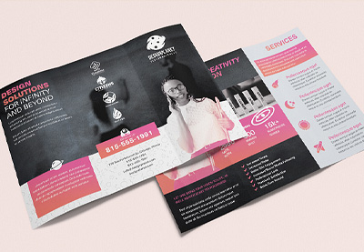

I hope this article brought some awesome new resources into your tool kit, from design inspiration to free templates that you can add to your arsenal.
Ready to jump in and start creating? Remember, you can find plenty of professional bifold and tri-fold designs on Envato Elements, if you’re looking for more inspiration or a premium option! Only need a single 3-fold or bifold brochure template? Check out GraphicRiver.
Here’s to your design project. Hopefully, your brochure meets all your goals and dazzles your audience! Why not get started today by downloading your next bifold or tri-fold brochure template?

Post pobrano z: 20 Best Free Bifold & Tri-Fold Brochure Template Designs (Download 2021)
Working on a bifold or tri-fold brochure project? Working with a professionally designed template could be the jump start you need to get your project started, going, or even completed!
I like to keep and collect a bank of tools, assets, and resources for professional and commercial use—like free templates and other valuable free finds on the Internet. In this article, we’ll look at some of the best free tri-fold and bifold brochure designs out there.
Before we dig into some awesome free finds, let’s take a quick look at some premium bifold and tri-fold brochure template options—they can be a great source of inspiration for your next tri-fold or bifold brochure! Then, we’ll dig right into a list of free templates to add to your design arsenal.
I get it—we’re all trying to get things done. We’re all working with a budget. Finding the right bifold or tri-fold brochure template, and finding it for free, is awesome. However, it can be a time-consuming process with limited results (that’s why lists are so handy, right?).
Don’t worry, we’re going to look at plenty of free content. But it’s good to think about the pros and cons when conducting your search.
A premium template comes with more options, more content. Often, there’s even documentation to help you get the job done. It can be way easier to find what you’re looking for, in way less time, with less hoops to jump through, too. There also tends to be more quality control when you’re working with a premium product.
Check out Envato Elements. There are plenty of brochure design templates here to check out.
The best part is, you’re looking at one fee for unlimited downloads. Download as many templates as you’d like to try out. Mix and match them, test them out—it’s all included.
The process is as simple as downloading the template and opening it up in the applicable software. Customize the content and the design to meet your project’s goals. This can also be a great fit if you’d like to try out more than one template! Download and experiment to your heart’s content.
Before we continue, let’s look at some of the awesome offerings on Envato Elements. Pick one up, or sit back and enjoy some visual inspiration for your next design project!
Prefer a bifold brochure style layout? Check out this brochure template design. Many templates, like this one, are for Adobe InDesign. It’s got stylish considerations for both the front and back cover.
Cute design, right? This brochure design has fashion in mind but could work for a variety of situations. This one’s for Adobe Illustrator—what software will you opt to use?
Darker colors and higher contrast make this bifold brochure design stand out! It also comes in two different sizes: US Letter and A4. This perk makes it pretty versatile—you could use it for more than one project!
Check out this colorful brochure template. Not only is it stylish and whimsical, but it’s available in such a wide variety of formats! From Photoshop to Microsoft Word, this one’s easy to customize.
How about a clean, organic look? This template has such a relaxing vibe. What kind of aesthetic do you think would work best for your brochure project? This one would be great for showcasing photos!
If you need a brochure for your restaurant or food business, this trifold food brochure template is a great option for you. It’s really easy to use because is fully layered and well organized. Some of its cool features are:
Not a fan of unlimited downloads? Prefer to only download and pay for the bifold or tri-fold brochures you need, rather than working from a large collection? Check out GraphicRiver—pay as you go, download only what you need, per brochure template.
The benefit here is that you’re looking at a one-time fee for exactly what you’re looking for, and that’s that—a simple, one-time transaction, no subscription fees and no fuss.
Let’s look at some of the awesome content available over on GraphicRiver before we dig into our collection of free finds.
How about a design that’s a little out of the ordinary? This trichure design folds outward and features square dimensions. This approach could be a perfect fit for art, design, and architecture projects—or any situation where you want to subvert expectations!
A pop of color can be eye-catching, right? In this tri-fold brochure template design, the red really stands out.
One of the great things about working with templates, like this one, is how easy it is to customize them. Red’s not your key color? Easily make it blue!
A three-fold brochure can be a great fit for menu designs. It can also work well for a whole host of different service-related data. Imagine having all your business offerings available in one easy-to-hand-out brochure!
A brochure template can save you a lot of time, but working with one can also be a lot of fun. It can help jump-start your process and give you a head start. Jump into a design, like this one, and start making your customizations.
A bifold brochure template like this one could be a great fit for a project with a lot of content to share with viewers. It’s important to present your content in a clear, organized way. This template does just that—with four different pages to mix and match, too!
Now, let’s check out a selection of awesome bifold and tri-fold brochure templates for free from different sources on the Internet. Consider adding these links and websites to your list of resources, especially if you spot a design that catches your eye!
Let’s dig in and check out some great brochure designs for 2021 and beyond:
How fun is this colorful brochure template from InDesign Skills? It could be a perfect fit for your school-related function, or any project that could benefit from a little playfulness and whimsy.
Check out this 3-fold brochure template for free from TemplateLab—the darker part has such high contrast! This could be a great space for important information.
This free tri-fold brochure template was designed with luxury apartments in mind, but it’s got so much space to showcase your photos! It’s got the potential to work for a multitude of projects.
Looking for something simple and clean? This Microsoft Word tri-fold pamphlet is easy to edit and well organized. Jump in, add your content, and you’re ready to go.
This InDesign template has such a lovely color scheme! There’s plenty of space to showcase your content in a really artistic and fun way.
Building or real estate your area of expertise? Check out this 3-fold brochure template. There’s plenty of space for your info and your pictures. Easily edit it in Microsoft Word—for free!
Isn’t this a stylish template? Easily edit this bifold brochure in InDesign. It’s free to download and start designing, right now!
Simple and clean, with plenty of space to showcase your content—that’s this template! Want to push it further? It’s easy to dig in and make this your own in Adobe InDesign.
Here’s another lovely InDesign template. This one’s a tri-fold—how many folds do you think is most appropriate for your project? The white text against the muted blue looks awesome, but it’s also easy to customize this color scheme.
If you’re looking for something simple, this Microsoft Word template might fit the bill. It’s clean, to the point, ready for your edits, and free to use!
This bifold brochure template could be a great fit if you’ve got infographics to include. Or it would be great if you’ve got some photos that’ll work well in a collage setting!
Check out this stylish, color block look! Jump in and customize the imagery, the text, and the color scheme in this free tri-fold pamphlet template for Adobe InDesign.
Fun and colorful flowers are the theme of this free Microsoft Word tri-fold layout. Download it now and start customizing this design with your content!
Prefer a bi-fold brochure design? This InDesign template could work for a variety of projects. Not only is it adaptable—it’s also free!
Floral elements and organic colors can make for such a soothing, welcoming, visual experience, just like we see in this free template. You could swap this out, change the colors, and it could work for so many projects!
Working in academia? Trying to get the word out to your community? This template could be a great fit, especially if you’ve got a lot of content to share.
This Adobe InDesign template mixes up the composition with rounded shapes to command the viewer’s attention. Variation in shape, like this, can be a great way to mix things up.
Sometimes, less is more, like in this Microsoft Word Brochure template. Don’t underestimate clean, open space in a design—it can work really well! This tri-fold brochure template is ready for mailing address content, too!
This is another great example of a minimalist design! There are interesting pops of color here, too—notice how the red really stands out! What color would you use in this design?
We can also use color and value to divide our composition and organize our content, as we see in this free three-fold brochure template! Download this one and give it a try!
So you found the perfect template. How do you make the right changes? Or you found a design you love, but you don’t understand why you love it. What makes a brochure design good versus great?
Here are some design tips that can help you with your brochure design choices:
It’s important to consider more than just how your brochure looks.
We want our brochure design to look snazzy, but if it doesn’t function well—if the reader can’t navigate the content easily—then we potentially lose our audience.
Make sure to consider what content should go where—and why. For example, what sides of your brochure will the viewer likely see first? What might they see last? Using this information, what information should you prioritize and what might be more appropriate as supplemental content?
Color can be very communicative. These communicative qualities really depend on our target audience. When working with color, as you design or customize your brochure design, here are some tips to keep in mind:
Reading a brochure should potentially be a cohesive experience—a continuous document with a unifying theme. Think about it like this: if you were writing the content for your brochure, the content would all be related, with one specific goal or purpose.
The same perspective works well for visual elements in a design. Establishing visual relationships and using repeating elements can help create a sense of cohesion and continuation from panel to panel.
Let’s say you’ve got a longer brochure to create, with a lot of content to deliver to your audience. It might get a little tedious to look at if every page is exactly the same. It’s fun to mix things up, and it makes for a more visually engaging presentation.
But, as we discussed a little earlier, consistency is a great way to build a cohesive experience. Too much similarity, and we risk boredom. How do we find a happy medium?
Use things like colors, repeating footers, logos, and other repeating elements to help establish that consistency—but still mix it up with layout variations.
Design is a lot of fun, but we can end up with a lot of choices. Don’t forget that great design is often both form and function. It can’t just look good. It’s got to work too.
Of course, that’s easier said than done. But it’s often a good rule of thumb to make sure your content isn’t cluttered. Here are some tips that can help keep your content easy to read:
Are you still looking for that perfect tri-fold or bifold brochure design? We’ve got plenty of brochure templates for you to choose from. Here are some more options:
When it comes to great design, there’s a lot to explore and cover. To learn more about brochure design and best practices, or to pump up your design skills, check out some of the tutorials on Envato Tuts+. From brochure design to typography to creating T-shirt designs, there’s so much to see and learn.
Check out these tutorials for more inspiration and brochure design walk-throughs, if you’d like to try making one from scratch.
BONUS: don’t forget to check our complete guide, where you’ll find a compilation of our best brochure design tutorials and inspiration: Brochure Design & Templates
I hope this article brought some awesome new resources into your tool kit, from design inspiration to free templates that you can add to your arsenal.
Ready to jump in and start creating? Remember, you can find plenty of professional bifold and tri-fold designs on Envato Elements, if you’re looking for more inspiration or a premium option! Only need a single 3-fold or bifold brochure template? Check out GraphicRiver.
Here’s to your design project. Hopefully, your brochure meets all your goals and dazzles your audience! Why not get started today by downloading your next bifold or tri-fold brochure template?
Post pobrano z: How to Create a GTA Photo Effect Action in Adobe Photoshop

The effect shown above is the one I will show you how to create in this tutorial. If you would like to create the even more advanced grand theft auto photo effects shown below and using just a single click, then check out my Grandiose Photoshop Action.

Follow along with us over on our Envato Tuts+ YouTube channel:
To recreate the design above, you will need the following photo:
First, open the photo that you want to work with. To open your photo, go to File > Open, choose your photo, and click Open. Now, before we get started, just check a couple of things:

Now we are going to crop the image to remove some of the space above the subject. Choose the Crop Tool (C), and transform the Crop Box as shown below:

In this section, we are going to create a GTA art style from our photo. Go to Layer > New > Layer to create a new layer and name it Temp 1.

Now press Control-Alt-Shift-E on your keyboard to make a screenshot, and then go to Image > Adjustments > Shadows/Highlights, and set Shadows to 10% and Highlights to 2% as shown below:

Go to Layer > New > Layer to create a new layer and name it Temp 2.

Now press Control-Alt-Shift-E on your keyboard to make a screenshot, and go to Filter > Sharpen > Sharpen. Then press Control-F on your keyboard to repeat this filter.

Change the Blending Mode of this layer to Soft Light, and then go to Filter > Other > High Pass and set the Radius to 1.5 px as shown below:

Now Control-click on the Temp 1 layer to get both layers selected at the same time and press Control-E on your keyboard to merge these two layers into one layer.

Go to Filter > Stylize > Diffuse and set the Mode to Anisotropic.

Now go to Edit > Transform > Rotate 90° Clockwise to rotate this layer 90° clockwise, and then press Control-F on your keyboard to repeat the previous filter.

Go to Edit > Transform > Rotate 90° Clockwise to rotate this layer another 90° clockwise, and then press Control-F on your keyboard to repeat the previous filter again.

Now go to Edit > Transform > Rotate 180° to rotate this layer 180° clockwise, and then go to Filter > Sharpen > Smart Sharpen and set the Amount to 250%, Radius to 1.5 px and Remove to Gaussian Blur as shown below:

Go to Filter > Noise > Reduce Noise, and set the Strength to 5, Preserve Details to 0%, Reduce Color Noise to 54% and Sharpen Details to 0% as shown below:

Now go to Layer > New > Layer to create a new layer and name it Temp 3.

Press Control-Alt-Shift-E on your keyboard to make a screenshot, and then go to Filter > Filter Gallery > Artistic > Cutout, and set the Number of Levels to 4, Edge Simplicity to 0 and Edge Fidelity to 3 as shown below:

Now set the Blending Mode of this layer to Soft Light and set the Opacity to 56%.

Control-click on the Temp 2 layer to get both layers selected at the same time and press Control-E on your keyboard to merge them. Then name this new layer GTA Art Style.

In this section, we are going to create a stroke around the subject. Select the Background layer, hide the GTA Art Style layer, choose the Quick Selection Tool (W), and select the background. Feel free to use the Shift and Alt buttons to add or remove some areas from the selection. Then press Control-Shift-I on your keyboard to invert the selection and get the selection around the subject.

Now go to Select > Modify > Smooth and set the Sample Radius to 5 px. Then select and show the GTA Art Style layer, go to Layer > New > Layer to create a new layer, and name it Subject Stroke.

Choose the Rectangular Marquee Tool (M), set the foreground color to #000000, Right-click anywhere inside the canvas, and choose Stroke. Set the Width to 5 px, Location to Outside, Mode to Normal and Opacity to 100% as shown below:

In this section, we are going to make final adjustments to the design. Press D on your keyboard to reset the swatches, go to Layer > New Adjustment Layer > Gradient Map to create a new gradient map adjustment layer, and name it Overall Contrast.

Now change the Blending Mode of this layer to Soft Light and set the Opacity to 26%.

Go to Layer > New Adjustment Layer > Levels to create a new levels adjustment layer and name it Overall Brightness.

Now Double-click on this layer thumbnail and in the Properties panel use the settings below:

Go to Layer > New Adjustment Layer > Hue/Saturation to create a new hue/saturation adjustment layer and name it Overall Saturation.

Now Double-click on this layer thumbnail and in the Properties panel use the settings below:

Go to Layer > New Adjustment Layer > Curves to create a new curves adjustment layer and name it Color Look.

Now Double-click on this layer thumbnail and in the Properties panel use the settings below:

Go to Layer > New Adjustment Layer > Brightness/Contrast to create a new brightness/contrast adjustment layer and name it Background Brightness.

Now, while the layer mask of the Background Brightness layer is selected, choose the Brush Tool (B), set the foreground color to #000000, and brush over the subject.

Double-click on this layer thumbnail and in the Properties panel enter the settings below:

Congratulations, you have succeeded! Here is our final result:

If you would like to create the even more advanced grand theft auto photo effects shown below and using just a single click, then check out my Grandiose Photoshop Action.
The action works so you just
fill in your subject with a color and play the action. Yes, it’s really
that simple! The action will do all the work for you, leaving you fully
layered results that you can further customize.
It comes with a detailed video tutorial that demonstrates how to use the action and also how to customize the results to get the most out of the effect.
