The phone in your pocket is a remarkable piece of engineering. It is a computer, a camera, a cinema, and a library, all compressed into a slab of metal and glass. But despite this technological marvel, there is a fundamental flaw: for many of us, our phones have become too big for our hands. The screen keeps growing, but our hands have not changed.
The Simple Reason: Our Hands Haven’t Grown
Smartphones have become undeniably larger over the years . There are several reasons for this. The push toward mobile internet and video consumption has made larger screens more desirable . A bigger phone allows for a larger battery, and for manufacturers, a larger device can often command a higher price .
However, the physical dimensions of our hands remain unchanged. An old NASA study cited by experts suggests that the average hand breadth (the width of your palm) is about 3.5 inches for men and 3.1 inches for women . The average thumb length is around 2.74 inches for men and 2.49 inches for women . When a phone’s width exceeds this comfortable reach, it becomes a struggle to use one-handed. You have to stretch your thumb uncomfortably, constantly adjust your grip, or simply concede defeat and use two hands.
What “Too Big” Feels Like
You know your phone is too big when the simple act of using it becomes a physical compromise. The most immediate discomfort is thumb strain. When you have to stretch your thumb across a large screen to reach the far side, it creates tension in the hand and wrist. This leads to a constant shifting of the phone’s position in your hand, a “grip shuffle,” which can feel precarious and tiring. The phone often becomes a “two-hand device” for any task beyond a simple swipe .
There is also a stark contrast between how a phone fits. The feeling of a truly compact phone is often described as liberating . Users of phones like the iPhone 13 Mini or Samsung Galaxy S10e recall the joy of a device that was easy to grip, fit comfortably in any pocket, and allowed effortless one-handed use . They felt like the phone was an extension of the hand, not an object to be wrestled with. The obsession with making phones thinner is a similar misstep; it doesn’t solve the fundamental problem of width and height. As one analyst put it, focusing on thinness is pointless; we should be asking for phones that are “short” again .
The Market’s Shift and the Case for Compact Phones
For years, consumers who wanted a small phone were forced to accept underpowered “value” models that lacked the best cameras or features . This is changing. There is a growing (though still niche) movement toward compact flagships. Brands like Google, vivo, and OnePlus have experimented with phones like the Pixel 10 Pro and OnePlus 13s, offering flagship performance in a smaller form factor . For many, a 6.3-inch screen is emerging as the “sweet spot,” offering enough screen space for most tasks while still being comfortable to use one-handed . It represents a balance between the ergonomics of a compact phone and the features of a high-end device .
The Trade-Off
It is a classic design compromise. Bigger screens are better for watching video, gaming, and productivity. They offer a more immersive experience and can make multitasking easier. But you sacrifice comfort, portability, and the ease of one-handed use . A smaller phone can’t fit a huge battery, and its keyboard is more cramped. However, for the vast majority of daily tasks, the difference is less about capability and more about comfort. As one writer put it, “you don’t need all that screen real estate” . The feeling of a phone that fits your hand properly is not about nostalgia. It is about pure, unadulterated comfort. And that, it turns out, is a feeling worth chasing.
A CRM system is a significant investment. But most businesses budget for the software license and forget everything else. The real cost of getting organized includes consulting, data migration, customization, training, and ongoing support, often 2-3 times the license fee alone. Here’s what businesses actually pay in 2026.
The Licensing Landscape: What Software Costs
CRM license pricing varies dramatically by platform and feature tier:
Salesforce leads the enterprise market with clear tiers: Starter at $25/user/month, Professional at $80, Enterprise at $165, and Unlimited+ at $330. Einstein AI adds $50/user/month on top of Professional or Enterprise. For a 10-person team on Enterprise with AI, annual licensing alone hits $25,800.
SAP Sales Cloud V2 typically costs $60–80/user/month, making it more competitive than Salesforce for feature parity. Volume discounts apply for 50+ users with multi-year commitments.
HubSpot ranges from free tools to $150/user/month for Enterprise, with mid-tier Professional at around $50–90 depending on features.
Microsoft Dynamics 365 Sales runs $65–162/user/month, climbing fast with add-ons.
A 50-user mid-market company on Salesforce Enterprise Edition pays approximately $105,000 per year in licensing alone before any implementation costs.
Implementation: The One-Time Investment
The license is the floor, not the ceiling. Implementation costs typically match or exceed first-year license fees.
By Business Size
Small businesses with 1-10 users pay $10,000–50,000 for implementation over 4-8 weeks. Growing SMBs with 10-50 users invest $50,000–150,000 over 2-4 months. Mid-market companies with 50-200 users spend $75,000–250,000 across 4-6 months. Enterprise deployments with 200+ users routinely exceed $150,000–500,000+ over 6-12 months.
What Implementation Includes
A standard implementation covers discovery and requirements workshops, system configuration (pipelines, territories, user roles, dashboards), integration setup, data migration, user acceptance testing, training, and go-live support.
For SAP Sales Cloud V2, a standard 8-16 week implementation for a mid-market company runs $40,000–120,000. Enterprise rollouts with 100+ users, multiple business units, and custom development typically cost $150,000–400,000+ over 3-6 months.
For Zoho implementations, costs range from $2,500–7,500 for basic setups to $20,000–75,000 for enterprise solutions.
The Hidden Costs That Break Budgets
Most businesses underestimate CRM costs by 40-80% because they overlook these line items:
Data migration and cleansing is the most common surprise. Duplicate contacts, inconsistent naming, missing fields, these problems exist in every source system. Budget 10-20% of implementation cost for data work. Skipping this means importing garbage into a clean system.
Customization costs add up quickly. Salesforce custom work (Apex, LWCs) runs $100–200/hour, with full custom builds exceeding $85,000. SAP’s plug-in framework development adds similar costs for complex requirements.
Integrations are frequently underestimated. Basic connectors cost $10,000–50,000, while complex enterprise integrations can reach $100,000+. For SAP ERP shops, native integration saves $20,000–50,000/year versus third-party CRM with middleware.
AppExchange add-ons catch many Salesforce buyers off guard. Features like advanced reporting, deduplication, document management, and e-signatures require paid apps, each with its own monthly fee.
Sandbox environments for development and testing cost extra, especially for organizations running multiple development cycles simultaneously. Data storage overages add approximately $125/month per 500MB beyond included limits.
Training and change management is where most projects cut corners, and where they fail. A CRM only works if people use it. Budget $5,000–15,000 for mid-market deployments. The cost of not doing this: low adoption, inaccurate data, and sales reps reverting to spreadsheets.
Post-launch support typically runs $10,000–45,000 annually. Premier Support from Salesforce adds roughly 30% to license fees. Many businesses also need a dedicated administrator, a full-time role with salaries from $70,000–120,000+ per year.
Real-World Total Cost Examples
Small business, 10 users on Salesforce Professional: Licenses: $9,600/year. Implementation: $15,000–25,000. Training: $3,000. AppExchange add-ons: $2,400/year. Year 1 total: approximately $30,000–40,000.
Mid-market, 50 users on SAP Sales Cloud V2: Licenses: $42,000–48,000/year. Standard implementation: $40,000–120,000. S/4HANA integration (if applicable): $20,000–50,000/year saved versus third-party CRM. Year 1 total: $82,000–168,000.
Enterprise, 200+ users on Salesforce Unlimited: Licenses: $330/user/month = $792,000/year. Implementation: $150,000–500,000+. Integrations: $50,000–100,000. Admin team: $140,000–240,000/year. Premier Support: ~$240,000/year. Year 1 total easily exceeds $1.5 million.
Strategies to Control Costs
Phase your rollout. Start with core use cases, then iterate. A 10-person agency doesn’t need territory management or CPQ.
Use declarative tools before custom code. Salesforce’s Flows and SAP’s standard configurations handle most needs without expensive development.
Optimize license mix. Give higher tiers to power users, lower-cost licenses to light users. Not everyone needs Enterprise.
Consider industry-specific solutions. For financial brokerages, white-label platforms like B2CORE reduce time-to-launch by 60-70% compared to custom builds, with pre-built compliance modules for KYC, AML, and trading integrations.
Get a fixed-price scope for well-defined deliverables. For evolving requirements, time and materials offers flexibility but requires tight governance.
The Bottom Line
CRM implementation is not a software purchase. It’s a business transformation. The organizations that budget realistically, planning for data migration, training, integration, and ongoing support, succeed. Those that focus only on the license price fail.
A reliable rule of thumb: budget 40-80% above your license cost for true Year 1 total cost of ownership. If you’re spending $60,000 on licenses, your real Year 1 cost is likely $84,000–108,000 when everything is factored in. Plan accordingly, and your CRM will deliver the ROI you’re expecting.
A CRM system is a significant investment. But most businesses budget for the software license and forget everything else. The real cost of getting organized includes consulting, data migration, customization, training, and ongoing support, often 2-3 times the license fee alone. Here’s what businesses actually pay in 2026.
The Licensing Landscape: What Software Costs
CRM license pricing varies dramatically by platform and feature tier:
Salesforce leads the enterprise market with clear tiers: Starter at $25/user/month, Professional at $80, Enterprise at $165, and Unlimited+ at $330. Einstein AI adds $50/user/month on top of Professional or Enterprise. For a 10-person team on Enterprise with AI, annual licensing alone hits $25,800.
SAP Sales Cloud V2 typically costs $60–80/user/month, making it more competitive than Salesforce for feature parity. Volume discounts apply for 50+ users with multi-year commitments.
HubSpot ranges from free tools to $150/user/month for Enterprise, with mid-tier Professional at around $50–90 depending on features.
Microsoft Dynamics 365 Sales runs $65–162/user/month, climbing fast with add-ons.
A 50-user mid-market company on Salesforce Enterprise Edition pays approximately $105,000 per year in licensing alone before any implementation costs.
Implementation: The One-Time Investment
The license is the floor, not the ceiling. Implementation costs typically match or exceed first-year license fees.
By Business Size
Small businesses with 1-10 users pay $10,000–50,000 for implementation over 4-8 weeks. Growing SMBs with 10-50 users invest $50,000–150,000 over 2-4 months. Mid-market companies with 50-200 users spend $75,000–250,000 across 4-6 months. Enterprise deployments with 200+ users routinely exceed $150,000–500,000+ over 6-12 months.
What Implementation Includes
A standard implementation covers discovery and requirements workshops, system configuration (pipelines, territories, user roles, dashboards), integration setup, data migration, user acceptance testing, training, and go-live support.
For SAP Sales Cloud V2, a standard 8-16 week implementation for a mid-market company runs $40,000–120,000. Enterprise rollouts with 100+ users, multiple business units, and custom development typically cost $150,000–400,000+ over 3-6 months.
For Zoho implementations, costs range from $2,500–7,500 for basic setups to $20,000–75,000 for enterprise solutions.
The Hidden Costs That Break Budgets
Most businesses underestimate CRM costs by 40-80% because they overlook these line items:
Data migration and cleansing is the most common surprise. Duplicate contacts, inconsistent naming, missing fields, these problems exist in every source system. Budget 10-20% of implementation cost for data work. Skipping this means importing garbage into a clean system.
Customization costs add up quickly. Salesforce custom work (Apex, LWCs) runs $100–200/hour, with full custom builds exceeding $85,000. SAP’s plug-in framework development adds similar costs for complex requirements.
Integrations are frequently underestimated. Basic connectors cost $10,000–50,000, while complex enterprise integrations can reach $100,000+. For SAP ERP shops, native integration saves $20,000–50,000/year versus third-party CRM with middleware.
AppExchange add-ons catch many Salesforce buyers off guard. Features like advanced reporting, deduplication, document management, and e-signatures require paid apps, each with its own monthly fee.
Sandbox environments for development and testing cost extra, especially for organizations running multiple development cycles simultaneously. Data storage overages add approximately $125/month per 500MB beyond included limits.
Training and change management is where most projects cut corners, and where they fail. A CRM only works if people use it. Budget $5,000–15,000 for mid-market deployments. The cost of not doing this: low adoption, inaccurate data, and sales reps reverting to spreadsheets.
Post-launch support typically runs $10,000–45,000 annually. Premier Support from Salesforce adds roughly 30% to license fees. Many businesses also need a dedicated administrator, a full-time role with salaries from $70,000–120,000+ per year.
Real-World Total Cost Examples
Small business, 10 users on Salesforce Professional: Licenses: $9,600/year. Implementation: $15,000–25,000. Training: $3,000. AppExchange add-ons: $2,400/year. Year 1 total: approximately $30,000–40,000.
Mid-market, 50 users on SAP Sales Cloud V2: Licenses: $42,000–48,000/year. Standard implementation: $40,000–120,000. S/4HANA integration (if applicable): $20,000–50,000/year saved versus third-party CRM. Year 1 total: $82,000–168,000.
Enterprise, 200+ users on Salesforce Unlimited: Licenses: $330/user/month = $792,000/year. Implementation: $150,000–500,000+. Integrations: $50,000–100,000. Admin team: $140,000–240,000/year. Premier Support: ~$240,000/year. Year 1 total easily exceeds $1.5 million.
Strategies to Control Costs
Phase your rollout. Start with core use cases, then iterate. A 10-person agency doesn’t need territory management or CPQ.
Use declarative tools before custom code. Salesforce’s Flows and SAP’s standard configurations handle most needs without expensive development.
Optimize license mix. Give higher tiers to power users, lower-cost licenses to light users. Not everyone needs Enterprise.
Consider industry-specific solutions. For financial brokerages, white-label platforms like B2CORE reduce time-to-launch by 60-70% compared to custom builds, with pre-built compliance modules for KYC, AML, and trading integrations.
Get a fixed-price scope for well-defined deliverables. For evolving requirements, time and materials offers flexibility but requires tight governance.
The Bottom Line
CRM implementation is not a software purchase. It’s a business transformation. The organizations that budget realistically, planning for data migration, training, integration, and ongoing support, succeed. Those that focus only on the license price fail.
A reliable rule of thumb: budget 40-80% above your license cost for true Year 1 total cost of ownership. If you’re spending $60,000 on licenses, your real Year 1 cost is likely $84,000–108,000 when everything is factored in. Plan accordingly, and your CRM will deliver the ROI you’re expecting.
A stunning ad doesn’t matter if no one stops scrolling. In 2026, the Facebook algorithm has fundamentally changed: creative doesn’t just attract attention, it is the targeting. Meta’s Andromeda algorithm now reads your visuals, audio, and captions to determine who should see your ad. Feed it the wrong signals, and your costs skyrocket. Feed it the right ones, and your ROI follows.
Here’s how to design Facebook ads that convert across every placement.
The Algorithm Has Changed: Creative = Targeting
Historically, you picked an audience first, then designed an ad for them. In 2026, that model is dead. Meta’s AI now analyzes your creative assets directly, interpreting visual cues, sounds, and text to decide who gets served the ad.
If you’re selling hiking boots, your ad needs to show a trail, mud, or a boot in action. The AI reads those signals. If your ad is a generic product shot on white, the algorithm has no idea who to show it to, and your CPMs will rise.
The rule: design for the algorithm’s vision, not just human eyes.
1. Feed Ads: The High-Intent Workhorse
Facebook and Instagram Feeds remain the most stable, high-volume placements. They excel at both branding and direct conversion because they allow for deeper storytelling and clear calls-to-action.
What works in 2026:
Authentic, “Ugly” Creatives. Polished, studio-shot ads are getting filtered out. Ads that look like organic content (lo-fi video, user-generated footage, founder selfies) are bypassing mental ad-blockers. One demand gen pro noted that “ugly ads” that appear platform-native often see dramatically higher CTRs because they don’t trigger the viewer’s internal “this is an ad” alarm.
Carousels are back. Instead of one image, use 3-10 cards to tell a story or showcase multiple products. Meta’s current trends show carousels performing very well, particularly for e-commerce.
Text-heavy statics. Don’t sleep on static images. They still drive 60-70% of conversions on Meta. A bold, text-only graphic that states a clear problem/solution can outperform a video if the hook is strong enough.
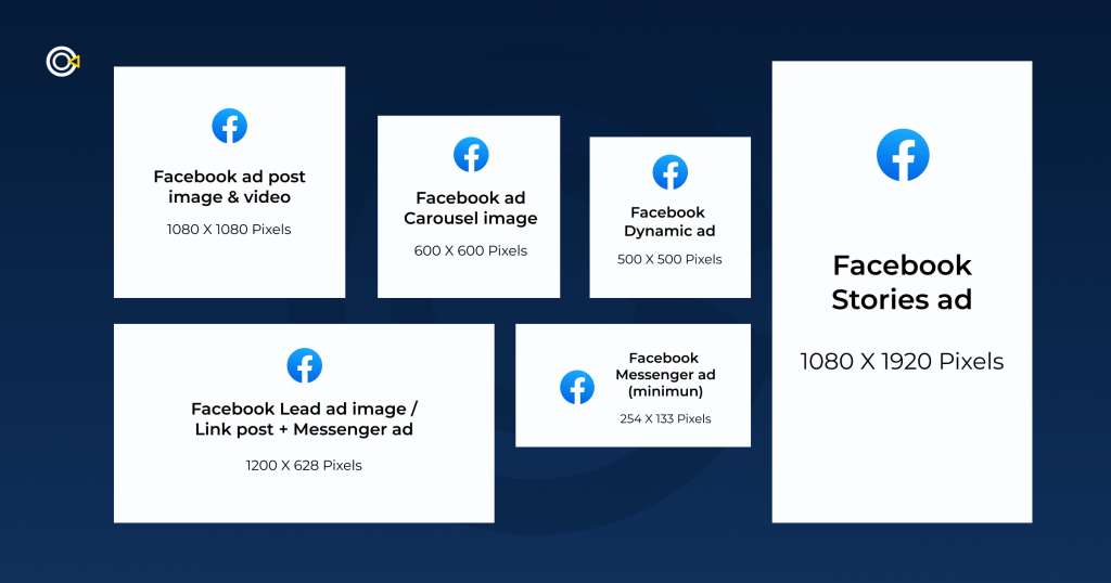
Specs: 1:1 (1080×1080) or 4:5 (1080×1350). Keep critical text away from the bottom 15% (where the action buttons sit).
2. Reels & Short-Form Video: The Discovery Engine
Short-form video is no longer just for “brand awareness.” With YouTube Shorts hitting billions of views and Instagram prioritizing Reels, this format is now a full-funnel performance driver.
What works in 2026:
The “Hook” is visual. You have 1-3 seconds to stop the scroll. Do not start with a logo fade-in. Start with a visual question, a surprising result, or a person talking directly to the camera.
Platform-native pacing. Don’t export a horizontal TV ad and crop it. Shoot vertically, use captions (sound off is default for many), and embrace fast cuts. The content should blend into the feed, not interrupt it.
Founder-led content. People trust people, not brands. Videos featuring a founder or an employee explaining a product’s “why” are generating up to 25% more leads than faceless corporate animations.
Specs: 9:16 (1080×1920). Duration: 15-60 seconds is the sweet spot. Text must be in the “safe zone” (center 80% of the frame) to avoid being covered by the like/comment buttons or profile icons.
3. Stories & Reels: The Full-Screen Immersion
Stories (and Reels placements) offer a full-screen, distraction-free environment. Because users tap through them quickly, you have about 5 seconds to convey your value proposition before they swipe away.
What works in 2026:
Vertical-First Design. Never run a horizontal letterboxed video here. It breaks the immersion. Use the full 9:16 canvas.
Dynamic Elements. Use stickers, polls, or countdown timers. In Stories, interactivity stops the swipe. A poll about a pain point engages the user immediately.
Sound & Silence. Since many users browse in public, design your Story to be understood with captions, but use trending audio to boost reach when sound is on.
Testing: Finding Your Winner (Without Wasting Budget)
Even the best hypothesis needs validation. With creative driving 56% of campaign outcomes, a systematic testing approach is non-negotiable.
1. Use Advantage+ Creative (AAC). Don’t just upload one image. Meta’s AI can now generate multiple text variations, adjust brightness, and even animate static images. Turn on Advantage+ Creative to let the algorithm serve the best combination to the right user. Studies show this can increase sales by 1.2x to 7.4x.
2. Dynamic Creative (DCO). Upload 3-5 headlines, 3 images/videos, and 2 descriptions. Meta will mix and match them in real-time to find the winning combo. This is more efficient than running 10 separate manual ads.
3. The “Big Swing” Test. Don’t test red vs. blue buttons. Test Video vs. Static or Problem-focused vs. Benefit-focused. Make the differences obvious so the data is conclusive.
Key Takeaways
Creative is the new targeting. Diversify your assets (images, short video, carousels) to give the AI enough data to find your customers.
Authenticity beats production value. User-generated content and founder-led videos build trust faster than polished commercials.
Optimize by placement. An ad that works in the Feed will fail in Stories if it’s not 9:16. Use the platform tools to customize aspect ratios per placement.
Let AI do the heavy lifting. Use Dynamic Creative and Advantage+ to automate testing, but always keep human oversight on the final brand message.
In 2026, the brands that win are not the ones with the biggest budgets, they are the ones with the smartest creative systems. Design for the algorithm, test relentlessly, and let authentic visuals lead the way.
A stunning ad doesn’t matter if no one stops scrolling. In 2026, the Facebook algorithm has fundamentally changed: creative doesn’t just attract attention, it is the targeting. Meta’s Andromeda algorithm now reads your visuals, audio, and captions to determine who should see your ad. Feed it the wrong signals, and your costs skyrocket. Feed it the right ones, and your ROI follows.
Here’s how to design Facebook ads that convert across every placement.
The Algorithm Has Changed: Creative = Targeting
Historically, you picked an audience first, then designed an ad for them. In 2026, that model is dead. Meta’s AI now analyzes your creative assets directly, interpreting visual cues, sounds, and text to decide who gets served the ad.
If you’re selling hiking boots, your ad needs to show a trail, mud, or a boot in action. The AI reads those signals. If your ad is a generic product shot on white, the algorithm has no idea who to show it to, and your CPMs will rise.
The rule: design for the algorithm’s vision, not just human eyes.
1. Feed Ads: The High-Intent Workhorse
Facebook and Instagram Feeds remain the most stable, high-volume placements. They excel at both branding and direct conversion because they allow for deeper storytelling and clear calls-to-action.
What works in 2026:
Authentic, “Ugly” Creatives. Polished, studio-shot ads are getting filtered out. Ads that look like organic content (lo-fi video, user-generated footage, founder selfies) are bypassing mental ad-blockers. One demand gen pro noted that “ugly ads” that appear platform-native often see dramatically higher CTRs because they don’t trigger the viewer’s internal “this is an ad” alarm.
Carousels are back. Instead of one image, use 3-10 cards to tell a story or showcase multiple products. Meta’s current trends show carousels performing very well, particularly for e-commerce.
Text-heavy statics. Don’t sleep on static images. They still drive 60-70% of conversions on Meta. A bold, text-only graphic that states a clear problem/solution can outperform a video if the hook is strong enough.
Specs: 1:1 (1080×1080) or 4:5 (1080×1350). Keep critical text away from the bottom 15% (where the action buttons sit).
2. Reels & Short-Form Video: The Discovery Engine
Short-form video is no longer just for “brand awareness.” With YouTube Shorts hitting billions of views and Instagram prioritizing Reels, this format is now a full-funnel performance driver.
What works in 2026:
The “Hook” is visual. You have 1-3 seconds to stop the scroll. Do not start with a logo fade-in. Start with a visual question, a surprising result, or a person talking directly to the camera.
Platform-native pacing. Don’t export a horizontal TV ad and crop it. Shoot vertically, use captions (sound off is default for many), and embrace fast cuts. The content should blend into the feed, not interrupt it.
Founder-led content. People trust people, not brands. Videos featuring a founder or an employee explaining a product’s “why” are generating up to 25% more leads than faceless corporate animations.
Specs: 9:16 (1080×1920). Duration: 15-60 seconds is the sweet spot. Text must be in the “safe zone” (center 80% of the frame) to avoid being covered by the like/comment buttons or profile icons.
3. Stories & Reels: The Full-Screen Immersion
Stories (and Reels placements) offer a full-screen, distraction-free environment. Because users tap through them quickly, you have about 5 seconds to convey your value proposition before they swipe away.
What works in 2026:
Vertical-First Design. Never run a horizontal letterboxed video here. It breaks the immersion. Use the full 9:16 canvas.
Dynamic Elements. Use stickers, polls, or countdown timers. In Stories, interactivity stops the swipe. A poll about a pain point engages the user immediately.
Sound & Silence. Since many users browse in public, design your Story to be understood with captions, but use trending audio to boost reach when sound is on.
Testing: Finding Your Winner (Without Wasting Budget)
Even the best hypothesis needs validation. With creative driving 56% of campaign outcomes, a systematic testing approach is non-negotiable.
1. Use Advantage+ Creative (AAC). Don’t just upload one image. Meta’s AI can now generate multiple text variations, adjust brightness, and even animate static images. Turn on Advantage+ Creative to let the algorithm serve the best combination to the right user. Studies show this can increase sales by 1.2x to 7.4x.
2. Dynamic Creative (DCO). Upload 3-5 headlines, 3 images/videos, and 2 descriptions. Meta will mix and match them in real-time to find the winning combo. This is more efficient than running 10 separate manual ads.
3. The “Big Swing” Test. Don’t test red vs. blue buttons. Test Video vs. Static or Problem-focused vs. Benefit-focused. Make the differences obvious so the data is conclusive.
Key Takeaways
Creative is the new targeting. Diversify your assets (images, short video, carousels) to give the AI enough data to find your customers.
Authenticity beats production value. User-generated content and founder-led videos build trust faster than polished commercials.
Optimize by placement. An ad that works in the Feed will fail in Stories if it’s not 9:16. Use the platform tools to customize aspect ratios per placement.
Let AI do the heavy lifting. Use Dynamic Creative and Advantage+ to automate testing, but always keep human oversight on the final brand message.
In 2026, the brands that win are not the ones with the biggest budgets, they are the ones with the smartest creative systems. Design for the algorithm, test relentlessly, and let authentic visuals lead the way.
Markdown is a great invention that lets us write less markup. It also handles typographical matters like converting straight apostrophes (') to opening or closing quotes (' or ') for us.
Although Astro has built-in support for Markdown via .md files, I’d argue that your Markdown experience can be enhanced in two ways:
Thankfully, this can be handled easily with Astro containers. I’ll show you how to do this in Practical Astro.
Taking it Further
I’ve been building with Astro for 3+ years, and I kept running into the same friction points on content-heavy sites: blog pages, tag pages, pagination, and folder structures that get messy over time.
So I built Practical Astro: Content Systems, 7 ready-to-use solutions for Astro content workflows (MDX is just one of them). You get both the code and the thinking behind it.
If you want a cleaner, calmer content workflow, check it out.
I also write about Astro Patterns and Using Tailwind + CSS together on my blog. Come by and say hi!
Markdown is a great invention that lets us write less markup. It also handles typographical matters like converting straight apostrophes (') to opening or closing quotes (' or ') for us.
Although Astro has built-in support for Markdown via .md files, I’d argue that your Markdown experience can be enhanced in two ways:
Thankfully, this can be handled easily with Astro containers. I’ll show you how to do this in Practical Astro.
Taking it Further
I’ve been building with Astro for 3+ years, and I kept running into the same friction points on content-heavy sites: blog pages, tag pages, pagination, and folder structures that get messy over time.
So I built Practical Astro: Content Systems, 7 ready-to-use solutions for Astro content workflows (MDX is just one of them). You get both the code and the thinking behind it.
If you want a cleaner, calmer content workflow, check it out.
I also write about Astro Patterns and Using Tailwind + CSS together on my blog. Come by and say hi!
This issue of What’s !important brings you clip-path jigsaws, a view transitions toolkit, name-only containers, the usual roundup of new, notable web platform features, and more.
Creating a jigsaw puzzle using clip-path
CodePen Embed Fallback
Amit Sheen demonstrated how to create a full jigsaw puzzle using clip-path. While I doubt that you’ll need to create a jigsaw puzzle anytime soon, Amit’s walkthrough offers a fantastic way to acquaint yourself with this evolving CSS property that’s becoming more and more popular every day.
Chris Coyier discussed the use of name-only containers for scoping, and how they compare to class names and @scope. Personally, I prefer @scope because it tends to result in cleaner HTML, and it seems that Chris has updated his stance to be more @scope-aligned too, but it really comes down to personal preference. What’s your take on it?
Hey, remember subgrid?
At one point, subgrid was one of the most highly-anticipated CSS features, but it’s been two and half years since it became Baseline Newly Available, and it’s barely made a dent in the CSS landscape. This is a shame, because subgrid can help us to break out of grids properly and avoid the ‘ol Michael Scofield/nested wrappers/negative margins extravaganza.
Source: David Bushell (although the red grid lines were added by me).
You Might Not Need…JavaScript?
Remember You Might Not Need jQuery? Pavel Laptev’s The Great CSS Expansion has a similar vibe, noting CSS alternatives to JavaScript libraries (and JavaScript in general) that are smaller and more performant.
It’s becoming increasingly difficult to keep up with all of these new CSS features. I attempted way too many rounds of Keith Cirkel’s new CSS or BS? quiz, and my best score was only 18/20. Sad times. Let me know your score in the comments (unless it’s higher than mine…).
This issue of What’s !important brings you clip-path jigsaws, a view transitions toolkit, name-only containers, the usual roundup of new, notable web platform features, and more.
Creating a jigsaw puzzle using clip-path
CodePen Embed Fallback
Amit Sheen demonstrated how to create a full jigsaw puzzle using clip-path. While I doubt that you’ll need to create a jigsaw puzzle anytime soon, Amit’s walkthrough offers a fantastic way to acquaint yourself with this evolving CSS property that’s becoming more and more popular every day.
Chris Coyier discussed the use of name-only containers for scoping, and how they compare to class names and @scope. Personally, I prefer @scope because it tends to result in cleaner HTML, and it seems that Chris has updated his stance to be more @scope-aligned too, but it really comes down to personal preference. What’s your take on it?
Hey, remember subgrid?
At one point, subgrid was one of the most highly-anticipated CSS features, but it’s been two and half years since it became Baseline Newly Available, and it’s barely made a dent in the CSS landscape. This is a shame, because subgrid can help us to break out of grids properly and avoid the ‘ol Michael Scofield/nested wrappers/negative margins extravaganza.
Source: David Bushell (although the red grid lines were added by me).
You Might Not Need…JavaScript?
Remember You Might Not Need jQuery? Pavel Laptev’s The Great CSS Expansion has a similar vibe, noting CSS alternatives to JavaScript libraries (and JavaScript in general) that are smaller and more performant.
It’s becoming increasingly difficult to keep up with all of these new CSS features. I attempted way too many rounds of Keith Cirkel’s new CSS or BS? quiz, and my best score was only 18/20. Sad times. Let me know your score in the comments (unless it’s higher than mine…).
Writing large programs in JavaScript without modules would be pretty difficult. Imagine you only have the global scope to work with. This was the situation in JavaScript before modules. Scripts attached to the DOM were prone to overwriting each other and variable name conflicts.
With JavaScript modules, you have the ability to create private scopes for your code, and also explicitly state which parts of your code should be globally accessible.
JavaScript modules are not just a way of splitting code across files, but mainly a way to design boundaries between parts of your system.
Behind every technology, there should be a guide for its use. While JavaScript modules make it easier to write “big” programs, if there are no principles or systems for using them, things could easily become difficult to maintain.
How ESM Traded Flexibility For “Analyzability”
The two module systems in JavaScript are CommonJS (CJS) and ECMAScript Modules (ESM).
The CommonJS module system was the first JavaScript module system. It was created to be compatible with server-side JavaScript, and as such, its syntax (require(), module.exports, etc.) was not natively supported by browsers.
The import mechanism for CommonJS relies on the require() function, and being a function, it is not restricted to being called at the top of a module; it can also be called in an if statement or even a loop.
// CommonJS — require() is a function call, can appear anywhere
const module = require('./module')

// this is valid CommonJS — the dependency is conditional and unknowable until runtime
if (process.env.NODE_ENV === 'production') {
  const logger = require('./productionLogger')
}

// the path itself can be dynamic — no static tool can resolve this
const plugin = require(`./plugins/${pluginName}`)
The same cannot be said for ESM: the import statement has to be at the top. Anything else is regarded as an invalid syntax.
// ESM — import is a declaration, not a function call
import { formatDate } from './formatters'

// invalid ESM — imports must be at the top level, not conditional
if (process.env.NODE_ENV === 'production') {
  import { logger } from './productionLogger' // SyntaxError
}

// the path must be a static string — no dynamic resolution
import { plugin } from `./plugins/${pluginName}` // SyntaxError: : template literals are dynamic paths
You can see that CommonJS gives you more flexibility than ESM. But if ESM was created after CommonJS, why wasn’t this flexibility implemented in ESM too, and how does it affect your code?
The answer comes down to static analysis and tree-shaking. With CommonJS, static tools cannot determine which modules are needed for your program to run in order to remove the ones that aren’t needed. And when a bundler is not sure whether a module is needed or not, it includes it by default. The way CommonJS is defined, modules that depend on each other can only be known at runtime.
ESM was designed to fix this. By making sure the position of import statements is restricted to the top of the file and that paths are static string literals, static tools can better understand the structure of the dependencies in the code and eliminate the modules that aren’t needed, which in turn, makes bundle sizes smaller.
Why Modules Are An Architectural Decision
Whether you are aware of it or not, every time you create, import, or export modules, you are shaping the structure of your application. This is because modules are the basic building blocks of a project architecture, and the interaction between these modules is what makes an application functional and useful.
The organization of modules defines boundaries, shapes the flow of your dependencies, and even mirrors your team’s organizational structure. The way you manage the modules in your project can either make or break your project.
The Dependency Rule For Clean Architecture
There are so many ways to structure a project, and there is no one-size-fits-all method to organize every project.
Clean architecture is a controversial methodology and not every team should adopt it. It might even be over-engineering, especially smaller projects. However, if you don’t have a strict option for structuring a project, then the clean architecture approach could be a good place to start.
“Nothing in an inner circle can know anything at all about something in an outer circle.”
Robert C. Martin
Based on this rule, an application should be structured in different layers, where the business logic is the application’s core and the technologies for building the application are positioned at the outermost layer. The interface adapters and business rules come in between.
A simplified representation of the clean architecture concentric circles diagram
From the diagram, the first block represents the outer circle and the last block represents the inner circle. The arrows show which layer depends on the other, and the direction of dependencies flow towards the inner circle. This means that the framework and drivers can depend on the interface adapters, and the interface adapters can depend on the use cases layer, and the use cases layer can depend on the entities. Dependencies must point inward and not outward.
So, based on this rule, the business logic layer should not know anything at all about the technologies used in building the application — which is a good thing because technologies are more volatile than business logic, and you don’t want your business logic to be affected every time you have to update your tech stack. You should build your project around your business logic and not around your tech stack.
Without a proper rule, you are probably freely importing modules from anywhere in your project, and as your project grows, it becomes increasingly difficult to make changes. You’ll eventually have to refactor your code in order to properly maintain your project in the future.
What Your Module Graph Means Architecturally
One tool that can help you maintain good project architecture is the module graph. A module graph is a type of dependency flow that shows how different modules in a project rely on each other. Each time you make imports, you are shaping the dependency graph of your project.
From the graph, you can see dependencies flowing in one direction (following the dependency rule), where high-level modules depend on low-level ones, and never the other way around.
Conversely, this is what an unhealthy one might look like:
I couldn’t find a project with an unhealthy dependency graph, so I had to modify the Express.js dependency graph above to make it look unhealthy for this example.
From the above graph above, you can see that utils.js is no longer a dependency of response.js and application.js as we would find in a healthy graph, but is also dependent on request.js and view.js. This level of dependence on utils.js increases the blast radius if anything goes wrong with it. And it also makes it harder to run tests on the module.
Yet another issue we can point out with utils.js is how it depends on request.js this goes against the ideal flow for dependencies. High-level modules should depend on low-level ones, and never the reverse.
So, how can we solve these issues? The first step is to identify what’s causing the problem. All of the issues with utils.js are related to the fact that it is doing too much. That’s where the Single Responsibility Principle comes into play. Using this principle, utils.js can be inspected to identify everything it does, then each cohesive functionality identified from utils.js can be extracted into its own focused module. This way, we won’t have so many modules that are dependent on utils.js, leading to a more stable application.
Moving on from utils.js, we can see from the graph that there are now two circular dependencies:
Circular dependencies occur when two or more modules directly or indirectly depend on each other. This is bad because it makes it hard to reuse a module, and any change made to one module in the circular dependency is likely to affect the rest of the modules.
For example, in the first circular dependency (express.js → application.js → view.js → express.js), if view.js breaks, application.js will also break because it depends on view.js — and express.js will also break because it depends on application.js.
You can begin checking and managing your module graphs with tools such as Madge and Dependency Cruiser. Madge allows you to visualize module dependencies, while Dependency Cruiser goes further by allowing you to set rules on which layers of your application are allowed to import from which other layers.
Understanding the module graph can help you optimize build times and fix architectural issues such as circular dependency and high coupling.
The Barrel File Problem
One common way the JavaScript module system is being used is through barrel files. A barrel file is a file (usually named something like index.js/index.ts) that re-exports components from other files. Barrel files provide a cleaner way to handle a project’s imports and exports.
Suppose we have the following files:
// auth/login.ts
export function login(email: string, password: string) {
  return `Logging in ${email}`;
}

// auth/register.ts
export function register(email: string, password: string) {
  return `Registering ${email}`;
}
Without barrel files, this is how the imports look:
// somewhere else in the app
import { login } from '@/features/auth/login';
import { register } from '@/features/auth/register';
Notice how the more modules we need in a file, the more import lines we’re going to have in that file.
Using barrel files, we can make our imports look like this:
// somewhere else in the app
import { login, register } from '@/features/auth';
And the barrel file handling the exports will look like this:
// auth/index.ts
export * from './login';
export * from './register';
Barrel files provide a cleaner way to handle imports and exports. They improve code readability and make it easier to refactor code by reducing the lines of imports you have to manage. However, the benefits they provide come at the expense of performance (by prolonging build times) and less effective tree shaking, which, of course, results in larger JavaScript bundles. Atlassian, for instance, reported to have achieved 75% faster builds, and a slight reduction in their JavaScript bundle size after removing barrel files from their Jira application’s front-end.
Coupling describes how the components of your system rely on each other. In practice, you cannot get rid of coupling, as different parts of your project need to interact for them to function well. However, there are two types of coupling you should avoid: (1) tight coupling and (2) implicit coupling.
Tight coupling occurs when there is a high degree of interdependence between two or more modules in a project such that the dependent module relies on some of the implementation details of the dependency module. This makes it hard (if not impossible) to update the dependency module without touching the dependent module, and, depending on how tightly coupled your project is, updating one module may require updating several other modules — a phenomenon known as change amplification.
Implicit coupling occurs when one module in your project secretly depends on another. Patterns like global singletons, shared mutable state, and side effects can cause implicit coupling. Implicit coupling can reduce inaccurate tree shaking, unexpected behavior in your code, and other issues that are difficult to trace.
While coupling cannot be removed from a system, it is important that:
You are not exposing the implementation details of a module for another to depend on.
You are not exposing the implementation details of a module for another to depend on.
The dependence of one module on another is explicit.
Patterns such as shared mutable states and global singletons are used carefully.
Module Boundaries Are Team Boundaries
When building large scale applications, different modules of the application are usually assigned to different teams. Depending on who owns the modules, boundaries are created, and these boundaries can be characterized as one of the following:
Weak: Where others are allowed to make changes to code that wasn’t assigned to them, and the ones responsible for the code monitor the changes made by others while also maintaining the code.
Strong: Where ownership is assigned to different people, and no one is allowed to make contributions to code that is not assigned to them. If anyone needs a change in another person’s module, they’ll have to contact the owner of that module, so the owners can make that change.
Collective: Where no one owns anything and anyone can make changes to any part of the project.
There must be some form of communication regardless of the type of collaboration. With Conway’s Law, we can better infer how different levels of communication coupled with the different types of ownership can affect software architecture.
Any organization that designs a system (defined broadly) will produce a design whose structure is a copy of the organization’s communication structure.
Based on this, here are some assumptions we can make:
Good Communication
Poor Communication
Weak Code Ownership
Architecture may still emerge, but boundaries remain unclear
Fragmented, inconsistent architecture
Strong Code Ownership
Clear, cohesive architecture aligned with ownership boundaries
Disconnected modules; integration mismatches
Collective Code Ownership
Highly collaborative, integrated architecture
Blurred boundaries; architectural drift
Here’s something to keep in mind whenever you define module boundaries: Modules that frequently change together should share the same boundary, since shared evolution is a strong signal that they represent a single cohesive unit.
Conclusion
Structuring a large project goes beyond organizing files and folders. It involves creating boundaries through modules and coupling them together to form a functional system. By being deliberate about your project architecture, you save yourself from the hassle that comes with refactoring, and you make your project easier to scale and maintain.
If you have existing projects you’d like to manage and you don’t know where to start, you can begin by installing Madge or Dependency Cruiser. Point Madge at your project, and see what the graph actually looks like. Check for circular dependencies and modules with arrows coming in from everywhere. Ask yourself if what you see is what you planned your project to look like.
Then, you can proceed by enforcing boundaries, breaking circular chains, moving modules and extracting utilities. You don’t need to refactor everything at once — you can make changes as you go. Also, if you don’t have an organized system for using modules, you need to start implementing one.
Are you letting your module structure happen to you, or are you designing it?