A Well-Designed JavaScript Module System is Your First Architecture Decision

Post pobrano z: A Well-Designed JavaScript Module System is Your First Architecture Decision

Writing large programs in JavaScript without modules would be pretty difficult. Imagine you only have the global scope to work with. This was the situation in JavaScript before modules. Scripts attached to the DOM were prone to overwriting each other and variable name conflicts.

With JavaScript modules, you have the ability to create private scopes for your code, and also explicitly state which parts of your code should be globally accessible.

JavaScript modules are not just a way of splitting code across files, but mainly a way to design boundaries between parts of your system.

Behind every technology, there should be a guide for its use. While JavaScript modules make it easier to write “big” programs, if there are no principles or systems for using them, things could easily become difficult to maintain.

How ESM Traded Flexibility For “Analyzability”

The two module systems in JavaScript are CommonJS (CJS) and ECMAScript Modules (ESM).

The CommonJS module system was the first JavaScript module system. It was created to be compatible with server-side JavaScript, and as such, its syntax (require(), module.exports, etc.) was not natively supported by browsers.

The import mechanism for CommonJS relies on the require() function, and being a function, it is not restricted to being called at the top of a module; it can also be called in an if statement or even a loop.

// CommonJS — require() is a function call, can appear anywhere
const module = require('./module')

// this is valid CommonJS — the dependency is conditional and unknowable until runtime
if (process.env.NODE_ENV === 'production') {
  const logger = require('./productionLogger')
}

// the path itself can be dynamic — no static tool can resolve this
const plugin = require(`./plugins/${pluginName}`)

The same cannot be said for ESM: the import statement has to be at the top. Anything else is regarded as an invalid syntax.

// ESM — import is a declaration, not a function call
import { formatDate } from './formatters'

// invalid ESM — imports must be at the top level, not conditional
if (process.env.NODE_ENV === 'production') {
  import { logger } from './productionLogger' // SyntaxError
}

// the path must be a static string — no dynamic resolution
import { plugin } from `./plugins/${pluginName}` // SyntaxError: : template literals are dynamic paths

You can see that CommonJS gives you more flexibility than ESM. But if ESM was created after CommonJS, why wasn’t this flexibility implemented in ESM too, and how does it affect your code?

The answer comes down to static analysis and tree-shaking. With CommonJS, static tools cannot determine which modules are needed for your program to run in order to remove the ones that aren’t needed. And when a bundler is not sure whether a module is needed or not, it includes it by default. The way CommonJS is defined, modules that depend on each other can only be known at runtime.

ESM was designed to fix this. By making sure the position of import statements is restricted to the top of the file and that paths are static string literals, static tools can better understand the structure of the dependencies in the code and eliminate the modules that aren’t needed, which in turn, makes bundle sizes smaller.

Why Modules Are An Architectural Decision

Whether you are aware of it or not, every time you create, import, or export modules, you are shaping the structure of your application. This is because modules are the basic building blocks of a project architecture, and the interaction between these modules is what makes an application functional and useful.

The organization of modules defines boundaries, shapes the flow of your dependencies, and even mirrors your team’s organizational structure. The way you manage the modules in your project can either make or break your project.

The Dependency Rule For Clean Architecture

There are so many ways to structure a project, and there is no one-size-fits-all method to organize every project.

Clean architecture is a controversial methodology and not every team should adopt it. It might even be over-engineering, especially smaller projects. However, if you don’t have a strict option for structuring a project, then the clean architecture approach could be a good place to start.

According to Robert Martin’s dependency rule:

“Nothing in an inner circle can know anything at all about something in an outer circle.”

Robert C. Martin

Based on this rule, an application should be structured in different layers, where the business logic is the application’s core and the technologies for building the application are positioned at the outermost layer. The interface adapters and business rules come in between.

A javascript module linear flow diagram going from frameworks to interface adapters, to use cases to entities.
A simplified representation of the clean architecture concentric circles diagram

From the diagram, the first block represents the outer circle and the last block represents the inner circle. The arrows show which layer depends on the other, and the direction of dependencies flow towards the inner circle. This means that the framework and drivers can depend on the interface adapters, and the interface adapters can depend on the use cases layer, and the use cases layer can depend on the entities. Dependencies must point inward and not outward.

So, based on this rule, the business logic layer should not know anything at all about the technologies used in building the application — which is a good thing because technologies are more volatile than business logic, and you don’t want your business logic to be affected every time you have to update your tech stack. You should build your project around your business logic and not around your tech stack.

Without a proper rule, you are probably freely importing modules from anywhere in your project, and as your project grows, it becomes increasingly difficult to make changes. You’ll eventually have to refactor your code in order to properly maintain your project in the future.

What Your Module Graph Means Architecturally

One tool that can help you maintain good project architecture is the module graph. A module graph is a type of dependency flow that shows how different modules in a project rely on each other. Each time you make imports, you are shaping the dependency graph of your project.

A healthy dependency graph could look like this:

Diagram of a javascript module clean architecture based on express.js demonstrating dependencies that flow in a single direction.
Generated with Madge and Graphviz.

From the graph, you can see dependencies flowing in one direction (following the dependency rule), where high-level modules depend on low-level ones, and never the other way around.

Conversely, this is what an unhealthy one might look like:

A more complex javascript module flow diagram showing how smaller dependencies only rely on larger dependencies, all the way to the end of the flow at which the smallest items circle back to the largest dependency.
I couldn’t find a project with an unhealthy dependency graph, so I had to modify the Express.js dependency graph above to make it look unhealthy for this example.

From the above graph above, you can see that utils.js is no longer a dependency of response.js and application.js as we would find in a healthy graph, but is also dependent on request.js and view.js. This level of dependence on utils.js increases the blast radius if anything goes wrong with it. And it also makes it harder to run tests on the module.

Yet another issue we can point out with utils.js is how it depends on request.js this goes against the ideal flow for dependencies. High-level modules should depend on low-level ones, and never the reverse.

So, how can we solve these issues? The first step is to identify what’s causing the problem. All of the issues with utils.js are related to the fact that it is doing too much. That’s where the Single Responsibility Principle comes into play. Using this principle, utils.js can be inspected to identify everything it does, then each cohesive functionality identified from utils.js can be extracted into its own focused module. This way, we won’t have so many modules that are dependent on utils.js, leading to a more stable application.

Moving on from utils.js​, we can see from the graph that there are now two circular dependencies:

  • express.js → application.js → view.js → express.js
  • response.js → utils.js→ view.js→ response.js

Circular dependencies occur when two or more modules directly or indirectly depend on each other. This is bad because it makes it hard to reuse a module, and any change made to one module in the circular dependency is likely to affect the rest of the modules.

For example, in the first circular dependency (express.js → application.js → view.js → express.js), if view.js breaks, application.js will also break because it depends on view.js — and express.js will also break because it depends on application.js.

You can begin checking and managing your module graphs with tools such as Madge and Dependency Cruiser. Madge allows you to visualize module dependencies, while Dependency Cruiser goes further by allowing you to set rules on which layers of your application are allowed to import from which other layers.

Understanding the module graph can help you optimize build times and fix architectural issues such as circular dependency and high coupling.

The Barrel File Problem

One common way the JavaScript module system is being used is through barrel files. A barrel file is a file (usually named something like index.js/index.ts) that re-exports components from other files. Barrel files provide a cleaner way to handle a project’s imports and exports.

Suppose we have the following files:

// auth/login.ts
export function login(email: string, password: string) {
  return `Logging in ${email}`;
}

// auth/register.ts
export function register(email: string, password: string) {
  return `Registering ${email}`;
}

Without barrel files, this is how the imports look:

// somewhere else in the app
import { login } from '@/features/auth/login';
import { register } from '@/features/auth/register';

Notice how the more modules we need in a file, the more import lines we’re going to have in that file.

Using barrel files, we can make our imports look like this:

// somewhere else in the app
import { login, register } from '@/features/auth';

And the barrel file handling the exports will look like this:

// auth/index.ts
export * from './login';
export * from './register';

​​Barrel files provide a cleaner way to handle imports and exports. They improve code readability and make it easier to refactor code by reducing the lines of imports you have to manage. However, the benefits they provide come at the expense of performance (by prolonging build times) and less effective tree shaking, which, of course, results in larger JavaScript bundles. Atlassian, for instance, reported to have achieved 75% faster builds, and a slight reduction in their JavaScript bundle size after removing barrel files from their Jira application’s front-end.

For small projects, barrel files are great. But for larger projects, I’d say they improve code readability at the expense of performance. You can also read about the effects barrel files had on the MSW library project.

The Coupling Issue

Coupling describes how the components of your system rely on each other. In practice, you cannot get rid of coupling, as different parts of your project need to interact for them to function well. However, there are two types of coupling you should avoid: (1) tight coupling and (2) implicit coupling.

Tight coupling occurs when there is a high degree of interdependence between two or more modules in a project such that the dependent module relies on some of the implementation details of the dependency module. This makes it hard (if not impossible) to update the dependency module without touching the dependent module, and, depending on how tightly coupled your project is, updating one module may require updating several other modules — a phenomenon known as change amplification.

Implicit coupling occurs when one module in your project secretly depends on another. Patterns like global singletons, shared mutable state, and side effects can cause implicit coupling. Implicit coupling can reduce inaccurate tree shaking, unexpected behavior in your code, and other issues that are difficult to trace.

While coupling cannot be removed from a system, it is important that:

  • You are not exposing the implementation details of a module for another to depend on.
  • You are not exposing the implementation details of a module for another to depend on.
  • The dependence of one module on another is explicit.
  • Patterns such as shared mutable states and global singletons are used carefully.

Module Boundaries Are Team Boundaries

When building large scale applications, different modules of the application are usually assigned to different teams. Depending on who owns the modules, boundaries are created, and these boundaries can be characterized as one of the following:

  • Weak: Where others are allowed to make changes to code that wasn’t assigned to them, and the ones responsible for the code monitor the changes made by others while also maintaining the code.
  • Strong: Where ownership is assigned to different people, and no one is allowed to make contributions to code that is not assigned to them. If anyone needs a change in another person’s module, they’ll have to contact the owner of that module, so the owners can make that change.
  • Collective: Where no one owns anything and anyone can make changes to any part of the project.

There must be some form of communication regardless of the type of collaboration. With Conway’s Law, we can better infer how different levels of communication coupled with the different types of ownership can affect software architecture.

According to Conway’s Law:

Any organization that designs a system (defined broadly) will produce a design whose structure is a copy of the organization’s communication structure.

Based on this, here are some assumptions we can make:

Good Communication Poor Communication
Weak Code Ownership Architecture may still emerge, but boundaries remain unclear Fragmented, inconsistent architecture
Strong Code Ownership Clear, cohesive architecture aligned with ownership boundaries Disconnected modules; integration mismatches
Collective Code Ownership Highly collaborative, integrated architecture Blurred boundaries; architectural drift

Here’s something to keep in mind whenever you define module boundaries: Modules that frequently change together should share the same boundary, since shared evolution is a strong signal that they represent a single cohesive unit.

Conclusion

Structuring a large project goes beyond organizing files and folders. It involves creating boundaries through modules and coupling them together to form a functional system. By being deliberate about your project architecture, you save yourself from the hassle that comes with refactoring, and you make your project easier to scale and maintain.

If you have existing projects you’d like to manage and you don’t know where to start, you can begin by installing Madge or Dependency Cruiser. Point Madge at your project, and see what the graph actually looks like. Check for circular dependencies and modules with arrows coming in from everywhere. Ask yourself if what you see is what you planned your project to look like.

Then, you can proceed by enforcing boundaries, breaking circular chains, moving modules and extracting utilities. You don’t need to refactor everything at once — you can make changes as you go. Also, if you don’t have an organized system for using modules, you need to start implementing one.

Are you letting your module structure happen to you, or are you designing it?

Further Reading


A Well-Designed JavaScript Module System is Your First Architecture Decision originally handwritten and published with love on CSS-Tricks. You should really get the newsletter as well.
The Radio State Machine

Post pobrano z: The Radio State Machine

Managing state in CSS is not exactly the most obvious thing in the world, and to be honest, it is not always the best choice either. If an interaction carries business logic, needs persistence, depends on data, or has to coordinate multiple moving parts, JavaScript is usually the right tool for the job.

That said, not every kind of state deserves a trip through JavaScript.

Sometimes we are dealing with purely visual UI state: whether a panel is open, an icon changed its appearance, a card is flipped, or whether a decorative part of the interface should move from one visual mode to another.

In cases like these, keeping the logic in CSS can be not just possible, but preferable. It keeps the behavior close to the presentation layer, reduces JavaScript overhead, and often leads to surprisingly elegant solutions.

The Boolean solution

One of the best-known examples of CSS state management is the checkbox hack.

If you have spent enough time around CSS, you have probably seen it used for all kinds of clever UI tricks. It can be used to restyle the checkbox itself, toggle menus, control inner visuals of components, reveal hidden sections, and even switch an entire theme. It is one of those techniques that feels slightly mischievous the first time you see it, and then immediately becomes useful.

If you have never used it before, the checkbox hack concept is very simple:

  1. We place a hidden checkbox at the top of the document.
<input type="checkbox" id="state-toggle" hidden>
  1. We connect a label to it, so the user can toggle it from anywhere we want.
<label for="state-toggle" class="state-button">
  Toggle state
</label>
  1. In CSS, we use the :checked state and sibling combinators to style other parts of the page based on whether that checkbox is checked.
#state-toggle:checked ~ .element {
  /* styles when the checkbox is checked */
}

.element {
  /* default styles */
}

In other words, the checkbox becomes a little piece of built-in UI state that CSS can react to. Here is a simple example of how it can be used to switch between light and dark themes:

CodePen Embed Fallback

We have :has()

Note that I’ve placed the checkbox at the top of the document, before the rest of the content. This was important in the days before the :has() pseudo-class, because CSS only allowed us to select elements that come after the checkbox in the DOM. Placing the checkbox at the top was a way to ensure that we could target any element in the page with our selectors, regardless of the label position in the DOM.

But now that :has() is widely supported, we can place the checkbox anywhere in the document, and still target elements that come before it. This gives us much more flexibility in how we structure our HTML. For example, we can place the checkbox right next to the label, and still control the entire page with it.

Here is a classic example of the checkbox hack theme selector, with the checkbox placed next to the label, and using :has() to control the page styles:

<div class="content">
  <!-- content -->
</div>

<label class="theme-button">
  <input type="checkbox" id="theme-toggle" hidden>
  Toggle theme
</label>
body {
  /* other styles */

  /* default to dark mode */
  color-scheme: dark;

  /* when the checkbox is checked, switch to light mode */
  &:has(#theme-toggle:checked) {
    color-scheme: light;
  }
}

/* use the color `light-dark()` on the content */
.content {
  background-color: light-dark(#111, #eee);
  color: light-dark(#fff, #000);
}

Note: I’m using the ID selector (#) in the CSS as it is already part of the checkbox hack convention, and it is a simple way to target the checkbox. If you worry about CSS selectors performance, don’t.

CodePen Embed Fallback

Hidden, not disabled (and not so accessible)

Note I’ve been using the HTML hidden global attribute to hide the checkbox from view. This is a common practice in the checkbox hack, as it keeps the input in the DOM and allows it to maintain its state, while removing it from the visual flow of the page.

Sadly, the hidden attribute also hides the element from assistive technologies, and the label that controls it does not have any interactive behavior on its own, which means that screen readers and other assistive devices will not be able to interact with the checkbox.

This is a significant accessibility concern, and to fix this, we need a different approach: instead of wrapping the checkbox in a label and hiding it with hidden, we can turn the checkbox into the button itself.

<input type="checkbox" class="theme-button" aria-label="Toggle theme">

No hidden, no label, just a fully accessible checkbox. And to style it like a button, we can use the appearance property to remove the default checkbox styling and apply our own styles.

.theme-button {
  appearance: none;
  cursor: pointer;
  font: inherit;
  color: inherit;
  /* other styles */
  
  /* Add text using a simple pseudo-element */
  &::after {
    content: "Toggle theme";
  }
}
CodePen Embed Fallback

This way, we get a fully accessible toggle button that still controls the state of the page through CSS, without relying on hidden inputs or labels. And we’re going to use this approach in all the following examples as well.

Getting more states

So, the checkbox hack is a great way to manage simple binary state in CSS, but it also has a very clear limitation. A checkbox gives us two states: checked and not checked. On and off. That is great when the UI only needs a binary choice, but it is not always enough.

What if we want a component to be in one of three, four, or seven modes? What if a visual system needs a proper set of mutually exclusive states instead of a simple toggle?

That is where the Radio State Machine comes in.

Simple three-state example

The core idea is very similar to the checkbox hack, but instead of a single checkbox, we use a bunch of radio buttons. Each radio button represents a different state, and because radios let us choose one option out of many, they give us a surprisingly flexible way to build multi-state visual systems directly in CSS.

CodePen Embed Fallback

Let’s break down how this works:

<div class="state-button">
  <input type="radio" name="state" data-state="one" aria-label="state one" checked>
  <input type="radio" name="state" data-state="two" aria-label="state two">
  <input type="radio" name="state" data-state="three" aria-label="state three">
</div>

We created a group of radio buttons. Note that they all share the same name attribute (state in this case). This ensures that only one radio can be selected at a time, giving us mutually exclusive states.

We gave each radio button a unique data-state that we can target in CSS to apply different styles based on which state is selected, and the checked attribute to set the default state (in this case, one is the default).

Style the buttons

The style for the radio buttons themselves is similar to the checkbox button we created earlier. We use appearance: none to remove the default styling, and then apply our own styles to make them look like buttons.

input[name="state"] {
  appearance: none;
  padding: 1em;
  border: 1px solid;
  font: inherit;
  color: inherit;
  cursor: pointer;
  user-select: none;

  /* Add text using a pseudo-element */
  &::after {
    content: "Toggle State";
  }

  &:hover {
    background-color: #fff3;
  }
}

The main difference is that we have multiple radio buttons, each representing a different state, and we only need to show the one for the next state in the sequence, while hiding the others. We can’t use display: none on the radio buttons themselves, because that would make them inaccessible, but we can achieve this by adding a few properties as a default, and overriding them for the radio button we want to show.

  1. position: fixed; to take the radio buttons out of the normal flow of the page.
  2. pointer-events: none; to make sure the radio buttons themselves are not clickable.
  3. opacity: 0; to make the radio buttons invisible.

That will hide all the radio buttons by default, while keeping them in the DOM and accessible.

Then we can show the next radio button in the sequence by targeting it with the adjacent sibling combinator (+) when the current radio button is checked. This way, only one radio button is visible at a time, and users can click on it to move to the next state.

input[name="state"] {
  /* other styles */

  position: fixed;
  pointer-events: none;
  opacity: 0;

  &:checked + & {
    position: relative;
    pointer-events: all;
    opacity: 1;
  }
}

And to make the flow circular, we can also add a rule to show the first radio button when the last one is checked. This is, of course, optional, and we’ll talk about linear and bi-directional flows later.

&:first-child:has(~ :last-child:checked) {}

One last touch is to add an outline to the radio buttons container. As we are always hiding the checked radio buttons, we are also hiding its outline. By adding an outline to the container, we can ensure that users can still see where they are when they navigate through the states using the keyboard.

.state-button:has(:focus-visible) {
  outline: 2px solid red;
}

Style the rest

Now we can add styles for each state using the :checked selector to target the selected radio button. Each state will have its own unique styles, and we can use the data-state attribute to differentiate between them.

body {
  /* other styles */
  
  &:has([data-state="one"]:checked) .element {
    /* styles when the first radio button is checked */
  }

  &:has([data-state="two"]:checked) .element {
    /* styles when the second radio button is checked */
  }

  &:has([data-state="three"]:checked) .element {
    /* styles when the third radio button is checked */
  }
}

.element {
  /* default styles */
}

And, of course, this pattern can be used for far more than a simple three-state toggle. The same idea can power steppers, view switchers, card variations, visual filters, layout modes, small interactive demos, and even more elaborate CSS-only toys. Some of these use cases are mostly practical, some are more playful, and we are going to explore a few of them later in this article.

CodePen Embed Fallback

Utilize custom properties

Now that we are back to keeping all the state inputs in one place, and we are already leaning on :has(), we get another very practical advantage: custom properties.

In previous examples, we often set the final properties directly per state, which meant targeting the element itself each time. That works, but it can get noisy fast, especially as the selectors become more specific and the component grows.

A cleaner pattern is to assign state values to variables at a higher level, take advantage of how custom properties naturally cascade down, and then consume those variables wherever needed inside the component.

For example, we can define --left and --top per state:

body {
  /* ... */
  &:has([data-state="one"]:checked) {
    --left: 48%;
    --top: 48%;
  }
  &:has([data-state="two"]:checked) {
    --left: 73%;
    --top: 81%;
  }
  /* other states... */
}

Then we simply consume those values on the element itself:

.map::after {
  content: '';
  position: absolute;
  left: var(--left, 50%);
  top: var(--top, 50%);
  /* ... */
}
CodePen Embed Fallback

This keeps state styling centralized, reduces selector repetition, and makes each component class easier to read because it only consumes variables instead of re-implementing state logic.

Use math, not just states

Once we move state into variables, we can also treat state as a number and start doing calculations.

Instead of assigning full visual values for every state, we can define a single numeric variable:

body {
  /* ... */
  &:has([data-state="one"]:checked) { --state: 1; }
  &:has([data-state="two"]:checked) { --state: 2; }
  &:has([data-state="three"]:checked) { --state: 3; }
  &:has([data-state="four"]:checked) { --state: 4; }
  &:has([data-state="five"]:checked) { --state: 5; }
}

Now we can take that value and use it in calculations on any element we want. For example, we can drive the background color directly from the active state:

.card {
  background-color: hsl(calc(var(--state) * 60) 50% 50%);
}

And if we define an index variable like --i per item (at least until sibling-index() is more widely available), we can calculate each item’s style, like position and opacity, relative to the active state and its place in the sequence.

.card {
  position: absolute;
  transform:
    translateX(calc((var(--i) - var(--state)) * 110%))
    scale(calc(1 - (abs(var(--i) - var(--state)) * 0.3)));
  opacity: calc(1 - (abs(var(--i) - var(--state)) * 0.4));
}

This is where the pattern becomes really fun: one --state variable drives an entire visual system. You are no longer writing separate style blocks for every card in every state. You define a rule once, give each item its own index (--i), and let CSS do the rest.

CodePen Embed Fallback

Not every state flow should loop

You may have noticed that unlike the earlier demos, the last example was not circular. Once you reach the last state, you get stuck there. This is because I removed the rule that shows the first radio button when the last one is checked, and instead added a disabled radio button as a placeholder that appears when the last state is active.

<input type="radio" name="state" disabled>

This pattern is useful for progressive flows like onboarding steps, checkout progress, or multi-step setup forms where the final step is a real endpoint. That said, the states are still accessible through keyboard navigation, and that is a good thing, unless you don’t want it to be.

In that case, you can replace the position, pointer-events, and opacity properties with display: none as a default, and display: block (or inline-block, etc.) for the one that should be visible and interactive. This way, the hidden states will not be focusable or reachable by keyboard users, and the flow will be truly linear.

CodePen Embed Fallback

Bi-directional flows

Of course, interaction should not only move forward. Sometimes users need to go back too, so we can add a “Previous” button by also showing the radio button that points to the previous state in the sequence.

To update the CSS so each state reveals not one, but two radio buttons, we need to expand the selectors to target both the next and previous buttons for each state. We select the next button like before, using the adjacent sibling combinator (+), and the previous button using :has() to look for the checked state on the next button (:has(+ :checked)).

input[name="state"] {
  position: fixed;
  pointer-events: none;
  opacity: 0;
  /* other styles */
  
  &:has(+ :checked),
  &:checked + &  {
    position: relative;
    pointer-events: all;
    opacity: 1;
  }

  /* Set text to "Next" as a default */
  &::after {
    content: "Next";
  }

  /* Change text to "Previous" when the next state is checked */
  &:has(+ :checked)::after {
    content: "Previous";
  }
}

This way, users can navigate in either direction through the states.

CodePen Embed Fallback

This is a simple extension of the previous logic, but it gives us much more control over the flow of the state machine, and allows us to create more complex interactions while still keeping the state management in CSS.

Accessibility notes

Before wrapping up, one important reminder: this pattern should stay visual in responsibility, but accessible in behavior. Because the markup is built on real form controls, we already get a strong baseline, but we need to be deliberate about accessibility details:

  • Make the radio buttons clearly interactive (cursor, size, spacing) and keep their wording explicit.
  • Keep visible focus styles so keyboard users can always track where they are.
  • If a step is not available, communicate that state clearly in the UI, not only by color.
  • Respect reduced motion preferences when state changes animate layout or opacity.
  • If state changes carry business meaning (validation, persistence, async data), hand that part to JavaScript and use CSS state as the visual layer.

In short: the radio state machine works best when it enhances interaction, not when it replaces semantics or application logic.

Closing thoughts

The radio state machine is one of those CSS ideas that feels small at first, and then suddenly opens a lot of creative doors.

CodePen Embed Fallback

With a few well-placed inputs, and a couple of smart selectors, we can build interactions that feel alive, expressive, and surprisingly robust, all while keeping visual state close to the layer that actually renders it.

But it is still just that: an idea.

Use it when the state is mostly visual, local, and interaction-driven. Skip it when the flow depends on business rules, external data, persistence, or complex orchestration.

Believe me, if there were a prize for forcing complex state management into CSS just because we technically can, I would have won it long ago. The real win is not proving CSS can do everything, but learning exactly where it shines.

So here is the challenge: pick one tiny UI in your project, rebuild it as a mini state machine, and see what happens. If it becomes cleaner, keep it. If it gets awkward, roll it back with zero guilt. And don’t forget to share your experiments.


The Radio State Machine originally handwritten and published with love on CSS-Tricks. You should really get the newsletter as well.

The Radio State Machine

Post pobrano z: The Radio State Machine

Managing state in CSS is not exactly the most obvious thing in the world, and to be honest, it is not always the best choice either. If an interaction carries business logic, needs persistence, depends on data, or has to coordinate multiple moving parts, JavaScript is usually the right tool for the job.

That said, not every kind of state deserves a trip through JavaScript.

Sometimes we are dealing with purely visual UI state: whether a panel is open, an icon changed its appearance, a card is flipped, or whether a decorative part of the interface should move from one visual mode to another.

In cases like these, keeping the logic in CSS can be not just possible, but preferable. It keeps the behavior close to the presentation layer, reduces JavaScript overhead, and often leads to surprisingly elegant solutions.

The Boolean solution

One of the best-known examples of CSS state management is the checkbox hack.

If you have spent enough time around CSS, you have probably seen it used for all kinds of clever UI tricks. It can be used to restyle the checkbox itself, toggle menus, control inner visuals of components, reveal hidden sections, and even switch an entire theme. It is one of those techniques that feels slightly mischievous the first time you see it, and then immediately becomes useful.

If you have never used it before, the checkbox hack concept is very simple:

  1. We place a hidden checkbox at the top of the document.
<input type="checkbox" id="state-toggle" hidden>
  1. We connect a label to it, so the user can toggle it from anywhere we want.
<label for="state-toggle" class="state-button">
  Toggle state
</label>
  1. In CSS, we use the :checked state and sibling combinators to style other parts of the page based on whether that checkbox is checked.
#state-toggle:checked ~ .element {
  /* styles when the checkbox is checked */
}

.element {
  /* default styles */
}

In other words, the checkbox becomes a little piece of built-in UI state that CSS can react to. Here is a simple example of how it can be used to switch between light and dark themes:

CodePen Embed Fallback

We have :has()

Note that I’ve placed the checkbox at the top of the document, before the rest of the content. This was important in the days before the :has() pseudo-class, because CSS only allowed us to select elements that come after the checkbox in the DOM. Placing the checkbox at the top was a way to ensure that we could target any element in the page with our selectors, regardless of the label position in the DOM.

But now that :has() is widely supported, we can place the checkbox anywhere in the document, and still target elements that come before it. This gives us much more flexibility in how we structure our HTML. For example, we can place the checkbox right next to the label, and still control the entire page with it.

Here is a classic example of the checkbox hack theme selector, with the checkbox placed next to the label, and using :has() to control the page styles:

<div class="content">
  <!-- content -->
</div>

<label class="theme-button">
  <input type="checkbox" id="theme-toggle" hidden>
  Toggle theme
</label>
body {
  /* other styles */

  /* default to dark mode */
  color-scheme: dark;

  /* when the checkbox is checked, switch to light mode */
  &:has(#theme-toggle:checked) {
    color-scheme: light;
  }
}

/* use the color `light-dark()` on the content */
.content {
  background-color: light-dark(#111, #eee);
  color: light-dark(#fff, #000);
}

Note: I’m using the ID selector (#) in the CSS as it is already part of the checkbox hack convention, and it is a simple way to target the checkbox. If you worry about CSS selectors performance, don’t.

CodePen Embed Fallback

Hidden, not disabled (and not so accessible)

Note I’ve been using the HTML hidden global attribute to hide the checkbox from view. This is a common practice in the checkbox hack, as it keeps the input in the DOM and allows it to maintain its state, while removing it from the visual flow of the page.

Sadly, the hidden attribute also hides the element from assistive technologies, and the label that controls it does not have any interactive behavior on its own, which means that screen readers and other assistive devices will not be able to interact with the checkbox.

This is a significant accessibility concern, and to fix this, we need a different approach: instead of wrapping the checkbox in a label and hiding it with hidden, we can turn the checkbox into the button itself.

<input type="checkbox" class="theme-button" aria-label="Toggle theme">

No hidden, no label, just a fully accessible checkbox. And to style it like a button, we can use the appearance property to remove the default checkbox styling and apply our own styles.

.theme-button {
  appearance: none;
  cursor: pointer;
  font: inherit;
  color: inherit;
  /* other styles */
  
  /* Add text using a simple pseudo-element */
  &::after {
    content: "Toggle theme";
  }
}
CodePen Embed Fallback

This way, we get a fully accessible toggle button that still controls the state of the page through CSS, without relying on hidden inputs or labels. And we’re going to use this approach in all the following examples as well.

Getting more states

So, the checkbox hack is a great way to manage simple binary state in CSS, but it also has a very clear limitation. A checkbox gives us two states: checked and not checked. On and off. That is great when the UI only needs a binary choice, but it is not always enough.

What if we want a component to be in one of three, four, or seven modes? What if a visual system needs a proper set of mutually exclusive states instead of a simple toggle?

That is where the Radio State Machine comes in.

Simple three-state example

The core idea is very similar to the checkbox hack, but instead of a single checkbox, we use a bunch of radio buttons. Each radio button represents a different state, and because radios let us choose one option out of many, they give us a surprisingly flexible way to build multi-state visual systems directly in CSS.

CodePen Embed Fallback

Let’s break down how this works:

<div class="state-button">
  <input type="radio" name="state" data-state="one" aria-label="state one" checked>
  <input type="radio" name="state" data-state="two" aria-label="state two">
  <input type="radio" name="state" data-state="three" aria-label="state three">
</div>

We created a group of radio buttons. Note that they all share the same name attribute (state in this case). This ensures that only one radio can be selected at a time, giving us mutually exclusive states.

We gave each radio button a unique data-state that we can target in CSS to apply different styles based on which state is selected, and the checked attribute to set the default state (in this case, one is the default).

Style the buttons

The style for the radio buttons themselves is similar to the checkbox button we created earlier. We use appearance: none to remove the default styling, and then apply our own styles to make them look like buttons.

input[name="state"] {
  appearance: none;
  padding: 1em;
  border: 1px solid;
  font: inherit;
  color: inherit;
  cursor: pointer;
  user-select: none;

  /* Add text using a pseudo-element */
  &::after {
    content: "Toggle State";
  }

  &:hover {
    background-color: #fff3;
  }
}

The main difference is that we have multiple radio buttons, each representing a different state, and we only need to show the one for the next state in the sequence, while hiding the others. We can’t use display: none on the radio buttons themselves, because that would make them inaccessible, but we can achieve this by adding a few properties as a default, and overriding them for the radio button we want to show.

  1. position: fixed; to take the radio buttons out of the normal flow of the page.
  2. pointer-events: none; to make sure the radio buttons themselves are not clickable.
  3. opacity: 0; to make the radio buttons invisible.

That will hide all the radio buttons by default, while keeping them in the DOM and accessible.

Then we can show the next radio button in the sequence by targeting it with the adjacent sibling combinator (+) when the current radio button is checked. This way, only one radio button is visible at a time, and users can click on it to move to the next state.

input[name="state"] {
  /* other styles */

  position: fixed;
  pointer-events: none;
  opacity: 0;

  &:checked + & {
    position: relative;
    pointer-events: all;
    opacity: 1;
  }
}

And to make the flow circular, we can also add a rule to show the first radio button when the last one is checked. This is, of course, optional, and we’ll talk about linear and bi-directional flows later.

&:first-child:has(~ :last-child:checked) {}

One last touch is to add an outline to the radio buttons container. As we are always hiding the checked radio buttons, we are also hiding its outline. By adding an outline to the container, we can ensure that users can still see where they are when they navigate through the states using the keyboard.

.state-button:has(:focus-visible) {
  outline: 2px solid red;
}

Style the rest

Now we can add styles for each state using the :checked selector to target the selected radio button. Each state will have its own unique styles, and we can use the data-state attribute to differentiate between them.

body {
  /* other styles */
  
  &:has([data-state="one"]:checked) .element {
    /* styles when the first radio button is checked */
  }

  &:has([data-state="two"]:checked) .element {
    /* styles when the second radio button is checked */
  }

  &:has([data-state="three"]:checked) .element {
    /* styles when the third radio button is checked */
  }
}

.element {
  /* default styles */
}

And, of course, this pattern can be used for far more than a simple three-state toggle. The same idea can power steppers, view switchers, card variations, visual filters, layout modes, small interactive demos, and even more elaborate CSS-only toys. Some of these use cases are mostly practical, some are more playful, and we are going to explore a few of them later in this article.

CodePen Embed Fallback

Utilize custom properties

Now that we are back to keeping all the state inputs in one place, and we are already leaning on :has(), we get another very practical advantage: custom properties.

In previous examples, we often set the final properties directly per state, which meant targeting the element itself each time. That works, but it can get noisy fast, especially as the selectors become more specific and the component grows.

A cleaner pattern is to assign state values to variables at a higher level, take advantage of how custom properties naturally cascade down, and then consume those variables wherever needed inside the component.

For example, we can define --left and --top per state:

body {
  /* ... */
  &:has([data-state="one"]:checked) {
    --left: 48%;
    --top: 48%;
  }
  &:has([data-state="two"]:checked) {
    --left: 73%;
    --top: 81%;
  }
  /* other states... */
}

Then we simply consume those values on the element itself:

.map::after {
  content: '';
  position: absolute;
  left: var(--left, 50%);
  top: var(--top, 50%);
  /* ... */
}
CodePen Embed Fallback

This keeps state styling centralized, reduces selector repetition, and makes each component class easier to read because it only consumes variables instead of re-implementing state logic.

Use math, not just states

Once we move state into variables, we can also treat state as a number and start doing calculations.

Instead of assigning full visual values for every state, we can define a single numeric variable:

body {
  /* ... */
  &:has([data-state="one"]:checked) { --state: 1; }
  &:has([data-state="two"]:checked) { --state: 2; }
  &:has([data-state="three"]:checked) { --state: 3; }
  &:has([data-state="four"]:checked) { --state: 4; }
  &:has([data-state="five"]:checked) { --state: 5; }
}

Now we can take that value and use it in calculations on any element we want. For example, we can drive the background color directly from the active state:

.card {
  background-color: hsl(calc(var(--state) * 60) 50% 50%);
}

And if we define an index variable like --i per item (at least until sibling-index() is more widely available), we can calculate each item’s style, like position and opacity, relative to the active state and its place in the sequence.

.card {
  position: absolute;
  transform:
    translateX(calc((var(--i) - var(--state)) * 110%))
    scale(calc(1 - (abs(var(--i) - var(--state)) * 0.3)));
  opacity: calc(1 - (abs(var(--i) - var(--state)) * 0.4));
}

This is where the pattern becomes really fun: one --state variable drives an entire visual system. You are no longer writing separate style blocks for every card in every state. You define a rule once, give each item its own index (--i), and let CSS do the rest.

CodePen Embed Fallback

Not every state flow should loop

You may have noticed that unlike the earlier demos, the last example was not circular. Once you reach the last state, you get stuck there. This is because I removed the rule that shows the first radio button when the last one is checked, and instead added a disabled radio button as a placeholder that appears when the last state is active.

<input type="radio" name="state" disabled>

This pattern is useful for progressive flows like onboarding steps, checkout progress, or multi-step setup forms where the final step is a real endpoint. That said, the states are still accessible through keyboard navigation, and that is a good thing, unless you don’t want it to be.

In that case, you can replace the position, pointer-events, and opacity properties with display: none as a default, and display: block (or inline-block, etc.) for the one that should be visible and interactive. This way, the hidden states will not be focusable or reachable by keyboard users, and the flow will be truly linear.

CodePen Embed Fallback

Bi-directional flows

Of course, interaction should not only move forward. Sometimes users need to go back too, so we can add a “Previous” button by also showing the radio button that points to the previous state in the sequence.

To update the CSS so each state reveals not one, but two radio buttons, we need to expand the selectors to target both the next and previous buttons for each state. We select the next button like before, using the adjacent sibling combinator (+), and the previous button using :has() to look for the checked state on the next button (:has(+ :checked)).

input[name="state"] {
  position: fixed;
  pointer-events: none;
  opacity: 0;
  /* other styles */
  
  &:has(+ :checked),
  &:checked + &  {
    position: relative;
    pointer-events: all;
    opacity: 1;
  }

  /* Set text to "Next" as a default */
  &::after {
    content: "Next";
  }

  /* Change text to "Previous" when the next state is checked */
  &:has(+ :checked)::after {
    content: "Previous";
  }
}

This way, users can navigate in either direction through the states.

CodePen Embed Fallback

This is a simple extension of the previous logic, but it gives us much more control over the flow of the state machine, and allows us to create more complex interactions while still keeping the state management in CSS.

Accessibility notes

Before wrapping up, one important reminder: this pattern should stay visual in responsibility, but accessible in behavior. Because the markup is built on real form controls, we already get a strong baseline, but we need to be deliberate about accessibility details:

  • Make the radio buttons clearly interactive (cursor, size, spacing) and keep their wording explicit.
  • Keep visible focus styles so keyboard users can always track where they are.
  • If a step is not available, communicate that state clearly in the UI, not only by color.
  • Respect reduced motion preferences when state changes animate layout or opacity.
  • If state changes carry business meaning (validation, persistence, async data), hand that part to JavaScript and use CSS state as the visual layer.

In short: the radio state machine works best when it enhances interaction, not when it replaces semantics or application logic.

Closing thoughts

The radio state machine is one of those CSS ideas that feels small at first, and then suddenly opens a lot of creative doors.

CodePen Embed Fallback

With a few well-placed inputs, and a couple of smart selectors, we can build interactions that feel alive, expressive, and surprisingly robust, all while keeping visual state close to the layer that actually renders it.

But it is still just that: an idea.

Use it when the state is mostly visual, local, and interaction-driven. Skip it when the flow depends on business rules, external data, persistence, or complex orchestration.

Believe me, if there were a prize for forcing complex state management into CSS just because we technically can, I would have won it long ago. The real win is not proving CSS can do everything, but learning exactly where it shines.

So here is the challenge: pick one tiny UI in your project, rebuild it as a mini state machine, and see what happens. If it becomes cleaner, keep it. If it gets awkward, roll it back with zero guilt. And don’t forget to share your experiments.


The Radio State Machine originally handwritten and published with love on CSS-Tricks. You should really get the newsletter as well.

Restaurant Interior Design: Creating Spaces People Want to Photograph

Post pobrano z: Restaurant Interior Design: Creating Spaces People Want to Photograph

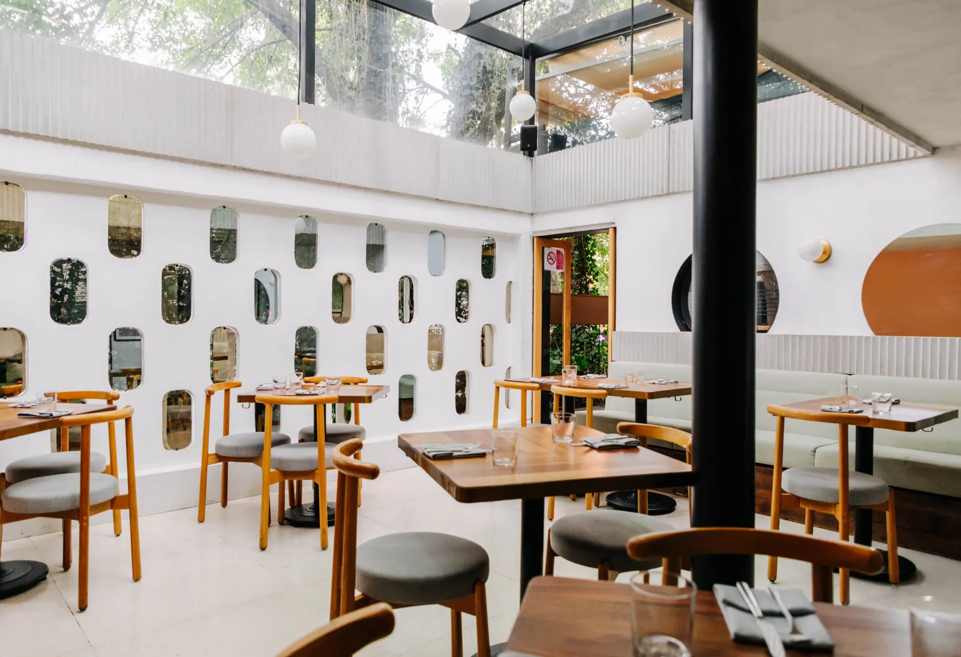
Walk into a restaurant today, and you’re not just entering a dining room. You’re entering a media studio. Every surface, every light fixture, every plate is a potential frame for a social media post. But in 2026, the rules have shifted. The neon signs and fake greenery that defined “Instagrammable” design for years are giving way to something more enduring: spaces that photograph beautifully because they’re authentic, not because they’re designed for a thumbnail.

Here’s how to build a restaurant that works in person and on screen.

The Numbers: Why Design Matters More Than Ever

OpenTable’s recent polling of diners reveals a clear mandate: 58% of diners deem a restaurant’s “Instagram/TikTok worthiness” as important, with 25% saying it’s extremely important. Nearly half (48%) say cozy, local charm is the most appealing interior style, and 54% are willing to pay a premium for a unique vibe.

But here’s the nuance. The Boston Globe reports that diners are experiencing “aesthetic fatigue.” When every restaurant looks like a stage set, nothing feels special. Guests are more cost-conscious and intentional, choosing restaurants that feel personal and authentic rather than performative.

The winning formula isn’t “designed for Instagram.” It’s “designed so well that Instagram loves it.”

The Front of House: Creating Shareable Moments

Entry and First Impressions

The entrance is your handshake. It’s also the first photo opportunity. A strong entry, whether through dramatic lighting, a distinctive door, or a striking material change, signals that this space was designed with intention. This is where the “journey” begins, and it’s where many guests will take their first photo.

The “Third Place” Quality

OpenTable found that 40% of diners consider restaurants, cafes, or bars to be their dedicated “third place” after home and work. This means your design must support lingering. Comfortable seating, varied lighting zones (bright for lunch, dim for dinner), and spaces that work for solo diners, couples, and groups all contribute to this feeling.

The Bathroom Paradox

Here’s a surprising design truth: bathrooms matter enormously. OpenTable’s poll found that 21% of restaurateurs are emphasizing “Instagrammable” bathrooms. Libby Slader, a branding and design firm owner, told the Boston Globe: “We’re still making sure that bathrooms either meet the design or even exceed the design in the restaurant. People really associate the bathroom with the cleanliness and the thought and the detail of the kitchen”.

A thoughtful bathroom, good lighting, interesting materials, a distinctive mirror, becomes a natural selfie spot. More importantly, it signals that attention to detail extends everywhere.

The Acoustic Layer: Designing for Conversation

A beautiful restaurant that’s too loud to talk in is a failure. Noise is consistently cited as one of the most irritating aspects of dining out, with 24% of customers ranking it as their top complaint. The financial impact is real: 80% of surveyed diners reported leaving a restaurant or cafe because of noise, and 91% said they would not return to places where noise levels were very high.

The Science of Sound

Research shows that customers begin to be disturbed by noise at 52 dB(A) and begin raising their voices at 57 dB(A). The willingness to spend time and money decreases starting at 52 dB(A). This triggers the Lombard effect: as ambient noise rises, people speak louder, which raises noise further, creating a stressful feedback loop.

Practical Acoustic Solutions

The Väla Centrum food court renovation offers a model. The design team used extensive acoustic wood wool cladding to reduce sound reflections in the human voice range, making the restaurant area “tranquil and homely”. The materials serve double duty: they improve acoustics while creating visual texture and pattern.

Table Spacing as a Design Tool

An analytical model published in Applied Acoustics demonstrates that proper table spacing can directly attenuate the Lombard effect. The model helps architects calculate minimum distances between tables based on room parameters. For intimate, higher-end concepts, greater spacing isn’t just about comfort, it’s about enabling conversation at normal voice levels, which directly supports higher per-person spending.

The Operational Backbone: Kitchen Workflow

Great design isn’t just what guests see. It’s what they don’t see: a kitchen that works.

Layout Fundamentals

An effective restaurant kitchen layout supports speed, safety, and consistency. The most common configurations include assembly line layouts for high-volume concepts, zone layouts for diverse menus, and galley layouts for narrow spaces.

Key Workstations

Every kitchen needs clear zones: prep stations, cooking stations, plating or pass stations, wash areas, and storage zones. Proper placement of these stations limits cross-traffic and supports a smooth production flow. For fast-casual concepts, linear movement from cooking to assembly to pickup, with minimal cross-traffic between stations, is essential.

Staff Safety

Clear walkways, separation of raw and cooked food paths, and strategic placement of handwashing sinks aren’t just code requirements, they’re design features that affect your team’s ability to work efficiently. Reducing manual handling tasks through automation (like integrated oil management systems) helps protect staff while keeping kitchens running smoothly.

The Professional Approach: Operational Design

The most sophisticated restaurant projects now integrate operational planning from the very first design phase. S&S Studio, a firm launched in late 2025, specializes in what they call “Operational Design”, bridging the gap between space design, brand identity, and daily operations.

This approach considers flow management, kitchen and bar technical design, customer journey mapping, and visual identity as a single, integrated system. The goal: minimize the discrepancy between the original creative intent and the day-to-day reality of running the restaurant.

Budgeting Reality

For restaurant owners planning new locations or renovations, design fees typically range from 50-80 yuan per square meter for mid-tier service to 80-300 yuan for comprehensive full-service design. For full-service projects, design fees generally account for 5-10% of total project costs, with higher percentages for more complex, high-end concepts.

The return on this investment is measurable. Industry data suggests that for every 1 yuan invested in design, the brand value return can be 3-5 yuan. More directly, well-designed spaces see improved staff efficiency (reducing unnecessary movement by up to 30%), higher customer satisfaction, and increased willingness to pay premium prices.

The Bottom Line

Restaurant design in 2026 is a balancing act. It must create “Instagrammable” moments without feeling performative. It must be quiet enough for conversation without feeling empty. It must look beautiful on screen while functioning flawlessly off screen.

The restaurants that succeed aren’t chasing trends. They’re building spaces rooted in authenticity, operational intelligence, and genuine hospitality. The photos will follow.

The post Restaurant Interior Design: Creating Spaces People Want to Photograph appeared first on Designer Daily: graphic and web design blog.

Restaurant Interior Design: Creating Spaces People Want to Photograph

Post pobrano z: Restaurant Interior Design: Creating Spaces People Want to Photograph

Walk into a restaurant today, and you’re not just entering a dining room. You’re entering a media studio. Every surface, every light fixture, every plate is a potential frame for a social media post. But in 2026, the rules have shifted. The neon signs and fake greenery that defined “Instagrammable” design for years are giving way to something more enduring: spaces that photograph beautifully because they’re authentic, not because they’re designed for a thumbnail.

Here’s how to build a restaurant that works in person and on screen.

The Numbers: Why Design Matters More Than Ever

OpenTable’s recent polling of diners reveals a clear mandate: 58% of diners deem a restaurant’s “Instagram/TikTok worthiness” as important, with 25% saying it’s extremely important. Nearly half (48%) say cozy, local charm is the most appealing interior style, and 54% are willing to pay a premium for a unique vibe.

But here’s the nuance. The Boston Globe reports that diners are experiencing “aesthetic fatigue.” When every restaurant looks like a stage set, nothing feels special. Guests are more cost-conscious and intentional, choosing restaurants that feel personal and authentic rather than performative.

The winning formula isn’t “designed for Instagram.” It’s “designed so well that Instagram loves it.”

The Front of House: Creating Shareable Moments

Entry and First Impressions

The entrance is your handshake. It’s also the first photo opportunity. A strong entry, whether through dramatic lighting, a distinctive door, or a striking material change, signals that this space was designed with intention. This is where the “journey” begins, and it’s where many guests will take their first photo.

The “Third Place” Quality

OpenTable found that 40% of diners consider restaurants, cafes, or bars to be their dedicated “third place” after home and work. This means your design must support lingering. Comfortable seating, varied lighting zones (bright for lunch, dim for dinner), and spaces that work for solo diners, couples, and groups all contribute to this feeling.

The Bathroom Paradox

Here’s a surprising design truth: bathrooms matter enormously. OpenTable’s poll found that 21% of restaurateurs are emphasizing “Instagrammable” bathrooms. Libby Slader, a branding and design firm owner, told the Boston Globe: “We’re still making sure that bathrooms either meet the design or even exceed the design in the restaurant. People really associate the bathroom with the cleanliness and the thought and the detail of the kitchen”.

A thoughtful bathroom, good lighting, interesting materials, a distinctive mirror, becomes a natural selfie spot. More importantly, it signals that attention to detail extends everywhere.

The Acoustic Layer: Designing for Conversation

A beautiful restaurant that’s too loud to talk in is a failure. Noise is consistently cited as one of the most irritating aspects of dining out, with 24% of customers ranking it as their top complaint. The financial impact is real: 80% of surveyed diners reported leaving a restaurant or cafe because of noise, and 91% said they would not return to places where noise levels were very high.

The Science of Sound

Research shows that customers begin to be disturbed by noise at 52 dB(A) and begin raising their voices at 57 dB(A). The willingness to spend time and money decreases starting at 52 dB(A). This triggers the Lombard effect: as ambient noise rises, people speak louder, which raises noise further, creating a stressful feedback loop.

Practical Acoustic Solutions

The Väla Centrum food court renovation offers a model. The design team used extensive acoustic wood wool cladding to reduce sound reflections in the human voice range, making the restaurant area “tranquil and homely”. The materials serve double duty: they improve acoustics while creating visual texture and pattern.

Table Spacing as a Design Tool

An analytical model published in Applied Acoustics demonstrates that proper table spacing can directly attenuate the Lombard effect. The model helps architects calculate minimum distances between tables based on room parameters. For intimate, higher-end concepts, greater spacing isn’t just about comfort, it’s about enabling conversation at normal voice levels, which directly supports higher per-person spending.

The Operational Backbone: Kitchen Workflow

Great design isn’t just what guests see. It’s what they don’t see: a kitchen that works.

Layout Fundamentals

An effective restaurant kitchen layout supports speed, safety, and consistency. The most common configurations include assembly line layouts for high-volume concepts, zone layouts for diverse menus, and galley layouts for narrow spaces.

Key Workstations

Every kitchen needs clear zones: prep stations, cooking stations, plating or pass stations, wash areas, and storage zones. Proper placement of these stations limits cross-traffic and supports a smooth production flow. For fast-casual concepts, linear movement from cooking to assembly to pickup, with minimal cross-traffic between stations, is essential.

Staff Safety

Clear walkways, separation of raw and cooked food paths, and strategic placement of handwashing sinks aren’t just code requirements, they’re design features that affect your team’s ability to work efficiently. Reducing manual handling tasks through automation (like integrated oil management systems) helps protect staff while keeping kitchens running smoothly.

The Professional Approach: Operational Design

The most sophisticated restaurant projects now integrate operational planning from the very first design phase. S&S Studio, a firm launched in late 2025, specializes in what they call “Operational Design”, bridging the gap between space design, brand identity, and daily operations.

This approach considers flow management, kitchen and bar technical design, customer journey mapping, and visual identity as a single, integrated system. The goal: minimize the discrepancy between the original creative intent and the day-to-day reality of running the restaurant.

Budgeting Reality

For restaurant owners planning new locations or renovations, design fees typically range from 50-80 yuan per square meter for mid-tier service to 80-300 yuan for comprehensive full-service design. For full-service projects, design fees generally account for 5-10% of total project costs, with higher percentages for more complex, high-end concepts.

The return on this investment is measurable. Industry data suggests that for every 1 yuan invested in design, the brand value return can be 3-5 yuan. More directly, well-designed spaces see improved staff efficiency (reducing unnecessary movement by up to 30%), higher customer satisfaction, and increased willingness to pay premium prices.

The Bottom Line

Restaurant design in 2026 is a balancing act. It must create “Instagrammable” moments without feeling performative. It must be quiet enough for conversation without feeling empty. It must look beautiful on screen while functioning flawlessly off screen.

The restaurants that succeed aren’t chasing trends. They’re building spaces rooted in authenticity, operational intelligence, and genuine hospitality. The photos will follow.

The post Restaurant Interior Design: Creating Spaces People Want to Photograph appeared first on Designer Daily: graphic and web design blog.

Working From Home? Here’s How to Design an Office That Works for You

Post pobrano z: Working From Home? Here’s How to Design an Office That Works for You

The transition to remote work has transformed the spare bedroom, the kitchen corner, and even the hallway into the modern executive suite. While the flexibility of working from home is undeniable, the physical reality often leaves much to be desired. If you are struggling with a dining table that hurts your back or a cluttered living room that makes it impossible to focus, it is time to rethink your environment.

Designing a workspace that actually works for you is not just about aesthetics; it is about ergonomics, productivity, and setting professional boundaries. Whether you have a dedicated room or a shared living space, creating a zone that separates “work mode” from “home mode” is the key to long-term success.

Ergonomics: The Foundation of Productivity

The most common mistake remote workers make is prioritizing style over support. If you are sitting on a kitchen chair for eight hours a day, you are likely sacrificing your posture and energy levels.

Your chair should be the first investment you make. Look for an adjustable office chair that provides lumbar support, allowing you to keep your feet flat on the floor and your knees at a 90-degree angle. Couple this with a desk at the correct height—your elbows should be level with your keyboard—to prevent repetitive strain injuries. If you find yourself slouching by mid-afternoon, consider a standing desk or a sit-stand converter to keep your blood flowing and your mind sharp.

Mastering Small Spaces with Clever Solutions

Not everyone has the luxury of a dedicated office. For those living in apartments or smaller homes, every square inch counts. This is where clever, space-saving furniture becomes essential.

If you are struggling to find a permanent spot for a desk, consider installing a wall mounted drop down desk. These innovative pieces of furniture are game-changers for compact living. When the workday begins, you simply fold the desk down to create a stable, ergonomic workspace. Once the clock strikes five, you fold it back up against the wall, effectively “hiding” your office and reclaiming your living space. It is the perfect solution for maintaining a psychological separation between your professional and personal life without permanently sacrificing floor space.

Lighting and Air Quality

Your physical environment has a profound impact on your cognitive function. Poor lighting, specifically harsh overhead fluorescent glare, can lead to eye strain and afternoon fatigue.

Whenever possible, position your workstation near a window to take advantage of natural light. Not only does natural light boost your mood, but it also helps regulate your circadian rhythm. If your workspace lacks natural light, invest in a high-quality desk lamp with adjustable color temperatures. Use cooler, blue-toned light for focus-heavy tasks during the day, and switch to warmer tones as you wind down.

Additionally, do not overlook the importance of air quality. A well-ventilated room keeps oxygen levels up, helping you avoid that mid-day “brain fog.” If your office is an interior room without windows, consider adding air-purifying indoor plants. Species like Snake Plants or ZZ plants are low-maintenance and can improve both the air quality and the visual appeal of your desk setup.

Defining Your Boundaries

Designing an office that works for you is as much about boundaries as it is about furniture. When you work where you live, the lines often blur, leading to burnout.

If you have a dedicated room, use it to your advantage by physically closing the door when the day is done. If you are using a multifunctional area, use visual cues to signal the start and end of the day. Using a specific desk lamp that only stays on during working hours, or even keeping your laptop in a drawer after 6:00 PM, helps your brain understand when it is time to switch off.

Personalize Your Space

Finally, remember that this is your office. While it needs to be functional, it should also be a space where you feel motivated and comfortable. Incorporate elements that bring you joy—whether that is a piece of art that inspires you, a high-quality rug to warm up the floor, or a personalized organizational system that keeps your files in check.

A well-designed home office is an investment in your career and your well-being. By combining ergonomic essentials, space-saving tools like a wall-mounted drop-down desk, and intentional boundaries, you can build a workspace that allows you to perform your best work while enjoying the comforts of home. Start small, assess your pain points, and build a layout that truly supports your daily workflow.

The post Working From Home? Here’s How to Design an Office That Works for You appeared first on Designer Daily: graphic and web design blog.

Working From Home? Here’s How to Design an Office That Works for You

Post pobrano z: Working From Home? Here’s How to Design an Office That Works for You

The transition to remote work has transformed the spare bedroom, the kitchen corner, and even the hallway into the modern executive suite. While the flexibility of working from home is undeniable, the physical reality often leaves much to be desired. If you are struggling with a dining table that hurts your back or a cluttered living room that makes it impossible to focus, it is time to rethink your environment.

Designing a workspace that actually works for you is not just about aesthetics; it is about ergonomics, productivity, and setting professional boundaries. Whether you have a dedicated room or a shared living space, creating a zone that separates “work mode” from “home mode” is the key to long-term success.

Ergonomics: The Foundation of Productivity

The most common mistake remote workers make is prioritizing style over support. If you are sitting on a kitchen chair for eight hours a day, you are likely sacrificing your posture and energy levels.

Your chair should be the first investment you make. Look for an adjustable office chair that provides lumbar support, allowing you to keep your feet flat on the floor and your knees at a 90-degree angle. Couple this with a desk at the correct height—your elbows should be level with your keyboard—to prevent repetitive strain injuries. If you find yourself slouching by mid-afternoon, consider a standing desk or a sit-stand converter to keep your blood flowing and your mind sharp.

Mastering Small Spaces with Clever Solutions

Not everyone has the luxury of a dedicated office. For those living in apartments or smaller homes, every square inch counts. This is where clever, space-saving furniture becomes essential.

If you are struggling to find a permanent spot for a desk, consider installing a wall mounted drop down desk. These innovative pieces of furniture are game-changers for compact living. When the workday begins, you simply fold the desk down to create a stable, ergonomic workspace. Once the clock strikes five, you fold it back up against the wall, effectively “hiding” your office and reclaiming your living space. It is the perfect solution for maintaining a psychological separation between your professional and personal life without permanently sacrificing floor space.

Lighting and Air Quality

Your physical environment has a profound impact on your cognitive function. Poor lighting, specifically harsh overhead fluorescent glare, can lead to eye strain and afternoon fatigue.

Whenever possible, position your workstation near a window to take advantage of natural light. Not only does natural light boost your mood, but it also helps regulate your circadian rhythm. If your workspace lacks natural light, invest in a high-quality desk lamp with adjustable color temperatures. Use cooler, blue-toned light for focus-heavy tasks during the day, and switch to warmer tones as you wind down.

Additionally, do not overlook the importance of air quality. A well-ventilated room keeps oxygen levels up, helping you avoid that mid-day “brain fog.” If your office is an interior room without windows, consider adding air-purifying indoor plants. Species like Snake Plants or ZZ plants are low-maintenance and can improve both the air quality and the visual appeal of your desk setup.

Defining Your Boundaries

Designing an office that works for you is as much about boundaries as it is about furniture. When you work where you live, the lines often blur, leading to burnout.

If you have a dedicated room, use it to your advantage by physically closing the door when the day is done. If you are using a multifunctional area, use visual cues to signal the start and end of the day. Using a specific desk lamp that only stays on during working hours, or even keeping your laptop in a drawer after 6:00 PM, helps your brain understand when it is time to switch off.

Personalize Your Space

Finally, remember that this is your office. While it needs to be functional, it should also be a space where you feel motivated and comfortable. Incorporate elements that bring you joy—whether that is a piece of art that inspires you, a high-quality rug to warm up the floor, or a personalized organizational system that keeps your files in check.

A well-designed home office is an investment in your career and your well-being. By combining ergonomic essentials, space-saving tools like a wall-mounted drop-down desk, and intentional boundaries, you can build a workspace that allows you to perform your best work while enjoying the comforts of home. Start small, assess your pain points, and build a layout that truly supports your daily workflow.

The post Working From Home? Here’s How to Design an Office That Works for You appeared first on Designer Daily: graphic and web design blog.

The Designer’s Guide to Basic UX Writing & Microcopy: Focus on the Power of Words in UI

Post pobrano z: The Designer’s Guide to Basic UX Writing & Microcopy: Focus on the Power of Words in UI

As designers, we obsess over pixels, grids, and color palettes. But there’s an invisible material in our interfaces that is just as crucial: language. The words we choose can be the difference between a user who feels guided and empowered, and one who is confused and frustrated.

This is the domain of UX writing and microcopy—the small but mighty bits of text that guide users through your product. It’s the button label, the error message, the placeholder text. It’s not just “copy”; it’s a core component of the user interface.

When done well, microcopy is invisible. It quietly does its job, building user confidence and paving the way for a seamless experience. Let’s break down the principles for writing clear, concise, and helpful text for the most critical UI elements.

Why Microcopy Matters: More Than Just Words

Before we dive in, let’s reframe what these words are:

  • Button Text: Not just a label, but a commitment. It tells the user what will happen when they click.
  • Error Messages: Not just an alert, but a solution. They should help the user fix the problem, not just announce it.
  • Labels & Instructions: Not just a description, but a guide. They prevent errors before they happen.

With that in mind, here are the fundamental principles.

Principle 1: Write Button Text that Builds Confidence

Buttons are the primary call-to-action (CTA) points in your interface. Their text needs to be specific, action-oriented, and predictable.

❌ What to Avoid:

  • Vague commands: “Submit,” “Go,” “Ok”
  • Technical jargon: “Configure,” “Execute,” “Transmit”
  • The classic, unhelpful: “Click Here”

✅ Principles & Examples:

  • Be Specific and Action-Oriented: Use a strong verb that describes the exact result of the action.
    • Instead of: Submit
    • Write: Sign Up for Free or Publish Post or Send Invoice
  • Use the Active Voice: Focus on what the user is doing.
    • Instead of: Your profile can be edited here.
    • Write: Edit Profile
  • Create a Sense of Value: When possible, hint at the benefit.
    • Instead of: Download
    • Write: Get My Ebook or Save Preferences

Real-World Example:

Notice how the button doesn’t just say “Ok” or “Confirm.” It explicitly repeats the destructive action, Delete Document, leaving no room for misunderstanding.

Principle 2: Write Error Messages that Solve Problems

Nothing halts user momentum like an error. A bad error message adds insult to injury; a good one turns a moment of failure into a moment of guidance.

❌ What to Avoid:

  • Technical gibberish: “Error 500: Internal Server Fault.”
  • Vague blame: “Invalid Input.”
  • Condescending tone: “You did it wrong.”

✅ Principles & Examples:

  • Explain the Problem in Plain Language: Clearly state what went wrong.
    • Instead of: Form Submission Error.
    • Write: We couldn't save your profile.
  • Provide the Solution (Most Importantly!): Tell the user exactly how to fix it.
    • Instead of: Invalid Email.
    • Write: Please enter a valid email address (e.g., name@example.com).
  • Be Humane and Respectful: The tone should be helpful, not accusatory. Use “we” to take responsibility where possible.
    • Instead of: You forgot to fill out the required fields.
    • Write: We need a few more details to complete your registration.

Principle 3: Write Labels & Instructions that Prevent Errors

The best error message is the one you never have to show. Clear labels and instructions set user expectations correctly from the start.

❌ What to Avoid:

  • Inconsistent terminology (e.g., “Client Name” in one place, “Customer Name” in another).
  • Ambiguous language.
  • Instructions that are paragraphs long.

✅ Principles & Examples:

  • Be Clear and Consistent: Use the same word for the same concept everywhere.
    • Instead of: Handle (What does that mean? Username? Nickname?)
    • Write: Username
  • Put the Key Information First: In placeholder text or hints, lead with the most important detail.
    • Instead of: Enter your phone number, including the area code first.
    • Write: Phone Number (including area code)
  • Use Sentence Case: Capitalize only the first word for labels and buttons (e.g., “Email address”). It’s easier and faster to read than Title Case.
  • Show Examples: When format matters, show, don’t just tell.
    • Instead of: Enter your date of birth.
    • Write:
      • Label: Date of Birth
      • Placeholder: MM/DD/YYYY

Real-World Example:

The labels are simple and standard. The placeholders provide a clear formatting template, preventing user guesswork and ensuring the data is collected correctly.

The Golden Thread: Tone & Voice

Underpinning all these principles is a consistent Tone of Voice. Is your product a trusted professional? A friendly guide? A witty companion? Your microcopy should reflect this consistently.

  • Be Concise: Omit needless words.
  • Be Useful: Your primary job is to help the user complete a task.
  • Be Human: Write like you speak (to a colleague, not a stranger).

Your Words are Part of the Design

The next time you’re designing a form, a modal, or an empty state, don’t treat the text as a last-minute filler. Wireframe with real, purposeful copy. Prototype with the exact messages.

Ask yourself: Is this button text a clear promise? Does this error message help the user move forward? Do these labels prevent confusion?

When you wield words with the same intention as you wield color and layout, you elevate your design from a mere visual arrangement to a coherent, helpful, and human-centered conversation.

The post The Designer’s Guide to Basic UX Writing & Microcopy: Focus on the Power of Words in UI appeared first on Designer Daily: graphic and web design blog.

The Gestalt Principles in Practice: A Visual Guide to How Our Brains Perceive Design

Post pobrano z: The Gestalt Principles in Practice: A Visual Guide to How Our Brains Perceive Design

As designers, we often operate on intuition. We “feel” when a layout is right or when a button is in the wrong place. But what if that intuition could be backed by a century-old psychology that explains exactly how our brains make sense of visual information?

Enter the Gestalt Principles.

Born from German psychology in the 1920s, Gestalt (meaning “unified whole”) theory is built on the idea that our brains are hardwired to see structure, patterns, and relationships by default. Instead of perceiving a collection of disconnected elements, we group them into a coherent whole.

For UI/UX designers, these principles are not just academic trivia; they are the bedrock of creating intuitive, user-friendly, and effective designs. Let’s break down the key Gestalt principles with real-world examples from the interfaces you use every day.

1. Proximity: Elements that are close together are perceived as related.

The Gist: Our brains group objects that are near each other, separating them from those that are farther apart. This is one of the most powerful tools for creating structure and organization without adding visual clutter.

UI/UX in Practice:
Think of any form you’ve ever filled out online. How do you know which label corresponds to which input field?

  • Bad Example: Labels are equidistant from multiple input fields, causing confusion.
  • Good Example: The label “First Name” is placed in close proximity to its text box, and there is clear, generous space between that group and the “Last Name” group. This visual grouping happens instantly, without the need for lines or boxes.

Takeaway: Use white space strategically to imply relationships. Group related interface elements (like a label and its input, or an icon and its text) by placing them close together.

2. Similarity: Elements that share similar attributes are perceived as related.

The Gist: Objects that look alike—whether through color, shape, size, or orientation—are perceived as part of the same group or as having the same function.

UI/UX in Practice:
Navigation menus are the classic example. But let’s look at a product listing.

Each product card has the same structure: image, title, price, and a button. Because they share the same visual attributes (same size, same font treatments, same button style), we instantly understand that they are the same type of object. Furthermore, if one “Add to Cart” button were a different color, we would perceive it as different—perhaps it’s out of stock, or already in the cart.

Takeaway: Establish consistent styles for similar elements (like all primary buttons) to create a predictable and scannable interface. Conversely, make different elements (like a “Delete” action) look distinctly different.

3. Closure: Our brains fill in the gaps to see a complete object.

The Gist: When presented with a complex arrangement of elements, we tend to look for a single, recognizable pattern. We will mentally “close” gaps to perceive a complete shape.

UI/UX in Practice:
Logo design famously uses this principle (see the WWF panda or the NBC peacock). In UI, it’s often used in loading animations and icon design.

The IBM logo is made of disconnected blue stripes, but we effortlessly read the letters “IBM.” In a UI, a loading spinner might be a circle with gaps, but our brain perceives a single, rotating shape. This allows designers to create recognizable forms with minimal elements, reducing cognitive load.

Takeaway: You don’t have to show every detail. Use suggestive shapes and negative space to create elegant, simple icons and graphics that the user’s mind will complete.

4. Common Region: Elements within a bounded area are perceived as a group.

The Gist: This is proximity’s powerful cousin. By placing elements inside a clearly defined boundary—like a box, a background color, or a subtle shadow—you create a strong perceived group.

UI/UX in Practice:
Look at any modern web app’s card-based layout.

On a dashboard, a “Statistics” card might contain a title, a chart, and a data point. Even if these elements are spaced out, the shared background and subtle border firmly group them together, separating them from the “Recent Activity” card right next to it. This is why cards are so effective for organizing diverse pieces of information on a single screen.

Takeaway: When proximity alone isn’t enough to create a strong group, use a common background, border, or shadow to define a “container” for related content.

5. Figure/Ground: We instinctively separate elements into foreground (the figure) and background (the ground).

The Gist: This is the basis for how we perceive depth and focus. The “figure” is the focal element, and the “ground” is the backdrop. A clear distinction is crucial for readability and hierarchy.

UI/UX in Practice:
Modal windows and pop-ups are the most direct application.

When a modal appears, the rest of the interface is often darkened or blurred. This immediately pushes the background content into the “ground,” making the modal the clear “figure” that demands the user’s attention. Without this effect, the modal would feel less distinct and more difficult to parse.

Takeaway: Use contrast, color, and blur to create a clear hierarchy between interactive elements (figures) and their context (ground). This is essential for overlays, modals, and navigation menus.

6. Focal Point (Prägnanz): The mind will interpret ambiguous images in the simplest way possible.

The Gist: Also known as the “law of simplicity,” this overarching principle states that we naturally order our experience in a manner that is regular, orderly, and simple. Every stimulus is perceived in its most simple form.

UI/UX in Practice:
A cluttered, confusing user interface violates this principle. A clean, well-organized one embraces it.

Consider the Google homepage. What do you see? A logo, a search bar, and two buttons. It’s the simplest possible interpretation of a search engine. There is no ambiguity. Your brain doesn’t have to work to figure out what to do. A competing, cluttered portal page with countless links and modules is complex and ambiguous, forcing the user to parse and simplify it themselves.

Takeaway: Reduce complexity. Strive for clarity and simplicity above all else. The easiest design for the brain to process is the one it will prefer.

Design with the Brain in Mind

The Gestalt Principles aren’t a set of rigid rules to be followed blindly. They are a framework for understanding the unconscious processes of visual perception. By designing with these principles in mind, you work with the user’s brain, not against it.

You create interfaces that feel intuitive because they are built on the very psychology that defines intuition itself. So the next time you’re refining a layout, ask yourself: How is my design using proximity, similarity, and closure to tell a clear, simple story? The answer will lead you to better design.

The post The Gestalt Principles in Practice: A Visual Guide to How Our Brains Perceive Design appeared first on Designer Daily: graphic and web design blog.

Iconography in the Wild: A Visual Analysis of How Top Apps Use Icons to Guide Users

Post pobrano z: Iconography in the Wild: A Visual Analysis of How Top Apps Use Icons to Guide Users

Icons are the silent workhorses of digital product design. In a crowded interface, they are the visual shorthand that guides us, informs us, and helps us act without a single word. But when done poorly, they become a source of confusion and friction—a universal “huh?” moment.

Great iconography, however, is a seamless language. It doesn’t just decorate; it communicates. To understand this language, we need to look at the experts. Let’s dissect how top-tier applications use icons to create intuitive, efficient, and beautiful user experiences.

We’ll break down our analysis into three key areas: Style, Consistency, and Metaphor.

1. Style: The Visual Voice of the App

An app’s icon set is a core part of its visual identity. The style choice is never arbitrary; it reinforces the brand’s personality and ensures visual harmony.

  • Linear Icons (The Minimalists): Apps like Twitter and Notion heavily rely on clean, thin-lined icons. This style conveys simplicity, clarity, and efficiency. It doesn’t shout; it whispers, getting out of the way of the content. In Notion, this is particularly effective, as the content is the interface, and the linear icons provide structure without visual weight.
  • Filled/Bold Icons (The Confident Guides): Spotify and Slack use bold, filled icons. This style is about energy, confidence, and making key actions unmistakable. Spotify’s vibrant green and thick white icons feel alive and tactile, perfectly matching its brand of immersive, continuous music playback.
  • Rounded & Friendly (The Approachable): Many consumer-facing apps, like Headspace and Calm, use icons with soft corners and generous curves. This style is psychologically associated with safety, approachability, and calm—exactly the emotions these brands want to evoke.
  • Duotone & Gradients (The Distinctive): Apps like Instagram and Discord have made duotone and gradient icons part of their core brand DNA. This style is highly distinctive and can make an app instantly recognizable, but it requires careful handling to avoid visual noise.

The Takeaway: The most effective icon style is an extension of the brand’s soul. A corporate finance app would feel wrong with playful, bubbly icons, just as a creative app would feel stifled by harsh, angular ones.

2. Consistency: The Unseen Framework

Consistency is what separates a random collection of pretty pictures from a true icon system. It’s the glue that makes a set of icons feel coherent and predictable.

Let’s analyze Figma as a masterclass in consistency. Their toolbar is a perfect example:

  • Grid & Proportion: Every icon lives within the same invisible bounding box. They have consistent visual weight, ensuring no single icon appears heavier or lighter than its neighbors.
  • Stroke Weight: The line thickness is uniform across all linear icons. Whether it’s the Frame tool or the Pen tool, the stroke is the same.
  • Detail Level: The complexity is consistent. Icons don’t mix highly detailed, realistic sketches with ultra-minimalist outlines.

When consistency breaks down, users subconsciously notice. If one icon is filled, another is linear, and a third uses a different corner radius, the interface feels messy and untrustworthy.

The Takeaway: Create and religiously adhere to an icon design system. Define rules for size, stroke, color palette, and a geometric grid. This ensures your icons work together as a unified team.

3. Metaphorical Language: Bridging the Abstract and the Literal

This is the hardest part of icon design: creating a visual metaphor that users instantly understand. The best apps use a mix of universal, familiar symbols and their own unique, but learnable, visual language.

  • Universal Metaphors (The No-Brainers):
    • Magnifying Glass = Search. Used by virtually every app (Chrome, App Store, Amazon).
    • Hamburger Menu = Navigation Menu. Despite its controversy, it’s widely recognized.
    • Envelope = Mail/Messages. A direct physical metaphor.
  • Platform Conventions (The Context-Aware):
    • The “Share” icon is a brilliant example of a learned convention. It started as a box with an arrow emerging from it on iOS. While the design varies slightly (Android uses connected dots), the concept is now universally understood. Apps that deviate from this (using an upload icon, for instance) often create momentary confusion.
  • Unique but Learnable (The Brand Builders):
    • TikTok’s “Inbox” isn’t an envelope; it’s a speech bubble. This fits their social, comment-driven environment.
    • Figma’s “Component” icon (a diamond) is an abstract metaphor. It doesn’t exist in the real world, but within the context of Figma, it becomes a powerful and specific symbol that users quickly learn.
    • Slack’s “Huddle” icon is a phone receiver inside a circle. It’s a fresh take on the classic “call” icon, fitting their modern brand while remaining clear.

The Pitfall: The “Mystery Meat” Navigation
This is what happens when the metaphorical link is broken. An icon that is so abstract or unique that the user has to tap it to discover its function. This is a failure of communication. The best icons are either instantly recognizable or become so after a single, logical explanation.

Lessons from the Wild: Your Iconography Checklist

After analyzing these apps, here’s a practical checklist for your next project:

  1. Audit for Style: Do your icons share a common visual language (stroke, corner radius, detail) that aligns with your brand?
  2. Enforce Consistency: Are they all on the same grid? Do they have the same visual weight?
  3. Test for Clarity: Can a first-time user correctly guess the function of your most important icons without a label? (Labels are still crucial for accessibility, but the icon should stand on its own).
  4. Prioritize Universal Metaphors: Where possible, use established symbols. Innovate only when it provides a clear benefit and is easy to learn.
  5. Context is King: An icon that works in a bottom navigation bar might be too vague in a complex toolbar. Consider the user’s location and expectations.

Iconography is a powerful design tool that operates just below the level of conscious thought for most users. When executed with purpose, style, and rigorous consistency, it creates an experience that feels effortless. It’s the quiet guide that leads users home, every time.

The post Iconography in the Wild: A Visual Analysis of How Top Apps Use Icons to Guide Users appeared first on Designer Daily: graphic and web design blog.

Agregator najlepszych postów o designie, webdesignie, cssie i Internecie