64 Awesome Halloween Invitations and Flyers for Your Spooky Celebrations

Post pobrano z: 64 Awesome Halloween Invitations and Flyers for Your Spooky Celebrations

It’s almost Halloween! That special time of the year when stores pack their shelves with candy and we all dress up as our favorite ghouls.

And what better way to celebrate our favorite monsters and urban legends then with a  spooktacular collection of Halloween invites and flyers you can only find on Envato Market? Here we have curated a selection of 50 to satisfy all your party needs.

Looking for more to choose from? Browse the wide selection of templates available to you on Envato Market.

Or enlist the help of a design professional by contacting the good folks at Envato Studio.

Halloween Invitations

You can’t have a party without sending out a few invites. These Halloween invitations will make you want to throw your very own costume party and celebrate in style.

Happy Halloween Banner Invitation Card

Great for kids parties, this Halloween invitation is super cute and bright. Enjoy the playful design complete with a tombstone, pumpkin, and witch hat.

Happy Halloween Banner Invitation Card

Halloween Party Invitation Template

Kick off your ghoulish celebrations with this invitation template. This simple design features dripping font and a creepy graveyard design at the bottom.

Halloween Party Invitation Template

Vintage Midnight Party Halloween Invitation

Inspired by the classics, this Halloween invite features several stills from horror classics with some fantastic fonts you can download for free. Pick from three versions and several color combinations.

Vintage Midnight Party Halloween Invitation

Halloween Monster Mash Party Invite

Monster mash anyone? Summon your friends to eat, drink, and be scary with this fun and simple Halloween party invite. With two themes available and text ready-to-edit, choose from portrait or landscape orientation for your invites.

Halloween Monster Mash Party Invite

Spooktacular Halloween Party Invitation

Keep it simple with this stylish invitation. This invite contains spooky ghosts against a starry sky. Enjoy the delightful design for a sweet take on Halloween invitations.

Halloween Flyer

Grungy Halloween Invitations in Retro Style

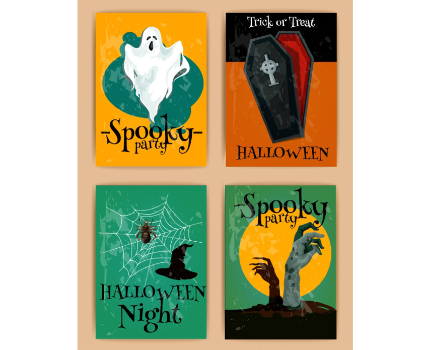
Add some retro charm to your holiday invites! This awesome collection includes four different designs to choose from. They go great with spooky Halloween themes and are sure to impress your party goers.

Grungy Halloween Invitations In Retro Style

Simple Halloween Bash Invitation Bundle

This creative set of invitations provides a variation of three fun designs to choose from. Pick from designs like Frankenstein, a werewolf, and a creepy pumpkin to bring a simple quirky flair to your invites.

Simple Halloween Bash Invitation Bundle

Skull Head Trick or Treat Halloween Invite

Are you a rebellious trick or treater wreaking havoc in the night? Then kick off your Halloween celebrations with this simple invite design. Editable in both Photoshop and Illustrator, you can customize this design no matter your Adobe product preferences.

Skull Head Trick or Treat Halloween Invitation

Typography Halloween Invite Flyer

Choose from different party themes to set your invite apart from others. This pack features spooky, minimalist designs with witch, ghost, and skull elements. Customize it easily by changing the fully editable text.

Typography Halloween Invite Flyer

Halloween Invitation II

Looking for a simple design that is haunting yet straight to the point? Check out this Halloween invitation that features an elegant cemetery silhouette that is subtle enough to fill you with fear. With a fully layered PSD file you can choose to customize the colors and text to fill your needs.

Halloween Invitation II

Halloween Invitation & Flyer Pack

This 2-for-1 deal packs a punch with a simple design you can use for either an invitation or party flyer. Change the background color to switch up the design or edit the text to fill your needs with Adobe Illustrator.

Halloween Invitation  Flyer Pack

Chalkboard Halloween Invitation Card

Love the simplicity of black and white? This chalkboard design features a simple composition that allows the typography and details of your party shine. It’s fully customizable and even comes with free fonts!

Chalkboard Halloween Invitation Card

Costume Halloween Party

Get your friends and family together for a fun costume party with this flyer invitation. This design features a cartoon theme perfect for all ages. Get access to three different color schemes to fit the style of your party.

Costume Halloween Party

Pumpkin Carving Halloween Invitation

What fun designs will you carve on your pumpkins this Halloween? Invite your friends over for a messy good time, and reward the winners with candy. Use this simple design for your invitations featuring a pumpkin, black cat, and simple yellow ribbons.

Pumpkin Carving Halloween Invitation

Glowing Halloween Party Invitation

This beautiful and simple design showcases several fun fonts to highlight all your party details. Available in the format for Adobe Illustrator, customize this invite with your own text and location.

Glowing Halloween Party Invitation

Purple Halloween Party Invitation

Need something short and sweet? This simple design features a beautiful purple night sky with creepy elements from a church cemetery. Create your invites quick and easy by just switching out the bottom text with your own location and contact details.

Purple Halloween Party Invitation

Zombies Attack Invitation Flyer

Watch out for the zombie attack with this wicked invitation flyer. This flyer features an apocalpytic theme with fire, destruction, and zombies, of course. Entertain your friends with the invite of the year!
Zombies Attack

Halloween Party Invitations – Set of 3

Do you like pumpkins, bats, or haunted houses? Choose from three simple designs with this set of Halloween party invitations. These designs use the vector EPS format, and you can easily customize the text for your celebration.

Halloween Party Invitations - Set of 3

Cute Halloween Party Invitation

You don’t always have to creep everyone out to have a good time. This simple party invitation features a cute trio of characters that you can interchange with several different colors. Editable in several formats, use this design for your kid’s party and school celebrations.

Cute Halloween Party Invitation

Halloween Frame Party Invitation

This beautiful yet simple design features a frame of skulls and other fall goodies to frame your choice of text. Add a hint of grunge to your party with this vintage-themed invitation.

Halloween Frame Party Invitation

Horror Witch Halloween Invitation

If you love bold colors and witches then this is the invite for you! Choose this invite made from 100% vector elements with easily resizable vectors. Shock your friends with these bold neon colors and choose something a little out of the box for this Halloween.

Horror Witch Halloween Invitation

Halloween Business Card Party Invitation

Business card or spooky party invite? This unique design features a layout and composition specially-made for business card printing. It utilizes a standard 3.5 x 2 inch design with high resolution for a fantastic high-quality result.

Halloween Business Card Party Invitation

Striped Halloween Party Invitation

Check out this colorful party invite featuring interchangeable skull and pumpkin designs. Edit your text with free fonts and set your celebrations into effect with this easy to use layout.

Striped Halloween Party Invitation

Halloween Ticket Party Invitation

Add a unique twist to your Halloween invites with a ticket-based design. Choose from several layout sizes and customize the colors to fit your theme.

Halloween Ticket Party Invitation

Halloween Costume Party Invitation Card

Having a costume party for all your friends? Pick this fun card that features a flyer full of fun cartoon characters taking their own spin on your favorite Halloween costumes.

Halloween Costume Party Invitation Card

Admission Ticket & Halloween Invite – Ghost Edition

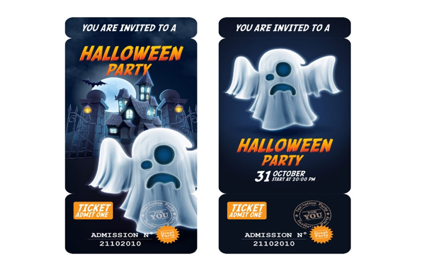
This unique Halloween invitation gives you the option of giving admission tickets to your friends. Simply bring the entire invite, and include an admission number for your exclusive party.

Admission Ticket  Halloween Invite - Ghost Edition

Admission Ticket & Halloween Invitation – Pumpkin Edition

Here is another great admission ticket design utilizing a traditional Halloween pumpkin instead. Choose between a pumpkin along a simple background or an intricate back drop to celebrate your Halloween bash. Admission Ticket  Halloween Invitation - Pumpkin Edition

Simple Pumpkin Witch Halloween Invitation

Cast a spell on all your friends with this clean Halloween invitation. This design features beautiful calligraphy along with an easy to use design you can customize in Adobe Illustrator.

Simple Pumpkin Witch Halloween Invitation

Zombie Party Halloween Invitation Card

Who knew zombies could be so beautiful? This vector design features two deadly zombie hands reaching out of their grave to celebrate your upcoming party. With fun details like bats, gravestones, and an owl, impress your friends with this beautiful yet simple design.

Zombie Party Halloween Invitation Card

Pumpkin Brew Halloween Party Invitation

Boil, boil, toil, and trouble! Impress your friends with this Halloween invite featuring a scary pumpkin and fierce green fire. Choose to keep the fonts as is or incorporate your own for added customization.

Pumpkin Brew Halloween Party Invitation

Halloween Flyers

Whether you’re staying home with friends or dancing the night away, these Halloween flyers will make you want to get up off your feet. Let’s just hope that they’re still attached when you do!

Horror Party Flyer

Kick off the holiday with the party of the year! This flyer features an awesome club theme with 3D text and more. Download several print ready files available in two convenient sizes.

Horror Party Flyer

Halloween Flyer

Create a big impact with this bold and beautiful Halloween flyer. This template features a colorful design with neon text elements you can easily adjust. Enjoy one fully layered Photoshop file with links to the fonts used.

Halloween Flyer

Halloween Night Party Flyer

Get ready to dance all night with this show stopping party flyer. This flyer contains impressive abstract elements combined with a Halloween theme. Download this print ready file and get ready to use it right away!

Halloween Night Party Flyer

Sexy Thriller Halloween Flyer

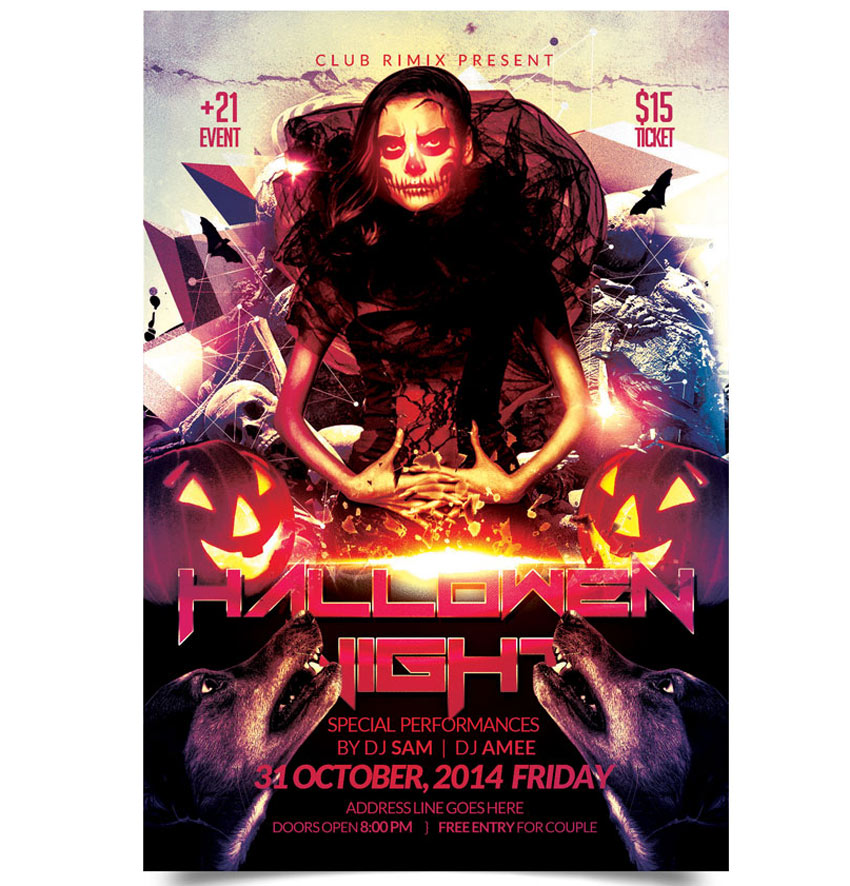
If you’re holding a party for the adults, try out this Halloween flyer for your nightclub or party events. With links to fonts used and several design variations, insert your own beautiful vixens to bring in your sinfully good times.

Sexy Thriller Halloween Flyer

Chills and Thrills Halloween Party Flyer

Create chills up the spines of your party goers with this party flyer. This template features a haunted forest vibes with chunky, grunge text. Update it easily with the help of Adobe Photoshop. It’s a flyer that’s perfect for beginners.

Chills and Thrills Halloween Party Flyer

Scary Scarecrow Halloween Flyer

Care to dance with a flaming scarecrow? Creep out your friends with this haunting design which includes six awesome scarecrows, two pre designed versions, and more custom elements to choose from.

Scary Scarecrow Halloween Flyer

Halloween Party Flyer

Creep out your party goers with this scary flyer. This flyer features a horror movie design reminiscent of iconic movie scenes. It’s great for any flyer or invitation and super easy to customize.

Halloween Party Flyer

Grunge Halloween Party Flyer

If you’re looking for a grunge look for your flyer, then look no further. This illustrative poster design features a fun grunge look that is matched with unique fonts and elements. Interchange your details with this easy-to-use template.

Grunge Halloween Party Flyer

Halloween Party Flyer

Don’t get caught in the spooky cobwebs! This cool flyer design features a black and white color theme for a nice, minimalist vibe. Simply switch out the party details to add your own in a matter of minutes!

Halloween Party Flyer

Graphic Zombie Hand Halloween Party Flyer

Having a zombie-themed party at your place? Try out this Halloween flyer to creep out your friends and let them know of the shenanigans ahead. Available in three colors styles and organized layers, this flyer is sure to wake the undead.

Graphic Zombie Hand Halloween Party Flyer

Halloween Rock Festival Flyer Template

Rock out at this year’s festival with this epic flyer template. This template features a rock and roll skull design with minimalist vector details. Choose from three different colors to enjoy this flyer in gold, white, and blue designs.

Halloween Rock Festival Flyer Template

Slime Halloween Party Flyer

Feeling a little slimey? Chances are you’ve gotten yourself into a sticky situation with this Halloween flyer. This design features an organized PSD file for easy editing and free fonts you can download in seconds. So get slimey in no time with this fun party flyer!

Slime Halloween Party Flyer

Gorey Zombie Hand Halloween Flyer

Celebrate the night the dead walk the earth with this quirky zombie flyer. Choose from three different versions, and even a different hand position to promote your zombie event.

Gorey Zombie Hand Halloween Flyer

Kids Halloween Party Flyer

If you’re looking for a kid-friendly design, then this is the flyer for you. With adorable vector elements and different monster cartoons to choose from, your child will have a blast knowing they have the coolest flyer on the block.

Kids Halloween Party Flyer

Haunted House Halloween Flyer

Enter at your own risk. This flyer features a dark haunted house along with a spooky design. With its elements so easy to customize, all you’ll need to is add your own text below and get ready to party!

Haunted House Halloween Flyer

Halloween Flyer

Add some shiny elements to your flyer for a hot design. This template features gold 3D elements like skulls and pumpkins for a sophisticated alternative. Swap out the title and additional text elements to get started with this flyer today!

Halloween Flyer

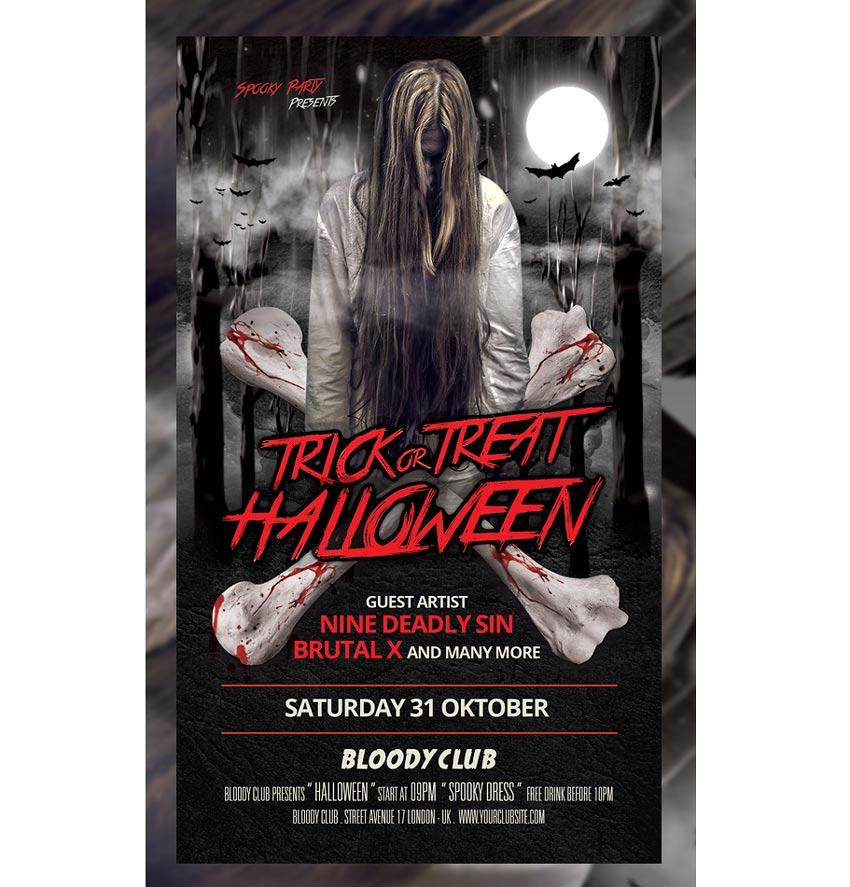
Spooky Halloween Flyer Template

Want to keep your friends up at night? Scare them with this super spooky Halloween template before they even show up to your party. Edit the text easily in Adobe Photoshop, and switch out the main photo with a choice of your own possessed model from Photodune.

Spooky Halloween Flyer Template

Zombie Brain Halloween Flyer

Bbbbraaainnns! This Halloween flyer features a bright design and colorful zombie that will be sure to charm the limbs off your friends. With two color options available, check out this flyer in its easily editable PSD format.

Zombie Brain Halloween Flyer

Club Z Horror Party Template

Did anyone invite zombies to this party? This bloody flyer design features dripping text and 
customizable elements you can edit in Adobe Photoshop. Change out the images with your own zombies or download some stocks from Photodune.

Club Z Horror Party Template

Frankenstein Halloween Flyer

It’s alive! If you’ve been hiding out in a secret laboratory, then this flyer may be for you. Surprise your friends with your deadly creation with this fun Halloween design. Edit in Adobe Photoshop and choose from several different colors to finalize your monster creation.

Frankenstein Halloween Flyer

Black and White Halloween Party Flyer

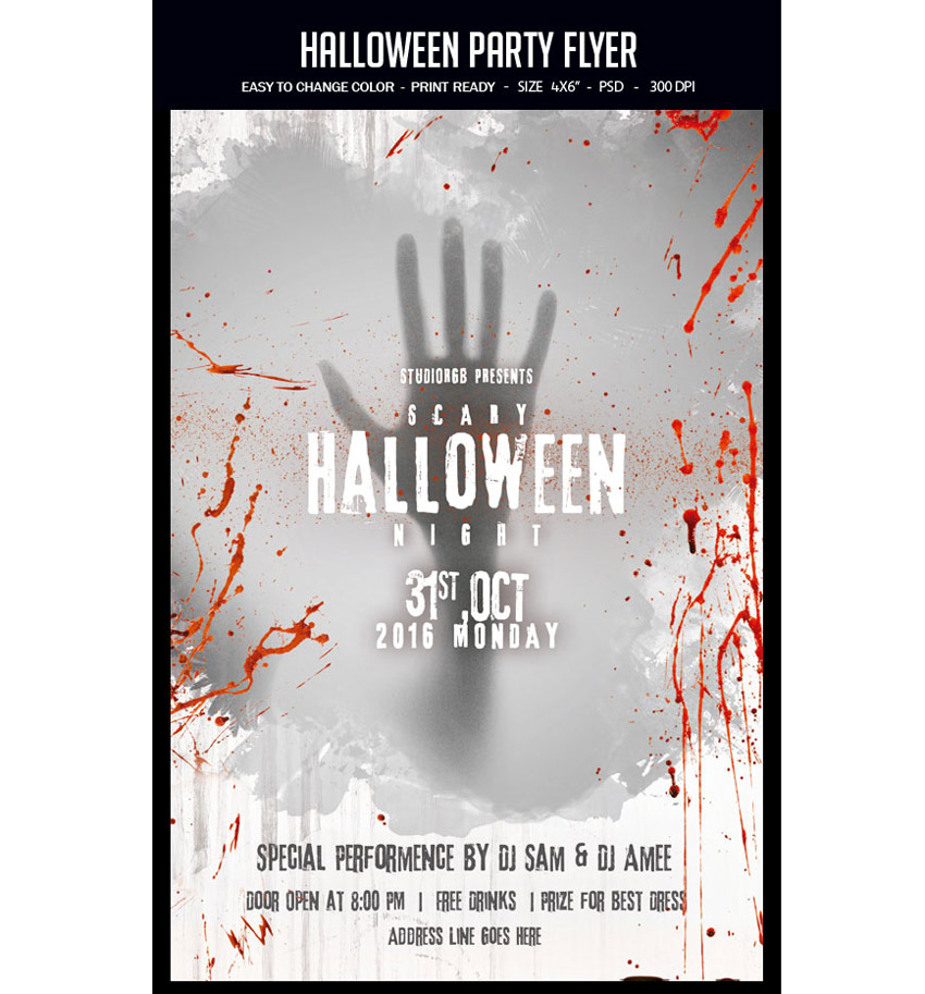
Looking for a simple design that is easy to print? Check out this grunge Halloween party flyer with graphic elements. Customize the text to fit your party details and celebrate your festivities in style.

Black and White Halloween Party Flyer

Zombie Party Halloween Flyer

Zombies like parties too! Bring in Halloween this year with a fun zombie party using this flyer design. It features colorful Halloween elements and splashes of grunge to keep things a little dirty.

Zombie Party Halloween Flyer

Graveyard Halloween Party Flyer

Need a flyer that is a balance of cool and spooky? Check out this wicked Halloween flyer with graveyard details and customizable text.

Graveyard Halloween Party Flyer

Grunge Vintage Halloween Party Flyer

Feeling a little vintage? Celebrate your feelings of nostalgia with this spooky flyer design. With its fully editable file and easy-to-use PSD format, change the colors to reflect your theme with this print ready poster.

Grunge Vintage Halloween Part

Skull Halloween Party Template

Yes, this awesome skull is included! With an explosive pink design, everyone will be read to dance the night away at your Halloween event. Included with this template are links to the fonts used for this easy-to-edit PSD file.

Skull Halloween Party Template

Simple Halloween Party Flyer

This flyer has all your favorite Halloween elements in one. With a fun ghoulish text atop a skull backdrop, you can let your event shine with this simple design and bold color. Fully editable in Adobe Photoshop, change out the colors or keep this beautiful yellow to go with your Halloween theme. 

Simple Halloween Party Flyer

Retro Halloween Party Flyer

If simple elements are more your style, check out this retro design. Featuring adorable Halloween elements like bats, pumpkins, and even your very own Dracula, invite your friends to your next horror party with this quick and easy flyer.

Retro Halloween Party Flyer

Halloween Monster Party Flyer

Don’t get too close or you just might end up for dinner! This Halloween flyer features a large vector design that is easily resizable in Photoshop. Choose from several vibrant colors and scare your friends with this monstrous design.

Halloween Monster Party Flyer

Trick or Treat Halloween Flyer

Trick or Treat? This Halloween design features a cool night time color palette with glowing pumpkins. Kick off your party or event with this ready-to-print flyer with guides for your understanding.

Trick or Treat Halloween Flyer

Voodoo Doll Halloween Flyer

Allude to your love of voodoo with this fun Halloween design. With a giant spider web, voodoo doll, and additional spooky elements, easily customize this illustrative poster with different colors and unique fonts.

Voodoo Doll Halloween Flyer

Halloween Trunk or Treat Flyer

Invite the neighbors over for a fun game of trunk or treat. Packed with three design variations, this template features ghost, pumpkin, and fire themes. Get access to six files and free fonts in one convenient download!

Halloween Trunk or Treat Flyer

Spooky Hand Halloween Flyer

Need a hand? This Halloween flyer features a mysterious spooky hand that slashes through the poster design. And with the image included, all you’ll need to do is switch out the text with your own party information!

Spooky Hand Halloween Flyer

Skull and Flower Halloween Flyer

If the other designs aren’t quite your speed, then try out this gorgeous Halloween flyer. Featuring a large skull with an elegant flower head piece, show off your love of fashion and style with this unique event poster. Customize the colors to your liking and take relief in knowing that all the images are included!

Skull and Flower Halloween Flyer

Pumpkin Trio Halloween Party Template

Need a quick flyer design with realistic elements? Check out this
impressive Halloween flyer packed with all the resources that you see.
Easily modify text, switch the colors around, and add or remove objects
to the layered PSD file.

Pumpkin Trio Halloween Party Template

Halloween Haunted House Flyer

Celebrate your favorite holiday in the comfort of your home with this haunted house theme. This template features a clean, modern design with bold text against a candlelit background. Just add your address and official event date to get your party started.

Halloween Haunted House Flyer

Conclusion

This list is jam-packed with Halloween resources for the avid designer familiar with Adobe Photoshop and Illustrator. But with thousands of flyers available at your fingertips, chances are we’ve missed a few to add to your personal collection. Be sure to browse Envato Market for more resources and let us know your favorites in the comments below!

64 Awesome Halloween Invitations and Flyers for Your Spooky Celebrations

Post pobrano z: 64 Awesome Halloween Invitations and Flyers for Your Spooky Celebrations

It’s almost Halloween! That special time of the year when stores pack their shelves with candy and we all dress up as our favorite ghouls.

And what better way to celebrate our favorite monsters and urban legends then with a  spooktacular collection of Halloween invites and flyers you can only find on Envato Market? Here we have curated a selection of 50 to satisfy all your party needs.

Looking for more to choose from? Browse the wide selection of templates available to you on Envato Market.

Or enlist the help of a design professional by contacting the good folks at Envato Studio.

Halloween Invitations

You can’t have a party without sending out a few invites. These Halloween invitations will make you want to throw your very own costume party and celebrate in style.

Happy Halloween Banner Invitation Card

Great for kids parties, this Halloween invitation is super cute and bright. Enjoy the playful design complete with a tombstone, pumpkin, and witch hat.

Happy Halloween Banner Invitation Card

Halloween Party Invitation Template

Kick off your ghoulish celebrations with this invitation template. This simple design features dripping font and a creepy graveyard design at the bottom.

Halloween Party Invitation Template

Vintage Midnight Party Halloween Invitation

Inspired by the classics, this Halloween invite features several stills from horror classics with some fantastic fonts you can download for free. Pick from three versions and several color combinations.

Vintage Midnight Party Halloween Invitation

Halloween Monster Mash Party Invite

Monster mash anyone? Summon your friends to eat, drink, and be scary with this fun and simple Halloween party invite. With two themes available and text ready-to-edit, choose from portrait or landscape orientation for your invites.

Halloween Monster Mash Party Invite

Spooktacular Halloween Party Invitation

Keep it simple with this stylish invitation. This invite contains spooky ghosts against a starry sky. Enjoy the delightful design for a sweet take on Halloween invitations.

Halloween Flyer

Grungy Halloween Invitations in Retro Style

Add some retro charm to your holiday invites! This awesome collection includes four different designs to choose from. They go great with spooky Halloween themes and are sure to impress your party goers.

Grungy Halloween Invitations In Retro Style

Simple Halloween Bash Invitation Bundle

This creative set of invitations provides a variation of three fun designs to choose from. Pick from designs like Frankenstein, a werewolf, and a creepy pumpkin to bring a simple quirky flair to your invites.

Simple Halloween Bash Invitation Bundle

Skull Head Trick or Treat Halloween Invite

Are you a rebellious trick or treater wreaking havoc in the night? Then kick off your Halloween celebrations with this simple invite design. Editable in both Photoshop and Illustrator, you can customize this design no matter your Adobe product preferences.

Skull Head Trick or Treat Halloween Invitation

Typography Halloween Invite Flyer

Choose from different party themes to set your invite apart from others. This pack features spooky, minimalist designs with witch, ghost, and skull elements. Customize it easily by changing the fully editable text.

Typography Halloween Invite Flyer

Halloween Invitation II

Looking for a simple design that is haunting yet straight to the point? Check out this Halloween invitation that features an elegant cemetery silhouette that is subtle enough to fill you with fear. With a fully layered PSD file you can choose to customize the colors and text to fill your needs.

Halloween Invitation II

Halloween Invitation & Flyer Pack

This 2-for-1 deal packs a punch with a simple design you can use for either an invitation or party flyer. Change the background color to switch up the design or edit the text to fill your needs with Adobe Illustrator.

Halloween Invitation  Flyer Pack

Chalkboard Halloween Invitation Card

Love the simplicity of black and white? This chalkboard design features a simple composition that allows the typography and details of your party shine. It’s fully customizable and even comes with free fonts!

Chalkboard Halloween Invitation Card

Costume Halloween Party

Get your friends and family together for a fun costume party with this flyer invitation. This design features a cartoon theme perfect for all ages. Get access to three different color schemes to fit the style of your party.

Costume Halloween Party

Pumpkin Carving Halloween Invitation

What fun designs will you carve on your pumpkins this Halloween? Invite your friends over for a messy good time, and reward the winners with candy. Use this simple design for your invitations featuring a pumpkin, black cat, and simple yellow ribbons.

Pumpkin Carving Halloween Invitation

Glowing Halloween Party Invitation

This beautiful and simple design showcases several fun fonts to highlight all your party details. Available in the format for Adobe Illustrator, customize this invite with your own text and location.

Glowing Halloween Party Invitation

Purple Halloween Party Invitation

Need something short and sweet? This simple design features a beautiful purple night sky with creepy elements from a church cemetery. Create your invites quick and easy by just switching out the bottom text with your own location and contact details.

Purple Halloween Party Invitation

Zombies Attack Invitation Flyer

Watch out for the zombie attack with this wicked invitation flyer. This flyer features an apocalpytic theme with fire, destruction, and zombies, of course. Entertain your friends with the invite of the year!

Zombies Attack

Halloween Party Invitations – Set of 3

Do you like pumpkins, bats, or haunted houses? Choose from three simple designs with this set of Halloween party invitations. These designs use the vector EPS format, and you can easily customize the text for your celebration.

Halloween Party Invitations - Set of 3

Cute Halloween Party Invitation

You don’t always have to creep everyone out to have a good time. This simple party invitation features a cute trio of characters that you can interchange with several different colors. Editable in several formats, use this design for your kid’s party and school celebrations.

Cute Halloween Party Invitation

Halloween Frame Party Invitation

This beautiful yet simple design features a frame of skulls and other fall goodies to frame your choice of text. Add a hint of grunge to your party with this vintage-themed invitation.

Halloween Frame Party Invitation

Horror Witch Halloween Invitation

If you love bold colors and witches then this is the invite for you! Choose this invite made from 100% vector elements with easily resizable vectors. Shock your friends with these bold neon colors and choose something a little out of the box for this Halloween.

Horror Witch Halloween Invitation

Halloween Business Card Party Invitation

Business card or spooky party invite? This unique design features a layout and composition specially-made for business card printing. It utilizes a standard 3.5 x 2 inch design with high resolution for a fantastic high-quality result.

Halloween Business Card Party Invitation

Striped Halloween Party Invitation

Check out this colorful party invite featuring interchangeable skull and pumpkin designs. Edit your text with free fonts and set your celebrations into effect with this easy to use layout.

Striped Halloween Party Invitation

Halloween Ticket Party Invitation

Add a unique twist to your Halloween invites with a ticket-based design. Choose from several layout sizes and customize the colors to fit your theme.

Halloween Ticket Party Invitation

Halloween Costume Party Invitation Card

Having a costume party for all your friends? Pick this fun card that features a flyer full of fun cartoon characters taking their own spin on your favorite Halloween costumes.

Halloween Costume Party Invitation Card

Admission Ticket & Halloween Invite – Ghost Edition

This unique Halloween invitation gives you the option of giving admission tickets to your friends. Simply bring the entire invite, and include an admission number for your exclusive party.

Admission Ticket  Halloween Invite - Ghost Edition

Admission Ticket & Halloween Invitation – Pumpkin Edition

Here is another great admission ticket design utilizing a traditional Halloween pumpkin instead. Choose between a pumpkin along a simple background or an intricate back drop to celebrate your Halloween bash. Admission Ticket  Halloween Invitation - Pumpkin Edition

Simple Pumpkin Witch Halloween Invitation

Cast a spell on all your friends with this clean Halloween invitation. This design features beautiful calligraphy along with an easy to use design you can customize in Adobe Illustrator.

Simple Pumpkin Witch Halloween Invitation

Zombie Party Halloween Invitation Card

Who knew zombies could be so beautiful? This vector design features two deadly zombie hands reaching out of their grave to celebrate your upcoming party. With fun details like bats, gravestones, and an owl, impress your friends with this beautiful yet simple design.

Zombie Party Halloween Invitation Card

Pumpkin Brew Halloween Party Invitation

Boil, boil, toil, and trouble! Impress your friends with this Halloween invite featuring a scary pumpkin and fierce green fire. Choose to keep the fonts as is or incorporate your own for added customization.

Pumpkin Brew Halloween Party Invitation

Halloween Flyers

Whether you’re staying home with friends or dancing the night away, these Halloween flyers will make you want to get up off your feet. Let’s just hope that they’re still attached when you do!

Horror Party Flyer

Kick off the holiday with the party of the year! This flyer features an awesome club theme with 3D text and more. Download several print ready files available in two convenient sizes.

Horror Party Flyer

Halloween Flyer

Create a big impact with this bold and beautiful Halloween flyer. This template features a colorful design with neon text elements you can easily adjust. Enjoy one fully layered Photoshop file with links to the fonts used.

Halloween Flyer

Halloween Night Party Flyer

Get ready to dance all night with this show stopping party flyer. This flyer contains impressive abstract elements combined with a Halloween theme. Download this print ready file and get ready to use it right away!

Halloween Night Party Flyer

Sexy Thriller Halloween Flyer

If you’re holding a party for the adults, try out this Halloween flyer for your nightclub or party events. With links to fonts used and several design variations, insert your own beautiful vixens to bring in your sinfully good times.

Sexy Thriller Halloween Flyer

Chills and Thrills Halloween Party Flyer

Create chills up the spines of your party goers with this party flyer. This template features a haunted forest vibes with chunky, grunge text. Update it easily with the help of Adobe Photoshop. It’s a flyer that’s perfect for beginners.

Chills and Thrills Halloween Party Flyer

Scary Scarecrow Halloween Flyer

Care to dance with a flaming scarecrow? Creep out your friends with this haunting design which includes six awesome scarecrows, two pre designed versions, and more custom elements to choose from.

Scary Scarecrow Halloween Flyer

Halloween Party Flyer

Creep out your party goers with this scary flyer. This flyer features a horror movie design reminiscent of iconic movie scenes. It’s great for any flyer or invitation and super easy to customize.

Halloween Party Flyer

Grunge Halloween Party Flyer

If you’re looking for a grunge look for your flyer, then look no further. This illustrative poster design features a fun grunge look that is matched with unique fonts and elements. Interchange your details with this easy-to-use template.

Grunge Halloween Party Flyer

Halloween Party Flyer

Don’t get caught in the spooky cobwebs! This cool flyer design features a black and white color theme for a nice, minimalist vibe. Simply switch out the party details to add your own in a matter of minutes!

Halloween Party Flyer

Graphic Zombie Hand Halloween Party Flyer

Having a zombie-themed party at your place? Try out this Halloween flyer to creep out your friends and let them know of the shenanigans ahead. Available in three colors styles and organized layers, this flyer is sure to wake the undead.

Graphic Zombie Hand Halloween Party Flyer

Halloween Rock Festival Flyer Template

Rock out at this year’s festival with this epic flyer template. This template features a rock and roll skull design with minimalist vector details. Choose from three different colors to enjoy this flyer in gold, white, and blue designs.

Halloween Rock Festival Flyer Template

Slime Halloween Party Flyer

Feeling a little slimey? Chances are you’ve gotten yourself into a sticky situation with this Halloween flyer. This design features an organized PSD file for easy editing and free fonts you can download in seconds. So get slimey in no time with this fun party flyer!

Slime Halloween Party Flyer

Gorey Zombie Hand Halloween Flyer

Celebrate the night the dead walk the earth with this quirky zombie flyer. Choose from three different versions, and even a different hand position to promote your zombie event.

Gorey Zombie Hand Halloween Flyer

Kids Halloween Party Flyer

If you’re looking for a kid-friendly design, then this is the flyer for you. With adorable vector elements and different monster cartoons to choose from, your child will have a blast knowing they have the coolest flyer on the block.

Kids Halloween Party Flyer

Haunted House Halloween Flyer

Enter at your own risk. This flyer features a dark haunted house along with a spooky design. With its elements so easy to customize, all you’ll need to is add your own text below and get ready to party!

Haunted House Halloween Flyer

Halloween Flyer

Add some shiny elements to your flyer for a hot design. This template features gold 3D elements like skulls and pumpkins for a sophisticated alternative. Swap out the title and additional text elements to get started with this flyer today!

Halloween Flyer

Spooky Halloween Flyer Template

Want to keep your friends up at night? Scare them with this super spooky Halloween template before they even show up to your party. Edit the text easily in Adobe Photoshop, and switch out the main photo with a choice of your own possessed model from Photodune.

Spooky Halloween Flyer Template

Zombie Brain Halloween Flyer

Bbbbraaainnns! This Halloween flyer features a bright design and colorful zombie that will be sure to charm the limbs off your friends. With two color options available, check out this flyer in its easily editable PSD format.

Zombie Brain Halloween Flyer

Club Z Horror Party Template

Did anyone invite zombies to this party? This bloody flyer design features dripping text and 
customizable elements you can edit in Adobe Photoshop. Change out the images with your own zombies or download some stocks from Photodune.

Club Z Horror Party Template

Frankenstein Halloween Flyer

It’s alive! If you’ve been hiding out in a secret laboratory, then this flyer may be for you. Surprise your friends with your deadly creation with this fun Halloween design. Edit in Adobe Photoshop and choose from several different colors to finalize your monster creation.

Frankenstein Halloween Flyer

Black and White Halloween Party Flyer

Looking for a simple design that is easy to print? Check out this grunge Halloween party flyer with graphic elements. Customize the text to fit your party details and celebrate your festivities in style.

Black and White Halloween Party Flyer

Zombie Party Halloween Flyer

Zombies like parties too! Bring in Halloween this year with a fun zombie party using this flyer design. It features colorful Halloween elements and splashes of grunge to keep things a little dirty.

Zombie Party Halloween Flyer

Graveyard Halloween Party Flyer

Need a flyer that is a balance of cool and spooky? Check out this wicked Halloween flyer with graveyard details and customizable text.

Graveyard Halloween Party Flyer

Grunge Vintage Halloween Party Flyer

Feeling a little vintage? Celebrate your feelings of nostalgia with this spooky flyer design. With its fully editable file and easy-to-use PSD format, change the colors to reflect your theme with this print ready poster.

Grunge Vintage Halloween Part

Skull Halloween Party Template

Yes, this awesome skull is included! With an explosive pink design, everyone will be read to dance the night away at your Halloween event. Included with this template are links to the fonts used for this easy-to-edit PSD file.

Skull Halloween Party Template

Simple Halloween Party Flyer

This flyer has all your favorite Halloween elements in one. With a fun ghoulish text atop a skull backdrop, you can let your event shine with this simple design and bold color. Fully editable in Adobe Photoshop, change out the colors or keep this beautiful yellow to go with your Halloween theme. 

Simple Halloween Party Flyer

Retro Halloween Party Flyer

If simple elements are more your style, check out this retro design. Featuring adorable Halloween elements like bats, pumpkins, and even your very own Dracula, invite your friends to your next horror party with this quick and easy flyer.

Retro Halloween Party Flyer

Halloween Monster Party Flyer

Don’t get too close or you just might end up for dinner! This Halloween flyer features a large vector design that is easily resizable in Photoshop. Choose from several vibrant colors and scare your friends with this monstrous design.

Halloween Monster Party Flyer

Trick or Treat Halloween Flyer

Trick or Treat? This Halloween design features a cool night time color palette with glowing pumpkins. Kick off your party or event with this ready-to-print flyer with guides for your understanding.

Trick or Treat Halloween Flyer

Voodoo Doll Halloween Flyer

Allude to your love of voodoo with this fun Halloween design. With a giant spider web, voodoo doll, and additional spooky elements, easily customize this illustrative poster with different colors and unique fonts.

Voodoo Doll Halloween Flyer

Halloween Trunk or Treat Flyer

Invite the neighbors over for a fun game of trunk or treat. Packed with three design variations, this template features ghost, pumpkin, and fire themes. Get access to six files and free fonts in one convenient download!

Halloween Trunk or Treat Flyer

Spooky Hand Halloween Flyer

Need a hand? This Halloween flyer features a mysterious spooky hand that slashes through the poster design. And with the image included, all you’ll need to do is switch out the text with your own party information!

Spooky Hand Halloween Flyer

Skull and Flower Halloween Flyer

If the other designs aren’t quite your speed, then try out this gorgeous Halloween flyer. Featuring a large skull with an elegant flower head piece, show off your love of fashion and style with this unique event poster. Customize the colors to your liking and take relief in knowing that all the images are included!

Skull and Flower Halloween Flyer

Pumpkin Trio Halloween Party Template

Need a quick flyer design with realistic elements? Check out this
impressive Halloween flyer packed with all the resources that you see.
Easily modify text, switch the colors around, and add or remove objects
to the layered PSD file.

Pumpkin Trio Halloween Party Template

Halloween Haunted House Flyer

Celebrate your favorite holiday in the comfort of your home with this haunted house theme. This template features a clean, modern design with bold text against a candlelit background. Just add your address and official event date to get your party started.

Halloween Haunted House Flyer

Conclusion

This list is jam-packed with Halloween resources for the avid designer familiar with Adobe Photoshop and Illustrator. But with thousands of flyers available at your fingertips, chances are we’ve missed a few to add to your personal collection. Be sure to browse Envato Market for more resources and let us know your favorites in the comments below!

Building a Full-Stack Serverless Application with Cloudflare Workers

Post pobrano z: Building a Full-Stack Serverless Application with Cloudflare Workers

One of my favorite developments in software development has been the advent of serverless. As a developer who has a tendency to get bogged down in the details of deployment and DevOps, it’s refreshing to be given a mode of building web applications that simply abstracts scaling and infrastructure away from me. Serverless has made me better at actually shipping projects!

That being said, if you’re new to serverless, it may be unclear how to translate the things that you already know into a new paradigm. If you’re a front-end developer, you may have no experience with what serverless purports to abstract away from you – so how do you even get started?

Today, I’ll try to help demystify the practical part of working with serverless by taking a project from idea to production, using Cloudflare Workers. Our project will be a daily leaderboard, called „Repo Hunt” inspired by sites like Product Hunt and Reddit, where users can submit and upvote cool open-source projects from GitHub and GitLab. You can see the final version of the site, published here.

Workers is a serverless application platform built on top of Cloudflare’s network. When you publish a project to Cloudflare Workers, it’s immediately distributed across 180 (and growing) cities around the world, meaning that regardless of where your users are located, your Workers application will be served from a nearby Cloudflare server with extremely low latency. On top of that, the Workers team has gone all-in on developer experience: our newest release, at the beginning of this month, introduced a fully-featured command line tool called Wrangler, which manages building, uploading, and publishing your serverless applications with a few easy-to-learn and powerful commands.

The end result is a platform that allows you to simply write JavaScript and deploy it to a URL – no more worrying about what „Docker” means, or if your application will fall over when it makes it to the front page of Hacker News!

If you’re the type that wants to see the project ahead of time, before hopping into a long tutorial, you’re in luck! The source for this project is available on GitHub. With that, let’s jump in to the command-line and build something rad.

Installing Wrangler and preparing our workspace

Wrangler is the command-line tool for generating, building, and publishing Cloudflare Workers projects. We’ve made it super easy to install, especially if you’ve worked with npm before:

npm install -g @cloudflare/wrangler

Once you’ve installed Wrangler, you can use the generate command to make a new project. Wrangler projects use „templates” which are code repositories built for re-use by developers building with Workers. We maintain a growing list of templates to help you build all kind of projects in Workers: check out our Template Gallery to get started!

In this tutorial, we’ll use the „Router” template, which allows you to build URL-based projects on top of Workers. The generate command takes two arguments: first, the name of your project (I’ll use repo-hunt), and a Git URL. This is my favorite part of the generate command: you can use all kinds of templates by pointing Wrangler at a GitHub URL, so sharing, forking, and collaborating on templates is super easy. Let’s run the generate command now:

wrangler generate repo-hunt https://github.com/cloudflare/worker-template-router
cd repo-hunt

The Router template includes support for building projects with webpack, so you can add npm modules to your project, and use all the JavaScript tooling you know and love. In addition, as you might expect, the template includes a Router class, which allows you to handle routes in your Worker, and tie them to a function. Let’s look at a simple example: setting up an instance of Router, handling a GET request to /, and returning a response to the client:

// index.js
const Router = require('./router')

addEventListener('fetch', event => {
  event.respondWith(handleRequest(event.request))
})

async function handleRequest(request) {
  try {
    const r = new Router()
    r.get('/', () => new Response("Hello, world!"))
    const resp = await r.route(request)
    return resp
  } catch (err) {
    return new Response(err)
  }
}

All Workers applications begin by listening to the fetch event, which is an incoming request from a client to your application. Inside of that event listener, it’s common practice to call a handleRequest function, which looks at the incoming request and determines how to respond. When handling an incoming fetch event, which indicates an incoming request, a Workers script should always return a Response back to the user: it’s a similar request/response pattern to many web frameworks, like Express, so if you’ve worked with web frameworks before, it should feel quite familiar!

In our example, we’ll make use of a few routes: a „root” route (/), which will render the homepage of our site; a form for submitting new repos, at /post, and a special route for accepting POST requests, when a user submits a repo from the form, at /repo.

Building a route and rendering a template

The first route that we’ll set up is the „root” route, at the path /. This will be where repos submitted by the community will be rendered. For now, let’s get some practice defining a route, and returning plain HTML. This pattern is common enough in Workers applications that it makes sense to understand it first, before we move on to some more interesting bits!

To begin, we’ll update index.js to set up an instance of a Router, handle any GET requests to /, and call the function index, from handlers/index.js (more on that shortly):

// index.js
const Router = require('./router')
const index = require('./handlers/index')

addEventListener('fetch', event => {
  event.respondWith(handleRequest(event.request))
})

function handleRequest(request) {
  try {
    const r = new Router()
    r.get('/', index)
    return r.route(request)
  } catch (err) {
    return new Response(err)
  }
}

As with the example index.js in the previous section, our code listens for a fetch event, and responds by calling the handleRequest function. The handleRequest function sets up an instance of Router, which will call the index function on any GET requests to /. With the router setup, we route the incoming request, using r.route, and return it as the response to the client. If anything goes wrong, we simply wrap the content of the function in a try/catch block, and return the err to the client (a note here: in production applications, you may want something more robust here, like logging to an exception monitoring tool).

To continue setting up our route handler, we’ll create a new file, handlers/index.js, which will take the incoming request and return a HTML response to the client:

// handlers/index.js
const headers = { 'Content-Type': 'text/html' }
const handler = () => {
  return new Response("Hello, world!", { headers })
}
module.exports = handler

Our handler function is simple: it returns a new instance of Response with the text „Hello, world!” as well as a headers object that sets the Content-Type header to text/html – this tells the browser to render the incoming response as an HTML document. This means that when a client makes a GET request to the route /, a new HTML response will be constructed with the text „Hello, world!” and returned to the user.

Wrangler has a preview function, perfect for testing the HTML output of our new function. Let’s run it now to ensure that our application works as expected:

wrangler preview

The preview command should open up a new tab in your browser, after building your Workers application and uploading it to our testing playground. In the Preview tab, you should see your rendered HTML response:

With our HTML response appearing in browser, let’s make our handler function a bit more exciting, by returning some nice looking HTML. To do this, we’ll set up a corresponding index „template” for our route handler: when a request comes into the index handler, it will call the template and return an HTML string, to give the client a proper user interface as the response. To start, let’s update handlers/index.js to return a response using our template (and, in addition, set up a try/catch block to catch any errors, and return them as the response):

// handlers/index.js
const headers = { 'Content-Type': 'text/html' }
const template = require('../templates/index')

const handler = async () => {
  try {
    return new Response(template(), { headers })
  } catch (err) {
    return new Response(err)
  }
}

module.exports = handler

As you might imagine, we need to set up a corresponding template! We’ll create a new file, templates/index.js, and return an HTML string, using ES6 template strings:

// templates/index.js
const template = () => {
  return <code><h1>Hello, world!</h1>`
}

module.exports = template

Our template function returns a simple HTML string, which is set to the body of our Response, in handlers/index.js. For our final snippet of templating for our first route, let’s do something slightly more interesting: creating a templates/layout.js file, which will be the base „layout” that all of our templates will render into. This will allow us to set some consistent styling and formatting for all the templates. In templates/layout.js:

// templates/layout.js
const layout = body => `
<!doctype html>
<html>
  <head>
    <meta charset="UTF-8">
    <title>Repo Hunt</title>
    <meta name="viewport" content="width=device-width, initial-scale=1">
    <link rel="stylesheet" href="https://cdnjs.cloudflare.com/ajax/libs/bulma/0.7.5/css/bulma.min.css">
  </head>
  <body>
    <div class="container">
      <div class="navbar">
        <div class="navbar-brand">
          Repo Hunt
          Find cool open-source projects daily
        </div>
        <div class="navbar-menu">
          <div class="navbar-end">
            <div class="navbar-item">
              Post a repository
            </div>
          </div>
        </div>
      </div>
      <div class="section">
        ${body}
      </div>
    </div>
  </body>
</html>
`
module.exports = layout

This is a big chunk of HTML code, but breaking it down, there’s only a few important things to note: first, this layout variable is a function! A body variable is passed in, intended to be included inside of a div right in the middle of the HTML snippet. In addition, we include the Bulmahttps://bulma.io) CSS frameworkhttps://bulma.io), for a bit of easy styling in our project, and a navigation bar, to tell users *what* this site is, with a link to submit new repositories.

To use our layout template, we’ll import it in templates/index.js, and wrap our HTML string with it:

// templates/index.js
const layout = require('./layout')

const template = () => {
  return layout(`<h1>Hello, world!</h1>`)
}

module.exports = template

With that, we can run wrangler preview again, to see our nicely rendered HTML page, with a bit of styling help from Bulma:

Storing and retrieving data with Workers KV

Most web applications aren’t very useful without some sort of data persistence. Workers KV is a key-value store built for use with Workers – think of it as a super-fast and globally distributed Redis. In our application, we’ll use KV to store all of the data for our application: each time a user submits a new repository, it will be stored in KV, and we’ll also generate a daily array of repositories to render on the home page.

A quick note: at the time of writing, usage of Workers KV requires a paid Workers plan. Read more in the „Pricing” section of the Workers docs here.

Inside of a Workers application, you can refer to a pre-defined KV namespace, which we’ll create inside of the Cloudflare UI, and bind to our application once it’s been deployed to the Workers application. In this tutorial, we’ll use a KV namespace called REPO_HUNT, and as part of the deployment process, we’ll make sure to attach it to our application, so that any references in the code to REPO_HUNT will correctly resolve to the KV namespace.

Before we hop into creating data inside of our namespace, let’s look at the basics of working with KV inside of your Workers application. Given a namespace (e.g. REPO_HUNT), we can set a key with a given value, using put:

const string = "Hello, world!"
REPO_HUNT.put("myString", string)

We can also retrieve the value for that key, by using async/await and waiting for the promise to resolve:

const getString = async () => {
  const string = await REPO_HUNT.get("myString")
  console.log(string) // "Hello, world!"
}

The API is super simple, which is great for web developers who want to start building applications with the Workers platform, without having to dive into relational databases or any kind of external data service. In our case, we’ll store the data for our application by saving:

  1. A repo object, stored at the key repos:$id, where $id is a generated UUID for a newly submitted repo.
  2. A day array, stored at the key $date (e.g. "6/24/2019"), containing a list of repo IDs, which indicate the submitted repos for that day.

We’ll begin by implementing support for submitting repositories, and making our first writes to our KV namespace by saving the repository data in the object we specified above. Along the way, we’ll create a simple JavaScript class for interfacing with our store – we’ll make use of that class again, when we move on to rendering the homepage, where we’ll retrieve the repository data, build a UI, and finish our example application.

Allowing user-submitted data

No matter what the application is, it seems that web developers always end up having to write forms. In our case, we’ll build a simple form for users to submit repositories.

At the beginning of this tutorial, we set up index.js to handle incoming GET requests to the root route (`/). To support users adding new repositories, we’ll add another route, GET /post, which will render a form template to users. In index.js:

// index.js

// ...

const post = require('./handlers/post')

// ...

function handleRequest(request) {
  try {
    const r = new Router()
    r.get('/', index)
    r.get('/post', post)
    return r.route(request)
  } catch (err) {
    return new Response(err)
  }
}

In addition to a new route handler in index.js, we’ll also add handlers/post.js, a new function handler that will render an associated template as an HTML response to the user:

// handlers/post.js
const headers = { 'Content-Type': 'text/html' }
const template = require('../templates/post')

const handler = request => {
  try {
    return new Response(template(), { headers })
  } catch (err) {
    return new Response(err)
  }
}

module.exports = handler

The final piece of the puzzle is the HTML template itself – like our previous template example, we’ll re-use the layout template we’ve built, and wrap a simple three-field form with it, exporting the HTML string from templates/post.js:

// templates/post.js
const layout = require('./layout')

const template = () =>
  layout(`
  <div>
    <h1>Post a new repo</h1>
    <form action="/repo" method="post">
      <div class="field">
        <label class="label" for="name">Name</label>
        <input class="input" id="name" name="name" type="text" placeholder="Name" required></input>
      </div>
      <div class="field">
        <label class="label" for="description">Description</label>
        <input class="input" id="description" name="description" type="text" placeholder="Description"></input>
      </div>
      <div class="field">
        <label class="label" for="url">URL</label>
        <input class="input" id="url" name="url" type="text" placeholder="URL" required></input>
      </div>
      <div class="field">
        <div class="control">
          <button class="button is-link" type="submit">Submit</button>
        </div>
      </div>
    </form>
  </div>
<code>)

module.exports = template

Using wrangler preview, we can navigate to the path /post and see our rendered form:

If you look at the definition of the actual form tag in our template, you’ll notice that we’re making a POST request to the path /repo. To receive the form data, and persist it into our KV store, we’ll go through the process of adding another handler. In index.js:

// index.js

// ...

const create = require('./handlers/create')

// ...

function handleRequest(request) {
  try {
    const r = new Router()
    r.get('/', index)
    r.get('/post', post)
    r.post('/repo', create)
    return r.route(request)
  } catch (err) {
    return new Response(err)
  }
}

When a form is sent to an endpoint, it’s sent as a query string. To make our lives easier, we’ll include the qs library in our project, which will allow us to simply parse the incoming query string as a JS object. In the command line, we’ll add qs simply by using npm. While we’re here, let’s also install the node-uuid package, which we’ll use later to generate IDs for new incoming data. To install them both, use npm’s install --save subcommand:

npm install --save qs uuid

With that, we can implement the corresponding handler function for POST /repo. In handlers/create.js:

// handlers/create.js
const qs = require('qs')

const handler = async request => {
  try {
    const body = await request.text()

    if (!body) {
      throw new Error('Incorrect data')
    }

    const data = qs.parse(body)
    
    // TODOs:
    // - Create repo
    // - Save repo
    // - Add to today's repos on the homepage

    return new Response('ok', { headers: { Location: '/' }, status: 301 })
  } catch (err) {
    return new Response(err, { status: 400 })
  }
}

module.exports = handler

Our handler function is pretty straightforward — it calls text on the request, waiting for the promise to resolve to get back our query string body. If no body element is provided with the request, the handler throws an error (which returns with a status code of 400, thanks to our try/catch block). Given a valid body, we call parse on the imported qs package, and get some data back. For now, we’ve stubbed out our intentions for the remainder of this code: first, we’ll create a repo, based on the data. We’ll save that repo, and then add it to the array of today’s repos, to be rendered on the home page.

To write our repo data into KV, we’ll build two simple ES6 classes, to do a bit of light validation and define some persistence methods for our data types. While you could just call REPO_HUNT.put directly, if you’re working with large amounts of similar data, it can be nice to do something like new Repo(data).save() – in fact, we’ll implement something almost exactly like this, so that working with a Repo is incredibly easy and consistent.

Let’s define store/repo.js, which will contain a Repo class. With this class, we can instantiate new Repo objects, and using the constructor method, we can pass in data, and validate it, before continuing to use it in our code.

// store/repo.js
const uuid = require('uuid/v4')

class Repo {
  constructor({ id, description, name, submitted_at, url }) {
    this.id = id || uuid()
    this.description = description
    
    if (!name) {
      throw new Error(`Missing name in data`)
    } else {
      this.name = name 
    }
    
    this.submitted_at = submitted_at || Number(new Date())
    
    try {
      const urlObj = new URL(url)
      const whitelist = ['github.com', 'gitlab.com']

      if (!whitelist.some(valid => valid === urlObj.host)) {
        throw new Error('The URL provided is not a repository')
      }
    } catch (err) {
      throw new Error('The URL provided is not valid')
    }

    this.url = url
  }

  save() {
    return REPO_HUNT.put(`repos:${this.id}`, JSON.stringify(this))
  }
}

module.exports = Repo

Even if you aren’t super familiar with the constructor function in an ES6 class, this example should still be fairly easy to understand. When we want to create a new instance of a Repo, we pass the relevant data to constructor as an object, using ES6’s destructuring assignment to pull each value out into its own key. With those variables, we walk through each of them, assigning this.$key (e.g. this.name, this.description, etc) to the passed-in value.

Many of these values have a „default” value: for instance, if no ID is passed to the constructor, we’ll generate a new one, using our previously-saved uuid package’s v4 variant to generate a new UUID, using uuid(). For submitted_at, we’ll generate a new instance of Date and convert it to a Unix timestamp, and for url, we’ll insure that the URL is both valid *and* is from github.com or gitlab.com to ensure that users are submitting genuine repos.

With that, the save function, which can be called on an instance of Repo, inserts a JSON-stringified version of the Repo instance into KV, setting the key as repos:$id. Back in handlers/create.js, we’ll import the Repo class, and save a new Repo using our previously parsed data:

// handlers/create.js

// ...

const Repo = require('../store/repo')

const handler = async request => {
  try {
    // ...
    
    const data = qs.parse(body)
    const repo = new Repo(data)
    await repo.save()

    // ...
  } catch (err) {
    return new Response(err, { status: 400 })
  }
}

// ...

With that, a new Repo based on incoming form data should actually be persisted into Workers KV! While the repo is being saved, we also want to set up another data model, Day, which contains a simple list of the repositories that were submitted by users for a specific day. Let’s create another file, store/day.js, and flesh it out:

// store/day.js
const today = () => new Date().toLocaleDateString()
const todayData = async () => {
  const date = today()
  const persisted = await REPO_HUNT.get(date)
  return persisted ? JSON.parse(persisted) : []
}

module.exports = {
  add: async function(id) {
    const date = today()
    let ids = await todayData()
    ids = ids.concat(id)
    return REPO_HUNT.put(date, JSON.stringify(ids))
  }
}

Note that the code for this isn’t even a class — it’s an object with key-value pairs, where the values are functions! We’ll add more to this soon, but the single function we’ve defined, add, loads any existing repos from today’s date (using the function today to generate a date string, used as the key in KV), and adds a new Repo, based on the id argument passed into the function. Back inside of handlers/create.js, we’ll make sure to import and call this new function, so that any new repos are added immediately to today’s list of repos:

// handlers/create.js

// ...

const Day = require('../store/day')

// ...

const handler = async request => {
  try {

    // ...
    
    await repo.save()
    await Day.add(repo.id)

    return new Response('ok', { headers: { Location: '/' }, status: 301 })
  } catch (err) {
    return new Response(err, { status: 400 })
  }
}

// ...

Our repo data now persists into KV and it’s added to a listing of the repos submitted by users for today’s date. Let’s move on to the final piece of our tutorial, to take that data, and render it on the homepage.

Rendering data

At this point, we’ve implemented rendering HTML pages in a Workers application, as well as taking incoming data, and persisting it to Workers KV. It shouldn’t surprise you to learn that taking that data from KV, and rendering an HTML page with it, our homepage, is quite similar to everything we’ve done up until now. Recall that the path / is tied to our index handler: in that file, we’ll want to load the repos for today’s date, and pass them into the template, in order to be rendered. There’s a few pieces we need to implement to get that working – to start, let’s look at handlers/index.js:

// handlers/index.js

// ...
const Day = require('../store/day')

const handler = async () => {
  try {
    let repos = await Day.getRepos()
    return new Response(template(repos), { headers })
  } catch (err) {
    return new Response(`Error! ${err} for ${JSON.stringify(repos)}`)
  }
}

// ...

While the general structure of the function handler should stay the same, we’re now ready to put some genuine data into our application. We should import the Day module, and inside of the handler, call await Day.getRepos to get a list of repos back (don’t worry, we’ll implement the corresponding functions soon). With that set of repos, we pass them into our template function, meaning that we’ll be able to actually render them inside of the HTML.

Inside of Day.getRepos, we need to load the list of repo IDs from inside KV, and for each of them, load the corresponding repo data from KV. In store/day.js:

// store/day.js

const Repo = require('./repo')

// ...

module.exports = {
  getRepos: async function() {
    const ids = await todayData()
    return ids.length ? Repo.findMany(ids) : []
  },
  
  // ...
}

The getRepos function reuses our previously defined todayData function, which returns a list of ids. If that list has *any* IDs, we want to actually retrieve those repositories. Again, we’ll call a function that we haven’t quite defined yet, importing the Repo class and calling Repo.findMany, passing in our list of IDs. As you might imagine, we should hop over to store/repo.js, and implement the accompanying function:

// store/repo.js

class Repo {
  static findMany(ids) {
    return Promise.all(ids.map(Repo.find))
  }

  static async find(id) {
    const persisted = await REPO_HUNT.get(`repos:${id}`)
    const repo = JSON.parse(persisted)
    return persisted ? new Repo({ ...repo }) : null
  }

  // ...
}

To support finding all the repos for a set of IDs, we define two class-level or static functions, find and findMany which uses Promise.all to call find for each ID in the set, and waits for them all to finish before resolving the promise. The bulk of the logic, inside of find, looks up the repo by its ID (using the previously-defined key, repos:$id), parses the JSON string, and returns a newly instantiated instance of Repo.

Now that we can look up repositories from KV, we should take that data and actually render it in our template. In handlers/index.js, we passed in the repos array to the template function defined in templates/index.js. In that file, we’ll take that repos array, and render chunks of HTML for each repo inside of it:

// templates/index.js

const layout = require('./layout')
const dateFormat = submitted_at =>
  new Date(submitted_at).toLocaleDateString('en-us')

const repoTemplate = ({ description, name, submitted_at, url }) =>
  `<div class="media">
      <div class="media-content">
        <p>
          ${name}
        </p>
        <p>
          ${description}
        </p>
        <p>
          
            Submitted ${dateFormat(submitted_at)}
        </p>
      </div>
    </div>
  `

const template = repos => {
  const renderedRepos = repos.map(repoTemplate)

  return layout(`
  <div>
    ${
      repos.length
        ? renderedRepos.join('')
        : `<p>No repos have been submitted yet!</p>`
    }
  </div>
`)
}

module.exports = template

Breaking this file down, we have two primary functions: template (an updated version of our original exported function), which takes an array of repos, maps through them, calling repoTemplate, to generate an array of HTML strings. If repos is an empty array, the function simply returns a p tag with an empty state. The repoTemplate function uses destructuring assignment to set the variables description, name, submitted_at, and url from inside of the repo object being passed to the function, and renders each of them into fairly simple HTML, leaning on Bulma’s CSS classes to quickly define a media object layout.

And with that, we’re done writing code for our project! After coding a pretty comprehensive full-stack application on top of Workers, we’re on the final step: deploying the application to the Workers platform.

Deploying your site to workers.dev

Every Workers user can claim a free Workers.dev subdomain, after signing up for a Cloudflare account. In Wrangler, we’ve made it super easy to claim and configure your subdomain, using the subdomain subcommand. Each account gets one Workers.dev subdomain, so choose wisely!

wrangler subdomain my-cool-subdomain

With a configured subdomain, we can now deploy our code! The name property in wrangler.toml will indicate the final URL that our application will be deployed to: in my codebase, the name is set to repo-hunt, and my subdomain is signalnerve.workers.dev, so my final URL for my project will be repo-hunt.signalnerve.workers.dev. Let’s deploy the project, using the publish command:

wrangler publish

Before we can view the project in browser, we have one more step to complete: going into the Cloudflare UI, creating a KV namespace, and binding it to our project. To start this process, log into your Cloudflare dashboard, and select the „Workers” tab on the right side of the page.

Inside of the Workers section of your dashboard, find the „KV” menu item, and create a new namespace, matching the namespace you used in your codebase (if you followed the code samples, this will be REPO_HUNT).

In the listing of KV namespaces, copy your namespace ID. Back in our project, we’ll add a `kv-namespaces` key to our `wrangler.toml`, to use our new namespace in the codebase:

# wrangler.toml
[[kv-namespaces]]
binding = "REPO_HUNT"
id = "$yourNamespaceId"

To make sure your project is using the new KV namespace, publish your project one last time:

wrangler publish

With that, your application should be able to successfully read and write from your KV namespace. Opening my project’s URL should show the final version of our project — a full, data-driven application without needing to manage any servers, built entirely on the Workers platform!

What’s next?

In this tutorial, we built a full-stack serverless application on top of the Workers platform, using Wrangler, Cloudflare’s command-line tool for building and deploying Workers applications. There’s a ton of things that you could do to continue to add to this application: for instance, the ability to upvote submissions, or even to allow comments and other kinds of data. If you’d like to see the finished codebase for this project, check out the GitHub repo!

The Workers team maintains a constantly growing list of new templates to begin building projects with – if you want to see what you can build, make sure to check out our Template Gallery. In addition, make sure to check out some of the tutorials in the Workers documentation, such as building a Slack bot, or a QR code generator.

If you went through the whole tutorial (or if you’re building cool things you want to share), I’d love to hear about how it went on Twitter. If you’re interested in serverless and want to keep up with any new tutorials I’m publishing, make sure to join my newsletter and subscribe to my YouTube channel!

The post Building a Full-Stack Serverless Application with Cloudflare Workers appeared first on CSS-Tricks.

Building a Full-Stack Serverless Application with Cloudflare Workers

Post pobrano z: Building a Full-Stack Serverless Application with Cloudflare Workers

One of my favorite developments in software development has been the advent of serverless. As a developer who has a tendency to get bogged down in the details of deployment and DevOps, it’s refreshing to be given a mode of building web applications that simply abstracts scaling and infrastructure away from me. Serverless has made me better at actually shipping projects!

That being said, if you’re new to serverless, it may be unclear how to translate the things that you already know into a new paradigm. If you’re a front-end developer, you may have no experience with what serverless purports to abstract away from you – so how do you even get started?

Today, I’ll try to help demystify the practical part of working with serverless by taking a project from idea to production, using Cloudflare Workers. Our project will be a daily leaderboard, called „Repo Hunt” inspired by sites like Product Hunt and Reddit, where users can submit and upvote cool open-source projects from GitHub and GitLab. You can see the final version of the site, published here.

Workers is a serverless application platform built on top of Cloudflare’s network. When you publish a project to Cloudflare Workers, it’s immediately distributed across 180 (and growing) cities around the world, meaning that regardless of where your users are located, your Workers application will be served from a nearby Cloudflare server with extremely low latency. On top of that, the Workers team has gone all-in on developer experience: our newest release, at the beginning of this month, introduced a fully-featured command line tool called Wrangler, which manages building, uploading, and publishing your serverless applications with a few easy-to-learn and powerful commands.

The end result is a platform that allows you to simply write JavaScript and deploy it to a URL – no more worrying about what „Docker” means, or if your application will fall over when it makes it to the front page of Hacker News!

If you’re the type that wants to see the project ahead of time, before hopping into a long tutorial, you’re in luck! The source for this project is available on GitHub. With that, let’s jump in to the command-line and build something rad.

Installing Wrangler and preparing our workspace

Wrangler is the command-line tool for generating, building, and publishing Cloudflare Workers projects. We’ve made it super easy to install, especially if you’ve worked with npm before:

npm install -g @cloudflare/wrangler

Once you’ve installed Wrangler, you can use the generate command to make a new project. Wrangler projects use „templates” which are code repositories built for re-use by developers building with Workers. We maintain a growing list of templates to help you build all kind of projects in Workers: check out our Template Gallery to get started!

In this tutorial, we’ll use the „Router” template, which allows you to build URL-based projects on top of Workers. The generate command takes two arguments: first, the name of your project (I’ll use repo-hunt), and a Git URL. This is my favorite part of the generate command: you can use all kinds of templates by pointing Wrangler at a GitHub URL, so sharing, forking, and collaborating on templates is super easy. Let’s run the generate command now:

wrangler generate repo-hunt https://github.com/cloudflare/worker-template-router
cd repo-hunt

The Router template includes support for building projects with webpack, so you can add npm modules to your project, and use all the JavaScript tooling you know and love. In addition, as you might expect, the template includes a Router class, which allows you to handle routes in your Worker, and tie them to a function. Let’s look at a simple example: setting up an instance of Router, handling a GET request to /, and returning a response to the client:

// index.js
const Router = require('./router')

addEventListener('fetch', event => {
  event.respondWith(handleRequest(event.request))
})

async function handleRequest(request) {
  try {
    const r = new Router()
    r.get('/', () => new Response("Hello, world!"))
    const resp = await r.route(request)
    return resp
  } catch (err) {
    return new Response(err)
  }
}

All Workers applications begin by listening to the fetch event, which is an incoming request from a client to your application. Inside of that event listener, it’s common practice to call a handleRequest function, which looks at the incoming request and determines how to respond. When handling an incoming fetch event, which indicates an incoming request, a Workers script should always return a Response back to the user: it’s a similar request/response pattern to many web frameworks, like Express, so if you’ve worked with web frameworks before, it should feel quite familiar!

In our example, we’ll make use of a few routes: a „root” route (/), which will render the homepage of our site; a form for submitting new repos, at /post, and a special route for accepting POST requests, when a user submits a repo from the form, at /repo.

Building a route and rendering a template

The first route that we’ll set up is the „root” route, at the path /. This will be where repos submitted by the community will be rendered. For now, let’s get some practice defining a route, and returning plain HTML. This pattern is common enough in Workers applications that it makes sense to understand it first, before we move on to some more interesting bits!

To begin, we’ll update index.js to set up an instance of a Router, handle any GET requests to /, and call the function index, from handlers/index.js (more on that shortly):

// index.js
const Router = require('./router')
const index = require('./handlers/index')

addEventListener('fetch', event => {
  event.respondWith(handleRequest(event.request))
})

function handleRequest(request) {
  try {
    const r = new Router()
    r.get('/', index)
    return r.route(request)
  } catch (err) {
    return new Response(err)
  }
}

As with the example index.js in the previous section, our code listens for a fetch event, and responds by calling the handleRequest function. The handleRequest function sets up an instance of Router, which will call the index function on any GET requests to /. With the router setup, we route the incoming request, using r.route, and return it as the response to the client. If anything goes wrong, we simply wrap the content of the function in a try/catch block, and return the err to the client (a note here: in production applications, you may want something more robust here, like logging to an exception monitoring tool).

To continue setting up our route handler, we’ll create a new file, handlers/index.js, which will take the incoming request and return a HTML response to the client:

// handlers/index.js
const headers = { 'Content-Type': 'text/html' }
const handler = () => {
  return new Response("Hello, world!", { headers })
}
module.exports = handler

Our handler function is simple: it returns a new instance of Response with the text „Hello, world!” as well as a headers object that sets the Content-Type header to text/html – this tells the browser to render the incoming response as an HTML document. This means that when a client makes a GET request to the route /, a new HTML response will be constructed with the text „Hello, world!” and returned to the user.

Wrangler has a preview function, perfect for testing the HTML output of our new function. Let’s run it now to ensure that our application works as expected:

wrangler preview

The preview command should open up a new tab in your browser, after building your Workers application and uploading it to our testing playground. In the Preview tab, you should see your rendered HTML response:

With our HTML response appearing in browser, let’s make our handler function a bit more exciting, by returning some nice looking HTML. To do this, we’ll set up a corresponding index „template” for our route handler: when a request comes into the index handler, it will call the template and return an HTML string, to give the client a proper user interface as the response. To start, let’s update handlers/index.js to return a response using our template (and, in addition, set up a try/catch block to catch any errors, and return them as the response):

// handlers/index.js
const headers = { 'Content-Type': 'text/html' }
const template = require('../templates/index')

const handler = async () => {
  try {
    return new Response(template(), { headers })
  } catch (err) {
    return new Response(err)
  }
}

module.exports = handler

As you might imagine, we need to set up a corresponding template! We’ll create a new file, templates/index.js, and return an HTML string, using ES6 template strings:

// templates/index.js
const template = () => {
  return <code><h1>Hello, world!</h1>`
}

module.exports = template

Our template function returns a simple HTML string, which is set to the body of our Response, in handlers/index.js. For our final snippet of templating for our first route, let’s do something slightly more interesting: creating a templates/layout.js file, which will be the base „layout” that all of our templates will render into. This will allow us to set some consistent styling and formatting for all the templates. In templates/layout.js:

// templates/layout.js
const layout = body => `
<!doctype html>
<html>
  <head>
    <meta charset="UTF-8">
    <title>Repo Hunt</title>
    <meta name="viewport" content="width=device-width, initial-scale=1">
    <link rel="stylesheet" href="https://cdnjs.cloudflare.com/ajax/libs/bulma/0.7.5/css/bulma.min.css">
  </head>
  <body>
    <div class="container">
      <div class="navbar">
        <div class="navbar-brand">
          Repo Hunt
          Find cool open-source projects daily
        </div>
        <div class="navbar-menu">
          <div class="navbar-end">
            <div class="navbar-item">
              Post a repository
            </div>
          </div>
        </div>
      </div>
      <div class="section">
        ${body}
      </div>
    </div>
  </body>
</html>
`
module.exports = layout

This is a big chunk of HTML code, but breaking it down, there’s only a few important things to note: first, this layout variable is a function! A body variable is passed in, intended to be included inside of a div right in the middle of the HTML snippet. In addition, we include the Bulmahttps://bulma.io) CSS frameworkhttps://bulma.io), for a bit of easy styling in our project, and a navigation bar, to tell users *what* this site is, with a link to submit new repositories.

To use our layout template, we’ll import it in templates/index.js, and wrap our HTML string with it:

// templates/index.js
const layout = require('./layout')

const template = () => {
  return layout(`<h1>Hello, world!</h1>`)
}

module.exports = template

With that, we can run wrangler preview again, to see our nicely rendered HTML page, with a bit of styling help from Bulma:

Storing and retrieving data with Workers KV

Most web applications aren’t very useful without some sort of data persistence. Workers KV is a key-value store built for use with Workers – think of it as a super-fast and globally distributed Redis. In our application, we’ll use KV to store all of the data for our application: each time a user submits a new repository, it will be stored in KV, and we’ll also generate a daily array of repositories to render on the home page.

A quick note: at the time of writing, usage of Workers KV requires a paid Workers plan. Read more in the „Pricing” section of the Workers docs here.

Inside of a Workers application, you can refer to a pre-defined KV namespace, which we’ll create inside of the Cloudflare UI, and bind to our application once it’s been deployed to the Workers application. In this tutorial, we’ll use a KV namespace called REPO_HUNT, and as part of the deployment process, we’ll make sure to attach it to our application, so that any references in the code to REPO_HUNT will correctly resolve to the KV namespace.

Before we hop into creating data inside of our namespace, let’s look at the basics of working with KV inside of your Workers application. Given a namespace (e.g. REPO_HUNT), we can set a key with a given value, using put:

const string = "Hello, world!"
REPO_HUNT.put("myString", string)

We can also retrieve the value for that key, by using async/await and waiting for the promise to resolve:

const getString = async () => {
  const string = await REPO_HUNT.get("myString")
  console.log(string) // "Hello, world!"
}

The API is super simple, which is great for web developers who want to start building applications with the Workers platform, without having to dive into relational databases or any kind of external data service. In our case, we’ll store the data for our application by saving:

  1. A repo object, stored at the key repos:$id, where $id is a generated UUID for a newly submitted repo.
  2. A day array, stored at the key $date (e.g. "6/24/2019"), containing a list of repo IDs, which indicate the submitted repos for that day.

We’ll begin by implementing support for submitting repositories, and making our first writes to our KV namespace by saving the repository data in the object we specified above. Along the way, we’ll create a simple JavaScript class for interfacing with our store – we’ll make use of that class again, when we move on to rendering the homepage, where we’ll retrieve the repository data, build a UI, and finish our example application.

Allowing user-submitted data

No matter what the application is, it seems that web developers always end up having to write forms. In our case, we’ll build a simple form for users to submit repositories.

At the beginning of this tutorial, we set up index.js to handle incoming GET requests to the root route (`/). To support users adding new repositories, we’ll add another route, GET /post, which will render a form template to users. In index.js:

// index.js

// ...

const post = require('./handlers/post')

// ...

function handleRequest(request) {
  try {
    const r = new Router()
    r.get('/', index)
    r.get('/post', post)
    return r.route(request)
  } catch (err) {
    return new Response(err)
  }
}

In addition to a new route handler in index.js, we’ll also add handlers/post.js, a new function handler that will render an associated template as an HTML response to the user:

// handlers/post.js
const headers = { 'Content-Type': 'text/html' }
const template = require('../templates/post')

const handler = request => {
  try {
    return new Response(template(), { headers })
  } catch (err) {
    return new Response(err)
  }
}

module.exports = handler

The final piece of the puzzle is the HTML template itself – like our previous template example, we’ll re-use the layout template we’ve built, and wrap a simple three-field form with it, exporting the HTML string from templates/post.js:

// templates/post.js
const layout = require('./layout')

const template = () =>
  layout(`
  <div>
    <h1>Post a new repo</h1>
    <form action="/repo" method="post">
      <div class="field">
        <label class="label" for="name">Name</label>
        <input class="input" id="name" name="name" type="text" placeholder="Name" required></input>
      </div>
      <div class="field">
        <label class="label" for="description">Description</label>
        <input class="input" id="description" name="description" type="text" placeholder="Description"></input>
      </div>
      <div class="field">
        <label class="label" for="url">URL</label>
        <input class="input" id="url" name="url" type="text" placeholder="URL" required></input>
      </div>
      <div class="field">
        <div class="control">
          <button class="button is-link" type="submit">Submit</button>
        </div>
      </div>
    </form>
  </div>
<code>)

module.exports = template

Using wrangler preview, we can navigate to the path /post and see our rendered form:

If you look at the definition of the actual form tag in our template, you’ll notice that we’re making a POST request to the path /repo. To receive the form data, and persist it into our KV store, we’ll go through the process of adding another handler. In index.js:

// index.js

// ...

const create = require('./handlers/create')

// ...

function handleRequest(request) {
  try {
    const r = new Router()
    r.get('/', index)
    r.get('/post', post)
    r.post('/repo', create)
    return r.route(request)
  } catch (err) {
    return new Response(err)
  }
}

When a form is sent to an endpoint, it’s sent as a query string. To make our lives easier, we’ll include the qs library in our project, which will allow us to simply parse the incoming query string as a JS object. In the command line, we’ll add qs simply by using npm. While we’re here, let’s also install the node-uuid package, which we’ll use later to generate IDs for new incoming data. To install them both, use npm’s install --save subcommand:

npm install --save qs uuid

With that, we can implement the corresponding handler function for POST /repo. In handlers/create.js:

// handlers/create.js
const qs = require('qs')

const handler = async request => {
  try {
    const body = await request.text()

    if (!body) {
      throw new Error('Incorrect data')
    }

    const data = qs.parse(body)
    
    // TODOs:
    // - Create repo
    // - Save repo
    // - Add to today's repos on the homepage

    return new Response('ok', { headers: { Location: '/' }, status: 301 })
  } catch (err) {
    return new Response(err, { status: 400 })
  }
}

module.exports = handler

Our handler function is pretty straightforward — it calls text on the request, waiting for the promise to resolve to get back our query string body. If no body element is provided with the request, the handler throws an error (which returns with a status code of 400, thanks to our try/catch block). Given a valid body, we call parse on the imported qs package, and get some data back. For now, we’ve stubbed out our intentions for the remainder of this code: first, we’ll create a repo, based on the data. We’ll save that repo, and then add it to the array of today’s repos, to be rendered on the home page.

To write our repo data into KV, we’ll build two simple ES6 classes, to do a bit of light validation and define some persistence methods for our data types. While you could just call REPO_HUNT.put directly, if you’re working with large amounts of similar data, it can be nice to do something like new Repo(data).save() – in fact, we’ll implement something almost exactly like this, so that working with a Repo is incredibly easy and consistent.

Let’s define store/repo.js, which will contain a Repo class. With this class, we can instantiate new Repo objects, and using the constructor method, we can pass in data, and validate it, before continuing to use it in our code.

// store/repo.js
const uuid = require('uuid/v4')

class Repo {
  constructor({ id, description, name, submitted_at, url }) {
    this.id = id || uuid()
    this.description = description
    
    if (!name) {
      throw new Error(`Missing name in data`)
    } else {
      this.name = name 
    }
    
    this.submitted_at = submitted_at || Number(new Date())
    
    try {
      const urlObj = new URL(url)
      const whitelist = ['github.com', 'gitlab.com']

      if (!whitelist.some(valid => valid === urlObj.host)) {
        throw new Error('The URL provided is not a repository')
      }
    } catch (err) {
      throw new Error('The URL provided is not valid')
    }

    this.url = url
  }

  save() {
    return REPO_HUNT.put(`repos:${this.id}`, JSON.stringify(this))
  }
}

module.exports = Repo

Even if you aren’t super familiar with the constructor function in an ES6 class, this example should still be fairly easy to understand. When we want to create a new instance of a Repo, we pass the relevant data to constructor as an object, using ES6’s destructuring assignment to pull each value out into its own key. With those variables, we walk through each of them, assigning this.$key (e.g. this.name, this.description, etc) to the passed-in value.

Many of these values have a „default” value: for instance, if no ID is passed to the constructor, we’ll generate a new one, using our previously-saved uuid package’s v4 variant to generate a new UUID, using uuid(). For submitted_at, we’ll generate a new instance of Date and convert it to a Unix timestamp, and for url, we’ll insure that the URL is both valid *and* is from github.com or gitlab.com to ensure that users are submitting genuine repos.

With that, the save function, which can be called on an instance of Repo, inserts a JSON-stringified version of the Repo instance into KV, setting the key as repos:$id. Back in handlers/create.js, we’ll import the Repo class, and save a new Repo using our previously parsed data:

// handlers/create.js

// ...

const Repo = require('../store/repo')

const handler = async request => {
  try {
    // ...
    
    const data = qs.parse(body)
    const repo = new Repo(data)
    await repo.save()

    // ...
  } catch (err) {
    return new Response(err, { status: 400 })
  }
}

// ...

With that, a new Repo based on incoming form data should actually be persisted into Workers KV! While the repo is being saved, we also want to set up another data model, Day, which contains a simple list of the repositories that were submitted by users for a specific day. Let’s create another file, store/day.js, and flesh it out:

// store/day.js
const today = () => new Date().toLocaleDateString()
const todayData = async () => {
  const date = today()
  const persisted = await REPO_HUNT.get(date)
  return persisted ? JSON.parse(persisted) : []
}

module.exports = {
  add: async function(id) {
    const date = today()
    let ids = await todayData()
    ids = ids.concat(id)
    return REPO_HUNT.put(date, JSON.stringify(ids))
  }
}

Note that the code for this isn’t even a class — it’s an object with key-value pairs, where the values are functions! We’ll add more to this soon, but the single function we’ve defined, add, loads any existing repos from today’s date (using the function today to generate a date string, used as the key in KV), and adds a new Repo, based on the id argument passed into the function. Back inside of handlers/create.js, we’ll make sure to import and call this new function, so that any new repos are added immediately to today’s list of repos:

// handlers/create.js

// ...

const Day = require('../store/day')

// ...

const handler = async request => {
  try {

    // ...
    
    await repo.save()
    await Day.add(repo.id)

    return new Response('ok', { headers: { Location: '/' }, status: 301 })
  } catch (err) {
    return new Response(err, { status: 400 })
  }
}

// ...

Our repo data now persists into KV and it’s added to a listing of the repos submitted by users for today’s date. Let’s move on to the final piece of our tutorial, to take that data, and render it on the homepage.

Rendering data

At this point, we’ve implemented rendering HTML pages in a Workers application, as well as taking incoming data, and persisting it to Workers KV. It shouldn’t surprise you to learn that taking that data from KV, and rendering an HTML page with it, our homepage, is quite similar to everything we’ve done up until now. Recall that the path / is tied to our index handler: in that file, we’ll want to load the repos for today’s date, and pass them into the template, in order to be rendered. There’s a few pieces we need to implement to get that working – to start, let’s look at handlers/index.js:

// handlers/index.js

// ...
const Day = require('../store/day')

const handler = async () => {
  try {
    let repos = await Day.getRepos()
    return new Response(template(repos), { headers })
  } catch (err) {
    return new Response(`Error! ${err} for ${JSON.stringify(repos)}`)
  }
}

// ...

While the general structure of the function handler should stay the same, we’re now ready to put some genuine data into our application. We should import the Day module, and inside of the handler, call await Day.getRepos to get a list of repos back (don’t worry, we’ll implement the corresponding functions soon). With that set of repos, we pass them into our template function, meaning that we’ll be able to actually render them inside of the HTML.

Inside of Day.getRepos, we need to load the list of repo IDs from inside KV, and for each of them, load the corresponding repo data from KV. In store/day.js:

// store/day.js

const Repo = require('./repo')

// ...

module.exports = {
  getRepos: async function() {
    const ids = await todayData()
    return ids.length ? Repo.findMany(ids) : []
  },
  
  // ...
}

The getRepos function reuses our previously defined todayData function, which returns a list of ids. If that list has *any* IDs, we want to actually retrieve those repositories. Again, we’ll call a function that we haven’t quite defined yet, importing the Repo class and calling Repo.findMany, passing in our list of IDs. As you might imagine, we should hop over to store/repo.js, and implement the accompanying function:

// store/repo.js

class Repo {
  static findMany(ids) {
    return Promise.all(ids.map(Repo.find))
  }

  static async find(id) {
    const persisted = await REPO_HUNT.get(`repos:${id}`)
    const repo = JSON.parse(persisted)
    return persisted ? new Repo({ ...repo }) : null
  }

  // ...
}

To support finding all the repos for a set of IDs, we define two class-level or static functions, find and findMany which uses Promise.all to call find for each ID in the set, and waits for them all to finish before resolving the promise. The bulk of the logic, inside of find, looks up the repo by its ID (using the previously-defined key, repos:$id), parses the JSON string, and returns a newly instantiated instance of Repo.

Now that we can look up repositories from KV, we should take that data and actually render it in our template. In handlers/index.js, we passed in the repos array to the template function defined in templates/index.js. In that file, we’ll take that repos array, and render chunks of HTML for each repo inside of it:

// templates/index.js

const layout = require('./layout')
const dateFormat = submitted_at =>
  new Date(submitted_at).toLocaleDateString('en-us')

const repoTemplate = ({ description, name, submitted_at, url }) =>
  `<div class="media">
      <div class="media-content">
        <p>
          ${name}
        </p>
        <p>
          ${description}
        </p>
        <p>
          
            Submitted ${dateFormat(submitted_at)}
        </p>
      </div>
    </div>
  `

const template = repos => {
  const renderedRepos = repos.map(repoTemplate)

  return layout(`
  <div>
    ${
      repos.length
        ? renderedRepos.join('')
        : `<p>No repos have been submitted yet!</p>`
    }
  </div>
`)
}

module.exports = template

Breaking this file down, we have two primary functions: template (an updated version of our original exported function), which takes an array of repos, maps through them, calling repoTemplate, to generate an array of HTML strings. If repos is an empty array, the function simply returns a p tag with an empty state. The repoTemplate function uses destructuring assignment to set the variables description, name, submitted_at, and url from inside of the repo object being passed to the function, and renders each of them into fairly simple HTML, leaning on Bulma’s CSS classes to quickly define a media object layout.

And with that, we’re done writing code for our project! After coding a pretty comprehensive full-stack application on top of Workers, we’re on the final step: deploying the application to the Workers platform.

Deploying your site to workers.dev

Every Workers user can claim a free Workers.dev subdomain, after signing up for a Cloudflare account. In Wrangler, we’ve made it super easy to claim and configure your subdomain, using the subdomain subcommand. Each account gets one Workers.dev subdomain, so choose wisely!

wrangler subdomain my-cool-subdomain

With a configured subdomain, we can now deploy our code! The name property in wrangler.toml will indicate the final URL that our application will be deployed to: in my codebase, the name is set to repo-hunt, and my subdomain is signalnerve.workers.dev, so my final URL for my project will be repo-hunt.signalnerve.workers.dev. Let’s deploy the project, using the publish command:

wrangler publish

Before we can view the project in browser, we have one more step to complete: going into the Cloudflare UI, creating a KV namespace, and binding it to our project. To start this process, log into your Cloudflare dashboard, and select the „Workers” tab on the right side of the page.

Inside of the Workers section of your dashboard, find the „KV” menu item, and create a new namespace, matching the namespace you used in your codebase (if you followed the code samples, this will be REPO_HUNT).

In the listing of KV namespaces, copy your namespace ID. Back in our project, we’ll add a `kv-namespaces` key to our `wrangler.toml`, to use our new namespace in the codebase:

# wrangler.toml
[[kv-namespaces]]
binding = "REPO_HUNT"
id = "$yourNamespaceId"

To make sure your project is using the new KV namespace, publish your project one last time:

wrangler publish

With that, your application should be able to successfully read and write from your KV namespace. Opening my project’s URL should show the final version of our project — a full, data-driven application without needing to manage any servers, built entirely on the Workers platform!

What’s next?

In this tutorial, we built a full-stack serverless application on top of the Workers platform, using Wrangler, Cloudflare’s command-line tool for building and deploying Workers applications. There’s a ton of things that you could do to continue to add to this application: for instance, the ability to upvote submissions, or even to allow comments and other kinds of data. If you’d like to see the finished codebase for this project, check out the GitHub repo!

The Workers team maintains a constantly growing list of new templates to begin building projects with – if you want to see what you can build, make sure to check out our Template Gallery. In addition, make sure to check out some of the tutorials in the Workers documentation, such as building a Slack bot, or a QR code generator.

If you went through the whole tutorial (or if you’re building cool things you want to share), I’d love to hear about how it went on Twitter. If you’re interested in serverless and want to keep up with any new tutorials I’m publishing, make sure to join my newsletter and subscribe to my YouTube channel!

The post Building a Full-Stack Serverless Application with Cloudflare Workers appeared first on CSS-Tricks.

What Makes Photoshop Better Than Free Alternatives?

Post pobrano z: What Makes Photoshop Better Than Free Alternatives?

Final product image
What You’ll Be Creating

Adobe Photoshop has long been an industry standard, and even though it’s famous for being costly, it’s the first choice for most people when it comes to photo editing.

But there are many other programs, available for free, marketed as „Photoshop alternatives”. Why not use one of them instead? Everyone will say, duh, Photoshop is for professionals, free alternatives are for amateurs! But what does that mean, really? What’s so professional about Photoshop, except its price?

If you search for the answer on the Internet, it’s hard to get anything specific. You’ll learn that „free programs are only good for basic editing” and „you need Photoshop for anything serious”, but nobody will tell you exactly what functions Photoshop has that free photo editors lack.

I decided to test it myself. I’ve picked three programs: GIMP, Krita, and Photopea. I’m going to edit a photo in Photoshop, and then try to do the same in each of these three. This should give us a better idea of the real capabilities of these programs in comparison to Photoshop.

Photoshop Creative Cloud

Let’s edit a photo in Photoshop first. I’ll include basic retouching and elements of photo manipulation, as well as styling the text. It’s not possible to show all the functions of Photoshop during one edit, but I hope this mix will give you a good overview.

RAW Editor

My photo is saved in NEF format, which is a type of RAW file. When I opened it in Photoshop, I got a chance to edit the RAW properties directly in the default plugin, called Camera RAW. I could fix the exposure, contrast, highlights, and more, change the saturation or luminosity of individual colors, and even sharpen the image or remove the noise. I could access everything that the camera has saved, and manipulate it manually.

camera raw plugin

Frequency Separation & Actions

Using filters like Smart Blur and High Pass, I used the technique of frequency separation to clean up the skin. To make things faster, I could reduce the frequency separation to an action. Actions record what I do, and I can replay it all with a single click whenever I need. For cleaning the skin, I could use various healing tools.

frequency separation photoshop

Selection With Paths

I used the Pen Tool to select the edges of the body. Photoshop has many selection tools, but the Pen Tool is the most precise of them all. It allows me to „draw” a selection outline step by step, and modify every curve of this outline.

selection with pen tool

Refine Edge

My selection has hard edges, so I smoothed it out with the Refine Edge feature. It intelligently added strands of hair to my selection, so that the hairstyle didn’t look like a hat.

refine edge photoshop

Layer Mask

To remove the selected area without actually removing anything from the original photo, I placed the previous layers in a group and applied a Layer Mask to it. The Layer Mask hides the selected area, and the original photo stays intact.

layer mask photoshop

Smart Filters

I cropped the image and placed a background photo behind the model. I applied a Gaussian Blur to it. Because it’s a Smart Object, the actual image doesn’t get blurry—it just appears so, and I can remove the blur or adjust it anytime I need.

smart filter photoshop

Photo Filter

I added a Photo Filter to the model to give her a greenish tint, fitting the background. The filter affects the contents of the group only, and because it’s an adjustment layer, it can be removed or adjusted anytime without any loss.

photo filter photoshop

Selective Color

Using Selective Color, I could modify colors in the image separately and very precisely. I made the model even greener with it, changing the contrast at the same time.

selective color photoshop

Color Range Selection

I selected the red dress using the Color Range feature, and applied a Hue/Saturation adjustment to the selection. This allowed me to change the red to a more faded color. Because the adjustment layer has a mask, I used it to exclude the lips from this effect.

color range selection photoshop

Content Aware Fill

I noticed that a part of the finger was missing. I could recreate it automatically with the Content Aware Fill. It’s not perfect, but in this area it will not be noticeable.

content aware fill photoshop

Smart Objects

I turned the whole group into a Smart Object—its contents are still accessible, but I can now add filters to it as if it was a single layer. I added a Gaussian Blur and then used a Layer Mask to remove the effect from the parts that I wanted to keep sharp.

smart object photoshop

Gradient Map

I added a Gradient Map to the whole image. It let me assign different colors to different levels of brightness in the picture, leading to unique color effects.

gradient map photoshop

Color Balance

Finally, I changed the Color Balance of the picture to create an even more interesting effect.

color balance photoshop

Text Editing

In Photoshop I can add text to the image, with lots of ways to modify it. I can change the distance between letters, their length and width, and even set the kerning. I can also add a Layer Style to the text—add a Drop Shadow, cover it with a gradient or pattern, add a Stroke, and much more. Such a Layer Style can be saved to use on any other layer with a single click.

text editing photoshop
photoshop before after

GIMP 2.10.10

Let’s start with GIMP, since it’s the most popular alternative to Photoshop. GIMP is an open-source editor created by its community, getting more and more advanced every year. It used to be infamous for its unintuitive interface with freely floating windows, but it’s been fixed and today it’s much more user friendly. So let’s see how GIMP looks when compared to Photoshop!

First of all, GIMP doesn’t open RAW files. You need a plugin for that. This, as we’ll see, is a common problem when working with this program. Frequency separation works as it should, and there’s a single healing brush available, enough for this simple task. It’s impossible to save anything as an action or macro—you can write your own script or download a plugin.

The Pen Tool in GIMP works like a dream, and I would say it’s even more intuitive to use than its Photoshop counterpart. But although there are many options to modify the selection, there’s nothing similar to Refine Edge. I decided to clean up the hair with a Layer Mask, so I proceeded to group the layers… and here I was unpleasantly surprised. It’s impossible to select multiple layers! I had to drag and drop them into the group separately. To make things worse, I stumbled upon a weird bug that makes it impossible to move layers when Camtasia Recorder is running.

gimp pen tool
GIMP’s version of the Pen Tool turned out to be very comfortable to use.

Fortunately, the Layer Mask worked as expected, so I was able to remove the background non-destructively, without affecting the contents of the group. I cropped the image without problems, and added the background. Oddly enough, even though the image had been pasted below the model, during resizing it stayed on top. To see how the background looked behind the model, I had to lower the opacity of the resized layer.

I added blur to the background, but since there are no Smart Objects here, the image has been permanently modified by this. No going back, no way to adjust it. Similarly, I couldn’t add color adjustments to the model without merging the group. I couldn’t find anything similar to Photo Filter or Selective Color, so I used Hue/Saturation instead.

gimp resize image
This was frustrating. How can I resize the background properly, if I can’t see what’s in the front?

It’s possible to select by color in GIMP, but it’s imprecise and hard to adjust. Instead, I duplicated the layer, changed its colors to the intended color of the dress, and then used a Layer Mask to remove everything that wasn’t the dress. 

There’s no Content Aware Fill, but there’s a plugin called Resynthesizer that is used instead for this job. In fact, GIMP had this function long before Adobe developed it! For some reason, though, the plugin still isn’t included by default. And although it’s very powerful when it comes to removing things, I wasn’t able to use it to reconstruct the finger.

gimp no adjustment layers
All adjustments affect the layer directly, becoming a part of it.

To blend the edges of the model, I had to merge the layers again. I duplicated the layer and blurred it, then used a Layer Mask to reveal the sharpened part. Again, this is done permanently.

The Gradient Map feature exists in GIMP, but it’s terribly unintuitive to use. First you need to create a gradient, which is a difficult task in itself for some reason (I had to create a pattern and convert it to a gradient, because I couldn’t figure out the gradient editor), and then it simply gets applied to the image. There’s no way to change its intensity. I lowered its opacity, but it made the shadows duller.

gimp gradient editor
What you see here looks like a gradient editor, but you can’t simply click a marker and select a color. I still don’t know how you’re supposed to use it.

I changed the Color Balance, but I didn’t manage to achieve the same results as in Photoshop. I wanted a subtle change, but the sliders reacted very strongly to my experiments.

It’s possible to add text in GIMP, but the options are very limited. Also, there are no Layer Styles, only certain filters that simulate them. Because of this, after I added Drop Shadow, the text got as good as rasterized. It would lose its shadow if I decided to modify it.

gimp vs photoshop
When I finished, I noticed the reddish tint on the skin, but it was too late to adjust anything—all the adjustments have been long ago merged with the image.

Krita 4.2.2

Krita is another free, open-source graphic editor. Interestingly, it was created for digital painting and illustration, but volunteer developers have slowly added enough photo editing functions for it to be considered an alternative to Photoshop. As you’ll soon see, in many ways it surpasses GIMP!

Krita opened my RAW file without any problems, but offered just a very basic editor to adjust it, without showing live results. Not enough to perform the preliminary editing. 

I couldn’t use the frequency separation technique, because there’s no High Pass filter or anything similar. I removed the blemishes with the Smart Patch Tool, which is a very basic healing brush. It’s not possible to record actions or macros, but it’s possible to write your own Python scripts if you have the skills.

krita healing brush
The healing brush is very simple, mostly for removing small blemishes.

I used a type of Pen Tool to create a path, but it turned out to be very simple—I couldn’t adjust or move the handles after clicking, and there was no way to Undo a step. In fact, when the path got closed by accident when I was half done, Undo removed the whole path and I had to start anew.

There’s no Refine Edge or anything similar, so I decided to smooth the hair with a Layer Mask. There was no problem with creating a group and adding a Layer Mask to it.

krita pen tool
You can draw a selection with something that looks like a path, but every point loses its handles once you place another one. 

Cropping works perfectly, but when I pasted the background and started resizing it, a familiar problem occurred—the background image covered the model in the foreground. The photo visibly lagged when I moved it across the screen.

I added blur to the background, and I was finally pleasantly surprised: Krita has non-destructive filters! It means that the blur didn’t affect the image—it only appeared to—and I could adjust or remove it anytime. 

There’s no Photo Filter, but I used a Fill Layer in Color Mode, which is basically the same, just with a little more work. When I wanted to select the red tones in the photo, it turned out I could only pick colors from the list. So instead I added a colorizing adjustment layer and masked the outside of the dress manually.

krita adjustment layers
The adjustments are non-destructive and have their own masks. What’s strange is that a mask of an adjustment layer affects all the layers in the group—so black makes the adjustment and the layer below disappear.

There’s no Content-Aware Fill or anything similar to fill a missing area. Just like in Photoshop, I couldn’t add a filter to a group, so I saved this group as a File Layer—Krita’s version of Smart Objects. Then I added blur to it—non-destructively, without affecting the contents of the layer.

Gradient Map exists and is non-destructive, but works very, very slowly, which makes it impossible to experiment with colors. It doesn’t show a preview of its results, either. Even lowering the Opacity of this interactive layer took over five minutes! I thought it was a problem with the File Layer, but after merging the problem stayed the same. Adding a non-destructive Color Balance adjustment took a while as well.

krita gradient map
On the bottom you see the progress bar of… changing the Opacity of the gradient map. I can’t do anything major while it’s in progress, and it took minutes.

I can add text in Krita, but the options are very limited. The text is edited in a separate window, which makes it hard to adjust the size of the font to the composition. But, unlike GIMP, Krita has Layer Style options, just as non-destructive as in Photoshop.

krita vs photoshop
Even though all the adjustments were non-destructive, adjusting them proved to be very frustrating, as it required a lot of patience.

Photopea

Photopea is a web-browser app developed by a single person and available completely for free. And although something web-based may not sound like a Photoshop alternative, in my opinion Photopea comes closer to it than GIMP and Krita. Because it was designed to open PSD files without merging anything, it offers support for Smart Objects, Smart Filters, and adjustment layers.

Photopea opens RAWs, but offers just a very basic editor. Still, it was enough to make some preliminary changes.

It’s possible to perform frequency separation just like in Photoshop, and there are three types of healing tools. Photopea supports actions as well, so it’s possible to create frequency separation layers with a single click.

photopea filters
Photopea has all the most popular Photoshop filters, with the same names.

The Pen Tool exists, but only for drawing shapes. I used the Polygonal Lasso Tool instead to select the outline of the model. It’s impossible to create a precise selection this way, because the points can’t be modified and Undo deletes it all. However, because there’s the Refine Edge tool, it was possible for me to fix the selection afterwards. The only problem was that the function worked very slowly.

photopea refine edge
Refine Edge is a little tricky to use, but with enough work it can give a similar result to its Photoshop counterpart.

I grouped my layers and added a Layer Mask to the group—no problems here. Cropping works as it’s supposed to, and I was able to paste the background image… as a Smart Object! I could also resize it with the model staying in the front. This is something that neither GIMP nor Krita could manage.

I added a Gaussian Blur to the background, without affecting it—it has been added as a Smart Filter that can be adjusted and removed. I was also able to add a Photo Filter and Selective Color as non-destructive adjustment layers, clipped to the model only.

It’s possible to select by Color Range, but I couldn’t make it work the way I wanted, so instead I added a Hue/Saturation adjustment to the whole model and painted the selection on the mask instead. Painting turned out quite laggy in this high-resolution file.

photopea non destructive
Everything perfectly non-destructive right until the end!

I was able to reconstruct the missing part of the finger with the Content Aware tool. Then I converted the whole group to a Smart Object to add a filter to it—it worked perfectly. I added a Gaussian Blur and painted on the mask to reveal the sharper parts.

It’s possible to add text in Photopea, and there are a couple of useful options not present in GIMP or Krita. Layer Styles exist in a form very similar to Photoshop, so I could add a Drop Shadow non-destructively.

photopea vs photoshop
The tool similarity helped me achieve quite a similar end result.

Summary

Let’s sum it up. I’ve created a table of the functions used in the test, as well as a couple more. I assigned a point value to each:

  • + means the program has this function in a form similar to Photoshop. 1 point.
  • ~ means the program „sort of” has this function. It may not be as good, or only available with a plugin. 0.5 point.
  • means the program doesn’t have this function. 0 points.
Photoshop’s function GIMP Krita Photopea
RAW files support ~ + +
RAW editor ~ ~ ~
Precise selection with paths + ~
Refine Edge +
Frequency separation support + +
Actions (macros) ~ ~ +
Selecting multiple layers + +
Grouping layers + + +
Adding Layer Mask to group + + +
Cropping + + +
Placing new image as Smart Object +
Resizing layer in the background +
Non-destructive filters (Smart Filters) + +
Photo Filter ~ ~ +
Selective Color +
Content Aware Fill ~ ~ +
Select by color ~ ~ ~
Turning group of files into Smart Object + +
Gradient Map + + +
Color Balance + + +
Advanced text editing ~
Non-destructive Layer Styles + +
Channels + +
Liquify filter + + +
No ads + +
CMYK mode +
Non-destructive adjustments + +
Canvas Rotation + +
Quick Mask + +
Batch editing ~
3D features
Cloud storage
Frame animation + +
Integration with other programs
Skin tones selection
Vanishing point editing
Perspective grid +
Perspective crop
Field Blur
Integration with stock photos library
Total: 40 17 22 21.5

Conclusion

According to the numbers, each of the free alternatives is only about half as good as Photoshop. Of course, it’s not really a conclusive result—after all, it all depends on what functions you really need on a daily basis.

But that’s the thing. GIMP has some of the functions of Photoshop, but not all. Krita has some of these other functions, but lacks some of the ones that GIMP has. And Photopea has a lot of crucial functions, but is frustratingly slow with bigger images. Speaking of speed, none of the tested programs worked as smoothly as Photoshop. They either forced me to stop working when saving, or took precious seconds to update the preview of an effect, or didn’t offer any preview at all.

In the end, that’s what Photoshop really is—a time saver for photographers and designers. A program designed to make work as efficient as possible, with everything in one place and every tool optimized for convenience of use. No matter whether you work with raster, vectors, text, 3D, or video, Photoshop has something for you. And if it doesn’t, your work can be easily integrated with other apps from Creative Cloud.

This, I think, is why Photoshop is called a program for professionals. Not because you can do something in Photoshop that you can’t, with enough time and effort, in GIMP or Krita. It’s because it saves time—and for a professional, time is money. Free programs, as absurd as it may sound, are simply not worth it.

And what do you think? Maybe you are a professional using one of the free alternatives? And if you work in Photoshop, what made you choose it over the free options?

What Makes Photoshop Better Than Free Alternatives?

Post pobrano z: What Makes Photoshop Better Than Free Alternatives?

Final product image
What You’ll Be Creating

Adobe Photoshop has long been an industry standard, and even though it’s famous for being costly, it’s the first choice for most people when it comes to photo editing.

But there are many other programs, available for free, marketed as „Photoshop alternatives”. Why not use one of them instead? Everyone will say, duh, Photoshop is for professionals, free alternatives are for amateurs! But what does that mean, really? What’s so professional about Photoshop, except its price?

If you search for the answer on the Internet, it’s hard to get anything specific. You’ll learn that „free programs are only good for basic editing” and „you need Photoshop for anything serious”, but nobody will tell you exactly what functions Photoshop has that free photo editors lack.

I decided to test it myself. I’ve picked three programs: GIMP, Krita, and Photopea. I’m going to edit a photo in Photoshop, and then try to do the same in each of these three. This should give us a better idea of the real capabilities of these programs in comparison to Photoshop.

Photoshop Creative Cloud

Let’s edit a photo in Photoshop first. I’ll include basic retouching and elements of photo manipulation, as well as styling the text. It’s not possible to show all the functions of Photoshop during one edit, but I hope this mix will give you a good overview.

RAW Editor

My photo is saved in NEF format, which is a type of RAW file. When I opened it in Photoshop, I got a chance to edit the RAW properties directly in the default plugin, called Camera RAW. I could fix the exposure, contrast, highlights, and more, change the saturation or luminosity of individual colors, and even sharpen the image or remove the noise. I could access everything that the camera has saved, and manipulate it manually.

camera raw plugin

Frequency Separation & Actions

Using filters like Smart Blur and High Pass, I used the technique of frequency separation to clean up the skin. To make things faster, I could reduce the frequency separation to an action. Actions record what I do, and I can replay it all with a single click whenever I need. For cleaning the skin, I could use various healing tools.

frequency separation photoshop

Selection With Paths

I used the Pen Tool to select the edges of the body. Photoshop has many selection tools, but the Pen Tool is the most precise of them all. It allows me to „draw” a selection outline step by step, and modify every curve of this outline.

selection with pen tool

Refine Edge

My selection has hard edges, so I smoothed it out with the Refine Edge feature. It intelligently added strands of hair to my selection, so that the hairstyle didn’t look like a hat.

refine edge photoshop

Layer Mask

To remove the selected area without actually removing anything from the original photo, I placed the previous layers in a group and applied a Layer Mask to it. The Layer Mask hides the selected area, and the original photo stays intact.

layer mask photoshop

Smart Filters

I cropped the image and placed a background photo behind the model. I applied a Gaussian Blur to it. Because it’s a Smart Object, the actual image doesn’t get blurry—it just appears so, and I can remove the blur or adjust it anytime I need.

smart filter photoshop

Photo Filter

I added a Photo Filter to the model to give her a greenish tint, fitting the background. The filter affects the contents of the group only, and because it’s an adjustment layer, it can be removed or adjusted anytime without any loss.

photo filter photoshop

Selective Color

Using Selective Color, I could modify colors in the image separately and very precisely. I made the model even greener with it, changing the contrast at the same time.

selective color photoshop

Color Range Selection

I selected the red dress using the Color Range feature, and applied a Hue/Saturation adjustment to the selection. This allowed me to change the red to a more faded color. Because the adjustment layer has a mask, I used it to exclude the lips from this effect.

color range selection photoshop

Content Aware Fill

I noticed that a part of the finger was missing. I could recreate it automatically with the Content Aware Fill. It’s not perfect, but in this area it will not be noticeable.

content aware fill photoshop

Smart Objects

I turned the whole group into a Smart Object—its contents are still accessible, but I can now add filters to it as if it was a single layer. I added a Gaussian Blur and then used a Layer Mask to remove the effect from the parts that I wanted to keep sharp.

smart object photoshop

Gradient Map

I added a Gradient Map to the whole image. It let me assign different colors to different levels of brightness in the picture, leading to unique color effects.

gradient map photoshop

Color Balance

Finally, I changed the Color Balance of the picture to create an even more interesting effect.

color balance photoshop

Text Editing

In Photoshop I can add text to the image, with lots of ways to modify it. I can change the distance between letters, their length and width, and even set the kerning. I can also add a Layer Style to the text—add a Drop Shadow, cover it with a gradient or pattern, add a Stroke, and much more. Such a Layer Style can be saved to use on any other layer with a single click.

text editing photoshop
photoshop before after

GIMP 2.10.10

Let’s start with GIMP, since it’s the most popular alternative to Photoshop. GIMP is an open-source editor created by its community, getting more and more advanced every year. It used to be infamous for its unintuitive interface with freely floating windows, but it’s been fixed and today it’s much more user friendly. So let’s see how GIMP looks when compared to Photoshop!

First of all, GIMP doesn’t open RAW files. You need a plugin for that. This, as we’ll see, is a common problem when working with this program. Frequency separation works as it should, and there’s a single healing brush available, enough for this simple task. It’s impossible to save anything as an action or macro—you can write your own script or download a plugin.

The Pen Tool in GIMP works like a dream, and I would say it’s even more intuitive to use than its Photoshop counterpart. But although there are many options to modify the selection, there’s nothing similar to Refine Edge. I decided to clean up the hair with a Layer Mask, so I proceeded to group the layers… and here I was unpleasantly surprised. It’s impossible to select multiple layers! I had to drag and drop them into the group separately. To make things worse, I stumbled upon a weird bug that makes it impossible to move layers when Camtasia Recorder is running.

gimp pen tool
GIMP’s version of the Pen Tool turned out to be very comfortable to use.

Fortunately, the Layer Mask worked as expected, so I was able to remove the background non-destructively, without affecting the contents of the group. I cropped the image without problems, and added the background. Oddly enough, even though the image had been pasted below the model, during resizing it stayed on top. To see how the background looked behind the model, I had to lower the opacity of the resized layer.

I added blur to the background, but since there are no Smart Objects here, the image has been permanently modified by this. No going back, no way to adjust it. Similarly, I couldn’t add color adjustments to the model without merging the group. I couldn’t find anything similar to Photo Filter or Selective Color, so I used Hue/Saturation instead.

gimp resize image
This was frustrating. How can I resize the background properly, if I can’t see what’s in the front?

It’s possible to select by color in GIMP, but it’s imprecise and hard to adjust. Instead, I duplicated the layer, changed its colors to the intended color of the dress, and then used a Layer Mask to remove everything that wasn’t the dress. 

There’s no Content Aware Fill, but there’s a plugin called Resynthesizer that is used instead for this job. In fact, GIMP had this function long before Adobe developed it! For some reason, though, the plugin still isn’t included by default. And although it’s very powerful when it comes to removing things, I wasn’t able to use it to reconstruct the finger.

gimp no adjustment layers
All adjustments affect the layer directly, becoming a part of it.

To blend the edges of the model, I had to merge the layers again. I duplicated the layer and blurred it, then used a Layer Mask to reveal the sharpened part. Again, this is done permanently.

The Gradient Map feature exists in GIMP, but it’s terribly unintuitive to use. First you need to create a gradient, which is a difficult task in itself for some reason (I had to create a pattern and convert it to a gradient, because I couldn’t figure out the gradient editor), and then it simply gets applied to the image. There’s no way to change its intensity. I lowered its opacity, but it made the shadows duller.

gimp gradient editor
What you see here looks like a gradient editor, but you can’t simply click a marker and select a color. I still don’t know how you’re supposed to use it.

I changed the Color Balance, but I didn’t manage to achieve the same results as in Photoshop. I wanted a subtle change, but the sliders reacted very strongly to my experiments.

It’s possible to add text in GIMP, but the options are very limited. Also, there are no Layer Styles, only certain filters that simulate them. Because of this, after I added Drop Shadow, the text got as good as rasterized. It would lose its shadow if I decided to modify it.

gimp vs photoshop
When I finished, I noticed the reddish tint on the skin, but it was too late to adjust anything—all the adjustments have been long ago merged with the image.

Krita 4.2.2

Krita is another free, open-source graphic editor. Interestingly, it was created for digital painting and illustration, but volunteer developers have slowly added enough photo editing functions for it to be considered an alternative to Photoshop. As you’ll soon see, in many ways it surpasses GIMP!

Krita opened my RAW file without any problems, but offered just a very basic editor to adjust it, without showing live results. Not enough to perform the preliminary editing. 

I couldn’t use the frequency separation technique, because there’s no High Pass filter or anything similar. I removed the blemishes with the Smart Patch Tool, which is a very basic healing brush. It’s not possible to record actions or macros, but it’s possible to write your own Python scripts if you have the skills.

krita healing brush
The healing brush is very simple, mostly for removing small blemishes.

I used a type of Pen Tool to create a path, but it turned out to be very simple—I couldn’t adjust or move the handles after clicking, and there was no way to Undo a step. In fact, when the path got closed by accident when I was half done, Undo removed the whole path and I had to start anew.

There’s no Refine Edge or anything similar, so I decided to smooth the hair with a Layer Mask. There was no problem with creating a group and adding a Layer Mask to it.

krita pen tool
You can draw a selection with something that looks like a path, but every point loses its handles once you place another one. 

Cropping works perfectly, but when I pasted the background and started resizing it, a familiar problem occurred—the background image covered the model in the foreground. The photo visibly lagged when I moved it across the screen.

I added blur to the background, and I was finally pleasantly surprised: Krita has non-destructive filters! It means that the blur didn’t affect the image—it only appeared to—and I could adjust or remove it anytime. 

There’s no Photo Filter, but I used a Fill Layer in Color Mode, which is basically the same, just with a little more work. When I wanted to select the red tones in the photo, it turned out I could only pick colors from the list. So instead I added a colorizing adjustment layer and masked the outside of the dress manually.

krita adjustment layers
The adjustments are non-destructive and have their own masks. What’s strange is that a mask of an adjustment layer affects all the layers in the group—so black makes the adjustment and the layer below disappear.

There’s no Content-Aware Fill or anything similar to fill a missing area. Just like in Photoshop, I couldn’t add a filter to a group, so I saved this group as a File Layer—Krita’s version of Smart Objects. Then I added blur to it—non-destructively, without affecting the contents of the layer.

Gradient Map exists and is non-destructive, but works very, very slowly, which makes it impossible to experiment with colors. It doesn’t show a preview of its results, either. Even lowering the Opacity of this interactive layer took over five minutes! I thought it was a problem with the File Layer, but after merging the problem stayed the same. Adding a non-destructive Color Balance adjustment took a while as well.

krita gradient map
On the bottom you see the progress bar of… changing the Opacity of the gradient map. I can’t do anything major while it’s in progress, and it took minutes.

I can add text in Krita, but the options are very limited. The text is edited in a separate window, which makes it hard to adjust the size of the font to the composition. But, unlike GIMP, Krita has Layer Style options, just as non-destructive as in Photoshop.

krita vs photoshop
Even though all the adjustments were non-destructive, adjusting them proved to be very frustrating, as it required a lot of patience.

Photopea

Photopea is a web-browser app developed by a single person and available completely for free. And although something web-based may not sound like a Photoshop alternative, in my opinion Photopea comes closer to it than GIMP and Krita. Because it was designed to open PSD files without merging anything, it offers support for Smart Objects, Smart Filters, and adjustment layers.

Photopea opens RAWs, but offers just a very basic editor. Still, it was enough to make some preliminary changes.

It’s possible to perform frequency separation just like in Photoshop, and there are three types of healing tools. Photopea supports actions as well, so it’s possible to create frequency separation layers with a single click.

photopea filters
Photopea has all the most popular Photoshop filters, with the same names.

The Pen Tool exists, but only for drawing shapes. I used the Polygonal Lasso Tool instead to select the outline of the model. It’s impossible to create a precise selection this way, because the points can’t be modified and Undo deletes it all. However, because there’s the Refine Edge tool, it was possible for me to fix the selection afterwards. The only problem was that the function worked very slowly.

photopea refine edge
Refine Edge is a little tricky to use, but with enough work it can give a similar result to its Photoshop counterpart.

I grouped my layers and added a Layer Mask to the group—no problems here. Cropping works as it’s supposed to, and I was able to paste the background image… as a Smart Object! I could also resize it with the model staying in the front. This is something that neither GIMP nor Krita could manage.

I added a Gaussian Blur to the background, without affecting it—it has been added as a Smart Filter that can be adjusted and removed. I was also able to add a Photo Filter and Selective Color as non-destructive adjustment layers, clipped to the model only.

It’s possible to select by Color Range, but I couldn’t make it work the way I wanted, so instead I added a Hue/Saturation adjustment to the whole model and painted the selection on the mask instead. Painting turned out quite laggy in this high-resolution file.

photopea non destructive
Everything perfectly non-destructive right until the end!

I was able to reconstruct the missing part of the finger with the Content Aware tool. Then I converted the whole group to a Smart Object to add a filter to it—it worked perfectly. I added a Gaussian Blur and painted on the mask to reveal the sharper parts.

It’s possible to add text in Photopea, and there are a couple of useful options not present in GIMP or Krita. Layer Styles exist in a form very similar to Photoshop, so I could add a Drop Shadow non-destructively.

photopea vs photoshop
The tool similarity helped me achieve quite a similar end result.

Summary

Let’s sum it up. I’ve created a table of the functions used in the test, as well as a couple more. I assigned a point value to each:

  • + means the program has this function in a form similar to Photoshop. 1 point.
  • ~ means the program „sort of” has this function. It may not be as good, or only available with a plugin. 0.5 point.
  • means the program doesn’t have this function. 0 points.
Photoshop’s function GIMP Krita Photopea
RAW files support ~ + +
RAW editor ~ ~ ~
Precise selection with paths + ~
Refine Edge +
Frequency separation support + +
Actions (macros) ~ ~ +
Selecting multiple layers + +
Grouping layers + + +
Adding Layer Mask to group + + +
Cropping + + +
Placing new image as Smart Object +
Resizing layer in the background +
Non-destructive filters (Smart Filters) + +
Photo Filter ~ ~ +
Selective Color +
Content Aware Fill ~ ~ +
Select by color ~ ~ ~
Turning group of files into Smart Object + +
Gradient Map + + +
Color Balance + + +
Advanced text editing ~
Non-destructive Layer Styles + +
Channels + +
Liquify filter + + +
No ads + +
CMYK mode +
Non-destructive adjustments + +
Canvas Rotation + +
Quick Mask + +
Batch editing ~
3D features
Cloud storage
Frame animation + +
Integration with other programs
Skin tones selection
Vanishing point editing
Perspective grid +
Perspective crop
Field Blur
Integration with stock photos library
Total: 40 17 22 21.5

Conclusion

According to the numbers, each of the free alternatives is only about half as good as Photoshop. Of course, it’s not really a conclusive result—after all, it all depends on what functions you really need on a daily basis.

But that’s the thing. GIMP has some of the functions of Photoshop, but not all. Krita has some of these other functions, but lacks some of the ones that GIMP has. And Photopea has a lot of crucial functions, but is frustratingly slow with bigger images. Speaking of speed, none of the tested programs worked as smoothly as Photoshop. They either forced me to stop working when saving, or took precious seconds to update the preview of an effect, or didn’t offer any preview at all.

In the end, that’s what Photoshop really is—a time saver for photographers and designers. A program designed to make work as efficient as possible, with everything in one place and every tool optimized for convenience of use. No matter whether you work with raster, vectors, text, 3D, or video, Photoshop has something for you. And if it doesn’t, your work can be easily integrated with other apps from Creative Cloud.

This, I think, is why Photoshop is called a program for professionals. Not because you can do something in Photoshop that you can’t, with enough time and effort, in GIMP or Krita. It’s because it saves time—and for a professional, time is money. Free programs, as absurd as it may sound, are simply not worth it.

And what do you think? Maybe you are a professional using one of the free alternatives? And if you work in Photoshop, what made you choose it over the free options?

What Makes Photoshop Better Than Free Alternatives?

Post pobrano z: What Makes Photoshop Better Than Free Alternatives?

Final product image
What You’ll Be Creating

Adobe Photoshop has long been an industry standard, and even though it’s famous for being costly, it’s the first choice for most people when it comes to photo editing.

But there are many other programs, available for free, marketed as „Photoshop alternatives”. Why not use one of them instead? Everyone will say, duh, Photoshop is for professionals, free alternatives are for amateurs! But what does that mean, really? What’s so professional about Photoshop, except its price?

If you search for the answer on the Internet, it’s hard to get anything specific. You’ll learn that „free programs are only good for basic editing” and „you need Photoshop for anything serious”, but nobody will tell you exactly what functions Photoshop has that free photo editors lack.

I decided to test it myself. I’ve picked three programs: GIMP, Krita, and Photopea. I’m going to edit a photo in Photoshop, and then try to do the same in each of these three. This should give us a better idea of the real capabilities of these programs in comparison to Photoshop.

Photoshop Creative Cloud

Let’s edit a photo in Photoshop first. I’ll include basic retouching and elements of photo manipulation, as well as styling the text. It’s not possible to show all the functions of Photoshop during one edit, but I hope this mix will give you a good overview.

RAW Editor

My photo is saved in NEF format, which is a type of RAW file. When I opened it in Photoshop, I got a chance to edit the RAW properties directly in the default plugin, called Camera RAW. I could fix the exposure, contrast, highlights, and more, change the saturation or luminosity of individual colors, and even sharpen the image or remove the noise. I could access everything that the camera has saved, and manipulate it manually.

camera raw plugin

Frequency Separation & Actions

Using filters like Smart Blur and High Pass, I used the technique of frequency separation to clean up the skin. To make things faster, I could reduce the frequency separation to an action. Actions record what I do, and I can replay it all with a single click whenever I need. For cleaning the skin, I could use various healing tools.

frequency separation photoshop

Selection With Paths

I used the Pen Tool to select the edges of the body. Photoshop has many selection tools, but the Pen Tool is the most precise of them all. It allows me to „draw” a selection outline step by step, and modify every curve of this outline.

selection with pen tool

Refine Edge

My selection has hard edges, so I smoothed it out with the Refine Edge feature. It intelligently added strands of hair to my selection, so that the hairstyle didn’t look like a hat.

refine edge photoshop

Layer Mask

To remove the selected area without actually removing anything from the original photo, I placed the previous layers in a group and applied a Layer Mask to it. The Layer Mask hides the selected area, and the original photo stays intact.

layer mask photoshop

Smart Filters

I cropped the image and placed a background photo behind the model. I applied a Gaussian Blur to it. Because it’s a Smart Object, the actual image doesn’t get blurry—it just appears so, and I can remove the blur or adjust it anytime I need.

smart filter photoshop

Photo Filter

I added a Photo Filter to the model to give her a greenish tint, fitting the background. The filter affects the contents of the group only, and because it’s an adjustment layer, it can be removed or adjusted anytime without any loss.

photo filter photoshop

Selective Color

Using Selective Color, I could modify colors in the image separately and very precisely. I made the model even greener with it, changing the contrast at the same time.

selective color photoshop

Color Range Selection

I selected the red dress using the Color Range feature, and applied a Hue/Saturation adjustment to the selection. This allowed me to change the red to a more faded color. Because the adjustment layer has a mask, I used it to exclude the lips from this effect.

color range selection photoshop

Content Aware Fill

I noticed that a part of the finger was missing. I could recreate it automatically with the Content Aware Fill. It’s not perfect, but in this area it will not be noticeable.

content aware fill photoshop

Smart Objects

I turned the whole group into a Smart Object—its contents are still accessible, but I can now add filters to it as if it was a single layer. I added a Gaussian Blur and then used a Layer Mask to remove the effect from the parts that I wanted to keep sharp.

smart object photoshop

Gradient Map

I added a Gradient Map to the whole image. It let me assign different colors to different levels of brightness in the picture, leading to unique color effects.

gradient map photoshop

Color Balance

Finally, I changed the Color Balance of the picture to create an even more interesting effect.

color balance photoshop

Text Editing

In Photoshop I can add text to the image, with lots of ways to modify it. I can change the distance between letters, their length and width, and even set the kerning. I can also add a Layer Style to the text—add a Drop Shadow, cover it with a gradient or pattern, add a Stroke, and much more. Such a Layer Style can be saved to use on any other layer with a single click.

text editing photoshop
photoshop before after

GIMP 2.10.10

Let’s start with GIMP, since it’s the most popular alternative to Photoshop. GIMP is an open-source editor created by its community, getting more and more advanced every year. It used to be infamous for its unintuitive interface with freely floating windows, but it’s been fixed and today it’s much more user friendly. So let’s see how GIMP looks when compared to Photoshop!

First of all, GIMP doesn’t open RAW files. You need a plugin for that. This, as we’ll see, is a common problem when working with this program. Frequency separation works as it should, and there’s a single healing brush available, enough for this simple task. It’s impossible to save anything as an action or macro—you can write your own script or download a plugin.

The Pen Tool in GIMP works like a dream, and I would say it’s even more intuitive to use than its Photoshop counterpart. But although there are many options to modify the selection, there’s nothing similar to Refine Edge. I decided to clean up the hair with a Layer Mask, so I proceeded to group the layers… and here I was unpleasantly surprised. It’s impossible to select multiple layers! I had to drag and drop them into the group separately. To make things worse, I stumbled upon a weird bug that makes it impossible to move layers when Camtasia Recorder is running.

gimp pen tool
GIMP’s version of the Pen Tool turned out to be very comfortable to use.

Fortunately, the Layer Mask worked as expected, so I was able to remove the background non-destructively, without affecting the contents of the group. I cropped the image without problems, and added the background. Oddly enough, even though the image had been pasted below the model, during resizing it stayed on top. To see how the background looked behind the model, I had to lower the opacity of the resized layer.

I added blur to the background, but since there are no Smart Objects here, the image has been permanently modified by this. No going back, no way to adjust it. Similarly, I couldn’t add color adjustments to the model without merging the group. I couldn’t find anything similar to Photo Filter or Selective Color, so I used Hue/Saturation instead.

gimp resize image
This was frustrating. How can I resize the background properly, if I can’t see what’s in the front?

It’s possible to select by color in GIMP, but it’s imprecise and hard to adjust. Instead, I duplicated the layer, changed its colors to the intended color of the dress, and then used a Layer Mask to remove everything that wasn’t the dress. 

There’s no Content Aware Fill, but there’s a plugin called Resynthesizer that is used instead for this job. In fact, GIMP had this function long before Adobe developed it! For some reason, though, the plugin still isn’t included by default. And although it’s very powerful when it comes to removing things, I wasn’t able to use it to reconstruct the finger.

gimp no adjustment layers
All adjustments affect the layer directly, becoming a part of it.

To blend the edges of the model, I had to merge the layers again. I duplicated the layer and blurred it, then used a Layer Mask to reveal the sharpened part. Again, this is done permanently.

The Gradient Map feature exists in GIMP, but it’s terribly unintuitive to use. First you need to create a gradient, which is a difficult task in itself for some reason (I had to create a pattern and convert it to a gradient, because I couldn’t figure out the gradient editor), and then it simply gets applied to the image. There’s no way to change its intensity. I lowered its opacity, but it made the shadows duller.

gimp gradient editor
What you see here looks like a gradient editor, but you can’t simply click a marker and select a color. I still don’t know how you’re supposed to use it.

I changed the Color Balance, but I didn’t manage to achieve the same results as in Photoshop. I wanted a subtle change, but the sliders reacted very strongly to my experiments.

It’s possible to add text in GIMP, but the options are very limited. Also, there are no Layer Styles, only certain filters that simulate them. Because of this, after I added Drop Shadow, the text got as good as rasterized. It would lose its shadow if I decided to modify it.

gimp vs photoshop
When I finished, I noticed the reddish tint on the skin, but it was too late to adjust anything—all the adjustments have been long ago merged with the image.

Krita 4.2.2

Krita is another free, open-source graphic editor. Interestingly, it was created for digital painting and illustration, but volunteer developers have slowly added enough photo editing functions for it to be considered an alternative to Photoshop. As you’ll soon see, in many ways it surpasses GIMP!

Krita opened my RAW file without any problems, but offered just a very basic editor to adjust it, without showing live results. Not enough to perform the preliminary editing. 

I couldn’t use the frequency separation technique, because there’s no High Pass filter or anything similar. I removed the blemishes with the Smart Patch Tool, which is a very basic healing brush. It’s not possible to record actions or macros, but it’s possible to write your own Python scripts if you have the skills.

krita healing brush
The healing brush is very simple, mostly for removing small blemishes.

I used a type of Pen Tool to create a path, but it turned out to be very simple—I couldn’t adjust or move the handles after clicking, and there was no way to Undo a step. In fact, when the path got closed by accident when I was half done, Undo removed the whole path and I had to start anew.

There’s no Refine Edge or anything similar, so I decided to smooth the hair with a Layer Mask. There was no problem with creating a group and adding a Layer Mask to it.

krita pen tool
You can draw a selection with something that looks like a path, but every point loses its handles once you place another one. 

Cropping works perfectly, but when I pasted the background and started resizing it, a familiar problem occurred—the background image covered the model in the foreground. The photo visibly lagged when I moved it across the screen.

I added blur to the background, and I was finally pleasantly surprised: Krita has non-destructive filters! It means that the blur didn’t affect the image—it only appeared to—and I could adjust or remove it anytime. 

There’s no Photo Filter, but I used a Fill Layer in Color Mode, which is basically the same, just with a little more work. When I wanted to select the red tones in the photo, it turned out I could only pick colors from the list. So instead I added a colorizing adjustment layer and masked the outside of the dress manually.

krita adjustment layers
The adjustments are non-destructive and have their own masks. What’s strange is that a mask of an adjustment layer affects all the layers in the group—so black makes the adjustment and the layer below disappear.

There’s no Content-Aware Fill or anything similar to fill a missing area. Just like in Photoshop, I couldn’t add a filter to a group, so I saved this group as a File Layer—Krita’s version of Smart Objects. Then I added blur to it—non-destructively, without affecting the contents of the layer.

Gradient Map exists and is non-destructive, but works very, very slowly, which makes it impossible to experiment with colors. It doesn’t show a preview of its results, either. Even lowering the Opacity of this interactive layer took over five minutes! I thought it was a problem with the File Layer, but after merging the problem stayed the same. Adding a non-destructive Color Balance adjustment took a while as well.

krita gradient map
On the bottom you see the progress bar of… changing the Opacity of the gradient map. I can’t do anything major while it’s in progress, and it took minutes.

I can add text in Krita, but the options are very limited. The text is edited in a separate window, which makes it hard to adjust the size of the font to the composition. But, unlike GIMP, Krita has Layer Style options, just as non-destructive as in Photoshop.

krita vs photoshop
Even though all the adjustments were non-destructive, adjusting them proved to be very frustrating, as it required a lot of patience.

Photopea

Photopea is a web-browser app developed by a single person and available completely for free. And although something web-based may not sound like a Photoshop alternative, in my opinion Photopea comes closer to it than GIMP and Krita. Because it was designed to open PSD files without merging anything, it offers support for Smart Objects, Smart Filters, and adjustment layers.

Photopea opens RAWs, but offers just a very basic editor. Still, it was enough to make some preliminary changes.

It’s possible to perform frequency separation just like in Photoshop, and there are three types of healing tools. Photopea supports actions as well, so it’s possible to create frequency separation layers with a single click.

photopea filters
Photopea has all the most popular Photoshop filters, with the same names.

The Pen Tool exists, but only for drawing shapes. I used the Polygonal Lasso Tool instead to select the outline of the model. It’s impossible to create a precise selection this way, because the points can’t be modified and Undo deletes it all. However, because there’s the Refine Edge tool, it was possible for me to fix the selection afterwards. The only problem was that the function worked very slowly.

photopea refine edge
Refine Edge is a little tricky to use, but with enough work it can give a similar result to its Photoshop counterpart.

I grouped my layers and added a Layer Mask to the group—no problems here. Cropping works as it’s supposed to, and I was able to paste the background image… as a Smart Object! I could also resize it with the model staying in the front. This is something that neither GIMP nor Krita could manage.

I added a Gaussian Blur to the background, without affecting it—it has been added as a Smart Filter that can be adjusted and removed. I was also able to add a Photo Filter and Selective Color as non-destructive adjustment layers, clipped to the model only.

It’s possible to select by Color Range, but I couldn’t make it work the way I wanted, so instead I added a Hue/Saturation adjustment to the whole model and painted the selection on the mask instead. Painting turned out quite laggy in this high-resolution file.

photopea non destructive
Everything perfectly non-destructive right until the end!

I was able to reconstruct the missing part of the finger with the Content Aware tool. Then I converted the whole group to a Smart Object to add a filter to it—it worked perfectly. I added a Gaussian Blur and painted on the mask to reveal the sharper parts.

It’s possible to add text in Photopea, and there are a couple of useful options not present in GIMP or Krita. Layer Styles exist in a form very similar to Photoshop, so I could add a Drop Shadow non-destructively.

photopea vs photoshop
The tool similarity helped me achieve quite a similar end result.

Summary

Let’s sum it up. I’ve created a table of the functions used in the test, as well as a couple more. I assigned a point value to each:

  • + means the program has this function in a form similar to Photoshop. 1 point.
  • ~ means the program „sort of” has this function. It may not be as good, or only available with a plugin. 0.5 point.
  • means the program doesn’t have this function. 0 points.
Photoshop’s function GIMP Krita Photopea
RAW files support ~ + +
RAW editor ~ ~ ~
Precise selection with paths + ~
Refine Edge +
Frequency separation support + +
Actions (macros) ~ ~ +
Selecting multiple layers + +
Grouping layers + + +
Adding Layer Mask to group + + +
Cropping + + +
Placing new image as Smart Object +
Resizing layer in the background +
Non-destructive filters (Smart Filters) + +
Photo Filter ~ ~ +
Selective Color +
Content Aware Fill ~ ~ +
Select by color ~ ~ ~
Turning group of files into Smart Object + +
Gradient Map + + +
Color Balance + + +
Advanced text editing ~
Non-destructive Layer Styles + +
Channels + +
Liquify filter + + +
No ads + +
CMYK mode +
Non-destructive adjustments + +
Canvas Rotation + +
Quick Mask + +
Batch editing ~
3D features
Cloud storage
Frame animation + +
Integration with other programs
Skin tones selection
Vanishing point editing
Perspective grid +
Perspective crop
Field Blur
Integration with stock photos library
Total: 40 17 22 21.5

Conclusion

According to the numbers, each of the free alternatives is only about half as good as Photoshop. Of course, it’s not really a conclusive result—after all, it all depends on what functions you really need on a daily basis.

But that’s the thing. GIMP has some of the functions of Photoshop, but not all. Krita has some of these other functions, but lacks some of the ones that GIMP has. And Photopea has a lot of crucial functions, but is frustratingly slow with bigger images. Speaking of speed, none of the tested programs worked as smoothly as Photoshop. They either forced me to stop working when saving, or took precious seconds to update the preview of an effect, or didn’t offer any preview at all.

In the end, that’s what Photoshop really is—a time saver for photographers and designers. A program designed to make work as efficient as possible, with everything in one place and every tool optimized for convenience of use. No matter whether you work with raster, vectors, text, 3D, or video, Photoshop has something for you. And if it doesn’t, your work can be easily integrated with other apps from Creative Cloud.

This, I think, is why Photoshop is called a program for professionals. Not because you can do something in Photoshop that you can’t, with enough time and effort, in GIMP or Krita. It’s because it saves time—and for a professional, time is money. Free programs, as absurd as it may sound, are simply not worth it.

And what do you think? Maybe you are a professional using one of the free alternatives? And if you work in Photoshop, what made you choose it over the free options?

What Makes Photoshop Better Than Free Alternatives?

Post pobrano z: What Makes Photoshop Better Than Free Alternatives?

Final product image
What You’ll Be Creating

Adobe Photoshop has long been an industry standard, and even though it’s famous for being costly, it’s the first choice for most people when it comes to photo editing.

But there are many other programs, available for free, marketed as „Photoshop alternatives”. Why not use one of them instead? Everyone will say, duh, Photoshop is for professionals, free alternatives are for amateurs! But what does that mean, really? What’s so professional about Photoshop, except its price?

If you search for the answer on the Internet, it’s hard to get anything specific. You’ll learn that „free programs are only good for basic editing” and „you need Photoshop for anything serious”, but nobody will tell you exactly what functions Photoshop has that free photo editors lack.

I decided to test it myself. I’ve picked three programs: GIMP, Krita, and Photopea. I’m going to edit a photo in Photoshop, and then try to do the same in each of these three. This should give us a better idea of the real capabilities of these programs in comparison to Photoshop.

Photoshop Creative Cloud

Let’s edit a photo in Photoshop first. I’ll include basic retouching and elements of photo manipulation, as well as styling the text. It’s not possible to show all the functions of Photoshop during one edit, but I hope this mix will give you a good overview.

RAW Editor

My photo is saved in NEF format, which is a type of RAW file. When I opened it in Photoshop, I got a chance to edit the RAW properties directly in the default plugin, called Camera RAW. I could fix the exposure, contrast, highlights, and more, change the saturation or luminosity of individual colors, and even sharpen the image or remove the noise. I could access everything that the camera has saved, and manipulate it manually.

camera raw plugin

Frequency Separation & Actions

Using filters like Smart Blur and High Pass, I used the technique of frequency separation to clean up the skin. To make things faster, I could reduce the frequency separation to an action. Actions record what I do, and I can replay it all with a single click whenever I need. For cleaning the skin, I could use various healing tools.

frequency separation photoshop

Selection With Paths

I used the Pen Tool to select the edges of the body. Photoshop has many selection tools, but the Pen Tool is the most precise of them all. It allows me to „draw” a selection outline step by step, and modify every curve of this outline.

selection with pen tool

Refine Edge

My selection has hard edges, so I smoothed it out with the Refine Edge feature. It intelligently added strands of hair to my selection, so that the hairstyle didn’t look like a hat.

refine edge photoshop

Layer Mask

To remove the selected area without actually removing anything from the original photo, I placed the previous layers in a group and applied a Layer Mask to it. The Layer Mask hides the selected area, and the original photo stays intact.

layer mask photoshop

Smart Filters

I cropped the image and placed a background photo behind the model. I applied a Gaussian Blur to it. Because it’s a Smart Object, the actual image doesn’t get blurry—it just appears so, and I can remove the blur or adjust it anytime I need.

smart filter photoshop

Photo Filter

I added a Photo Filter to the model to give her a greenish tint, fitting the background. The filter affects the contents of the group only, and because it’s an adjustment layer, it can be removed or adjusted anytime without any loss.

photo filter photoshop

Selective Color

Using Selective Color, I could modify colors in the image separately and very precisely. I made the model even greener with it, changing the contrast at the same time.

selective color photoshop

Color Range Selection

I selected the red dress using the Color Range feature, and applied a Hue/Saturation adjustment to the selection. This allowed me to change the red to a more faded color. Because the adjustment layer has a mask, I used it to exclude the lips from this effect.

color range selection photoshop

Content Aware Fill

I noticed that a part of the finger was missing. I could recreate it automatically with the Content Aware Fill. It’s not perfect, but in this area it will not be noticeable.

content aware fill photoshop

Smart Objects

I turned the whole group into a Smart Object—its contents are still accessible, but I can now add filters to it as if it was a single layer. I added a Gaussian Blur and then used a Layer Mask to remove the effect from the parts that I wanted to keep sharp.

smart object photoshop

Gradient Map

I added a Gradient Map to the whole image. It let me assign different colors to different levels of brightness in the picture, leading to unique color effects.

gradient map photoshop

Color Balance

Finally, I changed the Color Balance of the picture to create an even more interesting effect.

color balance photoshop

Text Editing

In Photoshop I can add text to the image, with lots of ways to modify it. I can change the distance between letters, their length and width, and even set the kerning. I can also add a Layer Style to the text—add a Drop Shadow, cover it with a gradient or pattern, add a Stroke, and much more. Such a Layer Style can be saved to use on any other layer with a single click.

text editing photoshop
photoshop before after

GIMP 2.10.10

Let’s start with GIMP, since it’s the most popular alternative to Photoshop. GIMP is an open-source editor created by its community, getting more and more advanced every year. It used to be infamous for its unintuitive interface with freely floating windows, but it’s been fixed and today it’s much more user friendly. So let’s see how GIMP looks when compared to Photoshop!

First of all, GIMP doesn’t open RAW files. You need a plugin for that. This, as we’ll see, is a common problem when working with this program. Frequency separation works as it should, and there’s a single healing brush available, enough for this simple task. It’s impossible to save anything as an action or macro—you can write your own script or download a plugin.

The Pen Tool in GIMP works like a dream, and I would say it’s even more intuitive to use than its Photoshop counterpart. But although there are many options to modify the selection, there’s nothing similar to Refine Edge. I decided to clean up the hair with a Layer Mask, so I proceeded to group the layers… and here I was unpleasantly surprised. It’s impossible to select multiple layers! I had to drag and drop them into the group separately. To make things worse, I stumbled upon a weird bug that makes it impossible to move layers when Camtasia Recorder is running.

gimp pen tool
GIMP’s version of the Pen Tool turned out to be very comfortable to use.

Fortunately, the Layer Mask worked as expected, so I was able to remove the background non-destructively, without affecting the contents of the group. I cropped the image without problems, and added the background. Oddly enough, even though the image had been pasted below the model, during resizing it stayed on top. To see how the background looked behind the model, I had to lower the opacity of the resized layer.

I added blur to the background, but since there are no Smart Objects here, the image has been permanently modified by this. No going back, no way to adjust it. Similarly, I couldn’t add color adjustments to the model without merging the group. I couldn’t find anything similar to Photo Filter or Selective Color, so I used Hue/Saturation instead.

gimp resize image
This was frustrating. How can I resize the background properly, if I can’t see what’s in the front?

It’s possible to select by color in GIMP, but it’s imprecise and hard to adjust. Instead, I duplicated the layer, changed its colors to the intended color of the dress, and then used a Layer Mask to remove everything that wasn’t the dress. 

There’s no Content Aware Fill, but there’s a plugin called Resynthesizer that is used instead for this job. In fact, GIMP had this function long before Adobe developed it! For some reason, though, the plugin still isn’t included by default. And although it’s very powerful when it comes to removing things, I wasn’t able to use it to reconstruct the finger.

gimp no adjustment layers
All adjustments affect the layer directly, becoming a part of it.

To blend the edges of the model, I had to merge the layers again. I duplicated the layer and blurred it, then used a Layer Mask to reveal the sharpened part. Again, this is done permanently.

The Gradient Map feature exists in GIMP, but it’s terribly unintuitive to use. First you need to create a gradient, which is a difficult task in itself for some reason (I had to create a pattern and convert it to a gradient, because I couldn’t figure out the gradient editor), and then it simply gets applied to the image. There’s no way to change its intensity. I lowered its opacity, but it made the shadows duller.

gimp gradient editor
What you see here looks like a gradient editor, but you can’t simply click a marker and select a color. I still don’t know how you’re supposed to use it.

I changed the Color Balance, but I didn’t manage to achieve the same results as in Photoshop. I wanted a subtle change, but the sliders reacted very strongly to my experiments.

It’s possible to add text in GIMP, but the options are very limited. Also, there are no Layer Styles, only certain filters that simulate them. Because of this, after I added Drop Shadow, the text got as good as rasterized. It would lose its shadow if I decided to modify it.

gimp vs photoshop
When I finished, I noticed the reddish tint on the skin, but it was too late to adjust anything—all the adjustments have been long ago merged with the image.

Krita 4.2.2

Krita is another free, open-source graphic editor. Interestingly, it was created for digital painting and illustration, but volunteer developers have slowly added enough photo editing functions for it to be considered an alternative to Photoshop. As you’ll soon see, in many ways it surpasses GIMP!

Krita opened my RAW file without any problems, but offered just a very basic editor to adjust it, without showing live results. Not enough to perform the preliminary editing. 

I couldn’t use the frequency separation technique, because there’s no High Pass filter or anything similar. I removed the blemishes with the Smart Patch Tool, which is a very basic healing brush. It’s not possible to record actions or macros, but it’s possible to write your own Python scripts if you have the skills.

krita healing brush
The healing brush is very simple, mostly for removing small blemishes.

I used a type of Pen Tool to create a path, but it turned out to be very simple—I couldn’t adjust or move the handles after clicking, and there was no way to Undo a step. In fact, when the path got closed by accident when I was half done, Undo removed the whole path and I had to start anew.

There’s no Refine Edge or anything similar, so I decided to smooth the hair with a Layer Mask. There was no problem with creating a group and adding a Layer Mask to it.

krita pen tool
You can draw a selection with something that looks like a path, but every point loses its handles once you place another one. 

Cropping works perfectly, but when I pasted the background and started resizing it, a familiar problem occurred—the background image covered the model in the foreground. The photo visibly lagged when I moved it across the screen.

I added blur to the background, and I was finally pleasantly surprised: Krita has non-destructive filters! It means that the blur didn’t affect the image—it only appeared to—and I could adjust or remove it anytime. 

There’s no Photo Filter, but I used a Fill Layer in Color Mode, which is basically the same, just with a little more work. When I wanted to select the red tones in the photo, it turned out I could only pick colors from the list. So instead I added a colorizing adjustment layer and masked the outside of the dress manually.

krita adjustment layers
The adjustments are non-destructive and have their own masks. What’s strange is that a mask of an adjustment layer affects all the layers in the group—so black makes the adjustment and the layer below disappear.

There’s no Content-Aware Fill or anything similar to fill a missing area. Just like in Photoshop, I couldn’t add a filter to a group, so I saved this group as a File Layer—Krita’s version of Smart Objects. Then I added blur to it—non-destructively, without affecting the contents of the layer.

Gradient Map exists and is non-destructive, but works very, very slowly, which makes it impossible to experiment with colors. It doesn’t show a preview of its results, either. Even lowering the Opacity of this interactive layer took over five minutes! I thought it was a problem with the File Layer, but after merging the problem stayed the same. Adding a non-destructive Color Balance adjustment took a while as well.

krita gradient map
On the bottom you see the progress bar of… changing the Opacity of the gradient map. I can’t do anything major while it’s in progress, and it took minutes.

I can add text in Krita, but the options are very limited. The text is edited in a separate window, which makes it hard to adjust the size of the font to the composition. But, unlike GIMP, Krita has Layer Style options, just as non-destructive as in Photoshop.

krita vs photoshop
Even though all the adjustments were non-destructive, adjusting them proved to be very frustrating, as it required a lot of patience.

Photopea

Photopea is a web-browser app developed by a single person and available completely for free. And although something web-based may not sound like a Photoshop alternative, in my opinion Photopea comes closer to it than GIMP and Krita. Because it was designed to open PSD files without merging anything, it offers support for Smart Objects, Smart Filters, and adjustment layers.

Photopea opens RAWs, but offers just a very basic editor. Still, it was enough to make some preliminary changes.

It’s possible to perform frequency separation just like in Photoshop, and there are three types of healing tools. Photopea supports actions as well, so it’s possible to create frequency separation layers with a single click.

photopea filters
Photopea has all the most popular Photoshop filters, with the same names.

The Pen Tool exists, but only for drawing shapes. I used the Polygonal Lasso Tool instead to select the outline of the model. It’s impossible to create a precise selection this way, because the points can’t be modified and Undo deletes it all. However, because there’s the Refine Edge tool, it was possible for me to fix the selection afterwards. The only problem was that the function worked very slowly.

photopea refine edge
Refine Edge is a little tricky to use, but with enough work it can give a similar result to its Photoshop counterpart.

I grouped my layers and added a Layer Mask to the group—no problems here. Cropping works as it’s supposed to, and I was able to paste the background image… as a Smart Object! I could also resize it with the model staying in the front. This is something that neither GIMP nor Krita could manage.

I added a Gaussian Blur to the background, without affecting it—it has been added as a Smart Filter that can be adjusted and removed. I was also able to add a Photo Filter and Selective Color as non-destructive adjustment layers, clipped to the model only.

It’s possible to select by Color Range, but I couldn’t make it work the way I wanted, so instead I added a Hue/Saturation adjustment to the whole model and painted the selection on the mask instead. Painting turned out quite laggy in this high-resolution file.

photopea non destructive
Everything perfectly non-destructive right until the end!

I was able to reconstruct the missing part of the finger with the Content Aware tool. Then I converted the whole group to a Smart Object to add a filter to it—it worked perfectly. I added a Gaussian Blur and painted on the mask to reveal the sharper parts.

It’s possible to add text in Photopea, and there are a couple of useful options not present in GIMP or Krita. Layer Styles exist in a form very similar to Photoshop, so I could add a Drop Shadow non-destructively.

photopea vs photoshop
The tool similarity helped me achieve quite a similar end result.

Summary

Let’s sum it up. I’ve created a table of the functions used in the test, as well as a couple more. I assigned a point value to each:

  • + means the program has this function in a form similar to Photoshop. 1 point.
  • ~ means the program „sort of” has this function. It may not be as good, or only available with a plugin. 0.5 point.
  • means the program doesn’t have this function. 0 points.
Photoshop’s function GIMP Krita Photopea
RAW files support ~ + +
RAW editor ~ ~ ~
Precise selection with paths + ~
Refine Edge +
Frequency separation support + +
Actions (macros) ~ ~ +
Selecting multiple layers + +
Grouping layers + + +
Adding Layer Mask to group + + +
Cropping + + +
Placing new image as Smart Object +
Resizing layer in the background +
Non-destructive filters (Smart Filters) + +
Photo Filter ~ ~ +
Selective Color +
Content Aware Fill ~ ~ +
Select by color ~ ~ ~
Turning group of files into Smart Object + +
Gradient Map + + +
Color Balance + + +
Advanced text editing ~
Non-destructive Layer Styles + +
Channels + +
Liquify filter + + +
No ads + +
CMYK mode +
Non-destructive adjustments + +
Canvas Rotation + +
Quick Mask + +
Batch editing ~
3D features
Cloud storage
Frame animation + +
Integration with other programs
Skin tones selection
Vanishing point editing
Perspective grid +
Perspective crop
Field Blur
Integration with stock photos library
Total: 40 17 22 21.5

Conclusion

According to the numbers, each of the free alternatives is only about half as good as Photoshop. Of course, it’s not really a conclusive result—after all, it all depends on what functions you really need on a daily basis.

But that’s the thing. GIMP has some of the functions of Photoshop, but not all. Krita has some of these other functions, but lacks some of the ones that GIMP has. And Photopea has a lot of crucial functions, but is frustratingly slow with bigger images. Speaking of speed, none of the tested programs worked as smoothly as Photoshop. They either forced me to stop working when saving, or took precious seconds to update the preview of an effect, or didn’t offer any preview at all.

In the end, that’s what Photoshop really is—a time saver for photographers and designers. A program designed to make work as efficient as possible, with everything in one place and every tool optimized for convenience of use. No matter whether you work with raster, vectors, text, 3D, or video, Photoshop has something for you. And if it doesn’t, your work can be easily integrated with other apps from Creative Cloud.

This, I think, is why Photoshop is called a program for professionals. Not because you can do something in Photoshop that you can’t, with enough time and effort, in GIMP or Krita. It’s because it saves time—and for a professional, time is money. Free programs, as absurd as it may sound, are simply not worth it.

And what do you think? Maybe you are a professional using one of the free alternatives? And if you work in Photoshop, what made you choose it over the free options?

What Makes Photoshop Better Than Free Alternatives?

Post pobrano z: What Makes Photoshop Better Than Free Alternatives?

Final product image
What You’ll Be Creating

Adobe Photoshop has long been an industry standard, and even though it’s famous for being costly, it’s the first choice for most people when it comes to photo editing.

But there are many other programs, available for free, marketed as „Photoshop alternatives”. Why not use one of them instead? Everyone will say, duh, Photoshop is for professionals, free alternatives are for amateurs! But what does that mean, really? What’s so professional about Photoshop, except its price?

If you search for the answer on the Internet, it’s hard to get anything specific. You’ll learn that „free programs are only good for basic editing” and „you need Photoshop for anything serious”, but nobody will tell you exactly what functions Photoshop has that free photo editors lack.

I decided to test it myself. I’ve picked three programs: GIMP, Krita, and Photopea. I’m going to edit a photo in Photoshop, and then try to do the same in each of these three. This should give us a better idea of the real capabilities of these programs in comparison to Photoshop.

Photoshop Creative Cloud

Let’s edit a photo in Photoshop first. I’ll include basic retouching and elements of photo manipulation, as well as styling the text. It’s not possible to show all the functions of Photoshop during one edit, but I hope this mix will give you a good overview.

RAW Editor

My photo is saved in NEF format, which is a type of RAW file. When I opened it in Photoshop, I got a chance to edit the RAW properties directly in the default plugin, called Camera RAW. I could fix the exposure, contrast, highlights, and more, change the saturation or luminosity of individual colors, and even sharpen the image or remove the noise. I could access everything that the camera has saved, and manipulate it manually.

camera raw plugin

Frequency Separation & Actions

Using filters like Smart Blur and High Pass, I used the technique of frequency separation to clean up the skin. To make things faster, I could reduce the frequency separation to an action. Actions record what I do, and I can replay it all with a single click whenever I need. For cleaning the skin, I could use various healing tools.

frequency separation photoshop

Selection With Paths

I used the Pen Tool to select the edges of the body. Photoshop has many selection tools, but the Pen Tool is the most precise of them all. It allows me to „draw” a selection outline step by step, and modify every curve of this outline.

selection with pen tool

Refine Edge

My selection has hard edges, so I smoothed it out with the Refine Edge feature. It intelligently added strands of hair to my selection, so that the hairstyle didn’t look like a hat.

refine edge photoshop

Layer Mask

To remove the selected area without actually removing anything from the original photo, I placed the previous layers in a group and applied a Layer Mask to it. The Layer Mask hides the selected area, and the original photo stays intact.

layer mask photoshop

Smart Filters

I cropped the image and placed a background photo behind the model. I applied a Gaussian Blur to it. Because it’s a Smart Object, the actual image doesn’t get blurry—it just appears so, and I can remove the blur or adjust it anytime I need.

smart filter photoshop

Photo Filter

I added a Photo Filter to the model to give her a greenish tint, fitting the background. The filter affects the contents of the group only, and because it’s an adjustment layer, it can be removed or adjusted anytime without any loss.

photo filter photoshop

Selective Color

Using Selective Color, I could modify colors in the image separately and very precisely. I made the model even greener with it, changing the contrast at the same time.

selective color photoshop

Color Range Selection

I selected the red dress using the Color Range feature, and applied a Hue/Saturation adjustment to the selection. This allowed me to change the red to a more faded color. Because the adjustment layer has a mask, I used it to exclude the lips from this effect.

color range selection photoshop

Content Aware Fill

I noticed that a part of the finger was missing. I could recreate it automatically with the Content Aware Fill. It’s not perfect, but in this area it will not be noticeable.

content aware fill photoshop

Smart Objects

I turned the whole group into a Smart Object—its contents are still accessible, but I can now add filters to it as if it was a single layer. I added a Gaussian Blur and then used a Layer Mask to remove the effect from the parts that I wanted to keep sharp.

smart object photoshop

Gradient Map

I added a Gradient Map to the whole image. It let me assign different colors to different levels of brightness in the picture, leading to unique color effects.

gradient map photoshop

Color Balance

Finally, I changed the Color Balance of the picture to create an even more interesting effect.

color balance photoshop

Text Editing

In Photoshop I can add text to the image, with lots of ways to modify it. I can change the distance between letters, their length and width, and even set the kerning. I can also add a Layer Style to the text—add a Drop Shadow, cover it with a gradient or pattern, add a Stroke, and much more. Such a Layer Style can be saved to use on any other layer with a single click.

text editing photoshop
photoshop before after

GIMP 2.10.10

Let’s start with GIMP, since it’s the most popular alternative to Photoshop. GIMP is an open-source editor created by its community, getting more and more advanced every year. It used to be infamous for its unintuitive interface with freely floating windows, but it’s been fixed and today it’s much more user friendly. So let’s see how GIMP looks when compared to Photoshop!

First of all, GIMP doesn’t open RAW files. You need a plugin for that. This, as we’ll see, is a common problem when working with this program. Frequency separation works as it should, and there’s a single healing brush available, enough for this simple task. It’s impossible to save anything as an action or macro—you can write your own script or download a plugin.

The Pen Tool in GIMP works like a dream, and I would say it’s even more intuitive to use than its Photoshop counterpart. But although there are many options to modify the selection, there’s nothing similar to Refine Edge. I decided to clean up the hair with a Layer Mask, so I proceeded to group the layers… and here I was unpleasantly surprised. It’s impossible to select multiple layers! I had to drag and drop them into the group separately. To make things worse, I stumbled upon a weird bug that makes it impossible to move layers when Camtasia Recorder is running.

gimp pen tool
GIMP’s version of the Pen Tool turned out to be very comfortable to use.

Fortunately, the Layer Mask worked as expected, so I was able to remove the background non-destructively, without affecting the contents of the group. I cropped the image without problems, and added the background. Oddly enough, even though the image had been pasted below the model, during resizing it stayed on top. To see how the background looked behind the model, I had to lower the opacity of the resized layer.

I added blur to the background, but since there are no Smart Objects here, the image has been permanently modified by this. No going back, no way to adjust it. Similarly, I couldn’t add color adjustments to the model without merging the group. I couldn’t find anything similar to Photo Filter or Selective Color, so I used Hue/Saturation instead.

gimp resize image
This was frustrating. How can I resize the background properly, if I can’t see what’s in the front?

It’s possible to select by color in GIMP, but it’s imprecise and hard to adjust. Instead, I duplicated the layer, changed its colors to the intended color of the dress, and then used a Layer Mask to remove everything that wasn’t the dress. 

There’s no Content Aware Fill, but there’s a plugin called Resynthesizer that is used instead for this job. In fact, GIMP had this function long before Adobe developed it! For some reason, though, the plugin still isn’t included by default. And although it’s very powerful when it comes to removing things, I wasn’t able to use it to reconstruct the finger.

gimp no adjustment layers
All adjustments affect the layer directly, becoming a part of it.

To blend the edges of the model, I had to merge the layers again. I duplicated the layer and blurred it, then used a Layer Mask to reveal the sharpened part. Again, this is done permanently.

The Gradient Map feature exists in GIMP, but it’s terribly unintuitive to use. First you need to create a gradient, which is a difficult task in itself for some reason (I had to create a pattern and convert it to a gradient, because I couldn’t figure out the gradient editor), and then it simply gets applied to the image. There’s no way to change its intensity. I lowered its opacity, but it made the shadows duller.

gimp gradient editor
What you see here looks like a gradient editor, but you can’t simply click a marker and select a color. I still don’t know how you’re supposed to use it.

I changed the Color Balance, but I didn’t manage to achieve the same results as in Photoshop. I wanted a subtle change, but the sliders reacted very strongly to my experiments.

It’s possible to add text in GIMP, but the options are very limited. Also, there are no Layer Styles, only certain filters that simulate them. Because of this, after I added Drop Shadow, the text got as good as rasterized. It would lose its shadow if I decided to modify it.

gimp vs photoshop
When I finished, I noticed the reddish tint on the skin, but it was too late to adjust anything—all the adjustments have been long ago merged with the image.

Krita 4.2.2

Krita is another free, open-source graphic editor. Interestingly, it was created for digital painting and illustration, but volunteer developers have slowly added enough photo editing functions for it to be considered an alternative to Photoshop. As you’ll soon see, in many ways it surpasses GIMP!

Krita opened my RAW file without any problems, but offered just a very basic editor to adjust it, without showing live results. Not enough to perform the preliminary editing. 

I couldn’t use the frequency separation technique, because there’s no High Pass filter or anything similar. I removed the blemishes with the Smart Patch Tool, which is a very basic healing brush. It’s not possible to record actions or macros, but it’s possible to write your own Python scripts if you have the skills.

krita healing brush
The healing brush is very simple, mostly for removing small blemishes.

I used a type of Pen Tool to create a path, but it turned out to be very simple—I couldn’t adjust or move the handles after clicking, and there was no way to Undo a step. In fact, when the path got closed by accident when I was half done, Undo removed the whole path and I had to start anew.

There’s no Refine Edge or anything similar, so I decided to smooth the hair with a Layer Mask. There was no problem with creating a group and adding a Layer Mask to it.

krita pen tool
You can draw a selection with something that looks like a path, but every point loses its handles once you place another one. 

Cropping works perfectly, but when I pasted the background and started resizing it, a familiar problem occurred—the background image covered the model in the foreground. The photo visibly lagged when I moved it across the screen.

I added blur to the background, and I was finally pleasantly surprised: Krita has non-destructive filters! It means that the blur didn’t affect the image—it only appeared to—and I could adjust or remove it anytime. 

There’s no Photo Filter, but I used a Fill Layer in Color Mode, which is basically the same, just with a little more work. When I wanted to select the red tones in the photo, it turned out I could only pick colors from the list. So instead I added a colorizing adjustment layer and masked the outside of the dress manually.

krita adjustment layers
The adjustments are non-destructive and have their own masks. What’s strange is that a mask of an adjustment layer affects all the layers in the group—so black makes the adjustment and the layer below disappear.

There’s no Content-Aware Fill or anything similar to fill a missing area. Just like in Photoshop, I couldn’t add a filter to a group, so I saved this group as a File Layer—Krita’s version of Smart Objects. Then I added blur to it—non-destructively, without affecting the contents of the layer.

Gradient Map exists and is non-destructive, but works very, very slowly, which makes it impossible to experiment with colors. It doesn’t show a preview of its results, either. Even lowering the Opacity of this interactive layer took over five minutes! I thought it was a problem with the File Layer, but after merging the problem stayed the same. Adding a non-destructive Color Balance adjustment took a while as well.

krita gradient map
On the bottom you see the progress bar of… changing the Opacity of the gradient map. I can’t do anything major while it’s in progress, and it took minutes.

I can add text in Krita, but the options are very limited. The text is edited in a separate window, which makes it hard to adjust the size of the font to the composition. But, unlike GIMP, Krita has Layer Style options, just as non-destructive as in Photoshop.

krita vs photoshop
Even though all the adjustments were non-destructive, adjusting them proved to be very frustrating, as it required a lot of patience.

Photopea

Photopea is a web-browser app developed by a single person and available completely for free. And although something web-based may not sound like a Photoshop alternative, in my opinion Photopea comes closer to it than GIMP and Krita. Because it was designed to open PSD files without merging anything, it offers support for Smart Objects, Smart Filters, and adjustment layers.

Photopea opens RAWs, but offers just a very basic editor. Still, it was enough to make some preliminary changes.

It’s possible to perform frequency separation just like in Photoshop, and there are three types of healing tools. Photopea supports actions as well, so it’s possible to create frequency separation layers with a single click.

photopea filters
Photopea has all the most popular Photoshop filters, with the same names.

The Pen Tool exists, but only for drawing shapes. I used the Polygonal Lasso Tool instead to select the outline of the model. It’s impossible to create a precise selection this way, because the points can’t be modified and Undo deletes it all. However, because there’s the Refine Edge tool, it was possible for me to fix the selection afterwards. The only problem was that the function worked very slowly.

photopea refine edge
Refine Edge is a little tricky to use, but with enough work it can give a similar result to its Photoshop counterpart.

I grouped my layers and added a Layer Mask to the group—no problems here. Cropping works as it’s supposed to, and I was able to paste the background image… as a Smart Object! I could also resize it with the model staying in the front. This is something that neither GIMP nor Krita could manage.

I added a Gaussian Blur to the background, without affecting it—it has been added as a Smart Filter that can be adjusted and removed. I was also able to add a Photo Filter and Selective Color as non-destructive adjustment layers, clipped to the model only.

It’s possible to select by Color Range, but I couldn’t make it work the way I wanted, so instead I added a Hue/Saturation adjustment to the whole model and painted the selection on the mask instead. Painting turned out quite laggy in this high-resolution file.

photopea non destructive
Everything perfectly non-destructive right until the end!

I was able to reconstruct the missing part of the finger with the Content Aware tool. Then I converted the whole group to a Smart Object to add a filter to it—it worked perfectly. I added a Gaussian Blur and painted on the mask to reveal the sharper parts.

It’s possible to add text in Photopea, and there are a couple of useful options not present in GIMP or Krita. Layer Styles exist in a form very similar to Photoshop, so I could add a Drop Shadow non-destructively.

photopea vs photoshop
The tool similarity helped me achieve quite a similar end result.

Summary

Let’s sum it up. I’ve created a table of the functions used in the test, as well as a couple more. I assigned a point value to each:

  • + means the program has this function in a form similar to Photoshop. 1 point.
  • ~ means the program „sort of” has this function. It may not be as good, or only available with a plugin. 0.5 point.
  • means the program doesn’t have this function. 0 points.
Photoshop’s function GIMP Krita Photopea
RAW files support ~ + +
RAW editor ~ ~ ~
Precise selection with paths + ~
Refine Edge +
Frequency separation support + +
Actions (macros) ~ ~ +
Selecting multiple layers + +
Grouping layers + + +
Adding Layer Mask to group + + +
Cropping + + +
Placing new image as Smart Object +
Resizing layer in the background +
Non-destructive filters (Smart Filters) + +
Photo Filter ~ ~ +
Selective Color +
Content Aware Fill ~ ~ +
Select by color ~ ~ ~
Turning group of files into Smart Object + +
Gradient Map + + +
Color Balance + + +
Advanced text editing ~
Non-destructive Layer Styles + +
Channels + +
Liquify filter + + +
No ads + +
CMYK mode +
Non-destructive adjustments + +
Canvas Rotation + +
Quick Mask + +
Batch editing ~
3D features
Cloud storage
Frame animation + +
Integration with other programs
Skin tones selection
Vanishing point editing
Perspective grid +
Perspective crop
Field Blur
Integration with stock photos library
Total: 40 17 22 21.5

Conclusion

According to the numbers, each of the free alternatives is only about half as good as Photoshop. Of course, it’s not really a conclusive result—after all, it all depends on what functions you really need on a daily basis.

But that’s the thing. GIMP has some of the functions of Photoshop, but not all. Krita has some of these other functions, but lacks some of the ones that GIMP has. And Photopea has a lot of crucial functions, but is frustratingly slow with bigger images. Speaking of speed, none of the tested programs worked as smoothly as Photoshop. They either forced me to stop working when saving, or took precious seconds to update the preview of an effect, or didn’t offer any preview at all.

In the end, that’s what Photoshop really is—a time saver for photographers and designers. A program designed to make work as efficient as possible, with everything in one place and every tool optimized for convenience of use. No matter whether you work with raster, vectors, text, 3D, or video, Photoshop has something for you. And if it doesn’t, your work can be easily integrated with other apps from Creative Cloud.

This, I think, is why Photoshop is called a program for professionals. Not because you can do something in Photoshop that you can’t, with enough time and effort, in GIMP or Krita. It’s because it saves time—and for a professional, time is money. Free programs, as absurd as it may sound, are simply not worth it.

And what do you think? Maybe you are a professional using one of the free alternatives? And if you work in Photoshop, what made you choose it over the free options?

What Makes Photoshop Better Than Free Alternatives?

Post pobrano z: What Makes Photoshop Better Than Free Alternatives?

Final product image
What You’ll Be Creating

Adobe Photoshop has long been an industry standard, and even though it’s famous for being costly, it’s the first choice for most people when it comes to photo editing.

But there are many other programs, available for free, marketed as „Photoshop alternatives”. Why not use one of them instead? Everyone will say, duh, Photoshop is for professionals, free alternatives are for amateurs! But what does that mean, really? What’s so professional about Photoshop, except its price?

If you search for the answer on the Internet, it’s hard to get anything specific. You’ll learn that „free programs are only good for basic editing” and „you need Photoshop for anything serious”, but nobody will tell you exactly what functions Photoshop has that free photo editors lack.

I decided to test it myself. I’ve picked three programs: GIMP, Krita, and Photopea. I’m going to edit a photo in Photoshop, and then try to do the same in each of these three. This should give us a better idea of the real capabilities of these programs in comparison to Photoshop.

Photoshop Creative Cloud

Let’s edit a photo in Photoshop first. I’ll include basic retouching and elements of photo manipulation, as well as styling the text. It’s not possible to show all the functions of Photoshop during one edit, but I hope this mix will give you a good overview.

RAW Editor

My photo is saved in NEF format, which is a type of RAW file. When I opened it in Photoshop, I got a chance to edit the RAW properties directly in the default plugin, called Camera RAW. I could fix the exposure, contrast, highlights, and more, change the saturation or luminosity of individual colors, and even sharpen the image or remove the noise. I could access everything that the camera has saved, and manipulate it manually.

camera raw plugin

Frequency Separation & Actions

Using filters like Smart Blur and High Pass, I used the technique of frequency separation to clean up the skin. To make things faster, I could reduce the frequency separation to an action. Actions record what I do, and I can replay it all with a single click whenever I need. For cleaning the skin, I could use various healing tools.

frequency separation photoshop

Selection With Paths

I used the Pen Tool to select the edges of the body. Photoshop has many selection tools, but the Pen Tool is the most precise of them all. It allows me to „draw” a selection outline step by step, and modify every curve of this outline.

selection with pen tool

Refine Edge

My selection has hard edges, so I smoothed it out with the Refine Edge feature. It intelligently added strands of hair to my selection, so that the hairstyle didn’t look like a hat.

refine edge photoshop

Layer Mask

To remove the selected area without actually removing anything from the original photo, I placed the previous layers in a group and applied a Layer Mask to it. The Layer Mask hides the selected area, and the original photo stays intact.

layer mask photoshop

Smart Filters

I cropped the image and placed a background photo behind the model. I applied a Gaussian Blur to it. Because it’s a Smart Object, the actual image doesn’t get blurry—it just appears so, and I can remove the blur or adjust it anytime I need.

smart filter photoshop

Photo Filter

I added a Photo Filter to the model to give her a greenish tint, fitting the background. The filter affects the contents of the group only, and because it’s an adjustment layer, it can be removed or adjusted anytime without any loss.

photo filter photoshop

Selective Color

Using Selective Color, I could modify colors in the image separately and very precisely. I made the model even greener with it, changing the contrast at the same time.

selective color photoshop

Color Range Selection

I selected the red dress using the Color Range feature, and applied a Hue/Saturation adjustment to the selection. This allowed me to change the red to a more faded color. Because the adjustment layer has a mask, I used it to exclude the lips from this effect.

color range selection photoshop

Content Aware Fill

I noticed that a part of the finger was missing. I could recreate it automatically with the Content Aware Fill. It’s not perfect, but in this area it will not be noticeable.

content aware fill photoshop

Smart Objects

I turned the whole group into a Smart Object—its contents are still accessible, but I can now add filters to it as if it was a single layer. I added a Gaussian Blur and then used a Layer Mask to remove the effect from the parts that I wanted to keep sharp.

smart object photoshop

Gradient Map

I added a Gradient Map to the whole image. It let me assign different colors to different levels of brightness in the picture, leading to unique color effects.

gradient map photoshop

Color Balance

Finally, I changed the Color Balance of the picture to create an even more interesting effect.

color balance photoshop

Text Editing

In Photoshop I can add text to the image, with lots of ways to modify it. I can change the distance between letters, their length and width, and even set the kerning. I can also add a Layer Style to the text—add a Drop Shadow, cover it with a gradient or pattern, add a Stroke, and much more. Such a Layer Style can be saved to use on any other layer with a single click.

text editing photoshop
photoshop before after

GIMP 2.10.10

Let’s start with GIMP, since it’s the most popular alternative to Photoshop. GIMP is an open-source editor created by its community, getting more and more advanced every year. It used to be infamous for its unintuitive interface with freely floating windows, but it’s been fixed and today it’s much more user friendly. So let’s see how GIMP looks when compared to Photoshop!

First of all, GIMP doesn’t open RAW files. You need a plugin for that. This, as we’ll see, is a common problem when working with this program. Frequency separation works as it should, and there’s a single healing brush available, enough for this simple task. It’s impossible to save anything as an action or macro—you can write your own script or download a plugin.

The Pen Tool in GIMP works like a dream, and I would say it’s even more intuitive to use than its Photoshop counterpart. But although there are many options to modify the selection, there’s nothing similar to Refine Edge. I decided to clean up the hair with a Layer Mask, so I proceeded to group the layers… and here I was unpleasantly surprised. It’s impossible to select multiple layers! I had to drag and drop them into the group separately. To make things worse, I stumbled upon a weird bug that makes it impossible to move layers when Camtasia Recorder is running.

gimp pen tool
GIMP’s version of the Pen Tool turned out to be very comfortable to use.

Fortunately, the Layer Mask worked as expected, so I was able to remove the background non-destructively, without affecting the contents of the group. I cropped the image without problems, and added the background. Oddly enough, even though the image had been pasted below the model, during resizing it stayed on top. To see how the background looked behind the model, I had to lower the opacity of the resized layer.

I added blur to the background, but since there are no Smart Objects here, the image has been permanently modified by this. No going back, no way to adjust it. Similarly, I couldn’t add color adjustments to the model without merging the group. I couldn’t find anything similar to Photo Filter or Selective Color, so I used Hue/Saturation instead.

gimp resize image
This was frustrating. How can I resize the background properly, if I can’t see what’s in the front?

It’s possible to select by color in GIMP, but it’s imprecise and hard to adjust. Instead, I duplicated the layer, changed its colors to the intended color of the dress, and then used a Layer Mask to remove everything that wasn’t the dress. 

There’s no Content Aware Fill, but there’s a plugin called Resynthesizer that is used instead for this job. In fact, GIMP had this function long before Adobe developed it! For some reason, though, the plugin still isn’t included by default. And although it’s very powerful when it comes to removing things, I wasn’t able to use it to reconstruct the finger.

gimp no adjustment layers
All adjustments affect the layer directly, becoming a part of it.

To blend the edges of the model, I had to merge the layers again. I duplicated the layer and blurred it, then used a Layer Mask to reveal the sharpened part. Again, this is done permanently.

The Gradient Map feature exists in GIMP, but it’s terribly unintuitive to use. First you need to create a gradient, which is a difficult task in itself for some reason (I had to create a pattern and convert it to a gradient, because I couldn’t figure out the gradient editor), and then it simply gets applied to the image. There’s no way to change its intensity. I lowered its opacity, but it made the shadows duller.

gimp gradient editor
What you see here looks like a gradient editor, but you can’t simply click a marker and select a color. I still don’t know how you’re supposed to use it.

I changed the Color Balance, but I didn’t manage to achieve the same results as in Photoshop. I wanted a subtle change, but the sliders reacted very strongly to my experiments.

It’s possible to add text in GIMP, but the options are very limited. Also, there are no Layer Styles, only certain filters that simulate them. Because of this, after I added Drop Shadow, the text got as good as rasterized. It would lose its shadow if I decided to modify it.

gimp vs photoshop
When I finished, I noticed the reddish tint on the skin, but it was too late to adjust anything—all the adjustments have been long ago merged with the image.

Krita 4.2.2

Krita is another free, open-source graphic editor. Interestingly, it was created for digital painting and illustration, but volunteer developers have slowly added enough photo editing functions for it to be considered an alternative to Photoshop. As you’ll soon see, in many ways it surpasses GIMP!

Krita opened my RAW file without any problems, but offered just a very basic editor to adjust it, without showing live results. Not enough to perform the preliminary editing. 

I couldn’t use the frequency separation technique, because there’s no High Pass filter or anything similar. I removed the blemishes with the Smart Patch Tool, which is a very basic healing brush. It’s not possible to record actions or macros, but it’s possible to write your own Python scripts if you have the skills.

krita healing brush
The healing brush is very simple, mostly for removing small blemishes.

I used a type of Pen Tool to create a path, but it turned out to be very simple—I couldn’t adjust or move the handles after clicking, and there was no way to Undo a step. In fact, when the path got closed by accident when I was half done, Undo removed the whole path and I had to start anew.

There’s no Refine Edge or anything similar, so I decided to smooth the hair with a Layer Mask. There was no problem with creating a group and adding a Layer Mask to it.

krita pen tool
You can draw a selection with something that looks like a path, but every point loses its handles once you place another one. 

Cropping works perfectly, but when I pasted the background and started resizing it, a familiar problem occurred—the background image covered the model in the foreground. The photo visibly lagged when I moved it across the screen.

I added blur to the background, and I was finally pleasantly surprised: Krita has non-destructive filters! It means that the blur didn’t affect the image—it only appeared to—and I could adjust or remove it anytime. 

There’s no Photo Filter, but I used a Fill Layer in Color Mode, which is basically the same, just with a little more work. When I wanted to select the red tones in the photo, it turned out I could only pick colors from the list. So instead I added a colorizing adjustment layer and masked the outside of the dress manually.

krita adjustment layers
The adjustments are non-destructive and have their own masks. What’s strange is that a mask of an adjustment layer affects all the layers in the group—so black makes the adjustment and the layer below disappear.

There’s no Content-Aware Fill or anything similar to fill a missing area. Just like in Photoshop, I couldn’t add a filter to a group, so I saved this group as a File Layer—Krita’s version of Smart Objects. Then I added blur to it—non-destructively, without affecting the contents of the layer.

Gradient Map exists and is non-destructive, but works very, very slowly, which makes it impossible to experiment with colors. It doesn’t show a preview of its results, either. Even lowering the Opacity of this interactive layer took over five minutes! I thought it was a problem with the File Layer, but after merging the problem stayed the same. Adding a non-destructive Color Balance adjustment took a while as well.

krita gradient map
On the bottom you see the progress bar of… changing the Opacity of the gradient map. I can’t do anything major while it’s in progress, and it took minutes.

I can add text in Krita, but the options are very limited. The text is edited in a separate window, which makes it hard to adjust the size of the font to the composition. But, unlike GIMP, Krita has Layer Style options, just as non-destructive as in Photoshop.

krita vs photoshop
Even though all the adjustments were non-destructive, adjusting them proved to be very frustrating, as it required a lot of patience.

Photopea

Photopea is a web-browser app developed by a single person and available completely for free. And although something web-based may not sound like a Photoshop alternative, in my opinion Photopea comes closer to it than GIMP and Krita. Because it was designed to open PSD files without merging anything, it offers support for Smart Objects, Smart Filters, and adjustment layers.

Photopea opens RAWs, but offers just a very basic editor. Still, it was enough to make some preliminary changes.

It’s possible to perform frequency separation just like in Photoshop, and there are three types of healing tools. Photopea supports actions as well, so it’s possible to create frequency separation layers with a single click.

photopea filters
Photopea has all the most popular Photoshop filters, with the same names.

The Pen Tool exists, but only for drawing shapes. I used the Polygonal Lasso Tool instead to select the outline of the model. It’s impossible to create a precise selection this way, because the points can’t be modified and Undo deletes it all. However, because there’s the Refine Edge tool, it was possible for me to fix the selection afterwards. The only problem was that the function worked very slowly.

photopea refine edge
Refine Edge is a little tricky to use, but with enough work it can give a similar result to its Photoshop counterpart.

I grouped my layers and added a Layer Mask to the group—no problems here. Cropping works as it’s supposed to, and I was able to paste the background image… as a Smart Object! I could also resize it with the model staying in the front. This is something that neither GIMP nor Krita could manage.

I added a Gaussian Blur to the background, without affecting it—it has been added as a Smart Filter that can be adjusted and removed. I was also able to add a Photo Filter and Selective Color as non-destructive adjustment layers, clipped to the model only.

It’s possible to select by Color Range, but I couldn’t make it work the way I wanted, so instead I added a Hue/Saturation adjustment to the whole model and painted the selection on the mask instead. Painting turned out quite laggy in this high-resolution file.

photopea non destructive
Everything perfectly non-destructive right until the end!

I was able to reconstruct the missing part of the finger with the Content Aware tool. Then I converted the whole group to a Smart Object to add a filter to it—it worked perfectly. I added a Gaussian Blur and painted on the mask to reveal the sharper parts.

It’s possible to add text in Photopea, and there are a couple of useful options not present in GIMP or Krita. Layer Styles exist in a form very similar to Photoshop, so I could add a Drop Shadow non-destructively.

photopea vs photoshop
The tool similarity helped me achieve quite a similar end result.

Summary

Let’s sum it up. I’ve created a table of the functions used in the test, as well as a couple more. I assigned a point value to each:

  • + means the program has this function in a form similar to Photoshop. 1 point.
  • ~ means the program „sort of” has this function. It may not be as good, or only available with a plugin. 0.5 point.
  • means the program doesn’t have this function. 0 points.
Photoshop’s function GIMP Krita Photopea
RAW files support ~ + +
RAW editor ~ ~ ~
Precise selection with paths + ~
Refine Edge +
Frequency separation support + +
Actions (macros) ~ ~ +
Selecting multiple layers + +
Grouping layers + + +
Adding Layer Mask to group + + +
Cropping + + +
Placing new image as Smart Object +
Resizing layer in the background +
Non-destructive filters (Smart Filters) + +
Photo Filter ~ ~ +
Selective Color +
Content Aware Fill ~ ~ +
Select by color ~ ~ ~
Turning group of files into Smart Object + +
Gradient Map + + +
Color Balance + + +
Advanced text editing ~
Non-destructive Layer Styles + +
Channels + +
Liquify filter + + +
No ads + +
CMYK mode +
Non-destructive adjustments + +
Canvas Rotation + +
Quick Mask + +
Batch editing ~
3D features
Cloud storage
Frame animation + +
Integration with other programs
Skin tones selection
Vanishing point editing
Perspective grid +
Perspective crop
Field Blur
Integration with stock photos library
Total: 40 17 22 21.5

Conclusion

According to the numbers, each of the free alternatives is only about half as good as Photoshop. Of course, it’s not really a conclusive result—after all, it all depends on what functions you really need on a daily basis.

But that’s the thing. GIMP has some of the functions of Photoshop, but not all. Krita has some of these other functions, but lacks some of the ones that GIMP has. And Photopea has a lot of crucial functions, but is frustratingly slow with bigger images. Speaking of speed, none of the tested programs worked as smoothly as Photoshop. They either forced me to stop working when saving, or took precious seconds to update the preview of an effect, or didn’t offer any preview at all.

In the end, that’s what Photoshop really is—a time saver for photographers and designers. A program designed to make work as efficient as possible, with everything in one place and every tool optimized for convenience of use. No matter whether you work with raster, vectors, text, 3D, or video, Photoshop has something for you. And if it doesn’t, your work can be easily integrated with other apps from Creative Cloud.

This, I think, is why Photoshop is called a program for professionals. Not because you can do something in Photoshop that you can’t, with enough time and effort, in GIMP or Krita. It’s because it saves time—and for a professional, time is money. Free programs, as absurd as it may sound, are simply not worth it.

And what do you think? Maybe you are a professional using one of the free alternatives? And if you work in Photoshop, what made you choose it over the free options?

Agregator najlepszych postów o designie, webdesignie, cssie i Internecie