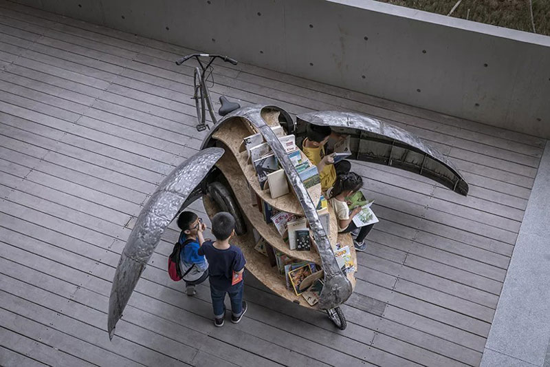
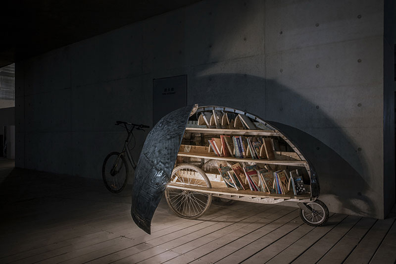
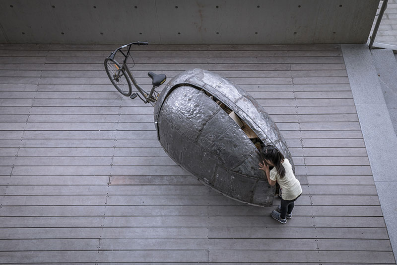
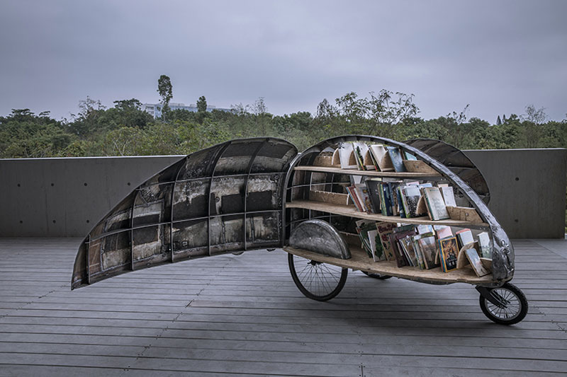
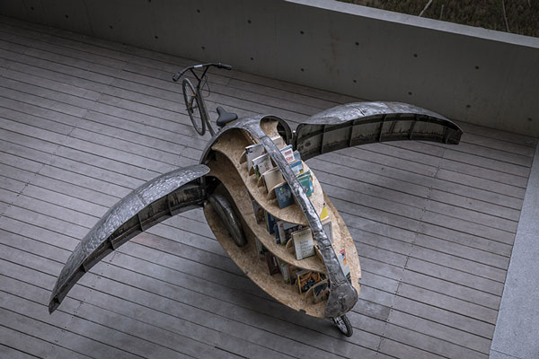
When closed, this bike looks like the random food-selling street carts you can see everywhere in China. However, when the ladybug opens its wings, something magical happens: it’s a tiny library!
Made of abandonned bikes and discarded metal car sheets, this “library-bike” can go anywhere to bring joy to kids by carrying children books. Just like a regular library, this bike also allows for kids to stay there and enjoy their book on the spot, thanks to a sitting space available.
This project was thought and built by LUO Studio, a design agency from Beijing in China.
Creating a website for a client who insists on using moving elements to make their website stand out means walking a fine line between creativity and distraction. There will always be clients who want obnoxious elements like background music, cursor trailers, and strange volume adjustment interfaces. However, some interactive elements have the potential to support user experience when implemented correctly.
Traditional advice tells designers to avoid moving elements, but moving elements can create the edge a website needs to be truly original. You don’t have to sacrifice originality to create a better user experience. Some of the top web design trends in 2019 incorporate movement into the page. For example, scroll-triggered animations, rotating animations, and using CSS to produce drop-shadows are effective at engaging users when done correctly.
Here’s how to incorporate moving elements on a webpage without distracting the user:
1. Fade the moving element into the background
Playing around with opacity is one way to make movement supportive rather than distracting. For example, Dutch Bros. Coffee uses a low-opacity mp4 file in the background for all of their locations. Each location’s page is styled in high contrast and features the address, hours of operation, and a link to a map. The content is clearly visible over the video playing in the background, and it makes you feel like you’re actually at the drive-thru window getting a coffee.
Fading a video into the background is just one way to subdue the possible distraction of a moving element. You can also make animated gifs and other animations low opacity. A video works for Dutch Bros. because the video conveys the experience you’d get at one of their locations. A video may not be the correct.
2. Automate your post sliders
If you’ve got a slider at the top of your page, automate the movement of that slider. For example, have each slide automatically move to the next after a couple of seconds, and rotate between no more than three pieces of content.
Make sure the content you feature in your slider is content you want visitors to focus on the most. A moving slider is distracting, but it works in your favor when you want visitors to pay attention to that content first.
3. Make use of state changes based on user interaction
Change the appearance of an element on mouseover. For example, if you’re asking for a donation, create a graphic that changes when a user hovers over that element. Make the change something that will make users smile.
A wonderful example of animation done correctly is Meteor Toys. When a user clicks on any of the three top menu options, the content zooms forward to meet the user. Clicking the other content on the page produces similar zoom animations that open content boxes right on the same page. This is called semantic animation.
4. Use parallax sparingly
There are an infinite number of website templates that use parallax, but when it’s not used intentionally, it doesn’t benefit the website. For instance, parallax scrolling looks cool, but if you’re just filling in a template, you’re not using the feature with intention.
Other sites like everylastdrop.co.uk use parallax to tell a story. In this case, the story is about how much water the average UK citizen uses each day, and leads the user to a short video at the end that describes how to save water. The presentation is unusual, but it’s definitely unique and engaging.
5. Remember to offer controls to users
When using movement to capture attention, remember to offer controls to users. Unless you’ve created a perfectly timed presentation, let users do their own scrolling and navigating. When users are on a website that isn’t a video presentation, they expect to stay in control.
Porchevolution.com is a great example of a site that has potential, but will lose users due to lack of controls. While the user can move this creative presentation along by clicking, they can’t adjust the volume. Since the soundtrack is half the presentation, some users will leave the site.
Keep refining your moving elements
When using moving elements on a page, continue to refine those elements based on user feedback. If you get emails or social media comments saying your animations are annoying or distracting, you may want to revamp them a bit.
At the end of the day, the coolest website in the world won’t be functional if it’s also distracting.
Creating a website for a client who insists on using moving elements to make their website stand out means walking a fine line between creativity and distraction. There will always be clients who want obnoxious elements like background music, cursor trailers, and strange volume adjustment interfaces. However, some interactive elements have the potential to support user experience when implemented correctly.
Traditional advice tells designers to avoid moving elements, but moving elements can create the edge a website needs to be truly original. You don’t have to sacrifice originality to create a better user experience. Some of the top web design trends in 2019 incorporate movement into the page. For example, scroll-triggered animations, rotating animations, and using CSS to produce drop-shadows are effective at engaging users when done correctly.
Here’s how to incorporate moving elements on a webpage without distracting the user:
1. Fade the moving element into the background
Playing around with opacity is one way to make movement supportive rather than distracting. For example, Dutch Bros. Coffee uses a low-opacity mp4 file in the background for all of their locations. Each location’s page is styled in high contrast and features the address, hours of operation, and a link to a map. The content is clearly visible over the video playing in the background, and it makes you feel like you’re actually at the drive-thru window getting a coffee.
Fading a video into the background is just one way to subdue the possible distraction of a moving element. You can also make animated gifs and other animations low opacity. A video works for Dutch Bros. because the video conveys the experience you’d get at one of their locations. A video may not be the correct.
2. Automate your post sliders
If you’ve got a slider at the top of your page, automate the movement of that slider. For example, have each slide automatically move to the next after a couple of seconds, and rotate between no more than three pieces of content.
Make sure the content you feature in your slider is content you want visitors to focus on the most. A moving slider is distracting, but it works in your favor when you want visitors to pay attention to that content first.
3. Make use of state changes based on user interaction
Change the appearance of an element on mouseover. For example, if you’re asking for a donation, create a graphic that changes when a user hovers over that element. Make the change something that will make users smile.
A wonderful example of animation done correctly is Meteor Toys. When a user clicks on any of the three top menu options, the content zooms forward to meet the user. Clicking the other content on the page produces similar zoom animations that open content boxes right on the same page. This is called semantic animation.
4. Use parallax sparingly
There are an infinite number of website templates that use parallax, but when it’s not used intentionally, it doesn’t benefit the website. For instance, parallax scrolling looks cool, but if you’re just filling in a template, you’re not using the feature with intention.
Other sites like everylastdrop.co.uk use parallax to tell a story. In this case, the story is about how much water the average UK citizen uses each day, and leads the user to a short video at the end that describes how to save water. The presentation is unusual, but it’s definitely unique and engaging.
5. Remember to offer controls to users
When using movement to capture attention, remember to offer controls to users. Unless you’ve created a perfectly timed presentation, let users do their own scrolling and navigating. When users are on a website that isn’t a video presentation, they expect to stay in control.
Porchevolution.com is a great example of a site that has potential, but will lose users due to lack of controls. While the user can move this creative presentation along by clicking, they can’t adjust the volume. Since the soundtrack is half the presentation, some users will leave the site.
Keep refining your moving elements
When using moving elements on a page, continue to refine those elements based on user feedback. If you get emails or social media comments saying your animations are annoying or distracting, you may want to revamp them a bit.
At the end of the day, the coolest website in the world won’t be functional if it’s also distracting.
Creating a website for a client who insists on using moving elements to make their website stand out means walking a fine line between creativity and distraction. There will always be clients who want obnoxious elements like background music, cursor trailers, and strange volume adjustment interfaces. However, some interactive elements have the potential to support user experience when implemented correctly.
Traditional advice tells designers to avoid moving elements, but moving elements can create the edge a website needs to be truly original. You don’t have to sacrifice originality to create a better user experience. Some of the top web design trends in 2019 incorporate movement into the page. For example, scroll-triggered animations, rotating animations, and using CSS to produce drop-shadows are effective at engaging users when done correctly.
Here’s how to incorporate moving elements on a webpage without distracting the user:
1. Fade the moving element into the background
Playing around with opacity is one way to make movement supportive rather than distracting. For example, Dutch Bros. Coffee uses a low-opacity mp4 file in the background for all of their locations. Each location’s page is styled in high contrast and features the address, hours of operation, and a link to a map. The content is clearly visible over the video playing in the background, and it makes you feel like you’re actually at the drive-thru window getting a coffee.
Fading a video into the background is just one way to subdue the possible distraction of a moving element. You can also make animated gifs and other animations low opacity. A video works for Dutch Bros. because the video conveys the experience you’d get at one of their locations. A video may not be the correct.
2. Automate your post sliders
If you’ve got a slider at the top of your page, automate the movement of that slider. For example, have each slide automatically move to the next after a couple of seconds, and rotate between no more than three pieces of content.
Make sure the content you feature in your slider is content you want visitors to focus on the most. A moving slider is distracting, but it works in your favor when you want visitors to pay attention to that content first.
3. Make use of state changes based on user interaction
Change the appearance of an element on mouseover. For example, if you’re asking for a donation, create a graphic that changes when a user hovers over that element. Make the change something that will make users smile.
A wonderful example of animation done correctly is Meteor Toys. When a user clicks on any of the three top menu options, the content zooms forward to meet the user. Clicking the other content on the page produces similar zoom animations that open content boxes right on the same page. This is called semantic animation.
4. Use parallax sparingly
There are an infinite number of website templates that use parallax, but when it’s not used intentionally, it doesn’t benefit the website. For instance, parallax scrolling looks cool, but if you’re just filling in a template, you’re not using the feature with intention.
Other sites like everylastdrop.co.uk use parallax to tell a story. In this case, the story is about how much water the average UK citizen uses each day, and leads the user to a short video at the end that describes how to save water. The presentation is unusual, but it’s definitely unique and engaging.
5. Remember to offer controls to users
When using movement to capture attention, remember to offer controls to users. Unless you’ve created a perfectly timed presentation, let users do their own scrolling and navigating. When users are on a website that isn’t a video presentation, they expect to stay in control.
Porchevolution.com is a great example of a site that has potential, but will lose users due to lack of controls. While the user can move this creative presentation along by clicking, they can’t adjust the volume. Since the soundtrack is half the presentation, some users will leave the site.
Keep refining your moving elements
When using moving elements on a page, continue to refine those elements based on user feedback. If you get emails or social media comments saying your animations are annoying or distracting, you may want to revamp them a bit.
At the end of the day, the coolest website in the world won’t be functional if it’s also distracting.
Creating a website for a client who insists on using moving elements to make their website stand out means walking a fine line between creativity and distraction. There will always be clients who want obnoxious elements like background music, cursor trailers, and strange volume adjustment interfaces. However, some interactive elements have the potential to support user experience when implemented correctly.
Traditional advice tells designers to avoid moving elements, but moving elements can create the edge a website needs to be truly original. You don’t have to sacrifice originality to create a better user experience. Some of the top web design trends in 2019 incorporate movement into the page. For example, scroll-triggered animations, rotating animations, and using CSS to produce drop-shadows are effective at engaging users when done correctly.
Here’s how to incorporate moving elements on a webpage without distracting the user:
1. Fade the moving element into the background
Playing around with opacity is one way to make movement supportive rather than distracting. For example, Dutch Bros. Coffee uses a low-opacity mp4 file in the background for all of their locations. Each location’s page is styled in high contrast and features the address, hours of operation, and a link to a map. The content is clearly visible over the video playing in the background, and it makes you feel like you’re actually at the drive-thru window getting a coffee.
Fading a video into the background is just one way to subdue the possible distraction of a moving element. You can also make animated gifs and other animations low opacity. A video works for Dutch Bros. because the video conveys the experience you’d get at one of their locations. A video may not be the correct.
2. Automate your post sliders
If you’ve got a slider at the top of your page, automate the movement of that slider. For example, have each slide automatically move to the next after a couple of seconds, and rotate between no more than three pieces of content.
Make sure the content you feature in your slider is content you want visitors to focus on the most. A moving slider is distracting, but it works in your favor when you want visitors to pay attention to that content first.
3. Make use of state changes based on user interaction
Change the appearance of an element on mouseover. For example, if you’re asking for a donation, create a graphic that changes when a user hovers over that element. Make the change something that will make users smile.
A wonderful example of animation done correctly is Meteor Toys. When a user clicks on any of the three top menu options, the content zooms forward to meet the user. Clicking the other content on the page produces similar zoom animations that open content boxes right on the same page. This is called semantic animation.
4. Use parallax sparingly
There are an infinite number of website templates that use parallax, but when it’s not used intentionally, it doesn’t benefit the website. For instance, parallax scrolling looks cool, but if you’re just filling in a template, you’re not using the feature with intention.
Other sites like everylastdrop.co.uk use parallax to tell a story. In this case, the story is about how much water the average UK citizen uses each day, and leads the user to a short video at the end that describes how to save water. The presentation is unusual, but it’s definitely unique and engaging.
5. Remember to offer controls to users
When using movement to capture attention, remember to offer controls to users. Unless you’ve created a perfectly timed presentation, let users do their own scrolling and navigating. When users are on a website that isn’t a video presentation, they expect to stay in control.
Porchevolution.com is a great example of a site that has potential, but will lose users due to lack of controls. While the user can move this creative presentation along by clicking, they can’t adjust the volume. Since the soundtrack is half the presentation, some users will leave the site.
Keep refining your moving elements
When using moving elements on a page, continue to refine those elements based on user feedback. If you get emails or social media comments saying your animations are annoying or distracting, you may want to revamp them a bit.
At the end of the day, the coolest website in the world won’t be functional if it’s also distracting.
There is no such thing as a too big wall for INIT. The Chilean street artist enjoys creating on very large surfaces, adding poetry to otherwise greyish and boring landscapes.
Using very contrasting styles and color schemes, INIT’s mural art sends a message accross in a very subtle way while enchanting the cities.
There is no such thing as a too big wall for INIT. The Chilean street artist enjoys creating on very large surfaces, adding poetry to otherwise greyish and boring landscapes.
Using very contrasting styles and color schemes, INIT’s mural art sends a message accross in a very subtle way while enchanting the cities.
There is no such thing as a too big wall for INIT. The Chilean street artist enjoys creating on very large surfaces, adding poetry to otherwise greyish and boring landscapes.
Using very contrasting styles and color schemes, INIT’s mural art sends a message accross in a very subtle way while enchanting the cities.
You can have the best open source project in the world but, if it doesn’t have good documentation, chances are it’ll never take off. In the office, good documentation could save you having to repeatedly answer the same questions. Documentation ensures that people can figure out how things work if key employees decide to leave the company or change roles. Well documented coding guidelines help bring consistency to a codebase.
If you’re writing long-form text, Markdown is clearly a great alternative to authoring HTML. Sometimes though, Markdown syntax isn’t enough. It’s always been possible to write straight HTML inside of Markdown documents. This includes custom elements so, if you’re building a design system with native web components, it’s easy to incorporate them inside your text-based documentation. If you’re working with React (or any other framework that speaks JSX, like Preact or Vue), you can do the same thing by using MDX.
This article is a broad overview of the tools available for writing documentation and for building style guides. Not all the tools listed here make use of MDX but it’s increasingly being incorporated into documentation tooling.
What is MDX?
A .mdx file has exactly the same syntax as a regular Markdown file, but lets you import interactive JSX components and embed them within your content. Support for Vue components is in alpha. It’s easy to get MDX set up with Create React App. There are MDX plugins for Next.js and Gatsby. The forthcoming version two release of Docusaurus will also come with built-in support.
Writing documentation with Docusaurus
Docusaurus is made by Facebook and used by every Facebook open source project, apart from React. It’s also used by many major open source projects outside of Facebook, including Redux, Prettier, Gulp and Babel.
Projects making use of Docusaurus.
You can use Docusaurus to document anything — it isn’t front-end specific. Docusaurus uses React under the hood, but you don’t have to know that framework to make use of it. It’ll take your Markdown files and turn them into a nicely-structured, well-formatted and readable documentation site, with a nice design right out of the box.
The Redux site shows the typical Docusaurus layout
Sites created with Docusaurus can also include a Markdown-based blog. Prism.js is included by default for zero-setup syntax highlighting. While relatively new, Docusaurus has proven popular, being voted the number one new tool of 2018 on StackShare.
Other options for written content
Docusaurus specifically caters to building documentation. Of course, there are a million and one ways to make a website — so you could roll your own solution with any back-end language, CMS, or static site generator.
The documentation sites for React, IBM’s design system, Apollo and Ghost CMS use Gatsby, for example — a generic static site generator often used for blogs. If you work with the Vue framework, VuePress is becoming a popular option. MkDocs is an open source static site generator for creating documentation, written in Python and configured with a single YAML file. GitBook is a popular paid product that’s free for open-source and non-profit teams. If you’re building internal documentation and want something easy, the reading experience on GitHub itself isn’t half bad, so you could just commit some Markdown files and leave it at that.
Documenting components: Docz, Storybook and Styleguidist
Style guides, design systems, pattern libraries — whatever you want to call them — have become a hugely popular area of concern in the last decade. What’s really made the difference in turning them from vanity projects into useful tools isn’t the pontificating of thought leaders but the emergence of component-driven frameworks, like React, and the tools mentioned here.
Storybook, Docz and Styleguidist all do much the same thing: display interactive UI components and document their API. A project may have dozens or even hundreds of components to keep track of — all with a variety to states and styles. If you want components to be reused, people have to know that they exist. We aid discoverability when we catalog components. A style guide gives an easily searchable and scannable overview of all your UI components. This helps to maintain visual consistency and avoid duplicating work.
These tools provide a convenient way to review different states. It can be difficult to reproduce every state of a component in the context of a real application. Rather than needing to click through an actual app, developing a component in isolation can be helpful. Hard-to-reach states (like a loading state, for example) can be mocked.
Dan Green wrote a nice synopsis of the benefits of using Storybook, but it applies equally to Docz and Styleguidist:
„Storybook has made it really easy for designers who code to collaborate with engineers. By working in storybook they don’t need to get a whole environment running (docker container, etc). For Wave, we have many important components that are only visible in the middle of a process that is short lived and time consuming to reproduce (i.e. a loading screen that only shows while a user is having their payment account set up). Before Storybook, we didn’t have a good way to work on these components and were forced to temporary hacks in order to make them visible. Now, with Storybook we have an isolated place to easily work on them, which has the bonus feature of being easily accessible for designers and PMs. It also makes it really easy for us to show off these states in sprint demos.”
– Dan Green, Wave Financial
As well as visualizing different states side-by-side and listing props, its often helpful to have written content about a component — whether its explaining the design rationale, use-cases, or describing the results of user-testing. Markdown is easy enough for *anybody* to learn — ideally a style guide should be a joint resource for designers and developers that both disciplines contribute to. Docz, Styleguidist and Storybook all offer a way to seamlessly intermingle Markdown with the components themselves.
Docz
Currently, Docz is a React-only project, but is working on support for Preact, Vue and web components. Docz is the newest of the three tools, but has already amounted over 14,000+ stars on GitHub. It is, to my mind, the easiest solution to work with. Docz provides two components — <Playground> and <Props>. These are imported and used directly in .mdx files.
import { Playground, Props } from "docz";
import Button from "../src/Button";
## You can _write_ **markdown**
### You can import and use components
<Button>click</Button>
You can wrap your own React components with <Playground> to create the equivalent of an embedded CodePen or CodeSandbox — a view of your component alongside editable code.
<Playground>
<Button>click</Button>
</Playground>
<Props> will show all the available props for a given React component, default values, and whether the prop is required.
<Props of={Button} />
I personally find this MDX-based approach the simplest to understand and the easiest to work with.
Just like with Docz, examples are written using Markdown syntax. Styleguidist uses Markdown code blocks (triple backticks) in regular .md files rather than MDX:
Code blocks in Markdown usually just show the code. With Styleguidist, any code block with a language tag of js, jsx or javascript will be rendered as a React component along with the code. Just like with Docz, the code is editable — you can change props and instantly see the result.
Styleguidist will automatically create a table of props from either PropTypes, Flow or Typescript declarations.
Styleguidist currently supports React and Vue.
Storybook
Storybook markets itself as „a development environment for UI components.” Rather than writing examples of components inside Markdown or MDX files, you write *stories* inside Javascript files. A *story* documents a particular state of a component. A component might have stories for a loading state and a disabled state, for example.
Storybook is less straightforward to use than Styleguidist and Docz. At over 36,000 GitHub stars though, it’s the most popular option. It’s an open source project with 657 contributors and a full-time maintainer. It is used by, among others, Airbnb, Algolia, Atlassian, Lyft, and Salesforce. Storybook supports more frameworks than any other offering — React, React Native, Vue, Angular, Mithril, Ember, Riot, Svelte and plain HTML are all supported.
Writing documentation about components currently requires addons. In a future release, Storybook is taking inspiration from Docz and adopting MDX.
# Button
Some _notes_ about your button written with **markdown syntax**.
<Story name="disabled">
<Button disabled>lorem ipsum</Button>
</Story>
Storybook’s new Docs feature is being rolled out incrementally over the next couple of months and looks set to be a big step forward.
Do you use @storybookjs for component docs or design systems? You're gonna love DocBlocks: 📦 Drop into MDX 🏗 Modular and composable 🤝 Compatible w/ @gatsbyjs, #nextjs, etc
The benefits of pattern libraries have been extolled at nauseating length in a million Medium articles. When done well, they aid visual consistency and facilitate the creation of cohesive products. Of course, none of these tools can magic up a design system. That takes careful thought about both design and CSS. But when it comes time to communicate that system to the rest of an organization, Docz, Storybook and Styleguidist are all great options.
In this tutorial, you will learn how to create an amazing typography dispersion effect. First, we are going to create and define a few patterns and brushes. Then, we are going to create a typography effect from our subject, and then disperse the letters in the direction we choose. After that, we are going to make some final adjustments.
I will try to explain everything in so much detail that everyone can
create it, even those who have just opened Photoshop for the first time.
The effect shown above is the one I will show you how
to create here in this tutorial. If you would like to create the effects
shown below, using just a single click and in just a few minutes, then check out my Typography 4 Photoshop Action.
What You’ll Need
To recreate the design above, you will need the following photo:
The stock image is no longer available, but you can get a similar one over on PhotoDune.
1. How to Get Started
Step 1
First, open the photo that you want to work with. To open your photo, go to File > Open, choose your photo, and click Open. Now, before we get started, just check a couple of things:
Your photo should be in RGB Color mode, 8 Bits/Channel. To check this, go to Image > Mode.
For best results, your photo size should be 1500–4000 px wide/high. To check this, go to Image > Image Size.
Your photo should be the Background layer. If it is not, go to Layer > New > Background from Layer.
Step 2
We are going to create a typography dispersion effect in the downward direction, so we need to expand the canvas on the bottom so we have more space for the effect, and also a little bit on the left and right sides. Go to Image > Canvas Size and use the settings below:
Step 3
Now we need to make this expanded canvas area seamless. Choose the Magic Wand Tool (W) and click once over the white area to select the whole white area we have just added. Go to Edit > Fill and select the settings below. After that, press Control-D on your keyboard to remove the selection.
2. How to Create Patterns and Brushes
Step 1
In this section, we are going to create the patterns and brushes we’ll need. Go to File > New to create a new file, name it Typography Pattern 1, and use the settings below:
Step 2
Now choose the Horizontal Type Tool (T), click anywhere inside the canvas, and type a single letter. You can use any font, font style, and font size. I have chosen Arial font, Regular font style, and 31.47 px size. After you type a letter, hit Enter on your keyboard and use the same method to add several letters. Here is what I got:
Step 3
Now click on the Background layer eye icon next to its thumbnail to hide it. Go to Edit > Define Pattern to define a pattern and name it Typography_Pattern_1. Keep this file open.
Step 4
Repeat the first two steps in this section,but in Step 1 name the new file Typography Pattern 2, and in Step 2 use different letters with the same font, font style and font size you used for the previous pattern. Here is what I got:
Step 5
Now click on the Background layer eye icon next to its thumbnail to hide it. Go to Edit > Define Pattern to define a pattern and name it Typography_Pattern_2. Keep this file open as well.
Step 6
Repeat the first two steps in this section,but in Step 1 name the new file Typography Pattern 3,
and in Step 2 use different letters with the same font, font style and
font size you used for the previous two patterns. Here is what I got:
Step 7
Now click on the Background layer eye icon next to its thumbnail to hide it. Go to Edit > Define Pattern to define a pattern and name it Typography_Pattern_3. Keep this file open as well.
Step 8
We are going to create brushes now. Select the Typography Pattern 1 document, go to Edit >Define Brush Preset, and name it Temp as we will remove this brush in the next few steps.
Step 9
Press B on your keyboard, right-click anywhere inside the canvas, select the Temp brush, and hit Enter. Then go to Window > Brush and inside the Brush window use the settings below:
Step 10
Now we are going to define this brush with new settings as a new brush. Go to Edit > Define Brush Preset and name it Typography_Brush_1. Press B on your keyboard, right-click anywhere inside the canvas, and Alt-click on the Temp brush to remove it.
Step 11
Repeat all the steps from Step 8 to Step 10 to create two more brushes from the two other documents Typography Pattern 2 andTypography Pattern 3.Of course, name those two new brushes according to theirserial number.Then close all documents except your photo document.
3. How to Create the Base
Step 1
Now we need to create the base that determines which part of our photo will be turned into typography. So the base will actually be our subject. Go to Layer > New > Layer to create a new layer and name it Base.
Step 2
While the Base layer is selected, fill your subject with a color. You can do it in various ways. For example, you can create a selection of your subject using the Pen Tool (P), Magic Wand Tool (W), Lasso Tool (L) or some other tool, and then just fill the selection with a color. Or you can choose the Brush Tool (B) and brush over your photo using a hard or soft brush.
4. How to Create Typography From a Subject
Step 1
In this section we are going to create a typography effect from a subject that we have defined with the Base layer. Control-click on the Base layer thumbnail to make a selection of that layer, select the Background layer, and go to Layer > New > Layer Via Copy. Then hide the Base layer by clicking on the eye icon next to its thumbnail.
Step 2
Now go to File > New to create a new file, name it Text, and use the settings below. You can use different values for width/height, but make sure that the document is at least as big as your photo document.
Step 3
Choose the Horizontal Type Tool (T) and type the text so it covers the whole document. You should use the same font and font style that you used for creating patterns and brushes. Also, the font size should be the same or very close.
Feel free to make changes to your text, like increasing or decreasing leading, tracking and more. If the content of the text does not matter to you, you can use a text generator to speed up the process.
Step 4
Now choose the Move Tool (V), click and hold inside the canvas, and drag the text layer from the Text document to your photo document and position it so it covers the whole subject. Double-click on this layer name and rename it Text.
Step 5
Control-click on the Layer 1 thumbnail to make a selection of that layer, and then go to Layer > Layer Mask > Reveal Selection.
Step 6
Now select Layer 1 and drag it above the Text layer. Then go to Layer > Create Clipping Mask. Double-click on this layer name and rename it Text Color.
Step 7
Now we are going to create a solid color background. Select the Background layer and go to Layer > New Fill Layer > Solid Color to create a new solid color fill layer, name it Background Color, and use the settings below:
Step 8
Select the Background layer and go to Layer > New > Layer Via Copy to duplicate that layer. Then drag this layer just below the Base layer, go to Filter > Blur > Gaussian Blur, and use the settings below:
Step 9
Now go to File > Save As to save your document as a new file. You can name it however you want, and you can save it anywhere you want, but keep in mind that you will need to select that file later to apply a filter. Then right-click on the Background copy layer and choose Delete Layer.
Step 10
We need to correct the edges of the subject slightly. Select the layer mask of the Text layer, go to Select > Select and Mask, and use the settings below:
Step 11
Right-click on the Text layer name and choose Convert to Smart Object. Then go to Filter > Displace, use the settings below, and choose OK. After that you will get another window, and there you can choose the file you have previously saved and click Open.
Step 12
Now we are just going to group some layers. Select the Background Color layer, Shift-click on the Text Color layer, go to Layer > New > Group from Layers to create a new group from these layers, and name it Subject Typography.
5. How to Create Dispersed Letters
Step 1
In this section, we are going to create letters that we are going to disperse later. First we need to create another base layer that determines which areas will be dispersed. Select the Base layer, go to Layer > New > Layer to create a new layer, and name it Base 2.
Step 2
Control-click on the Base layer thumbnail to make a selection of that layer and go to Layer > Layer Mask > Reveal Selection.
Step 3
Now select the Base 2 layer thumbnail, choose the Brush Tool (B), pick a soft or hard brush, and start brushing over the areas you want to disperse.
Step 4
Select the layer mask of the Base 2 layer, right-click on it, and choose Apply Layer Mask.
Step 5
Control-click on the Base2 layer thumbnail to make a selection of that layer. Choose the Lasso Tool (L), right-click anywhere inside the canvas, choose Make Work Path, and use the settings below:
Step 6
Now click on the eye icon of the Base 2 layer next to its thumbnail to hide it. Select the Subject Typography group and go to Layer > New > Layer to create a new layer. Leave the default name Layer 1 because we will delete this layer in the next few steps.
Step 7
Choose the Pen Tool (P), right-click anywhere inside the canvas, choose Fill Work Path, and use the settings below:
Custom Pattern is Typography_Pattern_1.
Step 8
Now Control-click on the Layer 1 thumbnail to make a selection of that layer, select the Background layer, and go to Layer > New > Layer Via Copy to create a new layer via copy, and name it L_1 (abbreviation of Letter_1). Then right-click on Layer 1 and choose Delete Layer.
Step 9
Now repeat all the steps from Step 6 to Step 8 as many times you want, depending on how many letters layers you want to create, using Typography_Pattern_1. I have repeated it nine more times, so I have ten letters layers in total.
Step 10
Now we are going to create more letters layers but with other patterns, so we have different letters. Repeat all the steps from Step 6 to Step 8, but in Step 7 use the settings below instead of the settings you used the previous time.
Custom Pattern is Typography_Pattern_2.
Step 11
Now repeat Step 10 as many times you want, depending on
how many letters layers you want to create, using Typography_Pattern_2. I have repeated it nine more
times, so I have 20 letters layers in total.
Step 12
Now we are going to create more letters layers with our last pattern,
so we have different letters. Repeat all the steps from Step 6 to Step 8, but in Step 7 use the settings below instead of the settings you used the previous time.
Custom Pattern is Typography_Pattern_3.
Step 13
Now repeat Step 12 as many times as you want, depending on
how many letters layers you want to create, using Typography_Pattern_3. I have repeated it nine more
times, so I have 30 letters layers in total.
Step 14
Now select the first letters layer, go to Filter > Displace, use the settings below, and choose OK. After that you will get another window, and there you can choose the file you have previously saved and click Open.
Step 15
Select the next letters layer and press Control-F to apply the previous filter with the same settings. Use the same method to apply this filter to all other letters layers.
Step 16
We are going to group all the letters layers now. Select your top letters layer and Shift-click on the last letters layer to select all letters layers, go to Layer > New > Group from Layers to create a new group from selected layers and name it Letters. Then drag the group just above the Subject Typography group.
6. How to Disperse Letters
Step 1
In this section, we are going to disperse the letters we have just created. So all you have to do now is to choose the Move Tool (V), select the letters layer that you want to move, and move it in the direction of your choice. I want to create a dispersion in the downward direction, so here is what I got:
Step 2
Now we are going to transform some letters to create depth. Select the letters layer that you want to transform, choose the Lasso Tool (L), right-click anywhere inside the canvas, and use the settings below:
Step 3
I have transformed a few more letters layers. Feel free to transform as many layers as you want, and also to use different values for width/height. Here is what I got:
Step 4
Now to give more depth and focus to the effect, we are going to blur some letters. Select the letters layer that you want to blur, go to Filter > Blur > Gaussian Blur, and use the settings below:
Step 5
I have blurred a few more letters layers. Feel free to transform as
many layers as you want, and also to use different values for Gaussian blur. Here is what I got:
Step 6
Now make some final changes to the dispersed letters, so you can move, transform and blur letters layers as you like. Also feel free to move or transform the whole Letters group and also change the layer order in the Layers panel. Here is what I got:
7. How to Create a Missing Letters Effect
Step 1
In this section, we are going to create a missing letters effect. Select the Text layer and go to Layer > Layer Mask > Reveal All to add a blank layer mask to this layer.
Step 2
Select the layer mask of the Text layer and press D on your keyboard to reset the swatches. Choose the Brush Tool (B), right-click anywhere inside the canvas, pick some of the typography brushes we have created at the beginning of the tutorial, and hit Enter. Then start brushing over the areas where you wish to create a missing letters effect. You can also use a soft brush for the edges. Here is what I got:
8. How to Make Adjustments
Step 1
In this section, we are going to make some final adjustments to the effect. Firstly we are going to add a nice color look. So select the Letters group and go to Layer > New Adjustment Layer > Curves to create a new curves adjustment layer just below the Base layer, and name it Color Look.
Step 2
Now double-click on the Color Look layer thumbnail and use the settings below:
Step 3
Now we are going to add a subtle filter. Go to Layer > New Adjustment Layer > Photo Filter to create a new photo filter adjustment layer and name it Photo Tint.
Step 4
Double-click on the Photo Tint layer thumbnail and use the settings below:
Step 5
Now we are going to add a subtle contrast. Press D on your keyboard to reset the swatches, go to Layer > New Adjustment Layer > Gradient Map to create a new gradient map adjustment layer and name it Overall Contrast.
Step 6
Change the blending mode of the Overall Contrast layer to Soft Light and drop the Opacity to 8%.
Step 7
Finally we are going to add sharpening to the whole effect. Press Control-Alt-Shift-E on your keyboard to make a snapshot, and then go to Filter > Other > High Pass and use the settings below:
Step 8
Double-click on the Layer 1 name and rename it Overall Sharpening. Change its blending mode to Hard Light and drop the Opacity to 82%.
You Made it!
Congratulations, you have succeeded! Here is our final result:
If you would like to create the effect shown below, using just a single click and in just a few minutes, then check out
my Typography 4 Photoshop Action.
The action works so that you just brush over the areas that you want to disperse in letters, play the
action, and the action will do everything for you, giving you fully
layered and customizable results.
You can choose from five different dispersion directions:
Right
Left
Up
Down
Middle
And each direction comes in three optional letter sizes:
Small
Medium
Large
The action is made so that every time you run the action,
you will get a unique result even if you use the same brushed
area. The letters will always be differently arranged and deployed. The subject typography is a fully editable text layer. You can use your own text, change the font, font style, letter spacing, line height, etc. The action will also create 10 preset
color looks for you.
It
comes with a detailed video tutorialthat demonstrates how to use and customize the look of your action to get the most out of the effect.
Agregator najlepszych postów o designie, webdesignie, cssie i Internecie