The interaction between your brand and its customer is the lifeblood of any business. Without setting up proper channels to bridge the gap between you and your audience, you may as well kiss your business goodbye.
Keeping an open line of communication is vital to the success of your online business. This reason is precisely why email marketing is one of the best channels for this purpose. Not only can you build better relationships with your current subscribers but you can also convert them into loyal customers!
However, you need to keep up with the different email marketing trends so you can make the most out of your strategy. One of the more recent and interesting trends in this discipline is interactive email. It doubles down on the concept of what makes email great, thus helping you increase your engagement levels and conversion rate!
In this post, learn the value that interactive email brings to your business and concrete examples of interactive email at work to help you come up with ideas of your own for your business.
Why the need for interactive email
Email marketing is a very dynamic practice. With lots of innovation going around in this space, you need to be sharp, vigilant, and on your toes should you want to make the most out of your email campaigns.
The fact of the matter is that what works now in email marketing may not be as effective sooner than you think. Every company and brand is observing the latest practices on how to get more subscribers and increase their CTRs from their campaigns.
Therefore, the latest tactics and technology lose their novelty faster than you’d think because people are quick to adapt to them. If you’re not susceptible to change, then you might as well count yourself out from the game – email will always evolve to provide people with better ways to interact with your content.
Speaking of interaction, interactive email is somewhat of a game-changer in the strictest sense. This type of email has been around for years but not a lot of brands have implemented it as extensively. If there’s an innovation in email marketing that you need to capitalize on, then it’s got to be interactive email.
The key is “interaction”
If you’re not familiar with interactive email, then think of the usual emails that you receive from brands. There are good reasons why you subscribe and remain subscribed to their email lists such as persuasive copy, clear message, and others. However, wouldn’t it be nice if the email looks just as great as its content?
There’s nothing wrong with how brands design their emails, but there’s only so much you can do with it. What if there’s an image carousel or animated images like a GIF in the email? With a host of other potential elements you can add, you can create more
compelling emails that you can test and benchmark to help you engage and interact with your subscribers even more!
With interactive email, you don’t have to imagine. You can design your emails like you would a website. You can add menu hamburger menus, videos, and even payment gateways in your emails. And those are just some of the possible elements you can add!
Interactive email examples
Instead of telling you how to use interactive email for your business, it’s better to just show you! Below are examples of how companies used interactive email to great effect:
The New York Times – To drive more subscribers to their publication, the brand created an email that makes use of an animated GIF as its heading. The headline reads, “Give the Truth. Give the Facts. Give the Times.”
Pret – To promote its Smoothie and Frappe campaign, Pret launched an email campaign using animation as well. However, instead of GIF, the brand used CSS animated sprites to create the visuals of pouring a smoothie or frappe on a plastic cup every time the user clicks on the available flavors.
TrendyMinds – The brand sent out an email promoting their latest content by way of a game. To unlock the content, subscribers must click on the colors in correct order.
Email marketing is always on the cusp of the future and interactive email is proof of that claim. With the technological advancements from companies like Campaign Monitor, the ability to create engaging and interactive messages is now upon us. There’s no need to send static, text-based email message now that you have a more compelling way to display your content to people via email.
It’s up to you to adapt with the times and include interactive emails in your strategy before it’s too late. Hopefully, the tips and examples above should have convinced you to take this route now.
Imagine you get a piece of white paper on one hand and on the other you get all the rainbow colors in a pallet. Now you can start playing… This is how I feel when I am designing a website from scratch, when I can play with layouts and colors in the website builder to create my website masterpiece.
But, at the same time, I remind myself that the creative part of the process needs to include my customers. The way it should be done is by thinking about their experiences in the buying process of a product or service, or just when reading my blog.
In this blog post, I will help you understand what matters the most in UX (User Experience). And at the end, the answer to all the following questions will be yes!
Anyone who comes to my website understands what my business is about (especially if it’s their first time)?
Is it easy to navigate?
My customers find everything they need?
Let’s start:
Design for the users – Know your target audience
Why are you making this site? Skip the temptation to dive into the website builder tools without first thinking about your main objective for the website. Remember why you are making it and what must be included.
Who is your audience? This is the second natural question that comes into play and one of the most important. Define your audience (age range, locations, preferences, etc.) and adjust all your website content to satisfy them.
What do you want visitors to do / take away when they land on your site? Is it an impression? Is it a feeling? Is it something more tangible such as e-book? You should consider passing something onto them as a way to establish a relationship and turn them into recurring visitors.
Are you creating the site for a client? If so, what are the client’s goals? If the website on the table is for a client, put yourself on their shoes and make it just as you would make yours. Think and plan all the little aspects and ask them any questions in order to take into consideration all their goals.
Say more with less – simple design elements. How many seconds users have to pay attention? Make sure they do not have to stay 100% focused to be able to understand your website. If it’s too messy or too hard to get the message, they will just leave. With all the entertaining messages we constantly get through ads, signs, sounds, emails, and so on, we tend to have shorter attention span. Do not fall into the fallacy of building a messy website and you will have better chances of succeeding.
Consistency – very important. Start with a nice introduction but remember to follow-up with content that matches the initial message. Build up on the tone smoothly and you will be able to present everything you want in the right time and with the right words. Stick to this strategy even if you like to be aggressive with content. It is better to go one step at a time not to sounds confusing or messy. It is human nature to avoid messy things, places and guess what? Websites too. We will avoid incomprehensive, inconsistent websites. Period.
Color scheme – we have all visited websites that looked like a carnival of colors. There are web designers (or con artists) out there that are really masters at throwing around all sorts of red, yellow, blue and green. Do they really think it’s cool? I guess so…Let’s admit: at least they exist to make us laugh. Those kinds of websites are so funny! However, getting back to business, it’s hard to really see companies with funky websites as reliable. I have certainly never seen reliable companies with funky color schemes on their websites.
Fonts – same thing applies here. There are thousands of fonts out there nowadays, we know. There are some that are very impressive, cool, fancy, elaborate… We know that too. It’s very tempting to browse through all the varieties of fonts you can find. And it’s even more tempting to try them out. But save yourself some time to play with them later. A website is not a place for that. Avoid using many types of fonts. Think about your logo, general appearance of your website and try to maintain your fonts consistent with your color schemes, brand identity and content.
Images and videos – this part can really make it or break it. To make it, use high quality images and videos only. There are countless smartphones out there that shoot very good pictures and videos. You certainly have one you can use. If you have a camera, even better. Make sure all the visual content you put into your website is good in terms of brightness, focus and angle. The visuals will play a major role in reinforcing your messages throughout the website. Ultimately, they will prevail with the impression you are passing onto your visitors. I have a golden rule that I use to determine if the files are ok to upload to my websites: if I would see it on YouTube or on the TV and think it’s bad quality, beyond acceptable, I don’t use it.
White space – a good musician knows a pause is just like any other musical note and should be used wisely within the harmony of a song. However, a musician usually is not silent for a long period of time, otherwise that’s not actually playing music. It is basically the same thing when it comes to websites. Avoid leaving blank spaces around your website but know when to use it to give users a break and to make the website better, aesthetically speaking.
Navigation bar – where do you click when you want to go to the “beginning” of a website? The homepage button. Where is it? On the navigation bar. Where do look when you want to find a contact page? On the navigation bar. You get the point… The go-to place when looking for pages on any given website is the navigation bar. So keep it simple and organized. This ensures users will find everything they are looking for. The better the navigation bar, the better experience, the better impression, the better revenues…
Cover the basics – mobile usability, site speed, security, reliability. Everything has a start. And these four key elements are the solid basis for a good user experience. Starting from mobile, users want to be able to see the full content of a website when navigating on their phones and tablets. They want to be able to click on every link, image and video with the tip of their fingers. Secondly, people want pages to open at the very moment they click a link, so site speed is very important for their experience. Last but not least, security and reliability are indispensible. You can pass on a trustworthy image by following the branding aspects discussed above. Needless to say, the easiest way to have all the above accomplished without moving a finger is by making your websites here on SITE123.
Call to Action or short CTA – and before they leave your website, get them to take some kind of action. Yes, take advantage of them already being on your website and get them to do something that establishes or strengthens the connection between you and them. That can be by asking them to share something, to download something, or even by selling them something. There are many possibilities and you can use your imagination and knowledge of your visitors to choose what the best for your website is.
How to keep improving?
Collect data about your users. Science has been doing it forever and all the other areas of life have been mimicking it since the beginning of the modern age. The use of data is simply amazing to better understand your users and to foresee how you can improve your website/business in order to enhance user experience. There are plenty of tools you can use to collect and analyze data about your users. On our plugin manager and app market you can find tools that allow you to see all sorts of data. Everything from how many visitors you get to what kinds of things they search for on the internet. Enjoy!
Respond to live chat or to your customers’ emails – this will give you first-hand experience when customers are confused. It is like a direct source of feedback in this sense. If visitors get confused with something on your website, they can instantly reach you to ask a question. Now you understand more about their experience and also have the chance of developing the conversation with them.
Conclusion
When you start by thinking about your main objective for the website, you are on the right path. Then, it’s just a matter of putting your customers in the center of everything and build the website around them. In the end, they are the ones giving you the money, visibility or whatever you are getting from your website/business.
The key to succeeding is in considering all the key aspects. Think about your logo, general appearance and try to maintain your fonts consistent with your color schemes. Step by step you can build and represent your brand identity. With the attention to use blank spaces wisely, and providing a solid navigation bar and contact channel, it will be easy to excel in user experience.
Now that you master the magic of user experience, it’s time to create a website!
Physicists can’t explain what time is. No one else can either. All we know is that there are situations in which we can’t get enough of it. When it isn’t used wisely, bad things can happen.
Still, we can take time, make time, pass the time, and track time; and whatever time may be made of, it can be used wisely.
We can schedule our time using a calendar app, and track it using a time-tracking app. There are numerous invoicing apps, expense tracking apps and project management apps. There are also other tools that make it easier for us to use time wisely.
The invoicing/time tracking app market can be bewildering. There are so many choices, that it can be difficult and time-consuming to find the best of the best. The good news is, we’ve done that for you with the following selections.
FreshBooks is an accounting app that is so simple to use that it’s commonly referred to as ridiculously easy. There’s virtually no learning curve to FreshBooks, so creating and sending your first invoice only takes a few seconds. Tracking time, managing expenses, adding clients and viewing financial reports are just as easy. FreshBooks allows you to make the best use of your business hours, so you can grow your business instead of just taking care of time-consuming tasks.
FreshBooks is the perfect solution for service-based businesses, but users range from freelancers to start-ups to small enterprises. The reason behind such broad use is the breadth of useful features that make users so much more productive.
You can use the proposal feature to create a project outline, scope, and timeline in an estimate/proposal format that can then be sent directly to a client.
Expense tracking is one of the most popular features in Freshbooks. You can literally take photos of receipts with your phone and add them directly to clients and invoices within the Freshbooks mobile app. Then, once you’re ready, you can create and send invoices bearing your logo and brand colors. And since FreshBooks takes care of your time-tracking needs, you can easily illustrate what you did and when you did it, right on the invoice.
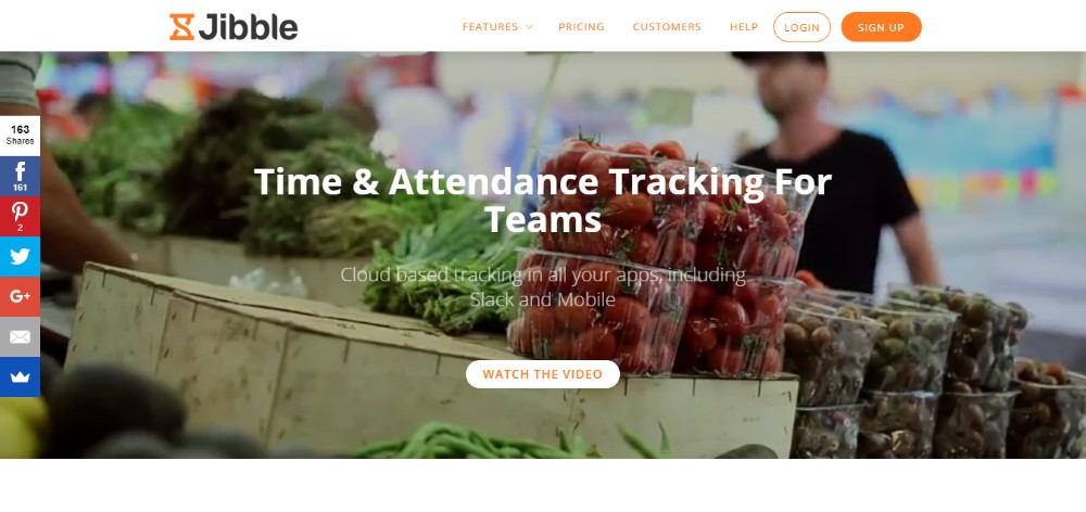
Jibble.io is a cloud-based, team time and attendance tracking app featuring a basic plan that is free for an unlimited number of users. The free plan offers up to 2 months of access to timesheets stored in the cloud, unlimited access to its many features, priority support, and unlimited usage of its activity tracking and collaboration powerups.
With Jibble, it’s always a simple task to drill down to see what activities have been worked on. Time sheets can then be generated, exported, and downloaded in spreadsheet formats to support accounting activities. Jibble also enables team leaders to generate personal timesheets for staff member use and input.
The statistics and alert feature calculates average daily and weekly hours worked by teams and by team members, including clock in and out times for the latter. Alerts are issued when anomalies are detected in the recorded stats.
The thinking behind Invoice Plane was to create a self-hosting billing cycle management app that targeted the self-employed workforce, small to mid-size businesses, and freelancers. The result was a reliable, easy to use invoicing and client management system that to date can claim more than 100,000 downloads in more than 190 countries.
Invoice Plane is an open source software tool, and it’s free. This app enables you to manage quotes, invoices, payments, and client relationships. It can be customized to fit your billing process needs and workflow, and it provides access to PayPal, Stripe, Bitcoin, and 22 other payment gateways.
Although you can download Invoice Plane today for free, the authors suggest you view their demo first. You can then try it out on your server or use one of the hosting solutions that are offered.
TimeCamp tracks both task time and attendance. It is free to use for busy freelancers, and you can access TimeCamp with a browser extension or on any device by using a mobile app.
TimeCamp integrates with Slack, Evernote, Trello, Basecamp and more. It will keep your billing cycle up to date, create invoices, and integrates seamlessly with multiple project management software systems.
AND CO is a simple-to-use app featuring a beautiful UI that was designed with studios and freelancers in mind. ADD CO is completely free. No trial is necessary, and you can keep your credit card in your purse or wallet.
AND CO is accessible on the web, Android, and iOS. You can run your entire business with this invoicing, payments, time tracking, expense tracking, and project management app. It’s used by more than 100,000 businesses around the globe.
Scoro provides a comprehensive solution to your business management needs. Track your business’s or team’s performance in real time on Scoro’s modern, attractive dashboard.
You can use this app to track both actual and billable hours, transfer hours to an invoice, keep up to date with everyone’s schedule on the shared team calendar, and get a one-page overview of any project on demand. You can also track time spent on meetings, planning sessions, etc.
Minterapp is a time tracking tool for small business and startups. It monitors how much time a user spends on a task and converts that tracked time into an invoice with a single click. Invoices can be customized to fit a user’s brand, and a client can return payment via Stripe or PayPal.
Minterapp maintains a record of all invoices, whether they are still in draft, are pending, or have been paid.
This small business invoicing, billing, and reporting app seamlessly integrates with over a dozen payment gateways. As such, a Hiveage user can serve a worldwide clientele. Hiveage also assists in preparing detailed quotations for clients and manages recurring payments and subscriptions.
Different levels of staff access can be granted, and Hiveage can also be used to effectively manage multiple teams, projects, or businesses from a single login.
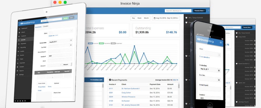
Invoice Ninja is a suite of apps freelancers can use for their project estimating, quoting, and invoicing activities. The suite also contains time tracking web and desk apps, Kanban boards, and a proposal template and proposal creation tool. Clients will benefit from having access to over 40 payment gateways.
This Invoice Ninja suite of apps is completely free.
Conclusion
Having reviewed this list of time tracking and invoicing apps, you’ve found one or two that can serve you well. Each of these can enable you to use your valuable time to the best advantage.
You will save time as well. The minutes you save every day from time tracking results are valuable. They can add up to many days saved during a year.
Any of these apps is a good investment, and the ROI on several will be immediate.
CSS is easy, some might argue, but that „easiness” can cause messy code. This is especially true through power of preprocessors like Sass or Less where, if you aren’t careful, your CSS can become harder to deal with instead of easier. Sass? Harder? This Gist shows a great example of Sass nesting hell.
If your Sass code looks like that, you can definitely improve your code with SEM & BIO, a CSS technique I’ll introduce you to now!
In this article, I am going to use the code example below to explain how SEM and BIO works and how they can help enhance your CSS strategy.
Generally, SEM is concerned with high level CSS philosophy whereas BIO is an actual technique to help you write better CSS to achieve SEM. The main purpose of both SEM and BIO is to better handle the CSS specificity which is one of the most important concepts you should understand for CSS.
From the CodePen example above, the „Search” button in the header looks exactly same as the ‘Link’ button in the sidebar. When we compare the HTML markup,
the „Search” button is <button> element
but the „Link” button is <a role="button" ...> element
…and even if the markup is different, the styles are identical by using the same classes: .c-btn and .c-btn--yellow.
The button styles are scalable and it allows you to add the same looking components anywhere you want as it won’t be polluted by its parents or siblings. This can save you from the big headache of not knowing why totally unrelated components are broken even if the changes are made on a different component from a totally different place.
The button in the header and in the main section look quite similar besides the 3D effect. In this case, instead of creating two different sets of buttons having totally different code bases, we could extend the plain button style by just adding the 3D effect to it.
It goes the same with the button in the footer. Even though the button has a different color and size, we could easily extend it by adding or removing new or different features.
Probably one of the biggest challenges for most front-enders is to understand CSS written by other people, or our past selves. We sometimes spend more time trying to understand the existing code than adding awesomely-written new code.
With SEM and BIO, we can definitely improve the code and save others (including ourselves!) from messy, unmaintainable code.
BIO
There are many great techniques out there to improve the way we write CSS, and from my experience, I found the following three techniques that make up the BIO acronym work very well together
A lot of developers/engineers already know those famous techniques but I would like to go through each of them and talk about the way I use those techniques.
BEM
BEM is very popular methodology and it has been helping us significantly improve the way we think about CSS and Sass/Less.
As the bad example above shows, we tend to overuse the power of Sass/Less and falling into nesting-hell. But with BEM, we start to have a very low CSS specificity by maintaining the styles in one (or two) levels of nesting.
If you’ve experienced any battles fighting higher CSS specificity, you will know how painful it is to come out a winner.
Going back to our example, the HTML markup looks like this:
When you create a class name, go with the core concept of BEM: your component is a block and all elements inside are individually attached to the block.
From our example again, I named .o-grid__form instead of .o-grid__item-form because the form itself is a separate component and doesn’t have to be tied with and be a child of o-grid__item.
Also, to more efficiently control styles, I have added another class name o-grid__header along with o-grid__item to extend the styles. Moreover, the button contains BEM-styled classes with the approach of OOCSS, which we’ll touch on next.
OOCSS
As we have already discussed, there are many great CSS methodologies and strategies helping us improve the way we write CSS. However, I see a lot of folks forcing themselves to decide on one methodology to use out of the bunch.
From my experience, combining methodologies can actually enhance their benefits by combining the best of multiple worlds. For example, I personally have found that BEM and OOCSS work very well together.
OOCSS stands for Object Oriented CSS and you can think of it working like Lego blocks:
OOCSS creates each individual part separately and then constructs them together in order to build components.
From our example, I have created buttons using the OOCSS naming convention:
.c-btn
.c-btn--yellow
.c-btn--blue
.c-btn--3d
.c-btn--large
To render the yellow search button in our example header, we combine these classes:
.c-btn
.c-btn--yellow
If we want to have the 3D button in the main section, we add in the 3D class, .c-btn--3d and call it a day.
And for the blue button in the footer, we can switch the yellow modifier to blue along with the large modifier. As you can see, the button is not depending on the header block giving us greater flexibility with how we use and repurpose components. And, by doing so, we can construct the buttons without impacting any other components or patterns while gaining the benefit of easily extending new presentational feature, like alternative colors and shapes.
Here example of a button collection created using OOCSS to create the variations:
On top of BEM and OOCSS, with the help of ITCSS, we can further improve our CSS strategy. Let’s look at that method next.
ITCSS
ITCSS stands for Inverted Triangle CSS and it helps organize CSS by applying a structure that determines how specific to get with a specific component. Lubos Kmetko has written an excellent overview of ITCSS that is worth reading.
You can see how I have put ITCSS to use by splitting styles up by grouped levels of specificity in this Gist.
Based on that example, you can see how I named components by adding a namespace to the class. So, for example, a the „button” component is prefixed with a „c” (.c-button) to indicate the component status and prevent it from being mistaken for another item. By doing so, everyone working on the project knows the function of that specific class and how changing its properties might affect other areas.
Here’s a visual that illustrates all the ITCSS levels:
Let’s go through each section.
Settings
Settings are generally a collection of variables that do not generate CSS, but are applied to classes. Some examples include:
Base
Color
Typography
Animation
Tools
Tools also will not produce any CSS yet and are typically preprocessor functions that help write or extend properties on classes:
Functions
Placeholders
Mixins
Media queries
Vendors
Vendors are third-party styles that are being used on a project. Think of things like reset.css, normalize.css, or even Foundation and Bootstrap.
The reason these styles are higher up in the structure is so we can override them if needed. As you may recall, if the same class is called twice, the cascade will render the properties of the second instance, assuming the properties are exactly the same:
.btn--large {
  padding: 3em;
}

/* This one wins out */
.btn--large {
  padding: 5em;
}
Just for the side note, in Sass, you can use ~ to point to the node_modules folder so you are able to import style assets from the source rather than having to move it into your own directories.
@import '~modern-normalize/modern-normalize';
Objects
Objects (namespace: o-) are used for design patterns, such as layouts, where items are being arranged rather than decorated. Object classes are used across all pages, so if you make any changes to the object classes, you should be very careful because any changes are going to affect each and every page throughout the website.
The most common object classes I use are:
.o-page: the most outer container which usually contains max-width: 100vw and overflow: hidden.
.o-main: the outer container for the main area.
.o-container: the outer container for components and it usually provides a fixed width.
.o-content: in case if any extra configuration is needed for the actual content area.
.o-grid: if a grid layout with different number of columns are required.
Do you use any other object classes? If so, please share with me. 😃
Elements
Elements (namespace: e-) are the HTML native elements which we would not style based on the class names. For example, we should provide default styles to <a> element rather than .link class.
// Do this for the default link style
a {
  text-decoration: none;

  &:hover {
    background-color: blue;
    color: white;
  }
}

// Don’t provide the default link style to a class
.link {
  text-decoration: none;

  &:hover {
    background-color: blue;
    color: white;
  }
}
It is because, especially in a CMS like WordPress, you wouldn’t want to add a class every single time you want to use a link in content. Hence, we provide a default style to the <a> element so without any class, the link will still have good-looking styles.
Components
A component (namespace: c-) is a small feature that makes up a part of the website. Think buttons, accordions, sliders, modal dialogs, etc. Each component is fully functional by itself and does not rely on any other components. This fact should be considered when you name the component.
For example, the button in the main section from the example above shouldn’t be called .c-main-button because main scopes it inside the main section and limits the use of it in other places, like a sidebar. Something like .c-btn is much nicer because the button is no longer tied to any other specific sections of the page.
If you need any extra features, you can always extend properties with a BEM modifier (combining powers!) or use Scope, which is coming up in a bit.
Patterns
A lot of developers/engineers use the terms component and pattern synonymously and that’s totally fine if you are more comfortable with that. It is just my preference to separate those two terms.
For a general rule of thumb, I think of a pattern (namespace: p-) as a combination of components but in a way that is not scaleable.
For example, I would consider the accordion as a component. It is scaleable and reusable on its own, meaning that it can be used in other parts of the website without making any changes even if the accordion would contain other components such as buttons.
On the other hand, the header, for example, would be a pattern because it is not scaleable (the header cannot be used in the content or sidebar area) and also contains other components such as buttons, accordions, menus, logos, search form etc.
Scope
Be warned; I only use the scope if it’s absolutely necessary. The purpose of the scope (namespace: s-) is to give us the highest specificity so we can overwrite any styles for a specific purpose.
Remember, If you find yourself using the scope class many times, you might be writing styles that are too specific and you should consider refactor your CSS structure.
Here is a simple example of the use of the scope class, .s-home.
.c-accordion {
  .s-home & {
    // Changing the background color specically on the homepage
    background-color: tomato;
  }
}
As a side note, the above example could actually be refactored by providing a modifier to the accordion (e.g., .c-accordion--bg-tomato) instead of using the scope class. That would be a much more extensible way of writing and make the component more modular.
Utility
Sometimes you may want to make changes only for a certain style in a specific place. In that case, utility (namespace: u-) classes can help us update it without changing the whole CSS structure.
For example, the font-size of the accordion heading is set to 32px.
.c-accordion__heading {
  font-size: rem(32);
}
But if the font size is only different in the news section of your site and does not change anywhere else, then you might want to apply the utility class instead of setting higher specificity with the parent class or scope class.
Please note that we all know !important is BAD but I added !important to the value. It is because when we use the utility class, we are absolutely sure we want the specific style to be updated as we want. Also the utility class should overwrite any other styles, so having the !important actually works well here for the utility classes. That said, the utility classes should only play a role as a helper. It should never be used for structuring your CSS.
Like scope classes, if you are using too many utility classes, you should check with designer if the design can be more consistent across the site.
Extra Namespace
On top of the namespaces we discussed above, there are two more I often use:
is-: this indicates the state of the block or element. Most commonly used class is .is-active, like the active link in navigation.
js-: this indicates that the specific element is bound to JavaScript events. For example, js-menu-click indicates that the element is bound to the click event.
Linting
Finally making rules with .stylelint and .eslint can significantly improve the code quality.
In the frontend workflow, I don’t make it as a recommendation; I make it mandatory so that failing of the rules won’t get approved.
In this way, we can ensure that the coding quality stays at its best and provide better code to other developers, including your future self.
In Action
In this section, I’d like to discuss how we could use SEM and BIO. I have made a simple, practical example to get us started:
The main practice with the example is to build an accordion that can be used as:
a normal accordion but with different color themes in the main section
a menu in the sidebar
a block displaying social media icons in the footer
What we’re achieving is a component that is:
Scalable: as it can be added in any part of the page without any coding changes
Extensible: as it can serve different functionalities with the core functions unchanged
Maintainable: as it is organized in a way that makes sense
To achieve SEM, BIO has been used including:
BEM:.c-accordion as a block and its children as elements, also used modifiers, e.g., .c-accordion--light and .c-accordion--dark
ITCSS: The ordering/sorting of SASS files handles the CSS specificity quite well. For example, the accordion button in the sidebar contains class="c-accordion__trigger p-sidebar-menu__button" which the pattern (p-) overwrites the component (c-) with no issues.
OOCSS: the accordion is constructed with several classes, for example, class="c-accordion c-accordion--dark c-accordion--single" which creates a dark theme with opening a single panel only each time.
Final thoughts
I have used this approach for almost all of my projects including universities, government departments, commercial retailers, and many other websites. In each case, I have successfully delivered all of the projects to the clients (almost no issues during the client approval stage and delivered on time); this approach has worked for me very well so far and I think it could for you as well.
That being said, technologies always change (especially on the front end) and I am more than happy to hear and discuss any of your ideas/approaches/strategies that worked for you. Let me know in the comments!
If you ever need to hand-manipulate a color in native CSS, HSL is pretty much the only way. HSL (the hsl() and hsla() functions in CSS) stands for hue, saturation, lightness, and optionally, alpha. We’ve talked about it before but we can break it down a little more and do some interesting things with it.
Hue: Think of a color wheel. Around 0o and 360o are reds. 120o is where greens are and 240o are blues. Use anything in between 0-360. Values above and below will be modulus 360.
Saturation: 0% is completely desaturated (grayscale). 100% is fully saturated (full color).
Lightness: 0% is completely dark (black). 100% is completely light (white). 50% is average lightness.
alpha: Opacity/Transparency value. 0 is fully transparent. 1 is fully opaque. 0.5 is 50% transparent.
You can hand-manipulate any of those four values and have a decent sense of what is going to happen. Change the hue to take a trip around the color wheel. Change the saturation to get deeper or more muted colors. Change the lightness to essentially mix in black or white.
You might have some mental chops with rgb(), knowing that rgb(255, 0, 0) is clearly red or rgb(0, 0, 0) is black, but manipulating those to get to a light purple or starting with a forest green and getting a little lighter isn’t exactly mental math. You might even be the clever sort who can identify color by Hex codes. Ask David DeSandro at a party sometime. Still, nothing nearly as intuitive as HSL.
I really like HSL when playing with color in JavaScript. For example, say you want to generate some different red tones. You could randomize the H, S, and L tightly around some values:
Wanna learn more about color on the web in general? Don’t miss Sarah Drasner’s A Nerd’s Guide to Color on the Web. Lots of great goodies in there to up your understanding of working with color.
Every week, we’ll give you an overview of the best deals for designers, make sure you don’t miss any by subscribing to our deals feed. You can also follow the recently launched website Type Deals if you are looking for free fonts or font deals.
Front End Developer eLearning Bundle, 20 Course/120+ Hours
Your lifetime access gives you so much learning spread out over 20 courses and 120+ teaching hours. This collection is great for you beginners looking to really digest all you can about the world of JavaScript.
This classic font family is loaded with style. An All-Caps typeface, this collection comes in Regular and Rough styles, as well as regular or slanted fonts. With 300+ glyphs and plenty of extras, your design problems are solved with this family that’s a great choice for everything from book covers to packaging.
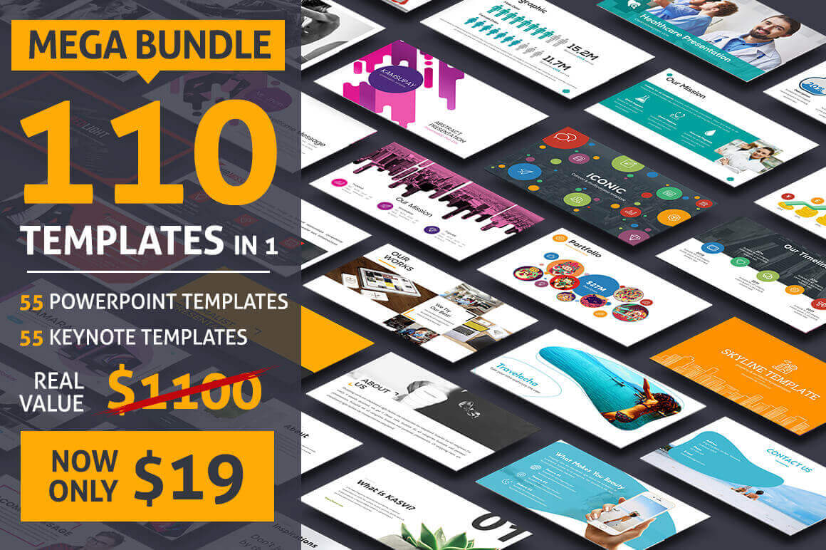
This bundle contains various styles/themes suitable for every business. Insanely well-designed, fully customizable, and available in multiple different visual styles, this templates can help turn your audiences into loyal clients. What’s more, if you act now, you can save 92% off the regular price!
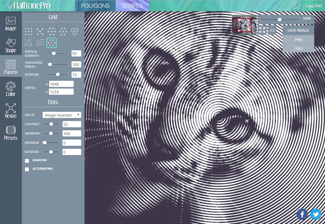
HalftonePro is a powerful and easy-to-use tool for creating vector halftone, low poly, or stripe patterns. You can use an existing image as the source or create your own gradient. Play around to customize a pattern as you see fit and then export it for use in programs like Adobe Illustrator, GIMP or Inkscape.
Business Booster Bundle of 200+ Professional Vectors
Whether you’re rebranding your business or just looking for a fresh marketing take, the Business Booster Bundle is your answer! Loaded with more than 200 professional vectors, you’ll get everything you need to market your business via all sorts of resources from infographics to presentations. It’s time for a fresh new look!
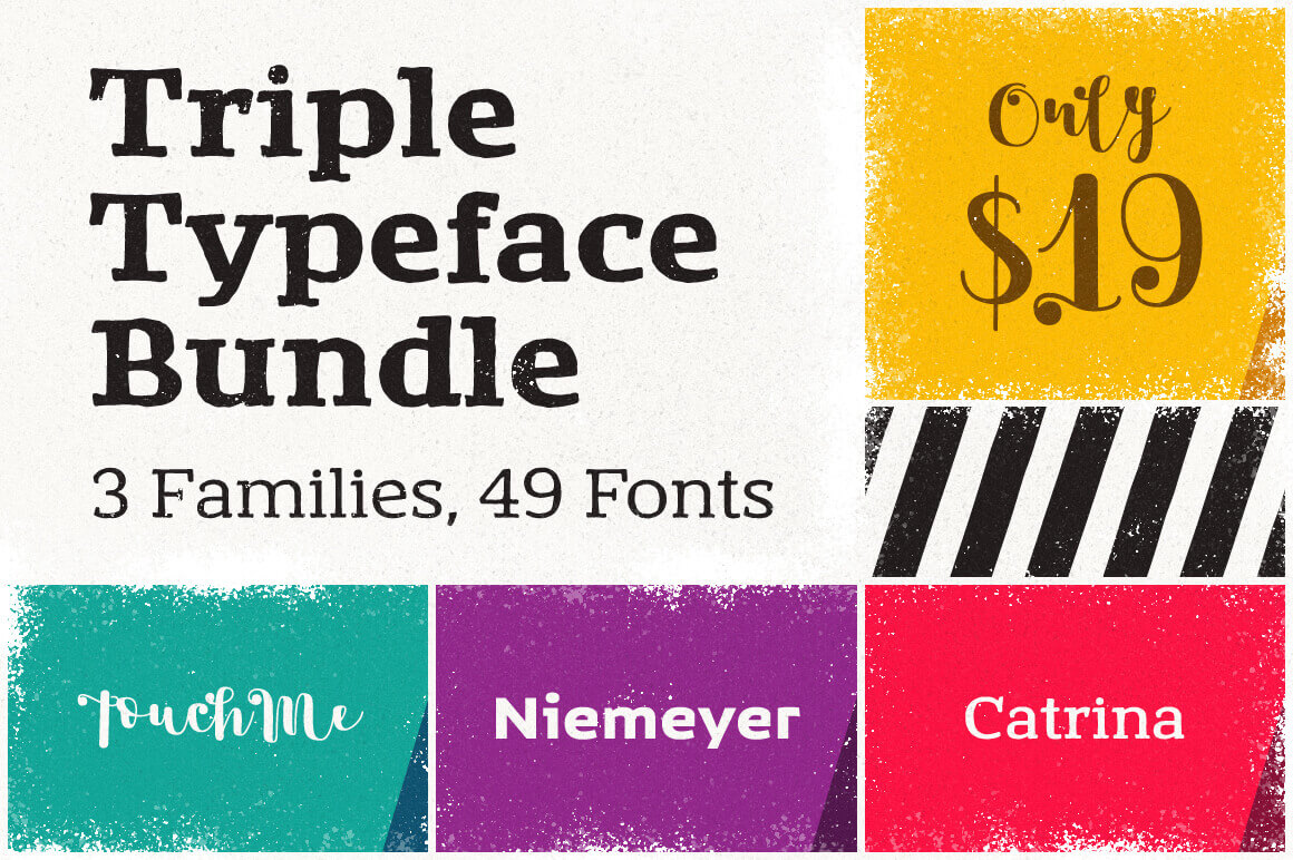
Your family of fonts is about to expand big time. With this magnificent Mighty Deal you’ll get a whopping 49 unique typefaces, made up from 3 fabulous font families. Multiple weights and loads of OpenType Features make for an easy choice when it comes to everything from branding to magazine covers.
While browsing the latest award-winning websites, you may notice a lot of fancy image distortion animations or neat 3D effects. Most of them are created with WebGL, an API allowing GPU-accelerated image processing effects and animations. They also tend to use libraries built on top of WebGL such as three.js or pixi.js. Both are very powerful tools to create respectively 2D and 3D scenes.
But, you should keep in mind that those libraries were not originally designed to create slideshows or animate DOM elements. There is a library designed just for that, though, and we’re going to cover how to use it here in this post.
WebGL, CSS Positioning, and Responsiveness
Say you’re working with a library like three.js or pixi.js and you want to use it to create interactions, like mouseover and scroll events on elements. You might run into trouble! How do you position your WebGL elements relative to the document and other DOM elements? How would handle responsiveness?
This is exactly what I had in mind when creating curtains.js.
Curatins.js allows you to create planes containing images and videos (in WebGL we will call them textures) that act like plain HTML elements, with position and size defined by CSS rules. But these planes can be enhanced with the endless possibilities of WebGL and shaders.
Wait, shaders?
Shaders are small programs written in GLSL that will tell your GPU how to render your planes. Knowing how shaders work is mandatory here because this is how we will handle animations. If you’ve never heard of them, you may want to learn the basics first. There are plenty of good websites to start learning them, like The Book of Shaders.
Now that you get the idea, let’s create our first plane!
Setup of a basic plane
To display our first plane, we will need a bit of HTML, CSS, and some JavaScript to create the plane. Then our shaders will animate it.
HTML
The HTML will be really simple here. We will create a <div> that will hold our canvas, and a div that will hold our image.
<body>
  <!-- div that will hold our WebGL canvas -->
  <div id="canvas"></div>

    <!-- div used to create our plane -->
    <div class="plane">

      <!-- image that will be used as a texture by our plane -->
      <img src="path/to/my-image.jpg" />

    </div>

</body>
CSS
We will will use CSS to make sure the <div> that wraps the canvas will be bigger than our plane, and apply any size to the plane div. (Our WebGL plane will have the exact same size and positions of this div.)
body {
  /* make the body fit our viewport */
  position: relative;
  width: 100%;
  height: 100vh;
  margin: 0;

  /* hide scrollbars */
  overflow: hidden;
}

#canvas {
  /* make the canvas wrapper fit the document */
  position: absolute;
  top: 0;
  right: 0;
  bottom: 0;
  left: 0;
}
.plane {
  /* define the size of your plane */
  width: 80%;
  max-width: 1400px;
  height: 80vh;
  position: relative;
  top: 10vh;
  margin: 0 auto;
}

.plane img {
  /* hide the img element */
  display: none;
}
JavaScript
There’s a bit more work in the JavaScript. We need to instantiate our WebGL context, create a plane with uniform parameters, and use it.
window.onload = function() {
  // pass the id of the div that will wrap the canvas to set up our WebGL context and append the canvas to our wrapper
  var webGLCurtain = new Curtains("canvas");

  // get our plane element
  var planeElement = document.getElementsByClassName("plane")[0];

  // set our initial parameters (basic uniforms)
  var params = {
    vertexShaderID: "plane-vs", // our vertex shader ID
    fragmentShaderID: "plane-fs", // our framgent shader ID
    uniforms: {
      time: {
        name: "uTime", // uniform name that will be passed to our shaders
        type: "1f", // this means our uniform is a float
        value: 0,
      },
    }
  }

  // create our plane mesh
  var plane = webGLCurtain.addPlane(planeElement, params);

  // use the onRender method of our plane fired at each requestAnimationFrame call
  plane.onRender(function() {
    plane.uniforms.time.value++; // update our time uniform value
  });

}
Shaders
We need to write the vertex shader. It won’t be doing much except position our plane based on the model view and projection matrix and pass varyings to the fragment shader:
<!-- vertex shader -->
<script id="plane-vs" type="x-shader/x-vertex">
  #ifdef GL_ES
  precision mediump float;
  #endif

  // those are the mandatory attributes that the lib sets
  attribute vec3 aVertexPosition;
  attribute vec2 aTextureCoord;

  // those are mandatory uniforms that the lib sets and that contain our model view and projection matrix
  uniform mat4 uMVMatrix;
  uniform mat4 uPMatrix;

  // if you want to pass your vertex and texture coords to the fragment shader
  varying vec3 vVertexPosition;
  varying vec2 vTextureCoord;

  void main() {
    // get the vertex position from its attribute
    vec3 vertexPosition = aVertexPosition;
    // set its position based on projection and model view matrix
    gl_Position = uPMatrix * uMVMatrix * vec4(vertexPosition, 1.0);

    // set the varyings
    vTextureCoord = aTextureCoord;
    vVertexPosition = vertexPosition;
  }
</script>
Now our fragment shader. This is where we will add a little displacement effect based on our time uniform and the texture coordinates.
<!-- fragment shader -->
<script id="plane-fs" type="x-shader/x-fragment">
  #ifdef GL_ES
  precision mediump float;
  #endif

  // get our varyings
  varying vec3 vVertexPosition;
  varying vec2 vTextureCoord;

  // the uniform we declared inside our javascript
  uniform float uTime;

  // our texture sampler (this is the lib default name, but it could be changed)
  uniform sampler2D uSampler0;

  void main() {
    // get our texture coords
    vec2 textureCoord = vTextureCoord;

    // displace our pixels along both axis based on our time uniform and texture UVs
    // this will create a kind of water surface effect
    // try to comment a line or change the constants to see how it changes the effect
    // reminder : textures coords are ranging from 0.0 to 1.0 on both axis
    const float PI = 3.141592;

    textureCoord.x += (
      sin(textureCoord.x * 10.0 + ((uTime * (PI / 3.0)) * 0.031))
      + sin(textureCoord.y * 10.0 + ((uTime * (PI / 2.489)) * 0.017))
      ) * 0.0075;

    textureCoord.y += (
      sin(textureCoord.y * 20.0 + ((uTime * (PI / 2.023)) * 0.023))
      + sin(textureCoord.x * 20.0 + ((uTime * (PI / 3.1254)) * 0.037))
      ) * 0.0125;

    gl_FragColor = texture2D(uSampler0, textureCoord);
  }
</script>
Et voilà! You’re all done, and if everything went well, you should be seeing something like this.
Alright, that’s pretty cool so far, but we started this post talking about 3D and interactions, so let’s look at how we could add those in.
About vertices
To add a 3D effect we would have to change the plane vertices position inside the vertex shader. However in our first example, we did not specify how many vertices our plane should have, so it was created with a default geometry containing six vertices forming two triangles :
In order to get decent 3D animations, we would need more triangles, thus more vertices:
This plane has five segments along its width and five segments along its height. As a result, we have 50 triangles and 150 total vertices.
Refactoring our JavaScript
Fortunately, it is easy to specify our plane definition as it could be set inside our initial parameters.
We are also going to listen to mouse position to add a bit of interaction. To do it properly, we will have to wait for the plane to be ready, convert our mouse document coordinates to our WebGL clip space coordinates and send them to the shaders as a uniform.
// we are using window onload event here but this is not mandatory
window.onload = function() {
  // track the mouse positions to send it to the shaders
  var mousePosition = {
    x: 0,
    y: 0,
  };

  // pass the id of the div that will wrap the canvas to set up our WebGL context and append the canvas to our wrapper
  var webGLCurtain = new Curtains("canvas");

  // get our plane element
  var planeElement = document.getElementsByClassName("plane")[0];

  // set our initial parameters (basic uniforms)
  var params = {
    vertexShaderID: "plane-vs", // our vertex shader ID
    fragmentShaderID: "plane-fs", // our framgent shader ID
    widthSegments: 20,
    heightSegments: 20, // we now have 20*20*6 = 2400 vertices !
    uniforms: {
      time: {
        name: "uTime", // uniform name that will be passed to our shaders
        type: "1f", // this means our uniform is a float
        value: 0,
      },
      mousePosition: { // our mouse position
        name: "uMousePosition",
        type: "2f", // notice this is a length 2 array of floats
        value: [mousePosition.x, mousePosition.y],
      },
      mouseStrength: { // the strength of the effect (we will attenuate it if the mouse stops moving)
        name: "uMouseStrength", // uniform name that will be passed to our shaders
        type: "1f", // this means our uniform is a float
        value: 0,
      },

    }
  }

  // create our plane mesh
  var plane = webGLCurtain.addPlane(planeElement, params);

  // once our plane is ready, we could start listening to mouse/touch events and update its uniforms
  plane.onReady(function() {
    // set a field of view of 35 to exagerate perspective
    // we could have done it directly in the initial params
    plane.setPerspective(35);
    // listen our mouse/touch events on the whole document
    // we will pass the plane as second argument of our function
    // we could be handling multiple planes that way
    document.body.addEventListener("mousemove", function(e) {
      handleMovement(e, plane);
    });
    document.body.addEventListener("touchmove", function(e) {
      handleMovement(e, plane);
    });
  }).onRender(function() {
    // update our time uniform value
    plane.uniforms.time.value++;
    // continually decrease mouse strength
    plane.uniforms.mouseStrength.value = Math.max(0, plane.uniforms.mouseStrength.value - 0.0075);
  });

  // handle the mouse move event
  function handleMovement(e, plane) {
    // touch event
    if(e.targetTouches) {
      mousePosition.x = e.targetTouches[0].clientX;
      mousePosition.y = e.targetTouches[0].clientY;
    }
    // mouse event
    else {
      mousePosition.x = e.clientX;
      mousePosition.y = e.clientY;
    }
    // convert our mouse/touch position to coordinates relative to the vertices of the plane
    var mouseCoords = plane.mouseToPlaneCoords(mousePosition.x, mousePosition.y);
    // update our mouse position uniform
    plane.uniforms.mousePosition.value = [mouseCoords.x, mouseCoords.y];

    // reassign mouse strength
    plane.uniforms.mouseStrength.value = 1;
  }

}
Now that our JavaScript is done, we have to rewrite our shaders so that they’ll use our mouse position uniform.
Refactoring the shaders
Let’s look at our vertex shader first. We have three uniforms that we could use for our effect:
the time which is constantly increasing
the mouse position
our mouse strength, which is constantly decreasing until the next mouse move
We will use all three of them to create a kind of 3D ripple effect.
<script id="plane-vs" type="x-shader/x-vertex">
  #ifdef GL_ES
  precision mediump float;
  #endif

  // those are the mandatory attributes that the lib sets
  attribute vec3 aVertexPosition;
  attribute vec2 aTextureCoord;

  // those are mandatory uniforms that the lib sets and that contain our model view and projection matrix
  uniform mat4 uMVMatrix;
  uniform mat4 uPMatrix;

  // our time uniform
  uniform float uTime;

  // our mouse position uniform
  uniform vec2 uMousePosition;

  // our mouse strength
  uniform float uMouseStrength;

  // if you want to pass your vertex and texture coords to the fragment shader
  varying vec3 vVertexPosition;
  varying vec2 vTextureCoord;

  void main() {
    vec3 vertexPosition = aVertexPosition;

    // get the distance between our vertex and the mouse position
    float distanceFromMouse = distance(uMousePosition, vec2(vertexPosition.x, vertexPosition.y));

    // this will define how close the ripples will be from each other. The bigger the number, the more ripples you'll get
    float rippleFactor = 6.0;

    // calculate our ripple effect
    float rippleEffect = cos(rippleFactor * (distanceFromMouse - (uTime / 120.0)));

    // calculate our distortion effect
    float distortionEffect = rippleEffect * uMouseStrength;

    // apply it to our vertex position
    vertexPosition +=  distortionEffect / 15.0;

    gl_Position = uPMatrix * uMVMatrix * vec4(vertexPosition, 1.0);

    // varyings
    vTextureCoord = aTextureCoord;
    vVertexPosition = vertexPosition;
  }
</script>
As for the fragment shader, we are going to keep it simple. We are going to fake lights and shadows based on each vertex position:
<script id="plane-fs" type="x-shader/x-fragment">
  #ifdef GL_ES
  precision mediump float;
  #endif

  // get our varyings
  varying vec3 vVertexPosition;
  varying vec2 vTextureCoord;

  // our texture sampler (this is the lib default name, but it could be changed)
  uniform sampler2D uSampler0;

  void main() {
    // get our texture coords
    vec2 textureCoords = vTextureCoord;

    // apply our texture
    vec4 finalColor = texture2D(uSampler0, textureCoords);

    // fake shadows based on vertex position along Z axis
    finalColor.rgb -= clamp(-vVertexPosition.z, 0.0, 1.0);

    // fake lights based on vertex position along Z axis
    finalColor.rgb += clamp(vVertexPosition.z, 0.0, 1.0);

    // handling premultiplied alpha (useful if we were using a png with transparency)
    finalColor = vec4(finalColor.rgb * finalColor.a, finalColor.a);

    gl_FragColor = finalColor;
  }
</script>
With these two simple examples, we’ve seen how to create a plane and interact with it.
Videos and displacement shaders
Our last example will create a basic fullscreen video slideshow using a displacement shader to enhance the transitions.
Displacement shader concept
The displacement shader will create a nice distortion effect. It will be written inside our fragment shader using a grayscale picture and will offset the pixel coordinates of the videos based on the texture RGB values. Here’s the image we will be using:
The effect will be calculated based on each pixel RGB value, with a black pixel being [0, 0, 0] and a white pixel [1, 1, 1] (GLSL equivalent for [255, 255, 255]). To simplify, we will use only the red channel value, as with a grayscale image red, green and blue are always equal.
You can try to create your own grayscale image (it works great with geometric shape ) to get your unique transition effect.
Multiple textures and videos
A plane can have more than one texture simply by adding multiple image tags. This time, instead of images we want to use videos. We just have to replace the <img /> tags with a <video /> one. However there are two things to know when it comes to video:
The video will always fit the exact size of the plane, which means your plane has to have the same width/height ratio as your video. This is not a big deal tho because it is easy to handle with CSS.
On mobile devices, we can’t autoplay videos without a user gesture, like a click event. It is therefore safer to add a „enter site” button to display and launch our videos.
HTML
The HTML is still pretty straightforward. We will create our canvas div wrapper, our plane div containing the textures and a button to trigger the video autoplay. Just notice the use of the data-sampler attribute on the image and video tags—it will be useful inside our fragment shader.
<body>
  <div id="canvas"></div>
  <!-- this div will handle the fullscreen video sizes and positions -->
  <div class="plane-wrapper">
    <div class="plane">
      <!-- notice here we are using the data-sampler attribute to name our sampler uniforms -->
      <img src="path/to/displacement.jpg" data-sampler="displacement" />
      <video src="path/to/video.mp4" data-sampler="firstTexture"></video>
      <video src="path/to/video-2.mp4" data-sampler="secondTexture"></video>
    </div>
  </div>

  <div id="enter-site-wrapper">
    <span id="enter-site">
      Click to enter site
    </span>
  </div>
</body>
CSS
The stylesheet will handle a few things: display the button and hide the canvas before the user has entered the site, size and position our plane-wrapper div to handle fullscreen responsive videos.
@media screen {

  body {
    margin: 0;
    font-size: 18px;
    font-family: 'PT Sans', Verdana, sans-serif;
    background: #212121;
    line-height: 1.4;
    height: 100vh;
    width: 100vw;
    overflow: hidden;
  }

  /*** canvas ***/

  #canvas {
    position: absolute;
    top: 0;
    right: 0;
    bottom: 0;
    left: 0;
    z-index: 10;

    /* hide the canvas until the user clicks the button */
    opacity: 0;
    transition: opacity 0.5s ease-in;
  }

  /* display the canvas */
  .video-started #canvas {
    opacity: 1;
  }

  .plane-wrapper {
    position: absolute;

    /* center our plane wrapper */
    left: 50%;
    top: 50%;
    transform: translate(-50%, -50%);
    z-index: 15;
  }

  .plane {
    position: absolute;
    top: 0;
    right: 0;
    bottom: 0;
    left: 0;

    /* tell the user he can click the plane */
    cursor: pointer;
  }

  /* hide the original image and videos */
  .plane img, .plane video {
    display: none;
  }

  /* center the button */
  #enter-site-wrapper {
    display: flex;
    justify-content: center;
    align-items: center;
    align-content: center;
    position: absolute;
    top: 0;
    right: 0;
    bottom: 0;
    left: 0;
    z-index: 30;

    /* hide the button until everything is ready */
    opacity: 0;
    transition: opacity 0.5s ease-in;
  }

  /* show the button */
  .curtains-ready #enter-site-wrapper {
    opacity: 1;
  }

  /* hide the button after the click event */
  .curtains-ready.video-started #enter-site-wrapper {
    opacity: 0;
    pointer-events: none;
  }

  #enter-site {
    padding: 20px;
    color: white;
    background: #ee6557;
    max-width: 200px;
    text-align: center;
    cursor: pointer;
  }

}

/* fullscreen video responsive */
@media screen and (max-aspect-ratio: 1920/1080) {
  .plane-wrapper {
    height: 100vh;
    width: 177vh;
  }
}

@media screen and (min-aspect-ratio: 1920/1080) {
  .plane-wrapper {
    width: 100vw;
    height: 56.25vw;
  }
}
JavaScript
As for the JavaScript, we will go like this:
Set a couple variables to store our slideshow state
Create the Curtains object and add the plane to it
When the plane is ready, listen to a click event to start our videos playback (notice the use of the playVideos() method). Add another click event to switch between the two videos.
Update our transition timer uniform inside the onRender() method
window.onload = function() {

  // here we will handle which texture is visible and the timer to transition between images
  var activeTexture = 1;
  var transitionTimer = 0;

  // set up our WebGL context and append the canvas to our wrapper
  var webGLCurtain = new Curtains("canvas");

  // get our plane element
  var planeElements = document.getElementsByClassName("plane");

  // some basic parameters
  var params = {
    vertexShaderID: "plane-vs",
    fragmentShaderID: "plane-fs",
    imageCover: false, // our displacement texture has to fit the plane
    uniforms: {
      transitionTimer: {
        name: "uTransitionTimer",
        type: "1f",
        value: 0,
      },
    },
  }

  var plane = webGLCurtain.addPlane(planeElements[0], params);

  // create our plane
  plane.onReady(function() {
    // display the button
    document.body.classList.add("curtains-ready");

    // when our plane is ready we add a click event listener that will switch the active texture value
    planeElements[0].addEventListener("click", function() {
      if(activeTexture == 1) {
        activeTexture = 2;
      }
      else {
        activeTexture = 1;
      }
    });

    // click to play the videos
    document.getElementById("enter-site").addEventListener("click", function() {
      // display canvas and hide the button
      document.body.classList.add("video-started");

      // play our videos
      plane.playVideos();
    }, false);

  }).onRender(function() {
    // increase or decrease our timer based on the active texture value
    // at 60fps this should last one second
    if(activeTexture == 2) {
      transitionTimer = Math.min(60, transitionTimer + 1);
    }
    else {
      transitionTimer = Math.max(0, transitionTimer - 1);
    }
    // update our transition timer uniform
    plane.uniforms.transitionTimer.value = transitionTimer;
  });
}
Shaders
This is where all the magic will occur. Like in our first example, the vertex shader won’t do much and you’ll have to focus on the fragment shader that will create a “dive in” effect:
<script id="plane-vs" type="x-shader/x-vertex">
  #ifdef GL_ES
  precision mediump float;
  #endif

  // default mandatory variables
  attribute vec3 aVertexPosition;
  attribute vec2 aTextureCoord;

  uniform mat4 uMVMatrix;
  uniform mat4 uPMatrix;

  // varyings
  varying vec3 vVertexPosition;
  varying vec2 vTextureCoord;

  // custom uniforms
  uniform float uTransitionTimer;

  void main() {

    vec3 vertexPosition = aVertexPosition;

    gl_Position = uPMatrix * uMVMatrix * vec4(vertexPosition, 1.0);

    // varyings
    vTextureCoord = aTextureCoord;
    vVertexPosition = vertexPosition;
  }
</script>

<script id="plane-fs" type="x-shader/x-fragment">
  #ifdef GL_ES
  precision mediump float;
  #endif

  varying vec3 vVertexPosition;
  varying vec2 vTextureCoord;

  // custom uniforms
  uniform float uTransitionTimer;

  // our textures samplers
  // notice how it matches our data-sampler attributes
  uniform sampler2D firstTexture;
  uniform sampler2D secondTexture;
  uniform sampler2D displacement;

  void main( void ) {
    // our texture coords
    vec2 textureCoords = vec2(vTextureCoord.x, vTextureCoord.y);

    // our displacement texture
    vec4 displacementTexture = texture2D(displacement, textureCoords);

    // our displacement factor is a float varying from 1 to 0 based on the timer
    float displacementFactor = 1.0 - (cos(uTransitionTimer / (60.0 / 3.141592)) + 1.0) / 2.0;

    // the effect factor will tell which way we want to displace our pixels
    // the farther from the center of the videos, the stronger it will be
    vec2 effectFactor = vec2((textureCoords.x - 0.5) * 0.75, (textureCoords.y - 0.5) * 0.75);

    // calculate our displaced coordinates to our first video
    vec2 firstDisplacementCoords = vec2(textureCoords.x - displacementFactor * (displacementTexture.r * effectFactor.x), textureCoords.y - displacementFactor * (displacementTexture.r * effectFactor.y));
    // opposite displacement effect on the second video
    vec2 secondDisplacementCoords = vec2(textureCoords.x - (1.0 - displacementFactor) * (displacementTexture.r * effectFactor.x), textureCoords.y - (1.0 - displacementFactor) * (displacementTexture.r * effectFactor.y));

    // apply the textures
    vec4 firstDistortedColor = texture2D(firstTexture, firstDisplacementCoords);
    vec4 secondDistortedColor = texture2D(secondTexture, secondDisplacementCoords);

    // blend both textures based on our displacement factor
    vec4 finalColor = mix(firstDistortedColor, secondDistortedColor, displacementFactor);

    // handling premultiplied alpha
    finalColor = vec4(finalColor.rgb * finalColor.a, finalColor.a);

    // apply our shader
    gl_FragColor = finalColor;
  }
</script>
Here’s our little video slideshow with a cool transition effect:
This example is a great way to show you how to create a slideshow with curtains.js: you might want to use images instead of videos, change the displacement texture, modify the fragment shader or even add more slides…
Going deeper
We’ve just scraped the surface of what’s possible with curtains.js. You could try to create multiple planes with a cool mouse over effect for your article thumbs for example. The possibilities are almost endless.
If you want to see more examples covering all those basics usages, you can check the library website or the GitHub repo.
In this hands-on course, Adobe guru Daniel Walter Scott will take you through examples of typical creative challenges you will encounter as you learn to master Adobe Photoshop. You’ll learn about adjusting colors, masking, retouching, and manipulating images. Whether you are a photographer, marketer, or designer, this is the perfect course to gain core Adobe Photoshop skills.
You can take our new course straight away with a subscription to Envato Elements. For a single low monthly fee, you get access not only to this course, but also to our growing library of over 1,000 video courses and industry-leading eBooks on Envato Tuts+.
Plus you now get unlimited downloads from the huge Envato Elements library of 550,000+ creative assets. Create with unique fonts, photos, graphics and templates, and deliver better projects faster.
In this tutorial, you will learn how to create a sparkle photo effect. I will explain everything in so much detail that everyone can create it, even those who have just opened Photoshop for the first time.
The effect shown above is the one I will show you how to create in this tutorial. If you would like to create the even more advanced magic dust effects below, using just a single click and in only a few minutes, then check out my Magic Dust 2 Photoshop Action.
What You’ll Need
To recreate the design above, you will need the following resources:
First, open the photo that you want to work with. To open your photo, go to File > Open, choose your photo, and click Open. Now, before we get started, just check a couple of things:
Your photo should be in RGB Color mode, 8 Bits/Channel. To check this, go to Image > Mode.
For best results, your photo size should be 2000–3000 px wide/high. To check this, go to Image > Image Size.
Your photo should be the Background layer. If it is not, go to Layer > New > Background from Layer.
2. How to Create the Sparkles Brush
Step 1
In this section, we are going to create the brush that we will need for this effect. Choose the Brush Tool (B) and pick a soft brush. Then, go to Window > Brush and in the Brush window use the settings below:
Step 2
Now to define this brush with new settings as a new brush, click on the top right icon in the bottom right corner of the Brush panel, and name it Sparkles.
3. How to Create the Sparkles
Step 1
In this section we are going to create the sparkles. Go to Layer > New > Layer to create a new layer and name it Sparkles_Small_1.
Step 2
Now choose the Brush Tool (B), select the Sparkles brush, and set the Diameter of the brush to around 10 px. Then, set the foreground color to #ffffff and brush as shown below (decrease the Diameter of the brush as you brush from the edges of the photo towards the center):
Step 3
Go to Layer > New > Layer to create a new layer and name it Sparkles_Small_2. Then, drag this layer just below the Sparkles_Small_1 layer in the Layers panel.
Step 4
Now choose the Brush Tool (B), select the Sparkles brush, and set the Diameter of the brush to around 10 px. Then, set the foreground color to #ffffff and brush as shown below (decrease the Diameter of the brush as you brush from the edges of the photo towards the center):
Step 5
Go to Layer > New > Layer to create a new layer and name it Sparkles_Medium_1. Then, drag this layer just below the Sparkles_Small_2 layer in the Layers panel.
Step 6
Now choose the Brush Tool (B), select the Sparkles brush, and set the Diameter of the brush to around 35 px. Then, set the foreground color to #ffffff and brush as shown below (decrease the Diameter of the brush as you brush from the edges of the photo towards the center):
Step 7
Go to Layer > New > Layer to create a new layer and name it Sparkles_Medium_2. Then, drag this layer just below the Sparkles_Medium_1 layer in the Layers panel.
Step 8
Now choose the Brush Tool (B), select the Sparkles brush, and set the Diameter of the brush to around 35 px. Then, set the foreground color to #ffffff and brush as shown below (decrease the Diameter of the brush as you brush from the edges of the photo towards the center):
Step 9
Go to Layer > New > Layer to create a new layer and name it Sparkles_Large_1. Then, drag this layer just below the Sparkles_Medium_2 layer in the Layers panel.
Step 10
Now choose the Brush Tool (B), select the Sparkles brush, and set the Diameter of the brush to around 50 px. Then, set the foreground color to #ffffff and brush as shown below (decrease the Diameter of the brush as you brush from the edges of the photo towards the center):
Step 11
Go to Layer > New > Layer to create a new layer and name it Sparkles_Large_1. Then, drag this layer just below the Sparkles_Large_1 layer in the Layers panel.
Step 12
Now choose the Brush Tool (B), select the Sparkles brush, and set the Diameter of the brush to around 75 px. Then, set the foreground color to #ffffff and brush as shown below (decrease the Diameter of the brush as you brush from the edges of the photo towards the center):
Step 13
Select the Sparkles_Small_1 layer, go to Layer > New Fill Layer > Solid Color to create a new solid color fill layer, name it SS_1_Color, and choose the color #eea815 as shown below:
Step 14
Now press Control-Alt-G on your keyboard to create a clipping mask. Then, select the Sparkles_Small_1 layer and change the Blending Mode of this layer to Linear Dodge (Add).
Step 15
Select the SS_1_Color layer and press Control-J on your keyboard to duplicate it. Then, drag this layer just above the Sparkles_Medium_1 layer in the Layers panel. After that, press Control-Alt-G on your keyboard to create a clipping mask.
Step 16
Now name this layer SM_1_Color. Then, select the Sparkles_Medium_1 layer and change the Blending Mode of this layer to Linear Dodge (Add).
Step 17
Select the SM_1_Color layer and press Control-J on your keyboard to duplicate it. Then, drag this layer just above the Sparkles_Large_1 layer in the Layers panel. After that, press Control-Alt-G on your keyboard to create a clipping mask.
Step 18
Now name this layer SL_1_Color. Then, select the Sparkles_Large_1 layer
and change the Blending Mode of this layer to Linear Dodge (Add).
Step 19
Select the SS_1_Color layer and Shift-click on the Sparkles_Large_2 layer to select all layers between. Then, go to Layer > New > Group from Layers to create a new group from the selected layers and name it Sparkles.
4. How to Create the Focus
Step 1
In this section, we are going to create the focus. Select the Background layer, go to Layer > New Adjustment Layer > Levels to create a new levels adjustment layer, and name it Focus_1.
Step 2
Now Double-click on this layer thumbnail and, in the Properties panel, use the settings below:
Step 3
Choose the Brush Tool (B), pick a soft brush, set the foreground color to #000000, and brush as shown below:
Step 4
Now select the Background layer and press Control-J on your keyboard to duplicate it. Then, go to Filter > Blur > Gaussian Blur and set the Radius to 10 px.
Step 5
Go to Layer > Layer Mask > Reveal All to add a layer mask that reveals the whole layer.
Step 6
Choose the Brush Tool (B), pick a soft brush, set the foreground color to #000000, and brush as shown below:
Step 7
Now name this layer Focus_2.
5. How to Make the Final Adjustments
Step 1
In this section, we are going to make final adjustments to the design. Select the Sparkles folder, go to Layer > New Adjustment Layer > Curves to create a new curves adjustment layer, and name it Color Look.
Step 2
Now Double-click on this layer thumbnail and in the Properties panel enter the settings below:
Step 3
Press D on your keyboard to reset the swatches. Then, go to Layer > New Adjustment Layer > Gradient Map to create a new gradient map adjustment layer and name it Overall Contrast.
Step 4
Now change the Blending Mode of this layer to Overlay and set the Opacity to 10%.
Step 5
Go to Layer > New Adjustment Layer > Vibrance to create a new vibrance adjustment layer and name it Overall Vibrance/Saturation.
Step 6
Now Double-click on this layer thumbnail and in the Properties panel, set the Vibrance to +10 and the Saturation to +5.
Step 7
Go to Layer > New Adjustment Layer > Levels to create a new levels adjustment layer and name it Overall Brightness.
Step 8
Now Double-click on this layer thumbnail and in the Properties panel enter the settings below:
Step 9
Press Control-Alt-Shift-E on your keyboard to make a screenshot, and then press Control-Shift-U to desaturate this layer. Then, go to Filter > Other > High Pass and set the Radius to 2 px.
Step 10
Change the Blending Mode of this layer to Vivid Light and set the Opacity to 50%. Then, name this layer Overall Sharpening.
You Made It!
Congratulations, you have succeeded! Here is our final result:
If you would like to create the even more advanced magic dust effects
below, using just a single click and in only a few minutes, then check
out my Magic Dust 2 Photoshop Action.
The
action works so you simply draw a path over your photo where you want the effect to appear and just
play the action. It’s really that simple! The sparkles remain fully layered, and you have full control over them to customize them—you can move, scale, or rotate them, remove them, or
duplicate them to create even more sparkles! The action
will also create 15 preset color looks that you can choose from.
The action comes with a detailed video tutorial that demonstrates how to use the action and customize the results to get the most out of the effect.