How to Create 5 Awesome Gradient Effects in Adobe InDesign

Post pobrano z: How to Create 5 Awesome Gradient Effects in Adobe InDesign
Final product image
What You’ll Be Creating

Gradient effects are super easy to achieve in InDesign, and they’re an instant way of bringing your layouts bang up-to-date. 

Read on to discover five high-impact gradient effects, from duotone to neon-pastel, that would look fantastic on posters, flyers, stationery, or magazine designs.

If you want to make your gradient effects truly unique, you can easily add cool typography over the top of your design. Head over to GraphicRiver or Envato Elements to source great fonts for your next project.

What You’ll Need to Create Your Gradient Effects

All you need is access to Adobe InDesign to create the majority of these effects. 

To create the ‘Retro’ text effect, you’ll need to download Charlevoix Pro ExtraBold.

1. Simple Duotone Gradient Effect

This is the simplest gradient effect to achieve, and it looks amazing set as a background or as a fill color for shapes or text. 
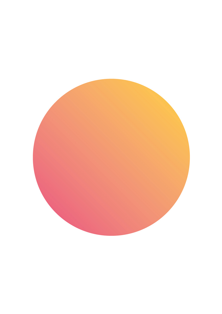
final duotone effect

Step 1

Open InDesign and go to File > New > Document. You can set the page to any size you prefer.

If you’re creating your gradient effects for print (as I am here), make sure the Intent is set to Print. For online-friendly images, set the Intent to Web

With your document created, expand the Swatches panel (Window > Color > Swatches)

Choose New Color Swatch from the panel’s drop-down menu (at top-right). Set the Color Mode to CMYK for print or RGB for web, and set the levels to C=0 M=82 Y=24 K=0 or R=234 G=76 B=125.

Click Add and OK.

Create a second new swatch, C=0 M=17 Y=85 K=0 or R=255 G=211 B=50.
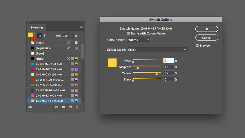
yellow swatch

Step 2

Choose New Gradient Swatch from the Swatches panel’s menu. 
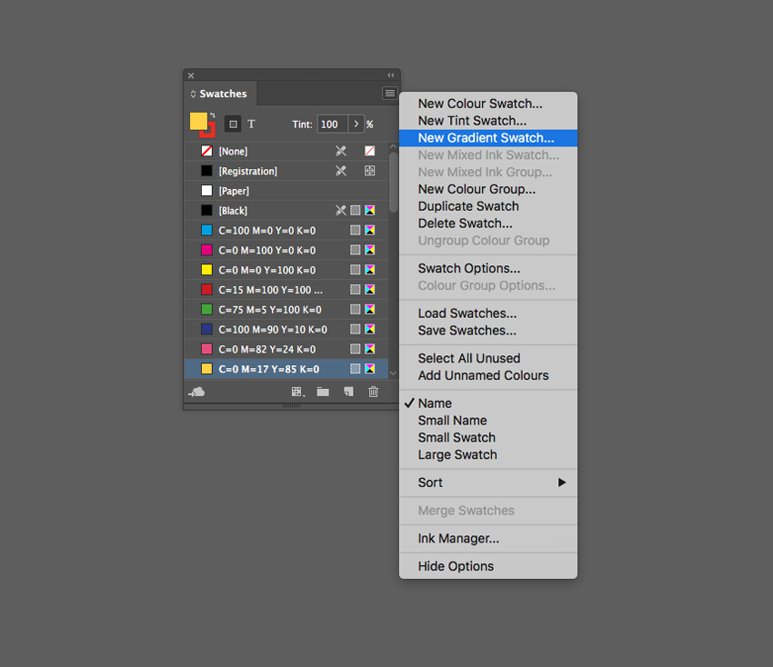
new gradient swatch

Name the swatch Duotone Gradient, set the Type to Linear, and choose Swatches from the Stop Color menu. 

Click on the left-hand stop on the Gradient Ramp and set this to your first pink swatch, C=0 M=82 Y=24 K=0. Set the right-hand stop to the yellow swatch, C=0 M=17 Y=85 K=0.

Click Add and OK.
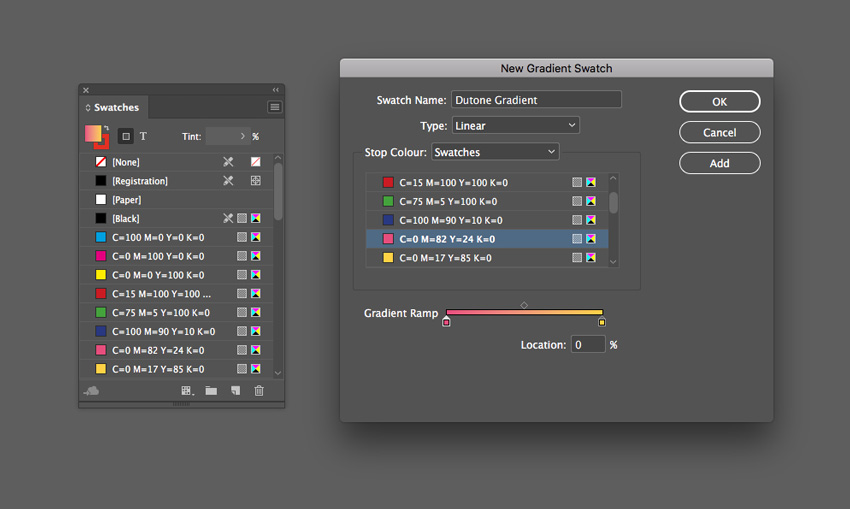
new gradient swatch

Step 3

Create a shape on the page you’d like to apply the gradient to. Use the Rectangle Tool (M) to create a background shape. Here I’ve used the Ellipse Tool (L) to create a circle (holding Shift to keep the proportions).
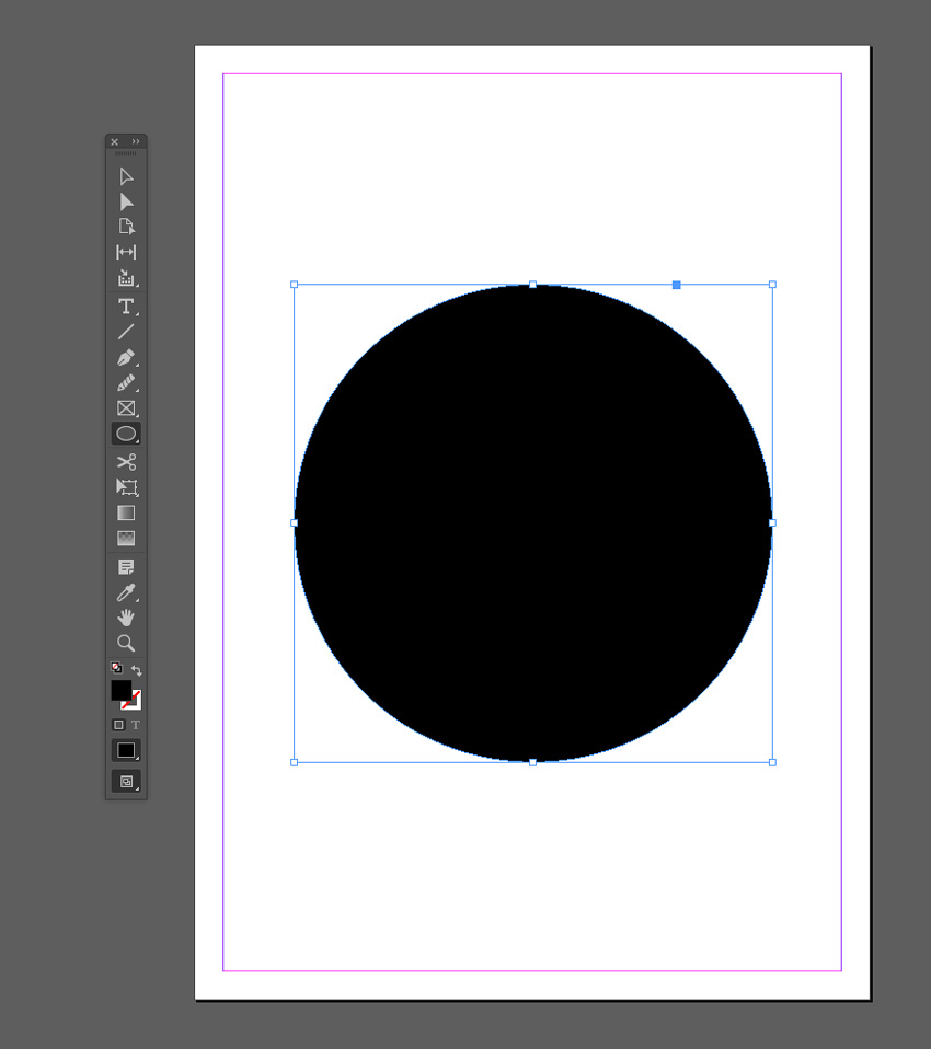
ellipse tool

Apply the Duotone Gradient swatch to the Fill Color of the shape from the Swatches panel.
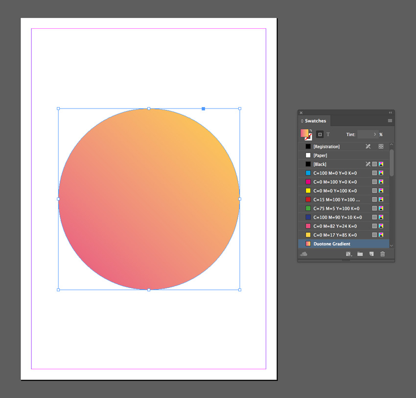
duotone swatch

You can use the Gradient panel (Window > Color > Gradient) to adjust the Angle of the gradient.
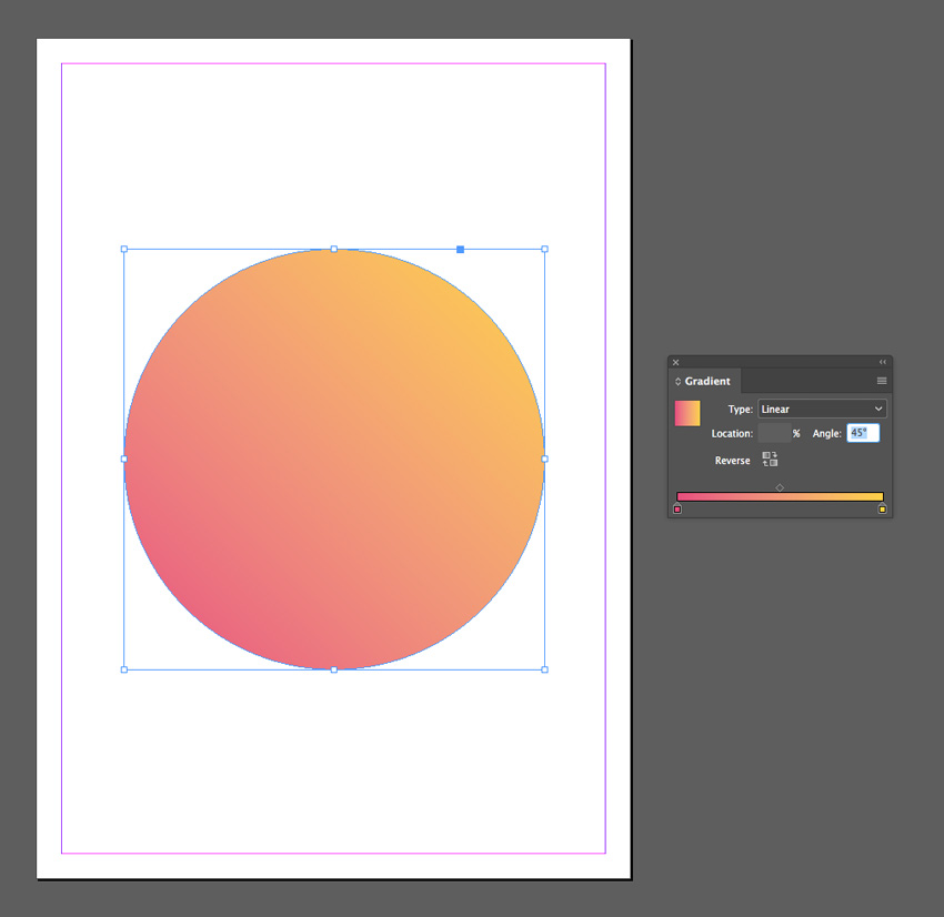
angle of gradient
duotone effect

2. Blackout Gradient Effect

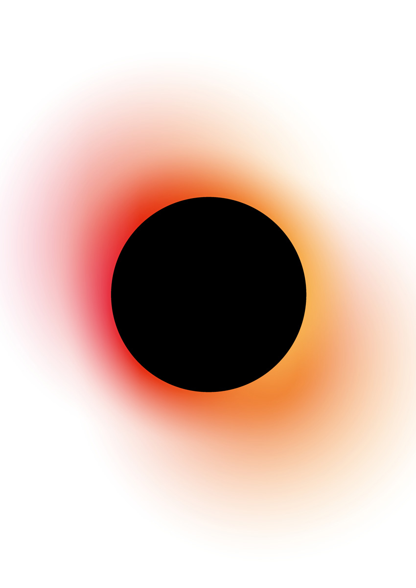
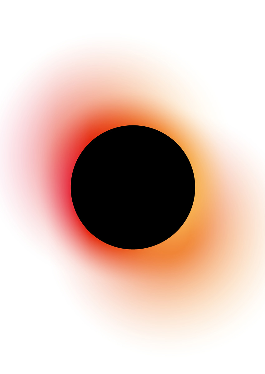
This is a high-impact gradient effect that gives an eclipse effect. This works best as a standalone effect using a circle design. Why not try placing text or an image inside the inner circle for extra impact?

Step 1

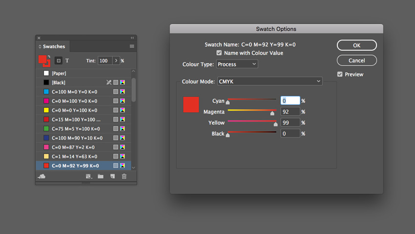
From the Swatches panel (Window > Color > Swatches), choose Create New Swatch. Create a hot pink swatch, C=0 M=87 Y=2 K=0 or R=232 G=59 B=140.

Create two more new swatches:

  • C=1 M=14 Y=63 K=0 or R=254 G=219 B=117 
  • C=0 M=92 Y=99 K=0 or R=229 G=45 B=20 
swatch options

Step 2

Choose New Gradient Swatch from the Swatches panel’s menu. 

Name the swatch Blackout Gradient, set the Type to Linear and choose Swatches from the Stop Color menu. 

Click on the left-hand stop on the Gradient Ramp and set this to your hot pink swatch, C=0 M=87 Y=2 K=0. Set the right-hand stop to the pale yellow swatch, C=0 M=92 Y=99 K=0.

Click on the ramp about a third across from the left to add a third stop, setting this to your red swatch, C=0 M=92 Y=99 K=0.
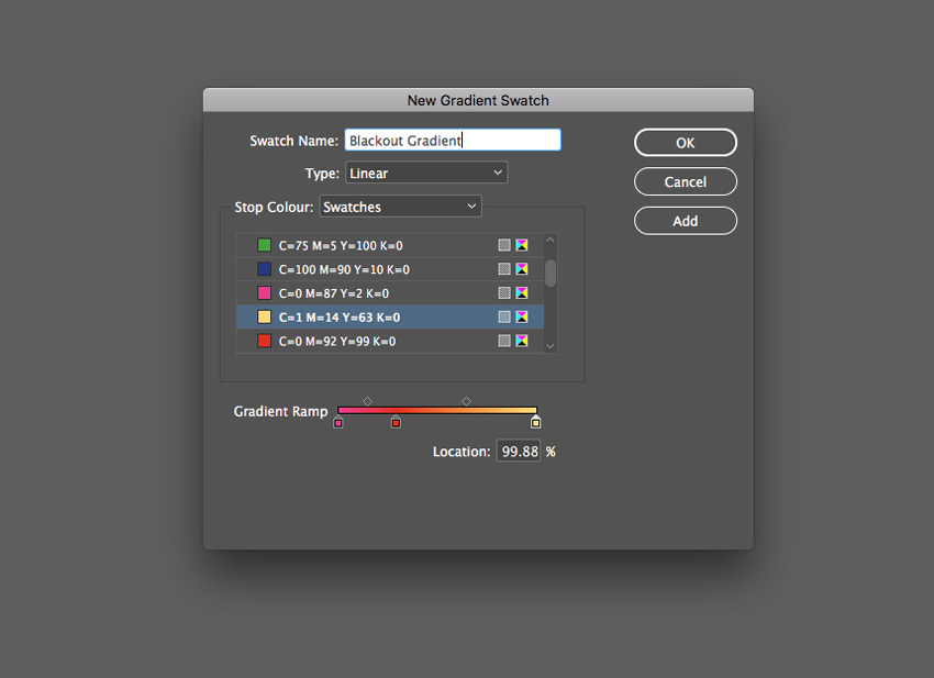
blackout gradient

Step 3

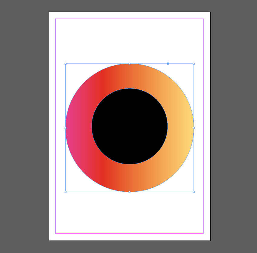
Take the Ellipse Tool (L) and drag onto the page to create a small circle. Set the Fill Color to [Black].
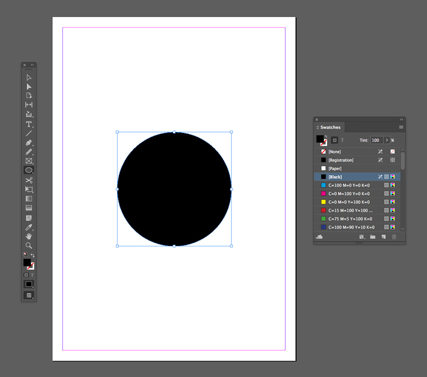
small circle

Then create a second larger circle over the top, setting the Fill to Blackout Gradient. 
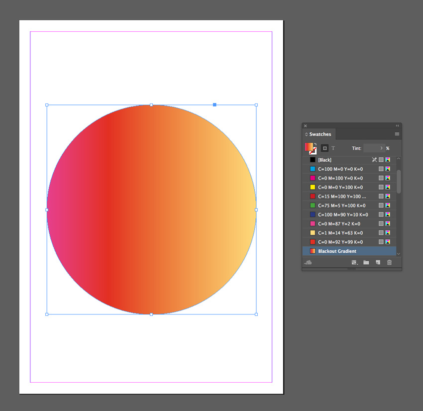
large circle

Right-Click on this larger circle and choose Arrange > Send to Back. 
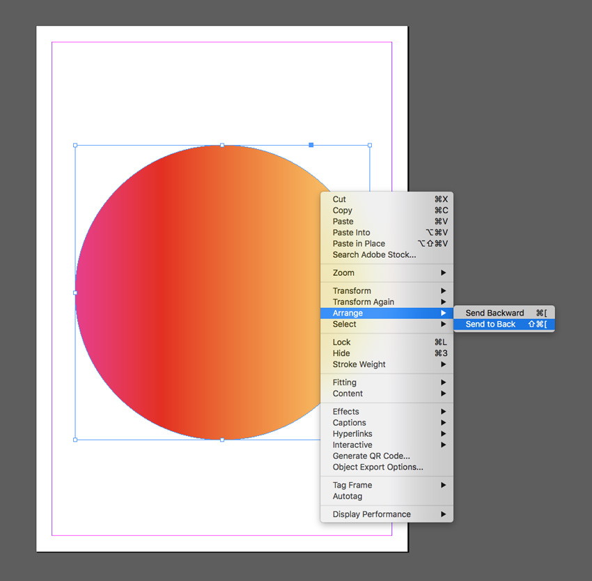
send to back
circle behind

Step 4

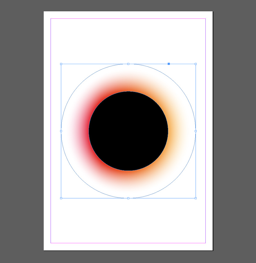
With the Blackout Gradient circle selected, go to Object on the top main menu and choose Effects > Gradient Feather.

Set the Type to Radial, and move the dark stop on the ramp about two-thirds of the way along. 
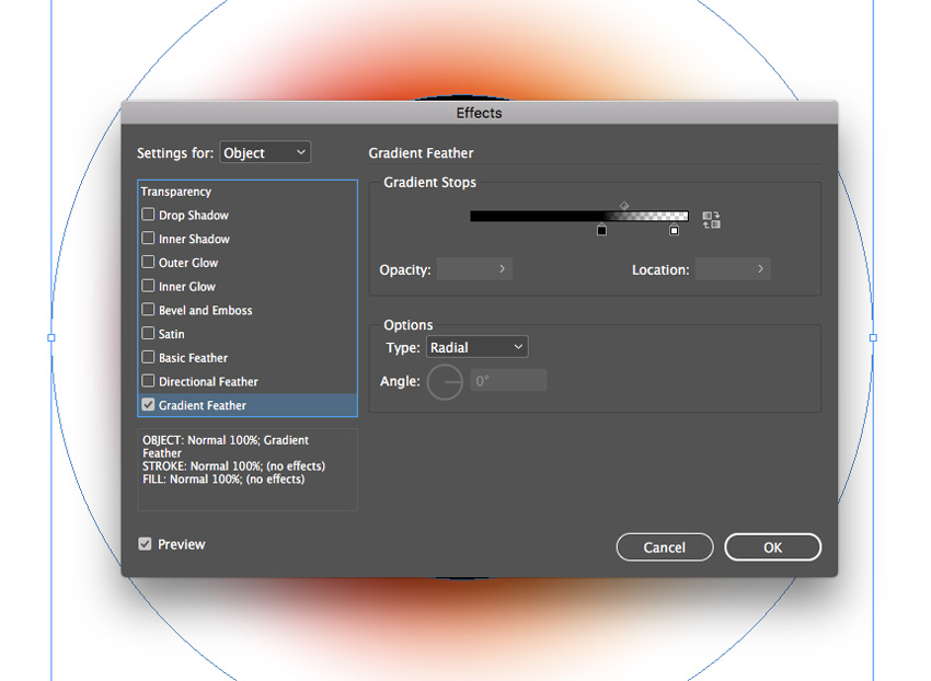
gradient feather

Click OK to exit the window. 

gradient applied

Step 5

Edit > Copy and Edit > Paste the gradient circle, sending it to the back as before. Scale it up to a slightly larger size and position it towards the top-left of the design.
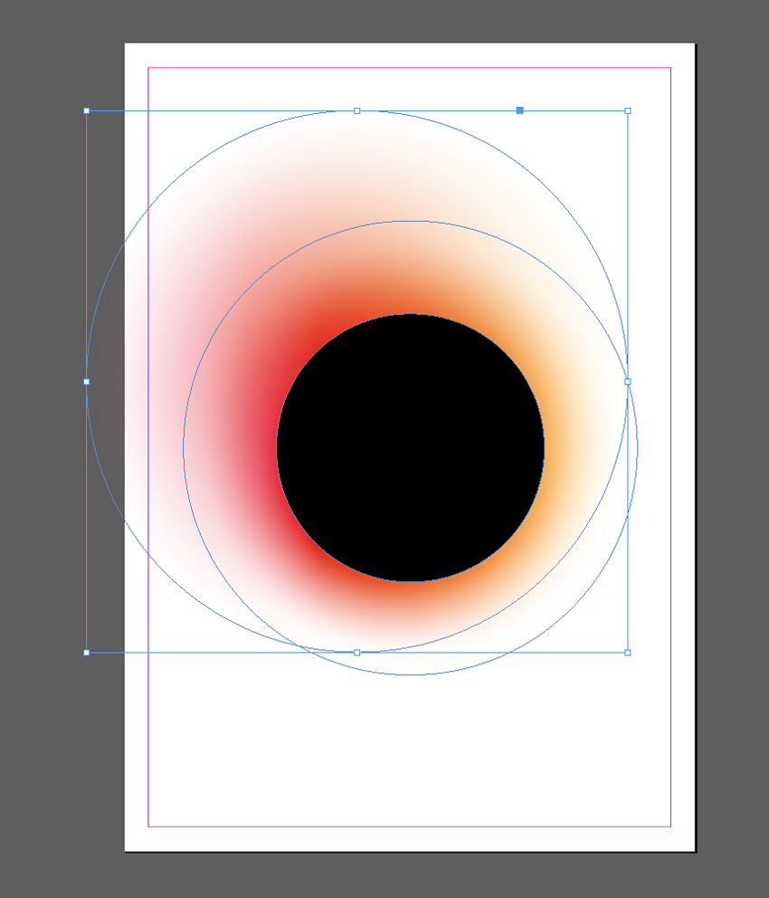
pasted circle

Edit > Paste again, moving this circle to the bottom-right of the design. 
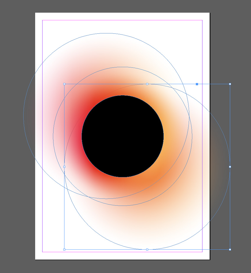
circle pasted
blackout effect

3. Pride Gradient Effect

Show your support of Pride this summer (LGBT Pride Month takes place in June) with this gradient set in the colors of the Pride flag.
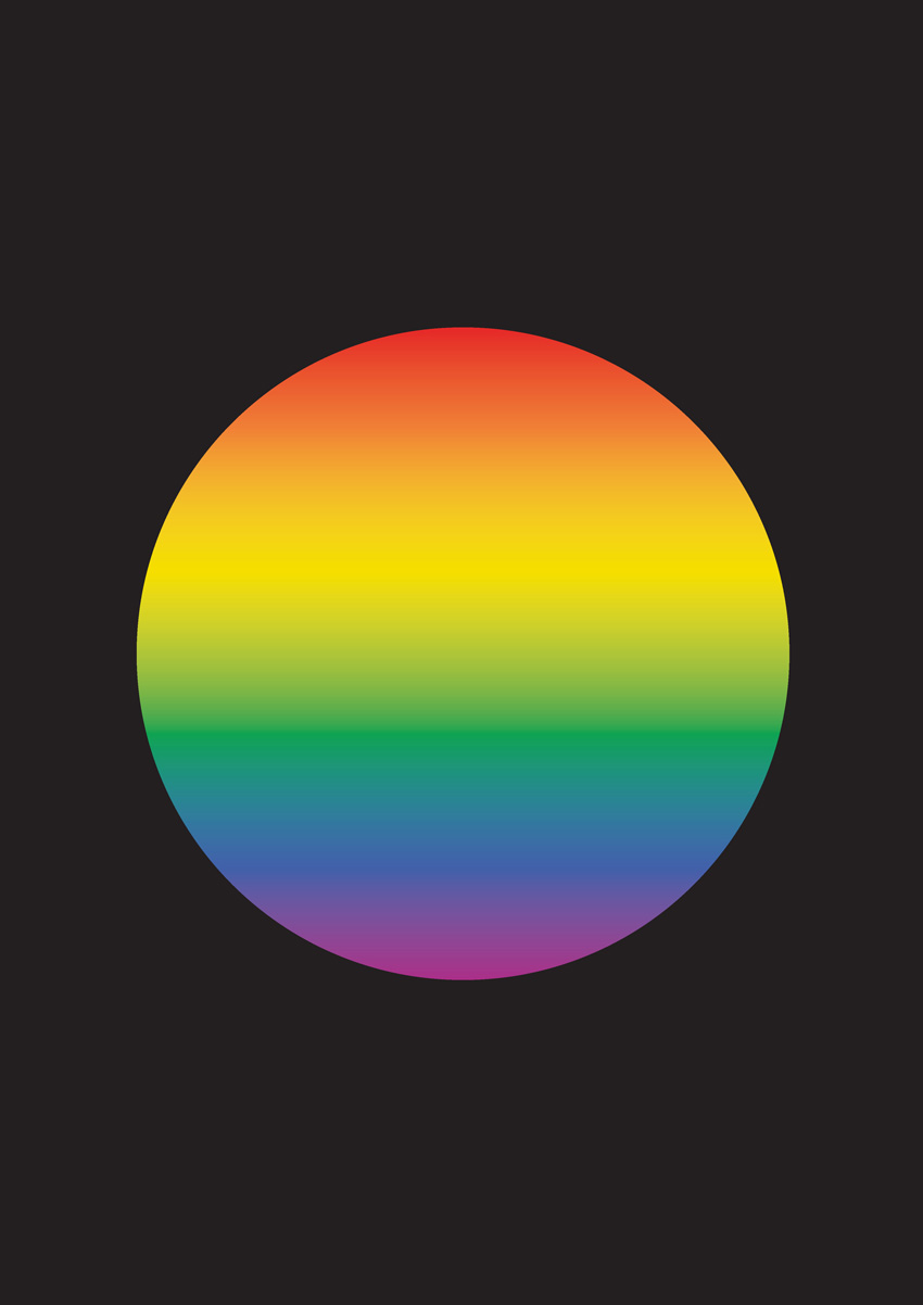
final pride effect

Step 1

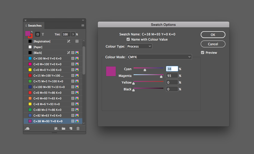
From the Swatches panel (Window > Color > Swatches), choose Create New Swatch. Create a red swatch, C=0 M=93 Y=86 K=0 or R=230 G=42 B=40.

Create five more new swatches:

  • C=0 M=60 Y=83 K=0 or R=240 G=127 B=54 
  • C=8 M=6 Y=93 K=0 or R=245 G=222 B=0
  • C=80 M=3 Y=86 K=0 or R=12 G=164 B=81
  • C=82 M=63 Y=0 K=0 or R=66 G=96 B=169
  • C=38 M=93 Y=0 K=0 or R=171 G=45 B=136 
swatch options

Step 2

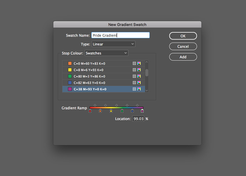
Choose New Gradient Swatch from the Swatches panel’s menu. 

Name the swatch Pride Gradient, set the Type to Linear, and choose Swatches from the Stop Color menu. 

Click on the left-hand stop on the Gradient Ramp and set this to your new red swatch, C=0 M=93 Y=86 K=0. Set the right-hand stop to the violet swatch, C=38 M=93 Y=0 K=0.

Click on the ramp to add four more stops, setting them to (from left to right) orange, yellow, green, and blue from your palette of new swatches. 

Then click Add and OK

pride gradient

Step 3

Create a shape on the page you’d like to apply the gradient to. Here I’ve used the Ellipse Tool (L) to create a circle (holding Shift to keep the proportions).
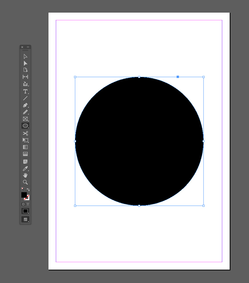
ellipse tool

Apply the Pride Gradient swatch to the Fill Color of the shape from the Swatches panel.
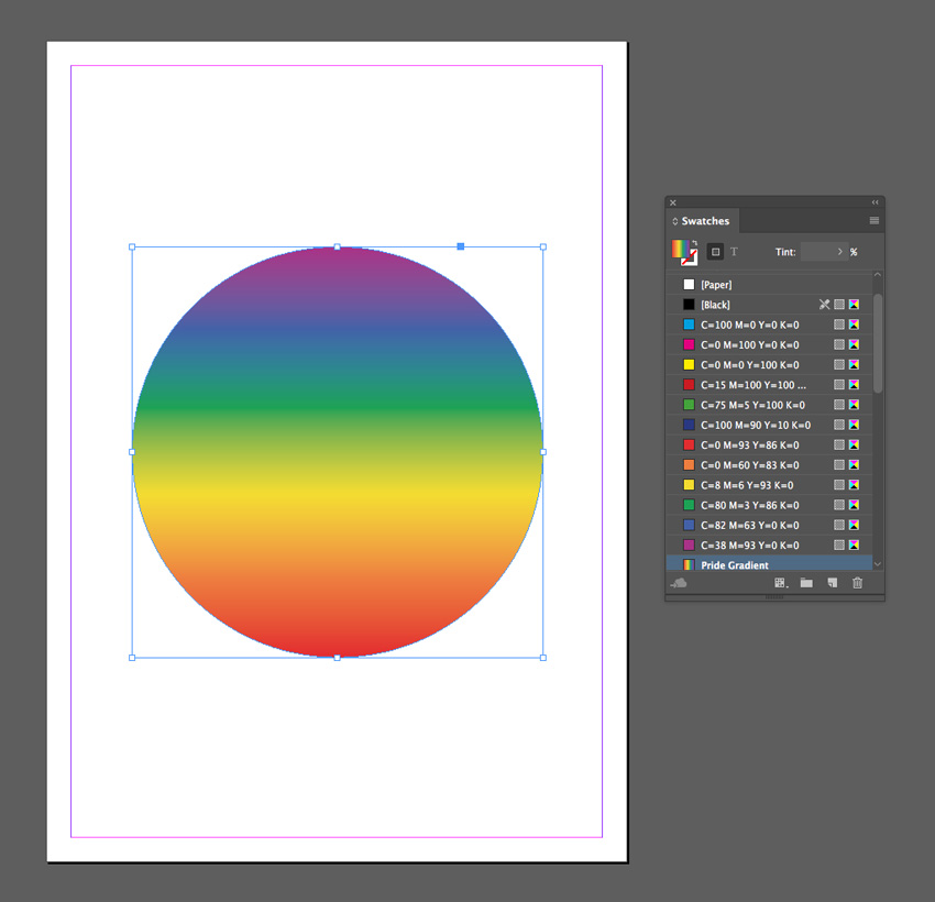
fill color

You can use the Gradient panel (Window > Color > Gradient) to adjust the Angle of the gradient.
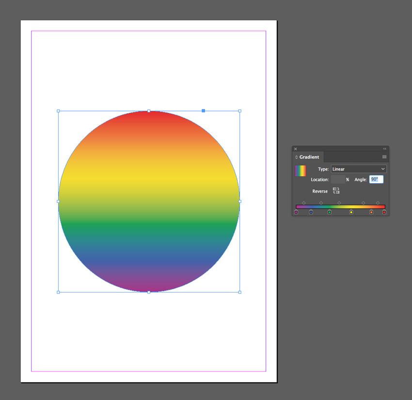
angle of gradient

Step 4

You can set the shape against a dark background for impact.

Use the Rectangle Tool (M) to create a frame across the whole page and set the Fill Color to [Black]. Right-Click on the shape and choose Arrange > Send to Back. 
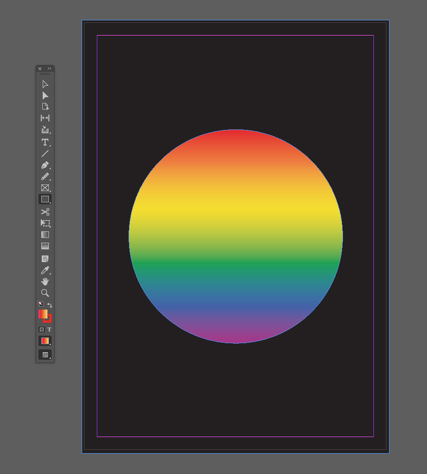
black background
rainbow pride effect

4. Pastel and Neon Double Gradient Effect

This is a popular take on the gradient trend that looks incredible on posters and magazine covers. It’s simple to create, and you can switch up colors to create an almost endless range of results.
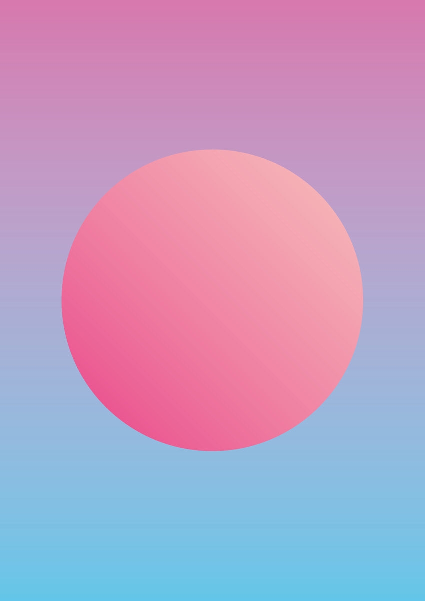
final pastel effect

Step 1

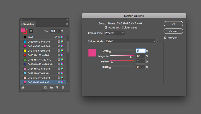
From the Swatches panel (Window > Color > Swatches), choose Create New Swatch. Create a lavender swatch, C=14 M=65 Y=0 K=0 or R=215 G=119 B=174.

Create three more new swatches:

  • C=59 M=0 Y=6 K=0 or R=98 G=198 B=233 
  • C=0 M=33 Y=22 K=0 or R=248 G=192 B=186
  • C=0 M=86 Y=7 K=0 or R=233 G=62 B=136
swatch options

Step 2

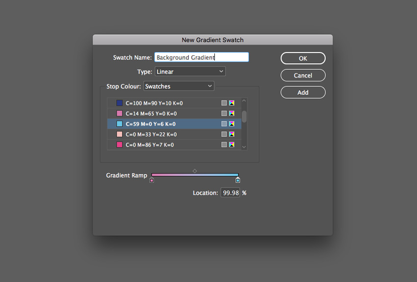
Choose New Gradient Swatch from the Swatches panel’s menu. 

Name the swatch Background Gradient, set the Type to Linear and choose Swatches from the Stop Color menu. 

Click on the left-hand stop on the Gradient Ramp and set this to your new lavender swatch, C=14 M=65 Y=0 K=0. Set the right-hand stop to the blue swatch, C=59 M=0 Y=6 K=0.

Then click Add and OK

background gradient

Step 3

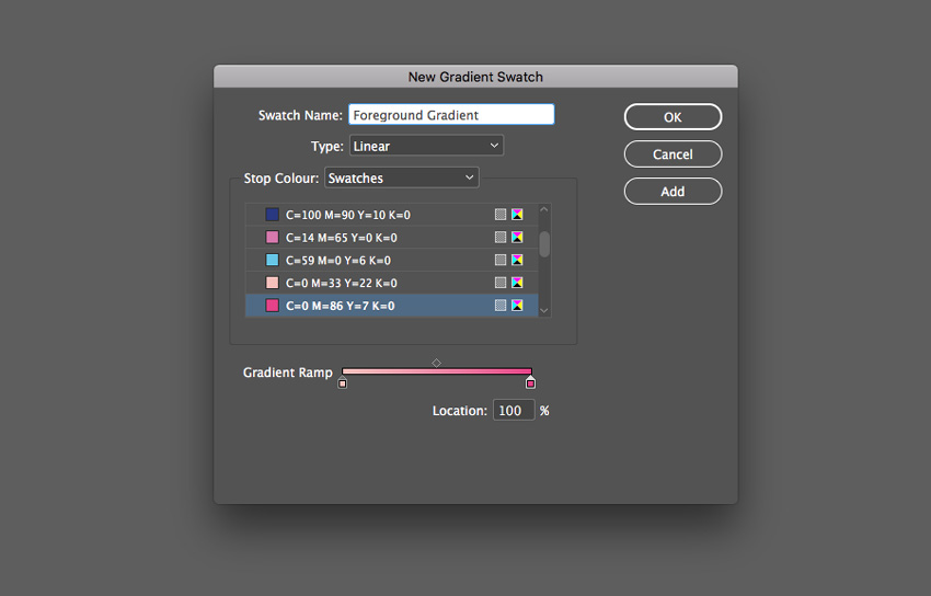
Create a second New Gradient Swatch. Name this swatch Foreground Gradient, set the Type to Linear, and choose Swatches from the Stop Color menu. 

Click on the left-hand stop on the Gradient Ramp and set this to your pale pink swatch, C=0 M=33 Y=22 K=0. Set the right-hand stop to the bright pink swatch, C=0 M=86 Y=7 K=0. Click Add and OK

new gradient swatch

Step 4

Create a shape on the page you’d like to apply the gradient to. Here I’ve used the Ellipse Tool (L) to create a circle.

Apply the Foreground Gradient swatch to the Fill Color of the shape from the Swatches panel.
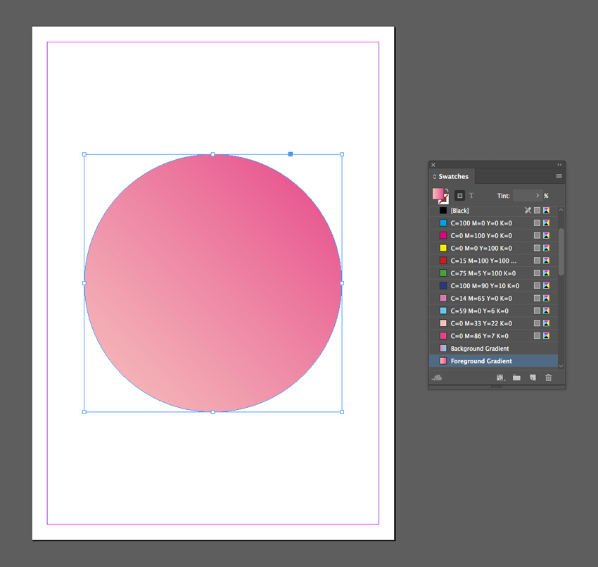
circle gradient

Step 5

Create a shape across the whole page using the Rectangle Tool (M) and Right-Click > Arrange > Send to Back.

Apply the Background Gradient swatch to the Fill Color of the shape.
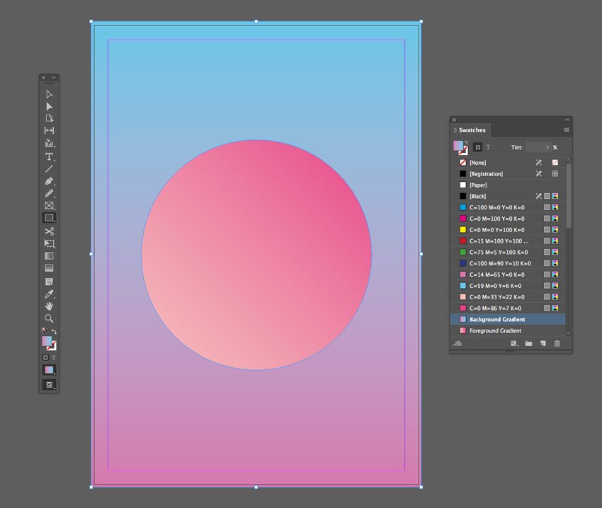
background gradient

You can adjust the Angle of the gradient and strength of each of the colors from the Gradient panel (Window > Color > Gradient).
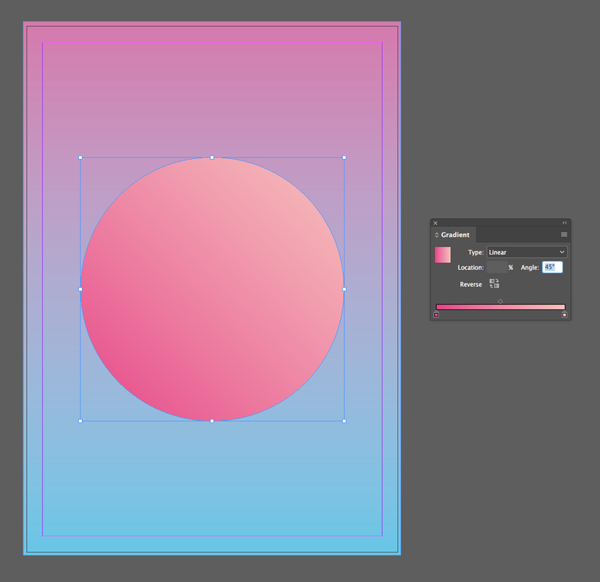
gradient angle
final double gradient

5. Retro Gradient Effect

This funky effect takes inspiration from 1960s and 70s graphic design. It’s a more chunky, dissected take on the gradient trend, and it’s great for giving typography a retro flavor. 

For this effect, you’ll need to download Charlevoix Pro ExtraBold.
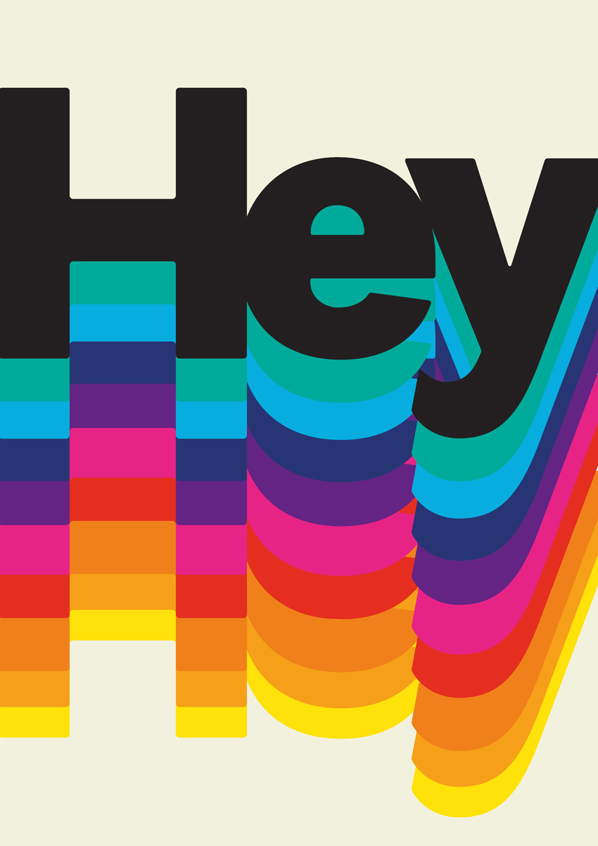
final retro effect

Step 1

From the Swatches panel (Window > Color > Swatches), choose Create New Swatch from the panel’s main menu. 

Create a yellow swatch, C=3 M=6 Y=91 K=0 or R=255 G=226 B=9.

Create ten more new swatches, to create a full rainbow palette plus one pale swatch and one dark swatch:

  • C=0 M=44 Y=93 K=0 or R=246 G=159 B=25 
  • C=0 M=59 Y=94 K=0 or R=240 G=128 B=26
  • C=0 M=92 Y=92 K=0 or R=230 G=45 B=32
  • C=0 M=93 Y=0 K=0 or R=231 G=36 B=134
  • C=77 M=100 Y=0 K=0 or R=98 G=36 B=131
  • C=100 M=90 Y=22 K=5 or R=39 G=52 B=117
  • C=73 M=9 Y=4 K=0 or R=6 G=173 B=224
  • C=77 M=4 Y=47 K=0 or R=0 G=170 B=155
  • C=7 M=3 Y=17 K=0 or R=242 G=241 B=222
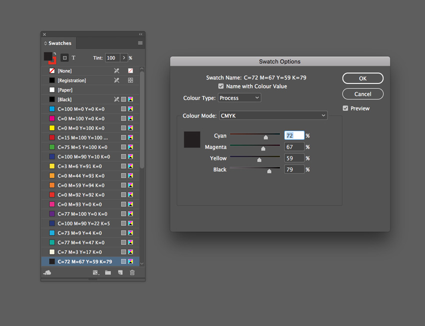
  • C=72 M=67 Y=59 K=79 or R=35 G=31 B=32
swatch options

Step 2

Use the Type Tool (T) to create a large text frame across the bottom of the page. 

Type in a single word, such as ‘Hey’, and from either the top Controls panel or the Character panel (Window > Type & Tables > Character), set the Font to Charlevoix Pro ExtraBold. Blow up the Font Size so that the text extends across the whole page, crossing the trim edge on both sides.

Set your Type Tool cursor between each of the letters and reduce the Kerning (letter-spacing) from the Character panel, so that the letters are pushed closer together. 

Set the Font Color, from the Swatches panel, to your new yellow swatch, C=3 M=6 Y=91 K=0.
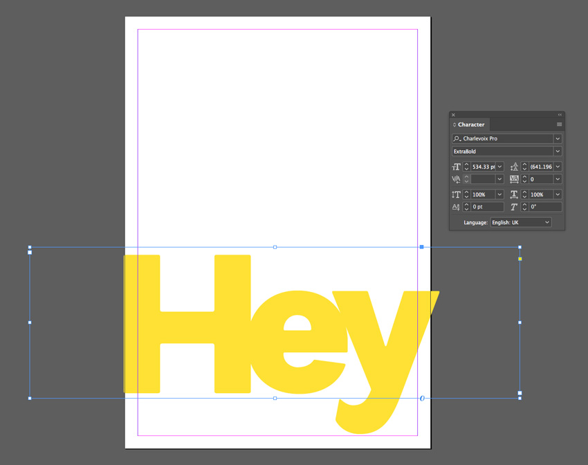
yellow swatch

Step 3

Select the text frame and Edit > Copy, Edit > Paste in Place, using the arrow keys to move this second frame upwards slightly. 

Adjust the Font Color to your orange swatch, C=0 M=44 Y=93 K=0.
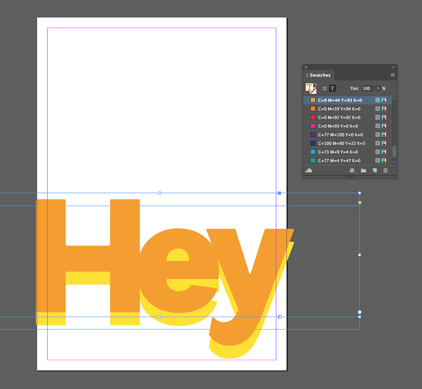
orange swatch

Step 4

Continue to Edit > Paste in Place more text frames, shifting them upwards and adjusting the Font Color until you have created a gradual rainbow effect, as shown below. 
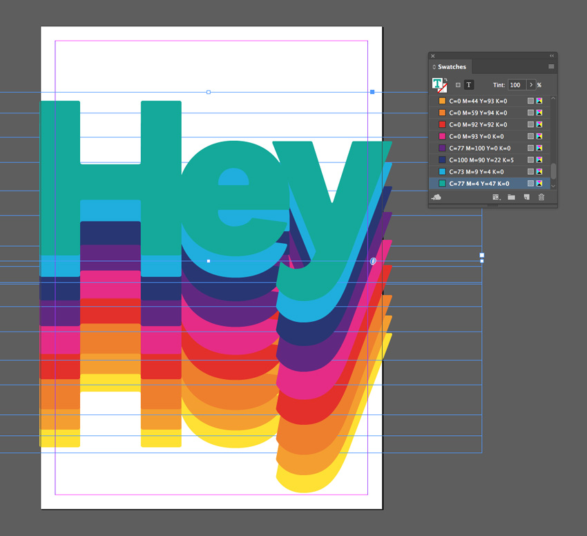
colored frames

For your final text frame, set the Font Color to your off-black swatch, C=72 M=67 Y=59 K=79.
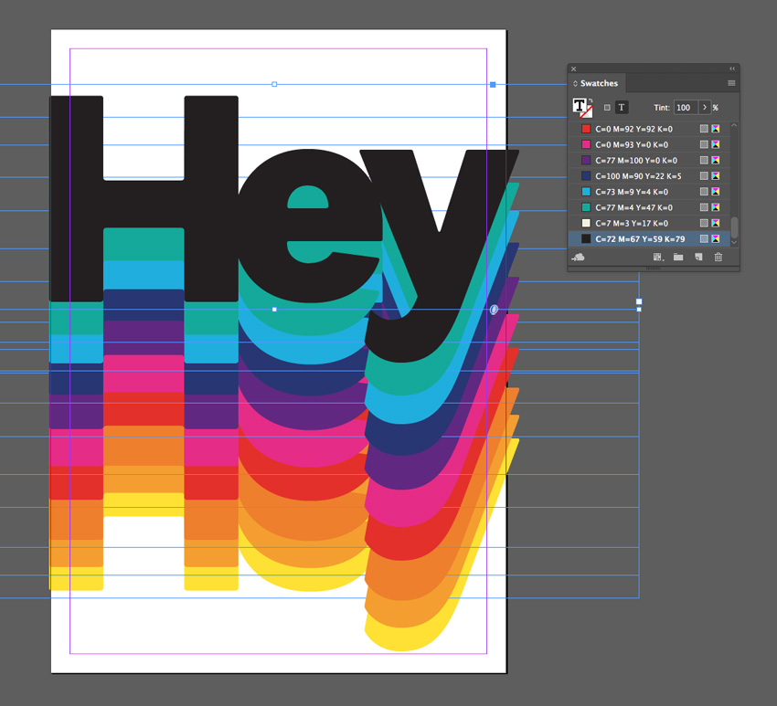
pasted frames

Step 5

To add a final retro vibe to your effect, create a shape across the whole page using the Rectangle Tool (M) and Right-Click on it and Arrange > Send to Back.

Set the Fill Color to the beige swatch, C=7 M=3 Y=17 K=0.
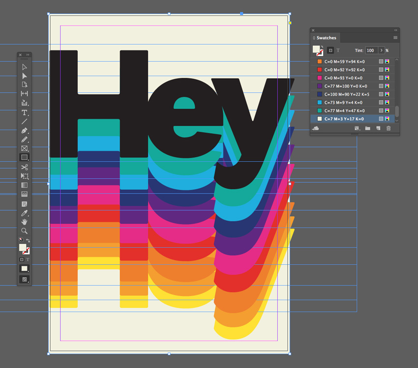
black text
final effect

Hey! Awesome Work!

And there we have it! Five quick and effective gradient effects that can transform any lacklustre layout.

Why not add cool typography to your gradient designs to transform them into posters or flyers? Head over to GraphicRiver or Envato Elements to source great fonts for your next project.

Looking for more InDesign text effect tutorials? Don’t miss these:

1 Element CSS Rainbow Gradient Infinity

Post pobrano z: 1 Element CSS Rainbow Gradient Infinity

I first got the idea to CSS something of the kind when I saw this gradient infinity logo by Infographic Paradise:

Original illustration. Shows a thick infinity symbol with a rainbow gradient filling its two loops and some highlights over this gradient.
The original gradient infinity.

After four hours and some twenty minutes, of which over four hours were spent on tweaking positioning, edges and highlights… I finally had the result below:

Screenshot of my version. Shows a thick infinity symbol with a rainbow gradient filling its two loops and some highlights over this gradient.
My version of the rainbow gradient infinity.

The gradient doesn’t look like in the original illustration, as I chose to generate the rainbow logically instead of using the Dev Tools picker or something like that, but other than that, I think I got pretty close—let’s see how I did that!

Markup

As you’ve probably already guessed from the title, the HTML is just one element:

<div class='∞'></div>

Styling

Deciding on the approach

The first idea that might come to mind when seeing the above would be using conic gradients as border images. Unfortunately, border-image and border-radius don’t play well together, as illustrated by the interactive demo below:

See the Pen by thebabydino (@thebabydino) on CodePen.

Whenever we set a border-image, border-radius just gets ignored, so using the two together is sadly not an option.

So the approach we take here is using conic-gradient() backgrounds and then getting rid of the part in the middle with the help of a mask. Let’s see how that works!

Creating the two ∞ halves

We first decide on an outer diameter.

$do: 12.5em;

We create the two halves of the infinity symbol using the ::before and ::after pseudo-elements of our .∞ element. In order to place these two pseudo-elements next to one another, we use a flex layout on their parent (the infinity element .∞). Each of these has both the width and the height equal to the outer diameter $do. We also round them with a border-radius of 50% and we give them a dummy background so we can see them.

.∞ {
  display: flex;
	
  &:before, &:after {
    width: $do; height: $do;
    border-radius: 50%;
    background: #000;
    content: '';
  }
}

We’ve also placed the .∞ element in the middle of its parent (the body in this case) both vertically and horizontally by using the flexbox approach.

See the Pen by thebabydino (@thebabydino) on CodePen.

How conic-gradient() works

In order to create the conic-gradient() backgrounds for the two haves, we must first understand how the conic-gradient() function works.

If inside the conic-gradient() function we have a list of stops without explicit positions, then the first is taken to be at 0% (or 0deg, same thing), the last is taken to be at 100% (or 360deg), while all those left are distributed evenly in the [0%, 100%] interval.

See the Pen by thebabydino (@thebabydino) on CodePen.

If we have just 2 stops, it’s simple. The first is at 0%, the second (and last) at 100% and there are no other stops in between.

If we have 3 stops, the first is at 0%, the last (third) at 100%, while the second is dead in the middle of the [0%, 100%] interval, at 50%.

If we have 4 stops, the first is at 0%, the last (fourth) at 100%, while the second and third split the [0%, 100%] interval into 3 equal intervals, being positioned at 33.(3)% and 66.(6)% respectively.

If we have 5 stops, the first is at 0%, the last (fifth) at 100%, while the second, third and fourth split the [0%, 100%] interval into 4 equal intervals being positioned at 25%, 50% and 75% respectively.

If we have 6 stops, the first is at 0%, the last (sixth) at 100%, while the second, third, fourth and fifth split the [0%, 100%] interval into 5 equal intervals being positioned at 20%, 40%, 60% and 80% respectively.

In general, if we have n stops, the first is at 0%, the last at 100%, while the ones in between split the [0%, 100%] interval into n-1 eqial intervals spanning 100%/(n-1) each. If we give the stops 0-based indices, then each one of them is positioned at i*100%/(n-1).

For the first one, i is 0, which gives us 0*100%/(n-1) = 0%.

For the last (n-th) one, i is n-1, which gives us (n-1)*100%/(n-1) = 100%.

Here, we choose to use 9 stops which means we split the [0%, 100%] interval into 8 equal intervals.

Alright, but how do we get the stop list?

The hsl() stops

Well, for simplicity, we choose to generate it as a list of HSL values. We keep the saturation and the lightness fixed and we vary the hue. The hue is an angle value that goes from 0 to 360, as we can see here:

Hue scale from 0 to 360 in the HSB/HSL models.
Visual representation of the hue scale from 0 to 360 (saturation and lightness being kept constant).

With this in mind, we can construct a list of hsl() stops with fixed saturation and lightness and varying hue if we know the start hue $hue-start, the hue range $hue-range (this is the end hue minus the start hue) and the number of stops $num-stops.

Let’s say we keep the saturation and the lightness fixed at 85% and 57%, respectively (arbitrary values that can probably be tweaked for better results) and, for example, we might go from a start hue of 240 to an end hue of 300 and use 4 stops.

In order to generate this list of stops, we use a get-stops() function that takes these three things as arguments:

@function get-stops($hue-start, $hue-range, $num-stops) {}

We create the list of stops $list which is originally empty (and which we’ll return at the end after we populate it). We also compute the span of one of the equal intervals our stops split the full start to end interval into ($unit).

@function get-stops($hue-start, $hue-range, $num-stops) {
  $list: ();
  $unit: $hue-range/($num-stops - 1);
	
  /* populate the list of stops $list */
	
  @return $list
}

In order to populate our $list, we loop through the stops, compute the current hue, use the current hue to generate the hsl() value at that stop and then then add it to the list of stops:

@for $i from 0 to $num-stops {
  $hue-curr: $hue-start + $i*$unit;
  $list: $list, hsl($hue-curr, 85%, 57%);
}

We can now use the stop list this function returns for any kind of gradient, as it can be seen from the usage examples for this function shown in the interactive demo below (navigation works both by using the previous/next buttons on the sides as well as the arrow keys and the PgDn/ PgUp keys):

See the Pen by thebabydino (@thebabydino) on CodePen.

Note how, when our range passes one end of the [0, 360] interval, it continues from the other end. For example, when the start hue is 30 and the range is -210 (the fourth example), we can only go down to 0, so then we continue going down from 360.

Conic gradients for our two halves

Alright, but how do we determine the $hue-start and the $hue-range for our particular case?

In the original image, we draw a line in between the central points of the two halves of the loop and, starting from this line, going clockwise in both cases, we see where we start from and where we end up in the [0, 360] hue interval and what other hues we pass through.

Original illustration, annotated. We've marked out the central points of the two halves, connected them with a line and used this line as the start for going around each of the two halves in the clockwise direction.
We start from the line connecting the central points of the two halves and we go around them in the clockwise direction.

To simplify things, we consider we pass through the whole [0, 360] hue scale going along our infinity symbol. This means the range for each half is 180 (half of 360) in absolute value.

Hue scale from 0 to 360 in the HSB/HSL models, with saturation and lightness fixed at 100% and 50% respectively. Red corresponds to a hue of 0/ 360, yellow to a hue of 60, lime to a hue of 120, cyan to a hue of 180, blue to a hue of 240, magenta to a hue of 300.
Keywords to hue values correspondence for saturation and lightness fixed at 100% and 50% respectively.

On the left half, we start from something that looks like it’s in between some kind of cyan (hue 180) and some kind of lime (hue 120), so we take the start hue to be the average of the hues of these two (180 + 120)/2 = 150.

Original illustration, annotated. For the left half, our start hue is 150 (something between a kind of cyan and a kind of lime), we pass through yellows, which are around 60 in hue and end up at a kind of red, 180 away from the start, so at 330.
The plan for the left half.

We get to some kind of red, which is 180 away from the start value, so at 330, whether we subtract or add 180:

(150 - 180 + 360)%360 = (150 + 180 + 360)%360 = 330

So… do we go up or down? Well, we pass through yellows which are around 60 on the hue scale, so that’s going down from 150, not up. Going down means our range is negative (-180).

Original illustration, annotated. For the right half, our start hue is 150 (something between a kind of cyan and a kind of lime), we pass through blues, which are around 240 in hue and end up at a kind of red, 180 away from the start, so at 330.
The plan for the right half.

On the right half, we also start from the same hue in between cyan and lime (150) and we also end at the same kind of red (330), but this time we pass through blues, which are around 240, meaning we go up from our start hue of 150, so our range is positive in this case (180).

As far as the number of stops goes, 9 should suffice.

Now update our code using the values for the left half as the defaults for our function:

@function get-stops($hue-start: 150, $hue-range: -180, $num-stops: 9) {
  /* same as before */
}

.∞ {
  display: flex;
	
  &:before, &:after {
    /* same as before */
    background: conic-gradient(get-stops());
  }
  
  &:after {
    background: conic-gradient(get-stops(150, 180));
  }
}

And now our two discs have conic-gradient() backgrounds:

See the Pen by thebabydino (@thebabydino) on CodePen.

However, we don’t want these conic gradients to start from the top.

For the first disc, we want it to start from the right—that’s at 90° from the top in the clockwise (positive) direction. For the second disc, we want it to start from the left—that’s at 90° from the top in the other (negative) direction, which is equivalent to 270° from the top in the clockwise direction (because negative angles don’t appear to work from some reason).

The conic gradient for the first (left) half starts from the right, which means an offset of 90° in the clockwise (positive) direction from the top. The conic gradient for the second (right) half starts from the left, which means an offset of 270° in the clockwise (positive) direction (and of 90° in the negative direction) from the top.
Angular offsets from the top for our two halves.

Let’s modify our code to achieve this:

.∞ {
  display: flex;
	
  &:before, &:after {
    /* same as before */
    background: conic-gradient(from 90deg, get-stops());
  }
  
  &:after {
    background: conic-gradient(from 270deg, get-stops(150, 180));
  }
}

So far, so good!

See the Pen by thebabydino (@thebabydino) on CodePen.

From 🥧 to 🍩

The next step is to cut holes out of our two halves. We do this with a mask or, more precisely, with a radial-gradient() one. This cuts out Edge support for now, but since it’s something that’s in development, it’s probably going to be a cross-browser solution at some point in the not too far future.

Remember that CSS gradient masks are alpha masks by default (and only Firefox currently allows changing this via mask-mode), meaning that only the alpha channel matters. Overlaying the mask over our element makes every pixel of this element use the alpha channel of the corresponding pixel of the mask. If the mask pixel is completely transparent (its alpha value is 0), then so will the corresponding pixel of the element.

See the Pen by thebabydino (@thebabydino) on CodePen.

In order to create the mask, we compute the outer radius $ro (half the outer diameter $do) and the inner radius $ri (a fraction of the outer radius $ro).

$ro: .5*$do;
$ri: .52*$ro;
$m: radial-gradient(transparent $ri, red 0);

We then set the mask on our two halves:

.∞ {
  /* same as before */
	
  &:before, &:after {
    /* same as before */
    mask: $m;
  }
}

See the Pen by thebabydino (@thebabydino) on CodePen.

This looks perfect in Firefox, but the edges of radial gradients with abrupt transitions from one stop to another look ugly in Chrome and, consequently, so do the inner edges of our rings.

Screenshot. Shows a close-up of the inner edge of the right half in Chrome. These inner edges look jagged and ugly in Chrome.
Close-up of the inner edge of the right half in Chrome.

The fix here would be not to have an abrupt transition between stops, but spread it out over a small distance, let’s say half a pixel:

$m: radial-gradient(transparent calc(#{$ri} - .5px), red $ri);

We now got rid of the jagged edges in Chrome:

Screenshot. Shows a close-up of the inner edge of the right half in Chrome after spreading out the transition between stops over half a pixel. These inner edges now look blurry and smoother in Chrome.
Close-up of the inner edge of the right half in Chrome after spreading out the transition between stops over half a pixel.

The following step is to offset the two halves such that they actually form an infinity symbol. The visible circular strips both have the same width, the difference between the outer radius $ro and the inner radius $ri. This means we need to shift each laterally by half this difference $ri - $ri.

.∞ {
  /* same as before */
	
  &:before, &:after {
    /* same as before */
    margin: 0 (-.5*($ro - $ri));
  }
}

See the Pen by thebabydino (@thebabydino) on CodePen.

Intersecting halves

We’re getting closer, but we still have a very big problem here. We don’t want the right part of the loop to be completely over the left one. Instead, we want the top half of the right part to be over that of the left part and the bottom half of the left part to be over that of the right part.

So how do we achieve that?

We take a similar approach to that presented in an older article: using 3D!

In order to better understand how this works, consider the two card example below. When we rotate them around their x axes, they’re not in the plane of the screen anymore. A positive rotation brings the bottom forward and pushes the top back. A negative rotation brings the top forward and pushes the bottom back.

See the Pen by thebabydino (@thebabydino) on CodePen.

Note that the demo above doesn’t work in Edge.

So if we give the left one a positive rotation and the right one a negative rotation, then the top half of the right one appears in front of the top half of the left one and the other way around for the bottom halves.

Addiing perspective makes what’s closer to our eyes appears bigger and what’s further away appears smaller and we use way smaller angles. Without it, we have the 3D plane intersection without the 3D appearance.

Note that both our halves need to be in the same 3D context, something that’s achieved by setting transform-style: preserve-3d on the .∞ element.

.∞ {
  /* same as before */
  transform-style: preserve-3d;
	
  &:before, &:after {
    /* same as before */
    transform: rotatex(1deg);
  }
  
  &:after {
    /* same as before */
    transform: rotatex(-1deg);
  }
}

And now we’re almost there, but not quite:

See the Pen by thebabydino (@thebabydino) on CodePen.

Fine tuning

We have a little reddish strip in the middle because the gradient ends and the intersection line don’t quite match:

Screenshot. Shows a close-up of the intersection of the two halves. In theory, the intersection line should match the start/ end line of the conic gradients, but this isn't the case in practice, so we're still seeing a strip of red along it, even though the red side should be behind the plane of the screen and not visible.
Close-up of small issue at the intersection of the two halves.

A pretty ugly, but efficient fix is to add a 1px translation before the rotation on the right part (the ::after pseudo-element):

.∞:after { transform: translate(1px) rotatex(-1deg) }

Much better!

See the Pen by thebabydino (@thebabydino) on CodePen.

This still isn’t perfect though. Since the inner edges of our two rings are a bit blurry, the transition in between them and the crisp outer ones looks a bit odd, so maybe we can do better there:

Screenshot. Shows a close-up of the area around the intersection of the two halves, where the crisp outer edges meet the blurry inner ones, which looks odd.
Close-up of continuity issue (crisp outer edges meeting blurry inner ones).

A quick fix here would be to add a radial-gradient() cover on each of the two halves. This cover is transparent white for most of the unmasked part of the two halves and goes to solid white along both their inner and outer edges such that we have nice continuity:

$gc: radial-gradient(#fff $ri, rgba(#fff, 0) calc(#{$ri} + 1px), 
  rgba(#fff, 0) calc(#{$ro} - 1px), #fff calc(#{$ro} - .5px));

.∞ {
  /* same as before */
	
  &:before, &:after {
    /* same as before */
    background: $gc, conic-gradient(from 90deg, get-stops());
  }
  
  &:after {
    /* same as before */
    background: $gc, conic-gradient(from 270deg, get-stops(150, 180));
  }
}

The benefit becomes more obvious once we add a dark background to the body:

See the Pen by thebabydino (@thebabydino) on CodePen.

Now it looks better even when zooming in:

Screenshot. Shows a close-up of the area around the intersection of the two halves, we don't have the same sharp contrast between inner and outer edges, not even when zooming in.
No more sharp contrast between inner and outer edges.

The final result

Finally, we add some prettifying touches by layering some more subtle radial gradient highlights over the two halves. This was the part that took me the most because it involved the least amount of logic and the most amount of trial and error. At this point, I just layered the original image underneath the .∞ element, made the two halves semi-transparent and started adding gradients and tweaking them until they pretty much matched the highlights. And you can see when I got sick of it because that’s when the position values become rougher approximations with fewer decimals.

Another cool touch would be drop shadows on the whole thing using a filter on the body. Sadly, this breaks the 3D intersection effect in Firefox, which means we cannot add it there, too.

@supports not (-moz-transform: scale(2)) {
  filter: drop-shadow(.25em .25em .25em #000) 
          drop-shadow(.25em .25em .5em #000);
}

We now have the final static result!

See the Pen by thebabydino (@thebabydino) on CodePen.

Spicing it up with animation!

When I first shared this demo, I got asked about animating it. I initially thought this would be complicated, but then it hit me that, thanks to Houdini, it doesn’t have to be!

As mentioned in my previous article, we can animate in between stops, let’s say from a red to a blue. In our case, the saturation and lightness components of the hsl() values used to generate the rainbow gradient stay constant, all that changes is the hue.

For each and every stop, the hue goes from its initial value to its initial value plus 360, thus passing through the whole hue scale in the process. This is equivalent to keeping the initial hue constant and varying an offset. This offset --off is the custom property we animate.

Sadly, this means support is limited to Blink browsers with the Experimental Web Platform features flag enabled.

Screenshot showing the Experimental Web Platform features flag being enabled in Chrome.
The Experimental Web Platform features flag enabled in Chrome.

Still, let’s see how we put it all into code!

For starters, we modify the get-stops() function such that the current hue at any time is the initial hue of the current stop $hue-curr plus our offset --off:

$list: $list, hsl(calc(#{$hue-curr} + var(--off, 0)), 85%, 57%);

Next, we register this custom property:

CSS.registerProperty({
  name: '--off', 
  syntax: '<number>', 
  initialValue: 0;
})

And finally, we animate it to 360:

.∞ {
  /* same as before */
	
  &:before, &:after {
    /* same as before */
    animation: shift 2s linear infinite;
  }
}

@keyframes shift { to { --off: 360 } }

This gives us our animated gradient infinity!

Animated ∞ logo (live demo, Blink only with flag enabled).

That’s it! I hope you’ve enjoyed this dive into what can be done with CSS these days!

The post 1 Element CSS Rainbow Gradient Infinity appeared first on CSS-Tricks.

Envato Elements Now Offers Video!

Post pobrano z: Envato Elements Now Offers Video!

Welcome to video on Envato Elements!

If you work with video, your life just got a little easier. Instead of having to create everything from scratch or chase around the web looking for stock footage, motion graphics and After Effects templates, you can now access more than 60,000 top-quality video items, all in one place.

Read all about it on the Envato Blog, check out our related articles and courses, or go and check out the stock video and video templates for yourself!

Related Content

Agregator najlepszych postów o designie, webdesignie, cssie i Internecie