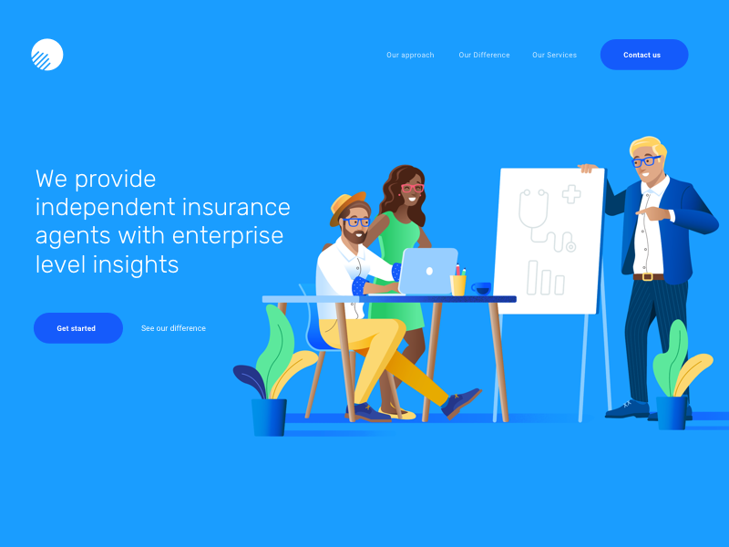
Graphic Design Trends You Shouldn’t Miss

Post pobrano z: Graphic Design Trends You Shouldn’t Miss

In a digital era, trends constantly shift and change.  This is true in the field of graphic art.  What was trendy or modern a few years ago might look outdated in 2018.  Some trends have staying power, while others disappear quickly.

Latest graphic design trends

2018 is the year that imagination has been given freedom to roam.  Trends are wider, more experimental and far freer.  Some trends in the field are new while others have been evolving over time.
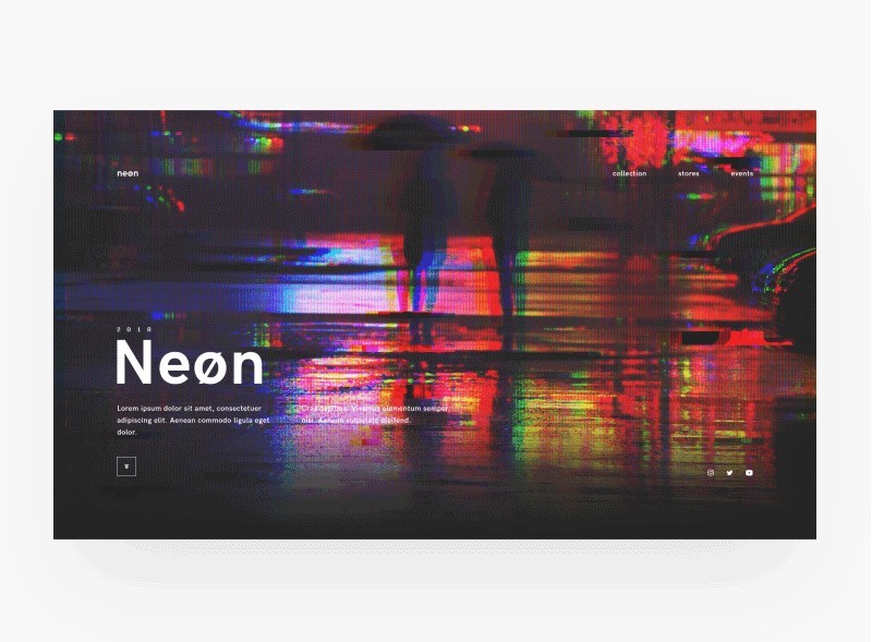
Graphic design is a field which is never boring.  New ideas constantly emerge and the boundaries of the industry shift and change all of the time.  Nike does that with its magazine advertisements once a few years.

This article will introduce you to some of the current trends in graphic design.

The glitch effect

One of the more popular movements in the graphic art field is ‘the glitch effect’’ which gives the appearance of a corrupted image.
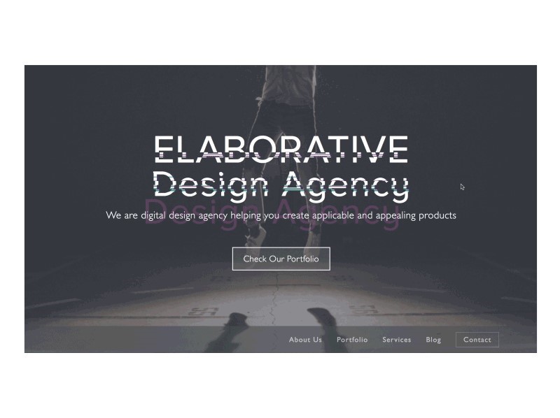
Signs of imperfection which would (until recently) have been discarded or seen to be problematic are now being embraced and turned into a trend.

The film industry has used the glitch effect for a while, presenting broken images and imperfect shoots as a way to create tension.

However, 2018 is the year that faulted images are starting to take over the design world too.

Destroyed design

In recent times, graphic artists have been preoccupied with destroying their designs or imagery.
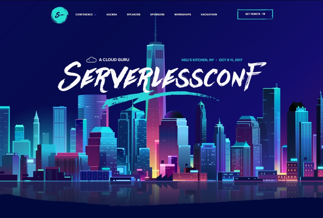
This might mean spray painting over them, tearing them or crumpling them.  Rumpled, worn in or destroyed designs are leading the way in 2018.

Color channels

Playing with color is a new trend in 2018.  Designers are using color to distort images, producing a psychedelic or hallucinogenic effect.
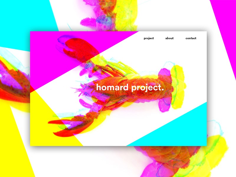
These images have a psychological impact on viewers, keeping them engaged.  As a result, ‘color channels’ are emerging as a popular trend in 2018.

Holography is slowing down

The hologram effect has been hugely popular for a while, with designers using holograms in branding, logo design, brochures and even stock photos.

Holograms added an interesting detail to the minimalist design.  Recently, however, the trend has begun to slow down.  While the holographic design will still hold some power, we’ll be seeing it less frequently in 2018.

Double exposure duotones

Double exposure duotones offer a radically new element to the graphic designer.  In 2018 this trend uses vivid colors.
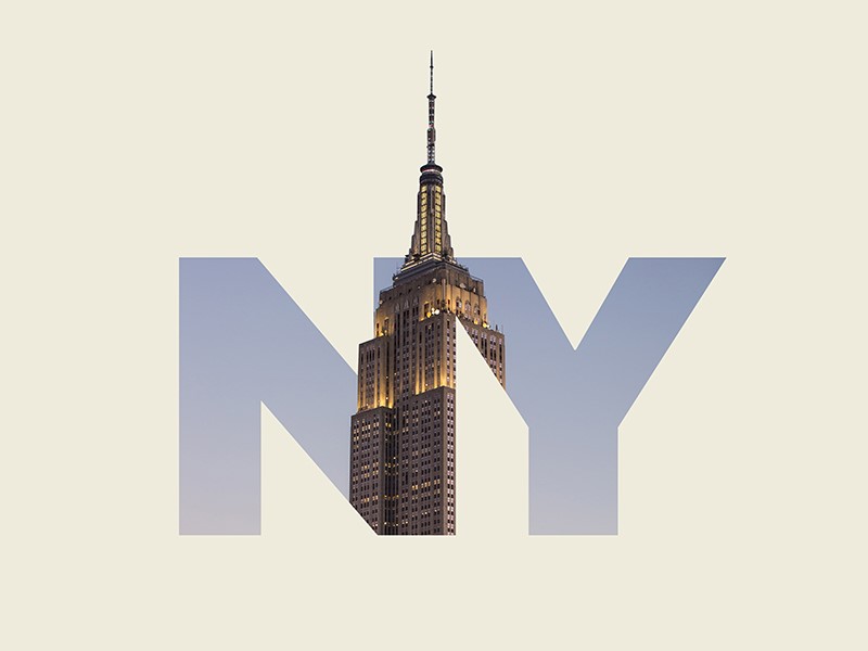
Different overlapping images are used to create an interesting visual effect.  This combination is used to create a modern design which is taking over the industry.

Muted or moody color tones

As the retro themes of the 80s and 90s are starting to reemerge, moodier colors are beginning to dominate the design field.

These colors reflect the themes of times gone by when cameras and screens were not able to capture saturated colors.
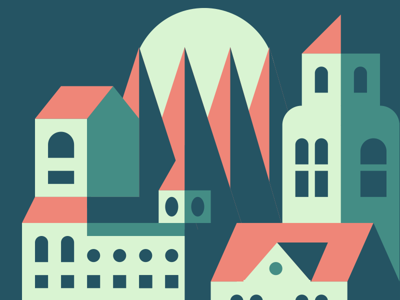
Popular trends include muted colors (or low-intensity colors with a greyed out effect).  These colors are removed from their primary base and have a low Chroma.

Moody colors have been used to create texture, fabrics, screens, paper and retro website designs.  This trend is emerging strongly in the design field and will gain popularity in 2018.

Ultra Violet

Ultraviolet is a deep purple-blue color reminiscent of the mobile disco era.  It is often used to give a futuristic feel to design.
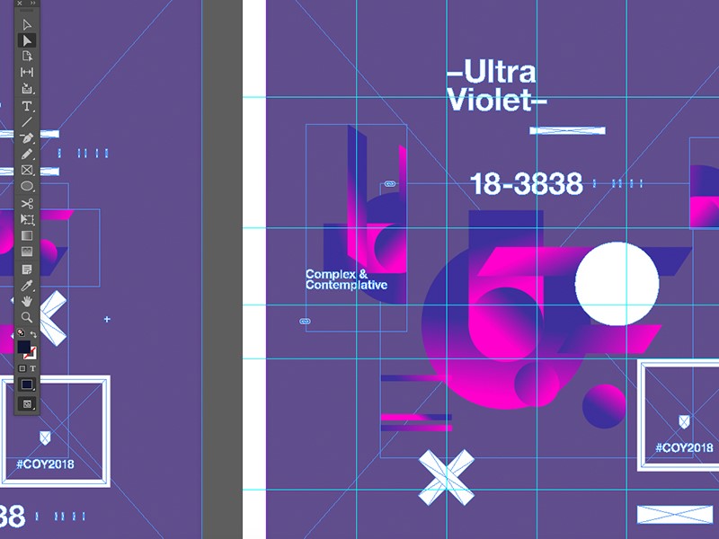
This color has recently become trendy, drawing on the space theme to provoke an atmosphere of exploration or discovery.

Futuristic themes are beginning to emerge in web design, graphic design, fashion and interior design.  This is definitely a graphic design trend for 2018.

Mid Century design

Mid Century design draws inspiration from themes which existed between the 1930’s and mid 1960’s.

This trend has been growing within the interior design industry for the past while with a focus on mid-century Scandinavian furniture design.  This theme gives the feeling of timeless quality and attention to detail.

During 2018, this theme will start to emerge far more strongly in the world of digital and graphic design, adding a retro feel to work that is produced.

Colored fonts

As nostalgia takes over, designers are often choosing to use colored and highlighted fonts to draw attention to their content.

This is replacing the old trend of using illustration or imagery to put a message across.

New software which allows for developing your own handmade color fonts has recently been released (Photoshop CC 2017/2018).

This enables graphic artists to create an attention-grabbing but unique element to their work. This trend is going to increase rapidly as 2018 unfolds.

Cinemagraphs

Cinemagraphs are living photographs where a person takes small continuous motions.  They have become increasingly popular on social media sites.
This trend, which combines the photograph and the video is bound to become more popular in 2018, adding a new element to the design field.

Responsive logos

Recently, responsive design has emerged as a crucial element of web design.  Many people use mobile phones and tablets to browse the web, and the market is even making a move towards wearable online devices.

As a result, designers are adjusting their designs so they will suit a wide range of screens.
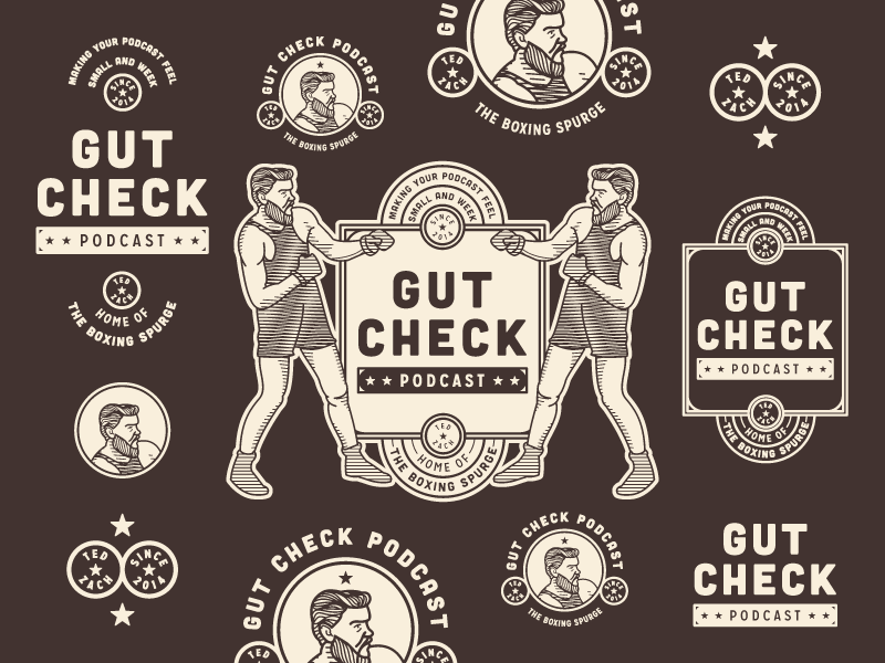
More recently, companies have started to focus on making their logos responsive.  This means ensuring that the logo is simple enough to work well on a small screen.

Many companies are also modernizing their logos in order to adjust to the current market.

Responsive logos are therefore an emerging trend which is rapidly emerging during 2018.

Greater depth

Flat design has been a recent trend in web design.  This meant taking away shadows or 3D elements in website design and replacing them with simple, flat colors.  However, this trend is starting to change.

Extreme minimalism is giving way to the realization that detail adds an interesting element to design, helping designers to create a hierarchy.  Viewers strongly engage with the detail on a site and this helps them to engage.

As a result, sites are changing from flat to semi – flat designs. Shadows are often added to call to action buttons, long shadows, soft and subtle color variations and a larger degree of nuance.

Shadows added in this 2018 trend do not have harsh qualities as their predecessors once did.  Instead, the trend is to add subtly to the site, creating interest without the contrast.

Debonair duotones

Old comic strips often show pixilated images or halftones which are printed in overlapping format.

Contrasting colors such as red and green were often used to create a visual effect.  The result was an attractive two-toned image which created a sense of vibrancy.

This old printing technique has been given new life by digital media. New tools and techniques make it possible to overlay a range of different colors, from duotones to quadtones.

There is even the possibility for designers to create fake duotones using software such as Photoshop or InDesign.

Fake duotones don’t have the same contrast as the traditional duotoned image, but they are still effective and easy to create.

Retro designs – inspired by the 80s and 90s

We’ve already discussed the moody colors which are making a comeback in 2018 but the influence of the 80’s and 90’s goes further still.
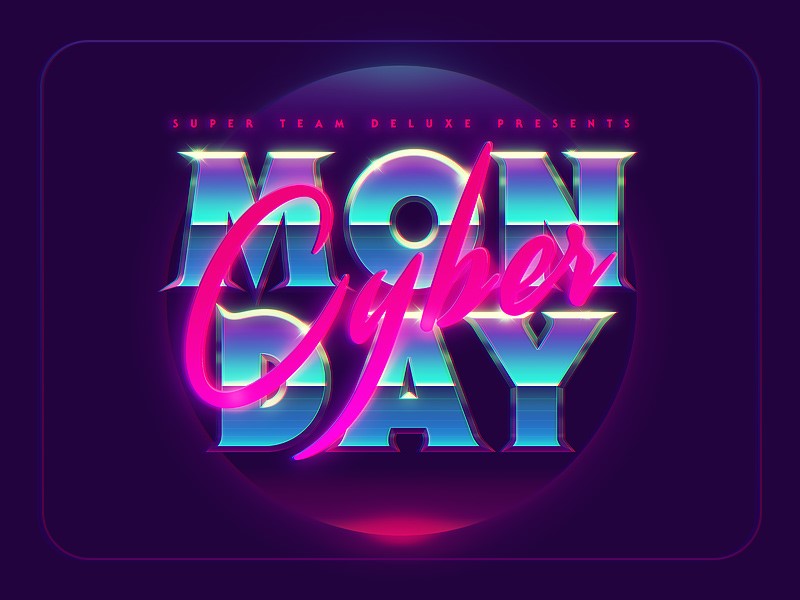
Both electric and pastel colors are starting to make a comeback as designers move away from the vivid colors made popular by flat design.

Patters from this era are also starting to influence design.  Instead of the minimalist imagery of recent times, geometric patterns and abstract designs are becoming more and more popular.

Our current brand leaders and target audiences are made up largely of the millennial generation (or children of the 80s and 90s).

This is reflective of the nostalgic designs which are starting to arise.  Adding a touch of nostalgia is bound to be a hit.

Focus on authenticity

This year is seeing a trend towards photographic images.  Both custom photography and stock photo images can evoke emotion in your viewers.

Imagery assists designers to send out a clear and concise message.  They also give voice to a brand.

In the 80s and 90s, the grittiness of authentic photography had a wide appeal.  This trend changed towards staged images or photos which have become generic.

Thankfully, the trend is changing back to interesting photographs which are full of life.

Authentic images increased in popularity during 2017 and will continue to do so in 2018.  Brands are seeking to connect with users rather than present them with overused and tired images.

Talented photographers are assisting by offering up excellent photos to stock image sites, often without restriction.

Summary

Graphic design is going through a rapid shift, pushing the boundaries into new arenas while simultaneously embracing the past.

We are seeing old trends fade away as new opportunities emerge within the field.  The field of design is embracing a more authentic image which speaks to their audiences.

As a designer, it is now a time to take risks, breaking old patterns.  2018 is the year to allow the imagination free reign and embrace the waves of change.
Ultimate Design Bundle: Great Prey for a Design Hunter

Post pobrano z: Ultimate Design Bundle: Great Prey for a Design Hunter

Every designer is a skilled internet hunter. After just a little time you learn where to find your prey, how to understand if it is worth getting and when will be the perfect time to hunt it down. Of course, I am talking about icons, fonts, and other design elements.

Even inexperienced beginners know that drawing the design from a scratch is a really complicated and long-time task. Even the simplest landing page design needs at least a dozen icons and don’t even start talking about fonts, background and the rest of graphics. It will take several days or maybe weeks to draw a design using ready elements, because you have to tune them up and polish the whole picture to perfection, but without pre-made stuff, it will be months. Come on, the payment is not that big to put so many efforts in work (there are exceptions, yes, but let’s be sincere, they are VERY rare).

As every good hunter, you sure have a really big hoard of graphic elements. Like mountains of gold, silver, and gemstones in a dragon cave, they lay silent and beautiful on your computer’s hard drive. However, what dragon will refuse to get some more precious treasures into his collection? That’s very pity you are not a dragon and can’t afford having everything you want, huh? I feel your pain, bro, every designer has the same problem with paid content. And that’s why you learn not only “where” to get those goodies, but also “when” to hunt for them. Every company does sales time to time and you can be lucky to grab the stuff you adore for a sufficiently lower price.

If you were waiting for a perfect time to hunt down some TemplateMonster product, stop waiting and go check Ultimate Design Bundle. We created it keeping in mind designers, their desires, and needs, so it is definitely worth your attention.

We put inside that bundle an unbelievably huge bunch of products:

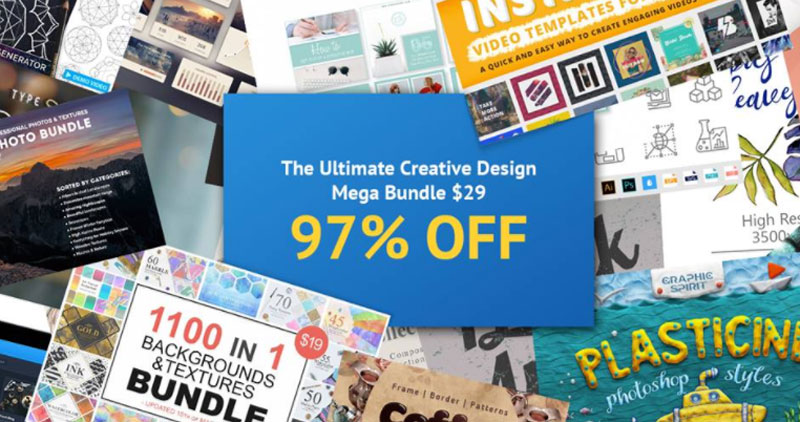
Why the perfect time to get that bundle is now? Because until April 30 it costs only $29! Twenty-nine bucks, Carl! On the other time that set of graphic elements would be worth $1123 and we sell it with a 97% discount. Even a Black Friday is not so profitable!

There’s not much time has left, so hurry up! This great pray waits for you, digital hunter!

Animating Progress

Post pobrano z: Animating Progress

Jonathan Snook on the complexity of animating the <progress> element. If you’re unfamiliar, that’s the element that spits out a bar chart-like visual that indicates a position between two values:

This example has custom styles, but you get the point.

Jonathan’s post shows off a method for animating a change in progress value using CSS and a touch of JavaScript while making sure that it animates properly in every modern browser. The demo he made looks pretty neat. I’m sure this is going to be one of those posts I come back to again and again.

We recently shared a post by Dave Rupert that takes an SVG approach. Jeremias Menichelli also has an alternative approach, creating a ring shape and converting it into a React component.

Direct Link to ArticlePermalink

The post Animating Progress appeared first on CSS-Tricks.

Container-Adapting Tabs With “More” Button

Post pobrano z: Container-Adapting Tabs With “More” Button

Or the priority navigation pattern, or progressively collapsing navigation menu. We can name it in at least three ways.

There are multiple UX solutions for tabs and menus and each of them have their own advantages over another, you just need to pick the best for the case you are trying to solve. At design and development agency Kollegorna we were debating on the most appropriate UX technique for tabs for our client’s website…

We agreed it should be a one-liner because the amount of tab items is unknown and narrowed our options down to two: horizontal scroll and adaptive with “more” button. Firstly, the problem with the former one is that horizontal scroll as a feature is not always visually obvious for users (especially for narrow elements like tabs) whereas what else can be more obvious than a button (“more”), right? Secondly, scrolling horizontally using a mouse-controlled device isn’t a very comfortable thing to do, so we might need to make our UI more complex with additional arrow buttons. All considered, we ended up choosing the later option:

Planning

The main intrigue here is if it’s possible to achieve that without JavaScript? Partly yes, however the limitations that it comes with probably make it only good for a concept museum rather than real life scenarios (anyway, Kenan did a really nice job). Still, the dependency on JS doesn’t mean we can’t make it usable if for some reason the technology is not available. Progressive enhancement and graceful degradation for the win!

Since the amount of tab items is uncertain or volatile, we will make use of Flexbox which ensures the items are nicely spread in the container element without setting the widths.

Initial Prototype

There are two lists both visually and technically: one is for items that fit in the container, and one for items that don’t. Since we’ll depend on JavaScript, it’s totally fine to have our initial markup with a single list only (we will duplicate it with JS):

<nav class="tabs">
  <ul class="-primary">
    <li><a href="...">Falkenberg</a></li>
    <li><a href="...">Braga</a></li>
    <!-- ... -->
  </ul>
</nav>

With a tiny touch of flex-based CSS things are starting to get serious here. I’ll skip the decorative CSS properties in my examples here and place here what really matters:

.tabs .-primary {
  display: flex;
}
.tabs .-primary > li {
  flex-grow: 1;
}

Here’s what we already have:

Container-Adapting Tabs With More Button

Graceful Degradation

Now before enhancing it progressively with JavaScript, let’s make sure it degrades gracefully if there is no JS available. There multiple of reasons for JS absence: it’s still loading, it has fatal errors, it failed to be transferred over the network.

.tabs:not(.--jsfied) {
  overflow-x: auto;
  -webkit-overflow-scrolling: touch;
}

And once JavaScript is here, the --jsfied class name is added to the container element which neutralizes the CSS above:

container.classList.add('--jsfied')

Turns out the horizontal scroll strategy that I mentioned before might make a fine use here! When there’s not enough room for menu items the overflowing content gets clipped inside the container and scrollbars are displayed. That’s way better than empty space or something that’s broken, isn’t it?

Container-Adapting Tabs With More Button

Missing Parts

First off, let’s insert the missing DOM parts:

  • Secondary (dropdown) list which is a copy of the main list;
  • “More” button.
const container = document.querySelector('.tabs')
const primary = container.querySelector('.-primary')
const primaryItems = container.querySelectorAll('.-primary > li:not(.-more)')
container.classList.add('--jsfied')

// insert "more" button and duplicate the list

primary.insertAdjacentHTML('beforeend', `
  <li class="-more">
    <button type="button" aria-haspopup="true" aria-expanded="false">
      More &darr;
    </button>
    <ul class="-secondary">
      ${primary.innerHTML}
    </ul>
  </li>
`)
const secondary = container.querySelector('.-secondary')
const secondaryItems = secondary.querySelectorAll('li')
const allItems = container.querySelectorAll('li')
const moreLi = primary.querySelector('.-more')
const moreBtn = moreLi.querySelector('button')
moreBtn.addEventListener('click', (e) => {
  e.preventDefault()
  container.classList.toggle('--show-secondary')
  moreBtn.setAttribute('aria-expanded', container.classList.contains('--show-secondary'))
})

Here we are nesting secondary list into primary and using some aria-* properties. We want our navigation menu to be accessible, right?

There’s also an event handler attached to the „more” button that toggles the --show-secondary class name on the container element. We’ll use it to show and hide the secondary list. Now let’s style the new parts. You may want to visually accent „more” button.

.tabs {
  position: relative;
}
.tabs .-secondary {
  display: none;
  position: absolute;
  top: 100%;
  right: 0;
}
.tabs.--show-secondary .-secondary {
  display: block;
}

Here’s where that brought us to:

Container-Adapting Tabs With More Button

Obviously, we need some code that hides and shows the tabs…

Hiding and Showing Tabs in the Lists

Because of Flexbox, the tab items will never break into multiple lines and will shrink to their minimum possible widths. This means we can walk through the each item one by one, add up their widths, compare it to the width of .tabs element and toggle the visibility of particular tabs accordingly. For that we will create a function called doAdapt and wrap in the code below in this section.

To begin width, we should visually reveal all the items:

allItems.forEach((item) => {
  item.classList.remove('--hidden')
})

On a side note, .--hidden works the way you’ve probably expected:

.tabs .--hidden {
  display: none;
}

Math time! I’ll have to disappoint you if you expected some advanced mathematics. So, as described previously, we walk through the each primary tab by adding up their widths under stopWidth variable. We also perform a check if the item fits in the container, hide the item if not and save its index for later use.

let stopWidth = moreBtn.offsetWidth
let hiddenItems = []
const primaryWidth = primary.offsetWidth
primaryItems.forEach((item, i) => {
  if(primaryWidth >= stopWidth + item.offsetWidth) {
    stopWidth += item.offsetWidth
  } else {
    item.classList.add('--hidden')
    hiddenItems.push(i)
  }
})

Hereafter, we need to hide the equivalent items from the secondary list that remained visible in the primary one. As well as hide “more” button if no tabs were hidden.

if(!hiddenItems.length) {
  moreLi.classList.add('--hidden')
  container.classList.remove('--show-secondary')
  moreBtn.setAttribute('aria-expanded', false)
}
else {  
  secondaryItems.forEach((item, i) => {
    if(!hiddenItems.includes(i)) {
      item.classList.add('--hidden')
    }
  })
}

Finally, ensure doAdapt function is executed at the right moments:

doAdapt() // adapt immediately on load
window.addEventListener('resize', doAdapt) // adapt on window resize

Ideally the resize event handler should be debounced to prevent unnecessary calculations.

Ladies and gentlemen, this is the result (play with resizing the demo window):

See the Pen Container-Adapting Tabs With „More” Button by Osvaldas (@osvaldas) on CodePen.

I could probably end my article here, but there is an extra mile we can walk to make it better and some things to note…

Enhancements

It has been implemented in the demo above, but we haven’t overviewed a small detail that improves the UX of our tabs widget. It’s hiding the dropdown list automatically if user clicks anywhere outside the list. For that we can bind a global click listener and check if the clicked element or any of its parents is the secondarylist or „more” button. If not, the dropdown list gets dismissed.

document.addEventListener('click', (e) => {
  let el = e.target
  while(el) {
    if(el === secondary || el === moreBtn) {
      return;
    }
    el = el.parentNode
  }
  container.classList.remove('--show-secondary')
  moreBtn.setAttribute('aria-expanded', false)
})

Edge Cases

Long Tab Titles

You might have been wondering how the widget behaves with long tab titles. Well, you have at least two options here…

  1. Let titles wrap to the next line which is how they behave by default (you can also enable word wrapping with word-wrap: break-word):
Container-Adapting Tabs With More Button
  1. Or you can disable all kinds of wrapping in the primary list with white-space: nowrap. The script is flexible enough to put the too-long items to the dropdown (where the titles are free to wrap) by stepping aside the shorter siblings:
Container-Adapting Tabs With More Button

Many Tabs

Even though the secondary list is position: absolute it doesn’t matter how long your document’s height is. As long as the container element or its parents are not position: fixed, the document will adapt and the bottom items will be reachable by scrolling down the page.

A Thing to be Aware Of

Things may become tricky if the tabs are buttons rather than anchors semantically, which means their response to clicks are decided by JavaScript, e.g.: dynamic tabs. The problem here is that tab button event handlers aren’t duplicated along with the markup. I see at least two approaches to solve that:

  • Place dynamic event handler attachments right after the adaptive tab code;
  • Use an event delegation method instead (think of jQuery’s live()).

Unfortunately, events occur in quantity: most likely your tabs will have a selected state that visually indicates the current tab so it’s also important to manage the states simultaneously. Otherwise, flip the tablet and you’re lost.

Browser Compatibility

Even though I used ES6 syntax in the examples and demo, it should be converted to ES5 by a compiler such as Babel to significantly widen the browser support (down to IE9 including).

You can also expand the Flexbox implementation with an older version and syntax (all the way down to IE10). If you need to also support non-Flexbox browsers you can always do feature detection with CSS @supports, apply the technique progressively, and rely on horizontal scroll for older browsers.

Happy tabbing!

The post Container-Adapting Tabs With “More” Button appeared first on CSS-Tricks.

Envato Tuts+ Community Challenge: Created by You, May 2018 Edition

Post pobrano z: Envato Tuts+ Community Challenge: Created by You, May 2018 Edition

Welcome to our monthly feature of fantastic tutorial results created by
you, the Envato Tuts+ community! 

Every day, visitors like you take the
time not only to read our tutorials but also to try them out. This is an
assortment of those comment submissions found throughout the Design
& Illustration section. Check out this set of results and join in
for the next roundup, published next month!

Vector Tutorial Results

Taken from the
comments section of your favorite tutorials, these first pieces are an
assortment of results created with vector drawing programs. Check out
these amazing results!

How to Create a Subtle Summer Sunset Textured Illustration in Adobe Illustrator

Elsa Pakopoulou tackled this Subtle Summer Sunset Illustration from with success! Check out her work below!

How to Create a Subtle Summer Sunset Textured Illustration in Adobe Illustrator

Create a Burning, Vector Match Using Gradient Meshes

Célia designed a fiery match using this Burning Vector Match tutorial from . See her result below!

Create a Burning Vector Match Using Gradient Meshes

How to Create a Deep Diving Illustration in Adobe Illustrator

Inspired by this magical Deep Diving Illustration by , Caroll Boubou created a beautiful sea blue version. Check it out below!

How to Create a Deep Diving Illustration in Adobe Illustrator

How to Create a Vintage Spring Portrait of a Girl in Adobe Illustrator

Olga Chernyateva made a delightful version of this Vintage Spring Portrait from instructor . Check out her design below!

How to Create a Vintage Spring Portrait of a Girl in Adobe Illustrator

How to Create a Cute Cartoon Kitten in Adobe Illustrator

Sevvel Sundaramoorthy made this super cute Cartoon Kitten Illustration thanks to a tutorial by . Check out their cartoon below!

How to Create a Cute Cartoon Kitten in Adobe Illustrator

How to Draw Heart-Shaped Daisies in Adobe Illustrator

In celebration of spring, Ilaria made this lovely Heart-Shaped Daisy Illustration from a tutorial by . Check out her result below!

How to Draw Heart-Shaped Daisies in Adobe Illustrator

How to Create a Flat Design Wall Shelves Illustration in Adobe Illustrator

Nada Wagih made a perfect recreation of this awesome Flat Design Wall Shelves Illustration by . Check it out!

How to Create a Flat Design Wall Shelves Illustration in Adobe Illustrator

How to Create a Watercolor Mermaid Illustration in Adobe Illustrator

Ahmed Mahmoud created his own beautiful Watercolor Mermaid Illustration inspired by this great tutorial by . Check out his design below!

How to Create a Watercolor Mermaid Illustration in Adobe Illustrator

How to Draw Sailor Moon in Adobe Illustrator

Dolores Lombardi did a great job with this Sailor Moon Illustration from . Check out her pretty work below!

How to Draw Sailor Moon in Adobe Illustrator

How to Create a Gradient Icon Inspired by Instagram in Adobe Illustrator

Daniel Johnson used this Instagram Gradient Icon tutorial from to work out his own design for a special project. Check out his result below.

How to Create a Gradient Icon Inspired by Instagram in Adobe Illustrator

Adobe Photoshop Tutorial Results

Let’s
take a look at this next set of results inspired by Adobe Photoshop
tutorials published here on Envato Tuts+. Contributions range from photo
manipulations to text effects and more! Check out these wicked results
below!

How to Create a Sketch vs. Camera Effect in Adobe Photoshop

Debayani Das made a brilliant Sketch vs. Camera Effect using this fun tutorial by . Check it out below!

How to Create a Sketch vs Camera Effect in Adobe Photoshop

How to Create an inFamous Inspired Text Effect in Adobe Photoshop

Atka Kaa made a perfect recreation of this brilliant inFamous Text Effect from instructor . Check out their work below!

How to Create an inFamous Inspired Text Effect in Adobe Photoshop

How to Create a Mysterious Forest Scene With Adobe Photoshop

Liya Rybakova ventured into the forest with this Mysterious Forest Scene tutorial from . Check out her magical version below!

How to Create a Mysterious Forest Scene With Adobe Photoshop

How to Create a Vintage Portrait Photo Manipulation in Adobe Photoshop

Midolu36 explored vintage portraits with this Vintage Photo Manipulation from instructor . Check out their awesome version below!

How to Create a Vintage Portrait Photo Manipulation in Adobe Photoshop

How to Create a Retro 'Saved by the Bell’ Inspired Text Effect in Adobe Photoshop

Erica went for a retro effect with this cool Saved by the Bell Text Effect from . Check out her cool glitch-inspired result below!

How to Create a Retro Saved by the Bell Inspired Text Effect in Adobe Photoshop

How to Create a Photo Manipulation of a Cat and Flying Fish With Adobe Photoshop

Susana González Gutierrez created this adorable Cat and Flying Fish Photo Manipulation after following one of tutorial. Check out her fabulous result below!

How to Create a Photo Manipulation of a Cat and Flying Fish With Adobe Photoshop

How to Create a Cartoon Text Effect in Adobe Photoshop

Photoshop newbie H. Pronk smashed this Cartoon Text Effect tutorial from . Make sure to check out their wicked result below!

How to Create a Cartoon Text Effect in Adobe Photoshop

Design Tutorial Results

These final
pieces are inspired by an assorted of design tutorials that don’t quite
fit the previous categories. They include everything from print design
to drawing and more! Enjoy these beautiful pieces created by the
community below!

How to Create a Fall-Themed Wedding Invite in Adobe InDesign

Jael did a beautiful job with this Fall-Themed Wedding Invite from instructor . Check out her work below!

How to Create a Fall-Themed Wedding Invite in Adobe InDesign

How to Draw a Realistic Eye

Gure Shav took on this Drawing a Realistic Eye tutorial from to create a stunning result of their own. Check out their drawing below!

How to Draw a Realistic Eye

How to Create a Summer Picnic Community Event Flyer in Adobe InDesign

RD designed a pretty sweet Summer Picnic Event Flyer inspired by this design from . Check out their work below!

How to Create a Summer Picnic Community Event Flyer in Adobe InDesign

How to Be Involved in the Next Showcase

Have
you created a piece based on one of our tutorials here in the Design
& Illustration section of Envato Tuts+? We’re keen for you to share
your results with us! Check out the general guidelines below to join in
with our community:

  • Your artwork should be similar in some
    way to the tutorial that you followed or that inspired it. The aim of
    these showcases is to share what readers have created after following
    the tutorial.
  • Comment on the tutorial you used, attaching an
    image of your result. We’re keen on all levels of ability: from beginner
    to advanced!
  • Include a comment about your result, yourself, or your process. We like knowing about you and what you’re sharing.
  • Share
    the tutorial when you share that artwork elsewhere on the web. If
    you’ve posted your piece on sites like Facebook, Tumblr or Behance, link
    back to the tutorial so that other users know your source and can join
    in on the fun.

Thanks to everyone who was highlighted above for sharing your results with the Envato Tuts+ community. We look forward
to checking out your brilliant versions of our tutorials in the near
future, and welcome users new and old to participate in upcoming
showcases.

New Course: Up and Running With Cinema 4D

Post pobrano z: New Course: Up and Running With Cinema 4D

Up and Running With Cinema 4D is a brand new course for artists and designers who are just getting started with 3D and are ready to learn the foundational skills that Cinema 4D provides. In this post, you’ll learn more about the course and watch some free preview videos to whet your appetite and pick up some useful Cinema 4D skills!

What You’ll Learn

In this course, you’ll learn how to create and manipulate basic shapes, use colour, work with lighting and rendering, and more. Jonathan Lam will walk you through the step-by-step process of how to use these skills to create a simple pair of headphones! 

3D headphones

By the end of the course, you’ll have a better understanding of how these tools work together and how to come up with your own modelling solutions.

Here are some free lessons from this course, as a preview of what you can expect:

Introduction to Basic Shapes in Cinema 4D

In this video you’ll learn about different ways to create and manipulate basic shapes in Cinema 4D. This will act as the foundation of our modelling techniques.


Introduction to Deformers

In this video you’ll learn how to use the “deformers”, which will provide further options for manipulating shapes into what we want for modelling.


How to Edit Basic Shapes in Cinema 4D

In this video you will learn how to make basic shapes editable. You’ll learn the options that become available to you and discuss how this can affect your modelling. You will then use the half sphere object to create part of the headphones model.


Take the Course

You can take our new course straight away with a subscription to Envato Elements. For a single low monthly fee, you get access not only to this course, but also to our growing library of over 1,000 video courses and industry-leading eBooks on Envato Tuts+. 

Plus you now get unlimited downloads from the huge Envato Elements library of 580,000+ creative assets. Create with unique fonts, photos, graphics and templates, and deliver better projects faster.

How to Create an Abstract Portrait With Rocks and Lava in Adobe Photoshop

Post pobrano z: How to Create an Abstract Portrait With Rocks and Lava in Adobe Photoshop

Final product image
What You’ll Be Creating

In this tutorial I’ll show you how to use Adobe Photoshop to create an abstract piece featuring a broken woman portrait. 

First, we’ll build the base background using several landscape and abstract texture images. After that, we’ll retouch the model, add a mountain to the model’s head, and import the abstract texture and crack effect. Later, we’ll add rocks with lava effects and draw some lines. We’ll work with an abstract texture again, using the Dodge and Burn Tool and several adjustment layers to complete the final effect.

Tutorial Assets

The following assets were used during the production of this tutorial:

1. How to Build the Base Background

Step 1

Create a new 3000 x 1790 px document with the given settings:

new file

Step 2

Open the landscape 1 image. Drag this image into the white canvas using the Move Tool (V).

add landscape 1

Click the
second icon at the bottom of the Layers panel to add a mask to this
layer. Select a soft round brush with black color (soft black brush) to
remove the hard edges and blend the landscape to make it fade out into
the white background.

landscape 1 masking

Step 3

Go to Layer > New Adjustment Layer > Hue/Saturation and set it as Clipping Mask. Bring the Saturation value down to -100.

landscape 1 hue saturation

Step 4

Place the
landscape 2 image onto the existing canvas and add a mask to this layer.
Use a soft black brush to remove the bottom of this landscape and leave
the mountains visible softly and subtly in the middle of the canvas.

add landscape 2
landscape 2 masking

Step 5

Make a Hue/Saturation adjustment layer (set as Clipping Mask) to desaturate the landscape 2.

landscape 2 hue saturation

Step 6

Open the
abstract texture pack. Browse the folder of the colorful power backgrounds
and select the first group. Take the image you like and place it onto
the existing canvas.

add texture 1

Use a layer mask to erase most of this texture image, leaving some details visible subtly on top of both sides.

texture 1 masking

Step 7

Add a Gradient Map adjustment layer and pick the default colors (black and white) to desaturate the texture.

texture 1 gradient map

Step 8

Create a Curves adjustment layer and increase the lightness to make the effect more subtle.

texture 1 curves

Step 9

Open the
abstract texture pack again. Browse the grunge folder and select one
image from the fourth group to add to the main canvas. Use a layer mask
to erase the bottom and make the effect visible mostly on the upper section.

add texture 2
texture 2 masking

Step 10

Create a Hue/Saturation adjustment layer and reduce the Saturation value to the minimum.

texture 2 hue saturation

Step 11

Use an Invert adjustment layer to make the effect more subtle.

texture 2 invert

2. How to Retouch the Model

Step 1

Open the model image. Cut out the model on the left and place her in the middle of the main canvas.

add model

Step 2

Add a mask
to the model layer and select a brush from the watercolor brush set.
I’ve used the one numbered 2494 and pressed F5 to change the settings of
this brush.

watercolor brush settings

Use this brush to trim the hair and some details on her shoulders.

model masking

Step 3

Make a Gradient Map adjustment layer with black and white to desaturate the model.

model gradient map

Step 4

Create a
Curves adjustment layer to bring more light to the model, especially the
side of the model towards the background. Paint on the shadow and face
of the model so they won’t be affected or will be less affected by this adjustment
layer.

model curves 1

Step 5

Make a new layer and use a soft brush with Opacity and Flow about 50% to reduce the shadow on the model’s shoulder.

remove neck shadow

Step 6

Create a new layer, and use a soft brush with the color #808080 to decrease the light on the model’s lips and teeth.

decrease lips highlight

Step 7

Add a new layer, change the mode to Overlay 100%, and fill with 50% gray.

model DB new layer

Activate
the Dodge and Burn Tool (O) to refine the light and shadow on the model.
You can see how I did it with Normal mode and the result with Overlay
mode.

model DB results

3. How to Add the Mountain

Step 1

Open the
mountain image. Select the big mountain on the right to add to the
model’s head. Use the Free Transform Tool (Control-T) with Warp mode
to distort the mountain to fit the size of the head.

select mountain
add mountain

Step 2

Add a mask to this layer and use a hard black brush to cut the contour of the mountain to fit the head completely.

mountain masking

Step 3

Create a Hue/Saturation adjustment layer to desaturate this mountain.

mountain hue saturation

Step 4

Make a Curves adjustment layer to increase the contrast of the mountain.

mountain curves 1

Step 5

Use another
Curves adjustment layer to brighten the mountain. On this layer mask,
use a soft black brush with a lowered opacity (about 20-50%) to reduce
the light to keep the mountain’s contrast but still show some texture.

mountain curves 2
mountain curves 2 masking

4. How to Import the Abstract Textures

Step 1

Open the
abstract texture pack again. Browse the grunge folder and select one
from the fifth group to add to the lower part of the canvas. Use a layer mask
with a watercolor brush to remove the top and leave some jagged,
crumbly effects on the model’s body and both bottom corners of the canvas.
Lower the brush’s opacity if needed to get a better, more natural
effect.

add texture 2
texture 2 masking

Step 2

Create a Hue/Saturation adjustment layer to desaturate the effect.

texture 2 hue saturation

Step 3

Make a
Curves adjustment layer to strengthen the effect. On the layer mask,
use a watercolor brush to reduce the dark effect in the bottom right corner.

texture 2 masking

Step 4

Duplicate
this texture image and drag it above the top of the layers. Move it up
and use a layer mask with a watercolor brush to remove most of the
image, leaving some subtle abstract effects visible around the model’s head
and the bottom of the mountain to give it some details and texture.

texture 2 duplication
texture 2 duplication masking

Step 5

Add a Hue/Saturation adjustment layer to turn the color of the effect to black and white.

texture 2 copy hue saturation

Step 6

Use a Curves adjustment layer to make the effect on the mountain more visible and on the background less visible.

texture 2 copy curves

5. How to Make the Crack Effect

Step 1

Move the crack image into the main document and change this layer mode to Multiply 100%.

add crack texture

Add a mask to this layer and use a watercolor brush to remove the areas outside the model.

crack masking

Step 2

Use the
Lasso Tool (L)
to select a part of the crack image and place it onto the
model’s face. Activate Control-T to make it much smaller, and then use a
layer mask to erase the parts outside the face.

add crack texture more

Step 3

Select the
crack layers and hit Control-G to create a group for them. Change this
group’s mode to Multiply 100% and add a Curves adjustment layer within
this group. Decrease the lightness to increase the broken effect’s visibility.
On the layer mask, use a soft black brush to reduce the effect on the
areas which are too dark after this step.

crack effect curves 1
crack effect curves 1 masking

Step 4

Use another
Curves adjustment layer to brighten the effect, especially the contour
around the face and body. Paint on the shadow areas so they won’t be
affected by this adjustment layer.

crack effect curves 2

6. How to Add the Rocks and Lava Effect

Step 1

Open the
rock images pack. Select the meteor_11 folder and take one rock from
this. Place it above the mountain’s area and use Control-T to rotate it
as shown below.

add rock

Use a layer mask to blend this rock with the existing surface.

rock masking

Step 2

Add more lava effect to the head and model’s body using different rocks.

add more rock

Step 3

For the lava effects on the model’s cheek and shoulder, use a Curves adjustment layer to brighten them as they’re too dark now.

lava effect on body curves 1 brightening
lave effect on cheek curves 1 brightening

Step 4

Add one
rock from the meteor_11 folder to our working document, and then go
to Filter > Liquify. Select the Twirl Clockwise Tool (C) to tweak the
rock so it looks different from the original form. Don’t overdo it as
it would look too strange and unnatural.

rock liquifying

Use Control-T to scale it down and place it below the mountain area.

add rock after liquifying

Step 5

Use the same method to tweak different rocks into different forms and add them around the ear area and above the forehead.

add more rock to the head

Use a layer
mask to blend the upper part of the rocks with the forehead and break their tops to get the form of a headpiece (the rocks above the forehead include two
rock parts; the smaller one is upper and the bigger is lower).

rock decoration masking

Step 6

Make a
Curves adjustment layer to bring more light for the rocks on the
forehead. On their layer mask, paint on the shadow area so they won’t be
brightened by this adjustment layer.

rock decoration curves 1
rock decoration curves 2

Step 7

Use
the Liquify Tool to make some small twisted parts to decorate the eyes
and forehead. Use a Curves adjustment layer if you feel any
details are too dark or want to increase their visibility.

decorate eyes face

Step 8

Turn one
rock into a similar result below and place it onto one of the model’s
shoulders. Duplicate this layer and flip it horizontally and move it to the other shoulder.

add rock to shoulders

Add another
rock to one of the shoulders to make the two sides appear different. On
each of these three layers, use a layer mask to blend them with the
shoulders.

add more rock to left shoulder
shoulders rock masking

Step 9

Create a
Curves
adjustment layer for each of these indicated layers to match
their lightness with the background. Paint on the back side of the rocks
if you feel this part is too bright.

shoulders rocks curves

Step 10

Use the
same method to add more rocks on the background, and use Control-T with Warp mode to turn them into different sizes and forms. Place them
vertically on both sides of the model.

add more rocks to background

Step 11

Group all
the rock layers and use a Curves adjustment layer to brighten them a
bit. The selected areas show where to paint on the layer mask.

all rocks curves

7. How to Draw the Lines

Step 1

Create a
new layer on top of the layer and activate the Line Tool (U). Draw five
lines with black color and 1 px stroke along the rocks on the background. Hold the Shift key to make them go straight.

draw lines

Step 2

Use a layer mask to remove some line parts on the rocks.

lines masking

8. How to Do the Final Adjustments

Step 1

Add the
texture used in section 4 to the top of the layers and use a layer mask
to erase most of this texture image, leaving the grunge effect covering
only the lower part of the model’s body, especially the rocks on the
shoulders, to make them integrated better with the background.

texture 2 copy 2
texture 2 copy 2 masking

Step 2

Create a Hue/Saturation adjustment layer to desaturate the texture’s effect.

texture 2 copy 2 hue saturation

Step 3

Make a Curves adjustment layer to match the effect’s lightness with the rest of the body and background.

texture 2 copy 2 curves

Step 4

I want to desaturate and reduce some lava details to make them appear
more subtle. Use the Lasso Tool to select one area on the neck (or any
areas you want) and go to Layer > New Adjustment Layer >
Hue/Saturation
. Decrease the Reds and Yellows values.

whole scene hue saturation with reds
whole scene hue saturation with yellows

On this layer mask, use a lowered soft black brush to recover some yellow details.

whole scene hue saturation masking

Step 5

Create a
new layer, change the mode to Overlay 100%, and fill with 50% gray. Use
the Burn Tool to paint more shadow below the strokes of the crack effect
on the model’s face to increase their visibility, and use the Dodge Tool
to brighten the model’s contour.

whole scene DB
whole scene DB result

Step 6

Add a
Curves adjustment layer to increase the whole canvas contrast. Paint on
the edges and the shadow areas of the model so they won’t be affected by
this adjustment layer.

whole scene curves 1

Step 7

Make
another Curves adjustment layer to bring more light to the middle of the
canvas. The selected areas on the edges and shadows show where to paint on the layer mask.

whole scene curves 2

Step 8

Use another Curves adjustment to darken the edges more, to give the whole scene a better contrast.

whole scene curves 3

Congratulations, You’re Done!

I hope that you’ve enjoyed the tutorial and learned something new for
your own projects. Feel free to share your results or leave comments in
the box below. Enjoy Photoshopping!

final result

How to design a creative website

Post pobrano z: How to design a creative website

As the digital world grows and evolves, many businesses are starting to work online.  However, in order to appeal to new clients, businesses need a website.  This website provides an interactive space between a business and its clients.

An excellent website designer is able to offer a business a custom-made website.  This website will be both creative and adaptive to business needs.

What to consider when designing a website

When you begin designing a business website, take your audience into account.    There are many different types of website templates available.  However, each appeal to different members of an audience.

When designing a website, you might want to use an existing template which will suit a specific viewer.

Alternately, you might select a custom template.  This choice largely depends on what you will be using a website for.

A good website should be able to adapt and adjust as the business expands.  This will enable a business to grow with ease.

When creating a business website, it’s helpful to note that there are a lot of free resources which can be accessed.

These resources offer ready-made templates which can be adjusted to the needs of a site or its clients.

This enables you to save time and money on designing a site.  Your site can also be up and running in a very short period of time.

Free website templates are also often very easy to manage, with drag and drop features which enable a site manager to change and adjust the content or images on a site with relative ease.

How to search for inspiration

When you’re working on a site, seek for inspiration everywhere you go.  You could look at a collection of old art, view color combinations in nature or look at the dynamic movement of waves rolling off the sea.

Even the evolving colors of a city street might inspire you.  Once you have the inspiration you need, begin by creating a mood board.  This will assist you to bring your ideas together.

Learn about colors

Color sends out a message, creating atmosphere or mood.  Some colors (those next to each other on the color wheel) are complementary and can be used to create attractive but subtle designs.

Others are contrasting (such as red and green or blue and orange).  When placed together, these colors offset one another and bring a interest to a page.

Your local paint company should have a color wheel for you to explore.  Interior and graphic designs both rely on color insights.

If it seems complicated, create a website with a dark background. There are lots of black textures online for you to use. And then, every color will be easily put into a contrasting scheme.

Learn about typography

When creating a website or blog, your knowledge of typography will enhance your viewing experience.

This is because, like color, typography sends out a clear message.  Typography can be used to create a mood or tell a story about a site.

The layout of a webpage, the typeface was chosen, and the way this font is spaced will all make a difference to the legibility of a site.

Clean-lined, well-organized text will create a pleasant experience for the reader.  This will encourage the reader to engage more deeply with a site.

Look at background  images

Only a few years ago placing a great deal of imagery on a site meant that the site would take a long time to download.

Now, however, bandwidth is much faster and it is easier to add attractive background images to a site.

These images can reflect the goals of a company (for example blueprint drawings might represent an architectural firm).

Remember to keep your images responsive though.  This means they will give the same impact when downloaded on a mobile device.

Learn Photoshop

Once you’ve mastered Photoshop, you’ll be able to give your clients just about any image they need.

If you’re unfamiliar with the program, have a look for online tutorials.  They’ll guide you on how to use the program in step by step fashion.  Once you’ve mastered Photoshop, you’ll have far more to offer your clients.

Start drawing

Although websites use a variety of different codes to create the desired effect, begin by planning your website design on paper.

This will prevent any blocks between you and your ideas.  Creative people often feel very comfortable planning on paper.

Search for internet inspiration

Once you’ve started planning your website, search the internet for a range of inspiring sites you can draw from.

Good quality web designs will offer you a multitude of different ideas to add to your site.  It might also be helpful to explore ideas which don’t appeal to you.

This will show you what to avoid.  You could even Google ‘worst sites’.  Looking at badly designed sites might be educational for you.

Simplify your home page

When you are working with website design, your goal will be to keep your homepage simple and free of clutter.

When a viewer lands on your homepage, they’re looking for evidence that they’ve come to the right place.  Brand identity needs to be clear and content minimal.

When your viewers land on your page, they will scan your page for information.  The less they have to see and remember, the more likely they assess what they want from your site.

This means they will navigate more deeply into your site, or even respond to a call to action button.

If you do use content on your home page, break it up into small chunks.  If you can, use an image or icon to portray a similar message.  Your viewer can always search for any information they need later on.

Use hierarchy to direct your viewer

As a designer, it’s your goal to focus your viewer’s attention on important aspects of your site.

As a designer, you’ll be arranging the site and its context in a manner which is clear and easy to understand.

You’ll only have a short while to show your viewer what your site is about.  If your information is clearly arranged, with headings and subheadings, your viewer will know what to expect.

You can also use contrast, color, size and spacing to show your viewer important information.  Displaying your information in strips will make it easily comprehensible to viewers.

Keep your content easy to read

Legibility is always key when creating a website.  No matter how attractive or profound the information you share might be, it won’t matter if viewers cannot read it.  You want your viewer to be able to read and absorb your content easily.

Use contrast:  if your information stands out against the background of your site, it will be easy to read.  Think black letters on a white page or white lettering against a deep grey background.

This is much easier to read than the vague differences between green and turquoise, which make it hard for viewers to see.

Font size:  when we read online, the screen is usually at least 24 inches from our faces.  This makes small lettering very hard to read.  Most online sites use a font size of at least 16pts.  However, this may vary depending on the type of font used.

Use clean lined fonts:  Clean-lined fonts are often referred to as ‘sans serifs’ and are often the most frequently used online font option.

Fonts with serifs are often used in books or offline publishing.  Clean, easy looking text is best used for online site design.

Hand drawn text is very attractive and gives a unique feel to a website, but keep it limited to headings.  It can be very difficult to read in large quantities.

Limit your fonts:  When constructing your website, limit your fonts to two or three choices.  This will help you to create an orderly site.  Too many fonts can clutter up your site while a limited number will keep it harmonious.

Summary

As a website designer, you will never stop learning.  Whether you focus on typography, digital skills or finding inspiration, there are always new steps to take.

As you grow and evolve as a designer, you will have more to offer your clients.  Keep learning and you’ll watch your designs change as you do.

Construction has started on the largest solar project in Nepal

Post pobrano z: Construction has started on the largest solar project in Nepal


The reports say that the constructions of a 25MW largest solar PV project in Nepal has begun. The foundation stone was laid last week at Devighat in Nuwakot by Minister for Energy, Water Resources and Irrigation, Barsha Man Pun.

The government plans to finish the construction of the project in a year.

As stated by Pankaj Kumar, national capacity building expert, this is the first large-scale solar project in Nepal.

Agregator najlepszych postów o designie, webdesignie, cssie i Internecie