Post pobrano z: All Kinds of Planes

Post pobrano z: All Kinds of Planes
Post pobrano z: How to Make a Halftone Roy Lichtenstein Style Poster in Adobe Photoshop
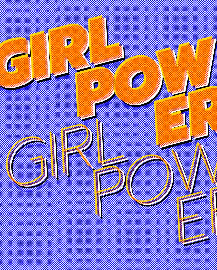
For this tutorial we will design a typographic poster using the Color Halftone filter to achieve a Roy Lichtenstein art style look.
Get inspired and check out poster and flyer design templates over on GraphicRiver.
You will also need to download and install the following font file and image:
Install the font on your system and you are ready to get started!
In Photoshop, go to File > New. Name the document Girl Power. Set the Width to 1275 px and Height to 1650 px. I will change the measurements of Width and Height to Inches. Set the Resolution to 72 Pixels/Inch. To start, we will set the Color Mode to Grayscale and change it later on. Click OK. Later on, we will need to change the mode to Duotone, and the only way to do this is by starting with a Grayscale mode file.

Press Command-R to activate the rulers on the document. As I mentioned in the step above, I am using inches for this project. If you wish to change to other units, go to Photoshop > Preferences > Units & Rulers. A Preferences window will pop up, and you will be able to change to the desired system.

Click on the Rulers and drag onto the page to create a guide. Hold Shift to drag to an even number. In this case, let’s create a 1 inch margin all around our document. Hide or display the guides by pressing Command-;.

In order to be able to create a screen or halftone effect, we need to start with a grayscale file and turn it into Monotone. A halftone effect only works on gradients if you are using CMYK or RGB. We are looking for an even pattern, and this can only be achieved by converting our file mode from Grayscale to Monotone. Head over to Image > Mode > Duotone.

The Duotone Options window will pop up. Under Type, select Monotone. For Ink 1, click on the second square and use the color black or the code #000000. Click OK.

Using the Paint Bucket Tool (G), color the page with the following color code: #a2a2a2.

Head over to Filter > Pixelate > Color Halftone.

The Color Halftone window will pop up. Use the settings from the image below and click OK.

We want to create a denser look and have the dots be white. On the Layers panel, duplicate the Background layer by pressing Command-J. Let’s invert the pattern by pressing Command-I. The layer should change from left to right like the image below.

In order to be able to work in color, we have to change the mode again to RGB. Go to Image > Mode > RGB Color.

Create a new layer by pressing Shift-Command-N, and name it Blue background. Using the Paint Bucket Tool (G), select a blue foreground color (#0000ff), and paint over the new layer.

To be able to see the halftone texture we created on Layer 1, we need to set the Blending Mode of the blue background layer to Screen on the Layers panel.

We can alter the size of Layer 1 to create a more prominent texture. I am resizing mine by pressing Command-T. Head over to the Options bar and check that the Maintain Aspect Ratio button is activated. Set the Width and Height to 130%.

Set the foreground color to black on the Tools panel. Press T to activate the Type Tool and type Girl Power on three lines like the image below. We want to the text to cover the poster horizontally. I used separate layers for each word and activated right align text on the Options bar for the word Power. To edit the style, bring up the Character panel by going to Type > Panels > Character Panel. I am using the font Prompt Black Italic and set the Size to 360 pt. For the word Power, set the Leading to 280 pt.

On the Layers panel, select both layers by pressing Shift and clicking on each layer. We want to add movement to the poster, so we will rotate these two text layers. Press Command-T to rotate and hold Shift for an even rotation to 15 degrees. Alternatively, you can head over to the Options bar and type -15.00 in the Rotate option. Hit Enter to set the text. Place the text just within the top margin.
On this specific poster, we want the type to bleed over to create a strong aesthetic, so we will leave the sides to bleed over.

To add more texture to the text, we need to duplicate the two layers we created. Do this by selecting both layers on the Layers panel and pressing Command-J. Using the Move Tool (V), drag both of the new layers under the main text and move them to the right. To create contrast, let’s set the font style to Thin Italic on the Characters panel.

We want to add movement and a Lichtenstein effect to the poster. Let’s duplicate the text layers and set them in two other colors. First, we need to create folders containing all these layers to keep things organized. On the Layers panel, select the four text layers we created and drag them towards the folder at the bottom.

Duplicate the folder to create three more folders by pressing Command-J on the folder. Name each folder with the following color names: black, white, yellow, red.

Using the Characters panel, change the color of each folder’s text layer. Use plain black and white for the first two. For yellow, use the code #ffd200 and for red, the code #ff3d00. In order to see all the layers, we need to slightly move them around—there is no right or wrong for this part! I used the keyboard as it gives us more control compared to the mouse.

The red text is taking over our poster, so I would like to add some texture and contrast to that text layer. Let’s duplicate (Command-J) Layer 1 with the halftone and drag it into the Red folder. Open the Red folder by clicking on the arrow. We will now be working within this folder.

Select the four text layers, and Right Click > Rasterize Type. Keep the four layers selected and Right Click > Merge Layers.

Remember we are still working on the Red folder. Press Command and click on the newly merged layer thumbnail. This will outline and select the objects in this layer, i.e. our text.

Deactivate the visibility of the Power copy text layer and, while still selecting the objects, click on Layer 1 copy. Remember this is the halftone layer we duplicated. Press Shift-Command-I and use the Erase Tool (E) to brush over the poster. This will erase everything in the layer but the words we selected.

We still want to maintain the red color to make our poster stand out. On the Layers panel, activate the visibility of the Power Copy text layer and set the Blending Mode to Screen. We want this layer to be transparent, so let’s merge the two layers left under the Red folder and set the Blending Mode to Multiply.

If desired, on the Layers panel we can duplicate the black folder layer and set the blending mode to Color Burn and the Opacity to 55% to add more shadowing to the poster.

Head over to File > Save for Web (Shift-Option-Command-S). Set the quality to Maximum, or lower the quality if there are any size constraints. Under Image Size, set the width and height to the size you need. Click on Save…, add a name, and click on Save.

In this tutorial, we’ve created a poster using the famous Roy Lichtenstein style. Today we’ve learned how to:


Post pobrano z: Wakamai Fondue
Roel Nieskens released a tool that lets you upload a font file and see what’s inside, from how many characters it contains to the number of languages it supports. Here’s what you see once you upload a font, in this case Covik Sans Mono Black:

Why is this data useful? Well, I used this tool just the other day when I found a font file in a random Dropbox folder. What OpenType features does this font have? Are there any extra glyphs besides the Roman alphabet inside? Wakamai Fondue answered those questions for me in a jiffy.
Direct Link to Article — Permalink
The post Wakamai Fondue appeared first on CSS-Tricks.
Post pobrano z: Solved With CSS! Dropdown Menus
This post is the second in a series about the power of CSS.
CSS is getting increasingly powerful, and with features like CSS grid and custom properties (also known as CSS variables), we’re seeing some really creative solutions emerging. Some of those solutions focus around not only making the web prettier, but making it more accessible, and making styling accessible experiences better. I’m definitely here for it!
A common UI pattern that we see on the web are dropdown menus. They’re used to display related information in pieces, without overwhelming the user with buttons, text, and options. Somewhere that we see these a lot is inside of headers or navigation areas on websites.

Let’s see if we can make one of these menus with CSS alone. We’ll create a list of links within a nav component like so:
<nav role="navigation">
  <ul>
    <li><a href="#">One</a></li>
    <li><a href="#">Two</a></li>
    <li><a href="#">Three</a></li>
  </ul>
</nav>
Now, say we want a sub-menu dropdown on the second navigation item. We can do the same thing there and include a list of links within that list item:
<nav role="navigation">
  <ul>
    <li><a href="#">One</a></li>
    <li><a href="#">Two</a>
      <ul class="dropdown">
        <li><a href="#">Sub-1</a></li>
        <li><a href="#">Sub-2</a></li>
        <li><a href="#">Sub-3</a></li>
      </ul>
    </li>
    <li><a href="#">Three</a></li>
  </ul>
</nav>
We now have our two-tiered navigation system. In order to have the content hidden and displayed when we want it to be visible, we’ll need to apply some CSS. All style properties have been removed from the following example for clarity on interaction:
li {
 display: block;
 transition-duration: 0.5s;
}

li:hover {
  cursor: pointer;
}

ul li ul {
  visibility: hidden;
  opacity: 0;
  position: absolute;
  transition: all 0.5s ease;
  margin-top: 1rem;
  left: 0;
  display: none;
}

ul li:hover > ul,
ul li ul:hover {
  visibility: visible;
  opacity: 1;
  display: block;
}

ul li ul li {
  clear: both;
  width: 100%;
}
See the Pen Simple CSS Dropdown Menu with Hover by Una Kravets (@una) on CodePen.
Now, the submenu dropdown is hidden, but will be exposed and become visible when we hover over its correlating parent in the navigation bar. By styling ul li ul, we have access to that submenu, and by styling ul li ul li, we have access to the individual list items within it.
This is starting to look like what we want, but we’re still far from finished at this point. Web accessibility is a core part of your product’s development, and right now would be the perfect opportunity to bring this up. Adding role="navigation" is a good start, but in order for a navigation bar to be accessible, one should be able to tab through it (and focus on the proper item in a sensible order), and also have a screen reader accurately read out loud what is being focused on.
You can hover over any of the list items and clearly see what is being hovered over, but this isn’t true for tab navigation. Go ahead and try to tab through the example above. You lose track of where the focus is visually As you tab to Two in the main menu, you’ll see a focus indicator ring, but when you tab to the next item (one of its submenu items), that focus disappears.

Now, it’s important to note that theoretically you are focused on this other item, and that a screen reader would be able to parse that, reading Sub-One, but keyboard users will not be able to see what’s going on and will lose track.
The reason this happens is because, while we’re styling the hover of the parent element, as soon as we transition focus from the parent to one of the list items within that parent, we lose that styling. This makes sense from a CSS standpoint, but it’s not what we want.
Luckily, there is a new CSS pseudo class that will give us exactly what we want in this case, and it’s called :focus-within.
The :focus-within pseudo selector is a part of the CSS Selectors Level 4 Spec and tells the browser to apply a style to a parent when any of its children are in focus. So in our case, this means that we can tab to Sub-One and apply a :focus-within style along with the :hover style of the parent and see exactly where we are in the navigation dropdown. In our case it would be ul li:focus-within > ul:
ul li:hover > ul,
ul li:focus-within > ul,
ul li ul:hover {
  visibility: visible;
  opacity: 1;
  display: block;
}
See the Pen Simple CSS Dropdown Menu with Hover and :focus-within by Una Kravets (@una) on CodePen.
Sweet! It works!
Now, when we tab to the second item, our submenu pops up, and as we tab through the submenu, the visibility remains! Now, we can append our code to include :focus states alongside :hover to give keyboard users the same experience as our mouse users.

In most cases, such as on direct links, we usually can just write something like:
a:hover,
a:focus {
  ...
}
But in this case, since we’re applying hover styles based on the parent li, we can again utilize :focus-within to get the same look at feel when tabbing through. This is because we can’t actually focus on the li (unless we add a tabindex="0"). We’re actually focusing on the link (a) within it. :focus-within allows us to still apply styles to the parent li when focusing on the link (pretty darn cool!):
li:hover,
li:focus-within {
  ...
}
At this point, since we are applying a focus style, we can do something that’s typically not recommended (remove the styling of that blue outline focus ring). We can do this by:
li:focus-within a {
  outline: none;
}
The above code specifies that when we focus within list items via the link (a), do not apply an outline to the link item (a). It’s pretty safe to write it this way, because we’re exclusively styling the hover state, and with browsers that do not support :focus-within, the link will still get a focus ring. Now our menu looks like this:

:focus-within, :hover states, and customizing the focus ring to disappearSee the Pen Simple CSS Dropdown Menu with Hover and :focus-within and Focus states by Una Kravets (@una) on CodePen.
If you’re familiar with accessibility, you may have heard of ARIA labels and states. You can use these to your advantage to also create these types of dropdowns with built-in accessibility at the same time! You can find an excellent example here by Heydon Pickering. When including ARIA markup, your code would look a little more like this:
<nav role="navigation">
  <ul>
    <li><a href="#">One</a></li>
    <li><a href="#" aria-haspopup="true">Two</a>
      <ul class="dropdown" aria-label="submenu">
        <li><a href="#">Sub-1</a></li>
        <li><a href="#">Sub-2</a></li>
        <li><a href="#">Sub-3</a></li>
      </ul>
    </li>
    <li><a href="#">Three</a></li>
  </ul>
</nav>
You’re adding aria-haspopup="true" to the parent of the dropdown menu to indicate an alternative state, and including aria-label="submenu" on the actual dropdown menu itself (in this case our list with class="dropdown".
These properties themselves will give you the functionality you need to show the dropdown menu, but the downside is that they only work with JavaScript enabled.
Speaking of caveats, let’s talk about browser support. While :focus-within does have pretty good browser support, it’s important to note that Internet Explorer and Edge are not supported, so your users on those platforms will not be able to see the navigation.
This browser support data is from Caniuse, which has more detail. A number indicates that browser supports the feature at that version and up.
| Chrome | Opera | Firefox | IE | Edge | Safari |
|---|---|---|---|---|---|
| 60 | 47 | 52 | No | No | 10.1 |
| iOS Safari | Opera Mobile | Opera Mini | Android | Android Chrome | Android Firefox |
|---|---|---|---|---|---|
| 10.3 | No | No | No | 64 | 57 |
The ultimate solution here would be to use both ARIA markup and CSS :focus-within to ensure a solid dropdown experience for your users.
See the Pen Simple CSS Dropdown Menu with Hover and :focus-within and Focus states and ARIA by Una Kravets (@una) on CodePen.
If you want to be able to use this feature in the future, please upvote it on Edge User Voice! And upvote :focus-ring while you’re at it, so that we’ll be able to style that focus ring and create a beautiful interactive web experience for all 😀
:focus-within, highlighting demos like highlighted <table> rows and dropdown menus:focus-withinThe post Solved With CSS! Dropdown Menus appeared first on CSS-Tricks.