When you stop for a moment and think about it for a second, technology is amazing. Take lamps for example, all you need is to hit a button and you get some light. It’s almost too simple and maybe the reason why we spend so much electricity unnecessarily.
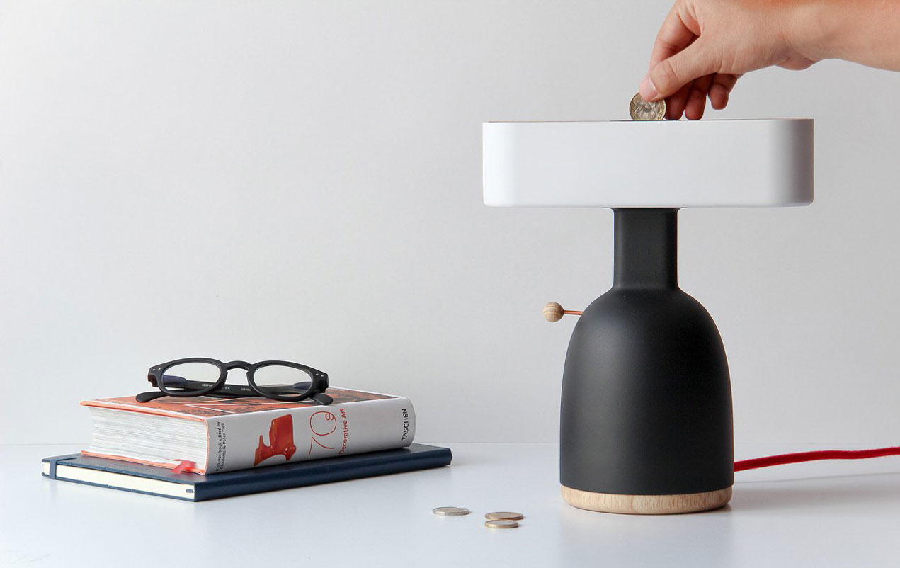
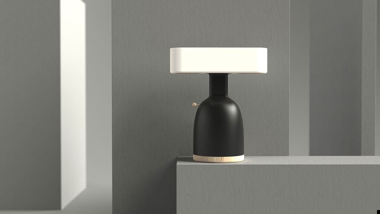
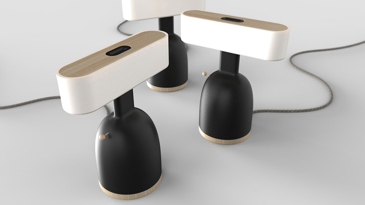
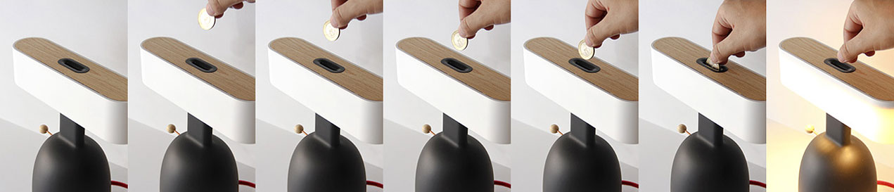
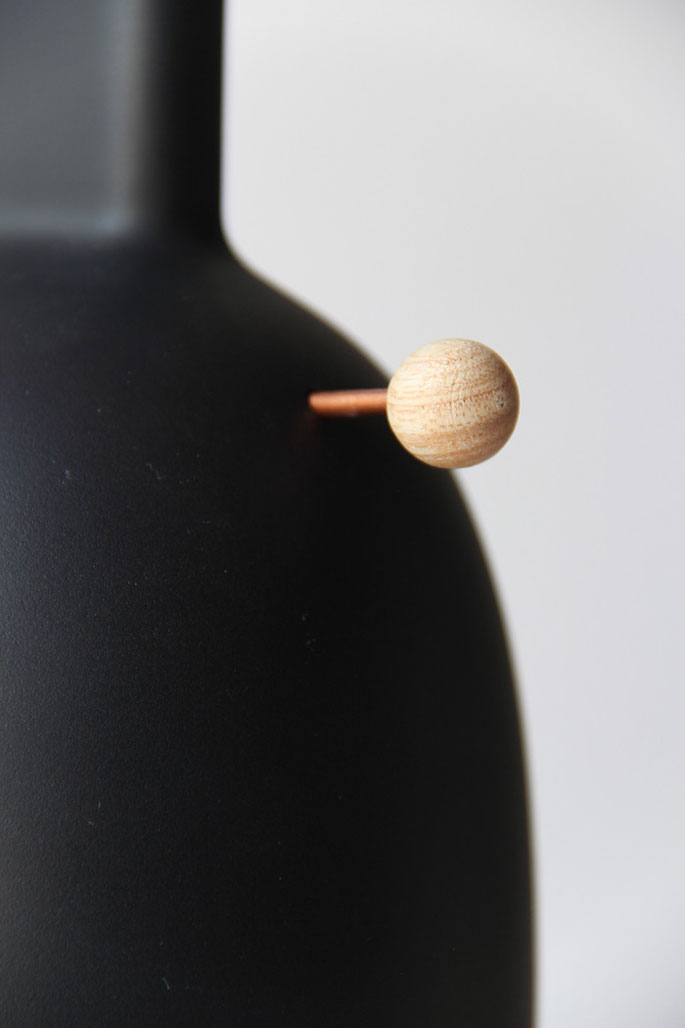
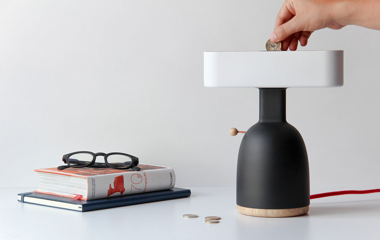
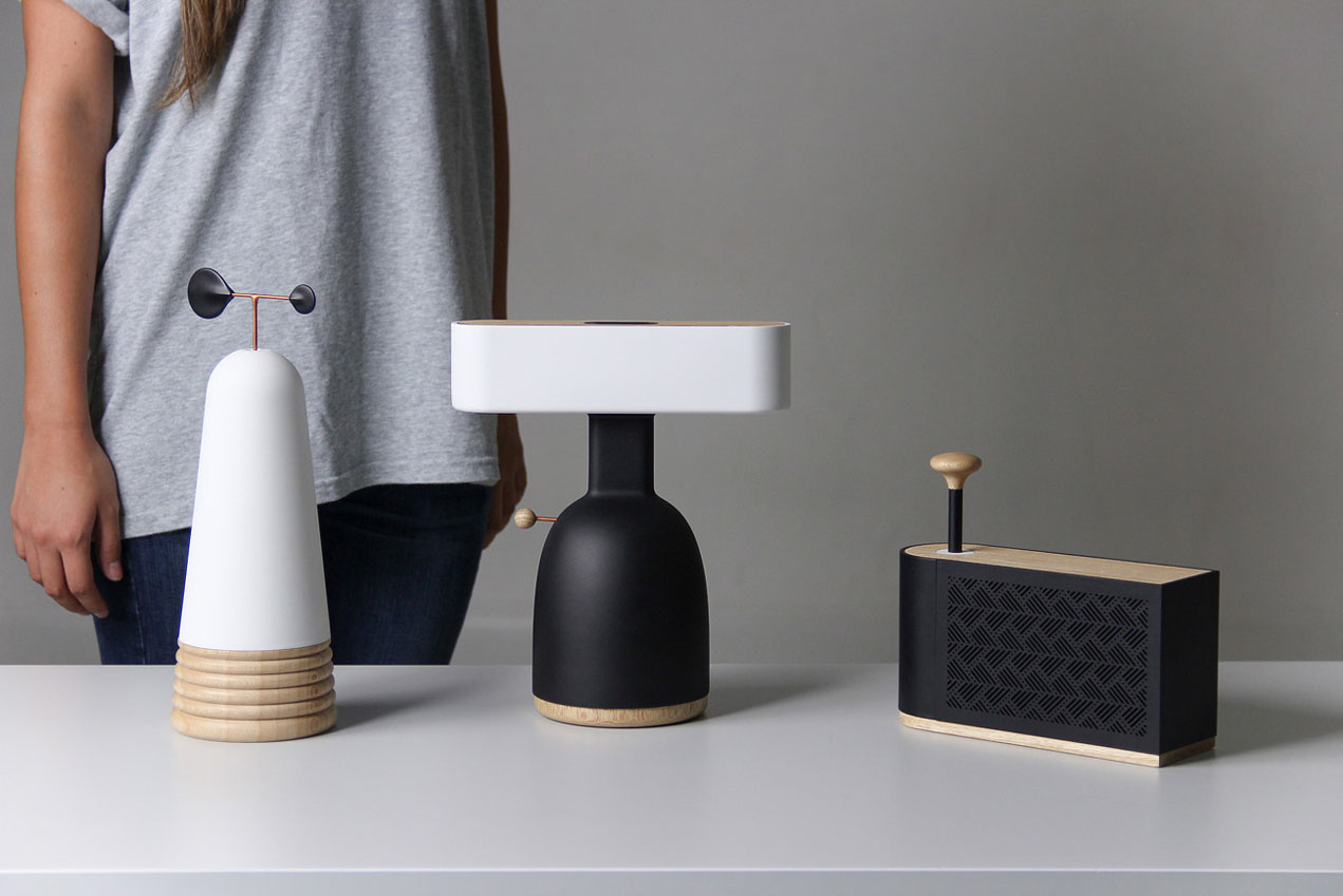
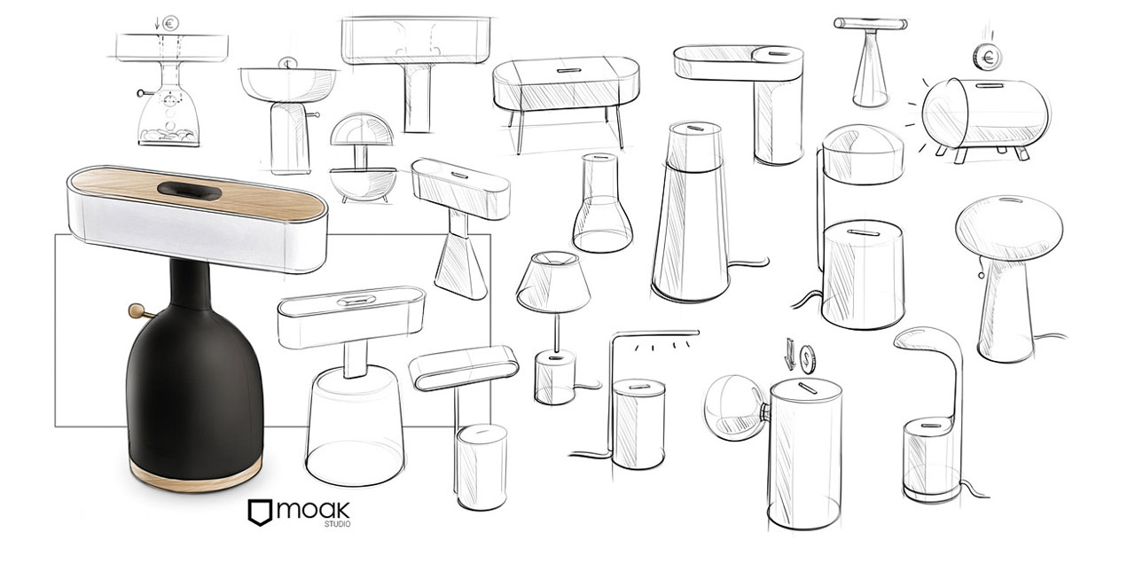
This could have been the thought process behind the creation of DINA, a lamp that requires that you insert a coin before you can use it. Although you can get your money back easily, the fact that you need to pay when using the light is a recurring reminder that cool technology comes with an energy price.
This cool modern desk lamp was designed by MOAK, a design studio from Cali in Colombia who specializes in lighting and furniture.
To make your brand stand out while advertising, you need to find the perfect elements to include in your campaigns. As you can learn from AuthorityAdviser, every marketer wants to create eye-catching advertising that can be noticed by many people, and for this they will struggle to include the most interesting information that will get viewers thinking about the message hidden in the advert. There are brilliant ways you could create inspirational messages that will improve the impact of your advertising. Here are some of the tactics you could apply that are effective.
Trick the Eye with Juxtaposed Imagery
While creating an advertising campaign, one of the things you want to take care of is presentation. Crafting a perfect message includes using tools of communication like imagery and juxtaposition to help create visualization in the minds of your audience. The good thing about this technique is that it often results in adverts that are interesting and many people will want to get more information about what the presentation is all about. It is one of the best ways to stand out and capture the attention of the audience.
Proportion
Proportion is another aspect of advertising that you can use to create impactful ads. In this case, you try to make some parts of the advertisement louder and eye-catching in a manner that no one can ignore. However, using proportion may not always offer a beautiful outcome, but the advantage is that it creates an unusual image that will trigger the attention of the audience.
Use Exaggeration
You can also apply exaggeration in some concepts while advertising. The purpose of this is to ensure the advert does not look obvious and is unique in the eyes of the viewer. Exaggeration will help you to present a message in a manner that is different and intended to help the audience understand what you are communicating more profoundly.
Edit Photos to Add Clever Effects
Don’t always give people the obvious while presenting your message through photos. You can edit them to add special effects that create a dramatic result. Such messaging sticks better in the minds of the audience and could carry more impact if shared well. You should stretch your creativity, but also be careful not to reach limits where some people will be made to feel offended by the way you craft the message.
Play with Scale
Scale helps mostly when you want to show how convenient something can be to the user. It is a form of exaggeration that will help to show the audience how the item could be useful to them. It’s a subtle formula of saying a lot with little.
Marketing is a field filled with many possibilities and you should explore all of them to bring out the results you desire for your projects. There are many tactics you could employ to make your messages more impactful including using exaggeration and proportion to illustrate what you are saying. The idea is to be different and stand out from the competition. See some ideas you could employ above.
I used to think implementing swipe gestures had to be very difficult, but I have recently found myself in a situation where I had to do it and discovered the reality is nowhere near as gloomy as I had imagined.
This article is going to take you, step by step, through the implementation with the least amount of code I could come up with. So, let’s jump right into it!
The HTML Structure
We start off with a .container that has a bunch of images inside:
We use display: flex to make sure images go alongside each other with no spaces in between. align-items: center middle aligns them vertically. We make both the images and the container take the width of the container’s parent (the body in our case).
.container {
  display: flex;
  align-items: center;
  width: 100%;

  img {
    min-width: 100%; /* needed so Firefox doesn't make img shrink to fit */
    width: 100%; /* can't take this out either as it breaks Chrome */
  }
}
The fact that both the .container and its child images have the same width makes these images spill out on the right side (as highlighted by the red outline) creating a horizontal scrollbar, but this is precisely what we want:
Given that not all the images have the same dimensions and aspect ratio, we have a bit of white space above and below some of them. So, we’re going to trim that by giving the .container an explicit height that should pretty much work for the average aspect ratio of these images and setting overflow-y to hidden:
.container {
  /* same as before */
  overflow-y: hidden;
  height: 50vw;
  max-height: 100vh;
}
The result can be seen below, with all the images trimmed to the same height and no empty spaces anymore:
The result after images are trimmed by overflow-y on the .container (see live demo).
Alright, but now we have a horizontal scrollbar on the .container itself. Well, that’s actually a good thing for the no JavaScript case.
Otherwise, we create a CSS variable --n for the number of images and we use this to make .container wide enough to hold all its image children that still have the same width as its parent (the body in this case):
Note that we keep the previous width declarations as fallbacks. The calc() values won’t change a thing until we set --n from the JavaScript after getting our .container and the number of child images it holds:
const _C = document.querySelector('.container'),
      N = _C.children.length;

_C.style.setProperty('--n', N)
Now our .container has expanded to fit all the images inside:
Next, we get rid of the horizontal scrollbar by setting overflow-x: hidden on our container’s parent (the body in our case) and we create another CSS variable that holds the index of the currently selected image (--i). We use this to properly position the .container with respect to the viewport via a translation (remember that % values inside translate() functions are relative to the dimensions of the element we have set this transform on):
body { overflow-x: hidden }

.container {
  /* same styles as before */
  transform: translate(calc(var(--i, 0)/var(--n)*-100%));
}
Changing the --i to a different integer value greater or equal to zero, but smaller than --n, brings another image into view, as illustrated by the interactive demo below (where the value of --i is controlled by a range input):
Alright, but we don’t want to use a slider to do this.
The basic idea is that we’re going to detect the direction of the motion between the "touchstart" (or "mousedown") event and the "touchend" (or "mouseup") and then update --i accordingly to move the container such that the next image (if there is one) in the desired direction moves into the viewport.
function lock(e) {};

function move(e) {};

_C.addEventListener('mousedown', lock, false);
_C.addEventListener('touchstart', lock, false);

_C.addEventListener('mouseup', move, false);
_C.addEventListener('touchend', move, false);
Note that this will only work for the mouse if we set pointer-events: none on the images.
.container {
  /* same styles as before */

  img {
    /* same styles as before */
    pointer-events: none;
  }
}
Also, Edge needs to have touch events enabled from about:flags as this option is off by default:
Enabling touch events in Edge.
Before we populate the lock() and move() functions, we unify the touch and click cases:
function unify(e) { return e.changedTouches ? e.changedTouches[0] : e };
Locking on "touchstart" (or "mousedown") means getting and storing the x coordinate into an initial coordinate variable x0:
let x0 = null;

function lock(e) { x0 = unify(e).clientX };
In order to see how to move our .container (or if we even do that because we don’t want to move further when we have reached the end), we check if we have performed the lock() action, and if we have, we read the current x coordinate, compute the difference between it and x0 and resolve what to do out of its sign and the current index:
let i = 0;

function move(e) {
  if(x0 || x0 === 0) {
    let dx = unify(e).clientX - x0, s = Math.sign(dx);

    if((i > 0 || s < 0) && (i < N - 1 || s > 0))
      _C.style.setProperty('--i', i -= s);

    x0 = null
  }
};
The result on dragging left/ right can be seen below:
Switching between images on swipe (live demo). Attempts to move to the right on the first image or left on the last one do nothing as we have no other image before or after, respectively.
The above is the expected result and the result we get in Chrome for a little bit of drag and Firefox. However, Edge navigates backward and forward when we drag left or right, which is something that Chrome also does on a bit more drag.
Edge navigating the pageview backward or forward on left or right swipe.
In order to override this, we need to add a "touchmove" event listener:
_C.addEventListener('touchmove', e => {e.preventDefault()}, false)
Sadly, there’s an Edge bug that makes any transition to a CSS variable-depending calc() translation fail. Ugh, I guess we have to forget about Edge for now.
Refining the Whole Thing
With all the cool swipe effects out there, what we have so far doesn’t quite cut it, so let’s see what improvements can be made.
Better Visual Cues While Dragging
First off, nothing happens while we drag, all the action follows the "touchend" (or "mouseup") event. So, while we drag, we have no indication of what’s going to happen next. Is there a next image to switch to in the desired direction? Or have we reached the end of the line and nothing will happen?
To take care of that, we tweak the translation amount a bit by adding a CSS variable --tx that’s originally 0px:
We use two more event listeners: one for "touchmove" and another for "mousemove". Note that we were already preventing backward and forward navigation in Chrome using the "touchmove" listener:
Now let’s populate the drag() function! If we have performed the lock() action, we read the current x coordinate, compute the difference dx between this coordinate and the initial one x0 and set --tx to this value (which is a pixel value).
We also need to make sure to reset --tx to 0px at the end and remove the transition for the duration of the drag. In order to make this easier, we move the transition declaration on a .smooth class:
.smooth { transition: transform .5s ease-out; }
In the lock() function, we remove this class from the .container (we’ll add it again at the end on "touchend" and "mouseup") and also set a locked boolean variable, so we don’t have to keep performing the x0 || x0 === 0 check. We then use the locked variable for the checks instead:
let locked = false;

function lock(e) {
  x0 = unify(e).clientX;
  _C.classList.toggle('smooth', !(locked = true))
};

function drag(e) {
  e.preventDefault();
  if(locked) { /* same as before */ }
};

function move(e) {
  if(locked) {
    let dx = unify(e).clientX - x0, s = Math.sign(dx);

    if((i > 0 || s < 0) && (i < N - 1 || s > 0))
    _C.style.setProperty('--i', i -= s);
    _C.style.setProperty('--tx', '0px');
    _C.classList.toggle('smooth', !(locked = false));
    x0 = null
  }
};
The result can be seen below. While we’re still dragging, we now have a visual indication of what’s going to happen next:
Swipe with visual cues while dragging (live demo).
Fix the transition-duration
At this point, we’re always using the same transition-duration no matter how much of an image’s width we still have to translate after the drag. We can fix that in a pretty straightforward manner by introducing a factor f, which we also set as a CSS variable to help us compute the actual animation duration:
Let’s say that we don’t want to move on to the next image if we only drag a little bit below a certain threshold. Because now, a 1px difference during the drag means we advance to the next image and that feels a bit unnatural.
To fix this, we set a threshold at let’s say 20% of an image’s width:
function move(e) {
  if(locked) {
    let dx = unify(e).clientX - x0, s = Math.sign(dx),
        f = +(s*dx/w).toFixed(2);

    if((i > 0 || s < 0) && (i < N - 1 || s > 0) && f > .2) {
      /* same as before */
    }

    /* same as before */
  }
};
The result can be seen below:
We only advance to the next image if we drag enough (live demo).
Maybe Add a Bounce?
This is something that I’m not sure was a good idea, but I was itching to try anyway: change the timing function so that we introduce a bounce. After a bit of dragging the handles on cubic-bezier.com, I came up with a result that seemed promising:
What our chosen cubic Bézier timing function looks like compared to a plain ease-out.
Using a custom CSS timing function to introduce a bounce (live demo).
How About the JavaScript Way, Then?
We could achieve a better degree of control over more natural-feeling and more complex bounces by taking the JavaScript route for the transition. This would also give us Edge support.
We start by getting rid of the transition and the --tx and --f CSS variables. This reduces our transform to what it was initially:
The above code also means --i won’t necessarily be an integer anymore. While it remains an integer while we have a single image fully into view, that’s not the case anymore while we drag or during the motion after triggering the "touchend" or "mouseup" events.
For example, while we have the first image fully in view, --i is 0. While we have the second one fully in view, --i is 1. When we’re midway between the first and the second, --i is .5. When we have a quarter of the first one and three quarters of the second one in view, --i is .75.
We then update the JavaScript to replace the code parts where we were updating these CSS variables. First, we take care of the lock() function, where we ditch toggling the .smooth class and of the drag() function, where we replace updating the --tx variable we’ve ditched with updating --i, which, as mentioned before, doesn’t need to be an integer anymore:
function lock(e) {
  x0 = unify(e).clientX;
  locked = true
};

function drag(e) {
  e.preventDefault();

  if(locked) {
    let dx = unify(e).clientX - x0,
      f = +(dx/w).toFixed(2);

    _C.style.setProperty('--i', i - f)
  }
};
Before we also update the move() function, we introduce two new variables, ini and fin. These represent the initial value we set --i to at the beginning of the animation and the final value we set the same variable to at the end of the animation. We also create an animation function ani():
let ini, fin;

function ani() {};

function move(e) {
  if(locked) {
    let dx = unify(e).clientX - x0,
        s = Math.sign(dx),
        f = +(s*dx/w).toFixed(2);

    ini = i - s*f;

    if((i > 0 || s < 0) && (i < N - 1 || s > 0) && f > .2) {
      i -= s;
      f = 1 - f
    }

    fin = i;
    ani();
    x0 = null;
    locked = false;
  }
};
This is not too different from the code we had before. What has changed is that we’re not setting any CSS variables in this function anymore but instead set the ini and the fin JavaScript variables and call the animation ani() function.
ini is the initial value we set --i to at the beginning of the animation that the "touchend"/ "mouseup" event triggers. This is given by the current position we have when one of these two events fires.
fin is the final value we set --i to at the end of the same animation. This is always an integer value because we always end with one image fully into sight, so fin and --i are the index of that image. This is the next image in the desired direction if we dragged enough (f > .2) and if there is a next image in the desired direction ((i > 0 || s < 0) && (i < N - 1 || s > 0)). In this case, we also update the JavaScript variable storing the current image index (i) and the relative distance to it (f). Otherwise, it’s the same image, so i and f don’t need to get updated.
Now, let’s move on to the ani() function. We start with a simplified linear version that leaves out a change of direction.
const NF = 30;

let rID = null;

function stopAni() {
  cancelAnimationFrame(rID);
  rID = null
};

function ani(cf = 0) {
  _C.style.setProperty('--i', ini + (fin - ini)*cf/NF);

  if(cf === NF) {
    stopAni();
    return
  }

  rID = requestAnimationFrame(ani.bind(this, ++cf))
};
The main idea here is that the transition between the initial value ini and the final one fin happens over a total number of frames NF. Every time we call the ani() function, we compute the progress as the ratio between the current frame index cf and the total number of frames NF. This is always a number between 0 and 1 (or you can take it as a percentage, going from 0% to 100%). We then use this progress value to get the current value of --i and set it in the style attribute of our container _C. If we got to the final state (the current frame index cf equals the total number of frames NF, we exit the animation loop). Otherwise, we just increment the current frame index cf and call ani() again.
At this point, we have a working demo with a linear JavaScript transition:
Version with linear JavaScript transition (live demo).
However, this has the problem we initially had in the CSS case: no matter the distance, we have to have to smoothly translate our element over on release ("touchend" / "mouseup") and the duration is always the same because we always animate over the same number of frames NF.
Let’s fix that!
In order to do so, we introduce another variable anf where we store the actual number of frames we use and whose value we compute in the move() function, before calling the animation function ani():
function move(e) {
  if(locked) {
    let dx = unify(e).clientX - x0,
      s = Math.sign(dx),
      f = +(s*dx/w).toFixed(2);

    /* same as before */

    anf = Math.round(f*NF);
    ani();

    /* same as before */
  }
};
We also need to replace NF with anf in the animation function ani():
function ani(cf = 0) {
  _C.style.setProperty('--i', ini + (fin - ini)*cf/anf);

  if(cf === anf) { /* same as before */ }

  /* same as before */
};
With this, we have fixed the timing issue!
Version with linear JavaScript transition at constant speed (live demo).
Alright, but a linear timing function isn’t too exciting.
We could try the JavaScript equivalents of CSS timing functions such as ease-in, ease-out or ease-in-out and see how they compare. I’ve already explained in a lot of detail how to get these in the previously linked article, so I’m not going to go through that again and just drop the object with all of them into the code:
The k value is the progress, which is the ratio between the current frame index cf and the actual number of frames the transition happens over anf. This means we modify the ani() function a bit if we want to use the ease-out option for example:
function ani(cf = 0) {
  _C.style.setProperty('--i', ini + (fin - ini)*TFN['ease-out'](cf/anf));

  /* same as before */
};
Version with ease-out JavaScript transition (live demo).
We could also make things more interesting by using the kind of bouncing timing function that CSS cannot give us. For example, something like the one illustrated by the demo below (click to trigger a transition):
The graphic for this would be somewhat similar to that of the easeOutBounce timing function from easings.net.
Graphical representation of the timing function.
The process for getting this kind of timing function is similar to that for getting the JavaScript version of the CSS ease-in-out (again, described in the previously linked article on emulating CSS timing functions with JavaScript).
We start with the cosine function on the [0, 90°] interval (or [0, π/2] in radians) for no bounce, [0, 270°] ([0, 3·π/2]) for 1 bounce, [0, 450°] ([0, 5·π/2]) for 2 bounces and so on… in general it’s the [0, (n + ½)·180°] interval ([0, (n + ½)·π]) for n bounces.
The input of this cos(k) function is in the [0, 450°] interval, while its output is in the [-1, 1] interval. But what we want is a function whose domain is the [0, 1] interval and whose codomain is also the [0, 1] interval.
We can restrict the codomain to the [0, 1] interval by only taking the absolute value |cos(k)|:
While we got the interval we wanted for the codomain, we want the value of this function at 0 to be 0 and its value at the other end of the interval to be 1. Currently, it’s the other way around, but we can fix this if we change our function to 1 - |cos(k)|:
Now we can move on to restricting the domain from the [0, (n + ½)·180°] interval to the [0, 1] interval. In order to do this, we change our function to be 1 - |cos(k·(n + ½)·180°)|:
This gives us both the desired domain and codomain, but we still have some problems.
First of all, all our bounces have the same height, but we want their height to decrease as k increases from 0 to 1. Our fix in this case is to multiply the cosine with 1 - k (or with a power of 1 - k for a non-linear decrease in amplitude). The interactive demo below shows how this amplitude changes for various exponents a and how this influences the function we have so far:
Secondly, all the bounces take the same amount of time, even though their amplitudes keep decreasing. The first idea here is to use a power of k inside the cosine function instead of just k. This manages to make things weird as the cosine doesn’t hit 0 at equal intervals anymore, meaning we don’t always get that f(1) = 1 anymore which is what we’d always need from a timing function we’re actually going to use. However, for something like a = 2.75, n = 3 and b = 1.5, we get a result that looks satisfying, so we’ll leave it at that, even though it could be tweaked for better control:
The timing function we want to try.
This is the function we try out in the JavaScript if we want some bouncing to happen.
const TFN = {
  /* the other function we had before */
  'bounce-out': function(k, n = 3, a = 2.75, b = 1.5) {
    return 1 - Math.pow(1 - k, a)*Math.abs(Math.cos(Math.pow(k, b)*(n + .5)*Math.PI))
  }
};
Hmm, seems a bit too extreme in practice:
Version with a bouncing JavaScript transition (live demo).
Maybe we could make n depend on the amount of translation we still need to perform from the moment of the release. We make it into a variable which we then set in the move() function before calling the animation function ani():
const TFN = {
  /* the other function we had before */
  'bounce-out': function(k, a = 2.75, b = 1.5) {
    return 1 - Math.pow(1 - k, a)*Math.abs(Math.cos(Math.pow(k, b)*(n + .5)*Math.PI))
  }
};

var n;

function move(e) {
  if(locked) {
    let dx = unify(e).clientX - x0,
      s = Math.sign(dx),
      f = +(s*dx/w).toFixed(2);

    /* same as before */

    n = 2 + Math.round(f)
    ani();
    /* same as before */
  }
};
This gives us our final result:
Version with the final bouncing JavaScript transition (live demo).
There’s definitely still room for improvement, but I don’t have a feel for what makes a good animation, so I’ll just leave it at that. As it is, this is now functional cross-browser (without have any of the Edge issues that the version using a CSS transition has) and pretty flexible.
List rendering is one of the most commonly used practices in front-end web development. Dynamic list rendering is often used to present a series of similarly grouped information in a concise and friendly format to the user. In almost every web application we use, we can see lists of content in numerous areas of the app.
In this article we’ll gather an understanding of Vue’s v-for directive in generating dynamic lists, as well as go through some examples of why the key attribute should be used when doing so.
Since we’ll be explaining things thoroughly as we start to write code, this article assumes you’ll have no or very little knowledge with Vue (and/or other JavaScript frameworks).
Case Study: Twitter
We’re going to use Twitter as the case study for this article.
When logged in and in the main index route of Twitter we’re presented with a view similar to this:
On the homepage, we’ve become accustomed to seeing a list of trends, a list of tweets, a list of potential followers, etc. The content displayed in these lists depends on a multitude of factors—our Twitter history, who we follow, our likes, etc. As a result, we can say all this data is dynamic.
Though this data is dynamically obtained, the way this data is shown remains the same. This is in part due to using reusable web components.
For example; we can see the list of tweets as a list of single tweet-component items. We can think of tweet-component as a shell that takes data of sorts, such as the username, handle, tweet and avatar, among other pieces, and that simply displays those pieces in a consistent markup.
Let’s say we wanted to render a list of components (e.g. a list of tweet-component items) based on a large data source obtained from a server. In Vue, the first thing that should come to mind to accomplish this is the v-for directive.
The v-for directive
The v-for directive is used to render a list of items based on a data source. The directive can be used on a template element and requires a specific syntax along the lines of:
Let’s see an example of this in practice. First, we’ll assume we’ve already obtained a collection of tweet data:
const tweets = [
  {
    id: 1,
    name: 'James',
    handle: '@jokerjames',
    img: 'https://semantic-ui.com/images/avatar2/large/matthew.png',
    tweet: "If you don't succeed, dust yourself off and try again.",
    likes: 10,
  },
  {
    id: 2,
    name: 'Fatima',
    handle: '@fantasticfatima',
    img: 'https://semantic-ui.com/images/avatar2/large/molly.png',
    tweet: 'Better late than never but never late is better.',
    likes: 12,
  },
  {
    id: 3,
    name: 'Xin',
    handle: '@xeroxin',
    img: 'https://semantic-ui.com/images/avatar2/large/elyse.png',
    tweet: 'Beauty in the struggle, ugliness in the success.',
    likes: 18,
  }
]
tweets is a collection of tweet objects with each tweet containing details of that particular tweet—a unique identifier, the name/handle of the account, tweet message, etc. Let’s now attempt to use the v-for directive to render a list of tweet components based on this data.
First and foremost, we’ll create the Vue instance—the heart of the Vue application. We’ll mount/attach our instance to a DOM element of id app and assign the tweets collection as part of the instance’s data object.
new Vue({
  el: '#app',
  data: {
    tweets
  }
});
We’ll now go ahead and create a tweet-component that our v-for directive will use to render a list. We’ll use the global Vue.component constructor to create a component named tweet-component:
The tweet-component expects a tweet object prop as seen in the prop validation requirement (props: {tweet: Object}). If the component is rendered with a tweet prop that is not an object, Vue will emit warnings.
We’re binding the properties of the tweet object prop on to the component template with the help of the Mustache syntax: {{ }}.
The component markup adapts Bulma’s Box element as it represents a good resemblance to a tweet.
In the HTML template, we’ll need to create the markup where our Vue app will be mounted (i.e. the element with the id of app). Within this markup, we’ll use the v-for directive to render a list of tweets. Since tweets is the data collection we’ll be iterating over, tweet will be an appropriate alias to use in the directive. In each rendered tweet-component, we’ll also pass in the iterated tweet object as props for it to be accessed in the component.
Regardless of how many more tweet objects would be introduced to the collection; or how they’ll change over time—our set up will always render all the tweets in the collection in the same markup we expect.
With the help of some custom CSS, our app will look something like this:
Though everything works as expected, we may be prompted with a Vue tip in our browser console:
[Vue tip]: <tweet-component v-for="tweet in tweets">: component lists rendered with v-for should have explicit keys...
You may not be able to see the warning in the browser console when running the code through CodePen.
Why is Vue telling us to specify explicit keys in our list when everything works as expected?
key
It’s common practice to specify a key attribute for every iterated element within a rendered v-for list. This is because Vue uses the key attribute to create unique bindings for each node’s identity.
Let’s explain this some more—if there were any dynamic UI changes to our list (e.g. order of list items gets shuffled), Vue will opt towards changing data within each element instead of moving the DOM elements accordingly. This won’t be an issue in most cases. However, in certain instances where our v-for list depends on DOM state and/or child component state, this can cause some unintended behavior.
Let’s see an example of this. What if our simple tweet component now contained an input field that will allow the user to directly respond to the tweet message? We’ll ignore how this response could be submitted and simply address the new input field itself:
We’ll include this new input field on to the template of tweet-component:
We’ve attached a click event listener on the button element to call a shuffle method when triggered. In our Vue instance; we’ll create the shuffle method responsible in randomly shuffling the tweets collection in the instance. We’ll use lodash’s _shuffle method to achieve this:
However, if we type some information in the input of each component then click shuffle; we’ll notice something peculiar happening:
Since we haven’t opted to using the key attribute, Vue has not created unique bindings to each tweet node. As a result, when we’re aiming to reorder the tweets, Vue takes the more performant saving approach to simply change (or patch) data in each element. Since the temporary DOM state (i.e. the inputted text) remains in place, we experience this unintended mismatch.
Here’s a diagram that shows us the data that gets patched on to each element and the DOM state that remains in place:
To avoid this; we’ll have to assign a unique key to every tweet-component rendered in the list. We’ll use the id of a tweet to be the unique identifier since we should safely say a tweet’s id shouldn’t be equal to that of another. Because we’re using dynamic values, we’ll use the v-bind directive to bind our key to the tweet.id:
Now, Vue recognizes each tweet’s node’s identity; and thus will reorder the components when we intend on shuffling the list.
Since each tweet component is now being moved accordingly, we can take this a step further and use Vue’s transition-group to show how the elements are being reordered.
To do this, we’ll add the transition-group element as a wrapper to the v-for list. We’ll specify a transition name of tweets and declare that the transition group should be rendered as a div element.
Based on the name of the transition, Vue will automatically recognize if any CSS transitions/animations have been specified. Since we aim to invoke a transition for the movement of items in the list; Vue will look for a specified CSS transition along the lines of tweets-move (where tweets is the name given to our transition group). As a result, we’ll manually introduce a .tweets-move class that has a specified type and time of transition:
#app .tweets-move {
  transition: transform 1s;
}
This is a very brief look into applying list transitions. Be sure to check out the Vue docs for detailed information on all the different types of transitions that can be applied!
Our tweet-component elements will now transition appropriately between locations when a shuffle is invoked. Give it a try! Type some information in the input fields and click “Shuffle!” a few times.
Pretty cool, right? Without the key attribute, the transition-group element can’t be used to create list transitions since the elements are patched in place instead of being reordered.
Should the key attribute always be used? It’s recommended. The Vue docs specify that the key attribute should only be omitted if:
We intentionally want the default manner of patching elements in place for performance reasons.
The DOM content is simple enough.
Conclusion
And there we have it! Hopefully this short article portrayed how useful the v-for directive is as well as provided a little more context to why the key attribute is often used. Let me know if you may have any questions/thoughts whatsoever!
If you liked my style of writing and are potentially interested in learning how to build apps with Vue.js, you may like the book Fullstack Vue: The Complete Guide to Vue.js that I helped publish! The book covers numerous facets of Vue including but not restricted to routing, simple state management, form handling, Vuex, server persistence, and testing. If you’re interested, you can get more information from our website, https://fullstack.io/vue.
Jeremy Keith has written a new book all about service workers and offline functionality that releases at the end of the month. The first chapter is posted on A List Apart. Now that the latest versions of iOS and macOS Safari support service workers, I can’t think of a better time to learn about how progressive web apps work under the hood. In fact, here’s an example of a simple offline site and a short series on making web apps work offline.
News of Jeremy’s book had me going back through his previous book, Resilient Web Design, where I half-remembered this super interesting quote from Chapter 4:
If you build something using web technologies, and someone visits with a web browser, you can’t be sure how many of the web technologies will be supported. It probably won’t be 100%. But it’s also unlikely to be 0%. Some people will visit with iOS devices. Others will visit with Android devices. Some people will get 80% or 90% of what you’ve designed. Others will get just 20%, 30%, or 50%. The web isn’t a platform. It’s a continuum.
I love this idea of the web as a continuum that’s constantly improving and growing over time and so I’m sure Jeremy’s latest book will be just as fun and interesting.
In this tutorial, I will teach you how to create an African celebratory pattern in Adobe Illustrator. To bring this pattern to life, we’ll create different elements that represent African culture such as sacred African symbols, shapes, and silhouettes, and then we’ll combine all the elements to create a seamless pattern. Excited? Let’s get started then!
1. How to Set Up the Canvas
Create a new 600 px by 600 px document in Illustrator with the given settings:
2. How to Create the Triangles
Step 1
We’ll start by forming the first element of our pattern: triangles. First, select the Polygon Tool, and thenclick once on the canvas and change the radius to 50 px and the Sides to 3.
Step 2
Next, change the fill color to teal #14aaa3.
Step 3
Now that we have changed the color of the first triangle, we want to duplicate the triangle and rotate it. Activate the Selection Tool (V), and then select the shape and hold down Alt on the keyboard, and drag the shape while pressing Shift. Next, press Control-D seven times to create more triangles.
Step 4
Now that we have our triangles, we want to group them and change the rotation. Activate the Selection Tool (V), select all the triangles, and press Control-G to group them.Next, select the grouped elements, Right-click, select Transform, and then Rotate. Change the angle to 180.
Step 5
Now, we want to center the shapes. Select the elements, and then press Shift-F7 to bring out the Align panel and click on Horizontal Align Center. Make sure to select Align to Artboard in the Align adjustment panel.
Step 6
Next, we want to add another layer of triangles on top. Activate the Selection Tool (V), and thenselect the triangles, hold down Alt, and drag the shape slightly on top while pressing Shift. Fill it in yellow #edb71e.
3. How to Create the Circles and the African Symbol
Step 1
Create a new layer and name it medium circles. Then, activate the Ellipse Tool (L), fill it with red #e22227, and click on the canvas. Change the Width and Height to 20 px.
Step 2
Next, place the circle between the first two triangles. Activate the Selection Tool (V), select the circle, hold down Alt, and drag the shape down while pressing Shift as shown below.
Step 3
Now, we want to duplicate the circles between each triangle. Activate the Selection Tool (V), select the circles, and press Control-G to group them. Then, hold down Alt and drag the shapes into the spaces while pressing Shift as shown below.
Step 4
Before creating the African love symbol, we want to separate each part with thin rectangles. Activate the Rectangle Tool (M), fill it in red #e22227, and then click on the canvas and change the Width to 600 px and Height to 5.3333 px as shown below.
Step 5
Next, activate the Selection Tool (V) and place the shape under the triangles. Then duplicate the shape by pressing Alt on the keyboard, and drag the shape as shown below.
Step 6
Now we want to create the African love symbol. Create a new layer and name it Love symbol. Then, activate the Pen Tool (P) and start by drawing half of the shape as shown below.
Step 7
Then duplicate the shape by pressing Alt on the keyboard, and drag the shape as shown below.
Step 8
Now, we want to reflect the shape. Select the duplicated shape, Right-Click, and select Transform>Reflect.
Step 9
Now that we have reflected the shape, we want to finish the symbol. Activate the Pen Tool (P), click on the bottom right anchor point, and draw the shape as shown below.
Step 10
Next, select the Pen Tool (P), and click on the top left anchor point to finish the left wing as shown below.
Step 11
Now that we have finished drawing the symbol, we want to change the color. Fill it in a light yellow #fcde62. Next, activate the Selection Tool (V) and make the shape smaller, pressing Shift while resizing. Then, select the symbol and place it as shown below.
Next, we want to duplicate the shape. Select the symbol and hold down Alt on the keyboard, and drag the shape while pressing Shift. Next, press Control-D until the space is filled.
4. How to Create the Woman Silhouette
Step 1
Create a new layer and name it woman. Then, activate the Ellipse Tool (L) and fill it in cream #f4eabc, and click on the canvas. Change the Width and Height to 15 px.
Step 2
Then, select the Pen Tool (P) and start drawing the body as shown below. Start from the circle to the left arm and keep moving.
Step 3
Now that we have finished drawing the silhouette, activate the Selection Tool (V) and place the shape under the rectangle shape. Next, we want to duplicate the shape. Select the silhouette, hold down Alt on the keyboard, and drag the shape while pressing Shift.
Step 4
Next, we want to fill the space with more silhouettes. Press Control-D until the space is filled as shown below.
5. How to Create the Man Silhouette
Step 1
Before drawing the man silhouette, we want to break the designs with more lines and circles in between. First, drag one of the previous red rectangles, hold down Alt on the keyboard, and drag the shape while pressing Shift. Duplicate the shape twice, as shown below.
Step 2
Next, we want to fill the space between the two lines with small circles. Activate the Ellipse Tool (L), fill it in yellow #ecb71e, and click on the canvas. Change the Width and Height to 9 px.
Step 3
Now, use the Selection Tool (V) to place the circle between the two shapes, and duplicate the circle once. Press Alt on the keyboard and drag the shape while pressing Shift.Duplicate the circle as shown below.
Step 4
Next, we want to fill the space with more circles. Press Control-D until the space is filled as shown below.
Step 5
Now that we have broken down our pattern a little bit, we want to draw the man silhouette. Activate the Pen Tool (P) and draw the silhouette as shown below.
Step 6
Next, we want to draw another shape between the arms and the trumpet. Activate the Pen Tool (P) and draw the shape as shown below.
Step 7
Now that we’ve finished drawing the silhouette, we want to change the color and duplicate the silhouette to fill the space. Select the silhouette and fill it in cream #f4eabc. Then, select the shape between the arms and fill it in green #10755b. Next, select both shapes and press Control-G to group them. Then, press Alt on the keyboard, drag the shape while pressing Shift, and pressControl-D until the space is filled as shown below.
6. How to Create the Waves, Triangles, and Background
Step 1
First, we want to break down the pattern a little bit. Activate the Rectangle Tool (M), fill it with cream #f4eabc, and draw a thin rectangle under the silhouette as shown below.
Step 2
Now, we want to draw the waves. Choose the Pen Tool (P), fill it with blue #17aaa3, and then place each wave between the silhouettes as shown below.
Step 3
Next, we want to duplicate the triangles and circles from the top to the bottom. Select the triangles and circles and press Control-G to group them. Then, press Alt on the keyboard and drag the shapes under the rectangle as shown below. Hold Shift while duplicating. Next, select the duplicated elements, Right-Click, Transform>Rotate.
Step 4
Now that we have finished drawing all objects, we want to add our background. Create a new layer and name it background. Place this layer under all layers. Then, activate the Rectangle Tool (M) and fill it in green #10755b. Next, drag the rectangle all over the canvas as shown below.
7. How to Make the Pattern Seamless
Step 1
Now, we want to readjust the design to be able to make it seamless. All elements except the lines have to be inside the artboard. Activate the Selection Tool (V), select all the objects that are hanging on the sides, and resize them as shown below.
Step 2
Now that we have adjusted everything, we want to make a clipping mask to remove any objects hanging around the artboard. Activate the Rectangle Tool (M), fill it with white #ffffff, and click on the canvas. Change the Width and Height to 600 px. Then, select all elements, including the background, and Right-click > Make Clipping Mask.
Step 3
Here is the fun part! We can now make it seamless. Select the artwork, and then go to Object> Pattern > Make. Change the Width and Height to 600 px.
Congratulations! Our African Celebratory Pattern Is Done!
Great job! We’ve finished creating our African celebratory pattern. I hope this tutorial brought you a joyful mood and helped you to discover some new tips and tricks which will be useful for your future artworks! Keep creating.
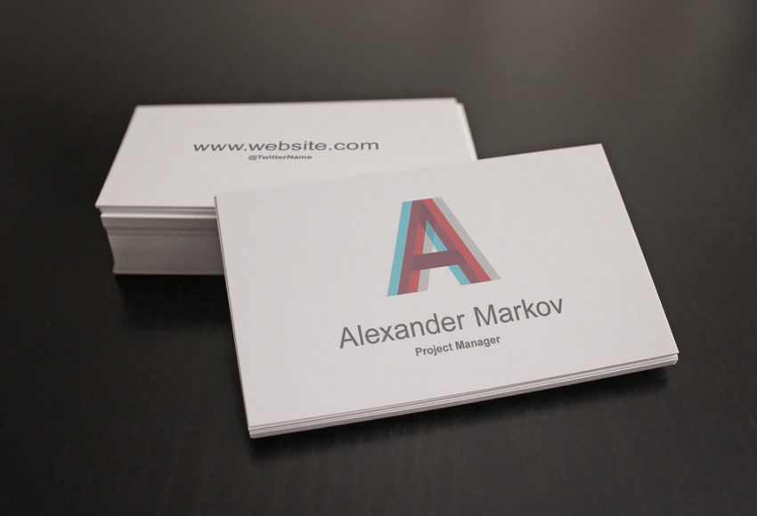
In this tutorial we’ll create an editable business card mockup using very simple photography and Photoshop techniques. You’ll be able to transform your photo into a customizable template, to showcase your design with elegance.
A mockup is an editable template that you can use to showcase a replica/model of your final product: in the graphic design field, it’s used to offer your clients a very detailed preview of what they ordered—in this case, a photo of their printed business cards.
The Workflow
These are the steps we’re going through for this tutorial:
How to Design Your Card/Flyer. Use any software you prefer; Illustrator and InDesign are recommended when designing printable graphics.
How to Photograph the Business Cards. Place blank cards or any stationery element on a surface and take photos of them.
How to Choose and Edit the Photos in Photoshop. Choose the best photos and retouch the composition.
How to Add Smart Objects to the Photographs. The card design will be added using these smart templates that automatically apply transformations and filters to a given image.
You can apply the techniques used in this tutorial when creating any type of stationery or branding mockup, so that you can show your customers a photo of the final printed result, without having to actually print it.
Not everyone has access to professional photo shooting tools, but I will show you how to achieve a professional looking mockup nonetheless. For this tutorial, you need Adobe Photoshop CS5 (or superior) and the best camera that you can access (even a good smartphone camera is surprisingly efficient).
1. How to Design Your Business Card
Step 1
When you have to design a standard business card, consider the country to which you will have to deliver it and establish with your client the dimensions before starting your work. Each country has its own most used dimensions; you can refer to this guide for more information.
You most likely want to set up your document in Illustrator or InDesign, because they’re specifically created for the printing process. However, Photoshop can prepare a print document as well.
If you like to work in Photoshop when it comes to printable graphics, you can use these useful Photoshop Actions: they automatically create documents in CMYK mode, 300DPI, with most of the standard international print sizes, including bleeds (necessary for the printing process).
Step 2
When creating a mockup, you don’t need to consider the bleeds and cut size because you can just place your design in the correct position. However, you should always design a business card in vector format, with print-ready colors, and consider the necessary bleed amount. Check out more detailed guides on how to design a business card if you want more information.
For this tutorial, we’ll use this simple design that I prepared.
2. How to Prepare the Scene and Take Photos of Blank Business Cards
When it comes to photography, there’s a great abundance of guides and books dedicated to the photo shooting process: the lighting setup, the camera setup, etc. I’m not going to pretend to give you a complete explanation of these vast topics in these few lines, but I will tell you the simple key steps that will make your photo decent, even if the setup and the lights are not ideal.
Step 1
A darker photo is always better than a brighter one. To deal with an underexposed photo is easier than an overexposed one.To retouch a darker photo is better than a darker one because in Photoshop you can restore information from darker shadow areas and reveal some of the lost details a lot more easily than you can from areas that are too bright, where sometimes all the pixels are just plain white.
Step 2
Always have one or more dominant light sources. Try to have a clear light direction in order to create an attractive defined contrast between lights and shadows that will make your design a lot more distinguishable.
If you have no distinctive light in your scene, the subject will be very dull and bland in the final photo. You can use as many lights as you want. If you think the natural available light is too strong and will burn your shot, tune down the exposure in your camera: the correct exposure is always between 0 and -1.
Step 3
Be generous with the subject’s background.Maybe this is personal, but from experience I think it’s always better that you take a photo which includes more background than you will actually need: you can crop the photos in Photoshop carefully and focus on the exposure and scene while taking the photos.
Many times it will happen that you want more „air” on your subject, and you’ll have to create parts of the background because we took the photo too close to the subject.
For this tutorial we’ll be working on this sample above: as you can see, I included more background than I would need, so that in Photoshop we have an easier time cropping the subject and a lot of space to work with. Below,you can see the actual final area used.
Step 4
Prepare the scene, being consistent with your task. Take your time positioning your elements on the surface and use your taste trying to create a composition that makes sense. Showing two sides of the card is the most obvious choice, but not mandatory.
For example, it’s not a fixed rule that the cards have to be placed with geometry (as I do in most my mockups because they look more institutional/corporate): in fact, they could be scattered on the table, or even aligned as a card castle as long as you think it’s attractive for you or your client.
Experiment, and don’t stop trying other positions, moving the elements on the surface. Take many photos from many angles, change the light direction and intensity, etc. Always guarantee yourself plenty of selections at the end of the shooting section.
3. How to Do the Photo Selection and Retouching
Step 1
Once we have finished the photography phase, transfer the photos from the camera to the computer and open Photoshop. If you prefer Lightroomto adjust lighting and contrast, that is also a very valid alternative, but you will need Photoshop to create the Smart Objects for the business card design.
Let’s continue with our sample: we’ve reached the point where we’ve decided how to crop our photo to enhance the subject. Use the Cropping Tool (C) or make a Selection with the Rectangular Marquee Tool (M) and then go to Image > Crop.
Step 2
Now let’s move on to adjusting the lighting, color, and contrast, and removing eventual spots and unwanted details. Before doing anything, we want to remove dust and spots that sometimes will be visible on the surface that we used, especially if it’s dark.
Step 3
Select the Clone Stamp Tool (S), Alt-click on a clean spot to refer to that portion of image, and then click on the spot that you want to cover. Also, the Healing Brush Tool (J) can be used efficiently. Below is the clean photo.
Step 4
To reduce the reddish tone of the photo, I applied these „Black & White” adjustment settings. To create a new Adjustment Layer, go to Layer > New Adjustment Layer > Black & White…
Step 5
I added also a soft light in the center to brighten the scene a bit. To create that soft light effect, pick a large Brush (B) with hardness set to 0%, and paint a white circle on a New Layer. Change the Blending Mode of this layer to Soft Light, and our document should look like the image below.
Step 6
Now it’s time to add the Smart Objects that will contain our card designs. First of all, we need a template the same size as the card, so we create a selection using the Rectangular Marquee Tool (M) in Fixed Ratio mode, and enter the proportions of our card, which are in this case 3.5 x 2 since the card itself is 3.5 in x 2 in.
It’s not important that this selection matches the actual size of the card design; however, it is mandatory that we use the same proportions. In this step, you have to create a selection which is as close as possible to the business card below. It depends on the photograph’s dimensions.
Step 7
Fill the selection with any color on a New Layer and name this layer Front Card. The layer in blue named Front Card will become our front card design.
Step 8
Right Click on it in the Layers panel and Convert to Smart Object.
Step 9
Set the Front Card Layer to Multiply Blending Mode so we can see what happens, and transform the layer using the Free Transform Tool (Control-T). At the corners of your layer there are anchor points indicated by small squares; while holding Control, clickon each of them to position this layer and match the card’s perspective.
Step 10
Sometimes you will also need to use the Warp Tool while transforming, because the cards bend slightly. (The Warp Tool on Smart Objects is available only from Photoshop CS5 and higher.)
Step 11
Do the same process with the card back, creating a New Smart Object (we’re using a red color this time). The fastest way to do this is to create a duplicate of that Front Card Smart Object.
So Right-Click on the Front Card Layer and choose the option New Smart Object Via Copy, which will create a new editable copy of that Smart Object.
Step 12
Enter in the newly created Smart Object (Right Click > Edit Contents) and fill this one with another color (I used red) so we can distinguish them better. Finally, name this red layer Back Card. Apply the same transformations as we did with the blue layer, trying to match the corners as precisely as possible. The document should look like this.
Step 13
In this case, for the red Back Card layer, we will also have to apply a Layer Mask because the card at the back is partially covered by the ones in front. To do so, hold Control and clickon the Front Card layer in the Layers panel; this will create the selection that we need.
Step 14
Then clickon the Back Card layer and then on the Layer Mask icon.
Step 15
We just need to Invert the Layer Mask for our task, so click Control-I on the Layer Mask.
Step 16
Make manual adjustments if needed; below you can see how it was necessary to cover a bit of the card space that didn’t match the starting selection. Using the Lasso Tool (L), we select the small parts that still need masking.
Step 17
Now we need to blend the cards smoothly into the photo. The Multiply Blending Mode and the Layer Mask already do a great job, giving the illusion that the tops of the cards are now blue and red, but there’s a detail that makes the composition still not realistic, and that is the depth of field.
To give the illusion of depth of field in certain areas, we just need to blur the edges of the Smart Objects so that they match the amount of blur in the photo below. Select the Back Card Layer (and not the Mask), go to Filter > Blur > Gaussian Blur, and choose an amount that matches the photograph below—for our photo, a value of 2/3 pixels.
Step 18
Below you can see the edges before and after the blur. Remember to work on the Smart Object so that it will register the Blur Filter as a Smart Filter and it will not modify the starting image inside of it. That’s why it’s called non-destructive, because it doesn’t actually modify the content of the Smart Object, but it works on its appearance.
As you can see on the right where the Blur has been applied, the corners and edges blend together with the photo, resulting in a more realistic effect. But not only the edges—once you apply the design on the card, it will look out of place if it’s really focused and sharp, while the area surrounding it is all blurred.
The blur amount must be consistent throughout the picture in order for the design to really blend in the photo.
Step 19
Select Back Card, Right Click on the layer, and then Edit Contents: doing so will open a new document (the Smart Object) where you can see our red layer.
Step 20
The content of the Smart Object should look like this.
Step 21
At this point, we just need to place our design into this document. Go to File > Place and select your image.
Step 22
Close the Smart Object now and Photoshop will ask you to Save. Click Yes and the Smart Object will automatically update the image, maintaining transformations and adjustments, so instead of the red color we have our design now.
Step 23
Do the same process with the Card Front Layer, and you have your beautiful, ready-to-use, customizable mockup.
Awesome! Our Mockup Is Ready to Be Used
Test this mockup with other designs: the Smart Object will do all the work for us, and we can utilize this template to preview as many as we want. They can be also used to showcase flyers and posters because the photo doesn’t give any reference to the real size of the paper sheets. So they could be any size you need, as long as the proportions of the card and your design are more or less maintained.
Before using it on the poster, we will remove the background and use the bust that is in focus. To do this, in the Layers panel, Duplicate the Background layer by pressing Command-J. Click on the eye icon to Hide the visibility of the original Background layer.
Step 3
While selecting the new layer in the Layers panel, click on the Vector Mask button to add a Layer Mask to Layer 1.
Step 4
While selecting the new Layer Mask, select the Brush Tool (B). Use black as the foreground colorand paint over the image to erase the background.
Step 5
Once we have painted over most of the image with the Brush Tool (B), we can Zoom in (Z) and work on the details.
Step 6
If needed, tap the backslash key (\) to display a red overlay on the layer mask. This is useful to check if we have erased the right parts of the image.
Step 7
Let’s go ahead and crop the image using the Crop Tool (C) and crop the bust to a manageable size.
2. How to Set Up a New Document, Create Rulers, and Duplicate Layers
Step 1
In Photoshop, go to File > New. Name the document The Future of Philosophy, and set the Width to 1275 px and Height to 1650 px. I am using this composition as an online pamphlet, so I will be using 72 dpi with Background ContentsWhite. Click OK to create the document.
Step 2
Activate the rulers by pressing Command-R. I am using inches—you can change this by going to Photoshop > Preferences > Units and Rulers.
Step 3
Click on the rulers and drag towards the page to create guidelines. I’ve set mine to 1 inch on each side. Hold Shift to drag the guideline to an even number.
Step 4
Let’s duplicate the bust layer with the layer mask onto our Future of Philosophy file. To do so, select the layer and Right Click > Duplicate Layer. Under As, change the name to Bust and select Document > The Future of Philosophy. Click OK to continue.
Step 5
Let’s make the image smaller by using the Transform Tool (Command-T). I am leaving about 1 inch on the top and the bottom as margins. You can hide the guides by pressing Command-;.
Step 6
Select the background layer and paint the layer using the Paint Bucket Tool (G) and black as the foreground colour.
3. How to Use Adjustment Layers
Step 1
The image is looking yellow in tone, so let’s manipulate it to give it a futuristic feeling. On the Layers panel,select the Bust Layer and click on Create New Fill or Adjustment Panel > Black & White. This will add a layer on top of our image without committing to turning the image itself Black and White.
Step 2
The Properties panel will open up, and we can adjust the colours that are turning black and white. The highlights are looking too burned and we are losing some definition, so let’s look for the blue colour and move the slider to the left. That looks better!
Step 3
To make it even more futuristic, let’s add a blue overlay. On the Layers panel, click on create a New Layer. Using the Bucket Tool (G), select a foreground colour of blue with the following code: #0030ff. Paint over the layer and set the Blending Mode to Overlay.
4. How to Use the Liquify Tool
Step 1
Select the Bust Layer and duplicate it by pressing Command-J. Hide the visibility of the original layer by clicking on the eye icon, and go back to the copy.
We need to keep the masked image only. If we go ahead and use the Liquify Tool, we will only see the results on the spaces the mask is revealing. While selecting the bust layer, hold Command and select the Layer Mask. This will select the spaces we didn’t hide at the beginning.
Step 2
Make sure that the bust layer is selected and not the layer mask. We want to delete the opposite of this, so let’s inverse it by pressing Shift-Command-I and Delete.
Step 3
Deselect by pressing Command-D. Delete the Layer Mask by clicking on the layer mask, Right Click > Delete Layer Mask.
Step 4
Go to Filter > Liquify (Shift-Command-X), and a new window will pop up showing the selected bust later. For this specific image, we want to create a digital glitch look.
Step 5
Let’s use the Forward Warp Tool (W). On the right side of the window, we can tweak the Tool Options. Since we want to make small glitches, we can start with a Brush Size of 150, Brush Density of 100, and Brush Pressure of 50. We can now brush over the image. Feel free to experiment with other settings! Once you are done, click OK.
Step 6
We have our image almost ready. To give a more digital look to this traditional bust, we can reinforce the brightness and contrast. At the bottom of the Layers panel,click on Create a New Fill or Adjustment Layer > Brightness/Contrast. The Properties window will pop up, and we can adjust the settings to Brightness:-15 and Contrast:70.
5. How to Add Text
Step 1
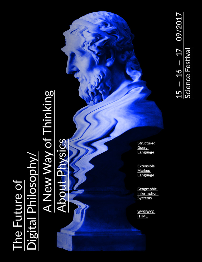
In order to create a contrast with the horizontal lines we created on the bust, we will use vertical text. Press T to add a new text layer and add other details. Set the font to Lato Regular, at 75 pt in white, and select Underline on the Character panel to add prominence to the title. I also used two text boxes for the title of the poster. In the first, type „The Future of Digital Philosophy” and in the second, „A New Way of Thinking About Physics”.
Step 2
Select both of these text boxes by clicking on one, holding Shift, and clicking on the other. Rotate by pressing Command-R and hold Shift for an even rotation. Let’s place them on the bottom left corner margin.
Step 3
You will notice that the white text is slightly conflicting with the image. Let’s add a gradient to darken the bust. On the Layers panel,select the blue layer and add a new layer.
Step 4
On the toolbar,select the Gradient Tool (G). Set your background and foreground colours as black and white. Drag from the left side of the poster to the centre to create a partial gradient. Let’s set the Blending Mode for this layer to Multiply.
Step 5
Now let’s add more details to our poster! Using the same Text Tool as before, we can add more components to bring it to life. I added dates and the kind of event at 46 pt in size, and to create balance on the poster I placed this text on the opposite side to the title. I also added bits of information parallel to the bust to reinforce the theme of the event and add another layer of detail with the same character style, but this time at 18 pt in size.
6. Saving the Poster for Web
Click File > Save As to save the file as a .PSD to later edit it. For a lower-resolution web jpeg, click File > Save for web (Shift-Option-Command-S) to save the file as a .JPEG. Here you can alter the quality of the image and the image size. Click on Save… and save the file.
Congratulations on Finishing This Tutorial!
We have covered some interesting skills for putting together a promotional piece for social media. Today, you’ve learned to:
Clean up an image using Layer Masks.
Use Adjustment Layers to tweak images endlessly.
Use the Liquify Tool to change a traditional object into a digital one.
Format typography and use it in different directions to interact with the image.
I like to jog. Sometimes it’s cold out. Sometimes it’s cold out, but it looks like it isn’t. The sun is shining, the birds are chirping. Then you step outside in shorts and a t-shirt and realize you have roughly 2 minutes before exposure sets in.
I decided to solve this first world problem using a lightbulb to display a certain color based on what the temperature outside is. It works better than I expected, and that’s saying something because usually nothing works out like I want it to.
This was a fun project to build, and since it is essentially a hosted service running on a timer, it’s a perfect use case for Serverless.
Now you might be thinking, “um, wouldn’t it be easier to just check the weather?” Well, it would, but then I wouldn’t have an excuse to buy an expensive lightbulb or write an article with the word “Serverless.”
So let’s look at how you can build your own Weather Bulb. The final code is not complicated, but it does have some interesting pieces that are worth noting. By the way, did I mention that it’s Serverless?
Building the Weather Bulb
The first thing you are going to need is the bulb. You can’t have a Weather Bulb sans bulb. Say the word “bulb” out loud about 10 times and you’ll notice what a bizarre word it is. Bulb, bulb, bulb, bulb — see? Weird.
I am using the LIFX Mini Color. It’s not *too* expensive, but more importantly, it’s got an API that is wide open.
The API has two methods of authentication. The first contains the word “OAuth” and I’m already sorry that you had to read that. Don’t worry, there is an easier way that doesn’t involve OAu…. that which won’t be named.
The second way is to register an application with LIFX. You get back a key and all you have to do is pass that key with any HTTP request. That’s what I’m using for this demo.
For instance, if we wanted to change the bulb color to blue, we can just pass color: blue to the /state endpoint.
The API supports a few different color formats, including named colors (like red, blue), hex values, RBG, Kevlin, hue brightness and saturation. This is important because it factors into what proved to be the hardest part of this project: turning temperature into color.
Representing Temperature With Color
If you’ve ever watched a weather report, you’ll be familiar with the way that meteorology represents weather conditions with color on a map.
Usually, this is done to visualize precipitation. You have probably seen that ominous green strip of storms bearing down on you on a weather map while you try to figure out if you should get in the bathtub because you’re in the path of a tornado. Or maybe that’s just all of us unlucky souls here in America’s Tornado Alley.
Color is also used to represent temperature. This is precisely what I wanted to do with the bulb. The tough thing is that there doesn’t seem to be a standardized way to do this. Some maps show it as solid colors in bands. In this case, blue might represent the band from 0℉ – 32℉.
Others have it as a gradient scale which is more precise. This is what I was after for the Weather Bulb.
My first stab at solving this was just to Google “temperature color scale” and other various iterations of that search term. I got back a lot of information about Kelvin.
Kelvin is a representation of the temperature of a color. Literally. For any light source (light bulb, the sun, ect) the actual temperature of that source will affect the color of the light it emits. A fire burns a yellowish red color. The hotter that fire gets, the more it moves towards white. Hence the saying, “white hot”. So if someone ever says “red hot,” you can correct them in front of everyone because who doesn’t love a pedantic jerk?
The LIFX bulb supports Kelvin, so you might think that this would work. After all, this is the Kelvin scale….
The problem is that there is simply not enough color variation because these are not actual colors, but rather the tinge of color that a light is emitting based on it’s “temperature.” Here is the Kelvin color wheel that comes with the LIFX app.
These colors are barely distinguishable from one another on the bulb. Not exactly what I was after.
That leaves me with trying to convert the color to either Hex, RGB or some other format. This is tough because where do you begin? I spent an embarrassing amount of time adjust RGB scale values between blue for cold (0, 0, 255) and red for hot (255, 0, 0). It was about this time that it dawned on me that maybe HSL would be a better way to go here. Why? Because hue is a whole lot easier to understand.
Hue
Hue is a representation of color on a scale between 0 and 360. This is why we often see color represented on a wheel (360°). That’s a vast oversimplification, but unless you want me to start talking about wavelengths, let’s go with that definition.
The hue color wheel looks like this….
If we flatten it out, it’s easier to reason about.
We’re ready to convert temperature to color. The first thing we need to do is figure out a set temperature range. I went with 0℉ to 100℉. We can’t work with infinite temperature color combinations. Numbers go on forever, colors do not. It can only get so hot before our bulb is just bright red all the time, and that’s 100℉. The same is true for cold.
If light blue represents 0℉, I can start at about the 200 mark on the hue scale. Red will represent 100℉. You can see that red is at both extremes, so I can move either left OR right, depending on what colors I want to use to represent the temperature. It’s not the same as the colors they use in actual weather programs, but who cares? Obviously not me.
I chose to go right because there is no pink on the left and pink is my favorite color. I also felt like pink represents warm a bit better than green. Green is rain and tornadoes.
Now we can back into a hue based on temperature. Ready? Here we go.
Let’s pretend it’s a brisk 50℉ outside.
If 100℉ is the hottest we go (360) and 0℉ is the coldest (200), then we have a color scale of 160 points. To figure out where in that 160 point range we need to be, we can divide the current temperature by the upper bound of 100℉ which will give us the exact percentage we need to move in our range, or 50%. If we move 50% of the way into a 160 point range, that leaves us at 80. Since we are starting at 200, that gives us a hue of 280.
That sounds complicated, but only because word problems in math SUCK. Here’s how the code looks when it’s all said and done…
let hue = 200 + (160 * ( temperature / 100 ));
OK! We’ve got a dynamic color scale based on hue, and wouldn’t you know it, we can just pass the hue to LIFX as simply as we pass a named color.
Now we just need to find out what the current temperature is, back into a hue and do that every few minutes. Serverless, here we come!
Serverless Timer Functions
Serverless is all the rage. It’s like HTML5 used to be: it doesn’t matter what it is, it only matters that you know the word and are not afraid to use it in a blog post.
For this example, we’ll use Azure Functions because there is support for timer triggers, and we can test those timer triggers locally before we deploy using VS Code. One of the things about Serverless that irritates me to no end is when I can’t debug it locally.
Timer Triggers in Azure Functions are specified as Cron Expressions. Don’t worry, I didn’t know what that was either.
Cron Expressions allow you to get very specific with interval definition. Cron breaks things down into second, minute, hour, day, month, year. So if you wanted to run something every second of every minute of every hour of every day of every year, your expression would look like this…
* * * * * *
If you wanted to run it every day at 10:15, it would look like this…
* 15 10 * * *
If you wanted to run it every 5 minutes (which is what Azure defaults to), you specify that by saying “when minutes is divisible by 5.”
0 */5 * * * *
For the purposes of this function, we set it to 2 minutes.
I am using a 2 minute interval because that’s how often we can call the weather API for free 💰.
Getting the Forecast From DarkSky
DarkSky has a wonderful weather API that you can call up to 1,000 times per day for free. If there are 1,440 minutes in a day (and there are), that means we can call DarkSky every 1.44 minutes per day and stay in the free zone. I just rounded up to 2 minutes because temperature doesn’t change that fast.
This is what our function looks like when we call the DarkSky API. All of my tokens, keys, latitude and longitude settings are in environment variables so they aren’t hardcoded. Those are set in the local.settings.json file. I used axios for my HTTP requests because it is a magical, magical package.
const axios = require('axios');

module.exports = function (context, myTimer) {
  // build up the DarkSky endpoint
  let endpoint = `${process.env.DS_API}/${process.env.DS_SECRET}/${process.env.LAT},
                  ${process.env.LNG}`;

  // use axios to call DarkSky for weather
  axios
    .get(endpoint)
    .then(response => {
      let temp = Math.round(response.data.currently.temperature);

      // TODO: Set the color of the LIFX bulb
    })
    .catch(err => {
      context.log(err.message);
    });
};
Now that I have the temperature, I need to call the LIFX API. And wouldn’t you know it, someone has already created an npm package to do this called lifx-http-api. This is why you love JavaScript.
Setting the Bulb Hue
After the weather result comes back, I need to use the LIFX API instance and call the setState method. This method returns a promise which means that we need to nest promises. Nesting promises can get out of hand and could land us right back in callback hell, which is what we’re trying to avoid with promises in the first place.
Instead, we’ll handle the first promise and then return Promise.all which we can handle at another top-level then. This just prevents us from nesting then statements.
Remember kids, promises are just socially acceptable callbacks.
const axios = require('axios');
const LIFX = require('lifx-http-api');

let client = new LIFX({
  bearerToken: process.env.LIFX_TOKEN
});

module.exports = function (context, myTimer) {
  // build up the DarkSky endpoint
  let endpoint = <code>${process.env.DS_API}/${process.env.DS_SECRET}/${
    process.env.LAT
    },${process.env.LNG}<code>;

  // use axios to call DarkSky for weather
  axios
    .get(endpoint)
    .then(response => {
      let temp = Math.round(response.data.currently.temperature);

      // make sure the temp isn't above 100 because that's as high as we can go
      temp = temp < 100 ? temp : 100;

      // determine the hue
      let hue = 200 + (160 * (temp / 100));

      // return Promise.all so we can resolve at the top level
      return Promise.all([
        data,
        client.setState('all', { color: <code>hue:${hue}<code> })
      ]);
    })
    .then(result => {
      // result[0] contains the darksky result
      // result[1] contains the LIFX result
      context.log(result[1]);
    })
    .catch(err => {
      context.log(err.message);
    });
};
Now we can run this thing locally and watch our timer do it’s thang.
That’s it! Let’s deploy it.
Deploying Weather Bulb
I can create a new Functions project from the VS Code extension.
I can right-click that to “Open in portal” where I can define a deployment source so it sucks my code in from Github and deploys it. This is ideal because now whenever I push a change to Github, my application automatically gets redeployed.
All Hail the Weather Bulb
Now just sit back and behold the soft glow of the Weather Bulb! Why look at the actual temperature when you can look at this beautiful shade of hot pink instead?
Can you guess what the temperature is based on what you know from this article? The person who leaves a comment and gets the closest will get a free LIFX lightbulb from me (because I ❤️ all of you), or the cost of the bulb if you are outside the U.S. (~$40).
You can grab all of the code for this project from Github.


![Animated gif. Shows the graphical representation of the cubic Bézier curve, with start point at (0, 0), end point at (1, 1) and control points at (1, 1.59) and (.61, .74), the progression on the [0, 1] interval being a function of time in the [0, 1] interval. Also illustrates how the transition function given by this cubic Bézier curve looks when applied on a translation compared to a plain ease-out.](https://cdn.css-tricks.com/wp-content/uploads/2018/03/bounce_css.gif)


.jpg)