2018 is finally here and design is hotter and more complex than ever. To make it through the ever-changing jungle of pixels, vectors, stock images and what not, we handpicked the top graphic design resources that you’ll need this year to save time, optimize your work and improve your design quality. Whether you’re just starting out or a veteran pixel champion, all these resources are a must-have in your design toolbox for this year and forever.
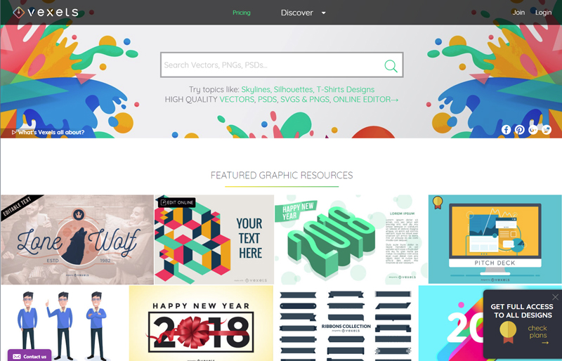
The hottest site dedicated to vector graphics has got it all: well over 20,000 PNG & SVG items, free vectors for the casual user, premium content for seasoned designers, and if you’re in a hurry or lacking inspiration, you can take up their online editor and choose among hundreds of ready-to-edit designs. Still can’t find what you need? Ask them to make a custom design specially for you! They’re big on skylines, silhouettes and cartoons, and have a wide range of exclusive trendy designs you won’t find anywhere else. While their content is affordable and cost-efficient, they also offer free download options depending on the use you’ll give the design.
Whatever your project is, Pexels is a must when it comes to high quality free stock photography. Self-proclaimed as the website that gathers “the best free stock photos in one place”, they add five photos per day, all of them are creative common 0 (can be used without attribution) and ready for commercial use.
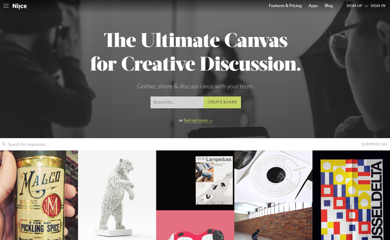
Niice is a design inspiration hub meant for teams. What started as a carefully curated inspiration site is now a team-focused platform for creative discussion where team members can gather up, share and discuss creative ideas. They make it really easy to share visual boards and get all members on the same page. If you’re a lone wolf, you can find awesome inspiration for yourself.
If you are a Chrome user and haven’t heard about Piktab, you’re in for a treat. A handy extension, Piktab allows you to discover free graphic resources every time you open a new tab. Finding awesome free content can’t get any easier than this. It gathers content from the top design sites out there, and you can customize your experience any way you want.
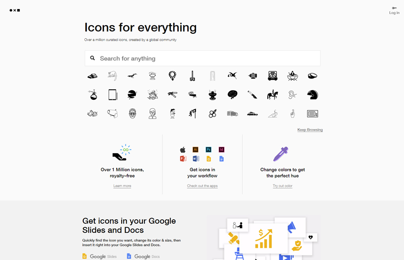
With a modern interface, high quality icons, and affordable prices, Noun Project is a globally-powered icon factory that hosts over a million designs from artists and designers from all over the world. If budget is too restrictive, you can pay with attribution. You are guaranteed to find anything here.
Keeping up with the latest design trends and news can be mind-numbing, as there are plenty of options to pick from, but we found DesignTAXI as a daily hub of informative and engaging design-related content where you can find pretty much anything, from film, art and graphic design news all the way to fashion and product design.
When it comes to finding top quality free editable graphics, look no further than Pixeden. Armed with free web graphics, background graphics, textures, PSD mockups and tons of more features, they make any graphic designer’s life easier when it’s time to present a project or show your client how awesome your design looks on various formats
Arguably the ruler of all font sites, FontSquirrel is everything we look for: free and 100% ready for commercial use. If by “free” you think “low quality”, think again. The hottest and trendiest fonts are there for the taking. Did we mention all their fonts are handpicked? That means you’ll surely get a great font regardless of your choice.
Skillshare is a heaven-sent for anyone who’s eager to either learn new skills or improve their craft from the best in the biz. With over 18,000 design classes available (and counting), this is by and large one of the most resourceful sites you’ll ever come across with.
When color matters, it’s time for Adobe Color CC, a super-useful tool which allows you to create your own color palette from scratch or draw inspiration from a massive library of palettes, all of which are human-made. Originally as a stand-alone Adobe product, it’s now embedded into Illustrator for a seamless design experience. The best thing about it: it’s totally free.
You’re now officially set for your design journey, so get those creative juices flowing and your design skills going. Did you find these useful? Do you have a pick of your own? Let us know!
How do we convince web developers that React Native has already solved many of the hardest GUI problems for them? Go back in time and release React Native before React DOM? Is there an easier way…
Like a lot of people in this Twitter thread, I didn’t really understand that React Native was even for building on the web. I thought it was a way to write React to build native mobile apps. Nicolas has a whole „React Native for Web” repo though, explaining otherwise. Plus a conference talk.
It probably doesn’t help that the tagline is „Build native mobile apps using JavaScript and React.” I suppose, it does do that (e.g. build an iOS or Android app), but it also can build your web app, which could mean… single code base?
Several of the replies suggest „a better DOM” which is interesting. Or, as Nicolas points out, it’s kinda like „web: the good parts” as much of it is an intentionally limited subset of the involved platforms in order to simplify things and make them interoperable.
Obviously, this isn’t for every project. But, if you have a React-based website already, and either have or want a native mobile app, then it seems like this is worth exploring.
Using custom fonts in a performant way is becoming far easier. Let’s take a peek at some things we can do when using custom fonts to make sure we’re being as performant as we can be.
1) Reduce the File Size
Far from containing only numbers, the Latin alphabet and common punctuation, many fonts support multiple languages and include thousands of additional glyphs, adding significantly to the file size.
The Mac tool Font Book can display all the available glyphs in a font.
In these cases, subsetting is useful. Subsetting is the removal of characters you don’t need. You can do this using the command line tool pyftsubset, which can be downloaded as part of FontTools. (The website FontSquirrel offers a GUI for subsetting. Its a popular alternative thats also worth considering – but be aware that it isn’t compatible with variable fonts). The easiest way to specify the characters you want to keep is with unicode. Unicode is a standard that provides a unique code to every character from the world’s languages.
Unicode has assigned a number to many thousands of characters. We are interested in a very limited subset.
The pyftsubset command is followed by the name of your font file and the unicode specifying your chosen unicode range. The following is a subset that caters to the English language.
You can then reduce the size of the font further by compressing to a woff2 file format. You could do this with a separate command line utility from Google, or just add some extra options when you run the pyftsubset command:
If you’re confident you’re not going to use any of the characters you’ve removed from the font, this is all you need to do — you’ve radically lowered the size of the font, and you can now use it in @font-face as usual. But what if some of the pages on your site make use of additional glyphs that have been removed from the font? You’ll want to avoid any characters being displayed with a fallback typeface. To solve this potential issue, be sure to note the range you use when creating your subset with pyftsubset. You’ll want to specify it within the @font-face block.
@font-face {
  font-family: 'Source Sans Pro';
  src: url('/fonts/SourceSansPro.woff2') format('woff2');
  unicode-range: U+0020-007F; /* The bare minimum for the English Language */
}
The above unicode-range is specifying characters that are likely to be used across all pages of the site. This font will therefore be downloaded on every page.
Firefox has the best font-related dev-tooling. Look in the Fonts tab of Firefox to find out which fonts are being used. In other browsers look in the Network tab to find out which font files are being downloaded.
I’ll also create another file with pyftsubset. This won’t repeat any of the characters from the the first file. Rather, it will only contain glyphs that are rarely used on the site.
By again specifying a unicode-range within another @font-face declaration, we ensure the file will be downloaded only when its needed — when a character on the page matches against the specified range.
How many fonts would the browser download? One hundred? The answer is, just one. Fonts are lazy loaded by default. This is a smart move by browser vendors — only download what is actually needed. There is, however, a downside. To know what font variants are being used, the browser must parse all the HTML and all the CSS. Only after all of that will any font files be requested. If we want to kick things off more quickly, we have to use preloading.
Preloading is as simple as adding a link tag into the head of the document:
The preloaded font is the first resource to download after the HTML document itself.
It’s not a good idea to preload too many resources, or wastefully preload any resource that might not be used on the page. For this reason I stick to preloading only the normal weight, non-italic file. I’m less concerned about a late-loading bold or italic file as those styles are used less often across the site. A flash of unstyled text (FOUT) for these font files is less disruptive than a FOUT of the regular Roman font, which makes up the bulk of the text. If you’re using a variable font, this is a non-issue. However, preloading variable fonts currently presents its own problem.
Should You Preload a Variable Font?
It’s clearly wasteful to send a browser a resource it can’t use. That’s why we include a type attribute that specifies the MIME type of the resource. If the resource isn’t supported by the browser, it won’t be downloaded. In the case of fonts, we specify type="font/woff2". Edge, Safari and Firefox are implementing both variable fonts and preload at the same time, so there isn’t an issue for those browsers. Chrome and Opera, however, have supported preload since 2016. Variable fonts are a brand new addition, whereas woff2 has been supported since 2014. For that reason, preloading a variable woff2 will force older versions of Chrome and Opera to download a resource they won’t know what to do with.
Ideally, we’d be able to specify the resource as a variable font within the type attribute, but this is largely unnecessary. Chrome is evergreen. There’s a new release every six weeks and it automatically updates in the background. Relatively few visitors will be using an ancient version. Once variable fonts have been around in Chrome for several versions, it will be safe to preload.
3) Managing FOUT and FOIT
So far we’ve looked at speeding up font loading. A good user experience is not just about the total loading time of a page or a font — it’s about how users experience the site while it’s loading. If you want users to stick around, you need to think about perceived performance. The different browsers aren’t consistent in how they manage font loading. We can now easily decide the loading strategy for ourselves using the CSS font-display property.
The font-display property is defined within an @font-face block.
The available options are block, optional, swap and fallback. Which should you pick?
The optional value sounds like a good bet — fonts are a nice-to-have enhancement, but not a strict necessity. In practice, I’ve found it a bad choice. Seeing the typeface of a page change upon navigation or reload is unexpected for users, and somewhat disconcerting. The window of time given for the custom font to load is incredibly small. If you’re preloading the font, it’s likely to load within this narrow timeframe. If not, users will often experience the fallback web safe font — even on a good connection with an expensive computer. That’s not great for brand consistency. If you’ve put much time into finding a similar fallback font, this might be an acceptable option, but if it’s that similar and performance is paramount, then maybe you should reconsider why you’re using a custom font at all.
The swap value is a better option. The web safe fallback font is shown immediately and replaced by the custom font once it’s loaded. Unfortunately, the swap period is infinite, so on a slow connection, the font could change after the user has already become immersed in the text, creating a jarring and disconcerting experience.
The fallback value is similar to the default behavior of most browsers — a short block period of invisible text followed by a fallback font if the custom font still hasn’t loaded. Unlike swap, there is a timeout period. If the custom font doesn’t load within three seconds, the font doesn’t change — the user is left with the fallback. You can read a whole article on CSS-Tricks about font-display and decide which option works best for you.
Wrapping Up
Text makes up the majority of content on most websites. Font-loading is therefore an important piece in the performance puzzle. If you want to keep up with font loading developments, Zach Leatherman just started a newletter about the subject.
Moog Audio is a popular audio hi-fi shop known for high-end speakers and sound equipment, based out of Montreal and Toronto. To illustrate the difference in sound quality that high-end speaker deliver compared to average speakers, we created a illustrated campaign that highlights the main drawback of mediocre speakers: they filter out much of the richness of the sound, and you end up only hearing a fraction of the actual song.
PROBLEM: The illegal downloading of films is a crime that is hurting the Philippine film industry. 99% of Filipinos who have Wifi access in their homes have committed the crime of piracy by downloading, sharing, or streaming files obtained through illegal means.
The Femmes en créa group invites the advertising industry to participate in the Equity Poker Tournament, taking place in Montreal on March 8, the next International Women’s Day. For the occasion, lg2 has created a version of poker in which the King and the Queen have the same value. For this special edition deck, they even share the same card.
In today’s tutorial, we’re going to tackle another icon project, in which we’re going to gradually learn how to create
a set of text editor elements, using some of the basic shapes and tools found
within good old Illustrator.
So, if that sounds
like something right up your alley, make sure you grab a fresh cup of that
magic bean juice and let’s get started!
And don’t forget, you can always expand the pack by heading over to GraphicRiver where you’ll find a huge selection of UI icons.
1. How to Set Up a New Project File
Assuming you already have Illustrator up
and running in the background, bring it up and let’s set up a New Document (File > New or Control-N)
using the following settings:
Number
of Artboards: 24
Spacing:
20 px
Columns: 4
Width: 32
px
Height: 32
px
Units: Pixels
And from the Advanced tab:
Color
Mode: RGB
Raster
Effects: Screen (72ppi)
Preview Mode: Default
2. How to Set Up a Custom Grid
Since we’re going to be creating the icons
using a pixel-perfect workflow, we’ll want to set up a nice little Grid so that we can have full control
over our shapes.
Step 1
Go to the Edit > Preferences > Guides & Grid submenu, and adjust
the following settings:
Once we’ve set up our custom grid, all we
need to do in order to make sure our shapes look crisp is enable the Snap to Grid and Snap to Pixel options found under the View menu, which will transform into Snap to Pixel each time you enter the Pixel Preview mode (if you’re using an older version of the software).
Now, if you’re new to
the whole “pixel-perfect workflow”, I strongly recommend you go through my How
to Create Pixel-Perfect Artwork tutorial, which will help you widen your
technical skills in no time.
3. How to Set Up the Layers
With the New Document created, it would be
a good idea to structure our project using a couple of layers in order to
separate the reference grids from the actual icons. If you’re familiar with my
previous tutorials, you’ll notice that with this one we’re taking a slightly
different approach, since we’re basing the project on Artboards instead of
Layers due to the high icon count.
That being said, bring up the Layers panel, and create a total of two
layers, which we will rename as follows:
layer
1: reference grids
layer 2: icons
4. How to Create the Reference Grids
The reference grids (or base grids)
are a set of precisely delimited reference surfaces, which allow us to build
our icons by focusing on size and consistency.
Usually, the size of the grids determines
the size of the actual icons, and they should always be the first decision you
make once you start a new project, since you’ll always want to start from the
smallest possible size and build on that.
Now, in our case, we’re going to be
creating the icon pack using just one size, more exactly 32 x 32 px, which is on the smaller side of the scale.
Step 1
Make sure you’re on
the right layer (that would be the first one), and then grab the Rectangle Tool (M) and create a 32 x 32 px orange (#F15A24) square
which we will center align to the first Artboard and use to define the overall
size of our icons.
Step 2
Add a smaller 28 x 28 px one (#FFFFFF) which we will
position on top of the previous shape, since it will act as our active drawing
area, thus giving us an all-around 2 px padding
to work with.
Step 3
Select and group the
two squares together using the Control-G keyboard shortcut, and then create the remaining grids using 23 copies
(Control-C > Control-F) which we
will position onto each of the empty Artboards. Take your time, and once you’re
done, make sure you lock the current layer before moving on to the next section.
5. How to Create
the Justify Icon
Assuming you’ve
successfully managed to create and position the little reference grids, move on
to the next layer (that would be the second one), and let’s kick off the
project by creating the first icon of the set.
Step 1
Start by creating the bottom horizontal line using a 2 px thick Stroke, which we will color using #252A2D and then position at a
distance of 2 px from the center of
the active drawing area’s bottom edge.
Step 2
Finish off the icon by adding the remaining
lines using two copies (Control-C >
Control-F twice) of the one that we’ve just created, which we will
vertically stack at a distance of 4 px from
the original. Once you’re done, select and group all three of them together
using the Control-G keyboard
shortcut before moving on to the next reference grid.
6. How to Create
the Align Left Icon
As soon as we’ve
finished working on the second icon, we can move on to the next active drawing
area, where we will quickly put together our next one.
Step 1
Since some of the upcoming icons are based on the one that we’ve just
finished working on, we will make a copy (Control-C)
of it which we will then paste (Control-F)
onto the current reference grid, making sure to click on the underlying
Artboard first to make it active.
Step 2
Isolate the middle stroke by double
clicking on it, and then shorten its length from 24 px to 16 px—you can do this by
selecting its right anchor point using the Direct
Selection Tool (A) and then pushing it to the left by 8 px using the Move tool (right click >
Transform > Move > Horizontal > – 8 px).
Once you’re done, press the Escape key to exit Isolation Mode, and then make a copy (Control-C) of the resulting icon before
moving on to the next grid.
7. How to Create
the Right Align Icon
Next, we’re going
to quickly create the right align icon, so make sure you’re on the right Artboard (that would be the third one) and let’s get started.
Step 1
Paste a copy of the icon that we’ve just finished working on onto the
empty active drawing area using the Control-F
keyboard shortcut.
Step 2
Adjust the copy that we’ve just created by vertically reflecting it
using the Reflect tool (right click > Transform > Reflect
> Vertical). Once you’re done, don’t forget to make a copy (Control-C) of the resulting icon,
before moving on to the next one.
8. How to Create
the Center Align Icon
Since no text
editor is complete without a center align option, we’re going to quickly add
one in the following moments.
Step 1
Paste a copy of the previous icon onto the fourth Artboard using the Control-F keyboard shortcut so that it
places it in exactly the same position.
Step 2
Isolate the middle Stroke of
the copy that we’ve just created by double clicking on it, and then center
align it to the underlying Artboard using the Align panel’s Horizontal
Align Center option. Once you’re done, quickly exit IsolationMode by
pressing the Escape key.
9. How to Create
the Increase Indent Icon
Move on down to the second row, and then zoom in on the first artboard where we will start working
on our next icon.
Step 1
Create the icon’s main shapes using a copy (Control-C) of the justify one, which we will paste (Control-F) onto the current active
drawing area and then adjust by isolating and shortening the length of its
middle and bottom Strokes from 24 px to 12 px using the Move tool
(left anchor points selected > right
click > Transform > Move > Horizontal > 12 px).
Step 2
Add the main shape for the right-facing arrow
using an 8 x 12 px rectangle, which
we will color using #252A2D and then position on the left side of the active
drawing area, as seen in the reference image.
Step 3
Finish off the icon by turning the shape that
we’ve just created into an arrow by first adding a new anchor point to the
center of its right edge using the Add
Anchor Point Tool (+), and then removing its top and bottom ones using the Delete Anchor Point Tool (-). Once
you’re done, exit Isolation mode,
and then make a copy (Control-C) of
the entire icon before moving on to the next Artboard.
10. How to Create the Decrease Indent Icon
Assuming you’ve finished working on the previous icon, position yourself
on the neighboring Artboard, where we will create its alternate version.
Step 1
Use the Control-F
keyboard shortcut to paste a copy of the increase indent icon onto the
current active drawing area.
Step 2
Double click on the little arrow to isolate it, and
then quickly adjust it by vertically reflecting it using the Reflect tool (right click > Transform > Reflect > Vertical). Once you’re
done, don’t forget to exit Isolation
Mode using the Escape key before
moving on to the next icon.
11. How to Create the Add Space Before Paragraph Icon
As soon as you’ve finished working on the decrease indent icon, we can move
on to the next active drawing area, where we will create our next item.
Step 1
Create the main shapes of the icon using a copy
(Control-C) of the justify one,
which we will paste (Control-F) onto
the current Artboard, making sure to center align it to the active drawing
area’s bottom edge.
Step 2
Ungroup the copy that we’ve just pasted (right click > Ungroup or Shift-Control-G), and then adjust it by
removing its top Stroke line by
selecting it and then pressing Delete.
Step 3
Finish off the current icon by adding the down-facing arrow. We will create it using a 12
x 8 px rectangle (#252A2D), which we will adjust by adding a new anchor
point to the center of its bottom edge using the Add Anchor Point Tool (+), and then removing its bottom ones using
the Delete Anchor Point Tool (-).
Once you’re done, select and group (Control-G)
all three shapes together before moving on to the next one.
12. How to Create the Add Space After Paragraph Icon
Next, we’re going to quickly create an alternate version of the icon that
we’ve just finished working on.
Step 1
Create a copy (Control-C) of the previous icon, which we will paste (Control-F) onto the empty active
drawing area, as seen in the reference image.
Step 2
Ungroup the copy that we’ve just created (right click > Ungroup or Shift-Control-G), and then adjust the
icon by flipping the position of its Strokes
with its arrow as seen in the reference image, making sure to select and group
(Control-G) them before moving on to
the next one.
13. How to Create the Type Tool Icon
Assuming you’ve already moved down to the third row, let’s start working on
the next category, which has to do with text formatting.
Step 1
Create the upper section of the icon using a 20 x 6 px rectangle with a 4 px thick Stroke, which we will color using #252A2D and then center align to
the active drawing area’s top edge.
Step 2
Open up the path of the shape that we’ve just
created by adding a new anchor point to the center of its bottom edge using the Add Anchor Point Tool (+) and then
immediately selecting and removing it by pressing Delete.
Step 3
Add the center section using a 20 px tall 8 px thick vertical Stroke
line (#252A2D), which we will center align to the previous shape, as seen in the
reference image.
Step 4
Finish off the icon by creating the bottom
section using a 16 px wide 4 px thick Stroke line (#252A2D), which we will center align to the active
drawing area’s bottom edge. Take your time, and once you’re done, select and
group (Control-G) all three shapes
together before moving on to the next one.
14. How to Create the Bold Icon
Next, we’re going to quickly create one the most used icons in all text
editor history, so make sure you’ve positioned yourself on the next Artboard, and let’s jump straight into it.
Step 1
Create the lower section of the icon using a 12 x 12 px square with a 4 px thick Stroke, which we will color using #252A2D and then center align to
the active drawing area’s bottom edge.
Step 2
Quickly adjust the shape that we’ve just created
by setting the Radius of its right
corners to 6 px from within the Transform panel’s Rectangle Properties.
Step 3
Finish off the current icon by adding the upper
section using an 8 x 8 px square
with a 4 px thick Stroke (#252A2D), which we will adjust
by setting the Radius of its right
corners to 4 px from within the Transform panel’s Rectangle Properties. Once
you’re done, position the resulting shape as seen in the reference image, making
sure to select and group them together afterwards using the Control-G keyboard shortcut.
15. How to Create
the Underline Icon
As usual, make
your way to the next Artboard, where we will see how to put together the
underline icon.
Step 1
Start by creating the lower section using a 24 px wide 4 px thick Stroke line, which we will color using #252A2D and then center align to the active drawing area’s bottom edge.
Step 2
Create the main shape for the “U” letter using a 12 x 14 px rectangle with a 4
px thick Stroke (#252A2D), which
we will center align to the active drawing area’s top edge so that its path
overlaps it.
Step 3
Start adjusting the shape by setting the Radius of its bottom corners to 6 px from within the Transform
panel’s Rectangle Properties.
Step 4
Finish off the icon by opening up the path of the shape that we’ve
previous adjusted, by adding a new anchor point to the center of its top edge
using the Add Anchor Point Tool (+),
and then immediately selecting and removing it by pressing Delete. Once you’re done, don’t forget to select and group the two
shapes together using the Control-G
keyboard shortcut.
16. How to Create
the Italic Icon
We are now down to
the last icon of the current row, so assuming you’ve already positioned
yourself onto the Artboard, let’s create the next item.
Step 1
Create the bottom and upper sections of the “I” shaped letter using two 16 px wide 4 px thick Stroke lines
(#252A2D), which we will position as seen in the reference image.
Step 2
Finish off the current icon by adding the diagonal line connecting the
two horizontal sections using a 4 px thick Stroke (#252A2D). As always, once
you’re done, select and group (Control-G)
all three shapes together before moving on to the next one.
17. How to Create
the Bring to Front Icon
Assuming you’ve
moved down another row, zoom in on its first Artboard and let’s create our next
icon.
Step 1
Start by creating the front shape using a 12 x 12 px square with a 4
px thick Stroke, which we will
color using #252A2D and then align to the active drawing area’s top-left
corner.
Step 2
Create the back shape using another 12
x 12 px square with a 4 px thick Stroke (#252A2D), which we will align
to the active drawing area’s bottom-right corner.
Step 3
Adjust the shape of the square that we’ve just created by adding a set
of new anchor point where its paths intersect those of the first one using the Add Anchor Point Tool (A), making sure
to reposition its corner one as seen in the reference image.
Step 4
Finish off the icon by adding a fill to the resulting shape, which we
will create using a copy (Control-C)
which we will paste in place (Control-F)
and then adjust by flipping its Stroke
with its Fill (Shift-X). Once you’re done, select and group (Control-G) the two shapes together, doing the same for the entire
icon afterwards.
18. How to Create
the Send to Back Icon
By now, you already
know the drill, so jump on the next Artboard and let’s carry on working on our next item.
Step 1
Create the back shape using a 12
x 12 px square with a 4 px thick Stroke (#252A2D), which we will
align to the active drawing area’s top-left corner.
Step 2
Finish off the current icon by adding the front shape using another 12 x 12 px square with a 4 px thick Stroke (#252A2D) and a 12 x
12 px fill shape (#252A2D), which we will group (Control-G) and then align to the active drawing area’s bottom-right
corner. Once you’re done, select and group (Control-G) all of the shapes together before moving on to the next
one.
19. How to Create
the Insert Header Icon
Make sure you’ve
positioned yourself onto the empty neighboring Artboard, and then let’s get
started working on our next icon.
Step 1
Create the upper section using a 20
x 6 px rectangle with a 4 px thick Stroke, which we will color using #252A2D and then center align to the active drawing area’s top edge.
Step 2
Add the main shape for the lower section using a 20 x 8 px rectangle with a 4
px thick Stroke (#252A2D), which
we will position so that its bottom path overlaps the edge of the active
drawing area, as seen in the reference image.
Step 3
Open up the path of the shape that we’ve just created by adding a new
anchor point to the center of its bottom edge using the Add Anchor Point Tool (+) and then immediately selecting and
removing it by pressing Delete.
Step 4
Finish off the icon by adding the little fill segment using a 12 x 4 px rectangle (#252A2D), which we
will center align to the active drawing area’s bottom edge. Once you’re done,
select and group all of the composing shapes together using the Control-G keyboard shortcut.
20. How to Create
the Insert Footer Icon
Next, we’re going
to quickly create another version of the header icon, so make sure you position
yourself onto the next active drawing area, and let’s get started.
Step 1
Create a copy (Control-C) of
the previous icon, which we will then paste onto the current Artboard using the Control-F keyboard shortcut.
Step 2
Finish off the current icon by horizontally reflecting the copy that
we’ve just created (right click >
Transform > Reflect > Horizontal), making sure to center it again afterwards.
21. How to Create
the List Icon
Our next item is a
must have for any good text editors, so hop on down to the next row and let’s
jump straight into it.
Step 1
Create the upper bullet using a 4
x 4 px square, which we will color using #252A2D and then align to the
active drawing area’s left edge, positioning it at a distance of 2 px from its top one.
Step 2
Add the list item using a 16 px wide 4 px thick Stroke line (#252A2D), which we will
position next to the bullet as seen in the reference image, making sure to
select and group (Control-G) the two
together before moving on to the next step.
Step 3
Finish off the icon by creating two copies (Control-C > Control-F twice) of the
shapes that we’ve just grouped, which we will vertically stack
below at a distance of 4 px from the
original. Once you have your shapes in place, don’t forget to select and group
all of them together using the Control-G
keyboard shortcut.
22. How to Create
the Sublist Icon
We now have a list
icon, but how about we move on to the next Artboard and create a sub-level one.
Step 1
Start by creating a copy (Control-C)
of the previous icon, which we will paste onto the current active drawing area
using the Control-F keyboard
shortcut.
Step 2
Finish off the current icon by isolating the middle and bottom list
items, and then adjusting their length so that their bullets align to the top
one as seen in the reference image. Take your time, and once you’re done, exit Isolation Mode by pressing the Escape key.
23. How to Create
the Insert Page Break Icon
Number 19 off our items’ list is the page break icon, which we will create in a blink of
an eye.
Step 1
Start by creating the center line using a 24 px wide 4 px thick Stroke, which we will color using #252A2D and then center align to the underlying Artboard.
Step 2
Add the main shapes for the pages using two 12 x 6 px rectangles with a 4
px thick Stroke (#252A2D), which
we will position onto the top and bottom edges of the active drawing area as seen
in the reference image.
Step 3
Finish off the icon by opening up the paths of the shapes that we’ve
just created by adding a new anchor point to the center of their outer edges
and then immediately selecting and removing them using the Delete key. Once you’re done, select and group all three shapes
together using the Control-G
keyboard shortcut.
24. How to Create
the Resize Icon
Next off, we have
another simple yet useful tool that most of the time goes overlooked, but not
today.
Step 1
Create the icon’s main body using a 20
x 20 px square with a 4 px thick Stroke (#252A2D), which we will
center align to the underlying Artboard.
Step 2
Finish off the current icon by creating a smaller 12 x 12 px square with a 4 px thick Stroke (#252A2D), which we will align to the active drawing area’s
bottom-right corner. Once you’re done, don’t forget to select and group (Control-G) the two together before
moving on to the next one.
25. How to Create
the Shapes Icon
We are now down to
our sixth and last row of icons, so assuming you’ve already positioned yourself
onto the first of its Artboards, let’s create our next item.
Step 1
Start by creating a 16 x 16 px
circle with a 4 px thick Stroke, which we will color using #252A2D and then
align to the active drawing area’s top-left corner.
Step 2
Add a smaller 12 x 12 px square with a 4
px thick Stroke (#252A2D), which
we will position on the circle as seen in the reference image.
Step 3
Finish off the current icon by adding a set of new anchor points to the
edges of the square where the two paths overlap using the Add Anchor Point Tool (+), and then selecting and removing its
corner one using the Delete key. As
always, don’t forget to select and group (Control-G)
the two shapes together once you’re done.
26. How to Create
the Chart Icon
If you love
charts, you’ll be happy to know that we’re going to be building one of our own
in the following moments.
Step 1
Create the lower section of the icon using a 24 px wide 4 px thick Stroke line (#252A2D), which we will
center align to the active drawing area’s bottom edge.
Step 2
Add the vertical chart segments using three 16 px tall 4 px thick Strokes (#252A2D), which we will
position 4 px from
one another horizontally, and then center align them to the active drawing area’s top edge.
Step 3
Finish off the chart, by adjusting the length of its outer vertical
segments as seen in the reference image. Take your time, and once you’re done, make sure you select and group (Control-G)
all of the icon’s composing shapes before moving on to the next one.
27. How to Create the Table Icon
The next item off our list is one that you probably use quite a lot, so make sure you position yourself onto the next
Artboard, and let’s quickly learn how to create it.
Step 1
Start working on the upper section by creating an 8 x 8 px square with a 4 px
thick Stroke (#252A2D), which we
will align to the active drawing area’s top-left corner.
Step 2
Add a wider 12 x 8 px one
with the same 4 px thick Stroke (#252A2D), which we will
position onto the square’s right side so that their outlines overlap.
Step 3
Create the left shape for the icon’s lower section using an 8 x 12 px rectangle with a 4 px thick Stroke (#252A2D), which we will align to the active drawing area’s
bottom-left corner.
Step 4
Finish off the current icon by adding a 12 x 12 px square with a 4
px thick Stroke (#252A2D) in the
lower-right corner of the active drawing area, making sure to select and group
all four shapes together afterwards using the Control-G keyboard shortcut.
28. How to Create
the Ruler Icon
We are now down to
our last icon, so make your way to the remaining Artboard, and let’s wrap
things up!
Step 1
Create the upper section of the ruler using a 20 x 6 px rectangle with a 4
px thick Stroke (#252A2D), which
we will center align to the active drawing area’s top edge.
Step 2
Finish off the icon, and with it the project itself, by adding a 6 x 20 px rectangle with a 4 px thick Stroke (#252A2D), which we will center align to the active drawing
area’s left edge. As always, once you’re done, don’t forget to select and group
(Control-G) the two shapes together
before hitting that save button.
Great Job!
It might have been
a longer one than usual, but if you made it to the end, you should now have a
nice little practical icon set that you can put to use in any future project.
As always, I hope
you’ve managed to keep up with each and every step and learned something new
and useful along the way.
That being said, if you have any questions, feel free to post them within
the comments section and I’ll get back to you as soon as I can!
Before you start creating the Spiderman text effect, download and install the font and patterns into your Photoshop.
1. Create the Background
I’ll show you how to make the background for the final image, but if you want to use your own background, then skip this whole part.
Step 1
Start by creating a new 850 x 500 px document with the Resolution of 72 Pixels/Inch and the Background Contents to White.
Step 2
Double click the Background layer in the Layers panel to unlock it. Now right click this unlocked layer and choose Blending Options from the menu. Another way to open these options is to select the layer and go to Layer > Layer Style > Blending Options.
Then add a Gradient Overlay with these settings:
Blend Mode: Linear Burn
Opacity: 20%
Click the Gradient box to create the gradient fill using the colors White on the left and Black on the right.
Style: Radial
Angle: 0°
Check the Dither box.
Step 3
Add a Pattern Overlay with these settings:
Click on the Pattern box and choose the Dark Wall pattern.
Opacity: 100%
Scale: 100%
This will create a dark textured background with a vignette.
2. Create the Spiderman Text Effect
This text effect is made of one layer, so you can save it as a new style in your Styles palette for future use.
Step 1
Pick the Type Tool and select the Aero Matics font. Set the Font Style to Bold Italic and Font Size around 200 pt. Write „SPIDER” with capital letters.
Step 2
Select your text layer in the Layers panel, right click on the layer and choose Blending Options from the menu.
Add Pattern Overlay with these settings:
Click on the Pattern box and choose the Spidy pattern.
Scale: 25%
This will add the main red Spiderman pattern.
Step 3
Add Gradient Overlay with these settings:
Blend Mode: Multiply
Opacity: 14%
Click the Gradient box to create the gradient fill using the colors Black on the left and White on the right.
Style: Linear
Angle: -90°
Check the Dither box.
Step 4
Add Color Overlay with these settings:
Blend Mode: Multiply
Click on the Color box and choose the color #e10505.
Opacity: 100%
Both color and gradient overlay will slightly darken the main texture.
Step 5
Add Satin with these settings:
Blend Mode: Linear Dodge (Add) with Color#ffeb0d
Opacity: 100%
Angle: 0°
Distance: 4 px
Size: 16 px
Uncheck the Invert box, if checked.
Satin adds a yellow and orange glow inside the Spiderman texture.
Step 6
Add an Outer Glow with these settings:
Blend Mode: Normal
Opacity: 100%
Technique: Precise
Spread: 0%
Size: 8 px
Range: 55%
Jitter: 0 %
Select the radio button next to the gradient and then edit the gradient Stops:
First gradient stop Color#111111 and Location at 21%.
Second gradient stop Color#177ece and Location at 48%.
Third gradient stop Color#9adaff and Location at 73%.
This will add a blue gradient around the text with dark blue center.
Step 7
Add Inner Shadow with these settings:
Blend Mode: Linear Burn with Color#010101
Opacity: 30%
Uncheck the Use Global Light before setting Angle: -90°.
Distance: 6 px
Choke: 0%
Size: 0 px
Inner shadow adds a 3D feel to the style.
Step 8
Add Inner Glow with these settings:
Blend Mode: Screen
Opacity: 71%
Choose Color#ffeb0d
Technique: Softer
Source: Edge
Choke: 0%
Size: 5 px
Inner glow adds a thin yellow stroke around the texture.
Step 9
Add Stroke with these settings:
Size: 2 px
Position: Outside
Blend Mode: Normal
Opacity: 100%
Fill Type: Gradient
Style: Linear
Angle: 90°
Check the Dither box.
Set the Gradient with these 5 stops:
First gradient stop Color#003669 and Location at 12%.
Second gradient stop Color#bcebff and Location at 22%.
Third gradient stop Color#003669 and Location at 52%.
Fourth gradient stop Color#bcebff and Location at 83%.
Fifth gradient stop Color#003669 and Location at 96%.
The stroke will add small, blue, shiny lines around the text.
Step 10
Add Bevel & Emboss with these settings:
Style: Inner Bevel
Technique: Smooth
Depth: 100%
Direction: Up
Size: 18 px
Uncheck the Use Global Light box before setting Angle: 110° and Altitude: 30°
Highlight Mode: Linear Dodge (Add) with Color#ffc000 and Opacity: 26%
Shadow Mode: Linear Burn with Color#0a2a40 and Opacity: 20%
Step 11
Add a Texture with these settings:
Click on the Pattern box and choose the Spidy pattern.
Scale: 25%
Depth: +120%
Inner bevel with texture adds more depth into the red Spiderman pattern.
Step 12
As a final step, add a Drop Shadow with these settings:
Blend Mode: Normal with Color#001e2d
Opacity: 100%
Uncheck the Use Global Light before setting Angle: 120°
Distance: 3 px
Spread: 100%
Size: 11 px
Congratulations! You’re Done!
In this tutorial, you learned how to create a Spiderman text effect in Photoshop.
We started out by creating the dark background with a seamless pattern. Then we created a text layer and added many different effects in order to create a Spiderman-style text effect.
I hope you’ve enjoyed this tutorial, and if you like the final effect, don’t forget to save this style to your Layer Styles palette for future projects.