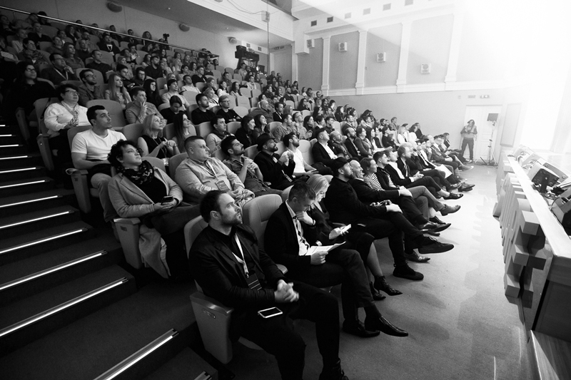
On April 19-21 Minsk will host one of the brightest creative festivals in Eastern Europe – International Advertising and Marketing Festival WHITE SQUARE.
Historically being a mediator of avant-garde ideas, Belarus is proud to be a motherland of the world famous Malevich and Chagall, and is recently getting more and more recognized thanks to innovative projects in IT sphere World of Tanks, Viber and MSQRD, and in communications industry – to WHITE SQUARE Festival that will celebrate its tenth anniversary this spring.
CALL FOR ENTRIES IS NOW OPEN ON OFFICIAL WEBSITE ADFEST.BY. DEADLINE – MARCH 30!
Entries are being accepted into 6 CONTESTS, 17 nominations that will be judged by 5 categories of international JURY consisting of the leading creatives from all around Europe, holding numerous prestigious industrial trophies including over 200 Lions and having a rich experience of judging at world famous ad festivals including Cannes.
High level of organization of judging process, jury team, entries and awards has been many times recognized by the leading representatives of professional community of different countries, including global creativity ranking The Gunn Report.
Promoting creative solutions worldwide WHITE SQUARE has been included into new global creativity ranking AdForum Business Creative Report that will help the players of ad market all around the world to track top agencies and best projects in sector of services.
Next to the contests WHITE SQUARE has various educational and evening programs consisting of over 80 different activities: master-classes from the leading experts of communications industry from all around the world, awards shows, theme parties and many more.
Detailed information about participation in WHITE SQUARE is provided on adfest.by or directly at the Directorate of the Festival – Association of Communications and Marketing Agencies of Belarus ACMA, EACA member, via konkurs@adfest.by.
If you have yet to answer this question, you’re also probably wondering why your business is underperforming. Satisfied customers are the foundation of any company. However, to satisfy someone, you have to know their needs. With the vast number of people in the world, it’s impossible to satisfy everyone. You have to focus your efforts to maximize your results. When you make a conscious decision to do this, it becomes much easier to figure out who is your ideal customer.
What Is An Ideal Customer?
The short answer to this question is someone who stands to benefit from your product or your service. However, within that, you also want to cater to people who can help your business go where you want it to be. Let’s say you sell electronics. If you’re dealing in high-end home theater equipment, you’re going to want to invest your marketing and sales resources in people with the means to afford it. However, within that, you’ll also need to narrow your focus to those who appreciate state of the art equipment. They will see the value in what you have to offer and they have the means to help your business be successful offering it.
Know Your Product First
However, before you can know your customer, you have to know your product. Take a look at it from a buyer’s point of view. What does your product do for them? What problems does it solve? How will using it improve their lives? How will buying from you be of benefit to them—as opposed to buying from someone else? Assessing your situation in this fashion will make it easier to design your site to sell electronics online to a specific group of people. It will also make it easier to craft effective marketing messages and activities.
Then Get To Know Your Customer
With answers to the questions above, you can begin to identify the traits of your ideal customer. Where do they live? Where do they work? What do they do for a living? Where do they shop for what you’re offering? Are their purchases usually tied to a life event? At what time of the year do they most often tend to buy? Have they bought products similar to yours in the past? Where do they conduct their research before shopping? How do they shop, and most importantly—how do they conduct their purchase transactions?
Create a Persona
Using that data, you can create an entity to which you can speak. Find a picture of this type of person somewhere and assign a profile to them. You might say, “The ideal customer for my electronics business is a college student, looking to have the latest electronics for their dorm or apartment. Their budget is tight, but they like cool tech. They are pretty savvy about electronic devices and they spend a lot of time in online forums and on social media.” These perceptions will help you craft organic content and product messaging in the style of language to which they can relate. It will also give you the insights you need to place these assets in the places they tend to frequent.
When you’re working this way, you’ll get a lot more mileage out of your marketing and advertising budgets. What’s more, you can use this to inform the tone and tenor of your ecommerce site to help this group of people feel at home shopping it. Get the factors related to determining your ideal customer right and you’ll find yourself with a cadre of satisfied, enthusiastic and loyal customers.
I’ve shared this little productivity tip with enough folks who have found it useful and figured I’d make a post out of it.
I love time tracking and I love task lists, but boy do I hate managing them both. So, I’ve been using my time tracker as my task list.
I use Harvest for time tracking. It allows you to create time entries in the future and I suspect many other time tracking apps do the same. That means today I can enter all the time entries I plan on doing tomorrow. Or, if I’m feeling super organized, I can create entries for the following week. All of my tasks are right there in front of me and ready to clock my time.
If I don’t get to a task that day? No worries. Harvest has a subtle feature that allows me to move a time entry from one day to another. Now, I’m good to go for the nest day.
Again, other apps are probably capable of doing the same.
I know, it’s a super small thing but it delights me every day and helps me manage two important things in one.
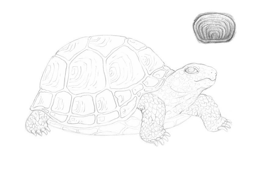
Did you know that turtles belong to one of the oldest reptile groups in the world—beating snakes, crocodiles, and alligators? The first proto-turtles are believed to have existed about 220 million years ago!
Drawing a turtle is a great experience for artists of any skill level. Using the example of this animal, we can observe a variety of textures and natural patterns.
We’ll sketch a turtle from scratch, both in a side and aerial view, using just a couple of graphite pencils. Let’s have fun!
What You Will Need
an HB graphite pencil
a 3B graphite pencil
an eraser
drawing paper
1. How to Draw a Turtle in a Side View
Step 1
Let’s start with a rough sketch of the turtle’s figure.
I draw a rounded shape of the shell. Most land-based turtles have a large, heavy, dome-shaped shell that protects the animal’s body from predators.
The shell is actually a part of the skeleton; it consists of over 50 bones. And, contrary to a popular belief, a turtle cannot come out of its shell.
Then I add the shape of the head…
… and mark the feet—or, more precisely, the places where the limbs meet the ground. We don’t add the fourth shape because it is not visible in this foreshortening.
Step 2
I refine the initial shape, outlining the upper shell of the turtle (it is called the carapace).
A shell is a three-dimensional object, so I round the contour line in the bottom part of the shape.
Then I add the plastron—the lower shell that encases the belly.
Step 3
I outline the shape of the head.
Step 4
I draw the eye. Most terrestrial turtles have their eyes looking down at objects in front of them, so my intention is to convey this feature by lowering the eye’s inner corner.
Step 5
I draw the line of the mouth. Turtles have rigid beaks that help them to bite off pieces of food.
I also add the nostrils.
Step 6
Using simple shapes, I construct the short, sturdy feet of the turtle.
Step 7
I refine the feet, erasing all the unnecessary lines.
Step 8
Turtles usually have long claws, so I add four claws to each limb. The feet look much more credible now!
I also refine the shape of the carapace.
Step 9
I draw the prominent polygonal plates (they are called the scutes) in the upper part of the carapace.
I add the next row of scutes just underneath the first one.
Step 10
I add two more rows; the scutes here are smaller.
I also mark the relief elements of the plastron with light lines; we don’t need too many details here.
Step 11
Let’s add some details to the turtle’s skin. The pattern may vary; you can see a couple of examples in the image below.
I add the elements, starting from the head. I also draw the folds of skin in the neck area.
Step 12
I complete the pattern in the head and neck area.
Then I add the pattern of the turtle’s limbs; it resembles a set of close-fitting jags of slightly different size.
Step 13
I draw the pattern of the scutes. You can see an example scheme in the image below.
By the way, counting the rings formed by the stack of smaller, older scutes on top of the larger, newer ones can help to estimate the approximate age of a turtle.
Step 14
With the HB pencil, I add some shading to the darkest areas of my drawing, including the drop shadow.
Step 15
I also add a layer of light hatching to the sides of the shell and the head of the turtle.
Step 16
With the 3B pencil, I emphasize the pattern of the scutes.
Step 17
With the 3B pencil, I increase the contrast in the drawing by darkening the skin texture.
Step 18
With the 3B pencil, I cover the shell with a layer of hatching, accentuating the sides and the gaps between the scutes.
Step 19
To make this drawing harmonious, I apply more 3B graphite strokes to the limbs and head.
This illustration is complete!
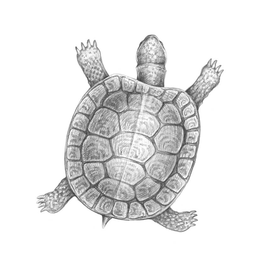
2. How to Draw a Turtle in an Aerial View
Step 1
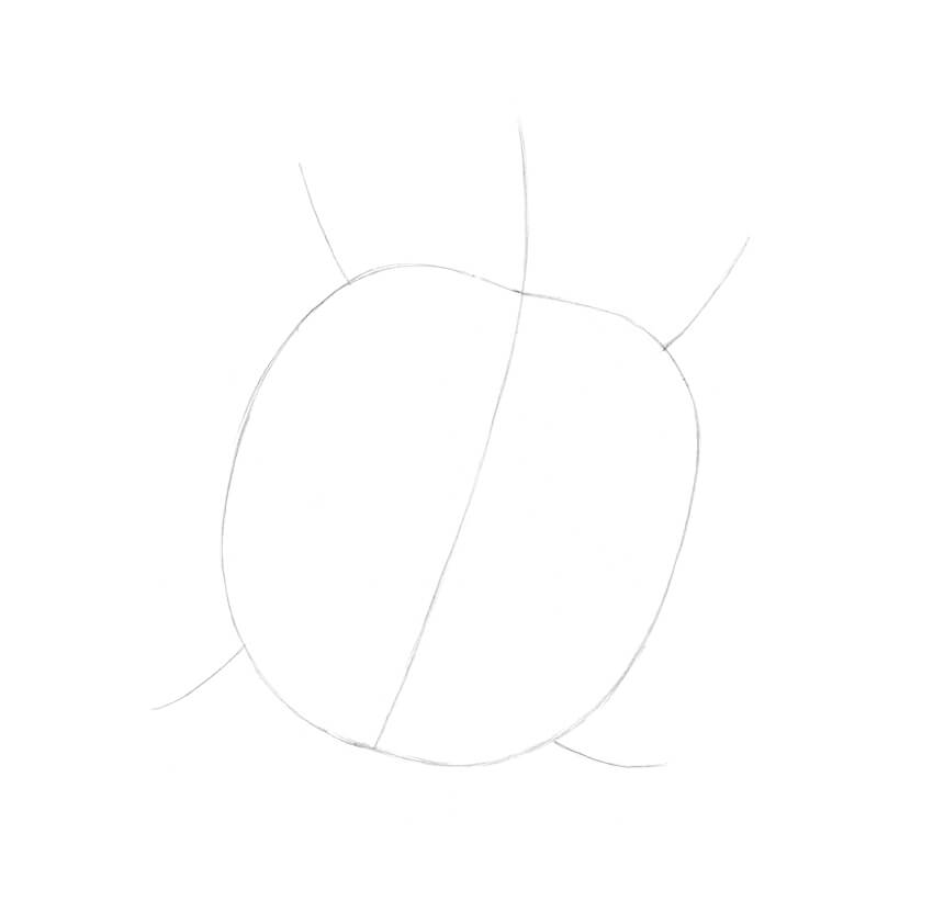
I draw a light line with the HB pencil; let’s assume that this line is going through the center of the turtle’s head and shell.
I add the shape of the shell and the framework of the limbs.
This reference is not a strict guideline, it’s rather a general outline that helps us to convey the direction of the body.
Step 2
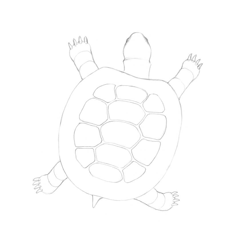
I draw the shape of the head with the neck, and then add the feet.
Step 3
I refine the shape of the neck. Turtles often have a traverse skinfold that is visible in this foreshortening.
I narrow the shape of the head and add the eyes—they are barely visible.
Step 4
I construct the limbs.
Step 5
To complete the feet, I add the claws.
Step 6
I draw a short tail; most species of turtles have it.
Step 7
I draw a new rounded shape inside the shell outline, and then divide it into three parts.
Step 8
I draw the scutes in the central part of the shell. Allow the elements to be slightly uneven—this makes the drawing more natural.
I add the circular row of smaller scutes.
Step 9
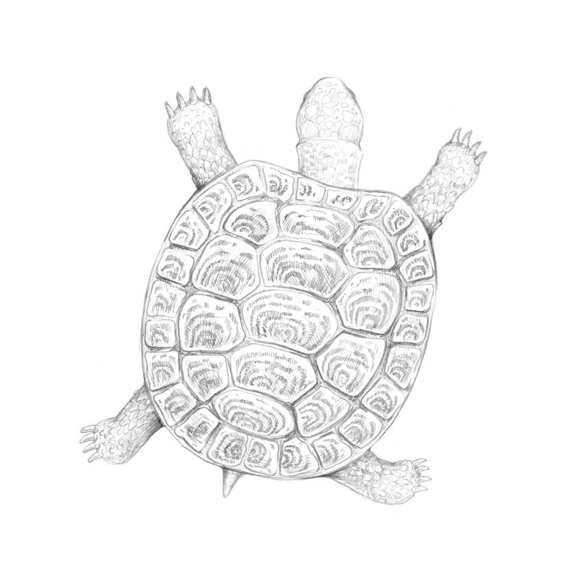
I create a pattern of scutes. Don’t strive for perfection; let the pattern be slightly irregular and spontaneous.
Step 10
I add the jagged pattern of the limbs.
Step 11
With the HB pencil, I accentuate the darkest areas of the drawing.
Step 12
With the 3B pencil, I increase the contrast, darkening the pattern of the scutes and the gaps between the plates.
Step 13
I apply a layer of hatching to the shell, using the 3B pencil. I also work on the textures of the turtle’s limbs, head, and tail.
Step 14
With the 3B pencil, I darken the shell, leaving its center relatively light to create an illusion of convexity. I also accentuate the shadows on the limbs and neck.
Your Artworks Are Complete
Congratulations—we’ve created two beautiful graphite pencil drawings! I hope you were inspired by the fascinating textures and the world of nature.
Let your creative journey be fruitful and full of joy!
Knockout text is a technique where words are clipped out of an element and reveal the background. In other words, you only see the background because the letters are knocking out holes. It’s appealing because it opens up typographic styles that we don’t get out of traditional CSS properties, like color.
While we’ve seen a number of ways to accomplish knockout text in the past, there are some modern CSS properties we can use now and even enhance the effect further, like transitions and animations. Let’s see them in action.
Mix Blend Modes
There are four blend modes that effortlessly make text cutouts: multiply, screen, darken, and lighten. Applying these to the top element of a stack of image and text, text being at top, creates the knockout design.
Even though, in most cases, either black or white is used in these blend modes to get a clear distinction between the text and the background, I prefer using a darker or lighter color instead to keep the back image slightly visible, like this:
Using a darker (or lighter) color also creates a nice „theme” going on with the image shown through the text.
The multiply blend mode keeps darker colors dark and the lighter colors let through whatever’s behind them: a black portion on the top layer will be fully opaque and white will be fully transparent.
The effects of the multiply mix blend mode.
In the above example, the white text became completely see-through while the darker color around it lets the image behind be seen only a little, as the darker shades remain unaffected.
The screen blend mode reverses the roles: darker colors create translucence while lighter shades remain light and block what’s behind.
The darken and lighten blend modes are similar to multiply and screen, respectively, except that details are lost on the portions of the back image that can be seen. Rather than mixing the shades, the modes choose the darker or the lighter shade of the two layers that are shown.
See below the difference in how the four modes have blended the colors:
/* Knockout text within a dark area */
.multiply {
  color: white;
  mix-blend-mode: multiply;
  background-color: rgb(59, 2, 6);
}

/* Knockout text within a bright area */
.screen {
  color: black;
  mix-blend-mode: screen;
  background-color: rgb(244, 220, 211);
}

/* Knockout text within a dark area that's less detailed */
.darken {
  color: white;
  mix-blend-mode: darken;
  background-color: rgb(59, 2, 6);
}

/* Knockout text within a light area that's less detailed */
.lighten {
  color: black;
  mix-blend-mode: lighten;
  background-color: rgb(244, 220, 211);
}
Using a blend mode is the most convenient option to get a knockout text effect, because it allows us to apply additional styles that other techniques might not allow.
Let’s take a closer look at the styles we can use to enhance the knockout effect.
Shadow Blur
Adding a white/black or a light/dark text shadow to the text creates a blurred effect. For example, let’s say I add a text-shadow that’s with a large blur radius value:
.text {
  text-shadow: 0 0 9px white;
  ...
}
Now the edges are less crisp and give a sort of cloudy effect:
We can even make things move around a little. For example, let’s take build on the text-shadow idea we looked at above and put some movement on it to make it appear that the text is glowing:
Transition is another property we can apply to our knockout text and that opens up even more interesting possibilities, like using text-indent on pseudo-classes like :hover.
Here’s how we can use transition on pseudo-classes to introduce a new element into the knockout text:
/* The knockout text */
.text {
  transition: text-indent .5s;
  ...
}

/* On hover, trigger the transition */
.text:hover {
  text-indent: 5px;
  transition: text-indent .5s;
}

/* The thing that slides in on hover */
.text:hover::before {
  display: inline-block;
  content: '✈︎';
}
The transparent text shows the image behind it that’s already cut to the shape of the text. Although this is a true knockout text approach—it literally removes the text’s surrounding background on screen—having no background left to bleed into or move over leaves little space for other effects like blur, or moving text, to take place. That’s where mix-blend-mode has an advantage.
CSS Mask
The first technique we looked at employs masking, a concept where shapes are created on a foreground layer and use color to determine how much of the shape shows the background. The black parts of the foreground hide (or „mask”) and white parts reveal the background, or vice-versa. Any gray value between black and white is treated as varying degrees of partial transparency.
CSS mask works the same way: you straight up declare an image to be the mask applied over another image and, depending on the type of the mask, we get a portion cut out. As of writing this post CSS mask is fully supported in Firefox only.
This browser support data is from Caniuse, which has more detail. A number indicates that browser supports the feature at that version and up.
Desktop
Chrome
Opera
Firefox
IE
Edge
Safari
67*
52*
53
No
No
TP*
Mobile / Tablet
iOS Safari
Opera Mobile
Opera Mini
Android
Android Chrome
Android Firefox
11.3*
37*
No
62*
64*
57
Since we are looking specifically into knockout text, the mask needs to be made from text. This is a great use for SVG <mask>, which can create masks from SVG shapes and texts.
The luminance value on the mask-type property of the foreground element implements a masking mechanism where parts of this layer, corresponding to the black parts of the mask, become transparent. The parts corresponding to the white portions of the mask remain opaque. The mask property uses the url() value to designate the SVG element used for the mask.
SVG’s <mask> element creates a mask imaged from its contents. The contents I made inside the <mask> are a white rectangle (<rect>) and black text (<text>). The text, being black, brings up the portion of the image behind it to the view after masking.
Blurring, Animation, and Transition
CSS masks open up the same blur and animation effects we were able to use with mix-blend-mode.
That same glowing text from we used before applies here as well, this time applied directly to the <text> element of the SVG:
However, unlike mix-blend-mode, not all the same properties can be animated. For example, text-indent won’t work here and neither will transform. It’s true that CSS transforms can be applied to SVG elements but because our mask is actually being used as a mask in its truest form, browsers might not apply those transformations.
We can always inject a transform SVG attribute using JavaScript, delivering those transformations to the elements inside the mask:
t = document.querySelector('text');
b = document.querySelector('.backdrop');
b.onmouseover = ()=>{
  t.setAttribute('transform', 'translate(20)');
}
b.onmouseout = ()=>{
  t.removeAttribute('transform');
}
Conclusion
When it comes to browser support and production safe code, CSS mask lags behind due to being limited to Firefox support. The blend modes mentioned in this post are supported in almost all the major browsers, except Edge. The background-clip property is also supported by all the browsers, but still requires -webkit prefix.
In terms of result, both blend modes and mask give similar output. Between background-clip and mix-blend-mode values, it’ll be the choice of the design that’ll lead to choosing one over another. What you can achieve with background-clip can also be done by blending, provided you’re using either only black or white background matching the page’s body.
TLDR; knockout text method uno: apply one of the four knockout-friendly blend modes to the top layer of a text-image stack and use dark/light (or black/white) color combination on the text and its enclosure. Method dos: set background-clip to text in the element carrying both a background image and a transparent text. Method tres: use CSS masking on a solid foreground with an image behind and dictate the cutout using an SVG text mask.
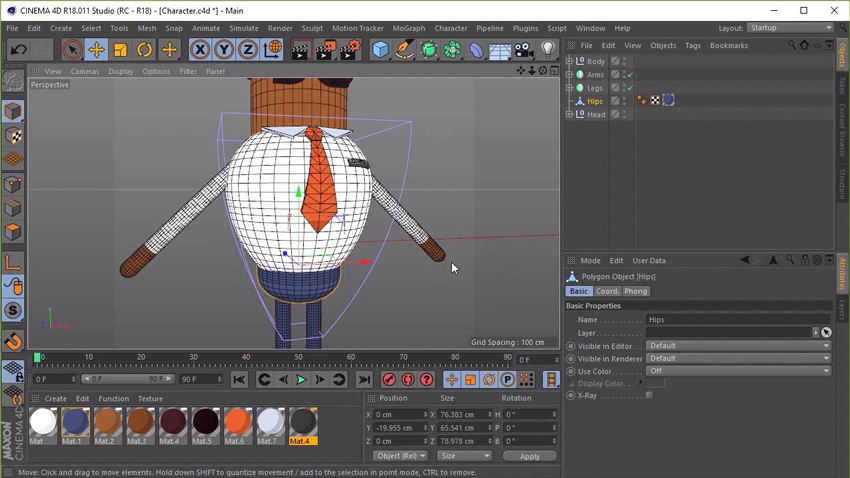
Do you want to learn animation quickly and easily? Our new course, Rig a Rubber Hose Character for Animation, will take you through the step-by-step process of rigging a simple “rubber hose style” character in Cinema 4D.
Instructor Jonathan Lam will teach you how to prepare a character for your own animations, graphics, or video-game projects. This workflow is perfect for those looking to get into rigging and basic 3D animation.
You can take our new course straight away with a subscription to Envato Elements. For a single low monthly fee, you get access not only to this course, but also to our growing library of over 1,000 video courses and industry-leading eBooks on Envato Tuts+.
Plus you now get unlimited downloads from the huge Envato Elements library of 460,000+ creative assets. Create with unique fonts, photos, graphics and templates, and deliver better projects faster.