In part one of a series of posts about optical illusions on the web, Dan Wilson looks at how to create the “Red Reveal” that he happens to describe like this:
Growing up, my family played a lot of board games. Several games such as Outburst, Password, and Clue Jr. included something that amazed me at the time — a red lens and cards with some light blue text that was obscured by a myriad of red lines. When you put the red lens over the card, the text would magically appear.
Here’s one example of that effect from a nifty Pen:
I’d also recommend reading part two in this series, Barrier Grid Animation, which uses a bunch of CSS techniques to trick your eye into seeing an animation of several static images.
Some people have a talk preparation process that is super organized and runs like a well-oiled machine. Mine, on the other hand, is a bit messy, but it works for me. Even when a talk looks polished and put together on stage, it doesn’t mean the process to get it there was that way too.
Me on stage at An Event Apart.
When putting together a new talk recently, I noticed there was most definitely a pattern to how my talks take shape. Here’s how the talk-making process goes for me:
The Research Phase
True to the nature of research, all my talks start by collecting articles, books, videos, and other things that relate to the topic of the talk. At this point in the talk development process, I usually only have a general topic idea instead of a fully fleshed out point-of-view or main message. That means I end up collecting things that might only be tangentially related to the topic and going down some strange topical rabbit holes.
I’ll save all these as a collection of bookmarks but usually also in a Google Doc with notes or quotes from the piece that seem most relevant. That makes it easier to keep a high-level view of what I’ve collected, and even discover interesting threads that connect some of the seemingly unrelated sources.
This initial phase is intentionally fuzzy on focus. Only a small percentage of the research I collect actually makes it to the end talk content. Sometimes the things that don’t make it spark ideas for other talks, or just gets filed away in my brain for future (hopefully interesting) things.
Outlining: The Giant Mess Phase
There’s probably a smarter sounding name for this phase, but for every talk I’ve done, there’s always a point where I step back and think, „Holy crap this is all a giant mess! What am I even doing with all this!?” So, that’s what I’ll call this phase. This is the phase where I make a general outline for the talk (again in a Google Doc or Word file) and start fitting my thoughts, examples or demos, and relevant research into it.
I outline the major points I think the talk should make and try to fit them into some sort of narrative order. These tend to change and morph a bit as the talk takes shape, but that’s OK because I’m still in the giant mess phase.
At the top of my document I have a three-part block that helps keep me focused:
What is the main question this talk answers (or the main problem it addresses)?
What is the main message of this talk?
Three points that support the main message:
(I started doing this on advice from Bill Smartt, and it’s been a huge help ever since.)
A talk outline for a 30 min talk complete with comments to myself.
The rest of the document addresses the body of the talk with each main point as a headline and some notes underneath it. Personally, I don’t write out talks word-for-word and memorize them. I do write out an introduction and conclusion to make sure I’m setting up the topic and summarizing it well, but the rest of the notes are bulleted lists of points to make and references supporting examples, demos, or references. I leave space at the bottom of the document for random thoughts and notes as well as probably a few too many comments to myself on possible changes to make or different directions to take. Points that don’t fit into the main narrative get moved down to this section too.
Once I feel like I have a cohesive outline, or at least one that isn’t a total mess, I move on to making some visuals.
The Editing Phase
A recent talk with all the edited-out slides shown ghosted out. Those slides never made it to the final talk.
This is the point where I start making slides and such based on the outline. Some people leave slides to the very last thing, but I leave them more to the almost last thing and do some of my thinking and organizing while I build up the slide deck.
I’ll make slides for each point in the outline, take screen recordings of demos or examples, and start piecing things together in order. I tend to think of my talks in sections at this point and, as I create the slides for each section, I’ll try talking through them out loud to see how they flow. (It’s amazing how different things sound when you say them out loud!)
There is a lot of rearranging and cutting out during this phase to work towards something that feels cohesive. I keep working on adding, deleting, and rearranging slides until I’ve got visuals for the full narrative of my outline. Sometimes things fall into place quickly, but for most talks this part can take a while.
At this point I almost always have far too much content. I’ll run through what I have for the talk in 10 to 15 minute chunks, editing down and solidifying points until I’ve got something that fits neatly into the required time length. Most times this means a 30 minutes and 45-60 minute version of the talk depending on the format of the event where it’s being given.
The same talk without the slides that have been edited out.
Rehearsing: The Talking to Myself Phase
Rehearsing is so important but it can also be very awkward. It seems like everyone has a different strategy for rehearsing talks, which totally makes sense. I have a really hard time rehearsing talks in their entirety when I’m standing in my office talking to the wall or to the dog, so I tend to rehearse in 15 or 30 minute chunks; practicing the first half then taking a break to do some other things and coming back to run through the second half. That way I know I have a handle on all the material, but haven’t driven myself (or the dog) up a wall with all that talking to no one in particular.
Ah, that familiar presenter notes view. I like a giant notes window even though I rarely actually read them while I’m on stage. They’re a „just in case” kind of thing.
As often as possible I’ll try to give a new talk to a few friends or at a meetup before doing it on stage for the first time. Having a real live human audience can really help show which points are strong and which might need a bit more work to get across well. I also always run through the „final” talk from start-to-finish at least once in the 24 hours before I’ll be on stage to make sure all the content is fresh in my mind.
A Talk is Never Really Done
Seriously. They really never are. The funny thing about talks is that when you give them more than once, they’re rarely exactly the same. (Yes, it is totally fine to do the same talk more than once.) There is always something to improve, something to add, or new points or examples to add to the narrative.
I usually make notes for myself on what worked or what didn’t right after getting off stage. That’s a good time to recall which parts of the talk felt like they could use some work, but it’s not such a good time to actually make any edits. I’ll go back to those notes a few days later (having some space here is really helpful) and make adjustments as needed. Also, if I come across other relevant examples or research at any point in time, I’ll try to add them into the talk for the next time around.
You Do You
If there’s one thing I’ve learned working on talks and talking to other speakers about their process, it’s that no two people work the same way. Everyone has their own way of putting together talks that they’ve customized for their own habits and preferences. If your talk development process looks nothing like mine, that’s totally fine. And if you haven’t found a process that works for you yet, keep experimenting with different techniques. You’ll find one that works for you!
For more on how to get a talk together, check out these other articles too:
System font stacks got hot about a year ago, no doubt influenced by Mark Otto’s work putting them live on GitHub.
The why, to me, feels like (1) yay performance and (2) the site looks like the rest of the operating system. But to Mark:
Helvetica was created in 1957 when the personal computer was a pipe dream. Arial was created in 1982 and is available on 95% of computers across the web. Millions, if not billions, of web pages currently use this severely dated font stack to serve much younger content to much younger browsers and devices.
As display quality improves, so too must our use of those displays. System fonts like Apple’s San Francisco and Microsoft’s Segoe aim to do just that, taking advantage of retina screens, dynamic kerning, additional font-weights, and improved readability. If operating systems can take advantage of these changes, so too can our CSS.
I also like the team’s idea of adding emoji fonts at the end of the font declaration so that you have the best support possible for those too:
This is part two in our four-part series on How to Design Flat Icons in Affinity Designer.
If you haven’t already, make sure to check out Part One to this series, where you’ll get the introduction to this course as well as the first lesson for creating a flat shopping bag icon.
In this lesson, Yulia Sokolova will show you how to create a quick discount badge icon. Learn how to make the second icon in this set, using basic shape tools, operations, and the Artistic Text Tool.
Create a yellow shape using the Rounded Rectangle Tool (M). Adjust the shape with the Vector Crop Tool to shrink in the right side.
Then create a yellow triangle and attach it to the first shape, adjusting the size with the Transform panel. Align the shapes together.
Now combine the shapes so that there’s no gap. Then modify the triangle to look more like a badge.
Complete the design of the badge using the Rectangle Tool (M) to create the tag and the Ellipse Tool (L), along with operations, to create the badge’s hole.
Finish the badge with some text. Here we’ll use the Bowlby One Free Font to create the percentage sign to represent the discount.
Then use the same methods as before to create a trendy long shadow effect and the circular base for the icon. Here’s the finished result.
How to Create a Hanger Icon
Time for the third icon. In this next lesson, we’ll learn how to create a simple hanger icon using basic shapes and operations.
Use the Triangle Tool to create the initial base shape for the orange hanger. Duplicate this shape and make it smaller, and then create a circle for the top of the hanger with the Ellipse Tool(L).
Combine the larger triangle and circle shapes together, and then modify the new shape with the smaller triangle. This will result in a cutout effect for a stylized hanger design.
Finish the hanger with a curved metal rod. Use the Artistic Text Tool to create the metal shape from a simple question mark symbol. Then apply the gray shape to the hanger.
Create the final hanger icon with the usual steps from before. Make a long shadow effect first, and then apply it to the purple circular base. Here’s the result.
Want More?
All done! Let’s continue with the fourth and fifth icons in the next lesson. There we’ll learn how to create a
colorful shopping basket and dress icons.
Working as a freelance web designer has some serious perks: you meet a variety of interesting people, you (mostly) choose your own hours, and you can apply both your artistic side and your technical skills to helping clients get the most out of their web presence. At the same time, it has one major drawback: you can only bill for the actual work you do, and there are only so many hours in a day. Wouldn’t it be nice to set up a passive income stream or two that allows you to keep earning even while you sleep? Here, we present some proven techniques to do just that.
Start Blogging
People browsing the web are generally either looking for entertainment or trying to learn something. If you can share some of your skills in a way that will prove helpful to the latter kind, you can easily start a blog on your area of expertise. Once you have consistent traffic, repeat visitors and a mailing list, you can either use it to promote your personal brand or treat it as a money-making asset in its own right.
This isn’t to say that blogging successfully will be an instant payday for little work. Earning money this way requires at least six months of regularly posting interesting, informative content and not everybody is cut out for doing this. On the other hand, some people love to write and teach others. If this describes you, you can get an idea of what’s already out there by clicking here.
Design CMS Themes, Plugins and Templates
If you still use Wix or Jimbo to design sites for your clients, this won’t be for you just yet. If, however, you have a strong grasp of CSS, PHP and other lower level tools, there’s nothing stopping you from creating something once and selling it over and over again.
Be aware that users will be reviewing your product thoroughly and publicly, so make sure to test it and (especially) provide adequate documentation that even amateurs can understand. Themeforest and Template Monster are two of the marketplaces on which you can market your product.
Affiliate Marketing
Affiliate marketing has developed something of a bad rep. Some people who saw it as a get-rich-quick opportunity were inevitably disappointed, while others use all kinds of user-hateful, black hat tactics to bait clicks. On the other side of the coin, some affiliate programs seem to have a little trouble calculating percentages, or allow vendors to market products without applying any kind of quality control.
Even so, there’s nothing wrong with the business model itself: Amazon and other online retailers allow you to do marketing on their behalf and pay you depending on the amount of success you achieve. Assuming some basic rules are followed, the customer’s interests aren’t compromised at any point.
Some people do make a living out of AM and even a good one. Don’t limit yourself to only the well-known affiliate programs: approach individual companies directly, or focus on specialized services that pay real money for qualified leads. The best payday loan affiliate program, for instance, pays as much as $230 per action.
Again, this kind of business requires time and effort to get off the ground. To learn a little more, spend a few minutes browsing around this site.
Become a Hosting Reseller
If you’re already selling website designs, you might as well up-sell hosting solutions to clients looking for a no-fuss, turnkey option. In fact, a little thought will show you a number of additional services you can offer your existing clients, from advising them on software choices to training their staff in digital marketing.
If you’re technically savvy and willing to spend a bit on the necessary hardware, you can set up your own server, or you can re-sell hosting services from one of the established providers. Hostgator offers good support, but there are literally hundreds of hosting companies that will be happy to have you market their products.
Vending Stock Images
People, including web users, are visual creatures. The choice of feature photograph can easily make or break a web page’s performance, and savvy digital marketers know this.
If you have a huge pool of photographs you own the licenses to, either from having taken them yourself or purchased the rights, it might be worth your while going through your collection and adding tags to each. They can then either be sold on websites such as Shutterstock, or you can charge for the service of searching for the “perfect” image on your clients’ behalf.
Write an Ebook
Even if you’re very familiar with the subject, writing an ebook of 10,000+ words is a non-trivial task. The good news: you only have to do it once for it to (potentially) keep earning money for years to come.
Self-publishing is often done in conjunction with running a blog: the blog can be used to market the book, the book increases the credibility of the blog, and both help to establish the author as an expert that people are happy to consult. One key thing to remember is that a narrow focus is often best. A book called “What Makes a Website Great” will be buried under hundreds of similar titles, but “5 Steps to Creating Great Websites for Restaurants” will appeal to at least some readers.
Write an App
If you know how to code, writing an app that solves whatever problem bugs you from time to time represents another potential source of passive income.
Realistically, though, most apps tank rather than take off. Unless it’s something really simple, you’ll be investing a huge amount of time and money in building one, so do your market research beforehand and consider teaming up with somebody who has skills that complement your own.
Coffee Mugs and T-Shirts
If you’re occasionally struck by an idea for a visual design that’s bold, quirky and engaging, consider spending half an hour perfecting it in Photoshop and submitting it to one of the various fulfillment sites that are always hungry for new content. Success isn’t guaranteed, of course, but a couple of people have made good money in this way, and trying costs nothing.
Love is in the air! And in this collection of premium design assets, we present you with 50 stunning wedding invitation templates.
Loaded with incredible designs from GraphicRiver and Envato Elements, this collection features a plethora of gorgeous invitations we’re sure you’ll love.
Download these templates today to embark on your romantic journey or enlist the help of a design professional from Envato Studio for custom invitation design.
50 Fabulous Wedding Invitation Templates
Start the first day of the rest of your life in style. Download one of these premium wedding invitation templates to celebrate your love with the world. They’re crafted with exquisite designs and luxurious elements, so say „I do” to these fabulous wedding templates today. Enjoy!
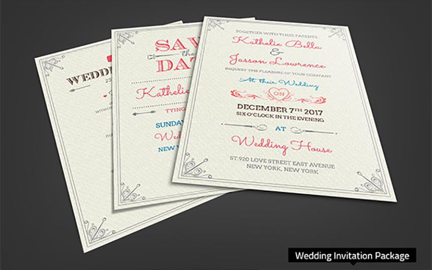
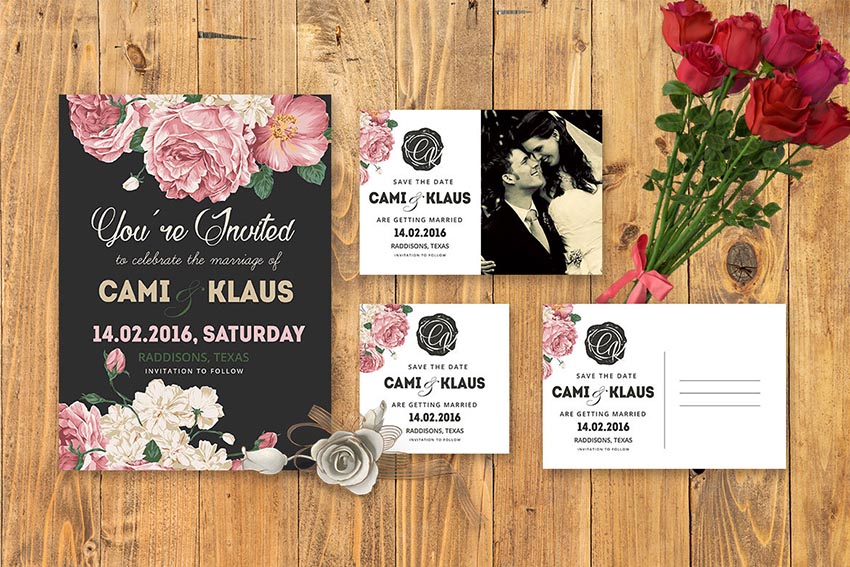
To kick off this collection, we’ll start with this lovely wedding invitation set. This set includes several unique templates for your wedding invitations, RSVP cards, and so much more. Celebrate your special day in style with this minimal design featuring unique cursive lettering.
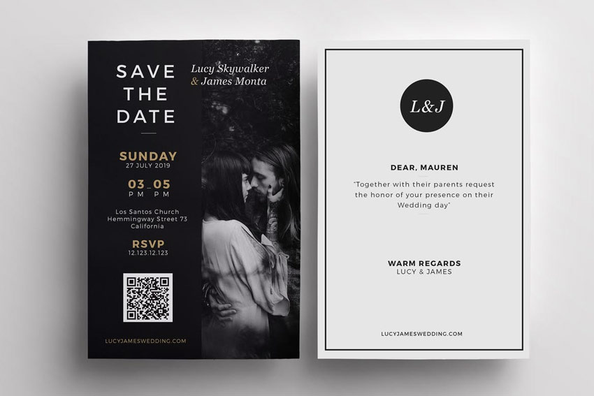
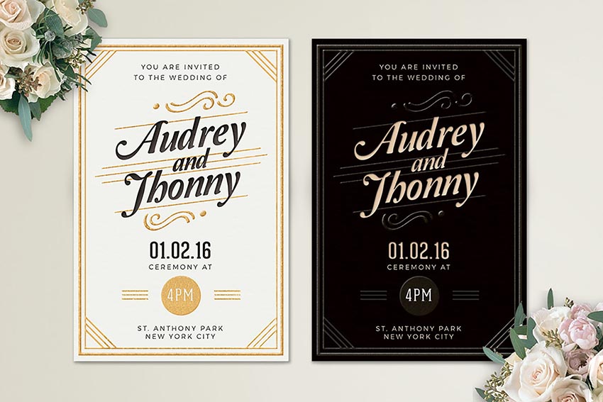
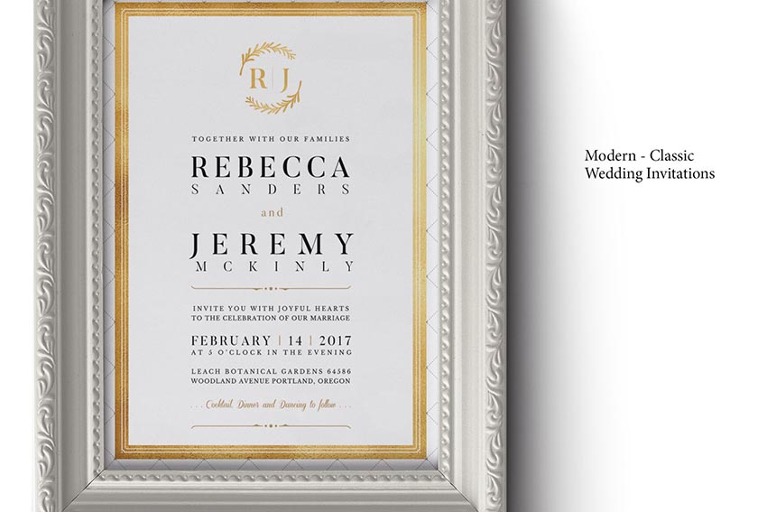
Dazzle your guests with this stunning wedding invitation design. This template features an elegant black and white color scheme with gold elements to complement your overall palette. Print ready and easy to use, this design can be downloaded today!
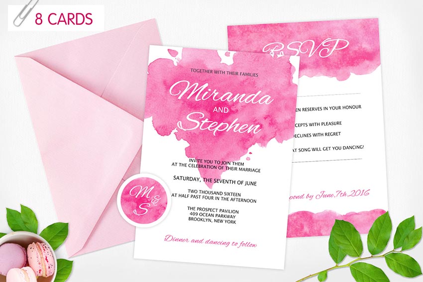
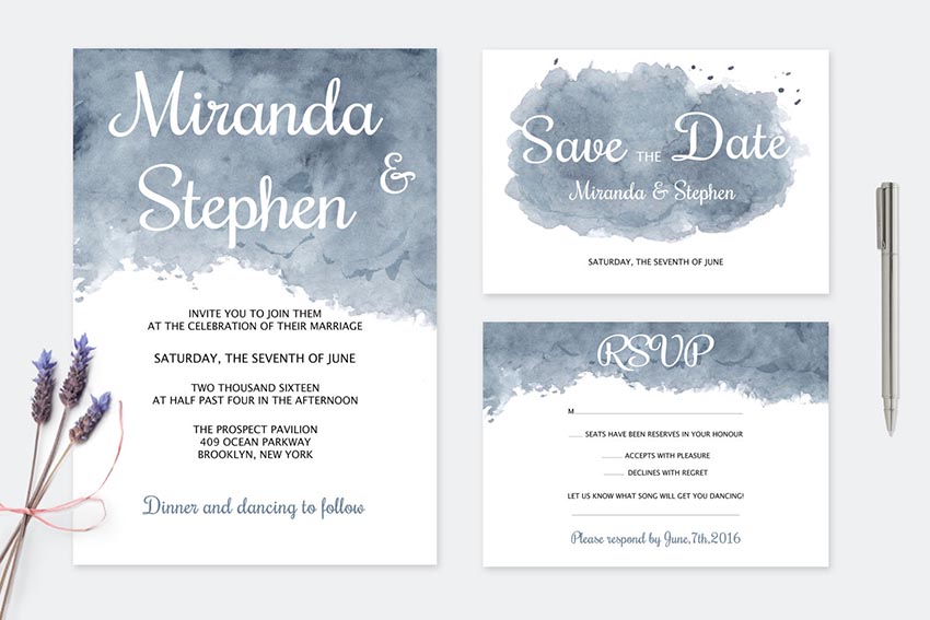
This beautiful invitation package features a handmade watercolor wash that is sure to impress your guests! Also included in this package are eight Photoshop files with multiple card designs and so much more!
Match your invitation design to the bride’s dress details with this elegant invitation. This template features a lovely dark and light version with a professional clean design that is sure to make your invitations memorable.
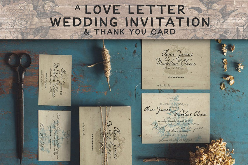
Send a love letter to all your party guests with this stunning invitation package. This download includes several print-ready designs with lovely script details. Easily adjust and customize the designs for more creative options.
Customize your invitations to match your wedding’s style. Perfect for that elegant look, this suite includes one invitation and matching RSVP card. Complement your wedding details by featuring this beautiful gold wreath set.
Kick off your wonderful wedding experience with this floral invitation suite. Apart from the initial documentation file, you’ll also receive four separate Photoshop files with double-sided invitations and additional wedding cards.
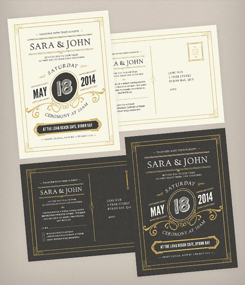
Need an invitation with a unique vintage theme? Then look no further! Here we have a gorgeous template that features a pristine vintage design with rustic elements and both front and back layout options.
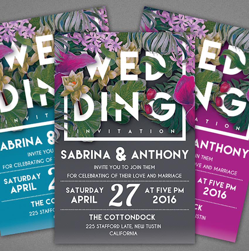
One unique way to make your invitations shine is to match them to your current floral arrangement. Use this template to feature your favorite flowers with a modern typographic design. Included in this set are two Photoshop files that are well organized with color-coded groups.
Stamp your face on a cute invitation design and let your loved ones know you’re ready to take the leap! This lovely template features a professional clean design that is print ready and super easy to use. Simply drag and drop your photos into the allotted Smart Objects to customize this design easily.
Are you having a wedding in the summer? Then perhaps you’ll love this gorgeous floral wedding invitation card. Designed with vintage floral elements and elegant text, this pack includes two high resolution invitation cards. Share the love today!
Enjoy this rustic invitation design for your special day. This elegant template features a minimalist design with vintage rustic elements to highlight your wedding arrangements. Download this file to get three unique color combinations and links to free fonts.
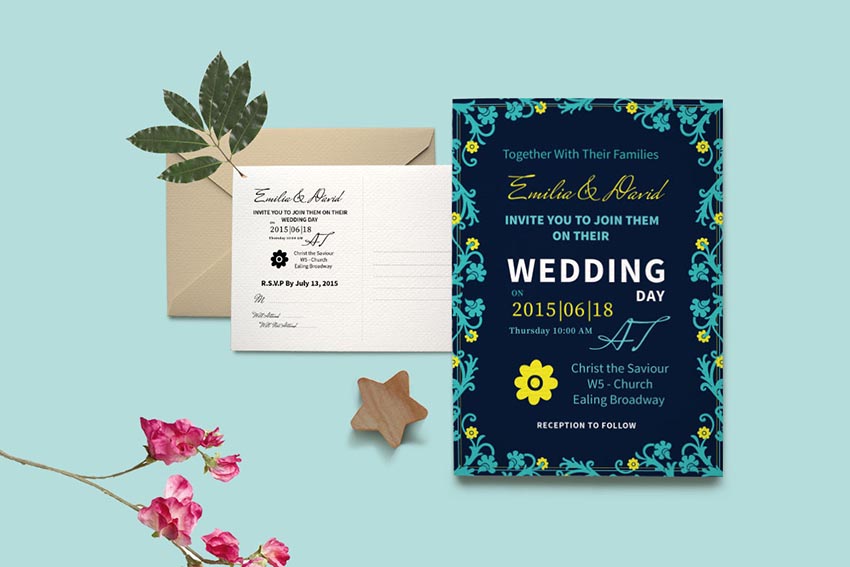
You can achieve the look of custom chalkboard lettering against a dusty blackboard with this unique design. This template features two additional color alternatives with a front and back design for a nice vintage look.
Many invitation templates on GraphicRiver come with elegant color alternatives. Check out this vintage wedding invitation, for instance. This template features three unique color combinations along with a clean front and back design perfect for your romantic celebration.
Want a wedding invitation with bold, vibrant colors? Then check out this lovely minimalist design. This template features four unique color combinations that we’re sure you’ll love. Download free fonts included with this package to take advantage of this stunning design.
There’s no need for a fussy design when you can celebrate your love with an elegant wedding invitation. This template features four fully layered Photoshop files, with two color options, and so much more!
Or how about a nice watercolor design for your wedding invitation? This template features a special design with handmade watercolor textures that are sure to complement your special day. Download this template to get access to four color combinations and so much more!
If you love the look of sparkly bokeh photography, then we’re sure you’ll enjoy this stunning wedding invitation. This template features a gorgeous sparkly design with elegant text and a simplistic layout.
Put your love on display with this beautiful wedding invitation template. This design features a print-ready layout that is super easy to use. Simply place your photos into the appropriate Smart Objects to enjoy this design quickly and easily.
Love geometric shapes and warm, vibrant colors? Then this template might be the one for you! Included in this package are all the materials you need to kick off your wedding in style. Enjoy a complete collection featuring modern designs for wedding invitations, RSVP cards, and more!
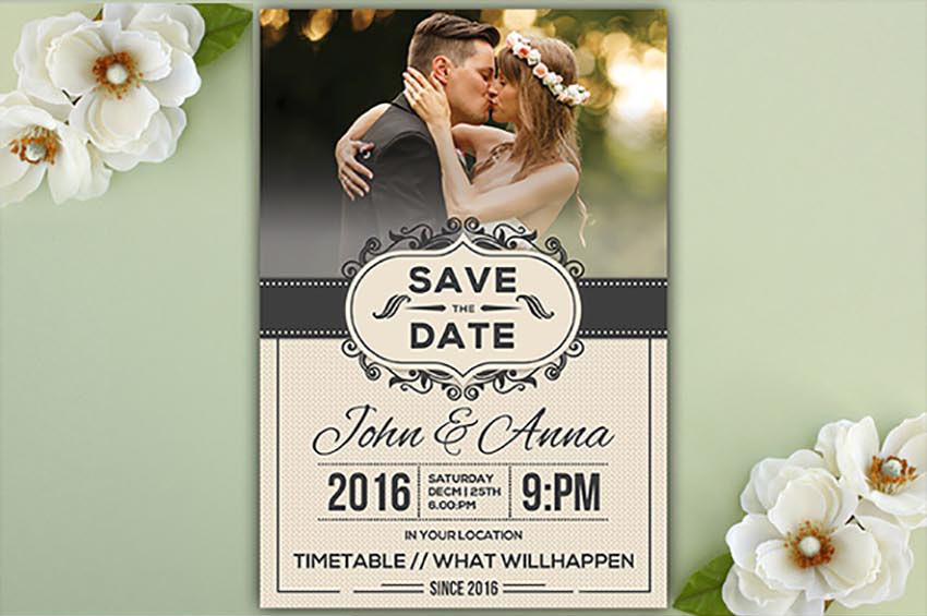
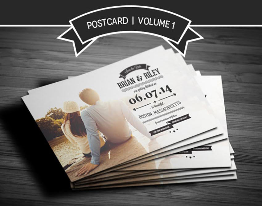
Many lovely couples utilize talented photographers for stunning engagement photos. So take advantage of your special photo shoot by showcasing your photos on your save the date cards. Created in Photoshop with well organized layers, this template is ready to download and enjoy today!
Save the date with a remarkable design that is classic and effortless. This wedding invitation features a sublime design with exquisite watercolor foliage. Adjust the text elements with the names of you and your love to enjoy this invitation now!
Get royal with this stunning wedding invitation package. Included in this package are ten premium Photoshop files with templates for the invitations, RSVP cards, and so much more. Download this set to create a nice, cohesive look for all your wedding materials.
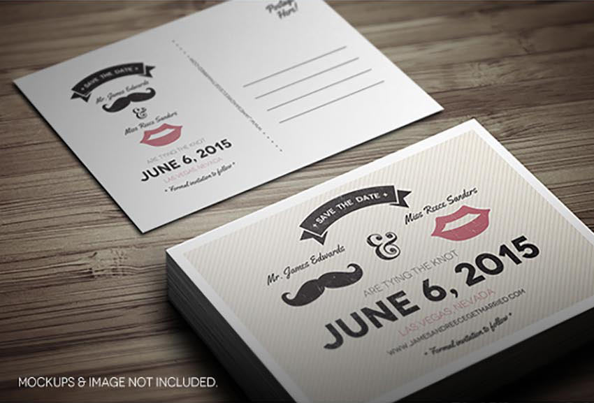
This super cute wedding invitation is perfect for an adorable retro couple. Show off his manly stache and her favorite lip shade with this cute design. This template features two layered Photoshop files, front and back designs, and plenty of room for guest information.
Save the date in style with this customized wedding invitation. This template features two layered PSD files that are super easy to edit. Simply drag and drop your favorite photo into the template and change the details for a personalized design.
Show how much you love each other with this adorable wedding invitation package. This package includes 11 Photoshop files with templates for your save the date invites, RSVP forms, and thank you cards. Download this set today to get 11 great designs in one professional package!
Take advantage of cool typographic design with this unique wedding invitation template. This design features a grungy mix of letters for all your pertinent information. Download this package to get an easy-to-use file with fully editable layers and more.
Wedding planning is already stressful, so do yourself a favor and go with a simple and elegant invitation design. This template features five gorgeous color variations with simplistic details and well-organized layers. Download it today to plug in your wedding details in no time at all!
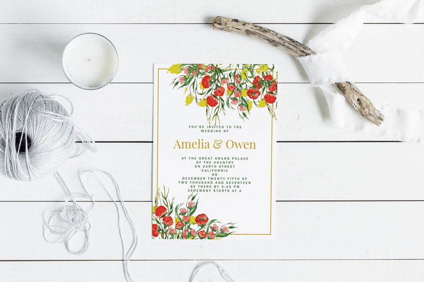
Match your invites to your garden surroundings. We hope you’re inspired to take a calming stroll amongst the flowers after using this lovely invitation set. Included in this download are several Photoshop files with front and back wedding card designs for fast printing!
With a mix of fresh flowers and vintage design, this template features two unique light and dark versions to match your overall theme. Download this package today to get access to fully editable files and print-ready templates.
Are you a bird lover at heart? Incorporate your passion into your wedding with this unique wedding invitation set. This template features a simplistic, elegant design with double-sided cards in a print-ready format. Download it today to make the most of this lovely design.
For a classic wedding invite design, check out this gorgeous collection below. This package features easily editable Photoshop files for invites, info cards, and so much more. Customize it easily with your wedding details to get started today!
Stand out from the crowd and download a template today that won’t be expected. This creative design features a unique black and white style with charming design details. You’ll receive a documentation file with nine additional files to cover your wedding arrangements.
White typography against a solid black background always makes for stunning design. And you can utilize this design for print-ready invitations that are super easy to use. Purchase this package today to get access to several black and white designs featuring that classic vintage look.
Do it yourself with this fabulous wedding invitation set! This package includes an elegant design with incredible peony flowers and room for photos. Customize your cards easily with dreamy engagement photography and all your wedding details.
Save the date with this divine wedding invitation package. Featuring a gorgeous wash of watercolor as the base, this design also includes eight Photoshop files that are easy to use. Download the free fonts included with these templates to take full advantage of these designs.
The beauty of DIY design is that you can still create beautiful invitations that won’t break the bank. And this vintage template is certainly no different. Included in this package are several files for your invites and cards in a print-ready format you can also print at home.
Match your vintage wedding theme with this authentic invitation design. Included in this package are four Photoshop and Illustrator files with 100% vector elements. Show off your style and your incredible taste with this overall charming invitation set.
Those special little details really set a normal invitation apart from an extraordinary one. And this watercolor invite set features lovely floral details with files available in Adobe Photoshop. Get it printed on a special card stock with raised ink for an awesome experience.
Minimalist design can be just as fabulous as ornate ones. And with this adorable invitation set, you’ll be able to enjoy a simple design with a loving couple on the back cover. This package also includes elegant font types with vintage design elements for added style.
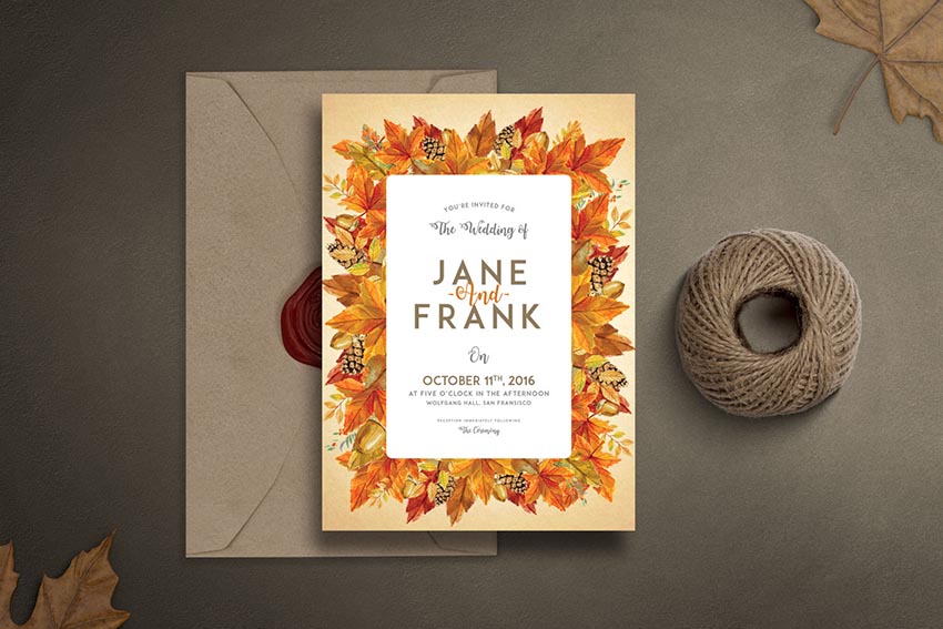
As the colors on the leaves start to change, autumn becomes a beautiful time of the year to have a wedding. And with this invitation set, you get access to a nice fall design with several invitation cards that are easily editable. Celebrate your favorite season with the wedding of a lifetime!
Go for a traditional aesthetic with this sweet embroidery invitation package. This download includes several important items like invites, RSVP cards, and more to complete your special day. Get access to front and back designs with bleed lines and more.
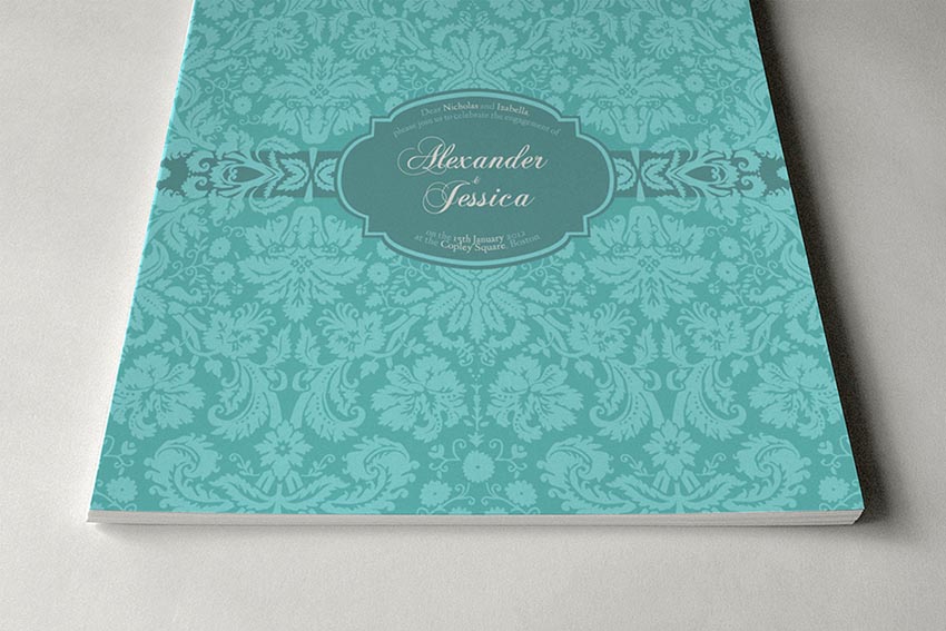
It’s always good to have options in your life. And with this wedding invitation package, you get access to 24 vintage invitations featuring a fabulous brocade design. With print-ready files and six color variations, these mature wedding designs will make your plans complete.
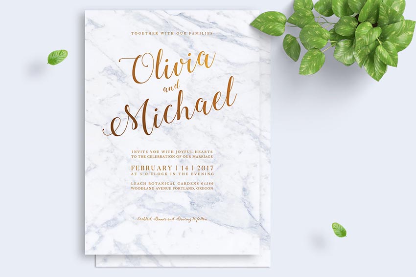
Marble floors exude class and sophistication. And you can incorporate that expensive look into your designs with these marble wedding invitations. Complete with print-ready files that are also fully editable, this template lets you enjoy that marvelously chic look without breaking the bank.
Unite your love of flowers and vibrant watercolors with this stunning invitation set. Included in this package are several save the date designs with a bonus set of eight watercolor elements. Choose a premium card stock to truly highlight your awesome designs.
Showcase your classic wedding theme with this gorgeous modern design. This template features print-ready, fully editable files, with only free fonts used. Download this package today for a smart and simple wedding solution.
This fun floral invitation is made with 100% vector elements. This means you can easily customize the flowers and leaves by scaling them to the size you desire. Make additional changes to the text or colors for a nice personalized touch.
Or surprise your guests with these extraordinary invites featuring beautiful script text. This template includes a classy watercolor wreath design that your guests are sure to love. Choose from two color palettes, green and gold, to make your wedding unique and memorable.
If your wedding is during that special time of the year when the flowers are at full bloom, then you’ll definitely want this spring invitation set to match your theme. Included in this package is a lovely watercolor design with flirty elements and gorgeous cursive fonts.
To finish this awesome collection, we’ll feature this amazing typographic design. Included in this package are six separate Photoshop files with a multitude of color variations to fit any theme. Download today to customize this design quickly and easily.
Conclusion
This list is jam-packed with exciting resources for the avid designer
familiar with Adobe Photoshop and Illustrator. If you need additional
help modifying these templates, enlist the skills of a talented
professional by choosing one of the amazing designers from Envato Studio.
And with hundreds of gorgeous wedding invitation templates available, chances are we’ve missed a few to add to your personal collection. Be sure to browse Envato Market and Envato Elements for more resources, and let us know your favorites in the comments below!
Procreate is my favorite drawing app available for the iPad.
In this tutorial we’ll be creating a colorful portrait of a beautiful woman, using different painting techniques. We’ll take some inspiration from the retro and glamour styles, and we’ll use vibrant neon colors to make it stylish.
Let’s start!
1. How to Make a Sketch
Step 1
In this tutorial, I’m using an iPad pro with the Apple
Pencil and the Procreate 4 app.
First, open the application. Tap the (+) icon in the top-right corner to
create a New Canvas. There you can
select one of the canvases from the list or create a new one.
Tap to Create
Custom Size and create a 3500 x 4000
px canvas, RGB, 300 DPI.
Step 2
Before creating a sketch, let’s find a proper brush
for it.
First, open the Brushes
tab, tap the Sketching set, and
select the 6B Pencil.
Let’s modify this brush a little bit. Tap the 6B Pencil icon, and the Settings of the tool will appear. Choose
the General settings and change the Size Limits to ~30% Max. It will allow us to have more flexibility in the
sketching process.
Step 3
Let’s begin by drawing a sketch.
We already have two layers by default: one layer with the background color and one empty layer. Open the Layers panel, tap „Layer 2”, and rename it to „sketch”.
Step 4
Now we can start sketching. Usually I make a
combination of basic shapes first, where I’m trying to search for the silhouette of
the character and her features. Then I refine the sketch, adding a couple
more details to give them a bit more character.
I do a lot of rotating of the canvas in the process. You
can do it too if you like—just use two fingers and rotate your image or size
it.
Also, you can change the Size and Opacity of any Brush tool by moving up
and down the sliders on the left
side of the screen.
2. How to Create the Main Shapes
Step 1
First, let’s
create the Palette of the basic
colors.
We have the Colors menu in the top right corner, where we can select the color.
For the Create
a New Palette option, click on the (+) icon, and a new area with empty boxes for our new palette will appear. Rename
it to „neon”.
Now pick the color and tap on any of the empty boxes, and
it saves it (tap on the boxes to create the colors for your palette, and tap on
them to delete any of them).
This way we’ll create our own Palette. Basically, we’ll choose bright colors for the hair and
clothes (place them on the first row), and cold brown colors and nuances of lilac,
purple and lavender for the skin (on the second and third rows).
Step 2
Now open the Layers
menu, tap N on the
„sketch” layer, lower the Opacity
to 50%, and change the Blending Mode to Multiply.
Step 3
Let’s set a background color by tapping the
„Background color” layer, which we already have by default. Select a
dark purple color on the Color Wheel.
Step 4
It’s time to
begin painting.
Create a New
Layer for the skin and drag it under the „sketch” layer.
First, go to Brushes >
Airbrushing > Hard Airbrush andpick
a brown color from our Palette.
Draw the
outlines of the body, using our sketch as a reference. Now we can fill it with
a solid color. Just drag it from the Colors in the top right using your
finger, and drop it onto your outline shape. Make sure that your lines are
completely closed. Then refine the edges using the Eraser Tool. Choose the Hard Airbrush tool as an eraser.
Step 5
Using this method, draw the hair and clothes on separate layers. Organize them as shown below.
Step 6
Open the „makeup” layer, and draw eyelashes,
eyebrows, nostrils, and the middle line of the lips using the 6B Pencil and a dark brown color.
Create a New
Layer for the eyes and lips on top of the „skin” layer. Fill them
with colors using the same brush.
Step 7
Set the Opacity of the „sketch” layer to 30%,
making it more transparent. It’s still useful to us in the painting process,
but should not be so conspicuous at the same time.
3. How to Add Shadows and Highlights to the Body
Step 1
Let’s start by adding some volume to the body. Tap on
the „skin” layer and select Alpha
Lock from
the drop-down list.
It will help us to paint inside the body shape without crossing this area.
Now select a dark brown color from our Palette and choose the Nikko Rull brush from the Painting set.
Start creating soft shadows by making strokes on the
shadowy area. Change the stroke Size
and Opacity in the process until you get the desired shapes. Turn off the „sketch” layer to see the
result.
Step 2
This way, add some deeper shadows using the same brush.
Check the result, making the „sketch”
layer invisible.
Step 3
Let’s change the color of the strokes on the
„makeup” layer.
First select the layer, and then tap the Adjustments icon and choose the Hue, Saturation, and Brightness from the drop-down
list.
Change the color, making it darker. Move the sliders until you get the desired
result.
Step 4
Now let’s add some blush to the skin.
Create a New
Layer on top of the „skin” layer first. Then tap on the
„skin” layer and choose Select
from the drop-down list. It will allow us to draw on the „blush”
layer just inside the body shape.
Choose the Soft
Brush from the Airbrushing set,
and draw some blush shapes on the cheeks, nose, and neck. Reduce the Opacity of the layer to 40%.
Step 5
It’s time to add some highlights to the lightened
area.
Create a New
Layer on top of the „blush” layer, and rename it to
„highlights”. Pick a beige color from our Palette, and paint some highlights strokes, using the same Nikko Rull brush. Reduce the Opacity to 40%.
Step 6
Now create a New Layer again on top of the „highlights”. Draw more evident strokes, using the same color and brush. Reduce the Opacity to 40% as well.
Step 7
Once we’re happy with the highlights, we can merge
these layers. Tap on the top layer with highlights and choose Merge Down from the drop-down list. Or
you can take the two layers (one finger on one, and one finger on the other)
and squeeze them together.
Step 8
Create a New
Layer on top of the „highlights”. We’ll add some bright highlights to make the look more expressive. Use the same brush and lilac tint
from our Palette. In the end, lower
the Opacity to 60%.
Now create a New
Layer again and draw some highlights on the cheekbone, on the corner of the
eyes and lips, on the tip of the nose, under her eyebrows, and on the forehead.
Use the same color and brush with 100%
Opacity. Once you’re happy with the result, merge all these layers with
highlights, blush and skin into one „skin” layer.
Step 9
Let’s refine the skin a little bit, correcting the roughness of
the skin
and improving the shape of her face and body. Use the Color Picker Button to select the color you need. You can find this
button between the Size and Opacity sliders.
Step 10
Now let’s add some volume to the eyes.
Start with the white of the eye, adding some brown
shadows under the eyelashes. Choose a dark brown color for the top of the iris and
a light brown color for the underside. Also add some bright green strokes to
the iris.
Next, draw a strip on the edge of the eyelid, adding some
shadows and highlights to it.
In the end, add some gloss and twinkles to the white of
the eye, the iris, and the pupil.
Step 11
Now we’ll get to work on the lips.
Add the shadows first, using dark shades of cherry
color. Then add some bright pink strokes and a white gloss to the upper part of
the lips. In the end, draw some dark brown shadows on the left part of the upper
lip and under the bottom lip, as shown below.
Here’s how the face of our woman looks at this stage.
Step 12
Let’s refine the face a little bit, adding some deeper
shadows to the area above and under the eyes and neck. Also, draw some bright gloss
using the lavender color from our Palette.
Step 13
Once we’re happy with the volume of the face and body,
let’s add a texture to make the skin more natural.
Create a New
Layer on top of the „skin”, and rename it „skin
texture”. Choose the Splatter
brush from the Spraypaints set and pick
a brown color.
Apply Select to
the „skin” layer. Using the max
size of the brush, draw some strokes, spraying tiny spots on the skin area.
Reduce the Opacity to 20%.
Now create a New
Layer again on top of the „skin texture”. Draw some freckles and
moles, using the same brown color and the Nikko
Rull brush. Add them randomly to the nose, cheeks, forehead, and shoulders.
Reduce the Opacity of the layer to 50%.
Step 14
In the end, let’s draw some falling shadows from the
hairstyle. Create a New Layer for
themon top of the „skin”.
Add some dark shadows to the forehead under the fringe first. Lower the Opacity to 65%. Then, on a New Layer, draw some deep pink reflections using the Soft
Brush. Reduce the Opacity to 35%.
4. How to Create a Neon Hairstyle
Step 1
Let’s start forming the hairstyle.
First, make the „sketch” layer visible. Also
reduce the Opacity of the „hair
2” layer to 50%.
Now lock in the „hair 1” and „hair
2” layers by activating Alpha Lock.
Use the Soft Brush to draw some blue
strokes at the edges of the main hairstyle shape. Also add some pink to the
edges of the hair on the „hair 2” layer.
Step 2
Create a New
Layer on top of the hair layers. Use the 6B
Pencil and blue color to draw the lines of the strands
of hair, styling separate locks. In the end, turn off the „sketch”
layer.
Step 3
Use the textured brush Nikko Rull and cyan color from our Palette to add some bright spots to the inner part of the
hairstyle. Then pick a pink color and draw some gentle textured strokes of the
highlights.
This way, add a lilac touch to the locks.
Step 4
Apply Select
to the „hair 2” layer, and create a New Layer on top of it. Pick a cyan color and draw some short, bright strokes, imitating shaved hair. Also use a blue color to draw the
shadows from the upper hair and the area behind the ear.
Step 5
Lock in the „hair lines” layer by activating Alpha Lock. Use the same brush with pink
and blue colors to shade the hair lines, according to the principle „pink to pink,
blue to blue.”
Then turn off Alpha
Lock, choose the 6B Pencil, and
draw separate thin blue hairs. In the end, add some gloss to these hairs using cyan.
5. How to Add Volume and Texture to the Clothes
Step 1
Let’s start with the earrings.
First, choose the Soft
Brush from the Airbrushing set and a green color. Apply Alpha Lock to the layers with earrings and draw some green shadows.
Now turn off Alpha Lock. Select the new Lightpen brush from the Luminance set, choose a lime green color from
our Palette, and draw some shining strokes on the edges of the earrings.
Step 2
Now let’s move to the
dress. Make the „sketch” layer visible first. Then lock in the „dress” layer by activating Alpha Lock.
Using the Nikko Rull brush, draw two lime color strokes to decorate the edges of the dress. Also
use a pink color for the
underside of the dress. Then, using the Soft Brush, add some lilac tints to the
cloth.
Turn off the
„sketch” layer. Pick the Nikko
Rull brush again and draw some cyan highlights and purple shadows, forming the creases of the dress.
Step 3
Now let’s add some
texture to the fabric.
Create a New Layer on top of the „dress” layer.
Select the Newsprint brush from the Retro set, and draw some pink strokes
on the creases and on the area of the shoulders.
Create a New Layer again and draw some green
strokes on the highlights area. Then, using the EraserTool, make some vertical stripes on top of them.
In the end, on a New Layer, draw some lime green and yellow dots on the green
texture.
Step 4
Take the Selection Tool, and select the area of the dress we want to make a little darker. Then go to Adjustments > Curves, and pull the right slider down a little.
Do the same for the
creases, as shown in the screenshot below.
In the end, using the Nikko Rull brush and a dark violet color, draw some vertical stripes deep in the folds.
6. It’s Time for the Final Touches
Step 1
Let’s add some necessary
details.
First, create a New Layer for reflections on top of the
„eyes/ lips”. Apply Alpha
Lock and Select to the „skin” layer.
Now pick the lilac color
and draw some shapes of reflections mostly along the left side of the body. Use
the Nikko Rull brush with 60% Opacity for it. Draw more saturated strokes on the edges of the body shape.
Step 2
Create a New Layer for the rim light on top of the
„makeup”, and deselect the „skin” layer.
Pick the cyan color and the 6B Pencil brush to draw vivid strokes on the left side of the face. Add some gloss to the eyebrows, eyelashes, and the tip of the nose as well.
Step 3
In the end, we have to add some reflections from the earrings.
Create a New Layer for the green reflections
under the „reflections” layer. Pick the Nikko Rull brush again and draw some green and yellow shapes on the
cheeks and chin.
7. How to Create an Abstract Background
Step 1
We already have the
basic dark purple color on our default background layer. Let’s add some texture and a pattern
to make our image more stylish.
Create a New Layer on top of „Background
color”. Pick a new brush, Nebula, from the Luminance set and a blue color to add some mistiness to the background. Reduce the Opacity of the layer to 60%.
Create a New Layer on top of the blue nebula and add
some pink splashes as well, reducing the Opacity
of the layer to 60% too.
In the end, pick a dark main color from the background and add a splash to the bottom right corner of
our canvas. Pick the Eraser Tool with the Soft
Pastel brush and make some holes in the blue and pink shapes, diffusing their density.
Step 2
Let’s create a simple
pattern for the decoration of our background.
First, turn off the
„background” and all nebula layers. Create a New Layer
on top of them. Pick the Hard Brush
from the Airbrushing set and tap on the canvas, making perfect dots. using a grid on the canvas will help you to place them at
equal distances from each other.
Now let’s duplicate this
row of dots. Tap Transform in
the top panel, swipe down with three fingers, and the menu will appear. Choose Copy+Paste and we’ll get these dots on the new layer. Move them down and to the right. As a result, we’ll get them in staggered order. Merge these layers into
one.
Duplicate this layer
using the same principle.
Now let’s flip our four
rows horizontally. Just tap Transform
in the top panel and choose the first icon in the bottom panel. Move them to the
right side.
Step 3
Let’s add some texture
to the dots. Apply Select to the layer with the dots. Create a New
Layer on top of it and choose a new brush, Burnt Tree, from the Charcoals
set.
Pick the pink color from
our Palette and use the max size of the brush to cover our dots with texture. Turn off the first layer with blue dots. Now we have clean, textured pink dots. Reduce the Opacity of the layer to 55%.
Great Work! We’re Finished!
I hope you’ve enjoyed the process and the final result meets your expectation!
Good luck, and don’t be afraid to use your imagination and create something beautiful!
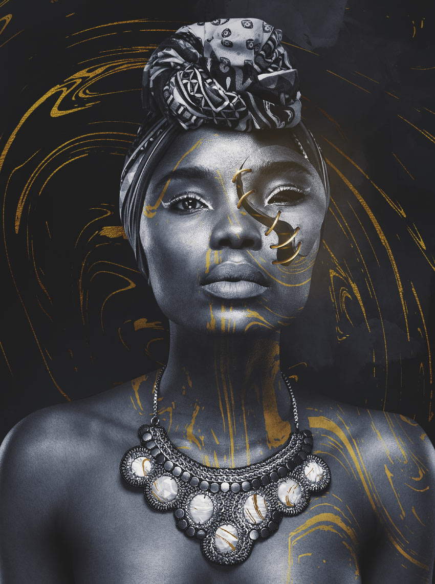
Today, we will be learning how to create a golden stitched effect using just a handful of images and default brushes. We will utilize color palettes, adjustment layers, and textures to their fullest extent to create a striking piece of black, white, and gold art portraiture.
What You’ll Need
Here are the resources we will be using, all found on Envato Elements!
First, we are going to be creating a fairly basic background using a few textures.
Step 1
Create a New Document in a size of 2834 x 3803 px.
Create a Color Fill Layer and set it to a very dark grey #090909.
Using a very large soft Brush, with a 50% Flow, paint giant white blobs all over your canvas.
Step 2
Place texture „21” from the Artistic Backgrounds texture pack, or any other watercolor texture, in the middle of your canvas and set it to Soft Light.
Remember, color doesn’t matter in this instance as it all will be black and white in the end!
Place texture „6” over texture „21” and also set it to Soft Light.
Add a Layer Mask to „6” and using a very large soft Brush mask out the bottom-left portion of the texture.
Step 3
Create a black to white Gradient Map adjustment layer. Set the Opacity to 78%.
Duplicate the Gradient Map and set the duplicate’s Opacity back to 100%. This is to add extra contrast to the background.
Step 4
Next, let’s place our gold leaf detail from the Gold Streak Backgrounds texture pack. I used texture „8” set to Hard Light.
Clip a New Layer into the gold texture and set it to Soft Light.
Using a medium soft round Brush paint black and white streaks going diagonally from top-left to bottom-right to give the gold more shine.
Lastly, clip a Color Balance layer into the gold texture. Settings: Red -35, Green +7, and Blue -30.
Group all your background layers together and name the group „Background.”
2. How to Do Color Correcting
Normally, I would save this step for last, but in this case, it helps to do some overall color correcting early on. This is largely due to the atmosphere of the image relying so heavily on this handful of adjustment layers.
Take note that almost all other layers after this step will be located under this group of layers.
Step 1
All layers are numbered as the order is important.
Color Lookup Layer: (3DLUT) FoggyNight. Opacity 42%.
Color Balance Layer: Red -8 and Blue +15
Step 2
Now, for the second batch.
Color Lookup Layer: (3DLUT) Kodak 5218 Kodak 2395
Curves:
Make sure to group all your layers together and name the group „CC”.
3. How to Prepare and Process Our Model
Next, we will be placing and preparing our model. Remember all layers from now on will be placed under the „CC” group.
Step 1
Place our Beautiful African Woman image in the middle of the canvas, keeping the crop fairly tight with her shoulders and upper chest touching the edges of the canvas.
Extract her using your preferred method. As she has no complicated clothing or hair, any method will do! I personally use the Pen Tool.
Step 2
Create and clip a Brightness/Contrast layer into the model. Settings: Contrast -50.
Create and clip a New Layer into our model and set it to Overlay.
Using a soft round Brush, bring back in some of the contrast by painting black on the shadows and white on the highlights of our model. Make sure to bring a lot of brightness into her left eye and darken the top of her head wrap.
Step 3
Create and clip a black to white Gradient Map into our model.
Step 4
Next, we will be adding some gold detail to our model’s body to help connect her with her surroundings.
Go back into the Gold Streak Backgrounds texture pack and place texture „6” over the model. Set the layer to Hard Light.
Step 5
Add a Layer Mask to the gold texture and mask out the left side of the texture on the chest, necklace and face using a hard round Brush.
Double-Click on the gold texture to open up its Layer Style panel. Hold down Alt to separate and move the Blend If toggles around. The settings are below:
I went ahead and gave the same treatment to the white stones on her necklace, only I didn’t use Blend If. I just masked some of the gold texture „1”, from the texture pack, into the stones to add a little extra detail.
Step 6
To finish up the model, we are going to create and clip a Curves layer into her. The settings:
Press Control-I to invert the Curves layer mask. Using a large round Brush, paint white to mask back in some of the darkness around the model’s head and shoulders.
Group all your model layers together and name the group „Model.”
4. How to Create a Hollow Face
Next, we will be creating the face „panel” that will later be stitched back on!
Step 1
Go back to the „Model” group and create and clip a Brightness/Contrast layer into the top of the „Model” layer, above all other clipped layers. Settings: Brightness -100 and Contrast 100.
Using the Pen Tool, create a path around the eye and part of the cheek of our model. At this point, we are creating the shape of the hole and panel, so feel free to choose whatever shape you’d like.
Right-Click > Make Selection to turn the path into a selection.
Step 2
With the Brightness/Contrast layer active, Right-Click > Fill with black.
Control-I to invert the layer mask. Now, only the eye and cheek should be dark.
Step 3
Control-Click the Brightness/Contrast Layer Mask to make a selection in the same shape as the mask.
Duplicate the „Model Group” and turn off the Brightness/Contrast layer. Merge the duplicated group together and then Edit > Copy and Edit > Paste.
Delete the merged „Model” duplicate. This will leave you with just a face panel in the same shape as the layer mask on the Brightness/Contrast layer.
Step 4
Tilt and position the face panel so that it is slightly pointing upward.
Step 5
To make the edge of our face section, duplicate the face panel and bring it down 5 px and to the left 5 px.
Add a Color Overlay layer style in a medium gray color #717171.
Right-Click > Rasterize Layer Style.
Step 6
Add some noise by creating and clipping a New Layer into the face edge, filling it with black.
Go to Filter > Noise > Add Noise. Settings: Amount 7, Gaussian and Monochromatic. It should be fairly subtle.
Step 7
Create and clip a New Layer into the face’s edge. Set it to Overlay.
Using a 2-5 px hard round Brush, paint lines on the face’s edge in both black and white. They don’t have to be perfect. This is to give it a wood grain effect.
Set the layer’s Opacity to 70%.
Step 8
Create and clip yet another New Layer into the „Face Edge” layer and set it to Soft Light.
Using a large soft Brush with a low Flow Rate, paint in some shadows and highlights.
Step 9
To add some final detail, we are going to add wrinkles to the model’s skin. Add a Layer Mask to the „Face Panel” layer.
Using a hard, round Brush, mask out parts of the face nearest the edge in „half-oval” shapes.
Create and clip a New layer into your face edge layer.
Using a semi-hard round Brush, paint black under where you masked out the face. This will create a shadow effect. Set the layer Opacity to 50%.
Step 10
We will finish off the wrinkles by adding some shading to them. Create and clip a New Layer into your face panel. Set it to Soft Light.
Using a medium soft round Brush with a low Flow Rate, paint black on the left and right side of each wrinkle and white in the middle. This will give it a „folding” effect.
Step 11
Group all your face layers together, except the one in the „Model” group of course, and name the group „Face.”
Add a layer mask to the „Face” group and, using a hard round Brush, mask out the eye.
5. Creating Thread Holes
Next, we are going to be focusing on how to create the holes that our thread will loop through. The process is very similar to how we did the edge of the model’s face.
Step 1
Using the Ellipse Tool create medium gray #818181 circles along the side of the face panel and original model’s face. They should be in pairs and side by side but at a slight angle.
Step 2
Select all your hole layers and Right-Click > Merge Shapes so that they are all one shape and thus one layer.
Duplicate the newly merged holes and clip them into the original holes. Change their color from gray to black.
Move the black holes 3 px down and 7 px to the left.
Step 3
Create and clip a New Layer into the grey holes, below your black holes. Set the layer to Soft Light.
Now, just as we did before with the face’s edge, add a wood grain texture to the holes with a 1 px hard round Brush by painting black and white lines in the holes in a „C” shape. Set the layer’s Opacity to 70%.
Step 4
Create and clip a New Layer into your gray holes, above your wood grain but below your black holes, and set it to Overlay.
Using a small, soft, round Brush, paint white in the middle and black on both sides of the grey holes. This will give them more dimension and make them appear more curved.
Step 5
To finish up the holes, we are going to add some shading to the hole itself, similar to what we did with the wrinkles in step 4. Create a New Layer below your gray holes. Set it to Soft Light.
Using a small, soft, round Brush, paint white on the left side of the holes and black on the right side.
Create another New Layer and, with a slightly bigger Brush, paint more black around the holes, focusing on the left side. Keep this layer set to Normal.
Group all the hole layers together and name the group „Holes.”
6. How to Create Golden Thread
Finally, we have reached the main event: creating our golden thread! This is a long one, so get ready.
Step 1
We will be creating the base for our thread using the Pen Tool. First, however, go to your Brush Tool and set it to 100% Hard, a Size of 15 px, and a dark gold/brown color #87461c
Create a New Layer.
Now, go to your Pen Tool and create paths arching from one hole to the hole directly across from it.
Step 2
Right-Click > Stoke Path. Make sure that Tool is set to Brush and Simulate Pressure is Unchecked. Press OK.
Right-Click > Delete Paths if you are satisfied with how your lines look. You can re-do them as many times as you need.
You can also use the Eraser Tool with a hard round Brush to fix the ends of the thread, and use a combination of the Lasso Tool and Move Tool to adjust the threads even further.
Step 3
Create and clip a New Layer into your thread. Fill it with black and set it to Screen.
Go to Filter > Noise > Add Noise. Settings: Amount 13 px, Gaussian, and Monochromatic.
Duplicate the noise layer to increase its intensity.
Step 4
Before we move on to painting our gold, we have to do a bit of prep work.
First, below is the color palette we will be using. I suggest making some Photoshop Color Swatches of them, or just copy and paste the image below above all your current layers so you can easily color pick from it using the Eyedropper Tool! Whichever is easiest.
Second, we will need to figure out what brushes to use. You could absolutely use a semi-hard round Brush if you want to. However, I suggest something with more texture. Brushes that are meant to give a charcoal, pastel or brush stroke effect work great. As do „natural edge” brushes. The example below is a „natural” brush.
One stroke of the brush.
Two strokes of the brush.
Three strokes of the brush.
All versions of Photoshop come with similar brushes by default!
Step 5
Now that we have our colors and brushes settled, we can move on to the painting. Create a New Layer and clip it into your thread layer, above your noise layers.
Using your preferred brush, paint the second color in our palette, which is #ad6d16, onto the thread in a „C” motion. This color is only slightly lighter than the thread’s base color.
Step 6
Next, do the same thing with the third color in the palette, #ca9d40, only make it slightly shorter than the previous stroke of color.
And with the fourth color in the palette, #e7d63e, again making it slightly shorter than the previous swipe.
Step 7
And the same with the fifth (#fffbcb) and sixth (#ffffff) colors. Use the Smudge Tool to smooth out any areas that seem too choppy.
Repaint them as many times as you deem necessary. I didn’t nail this my first, second or third time either! Think of it as just painting a gold gradient, as that’s what we are doing!
Do this to all the remaining stitches. Again, take your time! Gold can be very tricky to paint.
Step 8
Next, we are going to paint some thread details. This part is also a bit tricky, but we can do it! Create and clip a New Layer into your thread layer, above the gold you just painted.
Using the same brush you used to paint the gold, but this time set toa 2 px Size, paint lines of the darkest color in our palette, #87461c, across the first thread. Paint it in a slight twisting motion.
Step 9
Do the same with the other five colors, using the light colors to make highlights on the thread.
If your lines seem too strong, you can lower the opacity of the layer a small amount, or you can lower the Flow Rate of your brush to 50%. We want the lines to be very dainty and thin.
We also want them to be sharp. Do this by going to Filter > Sharpen > Smart Sharpen. Settings: Amount 72% and Radius 1.9 px.
Do this to the remaining threads. Unfortunately, there is no quick trick to this—we are just painting lines! Dark lines first, and then light lines on top.
Step 10
Create and clip a New Layer into your thread, above the lines you just created. Set it to Multiply.
Using a small, soft, round Brush, paint shadows in a dark brown color (#5f2d0d) at each corner of the threads.
Step 11
Create and clip yet another layer into your thread, above your shadows layer, and set it to Screen.
Using the same brush we used for the shadows, only this time in a medium orange color (#c98614), paint some light on the left side of the thread.
Step 12
There is a very important part missing thus far: shadows! Create a New Layer below your thread.
Using a semi-hard round Brush with a 10% Flow Rate, paint shadows underneath the thread.
Remember, shadows will be darker and less soft the closer they are to the object they are being cast by. Use the Smudge Tool to smudge out the ends of shadows to disperse them a bit. Setting your brush to a low flow rate will allow you to build up the shadows slowly.
Group all your thread layers together and name the group „Stitch.”
7. How to Add the Finishing Touches
To finish everything off, we will be adding some small details such as the stitches running underneath the face panel and some lens flares.
Step 1
Go into your „Model” group and Control-Click on the Brightness/Contrast layer that we created the face panel shape from.
Leave the group and create a New Layer below your „Face” group.
With the Brush Tool set to 100% Hard, a Size of 15 px and a dark gold/brown color (#87461c), use the Pen Tool to create paths similar to step 6. This time, however, we are creating the thread that runs underneath the face panel.
Right Click > Stroke Path.
Step 2
Add a Bevel & Emboss layer style to the new thread layer. Settings below:
Shadow Mode Color: #281200
Step 3
Create and clip a New Layer into your threads. Set it to Overlay.
Using a medium soft round Brush, paint black on the outer edges of the thread and white on the middle section of the thread to add contrast and lighting.
Group all your under thread layers up and name the group „Under Stitch”.
Step 4
Finally, create a New Layer above all your other layers, including the „CC” group! Set the layer to Screen.
With a soft round medium Brush, paint pale yellow (#fffbcb) lens flares on a few of the stitches. I like to paint six-point stars. Bring the layer Opacity down to 60% if the shine is too strong.
Step 5
Create one more New Layer above all previous layers. Set it to Screen.
Using a very large soft Brush with a Flow Rate of 5%, paint that same pale yellow color on the left side of the face. Again, bring down the layer Opacity if needed. We want this to be a very subtle final pop of light and color.
You’ve Done It!
Be proud! Painting gold is no small task. Remember that keeping to a specific color palette can help a lot, and you don’t need fancy brushes to create stunning effects. Sometimes a simple round brush is the best answer!
As always, keep experimenting with different techniques, and don’t forget to post your version below, along with any questions, comments, or critiques!
Bower and npm are de-facto the package managers of the web. I doubt there are many front-end developers out there who haven’t heard of them or used them to manage dependencies.
Whilst many of us use them as consumers, one day you might decide to share a project of your own and become a contributor! This happened to me recently. I had the experience of publishing my open-source library on npm and Bower.
Although their official docs were quite good, I still ended up struggling with three little known gotchas. I won’t focus on the basics in this post. You can always find and read about them. I’ll instead focus on the gotchas.
Nowadays, it looks like even Bower tells people not to use Bower. However, in 2018, there are still many projects that depend on it. The state of JavaScript in 2017 survey shows that around 24% of surveyed developers still use Bower as a package manager. Therefore, I think it might take a little while before we see the end of Bower, which means it’s probably still worth supporting it to cover legacy-package-managed projects. I feel the pain of those of you working on a legacy project—that’s why I chose to publish my open source module there, too.
My hope is that after this you’ll be one step ahead when you decide to share your code with the world. Without any further ado, here are some gotchas I’ve come across when managing packages.
Removing a Package From npm
Why bother spending hours choosing a name, when you can focus on shipping the features first? In my first experience with npm, I was unfortunate to leave the name of my project „test-something.”
Guess what? A few days later, I found out that the un-publish option in the npm public registry is only allowed with versions published in the last 24 hours. If you are trying to un-publish a version published more than a day ago then you must contact support.
They state that it is generally considered bad practice to delete a library that other people depend on. I understand that but I’m 100% sure that no projects depend on a package called „test something.”
I was about to leave things alone, but my test package was going to be visible forever in my shiny npm user profile. Dislike!
I contacted support and they handled my request within the very same day. They still didn’t want to completely un-publish it but they did transfer it to the @npm user account and deprecated it with a deprecation note. This removed it from my profile (woohoo!) and from the search results. However, if someone knows the exact URL (or name) they can still install it. While that’s not totally ideal, the deprecation note will still be an alert that the package is no longer supported.
I think this might be related to the 11 lines of code, that Azer Koçulu deleted from npm and which kind of broke the internet for a moment. Safety first.
The moral of the story: make sure to choose your package name wisely!
Exporting Modules
Another gotcha I encountered was how to export my module. I wanted to do it in a universal way so that anyone can import it to the browser in any of the three most popular approaches. For example…
…with ES6:
// If a transpiler is configured (like webpack, Babel, Traceur Compiler or Rollup):
import MyModule from 'my-module';
…with CommonJS:
// If a module loader is configured (like RequireJS, Browserify or Neuter):
const MyModule = require('my-module');
What I was actually looking for is the Universal Module Definition pattern. It’s a pattern that provides a clean way to expose your module to different environments that consume modules in a variety of ways.
This pattern has a couple of variations, depending on what you really need. However, modules written this way are capable of working everywhere, be it in the client, on the server or elsewhere.
The standard pattern is:
(function (root, factory) {
  if (typeof define === 'function' && define.amd) {
    // AMD. Register as an anonymous module.
    define(['dependency'], factory);
	} else if (typeof module === 'object' && module.exports) {
		  // Node. Does not work with strict CommonJS, but
		  // only CommonJS-like environments that support module.exports,
		  // like Node.
		  module.exports = factory(require('dependency'));
	} else {
    // Browser globals (root is window)
    root.returnExports = factory(root.dependency);
	}
}(this, function (dependency) {
  // Use dependency in some fashion.
  return {
    // Your module goes here
  };
}));
I am building a package for npm and Bower. I followed the pattern to keep the working files (ES6) in the src/ package directory and build my distribution files (ES5, compiled with Babel) in the dist/ directory.
I ignore the entire dist/ folder in the .gitignore file. You know the drill: source control should only contain source. If it’s generated from the source, it doesn’t belong there—it should be generated by your build process instead.
On the one hand (npm), I have a .npmignore which does exactly the opposite and ignores src/ instead of dist/. On npm, I only want my distribution files. That works out perfectly well.
On the other hand (Bower), the dist/ folder is missing in the repository and, therefore, the Bower package doesn’t include it. You see, Bower tracks your publicly available Git endpoint only. By pushing Git tags you release a new version on the Bower registry. Yes, it can ignore files, but they are related only to the files in your repository.
So, how can I publish the ignored by git dist/ folder contents on Bower?
I’m not sure it’s possible to do. The only workaround I found is to commit the distribution files in the repository. If you really want to keep those distribution files out of the repo, the trick is to commit them right before you release a tag. Release a tag. Remove them.
There is one more use case that gives me some peace of mind. Imagine somebody downloads a ZIP of your repository and drops it into their project. They won’t need your fancy build step. The production source is already there. All right, maybe that’s not so bad after all.
Wrapping Up
Both npm and Bower continue to be widely used and helpful ways to manage project dependencies, even if Bower is bowing out. While they’re great at what they do, being the owner and a contributor to a package listed in either package directory presents some challenges for us and I hope the ones I’ve outlined here help save other some time and possible headache.
Do you know any other ways to handle the gotchas covered here? Or have stumbled into gotchas of your own? Let me know in the comments!