Art Therapy: Paint What You Feel

Post pobrano z: Art Therapy: Paint What You Feel

Final product image
What You’ll Be Creating

Do you remember how it felt to paint something as a child? It was a very messy activity, but it was such fun to get creative with all those colors! Well, at least until you started to expect something from your art, for example to picture an object realistically and to get your teacher’s approval. The process of painting then became less important than the end result.

Today, you may feel paralyzed just thinking of taking a brush again. It’s so hard to paint something, and you don’t want to make a fool of yourself! But the truth is, it’s very easy to paint. Children do it, don’t they? Children don’t think about the future so much, and they don’t make plans—they just enjoy the moment. This lets them paint without any anxiety and fear of judgment, and this is something you can learn from them!

But what can you paint without analyzing and planning? The answer is: your emotions. It’s not only relaxing, but it’s also healthy to acknowledge what you feel and allow yourself to feel it without judgment. The best thing about it is that you can’t do it wrong. Nobody can tell you what such a painting is supposed to look like—only you. Keep reading if you want to learn how to start!

This tutorial is part of the Art Therapy series. It teaches you how to
use art for relaxation and fun, without putting too much pressure on
yourself.

What You Will Need

For painting:

  • A set of paints—you can use anything you can get, but the best, in my opinion, are acrylics. You can usually get a set of 12 tubes in a stationery shop quite cheaply, as it’s considered a beginner’s set. They blend nicely, dry fast, and can be applied thickly on the paper. Watercolors can be more easily available, but they’re not so easy to play with.
  • A few brushes—at least a big, wide one, and a smaller one. The big ones are really expressive, so they’re perfect for this exercise.
  • Two sheets of thick paper—you don’t need to buy special, expensive paper for painters if you don’t want to. An art pad with thicker sheets should do just fine, though if you want to keep the painting afterwards, you may need to put it inside a clip frame to straighten it.
  • A glass of water—water makes the acrylics smoother, and you’ll also want to clean your brush every time you switch to another color. Just make sure to keep it away from the glass you drink from!
  • Paper towels—to clean your brush after taking it out of the water, as well as for emergency cleaning.
basic painting supplies

For the tutorial:

  • A pencil
  • A drawing compass
  • A ruler
drawing supplies

Before you start creating, make sure your workspace is not prone to staining. Place some spare sheets of paper under your „canvas” to have full freedom of painting—you won’t have to slow down close to the edges. Children don’t care about these things so much, but it may be hard for you to fully enjoy the activity if you’re worrying about making a mess!

Colors and Emotions

Although emotions are not visual and they don’t have any colors, we can associate certain colors with certain feelings. Some become linked by our experience, while others may be programmed in our mind before we’re even born. Synesthetes also find it very natural to describe feelings as colors.

I’ll show you a popular description of the meaning behind the colors, but keep in mind that various cultures assign different meanings to colors, so it’s not really a universal description—just a popular one. You can use this list to confront your own notions about colors and feelings, which can be especially useful if you’ve never done that before.

Black

It’s the color of mystery, but it also symbolizes all the darkest feelings: grief, despair, sorrow. Just as black can’t get any darker, these feelings can’t get any deeper. Black covers everything just as these dark feelings can stop you from feeling anything else. Black can also be used to hide what you really feel—emotions you’re ashamed of or the ones you don’t want to acknowledge. It’s the color of domination and isolation.

the meaning of black

Grey

It’s the color of neutrality, dullness, but also apathy, numbness. Grey is more neutral than white, because it’s neither dark nor bright. It can symbolize indecisiveness, the fear of choosing a side, of appearing too bold or even of being visible at all. It can be a symbol of depression, of all the colors-emotions reduced to similar shades of grey—a state not as dark as the sorrow of black, but a constant tiredness of not feeling anything at all. On the other hand, grey can symbolize stability and rationality, especially when put next to vibrant colors.

the meaning of grey

Red

It’s the color of energy, passion, ambition, but also desire and love. It symbolizes fierce feelings that come quickly and overwhelm you with their power, guiding you towards a certain goal that becomes more important than everything else. Red is about feeling „with all your heart”, be it love or anger. It also symbolizes sexual attraction and danger.

the meaning of red

Orange

It’s like a more rational, calmer type of red. It symbolizes joy and optimism; it can be about motivation, but without the blinding effect of red. It’s about cooperation, social activities, the power of working together, and also extrovert energy. Orange can also symbolize instinct and reckless acting.

the meaning of orange

Brown

Brown is really nothing else than dark, desaturated
orange, but because it’s the color of ever-present dirt, humans tend to treat it as
one of the main colors. Brown, like the ground, symbolizes stability,
permanence, reliability, and conservatism, but also dirtiness and foulness.

the meaning of brown

White

It can be considered a default color. It symbolizes spiritual purity, light, perfection, innocence. A white sheet of paper is perfect before you put anything on it; it’s good and complete on its own. Therefore, white is all about feeling confident and calm, without any stress to be something else. Every color can get neutralized by adding white to it, making their feelings calmer and less overwhelming. White is the color of enlightenment and spiritual awakening; a symbol of perfect contentment and balance between all the other colors (which create white when put together).

the meaning of white

Yellow

It’s the color of joy, enthusiasm, happiness, and general cheerfulness. Yellow is the brightest of hues, and as such it symbolizes the optimism that brightens everything put next to it. On the other hand, yellow can also symbolize stubbornness and cowardice.

the meaning of yellow

Green

It’s the color of hope, youthfulness, spirit, and also balance, calm, and safety. Green is the color of natural growth, of doing the things the right way, of harmony and peace. It’s the symbol of life and being alive in general. It also have negative connotations like jealousy, spite, and maliciousness.

the meaning of green

Blue

It’s the color of rationalism, wisdom, loyalty, and stability. It symbolizes calm, faith, and trust. It can be associated with conservatism, dutifulness, and introversion. It represents the mind rather than emotions; following logic rather than the gut. But it’s also associated with sadness, „feeling blue”, melancholy.

the meaning of blue

Purple

It’s the color of magic, mystery, of the extraordinary. It can symbolize creativity, independence, going against the flow, spirituality, imagination, but also pride, immaturity, narcissism.

the meaning of purple

Pink

It’s the color of recklessness, lightheartedness, of being silly and immature, but also of kindness, caring, gentleness, romantic love, and femininity. It symbolizes delicate, „quiet” feelings, as well as being detached from reality.

the meaning of pink

How to Create Your Emotional Color Palette

What colors do your emotions have? Let’s find out! There are so many emotions that it may be hard to tackle them all, so we’re going to use a simplified model—Robert Plutchik’s wheel of emotions.

This exercise helps understand the emotions you may not even be aware of, and get a better insight into your inner state.

Step 1

Take one sheet of your thick paper. Place your drawing compass in the middle and draw a circle.

draw a ciorcle with compass

Step 2

Put the compass on the circle and mark the same distance outside of it. Then put the compass in the center again and draw a bigger circle through the mark (if you do it properly, it will be twice as big, but it’s not really necessary to do it so precisely).

draw a bigger circle

Step 3

Repeat the previous steps to create one more circle.

three concentric circles

Step 4

Take the ruler and pencil, and draw a line across the smallest circle. Sketch it lightly—it’s just a guide line!

draw line across circle

Step 5

Draw another line, perpendicular to the other.

draw a perpencidular line

Step 6

Draw two more lines to divide each quarter into halves.

divide quarters into halves

Step 7

These were guide lines for the lines we actually need. Draw them now by cutting each triangle in half. These are the final lines, so you can press harder.

draw final lines
draw eight parts of cricle

Step 8

Connect each end of the triangle with the outer circle using the ruler.

cross the circle
draw more sections

Step 9

Time to put the emotions in there! In Plutchik’s model, the center is taken by the most intense emotions, and they get gradually weaker towards the biggest circle. Fill the center with:

  • Rage
  • Loathing
  • Grief
  • Amazement
  • Terror
  • Admiration
  • Ecstasy
  • Vigilance

The order is important!

basic intense emotions

Step 10

Now add the secondary emotions:

  • Rage →
    anger →
    annoyance
  • Loathing → disgust → boredom
  • Grief → sadness → pensiveness
  • Amazement → surprise → distraction
  • Terror → fear → apprehension
  • Admiration → trust → acceptance
  • Ecstasy → joy → serenity
  • Vigilance → anticipation → interest

There are also tertiary emotions, combined from the two others:

  • Annoyance + interest = aggressiveness
  • Interest + serenity = optimism
  • Serenity + acceptance = love
  • Acceptance + apprehension = submission
  • Apprehension + distraction = awe
  • Distraction + pensiveness = disapproval
  • Pensiveness + boredom = remorse
  • Boredom + annoyance = contempt

Notice that in this model the antagonistic emotions are placed opposite to each other—for example, joy-sadness, anger-fear, etc.

wheel of emotions

Step 11

Time to color the emotions! take a look at the primary emotions in the center and try to feel what color they have to you. You’ll probably find some that you can get straight from the tube. Put them in their place.

colors of emotions

Step 12

Other emotions, especially the secondary ones, may need mixing to get the proper color. Fill the whole wheel, coloring each emotion as you see fit. Don’t worry if some get repeated, or if you need to guess others because you don’t feel the color clearly—it’s your wheel, and you can fill it any way you want!

color wheel of emotions

How to Paint Your Emotional Landscape

Now you know something about your emotions and the colors you assign to them. Time to start painting! Painting your emotions has many benefits:

  • You don’t need to feel pressure about being „good enough”, so you can fully relax.
  • You can better understand your emotional state at the moment.
  • You can change your mood by using the colors for emotions you want to feel (especially if you’re susceptible to suggestion).
  • You can experiment and have fun, with no expectations about the outcome.

Obviously, I can’t tell you exactly how to paint such a painting, but I can suggest a direction. See how I’ve created my own mood painting to understand what it’s about.

Step 1

I’ve started in the center with something optimistic and pleasant to my eyes. I didn’t paint anything specific—just a few strokes that felt nice under my brush, to better understand how it works and what to expect from various movements.

how to start an abstract painting

Step 2

I’ve added another patch of color, this time playing with the shape of the strokes. Their direction and thickness can be just as expressive as the color itself. Keep in mind you can adjust the level of blending by controlling the wetness of the brush.

You don’t need to stick to the colors you’ve placed on the wheel. You can use it as a palette, but after that exercise you should simply feel what colors are pleasant to you, and which have negative connotations you’d prefer to avoid.

how rto add colors to abstract painting
abstract colors strokes

Step 3

I’ve added a huge blob of yellow, painting „waves” and covering the previous elements with it. Because why not? Nothing can stop me!

thick strokes abstract painting

Step 4

You can get very expressive by adding the paint directly to the „canvas”. This will force you to use the whole amount, and you can create nice, strong strokes with it.

add paint directly to canvas

Don’t be afraid to paint over the edges—even if you limit yourself all the time, allow yourself to feel more open here and now.

paint outside of the edges

Step 5

You can blend various patches of colors with a wet brush.

acrylics blending

Step 6

Using two colors at once can give you fantastic results as well!

painting with two colors at once
pretty strokes with two colors

Step 7

You can paint on a previous patch of color. The effects will be different depending on the wetness of the surface—play with it to see for yourself!

painting on wet paint

Step 8

There’s no happiness without sadness, so I decided to add a pinch of negative emotions to this landscape. It may look out of place first…

color composition balance

… but you can balance it with other colors. This reminds me that we can’t be happy and enthusiastic all the time—negative feelings are just the way our body says something’s wrong. Sadness is normal—it’s just a part of ourselves, not an enemy to fight and get rid of. If you feel „black”, don’t be afraid to add it—instead, see how you can make it a natural part of the landscape.

how to balance warm and cold colors

Step 9

Fill the whole scene this way, playing with colors, the shapes of the strokes, and the amount of paint.

fill the whole painting

Step 10

A smaller brush will let you add interesting accents here and there.
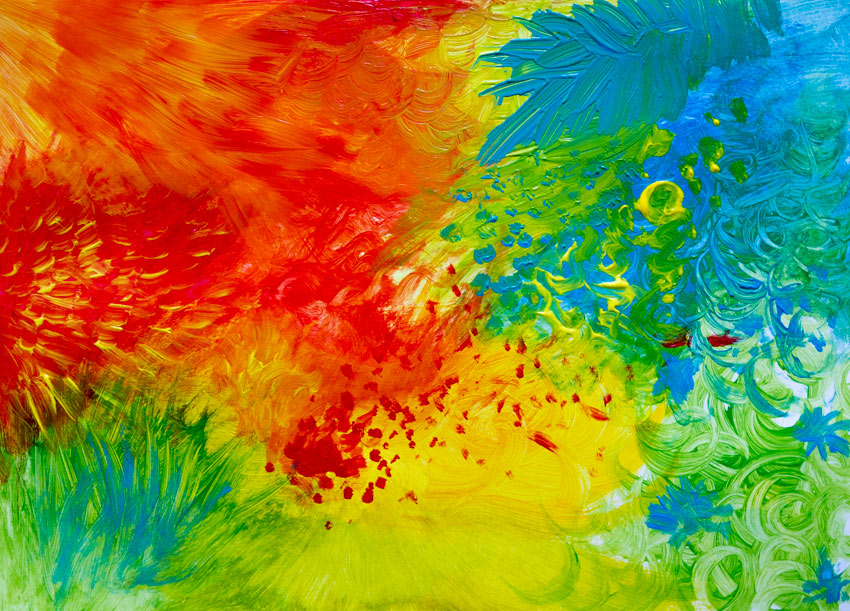
add accents with small brush

Beautiful!

Just looking at my mood painting makes me feel good and relaxed, and the thick strokes are so nice to touch. I hope you achieved the same pleasant effect with my guidance! If you want to try other relaxing art activities, don’t forget to check the other parts of the series:

You can also enjoy simple tutorials created for people with little or no experience at drawing:

how to paint abstract painting emotions

A Front End Developer’s Guide to GraphQL

Post pobrano z: A Front End Developer’s Guide to GraphQL

No matter how large or small your application is, you’ll have to deal with fetching data from a remote server at some point. On the front end, this usually involves hitting a REST endpoint, transforming the response, caching it, and updating your UI. For years, REST has been the status quo for APIs, but over the past year, a new API technology called GraphQL has exploded in popularity due to its excellent developer experience and declarative approach to data fetching.

In this post, we’ll walk through a couple of hands-on examples to show you how integrating GraphQL into your application will solve many pain points working with remote data. If you’re new to GraphQL, don’t panic! I’ll also highlight some resources to help you learn GraphQL using the Apollo stack, so you can start off 2018 ahead of the curve.

GraphQL 101

Before we dive into how GraphQL makes your life as a front end developer easier, we should first clarify what it is. When we talk about GraphQL, we’re either referring to the language itself or its rich ecosystem of tools. At its core, GraphQL is a typed query language developed by Facebook that allows you to describe your data requirements in a declarative way. The shape of your result matches the shape of your query: in the example below, we can expect to receive back an object with a currency property and a rates property containing an array of objects with both currency and rate keys.

{
  rates(currency: "USD") {
    currency
    rates {
      currency
      rate
    }
  }
}

When we talk about GraphQL in a broader sense, we’re often referring to the ecosystem of tools that help you implement GraphQL in your application. On the backend, you’ll use Apollo Server to create a GraphQL server, which is a single endpoint that parses a GraphQL request and returns data. How does the server know which data to return? You’ll use GraphQL Tools to build a schema (like a blueprint for your data) and a resolver map (just a series of functions that retrieve your data from a REST endpoint, database, or wherever else you choose).

This all sounds more complicated than it actually is — with Apollo Launchpad, a GraphQL server playground, you can create a working GraphQL server in your browser in less than 60 lines of code! 😮 We’ll reference this Launchpad I created that wraps the Coinbase API throughout this post.

You’ll connect your GraphQL server to your application with Apollo Client, a fast and flexible client that fetches, caches, and updates your data for you. Since Apollo Client isn’t coupled to your view layer, you can use it with React, Angular, Vue, or plain JavaScript. Not only is Apollo cross-framework, it’s also cross-platform, with React Native & Ionic supported out of the box.

Let’s give it a try! 🚀

Now that you’re well-versed in what GraphQL is, let’s get our hands dirty with a couple of practical examples that illustrate what it’s like to develop your front end with Apollo. By the end, I think you’ll be convinced that a GraphQL-based architecture with Apollo can help you ship features faster than before.

1. Add new data requirements without adding a new endpoint

We’ve all been here before: You spend hours building a perfect UI component when suddenly, product requirements change. You quickly realize that the data you need to fulfill these new requirements would either require a complicated waterfall of API requests or worse, a new REST endpoint. Now blocked on your work, you ask the backend team to build you a new endpoint just to satisfy the data needs for one component.

This common frustration no longer exists with GraphQL because the data you consume on the client is no longer coupled to an endpoint’s resource. Instead, you always hit the same endpoint for your GraphQL server. Your server specifies all of the resources it has available via your schema and lets your query determine the shape of the result. Let’s illustrate these concepts using our Launchpad from before:

In our schema, look at lines 22–26 where we define our ExchangeRate type. These fields list out all the available resources we can query in our application.

type ExchangeRate {
  currency: String
  rate: String
  name: String
}

With REST, you’re limited to the data your resource provides. If your /exchange-rates endpoint doesn’t include name, then you’ll need to either hit a different endpoint like /currency for the data or create it if it doesn’t exist.

With GraphQL, we know that name is already available to us by inspecting our schema, so we can query for it in our application. Try running this example in Launchpad by adding the name field on the right side panel!

{
  rates(currency: "USD") {
    currency
    rates {
      currency
      rate
      name
    }
  }
}

Now, remove the name field and run the same query. See how the shape of our result changes?

the data changes as you describe your query differently

Your GraphQL server always gives you back exactly the data you ask for. Nothing more. This differs significantly from REST, where you often have to filter and transform the data you get back from the server into the shape your UI components need. Not only does this save you time, it also results in smaller network payloads and CPU savings from loading and parsing the response.

2. Reduce your state management boilerplate

Fetching data almost always involves updating your application’s state. Typically, you’ll write code to track at least three actions: one for when the data is loading, one if the data successfully arrives, and one if the data errors out. Once the data arrives, you have to transform it into the shape your UI components expect, normalize it, cache it, and update your UI. This process can be repetitive, requiring countless lines of boilerplate to execute one request.

Let’s see how Apollo Client eliminates this tiresome process altogether by looking at an example React app in CodeSandbox. Navigate to `list.js` and scroll to the bottom.

export default graphql(ExchangeRateQuery, {
  props: ({ data }) => {
    if (data.loading) {
      return { loading: data.loading };
    }
    if (data.error) {
      return { error: data.error };
    }
    return {
      loading: false,
      rates: data.rates.rates
    };
  }
})(ExchangeRateList);

In this example, React Apollo, Apollo Client’s React integration, is binding our exchange rate query to our ExchangeRateList component. Once Apollo Client executes that query, it tracks loading and error state automatically and adds it to the data prop. When Apollo Client receives the result, it will update the data prop with the result of the query, which will update your UI with the rates it needs to render.

Under the hood, Apollo Client normalizes and caches your data for you. Try clicking some of the currencies in the panel on the right to watch the data refresh. Now, select a currency a second time. Notice how the data appears instantaneously? That’s the Apollo cache at work! You get all of this for free just by setting up Apollo Client with no additional configuration. 😍 To see the code where we initialize Apollo Client, check out `index.js`.

3. Debug quickly & painlessly with Apollo DevTools & GraphiQL

It looks like Apollo Client does a lot for you! How do we peek inside to understand what’s going on? With features like store inspection and full visibility into your queries & mutations, Apollo DevTools not only answers that question, but also makes debugging painless and, dare I say it, fun! 🎉 It’s available as an extension for both Chrome and Firefox, with React Native coming soon.

If you want to follow along, install Apollo DevTools for your preferred browser and navigate to our CodeSandbox from the previous example. You’ll need to run the example locally by clicking Download in the top nav bar, unzipping the file, running npm install, and finally npm start. Once you open up your browser’s dev tools panel, you should see a tab that says Apollo.

First, let’s check out our store inspector. This tab mirrors what’s currently in your Apollo Client cache, making it easy to confirm your data is stored on the client properly.

store inspector

Apollo DevTools also enables you to test your queries & mutations in GraphiQL, an interactive query editor and documentation explorer. In fact, you already used GraphiQL in the first example where we experimented with adding fields to our query. To recap, GraphiQL features auto-complete as you type your query into the editor and automatically generated documentation based on GraphQL’s type system. It’s extremely useful for exploring your schema, with zero maintenance burden for developers.

Apollo Devtools

Try executing queries with GraphiQL in the right side panel of our Launchpad. To show the documentation explorer, you can hover over fields in the query editor and click on the tooltip. If your query runs successfully in GraphiQL, you can be 100% positive that the same query will run successfully in your application.

Level up your GraphQL skills

If you made it to this point, awesome job! 👏 I hope you enjoyed the exercises and got a taste of what it would be like to work with GraphQL on the front end.

Hungry for more? 🌮 Make it your 2018 New Year’s resolution to learn more about GraphQL, as I expect its popularity to grow even more in the upcoming year. Here’s an example app to get you started featuring the concepts we learned today:

Go forth and GraphQL (and be sure to tag us on Twitter @apollographql along the way)! 🚀


A Front End Developer’s Guide to GraphQL is a post from CSS-Tricks

A Front End Developer’s Guide to GraphQL

Post pobrano z: A Front End Developer’s Guide to GraphQL

No matter how large or small your application is, you’ll have to deal with fetching data from a remote server at some point. On the front end, this usually involves hitting a REST endpoint, transforming the response, caching it, and updating your UI. For years, REST has been the status quo for APIs, but over the past year, a new API technology called GraphQL has exploded in popularity due to its excellent developer experience and declarative approach to data fetching.

In this post, we’ll walk through a couple of hands-on examples to show you how integrating GraphQL into your application will solve many pain points working with remote data. If you’re new to GraphQL, don’t panic! I’ll also highlight some resources to help you learn GraphQL using the Apollo stack, so you can start off 2018 ahead of the curve.

GraphQL 101

Before we dive into how GraphQL makes your life as a front end developer easier, we should first clarify what it is. When we talk about GraphQL, we’re either referring to the language itself or its rich ecosystem of tools. At its core, GraphQL is a typed query language developed by Facebook that allows you to describe your data requirements in a declarative way. The shape of your result matches the shape of your query: in the example below, we can expect to receive back an object with a currency property and a rates property containing an array of objects with both currency and rate keys.

{
  rates(currency: "USD") {
    currency
    rates {
      currency
      rate
    }
  }
}

When we talk about GraphQL in a broader sense, we’re often referring to the ecosystem of tools that help you implement GraphQL in your application. On the backend, you’ll use Apollo Server to create a GraphQL server, which is a single endpoint that parses a GraphQL request and returns data. How does the server know which data to return? You’ll use GraphQL Tools to build a schema (like a blueprint for your data) and a resolver map (just a series of functions that retrieve your data from a REST endpoint, database, or wherever else you choose).

This all sounds more complicated than it actually is — with Apollo Launchpad, a GraphQL server playground, you can create a working GraphQL server in your browser in less than 60 lines of code! 😮 We’ll reference this Launchpad I created that wraps the Coinbase API throughout this post.

You’ll connect your GraphQL server to your application with Apollo Client, a fast and flexible client that fetches, caches, and updates your data for you. Since Apollo Client isn’t coupled to your view layer, you can use it with React, Angular, Vue, or plain JavaScript. Not only is Apollo cross-framework, it’s also cross-platform, with React Native & Ionic supported out of the box.

Let’s give it a try! 🚀

Now that you’re well-versed in what GraphQL is, let’s get our hands dirty with a couple of practical examples that illustrate what it’s like to develop your front end with Apollo. By the end, I think you’ll be convinced that a GraphQL-based architecture with Apollo can help you ship features faster than before.

1. Add new data requirements without adding a new endpoint

We’ve all been here before: You spend hours building a perfect UI component when suddenly, product requirements change. You quickly realize that the data you need to fulfill these new requirements would either require a complicated waterfall of API requests or worse, a new REST endpoint. Now blocked on your work, you ask the backend team to build you a new endpoint just to satisfy the data needs for one component.

This common frustration no longer exists with GraphQL because the data you consume on the client is no longer coupled to an endpoint’s resource. Instead, you always hit the same endpoint for your GraphQL server. Your server specifies all of the resources it has available via your schema and lets your query determine the shape of the result. Let’s illustrate these concepts using our Launchpad from before:

In our schema, look at lines 22–26 where we define our ExchangeRate type. These fields list out all the available resources we can query in our application.

type ExchangeRate {
  currency: String
  rate: String
  name: String
}

With REST, you’re limited to the data your resource provides. If your /exchange-rates endpoint doesn’t include name, then you’ll need to either hit a different endpoint like /currency for the data or create it if it doesn’t exist.

With GraphQL, we know that name is already available to us by inspecting our schema, so we can query for it in our application. Try running this example in Launchpad by adding the name field on the right side panel!

{
  rates(currency: "USD") {
    currency
    rates {
      currency
      rate
      name
    }
  }
}

Now, remove the name field and run the same query. See how the shape of our result changes?

the data changes as you describe your query differently

Your GraphQL server always gives you back exactly the data you ask for. Nothing more. This differs significantly from REST, where you often have to filter and transform the data you get back from the server into the shape your UI components need. Not only does this save you time, it also results in smaller network payloads and CPU savings from loading and parsing the response.

2. Reduce your state management boilerplate

Fetching data almost always involves updating your application’s state. Typically, you’ll write code to track at least three actions: one for when the data is loading, one if the data successfully arrives, and one if the data errors out. Once the data arrives, you have to transform it into the shape your UI components expect, normalize it, cache it, and update your UI. This process can be repetitive, requiring countless lines of boilerplate to execute one request.

Let’s see how Apollo Client eliminates this tiresome process altogether by looking at an example React app in CodeSandbox. Navigate to `list.js` and scroll to the bottom.

export default graphql(ExchangeRateQuery, {
  props: ({ data }) => {
    if (data.loading) {
      return { loading: data.loading };
    }
    if (data.error) {
      return { error: data.error };
    }
    return {
      loading: false,
      rates: data.rates.rates
    };
  }
})(ExchangeRateList);

In this example, React Apollo, Apollo Client’s React integration, is binding our exchange rate query to our ExchangeRateList component. Once Apollo Client executes that query, it tracks loading and error state automatically and adds it to the data prop. When Apollo Client receives the result, it will update the data prop with the result of the query, which will update your UI with the rates it needs to render.

Under the hood, Apollo Client normalizes and caches your data for you. Try clicking some of the currencies in the panel on the right to watch the data refresh. Now, select a currency a second time. Notice how the data appears instantaneously? That’s the Apollo cache at work! You get all of this for free just by setting up Apollo Client with no additional configuration. 😍 To see the code where we initialize Apollo Client, check out `index.js`.

3. Debug quickly & painlessly with Apollo DevTools & GraphiQL

It looks like Apollo Client does a lot for you! How do we peek inside to understand what’s going on? With features like store inspection and full visibility into your queries & mutations, Apollo DevTools not only answers that question, but also makes debugging painless and, dare I say it, fun! 🎉 It’s available as an extension for both Chrome and Firefox, with React Native coming soon.

If you want to follow along, install Apollo DevTools for your preferred browser and navigate to our CodeSandbox from the previous example. You’ll need to run the example locally by clicking Download in the top nav bar, unzipping the file, running npm install, and finally npm start. Once you open up your browser’s dev tools panel, you should see a tab that says Apollo.

First, let’s check out our store inspector. This tab mirrors what’s currently in your Apollo Client cache, making it easy to confirm your data is stored on the client properly.

store inspector

Apollo DevTools also enables you to test your queries & mutations in GraphiQL, an interactive query editor and documentation explorer. In fact, you already used GraphiQL in the first example where we experimented with adding fields to our query. To recap, GraphiQL features auto-complete as you type your query into the editor and automatically generated documentation based on GraphQL’s type system. It’s extremely useful for exploring your schema, with zero maintenance burden for developers.

Apollo Devtools

Try executing queries with GraphiQL in the right side panel of our Launchpad. To show the documentation explorer, you can hover over fields in the query editor and click on the tooltip. If your query runs successfully in GraphiQL, you can be 100% positive that the same query will run successfully in your application.

Level up your GraphQL skills

If you made it to this point, awesome job! 👏 I hope you enjoyed the exercises and got a taste of what it would be like to work with GraphQL on the front end.

Hungry for more? 🌮 Make it your 2018 New Year’s resolution to learn more about GraphQL, as I expect its popularity to grow even more in the upcoming year. Here’s an example app to get you started featuring the concepts we learned today:

Go forth and GraphQL (and be sure to tag us on Twitter @apollographql along the way)! 🚀


A Front End Developer’s Guide to GraphQL is a post from CSS-Tricks

New Course: Make Great Presentations Quickly With PowerPoint Templates

Post pobrano z: New Course: Make Great Presentations Quickly With PowerPoint Templates

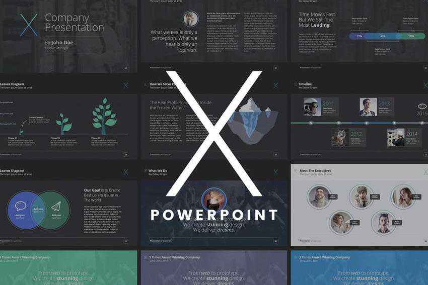
If you want to make a better impression with your PowerPoint presentations, you should check out our new course, Make Great Presentations Quickly With PowerPoint Templates.

The X Note PowerPoint template

What You’ll Learn

In this short course, instructor Andrew Childress will show you how to create a professional PowerPoint presentation using The X Note template, which is a great example of a professional template that reduces the hard work of building a compelling presentation. 

Learn how to use the power of a good template in Microsoft PowerPoint to bring together an engaging presentation quickly!

Watch the Introduction


Take the Course

You can take our new course straight away with a subscription to Envato Elements. For a single low monthly fee, you get access not only to this course, but also to our growing library of over 1,000 video courses and industry-leading eBooks on Envato Tuts+. 

Plus you now get unlimited downloads from the huge Envato Elements library of 400,000+ creative assets—including a wide range of elegant PowerPoint templates. Create with unique fonts, photos, graphics and templates, and deliver better projects faster.

New Course: Make Great Presentations Quickly With PowerPoint Templates

Post pobrano z: New Course: Make Great Presentations Quickly With PowerPoint Templates

If you want to make a better impression with your PowerPoint presentations, you should check out our new course, Make Great Presentations Quickly With PowerPoint Templates.

The X Note PowerPoint template

What You’ll Learn

In this short course, instructor Andrew Childress will show you how to create a professional PowerPoint presentation using The X Note template, which is a great example of a professional template that reduces the hard work of building a compelling presentation. 

Learn how to use the power of a good template in Microsoft PowerPoint to bring together an engaging presentation quickly!

Watch the Introduction


Take the Course

You can take our new course straight away with a subscription to Envato Elements. For a single low monthly fee, you get access not only to this course, but also to our growing library of over 1,000 video courses and industry-leading eBooks on Envato Tuts+. 

Plus you now get unlimited downloads from the huge Envato Elements library of 400,000+ creative assets—including a wide range of elegant PowerPoint templates. Create with unique fonts, photos, graphics and templates, and deliver better projects faster.

How to Draw a Festive Winter Landscape With Glowing Lamps in Adobe Illustrator

Post pobrano z: How to Draw a Festive Winter Landscape With Glowing Lamps in Adobe Illustrator

Final product image
What You’ll Be Creating

In this tutorial, you will learn how to use the Mesh Tool in Adobe Illustrator to create a vector evening winter background!

If you want to skip the tutorial and just use this background with some other awesome elements, purchase the Christmas Evening Winter Landscape from GraphicRiver!

Christmas Evening Winter Landscape

1. How to Draw the Background

Step 1

Let’s begin by using Mesh for a bit!

Start by drawing a rectangle and filling it with #4B6471 color and create a Mesh grid for this shape by manually placing nodes with the Mesh Tool (U).

Once your Mesh grid is done, begin coloring it by selecting the bottom row of nodes and the bottom middle node and changing their color to #8A9BA2.

Continue this step by coloring the nodes on the top and on the sides with #253B4B and the middle nodes of the second row from the top with #385260.

Finish by changing the color of the bottom nodes to #D2DAD9.

draw mesh background

Step 2

Let’s move on to drawing the snow hills!

Draw a #F6F7F2 rectangle, and then place some Mesh nodes with the Mesh Tool (U). Move said nodes to create a wavy shape out of the rectangle, trying to recreate the screenshot below.

Finally, color the selected nodes with #D0DFE4. The first hill is done!

mesh snow hill

Step 3

Draw the second hill following the same instructions as before and using these colors:

  1. #E1EBEC
  2. #C0D1D8
  3. #F6F7F2
draw mesh snow

Step 4

Finally, draw the third hill in a similar fashion.

  1. #CBD8DE
  2. #F4F6F1
draw snow hill

Step 5

Place the hills on top of each other, with the first one being in the front and the third one being in the back.

Make them overlap to match the screenshot!

arrange hills

Step 6

Place the hills on the bottom of the background!

place hills

2. How to Draw the Lamps

Step 1

Let’s move on to drawing the lamp.

Draw half an outline of it by using the Pen Tool (P), and then use Object > Transform > Reflect and click Copy to obtain the second half. Move them close to each other for now.

draw half

Step 2

Select the two halves and use Unite in the Pathfinder panel to create a united outline for the lamp.

reflect the lamp

Step 3

Using the Pen Tool (P) and some small ellipses (Ellipse Tool, L), draw the transparent surfaces of the lamp.

Lay the shapes on top of the outline, select all, and use Minus Front in the Pathfinder panel to „crop” them out.

crop out the lamp

Step 4

Select the result and apply a Linear, #2A1800 to #DFCFD9 to #2A1800 Gradient to it.

gradient

Step 5

Using the Pen Tool (P), draw a decorative swirl as can be seen below.

In the Stroke panel, change the Stroke Profile to the one below.

change stroke profile

Step 6

Draw a little ellipse and add it to both ends of the curve.

Selecting the curve, go to Object > Expand Appearance, and then select all objects and Unite them in the Pathfinder panel. Change the result’s color to #453A2E.

finish curve

Step 7

Attach the lamp to our decorative part.

add curve to lamp

Step 8

Let’s draw the lamppost! Use Mesh, just as we learned before.

  1. #100804
  2. #7F7460
  3. #5A503E
draw lamppost with mesh

Step 9

Draw the second part of the lamppost similarly.

  1. #100804
  2. #362C1B
  3. #796F5A
more mesh

Step 10

Draw the base.

  1. #100804
  2. #665B48
  3. #3B2E22
base of post with mesh

Step 11

Draw a #110600 rounded shape, and then bend it with Effect > Warp > Arc, using -20% Bend.

Go to Object > Expand Appearance.

warp object

Step 12

Color the shape with Mesh.

  1. #413629
  2. #6F6452
  3. #54493A
mesh

Step 13

Resize copies of the shape.

three copies

Step 14

Put the post together and add the rings we just created.

join lamppost

Step 15

Finally, attach the actual lamps to the top.

add lamps

3. How to Light Up the Lamps

Step 1

Now that we’ve drawn the outline, it’s time to put lights in these lamps!

Begin by drawing a narrow ellipse and adding a Radial, #FFFF7F to #000000 Gradient to it.

draw ellipse

Step 2

Put another copy of that ellipse on top and tweak the Transparency options, selecting Screen and 79% Opacity.

Create a copy of the result, rotate it, and make it smaller.

more ellipse

Step 3

Draw a very narrow ellipse with the same Gradient as before.

another gradient ellipse

Step 4

Add a copy on top, creating a cross. Change its Opacity to 61% and Transparency to Screen.

add one more

Step 5

Draw a circle, using the same Radial Gradient. Again, use Screen, now with 95% Opacity.

gradient circle

Step 6

Create a flare by placing all the elements on top of each other.

join flare

Step 7

Draw a final ellipse for the light, using Screen and a Radial Gradient from #FFFFFF to #FFB500 to #000000.

gradient ellipse

Step 8

Place the first flare behind the lamp outline and the final ellipse on top of it.

place light

Step 9

Add the lights to both lamps.

both lamps

Step 10

Create a few copies of the lamp for the upcoming landscape.

add copies

4. How to Add the Trees and the Snow

Step 1

Let’s begin drawing the trees!

Learn how to draw the branch we will be copying in the second section of this tutorial. Now draw the trunk, fill it with #544E48, and start adding copies of the branch to it as shown below.

add branches to tree

Step 2

Add more branches to complete the tree.

finish tree

Step 3

Create a copy of the branches without the trunk and draw another one.

another tree

Step 4

Add more branches to the second tree.

add more branches

Step 5

Draw a highlight with a #FCFC98 to #000000 Radial Gradient, change the Opacity to 70% and Transparency to Screen.

gradient highlight

Step 6

Create copies of the trees and add the highlights behind them.

copies of trees

Step 7

Place the trees and the lamps onto the background.

add to background

Step 8

Draw two identical circles. Fill one with #ACB99A and the second with a #020200 to white Radial Gradient.

Set both circles’ transparency to Screen.

two circles

Step 9

Place the green circle under the gradient, and then select both and use Make Mask in the Transparency panel. Check both Clip and Invert Mask.

transparency mask

Step 10

Add these highlights on top of the background.

add highlights

Step 11

To add snow, refer to this tutorial.

add snow

Step 12

Draw a rectangle on top of everything to „frame” all the content you want to be seen in the final picture.

draw outline

Step 13

Select all elements and right-click, after that selecting Make Clipping Mask.

make clipping mask

Step 14

You’re done!

final picture

Awesome Work, You’re Now Done!

What now? You can try any of my other tutorials from my profile, or check out my portfolio on GraphicRiver, as well as the original vector we recreated in this tutorial.

I hope you enjoyed the tutorial, and I would be super happy to see any results in the comments below!

Christmas Evening Winter Landscape
Christmas Evening Winter Background

Agregator najlepszych postów o designie, webdesignie, cssie i Internecie