Post pobrano z: Beatific
Advocating for Accessible UI Design
Post pobrano z: Advocating for Accessible UI Design
Accessibility is a hot topic these days, and the older we web-makers get, the hotter it’s going to become! That might be a snarky outlook, but what I’m trying to say is that it’s about time we start designing the web for everyone because the web was meant to be for everyone, and less and less are we able to predict where, when, and how our work will be consumed.
Accessibility is not just up to developers
As developers, we often encounter accessibility post-design, when we do things like implementating the correct role and aria attributes, ensuring navigation is keyboard friendly, and responsibly hiding elements. In general, our accessibility efforts go towards thinking about how to make specific components and features accessible, such as an SVG icon system or helpful tool-tips.
Given our roles as developers, this makes sense. Accessibility flaws, however, often originate in the UI design itself, and depending on our work environment, we developers don’t necessarily have the authority or bandwidth to advocate for accessibility in the designs we are handed.
For example, let’s say you are tasked with turning a Sketch file into a one-page WordPress site.
The design has finally been approved by the client, and now you have a weekend to build the thing, plus another two days to work with QA to perfect it. As you take a look at the design for the first time, you notice that, on small devices, the dainty serif typeface overlaid on a background image would be difficult for low-sighted visitors to read.
You, the accessibility-minded developer, could proceed in a few ways:
- Remain silent and sate your accessibility conscience by making accessible choices in the code where you can
- Go ahead and make accessibility improvements to the UI as you develop, present them in the finished product, and explain yourself after
- Compile a list of suggested changes to send to the designer and request they be implemented in the mockups so you can then develop them
I was in a situation like this recently and, judge me if you will, I chose number one.
If I’d had the time and the guts, number 2 would’ve gotten me the furthest, but given the nature of my role as a first-time contractor at this high-speed agency I was hoping to develop a working relationship with, I felt I’d be overstepping my bounds and wasn’t ready to take the risk of being too vocal out of the gate. I chose not to do number 3 for similar reasons, mainly for fear of causing more work and stress for the already extremely busy designer.
Now that I have the benefit of hindsight, however, might I add a fourth item to the list?
- Send a succinct list of non-technical accessibility tips for UI design to everyone on the team so they make more accessible design choices in future
Where to find such a list? Well, you are in luck! Read on!
Non-technical Accessibility Tips for UI Design
What follows is a list of plain language, no-jargon, „Accessibility Tips for UI Design” you, developer, can share with everyone at work: UI designers, content providers, project managers, and clients alike. The more we can spread awareness about accessibility and think critically about the mockups we are handed to implement, the more accessible the web will be!
I have chosen the examples below from various trendy website feeds, and I used the fantastic Funkify Chrome Extension to simulate the viewing experience of site visitors with varying abilities and disabilities.
First up:
Easy on the animations.
With great power comes great responsibility. The modern web affords us the power to bounce-in, fly-in, or drop-in any content we please, but besides the wow factor, how are these animations contributing to a reader’s experience on your site? How are the animations triggered? Can they be mistakenly triggered, causing a confusing jolt in the flow of your site visitor’s experience?
Take this example of a car repair company’s website. I’ve applied the „Elderly Ellen” filter from Funkify to simulate slightly blurred vision and shaky hands:
If I were Ellen, this experience would likely steer me away from Service King’s services! Someone like Elderly Ellen is constantly frustrated with technology. It’s unnecessary to cause her that stress when she’s trying to read about a service for repairing her car after an already traumatizing fender bender.
Make sure background and text colors have enough contrast.
Although that medium grey text looks just right on that light grey background, it’s hard to read…and impossible to read if you are working out in the sunshine (not a common occurance, but I’ve done it before). Here’s an example of the aforementioned grey-on-grey scenario:

And now, the same example affected by the „Sunshine Sue” filter from Funkify deems our low contrast captions simply invisible!

The solution? Run your color choices through the WebAIM contrast checker to see if they meet standards for readability and color contrast, and if they don’t, adjust the color values until they do.

The Funkify extension can be used to test anything that is visible in a browser. Even if a design mock isn’t yet implemented in code, an image or PDF can be opened in the browser and the extension will still work!
Be very careful when overlaying text on images, or don’t.
It might look just right to have that dainty serif overlaid on the big header image, but can you read it if you slightly blur your vision? If not, up the contrast between the text and image, perhaps by brightening the text color and increasing the transparency of the image on a dark background.
On Burberry’s website, for example, the user must select from a drop-down in order to enter the site, but the text identifying the drop-down is barely readable over top the background image. There are many ways to solve this from a design standpoint, but for a quick example, we could add a dark background beneath the light text to provide a bit more contrast:

Similarly, while the delicate descriptive text below the image on Tesla’s new Semi website is delicate and beautiful, it is barely legiible when simulating slightly blurred vision with „Blurry Bianca”:

Double-check the readability of font weights and sizes.
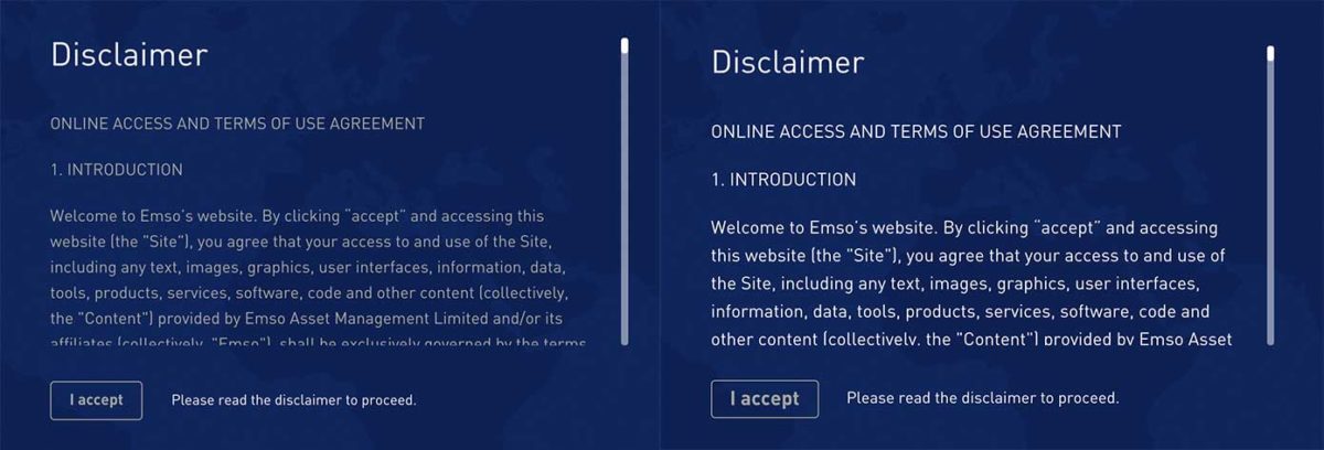
The thinner the font weight and the smaller the size, the harder it is to read. Even I, as a hearing, well-sighted individual, find myself zooming in on body text at times because it is so darn lightweight and small, even if the color contrast is up to speed. If you must stick with the lightweight font, increasing the sizes and line height can do wonders as well.
I like to ask myself, does it pass the slightly-cross-eye test? That is when I slightly cross my eyes, can I still make out the text?
Indicate external links.
If it is a requirement for a link to open in a new tab, first question whether it should be a requirement, then indicate it visually with a small icon or note in the UI.
Additionally, designers can make a note in their designs where there should be screen-reader-only text indicating the link will navigate the user away from their current viewing portal. This was brought to mind by way of some excellent replies to a Twitter conversation; read through that here.
Differentiate between action-oriented social media links vs. profile links.
When we see small social media icons, I think the general assumption is that they link to the relevant social media profiles. Sometimes, however, these icons are actually actions that, rather than linking to a profile, open a „New Tweet” dialog or similar. These actions should be marked as such.
Don’t rely 100% on icons and colors to communicate.
It’s easy to assume everyone knows that a hamburger icon indicates a menu or that everyone is familiar with the various versions of LinkedIn’s icon. However, this is not the case, and it causes a moment of confusion and insult that isn’t necessary to site visitors that are less in-the-know than we are. Especially if your audience tends to be older and/or less tech-savvy, make sure you aren’t relying on what you think is common knowledge.
Reliance on colors for meaning causes a similar issue, and more-so for any users that deal with color blindness. A recent Smashing Magazine article covers this problem in detail and uses the example of a color picker on shoe sales website that, for color-blind users, results in an entirely different palette.
What would the design look like without interactivity?
If all a user could do was scroll, does the content still make sense? Are there areas where, rather than hiding the thumbnail caption under a fancy hover event, the caption could be plainly visible instead? What about on a touch screen, where hover events are treated quite differently?
What else?
Have you encountered issues with accessibility in designs you’ve implemented? How did you handle it? What other tips can we give designers and producers for creating more accessible UI designs?
The first step to advocating for accessible UI design is to simply think twice about what you, the developer, are told to implement. While coding up a design, try applying a few of these Funkify filters and see what results they yield. Think critically about the designs you are handed, and start a conversation with your coworkers.
Advocating for Accessible UI Design is a post from CSS-Tricks
Start Saving With These Early Cyber Monday Deals
Post pobrano z: Start Saving With These Early Cyber Monday Deals
At Envato this year, Cyber Monday lasts a whole week. You can get 50% off selected items on Envato Market, or save a whopping $120 on an annual Envato Elements subscription, any time between now and next Wednesday, 29 November.
So if you’re looking for Photoshop actions, WordPress themes, stock photos, video footage, music or a wide array of other creative digital products, you can snag some impressive savings. Just visit the Cyber Monday Sale page to get the full details and start saving.

50% Off 500 Envato Market Items
For the Cyber Monday sale on Envato Market, 500 popular items have been marked with special 50% reductions.
So you can build a new site with top themes, add functionality with code, design with stunning add-ons and templates, or bring your projects to life with audio and video files. All at half the normal price.
You can browse all the discounted items on the sale page.

Save $120 on an Envato Elements Annual Subscription
If you just want one or two specific items, the Envato Market sale above is the one for you. But if you regularly use fonts, graphic templates, WordPress themes and other creative assets, an Envato Elements subscription is the best deal in town.
For $228 (the equivalent of $19 a month), you get a whole year of unlimited downloads from the huge library of 400,000+ stock photos, WordPress themes and plugins, icons, fonts, presentation templates, and much more.

And on top of that, you also get free access to unlimited Tuts+ courses and eBooks. So it’s the perfect way to improve your skills while having access to all the digital assets you’ll need for your creative projects throughout the year. It’s an investment that will pay off many times over.
Don’t Miss Out!
Remember, all of these deals end on 29 November, at 2 pm AEDT (Australian Eastern Daylight Time). Yes, that’s Australian time, so if you’re in Europe, America or other points east, you should make sure you’ve done all your shopping by Tuesday, 28 November at the latest. After that, the prices go back to normal.
You can find more details on all of these deals and links to the discounted items on the Envato Cyber Monday Sale page. So head over there to stock up on all the digital assets you’ll need for the coming year, at unbeatable prices.

The 2017 Motion Awards

The Legend Of The Crabe Phare
Post pobrano z: The Legend Of The Crabe Phare

MUSE Main Titles
Post pobrano z: MUSE Main Titles

Untapped
Post pobrano z: Untapped

How to Create a Bones Text Effect in Adobe Illustrator
Post pobrano z: How to Create a Bones Text Effect in Adobe Illustrator

In the following steps you will learn how to create a simple bones text effect in Adobe Illustrator.
For starters, you will learn how to set up a simple grid and how to create several pixel-perfect shapes. Using the Rounded Corners effect and some basic vector shape-building techniques, you will learn how to create the main bone shape. Moving on, you will learn how to save and use an art brush. For the final touches, you will learn how to add Drop Shadow effects and a simple background.
For more inspiration on how to adjust or improve your final text effect, you can find plenty of resources at GraphicRiver.
1. How to Create a New Document and Set Up a Grid
Hit Control-N to create a new document. Select Pixels from the Units drop-down menu, enter 850 in the width box and 600 in the height box, and then click that More Settings button. Select RGB for the Color Mode, set the Raster Effects to Screen (72 ppi), and then click Create Document.
Enable the Grid (View > Show Grid) and the Snap to Grid (View > Snap to Grid). You will need a grid every 5 px, so simply go to Edit > Preferences > Guides & Grid, and enter 5 in the Gridline every box and 1 in the Subdivisions box. Try not to get discouraged by all that grid—it will make your work easier, and keep in mind that you can easily enable or disable it using the Control-„ keyboard shortcut.
You can learn more about Illustrator’s grid system in this short tutorial by Andrei Stefan: Understanding Adobe Illustrator’s Grid System.
You should also open the Info panel (Window > Info) for a live preview with the size and position of your shapes. Don’t forget to set the unit of measurement to pixels from Edit > Preferences > Units. All these options will significantly increase your work speed.

2. How to Create the Bone Shape and Pattern Brush
Step 1
Pick the Rectangle Tool (M) and focus on your Toolbar. Remove the color from the stroke and then select the fill and set its color to R=253 G=241 B=193. Move to your artboard and simply create a 25 x 105 px rectangle—the grid and the Snap to Grid feature should help.
Focus on the bottom side of this rectangle and switch to the Direct Selection Tool (A). Select the right anchor point and drag it 5 px to the left, and then select the left anchor point and drag it 5 px up and 5 px to the right.

Step 2
Keep focusing on the bottom side of your existing shape. Using the Rectangle Tool (M), create a 30 x 35 px shape and place it as shown in the first image. Focus on the left side of this new rectangle and pick the Add Anchor Point Tool (+). Simply click in the point highlighted with blue to add a new anchor point for your shape.
Switch to the Direct Selection Tool (A), select the newly added anchor point and drag it 15 px to the left. Move to the right side of this shape and make sure that the Direct Selection Tool (A) remains active. Select the top anchor point and drag it 10 px down, and then select the bottom anchor point and drag it 10 px up and 5 px to the left.

Step 3
Using the Rectangle Tool (M), create a 25 px square and place it as shown in the first image. Focus on the bottom side of this new shape, pick the Add Anchor Point Tool (+) and add a new anchor point as shown below.
Keep focusing on your square and switch to the Direct Selection Tool (A). First, select the bottom-left anchor point and drag it 10 px up and 5 px to the left. Move to the bottom-right anchor point and drag it 5 px up, and then select the top-right anchor point and drag it 5 px up and 10 px to the left.

Step 4
Using the Rectangle Tool (M), create a 40 x 30 px shape and place it as shown in the first image. Pick the Add Anchor Point Tool (+) and add the two anchor points shown below.
Keep focusing on this new rectangle and switch to the Direct Selection Tool (A). First, select the bottom-left anchor point and drag it 5 px up. Move to the top-right anchor point and drag it 10 px to the left, and then select the top-left anchor point and drag it 5 px to the right.

Step 5
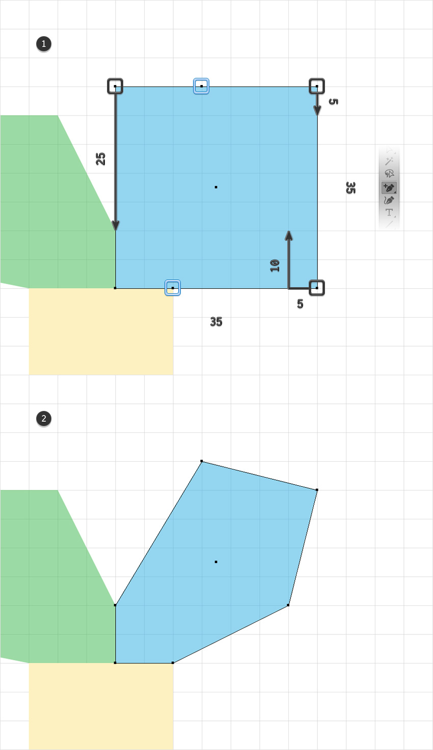
Using the Rectangle Tool (M), create a 35 px square and place it as shown in the first image. Pick the Add Anchor Point Tool (+) and add the two anchor points shown below.
Keep focusing on your square and switch to the Direct Selection Tool (A). First, select the bottom-right anchor point and drag it 10 px up and 5 px to the left. Move to the top-right anchor point and drag it 5 px down, and then select the top-left anchor point and drag it 25 px down.
Step 6
Select all the shapes made so far, open the Pathfinder panel (Window > Pathfinder), and click the Unite button. Make sure that the resulting shape is filled with R=253 G=241 B=193 and move to the next step.

Step 7
Make sure that your shape is still selected and go to Effect > Stylize > Rounded Corners. Enter a 5 px Radius, click OK, and then go to Object > Expand Appearance.

Step 8
Pick the Pen Tool (P) and create three simple triangles as shown in the first image. Select all the shapes made so far and click the Minus Front button from the Pathfinder panel.

Step 9
Make sure that your shape is selected, open the Brushes panel (Window > Brushes) and click that New Brush button. Select the Art Brush box and then click OK. Pick a name for your brush, drag that Width slider to 50%, enter the rest of the attributes shown in the following image, and then click the OK button.

3. How to Create the Text Effect
Step 1
Pick the Type Tool (T) and open the Character panel (Window > Type > Character). Select the Bonez font and then set the size to 150 px and the tracking to 100. Simply click on your artboard and add some text. Make it black (R=0 G=0 B=0) and lower its Opacity to about 30%.

Step 2
Disable the Grid (Control-„) and the Snap to Grid (Shift-Control-„).
Pick the Brush Tool (B) and select your art brush from the Brushes panel. Use that black text as a rough reference and start drawing paths to create the first letter.

Step 3
Move to the next letters and use the same art brush. Once you’re done, delete that piece of text.

Step 4
Select all the paths made so far and go to Effect > Stylize > Drop Shadow. Enter the attributes shown in the following image and then click OK.

Step 5
Make sure that all your paths are still selected, Group them (Control-G) and then go to Effect > Stylize > Drop Shadow. Enter the attributes shown below and then click OK.

4. How to Create the Background
Step 1
Pick the Ellipse Tool (L) and simply click on your artboard to open the Ellipse window. Set the Width to 600 px and the Height to 360 px and then click OK. Fill the resulting shape with R=235 G=107 B=38 and send it to back (Shift-Control-[).
Make sure that this orange shape stays selected and open the Align panel (Window > Align). Set the aligning to Artboard (open the fly out menu and go to Show Options if you can’t see the Align To section as shown in the following image) and then click the Horizontal Align Center and Vertical Align Center buttons. This will basically bring your selected shape to the center of the artboard.

Step 2
Make sure that your orange ellipse is still selected and go to Effect > Distort & Transform > Zig Zag. Enter the attributes shown in the following image and then click OK.

Step 3
Pick the Rectangle Tool (M) and simply click on your artboard to open the Rectangle window. Set the Width to 860 px and the Height to 610 px and then click OK. Fill the resulting shape with R=39 G=9 B=62, send it to back (Shift-Control-[), and don’t forget to center it.

Congratulations! You’re Done!
Here is how it should look. I hope you’ve enjoyed this tutorial and can apply these techniques in your future projects. Don’t hesitate to share your final result in the comments section.
Feel free to adjust the final design and make it your own. You can find some great sources of inspiration at GraphicRiver, with interesting solutions to improve your design.


Anachronistic group photo / Anachronique d’une redite
Post pobrano z: Anachronistic group photo / Anachronique d’une redite
 |
 |
| THE ORIGINAL? Backus Ice “Bringing friends together since 1863” – 2015 Source : Cannes Lions BRONZE, Agency : Publicis Lima (Peru) |
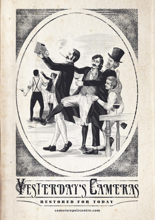
LESS ORIGINAL Camera Repair Centre – 2017 Source : Coloribus Agency : The Public House (Ireland) |
7 Ways to Improve Sales at Your Shopify Storefront
Post pobrano z: 7 Ways to Improve Sales at Your Shopify Storefront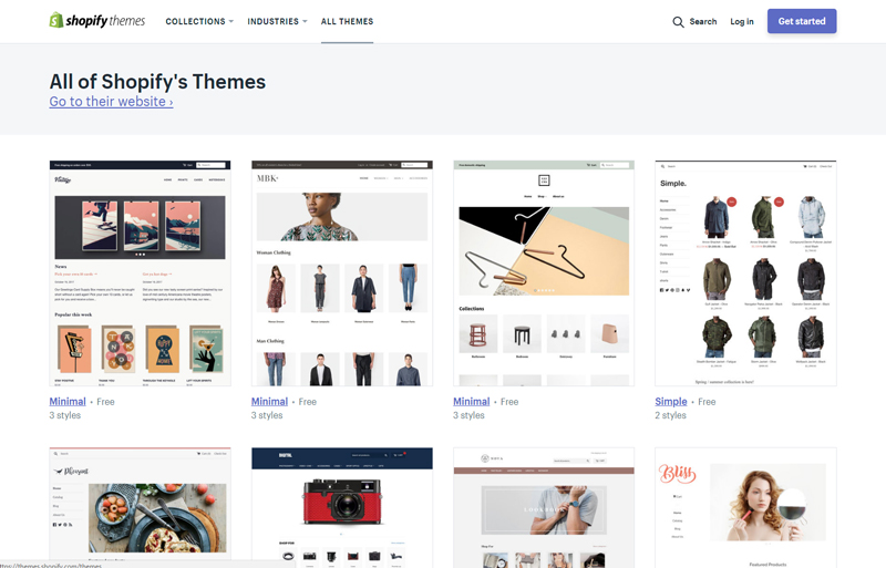
Shopify users have helped propel this storefront to iconic standing – enabling this shopping cart services provider to amass an impressive 115,000 new active storefronts over the past two years. It’s no mystery why retailers love using Shopify – the service makes it easy for just about anyone to get a professional-looking store up and running in a short matter of time. With a variety of premade free and premium templates to choose from, multichannel integration and dropship integrations, it’s never been faster or easier to start selling online.
But getting your store up on Shopify is just one part of the equation. Generating the sales you want while building your customer list is quite another. If you want more sales on Shopify, there are many tried and true methods. To help you get ahead of the game and improve your bottom line and ROI, here are 7 tried and true methods you can use that have been proven to increase sales exponentially.
Consider Using Premium Themes
Certainly, the free themes on Shopify aren’t bad. But with so many stores already using them, they are not all that unique, either. The key to really making your store stand out is with using premium themes. Your first stop should be at the official Shopify Theme Store – where you can connect with theme creators and designers to get a custom-made or premade premium theme for your store. Another good place is Theme Forest – where you can browse thousands of awesome themes. You can also find premium themes for Shopify at places like Out of the Sandbox and many others.
Rethink Social Media Marketing
What social media marketing are you doing for your Shopify store? If you are just posting updates, blog roll posts or pictures of your products, you probably are not doing enough to really generate buzz. Instead, consider hosting contests and polls as well as showcasing your wares on Instagram and Pinterest via sponsored posts and pins. Also, explore your options with hiring social media management experts from places like UpWork or Fiverr – which offer services starting at just $5 and up.
Improve the Customer Journey with a Shopify CRM
Once your customers arrive at your store, what’s next? Perhaps they are looking at multiple channels? Maybe they’ve purchased a product from an eBay store you’ve run in the past or from your Amazon store? What about their order history, customer profile, notes and more? In order to truly improve the customer journey and get to know your market like never before, you’ll want to look into a cross-channel Shopify CRM software solution to help you piece together all your data—so you can improve loyalty and retention while enhancing the customer journey.
Expand Niche Products with Drop Shipping Options
Are you unable to carry a product inventory? Or do you feel that your existing inventory is being limited by your overall budget? You have some options here. Look into drop shipping services like Dropified or Oberlo. They offer millions of products that you can auto-import into your Shopify store and the margins are very lucrative. It’s an easy and fast way to expand your inventory and get more sales without having to worry about fulfillment or overhead.
Streamline Fulfillment & Returns Logistics
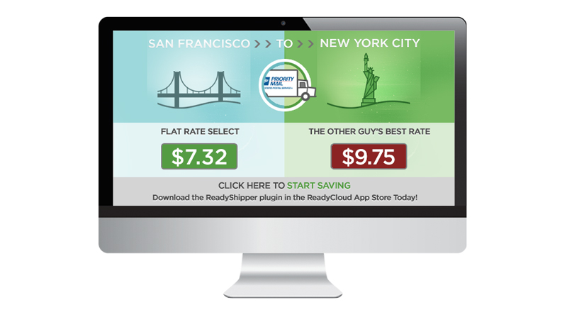
What about Fulfillment and returns logistics? You have lots of options these days with shipping software solutions and returns software. For fulfillment, consider software solutions like ReadyShipper X – which offers a multicarrier shipping solution. For returns, look to Shopify-friendly integrations like ReadyReturns, which automates your returns policy and works in tandem with ReadyShipper.
Also, make sure you look at the Shopify App Store to see all your options with products such as these. If your return and shipping volumes are low, you can always use Shopify’s included shipping and returns system. By making shipping and returns fast and easy for customers, you are 80% likelier to get more sales and earn repeat business, according to UPS.
Add Integrated Reviews & Digital Coupons
Don’t overlook the power of integrated reviews and digital coupons. More than 1 billion digital coupons were redeemed by smartphone users last year alone – and integrated reviews are a time-tested method of securing more conversions and improving customer loyalty. Shopify offers integrated apps for this, including YotPo for integrated customer reviews, and Better Coupon Box for easy digital coupons. Both will help you secure more social chatter, improve customer loyalty and trust, and will also help you improve your average order value exponentially.