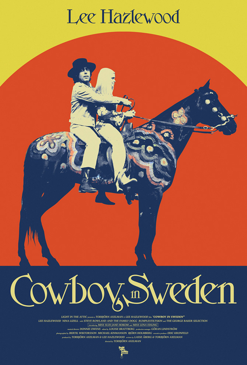
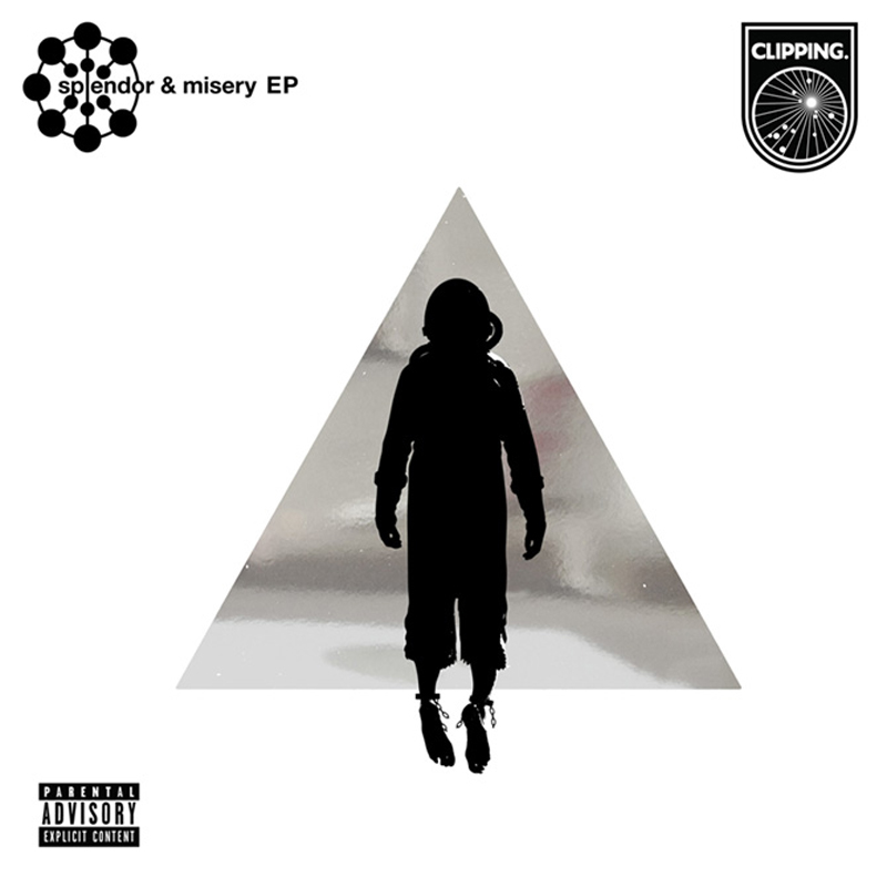
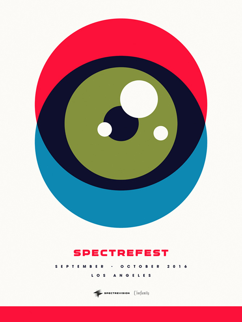
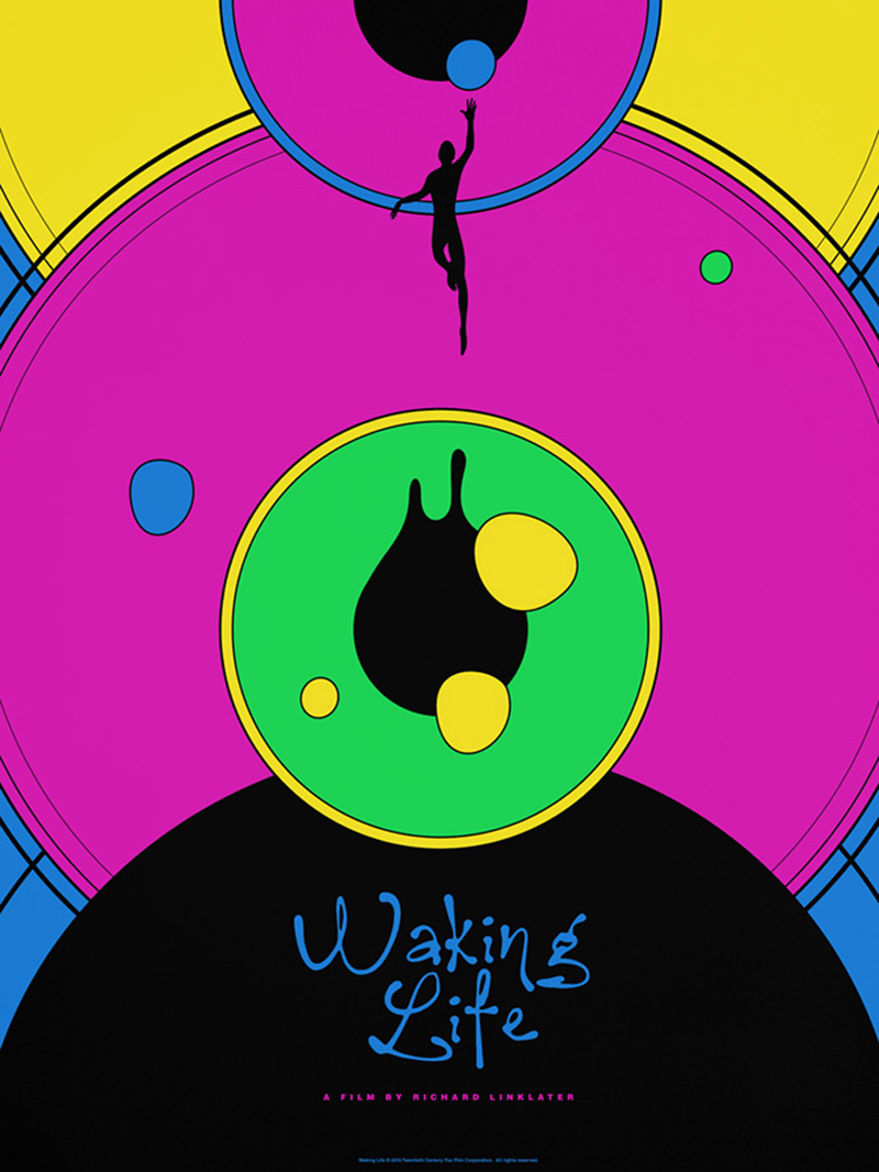
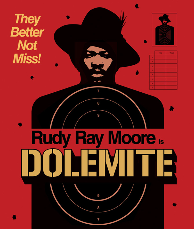
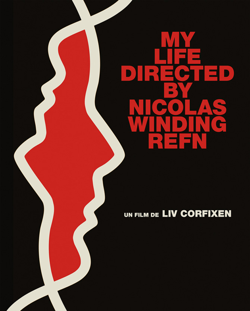
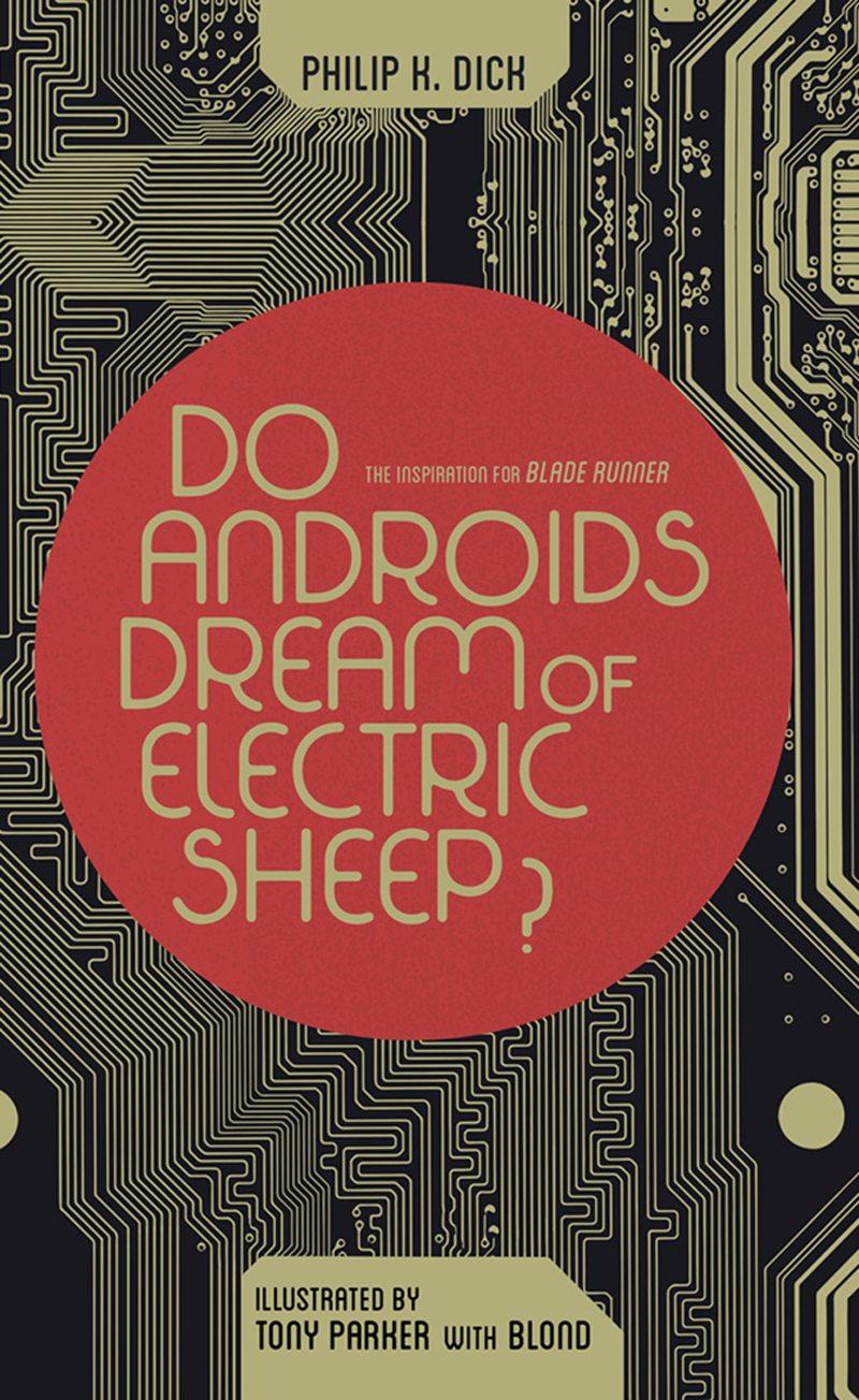
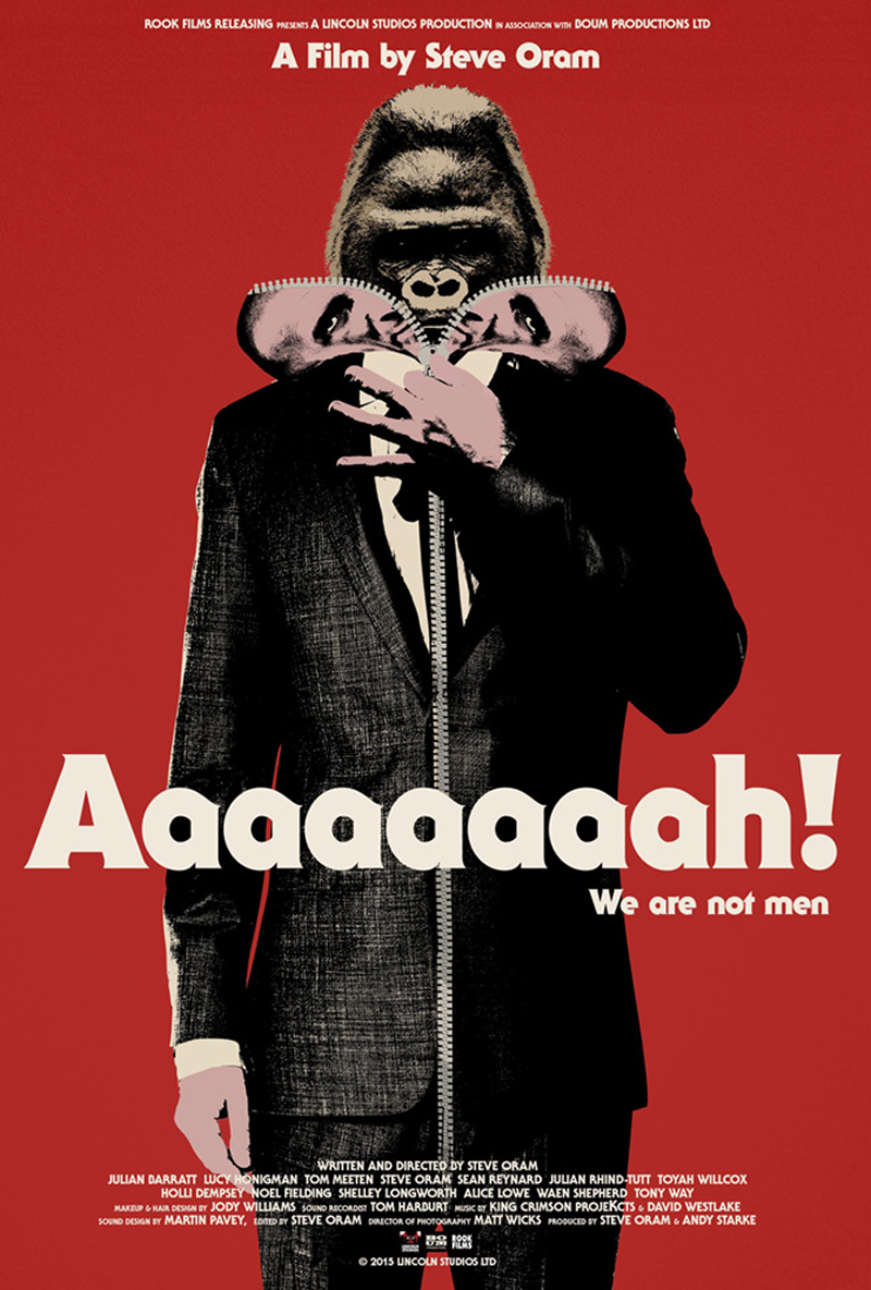
The Kingdom of Nonsense is the digital playground of Jay Shaw, a designer from Texas who doesn’t leave much information about himself on his website. He does, however, share the most important: his design work. On the portfolio, you can discover eye-catching and well-designed posters, book or vinyl covers.
Color is pretty good for separating things. That’s what your basic pie chart is, isn’t it? You tell the slices apart by color. With enough color contrast, you might be OK, but you might be even better off (particularly where accessibility is concerned) using patterns, or a combination.
Filling a pie slice with a pattern is not a common charting library feature (yet), but if your library of choice is SVG-based, you are free to implement SVG patterns.
You can use the patterns.css file that contains all the current patterns. That will only work for non-SVG elements.
You can use individual patterns, but copying them from the sample pages. CSS class definitions can be found here and SVG pattern defs can be found here
You can add your own patterns or modify mine! The conversion process from SVG document to pattern is very tedious. The purpose of the pattern fills toolchain is to simplify this process. You can clone the repo, run npm install and grunt dev to get a local server going. After that, any changes or additions to the src/patterns/**/* files will be automatically picked up and will re-render the CSS file and the sample pages. If you make new patterns, send them over in a pull request!
Here’s me applying them to SVG elements (but could just as easily be applied to HTML elements):
The topic of disabling links popped up at my work the other day. Somehow, a „disabled” anchor style was added to our typography styles last year when I wasn’t looking. There is a problem though: there is no real way to disable an <a> link (with a valid href attribute) in HTML. Not to mention, why would you even want to? Links are the basis of the web.
At a certain point, it looked like my co-workers were not going to accept this fact, so I started thinking of how this could be accomplished. Knowing that it would take a lot, I wanted to prove that it was not worth the effort and code to support such an unconventional interaction, but I feared that by showing it could be done they would ignore all my warnings and just use my example as proof that it was OK. This hasn’t quite shaken out for me yet, but I figured we could go through my research.
First, things first:
Just don’t do it.
A disabled link is not a link, it’s just text. You need to rethink your design if it calls for disabling a link.
Bootstrap has examples of applying the .disabled class to anchor tags, and I hate them for it. At least they mention that the class only provides a disabled style, but this is misleading. You need to do more than just make a link look disabled if you really want to disable it.
Surefire way: remove the href
If you have decided that you are going to ignore my warning and proceed with disabling a link, then removing the href attribute is the best way I know how.
This attribute may be omitted (as of HTML5) to create a placeholder link. A placeholder link resembles a traditional hyperlink, but does not lead anywhere.
Here is basic JavaScript code to set and remove the href attribute:
/*
 * Use your preferred method of targeting a link
 *
 * document.getElementById('MyLink');
 * document.querySelector('.link-class');
 * document.querySelector('[href="https://unfetteredthoughts.net"]');
 */
// "Disable" link by removing the href property
link.href = '';
// Enable link by setting the href property
link.href = 'https://unfetteredthoughts.net';
Styling this via CSS is also pretty straightforward:
a {
  /* Disabled link styles */
}
a:link, a:visited { /* or a[href] */
  /* Enabled link styles */
}
That’s all you need to do!
That’s not enough, I want something more complex so that I can look smarter!
If you just absolutely have to over-engineer some extreme solution, here are some things to consider. Hopefully, you will take heed and recognize that what I am about to show you is not worth the effort.
First, we need to style our link so that it looks disabled.
Setting color to currentColor should reset the font color back to your normal, non-link text color. I am also setting the mouse cursor to not-allowed to display a nice indicator on hover that the normal action is not allowed. Already, we have left out non-mouse users that can’t hover, mainly touch and keyboard, so they won’t get this indication. Next the opacity is cut to half. According to WCAG, disabled elements do not need to meet color contrast guidelines. I think this is very risky since it’s basically plain text at this point, and dropping the opacity in half would make it very hard to read for users with low-vision, another reason I hate this. Lastly, the text decoration underline is removed as this is usually the best indicator something is a link. Now this looks like a disabled link!
But it’s not really disabled! A user can still click/tap on this link. I hear you screaming about pointer-events.
.isDisabled {
  ...
  pointer-events: none;
}
Ok, we are done! Disabled link accomplished! Except, it’s only really disabled for mouse users clicking and touch users tapping. What about browsers that don’t support pointer-events? According to caniuse, this is not supported for Opera Mini and IE<11. IE11 and Edge actually don't support pointer-events unless display is set to block or inline-block. Also, setting pointer-events to none overwrites our nice not-allowed cursor, so now mouse users will not get that additional visual indication that the link is disabled. This is already starting to fall apart. Now we have to change our markup and CSS…
.isDisabled {
  cursor: not-allowed;
  opacity: 0.5;
}
.isDisabled > a {
  color: currentColor;
  display: inline-block;  /* For IE11/ MS Edge bug */
  pointer-events: none;
  text-decoration: none;
}
Wrapping the link in a <span> and adding the isDisabled class gives us half of our disabled visual style. A nice side-affect here is that the disabled class is now generic and can be used on other elements, like buttons and form elements. The actual anchor tag now has the pointer-events and text-decoration set to none.
What about keyboard users? Keyboard users will use the ENTER key to activate links. pointer-events are only for pointers, there is no keyboard-events. We also need to prevent activation for older browsers that don’t support pointer-events. Now we have to introduce some JavaScript.
Bring in the JavaScript
// After using preferred method to target link
link.addEventListener('click', function (event) {
  if (this.parentElement.classList.contains('isDisabled')) {
    event.preventDefault();
  }
});
Now our link looks disabled and does not respond to activation via clicks, taps, and the ENTER key. But we are still not done! Screen reader users have no way of knowing that this link is disabled. We need to describe this link as being disabled. The disabled attribute is not valid on links, but we can use aria-disabled="true".
Now I am going to take this opportunity to style the link based on the aria-disabled attribute. I like using ARIA attributes as hooks for CSS because having improperly styled elements is an indicator that important accessibility is missing.
Now our links look disabled, act disabled, and are described as disabled.
Unfortunately, even though the link is described as disabled, some screen readers (JAWS) will still announce this as clickable. It does that for any element that has a click listener. This is because of developer tendency to make non-interactive elements like div and span as pseudo-interactive elements with a simple listener. Nothing we can do about that here. Everything we have done to remove any indication that this is a link is foiled by the assistive technology we were trying to fool, ironically because we have tried to fool it before.
But what if we moved the listener to the body?
document.body.addEventListener('click', function (event) {
  // filter out clicks on any other elements
  if (event.target.nodeName == 'A' && event.target.getAttribute('aria-disabled') == 'true') {
    event.preventDefault();
  }
});
Are we done? Well, not really. At some point we will need to enable these links so we need to add additional code that will toggle this state/behavior.
function disableLink(link) {
// 1. Add isDisabled class to parent span
  link.parentElement.classList.add('isDisabled');
// 2. Store href so we can add it later
  link.setAttribute('data-href', link.href);
// 3. Remove href
  link.href = '';
// 4. Set aria-disabled to 'true'
  link.setAttribute('aria-disabled', 'true');
}
function enableLink(link) {
// 1. Remove 'isDisabled' class from parent span
  link.parentElement.classList.remove('isDisabled');
// 2. Set href
  link.href = link.getAttribute('data-href');
// 3. Remove 'aria-disabled', better than setting to false
  link.removeAttribute('aria-disabled');
}
That’s it. We now have a disabled link that is visually, functionally, and semantically disabled for all users. It only took 10 lines of CSS, 15 lines of JavaScript (including 1 listener on the body), and 2 HTML elements.
I could probably list about 100 reasons, since as a founder, user, and (ahem) PRO member of CodePen myself, I’m motivated to do so. But let me just list a few here. Some of these are my favorites, some are what PRO members have told us are their favorite, and some are lesser-known but very awesome.
1) No-hassle Debug View
Debug View is a way to look at your the Pen you’ve built with zero CodePen UI around it and no <iframe> containing it. Raw output! That’s a dangerous thing, in the world of user-generated code. It could be highly abused if we let it go unchecked. The way it works is fairly simple.
You can use Debug View if :
You’re logged in
The Pen is PRO-owned
Logging in isn’t too big of a deal, but sometimes that’s a pain if you just wanna shoot over a Debug View URL to your phone or to CrossBrowserTesting or something. If you’re PRO, you don’t worry about it at all, Debug View is totally unlocked for your Pens.
2) Collab with anybody anytime
Collab Mode on CodePen is the one that’s like Google Docs: people can work together in real time on the same Pen. You type, they see you type, they type, you see what they type.
Here’s what is special about that:
There is nothing to install or set up, just shoot anybody a link.
Only you need to be PRO. Nobody else does. They don’t even have to be logged in.
Basically, you can be coding together with someone (or just one or the other of you watching, if you please) in about 2 seconds. Here’s a short silent video if you wanna see:
People use it for all sorts of things. In classrooms and educational contexts, for hiring interviews, and just for working out problems with people across the globe.
Drag and drop uploading
Need to quickly host an asset (like an image) somewhere? As in, quickly get a URL for it that you can use and count on forever? It’s as easy as can be on CodePen.
If you’re working on a Project, you can drag and drop files right into the sidebar as well:
Save Anything Privately
Privacy is unlimited on CodePen. If you’re PRO, you can make unlimited Private Pens and Private Collections. You’re only limited in Private Projects by the total number of Projects on your plan. This is the number one PRO feature on CodePen for a variety of reasons. People use them to keep client work safe. People use them to experiment without anyone seeing messy tidbits. People use them to keep in-progress ideas.
I didn’t even mention my actual favorite CodePen PRO feature. I’ll have to share that one some other time 😉
It wasn’t long ago when Mikael Ainalem’s Pen demonstrated how you might use SVG outlines in HTML then lazyload the image (later turned into a webpack loader by Emil Tholin). It’s kind of like a skeleton screen, in that it gives the user a hint of what’s coming. Or the blur up technique, which loads a very small image blurrily blown up as the placeholder image.
José M. Pérez documents those, plus some more basic options (nothing, an image placeholder, or a solid color), and best of all, a very clever new idea using Primitive (of which there is a mac app and JavaScript version), which creates overlapping SVG shapes to use as the placeholder image. Probably a bit bigger-in-size than some of the other techniques, but still much smaller than a high res JPG!
Many businesses use the festive season as an opportunity to entice bargain-hunting customers into their stores. This flyer is a sweet and simple way of marketing winter season promotions, with a collage-inspired design and hand-drawn font style.
We’ll set up the flyer in Adobe InDesign, create a snowy scene directly in the software, and show you how to export your design for printing or circulating online.
Even if you’re a beginner to using InDesign, this single-page design is a great introduction to creating simple layouts and drawing graphics.
Looking for more promotional flyer designs? You can find a broad range of flyer templates over on Envato Elements, which are quick and simple to customize with your own text content.
What You’ll Need
You’ll need the following resource to complete this project:
A quick note on sizing: We’ll be setting up the flyer pictured here to a standard US flyer size, 8.5 by 11 inches. If you want to create your flyer to a different size, that’s no problem. You’ll simply have to adapt the scale of graphics and fonts to match your required page size.
Step 1
Open InDesign and go to File > New > Document. Uncheck Facing Pages and keep the Number of Pages set to 1.
Set the Width of the page to 8.5 in and Height to 11 in. Keep the margins to their default value, and add a Bleed of 0.5 in.
Click OK to create your document.
Step 2
We’re going to build up the design across a series of layers, which will help give the design a 3D collage-like effect.
To do this, expand the Layers panel (Window > Layers) and double-click on the default Layer 1 name in the panel. Rename the layer Background and click OK.
Click on the Create New Layer button at the bottom of the panel, and double-click on this to rename the layer as Type.
Then create a further five new layers using the same process, in this order: Mountains, Trees Background, Trees Foreground, Snow, and finally Snowfall.
Then click to the left of each layer’s name to lock all the layers except Background.
Step 3
We’ll also set up a color palette, which we can use throughout the design.
Expand the Swatches panel (Window > Color > Swatches) and choose New Color Swatch from the panel’s top-right drop-down menu.
Name the swatch Dusky Pink and set the percentage levels below to C=6 M=12 Y=16 K=5. Click Add and then OK.
Repeat the process to create a palette of CMYK swatches in lovely subdued tones of blues, pinks, and corals:
Teal: C=76 M=33 Y=23 K=6
Green Blue: C=68 M=38 Y=39 K=21
Pale Grey: C=11 M=6 Y=6 K=0
Pale Pink: C=3 M=12 Y=12 K=0
Pale Blue: C=28 M=6 Y=3 K=12
Coral: C=0 M=66 Y=52 K=0
Step 4
Take the Rectangle Tool (M) and drag across the whole page, extending it up to the edge of the bleed on all sides. From the Swatches panel, set the Fill to Dusky Pink.
Step 5
Create a second rectangle, allowing it to cover most of the page, with just a sliver at the bottom uncovered, as shown below.
Set the Fill to Pale Blue.
With this rectangle selected, go to Object > Effects > Gradient Feather. Adjust the Angle to 90 Degrees, and move the Gradient Stops until you’ve created a subtle gradated effect from blue to pink.
2. How to Create a Forest Scene for Your Flyer
Step 1
Head back to the Layers panel and lock the Background layer. Unlock Trees Foreground.
Take the Pen Tool (P) and create a small, tall triangle, by clicking four times onto the page, linking the lines into a shape. From the Swatches panel, set the Fill to Dusky Pink and Stroke Color to [None].
Step 2
Switch to the Line Tool (\) and drag from the bottom of the tree to the top, creating a trunk. Set the Stroke Color to Green Blue.
Create more lines stemming off the central trunk, reaching out to the edge of the tree, creating a series of branches.
Expand the Stroke panel (Window > Stroke) and select all the branches and the trunk (but not the pink triangle shape).
Set the Weight of the stroke to 2 pt and choose Straight Hash from the Type menu.
Step 3
Select the pink triangle and go to Object > Effects > Drop Shadow. Set the Effect Color to Green Blue, Opacity to 50%, and Noise to about 15%. You can tweak the other options until you’ve created a subtle, grainy drop shadow.
Click OK when you’re happy with the result.
Step 4
Select all the elements of the tree shape, including the triangle, trunk, and branches, and Right-Click > Group.
Use Shift to scale the whole illustration, positioning it at the bottom of the page, as shown below.
Edit > Copy, Edit > Paste the tree, creating multiple copies. Arrange them in a sequence along the bottom of the page and double-click on the triangle shape of each graphic to be able to adjust the color. Here, I’ve set one tree in Pale Grey and another in Pale Blue.
Continue to build up the row of trees, with one tree positioned in the center of the sequence and the page.
Step 5
Double-click on one of the triangle shapes to select this alone, and Edit > Copy.
Lock the Trees Foreground layer and unlock the layer below, Trees Background. From the Layers panel’s drop-down menu, make sure Paste Remembers Layers is not active, and then Edit > Paste, dropping the triangle onto this layer.
Adjust the Fill to Green Blue, and position it behind the row of trees, allowing it to peek through one of the gaps.
Copy and Paste this tree shape repeatedly, building up a background row of trees, creating a forest effect.
Step 6
Lock the Trees Background layer and unlock the Mountains layer below.
Edit > Paste another triangle shape onto this page, and drag to make it much larger. Change the Fill to Teal.
Go to Object > Effects > Inner Glow. From here, we can add a grainy texture to the shape. Set the Mode to Normal, Effect Color to Green Blue, and Opacity to about 50%. Increase the Size to 1.25 in, Choke to about 35%, and Noise to about 60%, before clicking OK.
Step 7
To create a snow cap for your mountain, take the Pen Tool (P) and click around the top of the triangle shape, creating more jagged edges along the bottom edge. Unite into a shape and set the Fill to Pale Grey.
With the cap selected, go to Object > Effects > Inner Glow. With the Mode set to Normal, adjust the Effect Color to Pale Blue. Increase the Choke to around 20% and Noise to about 40%, before clicking OK.
Step 8
Select both the blue triangle and snow cap and Right-Click > Group.
Copy and Paste the mountain, moving a copy over to the right side of the layout.
Create more copies of the mountain, stretching them and reducing their height, and fitting them in the central section of the layout, as shown below, creating a mountain range.
Step 9
Take the Ellipse Tool (L) and, holding Shift, drag onto the top-right of the page, creating a small moon. Set the Fill to Pale Grey.
With the circle selected, go to Object > Effects > Transparency. Choose Overlay from the Mode menu.
Click on Outer Glow in the window’s left-hand menu. Tweak the options to create a soft glow effect, to give the impression the moon is shining.
Click OK to exit the window.
Step 10
Lock the Mountains layer and unlock the Snow layer. Select the Pen Tool (P) and click around the bottom of the page, to create a long rectangle-like shape, which just overlaps the bottom edge of the trees. Set the Fill to [Paper].
3. How to Format Typography on Your Flyer
Step 1
Lock the Snow layer and unlock the Type layer.
Select the Type Tool (T) and drag onto the page to create a text frame across the center of the layout, above the mountain range. Type in ‘WINTER’.
From either the Controls panel at the top of the workspace or the Character and Paragraph panels (Window > Type & Tables > Character), set the Font to Naive Inline, Size 85 pt, Tracking 70 and set the text to Align Center. From the Swatches panel, set the Font Color to [Paper].
Step 2
Edit > Copy, Edit > Paste the text frame to create a second text frame below the first. Type in ‘SALE’ and increase the Font Size until the edges of the word meet the edges of ‘WINTER’ above.
Switch the Font Color to Coral for contrast.
Step 3
Build up more text frames around the main headline if you wish. You can add more details about the savings on offer…
… and where customers can benefit from the discounts.
Vary the Font Color between [Paper] and Teal, so that the coral ‘SALE’ text remains the most visible piece of type on the page.
4. How to Add a Snowy Finishing Touch
Step 1
It’s not a wintry scene without a generous sprinkling of snow!
Lock the Typography layer and unlock the top layer, Snowfall. Select the Pen Tool (P) and roughly draw a small circle onto the top of the page. Set the Fill to [Paper].
With the shape selected, go to Object > Effects > Transparency. Set the Mode to Overlay and bring the Opacity down to 70%.
Click on Drop Shadow in the window’s left-hand menu. Set the Effect Color to Teal, and add 30% Noise to create a subtle shadow. Click OK.
Step 2
Copy and Paste the circle repeatedly, creating a scattered group of snowdrops.
Then select the group and Copy and Paste, eventually building up a whole snowfall design across the top of the flyer. Avoid the circles spilling over any of the text, but allowing a few to fall over the top of the mountains helps the whole illustration to pull together.
5. How to Export Your Flyer
Your flyer’s finished—great job! Now all you have to do is export it, ready for circulating online or sending off for printing.
Step 1
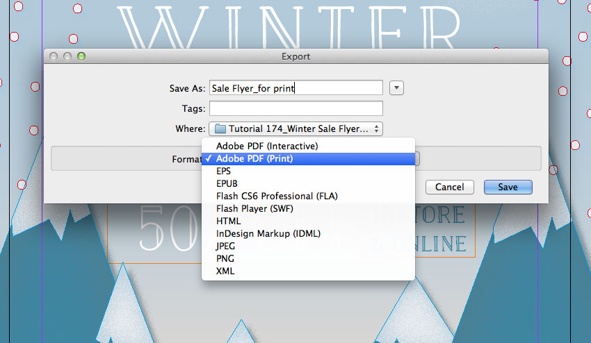
First up, make sure to File > Save your hard work. Then go back to File and choose Export.
In the Export window that opens, choose PNG or JPEG from the Format menu if you want to create a web-ready image.
If you’re looking to print your flyer professionally, choose Adobe PDF (Print) from the Format menu. Then click Save.
Step 2
If you’ve chosen PDF, the Export to PDF window will open. Select [Press Quality] from the Preset menu at the top.
Then click on Marks and Bleeds in the left-hand menu. Check All Printer’s Marks and Use Document Bleed Settings, before clicking Export to create your print-ready file.
Conclusion: Your Finished Flyer
Your winter sale flyer is finished and ready for distributing—awesome work!
In this tutorial, we’ve looked at how you can create gorgeous flyers with a craft-inspired look in InDesign. It’s also easy to adapt your flyer design to a different purpose—why not use it to promote a festive event?
Looking for more promotional flyer designs? You can find a broad range of flyer templates over on Envato Elements, which are super easy to customize with your own text content. Make sure to take a look!
Agregator najlepszych postów o designie, webdesignie, cssie i Internecie