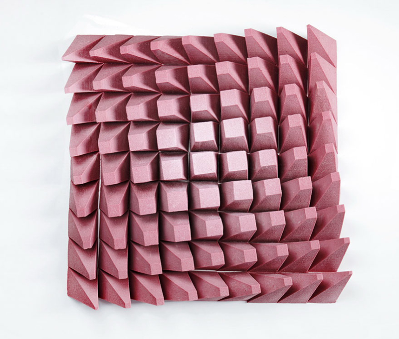
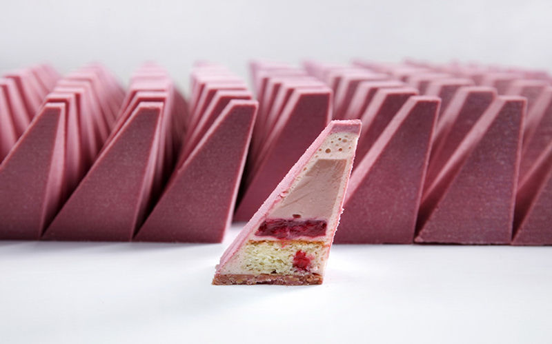
What happens when a talented designer, architect, and 3D artist combines her passion for baking cakes with her professional skills? The answer is in pictures in this post, with one of the latest creations by Dinara Kasko, a designer gone pastry artist.
Thanks to the power of the Internet, this Ukrainian housewife mashed up her passion with her professional background and now gives cake-creation workshops all around the world. See the video at the end of this post to see more about the making-off of this cake.
From credit card payment devices and gas pump screens to the software that your company creates, user interfaces react to the actions of the user and other sources and change their state accordingly. This concept isn’t just limited to technology, it’s a fundamental part of how everything works:
For every action, there is an equal and opposite reaction.
– Isaac Newton
This is a concept we can apply to developing better user interfaces, but before we go there, I want you to try something. Consider a photo gallery interface with this user interaction flow:
Show a search input and a search button that allows the user to search for photos
When the search button is clicked, fetch photos with the search term from Flickr
Display the search results in a grid of small sized photos
When a photo is clicked/tapped, show the full size photo
When a full-sized photo is clicked/tapped again, go back to the gallery view
Now think about how you would develop it. Maybe even try programming it in React. I’ll wait; I’m just an article. I’m not going anywhere.
Finished? Awesome! That wasn’t too difficult, right? Now think about the following scenarios that you might have forgotten:
What if the user clicks the search button repeatedly?
What if the user wants to cancel the search while it’s in-flight?
Is the search button disabled while searching?
What if the user mischievously enables the disabled button?
Is there any indication that the results are loading?
What happens if there’s an error? Can the user retry the search?
What if the user searches and then clicks a photo? What should happen?
These are just some of the potential problems that can arise during planning, development, or testing. Few things are worse in software development than thinking that you’ve covered every possible use case, and then discovering (or receiving) new edge cases that will further complicate your code once you account for them. It’s especially difficult to jump into a pre-existing project where all of these use cases are undocumented, but instead hidden in spaghetti code and left for you to decipher.
Stating the obvious
What if we could determine all possible UI states that can result from all possible actions performed on each state? And what if we can visualize these states, actions, and transitions between states? Designers intuitively do this, in what are called „user flows” (or „UX Flows”), to depict what the next state of the UI should be depending on the user interaction.
In computer science terms, there is a computational model called finite automata, or „finite state machines” (FSM), that can express the same type of information. That is, they describe which state comes next when an action is performed on the current state. Just like user flows, these finite state machines can be visualized in a clear and unambiguous way. For example, here is the state transition diagram describing the FSM of a traffic light:
What is a finite state machine?
A state machine is a useful way of modeling behavior in an application: for every action, there is a reaction in the form of a state change. There’s 5 parts to a classical finite state machine:
A set of states (e.g., idle, loading, success, error, etc.)
A set of actions (e.g., SEARCH, CANCEL, SELECT_PHOTO, etc.)
An initial state (e.g., idle)
A transition function (e.g., transition('idle', 'SEARCH') == 'loading')
Final states (which don’t apply to this article.)
Deterministic finite state machines (which is what we’ll be dealing with) have some constraints, as well:
There are a finite number of possible states
There are a finite number of possible actions (these are the „finite” parts)
The application can only be in one of these states at a time
Given a currentState and an action, the transition function must always return the same nextState (this is the „deterministic” part)
Representing finite state machines
A finite state machine can be represented as a mapping from a state to its „transitions”, where each transition is an action and the nextState that follows that action. This mapping is just a plain JavaScript object.
Let’s consider an American traffic light example, one of the simplest FSM examples. Assume we start on green, then transition to yellow after some TIMER, and then RED after another TIMER, and then back to green after another TIMER:
Given the current state and an action, what will the next state be?
With our setup, transitioning to the next state based on an action (in this case, TIMER) is just a look-up of the currentState and action in the machine object, since:
machine[currentState] gives us the next action mapping, e.g.: machine['green'] == {TIMER: 'yellow'}
machine[currentState][action] gives us the next state from the action, e.g.: machine['green']['TIMER'] == 'yellow':
Instead of using if/else or switch statements to determine the next state, e.g., if (currentState === 'green') return 'yellow';, we moved all of that logic into a plain JavaScript object that can be serialized into JSON. That’s a strategy that will pay off greatly in terms of testing, visualization, reuse, analysis, flexibility, and configurability.
Taking a look at a more complicated example, let’s see how we can represent our gallery app using a finite state machine. The app can be in one of several states:
start – the initial search page view
loading – search results fetching view
error – search failed view
gallery – successful search results view
photo – detailed single photo view
And several actions can be performed, either by the user or the app itself:
SEARCH – user clicks the „search” button
SEARCH_SUCCESS – search succeeded with the queried photos
SEARCH_FAILURE – search failed due to an error
CANCEL_SEARCH – user clicks the „cancel search” button
SELECT_PHOTO – user clicks a photo in the gallery
EXIT_PHOTO – user clicks to exit the detailed photo view
The best way to visualize how these states and actions come together, at first, is with two very powerful tools: pencil and paper. Draw arrows between the states, and label the arrows with actions that cause transitions between the states:
We can now represent these transitions in an object, just like in the traffic light example:
Now let’s see how we can incorporate this finite state machine configuration and the transition function into our gallery app. In the App’s component state, there will be a single property that will indicate the current finite state, gallery:
This looks similar to the previously described transition(currentState, action) function, with a few differences:
The action is an object with a type property that specifies the string action type, e.g., type: 'SEARCH'
Only the action is passed in since we can retrieve the current finite state from this.state.gallery
The entire app state will be updated with the next finite state, i.e., nextGalleryState, as well as any extended state (nextState) that results from executing a command based on the next state and action payload (see the „Executing commands” section)
Executing commands
When a state change occurs, „side effects” (or „commands” as we’ll refer to them) might be executed. For example, when a user clicks the „Search” button and a 'SEARCH' action is emitted, the state will transition to 'loading', and an async Flickr search should be executed (otherwise, 'loading' would be a lie, and developers should never lie).
We can handle these side effects in a command(nextState, action) method that determines what to execute given the next finite state and action payload, as well as what the extended state should be:
  // ...
  command(nextState, action) {
    switch (nextState) {
      case 'loading':
        // execute the search command
        this.search(action.query);
        break;
      case 'gallery':
        if (action.items) {
          // update the state with the found items
          return { items: action.items };
        }
        break;
      case 'photo':
        if (action.item) {
          // update the state with the selected photo item
          return { photo: action.item };
        }
        break;
      default:
        break;
    }
  }
  // ...
Actions can have payloads other than the action’s type, which the app state might need to be updated with. For example, when a 'SEARCH' action succeeds, a 'SEARCH_SUCCESS' action can be emitted with the items from the search result:
The command() method above will immediately return any extended state (i.e., state other than the finite state) that this.state should be updated with in this.setState(...), along with the finite state change.
The final machine-controlled app
Since we’ve declaratively configured the finite state machine for the app, we can render the proper UI in a cleaner way by conditionally rendering based on the current finite state:
You might have noticed data-state={galleryState} in the code above. By setting that data-attribute, we can conditionally style any part of our app using an attribute selector:
This is preferable to using className because you can enforce the constraint that only a single value at a time can be set for data-state, and the specificity is the same as using a class. Attribute selectors are also supported in most popular CSS-in-JS solutions.
Advantages and resources
Using finite state machines for describing the behavior of complex applications is nothing new. Traditionally, this was done with switch and goto statements, but by describing finite state machines as a declarative mapping between states, actions, and next states, you can use that data to visualize the state transitions:
Furthermore, using declarative finite state machines allows you to:
Store, share, and configure application logic anywhere – similar components, other apps, in databases, in other languages, etc.
Make collaboration easier with designers and project managers
Statically analyze and optimize state transitions, including states that are impossible to reach
Easily change application logic without fear
Automate integration tests
Conclusion and takeaways
Finite state machines are an abstraction for modeling the parts of your app that can be represented as finite states, and almost all apps have those parts. The FSM coding patterns presented in this article:
Can be used with any existing state management setup; e.g., Redux or MobX
Can be adapted to any framework (not just React), or no framework at all
Are not written in stone; the developer can adapt the patterns to their coding style
Are not applicable to every single situation or use-case
From now on, when you encounter „boolean flag” variables such as isLoaded or isSuccess, I encourage you to stop and think about how your app state can be modeled as a finite state machine instead. That way, you can refactor your app to represent state as state === 'loaded' or state === 'success', using enumerated states in place of boolean flags.
Resources
I gave a talk at React Rally 2017 about using finite automata and statecharts to create better user interfaces, if you want to learn more about the motivation and principles:
When you use a bit of inline <svg> and you don’t set height and width, but you do set a viewBox, that’s a fitwigoo. I love the name.
The problem with fatwigoo’s is that the <svg> will size itself like a block-level element, rendering enormously until the CSS comes in and (likely) has sizing rules to size it into place.
It’s one of those things where if you develop with pretty fast internet, you might not ever see it. But if you’re somewhere where the internet is slow or has high latency (or if you’re Karl Dubost and literally block CSS), you’ll probably see it all the time.
I was an offender before I learned how obnoxious this is. At first, it felt weird to size things in HTML rather than CSS. My solution now is generally to leave sensible defaults on inline SVG (probably icons) like height="20" width="20" and still do my actual sizing in CSS.
If we put four grid items in there, here’s what it looks like when inspecting it in Firefox DevTools:
Now let’s target one of those grid items and give it a background-color:
The grid area and the element are the same size!
There is a very specific reason for that though. It’s because the default value for justify-items and align-items is stretch. The value of stretch literally stretches the item to fill the grid area.
But there are several reasons why the element might not fill a grid area:
On the grid parent, justify-items or align-items is some non-stretch value.
On the grid element, align-self or justify-self is some non-stretch value.
On the grid element, if height or width is constrained.
Check it:
Who cares?
I dunno it just feels useful to know that when placing an element in a grid area, that’s just the starting point for layout. It’ll fill the area by default, but it doesn’t have to. It could be smaller or bigger. It could be aligned into any of the corners or centered.
Perhaps the most interesting limitation is that you can’t target the grid area itself. If you want to take advantage of alignment, for example, you’re giving up the promise of filling the entire grid area. So you can’t apply a background and know it will cover that whole grid area anymore. If you need to take advantage of alignment and apply a covering background, you’ll need to leave it to stretch, make the new element display: grid; also, and use that for alignment.
If you work with WordPress, you’re in luck—WordPress themes and plugins are now included in an annual Envato Elements subscription. And what’s more, you can lock in a special introductory rate for a limited time. Read on for more details.
What’s Included
Envato Elements already gives you unlimited downloads from a massive library of 400,000+ photos, graphics, templates, and other creative assets. Plus it gives you free access to more than 1,000 courses and 240 eBooks here on Envato Tuts+.
From today, you’ll still get all of that plus a curated collection of beautiful, premium WordPress themes and plugins.
As with everything else on Envato Elements, this is an „all you can eat” deal. You can download as many themes and plugins as you want, with no limits or credits to keep track of. And there’s a simple licensing system so that you know you’re covered for all of your projects.
Right now, there are over 190 top themes and 130 plugins available to choose from, and you can expect that number to grow as more authors join the platform and existing authors upload more items.
WordPress Themes
There’s a wide range of premium themes on offer, whether you’re looking for a multipurpose theme suitable for a corporate audience or something more creative that would work for a blog or portfolio site. There are even niche themes for real estate sites, wedding sites and more—and of course, you can find e-commerce themes to help you make sales from your site.
WordPress Plugins
A well-designed theme is a great start, of course, but if you’re working with WordPress you’ll also need access to premium plugins to add the features and functionality you want.
Envato Elements has you covered here too, with a selection of powerful plugins to help you create booking and scheduling systems, contact forms, responsive menus, social media feeds, and more.
What It Costs
It’s important to understand that WordPress themes and plugins are only available with an annual subscription, not a monthly one. Usually, an Envato Elements subscription costs $29 a month, so the annual subscription will be $348 a year ($29 x 12).
However, for a limited time, you can save $120 on your subscription and sign up for just $228 (the equivalent of $19 a month). Remember, for that price you get not only the WordPress themes and plugins but also thousands of photos, fonts, graphics, templates and more. It’s a pretty special deal.
So head over to Envato Elements to see what’s on offer, and if you like what you see, sign up for an annual subscription to start making unlimited downloads. Don’t spend too long thinking about it, though, because this introductory deal won’t last forever!
This is a romantic, rustic invitation which would be a perfect fit for winter weddings. In this tutorial suitable for beginners to Adobe InDesign, we’ll look at how to put together the invitation card and how to export your design ready for printing.
We’ll be dipping into vector software to edit the tree graphics in the design, so you will need access to Illustrator too.
Ready to get swept up in the romance of the colder months? Let’s go!
Note on sizing:We’ll be setting up the cards to a standard 4.5 in by 6.25 in size, which will fit inside standard sized envelopes that you can easily find online or in a stationery store. Try pairing your cards with a brown paper envelope for rustic charm.
1. How to Create a Rustic Backdrop for Your Invite
Step 1
Open up Adobe InDesign and go to File > New > Document.
With the Intent set to Print, uncheck the Facing Pages box. Set the Width of the page to 4.5 in and the Height to 6.25 in.
Add Margins of 0.5 in and a Bleed of 0.25 in. Then head up and click OK.
Step 2
Expand the Layers panel and double-click on the Layer 1 name. Rename the layer Background and click OK.
Take the Rectangle Frame Tool (F) and drag across the whole page, extending the image frame up to the edges of the bleed on all sides. Go to File > Place, choose the brown paper texture image you downloaded earlier, and click Open. Allow the image to fill up the whole frame.
Step 3
Expand the Swatches panel (Window > Color > Swatches) and choose New Color Swatch from the panel’s drop-down menu (at top-right).
Set the Type to Process and Mode to CMYK, and adjust the levels below to C=16 M=31 Y=36 K=4. Click Add and then OK.
Take the Rectangle Tool (M) and drag across the whole page, before setting the Fill of the shape to your new brown swatch from the Swatches panel.
With the shape selected, go to Object > Effects > Transparency. Bring the Opacity down to 35% and click OK.
2. How to Format Elegant Typography on Your Invite
Step 1
Lock the Background layer and click on the Create New Layer button at the bottom of the panel. Rename this new layer Typography.
With the rulers visible (go to View > Show Rulers if not), drag out a guide from the left-hand ruler, dropping it in the center of the page. This will help you judge how centered the typography elements on your page are.
Use the Type Tool (T) to create a text frame across the central guide, about a third of the way down the page. Type in ‘Name 1’.
From either the top Controls panel or the Character and Paragraph panels (Window > Type > Character and Paragraph), set the Font to Love Hewits, Size 80 pt. From the Swatches panel, adjust the Font Color to [Paper].
Step 2
Edit > Copy, Edit > Paste the text frame and position it below and a little to the right of the original. Edit the text to read ‘Name 2’.
You can create a smaller text frame to the left of the second name, type in an ampersand (‘&’), and set the Font to Miama.
Step 3
Once you’re happy with the formatting of the names, you may want to vectorise the text to make it a little easier to scale the names up and down as a group. Select all three text frames with your mouse and go to Type > Create Outlines.
Right-click on the vectors and choose Group. Then you can scale the names together, while holding down Shift, and adjust the position until you are happy with the result.
Step 4
In the Swatches panel, choose New Color Swatch from the panel’s menu. Name the swatch Charcoal and set the levels to C=62 M=52 Y=50 K=47.
Create a new text frame above the names, centering it on the page. Type in introductory text, such as ‘Please join us to celebrate the wedding of’, and set the Font to Aleo Bold, Size 8 pt, Align Center and increase the Tracking (space between all letters) to 200.
From the Swatches panel, switch the Font Color to Charcoal.
Step 5
Build up more text frames below the names by copying and pasting the top text frame repeatedly. Adjust the text to read the date and time of the event, then the place, and finally a ‘PTO for more details’ note if you want to place extra info like directions or contact details on the reverse of the card.
3. How to Add Snowy Forest Details to Your Invite
Step 1
Open up the winter tree vector in Illustrator. Isolate the tree silhouette alone, and head up to Edit > Copy.
Back in InDesign, lock the Typography layer and create a new layer above called Trees. Edit > Paste the tree vector directly onto the page. Position it at the bottom center of the page, and set the Fill to Charcoal.
Step 2
With the tree selected, go to Object > Effects > Transparency. Choose Multiply from the Mode menu, and pull the Opacity down to 80%. Click OK.
Copy and Paste the tree and scale it down a little, before placing it to the left of the original tree, allowing some of the branches to overlap. Edit > Copy, Edit > Paste this second tree and move it over to the right side, creating a fan effect.
Step 3
We can add extra details, like berries and snow, to the card to make it extra special.
Create a new swatch called Berry Red, C=15 M=87 Y=57 K=4. Then lock the Trees layer and create a new layer above, called Berries.
Take the Pencil Tool (N) and draw a rough berry shape over the top of one of the tree branches, setting the Fill to Berry Red.
Select the red shape and copy and paste repeatedly, spreading the berries across the tops of all the branches.
Step 4
Open the paint drops vector in Illustrator and adjust the color of the drops from black to White. Make sure to remove the background too, before saving as an Illustrator EPS (.eps) file.
Back in InDesign, create a new layer called Snow, and drag this down to sit above the Background layer and below the Typography layer.
Zoom into the top-right corner of the page and use the Pencil Tool (N) to draw a rough cloud-like shape onto the page.
Make sure the Fill and Stroke of the shape are set to [None] before going to File > Place. Choose the paint drops vector in white you edited earlier, and allow it to fill the shape.
Step 5
Copy and Paste the shape a few times, rotating each one slightly differently, and creating a cluster of shapes around the top-right corner of the layout, using them to create a frame around the edges of the page.
Select all the shapes and Right-Click > Group.
Copy and Paste the group repeatedly, positioning each group around the perimeter of the page, building up a snowy border around the whole invite.
Step 6
Create a new layer at the top of the sequence, naming it Snow Cap.
As we did with the border detailing, take the Pencil Tool (N) and doodle a small snow cap shape over the top of part of the central tree’s branches, as shown below.
With the Stroke and Fill of the shape set to [None], go to File > Place and choose the white paint drops image as before, allowing it to fill the shape.
Repeat the process of creating and filling snow cap shapes across the curved top of the central tree.
When you’ve finished, Right-Click > Group the snow caps.
Copy and Paste the group, scaling it down and repositioning to fit over the top of the left-hand tree. Repeat for the tree on the right side too.
4. How to Export Your Design for Printing
Step 1
Make sure to first File > Save your work, and then go to File > Export.
Choose Adobe PDF (Print) from the Format menu at the bottom of the Export window, name your file appropriately (something like ‘Wedding invite_final for print.pdf’), and hit Save.
In the window that opens, choose Press Quality from the Adobe PDF Preset dropdown menu at the top.
Step 2
Then click on Marks and Bleeds in the window’s left-hand menu. Check All Printer’s Marks and Use Document Bleed Settings, before clicking Export.
This will create a ready-to-print PDF file which you can send straight off to the printer’s—great job!
Conclusion
Your winter wedding invitation is finished. Awesome work! All you have to do now is send them off in the post, and get ready for the big day.
In this tutorial, we’ve covered a number of key skills relating to print and stationery design. You should now feel more confident with tackling projects like this and using your newfound skills to create more spectacular invitations.
Recycling is a way to stop the waste, it makes sure that the products you throw will come back to life in another form. However, there is a way to recycle your everyday items by yourself, especially if you are a designer.
1. Vintage Tennis Rackets turned into Mirrors
The shape of a tennis racket looks like a mirror frame, so why not just take this literally and just create a mirror with your old tennis rackets?
2. The Bath Tub Couch
These old vintage bathtubs look great when used for their primary functionality already, but they even look better when repurposed into couches.
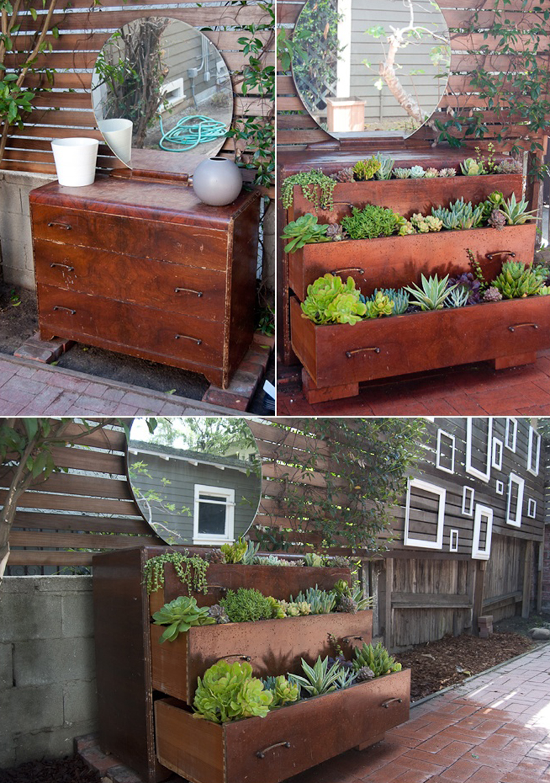
3. An Old Dresser turned into an Awesome Gardening Planter
Turning a furniture into a planter doesn’t only give it a new life, it makes grow new life.
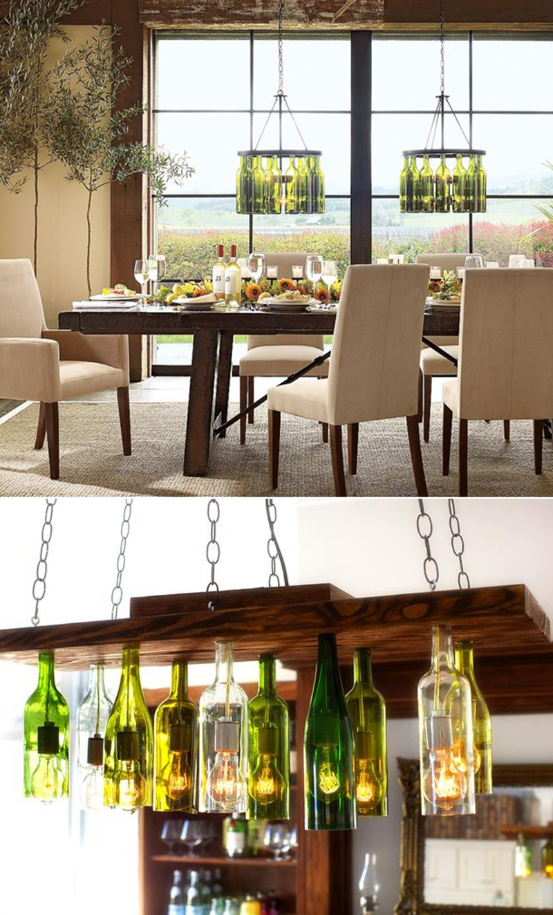
4. The Beer Chandelier
Using the word chandelier usually connotates a classy item for lightening your interior, not exactly something you’d imagine to be built with old beer bottles. However, if you look at the image under, you can see that it can work pretty well.
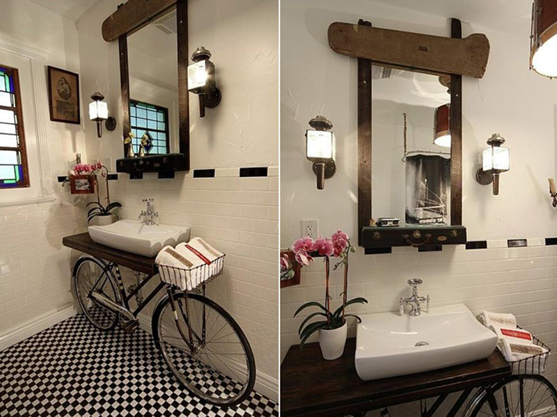
5. The Bathroom Bike
A great way to decorated a bathroom, include your old bike into the interior design of the room.
As a conclusion, the examples shown here should be convincing enough for us to always try to find a clever and practical solution before throwing anything.
In this tutorial you will learn how to use the Mesh Tool in Adobe Illustrator to create a vector Christmas background with a pile of gift boxes!
If you want to skip the tutorial and just use these presents along with some other awesome elements in your work, you can purchase Christmas Gift Boxes in Snow from GraphicRiver!
For our very first step, grab a red (#B33029) rectangle.
Proceed to Effects > Warp > Arc and apply the effect with the following settings:
Bend -28%
Horizontal 0%
Vertical 0%
Step 2
Go to Object > Expand Appearance, and modify the shape by bringing its edges up a bit.
Let’s begin using Mesh! Grab the Mesh Tool (U) and create a Mesh Grid like the one in the screenshot below by clicking where the nodes are supposed to be.
Once your Mesh Grid is done, begin coloring it by selecting the indicated column of nodes with the Mesh Tool (U) and changing their color to #F9E5D5.
Continue by coloring the nodes selected in the screenshot below with #D04640.
Finally, color the six nodes on the left edge of the shape with #941F17.
Step 3
Draw the lid of the box using the same technique and these colors:
#D24741
#D45458
#FFE0D0
Step 4
Create the bottom side of the gift box using the Mesh Tool and the following colors:
–
#B12E27
#FFEFDE
#DD544E
#941F17
#EF8A7E
Step 5
Assemble the box out of the three parts we made!
Step 6
Let’s move on to creating the bow!
Create the first element with Mesh and these colors:
#AE2C26
–
#871910
#3E0600
Step 7
Create the second element.
#8F1D15
#FAB7A8
#721107
#150100
Step 8
Put both elements together to create the first piece of the bow.
Step 9
Create another bottom part of the bow with Mesh.
#AB2C25
#7A150B
#120100
Step 10
Create the accompanying top part.
#A0241E
#D74F48
#FADCCC
#80170D
#190200
Step 11
Again, put the last two parts together.
Step 12
Draw the first half of piece number 3.
#B9352E
–
#FFF7E6
Step 13
Draw another part.
#C13C36
–
#480700
Step 14
Put together the third piece.
Step 15
Draw another part of the bow.
#C7413B
–
#691108
Step 16
Draw this part out of two shapes, both colored with #C7413B.
#C7413B
#FFF7E6
#4F0800
Step 17
Join our final two parts together!
Step 18
Now put together the left half of the bow, as indicated by the numbers.
Step 19
Go to Object > Transform > Reflect, choose the Vertical option, and press Copy to complete the bow.
Step 20
Draw a #100000 filled ellipse to serve as a shadow for the base of the bow.
Step 21
Place it onto the base.
Step 22
Add the bow on top of the gift box we drew earlier.
Step 23
Draw an ellipse filled with a Radial Gradient (#58342D to white) to create another shadow. Use the Multiply transparency mode.
Step 24
Add shadows on the base of the bow and under the box.
Step 25
Let’s create a new color variant of this box!
Proceed to Edit > Edit Colors > Convert to Greyscale.
Step 26
Go to Edit > Edit Colors > Adjust Colors and tweak the Black in the box by -14%.
Step 27
Finally, return to Edit > Edit Colors > Adjust Colors, only now choosing the RGB mode.
Tick Convert on the top of the window, and set the following parameters:
Red: -33%
Green: -9%
Blue: -9%
2. How to Draw the Second Present
Step 1
Draw the left side of the second gift box’s lid with Mesh.
#D3CFB4
#ABA485
#817756
#F7F5DF
Step 2
Draw the right part of the lid.
#E8E5CD
#C5BFA4
#F7F5DF
Step 3
Draw the left side of the box.
#9E9676
#695F3E
#796F4D
#E8E3CD
Step 4
Draw the right side of the box.
#CDC8AC
#695F3E
#796F4D
#E8E3CD
Step 5
Draw the lid.
#F2F1DB
#CFCAB0
#E9E6CF
Step 6
Put together the second box.
Step 7
Recolor a copy of the box with Edit > Edit Colors > Adjust Colors and these settings:
Red: -60%
Green: -37%
Blue: -12%
Step 8
Create another green box out of a copy with Edit > Edit Colors > Adjust Colors:
Red: -45%
Green: -36%
Blue: -34%
Step 9
Begin drawing the cyan bow.
#3B7F92
#9DD9CA
#113C33
#236072
Step 10
Draw the second element.
#3B7F92
#A0DBCD
#0E3533
#489397
#285F64
Step 11
Draw the next part.
#1A4F63
#05210B
Step 12
Create the next element.
#1E556C
#89CDC4
#27678B
#154549
#53A1AD
Step 13
#1D5268
#7FC4BE
#28698C
#112F3F
Step 14
Draw the final part of the bow.
#28667A
#5299A7
#0D3A3F
#66B9C4
Step 15
Create a shadow for the bow by filling an ellipse with a #0B3330 to white Radial Gradient and Multiply transparency.
Step 16
Add all the parts together.
Step 17
Let’s begin drawing the ribbon for the bow!
#286372
#79C5CD
#61A9B6
#0F2A30
Step 18
Draw the top part of the ribbon.
#3C8395
#153538
#59A3B0
Step 19
Join these two together!
Step 20
Create another element.
#2C6779
#144349
#5EAABA
#93D8DB
Step 21
Draw the last section of the ribbon.
#5EAABA
#16454C
Step 22
Draw a pattern for the box.
Use two circles with a #408696Stroke, which you would then Expand. Create a couple of different versions.
Step 23
Create a rectangular pattern out of the circles.
Step 24
Create two copies of the pattern.
Go to Effect > Distort & Transform > Free Distort and create a pattern for the side of the box.
Step 25
Grab the second copy and through Effect > Distort & Transform > Free Distort, create a pattern for the lid.
Step 26
Apply the pattern and the bow with the ribbon to the box.
Step 27
Grab a copy of the pattern, and set it to Multiply and 60% Opacity before applying it to the blue box.
Step 28
Take another pattern, this time with Screen and 60% Opacity, for the green box.
Step 29
Recolor the bow and the pattern with Edit > Edit Colors > Adjust Colors:
Red: 45%
Green: -47%
Blue: -41%
Step 30
Arrange the boxes we made into a pile.
3. How to Draw the Third Present
Step 1
Begin drawing the third box.
#778C80
#B6CCBC
#363E2A
#353C28
#5B6B5B
Step 2
Draw the lid.
#B2CDBF
#FEF9E7
#95B0A7
Step 3
Draw the side of the lid.
#8EA59B
#EDEFDE
#708477
#A1BCB3
#515F4F
Step 4
Assemble the gift box.
Step 5
Begin drawing a bow.
#90A29A
#102114
#C8D8C2
#637568
Step 6
Draw the second part.
#55675F
#DBEAD4
#798E87
#D4352C
Step 7
Draw another element with mesh.
#95A79F
#ECFCDF
#091B0F
Step 8
#8FA299
#516156
#CDDECD
Step 9
#A7BAB3
#E9FCDD
#75867C
#112216
Step 10
#112317
#53655C
Step 11
#7C9884
#E5EDE3
#224029
Step 12
Draw the eighth element:
#223B29
#46614F
and the final part.
#37513E
#0E2312
#893398
Step 13
Assemble the bow!
Step 14
Place the bow onto the box.
Step 15
Recolor a copy of the present into blue by using Edit > Edit Colors > Adjust Colors:
Red: -18%
Green: -7%
Blue: 15%
Step 16
Apply Edit > Edit Colors > Saturate with -35% Intensity to get a light blue box.
Step 17
Add these boxes and the boxes made in the first section to the group.
4. How to Draw the Background
Step 1
Draw the background with Mesh:
#6C9F99
#C4D7CA
#99C0B8
#D7E2D2
#3F7D79
Step 2
Add a drawing of snow.
#EFF4E4
#D1E0D5
Step 3
Combine the two.
Step 4
Place the group of presents on the snow.
Next, draw a rectangle and put it on top of the image. The rectangle should „frame” everything you want to keep in the picture.
Select all the elements, right-click, and choose Make Clipping Mask.
What now? You can try any of my other tutorials from my profile, or check out my portfolio on GraphicRiver, as well as the original vector we recreated in this tutorial.
I hope you enjoyed the tutorial, and I would be super happy to see any results in the comments below!
I recently learned about a browser feature where, if you provide a special HTTP header, it will automatically post to a URL with a report of any non-HTTPS content. This would be a great thing to do when transitioning a site to HTTPS, for example, to root out any mixed content warnings. In this article, we’ll implement this feature via a small WordPress plugin.
What is mixed content?
„Mixed content” means you’re loading a page over HTTPS page, but some of the assets on that page (images, videos, CSS, scripts, scripts called by scripts, etc) are loaded via plain HTTP.
A browser warning about mixed content.
I’m going to assume that we’re all too familiar with this warning and refer the reader to this excellent primer for more background on mixed content.
What is Content Security Policy?
A Content Security Policy (CSP) is a browser feature that gives us a way to instruct the browser on how to handle mixed content errors. By including special HTTP headers in our pages, we can tell the browser to block, upgrade, or report on mixed content. This article focuses on reporting because it gives us a simple and useful entry point into CSP’s in general.
CSP is an oddly opaque name. Don’t let it spook you, as it’s very simple to work with. It seems to have terrific support per caniuse. Here’s how the outgoing report is shaped in Chrome:
The outgoing report in the network panel of Chrome’s inspector.
What do I do with this?
What you’re going to have to do, is tell the browser what URL to send that report to, and then have some logic on your server to listen for it. From there, you can have it write to a log file, a database table, an email, whatever. Just be aware that you will likely generate an overwhelming amount of reports. Be very much on guard against self-DOSing!
Can I just see an example?
You may! I made a small WordPress plugin to show you. The plugin has no UI, just activate it and go. You could peel most of this out and use it in a non-WordPress environment rather directly, and this article does not assume any particular WordPress knowledge beyond activating a plugin and navigating the file system a bit. We’ll spend the rest of this article digging into said plugin.
Sending the headers
Our first step will be to include our content security policy as an HTTP header. Check out this file from the plugin. It’s quite short, and I think you’ll be delighted to see how simple it is.
There a lot of args we can play around with there.
With the Content-Security-Policy-Report-Only arg, we’re saying that we want a report of the assets that violate our policy, but we don’t want to actually block or otherwise affect them.
With the default-src arg, we’re saying that we’re on the lookout for all types of assets, as opposed to just images or fonts or scripts, say.
With the https arg, we’re saying that our policy is to only approve of assets that get loaded via https.
With the unsafe-inline and unsafe-eval args, we’re saying we care about both inline resources like a normal image tag, and various methods for concocting code from strings, like JavaScripts eval() function.
Finally, most interestingly, with the report-uri $rest_url arg, we’re giving the browser a URL to which it should send the report.
If you want more details about the args, there is an excellent doc on Mozilla.org. It’s also worth noting that we could instead send our CSP as a meta tag although I find the syntax awkward and Google notes that it is not their preferred method.
This article will only utilize the HTTP header technique, and you’ll notice that in my header, I’m doing some work to build the report URL. It happens to be a WP API URL. We’ll dig into that next.
Registering an endpoint
You are likely familiar with the WP API. In the old days before we had the WP API, when I needed some arbitrary URL to listen for a form submission, I would often make a page, or a post of a custom post type. This was annoying and fragile because it was too easy to delete the page in wp-admin without realizing what it was for. With the WP API, we have a much more stable way to register a listener, and I do so in this class. There are three points of interest in this class.
In the first function, after checking to make sure my log is not getting too big, I make a call to register_rest_route(), which is a WordPress core function for registering a listener:
In that function, I massage the report in it’s raw format, into a PHP array that my logging class will handle.
Creating a log file
In this class, I create a directory in the wp-content folder where my log file will live. I’m not a big fan of checking for stuff like this on every single page load, so notice that this function first checks to see if this is the first page load since a plugin update, before bothering to make the directory.
That update logic is in a different class and is wildly useful for lots of things, but not of special interest for this article.
Logging mixed content
Now that we have CSP reports getting posted, and we have a directory to log them to, let’s look at how to actually convert a report into a log entry,
In this class I have a function for adding new records to our log file. It’s interesting that much of the heavy lifting is simply a matter of providing the a arg to the fopen() function:
function add_row( $array ) {

    // Open for writing only; place the file pointer at the end of the file. If the file does not exist, attempt to create it.
    $mode = 'a';

    // Open the file.
    $path   = $this -> meta -> get_log_file_path();
    $handle = fopen( $path, $mode );

    // Add the row to the spreadsheet.
    fputcsv( $handle, $array );

    // Close the file.
    fclose( $handle );

    return TRUE;

}
Nothing particular to WordPress here, just a dude adding a row to a csv in a normal-ish PHP manner. Again, if you don’t care for the idea of having a log file, you could have it send an email or write to the database, or whatever seems best.
Caveats
At this point we’ve covered all of the interesting highlights from my plugin, and I’d advice on offer a couple of pitfalls to watch out for.
First, be aware that CSP reports, like any browser feature, are subject to cross-browser differences. Look at this shockingly, painstakingly detailed report on such differences.
Second, be aware that if you have a server configuration that prevents mixed content from being requested, then the browser will never get a chance to report on it. In such a scenario, CSP reports are more useful as a way to prepare for a migration to https, rather than a way to monitor https compliance. An example of this configuration is Cloudflare’s „Always Use HTTPS„.
Finally, the self-DOS issue bears repeating. It’s completely reasonable to assume that a popular site will rack up millions of reports per month. Therefore, rather than track the reports on your own server or database, consider outsourcing this to a service such as httpschecker.net.
Next steps
Some next steps specific to WordPress would be to add a UI for downloading the report file. You could also store the reports in the database instead of in a file. This would make it economical to, say, determine if a new record already exists before adding it as a duplicate.
More generally, I would encourage the curious reader to experiment with the many possible args for the CSP header. It’s impressive that so much power is packed into such a terse syntax. It’s possible to handle requests by asset type, domain, protocol — really almost any combination imaginable.