Post pobrano z: Avocado Man

Post pobrano z: Avocado Man
Post pobrano z: How to Draw an Octopus Step by Step
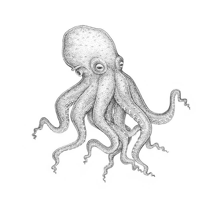
The theme of this tutorial is drawing an octopus; we’ll base it on the anatomy of this mollusc but also bring some stylization into our artwork.
I’ll show you an easy way to create a pencil sketch from scratch, and then we’ll explore the step-by-step process of drawing with ink liners. We’ll also learn to use dots and mix artistic techniques to our advantage!

I draw a slightly curved core line; it will help us to mark the positioning of the figure.

I outline the rough shape of the head. Then I add an oblong shape where the eyes are located.
According to this foreshortening, one side of the octopus is more visible to the viewer than another.

I add the framework of the limbs. An octopus has eight arms that can be divided into four pairs.
Now I mark only the arms that are visible in the foreground, just to keep the process as simple as possible. We’ll add the hidden arms later.

I draw the eyes. They are large, enclosed in a capsule, and have a slit-shaped pupil.

I draw the fold of the aperture at the side of the head.

I add the siphon; it resembles a funnel. An octopus uses a siphon for respiration and locomotion.
Now we are ready to proceed to drawing the tentacles, or the arms. This topic needs additional explanations, so I’ll see you in the next section!

It’s worth mentioning that, according to Wikipedia, the correct name for the limbs of an octopus is „arms”, not „tentacles”. But since it is a common appellation, I’ll be using „tentacles” now and then throughout the tutorial.
I draw the first pair of arms, keeping the lines smooth and soft.

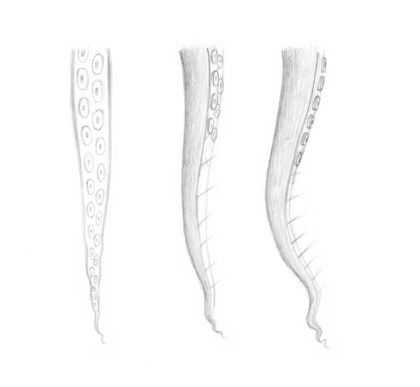
To draw the inner parts of the tentacles correctly, we need to keep in mind the principles of perspective.
The foreshortening defines how much of the interior surface we see; the image below illustrates this concept.
We’ll dwell upon drawing the suckers (the round elements that cover the interior surfaces of the arms) just in the next step.
I add the inner parts of the first pair of arms.

The stylized form of a sucker resembles a bowl with a hollow central cavity.
The principles of perspective are applicable here, too: the point of view defines how we see the object. For example, if we have an overhead view of a sucker, we’ll see only the top plane with the cavity and no sides.

Each arm has two rows of suckers. Depending on the species, the suckers can be placed in a parallel or a staggered order.

I add the suckers to the first pair of the arms. The suckers get smaller towards the end of the limb, so just mark the smallest ones without adding many details.

I draw the second pair of arms and then add the inner sides.

I add the suckers to the second pair of arms.
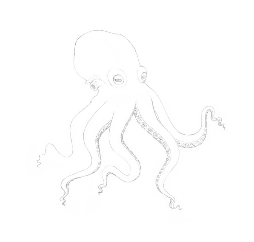
I draw the remaining tentacle of the third pair. Then I add the inner surface and the suckers, just as we did in the previous examples.

I draw the second arm from the third pair; it is hidden behind one of the arms in the foreground.

I add the fourth arm pair. Use your imagination and artistic flair to find the best direction for these arms; it’s important to keep the balance of the figure.
I applied light pencil hatching to the inner parts of the limbs just for your reference.
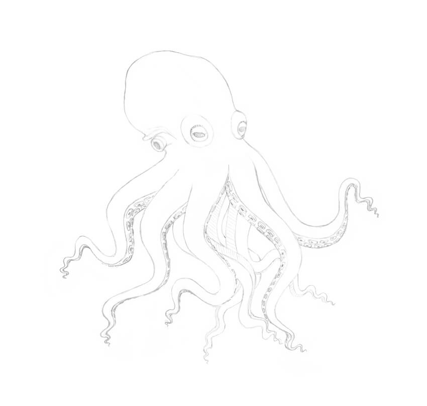
As a final addition to this pencil sketch, I draw the suckers.
I clean my drawing with the eraser. It’s important to make sure that all unnecessary pencil lines are removed before proceeding to any additional artistic tool.
The sketch is ready for inking!

Before we begin inking our octopus drawing, let’s try some warm-up exercises and practice making dots on the paper.
Dotwork (also known as stippling) is a great artistic technique; it’s a perfect choice for creating beautiful textures.
Draw a sample of dotwork that consists of two parts. Use the 0.2 ink liner for the left one and the 0.1 liner for the right one.

Create a line, using only dots. The speed of drawing influences the accuracy of the individual dots within the line.
The 0.2 ink liner is a great tool for this exercise.

The goal of the next exercise is to make a gradation of value. With the 0.2 ink liner, create a sample with an increasing density of ink dots.

With the 0.2 ink liner, I create the main contours.
To make the drawing more interesting, I use a dotted line in addition to a traditional continuous outline.
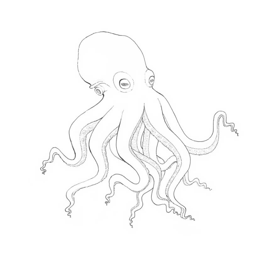
I add dots to the sides of the octopus, using the 0.2 ink liner. I also darken the pupils and mark the darker places of the figure.
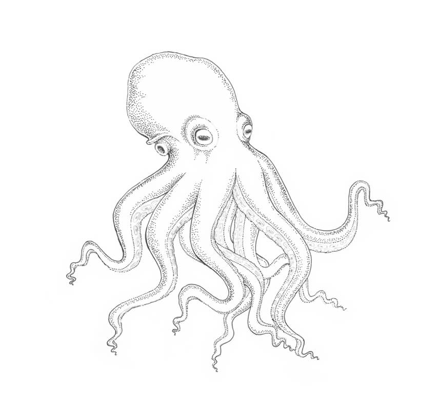
With the 0.1 ink liner, I add a layer of dots to the drawing.

I add dots to the back arms of the octopus, using the 0.1 ink liner. To create the core shadows of the arms, you can place dots closer to each other.

I outline the suckers, using the 0.05 liner, and also add dots to the eyes to make them more three-dimensional.
With the 0.2 liner, I add another layer of dots to the sides of the octopus, giving the drawing more contrast and making it more three-dimensional.
I create a pattern of the skin, applying the groups of dots to the head and arms. Approximately five dots per group is the way to go.

I make the contours of the drawing a bit thicker, using the 0.2 ink liner.

The ink drawing is complete!
As a finishing touch, I apply pencil hatches to the sides of the octopus, creating soft transitions from shadow to light. This combination of artistic techniques makes the drawing more unique and interesting.

Congratulations! You’ve created a beautiful artwork; I hope you enjoyed both the process and the result.
I wish you much success in drawing with pencils and ink. Have fun capturing the unique charm of the wonderful world of animals and nature!


Post pobrano z: A car seen by a visually impaired artist / Pas vu, pas pris?
 |
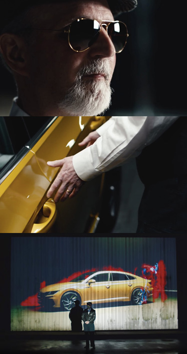 |
| THE ORIGINAL? Volvo S60 by Esef Armagan – 2009 Watch THE VIDEO Source : Golden Drums GRAND-PRIX Agency : Euro RSCG (The Netherlands) |
LESS ORIGINAL Volkswagen Arteon by Peter Eckert – 2017 Watch THE VIDEO Source : Coloribus Agency : Grabarz & Partner (Germany) |
Post pobrano z: looking in the rearview mirror / Une idée un peu trop rétro?
 |
 |
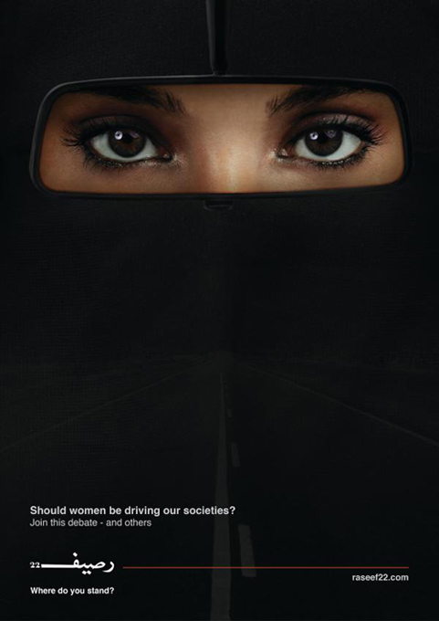
| THE ORIGINAL? Raseef 22 / Print Ad – 2016 “Should women be driving our societies?” Source : Dubaï Lynx SILVER Agency : JWT Doha (Qatar) |
LESS ORIGINAL Ford Middle East / Social Post (tweet)– 2017 “Welcome to the driver’s seat” Source : Twitter Agency : Unknown (Middle East) |
Post pobrano z: Design deals for the week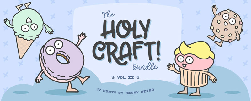
Every week, we’ll give you an overview of the best deals for designers, make sure you don’t miss any by subscribing to our deals feed. You can also follow the recently launched website Type Deals if you are looking for free fonts or font deals.
Continuing from the success of the 1st instalment, Missy Meyer releases her 2nd exclusive bundle and for a limited time ONLY you can grab some of her most popular products for 92% off the RRP.
$15 instead of $195 – Get it now!
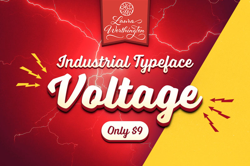
Reach back to the Industrial Age, full of big, bold words and cars! The Voltage Font Family by Laura Worthington offers up a practical typeface that’s both assertive yet down to earth. Loaded with hundreds of OpenType Features from swashes to ligatures, this is one charged-up font family that you won’t want to miss out on.
$9 instead of $35 – Get it now!
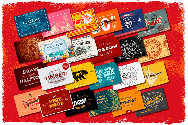
Looking to give your latest projects a bit of a boost? This Huge Graphic Pack is sure to please with more than 1500 professional design elements! You’ll get a wide variety of tools including backgrounds, logos, badges, textures, vintage illustrations and more from a slew of different themes ranging from arcs to food to nature.
$8 instead of $750 – Get it now!
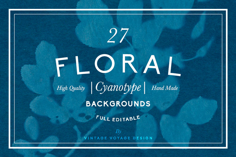
Your typeface toolbox is about to get a massive expansion. With this fabulous font bundle, you’ll get 109 typefaces in 75 unique font families, for 1 low price. With so much variety, you can work with virtually any client of yours, as well as pick up new ones. That means putting together everything from T-shirts to totes to invitations.
$12 instead of $1800 – Get it now!
Post pobrano z: 7 Essential Tips to Follow When Designing a Logo
The logo is an important brand identity that represents the face of any brand. You should exercise great care in designing your brand logo since it gives the first impression about your company to your prospective customers. A logo is not merely a graphic design but a powerful asset and a meaningful visual representation of your brand.
A designer needs to be creative and experienced to come up with the perfect logo that matches the requirements of the customers. Here are some essential tips which need to be followed while designing your brand logo,
Before you start doing the actual logo design, you should come up with some preliminary sketches and brainstorm different concepts which can illustrate the brand effectively. You can make vector based drafts using Illustrator or any other graphic design tools. You can also try traditional paper and pen drawings. You should first understand the brand and its values clearly and draw sketches that reflect the ideologies of the brand. You should sketch at least ten different ideas or concepts before you finalize something. Before you get started with preliminary work, you should do a thorough research about your client and their target audience so that you decide the appropriate design style.
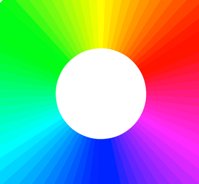
When you design a logo, you should choose the colours very carefully since each colour has a unique meaning and implication. For instance, bold and bright colours will get the immediate attention of customers whereas muted tones or dull colours tend to be overlooked. There is an emotion associated with every colour, and it adds distinction to your logo. The psychological properties behind some commonly used colours are listed below:
You should come up with a simple and creative design which will appear good in all backgrounds and format. The design should be unique and not copied from any other brands. You should also remember the phrase “Keep It simple Stupid!” when designing your logo and try not to make it too complicated. Make sure the logo appears good in both multicolour and grayscale format as well. For example, if you consider the logo of tech giant Apple, it appears awesome in any format, irrespective of the colour scheme used. Also, you should make your design versatile such that it appears good on all branding materials whether its social media pages, t-shirts, posters etc. You should design the logo in such a way that it’s legible and appears beautiful at all sizes.
Make sure your logo has a flexible and dynamic design so that it appeals to all categories of audiences and can be improved over time. If your design is rigid, then it means there is no scope of innovation or improvement at a later stage. Brands try to innovate and modernize their logo based on the current timeline which requires a dynamic design. Also, the design should be appealing to a diverse spectrum of customers with different tastes and preferences. Try to make your logo very simple and clear to the target audience. If your design is complicated, you will fail to engage your customers and make it difficult for them to identify your brand.
Your logo should have a deeper meaning and a unique story to tell your target audience. A logo is not just a shallow piece of artwork, but it’s an insignia to symbolize the ideologies of your brand. A cool and mind-blowing logo should have an intriguing tagline that invokes a sense of curiosity about your brand to the target customers. Try to get inspirations from popular brands like Nike (“Just do it”) or Apple (“Think different”) and come up with short and catchy taglines.

There are many online tools available that make use of intelligent machine learning algorithms to design your brand’s logo instantly based on your requirements. Tailor Brands logo maker is a novel branding platform which can not only design your logo but also come up with all branding elements including social media pages, business cards and other promotional materials. Using an AI based Tailor Brands logo maker will help you minimize the cost and effort required for designing your brand’s logo. Tailor Brands platform can create unique and dynamic logos which present your brand in a meaningful way.
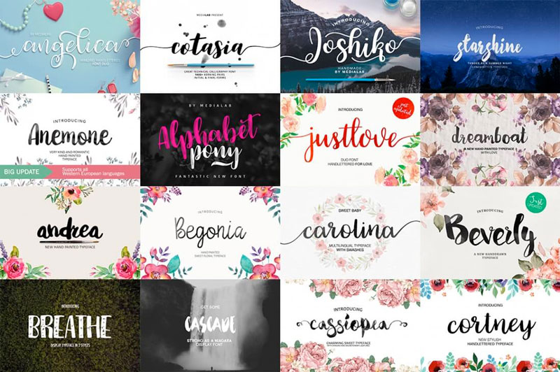
Using customized fonts for your logo can give it a unique appeal. The logos of famous brands like “Coco-Cola” or “Disney” have stayed memorable in the minds of the people for so many years because of their unique and creative typography. As a professional designer, you can try creating custom hand-drawn fonts to add more beauty to your logo design. This will increase the brand’s appeal to the end users as they will be impressed with the unique design.
Consider the above tips to come up with a brilliant logo that can engage your target audience and represent your brand in a more meaningful way.
Post pobrano z: How can your website stand out of the crowd?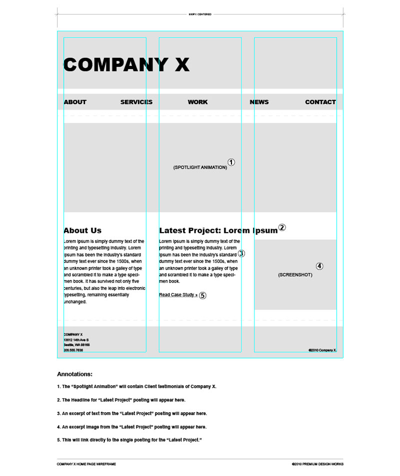
The virtual medium has become so strong these days that every entrepreneur with a small business or a multi-national company is vouching for online advertisement and promotion of their business. Having a website is the basic step that makes people across the globe aware of your presence and gives them a medium to get in touch with you. There was a time when it was difficult to get products from different countries but not anymore thanks to the internet. But the question arises, how businessmen can ensure a strong virtual presence and profits via the website? How can a website pool in traffic? And most importantly, amidst so many websites of the same product; how can your website stand out of the crowd?
Let’s start with basics:
To conclude, web designing is an art that can make or break your business. So while creating your website; it is essential to work on these key factors and hire a professional web designer who will help in creating a strong website.
Post pobrano z: A Five Minutes Guide to Better Typography
Pierrick Calvez with, just maybe, a bunch of typographic advice that you’ve heard before. But this is presented very lovingly and humorously.
Repeating the basics with typography feels important in the same way repeating the basics of performance does. Gzip your stuff. Make your line length readable. Set far expires headers. Make sure you have hierarchy. Optimize your images. Align left.
Let’s repeat this stuff until people actually do it.
Direct Link to Article — Permalink
A Five Minutes Guide to Better Typography is a post from CSS-Tricks
Post pobrano z: Help Your Users `Save-Data`
The breadth and depth of knowledge to absorb in the web performance space is ridiculous. At a minimum, I’m discovering something new nearly every week. Case in point: The Save-Data header, which I discovered via a Google Developers article by Ilya Grigorik.
If you’re looking for the tl;dr version of how Save-Data works, let me oblige you: If you opt into data savings on the Android version of Chrome (or the Data Saver extension on your desktop device), every request that Chrome sends to a server will contain a Save-Data header with a value of On. You can then act on this header to change your site’s content delivery in such a way that conserves data for the user. This is a very open-ended sort of opportunity that you’re being given, so let’s explore a few ways that you could act on the Save-Data header to send less bytes down the wire!
I don’t know if you’ve noticed, but images are often the largest chunk of the total payload of any given page. So perhaps the most impactful step you can take with Save-Data is to change how images are delivered. What I settled on for my blog was to rewrite requests for high DPI images to low DPI images. When I serve image sets like this on my site, I do so using the <picture> element to serve WebP images with a JPEG or PNG fallback like so:
<picture>
  <source srcset="/img/george-and-susan-1x.webp 1x, /img/george-and-susan-2x.webp 2x">
  <source srcset="/img/george-and-susan-1x.jpg 1x, /img/george-and-susan-2x.jpg 2x">
  <img src="/img/george-and-susan-1x.jpg" alt="LET'S NOT GET CRAZY HERE" width="320" height="240">
</picture>
This solution is backed by tech that’s baked into modern browsers. The <picture> element delivers the optimal image format according to a browser’s capabilities, while srcset will help the browser decide what looks best for any given device’s screen. Unfortunately, both <picture> and srcset lacks control over which image source to serve for users who want to save data. Nor should they! That’s not the job of srcset or <picture>.
This is where Save-Data comes in handy. When users visit my site and send a Save-Data request header, I use mod_rewrite in Apache to serve low DPI images in lieu of high DPI ones:
RewriteCond %{HTTP:Save-Data} =on [NC]
RewriteRule ^(.*)-2x.(png|jpe?g|webp)$ $1-1x.$2 [R=302,L]
If you’re unfamiliar with mod_rewrite, the first line is a condition that checks if the Save-Data header is present and contains a value of on. The [NC] flag merely tells mod_rewrite to perform a case-insensitive match. If the condition is met, the RewriteRule looks for any requests for a PNG, JPEG or WebP asset ending in -2x (the high DPI version), and redirects such requests to an asset ending in -1x (the low DPI version). The R=302 flag signals to the browser that this is a temporary (302) redirect. Since the user can toggle Data Saver on or off at will, we don’t want to send a permanent (301) redirect, as the browser will cache it. Caching the redirect ensures that it will be in effect even if Data Saver is turned off later on.

Aren’t redirects bad for performance? Most of the time, yes. Redirects add to latency because it takes longer for a request to be resolved. In this instance, however, it’s a fitting solution. We don’t want to rewrite requests without redirecting them because then low-quality images get cached under the same URLs as high-quality ones. What if the user connects to a wifi network, turns off Data Saver, and return to the site at a later time? The low-quality image will be served from the cache, even when Data Saver is turned off. That’s not at all what we want. If the user isn’t using Data Saver, we should assume the default image delivery strategy.
Of course, there are other ways you could change your image delivery in the presence of Save-Data. For example, Cory Dowdy wrote a post detailing how he uses Save-Data to serve lower quality images. Save-Data gives you lots of room to devise an image delivery strategy that makes the best sense for your site or application.
Server push is good stuff if you’re on HTTP/2 and can use it. It allows you send assets to the client before they ever know they need them. The problem with it, though, is it can be weirdly unpredictable in select scenarios. On my site, I use it to push CSS only, and this generally works well. Although, I do tailor my push strategy in Apache to avoid browsers that have issues with it (i.e., Safari) like so:
<If "%{HTTP_USER_AGENT} =~ /^(?=.*safari)(?!.*chrome).*/i">
  Header add Link "</css/global.5aa545cb.css>; rel=preload; as=style; nopush"
</If>
<Else>
  Header add Link "</css/global.5aa545cb.css>; rel=preload; as=style"
</Else>
In this instance, I’m saying „Hey, I want you to preemptively push my site’s CSS to people, but only if they’re not using Safari.” Even if Safari users come by, they’ll still get a preload resource hint (albeit with a nopush attribute to discourage my server from pushing anything).
Even so, it would behoove us to be extra cautious when it comes to pushing assets for users with Data Saver turned on. In the case of my blog, I decided I wouldn’t push anything to anyone who had Data Saver enabled. To accomplish this, I made the following change to the initial <If> header:
<If "%{HTTP:Save-Data} == 'on' || %{HTTP_USER_AGENT} =~ /^(?=.*safari)(?!.*chrome).*/i">This is the same as my initial configuration, but with an additional condition that says „Hey, if Save-Data is present and set to a value of on, don’t be pushing that stylesheet. Just preload it instead.” It might not be a big change, but it’s one of those little things that could help visitors to avoid wasted data if a push was in vain for any reason.
With Save-Data, you could elect to change what parts of the document you deliver. This presents all sorts of opportunities, but before you can embark on this errand, you’ll need to check for the Save-Data header in a back end language. In PHP, such a check might look something like this:
$saveData = (isset($_SERVER["HTTP_SAVE_DATA"]) && stristr($_SERVER["HTTP_SAVE_DATA"], "on") !== false) ? true : false;On my blog, I use this $saveData boolean in various places to remove markup for images that aren’t crucial to the content of a given page. For example, one of my articles has some animated GIFs and other humorous images that are funny little flourishes for users who don’t mind them. But they are heavy, and not really necessary to communicate the central point of the article. I also remove the header illustration and a teeny tiny thumbnail of my book from the nav.

From a payload perspective, this can certainly have a profound effect:

Another opportunity would be to use the aforementioned $saveData boolean to put a save-data class on the <html> element:
<html class="<?php if($saveData === true) : echo("save-data"); endif; ?>">With this class, I could then write styles that could change what assets are used in background-image properties, or any CSS property that references external assets. For example:
/* Just a regular ol' background image */
body {
  background-image: url("/images/bg.png");
}

/* A lower quality background image for users with Data Saver turned on */
.save-data body {
  background-image: url("/images/bg-lowsrc.png");
}
Markup isn’t the only thing you could modify the delivery of. You could do the same for videos, or even do something as simple as delivering fewer search results per page. It’s entirely up to you!
The Save-Data header gives you a great opportunity to lend a hand to users who are asking you to help them, well, save data. You could use URL rewriting to change media delivery, change how you deliver markup, or really just about anything that you could think of.
How will you help your users Save-Data? Leave a comment and let your ideas be heard!

Jeremy Wagner is the author of Web Performance in Action, available now from Manning Publications. Use promo code sswagner to save 42%.
Check him out on Twitter: @malchata
Help Your Users `Save-Data` is a post from CSS-Tricks
Post pobrano z: How to Create a Retro Interior Illustration in Adobe Illustrator

All of us have a nostalgia sometimes for the past: for the people we knew, some places, or things. Living in a high-tech digital age, we can miss something like an old-fashioned grandma’s pitcher or an old toy you owned as a child. Because you still remember how it was broken and you still want to cry. Just don’t cry now—I still need you to pass this tutorial!
Wipe off your tears and think about… something like… like a retro TV standing on a cabinet. I will show you how to create such an illustration using basic shapes, some warp effects, and the Offset Path.
By the way, GraphicRiver has a good collection of retro items, so feel free to check its collection.
Open Adobe Illustrator and create a new document (File > New) with 850 x 850 px Width and Height. We will start to create a TV shape. Using the Rounded Rectangle Tool, create a light grey rounded rectangle. Set the fill color as shown in the image below. You do not need the stroke color for your rectangle—it’s only there for better visibility.
Next, we will apply the Inflate effect to this rounded rectangle. Go to Effect > Warp > Inflate. Enter the options you see below. Expand this shape (Object > Expand Appearance).

Now we will make a smaller copy of the transformed rounded rectangle placed exactly in the middle of the original one. While keeping the shape selected, go to Object > Path > Offset Path, enter the negative number -9, and press OK. You will get a smaller copy of the shape in front of the original one. Change the color of this copy as shown in the image.
Next create a smaller copy of this shape. Select the second copy and again, go to Object > Path > Offset Path, and enter the negative number -4. Change the color of the smaller copy to dark grey.
And finally, using the same method, make the smallest copy of the shape, which will have the Offset Path -2. You should have four shapes in total.

Now let’s create the screen for the TV. Create a copy of any grey shape and place it in front. Make it smaller, and change the color to a darker shade. Next create a smaller copy of this shape: select the shape, go to Object > Path > Offset Path, and enter the negative number -2. Change the color of the created copy to a bluish grey.

Let’s give our TV screen more volume. Create an ellipse by using the Ellipse Tool (L), which overlaps the bluish shape. The color of this ellipse does not matter, as it is used as a cutter.
Now make a copy of the bluish shape in front (Control-C, Control-F) and, while keeping it selected with the overlapped ellipse, press the Minus Front button on the Pathfinder panel. This action leaves us with the part of the ellipse in front of the bluish screen. Finally change the color of the upper part of the screen to a lighter color.

Let’s add a speaker to our TV. Create a small dark grey circle (for an even circle, use the Ellipse Tool (L) while holding down the Shift key). Select this circle and while holding the Shift and Alt keys, drag it to the right. This way, you’ll create a second copy of the circle, which will be horizontally aligned.
While the newly created circle is selected, press the Control-D buttons three more times to repeat the previous step and create a group of circles exactly the same distance from each other.
Now select the line of circles and while holding the Shift and Alt keys, drag them down. And again, press the Control-D buttons to repeat the previous step. Do this as much as you need to get a result close to the one presented below.

In order to move the objects with more precision, we need to enable the Smart Guides. So, let’s go to View > Smart Guides (Control-U). Draw a circle with grey fill color and no stroke color. To make an even circle, use the Ellipse Tool (L) while holding down the Shift key. Create a copy of this circle in front (Control-C, Control-F), make it smaller, and be sure it stays exactly in the middle of the original one. For the smaller circle, change the fill color to the light grey.
Next, using the Rectangle Tool (M), create a grey rectangle and place it exactly in the middle of the circle. Create a copy of this rectangle in front (Control-C, Control-F), decrease its width (using the Selection Tool (V)), place it exactly in the middle of the original one, and change its color to the light grey.

Now place the manual switch on the right side of the TV. You can slightly rotate it to the side, to have the rectangle not precisely in the vertical position. To highlight this manual switch, we will create a dark grey circle behind it. After that, create a copy of the manual switch together with the highlighting and place it below, as shown in the image. The second copy of the manual switch can be slightly rotated in a different direction.

Now we will create the antenna. Let’s start by drawing a thin, vertically oriented, light grey ellipse. Using the Direct Selection Tool (A), move its left and right anchor points down. Create a small circle and attach it to the sharper end of the ellipse as shown in the image below. Make a copy of it to have an another antenna (Control-C, Control-V). Add an oval on the bottom.
And again, you do not need the stroke color because it is only there for better visibility.

Place our antenna on top and behind the TV (Control-X, Control-B). As the outer shape of our TV does not have any stroke color, we need to emphasize that the antenna is behind and is separated from the TV. Therefore, create a very thin horizontal oval and place it on the line of intersection between the antenna and the body of the TV.

Now let’s create the TV legs. First create a grey rectangle, and then take the Direct Selection Tool (A) and move the two lower anchor points to the left. The lower anchor points should be closer to each other than the upper anchor points are.

Place the TV leg in its place. To make another leg, select the left leg, right-click > Transform > Reflect, and then choose Vertical, Angle 90 degrees, and press Copy. Move the copy of the leg to the right. Our retro TV image is ready!

Of course, in past times, TVs were heavy and quite large. They were not hung on a wall, but placed on cabinets or tables. Therefore, today we will place our TV on a cabinet.
Let’s start with a brown rectangle (Rectangle Tool (M)). To make a darker rectangle inside the brown one, again we will use the Offset Path: while keeping the brown rectangle selected, go to Object > Path > Offset Path and enter Offset -10 px. Change the color of the created rectangle to dark brown.
Again, select the dark brown rectangle and go to Object > Path > Offset Path and enter Offset -3 px. Now, change its color to another shade of brown.

Let’s add a texture to the doors of our cabinet. Create a very thin, light brown ellipse, which should fit into the smallest rectangle. The Smart Guide, which you activated in one of the previous steps, will be really useful here. Place the oval inside the smallest rectangle on the left side.
Make a copy of this ellipse horizontally aligned (drag it to the right while holding the Shift and Alt keys). Now use the Control-D buttons to repeat the action as many times as necessary to fill the rectangle.

To make two doors for our cabinet, create a thin darker brown rectangle and place it in the middle of the cabinet, as shown in the image below.

To make the handle, create a brown even circle. Create a copy of this circle in front (Control-C, Control-F), and make it smaller. Be sure it stays exactly in the middle (use the Smart Guides). Now, change the color of the newly created circle to a lighter brown. Make a third copy of the circle, but this time just a little smaller than the light brown one (Control-C, Control-F). The color of the third smallest circle will be slightly darker than the second one.
For your convenience, group all the circles together (right-click > Group). These three circles will be our handle. Place the handle on the left door. When shrinking it down, make sure to hold the Shift button. Make a copy of the handle for the right door: hold the Shift and Alt keys and move the handle to the right.

The legs of our cabinet will be made in a similar way as for the TV. For that, create a brown rectangle, and then while using the Direct Selection Tool (A), move the two lower anchor points to the left. The lower anchor points should be closer to each other than the upper points are. Place the leg on the left side of the cabinet.
Finally, make another leg: select the left leg, right-click > Transform > Reflect, choose Vertical, Angle 90 degrees, and press Copy. Move the copy of the leg to the right. Our cabinet is ready!

Create a blue square 850 px Width and Height, by using the Rectangle Tool (M). First, take the tool, and then click on your artboard and enter the necessary options.

To add some dimensions to the scene, create a darker ellipse in the bottom part of the square.

Finally, place the created TV and the cabinet in front of the background. However, it will be easier to put the background behind all the objects (Control-X, Control-B).

Now we will add a pretty bouquet of flowers in a mason jar! To make the jar, we will start with a grey rounded rectangle. Remember that the stroke here is for better visibility.
Add a small rectangle on the upper part of the rounded rectangle and another small horizontally aligned rounded rectangle on top as the neck of the jar. Unite these shapes using the Unite button on the Pathfinder panel.

To add some water in the jar, create another copy of the shape of the vase by using the Offset Path (enter the value as -6). You will get two copies inside one another.
Now lower the opacity of these two copies: on the Appearance panel (Window > Appearance), you have to click on the word “Opacity” and in the pop-up menu, decrease its Opacity to 50%.
Now we will cut away a part of the inner shape. For the cutter, create a rectangle with any fill color you want. Make sure that the rectangle overlaps the top part of the inner shape. While keeping these two shapes selected, press the Minus Front button on the Pathfinder panel. We will end up with the bottom part of the shape, which will represent water in the jar.

Place the jar on our cabinet near the TV.

Finally, add some flowers into our jar. You can find out how to create these flowers in one of my previous tutorial. Place your flowers behind the jar. You’re done!

And we are finished! Well done! I hope you enjoyed learning some of the processes and shortcuts during the creation of this image in Adobe Illustrator. As always, feel free to share your project and ask questions in the comments section below. Happy designing!
