There’s no doubt that New York city is one of the most interesting places in the world! From the Statue of Liberty to the Empire State Building; there’s no shortage of incredible sights and landmarks. Here’s 10 quick facts on the great city of New York, courtesy of Buzzfeed:
Pinball was banned in the city until 1978. The NYPD even held “Prohibition-style” busts.
The Jewish population in NYC is the largest in the world outside of Israel.
There’s a man who mines sidewalk cracks for gold. He can make over $600 a week.
Albert Einstein’s eyeballs are stored in a safe deposit box in the city.
There is a birth in New York City every 4.4 minutes.
New York City has the largest Chinese population of any city outside of Asia.
In nine years, Madison Square Garden’s lease will run out and it will have to move.
It can cost over $289,000 for a one-year hot dog stand permit in Central Park.
UPS, FedEx, and other commercial delivery companies receive up to 7,000 parking tickets a DAY, contributing up to $120 million in revenue for the city of New York.
There are more undergrad and graduate students in NYC than Boston has people.
Crazy! Who would of thought that so many interesting facts could come out of a single city. But all that aside, the city produces some of the most amazing photography! Check out the collection below for 21 photos of NYC at its finest! Enjoy!
Credit to respective artists.
Credit:Laurent Nivalle
Credit:Jakob Wagner
Credit:Jakob Wagner
Credit:Aleks Ivic
Credit:Radifa Terza
Credit:Luis Bensimon
Credit:Luis Bensimon
Credit:Nicolás Cuello
Credit:Hugo Cuevas
Credit:magdalena kus
Credit:Victor Utama
Credit:Victor Utama
Credit:Victor Utama
Credit:Dan Murray
Credit:Dan Murray
Credit:Dan Murray
Credit:Florian W. Mueller
Credit:Florian W. Mueller
Credit:Gianluca G. Giancola
Credit:Gianluca G. Giancola
Credit:Gianluca G. Giancola
Conclusion
New York city is definitely one of the most incredible cities in the world; both in facts and in photographic beauty! I hope that you enjoyed this week’s photography collection! Thanks for stopping by!
Publicly supporting, utilizing, and accepting alternative payment methods is often a great way to promote your business, especially amongst more modern, technology-friendly demographics. Of course, not all companies are eager to embrace these new developments, but today we thought we’d take a look at a couple of ways in which businesses are gradually starting to get creative with their payment methods and why it is benefiting the company, their employees, and their customers.
Bitcoin
As perhaps the most famous cryptocurrency in the world, it is no surprise that businesses are utilizing Bitcoin in a variety of ways. While when the mysterious programmer – or collective – known as Satoshi Nakamoto first launched it in 2009 only computer-savvy individuals could collect and distribute Bitcoin, now almost anyone can get their hands on the currency using front-end interfaces like Gui Miner that will effectively mine Bitcoin for you. Not only are customers now able to buy all types of goods and services from companies like Expedia and Sears using the digital money, but companies can also now make their own transactions and pay their employees with Bitcoin – actions that have many benefits.
While traditional currencies can take days to transfer between accounts, Bitcoin transfers occur almost instantaneously, thus ensuring that business transactions such as invoices are never late. In addition to this, the transactions themselves are often extremely cheap, thereby saving companies, even more money as well as time. Finally, the fact that Bitcoin is inherently secure means that companies and their customers can rely on the currency completely without fear of theft or fraud.
Mobile Payments
Ever since the introduction of Apple Pay and Android Wallet, it appears that the idea of using credit cards or cash as payment methods has become less popular. According to a report published late last year by NTT DATA, Ingenico ePayments, Oxford Economics and Charney Research, customers are extremely eager to start using mobile payments for many of their financial transactions. In fact, of the 2,000 consumers that were surveyed, 70% stated that they wish to use mobile payment methods for travel, technology, retail, healthcare, and entertainment purchases, while some even reported trusting tech companies over traditional banks.
Mobile payments are notoriously swift and simple, which is why companies such as Starbucks have started creating innovative ways to tie their company to mobile payments. The leading coffee chain has created a loyalty program that entices those regular customers who embrace mobile payments to return; plus, when customers are in-store, queues tend to go down much faster due to how easy and convenient transactions are. Meanwhile, Walmart added mobile payments to their mobile app as far back as 2015 – a change that apparently improved the shopping experience for many customers according to reports.
It appears that by embracing alternative payment methods such as Bitcoin and mobile payments, companies are able to streamline almost every financial aspect of business. Needless to say, this improvement alone is sure to attract more happy customers and dedicated employees. We look forward to seeing how businesses around the world will continue to get creative with these payment methods, as it will hopefully lead to an even more pleasant experience for patrons.
Just got back from the gym and thought I’d throw together a collection of muscle and fitness logos for your inspiration! But first, here’s 10 quick facts about muscles:
Muscles make up about 40% of total body weight.
If all of the muscles in the body could all pull in one direction, it would create a force of 25 tons!
Humans are born with all of the muscle fibers they will ever have. They don’t grow new fibers, they just grow thicker.
Some of the biggest muscles are in the back, near the spine. They are responsible for keeping the body upright and gives the body the power it needs to lift and push things.
In the digestive system, the smooth muscles tighten up and relax, moving food through the body.
Smooth muscles are even found in the eyes, where they help keep the eyes focused, and help control the amount of light that enters the eye.
The skeletal muscles, which are the ones that can be controlled by conscious thought, work with the skeleton, or the bones, to move the body. They attach to the skeleton with tendons, which are cords of tough tissue.
Smiling takes 17 muscles in the face, while frowning takes 43!
The heart is made up of muscle, called cardiac muscle. This muscle works all by itself with no thought. The heart beats anywhere from 60 to 100 times a minute, every minute, of every day in a human life!
The strongest muscles in the body? Pound for pound, it’s the muscles that you chew with – called the masseters!
The ability to surf the World Wide Web is a beautiful thing, and it began in the hands of the history of the web design industry. People from across continents, from all cultures, backgrounds, and beliefs can connect and keep up to date with friends and news abroad. Though it only began in the early 80s, it has certainly become a booming destination.
But before we can really start to understand the web design industry, we have to delineate the difference between the internet and the World Wide Web. Sure, people use the terms interchangeably, but that doesn’t make it correct. In fact, the internet is simply a grouping of gigantic computer networks that allow other computers to make global connections.
The internet consists of varied languages that enable these computers to communicate with one another. They are the bridges that allow information to travel, and they are best referred to as protocols. Email protocols include things like: IMAP, SMTP, and POP3. That makes email a layer of the internet just as much as the World Wide Web is a layer. It just uses different protocols:
URLs (Uniform Resource Locator)- These are the final parts of the web’s puzzle. URLs provide the addresses to the location of documents that reside on the web.
HTML (Hypertext Markup Language)- HTML is a language that designers utilize to create their web pages.
HTTP (Hypertext Transfer Protocol)- HTTP is the most commonly used protocol, though FTP gets used as well. The HTML protocol is specifically designed for the World Wide Web. It is relatively quick and simplistic, which makes it a favorite for industry professionals. It works to request documents from their servers in order to give the browsers access.
So Where did it All Begin?
You might be shocked to discover that the concept for the World Wide Web may have originated in a short story penned by Murray Leinster, as far back as 1946. His short story describes computers with access to a central device that provided them with information. These computers resided in all homes, according to his short story. They were called, Logics. Although his description is not completely accurate, it does convey the idea that these computers were networked and readily accessible to the populace.
It took another 40 years for the true vision to be executed by an Englishman named Tim Berners Lee. He was working on the Enquire project. There was nothing whizz bang about his task, it was simply a database that contained software and people within the company he worked for. But, it was because of this project that he tried out hypertext to be displayed on other devices that utilize it. He employed the hypertext as a means of accessing each page on the database. This, in turn, granted access to other relevant pages through references within the system.
Interestingly enough, Berners Lee was not a computer programmer. Rather, he was a physicist. But, it was his need to share his discoveries and findings within that community that catapulted his dream to create a centralized database. This was in 1989. Sadly, no one else seemed to care about his idea. That is, except for his boss. He was encouraged to implement the idea into the next project. Eventually, it became known as the World Wide Web, and Tim Berners Lee is credited with its invention.
The Beginning of Browsers
Tim Berners Lee did not give up. In fact, he teamed up with Robert Cailliau, another physicist and they rewrote Tim’s initial proposal. They wanted to be able to use hypertext alongside the internet to create what we now know as “web pages.” Unfortunately, no one in the early 90s had any idea how brilliant this idea was.
But, even though Tim saw little appreciation for his idea, he pressed on. He created HTTP, HTML, and the first browser ever in existence. It worked as an editor as well. And, by June 8th of 1991, he announced his World Wide Web project to the globe. A few months later, the first web page appeared. It became the world’s first website. It shared all Tim’s plans for the web. HTML was made available that same year.
Then the browser scene exploded with improvements and differing functionalities. Some of those beginning browsers were:
Mosaic Browser
Viola WWW Browser
Line Mode Browser
Opera 1.0
Internet Explorer 1.0
Netscape Navigator 1.1
Cello Browser
Say Hello to CSS and JavaScript
Initially, text documents were all you found on a website. Of course today, they are so much more. What makes the difference is the introduction of CSS and JavaScript. August of 1995 is marked as the birthplace of JavaScript, though it was originally called Mocha. There were a number of people that did not like this code, including Cailliau. But, it helped make the web more interactive and dynamic.
JavaScript enabled websites to think, but CSS changed the look and style of the entire web. Though stylesheets have been around since the early 80s, cascading style sheets (CSS) created a consistency of style. They created the ability to separate the HTML content from the actual style or layout of that content. However, it wasn’t until 2000, that CSS was almost fully supported by browsers.
Booming Dot Com’s
Over a five year span of time, between 1995 and 2000, some investors realized it might be a good idea to focus on the web. They started investing money in all web related developments. And, companies that could be found online started making more money.
People called this the internet boom. Sadly, that boom didn’t last. And, many of these investors lost a good deal of money having invested only in technology and not actual business fundamentals.However, there are some businesses that did not feel the brunt of that crash. These entities survived the dot com bubble:
Ebay
Amazon
Google
And Social Networks Begin
The social network design was initially referred to as a bulletin board system (BBS). It allowed users to login and do stuff. They could upload and download information. They could read things and exchange messages with other members. Or, they could utilize various chat and messaging options.
The birth of the social network became one of the biggest races for online supremacy. AOL was one of the first internet companies to offer resources like we find on today’s social network platforms.
Obviously, much has improved and changed since the: “You’ve got mail!” phenomenon. Certainly we will continue to see growth in this arena. And, the history of the web design industry will continue.
Every week, we’ll give you an overview of the best deals for designers, make sure you don’t miss any by subscribing to our deals feed. You can also follow the recently launched website Type Deals if you are looking for free fonts or font deals.
PSD Bundle
We have included 140+ PSD Templates which has 15 PSD Categories. This bundle comes with massive discount of 87% off the Regular price for Limited time only!
Sick of boring old photos? Well, with the help of this Mighty Deal from Krystal Designs Co., you’ll never look at two photos the same again! The Mega Action Bundle is made up of 4 unique Photoshop Add-Ons that will give your ordinary images an extraordinary appearance. From double exposure to vintage painting, you can add some unique effects with the mere click of a mouse.
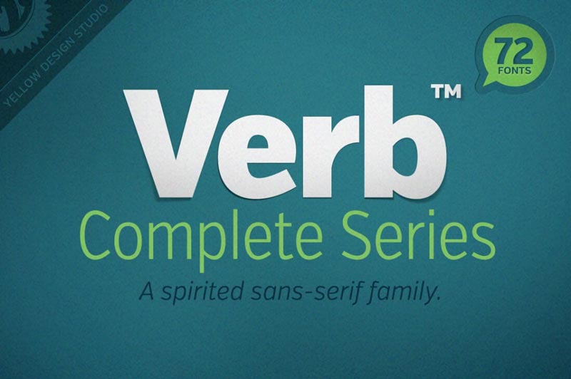
When artists create a new masterpiece, they have one goal in mind: to move you. Well, why shouldn’t the same go with Web designers? There’s no better way to get your next project moving than with the awesomely active (and actively awesome!) Verb font family!
After an overwhelming amout of requests to bring this incredible deal back, we’ve eventually managed to get it back for another run and this time, it’s even better than ever!
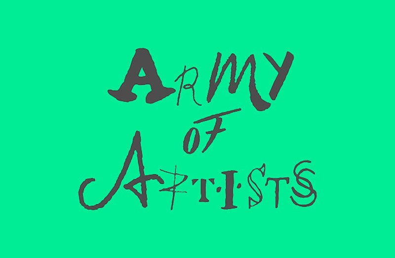
In the “unusual typefaces” family, a new kid has appeared: Army of Artists. The font was designed by Landor, a design consultancy with offices around the globe.
The concept font takes the first letter of famous artists’ signatures and uses it to represent one letter of the alphabet, a clever way to celebrate the artists’ individuality.
A blog post can be anything you want. You could easily write one that links up a bunch of articles on your site. Titles, summaries, links… all hand-crafted HTML. A „guide”, as it were. It will likely be appreciated by your readers, I find, especially when you’re linking up old evergreen content that is still relevant and useful today.
But let’s say you want to programmatically create these „guides”. That might make them faster to create, easier to maintain, and give you a nice level of control over them. Let’s look at a way to do that.
Guides on CSS-Tricks
I’m writing about this because guides are something we’ve just started to do here on CSS-Tricks. For example, I wanted to make a guide of our content that is well suited for folks just starting out, so I made Our Guide To Just Starting Out with CSS & HTML.
That wasn’t built by hand, it was built by programmatically attaching a variety of content to a Custom Post Type we created just for Guides.
Programmatically Attaching Posts to Posts
You know how you can put images into blog posts? But in WordPress, there is also a concept of a featured image, which is one specific programmatically attached image for that post.
That image is programatically attached to this Post.
But we’re talking associating Posts with Posts not Images to Posts. There is no built-in WordPress way of doing that, so we’ll reach for plugins.
CMB2 and Friends
CMB2 (i.e. the second version of „Custom Meta Boxes”) is a free, open source plugin for adding better UI and functionality around custom fields. If you’re familiar with Advanced Custom Fields, it’s a bit like that, only I guess entirely free and a bit more modular.
With that installed, now you can install (I guess we’ll call them sub-plugins?) that make CMB2 do stuff. The one we’re after is CMB2 Attached Posts Field which has the explicit job of attaching Posts to Posts (or really, post type to any post type).
It gives you this two-column UI on post types you activate it for:
Move anything from the left to right, and it’s now programatically attached. This is exactly what we’re after. Now we can hand select, and hand order, any type of post to attach to any other.
Configuring Things
Before you get to the UI you can see above, you not only need to install and activate those two plugins, but also tell CMB2 to create the custom meta boxes and apply them to the types of posts you want.
In our case, our Guides are a custom post type. That’s easy enough to enable:
Then we apply this new custom meta box only to that custom post type (so we don’t have to see it everywhere):
$cmb = new_cmb2_box( array(
  'id'            => 'guide_metabox',
  'title'         => __( 'The Guide Metabox', 'cmb2' ),
  'object_types'  => array( 'guides', ), // Post type
  'context'       => 'normal',
  'priority'      => 'high',
  'show_names'    => true, // Show field names on the left
  // 'cmb_styles' => false, // false to disable the CMB stylesheet
  // 'closed'     => true, // Keep the metabox closed by default
) );

// Regular text field
$cmb->add_field( array(
  'name'       => __( 'Things for the Guide', 'cmb2' ),
  'id'         => 'attached_cmb2_attached_posts',
  'type'       => 'custom_attached_posts',
  'show_on_cb' => 'cmb2_hide_if_no_cats',
  'options' => array(
    'show_thumbnails' => true, // Show thumbnails on the left
    'filter_boxes'    => true, // Show a text box for filtering the results
    'query_args'      => array(
      // 'posts_per_page' => 2,
      'post_type' => array('post', 'page')
    ), // override the get_posts args
  ),
) );
We nestle all this code nicely into a functionality plugin, rather than a `functions.php` file, so that changing themes has no bearing on this content.
A Template for Guides
Now that a custom post type exists for our guides, adding a file called `single-guides.php` into our active theme is enough to make that the file that renders for like `/guide/example/`.
In that file, we do whatever normal template-y stuff we’d do on any other template file (e.g. `page.php`, but also loop through all these posts we’ve attached!
It feels great to have some kind of mechanism for surfacing evergreen content like this. That can be quite a challenge for sites with a huge amount of content!
In this article we will leverage some unconventional CSS matrices to build a custom scroller that doesn’t require any JavaScript while scrolling, just some setup code.
In today’s tutorial, we’re going to take a look at the process of creating a set of woodwork tools, using nothing more than the basic geometric shapes and tools that we probably work with on a regular basis. Grab a bigger than usual mug of coffee, since this is going to be a long one.
Oh, and don’t forget you can always expand
the project by checking out GraphicRiver, where you can find tons of tool-themed vector packs ready to be clicked on.
1. How to Set Up a New Project File
Since I’m assuming you already have
Illustrator up and running in the background, bring it up and let’s set up a New Document (File > New or Control-N)
for our project using the following settings:
Number
of Artboards: 1
Width: 1200
px
Height: 600
px
Units: Pixels
And from the Advanced tab:
Color
Mode: RGB
Raster
Effects: Screen (72ppi)
Preview Mode: Default
2. How to Set Up a Custom Grid
Now, I know we’re not working on icons
today, but since we’re going to be creating the illustration using a pixel-perfect
workflow, we’ll want to set up a nice little grid so that we can have full
control over our shapes.
Step 1
Go to the Edit > Preferences > Guides & Grid submenu, and adjust
the following settings:
Once we’ve set up our custom grid, all we
need to do in order to make sure our shapes look crisp is enable the Snap to Grid option found under the View menu, which will transform into Snap to Pixel each time you enter Pixel Preview mode.
Now, if you’re new to
the whole “Pixel-Perfect workflow”, I strongly recommend you go through my how
to create pixel-perfect artwork tutorial, which will help you widen your
technical skills in no time.
3. How to Set Up the Layers
Once we’ve finished setting up our project
file, it would be a good idea to structure our document using a couple of
layers, since this way we can maintain a steady workflow by focusing on one
section of the illustration at a time.
That being said, bring up the Layers panel, and create a total of
three layers, which we will rename as follows:
layer
1: background
layer
2: carving tools
layer
3: measuring tools
layer 4: adjustment tools
Quick
tip:
I’ve colored all of my layers using the same green value, since it’s the
easiest one to view when used to highlight your selected shapes (whether they’re closed
or open paths).
4. How to Create the Background
We’re going to kick off the project by
creating the little sunset background, so make sure you’re on the right layer
(that would be the first one), and then lock all the other layers and let’s get
started.
Step 1
Create the
background’s fill section using a 368 x
148 px rectangle, which we will color using #EBEFF7 and then center align
to the underlying Artboard.
Step 2
Create the
outline section using a slightly larger 380
x 160 px rectangle (#2D2020) which we will center align to the Artboard as we did with the smaller
one, adjusting it by flipping its Fill
with its Stroke (Shift-X) and setting its weight to 4 px.
Once you’re done,
select and group the two shapes together using the Control-G keyboard shortcut before moving on to the next section of
the tutorial.
5. How to Create the Narrower Chisel
With the background in place, we’re going
to start working on the first carving tool. So, assuming you’re on the right
layer (that would be the second one), zoom in on the background and let’s jump into
it.
Step 1
Create the handle
using a 30 x 12 px rectangle, which
we will color using #E8B15B and then position in the upper-left section of
the background, at a distance of 20 px from
its outline’s top edge and 32 px from
its left one.
Step 2
Give the shape an outline, by
creating a copy (Control-C) of it
which we will paste in front (Control-F)
and then adjust by first changing its color to #2D2020 and then flipping its Fill with its Stroke (Shift-X), making
sure to set its Stroke’s Weight to 4 px afterwards.
Step 3
Give the handle its
wooden texture by taking a couple of moments and drawing it using a couple of 2 px thick Stroke lines (#2D2020) with a Round
Cap, making sure to group (Control-G)
them all together once you’re done.
Step 4
Mask the texture
lines that we’ve just grouped by creating a copy (Control-C) of the underlying yellow shape, which we will paste on
top of them (Control-F) and then
use as a Clipping Mask by right clicking > Make Clipping Mask.
Once you’re done, select and group all of the shapes that we have so far using the Control-G
keyboard shortcut.
Step 5
Start working on the
upper section of the metal body by creating a 12 x 26 px rectangle (#9DA3B2) which we will position below the
handle, making sure to center align the two.
Step 6
Adjust the shape that we’ve just created
by adding a pair of side anchor points, positioned at a distance of 4 px from its upper edge using the Add Anchor Point Tool (+).
For this step, I recommend
you turn on the Pixel Preview mode (Alt-Shift-Y) so that you can have a
better view of the process.
Step 7
Continue adjusting
the shape by individually selecting and pushing its bottom anchor points to the
inside by a distance of 3 px using the Move tool (right click > Transform > Move > Horizontal > + / – 3 px depending
on which side you start with).
Step 8
Give the resulting
shape a 4 px thick outline using the Stroke method, making sure to set
its color to #2D2020.
Step 9
Using the Pen Tool (P) draw a 12 px wide 2 px thick detail Stroke
line (#2D2020) that connects the metal section’s two side anchor points that
we added a few steps ago.
Step 10
Create a 4 x 6 px rectangle (#2D2020) which we
will center align to the detail line from the previous step. Once you’re done, select and
group all of the current section’s composing shapes together using the Control-G keyboard shortcut.
Step 11
Create the center
section of the chisel’s metal body using a 6
x 52 px rectangle (#C0C6D8) with a 4
px thick outline (#2D2020) which we will group (Control-G) and then position below the section that we’ve just
finished working on in the previous step.
Step 12
Add the chisel’s
cutting edge using a 6 x 8 px rectangle
(#9DA3B2) with a 4 px thick outline
(#2D2020) which we will group (Control-G)
and then position below the previously created section. Since we’re done
working on the current object, you can select and group (Control-G) all its composing sections as well.
6. How to Create
the Wider Chisel
Once you’ve
finished working on the narrower chisel, you can move a few pixels towards the
right and start working on the second one.
Step 1
Create the tool’s
handle using the same 12 x 30 px rectangle
(#E8B15B) with a 4 px thick outline
(#2D2020) and 2 px thick wooden
texture lines, which we will group (Control-G)
and then position on the right side of the previous chisel, at a distance of 16 px from it.
Step 2
Create the metal
body’s upper section using the same process, only this time reposition
the main shape’s bottom anchor points towards the inside by a distance of just 2 px. Once you’re done, group (Control-G) and position the shapes
below the handle.
Step 3
Start working on the
chisel’s center metal section by creating an 8 x 16 px rectangle, which we will color using #C0C6D8 and then
center align to the previous section, positioning it so that it overlaps the surface by 4 px.
Step 4
Create a larger 20 x 48 px rectangle (#C0C6D8) which we will
position below the smaller one, making sure to center align the two.
Step 5
Select and then unite
the two rectangles into a single larger shape using Pathfinder’s Unite Shape
Mode.
Step 6
Adjust the resulting
shape by setting the Radius of its
top corners to 4 px from within the Live Corners input value box.
Step 7
Select the two anchor points created during the unification process of the two rectangles, and adjust those as well by setting their Radius to 4 px.
Step 8
Give the resulting
shape a 4 px thick outline using the Stroke method, making sure to set
its color to #2D2020.
Step 9
Connect the chisel’s
lower metal section to its upper one, using a 2 x 2 px circle (#2D2020) which we will position towards the
rounded section of its larger shape. Once you’re done, select and group all
three shapes together using the Control-G
keyboard shortcut.
Step 10
Add the blade section
using a 20 x 10 px rectangle, which
we will color using #9DA3B2 and then center align to the metal body’s bottom
edge.
Step 11
Adjust the shape that
we’ve just created by adding a pair of anchor points at a distance of 2 px from its bottom edge, and then
individually selecting and pushing its top ones to the inside by a distance of 6 px using the Move tool (right click >
Transform > Move > Horizontal > + / – 6 px depending on which side
you start with).
Step 12
Give the resulting
shape a 4 px thick outline using the Stroke method, making sure to set
its color to #2D2020.
Step 13
Finish off the current
section, and with it the tool itself, by creating a 20 px wide 2 px thick Stroke line (#2D2020) which we will
center align to the chisel’s blade, selecting and grouping (Control-G) all three shapes together
afterwards. Once you’re done, select and group (Control-G) all of the chisel’s composing sections as well.
7. How to Create
the Hammer
With both
chisels finished, move a few pixels towards the right and then start working on
the wooden hammer.
Step 1
Create the upper section
sticking out of the hammer’s head using an 8 x 6 px rectangle (#CC8550) with a 4 px thick outline (#2D2020), which we will group (Control-G) and then position on the
right side of the wider chisel, at a distance of 30 px from it.
Step 2
Add the hammer’s head
using a 36 x 28 px rounded rectangle
(#E59A5C) with a 4 px Corner Radius
and a 4 px thick Stroke (#2D2020), on top of which we
will add the wooden texture using 2 px thick Stroke lines (#2D2020). Group (Control-G) all the shapes together, and
then position them below the previously created section.
Step 3
Create the handle using
an 8 x 48 px rectangle (#CC8550)
with a 4 px thick outline (#2D2020),
on top of which we will draw the wooden texture, grouping (Control-G) and then positioning the shapes below the hammer’s head.
Step 4
Add the hammer’s grip using a 16 x 34 px rounded rectangle (#E59A5C)
with a 4 px Corner Radius and a 4 px thick Stroke (#2D2020), which we will group (Control-G) and then center align to the bottom of its handle.
Step 5
Create the horizontal
detail lines using six 16 px wide 2 px thick Strokes (#2D2020), which we will vertically stack at a distance of 4 px from one another using the Align panel’s Vertical Distribute Space option. Group (Control-G) the lines and then center align them to the grip,
positioning them at a distance of 2 px from
its outline’s top edge.
Step 6
Finish off the grip, and
with it the hammer itself, by adding a 4
x 4 px circle (#2D2020) to the center of the surface delimited by the horizontal stroke
lines and the thicker outline. Once you’re done, group (Control-G) all of the current section’s shapes together, doing the
same for the entire tool afterwards.
8. How to Create
the Blades
As you’ve
probably noticed, the hammer has two little blades positioned around it, which
we will quickly add in the following moments.
Step 1
Create the blade’s body
using a 6 x 22 px rectangle (#C0C6D8)
with a 4 px thick Stroke (#2D2020) which we will group (Control-G) and then position on the
left side of the hammer’s handle, at a distance of 12 px from it.
Step 2
Create another smaller 3 x 10 px rectangle (#2D2020) which we
will center align to the left edge of the blade’s body, selecting and grouping (Control-G) them together afterwards.
Step 3
Create the second blade
using a copy (Control-C > Control-F)
of the left one, which we will position on the opposite side of the hammer’s
handle, maintaining the same 12 px distance.
9. How to Create the Level
Since we’re pretty much done working on
the carving tools, we can lock their layer and move on up to the next one (that
would be the third one), where we will start working on the measuring ones, the
first one being the level.
Step 1
Create the tool’s
main body using a 20 x 104 px rectangle,
which we will color using #E8B15B and then center align to the hammer,
positioning it on its right side at a distance of 16 px.
Step 2
Adjust the shape by
creating an 8 x 24 px rectangle
(highlighted with red) which we will center align to its right edge and then
remove using Pathfinder’s Minus Front Shape Mode in order to
create the little cutout.
Step 3
Create two 10 x 10 px circles (highlighted with
red) vertically stacked 52 px from
one another, which we will group (Control-G) and then center align to the level’s body, removing them afterwards using the Minus Front Shape Mode.
Step 4
Give the resulting
shape a 4 px thick outline (#2D2020)
using the Stroke method, selecting
and grouping the two together afterwards using the Control-G keyboard shortcut.
Step 5
Create the level’s
top section using a 20 x 6 px rectangle
(#C0C6D8) with a 4 px thick outline
(#2D2020), which we will group (Control-G)
and then position above its larger body.
Step 6
Add the little
vertical detail lines using two 6 px tall 4 px thick Strokes (#2D2020) which we will position 10 px from one another, grouping (Control-G) and then center aligning them to the level’s upper
section. Once you have them in place, select and group (Control-G) them and the larger rectangles together as well.
Step 7
Create the level’s
bottom section using a copy (Control-C
> Control-F) of its top one, which we will position on the opposite
side of its larger body.
Step 8
Start working on its
center balance tube by creating two 6 x
7 px rectangles (#C0C6D8) with a 4
px thick outline (#2D2020), which we will position inside the rectangular cutout
created a few steps ago.
Step 9
Unite the two
sections that we’ve just created using a 10
px tall 4 px thick Stroke line (#2D2020), selecting and
grouping all of them together afterwards using the Control-G keyboard shortcut.
Step 10
Finish off the level by adding a 10 px wide 4 px thick Stroke line (#2D2020) to the center of each of its circular
cutouts, selecting and grouping all its composing sections together afterwards
using the Control-G keyboard
shortcut.
10. How to Create the Ruler
The second object on our measuring tools
list is the ruler, which is without a shadow of doubt one of the most useful
tools that any craftsman can ask for.
Step 1
Start by creating the
tool’s main body using a 20 x 20 px rounded
rectangle (#DB6A42) with a 4 px Corner
Radius, which we will position on the right side of the level, at a
distance of 12 px from its right
edge and 12 px from its bottom one.
Step 2
Adjust the shape of
the ruler’s body by setting the Radius
of its top-right corner to 8 px from
within the Transform panel’s Rectangle Properties.
Step 3
Give the resulting
shape a 4 px thick outline (#2D2020), selecting and
grouping the two together afterwards using the Control-G keyboard shortcut.
Step 4
Create the ruler’s
center section using an 8 x 8 px circle
(#E8B15B) with a 4 px thick outline
(#2D2020), which we will group (Control-G)
and then center align to its larger body.
Step 5
Add in the little screws
using two 2 x 2 px circles (#2D2020), which we will
position onto the top-left and bottom-right corner of the ruler’s body. Once you
have them in place, select and group all of the shapes together using the Control-G keyboard shortcut.
Step 6
Add the ruler’s
tongue using a 6 x 87 px rectangle
with a 2 px thick Stroke (#2D2020), which we will
position on top of its main body, at a distance of 6 px from its outline’s left edge.
Step 7
Adjust the shape that
we’ve just created by selecting its bottom-right anchor point with the help of
the Direct Selection Tool (A), and
then removing it by pressing Delete
in order to open up its path.
Step 8
Finish off the ruler by adding its bottom
anchor, which we will create using an 8 x
12 px rounded rectangle with a 2 px
Corner Radius and a 2 px thick Stroke (#2D2020), which we will position over the larger body’s
bottom-right corner.
Once you’re done, select
and group all of the tool’s composing sections using the Control-G keyboard shortcut.
11. How to Create the Caliper
The next tool off our list is the caliper,
so grab another cup of coffee and let’s jump into it.
Step 1
Start working on the
caliper’s head by creating a 36 x 12 px rectangle (#C0C6D8) which we will position on the right side of the
ruler, at a distance of 6 px from
its tongue and 20 px from the top
edge of the background’s outline.
Step 2
Create another
smaller 26 x 6 px rectangle (#C0C6D8)
and position it towards the bottom of the larger one, so that its top section
overlaps 2 px from its height, and
its right one sticks out just 8 px from
its surface.
Step 3
Create the tool’s
main body using a 12 x 90 px rectangle
(#C0C6D8) which we will position underneath the smaller rectangle, aligning it
to its left edge.
Step 4
Select all three
rectangles, and then unite them into a single larger shape using Pathfinder’s Unite Shape Mode. Then, take a couple of moments and remove the
extra anchor point created during the process (highlighted in the reference
image) by clicking on it using the Delete
Anchor Point Tool (-).
Step 5
Continue adjusting
the shape by selecting its outer jaw’s top-right anchor point using the Direct Selection Tool (A), and then pushing
it to the bottom by a distance of 6 px
using the Move Tool (right click > Transform > Move >
Vertical > 6 px).
Step 6
Give the resulting shape
a 4 px thick outline using the Stroke method, making sure to set its
color to #2D2020.
Step 7
Take a couple of
moments and create the tool’s main scale using a couple of 6 px wide and 4 px wide, 4 px thick Stroke lines (#2D2020), which we will vertically stack at a
distance of 4 px from one another,
grouping (Control-G) and then
positioning them onto the larger body’s left side.
Step 8
Add an 8 px tall 2 px thick Stroke line
(#2D2020) to the edge of the outer jaw, leaving a 2 px gap between it and the thicker outline.
Step 9
Create a 4 x 4 px circle (#2D2020) and position it
onto the lower bottom of the caliper’s body, selecting and grouping all its
composing shapes together afterwards using the Control-G keyboard shortcut.
Step 10
Start working on the
bottom outer jaw, by creating a 22 x 12
px rectangle (#9DA3B2) which we will position at a distance of 14 px from the top one’s outline.
Step 11
Create the lower section
of the jaw using a 10 x 14 px rectangle
(#9DA3B2) which we will
position below the wider one, selecting and then uniting the two into a single
larger shape using Pathfinder’s Unite Shape Mode.
Step 12
Adjust the resulting
shape by selecting its bottom-left anchor point and pushing it to the top by a
distance of 6 px using the Move tool (right click > Transform > Move > Vertical > -6 px).
Step 13
Give the jaw a 4 px thick outline using the Stroke method, making sure to set its
color to #2D2020.
Step 14
Take a couple of moments and add in the measuring scale and the nose detail line using a couple of 2 px thick Stroke lines (#2D2020). Once you’re done, select and group (Control-G) all of the jaw’s composing
shapes together.
Step 15
Start working on the
bottom inner jaw by creating a 14 x 6
px rectangle (#9DA3B2) followed by a smaller 6 x 26 px one (#9DA3B2) underneath, which we will unite, giving the
resulting shape a 4 px thick outline
(#2D2020). Once you’re done, position the two shapes onto the right side of the
caliper, at a distance of 2 px from
the top jaw.
Step 16
Create the secondary
measurement scale using four 3 px wide 2 px thick Stroke lines (#2D2020) vertically stacked 4 px from one another, which we will group (Control-G) and then position onto the right side of the jaw’s
larger body.
Step 17
Add the clamping block
using a 6 px wide 2 px thick Stroke line (#2D2020) on top of which we will add a 4 x 4 px square (#2D2020), grouping (Control-G) and then positioning the two
onto the jaw’s bottom section. Once you’re done, select and group (Control-G) all of the current section’s
composing shapes together as well.
Step 18
Finish off the caliper by creating its stem using a 6 x 10 px rectangle
(#9DA3B2) with a 4 px thick outline
(#2D2020), which we will group (Control-G)
and then position below its larger body. Then, before you move on, select and
group (Control-G) all of the tool’s
composing sections together as well.
12. How to
Create the Pencil
Since no
measuring process is complete without precise notes, the next tool that we’re
going to work on is the simple yet powerful pencil.
Step 1
Create the pencil’s main
body using a 6 x 34 px rectangle (#E8B15B)
with a 4 px thick outline (#2D2020), which we will group (Control-G) and
then position on the lower right side of the caliper.
Step 2
Create two 6 px wide 2 px thick Stroke lines
(#2D2020), and position each one at a distance of 2 px from the pencil’s outline, making sure to select and group (Control-G) all the shapes together
afterwards.
Step 3
Create the tip using a 6 x 10 px rectangle (#C0C6D8) which we
will adjust by adding a pair of side anchor points at a distance of 4 px from its top edge, and another one
to its center using the Add Anchor Point
Tool (+). Remove the top side anchor points using the Delete Anchor Point Tool (-), and then position the adjusted shape on top of the pencil’s body.
Step 4
Give the resulting shape
a 4 px thick outline (#2D2020) with
a Round Join, selecting and grouping
(Control-G) the two shapes together,
doing the same for the entire pencil afterwards.
13. How to Create the Manual Drill
We are now down to the last group of tools, so
assuming you’ve already locked the previous layer, move on up to the next one (that
would be the fourth one) and let’s start working on the drill.
Step 1
Create the drill’s
handle using a 12 x 26 px rectangle
(#E8B15B) with a 4 px thick outline
(#2D2020), which we will group (Control-G)
and then position onto the right side of the pencil, at a distance of 16 px.
Step 2
Give the handle some
details by adding a set of five 12 px wide 4 px thick Stroke lines (#2D2020) vertically stacked at a distance of 4 px from one another, which we will
group (Control-G) and then center
align to the larger rectangles. Once you’re done, select and group all the
shapes together using the Control-G
keyboard shortcut.
Step 3
Create a 6 x 8 px rectangle (#9DA3B2) with a 4 px thick outline (#2D2020), which we
will group (Control-G) and then
position above the handle, center aligning the two.
Step 4
Add the drive wheel
using a 20 x 20 px circle (#C0C6D8)
with a 4 px thick outline (#2D2020), on top of
which we will add a smaller 8 x 8 px circle
(#2D2020). Group (Control-G) all
three shapes together and then center align them to the previous shapes, so
that their outlines overlap.
Step 5
Create the turning arm
using a 22 x 8 px rectangle with a 4 px thick Stroke (#2D2020), which we will adjust by selecting and then
removing its bottom-left anchor point, positioning the resulting shape onto the
right side of the drive wheel.
Step 6
Give the arm a handle,
using an 8 x 14 px rectangle (#E8B15B)
with a 4 px thick outline (#2D2020),
on top of which we will add a set of two 8
px wide 2 px thick Stroke lines (#2D2020) vertically
stacked 4 px from one another.
Group (Control-G) the lines, doing
the same for all of the handle’s shapes, and then position them onto the
bottom-right end of the arm.
Step 7
Create the drill’s neck
using a 6 x 28 px rectangle (#9DA3B2)
with a 4 px thick outline (#2D2020),
which we will group (Control-G) and
then position above the turning wheel.
Step 8
Start working on the
tool’s jaw by creating a 10 x 12 px rectangle
(#C0C6D8), which we will adjust by adding a set of anchor points at a distance
of 4 px from its top edge,
individually selecting and pushing its top ones to the inside by a distance of 2 px using the Move tool (right click >
Transform > Move > Vertical > + / – 4 px depending on which side
you start with). Give the resulting shape a 4 px thick outline (#2D2020), followed by a 10 px wide 2 px thick Stroke line (#2D2020), grouping (Control-G) and then positioning them
onto the upper section of the neck.
Step 9
Finish off the drill
by creating and positioning a 26 px tall 4 px thick Stroke line (#2D2020) on top of its jaw. Once you’re done, select
and group all its composing sections together using the Control-G keyboard shortcut.
14. How to
Create the Electric Saw
We are now down
to our last tool, so move a few pixels to the right and let’s
finish this!
Step 1
Start working on the
saw’s main body by creating a 28 x 44
px rectangle, which we will color using #DB6A42 and then position on the
right side of the drill, at a distance of 24
px from its jaw and 28 px from
the background outline’s top edge.
Step 2
Create a smaller 18 x 28 px rectangle (#DB6A42), which we will
position below the larger one, making sure to align it to its right side. Once
you have it in place, unite the shapes into a single larger one using Pathfinder’s Unite Shape Mode.
Step 3
Adjust the new shape by
selecting and then setting the Radius
of its top corners and the one created during the unification process to 4 px using the Live Corners input value field. Give the resulting shape a 4 px thick outline (#2D2020), and then
group (Control-G) the two
together.
Step 4
Create a 28 px wide 4 px thick Stroke line (#2D2020), which we will
position at a distance of 2 px from the upper section of the larger body’s
outline.
Step 5
Add the screws using
two 2 x 2 px circles (#2D2020),
which we will group (Control-G) and
thenposition above the detail line
from the previous step, leaving an all-around 2 px gap around them.
Step 6
Start working on the
tool’s side section, by creating an 18 x
22 px rectangle with a 4 px thick
outline (#2D2020) which we will align to the larger body’s left edge,
positioning it at a distance of 18 px from
its horizontal detail line.
Step 7
Adjust the shape that
we’ve just created, by setting the Radius
of its right corners to 4 px and
then adding a new anchor point to its bottom edge (where the two outlines
overlap), removing its bottom-right one.
Step 8
Add another set of
screws using two 2 x 2 px circles (#2D2020),
which we will group (Control-G) and
then position next to the side section’s upper edge, maintaining the same 2 px gap around them.
Step 9
Create a larger 4 x 4 px circle (#2D2020) and position it
in the bottom-left corner of the saw’s side section.
Step 10
Add the ventilation
insertions using three 8 px tall 2 px thick Stroke lines (#2D2020) positioned 4 px from one another, which we will group (Control-G) and then position onto the upper edge of the saw’s side section.
Once you’re done, select and group (Control-G)
all of the current section’s composing shapes together.
Step 11
Create a 6 px tall 4 px thick Stroke line
(#2D2020), and position it onto the inner section of the electric saw’s left
side. Then, add another 6 px wide 4 px thick one (#2D2020) onto its
body’s right side.
Step 12
Add the circular button
using an 8 x 8 px circle (#9DA3B2)
with a 2 px thick outline (#2D2020),
on top of which we will add a smaller 4
x 4 px circle (#2D2020). Group (Control-G)
all three shapes together, and then position them onto the lower section of the
saw’s body.
Step 13
Create another screw
using a 2 x 2 px circle (#2D2020),
which we will position below the circular button, at a distance of 2 px from the saw’s bottom left
corner.
Step 14
Create the two side
buttons using a 4 x 8 px rectangle
(#2D2020), followed by a 4 x 4 px square
(#2D2020), which we will vertically stack at a distance of 2 px from one another, grouping (Control-G) and then positioning them onto the larger outline’s right edge.
Step 15
Create the front guard
using a 10 x 5 px rectangle with a 2 px thick Stroke (#2D2020), on top of which we will add a smaller 4 x 3 px one (#2D2020), grouping (Control-G) and then positioning them
onto the upper edge of the saw’s outline. Once you’re done, select and group
all of the current shapes together using the Control-G keyboard shortcut.
Step 16
Start working on the
handle by creating its horizontal section using a 22 x 10 px rectangle, which we will color using #CC5C3A and then
position onto the saw’s right side, at a distance of 14 px from its outline’s top edge.
Step 17
Create the handle’s
vertical section using a 10 x 20 px rectangle
(#CC5C3A), which we will position below the previous shape, aligning it to its
right edge. Unite the two shapes using Pathfinder’s Unite Shape Mode, and then adjust
the resulting shape by setting the Radius
of its outer corner to 14 pxand its inner one to 4 px.
Step 18
Give the resulting shape
a 4 px thick outline (#2D2020),
followed by two 2 x 2 px circles (#2D2020)
and a 10 px wide 2 px thick Stroke line (#2D2020) positioned towards the bottom. Once
you’re done, select and group all the shapes together using the Control-G keyboard shortcut.
Step 19
Create the handle’s
bottom section using a 6 x 26 px rectangle
with a 4 px thick outline (#2D2020),
on top of which we will add a stack of five 6 px wide 2 px thick Stroke lines (#2D2020) positioned 4 px from one another. Once you have
all the shapes, group (Control-G)
them together and then position them below the previously created section.
Step 20
Create the rectangular
button using a 6 x 12 px rectangle
(#E8B15B) with a 4 px thick outline
(#2D2020), on top of which we will add a smaller 3 x 4 px one (#E8B15B), grouping (Control-G)
and then positioning them onto the left side of the previous section. Once
you’re done, select and group (Control-G)
all of the handle’s composing sections as well.
Step 21
Create the little
section connecting the saw’s upper body to its rear end, using a 10 x 12 px rectangle (#9DA3B2) with a 4 px thick outline (#2D2020), which we will
position below its lower section.
Step 22
Add a 4 x 4 px circle (#2D2020) to each side of
the shapes that we’ve just created, followed by a 2 x 4 px rectangle (#2D2020) positioned over its top edge. Once
you’re done, select and group all of the current section’s shapes together
using the Control-G keyboard
shortcut.
Step 23
Start working on the
tool’s bottom section by creating an 18
x 20 px rectangle (#DB6A42), which we will adjust by setting the Radius of its bottom corners to 9 px. Give the resulting shape a 4 px thick outline (#2D2020), followed by two 2 x 2 px circles (#2D2020) positioned towards its upper edge. Once you’re done, select and group (Control-G) all of them together,
positioning them below the previous section.
Step 24
Add the cable guard
using a 22 x 14 px rounded rectangle
with a 2 px thick Stroke (#2D2020) and a 4 px Corner Radius, which we will
adjust by setting its bottom-left one to 10
px. Position the resulting shape below the previous section, making sure
to send it to the back afterwards (right
click > Arrange > Send to Back).
Step 25
Create the little
section connecting the saw’s body to its shoe, using an 8 x 20 px rectangle (#9DA3B2) with a 4 px thick outline (#2D2020), which we will group (Control-G) and then position at a
distance of 16 px from the larger
body’s upper-left side.
Step 26
Add two 4 x 4 px squares (#2D2020) onto the larger
rectangle’s left side, and a 4 x 4 px circle
(#2D2020) onto its left one, selecting and grouping (Control-G) all of the current section’s composing shapes together
afterwards.
Step 27
Create the blade
using a 22 x 4 px rectangle (#2D2020) which we will
adjust by selecting its bottom-left anchor point and pushing it to the inside
by a distance of 4 px (right click > Transform > Move >
Horizontal > 4 px). Position the resulting shape above the previously
created section, at a distance of 4 px,
adding the teeth using two 4 x 4 px squares
(#2D2020). Once you’re done, don’t forget to select and group (Control-G) all its composing shapes
together.
Step 28
Finish off the tool, and with it the illustration itself, by creating the shoe using a 6 x 60 px rectangle (#C0C6D8) with a 4 px thick outline (#2D2020), which we will
position over the blade, aligning it to the top edge of the drill. Once you’re done,
select and group all of the saw’s composing shapes together using the Control-G keyboard shortcut.
It’s
a Wrap!
This might have been
one of longest tutorials that I’ve ever written, but I really believe the end
result is all worth it. That being said, I hope you’ve had the patience to
follow it through and most importantly learned some new tricks along the way.
Agregator najlepszych postów o designie, webdesignie, cssie i Internecie
 Credit:Laurent Nivalle
 Credit:Jakob Wagner
 Credit:Jakob Wagner
 Credit:Aleks Ivic
 Credit:Radifa Terza
 Credit:Luis Bensimon
 Credit:Luis Bensimon
 Credit:Nicolás Cuello
 Credit:Hugo Cuevas
 Credit:magdalena kus
 Credit:Victor Utama
 Credit:Victor Utama
 Credit:Victor Utama
 Credit:Dan Murray
 Credit:Dan Murray
 Credit:Dan Murray
 Credit:Florian W. Mueller
 Credit:Florian W. Mueller
 Credit:Gianluca G. Giancola
 Credit:Gianluca G. Giancola
 Credit:Gianluca G. Giancola