Post pobrano z: How to Create a Resume
If applying for that dream job is on your to-do list this year, you’ll want to dust off your resume and give it a refresh. The design of your resume is, some would argue, just as important as the content, and especially if you’re applying for a creative role, the layout and typography can speak volumes about your professional prowess.
Here I’ll break down the key building blocks of a perfectly tuned resume design. The sample resume design pictured here would make a great application for a graphic or web designer, but you’ll find you can apply the same key design techniques to other job applications and always end up with a resume that will showcase your credentials in their best light.

Read on to find out how to make an employer go ‘Oooh!’ when they open up your application envelope.
Looking for a cool resume but not sure where to get started? Check out the easy-to-edit resume templates on GraphicRiver and Envato Elements.
1. Standard Page Sizing
This may not be the most exciting thing to think about when designing your spectacular resume, but page size is absolutely key to guaranteeing your resume gets circulated around the office.
There is absolutely nothing more off-putting than a resume that’s been designed on a non-standard page size. If your resume’s too big, your potential employer might struggle to fit it in their photocopier or scanner. Too small? It’s not going to look good when photocopied onto a sheet of A4 (plus don’t even get me onto the eye-wincingly small font size—see Tip 4, below).
If you’re designing your resume in a design program like InDesign or Photoshop, make sure to set the document or canvas to a widely accepted standard page size. That’s Letter (215.9 x 279.4 mm) if you’re in the US, or widely accepted A4 (210 × 297 mm) if you’re in Europe or Australia.
In Adobe InDesign, you can select Letter or A4 from the Page Size drop-down menu when you go to File > New > Document.

If you’re going to design your resume with color or details that extend past the trim edge of the page, you should also bear in mind from the beginning that you will need to have your resume professionally printed. To prepare for this at the document setup stage, you should make sure to add a Bleed around the edges of the page, which will minimize the visual impact of any slight trimming errors. A Bleed Width between 3 and 5 mm will do the trick.

2. A Strong Grid Layout
Once you have your basic document ready, you can get started with designing the layout of your resume. You have to be able to fit quite a large amount of information on a single page, including your name and contact details, previous job titles and descriptions, qualifications, and other details that might be relevant to the role, such as software proficiency and languages.
Before you even begin designing, take a look at the older version of your resume and try to assess if there’s any information that could be trimmed down. For example, you could try editing job descriptions down to a sentence or two.
Once you’ve done a bit of copy editing with your text content, you will need to work out how to fit the remaining text on the page.
If you’re working in a simple word-processing application like Word or Pages, the temptation is to place all your content into one continuous column of text.
For many reasons, this is not the best route to take. For one, this doesn’t make the most of the space you have available on the page. You may well find that using this technique forces you to flow text onto a second page, which immediately brings up the disadvantage of the interviewer not noticing this second page of text (they are busy people, after all) when they are sifting through a mass of applications.
By restricting your text to just one column on the page, you are also limiting the potential visual interest of the page. Breaking your text into a couple of columns is a great way of keeping the eye engaged, as it moves back and forth from one column to the next.
With this in mind, you need to establish a strong grid layout for your page, which will help guide the eye over the information and give the resume both visual interest and a natural hierarchy, leading the reader from one section of information to the next.
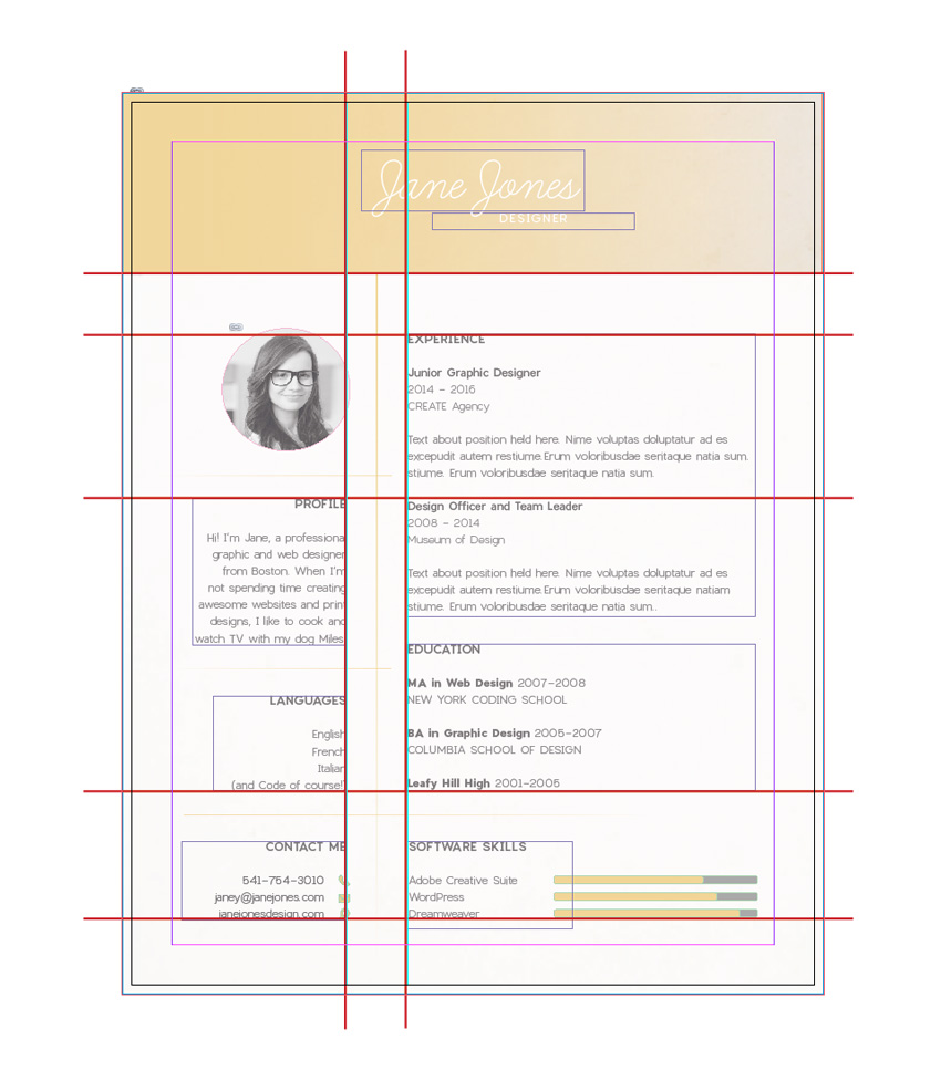
I think this is a great failsafe grid for a resume. You’ll see this grid layout repeated in subtle variations across many professionally designed CVs.
Let’s look at how to recreate it.
First, you’ll notice that this grid is bottom heavy, with over two-thirds of the lower part of the page set aside for text information. At the top of the layout, the grid allows a decent amount of space for a header, which can be colored or filled with an image, and, most importantly, will showcase your name. This instantly makes your name the most visually arresting element on the page, which is essential for building memorability with the employer.

The grid is split into two columns of unequal width, which adds an element of asymmetry and visual interest to the layout. The left column is narrow, punchy and easy to digest, which makes it perfect for placing those vital pieces of information that can translate to an interview, such as your photo, contact details, and bio.

The grid is ultimately simple in its design, allowing for a clear hierarchy of information to be read, starting with the name header at the top, followed by the key information in the left-hand column, and ending with the meatier details of your credentials in the right-hand column.

I’m not saying this is the only grid layout that works for resumes—explore other great resume designs online and you’ll find other variations on a grid design. But in general it’s safe to say that this three-part grid, which is then divided further into rectangular sections, is a failsafe technique for creating an easy-to-read, visually engaging page.
-

How to Get Hired: Advice From Creative Directors
In this tutorial, you’ll hear what creative directors and recruiters are looking for when they step into the interview room and sit down opposite you. You’ll…
3. A Bit of Breathing Space
Put yourself into the reader’s shoes—after sifting through dozens of resumes, would you want to be faced with an overcrowded page? Nope, what you’d really like to see is a calming, balanced page which puts you in a really good mood for reading the content.
It can be seriously tempting to cram that one-page resume with everything you’ve ever done… ever! But don’t fall into the trap of showcasing everything about what you’ve done—after all, you’re going to want to hold some things back for the interview stage. Allow the very best of what you’ve done to shine on the page.
In terms of the design of the resume, this is also a wise move. Less text content means you can afford to have more white space on the page, promoting a sense of calm and serenity. This will not only make the page look much more attractive, but it will also make the reader feel more at ease. A minimal resume design makes you appear confident and self-assured, which communicates to the interviewer that you’ll be a well-organized and decisive member of their team.

As well as generous portions of white space, you should also allow for wide margins on your resume, which always look much nicer than tight, restricted margins. You can set up wide margins from the New Document window in InDesign, or head up to Layout > Margins and Columns at the top of the workspace to tweak your margins while you work.

-
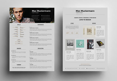
25 Creative Resume Templates: To Land a New Job in Style
Are you applying for a creative job? If so, you may need a creative resume template. We have a number of the best resume designs presented here that you can…
4. A Professional, Legible Font
Good typography is the backbone of a well-designed CV, but it’s easy to get carried away. Even though there are now thousands of commercially free fonts available online for download, you should think long and hard before picking a novelty typeface for use on your resume design.
Tried-and-tested fonts which have stood the test of time have done so for a reason—they are legible and attractive at any size, whether in headers or body text, which makes for an altogether pleasant reading experience.
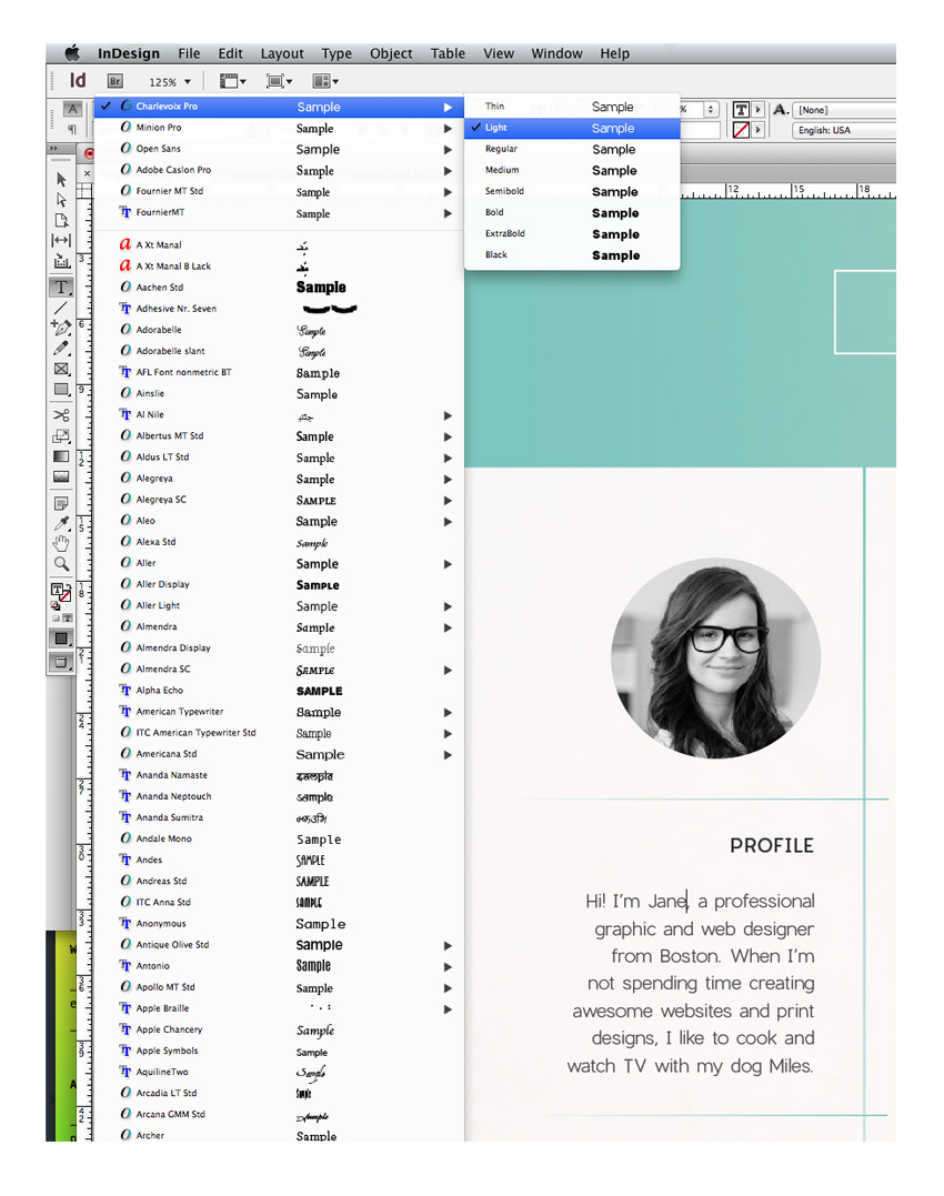
Whether you opt for a more traditional serif or a cleaner sans serif will also depend on the type of role you are applying for (applicants for more senior roles can command respect and authority with a solid serif, for example) and the culture of the company. Applying to a trendy young start-up? A contemporary sans serif like Charlevoix Pro will look youthful and forward-thinking.

Going for a business with a more formal structure? A humanist serif like Garamond is both attractive and communicates that you’ll mesh well with the existing company culture.
Other fonts that are failsafe picks for beautiful resume typography are:
Serifs
Sans Serifs
If you’re applying for a job in a creative industry, you should be aware that your future employer will know their Garamond from their Caslon! Creative employers will be interested in seeing which font you’ve chosen, and they’ll make judgements about your design knowledge and taste from this seemingly minor feature. That means avoid Comic Sans like the plague, and perhaps opt for a typeface which is a design classic for maximum brownie points.
In InDesign you can adjust the Font and Font Weight (e.g. Bold, Italic, etc.) from either the Character Formatting Controls panel at the top of the workspace when you have the Type Tool (T) selected, or from the Character panel (Window > Type & Tables > Character).
5. Introduce a Typographic Hierarchy
Hierarchy is a key typographic technique for designing any layout, whether it be a webpage, a poster or a business card. The idea is that you create a graduated hierarchy of type on the page, leading the eye to read items in order, and splitting up sections into manageable chunks.
To create a basic typographic hierarchy on your resume, you will need a basic trio of type styles, made up of heading, sub-heading, and body text styles. The main element you need to tweak is the Font Size, which you can adjust from the Character Formatting Controls panel in InDesign. Graduate the size down from larger for the header (your name at the top), medium for the sub-headings (e.g. ‘Education’), and small (between 10 and 11 pt) for the body text.

Next, work on bringing in some different weights to the trio. A heftier Bold or Black weight will suit a header, while a Bold or Bold Italic will help your sub-headings to stand-out. Stick with a Regular weight for body text, and avoid Light weights altogether, as these can be difficult to read in print.

Then look at bringing in extra formatting to further differentiate the styles. Setting headers and sub-headings in uppercase letters (in InDesign, click on the All Caps button in the Character Formatting Controls panel), as well as increasing the Tracking (space between all letters) is a subtle way to make your headings look more professional and clear to read.
Consider also the alignment of your text. Is all your text by default flushed left? Tweaking a heading or sub-heading to Align Center can make a huge difference to the layout, adding more interest and balancing out the left-leaning bulk of text.
6. An Attention-Grabbing Name
What’s in a name? Well, if you’re a time-stretched interviewer, it can certainly mean a lot. Because you’re not able to present yourself in person at the resume review stage, it’s important that the CV works hard to make your name lasting and memorable.
You should prioritize your name on the page, and make sure it is the single most dominant element on the layout. You can do this without setting your name in a WordArt-style font, and instead maintaining a simple, classic type style.
The secret to memorability is all in the staging. Allow your name plenty of breathing space at the top of the page. This forces the eye to digest that information alone, without being distracted by other content.
Aligning your name centrally is also a good technique for making your name the focal point of the layout, standing to attention at the top of the page. These two techniques also ensure that your name is easily found when the interviewer wants to refer to you quickly and easily in a meeting environment.
Choice of typeface can also help to make your name stand out, and help to build a sort of personal brand at the same time. Styling your name consistently across other parts of your application, such as your cover letter, business card, and portfolio website, will help to reinforce memorability and make a showcase of your knack for branding design too.

A script or handwritten font is also a lovely way of styling your name that mimics the look of a signature in a more legible way, making your resume appear at once more personal and warm. Here, I’ve used Learning Curve Pro, but Vellesa or Sharpen Script make great alternatives.
7. A Natural Photo
In recent years, applicants looking to stand out amongst their competitors have turned to using a portrait photo on their resumes. For some industries this can feel a little informal, but for creative companies like graphic design and web design agencies, a well-chosen photo can be a great finishing touch to a CV. Photos help you to build a personal relationship with the reader, and have the benefit of making you more memorable.

Having said that, some photos are simply not OK to use. Abandon that Facebook picture from last year’s summer holiday, and stage a professional-style shoot instead. Ask a trusted camera-savvy friend or hire a photographer to take some shots in a studio environment (or simply standing against a blank wall will do).
Natural, confident shots look best, so try to relax and picture how you would like your employer to view you. You want to look friendly but not hyper! If you’re struggling to relax, fold your arms in front of you and lift your shoulders back, which will immediately make you feel more confident and improve your posture.
Once you have your perfect shot, upload it to your computer and open the image up in Adobe Photoshop. Here’s my simple step-by-step process for editing your photo to get it ready to use in your resume design:
Step 1
Expand the Layers panel (Window > Layers) and drag the Background layer down onto the Create a New Layer button at the bottom of the panel to duplicate the layer.

Step 2
From the Create a New Adjustment Layer drop-down menu in the Layers panel, choose Black & White.

You can move the sliders around until you’re happy with the result. Try to keep the area of the face nice and bright. When you’re finished, you can close the Properties window.

Step 3
Use the Crop Tool (C) to pull the edges of the image in, until you have just the shoulders and head of the person remaining, and then hit Enter.

File > Save As the image as a JPEG file, ready to be placed into your resume document.

A black and white photo is a great choice for a resume, as it won’t distract from the color scheme of your design and always looks exceptionally professional compared to a full-color portrait.
Place your photo inside a circular or shaped image frame to give it a bit of interest and prevent it from looking just ‘stuck on’ to the page.
-

9 Creative Resume Design Tips (With Template Examples)
If you’re hunting for that dream role at a creative company you’re going to want to dust off your old resume and give it a modern refresh. But how can you…
8. A Dash of Infographics
Infographics have officially taken over the design world, successfully bridging the gap between data and visual design. If you’re applying for a design or tech role, no doubt the company will have dabbled in or be familiar with infographics, which makes them a great talking point for your resume.
Bring in subtle infographic references by using app-inspired icons in your contact details. You can download vector icons from flaticon.com. Open them in Adobe Illustrator, and Edit > Copy, Edit > Paste them directly into your InDesign layout. You can adjust the color and size of your icons directly from here.

Extra infographic details like flags or maps to illustrate language proficiency, or charts to visualise your level of skill relating to certain software, are fantastic ways of breaking up the monotony of text on your resume. Your interviewer will appreciate both your ingenious way of presenting information and the relevance the style has to the company’s projects and interests.
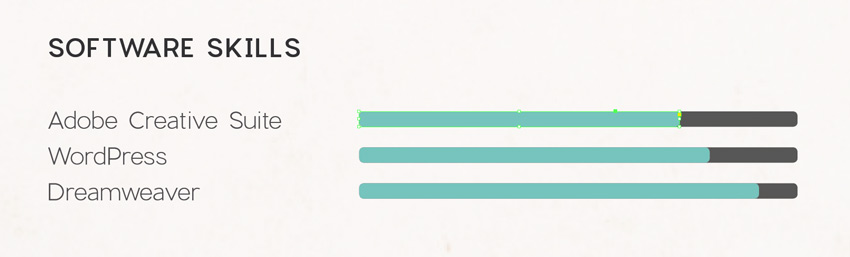
Simple chart bars and arrows are easy to create in InDesign directly, by using the shape tools. Check out this infographics tutorial to find out more about creating simple infographic elements in InDesign:
-
Create a Super Simple Infographic Template in Adobe InDesign
Adobe Photoshop and Illustrator are often used by infographic pros to create their statistical concepts, but here we’ll show how you can create a super…

9. Build a Whole Resume Package
Once you’ve finished up your resume and incorporated some of the elements and tips we’ve looked at in this article, it should be looking fabulous and ready for printing or sending off over email.
But wait up… there’s one more thing to consider before you hastily hit the Send button. More and more agencies are looking for something extra-special in applications, to help prioritise candidates who demonstrate creativity in their resume as well as their portfolio. A great way of making your application extra-special is to expand it into a complete resume package.
A cover letter is a traditional part of a job application, but think about how you can extend the design of the resume across to the letter too. Can you lift the style of your name and turn that into a personal logo, creating an interesting letterhead design?

Can you extend the style across to a business card too?
-

Photoshop in 60 Seconds: How to Customize a Business Card Template
In this quick video, Melody Nieves will show you how to easily customize a business card template from Envato Market.
If you want to go that one step further, you can even create a digital version of your application which combines your CV, portfolio, and extra elements like video content. You can use your print application as a stepping stone to a more detailed digital application, which you direct the employer to visit in your cover letter.
-

7 Creative Resume Ideas to Stand Out Online
Whether you’re looking for a position with a new company or looking to collaborate on big projects as a specialist, one thing’s for sure: You’re going to…
Creating a complete resume package really does show you are willing to go the extra mile with your application, which tells the employer that you really want to work for them and also demonstrates how you would approach projects when working for them. It may sound like a lot of work, but if you really want that dream creative job, you won’t regret putting in the extra effort.
Conclusion: You’re Ready to Send Off Your Application!
With your awesome resume ready to print or send off on email, you’ve done a fantastic job. Fingers crossed for getting to the interview stage!
In this article we’ve looked at nine top tips for designing a fantastic-looking resume. Let’s take a quick recap:
- Set your resume to a widely accepted (and cheap to post!) standard page size, like Letter or A4.
- Create a strong grid layout for your resume.
- Allow for generous white space and wide margins to create a balanced, calming layout.
- Use a professional and, above all else, legible font.
- Introduce a typographic hierarchy to lead the reader from A to B.
- Format your name to make it the centre of attention on the layout.
- Use a natural, confident portrait photo, and keep it black and white for extra brownie points.
- Experiment with infographic-inspired elements like icons and charts to add a playful touch.
- Build a whole resume package, including a branded cover letter, business card and online application to really blow the socks off your employer.
Stick to these nine helpful tips whenever you want to give your resume a refresh and you really can’t go wrong. Have some of your own tips for designing great job applications? We’d love to hear about them in the comments below.
Want an awesome resume but still unsure about where to start? Check out the huge range of stylish resume templates on GraphicRiver and Envato Elements.


