Rethink Breast Cancer in Canada is promoting a Give-A-Care, a line of products for young women with breast cancer, in a campaign aimed at friends. Supporters are invited to build a personalized care package that acknowledges what their friend is really going through, and gives her the care she really needs. Products include conversation hearts, lipstick, tissue packs, headache balm, lube, lip balm, water bottle, lemon balm, sensitive hand cream, tea, and a “do not disturb” sign. A 60-second video explores some of the ways you can really show you #giveacare about someone with cancer. See more on the website. Rethink Breast Cancer has developed a set of recommended Care Guidelines for Young Women with Breast Cancer to ensure their needs are addressed in a timely manner. Some of the challenges younger women with breast cancer may face include diagnosis during pregnancy, effects of chemotherapy on fertility, menopausal symptoms or osteoporosis, feelings of isolation, questions about sexuality, childcare, relationships, dating, employment and finances.
Give-A-Care Credits
The Give-A-Care campaign was developed at lg2, Toronto, by creative directors Chris Hirsch, Nellie Kim, Claude Auchu, copywriter Ariel Riske, art director Zachary Bautista, graphic designer Élise Cropsal, digital creative director Jennifer Varvaresso, user experience team Joël Auchu, Nicolas Baldovini, digital strategic planner Meg Siegel, account services team Krista Findlay, Antoine Levasseur, Taylor Johnston, Chloé Gascon, Alexandre Normand. Print and web production was produced at lg2fabrique.
Filming was shot by Scoot Design director Nathalie Cusson.
Rethink Breast Cancer worked with Aveda, H&M, Pluck Teas, Leaves of Trees, Orchard, Uberlube, The Ginger People, Nuvango Gallery & Goods, The Cashmere Shop, Organic Candies, Custom Candy,
McDonald’s in Hong Kong is encouraging people to rediscover the magic of Chinese New Year (CNY) with a new commercial bringing in the Year of the Rooster. The 60 second ad sets out to remind viewers what CNY felt like when they were children. Too often the rituals around the festival lose its fascination as people grow older, and repetition, routine and chores wear down the magic they once experienced as children. The spot opens on a CNY parade – a spectacular show of colour and sound – and leads up to a show-stopping moment when a little girl shares her McDonald’s fries with the dancing lion, proving the power of small gestures to make a big difference. The TVC launched in mid-January as part of the McDonald’s Prosperity advertising campaign, and is supported in print. McDonald’s in Singapore has launched a similar CNY commercial, addressing the question, “Do dragons fly?” by focusing on the flying of kites.
“Despite CNY being one of the most important festivals for family traditions, for many people it’s the little things that make it most memorable. That’s why our spot too had to be little – a little human story. We basically followed DDB Worldwide Chairman Emeritus Keith Reinhard’s legendary, yet timeless, creative formula: a simple story, with a surprise, and a smile at the end,” said Andreas Krasser, Head of Strategy and Innovation at DDB Group Hong Kong.
“As a brand, we have a strong belief in the heartland values of our local community, and our role in creating happy moments – one smile at a time,” said Randy Lai, Managing Director at McDonald’s Hong Kong. “DDB did a fantastic job of putting together a beautiful TV spot that’s reminiscent of the sheer joy we experienced as children during CNY.”
Chinese New Year McDonalds Credits
The Prosperity Brand campaign was developed at DDB Group Hong Kong and DDB Sydney by DDB Asia VP regional director Peter Rodenbeck, head of strategy and innovation Andreas Krasser, creative director Paul Yu, associate creative director Ben Ling, group creative director O Poon, DDB Sydney creative partner Steve Jackson, copywriters Owen Bryson and Shane Geffen, art director Trong Ronakiat, agency producer Denise Wong, head of broadcast Annie Tong, business director Noel Yuen, senior account manager Jim Leung.
Samsung India is running a nationwide television and digital campaign showcasing its initiative to take customer service to the doorsteps of consumers in the hinterlands. The campaign film #SamsungService follows Amit (Abhishek Jain), a Samsung customer service engineer on his way to a remote call-out made by a young woman (Drishti). Arriving at his destination after many trials and tribulations, Amit is surprised to find that he is at a hostel for the blind, and that his work has allowed the blind children of the hostel to support their housemate who is participating in a reality singing show on TV. The voiceover: “At times one must venture a little further than usual for the sake of relationships. That’s why Samsung service vans go to every corner of the country”. Launched on Youtube on December 30, the online film has been viewed over 56 millions times. The Samsung Cares campaign film is being shown on 50 television channels and is supported by print and digital elements.
In October 2016, Samsung launched 535 service vans, to ensure timely service to customers in the remotest corners of India. With the new addition, the Samsung service network is now over 3,000 strong from around 2,000 service points earlier. With this, Samsung’s reach will extend to customers in over 6,000 talukas across 29 states and 7 union territories, making Samsung’s service network the largest in this industry in India.
“In the last 21 years in India, Samsung has grown to become the largest consumer electronics and mobile phones brand in India. With a wide portfolio of products that are sold across India through more than 150,000 retail outlets, Samsung also has a strong pan India service network. Our new initiative of expanding to rural India, right upto the taluka level, helps us in taking care of our valued customers, wherever they are. The new campaign video gives a glimpse of yet another initiative towards our ‘Make for India’ commitment. We are very happy to receive an overwhelming response from consumers across India, who have given a big thumbs up to the campaign with around 13 million views on YouTube in just 96 hours,” said Ranjivjit Singh, Chief Marketing Officer, Samsung India.
Samsung Cares Credits
The Samsung Cares campaign was developed at Cheil India by chief creative officer Sagar Mahabaleshwarkar, executive creative director and copywriter Tarvinderjit Singh, account managers Kundan Joshee, Mohit Mishra, Subhransu Adhikari and Vandana Bhalla, planners Ayan Banik and Tanvi Arora.
Filming was shot in Manali and Kullu by director Anupam Mishra via Crazy Few Films, Mumbai, with director of photography Rubais, producers Urfi Kazmi and Viraj Gawas.
Editors were Shyam Salgaonkar (Sally) and Sanjay Mali at Prime Focus. Colourist was Nicola Gasparri at After Studios.
Music, composed by Dhruv Ghanekar was performed by Mohit Chauhan.
„100 years” charts the important story of women’s healthcare at Planned Parenthood in a way that only animation can. In this Motionographer feature, we speak to director Kirsten Lepore to learn more about how this project came about, what it was like working with Lena Dunham and what her goals and inspirations were for this film.
Designing wedding invitations can be scary—which style to choose? Which font to use? Go for pared-back elegance or flashy decadence? Vintage florals or modern minimalism? And above all, how to make it personal and special for the couple in question?
In this article, I’ll give you 10 top tips for designing wedding invitations, using some gorgeous templates as examples. Read on, and get inspired to create your own!
1. Choose a Style
Every invitation design will fall into a style category, or perhaps borrow from a couple of styles. Staying true to a particular style, especially if the couple are having a themed wedding, or love a particular period or genre, can be a great way of giving your invitation project a strong focus.
These are just a few of the design styles that work well for wedding invitations, and the qualities that each style brings to the design…
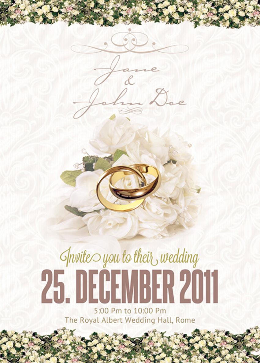
Traditional and Elegant: This style is classic, timeless and appropriate for both formal and informal weddings. You won’t risk offending any older members of the wedding party with this beautiful, tasteful style choice. Achieve the look of a traditional wedding invitation with script fonts, floral borders and dainty colors.
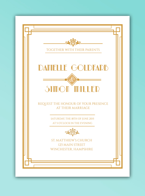
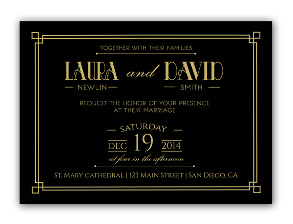
Art Deco: Another old-school style, but one that gives off a stronger vintage vibe, which can feel hip and on-trend. An Art Deco invitation style brings a lovely, symmetrical quality to your designs, like in the invitation example below, and adds a distinctly glamorous edge with lavish geometric designs and luxe colors, like gold, silver and jet black. You might want to allow for metallic foiling if you go with an Art Deco look.
Mid-Century Retro: This style borrows from 1950s design, but gives it a hip twist, making it look very relevant and ‘now’. Pastel colors, Americana-inspired typefaces and vintage-inspired graphics, like ribbons and badges, bring a fun, informal twist to this wedding invitation.
Choosing a style is a great place to get started with your designs. Even if you start out traditional, and add a twist of Art Deco with a 1920s-inspired font, mixing some of the main style genres will give your invitations an instantly recognisable and distinctive character.
2. Go for Timeless Typefaces
A font can make or break an invitation design. Step away from novelty, ‘out-there’ type styles, and choose typefaces that have lasting longevity.
Formal classics like Fournier and Caslon will prove to be timeless when the couple pulls out their wedding invitations decades later, and elegant scripts like Allura or Manglayang Script will always look occasion-appropriate.
Unless it’s a themed wedding, this might not be the time to experiment with a novelty font. Stay well away from grunge, marker-pen, and distressed fonts that might look cool, but will make your designs look too informal and flyer-like.
Look for typefaces that have a variety of weights too—you might fall in love with a particular font in a regular weight, but make sure there are italic and bold weights available too. Pulling out names and venues in different weights can divide up bulky text, and make the design appear more balanced. This Vakia font, for instance, is an elegant script with a timeless design.
Before you dive into designing your invitation, you need to consider a couple of practical issues. Yawn, I know, but nonetheless absolutely essential!
Firstly, what will the dimensions of your invitation be, and will it be oriented portrait or landscape?
Most invitations are designed to fit inside a standard envelope. If you’re sending your design to a professional printer, they may use their own standard-size envelopes for invitations, so your first task should be to get in touch with your printer and seek their advice on sizing. If you’re planning to save money and source the envelopes yourself, you should do this first, and size your invitation to fit your chosen envelope size. This wedding invitation stationery set features several card sizes that are sure to fit standard envelopes.
One more tip—don’t match the size of the invitation to the size of the envelope, as it will be too large to fit inside! Allow a few millimetres extra at least around the edge of the envelope.
Once you are happy with the dimensions of the invitation, you can decide whether to give the design a portrait or landscape orientation. Both can look lovely, but if you’re dealing with a lot of text (e.g. lengthy names or venue address) a portrait design might be more sensible. You won’t risk cramming text as easily as you might on a landscape design (Note: Save the Date and RSVP cards look especially lovely in landscape format).
Secondly, you need to consider how and where your invitation is going to be printed.
Dreaming of a letterpress finish? You’ll need to track down a letterpress specialist who is happy to produce the designs to the time restriction, quantity and price that you’re looking for.
Special printing effects like foiling and gloss printing can also stretch the purse strings, so make sure to not get too carried away (remember, often simple is best!) and shop around for the best deal if you do want something out of the ordinary.
4. News Alert! Florals Can Look Modern
Floral designs have a bad rep, and are often associated with old-fashioned, fusty styles.
I assure you, florals can look modern, and, when done well, strike that perfect (and sometimes elusive) balance of romance and modernity.
This floral wedding invitation unites modern typography with beautiful, watercolor-like flowers. And the blue background becomes a perfect contrast against the remaining subtle colors.
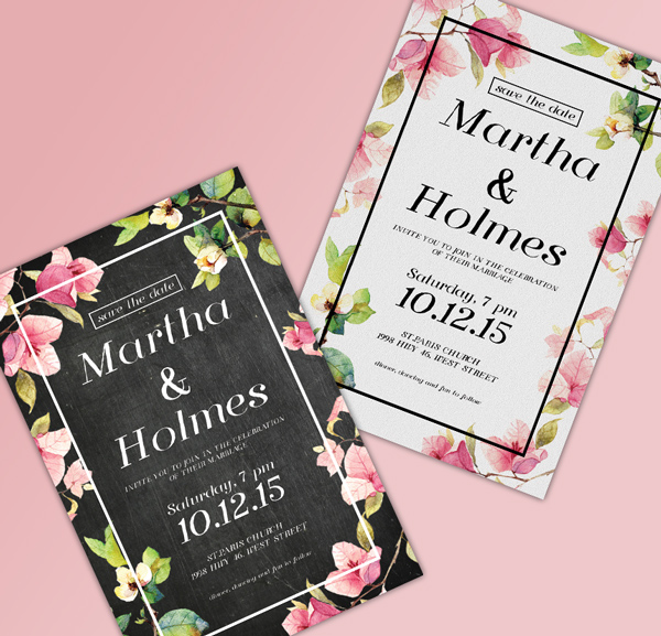
And this stylish wedding invitation is a perfect example of florals executed with a modern twist. The black background provides a stylish contrast to watercolor-style flowers in soft pinks and greens. The feature that makes it modern, not stuffy? Note the minimal white frame around the border of the design.
Photography is very under-used on wedding invitations. Designs tend to have a typographic or illustrative focus instead.
To give your wedding invitation a unique look, consider introducing photos onto the layout. This can also make your invitations look modern and fresh—ideal if you’d rather not go down the vintage route. You can even incorporate photos of the bride and groom to be, for an alternative photo-based wedding invitation.
To keep your design looking contemporary, set the photo as a background or border, like in this simple wedding invitation design below. This also allows you to make the invite customizable and unique—why not drop in different photos across a batch of invites, so guests receive their own unique invitation design?
When it comes to typesetting the text for your invitation, it’s best to follow a traditional, tried-and-tested formula. Even if your invites have a modern, unconventional design, you should still align your text centrally like this nautical-inspired wedding invitation.
Why? Aligning text centrally makes text appear instantly more formal and important, and distinguishes the invitation as something important and notable. Smaller chunks of text (e.g. names and dates) also look more organized and more elegant when aligned centrally. Flushing the text off-center can make headers look a little messy.
So when you come to arrange the text on your design, make sure to drag a vertical guide out to the dead-center of the page, whichever software you choose to use, and ensure that all text frames are aligned absolutely centrally.
You can also impose a hierarchy on the text by applying a variety of weights and font sizes to different sections. Try setting the names of the couple in a large size italic, the date and time of the event in bold (you don’t want anyone to forget this!) and extra items like dress code in a smaller size and a light or regular weight.
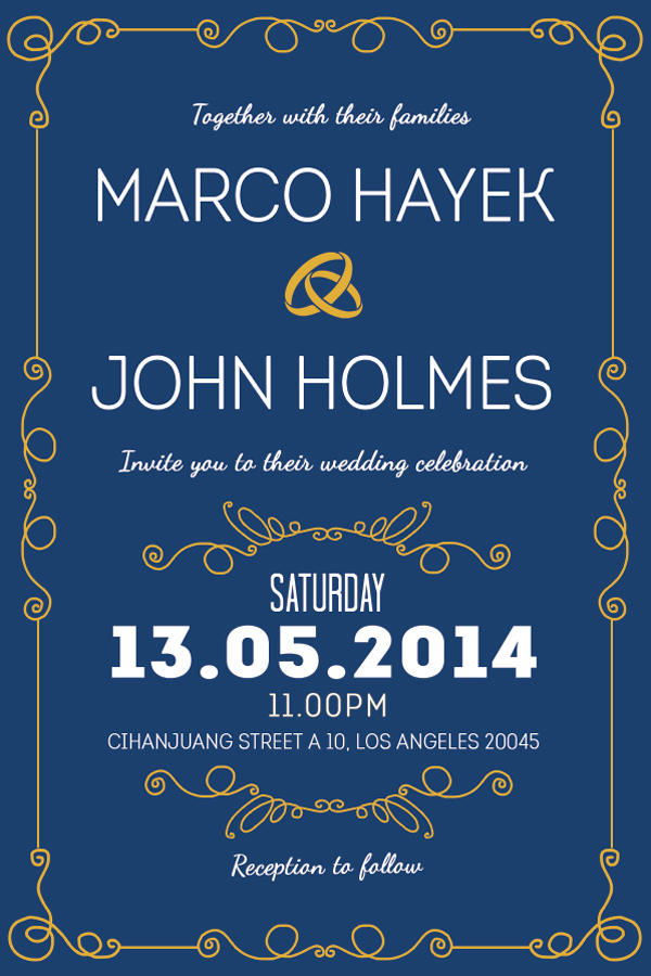
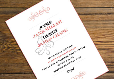
Consider separating different sections of the text using dividers (try ribbon banners for vintage styles, or elegant scripted flourishes for a traditional design, like in the elegant wedding invitation shown below) to make the information more digestible too.
The humble ampersand, the squiggly ‘&’ used to indicate ‘and’, is your new best friend when it comes to designing wedding invitations.
Particularly when sandwiched between the names of the couple, an ampersand looks elegant, dramatic and interesting, without distracting from the text around it. Replace a useless and sorry-looking ’and’ with a decorative substitute instead! This Risthi Script provides a gorgeous ampersand perfect for wedding designs like the one below.
You’d be amazed at how simple changes to color on your design can transform the whole look and feel of the invitation. I’m a big believer in the effectiveness of simple, minimal designs, and color is a great way of adding personality and theme to an otherwise classic, functional layout.
Take this winter-worthy example of a wedding invitation. The moody, deep blue background and crisp white text is a world away from the traditional white/cream background with dark text.
The invitation’s dramatic colors are perfectly suited for a winter wedding, but the design could easily be switched up to lighter pastel shades to create an entirely different look.
Don’t underestimate the high-contrast impact of monochrome designs too. A black and white palette can look glamorous, classic and fashionable all at the same time. Drop in a touch of gold or silver foiling for an extra-special color combination.
Once you’re happy with the basic layout of your invitation, including text, graphics and borders, experiment with different color combinations, and consider showing these options to the couple to help them feel involved in the process. This colorful wedding invitation shows that this unique style is successful with many different color combinations.
Color is an easy thing to change, but the core elements of the design might be more tricky to rethink; choosing color is an easy gateway into the design process if you’re designing for a client or friend.
9. If in Doubt, Keep It Classic
Classic invitation designs will always be in style, and suit a broad range of events and personal tastes. Unless the wedding has a strong theme, a traditional design will work really well, and, if designed beautifully, be treasured forever by the couple and their guests. This classy wedding invitation features gorgeous script fonts with floral elements that work perfectly for any wedding.
To keep your classic design looking modern, not stuffy, try to balance the design’s feminine and masculine elements. Straight, fuss-free line dividers and a geometric border give this design a masculine edge, while the scripted italics bring a feminine touch.
Why not introduce just one unconventional element to an otherwise classic design? In this example of a classic wedding invite, the typeface has a distinctly vintage vibe, and the dark background keeps it looking glamorous, not staid.
Whatever style of invitation you choose for your design, try to keep in mind who the couple are, and what their personal tastes are like.
If you’re designing an invitation for your own wedding, this is unlikely to be a problem. But if you’re designing for a relative, a friend, or a client, try not to get carried away. People commission designers as they want expertise and advice, but wedding invitations are particularly personal, and couples can be deeply disappointed if they wanted a folksy floral design and received a flashy Art Deco creation in its place!
One certain way to avoid this clash of tastes is to have the couple give you a set brief from the very beginning. Ask them what styles they like (e.g. vintage, elegant, contemporary), and show them some examples to fire their interest and give you a better idea of what they’re looking for. A couple that loves vintage-inspired fashion and furniture might also love something like this fun retro wedding invitation design.
You’ll never know a person’s individual preferences unless you ask! It’s also really useful to ask the couple what they definitely don’t like too. There’s no point spending ages perfecting a floral border if flowers just aren’t their thing.
Another important practical issue to consider is the couple’s budget, and take this into account when you put together the design—gold foil can look lovely, but it can also be expensive for bargain-hunting couples. Try a simple pattern design instead, like this retro wedding invitation that features unique pattern elements.
To conclude, I’ve covered a number of helpful tips and tricks to get you started with creating your own wedding invitation designs. To get started with designing your own invitations, you can:
Choose a Style: Pick a well-known design style, such as Art Deco or Traditional, to help steer your ideas and give the design focus
Go for Timeless Typefaces: Classic fonts that have stood the test of time will always look great on invitations, and will ensure your design never goes out of style.
Think About the Practicalities: Consider important issues like sizing, orientation and print finish before getting stuck into designing. You won’t regret it later!
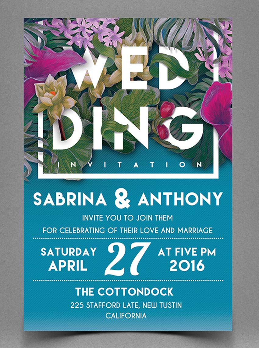
Keep Floral Designs Modern: Floral designs are a romantic, traditional choice for wedding invitations, but they don’t need to look stuffy. Try out abstract illustrations, and contrast against dramatic background color for a design that looks thoroughly contemporary.
Consider Using Photography: If you’re looking for a unique design that looks fresh and modern, introducing photography into a background or border might be the way to go.
Align Your Type Centrally: Sure, you can flush your type left or right if you want to, but 99% of the time, aligning your text centrally is going to make your typography look way better.
Embrace the Ampersand: Replace clumsy ands with decorative ampersands (&) for elegance and added interest.
Use Color to Transform Your Designs: Avoid reinventing the wheel all the time by switching up the colors of your design instead of changing the main elements of the layout.
If in Doubt, Keep It Classic: Personal tastes can differ, and design trends may come and go, but classic designs will always have an appeal in wedding invitation design. Add a modern twist to traditional designs to inject a bit of personality.
Above All… Always Make It Personal: Get to know the couple’s tastes and the vision they have for their wedding day. Can you bring those two factors together into one unified design? Keep the couple involved in the design process without compromising your creative ideas, by allowing them to choose a color scheme for the invitations from a selection you prepare for them.
If you use these ten tips as a starting point for your invitation design, you are well on your way to creating an invitation that’s going to be super-special.
If you’re still feeling a bit lost and in the dark (it happens to us all!), take a look again at some of the great templates featured in the article above, and see if one of those will fit the bill. You can also browse a wider selection of wedding invitation templates to find the perfect style for your event.
Wedding Invitation Tutorials From Envato Tuts+
Need more inspiration? Check out these amazing wedding invitation tutorials below, featuring incredible print designs for elegant, modern weddings. Try them out for fun, or incorporate these designs into your special day!