Optimum Type: A Big Book Filled With Typographic Inspiration

Post pobrano z: Optimum Type: A Big Book Filled With Typographic Inspiration

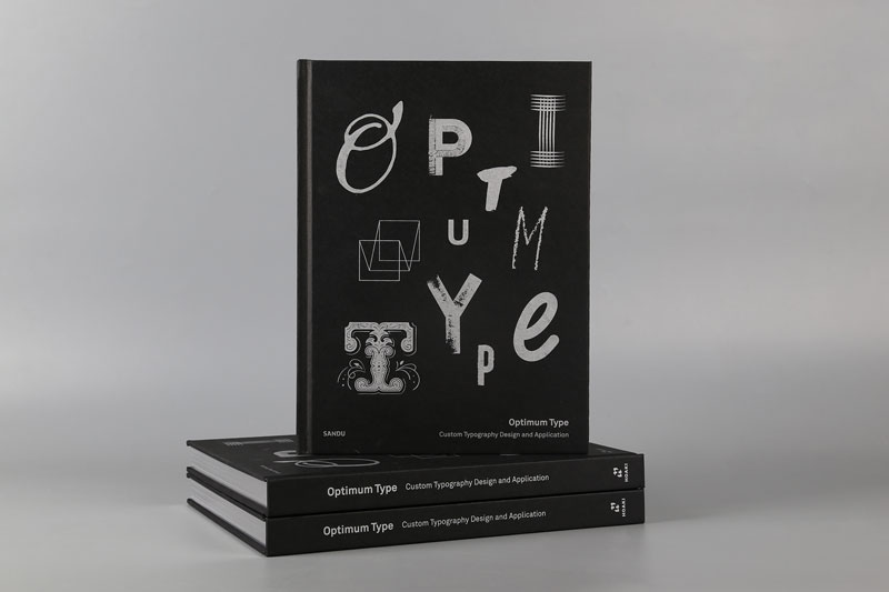
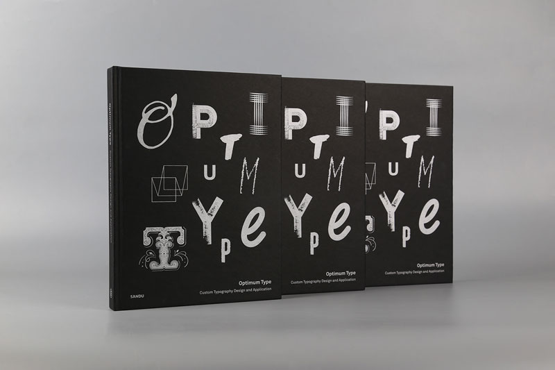
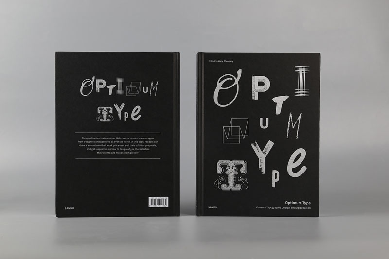
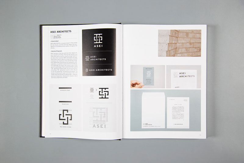
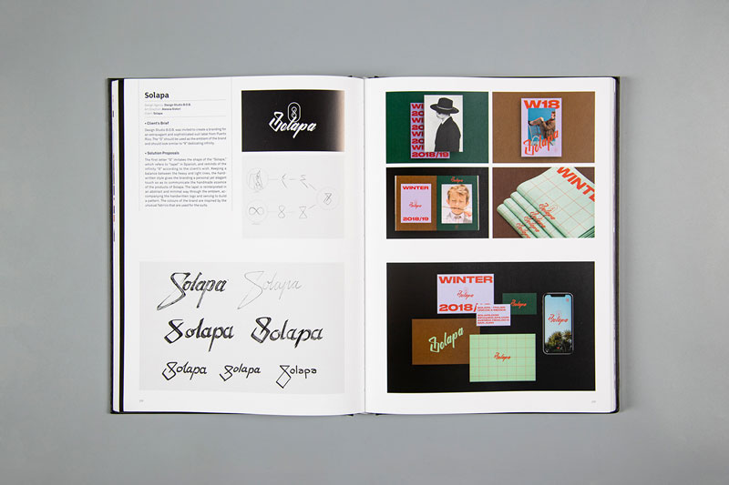
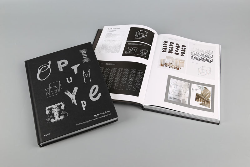
If you are looking for type inspiration, look no further. The book “Optimum Type“, published by Sandu Publishing, guides you through a series of brand and examines their use of type. The author is Wang Shaoqiang, a professor at the Guangzhou Academy of Fine Arts, where he is dean of the design, visualization, and animation department.

Optimum Type features more than 100 creative custom-created types from designers and agencies all over the world. A perfect source of inspiration, but also a great place to further study the influence of type on good branding.

Design Deals for the Week

Post pobrano z: Design Deals for the Week

Every week, we’ll give you an overview of the best deals for designers, make sure you don’t miss any by subscribing to our deals feed. You can also follow the recently launched website Type Deals if you are looking for free fonts or font deals.

Exclusive Font Bundle of 50+ Fonts, 30 Logos

This Exclusive Font Bundle is chock full of 50+ different fonts in a wide range of styles from playful to elegant. Additionally, you’ll get 30 editable logos. Not to mention hundreds of doodles objects to create your designs in style.

  • 50 fonts in 28 font families.
  • Wide range of styles – regular,light,bold ,callygraphy, signature, cartoon, fancy, serif, san serif, retro etc.
  • 30 editable logos.
  • Hundreds of doodles.
  • Extended license – use for unlimited personal and commercial projects.

$9 instead of $583 – Get it now!

The Art Poster Creator

With The Art Poster Creator you can quickly and easily whip up eye-popping, four-color screen posters. Just add your image via Smart Objects, then pick from a huge collection of well organized graphics from corners to frames to give your work that final touch. From Rock Concert to Dance Party, your work is sure to stun the crowd!

$7 instead of $40 – Get it now!

Power Sell, a Fun, Crafty Handwritten Font

Fun, bouncy and bursting with handwritten charm, Power Sell is a great font for everyone, particularly crafters. With its ultra smooth outlines, it’s optimal for all types of cutting with crafting machines. It’s also a great choice for children’s books, scrapbooks, logos, icons and tons more. An extended license and multilingual support just adds to the fun.

$5 instead of $20 – Get it now!

Grold Rounded Family of 40 Contemporary Fonts

Grold Rounded is a truly friendly font family with rounded terminals that harmonize with each rounded corner. Prominent and eye-catching, this unique family sports 40 fonts, including 10 different weights, and both normal and slim formats. Versatile for all media, it’s the perfect choice for editorials in magazines, websites, publishing, labels, packaging and more.

$12 instead of $160 – Get it now!

Highly Customizable Split-Flap Typography Creator

The Split-Flat Typography Creator includes everything you’ll need to build a creative and unique 3D style typography project with split-flap lettering. Includes realistic and detailed hi-res lettering with unlimited material and effect options – you can even animate your letters and create simple videos in Photoshop. Plus, you’ll find loads of additional graphic elements to help you create your own spectacular scenes.

$24 instead of $140 – Get it now!

March: Clean, Modern Serif Font

Meet March, a modern and clean display font to help inspire your latest artistic project. With 2 versions (Clean and Rough), 66 alternates and support for multiple languages, this typeface’s flexibility will give you the freedom to create everything from headlines to logos to product branding.

$5 instead of $18 – Get it now!

50+ Artista Procreate Brushes

Show off your artistic talent with this set of 50+ Artista Procreate Brushes. With a variety of brush types, you can create illustrations in any chosen style: spray, stroke, pencil, sketch and texture brushes. An extra set of 10 grunge textures will help you polish your work.

  • 61 unique brushes.
  • Wide range of styles – spray, hatch, pencil, sketch and texture.
  • 10 grunge textures to polish off your work.
  • Realistic brush set – from vivid illustrations to pencil drawings on paper.
  • Multiple file types – PNG, Brush, PDF.

$9 instead of $89 – Get it now!

Design Deals for the Week

Post pobrano z: Design Deals for the Week

Every week, we’ll give you an overview of the best deals for designers, make sure you don’t miss any by subscribing to our deals feed. You can also follow the recently launched website Type Deals if you are looking for free fonts or font deals.

Exclusive Font Bundle of 50+ Fonts, 30 Logos

This Exclusive Font Bundle is chock full of 50+ different fonts in a wide range of styles from playful to elegant. Additionally, you’ll get 30 editable logos. Not to mention hundreds of doodles objects to create your designs in style.

  • 50 fonts in 28 font families.
  • Wide range of styles – regular,light,bold ,callygraphy, signature, cartoon, fancy, serif, san serif, retro etc.
  • 30 editable logos.
  • Hundreds of doodles.
  • Extended license – use for unlimited personal and commercial projects.

$9 instead of $583 – Get it now!

The Art Poster Creator

With The Art Poster Creator you can quickly and easily whip up eye-popping, four-color screen posters. Just add your image via Smart Objects, then pick from a huge collection of well organized graphics from corners to frames to give your work that final touch. From Rock Concert to Dance Party, your work is sure to stun the crowd!

$7 instead of $40 – Get it now!

Power Sell, a Fun, Crafty Handwritten Font

Fun, bouncy and bursting with handwritten charm, Power Sell is a great font for everyone, particularly crafters. With its ultra smooth outlines, it’s optimal for all types of cutting with crafting machines. It’s also a great choice for children’s books, scrapbooks, logos, icons and tons more. An extended license and multilingual support just adds to the fun.

$5 instead of $20 – Get it now!

Grold Rounded Family of 40 Contemporary Fonts

Grold Rounded is a truly friendly font family with rounded terminals that harmonize with each rounded corner. Prominent and eye-catching, this unique family sports 40 fonts, including 10 different weights, and both normal and slim formats. Versatile for all media, it’s the perfect choice for editorials in magazines, websites, publishing, labels, packaging and more.

$12 instead of $160 – Get it now!

Highly Customizable Split-Flap Typography Creator

The Split-Flat Typography Creator includes everything you’ll need to build a creative and unique 3D style typography project with split-flap lettering. Includes realistic and detailed hi-res lettering with unlimited material and effect options – you can even animate your letters and create simple videos in Photoshop. Plus, you’ll find loads of additional graphic elements to help you create your own spectacular scenes.

$24 instead of $140 – Get it now!

March: Clean, Modern Serif Font

Meet March, a modern and clean display font to help inspire your latest artistic project. With 2 versions (Clean and Rough), 66 alternates and support for multiple languages, this typeface’s flexibility will give you the freedom to create everything from headlines to logos to product branding.

$5 instead of $18 – Get it now!

50+ Artista Procreate Brushes

Show off your artistic talent with this set of 50+ Artista Procreate Brushes. With a variety of brush types, you can create illustrations in any chosen style: spray, stroke, pencil, sketch and texture brushes. An extra set of 10 grunge textures will help you polish your work.

  • 61 unique brushes.
  • Wide range of styles – spray, hatch, pencil, sketch and texture.
  • 10 grunge textures to polish off your work.
  • Realistic brush set – from vivid illustrations to pencil drawings on paper.
  • Multiple file types – PNG, Brush, PDF.

$9 instead of $89 – Get it now!

Design Deals for the Week

Post pobrano z: Design Deals for the Week

Every week, we’ll give you an overview of the best deals for designers, make sure you don’t miss any by subscribing to our deals feed. You can also follow the recently launched website Type Deals if you are looking for free fonts or font deals.

Exclusive Font Bundle of 50+ Fonts, 30 Logos

This Exclusive Font Bundle is chock full of 50+ different fonts in a wide range of styles from playful to elegant. Additionally, you’ll get 30 editable logos. Not to mention hundreds of doodles objects to create your designs in style.

  • 50 fonts in 28 font families.
  • Wide range of styles – regular,light,bold ,callygraphy, signature, cartoon, fancy, serif, san serif, retro etc.
  • 30 editable logos.
  • Hundreds of doodles.
  • Extended license – use for unlimited personal and commercial projects.

$9 instead of $583 – Get it now!

The Art Poster Creator

With The Art Poster Creator you can quickly and easily whip up eye-popping, four-color screen posters. Just add your image via Smart Objects, then pick from a huge collection of well organized graphics from corners to frames to give your work that final touch. From Rock Concert to Dance Party, your work is sure to stun the crowd!

$7 instead of $40 – Get it now!

Power Sell, a Fun, Crafty Handwritten Font

Fun, bouncy and bursting with handwritten charm, Power Sell is a great font for everyone, particularly crafters. With its ultra smooth outlines, it’s optimal for all types of cutting with crafting machines. It’s also a great choice for children’s books, scrapbooks, logos, icons and tons more. An extended license and multilingual support just adds to the fun.

$5 instead of $20 – Get it now!

Grold Rounded Family of 40 Contemporary Fonts

Grold Rounded is a truly friendly font family with rounded terminals that harmonize with each rounded corner. Prominent and eye-catching, this unique family sports 40 fonts, including 10 different weights, and both normal and slim formats. Versatile for all media, it’s the perfect choice for editorials in magazines, websites, publishing, labels, packaging and more.

$12 instead of $160 – Get it now!

Highly Customizable Split-Flap Typography Creator

The Split-Flat Typography Creator includes everything you’ll need to build a creative and unique 3D style typography project with split-flap lettering. Includes realistic and detailed hi-res lettering with unlimited material and effect options – you can even animate your letters and create simple videos in Photoshop. Plus, you’ll find loads of additional graphic elements to help you create your own spectacular scenes.

$24 instead of $140 – Get it now!

March: Clean, Modern Serif Font

Meet March, a modern and clean display font to help inspire your latest artistic project. With 2 versions (Clean and Rough), 66 alternates and support for multiple languages, this typeface’s flexibility will give you the freedom to create everything from headlines to logos to product branding.

$5 instead of $18 – Get it now!

50+ Artista Procreate Brushes

Show off your artistic talent with this set of 50+ Artista Procreate Brushes. With a variety of brush types, you can create illustrations in any chosen style: spray, stroke, pencil, sketch and texture brushes. An extra set of 10 grunge textures will help you polish your work.

  • 61 unique brushes.
  • Wide range of styles – spray, hatch, pencil, sketch and texture.
  • 10 grunge textures to polish off your work.
  • Realistic brush set – from vivid illustrations to pencil drawings on paper.
  • Multiple file types – PNG, Brush, PDF.

$9 instead of $89 – Get it now!

A Primer on Display Advertising for Web Designers

Post pobrano z: A Primer on Display Advertising for Web Designers

A lot of websites (this one included) rely on advertising as an important revenue source. Those ad placements directly impact the interfaces we build and interact with every day. Building layouts with ads in them is a dance of handling them in fluid environments, and also balancing the need to showcase our content and highlight the ads to make sure they are effective.

In this post, I am going to share a few tips and ideas for integrating ad units into layouts. We’ll take a look at some placement options where we might consider or commonly expect to place advertisements in webpages, then move into styling strategies.

I might use some modern CSS properties along the way that are not fully supported in older browsers. Take a look at @supports if you wish to support old browsers in a progressive enhancement friendly way.

Common Digital Ad Placements

There are many, many different places we can drop ads onto a page and an infinite number of sizes and proportions we could use. That said, there are standard placements and sizes that are commonly used to help establish a baseline that can be used to set pricing and compare metrics across the industry. We’ll cover a few of them here, though you can see just how many options and variations are in the wild.

The Navigation Bar Placement

The space right above the main navigation of a site is often a great placement to put an advertisement. It’s great because — in many cases — navigation is at the top of the page, providing a prominent location that both lends itself to using a full-width layout and lots of user interaction. That’s often why we see other types of important content, like alerts and notifications, occupy this space.

The easiest way to do this is simply placing the ad element above the navigation and call it a day. But what if we want to “stick” the navigation to the top of the page once the ad scrolls out of view?

CodePen Embed Fallback

Here we’re using position: sticky to get that effect on the navigation. As documented by MDN, a sticky element is where:

The element is positioned according to the normal flow of the document, and then offset relative to its nearest scrolling ancestor (and containing block).

It might be tempting to use fixed positioning instead, but that removes the navigation from the normal document flow. As a result, it gets fixed to the top of the viewport and stays there as you scroll. That makes sticky a more viable method with a smoother user experience.

A fixed element literally stays put while it remains in view, while a sticky element is able to “stick” to the top when it reaches there, then “unstick” upon return.

Now, we could do the reverse where the ad is the sticky element instead of the navigation. That’s something you’ll need to weigh because hiding the navigation from view could be poor UX in certain designs, not to mention how persistent advertisements could interfere with the content itself. In other words, tread carefully.

The Header Placement

Displaying ads in the site header is another place we commonly bump into advertisements. There are two widely used patterns using the header placement. In advertising industry jargon, they’re referred to as:

  • Billboard: A rectangular ad that is presented as a main call-to-action These are typically 970⨉250. We could use the widest size there, 970px, to set the size of a site’s main content area.
  • Leaderboard: An ad that is wide, short, and often shares space with another element. These are typically 728⨉90.

The billboard spot, despite being large, is rarely used (estimated at only 2% of sites), but they do command higher rates The leaderboard is far and away the most widely used digital ad size, with a 2019 SEMrush study citing 36% of publishers using leaderboards and 57% of advertisers purchasing them.

CodePen Embed Fallback

The nice thing about a leaderboard is that, even if we use the same 970px container width that the billboard ad command, we still have enough room for another element, such as a logo. I tend to use flexbox to separate the site logo from the ad. I also give the container a fixed height that either equals or is greater than the 90px leaderboard height.

.header .container {
  /* Avoid content jumping */
  height: 90px;
  /* Flexibility */
  display: flex;
  align-items: center;
  justify-content: space-between;
}

The Sidebar Placement

The mid page unit ad (also known as medium rectangle) weighs in at 300⨉250 and is the top-performing ad unit — literally #1!

Google study of 2018 clickthrough rates (clicks per thousand views) compared for different ad placements. Google no longer provides these stats. (Source:Smart Insights)

Mid page units have influenced the design of sidebars on sites for a long time. Again, you can see an example right here on CSS-Tricks. 

Crack that open in DevTools and you will see that it has a rendered width of exactly 300px.

We can achieve the same thing using CSS grid:

CodePen Embed Fallback

Let’s say this is the markup of our layout:

<div class="wrapper">
  <main>Main content</main>
  <aside>Sidebar</aside>
</div>

We can set the wrapper as our grid container and define two columns, the second of which is the exact 300px width of our ad unit:

.wrapper {
  display: grid;
  grid-template-columns: minmax(0, 1fr) 300px;
}

If we aren’t displaying too many ads in the sidebar and want to draw more attention to them, we can try using the same sticky technique we did with the navigation placement:

<div class="wrapper">
  <main>Main content</main>
  <aside>
    <div class="is-sticky">Sidebar</div>
  </aside>
</div>
.is-sticky {
  position: sticky;
  top: 0;
}

But you must keep in mind that it will affect reach if the sidebar is longer than the viewport or when using a dynamic sidebar:

(View demo)

There are two ways I tend to solve this issue. The first is to keep it simple and only make important ads sticky. It’s the same concept applied to the CSS-Tricks sidebar, the only difference is that JavaScript toggles the visibility:

The second is to use a JavaScript library that includes scrolling behavior that can be used to listen for when the user reaches the end of the sidebar before triggering the sticky positioning:

There are other considerations when working with ads in the sidebar. For example, let’s say the ad we get is smaller than expected or the script that serves the ads fails for some reason. This could result in dreaded whitespace and none of the approaches we’ve looked at so far would handle that.

Where’d the widget go? The disable button is a simulation for an ad blocker.

Here’s how I’ve tackled this issue in the past. First, our markup:

<header class="header">
  <div class="container">

    <div class="header-content"> ... </div>
    
    <aside class="aside">
      <div class="aside-ad"> ... </div>
      <div class="aside-content"> ... </div>
    </aside>

  </div>
</header>

Then, we set the right measurements for the grid columns:

.header .container {
  display: grid;
  grid-template-columns: minmax(0, 1fr) 300px;
  grid-gap: 24px;
  min-height: 600px; /* Max height of the half-page ad */
}

Now let’s make the sidebar itself a flexible container that’s the exact width and height that we exact the ad to be, but hides any content that overflows it.

.aside {
  display: flex;
  flex-direction: column;
  overflow: hidden;
  height: 600px;
  width: 300px;
}

Finally, we can style the .aside-content element so that it is capable of vertical scrolling in the event that we need to display the widget:

.aside-content {
  overflow-y: auto;
}

Now, we’ve accounted for situations where the size of the ad changes on us or when we need fallback content.

No more whitespace, no matter what happens with our ad!

Styling Digital Ads

Now that we’ve looked at placements, let’s turn our attention to styling digital ads. It’s always a good idea to style ads, particularly for two reasons:

  1. Styling ads can help them feel like a native part of a website.
  2. Styling ads can make them more compelling to users.

Here are a few tips we can leverage to get the most from ads:

  • Use a flexible layout so things look good with or without ads. Let’s say an image doesn’t load for some reason or suddenly needs to be removed from the site. Rather than having to refactor a bunch of markup, it’s ideal to use modern CSS layout techniques, like flexbox and grid, that can adapt to content changes and reflow content, as needed.
  • Use styling that is consistent with the site design. Ads that look like they belong on a site are not only easier on the eye, but they leverage the trust that’s been established between the site and its readers. An ad that feels out of place not only runs the risk of looking spammy, but could compromise user trust as well.
  • Use a clear call to action. Ads should provoke action and that action should be easy to identify. Muddying the waters with overbearing graphics or too much text may negatively impact an ad’s overall performance.
  • Use accurate language. While we’re on the topic of content, make sure the ad delivers on its promises and sets good expectations for users. There’s nothing more annoying than expecting to get one thing when clicking on something only to be sold something else.
  • Use high-res images. Many ads rely on images to draw attention and emphasize content. When we’re working with ads that contain images, particularly smaller ad placements, it’s a good idea to use high-resolution images so they are crystal clear. The common way to do that is to make an image twice the size of the space to double its pixel density when it renders.

When working with custom ads where you have control over how they are implemented, like the ones here on CSS-Tricks, it’s a lot easier to adapt them to a specific layout and design. However, in cases where they are injected dynamically, say with a script, it might not be possible to wrap them in a div that can be used for styling; tactics like using ::before and ::after pseudo-elements as well as [attribute^=value] selectors are your friend in these situations.

Many advertising platforms will generate a unique ID for each ad unit which is great. They often start with the same prefix that we can use to target our styles:

[id^="prefix-"] {
  /* your style */
}
CodePen Embed Fallback

Handling Responsive Ads

Ad platforms that provide a script to inject ads will often handle responsive sizing by bundling their own styles and such. But, when that’s not the case, or when we have complete control over the ads, then accounting for how they display on different screen sizes is crucial. Proper responsive handling ensures that ads have a clear call-to-action at any screen size.

Flexbox, Grid and nth-child

One thing we can do is re-order where an ad displays. Again, flexbox and grid are great CSS techniques to lean on because they employ the order property, which can change the visual placement of the ad without affecting the order of the actual source code.

In this example, we will try to reorder our items so the ad is visible “above the fold,” which is a fancy way of saying somewhere at the top of the page before the user needs to start scrolling.

Here’s our markup: 

<div class="items">
  <div class="ad">...</div>
  <div class="item">...</div>
  <div class="item">...</div>
  <!-- and so on... -->
</div>

We can use :nth-child to select one or more items based on their source order, according to a formula:

.items {
  display: grid;
  /* ... */
}


.item:nth-child(-n+2) {
  order: -1;
}


@media only screen and (min-width: 768px) {
  .article:nth-child(-n+3) {
    order: -1;
  }
}

This selector will target the first n elements and set their order to a negative value. This allows the ad to dive between the items depending on the size of the viewport:

CodePen Embed Fallback

Handling Static Ads

Not all ads can be perfectly flexible… or are even designed to be that way. We can still sprinkle in some responsive behavior to ensure they still work with a layout at any given screen size.

For example, we can place the ad in a flexible container and hide the parts of the ad that overflow it.

Obviously, there’s a good deal of design strategy needed for something like this. Notice how the important ad content is flush to the left and the right is simply cut off.

Here’s the markup for our flexible container:

<div class="ad">
  <img src="https://i.imgur.com/udEua3H.png" alt="728x90" />
</div>

Depending on whether the ad’s important content is on the left or right of the ad layout, we can justify the container content either to flex-start, flex-end, or even center, while hiding the overflowing portion.

.ad {
  display: flex;
  justify-content: flex-end; /* depending on the side your important content live */
  overflow: hidden;
}
CodePen Embed Fallback

Handling Responsive Images

While ads aren’t always made from static images, many of them are. This gives us an opportunity to put the  <picture> tag to use, which gives us more flexibility to tell the browser to use specific images at specific viewport sizes in order to fill the space as nicely as possible.

<picture>
  <!-- Use the ad_728x90.jpg file at 768px and above  -->
  <source media="(min-width: 768px)" srcset="ad_728x90.jpg">
  <!-- The default file -->
  <img src="ad_300x250">
</picture>
CodePen Embed Fallback

We covered it a little earlier, but using high-resolution versions of an image creates a sharper image, especially on high-DPI screen. The <picture> element can help with that. It’s especially nice because it allows us to serve a more optimized image for low-resolution screens that are often associated with slower internet speeds.

Another thing you can do is using srcset to support multiple display resolutions which will allow the browser to choose the appropriate image resolution:

<img srcset="ad_300x250@2.jpg, ad_300x250@2.jpg 2x" src="ad_300x250_fallback.jpg" />

We can even combine the two:

<picture>
  <!-- ... -->
  <source media="(min-width: 768px)" srcset="ad_728x90.jpg, ad_728x90@2.jpg 2x" />
  <!-- ... -->
  <img srcset="ad_300x250@2.jpg, ad_300x250@2.jpg 2x" src="ad_300x250_fallback.jpg" />
</picture>

Let’s make sure we set the right width for the ad:

.selector {
  width: 250px;
}

And let’s use media queries for <picture> to handle the different assets/sizes:

.selector {
  width: 300px;
  height: 250px;
}


@media (min-width: 768px) {
  .responsive-ad {
    width: 728px;
    height: 90px;
  }
}

For more flexibility, we can make the image responsive in relation to its parent container:

.selector img {
  display: block;
  width: 250px;
  height: auto;
}

In the case of srcset, there’s no need to worry much about performance because the browser will only download the needed asset for a specific resolution.


Phew, there’s so much to consider when it comes to display advertising! Different types, different sizes, different variations, different layouts, different formats, different viewport sizes… and this is by no means a comprehensive guide to all-things-advertising.

But hopefully this helps you understand the elements that make for effective ads as a site publisher, especially if you are considering ads for your own site. What we’ve covered here should certainly get you started and help you make decisions to get the most from having ads on a site while maintaining a good user experience.

The post A Primer on Display Advertising for Web Designers appeared first on CSS-Tricks.

Tata Tiscon: Plant for the Planet

Post pobrano z: Tata Tiscon: Plant for the Planet

Film
Tata Tiscon

Civilisation today is staring at what can only be called the biggest human challenge. This pandemic has left us thinking, wondering and questioning about all that we have done in the past. The environment is one such area where enough human effort may not be sufficient to reverse the damage caused so far, but a little conscious effort every day, collectively may promise our future generations a safer planet to inhabit, a lot safer than the one we call our home today. Like every year, Tata Tiscon, India&rsquo;s biggest name in construction continues to spread the message of building a strong planet through Tata Tiscon Go Green, the brand&rsquo;s sustainability initiative.

Advertising Agency:Wunderman Thompson, India
VP Managing Partner:Vijay Jacob Parakkal
Chief Creative Officer:Senthil Kumar
ECD & VP:Arjun Mukherjee
Creative Director:Moeinuk Sengupta
Copy:Moeinuk Sengupta
Client Services Director:Sreeparna Gupta
Production House:Lightbulb Productions

Tata Tiscon: Plant for the Planet

Post pobrano z: Tata Tiscon: Plant for the Planet

Film
Tata Tiscon

Civilisation today is staring at what can only be called the biggest human challenge. This pandemic has left us thinking, wondering and questioning about all that we have done in the past. The environment is one such area where enough human effort may not be sufficient to reverse the damage caused so far, but a little conscious effort every day, collectively may promise our future generations a safer planet to inhabit, a lot safer than the one we call our home today. Like every year, Tata Tiscon, India&rsquo;s biggest name in construction continues to spread the message of building a strong planet through Tata Tiscon Go Green, the brand&rsquo;s sustainability initiative.

Advertising Agency:Wunderman Thompson, India
VP Managing Partner:Vijay Jacob Parakkal
Chief Creative Officer:Senthil Kumar
ECD & VP:Arjun Mukherjee
Creative Director:Moeinuk Sengupta
Copy:Moeinuk Sengupta
Client Services Director:Sreeparna Gupta
Production House:Lightbulb Productions

Agregator najlepszych postów o designie, webdesignie, cssie i Internecie