Few things make me more excited than when I know someone’s been baking in the kitchen, and I hear that final oven ding. I get a rush of adrenaline, making me to sprint at a speed quicker than normal. I’m always the first one to snatch a goodie off the oven rack.
But that’s just me. Maybe some of you don’t even like baked goods? If that’s the case, I can guarantee you’ll at least appreciate the collection below of baking related designs; from cookbooks, to the local bakery on the corner. I hope that this collection serves as inspiration for all of you! Enjoy!
Turning something objectively boring into something subjectively engaging isn’t easy. When you’ve got an attractive subject or a gorgeous setting to work with, making something creative doesn’t take as much effort. For example, if you were staring across the horizon from the top of Sugarloaf Mountain, you’d probably be able to think of a dozen different ways to take an inspiring picture or paint an abstract representation of the landscape.
However, what do you do when you’re presented with something as bland as a bunch of numbers? If you’re a website owner or developer in 2017, you know that numbers and data are now a major part of the game. Indeed, big data, as it’s technically known, has been helping to improve efficiency, increase engagement and generally give more depth to a variety of industries and endeavors.
Big Data is Changing the Way we Interact with the World
For example, Bernard Marr for Forbes has pointed out that big data was extremely helpful for Walmart during Hurricane Sandy. Following a series of storms in 2004, the company was able to compile a wealth of statistics about how people shop in an emergency. Fast-forward to 2012 and Walmart was able to stock up on items such as strawberries and Pop Tarts, all of which virtually sold out, due to the statistical insights from 2004.
Beyond businesses using big data to boost their bottom lines, consumer-facing websites have also made use of big data in recent years. Take, for instance, online bookmakers. These sites are basically statistical hubs where sports fans can go to get the lowdown on everything from a team’s/athlete’s past results to their future chances of success through various betting odds.
Unfortunately, as insightful and important as this information is in both instances, there really isn’t anything sexy about numbers. Now, in the case of Walmart, it doesn’t really matter if the company is creative with the presentation of the data or not. However, when you visit websites where statistical information is important but not the main reason for a person visiting the site (i.e. they’re mainly there for some form of entertainment), endless lists of data can be mind numbing.
Fortunately, as the use of big data has increased, web designers have responded in some clever ways.
Presentation is Key to Consuming Stats in Seconds
If we go back to our sports betting example, the way odds are now collated and presented has improved dramatically. Instead of bland tables filled with whitespace and nothing but numbers, operators will now incorporate images and icons to inject some colour into proceedings. For example, if someone wanted to find the latest AFL betting odds, they’d visit a site like Oddschecker. Each table on said website not only pulls in data from a variety of sources, but it contains a variety of interactive elements. From the + icon that adds bets to a user’s account with a little animation to auto-scroll links, the page feels a lot less mundane.
Similarly, when a punter wants to get more insight into a future game, they can click through Oddschecker’s AFL tips section and get important numerical insights through the use of infographics. For example, if someone wanted to know how many “net free kicks” each AFL team were award in 2016, they could get this information just be looking at the site’s graphical representation. Now, as well as making bland data more visually appealing, infographics also help increase engagement and retention. Visitors can tell they’re getting an abundance of useful information at first sight.
According to Identity PR, infographics do not only distil a lot of information and present it in an attractive way, but people are 30 times more likely to read articles with visuals in them. Moreover, the brain processes images 60,000 times faster than text. So, the use of infographics is actually something that bridges the gap between style and substance perfectly.
Looking towards another creative way to display big data findings, color, and orientation of images can be hugely important. If we take FightMetric as an example, you can see that the designers have tied the theme of the site (i.e. mixed martial arts) with its styling.
For instance, in an MMA bout, each fighter is assigned a color e.g. the red corner and the blue corner. Taking this convention, FightMetric colors each opposing stat in either red or blue. So, if a user wanted to compare the total number of strikes thrown vs. the number of strikes landed, they could quickly do this by noting how the red stacks up against the blue. To help promote this idea of one stat vs. another, FightMetric also uses semi-transparent boxouts. Instead of solid blocks of color, you can see through the boxout and make out the details of the fight image in the background. This almost gives the impression of a HUD that appears to be working in real-time.
Finally, and this is a subtle design consideration, many of the stats are noted as XX “of” XX. For fight fans, this use of the word “of” is one that will feel very familiar. Phrases such as “we’re entering round 2 of three” are common in the fight game and, therefore, help to give less significant stats more relevance.
Big Data is Great, but Only if it Looks Great
In a world where technology is increasingly making use of big data, the presentation of something traditionally uninspiring has become extremely important. As we said at the top of this article, it’s easy to take something beautiful and be creative with it. However, when you’re presented with a spreadsheet full of numbers that someone needs to make sense of and not fall asleep, things get a little tougher.
However, where there is a will there is a way. Using a little bit of artistic flair and some clever psychological tricks, web designers have been able to make something boring into something engaging. So, the next time you look at a website filled with stats, make sure you take note of any creative quirks the developers have used to make your experience a little less laborious.
These days, if you want to pursue a hobby as a nature photographer, there’s no need to carry a bulky camera, tripod, and extra lenses. You can use your smartphone to capture pictures like never before.
If you’re looking for a phone that will take quality pictures, consider a Sony smartphone, which incorporates the latest Xperia cameras. These use cutting edge triple image sensing technology, so you can produce high-quality images wherever you go. There are also plenty of apps out there to help you enhance your outdoor photography experience. Here is a rundown on some of Androids best apps for nature photography.
VSCO
You’ll need to edit your photos on the go and VSCO is considered to be one of the best image editors out there. It comes with a range of pre-set filters which you can add to your shots at the touch of a button. It has a total of 15 editing tools allowing you to adjust temperature, color, exposure level, saturation, and contrast. You can also add highlights, grain, and shadows. The app is free, though you can pay for extra filters.
My Tide Times
This is a must-have app if you’re taking landscape shots by the sea shore. My Tide Times will tell you everything you need to know about tide times throughout the world, with quick and easy access. The app connects with 9,000 different tidal stations throughout the UK, US, Australia, Canada, and New Zealand. You can also access information about sunrise and sunset times and moonrise and moonset times, as well as moon phases. This app is free to use and is available from Google play store.
Photo Tools
Photo Tools is a free app is packed with tools for the amateur and professional photographer alike. The myriad functions include minimal shutter speed calculator, time lapse calculator, multiple exposure compensation, multiple exposure compensation, light meter, color temperature chart, weather forecast and more.
Easy Release
The Easy Release app is essential if you are shooting people on location. If you work with many different models, you are probably aware of the necessity of model releases. This app makes is simple to create a custom release form that anyone can sign with their finger. The release is generated as a PDF, so you can easily share it with anyone who needs a copy.
Accuweather Platinum
Nature photography, of course, entails being outdoors and the last thing you need is a surprise with the weather. Accuweather Platinum will ensure that you don’t get caught in a storm in the middle of a photo shoot, with minute-by-minute precipitation forecasts for up to two hours ahead, localized to your precise GPD location. It is available for the UK and Ireland, as well as many other countries. There is a small fee for this app.
This is just a sample of the wide range of photo apps available. Apps can help you in a number of ways from finding the best lighting to calculating the depth of field. All designed to help you make the most of your nature photography.
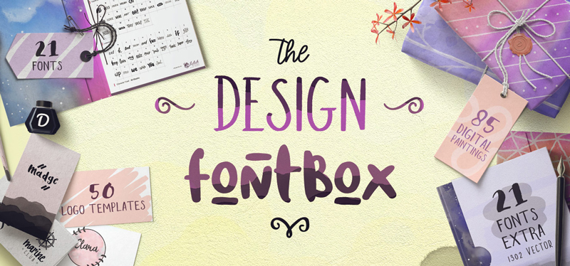
Post pobrano z: Design deals for the week Every week, we’ll give you an overview of the best deals for designers, make sure you don’t miss any by subscribing to our deals feed. You can also follow the recently launched website Type Deals if you are looking for free fonts or font deals. The Design Font box The Design Fontbox is here! Packed with 21 fonts, 21 […]
Post pobrano z: Creative photo campaign for the Mollat bookstores in France This type of photo where a book cover is completed by a person is not new, but always worth sharing when well done. Mollat is one of the rare independant book sellers that’s still successful in France, probably because of their creativity when it comes to promotion. The photo campaign has been widely shared on […]
Post pobrano z: 5 useful tools to create infography quicker Infography is one of the best way to communicate some complex ideas in a simple manner. It’s possible to create infographics from scratch, I’d even say it’s encouraged if you are a graphic designer. However, you will often not have the time or budget to create complex custom infographics. Luckily, there are excellent tools to […]
This was a blockbuster week for front-end developers as CSS Grid landed in the latest versions of Firefox and Chrome without a feature flag. That’s right: we can now go and play with Grid in two of the most popular browsers right away.
But why is CSS Grid a big deal and why should we care?
Well, CSS Grid is the first real layout system for the web. It’s designed for organizing content both into columns and rows and it finally gives developers almost God-like control of the screens before us. That means that we can finally ditch decades of hacks and workarounds for setting elements on a web page – ultimately it means that complex layouts and beautifully typeset pages are now not only possible but easy and maintainable.
With CSS Grid, the web is about to become a much more beautiful place than what we’re accustomed to.
OK, but how does Grid work? There are a lot of complex tutorials out there that go into an awful lot of detail but I think we should start with the very basics. What we’ll be making here is a relatively simple type specimen, with a bunch of characters from an alphabet laid out on a page.
To get started we’ll add our markup:
<div class='wrapper'>
  <div class='letter'>
    A
  </div>
  <div class='letter'>
    B
  </div>
</div>
First up we’ll style those letters to use the right font-size and color and then we’ll center those letters in the divs with flexbox properties like align-items and justify-content. And yes, that’s right! CSS Grid doesn’t replace flexbox properties as much as it compliments what they already do. We can even use many of these properties in conjunction with CSS Grid. But for now let’s return to the demo:
In the example above we have two simple divs sitting on top of one another because they’re default is display: block. Next up we’ll set our parent element to use Grid layout:
Now you might see that nothing really happened. And you’d be right! Unlike setting display: inline-block; or display: inline;, it’s not entirely clear what happens when we set display to grid. In fact, to get our grid to actually do something we first need to feed it a certain number of columns or rows. In this example we’ll just align the letters next to each other into two columns:
Let’s break these new lines of code down. First we create two columns of our grid with grid-template-columns. That 1fr value might seem super weird if you’ve never seen it before but it’s a valid CSS unit that tells each column to be one fraction of our grid. In this instance, that means there will be two columns of equal width.
Hooray! It works. But see that curious gap between the two columns? That’s the background of the wrapper peaking through each letter div and that’s because we’ve set the grid-column-gap property to 1px. Usually, we’d want to give a larger column-gap then that, especially if we’re aligning text blocks next to each other. But in this instance, a single pixel is good enough for us.
So what happens if we add two new letters to our markup? How will that change the layout?
<div class='wrapper'>
  <div class='letter'>
    A
  </div>
  <div class='letter'>
    B
  </div>
  <div class='letter'>
    C
  </div>
  <div class='letter'>
    D
  </div>
</div>
Well, technically it won’t change the grid at all – we’ve already told the grid to have two columns so those two letter divs are going to sit in place directly beneath the others and be exactly 1fr wide:
Now here’s the weird thing – why isn’t there a 1px gap between letters A and C as well as between B and D? Well, grid-column-gap is only for columns and what we’ve effectively done here is create a new row in our grid. We’ll have to use grid-row-gap to see that change take effect:
.wrapper {
  grid-column-gap: 1px;
  grid-row-gap: 1px;
  /* other styles go here */
  /* we could have also used the shorthand `grid-gap` */
}
We’ve created our very first grid. We’ve made a row and a column and all we’ve really had to do is change the markup. But let’s just explore our columns a little more. What would happen if we add another value to the grid-template-columns property? Like this:
.wrapper {
 grid-template-columns: 1fr 1fr 1fr;
}
Well, we’d create another column of course! And notice how we can clearly see the background of the wrapper element now because there aren’t any children to fill that space:
And if we change the value of a fr in that property then that would effectively create what’s known as an asymmetric grid. Let’s say that we wanted our first column in our grid to take up three times the amount of space as the other two columns:
.wrapper {
 grid-template-columns: 3fr 1fr 1fr;
}
That would lead to the columns with A and D to be larger than the other two columns, just as we’d expect:
Isn’t that powerful? No longer do we have to worry about negative margins or the perfect % value of a grid column to align things properly. We can make super complex grids without having to do any of the math that we would’ve been forced to do in the past. Now we just need to add a new value to the grid-template-columns property and voilá, a new grid column appears like magic!
But what about responsive grids, you might ask? Well that’s really just as simple as changing that property within a media query. Let’s say that we want 2 columns as our default grid size then at 500px we want 3 columns and finally, on larger screens, we’ll shift all that content into 4 columns. All we’d need to write is this:
Make sure to open up this demo in a new tab and change the size of the viewport to see the responsive magic happen!
So the grid-template-columns property is a lot more complicated than what I’ve shown here but this is a great starting point. Next up we ought to learn about the real, life-changing property in the CSS Grid spec: grid-template-rows.
Ok, let’s go into it blind. In the small bit of code below, and with what we’ve learned so far about Grid, let’s figure out what this new property might do:
Instead of setting the width of columns and their relationship with one another, we’re now going to set the height of rows and their relationship. So if we have two rows like in our previous demo and the last unit is set to 3fr then that means the second row will always be three times the height of the first:
This might look pretty simple yet previously we’ve never really been able to do this. We’ve always had to write gross hacks like setting a min-height on a specific element or changing a class name. But we’ve never been able to create relationships between rows like this before; that’s what makes CSS Grid so powerful.
With this tiny bit of knowledge and a handful of new properties, we can create fabulously complex layouts – asymmetric and responsive grids being just one small part of them. And so far this has only been a glimpse into the monstrous CSS Grid spec, as there’s an awful lot to cover. But I think that Jen Simmons described it best when she wrote about Grid:
We need to explore CSS Grid until we understand what it wants to do, what it can be forced into doing, and what it refuses to do. Many designers may not ever learn to code CSS, but you need to understand CSS well enough to understand our artistic medium.
And sure, all the code above looks very strange at first. But what it means is that we don’t have to use giant CSS frameworks and also a whole bunch of layout hacks are now completely irrelevant. But what really excites me most about Grid is that it compels us to see the space inside a browser in a completely new way.
We’ll have to not only learn a bunch of new properties, but we’ll also have to entirely rethink what we’ve learned in the past. So CSS Grid is not just a spec but a strange philosophy unto itself.
Let’s figure it out together!
Browser Support
This browser support data is from Caniuse, which also reports this feature is in W3C Candidate Recommendation status.
Desktop
Google Chrome
Mozilla Firefox
Internet Explorer
Opera
Apple Safari
57
52
10*
44
10.
Mobile / Tablet
iOS Safari
Android
Opera Mobile
Android Chrome
Android Firefox
No
No
No
No
No
More Information
Jen Simmons and Rachel Andrew have written a lot of amazing tutorials and walkthroughs on the subject
Without even realizing it, our perceptions are cross-referenced with our memories. Our brains conjure up an emotional reaction when our eyes see familiar shapes, colors, and textures. This fun exercise uses various styles of couches to help you make decisions about the emotional response that best represents the personality of your company (or how you would like your company to be perceived).
So, which couch feels most like your company? Parallel your choice with your company’s brand personality attributes. Insights on effective color and hand-picked typography choices (with links to free fonts) are included and will help codify your communication style. See if your choice aligns with your company’s mission and vision.
Is your brand…
Stylish?
Clean lines, modern, current. That’s a stylish company. Being confident and deliberate in your decision-making shows in everything you do. This company may associate themselves with a Mid-Century modern look.
Recommendations:
For color — go fruity for the main color, use: orange, plum, lime, blueberry, etc. ground it with a gray or charcoal. A geometric sans-serif font like Raleway will feel contemporary yet timeless; look cutting-edge yet approachable —all staying in line with that sharp stylish image.
Pragmatic in its approach, this company can accommodate almost anything that is thrown its way. The agile company appeals to people who want to get things done no matter what road blocks they come against. Energetic and flexible, this company is always on its toes.
Recommendations:
A fun muted tone with sage greens and slate blues will keep the look grounded. The typography should be super clean while the layout is geometric and modular. A condensed font face like Alpin Gothic will make an excellent evergreen typeface solution for your logotype.
Communication is key. Relationships are important to your organization both internal and external. Decisions are not made in a vacuum but are a result of the collaboration of many minds. Your company culture is perceived as young, thoughtful, and deliberate.
Recommendations:
The color family is a pop of color grounded in neutrals. Pick one strong color. Don’t clash hues. Balance a dominant color with lots of white. For a logotype, stay friendly and timeless with a sans-serif font such as, Langdon.
Case in Point:
Team Dandelion, ideation firm
Rustic?
Solid furniture, wood, and leather — heirlooms that evoke a rugged, organic tone. You take your work seriously. You are a meat and potatoes kind of company.
Recommendations:
Stay earthy or let your corporate identity color palette go beyond greens and chestnut browns with inspiration drawn from the colors of autumn leaves, baked clays, and terracotta. Keep the font strong, legible, and simple by using a san-serif or get bold with a slab font like Museo Slab. A showy, novelty font will dilute your message.
Happy and productive corporate or retail culture. This is a place where ideas become realized and enthusiasm is valued. The employees feel appreciated and are proud to be associated with the company.
Recommendations:
Let go a little with this color palette. Explore colors such as vintage teal, pink, or robin’s egg blue. Conversely, use a neutral as a secondary color to counter the fun color and ensure a professional feel. Play with a bold, retro script like, Grand Hotel for a logotype. Steer clear of novelty fonts. Over-designed fonts make you look like you are screaming for attention and may come off as amateurish. Downplay to stay above the pack.
A bookshelf laden with books from every generation and a smart looking desk lamp define this category. Rich in tradition and high on integrity, you’re a company built on a solid reputation that has garnered great respect from years of experience and deep knowledge of your industry.
Recommendations:
Consider darker colors to convey depth and couple it with several shades of an earthy tone: a mid-tone khaki or charcoal gray. Using a classic typeface with contrasting thick and thin strokes will be easily readable. A serif typeface will represent stability and credibility, along the lines of Crimson in upper and lower case.
Karen Barranco is originally from New Orleans and now in Los Angeles. In 2000 she founded Special Modern Design and her work has been been published internationally in books, print magazines, and online, including being featured on lynda.com and being hand-picked by Shepard Fairey to represent the „Revitalization of the Los Angeles River by 2020” initiative. Logos With Soul is a spin-off company for designers.
 credit:Gentiana Shabani
 credit:Sorbet Design
 credit:KJ Mska
 credit:Marc Cybe
 credit:Amber Dee
 credit:Laura Reeves
 credit:Sarah Brockett
 credit:Rosie Gopaul
 credit:Shao ?
 credit:Eszter Laki
 credit:Ralee N.
 credit:filthymedia ltd
 credit:Nastya Novikova
 credit:Martin Dvorak
 credit:Alyssa MacLeod
 credit:Jing Gao
 credit:Christos Andronicou
 credit:Laith Wallace
 credit:nathan somers
 credit:Sarah Babetski
 credit:Amanda Lee Krueger
 credit:Shai Long