Post pobrano z: Infinity Foods
Archiwum miesiąca: marzec 2017
C&C Coffee Co.
Post pobrano z: C&C Coffee Co.
Need to do Dependency-Free Ajax?
Post pobrano z: Need to do Dependency-Free Ajax?
One of the big reasons to use jQuery, for a long time, was how easy it made Ajax. It has a super clean, flexible, and cross-browser compatible API for all the Ajax methods. jQuery is still mega popular, but it’s becoming more and more common to ditch it, especially as older browser share drops and new browsers have a lot of powerful stuff we used to learn on jQuery for. Even just querySelectorAll is often cited as a reason to lose the jQuery dependency.
How’s Ajax doing?
Let’s say we needed to do a GET request to get some HTML from a URL endpoint. We aren’t going to do any error handling to keep this brief.
jQuery would have been like this:
$.ajax({
  type: "GET",
  url: "/url/endpoint/",
}).done(function(data) {
  // We got the `data`!
});
If we wanted to ditch the jQuery and go with browser-native Ajax, we could do it like this:
var httpRequest = new XMLHttpRequest();
httpRequest.onreadystatechange = ajaxDone;
httpRequest.open('GET', '/url/endpoint/');
httpRequest.send();

function ajaxDone() {
  if (httpRequest.readyState === XMLHttpRequest.DONE) {
    if (httpRequest.status === 200) {
      // We got the `httpRequest.responseText`!
    }
  }
}
The browser support for this is kinda complicated. The basics work as far back as IE 7, but IE 10 is when it really got solid. If you wanna get more robust, but still skip any dependencies, you can even use a window.ActiveXObject fallback and get down to IE 6.
Long story short, it’s certainly possible to do Ajax without any dependencies and get pretty deep browser support. Remember jQuery is just JavaScript, so you can always just do whatever it does under the hood.
But there is another thing jQuery has been doing for quite a while with it’s Ajax: it’s Promise based. One of the many cool things about Promises, especially when combined with a „asynchronous” even like Ajax, is that it allows you to run multiple requests in parallel, which is aces for performance.
The native Ajax stuff I just posted isn’t Promise-based.
If you want a strong and convenient Promise-based Ajax API, with fairly decent cross-browser support (down to IE 8), you could consider Axios. Yes, it’s a dependency just like jQuery, it’s just hyper-focused on Ajax, 11.8 KB before GZip, and doesn’t have any dependencies of its own.
With Axios, the code would look like:
axios({
  method: 'GET',
  url: '/url/endpoint/'
}).then(function(response) {
  // We got the `response.data`!
});
Notice the then statement, which means we’re back in the Promise land. Tiny side note, apparently the requests don’t look identical to jQuery on the server side.
Browsers aren’t done with us yet though! There is a fairly new Fetch API that does Promise-based Ajax with a nice and clean syntax:
fetch('/url/endpoint/')
  .then(function(response) {
    return response.text();
  })
  .then(function(text) {
    // We got the `text`!
  });
The browser support for this is getting pretty good too! It’s shipping in all stable desktop browsers, including Edge. The danger zone is no IE support at all and only iOS 10.1+.
Need to do Dependency-Free Ajax? is a post from CSS-Tricks
CSS-Tricks Chronicle XXX
Post pobrano z: CSS-Tricks Chronicle XXX
I got a chance to be on the Thunder Nerds podcast the other week, on the episode 55 – Down Wit SVG? Yeah You Know Me with Chris Coyier. We got to talk about a variety of things that I work on, including Practical SVG, CodePen, this site, ShopTalk, and upcoming conferences. Speaking of which…
The very next thing I’ll be speaking at is An Event Apart in Seattle on April 3-5, 2017. I’m also doing the A Day Apart workshop, which I gave a tiny sneak peek at the other day.
I’ll be at most of the other An Event Apart shows this year as well: Boston, Chicago, San Francisco, and Denver.
The AEA gang interviewed me about a bunch of interesting stuff recently, as well.
Other conferences I’ll be at this year include:
- June 16, 2017, CSS Day, Amsterdam, NL
- August 17, 2017, Build Right: Maker Series, Dayton, Ohio
- September 25-26, 2017, Web Unleashed, Toronto, Canada
- October 9-11, 2017, CSS Dev Conf, New Orleans, LA
And at least two more that I’ll need to wait to mention until they get something online for.
Sarah Drasner also keeps our Guide to 2017 Conferences post up-to-date, if you want to look more broadly at what’s out there.
We’ve shut down the shop here on CSS-Tricks. It’s likely temporary as we kinda revamp the merch in there and freshen things up. No exact plan yet, but of course we’ll let you know when it’s back open again.
Since the new year, Dave and I have been very steadily publishing new episodes of ShopTalk, and we have plenty more lined up. If you’re anything like me, your podcast listening behavior fluctuates and you go in and out of it. If you’re about to go into an „in” phase, might I recommend”
- 247: The Performance Equation
- 248: AMP
- 250: Web Security
CodePen Radio is also going strong. We’re up to 120 already! I might recommend:
Speaking of CodePen, if you’re a PRO user, you might have already gotten an email about our latest feature, now in BETA. It will be our biggest release ever on CodePen. If you had any sense at all that releases on CodePen were slowing down, you might have been right, because we’ve been so heads-down on this thing for over a year.
That’s not to say there isn’t anything new. We’ve release things like a revamped Autocomplete, new fonts like Fira Code and an updated Monoid, persistent editor layout, improved CORS handling, improved infinite loop detection, and plenty more.
We’ve also started sending another weekly newsletter called The CodePen Spark that is loaded with amazing work from that week. We’re already up through week 15!
CodePen Meetups are also hopping. I’m gearing up to go to one tonight, here in Miami where I have been living the past few months. I also recently got to attend the one in Denver, which was huuuuge. I’ve never been to one I didn’t have a good time and learn something at.
They’ve also been as international as ever! We have plenty in the United States, but There are upcoming meetups in places like:
- Auckland, New Zealand
- Sylhet, Bangladesh
- Örebro, Sweden
Bulgaria just had their first! Dublin has had fourteen! If you’d like to host one in your area, you can.
Last but not least, the CSS-Tricks Newsletter gets better all the time. Remember it’s completely hand-written these days to explain all the most interesting stuff that week and much of it is unique to the newsletter.
CSS-Tricks Chronicle XXX is a post from CSS-Tricks
THE PROCESS
Post pobrano z: THE PROCESS

How to Create a Camo Fabric Text Effect in Adobe Photoshop
Post pobrano z: How to Create a Camo Fabric Text Effect in Adobe Photoshop

In this tutorial I will show you how to create a camouflage or „camo” fabric text effect in Adobe Photoshop. You will learn how to use some Photoshop filters and create patterns with them. Then you will learn how to use the patterns with layer styles to create the final result.
If you’d like to skip this tutorial but still wish to buy the text effect, you can head over to GraphicRiver and buy Fabric Styles.
The complete pack has eight different text effects and works with shapes and text.

Tutorial Assets
The following assets were used during this tutorial:
- Aller Display
- Background and Contour inside the zip file attached to this tutorial.
1. How to Create the Fabric Pattern
Step 1
Open Photoshop and create a new 18 x 18 px document.

Step 2
Change the foreground color to #6b6b6b.

Step 3
Press Control-Shift-N to create a new layer. Then pick the Rectangle Tool and draw a 6 x 6 px square in the top left corner (You can zoom in on the image with Control-Space-Left-Click).
We need a texture just like the image below. Note that we have three different colors on the image: #6b6b6b for the light color, #3f3f3f for the medium color, and #121212 for the dark color. Keep doing 6 x 6 px squares on separate layers until you fill the entire 18 x 18 px document.

Step 4
Go to Edit > Define Pattern and name the pattern Fabric Texture Tutorial. Then click OK to save the pattern.

2. How to Create the Camo Texture
Step 1
Create a new 486 x 486 px document.

Step 2
Press D to reset the foreground and background colors. Then go to Filter > Render > Clouds.

Step 3
Go to Filter > Pixelate > Mosaic, set the Cell Size to 18 square, and click OK.

Step 4
Go to Filter > Filter Gallery. Then select Cutout in the Artistic category with these settings:
- Number of Levels: 4 or 5 (test and see which one you like more)
- Edge Simplicity: 1
- Edge Fidelity: 1

Step 5
Now double-click on the Background layer to unlock the layer. Then rename it Base Camo and click OK.

Step 6
Double-click the layer Base Camo to open the Layer Style window. Add a Pattern Overlay with these settings:
- Blend Mode: Hard Light
- Opacity: 52%
- Pattern: Select the pattern that we created before (Fabric Texture Tutorial)
- Scale: 100%
- Link with Layer: Checked
Click OK.

Your image should look like this:

Step 7
Go to Window > Adjustments to open the Adjustments panel.

Step 8
Add a Gradient Map by clicking on the last icon of the panel.

Step 9
Double-click on the gradient icon of the layer Gradient Map 1. The Properties panel will pop up.

Step 10
Click on the gradient bar of the Properties panel to open the Gradient Editor.
You can play with this next step and make different colors. I’m going to create a green texture.
Create a gradient with these settings:
- First Stop Color:
#0c1005 - First Stop Position: 0%
- Second Stop Color:
#8aa269 - Second Stop Position: 51%
- Third Stop Color:
#e3efcc - Third Stop Position: 100%

Step 11
Select the layer Base Camo and go to Edit > Define Pattern, and then name the pattern Camo Fabric and click OK.

3. How to Create the Texture of the Border
Step 1
Create a new 4 x 4 px document with a black background.

Step 2
Zoom in on the image until you see the individual pixels. Then pick the Pencil Tool with a size of 1 px and draw a diagonal white line as shown in the image below.

Step 3
Go to Edit > Define Pattern and name it Border Texture.

4. How to Create the Layer Styles
Step 1
Open the Background image that is inside the zip attached to this tutorial.

Step 2
Pick the Type Tool (T) with the font Aller Display and size of 179 pt and write FABRIC. Then place it on the shelf of the background.

Step 3
Double-click on the text layer to open the Layer Style window.
Let’s start with the Pattern Overlay so that we will be able to see what is happening on the image.
Add the Pattern Overlay with these settings:
- Blend Mode: Normal
- Opacity: 100%
- Pattern: Select the texture that we created (Camo Fabric)
- Scale: 25%
- Link with Layer: Checked

Step 4
Add a Bevel & Emboss with these settings:
- Style: Emboss
- Technique: Smooth
- Depth: 174%
- Direction: Up
- Size: 4 px
- Soften: 0 px
- Use Global Light: Unchecked
- Angle: 90º
- Altitude: 48º
- Gloss Contour: Click on the box and Load to install the contour file that is inside the zip
- Highlight Mode: Screen
- Highlight Mode Color:
#ffffff - Highlight Mode Opacity: 10%
- Shadow Mode: Normal
- Shadow Mode Color:
#364928 - Shadow Mode Opacity: 81%

Step 5
Add a Stroke with these settings:
- Size: 4 px
- Position: Outside
- Blend Mode: Normal
- Opacity: 100%
- Overprint: Unchecked
- Fill Type: Pattern
- Pattern: Select the pattern Camo Fabric
- Scale: 25%
- Link with Layer: Checked

Step 6
Add an Inner Shadow with these settings:
- Blend Mode: Linear Light
- Opacity: 2%
- Use Global Light: Unchecked
- Angle: -27º
- Distance: 6 px
- Choke: 6%
- Size: 8 px
- Contour: Linear
- Anti-Aliased: Unchecked
- Noise: 0%

Step 7
Add an Inner Glow with these settings:
- Blend Mode: Overlay
- Opacity: 20%
- Noise: 0%
- Color:
#ffffff - Technique: Softer
- Source: Center
- Choke: 39%
- Size: 27 px
- Contour: Linear
- Anti-Aliased: Unchecked
- Range: 85%
- Jitter: 0%

Step 8
Add an Outer Glow with these settings:
- Blend Mode: Linear Light
- Opacity: 100%
- Noise: 59%
- Color:
#969c8e - Technique: Softer
- Spread: 100%
- Size: 4 px
- Contour: Linear
- Anti-Aliased: Checked
- Range: 100%
- Jitter: 0%

Step 9
Add a Drop Shadow with these settings:
- Blend Mode: Normal
- Color:
#000000 - Opacity: 100%
- Use Global Light: Unchecked
- Angle: 146º
- Distance: 1 px
- Spread: 26%
- Size: 10 px
- Contour: Linear
- Anti-Aliased: Unchecked
- Noise: 0%
- Layer Knocks Out Drop Shadow: Checked

Step 10
Select the text layer and press Control-J to duplicate it. Then rename the copy to Camo TOP.

Step 11
Right-click on the layer Camo Top and choose Clear layer style. Then double-click it to open the Layer Style window.
Add a Bevel & Emboss with these settings:
- Style: Emboss
- Technique: Smooth
- Depth: 174%
- Direction: Up
- Size: 4 px
- Soften: 0 px
- Use Global Light: Unchecked
- Angle: 90º
- Altitude: 48º
- Gloss Contour: Select the contour that we installed before (Fabric Custom)
- Anti-Aliased: Checked
- Highlight Mode: Screen
- Highlight Mode Color:
#ffffff - Highlight Mode Opacity: 0%
- Shadow Mode: Normal
- Shadow Mode Color:
#4d6326 - Shadow Mode Opacity: 15%

Step 12
Add a Stroke with these settings:
- Size: 2 px
- Position: Outside
- Blend Mode: Linear Dodge (Add)
- Opacity: 45%
- Overprint: Unchecked
- Fill Type: Pattern
- Pattern: Select Border Texture (This will create the illusion of stitching on the edges)
- Scale: 200%
- Link with Layer: Checked

Step 13
Add an Inner Shadow with these settings:
- Blend Mode: Soft Light
- Color:
#000000 - Opacity: 20%
- Use Global Light: Unchecked
- Angle: -27º
- Distance: 0 px
- Choke: 62%
- Size: 10 px
- Contour: Linear
- Anti-Aliased: Unchecked
- Noise: 0%

Step 14
Add an Inner Glow with these settings:
- Blend Mode: Overlay
- Opacity: 4%
- Noise: 0%
- Color:
#ffffff - Technique: Softer
- Source: Center
- Choke: 53%
- Size: 16 px
- Contour: Linear
- Anti-Aliased: Unchecked
- Range: 85%
- Jitter: 0%
After that, click OK.

Congratulations, You’re Now Done!
In this tutorial, you learned how to create a camo fabric text effect in Adobe Photoshop.
We started out by creating a fabric texture, then we created a camo texture and merged both textures. Then we created a third texture for the border of the text. After that, we created two layer styles using all three textures.
Don’t forget to save the styles, so you can use it with other things.

I hope you have enjoyed this tutorial, and feel free to leave your comments below.
This text effect we just created is part of Fabric Styles.

How to Create Flat Design Easter Icons in Adobe Illustrator
Post pobrano z: How to Create Flat Design Easter Icons in Adobe Illustrator

Easter is a lovely spring holiday, which is
well known for its tradition of painting eggs. It’s usually associated with
gentle, vivid colors and a spring mood. In this tutorial, we’ll go through a
descriptive process of creating of flat Easter icons, using basic shapes, the
Pathfinder panel and some of the new Adobe Illustrator tools.
Apart from making Easter icons, these techniques
can be used to create any type of flat icons or flat banners as well.
If you’re interested, you can purchase these icons as well as many others as part of an Easter Icon Set on GraphicRiver.

1. Make Festive Easter Egg Icons
Step 1
Let’s start by making the base of the egg.
Take the Ellipse Tool (L) and make a
70 x 70 px circle. Select its side anchor points with the Direct Selection Tool (A) and drag them down a bit, making the
bottom of the shape bulged. Then select the upper anchor point and drag it up,
making the top of the egg pointed.

Step 2
We’ll be using a bright spring palette with
gentle colors that you can pick up directly from the screenshot below with the Eyedropper Tool (I) while holding the Shift key.
Fill the base of the egg with yellow and
keep a copy in back (Control-C > Control-B), as we may
need it later.
Now let’s depict the decorative ornament above the egg. Take the Rectangle Tool
(M) and make a 70 x 15 px blue shape.

Step 3
Take the Line Segment Tool (\), hold Shift
and make a horizontal shape with pink Stroke
of 3 pt Stroke Weight.
Let’s align all the shapes to the egg. Select everything (Control-A) and click
the egg while holding Alt in order
to make it a Key Object (you
will see a thick selection around it). Head to the Align panel and click Horizontal
Align Center.

Step 4
Now let’s modify the pink line. Select it
and go to Effect > Distort & Transform > Zig Zag. Set the Size to 5 px, Ridges per segment to 7
and Points to Smooth.
Object
> Expand the shape to apply the effect.

Step 5
Add another rectangle to the bottom of the
egg and fill it with green color. Now let’s delete those parts of the
rectangles outside the egg. We’ll be using one of the new Adobe Illustrator
tools: the Shaper Tool (Shift-N). Take
the Shaper Tool (Shift-N) and just
scribble above the piece that you want to delete. Repeat the same with other unwanted parts.
If you’re working with earlier versions of
Adobe Illustrator, try using the Shape
Builder Tool (Shift-M) instead. It works almost the same—just select
everything and click the unwanted pieces while holding Alt.
We will also try another way of hiding the
unneeded parts a few steps later, when we’ll be making another egg.

Step 6
Select the modified egg and Object > Expand it. Then select the
yellow middle of the egg together with the pink zigzagged line and Divide them in the Pathfinder panel, breaking the shape into two equal
halves.

Step 7
Fill the upper piece of the divided shape
in a nice pink color. Take the Ellipse
Tool (L) and make a 5 x 5 px
circle. Hold Alt-Shift and drag the
circle to the right, creating a couple of copies.

Step 8
Now that the basic view of the egg is ready,
let’s add a flat-style shadow, covering one half of the egg. Group (Control-G) all parts of the egg,
Copy and Paste in Front (Control-C > Control-F). Keeping the copy
selected, Unite it in the Pathfinder, merging it into one
silhouette.
Draw a vertical line across the egg, using
the Line Segment Tool (\). Align the
line to the egg silhouette, making the egg a Key Object.
Keeping the line and the egg silhouette
selected, Divide them in the Pathfinder.
Delete one of the pieces and switch the
remaining half to Multiply mode,
making it semi-transparent.

Step 9
Now let’s make another egg!
We already have a base, as we’ve made a
copy of it in the very first step. Move it aside and fill with orange color. Add
decorative elements on top and let’s see another way in which we can hide the
unneeded pieces. Duplicate the basic
shape once again (Control-C >
Control-F) and Bring it to Front (Shift-Control-]).
Select all the elements, right click and Make Clipping Mask. Here you have it!

Step 10
Let’s add a few more decorative elements to
the egg. Make two 5 x 5 px circles
above the yellow stripe of the egg, placing them closer to the edges. Select
both circles and either use the Blend
Tool (W) or go to Object > Blend
> Make. Then open the Blend
Options window (Object > Blend
> Blend Options) and set the Spacing
to Specified Steps with a value of 3.
Object
> Expand the Blend group and add more circles in
the upper part of the egg, filling them with yellow color.

Step 11
When you’re satisfied with the result, add a
semi-transparent flat shadow to one half of the egg.
Combine the eggs. Use the Rounded Rectangle Tool to make a
light-green background for our icon.
Make a square with the Rectangle Tool (M) and rotate it by 45 degrees with the Selection
Tool (V) while holding Shift.
Fill the rectangle with linear gradient
from light-green to white and switch it to Multiply
Blending Mode, making a semi-transparent long shadow.

Step 12
Duplicate the light-green background and
place the shadow between the copies. Use a Clipping
Mask to hide the unwanted piece of the long shadow.
Great! Our first icon is ready! Let’s move
on to the next one.

2. Make a Cute Bunny Icon
Step 1
Make a 70 x 70
px grey circle for the bunny’s head. Move the side anchor points
down a bit with the Direct Selection
Tool (A) to make the head slightly squashed.
Now let’s form the ears. Take the Ellipse Tool (L) and make a 15 x 50 px oval. Move its side anchor
points up a bit, making the top of the ear wider. Keeping the shape selected,
go to Object > Path > Offset Path
and set the Offset value to -5 px, leaving all other options as
default. This way we create a smaller shape for the inner part of the ear.

Step 2
Fill the inner part of the year with pink
color, group both parts of the ear and Send
to Back (Shift-Control-[). Double-click the Rotate Tool (R) to open the options window and set the Rotate Angle value to -20 degrees.

Step 3
Use the Reflect Tool (O) to flip the ear over the Vertical Axis and click Copy
to form the second ear on the opposite side of the head. You can group both
ears and Align them to the head,
making the whole set perfectly centered.
Squash the head base a bit more.

Step 4
Use the Ellipse Tool (L) to form a pair of dark glossy eyes with white
highlights and a circle for the nose. Take the Scissors Tool (C) and click both side anchor points of the nose in
order to split the shape into two halves.

Step 5
Delete the upper half and turn the
remaining part into a cute bunny nose. Press X to swap Fill and Stroke colors. Set the Stroke Weight to 2 px
and change the Variable Width Profile
in the control panel on top. Create two copies of the nose and make them
somewhat thinner and lighter, forming a mouth as shown in the screenshot below.

Step 6
Let’s finish up with our bunny by adding
tiny whiskers to his head. Make a 9 px
horizontal stroke of 1 pt, using the
Line Segment Tool (\). Rotate the
whiskers a bit and add them to both sides of the face.

Step 7
Add a flat shadow to one half of the
bunny’s head, as we did previously. Form a rounded rectangle for the background
and create a semi-transparent long shadow to finish up with the icon.
If you feel any difficulty in adding a long shadow to a complex object, check out the following tutorial from Part 7, Step 1 and onwards in order to find out how to give our long shadow the desired shape.
There you
have it! Let’s move to the next icon!

3. Make a Cute Chicken Icon
Step 1
This time we’ll depict a funny little
chicken popping out of the egg. First of all, make a striped egg with a few stripes
or other decorative elements to your liking, using the techniques that we’ve
learned in previous steps.
We need to remove the top part of the egg,
creating a cracked edge. Keep a copy of the egg’s base somewhere in the bottom, because we will need it later to form our chicken.
Make a horizontal line across the egg and
apply Effect > Distort &
Transform > Zig Zag. Set the Size
to 4 px, Ridges per segment to 7
and Points to Corner in order to
make the cracked edges sharp.

Step 2
Object
> Expand the zigzagged line and position it
across the egg, in the center of it. Copy the blue base of the egg, Paste
in Front (Control-C > Control-F) and Bring it all the way to
Front (Shift-Control-]), placing it on top of all the elements.
Select the zigzag and the egg base and Divide them in Pathfinder. Delete the upper part of the divided shape.
Finally, select everything, right click and Make Clipping Mask. Great! The cracked
piece of the egg is ready. Let’s put a chicken into it.

Step 3
Reveal the copy of the egg base that we’ve
created previously and fill it with gentle yellow color for the chicken’s body.
Shrink the shape to 60 x 75 px, making
it smaller. Select the side anchor points with the Direct Selection Tool (A) and drag them up a bit, making the
chicken rounder.

Step 4
Take the Polygon Tool and single-click
anywhere on the Artboard to open the pop-up options window. Make a 15 x 10 px triangle for the beak and fill
it with orange color.
Combine two triangles to form a beak and
squash them to form the proper shape. Don’t forget to add a pair of shiny eyes.
We can copy them from our bunny icon.

Step 5
Add a couple of oval wings, using the Ellipse Tool (L). Place the copy of the
chicken’s body above the wings and Make
Clipping Mask to hide the unneeded elements inside the mask.

Step 6
Finish up with the icon by adding all the
necessary elements like shadows and background. Awesome!
Let’s move on to our last icon and finish
our Easter set!

4. Make a Gift Box Icon
Step 1
Let’s start shaping our box from a 60 x 40 px green rectangle. Form a top of the box from a 65 x 15 px orange rectangle.

Step 2
Now let’s create a ribbon across the box.
Select both parts of the box and remember the mutual height of the shapes. You can find it in the Transform
panel. In our case, it is 55 px.
Make a blue ribbon of 5 x 55 px size,
placing it right in the center of the box. Add a smaller 5 x 15 px piece of ribbon at the top of the box, filling it with
darker blue color.

Step 3
Use the Pencil Tool (N) to make a bow with blue Stroke of 2 pt Weight.

Step 4
Let’s decorate our box with some ornament
or pattern. Copy the base of the box
and Paste it in Front (Control-C > Control-F).
Head to the Swatches panel, open the Swatch Libraries menu > Patterns > Basic
Graphics > Basic Graphics_Lines. Find the 10 lpi 30% swatch and click to apply a pattern with horizontal lines.

Step 5
Keeping the textured shape selected, double-click the Rotate Tool (R) and set the Angle
to 45 degrees. Deselect the Transform Objects checkbox and click OK, changing the direction of
the stripes.

Step 6
Let’s change the color of the stripes to
make them match our overall palette. Double-click
the applied pattern in the Swatches
panel to isolate it in the Pattern Mode.
Apply a light-green color to the Strokes
in the Color panel and click Done in the upper part of the working
area.

Step 7
Finish up with the icon by adding depth
with the help of the shadows and simple background.

Our Set of Icons Is Finished! Happy Easter!
Congratulations! We’ve done a great job, learning how to use the Shaper Tool and how to use work with basic shapes and the Pathfinder
panel. We can use these simple techniques to expand our set and create
more festive flat Easter icons!

If you’re interested, you can purchase these icons as well as many others as part of an Easter Icon Set on GraphicRiver.

How to Draw a Dalmatian Dog
Post pobrano z: How to Draw a Dalmatian Dog

In this tutorial, I’ll show you how to draw a Dalmatian dog with ink liners. Creating a black and white artwork with a high contrast may seem challenging. This step-by-step process will give you an example of how to use the basic principles of drawing to create impressive ink artworks.
We will also explore effective methods of depicting hair and making the texture look credible.
This is a stylized drawing of a dog. If you’re looking for how to draw a dog step by step, which is more anatomically correct, we have you covered.
What You Will Need
- Two sheets of paper
- Ink liners number 0.05, 0.1 and 0.3
-
A pencil (I recommend using an HB type)

1. How to Draw a Pencil Sketch
Step 1
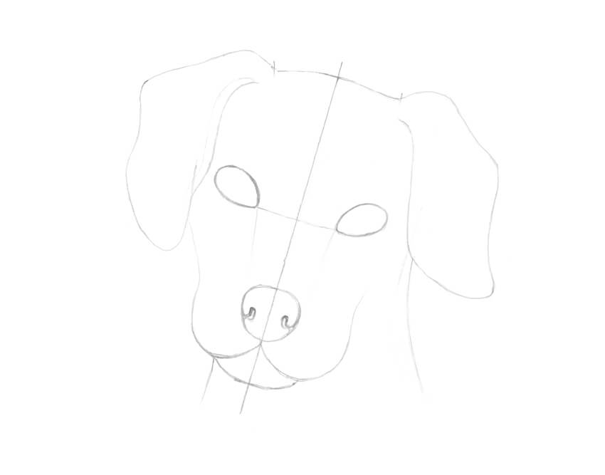
First, we need to construct the dog’s head and think over the details. I draw an axis line and mark the upper and lower borders of the head.
Having an axis line is very useful because you can use it for checking the symmetry in your drawing.

Step 2
I mark the shapes of the eyes; they are located slightly above the center of the head.
I also outline the general shape of the dog’s nose and mark the side borders of the head.

Step 3
I outline the jaw and the bottom part of the snout.

Step 4
I draw the nostrils.

Step 5
I add the ears. To make this process easier, I imagine that I’m drawing two pieces of thick cloth at the sides of the dog’s head.

Step 6
I mark the neck of the animal with two vertical lines.
Step 7
I create shaded areas of the black spots. I draw them anywhere I feel appropriate, accentuating the eyes and ears. A small spot in a shape of a heart on the forehead looks like a lovely addition.

Step 8
I also mark the small highlights in the dog’s eyes.

2. How to Draw Hair
Step 1
To create an illusion of hair, I usually use hatching. The lines can be long or short; sometimes they even turn to dots.

Step 2
I create a simple hatching; the lines slightly differ from each other. It is a basic pattern for the light-colored hair.

Step 3
Another way of drawing hair is by creating layers of hatching. It is also a great method for darkening and increasing the value.
Additional lines may be located between the existing ones and repeat their direction, or they may cross the base hatches at an angle.

Step 4
It is possible to add rounded lines to create an illusion of volume. This method of drawing is also known as contour hatching because it repeats the real shape of an object.

3. How to Draw a Dog With Ink Liners
Step 1
I make a clean copy of my drawing with a pencil, transferring the main contours onto a blank sheet of paper.
You can use a light table of just a window during the day for performing this step. Try to create light lines so that they won’t interfere with your future ink drawing.

Step 2
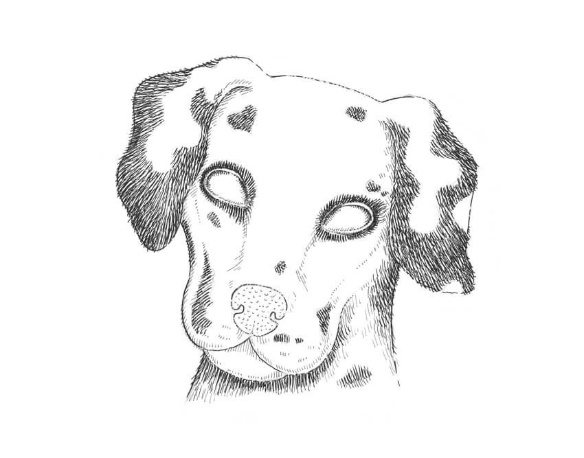
With the 0.3 ink liner, I outline the contours.
I recommend drawing interrupted lines; they seem more organic and allow you to achieve an illusion of diversity.

Step 3
I use the 0.1 liner to mark the black spots. I imagine that the hatches are going from the center of the snout to the periphery.

Step 4
With the 0.05 ink liner, I add thin hatches to create shady areas.

Step 5
I use the 0.05 liner to create the texture of the dog’s nose, drawing small, rounded lines.

Step 6
With the 0.05 liner, I apply the contour hatching to the eyes, accentuating their volume.

Step 7
I use the 0.3 ink liner to darken the black spots. Wider lines seem to be darker than thin ones, so this tool is perfect for creating black areas.
Please note that the lines are going beyond the contours that we outlined previously.
Step 8
I draw the white hair of the ears and neck with the 0.05 liner.

Step 9
I continue creating an illusion of light-colored hair on the dog’s snout, using the 0.05 liner.

Step 10
With the 0.05 ink liner, I work on the central part of the snout, the nose, and the forehead.

Step 11
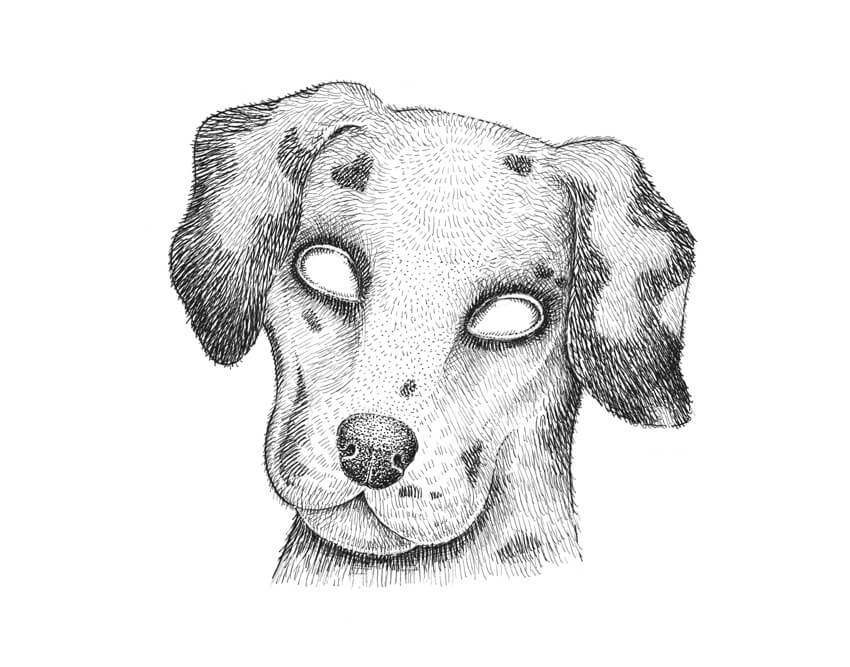
I add dots to the nose, using the 0.3 ink liner. The upper part of the nose is lighted, so I add only one layer of dots there.

Step 12
With the 0.1 liner, I draw rounded hatches on the sides of the nose, emphasizing its volume.
Step 13
I use the 0.1 ink liner to apply cross-hatching to the eyes, marking the pupils.

Step 14
With the 0.1 ink liner, I work on the eyes and expand the hatching there. Please be sure to leave small areas of blank paper for the highlights.

Step 15
With the 0.05 ink liner, I accent the shady areas, adding groups of thin hatches.
While working on the light-colored textures like hair, it is necessary to be accurate with the value in the drawing and increase it gradually.

Step 16
The drawing needs higher contrast, so I use the 0.3 ink liner to accent the black spots.
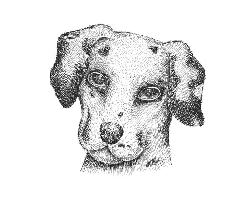
Step 17
With the 0.3 liner, I add another layer of hatching to the darkest areas of the eyes.

Step 18
I use the 0.3 ink liner to model the eyelids. I darken the outer corners of the eyes and leave only a thin line of blank paper on the upper eyelid.

Step 19
I add hatching to the nose, the jaw, and all the shady areas, using the 0.1 liner.

Step 20
As final touches, I add more cross-hatching to the sides of the head with the 0.05 liner.
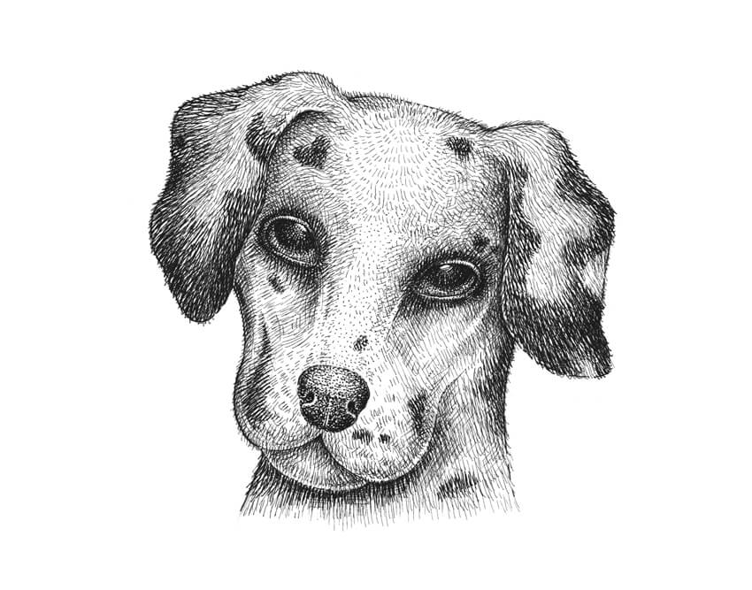
Your Drawing Is Complete
Congratulations! I hope you enjoyed both the process and the result.
Understanding the principles of conveying the light-and-shadow relationships is the core of successful drawing with ink. If you add it to the skill of observation, you will be able to depict anything you wish.
Good luck on your creative journey!

«White Square» advertising festival: deadline is coming!
Post pobrano z: «White Square» advertising festival: deadline is coming!
International Advertising Festival «White Square», one of the leading creative events in advertising and communications industry of Eastern Europe, will be held for the 9th time already on April 27-29 in the capital of Belarus – Minsk. Regardless the fact, that the deadline in only on April 7, it’s better to hurry up and that […]
How to Start a Vlog on a Budget (Tutorial)
Post pobrano z: How to Start a Vlog on a Budget (Tutorial)
Vlogs have become more and more popular over the last year and have seen well-known people start daily Youtube Shows about their lives for other people to watch and follow along. Now a lot of people think that you need the most expensive cameras out there to make a good quality show, a part of that is true, but Casey Neistat did dispell that myth. He used an entry level camera for his daily videos and amassed a nice following of more than 6 Million people over the course of launching his daily vlogs or video blogs (Whichever way you want to reference them as).
I also decided to challenge myself and ended up launching a daily vlog with the commitment of 365 episodes. I’m now on episode 42 as you can see below. The reason why I’m publishing this tutorial here today is because I want more people to realize that it isn’t hard to start your own Youtube channel. The motivation behind why you’re doing it is going to depict whether you make a success out of it or not, but in the end, if you stay committed you will come out on top.
Check out this video on how to start a vlog on a budget and make sure to check out my Youtube channel and remember to say hi when you do. JacquesvhTV on Youtube
If you have any questions or critique, do let me know.
Cheers,
JvH