While it is true that more people now conduct searches for products and brands online than they do from print media, it is also true that a huge percentage of people searching for those very same products and brands were directed there from some form of print media. If you are looking for a well-rounded marketing strategy for your business, it pays to understand the benefits of making print and digital media work together to broaden your reach. Here are just three of those benefits.
1. Many People Still Prefer Print Communications
If you are currently in the process of devising a marketing strategy, one thing you might want to be aware of is the fact that many people still prefer print communications over their digital counterpart. In a recent article posted by the Printing Industries Alliance, it was noted that greater numbers of people responded to direct mailings than advertisements of the same product online. Is it because their screen is constantly bombarded with so many popups that they simply close them off without taking a moment to read them?
It isn’t yet clear why this is happening but the PIA states that more people will respond to direct mail than online ads, even though online ads have the potential to reach a larger audience quicker. Now with the ability to use an online printing site when creating your own marketing mailers, you can save a ton of money with custom print jobs. Doesn’t it make sense to add direct mailing to your advertising campaign that will correspond directly to what you are using in digital form online? This way you capture a broader market share!
2. High Percentage of People Will Read Print Media vs. Online Content
While there are those who will spend hours reading content online, and these are the people you are marketing to with digital media, there are those who will read something in a journal or newspaper in its entirety but merely glance at its digital counterpart. Again, it isn’t yet understood why this phenomenon is happening but the reality is that if you have something to say, it is more likely that a reader will stick it through to the end in print form.
However, if you are using short bits of advertising with custom graphics or photos, you will almost certainly get a higher response online. The trick is to grab the reader’s attention within just a few seconds. Learning to use both print and digital media in your marketing strategies will ensure that you reach those who want more information as well as those whose interest is sparked with an image or a short sentence or two. It pays to cater to both long and short attentions spans!
3. Positive Response to Print Advertising
As mentioned above, overall, there is a positive response to print advertising. However, this comes about in a rather odd way! Print media will lead the reader to your website where they can get further information and browse your site for products or services mentioned in your print ads. Studies have shown that print ads that give a website URL will often prompt the reader to seek more information on your site. Of course, you need to pay special attention to the layout and content of that print advertisement, but when formatted well, you can significantly grow your audience with just a simple mention on a postcard, flyer or other forms of print media.
Learning to use both together is both an art and a science. However, don’t ever be led to believe that one is superior to the other. Both have their place in your marketing strategies and by learning how to make them work together, you will reach the widest audience possible. Isn’t that what marketing is all about anyway? Give it a try!
Many experienced professionals would agree that in order to establish and maintain a successful business, one must take advantage of online platforms to reach out to their customers and future potential clients. While setting up a website for your business is effective in building connections with a larger audience, a business must also be able to keep in step with the ever-changing trends in technology. The best example would be the evident increase in the demand for smartphones and tablets over desktop and laptop computers in the past few years.
Thus, in order to maintain a constant connection with the consumers, businesses must be able to adapt by developing user-friendly websites specifically designed for mobile devices. For starters and even business owners who have been in the industry for years, developing a web page for mobile devices will definitely boost the online presence of your brand. Choose Melbourne Website Design by GMG, the leading digital advertising agency in Australia, to take your business to the next level.
If you are still undecided on whether you really need to market your brand through mobile web pages then read more about the 5 reasons why people use their phones for business more than their computers.
1. Consumers use their mobile phones more than their computers.
For the first time in internet history, mobile web browsing has surpassed that of desktop computers last year. StatCounter, a Dublin-based research company specializing in web traffic analytics, reported in late October 2016 that 51.3% of web pages were loaded on mobile devices while 48.7% of web pages were accessed through desktop computers. In other parts of the world, there hasn’t been any transition between the two platforms as there are fewer people who own desktop computers compared to mobile devices.
2. It is easier to address issues through mobile devices.
Whether it is a new client asking about a particular product or an employee needing to relay urgent information to his or her co-workers or even potential clients, having the ability to constantly communicate through the mobile phone can help resolve issues more quickly before they even become a bigger problem. By acting quickly to customer issues, you can guarantee better feedback too.
3. Location-based marketing is possible through mobile technologies.
With the majority of smartphones having a GPS (global positioning system) capability, you may be able to determine the approximate location of your clients. Using this information, your marketing team can tailor content and advertisements based on the customer’s geographic location.
4. Mobile phone browsing generates internet traffic too.
Mobile devices are no doubt easier and more convenient to use compared to laptop and desktop computers. Reading daily news, checking your social media accounts, watching videos, and browsing photos are just some of the things that mobile device owners do while going to work or during their break. More than a quarter of the total web pages were browsed using mobile phones by billions of users worldwide. This should be a convincing reason why you should invest in mobile marketing.
5. Mobile marketing and web designing are cost-effective.
Unlike other forms, mobile marketing and web design is cost efficient and is capable of generating faster returns on your investment. A successful mobile campaign relies on creativity, strategic planning, and systematic execution. In order to drive web traffic and sales, it is important to effectively convey your message to your target audience and to determine what products and services are patronized by your clients.
Every week, we’ll give you an overview of the best deals for designers, make sure you don’t miss any by subscribing to our deals feed. You can also follow the recently launched website Type Deals if you are looking for free fonts or font deals.
The Font Bundle
The Fontbundles.net Font Bundle – A special opportunity for you to get your hands on all our essential in-house font releases from 2016 and 2017.
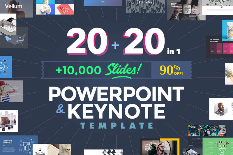
You’ll get an impressive collection of 20 PowerPoint and 20 Keynote templates that are simple to customize to any topic you’re working on. Besides more than 500 fonts to work with, you’ll also get to play with 10,000 slides as you build out the perfect presentation with ease.
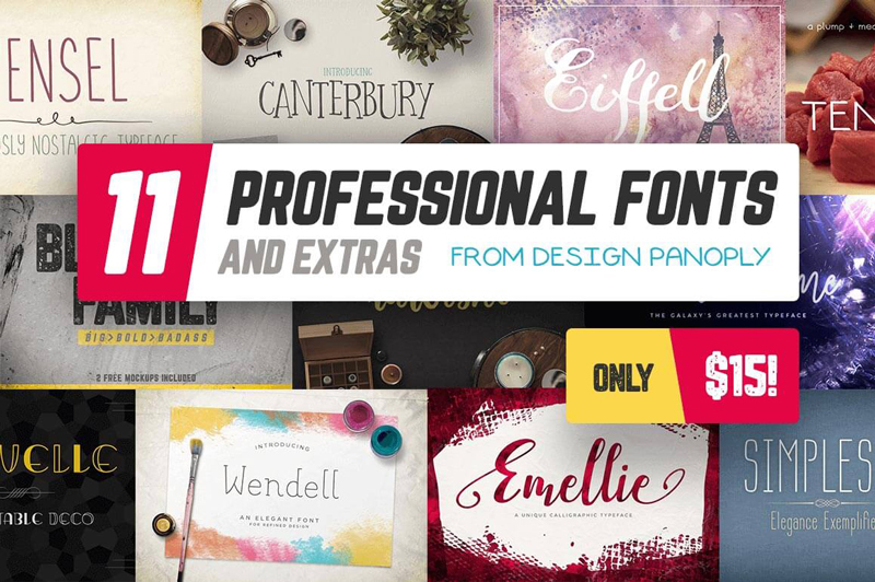
11 Professional Fonts (and extras) from Design Panoply
11 premium font families for 1 super low price. That’s a wide variety of gorgeous font styles, usable for loads of different projects, either personal or professional. You’ll also get loads of OpenType features and design extras to make your life loads easier.
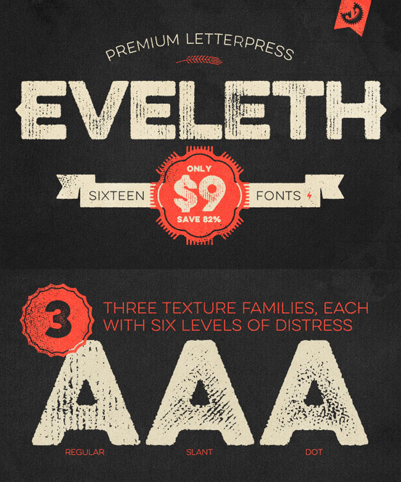
Get yourself 16 charming vintage fonts to work with. Additional weights, shadow layers and entertaining icons, shapes and emblems are just a few of the extras that come along for the ride. And if you act now, you can save yourself 82% off the regular price!
Owl Paperlamps is a project that comes from Portugal, initiated by Hugo and Theresa, two designers who decided that nature needs to take more space in our habitat. These origami lamps consist of a DIY kit for you to assemble our designs. You can buy it on the Etsy shop of the company.
To no one’s surprise, I’m sure, there are lots of different ways to do the same thing on the web. Shape morphing, being a thing on the web, is no different. There are some native technologies, some libraries that leverage those, and some libraries that do things all on their own. Let’s look at some of the options (with demos) and weigh the advantages and disadvantages.
SMIL
The original, native technology for shape morphing is SMIL. We have both a guide to SMIL on CSS-Tricks, and an article talking about replacements for it, since it doesn’t work in Microsoft browsers and Blink threatened to yank it at one point.
I wouldn’t suggest doing important work in SMIL but it is OG shape morphing.
Moving right along to probably the most robust possible option, Greensock’s MorphSVG is a powerhouse. Bear in mind:
MorphSVGPlugin is a bonus plugin for Club GreenSock members („Shockingly Green” and „Business Green” levels). It’s our way of showing our gratitude to those who are fueling innovation at GreenSock.
Worth it. Just MorphSVG alone is amazing. Unlike almost any other shape morphing method, it can tween between shapes of any number of points. It does so performantly, in a safe cross-browser fashion, and gives you more fine grain control over how the animation goes down.
If you’d like to play with MorphSVG, I created a drag-and-drop Pen to morphing between any two shapes (best results with SVG’s with viewBox="0 0 100 100" SVGs with just one <path>):
It’s a little hard to believe, but CSS is getting in on the shape morphing action! Eric Willigers, a Chrome developer, emailed me last year:
’d’ has become a presentation attribute. This allows SVG path elements to be animated using CSS animations and Web Animations, with path(’…’) keyframes.
I assume this is a spec change, so browsers other than Chrome will, presumably, start allowing this. For now, this works great in Chrome:
The API gives you some control over the morphing, like how precise you want it to be and the ability to reverse the draw direction so different points match up to tween.
d3
d3, probably the biggest library out there for data viz folks, can also do shape morphing. Here’s a GIF recording of a demo by Mike Bostock:
There is also a d3 plugin called d3-interpolate-path that helps make it better:
Interpolates path `d` attribute smoothly when A and B have different number of points.
mo.js
„Motion graphics for the web” is the mo.js tagline, another newer library. Oleg Solomka (@LegoMushroom) has some incredible demos of what is is capable of:
If you happen to be a video person before you became a web person (or you’re still both) perhaps you have experience working in Adobe After Effects, which is all about creating „incredible motion graphics and visual effects”. The bodymovin library exports After Effects into SVG, including plenty of hot morphing action. Here’s a great demo:
If I had to blindly guess about global marketshare, I would have gotten it wrong. I probably would have forgotten about UC browser (kind of the point of Peter O’Shaughnessy’s article) that’s so huge in Asia. I would have guessed Firefox has a slight edge on Safari (turns out Firefox is half the share of Safari), and that Edge would be outpacing IE by now (also only half).
This is good dinner party conversation fodder, but I wouldn’t base any major decision making on it. The only stats that matter at your websites stats.
Here’s this sites, in the last 7 days.
There is always the chicken-or-egg conundrum though. If you support a browser that you didn’t before, doesn’t it stand to reason the numbers would go up for it? The time-on-site and bounce rate stuff would get better, anyway.
In today’s
tutorial, we’re going to take a close look at the process of creating a particularly
interesting icon pack, since we’re going to illustrate some Romanian traditional
objects that are the living definition of what “home” was back before the
digital age. As always, we’re going to use and abuse Illustrator’s geometric
shapes, in combination with some basic tools such as the Align panel and
Pathfinder.
That being said, grab a fresh batch of coffee and let’s dive in!
Also, if you’re
looking to expand the project, you can do so by heading over to GraphicRiver
and checking out some of their home-themed icons.
1. How to Set Up a New Document
Since I’m hoping that you already have
Illustrator up and running in the background, bring it up and let’s set up a New Document (File > New or Control-N)
using the following settings:
Number
of Artboards: 1
Width: 800
px
Height: 600
px
Units: Pixels
And from the Advanced tab:
Color
Mode: RGB
Raster
Effects: Screen (72ppi)
Preview Mode: Default
2. How to Set Up a Custom Grid
Since we’re going to be creating the icons
using a pixel-perfect workflow, we’ll want to set up a nice little Grid so that we can have full control
over our shapes.
Step 1
Go to the Edit > Preferences > Guides & Grid submenu, and adjust
the following settings:
Once we’ve set up our custom grid, all we
need to do in order to make sure our shapes look crisp is enable the Snap to Grid option found under the View menu, which will transform into Snap to Pixel each time you enter Pixel Preview mode.
Now, if you’re new to
the whole “pixel-perfect workflow”, I strongly recommend you go through my how
to create pixel-perfect artwork tutorial, which will help you widen your
technical skills in no time.
3. How to Set Up the Layers
With the New Document created, it would be
a good idea to structure our project using a couple of layers, since this way
we can maintain a steady workflow by focusing on one icon at a time.
That being said, bring up the Layers panel, and create a total of four
layers, which we will rename as follows:
layer
1: reference grids
layer
2: pan flute
layer 3: sewing frame
layer 4: wooden spoons
4. How to Create the Reference Grids
The reference grids (or base grids)
are a set of precisely delimited reference surfaces, which allow us to build
our icons by focusing on size and consistency.
Usually, the size of the grids determines
the size of the actual icons, and they should always be the first decision you
make on you start a new project, since you’ll always want to start from the
smallest possible size and build on that.
Now, in our case, we’re going to be
creating the icon pack using just one size, more exactly 128 x 128 px, which is a fairly large one.
Step 1
Start by locking all
but the “reference grids” layer, and then grab the Rectangle Tool (M) and create a 128 x 128 px orange (#F15A24) square, which will help define the
overall size of our icons.
Step 2
Add a smaller 120 x 120 px one (#FFFFFF) which will
act as our active drawing area, thus giving us an all-around 4 px padding.
Step 3
Group the two squares composing the
reference grid using the Control-G keyboard
shortcut, and then create three copies at a distance of 40 px from one another, making sure to align them to the center of
the Artboard.
Once you’re done,
lock the current layer and move on to the next one where we’ll start working on
our first icon.
5. How to Create
the Pan Flute
The pan flute,
also known as panpipes, is a simple yet interesting musical instrument dating all
the way back to the ancient Greeks. It takes its name from Pan, the god of
nature and protector of shepherds. The name itself is a derivative of the word “paein”
which means “to pasture”, which is probably the reason why so many cultures,
including mine, have associated the instrument with the act of herding.
To me, this little
object has a special meaning, since it manages to take me back to a time and
place when life was simpler, and home wasn’t all about the place, but the
people that made it home.
Now, without wasting any more time, make sure you’re on the right layer
(that would be the second one) and let’s get kick off the project by recreating
it.
Step 1
Start working on the pan flute’s upper section, by creating an 8 x 6 px rectangle, which we will color
using #899E47 and then align to the top edge of the active drawing area,
positioning it at a distance of 4 px from
its top edge and 20 px from its left
one.
Step 2
Give the shape an outline using the Stroke method, by creating a copy of it
(Control-C) which we will paste in
front (Control-F) and then adjust by
changing its color to #2B3249 and then flipping its Fill with its Stroke (Shift-X). Set the Stroke’s Weight to 4 px, selecting and grouping both
shapes together afterwards using the Control-G
keyboard shortcut.
Step 3
Create nine copies of the shape that we’ve just
grouped (Control-C > Control-F nine
times), and then horizontally distribute them onto the original’s right side,
using the Align panel so that their
outlines end up overlapping.
Step 4
Create the pipes using ten rectangles (#A8755A—see the dimensions
below) with a 4 px thick outline (#2B3249),
which we will horizontally stack next to one another, grouping (Control-G) and then positioning them
underneath the smaller rectangles.
first pipe: 8 x 110 px
second pipe: 8 x 102 px
third pipe: 8 x 94 px
fourth pipe: 8 x 82 px
fifth pipe: 8 x 74 px
sixth pipe: 8 x 66 px
seventh pipe: 8 x 54 px
eighth pipe: 8 x 46 px
ninth pipe: 8 x 38 px
tenth pipe: 8
x 30 px
Step 5
Add an 8
px wide 4 px thick Stroke line (#2B3249) to the first,
fourth and seventh pipe’s lower section, positioning it at a distance of 2 px from their outlines. Once you’re done, select and group all the shapes that we have so far using the Control-G keyboard shortcut.
Step 6
Create the horizontal section holding all the
pipes together using a 92 x 16 px rectangle
(#CE9D78) with a 4 px thick outline
(#2B3249), which we will group (Control-G)
and then center align to the pipes, positioning it at a distance of 12 px from the active drawing area’s
top edge.
Step 7
Start adding details to the section from the
previous step, by creating the center flower using eight 2
x 2 px circles (#2B3249), which we will position around another 2 x 2 px one (2B3249). Once you have
them in place, don’t forget to select and group (Control-G) them together so that they won’t get separated by
accident.
Quick tip: for the current and
following step I recommend you turn on Pixel
Preview mode (Alt-Control-Y)
since it will give you the ability to carefully position each and every circle
as seen in the reference image. Once you’re
done, exit the mode by pressing Alt-Control-Y
again.
Step 8
Start working on the left decorative wave
pattern using a couple of 2 x 2 px circles
(#2B3249), which we will position as seen in the reference image. Once you’re
done, select and group (Control-G)
all the circles together before moving on to the next step.
Step 9
Finish off the current icon by adding the right
segment of the decorative pattern, using a copy of the one from the previous
step (Control-C > Control-F),
which we will position onto the opposite side of the flower, making sure to
vertically reflect it once we have it in place (right click > Transform > Reflect > Vertical). Once you’re
done, select and group (Control-G)
the decorative pattern to the underlying section, doing the same for all of the
icon’s composing shapes afterwards.
6. How to Create the Sewing Frame
Living in a digital age can really erase some of the older arts from one’s
mind, especially if that person never encountered them in real life. Sewing,
which is thought to have originated way back in the Stone Age, was and in some
places still is a powerful part of the Romanian culture and tradition, since it
has been used as a means of decoration of both the home and the clothes and
tools used back in the day.
To me personally, sewing brings back so many fond
memories from my childhood, when I used to sit next to my grandmother and watch
her spend hours creating beautiful art pieces to decorate her
home.
That being said, let’s get back to our own art, by first making sure we’re on
the right layer (that would be the third one) and then creating our
second icon.
Step 1
Start working on the frame’s main body by
creating a 106 x 106 px circle (#CE9D78)
with a 4 px thick outline (#2B3249),
which we will group (Control-G) and
then center align to the underlying active drawing area’s top edge.
Step 2
Create a smaller 90 x 90 px circle (#A8755A) with a 4 px thick outline (#2B3249), which we will group (Control-G) and then center align to the
one from the previous step.
Step 3
Add the canvas using a 78 x 78 px circle (#EFD4C5) with a 4 px thick outline (#2B3249), which we will group (Control-G) and then center align to the
previous section. Once you’re done, select and group (Control-G) all three sections together as well.
Step 4
Start working on the frame’s bottom section by
creating its outline using a 20 x 18 px rectangle
(#2B3249), which we will center align to the active drawing area’s bottom edge,
making sure to send it to the back of the larger circles (right click > Transform > Arrange > Send to Back).
Step 5
Add the fill section using a smaller 12 x 14 px rectangle (#CE9D78) which we
will center align to the top edge of the previously created shape.
Step 6
Create an 18
px tall 4 px thick Stroke line (#2B3249), which we will
center align to the shape from the previous step.
Step 7
Start working on the little tightening screw, by creating its main body
using a 44 px wide 4 px thick Stroke line (#2B3249), which we will
position towards the bottom section of the frame, leaving a 2 px gap between it and the larger
outline.
Step 8
Add the screw’s cap using an 8 x
8 px square (#2B3249), which we will center align to the
body’s right anchor point. Once you’re done, select and group (Control-G) the two shapes together,
sending them to the back of the bottom section afterwards (right click > Transform > Arrange > Send to Back).
Step 9
Start working on the actual decorative flower by creating the center
section using four 2 x 2 px squares
(#2B3249) which we will position so that they end
up forming a plus sign. Group (Control-G)
the shapes and then center align them to the canvas.
Step 10
Turn on the Pixel
Preview mode (Alt-Control-Y) and
create the upper section of the flower’s top-left petal,
using three sets of four 2 x 2 px squares
(#E56F5C) which we will position next to one another, pushing each set 2 px up so that they end up forming a
stair set. Group (Control-G) the
squares and then position them onto the left side of the plus sign, making sure
to leave a 2 px gap between them.
Step 11
Create a copy of the section from the previous step (Control-C > Control-F), which we
will rotate (right click > Transform
> Rotate > 90º) and then horizontally reflect (right click > Transform > Reflect > Horizontal),
positioning the resulting shape underneath the original.
Step 12
Give the petal an outline, by adding a couple of 2 x 2 px squares (#2B3249) around its two composing sections,
making sure to select and group (Control-G)
all of them together once you’re done.
Step 13
Create the other petals using three copies (Control-C > Control-F three times) of the one that we’ve just
finished working on, which we will position around the center plus sign,
reflecting them as needed.
Step 14
Continue adding details to the flower by creating four copies (Control-C > Control-F four times) of
its center plus sign, which we will position on the outer edge of space found
between each pair of petals.
Step 15
Finish off the flower, and with it the icon itself, by adding diagonal lines to each of its petals, using four sets of 2 x 2 px squares (#2B3249). Once you’re done, select and group (Control-G) all of the flower’s
composing shapes together, doing the same for the entire icon afterwards.
7. How to Create
the Wooden Spoons
We are now down to
our third and last icon, which is composed of a set of traditional handmade
spoons, which are another powerful means of expression of Romanian people’s minds, used not only to decorate but also as a tool within their households.
I’m not even going
to talk all that much about this art form, since I’m really hoping that by
creating this little icon you’ll gain a powerful enough curiosity to search for more information on it.
That being said, make sure you’re on the right layer (that would be the
fourth one) and let’s finish this.
Step 1
Start working on the first spoon by creating an 8 x 8 px circle (#D3685E) with a 4 px thick outline (#2B3249), which we will group (Control-G) and then position at a
distance of 16 px from the active
drawing area’s left edge, making sure to align it to its top edge afterwards.
Step 2
Create a slightly larger 12
x 12 px circle (#CE9D78) with a 4 px thick outline (#2B3249) on top of which we will add another 4 x 4 px circle (#2B3249). Group (Control-G) all three shapes together,
and then position them below the previous section.
Step 3
Create the spoon’s first set of petals using two 10 x 10 px rectangles (#CE9D78), which we will adjust by setting
the Radius of their lower outer
corners to 8 px and their upper
inner ones to 4 px from within the Transform panel’s Rectangle Properties. Give the resulting shapes a 4 px thick outline (#2B3249),
individually grouping (Control-G)
each petal, and then positioning them below the previous section.
Step 4
Create the remaining sets of petals using three
copies (Control-C > Control-F three times) of the ones that we already have, vertically
stacking them underneath one another.
Step 5
Adjust the color of some of the petals by
carefully selecting them using the Direct
Selection Tool (A) and then changing the color to #A8755A.
Step 6
Create a copy (Control-C > Control-F) of the spoon’s two circular sections, which we will position below its petals,
making sure to horizontally reflect them (right
click > Transform > Reflect > Horizontal) and change the color of
the larger one’s fill shape to #A8755A.
Step 7
Create the section connecting the small bowl to
the spoon’s handle using an 8 x 16 px rectangle (#A8755A) (1),
which we will adjust by adding a pair of side anchor points at a distance of 4 px from its top edge using the Add Anchor Point Tool (+) (2).
Then,
individually select and push the shape’s top anchors to the inside by a
distance of 2 px (right click > Transform > Move >
Horizontal > + / – 4 px depending on which side you start with) (3) giving
the resulting shape a 4 px thick
outline (#2B3249) (4).
Step 8
Add two 8
px wide 2 px thick Stroke lines (#2B3249) vertically stacked 3
px from one another, grouping (Control-G)
and then positioning the current section below the smaller circle.
Step 9
Finish off the spoon by creating its bowl using
a 16 x 16 px circle (#CE9D78), which we will
adjust by selecting and pushing its lower anchor point to the bottom by a
distance of 6 px (right click > Transform > Move > Vertical > 6 px). Give the resulting shape a 4
px thick outline (#2B3249), grouping (Control-G)
and then positioning the two shapes onto the previous section. Once you’re
done, select and group (Control-G)
all of the spoon’s composing shapes together, before moving on to the next one.
Step 10
Start working on the icon’s second spoon by
creating an 8 x 20 px rectangle (#A8755A)
which we will adjust by setting the Radius
of its top corners to 4 px from
within the Transform panel’s Rectangle Properties. Give the
resulting shape a 4 px thick outline
(#2B3249) followed by three 2 x 2 px circles (#2B3249) vertically stacked at 2 px from one another, grouping (Control-G) and then positioning the
shapes onto the right side of the first spoon, at a distance of 24 px.
Step 11
Add the circular section using a 12 x 12 px circle (#A8755A) with a 4 px outline (#2B3249) on top of which we will add a smaller 4 x 4 px circle (#2B3249), grouping (Control-G) and then positioning the shapes below the previously
created section, so they end up slightly overlapping them.
Step 12
Create a 12 x 16 px rectangle
(#CE9D78) which we will turn into a diamond by adding a new anchor point to the
center of each of its edges using the Add
Anchor Point Tool (+), removing the corner ones afterwards using the Delete Anchor Point Tool (-). Give the
resulting shape a 4 px thick outline
(#2B3249), grouping (Control-G) and
then positioning them both at the back of the circular section (right click > Transform > Arrange
> Send to Back).
Step 13
Create two 8 x 8 px circles
(#899E47) with a 4 px thick outline
(#2B3249), individually grouping (Control-G)
and then positioning them onto each side of the upper section of the diamond.
Step 14
Start working on the spoon’s main body by creating an 8 x 10 px rectangle (#A8755A), followed
by a larger 12 x 34 px one (#A8755A),
which we will unite and then position below the previous sections.
Step 15
Adjust the shape by setting the Radius
of its top corners to 4 px, adding a
pair of side anchor points at a distance of 14 px from its bottom edge. Then, individually select and push the
bottom anchor points to the inside by a distance of 4 px (right click >
Transform > Move > Horizontal > + / – 4 px depending on which side
you start with).
Step 16
Create the body’s lighter section using a 12 x 12 px square (#CE9D78) which we will center align to the
larger shape, positioning it at a distance of 15 px from its top edge.
Step 17
Give the larger body a 4 px thick
outline (#2B3249), followed by five 12
px wide 2 px thick Stroke lines (#2B3249) vertically
stacked 3 px from one another,
which we will group (Control-G) and
then center align to the section’s lighter rectangle.
Step 18
Add two pairs of two 2 x 2 px circles
(#2B3249) vertically stacked 2 px from
one another, positioning one on the upper section of the body and the other
one on the bottom. Once you’re done, select and group all of the current
section’s composing shapes together using the Control-G keyboard shortcut.
Step 19
Add an 8
x 8 px circle (#899E47) with a 4 px thick
outline (#2B3249), which we will group (Control-G) and then position on top of
the previous section, at a distance of 22
px from the active drawing area’s bottom edge.
Step 20
Finish off the spoon, by adding the bowl using a 16 x 22 px ellipse (#A8755A) with a 4 px thick outline (#2B3249), which we will group (Control-G)
and then position below the smaller circle. Once you’re done, select and group
(Control-G) all of its composing
sections together as well, before moving on to the third and last spoon.
Step 21
Start working on the third spoon, by creating a 12 x 16 px ellipse (#CE9D78) with a 4 px thick outline (#2B3249) on top of which we will add a 4 x 4 px circle (#2B3249), grouping (Control-G) and then positioning all three shapes at a distance of 20 px from the second spoon’s right
edge.
Step 22
Create an 8 x 8 px circle (#CE9D78)
with a 4 px thick outline (#2B3249)
which we will group (Control-G) and
then position below the previous section, at a distance of just 3 px.
Step 23
Create two more 8 x 8 px circles (#D3685E) with a 4 px thick outline (#2B3249), which we
will individually group (Control-G)
and then position onto the sides of the two sections that we have so far.
Step 24
Create a slightly larger 12 x 12 px circle (#A8755A) with a 4 px thick outline (#2B3249) on top of
which we will add a 4 x 4 px circle
(#2B3249). Group (Control-G) all
three shapes together and then position them below the smaller circular
section.
Step 25
Start working on the spoon’s flower by creating its petals using four 10 x 10 px squares (#CE9D78), which we will adjust by setting the Radius of two of its corners to 6 px from within the Transform panel’s Rectangle Properties. Give the resulting shapes a 4 px thick outline (#2B3249), and then
position them slightly over the previous section, selecting and grouping (Control-G) all four of them together.
Step 26
Change the color of the bottom-left and
top-right petals to #A8755A, and then add an 8 x 8 px circle (#D3685E) with a 4 px thick outline (#2B3249) in their
center, grouping all of them together afterwards using the Control-G keyboard shortcut.
Step 27
Create a copy (Control-C >
Control-F) of the circular section found above the spoon’s flower, and
position it below it, making sure to change the color of its fill shape to #CE9D78.
Step 28
Create the spoon’s lower body using a 20 x 32 px rectangle (#A8755A), from the bottom of which we will remove
two 14 x 24 px ellipses (highlighted
with red) using Pathfinder’s Minus Front Shape Mode. Once you’re
done, position the resulting shape below the previous section.
Step 29
Set the Radius of the
resulting shape’s top corners to 10 px (2),
adding a lighter 20 x 12 px rectangle
(#CE9D78) which we will position at a distance of 6 px from its top edge (3). Then, add five 20 px wide 2 px thick Stroke lines (#2B3249) vertically
stacked 3 px from one another,
which we will group (Control-G) and
then center align to the smaller shape’s center (4).
Add a 4 x 4 px circle (#2B3249) to the top of the larger shape (5),
followed by a 4 px thick outline (#2B3249)
(6), selecting and grouping (Control-G)
all the shapes together afterwards.
Step 30
Finish off the spoon, and with it the icon itself, by adding its little
bowl using a 16 x 22 px rectangle (#CE9D78)
which we will adjust by setting the Radius
of its top corners to 8 px from
within the Transform panel’s Rectangle Properties. Give the resulting
shape a 4 px thick outline (#2B3249),
grouping (Control-G) and then
positioning the two below the previously created section. Once you’re done,
select and group (Control-G) all of
the icon’s composing sections as well.
It’s a Wrap!
Great work! I hope that you’ve managed to
follow and understand each and every step, and most importantly learned something
new and useful along the way.
Picture editing becomes a much more enjoyable process if you’ve got a photo editor with advanced tools that is easy to use nonetheless. The latest version of Movavi Photo Editor definitely ticks all the boxes and here are the reasons why.
First of all, now you have more ways to transform your photographs. Second, new animated hints make it easier to figure out how the instruments should be used. And third, its main features just keep on being improved with each update, making the interface even more user-friendly.
Automatic and manual adjustments
The handy sliders will help you tweak manually the following parameters: brightness, contrast, saturation, hue, tint, temperature, gamma, exposure, highlights, shadows, blur, and sharpness.
The ‘Magic Enhance’ button will modify your image just in one click finding the optimal combination of brightness and contrast.
Retouch and make-up
This tab is a real gift for those who like taking portrait shots. There are a lot of instruments that you can use to fix most of the possible imperfections or to completely change your appearance. Basically, these tools can be divided into two big groups: retouch and make-up.
Retouching tools
Skin smoothing: light blur makes the skin look silky
Blemish removal: deleting of defects within a click
Shine remover: a brush that reduces skin shine
Red eye removal
Teeth whitening
Make-up kit
Foundation
Blush
Eyeshadow
Mascara
Eyebrow pencil
Lip color
Eye color
Hair color
Touch up your pictures just a bit or go for a complete makeover. Either way, your selfies will look perfect from now on.
At any point of editing, you can compare the original image with the enhanced one by choosing the ‘Before / After’ option.
Effects
Picture editing software won’t be complete without a great collection of effects. Movavi Photo Editor gives you a choice of more than 100 thematically grouped color filters, textures, and effects. Plus, you can ‘like’ the ones you prefer and quickly find them in ‘Favourites’. One more advantage – you can add an unlimited number of effects and adjust the intensity of each layer.
Object and background removal
With the help of these two tools, you can easily get rid of everything that spoils the picture – a random person, an odd object or even an unpleasant background.
Another way to make use of background and object removal is to create an impressive photo montage replacing boring surroundings with an unusual backdrop. You can also change the background to a solid color and make a collage pasting more photos. Following the animated tips, you’ll quickly get the hang of the instruments.
Other tools
There are also a set of basic tools that you can use to transform your shots:
rotate and flip images
level the horizon
crop the edges
resize photos
add captions and watermarks
copy and paste any picture element
In brief, Movavi Photo Editor’s multifunctionality doesn’t affect its simplicity in any way. Navigation in the program (e.g., zooming) is also optimized for touchscreens and touchpads, so it won’t matter whether you use a PC or a laptop. Try it now and see it for yourself: this photo editor is ready for any of your experiments with pictures!
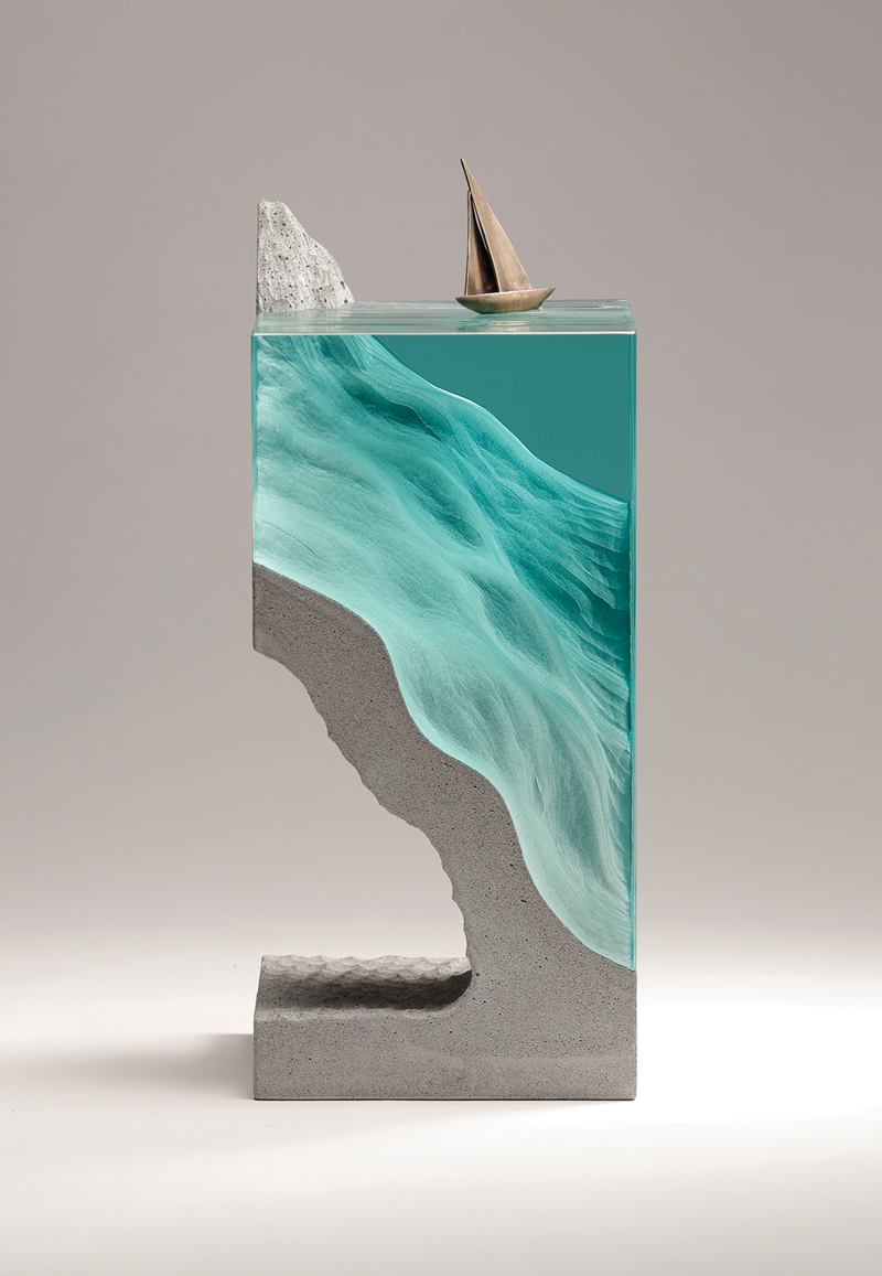
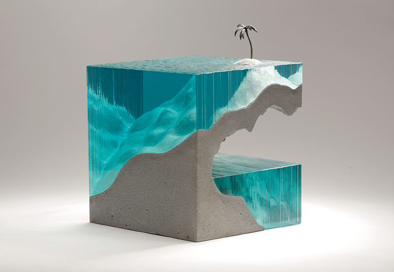
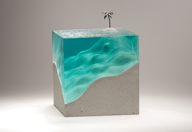
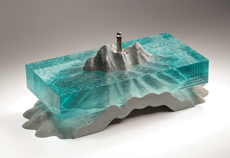
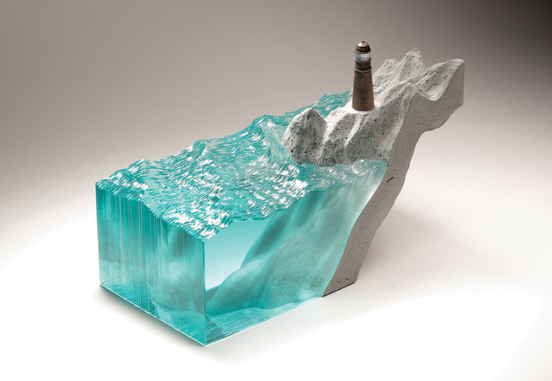
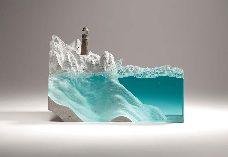
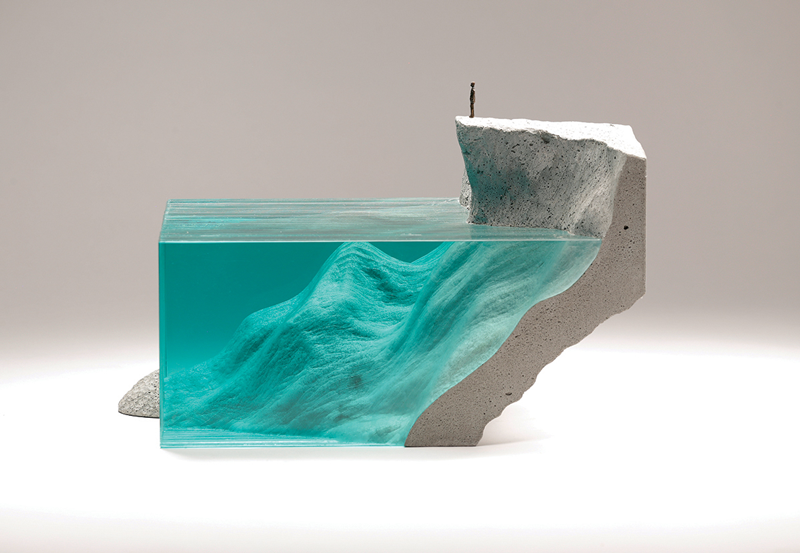
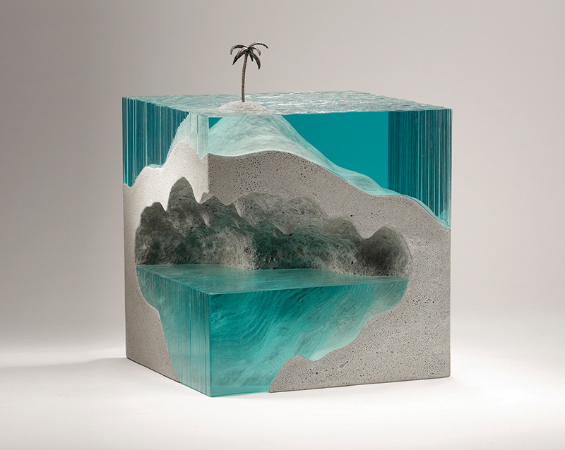
It’s not so common that we feature artists and designers more than once on Designer Daily. Ben Young is one of these artists whose work has been shared here previously, and that’s for a very good reason.
Mixing concrete and glass, the New Zealand artist creates impressive sculptures that take you to the depths of the ocean.
In CSS, some properties have shorthand. One property that takes separated values. Syntactic sugar, as they say, to make authoring easier. Take transition, which might look something like:
Dan Wilson recently used this kind of thing with animations to show how it’s possible to pause individual animations!
Here’s browser support:
Green indicates full support at the version listed (and above). Yellow indicates partial support. Red indicates no support. See Caniuse for full browser support details.