The internet is an amazing thing. With a couple clicks of a mouse or a swipe or two of a finger, anyone anywhere in the world can purchase almost anything, research any topic, or make instant contact with someone halfway around the globe.
As a society, however, do we take the time to fully appreciate this modern marvel of technology? Or do nearly half of online shoppers abandon a website that takes more than three seconds to load? Survey says it’s the latter. Amazing as the internet may be, if your site doesn’t have speed, it would seem it doesn’t have much. Luckily there’s a solution for that.
ABC, easy as 123, simple as CDN
A content delivery network, otherwise known as a CDN, is a network of data centers distributed around the globe designed to improve website performance, very much including page load time. A content delivery network, as the name implies, does so by delivering a website’s content to its users faster and more efficiently using caching.
Each data center in a CDN has a proxy cache server that stores all a website’s cacheable content, which consists of all static content including CSS files, JavaScript, template images, music, and videos as well as – in the case of advanced CDNs – dynamic content for the period in which it remains unchanged. Cache servers speed up a website in two ways: firstly, storing cached content eliminates lengthy trips to the origin server that would otherwise be required to fetch the requested content. Secondly, when a user visits the website, he or she is redirected to the data center closest to them in order to cut down on the physical distance the requested content has to travel in order for pages to load.
Content delivery networks also improve website performance by optimizing content. This includes compressing content like HTML, CSS, JavaScript and image files to speed up loading, removing unnecessary characters from source code, and managing multimedia resources effectively. CDNs also optimize network connections and reuse open sessions to maximize network efficiency.
Additional benefits
In addition to improving website performance and page load time, a content delivery network also improves a website’s reliability through the multi-server environment of the network. Having multiple servers provides built-in load balancing, which keeps any one server from being overwhelmed by traffic. Built-in load balancing on its own provides inherent protection against DDoS attacks, and advanced CDNs offer additional DDoS mitigation that can be tailored to an organization’s needs – always-on or on-demand, managed by DDoS mitigation specialists either way. Other integrated security may include a web application firewall, two-factor authentication, and customizable security rules.
Additionally, advanced CDNs include support for the latest internet protocols, allowing for automatic enabling of IPv6 and HTTP/2 without requiring any upgrade of the origin infrastructure. Thanks to its optimization tools, a CDN also cuts down on the bandwidth required by a website, which can significantly cut down on bandwidth bills.
Who needs a CDN?
When you consider that 47% of online consumers expect a page to load in less than two seconds, 79% who are dissatisfied with a website’s performance are less likely to make a purchase from that site again, and 44% will tell friends about a negative online experience, it’s tempting to say every website needs a CDN. Especially when you factor in that site speed is a significant aspect when it comes to search engine rankings.
However, some websites will benefit more than others from the speed and performance improvements that come along with a content delivery network. In order to keep shoppers happy and keep sales flowing, e-commerce sites will greatly benefit from a CDN. So too will any site using SSL, as a CDN will help make up for that extra time required to establish a secure connection with every user’s browser. The same goes for websites with plenty of international traffic, as all users will always have a data center at least somewhat close by. And of course, websites that experience high bursts of traffic will also be major beneficiaries of a CDN’s advantages, especially the built-in load balancing. Load balancing, as well as a CDN’s integrated DDoS protection, is important as well for websites in competitive industries like online gaming, software as a service and banking and finance that may be at increased risk of DDoS attack.
Obviously, no website owner has to invest in a CDN and reap its many benefits. Instead, site owners could wait for society to have a collective epiphany and become more grateful for all the amazing technology we’re able to access on a daily basis.
As an industry we play a part in gender presentations in the media. When we use images that doesn’t reflect society, images that portraits women as objects, we dictate unrealistic ideas. We wanted to change the way advertisers portraits women in their advertising. 68% of all women can’t relate to the imagery they see in advertising, we need to drive that number down if we want consumers to have a positive feeling about our brands.
A stain. A mustard stain that can be the mark of a proud heritage, traveling through history in the company of famous people who actually enjoyed the product at the time. That was the idea of this posters campaign. We found historical figures known for their epicurean side and associations with dijon mustard, and we suggested the beginning of an indulging tradition every since. Because Bornier is one of the very few big names of original Dijon mustards, with more than 200 years of tradition. But its remarkable heritage was known only among connoisseurs. We’ve helped changing that, raising quick awareness thanks to the surprising visuals.
Child abuse takes many shapes and forms. From psychological to physical, there are many ways that our most fragile individuals can be scarred for life.
Bathrooms are often overlooked by people when decorating their home. Luckily, interior designers usually know what’s up and take good care of this very private space in the house. If you are living with other people, whether they are just flatmates or family, the bathroom becomes de facto a retreat space and should be treated as such.
In this post, we take a look at some furniture, tips and tricks that can turn your bathroom into a more relaxing place.
1. Don’t be afraid of color
White and very pale colors are often associated with cleanliness and hygiene, thus the regular use of these very light color schemes in bathroom designs. This doesn’t mean that your bathroom should look like a hospital! Add some bright color touches, be bold with your use of color and it may very well help to brighten your mood.
In the following example, you can see the result of the collaboration between designer Katie Ridder and architect Peter Pennoyer. Now go ahead and tell me you wouldn’t want a bathroom like this.
2. Choose the right shower stall
If you don’t have a bathtub, or if you want both a tub and a shower stall, you should always make sure to choose carefuly. One good place online to find the right shower stall is Decoraport, a site that has anything you can need for your bathroom.
3. Bring some plants in the bathroom
We rarely put plants in our bathrooms, and we are probably wrong about it. Plants bring some life into any room, and there is no reason to not add plants where you wash. If your bathroom is too small, just use tiny plants, if it’s big enough, you can use these amazing planters we featured previously on Designer Daily.
4. Improve your bathroom storage by yourself
There are plenty of way you can easily improve the storage in your bathroom, and they don’t cost much! DIY & Crafts Magazine published an excellent article with over a dozen tips and tricks to store anything in the bathroom.
5. Keep it simple
You don’t have to, but keeping things simple can be the best way to make your bathroom more relaxing. Minimalism can work well in pretty much any field of design: graphics, furniture, product, web,.. anything less cluttered will give you a feeling of peace of mind. For interior design it’s the same, keep the clutter away to make your space a zen one.
This bathroom design by Amy Lau makes a splendid case for simplicity, who needs more when you have such a beautiful bathroom. I don’t think I would even bother going to the other rooms anymore.
6. Give it a good view
Ok, so this is a bit unfair for people living in the city. If you rent a downtown appartment, you probably don’t have enough space for a bathtub like the one on the picture below, and you wouldn’t want people living in neighboring buildings to peak inside. So if you are rich and own a huge land with a lake, please do yourself a favor and get a bathroom window like this.
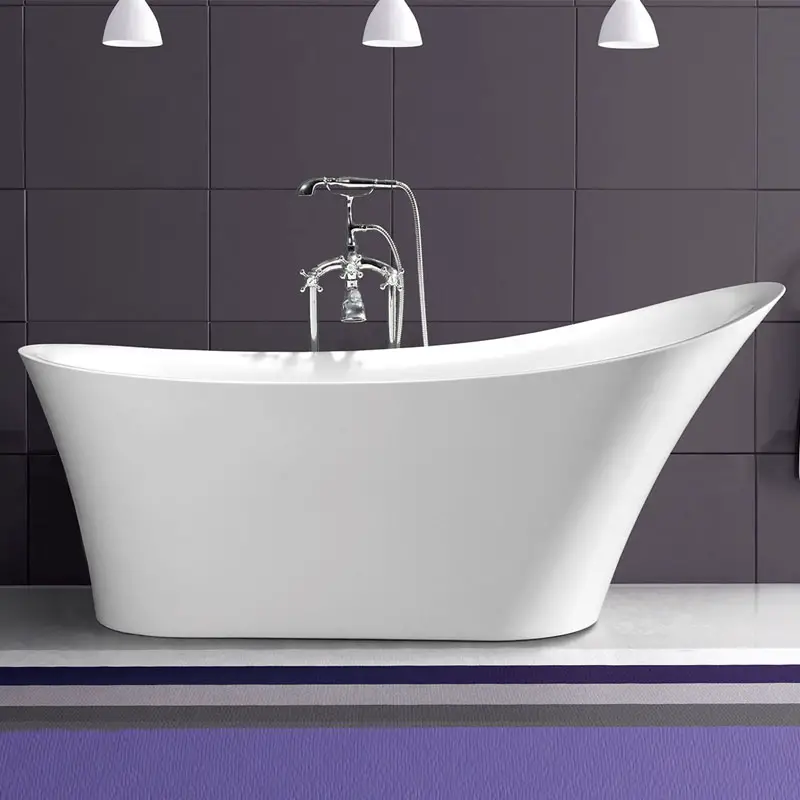
7. Get a freestanding bathtub
These are so elegant that we even wrote an entire article about it, you should check out what we wrote on freestanding bathtubs. This kind of bathtub is often the best choice for a classy space.
8. Add a nice rug
In most rooms, people understand that adding a big carpet changes the look and feel of the space, turning it into a new environment. For some reason, we are reluctant to use carpets in bathrooms. Well, actually I know the reason, it’s because of the room’s moisture level.
However, there are carpets designed specifically for bathrooms, and not all of these carpets are ugly, some look really great and will upgrade the whole bathroom design for quite little cost.
9. Get inspiration from a specific style of design
There are many well established design styles that you can pick ideas from. Which style you’ll choose will really depend on the look-and-feel you’d like to go for and on your personal preferences.
On the following example, you can see a gorgeous example of Scandinavian interior design style applied to the bathroom, but you could go for Asian, Tuscan, or New York style as well (among others).
10. Pay attention to details
As the saying goes: “The devil is in the details”. This saying is spot-on when it comes to design, a little detail can make or break your design, so it’s important to make sure that you didn’t leave some small detail poorly executed, and that you paid attention to add an extra touch when your design seems to be missing it.
In the example below, you can see a beautiful mirror, with a wall made of “cold” material, and a beautiful cold light that comes from behind the mirror. Everything looks gorgeous, but it wouldn’t really feel human without the slight color touch brought by the flower vase.
If you are a Christian, or if you just enjoy craft and enjoy following tradition for no religious reasons, chances are that you took the time to decorate some eggs last week.
Working as an artist and illustrator in Ohio, Dinara Mirtalipova was born and raised in Uzbekistan, where the egg decoration tradition is very vivid. Mirtalipova uses her talent to perpetuate this tradition by creating gorgeous eggs painted on wood or porcelain.
If you are lucky, you’ll get a chance to purchase one of her eggs on her Etsy shop next year, for this year it’s too late already.
As many as 60 percent of the Kenyan population now has access to electricity according to official data. But in neighbouring Tanzania, the penetration rate is less than half of that and sparsely populated rural communities are especially neglected.
Let’s say you have an element with a background-image, where only part of the image is visible, because the image is bigger than the element itself. The rest is cropped away, outside the element.
Now you want to move that background-image such that you’re focusing the center of the element on a specific point in it. You also want to do that with percentage values rather than pixels. We’re going to have to get clever.
This is going to involve some math.
Let’s use this as our image, which has markers for sizing:
And here’s our element, with that background-image applied. Notice we can only see the (top) left of the image:
Now let’s say we want to align a specific point on the image with the center of that element. Say, the point at 300px in from the left.
Since we’re asking for this position in pixels, it’s straightforward. With no position defined, the background-image „starts” with the point at 100 pixels at the center, so you need to move it to the left by 200 pixels:
It takes a second to figure out, but it’s nothing too taxing. You could have probably figured that out intuitively without needing to use a formula.
But what if you wanted to (or had to) express background-position as a percentage? Shouldn’t be too hard, right? Let’s try using a percentage to get ourselves centered at 300px again. We had a background-position-x of -200px, so let’s convert that to percent: -200 / 800 = -25%, so:
That feels like it kind of makes sense; background-position: 100% 0; makes the background-image flush-right and centered at 700px, or 7/8 the width of the image. But what if we wanted to center it at 100%? I guess we’d have to do… 9/8?
For example, with a value pair of '0% 0%’, the upper left corner of the image is aligned with the upper left corner of, usually, the box’s padding edge. A value pair of ‘100% 100%’ places the lower right corner of the image in the lower right corner of the area. With a value pair of '75% 50%’, the point 75% across and 50% down the image is to be placed at the point 75% across and 50% down the area.
Maybe we can reverse-engineer this.
On that last one, 112.5%, it was aligning the point at 112.5% across the background-image with the point at 112.5% across the bounding box. That kind makes sense. The spec seems written to make it easy for only three values: 0%, 50%, and 100%. Any other value isn’t so intuitive.
With background-position: 0;, we were focused on 100px, or 12.5%. With background-position: 100% 0;, we were focused on 700px, or 87.5%. How does background-position: 50% 0; look, exactly?
With background-position set to 100%, the center of our bonding box has „panned” from the center of the image, 3/4 of the way to the rightmost edge (from 400px to 700px). If we want to „pan” to the rightmost edge, we need to go that extra 1/4, or 200px. 1/4 is 1/3 of 3/4, so we need to go a third more than we did a moment ago, or a total of 66.667% from the center:
Whew! So to focus on the rightmost edge of a background-image that is 4 times the size of our bounding box, we need to set background-position: 116.667% 0;.
How the heck are we supposed to figure that out?
It’s a difference of 16.667% from the 100% we might expect. So if we wanted to focus on our original goal of 300px (or, 37.5%), we’d, uh, add 16.667%? There’s no way this is going to work:
To focus at 100% or 0%, you have to „overshoot” those values by a certain amount, when measured from the center.
So if we want to focus on 0%, or „100% of the way to the left of the center,” we have to subtract 66.667% from 50%. If we want to focus on 100%, or „100% of the way to the right of the center,” we have to add 66.667% to 50%.
I might have expected to have to add or subtract 50% to or from 50% to get to those edges: a 1:1 ratio of „how far I want to go from the center” to „what my background-position value should be.” But instead, we have to use a 4:3 ratio. In other words, we have to use a value four-thirds more „away from the center.”
Things are getting a little hairy here, so let’s introduce some terms:
c: Desired focal point (in percent) from leftmost edge of background image
So why 4/3? 4 is the ratio of our background-image width to our bounding box width; and 3 is… 1 less than 4. Could it be that simple? Let’s try a larger background-image, this time 1000px wide, or 5 times the width of our bounding box. And let’s again try to focus on the point at 200px. Here our equation would be:
So to revisit our equation, with a variable background-to-bounding-box ratio:
(c − 50%) × z/(z − 1) + 50% = p
Let’s turn this into English:
Given a point on a background-image at location c…
with c expressed as a percentage of the width of the image
where c is intended to lie in the horizontal center of the background image’s bounding box
and where the background-image is z times as wide as its bounding box
the correct background-position p (expressed as a percentage) is given by the following formula:
(c − 50%) × z/(z − 1) + 50% = p
Can we generalize this even more?
What if we wanted to align the point at 25% of the background-image with the point at 75% of the bounding box? Yikes!
Let’s revisit our original formula:
(c − 50%) × z/(z − 1) + 50% = p
Now let’s introduce some new terms:
b: Desired focal point (in percent) from the leftmost edge of the bounding box. Earlier we had assumed this to always be 50% so that the center of the bounding box would be focused on our target in the background-image.
d: background-image focal point (in percent) to align to bounding box’s midpoint in order to get c to align to b in the bounding box; if d of the background-image aligns with 50% of the bounding box, then c of the background-image will align with b of the bounding box.
Let’s think of it this way
To want to align position c of a background-image with position b of a bounding box is to want to align some other position, d, of a background-image with the center of the bounding box – and we already know how to do that. So can we figure out a way to derive d, the spot we need to be at 50%, from c, b, and z? Sure!
With our 800px wide background-image, in a 200px-wide bounding box (z = 4), if we want to focus the rightmost edge of the bounding box (b = 100%) on the position at 600px (c = 75%) in the image, we would want the center of the bounding box to be focused on the point at 500px (d = 62.5%).
How do we get from c (75%) to d (62.5%)? Where does that -12.5% difference come from?
Well, our b was 100%, 50% greater than our old „default” b of 50%. And 12.5% is 1/4 of that; 1/4 is the inverse of our z of 4. Is that where our d comes from? That would be:
d = c + (50% - b)/z
Looks promising. Now we can substitute d in for c in the original formula:
(d − 50%) × z/(z − 1) + 50% = p
Or:
(c + (50% − b)/z - 50%) × z/(z − 1) + 50% = p
Whew! Let’s test this. Let’s try to align the position at 25% in our background-image (200px) with the position at 75% in our bounding box. This would be:
p = (25% + (50% - 75%)/4 - 50%) × 4/(4 - 1) + 50%
p = -31.25% × 1.333 + 50%
p = 8.333%
Unbelievable! Let’s double check. How about the point at 87.5% in our background-image (700px) aligned with the position at 33.333% in our bounding box:
p = (87.5% + (50% - 33.333%)/4 - 50%) × 4/(4 - 1) + 50%
p = 41.6667% × 1.333 + 50%
p = 105.555%
When I began tackling this problem I did not expect it to be this difficult, but what a journey. I hope guiding you through my thought process has been enlightening, and that you may at some point find value in our little Sass function.
All the Pens embedded in this article can be found in this collection.
I was on vacation this past week and at some little beach gift shop they were selling this really cool big thick book called Ocean: A Photicular Book. You’ve probably seen something like it before… a plastic card that shows different images depending on how you are looking at it. This book is extremely well done in that the image are very high quality, and the design of the book makes the images move as you turn the pages.
Photicular, also known as Lenticular, or Integrated Photography, was first conceived in the early 20th century, but the basic concept has been around since 1692 when a French painter created paintings that revealed one, and then the other as the observer walked by. The simplest form of it is to cut two images into thin vertical strips and interleave them, placing in front of the composite image a plane of bars, like a picket fence, which only allows one to see one image at a time through the gaps. Instead of bars, lenses can be used, and more than two images – as many as dozens – can be interleaved.
The end result is really neat in the Ocean book. After mentioning this one on Twitter, I’ve heard good things about the Safari one as well. I’m sure they are all awesome. It’s almost like the newspapers and paintings in Harry Potter!
Of course, it made me think about how we might do something Photicular-like on the web. We have videos and GIFs on the web, so it’s not exactly hard to make images move. But it’s not just in the movement itself that made these books cool, it was that it moves along with your actions (of turning the page).
Perhaps we could page through a GIF as a user scrolled. Can you programmatically control which frame of GIF is currently being shown? Sorrrrrrta. There is no simple native technology for that, but there are some alternatives.
If you really wanted to stick with a GIF, BuzzFeed actually created a JavaScript library called libgif-js specifically for exerting control over GIFs in this way. Through this lib, you can jump to certain frames, pause and start the GIF like you can with video, and even make the GIFs „rubbable”, meaning dragging left-and-right on them scrub the GIF backward and forwards.
To get super meta, here’s a GIF of me playing with a „rubbable” GIF:
The squishing is just what the GIF is of, it’s the ability to scrub through the GIFs frames that is interesting here. Well, squishing Steve Buscemi’s head is interesting too, but you know what I mean.
Related
A decade ago, I remember my old boss Tim Chatman designing a paper flip book thing for a client of ours.
It’s not Photicular, but it uses the same kind of slotted paper tabs you pull to make the images change.
I’m also reminded of one of my own favorite childhood books, Dinnertime, where different animals pop out at you as you turn the pages.