During a having a team meeting the other day, a code formatting idea came up that I thought was super interesting. It had to do with formatting code in a such a way that made it easier to find what you were looking for later with any code editors „Find in Project” feature.
Here’s what it was.
When declaring a function in JavaScript, put a space after the function name and before the opening parenthesis, like…
function doSomething () {

}
That space between doSomething and () is perfectly fine. Then when you call the function, don’t use a space, like this:
doSomething();
It’s just a syntax convention.
But now, „Find in Project” is more useful. If we want to quickly find where that function was defined, we can search for „doSomething ()”, and if we want to find instances of where it is used, we can look for „doSomething()”.
You could extend the idea to classes or whatever too:
class myThing () {

  constructor () {

  }

  doThing () {

  }

}

let example = new myThing();
example.doThing();
I’d say that’s worth doing.
It reminds me of when I need to where a Ruby method is definied, I can always search for „def foo” since that „def ” is required for creating the method.
I can imagine a scenario where it might be useful to define base classes in CSS like .module { but then if it’s a variation or nested or used again for any other reason… .module{.
Leaving TODO comments throughout your code base turns a „Find in Project” for „TODO” an instant list of things you need to work on. Surely that could be even more nuanced, incorporating things like priority levels and assignments. Perhaps even emoji’s to help like Charlotte suggested!
Here’s an interesting one:
Use long classes/variables, mark future refactor points with comments. What are you looking for?
I like the idea of „long names”. I suppose the longer and more descriptively you name things, the easier they are to search for and get specific results (avoiding repetitive matches like you would with very simple names).
Comments are a great place to leave things to search for. I often use a convention where I put my own name in the comment if I want people to know it was me leaving the comment, but it’s not necessarily for me.
.thing {
  overflow: hidden; /* [Chris]: ugkghk this fixed a layout thing but I didn't have time to figure out exactly why. */
}
A smattering of responses:
At top of each template I add "<!– Start [name of template] –>", at bottom, same but "End." Helps FIP and in browser-rendered code.
In this tutorial I’ll show you how to use Adobe Photoshop to create a photo manipulation featuring an elephant and a rat skateboarding together.
First we’ll build the base scene using two stock images. Later we’ll add the road shadows, replace the sky, and import the skateboards. After that, we’ll add the elephant and rat, and we’ll blend them using adjustment layers, masking, and brushes. We’ll import other elements, such as hats, lollipop, and luggage, and we’ll use several adjustment layers to complete the final effect.
Tutorial Assets
The following assets were used during the production of this tutorial:
Create a new 2000 x 1293 px document in Photoshop with the given settings.
Step 2
Open the background image. Drag the image into the white canvas using the Move Tool (V). Convert this layer to a Smart Object.
Step 3
Go to Filter > Blur > Gaussian Blur and set the Radius to 12 px.
On the filter mask, select a soft round brush with black color (soft
black brush) to erase the midground and foreground, leaving the blur
effect visible only on the background.
Step 4
Create
a new layer and set it as Clipping Mask. Activate the Clone Tool (S) to
remove the existing shadows of the objects on the road. We’re aiming to make
the main light come straight across from left to right, so the existing shadow
should be erased or reduced.
Step 5
Go to Layer > New Adjustment Layer > Color Balance and change the Midtones settings:
Step 6
Add a Curves adjustment layer and increase the contrast a little. On
this layer mask, use a soft black brush to erase the middle to keep it a bit hazy.
Step 7
Make another Curves adjustment layer to increase the fuzziness of the
middle. On the layer mask, paint on the top and the bottom of the
background.
Step 8
Open
the road image. Use the Rectangular Marquee Tool (M) to select the road
area only and drag it into our main document using the Move Tool. Place
it over the existing road. Convert this layer to a Smart Object.
Add a mask to this layer and use a soft black brush to remove the sidewalk.
Step 9
Apply a Gaussian Blur of 6 px to the road. On this filter mask, use a
soft black brush to clear the blur effect in the midground (this is
in order to locate the main elements).
Step 10
Use a Color Balance adjustment layer to alter the road’s color.
Step 11
Make a Curves adjustment layer to bring more light to the road.
Step 12
Create another Curves adjustment layer to make the road hazier and mistier. Paint on the foreground to reduce the hazy effect there.
2. How to Make the Road Shadows
Step 1
We will now add shadows for the objects on the road.
First, create a new
layer and use the Polygonal Lasso Tool (L) to select the sign with the
letters JCT/181 (no need to be so precise). You should disable the Gaussian Blur filter on the background layer to see more clearly.
Fill this selection with a dark brown color (#1c190c) and flip it
vertically (Edit >Transform> Flip Vertical). Use the Free
Transform Tool (Control-T) to rotate it onto the right of the sign to
fit the light direction. Make it longer and much thinner.
Step 2
Lower the opacity of this layer to 80% and apply a Gaussian Blur of 8 px to this layer.
Step 3
Make shadows for the other objects: signs, bushes, etc. They should be long and thin.
Step 4
Make
another layer and use a soft brush with the same shadow color (#1c190c) to paint random shadows for the small bushes in the distance.
Select all shadow layers and hit Control-G to make a group for them.
Lower the opacity of this group to 30%, and enable the Gaussian Blur
filter on the background one.
3. How to Replace the Sky
Step 1
Open the sky image. Use the Rectangular Marquee Tool to select the sky only and place it in the upper half of the canvas.
Use a layer mask to remove the hard edges at the bottom and blend it
with the existing sky. Lower the brush opacity when masking off the sign
area so the integration looks smooth and natural.
Step 2
Apply a Gaussian Blur of 2 px to this layer.
Step 3
Make a Photo Filter adjustment layer and pick the color #ece900.
Step 4
Add a Color Balance adjustment layer and alter the Midtones and Highlights settings:
Step 5
Use a Curves adjustment layer to brighten the sky.
Step 6
To make the sky blend better with the background, create a new layer
and use a large soft brush with #d6c7b3 color and about 45% opacity to
paint on the middle of the canvas. You can use a layer mask to correct
anything that looks too misty.
4. How to Import the Skateboards
Step 1
Open the skateboard image. Cut out the skateboard from the white
background and place it on the right-hand side of the road. Duplicate it and make
it much smaller, and then place it on the left.
Step 2
Create a group for the skateboards and change the group’s mode to Normal
100%. The light on some wheels of the skateboards doesn’t really suit the
main light source. To fix it, make a new layer and change the mode to Multiply 100%. Use a yellow color for the brush (#b8ab0) and paint on the
indicated details to reduce the light there.
Step 3
Use another layer (Multiply mode) with the color #5e5847. Paint on the
metal details below the deck to make them a bit darker.
Step 4
Add a Hue/Saturation adjustment layer to change the skateboards’ color.
Step 5
Make a Curves adjustment layer to bring more light to the skateboards.
Paint on the shadow areas below the deck so they won’t be
affected by this adjustment layer.
Step 6
Add a Levels adjustment layer with the same purpose. The selected areas show where to paint on the layer mask.
Step 7
The main light comes straight from left to right, so the shadows will only
show the griptapes and decks. Create a new layer below the skateboard
group and use the Polygonal Lasso Tool to select the deck of the big
skateboard and fill it with the color #1c190c. Convert this layer to a Smart Object.
Lower the opacity of this layer to 60% and use Control-T to make the shadow longer below the skateboard.
Add a mask to this layer and remove the left of the shadow. Also decrease its visibility on the right.
Step 8
Apply a Gaussian Blur of 3 px to the shadow layer. On the filter mask,
paint on the left part of the shadow as it
should be harder than the rest.
Step 9
Duplicate this shadow layer and move it below the small skateboard.
Scale it down a lot to fit the size of the skateboard. Use a layer mask
to remove the left and right of the shadow (the lifting parts).
5. How to Retouch the Elephant
Step 1
Open the elephant image. Isolate the one on the right and place him
above the big skateboard. Resize him to fit the skateboard and remember
to convert this layer to a Smart Object.
Step 2
We’re aiming to turn this elephant into a baby one. Searching for references using Google, we can see the top of a baby’s head is rounder, the legs and trunk
shorter and plumper, and the skin smoother and less wrinkled.
First, we’ll
change the pose of the elephant a bit. Select Edit > Puppet Warp and
drag the points on the top of the head downward a bit until it looks rounder. Also lift the trunk and legs a bit.
On the filter mask, use a soft black brush to erase the legs and eye.
Step 3
Add
a mask to the elephant layer and use a medium-hard brush to remove the
trunk and the bottom of the legs a bit so he looks as if he’s standing
on the skateboard.
Step 4
We’ll use the legs from the original image and scale them much less than
the existing ones so they will look shorter and plumper. Select the front
leg from the original image and add it to the same position as the
existing one. Use Control-T to lift this leg a bit higher.
Use a layer mask to blend the legs with the existing body.
Step 5
Add the other legs and the chest part using the same method.
Step 6
Add the trunk to replace the old one. Use Control-T with the Warp mode to make it shorter and raised a bit.
Step 7
It’s time to clone the skin, which will help the skin look smoother. Start
with the least rough area of the skin, and from that, clone over the
elephant’s body. The trick is to reduce the brush’s opacity (about 50-60%)
so that the cloned areas will look smooth, but still show some original details
and textures.
Step 8
Make a group for the elephant layer and related ones. Use a Color Balance adjustment layer and alter the Midtones values:
Step 9
Add a Hue/Saturation adjustment layer to change the elephant’s color a bit.
Step 10
Create a Curves adjustment layer to bring more light to the elephant.
Paint on the shadow areas and the part behind the ear to make its shadow
on the body.
Step 11
Use another Curves adjustment layer to strengthen the shadow of the
elephant. The selected areas show where to paint on the layer mask.
Step 12
Create a new layer above the elephant group. Change the mode to Overlay 100%, and fill with 50% gray:
Activate the Dodge and Burn Tool (O) with Midtones Range, Exposure about 15-20% to refine the light and shadow on the elephant. You can see how I
did it with Normal mode and the result with Overlay mode.
Step 13
Make a new layer under the elephant group. Use a soft brush with the
color #1c190c, opacity about 45% to paint the shadow of the elephant’s feet
on the back of the skateboard.
6. How to Retouch the Rat
Step 1
Cut out the rat from the original background and place him above the
small skateboard. Use the Puppet Warp to lift his head a bit.
Step 2
Use a layer mask to remove the bottom of the feet outside the griptape.
Step 3
Change the rat’s color using a Color Balance adjustment layer.
Step 4
Use a Curves adjustment layer to brighten the rat. The selected areas show how to mask off the shadow area of the rat.
Step 5
Add another Curves adjustment layer to increase the shadow of the rat.
Step 6
Make a new layer, change the mode to Overlay 100%, and fill with 50%
gray. Use the Dodge and Burn Tool to enhance the light and shadow of the
rat.
Step 7
Create a new layer below the rat one. Hold Control and click the rat thumbnail layer to load his selection.
Fill
this selection with the color #1c190c and flip it vertically. Stretch
it and place it above the top of the small skateboard’s shadow.
Apply a Gaussian Blur of 2 px to this layer. Also use a layer mask to
remove the legs’ shadow and make the rat’s one blend smoothly with that of the
existing skateboard.
7. How to Add the Hats
Step 1
Cut out the hat and place it above the elephant’s head. Duplicate this
layer and make it much smaller. Add it to the head of the rat after
flipping it horizontally.
Step 2
Make a new layer below the hat ones. Use a soft brush with the color #1c190c to paint shadows for the hats.
Step 3
Create a group for the hats and add a Color Balance adjustment layer. Alter the Midtones settings:
Step 4
Make a Curves adjustment layer to brighten the hat. Use a soft black
brush to paint on the shadow area (the right side) of the hats so it
won’t be affected by this adjustment layer.
Step 5
Create
another Curves adjustment layer to increase the shadow of the hats.
Paint on the left side (bright area) to keep their lightness.
8. How to Create the Lollipop
Step 1
Open the lollipop image. First, isolate the stick of the lower one and
add it below the elephant’s trunk. Use Control-T to rotate it to fit the
direction of the trunk.
Cut out the candy part and add it below the stick.
Step 2
Use the Dodge Tool on a new layer (set as Clipping Mask) to brighten the top of the candy.
Step 3
Make a group for the stick and candy layers. Use a Hue/Saturation adjustment layer and reduce the Saturation value to -55:
Step 4
Create a Color Balance adjustment layer and alter the Midtones settings:
Step 5
Use a Curves adjustment layer to bring more light to the lollipop.
9. How to Import the Luggage
Step 1
Extract the luggage 1 image from the background and place it onto the big skateboard, between the front legs of the elephant.
Use a layer mask to remove its bottom outside the griptape.
Step 2
Add a Hue/Saturation adjustment layer and change the Master values:
Step 3
Use
the Dodge and Burn Tool on a new layer to refine the light and shadow
of the suitcase. Also paint the shadow of the handle and some small details
to fit the light sources.
Step 4
Open the luggage 2 image. Take the highest piece of luggage and place it onto the
small skateboard, to the right of the rat, after resizing it down. Use a
layer mask to remove its bottom.
Step 5
Add a Hue/Saturation adjustment layer to desaturate the luggage’s color a bit.
Step 6
Use the Dodge Tool to brighten the luggage as it looks too dark at the moment.
Step 7
Make several new layers and use a medium-soft brush with the color
#1c190c to paint the shadow of the handle of the small suitcase, the shadow of
the rat on his luggage and skateboard, and the shadow of the leg of the elephant
on the big suitcase.
10. How to Make the Final Adjustments
Step 1
Create a new Color Fill adjustment layer on top of the layers and fill
with the color #18011c. Change this layer mode to Exclusion 100%.
Step 2
Add a Gradient Map adjustment layer and pick the colors #e10019 and #00601b. Lower the opacity of this layer to 20%.
Step 3
Make a Color Balance adjustment layer and alter the Midtones and Highlights values:
Step 4
Create a Photo Filter adjustment layer and pick the color #d4a383.
Step 5
Add a Curves adjustment layer to increase the light and contrast of the whole scene.
Step 6
Make another Curves adjustment layer to bring more light to the left part of the scene. The right should be erased.
Step 7
Use a Vibrance adjustment layer to enhance the final effect.
Congratulations, You’re Done!
I hope that you’ve enjoyed the tutorial and learned something new for
your own project. Feel free to share your results or leave comments in
the box below. Enjoy Photoshopping!
In celebration of Envato Tuts+’s ten-year anniversary, we’re going to look back even further in time to explore the era-defining trends and styles in graphic design and illustration over the past ten decades.
Studies of design and illustration have always given historians intriguing insights into changing trends in aesthetics, buying patterns, and popular culture, but it’s also invaluable for designers to know what has influenced and continues to influence their work today.
Love vintage design, or simply want to find out more about how designers worked in the past? You’ll want to keep reading!
Make sure to pay a visit to GraphicRiver and Envato Elements to source vintage-inspired photos, illustrations, fonts and templates to channel a bygone time in your own designs.
Design in the 1920s
The 1920s marked one of the most important and exciting decades for the visual arts, and its remarkable influence is still felt across the design industry today.
The ‘Jazz Age’ marked an era of new social freedoms and economic growth, and favored design styles followed suit. At the start of the decade, more fluid, realist styles such as Art Nouveau were still very popular across the commercial arts, but by the middle of the decade this was dramatically replaced by new modernist styles which were gaining traction in Europe.
Travel poster published by Victorian Railways, Australia, which has a very striking Art Deco design.
Art Deco, a style defined by modernist, geometric designs and luxurious materials and colors, first emerged in France but quickly grew in popularity, becoming one of the first international design movements and resulting in some of the most glamorous buildings, interiors and artworks the world has ever seen.
Particularly in New York, the post-war economy was booming, and in this atmosphere of financial excess, advertising design experienced an incredibly creative period. Poster artists embraced the Art Deco style wholeheartedly, focussing on creating strongly graphic layouts, with rich color palettes and geometric type styles. The glamor of flapper girls, exotic travel, and new food and drink dominated billboards, enticing viewers to dance the Charleston or buy Coca-Cola.
You might not know the name A. M. Cassandre, but you’ve surely seen his work. His early 20th century French advertising posters have become iconic images of…
Design in the 1930s
The excesses of the 1920s unfortunately couldn’t last forever. The Great Depression had a sombre influence over design in the 1930s, with a more restrained form of Art Deco which focussed on curved forms replacing the glitter and glamor of the decade before. In poster art, we can see how the rich palette of colors from early Art Deco is replaced with more subdued tones.
Also influential during this decade was the accessibility of modern technology for consumers. Electricity, the automobile, and the telephone made radical changes to daily life, and design increasingly reflected this.
The Futurist art movement emphasized the supremacy of technology, speed and industry in an ever-changing world. Designers and illustrators focussed their efforts on giving a sense of movement and scale to their designs. 3D-style gradients and textures also became popular, helping poster work feel immersive and larger than life.
The best-know movie adaptation of The Wizard of Oz is the beloved Judy Garland classic from 1939. In this tutorial we’ll be designing a tribute to the film…
Sweets and chocolates have been around forever! This post takes a look at vintage and retro advertisements of some of our favorite treats, past and present….
Design in the 1940s
With the outbreak of the Second World War in 1939, fascism began to creep across Europe and threatened to spill over onto a global platform during the early part of the 1940s. This frightening new reality led to the once commercial emphasis of design to be replaced by propaganda and motivational imagery.
Some of the most interesting design to emerge in this period was that of the Soviet propaganda artists, who were inspired by Art Deco and Constructivism (a Russian art movement which emphasized art as having a social purpose) but developed a unique and direct style rendered in sombre shades of red, black and grey.
Stylistically, modernism was becoming a more influential movement, and we can see this in the use of abstract illustration, irregular layouts, and minimal color palettes. At the start of the 1940s, realist illustrations which romanticized battle were very popular, but by the end of the decade, consumers were ready for something very different.
We can see the roots of the Mid-Century Modern movement in design and illustration from the late 1940s. Visible brush strokes, witty designs and rich colors marked the end of the dark days of war and heralded a sunnier Post-War period.
This retro advertisement kit is inspired by the more colorful, optimistic style of the late 1940s
Pick up your broom, we’re going for a ride! Join me in Adobe Illustrator to create a bright and colorful little witch flying high above a city with the Pen…
Design in the 1950s
Designers have looked back to 1950s design time and time again, and with good reason. The era was an incredibly rich, optimistic and exciting time for design. Just as we have today, there were many different trends which found their place in the Fifties design landscape.
In America, a booming economy meant that ordinary homes now had kitchen appliances, motor cars, and televisions, all of which were advertised heavily to the public. Across commercial advertising we see atmospheric, cheerful illustrations and photos in pastel ice-cream shades or technicolor brights. The sense of movement, youth and excitement generated by this style of image is infectious, and still has remarkable influence over advertising design today.
Meanwhile, other designers were exploring modernism’s potential and giving it a fun, playful twist. Flat design was made popular by the Mid-Century Modern movement, which focussed on playful patterns and textures, and used simple, pared-back color palettes in earthy shades.
The Fifties were also a time for boundary-pushing in typography and typeface design. Perhaps the most famous example is designer Paul Rand’s reimagining of the logo for IBM in 1956. With its distinctive jaunty, geometric lettering, this type style influenced the perky, animated character of other typefaces which came to dominate billboards and signage across the last half of the decade.
If you’re a fan of Grease, you simply can’t forget the iconic dance scene, where Sandy and Danny attend a televised dance-off at their high school. In this…
The season of love and warmth is finally upon us! Create a vintage greeting card with lovely mistletoe and learn how to create an old effect on a card.
Design in the 1960s
Graphic design in the Sixties tended to split into two main stylistic groups. Some designers continued to evolve the simple, modernist style favored during the 1950s, and many were influenced by the Swiss Style, which came to have a huge influence over layout design and typography during the decade.
The Sixties were also a wonderful time for modernist illustration, with artists like Charley Harper exploring geometric shapes, stylized design and grainy textures in their drawings. Their simple, striking work had commercial appeal, making them a perfect fit for advertising work and textile prints during the period.
Charley Harper’s 1963 book plate illustration of finches is a lovely example of Sixties modernist illustration at its most whimsical and charming.
The other popular design movement in the Sixties was a reaction to the restrictions of minimal, modernist design. Psychedelic design was influenced by the free love movement, rock ‘n’ roll, and hallucinogenic drugs.
Graphic design merged with art, as designers and illustrators became more experimental and threw out the traditional rule books preaching grid structures and ordered layouts. A rainbow of acid colors, fluid lines, and trippy patterns came to define the look of the pop culture scene of the Sixties, and it’s still much more evocative of the Sixties in popular culture today than its modernist counterpart.
This cover of the San Francisco Oracle, January 1967, has an Art Nouveau-inspired psychadelic design
In today’s tutorial, I’m going to show you how to create a vintage vector scooter illustration. I’ll show you how to create simplified line art without…
Giving a nod to the golden era of French cinema, this New Wave-inspired poster picks up on the graphic elements and je-ne-sais-quoi charm of 1960s…
Design in the 1970s
1970s design has enjoyed a recent revival in design, fashion, and illustration, and perhaps this is in part because it’s such a rich resource for retro design in so many forms. The decade was defined by a diverse range of pop culture and social movements, which allowed individuals to express who they were more extrovertly through fashion, music, and art. Punk, Disco and the hippy movement were just a few of the cultural trends which defined the decade, and their influence spilled over into the world of design.
Flyer template inspired by the music-centric design styles of the 1970s.
In graphic design, we start to see photography becoming more dominant during this period, with illustration taking a more supportive role in magazine and ad design. Photography, as with everything in the Seventies, explored extremes—it was either moody greyscale or disco-bright technicolor. Magazines like Rolling Stone embellished photos with anarchic collage touches, bright color, and ‘look at me’ typography.
Developments in typesetting technology also helped the Seventies to become the decade that is defined by jaw-dropping typography, which is at turns both garish and revolutionary. Three-dimensional effects, curved lettering and cartoonish proportions make for type that pushes the limits of good taste, and has become the defining characteristic of 'retro’ design.
Summer is here, and festival season is in full swing. If you’re promoting a festival event this year, you can give your publicity a vintage twist with this…
If you’re into retro tech as much as I am, well buckle in since today we’re having a treat, and boy is it sweet. In the following moments, we will recreate…
Design in the 1980s
In the decade of boom and excess, there’s also nothing subtle about Eighties design. Topping the Seventies for sheer ‘look at me’ value, this decade carried over the more brash elements of Seventies design, such as disco typography, and exaggerated them even more.
Punk still had a huge influence on popular culture in the early 1980s, and an anarchic use of color was used by designers to contrast against newspaper-clipping text and moody silhouetted photography. Anti-establishment British bands like The Smiths and The Clash used traditional design elements like serif typefaces and reimagined them with a neon color palette and jumpy grids, creating engaging, confrontational album art in the process.
Album cover for London Calling by The Clash (Released in 1979 in the UK, and 1980 in the US) Album cover for The Smiths’ The Queen is Dead (1986)
In the latter part of the decade, garish, neon-saturated styles came to dominate commercial design and spilled over into music and the arts. Some of the most recognisable design traits of the Eighties can be sourced from the inescapable type styles that were developed from the mid-Eighties onwards. Sharply italicized lettering fonts in neon pinks and purples adorned album covers and advertising billboards alike.
While not all Eighties design is considered to be indeed ‘good’ at all, let alone tasteful, thankfully some designers were still creating amazing work, some of which has come to be recognized as iconic and well-loved as examples of ‘nostalgia art’ decades later. Some of the most incredible design during the 1980s appeared on movie posters, with complex collage designs, super-bright colors and highly detailed layouts. Illustrations were hyper-realistic and dramatic, with exaggerated light and shadows.
The promotional artwork for movie Labyrinth (1986) is a beautiful example of the highly detailed, illustrated collage style favored by poster designers in the 1980s
In this tutorial, I’ll show you how to create a TV silhouette scene inspired by the 80s horror movie, Poltergeist, in Adobe Illustrator.
Design in the 1990s
The designs that defined the 1990s take a little longer to come to mind than the visual culture of the hippy 70s and brash 80s, but it’s actually an incredibly significant decade for the development of graphic design as we know it today. Digital design technology had evolved and become more accessible (remember Microsoft Paint?), which meant that the days of creating layouts by hand were fast disappearing. As a result, layouts took on a more polished, clean appearance.
While design may have cleaned up its act, its influences were altogether much rougher around the edges. Grunge was a significant influence across pop culture, fashion and design over the early part of the decade, and in many ways this clashed with the clean, tech-forward focus of designers who were embracing digital design wholeheartedly.
You can’t mention Nineties graphic design without paying homage to American art director David Carson, who founded alternative music magazine Ray Gun in 1992. A world away from the measured minimalism of digital design, he ‘broke the grid’, experimenting with collage-style type and edgy photography. It remains the most evocative design example of the grunge era.
Towards the middle and later part of the decade, minimalism became the order of the day, which felt completely refreshing after the scruffy grunge years. Calvin Klein pioneered minimal graphic design in his adverts featuring a waif-like Kate Moss posing next to an ultra-simple, watermarked logo design. It marked a new era for advertising design in which less became more, setting the benchmark for the pared-back fashion advertising we see in print today.
Nineties grunge was an explosive era in American culture, filled with the sounds of punk rock, heavy metal, and electric guitars. In this tutorial, learn how…
Use Photoshop’s 3D tools and settings, shapes, and filters, to create a retro 80s/90s text effect inspired by sitcom title art.
Design in the 2000s
While the 90s marked the first venture into digital design for many designers, it was inescapable during the 2000s. No longer was computer-aided design simply an option, it became a necessity, with designers needing to craft layouts that would work just as well on computer screens as they would on handheld devices like mobile phones.
Logos had been around for decades, but the 2000s were the boom years for branding, with some of the most iconic tech brands like Google, Twitter and Facebook creating and honing their brand identities during this decade. Logo design became a consuming area of focus for many graphic designers during this decade, with many judging the future success or failure of a business from the quality of their brand design.
The original Facebook logo, which has since been redesigned to make the type appear less rounded.
The 2000s were a decade of great political and social change across the world stage, and design followed was often employed to raise awareness of causes such as environmental change and the impact of events like the financial crisis of 2007.
One of the most memorable examples of design as a political tool was Shepard Fairey’s “Hope” poster for the 2008 US presidential campaign. Stylistically, it referenced older street art styles, a hallmark of 2000s design, but the strong sans serif type and ultra-realistic portrait of Barack Obama made it feel fresh and relevant, and ultimately was a significant contributing factor to the success of Obama’s campaign.
In our new course, Mastering Logo Design in Adobe Illustrator, you’ll learn all the technical skills you need to start designing fantastic logos.
Design in the 2010s
Sure, we’re only seven years into the decade, but the 2010s have already seen plenty of incredible work and look to be an exciting decade for graphic design and illustration. While it can be difficult to assess the dominant trends of the decade without hindsight (and still with three promising years to go!), we can already look back on a few styles that have proved to be almost universally popular in the early and middle part of the decade.
Vintage mania hit the graphic design world at the start of the decade and still remains very dominant in design. With the internet becoming an all-encompassing influence in people’s lives, vintage, folk and ‘hipster’ styles can be seen as reactions to a technology-mad world, even if antique-style textures and vintage logos are used to brand tech products!
When you’re asked to give a design or image a ‘vintage’ look, what does that actually mean? ‘Vintage’ encompasses a whole range of styles, which span decades…
Design an Ireland travel poster in a vintage style for St. Patrick’s Day, using Illustrator for vector illustrations and Photoshop for textures.
Illustration has also experienced a welcome revival this decade, with flat design revisiting some of the modernist traits of mid-century design and vectorized and digital illustration evolving as an art form. We’re starting to see more explicitly tech-inspired design gradually creep back into illustration now too, with low-poly and line art taking their cues from the ever-evolving world of web and app design.
Looking to learn Cinema 4D quickly and easily by creating a 3D Mini Planet? You can do it in this simple and fun tutorial, where we will go through how to…
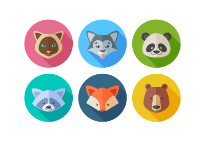
In this tutorial we’ll create six different animal portraits from one and the same circle! Let’s have fun making a set of trendy flat elements using basic…
Conclusion
A lot can change in a century! Design and illustration offer amazing insights into the social and cultural trends and changes that defined decades, and I hope you’ve found this trip back in time interesting and perhaps inspiring for your own creative work.
No designer can truly work in a vacuum, so it’s fantastic to be able to see what visual culture would have been a constant presence in the lives of your parents, grandparents, great grandparents and beyond.
Do you have a favorite decade for design? Let us know which eras get your creative juices flowing in the comments below.
Head over to GraphicRiver and Envato Elements to find vintage-inspired design elements to take a trip back in time in your own creative work.
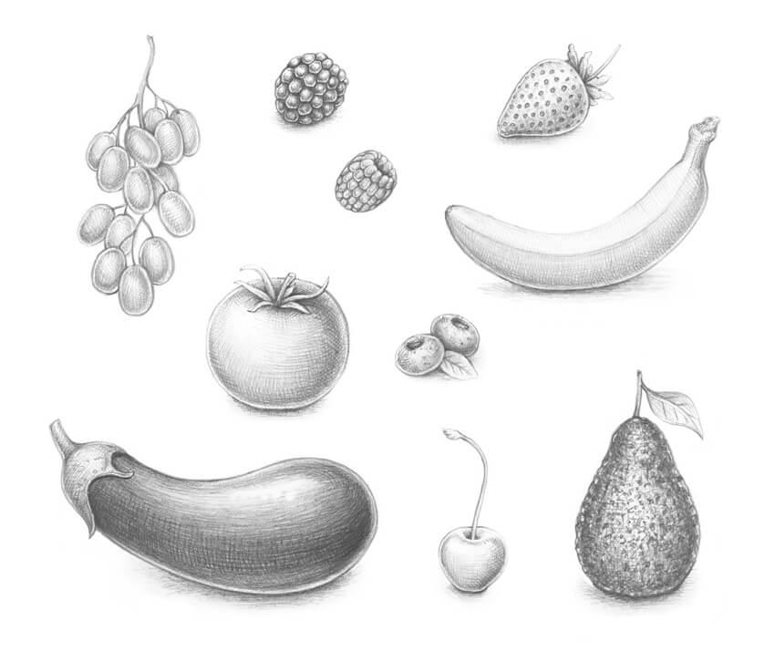
In this tutorial, I’ll show you an easy and quick way to sketch with graphite pencils. We’ll also learn to apply different types of hatching to achieve impressive results.
You don’t need anything fancy to complete this tutorial; just two pencils, an eraser, several sheets of drawing paper, and, of course, a desire for experimenting with your art supplies and creativity!
A background in drawing is desirable but not obligatory. To understand and repeat the steps, you just need to become familiar with the hatching techniques and observe my illustrations closely.
Nothing benefits an artist more than thoughtful observation and daily practice!
What You Will Need
In order to complete this tutorial, you’ll need the following equipment:
an HB graphite pencil
a 3B graphite pencil
an eraser
drawing paper
1. How to Draw With a Graphite Pencil
Step 1
This part of the tutorial is devoted to the tips and tricks of using graphite pencils. We’ll observe different ways of applying strokes and provide a starting point for developing your skill set.
The first type of hatching is a group of straight lines that have the same direction and approximately equal length.
Step 2
Another important technique for creating an illusion of three-dimensionality is contour hatching.
As you can see in the image below, the lines are slightly bent, as if they are repeating the contours of an object.
Step 3
Let’s compare the possibilities of our pencils. We have two types: an HB and a 3B.
Create two samples of simple parallel hatching, just to observe how they look next to each other. In my image, the HB sample is on the left, and the 3B is on the right.
The HB pencil leaves lighter marks on the paper, and we’ll use it mostly for creating the initial contours and designing the drawing.
The lines made with the 3B pencil are darker and more intense, so this tool is the optimal choice for shading.
Step 4
Let’s create a beautiful, velvety-looking texture. I’m making lines with soft rubbing strokes, holding my 3B pencil at an angle.
Try to vary the pressure and layer the graphite strokes; you can get a dark surface which will seem almost black.
Step 5
Sometimes it’s great to smooth over the look of the graphite strokes, making them blurry. To do that, I use my finger, gently rubbing the end of the hatching sample.
Please be sure that your hands are clean and dry before you make anything like this. Human skin has natural oils, so your drawing may get dirty.
If you don’t like using your own hand, you can get a blending stump or an ordinary cotton bud.
2. How to Draw a Strawberry
Step 1
Technically, a strawberry is not a berry—it’s an aggregate fruit. However, for the sake of this tutorial, let’s close our eyes to this fact.
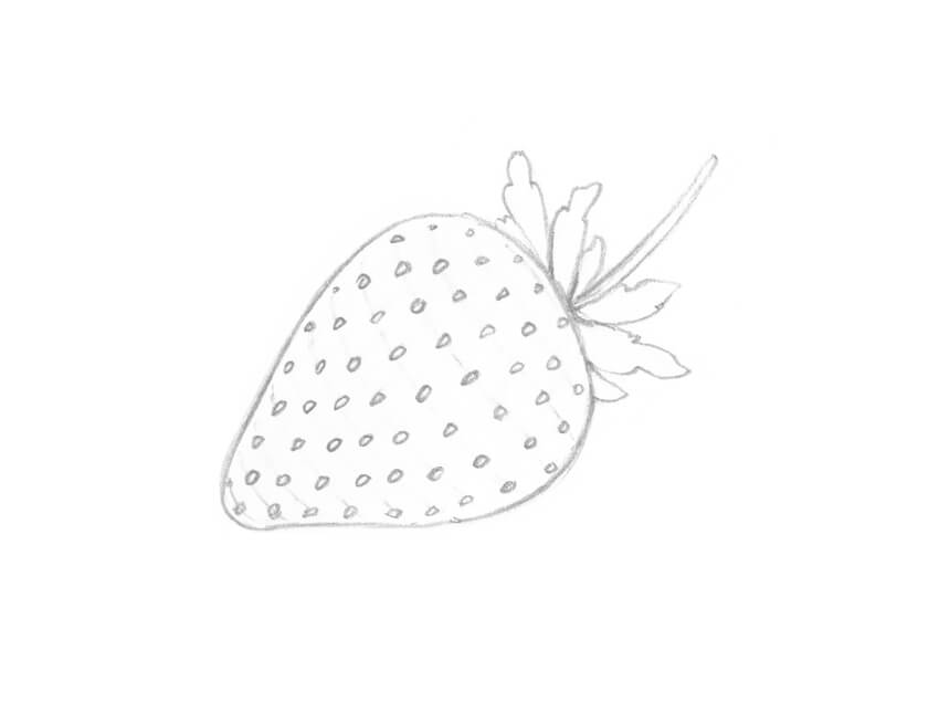
With an HB pencil, I draw the rough shape of the strawberry. Then I add the shapes of the leaves and the stem.
Step 2
I refine the shape of the strawberry and the contours of the leaves.
I also add the subsidiary lines; they will help us to allocate small seeds on the fruit’s body. Our goal is to make an illusion of volume, so the lines should be slightly bent.
Step 3
I soften the subsidiary lines with an eraser, so that they are barely visible, and draw the seeds. They arrange themselves in a staggered order.
Step 4
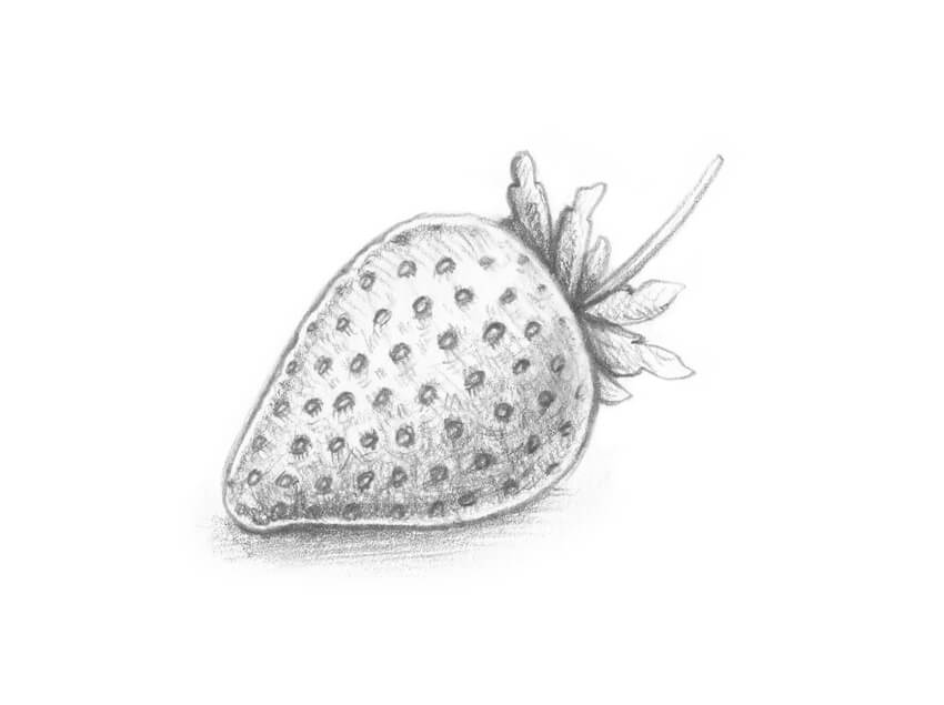
It’s time to apply the hatching, using a 3B pencil. I accentuate the sides of the strawberry, leaving the thin lines of the reflected light, and darken the leaves.
I also emphasize the small hollows (where the seeds are located) and then add the drop shadow. Please be sure to leave a highlight on the upper part of the strawberry.
This drawing already looks as if we’ve worked on it for a long time!
3. How to Draw a Cherry
Step 1
I draw the shape of the cherry, using the HB pencil. This shape resembles a circle with a narrowed bottom part.
Then I add a curved line for the stem.
Step 2
I add a small hollow to the upper part of the cherry and refine the stem.
Step 3
With the 3B pencil, I add the shadows.
I accentuate the hollow and the sides of the cherry with the contour hatching. Then I add some graphite strokes to the stem and mark the drop shadow.
It’s important to leave the highlights because a cherry is a smooth, glossy object.
4. How to Draw a Blackberry
Step 1
With an HB pencil, I draw a rough shape of the blackberry; then I add the parallel, slightly curved subsidiary lines.
Berries like blackberries are composed of a cluster of small drupes around a central stem. The reference lines are helpful for adding the rows of the drupes.
Step 2
Just imagine that the center of each drupe is sitting on the line you drew in the previous step. The rows are fitting closely to each other.
I noticed that it’s much easier to fill the shape of the blackberry with the small elements, starting with the bottom row.
Step 3
With the 3B pencil, I darken the borders between the drupes. I also add a shadow to each small element, leaving a highlight and a thin stripe of the reflexed light.
I’ve drawn a separate drupe just for your reference—you can see it in the image below.
As a finishing touch, I add a drop shadow.
5. How to Draw a Raspberry
Step 1
With the HB pencil, I draw the shape of the raspberry and then add the opening of the berry.
I sketch the subsidiary lines, just as we did with the blackberry drawing.
Step 2
I draw the rows of drupes, starting with the upper one. The principles of perspective are important here; the side drupes are less visible to the viewer.
Step 3
I add the shadows, making a soft texture with the 3B pencil. A raspberry doesn’t look glossy, so we don’t have to create deep shadows and contrasting highlights.
I’ve also added a sample of an individual drupe, just for your reference.
6. How to Draw a Blueberry
Step 1
With the HB pencil, I draw two oval shapes of the berries and add the small openings. To make this composition more interesting, I place a small leaf between the berries.
Step 2
I refine the upper part of each blueberry, adding a flared crown with the uneven edges.
I also add a drop shadow, using the 3B pencil.
Step 3
With the 3B pencil, I add smooth graphite strokes to the sides of the berries. It’s important to accentuate the borders between the objects and darken the openings.
If you wish to make your drawing more credible, you can add the groups of short hatches to create a beautiful spotty texture.
7. How to Draw Grapes
Now we are getting to some things you may not think of as berries. But grapes, tomatoes, and even bananas are berries according to the scientific definition. So let’s keep going!
Step 1
Drawing grapes can seem intimidating—there are so many elements to keep in mind! But don’t worry, we’ll find an easy way to design a small bunch of grapes.
I start with a framework, drawing a vertical core line and adding the shorter divergent lines. The grapes can grow singly or in a small group.
Step 2
I add some thickness to the stem and draw the elongated shapes of the grapes.
To make this process easier, let’s draw the elements that are closer to the viewer first. Some grapes overlap the vertical twig and other grapes.
Step 3
I add the remaining grapes. The initial sketch is complete!
Step 4
With the 3B pencil, I apply the shading. Basically, it’s just a layer of the contour hatching at the sides of each grape. Please be sure to leave the small highlights!
8. How to Draw a Tomato
Step 1
I draw a round shape of the tomato, using the HB pencil. I also mark the hollow in the upper part of the shape.
Step 2
I draw the stem and long shapes resembling leaves.
Step 3
I add the contour hatching, using the HB pencil. It’s important to accentuate the area of the hollow and the sides of the tomato.
Step 4
I darken the shape even more, using the 3B pencil. The strokes should be smooth and soft; you can shade them with your finger or a blending stump.
As usual, I check that the highlight and reflexes are in place, and add a drop shadow.
9. How to Draw a Banana
Step 1
I sketch a rough shape of the banana, using the HB pencil. This form consists of two elements: a long, wide shape for the banana’s body, and a thinner, shorter one for its upper part.
Step 2
I refine the contours of the banana, making this drawing more realistic.
A banana’s body has several sides (and we see two of them), so don’t forget to mark the border between these sides.
Step 3
I apply the contour hatching, using the 3B pencil. It’s important to darken the underside of the banana and accentuate the border between its sides.
I leave a strip of reflected light at the bottom side of the banana and create a drop shadow.
10. How to Draw an Eggplant (Aubergine)
Step 1
With the HB pencil, I draw the shape of the eggplant. It is an oval, with a prominent curve. I add the rough shape of the stem.
Step 2
I refine the upper part of the eggplant, adding the leaf-like elements.
Step 3
With the 3B pencil, I start shading the drawing; contour hatching is the best choice to give this sketch more volume.
The body of an eggplant is dark and glossy, so I apply a thick layer of the graphite strokes to its bottom part.
Step 4
I add more hatching to the sides of the eggplant, making it dark and contrasting.
I leave a bright highlight on the object’s body and add a drop shadow. With an eraser, I make the line of the reflected light at the bottom part of the eggplant.
11. How to Draw an Avocado
Step 1
With the HB pencil, I outline the shape of the avocado. It resembles a pear: a thinner upper part proceeds smoothly to a wider circular base.
I also add a stem and a leaf; these elements will help us to balance the composition.
Step 2
I add a pattern of the small semicircles and wavy lines to create the beautiful texture of the avocado.
Step 3
I add the contour hatching to the sketch, using the HB graphite pencil. I accentuate the sides of the avocado with an additional layer of strokes.
I also add a drop shadow, using the 3B pencil.
Step 4
With the 3B pencil, I work on the texture of the avocado and make my drawing more three-dimensional.
I apply the soft graphite strokes to emphasize the small surface imperfections, accentuating the dents and bumps. I also darken the sides of the avocado and blend the strokes with my finger.
Your Drawings Are Complete
Congratulations—we’ve created ten beautiful graphite pencil sketches! I hope you were inspired by the berries and enjoyed the process of drawing.
For practice, I recommend that you try getting some real berries (or other objects) and making your own sketches. It will help you to develop your observation skills and understand the principles of shading with graphite pencils much better.
Let your creative journey be successful and full of joy!
And if you are interested in other simple, step-by-step drawing tutorials, please check out these:
For as long as there has been email, there has been spam. At its most innocuous, it is a minor irritation, clogging up your inbox with invitations to join online dating sites or take advantage of the latest discounts from a travel agent. But at worst, it can be malicious, containing scams, malware and other harmful content.
Naturally enough, as the software we use online has developed, so has the ingenuity of the scammers and spammers who seek to take advantage of it. Just like antivirus protection and firewall technology, spam filtering is a discipline that is under continuous development.
The Form 7 Problem
There are around one and a quarter billion websites live around the world, and more than 25 percent of these are built on WordPress. Every one of those WordPress sites uses a variety of useful little plugins that can be downloaded for free to make the site more user friendly.
So far so good, but one of the most popular of these plugins is called the Contact 7 form. It is one of those handy forms you can complete to make contact with a website, and is the most popular plugin of its kind. Unfortunately, it is also extremely well liked by spammers, and site owners have reported an exponential rise in spam emails via this route.
Using Everycloud tech for spam filtering
There are a variety of tips and tricks out there for spam filtering, but by using everycloud tech you can be sure that you will not deter genuine customers from making contact. Asking users to prove they are human via captcha tools or quizzes is fine, but it can be seen as an unnecessary hurdle and turn people away. Companies like everycloudtech provide a solution that works quietly but effectively to filter spam without causing extra work or distraction.
Aren’t there plugins?
The way WordPress sites seem to almost run themselves, you might wonder why you would need to go to a specialist provider. Surely there are inbuilt features or “plugins for the plugins” that can deal with your spam problem?
The answer is a resounding “yes and no.” There are freeware solutions to most problems if you know where to look, and while some are reasonably effective, the old adage that you get what you pay for generally holds true.
We have already mentioned Captchas and quizzes. The problems with these are twofold – on the one hand they are becoming old hat and easier to circumvent. On the other, as we mentioned above, they do little to enhance user experience.
Another option is the Contact 7 Honeypot. This is actually a clever little device – it adds a hidden field to the contact form that real visitors will miss out but that bots will fall straight into.
Ultimately, it is neat, but by no means foolproof, and the best way around the rising problem of spam is to make use of the most up to date, professionally created technology.