Breast Cancer Now – the UK’s largest breast cancer charity, is running “Time Machine”, a commercial raising awareness of a goal of defeating breast cancer by 2050. The Time Machine commercial follows a young girl on a secret mission – the purpose of which isn’t revealed to the viewer until the very end. Over a series of days, we see the tiny trooper determinedly studying complex science textbooks, watching quantum theory videos, and raiding the house for objects to use in her special project. In the final reveal, the girl wakes up her mother, who has breast cancer – and leads her inside a ‘time machine’ that she has made from cardboard and household items. As mother and daughter sit in the makeshift machine together, the girl turns the dial from 2017 to 2050. The film closes with Breast Cancer Now’s aim that by 2050, everyone who develops breast cancer will live. The message of the film is that for some, including the family portrayed in this film, the year 2050, can’t come soon enough. The YouTube video links viewers to the Breast Cancer Now page Our Time is Now.
Great Guns’ Duncan Christie directed the bittersweet film, skilfully striking the perfect balance in tone between heart-breaking and empowering. Commenting on the project, Duncan says: “My aim was to build up a sense of intrigue to draw in the audience, making the final reveal all the more impactful. We kept the visual tone hopeful as we wanted to focus on the optimism of our young hero. We also felt the story would benefit from a naturalistic approach. In order to capture off-the-cuff, ‘snatched’ moments in the life of this family, we chose to improvise at times, leaving room for spontaneity during the shoot.
“In order to tell this story truthfully, we had to get into [actor] Jessica’s mind-set,” Duncan continues. “As one expects for a film so heavily reliant on a child actor’s performance, our casting process was exhaustive. We saw a lot of great young actresses but Jessica had that spark which ultimately made her the only choice. She has the emotional intelligence and charisma to a carry a film of this weight.”
‘2050’ was unveiled in November at the 2017 A Bigger Bounce fundraising event at The Roundhouse, held in aid of Breast Cancer Now. Sponsors included Viktor & Rolf, ITV, The Roundhouse, Hearst Magazine, Cucumber Productions Ltd., Moet Hennessy, Phil Mcintyre Television, Talon, Quantum, JamVans, Rhubarb and Great Guns. During the event, hosted by Alex Jones, generous prizes were donated and auctioned off. A Raffle saw prizes ranging from a brand-new car, to an overnight stay at the Dorchester, tea at the Wolseley with Dame Barbara Windsor and dinner at restaurant ‘34’ with Bruno Tonioli.
CEO of Great Guns, Laura Gregory comments: “Breast Cancer Now is making progress towards the 2050 goal, but reaching it is dependent on continued public awareness and raising money for vital and much needed breast cancer research. The committee for A Bigger Bounce worked tirelessly to produce the third event. Co-Chairs, Carolyn McCall and Philippa Brown did a superb job pulling the committee together and harnessing everyone’s strength to deliver a top-notch night of fun and entertainment. The committee gathered prizes that were truly out of this world and worthy of the amounts raised. I lost my mother to breast cancer and will always give time to raise money for continued research to beat the disease.”
Time Machine Credits
Filming was shot by director Duncan Christie via Great Guns with director of photography Sy Turnbull, executive producer Laura Gregory, producer Tim Francis, production designer Francesca Massariol, and casting director Kharmel Cochane.
Cast were Jessica Newton, Kate Rawson and Garry Summers.
As a kid, I used to spend my nights
watching The X-Files and wondering if there truly is something else in the universe, something that might change the way we think but most importantly
help us see our place within it.
Whether it’s little green men or grey ones,
our imagination has always run wild creating stories that might or might not be
true, so today we’re going to try and gather some evidence by creating our very
own alien abduction illustration. Of course, we’re going to do all of that
using our creative imagination and a few shapes and tools found in Adobe Illustrator.
That being said, go pour some magic bean
juice in that special agent mug, and let’s get started!
Oh, and don’t forget
you can always expand your project by heading over to GraphicRiver where you’ll
find a great selection of alien-themed vector assets.
1. How to Set Up a New Project File
Assuming you already have Illustrator up
and running in the background, bring it up and let’s set up a New Document (File > New or Control-N)
for our project using the following settings:
Number
of Artboards: 1
Width: 920
px
Height: 680
px
Units: Pixels
And from the Advanced tab:
Color
Mode: RGB
Raster
Effects: Screen (72ppi)
Preview Mode: Default
2. How to Set Up a Custom Grid
Even though today’s project is not an icon-based one, we’ll still want to create the illustration using a pixel-perfect
workflow, so let’s set up a nice little grid so that we can have full control
over our shapes.
Step 1
Go to the Edit > Preferences > Guides & Grid submenu, and adjust
the following settings:
Once we’ve set up our custom grid, all we
need to do in order to make sure our shapes look crisp is enable the Snap to Grid option found under the View menu (that’s if you’re using an
older version of Illustrator).
Now, if you’re new to
the whole “pixel-perfect workflow”, I strongly recommend you go through my How
to Create Pixel-Perfect Artwork tutorial, which will help you widen your
technical skills in no time.
3. How to Set Up the Layers
Once we’ve finished setting up our project
file, it would be a good idea to structure our document using a couple of
layers, since this way we can maintain a steady workflow by focusing on one
section of the illustration at a time.
That being said, bring up the Layers panel, and create a total of four
layers, which we will rename as follows:
layer
1: background
layer
2: main composition
layer
3: texture
layer 4: hud overlay
Quick tip: I’ve colored all of my layers using the same
green value, since it’s the easiest one to view when used to highlight your
selected shapes (whether they’re closed or open paths).
4. How to Create
the Background
As soon as we’ve
layered our document, we can start working on the project by creating the dark
background, so make sure you position yourself on the first layer, and let’s
jump straight into it.
Step 1
Create a 920 x 680 px rectangle,
which we will color using #2C2D2D and then center align to the underlying Artboard
using the Align panel’s Horizontal and Vertical Align Center options.
Step 2
Lock the current layer using the Layers panel, and then move on up to the next one (that would be the second one)
where we’ll gradually build our composition.
5. How to Create
the Cellar Entrance
With the
background in place, we can start working on our surreal composition, and we
will do so by creating the cellar entrance where the person behind the camera
lens is documenting the close encounter.
Step 1
Create a 280 x 536 px rectangle
(#656868), which we will center align to the underlying Artboard and then turn
into a subtle light curtain by applying a Linear gradient to it. Use the same #656868 hex value for both color stops, making
sure to set the left one’s Opacity
to 0%.
Step 2
Add the cellar’s entrance using a 280
x 396 px rectangle (#868989) which we will position on top of the one that
we’ve just created, center aligning it to the underlying one’s top edge.
Step 3
Adjust the smaller rectangle, by individually
selecting its bottom anchor points using the Direct Selection Tool (A), and then pushing them to the inside by 20 px using the Move tool (right click > Transform > Move > Horizontal > +/- 20 px depending on which side you start with).
Step 4
Zoom in on the document, and then start working
on the entrance’s sill by creating a 240
x 16 px rectangle (#6A6D6D), which we will position below the previously
adjusted shape.
Step 5
Add another shorter 248 x 4 px rectangle which we will color using #515454, and then
position as seen in the reference image.
Step 6
Select the Pen
Tool (P), and using #2C2D2D as your Fill
color draw the little wood cracks using the reference image as your main guide.
Take your time, and once you’re done, select and group them all together using
the Control-G keyboard shortcut,
doing the same for all of the current section’s composing shapes.
Step 7
Create the stairs using a 240 x 28 px rectangle for the top one, followed by a 256 x 28 px one for the center one and
an even larger 272 x 28 px one for
the bottom one. Color all three shapes using #515454, making sure to vertically
stack them 8 px from
one another.
Step 8
Give each stair a subtle highlight using three 2 px tall rectangles, which we will
color using #6A6D6D and then center align to their top edges.
Step 9
Add the hard shadows using three curved
segments, which we will color using #2C2D2D and then position onto the larger
rectangles’ bottom edges as seen in the reference image.
Step 10
As we did with the sill, take a couple of moments and draw a few cracks on each stair, using #2C2D2D as your Fill color. Take your time, and once you’re done, select and
individually group (Control-G) each
stair with its corresponding details, doing the same for the entire set afterwards.
6. How to Create
the Stars
As soon as we’ve
finished working on the stairs, we can focus on adding details to the
background framed by our cellar’s entrance, and we will do so by creating little stars.
Using a couple of 4 x 4 px circles
(#B1B5B5), gradually populate the night sky, making sure to select and group all
of them together afterwards using the Control-G
keyboard shortcut.
7. How to Create
the Windmill
With the stars in
place, we can start developing our composition by building some of the farm
utilities, the first one on our list being the windmill.
Step 1
Create the main shape for the windmill using a 72 x 248 px rectangle with a 4
px thick Stroke (#2C2D2D) with a Round Join, which we will position
on the lower side of the entrance, as seen in the reference image.
Step 2
Adjust the shape that we’ve just created, by adding a new anchor point to the center of its top
edge using the Add Anchor Point Tool (+) and then removing its corner ones using the Delete Anchor Point Tool (-).
Step 3
Add the drop pipe assembly using a 248
px tall 4 px thick Stroke line (#2C2D2D), which we will
center align to the windmill’s body.
Step 4
Add the horizontal structure beams using two 4 px thick Stroke lines
(#2C2D2D), which we will position onto the mill’s larger body as seen in the
reference image.
Step 5
Draw the diagonal beams using a couple of slightly thinner 2 px Stroke lines (#2C2D2D), which we
will position between the horizontal ones that we’ve just created. Take your
time, and once you’re done, select and group all of the body’s composing shapes
together using the Control-G
keyboard shortcut.
Step 6
Start working on the windmill’s head by creating a 16 x 16 px circle with a 1 px thick Stroke (#2C2D2D), which we will center
align to the larger body’s tip.
Step 7
Create a 24 x 24 px circle
with a 2 px thick Stroke (#2C2D2D), followed by a slightly larger 48 x 48 px one (#2C2D2D), both of which we will center align to the previously created shape.
Step 8
Add the vertical and horizontal detail lines using two 2 px thick Strokes (#2C2D2D), which we will center align to the head’s smaller
circle.
Step 9
Create the vertical pair of blades using two 8 x 28 px rectangles (#2C2D2D), which we will adjust by
individually selecting and pushing their inner-facing anchor points to the
inside by 2 px using
the Move tool (right click > Transform > Move > Horizontal > +/- 2 px depending
on which side you start with). Once you’re done, group (Control-G) and position the resulting shapes on the head’s
smaller circle.
Step 10
Add the remaining blades using three copies (Control-C > Control-F) of the ones that we’ve just grouped,
which we will adjust using the Rotate tool
(right click > Transform > Rotate
> 90º for the horizontal ones and 45º
for the diagonal ones). Once you’re done, select and group (Control-G) all of the head’s composing
shapes, doing the same for the entire windmill afterwards.
8. How to Create
the Phone Pole
As soon as you’ve
finished building the windmill, we can move a few pixels to the right and start
working on the phone pole.
Step 1
Create the pole’s main body using a 4 x 108 px rectangle, which we will
color using #2C2D2D and then position onto the right side of the cellar’s sill
as seen in the reference image.
Step 2
Using a couple of #2C2D2D colored rectangles, gradually add the remaining
sections to the pole, making sure to select and group them all together
afterwards using the Control-G
keyboard shortcut.
Step 3
Add the phone line using a 48 x
12 px ellipse with a 2 px thick Stroke (#2C2D2D), which we will adjust
by removing its top half by selecting its top anchor point using the Direct Selection Tool (A) and then
removing it by pressing Delete. Once
you’re done, position the resulting shape onto the pole’s horizontal section,
making sure to select and group (Control-G)
all of its composing shapes before moving on to the next section.
9. How to Create
the Flying Saucer
With the phone
pole in place, we can finally start working on the scarier section of our
composition, where we will get to create the imposing flying saucer.
Step 1
We’re going to start by quickly drawing the floating cow that’s being
abducted using #2C2D2D as our Fill color,
positioning the resulting shape as seen in the reference image.
Step 2
Create the main shape for the saucer’s upper section using an 80 x 40 px ellipse, which we will color
using #515454 and then position 42 px from the upper edge of the cellar’s entrance.
Step 3
Add the hard shadow using a 200 x 64 px ellipse (#2C2D2D), which we will position 8 px from the upper edge of the
shape that we’ve just created. Mask the larger shape using a copy (Control-C) of the one from underneath
(highlighted with red) which we will paste in front (Control-F) and then right
click > Make Clipping Mask, making sure to select and group (Control-G) the two together afterwards.
Step 4
Start working on the saucer’s lower body by creating a 200 x
64 px rectangle, which we will color using #6A6D6D and then position at a
distance of 12 px from the top edge
of the previous section.
Step 5
Add the bottom section using a darker 200 x 56 px ellipse (#2C2D2D), which we will center align to the lower
edge of the shape that we’ve just created.
Step 6
Create the circular insertion using a 12 x 8 px ellipse (#2C2D2D), which we will position as seen in the
reference image. Once you have the shape in place, select and group (Control-G) all of the lower body’s
composing shapes before moving on to the next step.
Step 7
Create the main shape for the tractor beam using an 80 x 12 px ellipse, which we will color using #6A6D6D and then
position as seen in the reference image.
Step 8
Add an 80 x 8 px rectangle (#6A6D6D) to
the lower half of the ellipse that we’ve just created, making sure to adjust
the new shape by individually selecting and pushing its bottom anchor points to
the inside by 8 px using
the Move tool (right click > Transform > Move > Horizontal > +/- 8 px depending
on which side you start with).
Step 9
Create the tractor beam’s lower section using a 64 x 12 px ellipse (#515454), on top of which we will add a smaller 48 x 6 px one (#2C2D2D), positioning
the two on the bottom edge of the shape that we’ve just created. Once you
have the ellipses in place, select and group (Control-G) all of the current section’s composing shapes, doing the
same for the entire saucer afterwards.
Step 10
Create the actual beam pulling the cow from the ground using a 32 x 296 px rectangle (#B1B5B5), which
we will position onto the lower half of the darker ellipse and then adjust by
selecting and pushing its bottom-left anchor point to the outside by 36 px (right click > Transform > Move > Horizontal > -36 px).
Step 11
Create the upper section of the beam using a 64 x 2 px ellipse (#B1B5B5), which we will adjust by removing its
right half, positioning the resulting shape onto the taller shape. Then, select
the two and combine them into a single larger shape using Pathfinder’s Make Compound
Shape option.
Step 12
Turn the beam into a gradient using #B1B5B5 for both of its color stops, making sure to set the left one’s Opacity to 0%. Once you’re done, select and group both the flying saucer and
the beam using the Control-G
keyboard shortcut.
Step 13
Add the smaller saucers using two 48 x 2 px rectangles (#B1B5B5) with a 1 px right corner Radius, which we will turn into gradients following the same
process used for the beam, making sure to leave the Angle set to 0º.
Position the resulting shapes as seen in the reference image, making sure to
group (Control-G) them together
before moving on to the next step.
10. How to Create the Fence
As you can see, our composition is gradually taking shape, so let’s continue working on it by creating the two fence
sections.
Step 1
Create the left section of the fence using a
couple of #2C2D2D coloredrectangles,
which we will position and adjust as seen in the reference image. Take your
time, and once you’re done, select and group (Control-G) all of the shapes together before moving on to the next
step.
Step 2
Create the right section using a copy (Control-C > Control-F) of the one that we’ve just finished
working on, which we will vertically reflect (right click > Transform > Reflect > Vertical) and then
position on the opposite side of the cellar’s entrance.
Step 3
Once you’re done working on
the fence, we can select and group (Control-G)
all of the composition’s shapes framed by the cellar’s entrance, masking them
afterwards using a copy (Control-C > Control-F)
of the underlying shape by right
clicking > Make Clipping Mask.
11. How to Create
the Alien
Since at this
point our composition is pretty much done, we can add the central piece of our
illustration, the little grey man.
Step 1
Create the alien’s main body using a 28 x 12 px rectangle (#2C2D2D), which we will adjust by setting the Radius of its top corners to 8 px, positioning the resulting shape
in the center of the entrance’s sill.
Step 2
Add the neck section using two 8 x 16 px ellipses (highlighted with
red), which we will horizontally distribute 4 px from one another, adjusting them by selecting and removing
their top and outer anchor points. Unite the resulting paths into a single
larger shape by pressing Control-J
twice, setting its color to #2C2D2D.
Step 3
Create the head using a 40 x 40 px circle (#2C2D2D), which we will adjust by selecting and
pushing its bottom anchor point to the outside by 8 px using the Move tool (right click > Transform > Move > Vertical > 8 px).
Step 4
Give the resulting shape a subtle highlight, which we will color using #515454.
Step 5
Separate the arms from his body using two 2 x 2 px squares (#868989) with a 1 px top corner Radius,
which we will position at a distance of 4
px from the torso’s sides. Once you’re done, select and group (Control-G) all of its composing shapes
together, before moving on to the next section.
Step 6
Add the shadows cast by the little grey man’s head onto the stairs
using a 56 x 158 px ellipse (#2C2D2D)
with a 64% Opacity as your base
shape, gradually adding 8 px to each new copy (Control-C > Control-F) and masking them using a copy of the corresponding
stair’s fill shape. Once you’re done, select and group (Control-G) all of the current layer’s
composing shapes before moving on to the next one.
12. How to Create
the Textures
As soon as we’ve
finished working on our composition, we can start adding some visual effects to
it. So, assuming you’ve positioned yourself on the next layer (that would be
the third one), let’s do just that by applying some subtle textures.
Step 1
Make the illustration look as if it was shot on film, by adding a
couple of 920 x 2 px rectangles (#FFFFFF),
which we will vertically stack 2 px from
one another. Once you’re done, group (Control-G)
and then center align the shapes to the underlying Artboard, making sure to
lower their Opacity to 6%.
Step 2
Give the illustration some noise by creating a 920 x 680 px rectangle (#2C2D2D), which
we will turn into a texture by going over to Effect > Photoshop Effects > Texture > Grain, where we
will set the Intensity to 40, the Contrast to 50, and the Grain Type to Stippled.
Step 3
Set the resulting texture’s Opacity to 12%, changing
its Blending Mode from Normal to Lighten.
13. How to Create the HUD
Once we’ve finished adding the textures, all we need to do in order to
finish our illustration is create the little camera HUD. That being said, move
on up to the fourth and last layer, and let’s wrap things up!
Step 1
Start by creating the framing guides using four 76 x 52 px rectangles with a 4 px thick Stroke (#868989), which we will position at a distance of 28 px from the Artboard’s corners and
then adjust by individually selecting and removing their inner-facing anchor
point.
Step 2
Zoom in on the Artboard’s bottom-left corner, and create the battery
level indicator using a 30 x 16 px rectangle
with a 4 px thick Stroke (#D8D8D8) for its main body. Add
the levels using three 4 x 8 px rectangles
(#D8D8D8) horizontally spaced 2 px from one another, followed by the nose using a 6 x 8 px rectangle (#D8D8D8). Once you’re done, select and group (Control-G) all its composing shapes
together, positioning them as seen in the reference image.
Step 3
Add the recording state using a 16
x 16 px circle (#F26A46), which we will position at a distance of 12 px from the top-right framing guide. Add the “REC” text (#F26A46) in front of it using a font of your choice.
Step 4
Finish off the HUD, and with it the project itself, by adding the elapsed
time indicator to the bottom framing guide, making sure to select and group (Control-G) all of its composing shapes
together before hitting that save button.
Great Job!
There you have it, fellow conspiracy theory lovers, an in-depth step-by-step tutorial on how to
create an alien abduction illustration.
I hope you’ve
managed to keep up with each and every step, and most importantly learned
something new and useful along the way.
That being said, I’m looking forward to seeing your final result, and if
you have any questions, feel free to post them in the comments section and I’ll
get back to you as soon as I can!
Get the best new fonts of 2018! Create inspiring designs with beautiful typography.
The Best New Fonts for 2018
Each font carries its own magic. Some are sturdy and professional, while others may be dainty or relaxed. Find the right font for your work with this quick selection below!
Featuring the latest font types to hit Envato Market and Envato Elements, we bring you 18 amazing typefaces for all your creative projects.
Enjoy effortless script types with elegant swoops and futuristic letters. Create awesome designs with these incredible fonts!
Need more help? Get quality advice from our experts at Envato Studio.
Learn More About Fonts
New to fonts and typefaces? Check out these great lessons to learn more:
Designed for optimal legibility, the Kiona font features crisp lines and clean edges. Take advantage of its four different font weights, developed after very different personalities. Are you feeling strong or edgy? Try out this font!
Show off your feisty side with the Selfish script font. Introducing a brand new handwritten font with incredible charm, the Selfish font is clean and fluid. It’s perfect for branding, home ware, and more—you’ll love this stylish font!
Design a luxury brand with the Sustans Typeface. Featuring stylish, handwritten letters, this typeface is sophisticated and multipurpose. Create compelling designs that are sure to arouse interest in your work! Give it a try!
You are unique. So find a font that matches your individual style. Ornacle is a font for innovators and risk takers. Enjoy its futuristic style designed with clever geometric elements to help you stand out. Shine with this creative typeface!
Hey darlings! Add a little sweetness to your work with this joyful typeface. Handwritten with brilliant brush details, this font also includes darling swashes and ligatures to match! Download it today to get access to unique OpenType stylistic alternates.
Fiesta Color is a gorgeous decorative typeface created with Fontself Maker. It features a trendy, geometric style with wonderful abstract elements exploding with color. Use it on postcards, invitations, or fashionable tote bags.
You can achieve the same beautiful swoops of traditional calligraphic handwriting with modern typefaces. And the stunning Flitte script is a perfect example! Use it for wedding invitations, t-shirts, and so much more!
Celebrate your favorite memories with the festive Tehika font. A hand-drawn script font with well-spaced letters, this font is simply magical. Attach it to the company’s Christmas card or apply a beautiful signature to any bare stationery. Try it out!
Create
that authentic handcrafted feel with the lovely Contaur typeface.
Designed for stationery, logos, and so much more, this font is a mixture
of tall and short elegant letters. It’s the perfect companion to any
beauty-related project!
Quirky and futuristic, the Auro font is a sleek, decorative typeface. Use it for headers and posters as a unique way to highlight your brand. Included in this download are a complete set of letters, numbers, and punctuation for you to enjoy.
Step into the future with the Teratur typeface. A modern font family with clean, minimal details, this typeface is inspired by classic sci-fi font types. Just toggle the caps lock to enjoy alternate letters. You’ll love this font!
Need something simple and multipurpose? Then try the Mellifret semi-bold script font. A great addition to any book cover or logo, this font is simple yet sporty. Included along with this three font pack deal are amazing swashes to help decorate your designs.
Utilizing the newest OpenType technology, the Heady Rough typeface is wild and energetic. Experiment with this versatile hand brushed style for impeccable designs that are hard to miss. Included are three fonts compatible with Photoshop CC 2017.1.1 or later.
A little grunge never hurt anyone! So begin your next adventure with this rustic, hand-painted brush font. By utilizing high-resolution brush stroke images, this font achieves hyper-realistic details with an authentic grunge finish. Download it now!
The Sacred Bridge Family is old-fashioned and dignified. Create that instant elegant feel with beautiful decorative letters designed after traditional letterpress styles. So what will you get? An awesome collection of 10 retro fonts with alternate glyphs, and multilingual support. Try it out!
Zembood features all the characteristics of an amazing vintage font. Add it to your modern apparel line for an edgy look in only a matter of seconds. With bold letters and fine grunge details, this font features a versatile style you’ll definitely want.
Bring
a smile to someone’s face with this set of pretty Bambi fonts. Great
for inspirational quotes, posters, and more, this calm brush font is
smooth and tranquil. Enjoy the bouncy baseline and curvy letters today!
Need a steampunk font for epic retro designs? Then try out the Starship typeface! Brilliantly charismatic, this font features a strong serif typeface with bold vintage letters. Download eight font files complete with regular, grunge, and inline styles.
Conclusion
This list features exciting
resources for the avid designer
familiar with type design. For
additional help with your font needs, enlist the skills of a talented
professional by choosing one of the amazing designers from Envato Studio.
And
with loads of fonts available at your fingertips, chances are we’ve
missed a few to add to your personal collection. Be sure to browse Envato Market and Envato Elements for more resources, and let us know your favorites in the comments below!
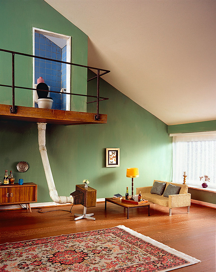
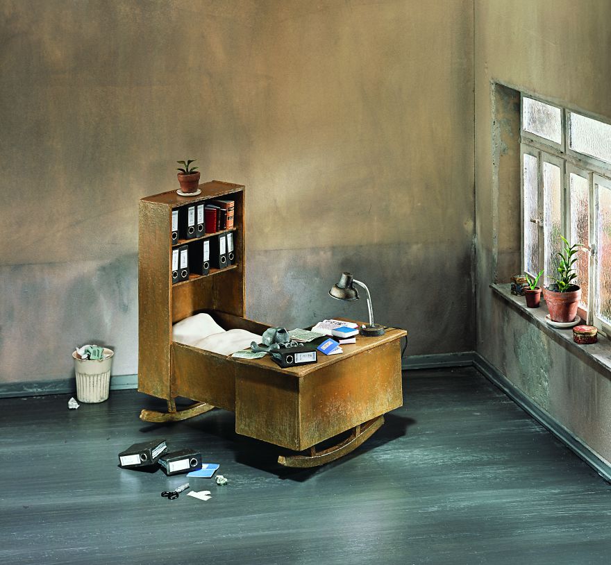
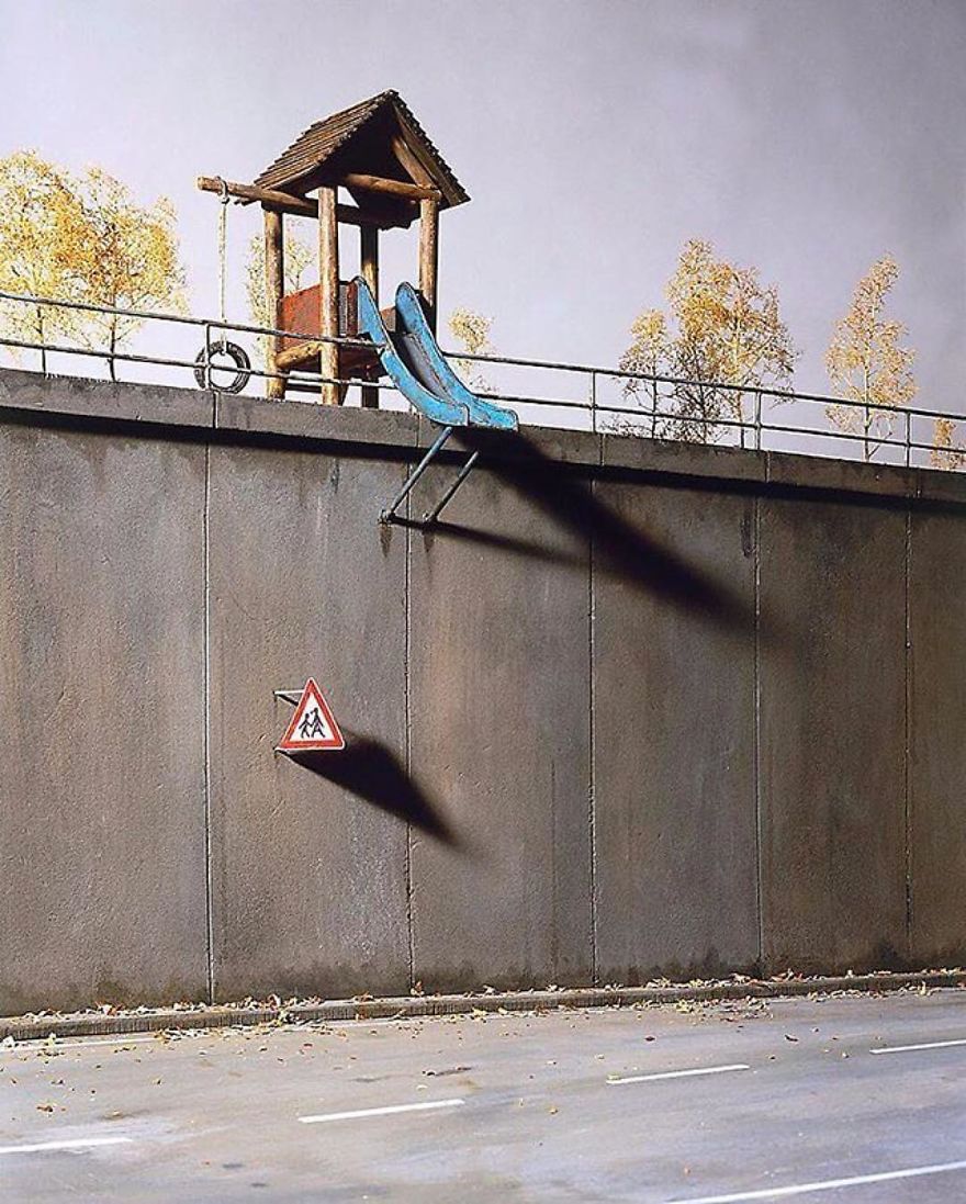
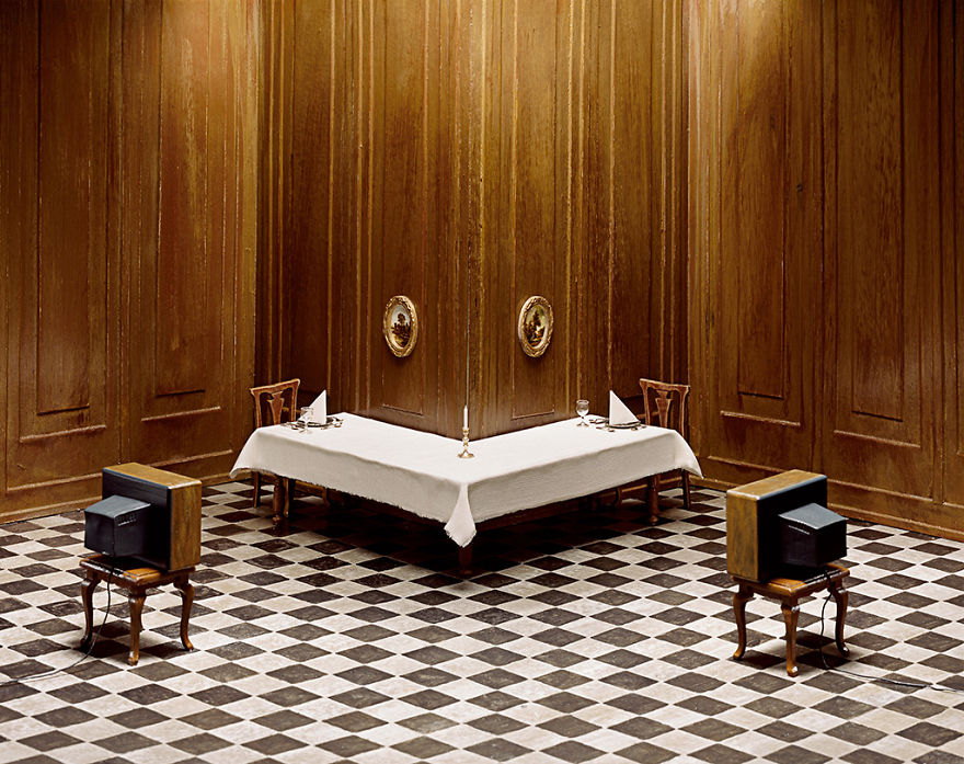
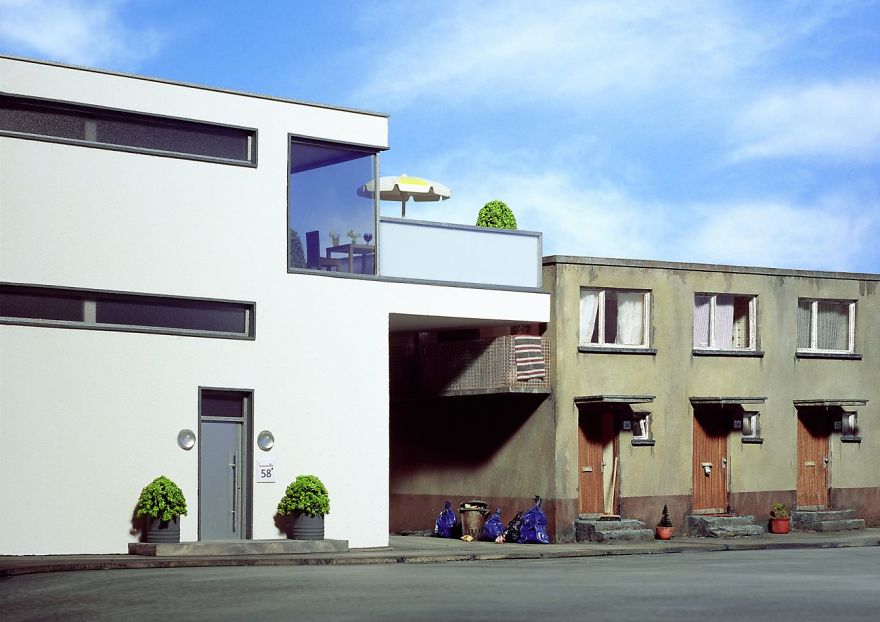
Frank Kunert is a German photographer based in Frankfurt. He creates carefully crafted 3D models that he then photographs. In his work, you get to see a sarcastic view of our modern world, often using absurdity to pinpoint the problems we face in education, social life, work, and many other aspects of our lives.
When you are creating a website, it’s no secret that you want it to stand out. An outstanding site gains points over the competition and is impressive to potential customers.
A unique and attractive website gives designers a competitive edge. Developers add original and successful websites to their portfolios in order to attract new clients.
The following tips will assist you to make your website stand out:
Layout and structure
A unique site structure or impressive layout will make your site memorable. However, this is no easy feat. Creating a unique website provides a visual challenge and the opportunity to stretch your developmental skills.
Remember to keep information well organized and accessible while working on a unique site. When offering a unique site, development time may be increased as you encounter new problems.
When designing a new site, use programs which are easily accessible to users. Many complex sites rely heavily on JavaScript, but this is not always accessible to users.
Branding
If your client has an excellent brand, this will assist your site to stand out. Branding aims to transcend a product, creating an emotional resonance with the user. Stick with your client’s branding guidelines, embrace them, and use the client’s logo on your site.
If your client does not have original branding or logos and only has a choice of font, this makes it harder. Work with the message, colorand font you would like your client to create.
Use text effectively
Using text to set your site apart is both complex and very effective. The content of a site reflects the client’s personality or corporate culture. Use text, video, subheadings and easy reading or legibility to set the site apart.
Ask your client for copy that is well written and effective, showing a sense of warmth which connects with the reader. You want any copy which reaches your site to go beyond the obvious sell tactics and to engage the reader. This can sometimes be tricky.
Work with your audience
When you construct your website around user needs, you create a site which is both engaging and easy to navigate.
Many designers don’t do this. Take time to research who your users are, what interests them, and how you can incorporate their needs to create a niche site which is easy to navigate.
Keep it simple
Although branding and logo set the stage, assuring users they have come to the right place, it is the site’s design which will keep the reader engaged. A well laid out site is clear and easy to read, has plenty of white space, and uses color effectively. Navigation is simple and easy to use. Keep content arranged according to hierarchy.
When creating your site, keep it simple. Arrange content so that you don’t overwhelm your audience, but they are easily able to find the information they need.
Use white space effectively
Background space keeps your design clear and simple. Website organization is an important aspect of your design.
Design each area of your page so that it is aesthetic and adds value. Use white space to keep your design looking clean and fresh.
Typography
When you browse the web and come across some of your favourite brands or designs, how often do you recognize the font or typeface immediately? A brand is often immediately recognizable by the font chosen. Using a clearly defined font will link viewers to your brand.
When creating a header font, use a font which will stand out, and tie your viewers back to your brand. Google Fonts has plenty of options which are free to use.
Play with text
Great websites use large font sizes to keep text legible. This helps to create an easy flow. It also assists the designer with narrowing down language so that it is clear and precise. A large text has no space to become superfluous, confusing readers.
Clear, legible text which is easy to read will make your message easier for viewers. Along with headings and subheadings, large fonts will also enable you to scan articles or web pages to find the information they need.
Dramatic Headlines
Headlines make a statement, showing users what your site is about. They are often the most important aspect of a site and grab user attention because of their information content.
As a result, large, attractive headlines are used amongst many modern designers.
Color
The goal of a website is not just to create site visitors, but to encourage those visitors to buy a product, commit to a service or access new knowledge. In other words, the success of a website is determined by its ability to convert viewers into clients or customers.
In order for a website to have a high conversion rate, there is a need to make it accessible, efficient, and to use prompts which encourage users to take action. Color is often used as a means of highlighting aspects such as ‘sign up’ or ‘get started’ buttons.
Instead of looking at which single color is most effective, focus on how color stands out against the background of your website. This way, you can use color to create a hierarchy, drawing user attention to the most important buttons on a site.
Use contrast
Web designers rely on color to give an emotional or intuitive message to viewers. This helps to portray the atmosphere or culture of a company.
Color does not only create a mood, however. By contrasting colors, a designer is able to highlight different areas of a page. This assists viewers with establishing a hierarchy.
Be willing to experiment
Have you ever thoughtabout designing using a watercolor theme? There are many approaches to watercolor.
It was a popular trend not too long ago, and it’s making a comeback. You can use various watercolor elements in your header, sidebar or footer, depending on the site you’re designing.
Using a grid is a popular website design method for modern websites. This effective way of designing enables you to add effective imagery to your site while presenting options to site visitors.
When using a grid, keep it simple. Too many options can be overwhelming for visitors. Keep your imagery simple and your navigation panel concise and easy to use.
Minimalism
Minimalism sounds simple, with its use of white space, attractive imagery, and sleek typography, and believes that less is more. However, there is a lot going on beneath the clean surface.
In minimalism, negative space is used to draw attention to specific elements, so that the viewer does not get overwhelmed by too much information. The focus is on content, and the bare background is a means of achieving this goal.
When creating minimalist designs, focus on large images which give a sense of drama to your page, providing an emotional connection for viewers. Image quality is vital, as it will provide the emotional or atmospheric element to your page.
Social proof
When you have an expert review a product, make a statement on a service or carry out research, you create a sense of trust or reliability for your readers. Likewise, customer reviews or testimonials show how clients have experienced a product or service.
When using reviews, do so after you’ve made an argument for how your product will fit, providing a similar service or content. This will enable the review to offer a persuasive element to your site.
Go fast
Users are quick to abandon slow websites. Therefore, if you want to ensure that viewers turn into clients, it is important that your site downloads quickly.
Online viewers are impatient, and if your site takes more than a few seconds to download, they will often abandon the page.
Search engines give a higher ranking to pages which load quickly. In order to ensure rapid download, use only essential elements in your design, and go for premium hosting to ensure your downloading speed gives you what you need.
Summary
Developing a stellar website is all about embracing customer need, thinking through your design so that it works intuitively while being aesthetically appealing.
If you are able to work with client needs, your site will set you apart from the competition. Follow these tips and get started, and remember, never settle for second best!
A grand total of 77,609 responses from WordPress users and professionals collected by Automattic between 2015 and 2017. The stats for 2015 and 2016 have been shared at the annual State of the Word address and 2017 marks the first time they have been published on WordPress News.
A few items that caught my attention at first glance:
Between 66% and 75% of WordPress users installed WordPress on their own. In other words, they were savvy enough to do it without the help of a developer. Hosting providers were next up and clocked in at 13-14% of installs.
WordPress professionals described their clients as large and enterprise companies only 6-7% of the time. I guess this makes sense if those companies are relying on in-house resourcing, but I still would have pegged this higher.
What do users love most about WordPress? It’s simple and user-friendly (49-52%). What frustrates them most about it? Plugins and themes (19-28%). Seems like those two would go hand-in-hand to some degree.
I’m not a statistician and have no idea how much the results of these surveys accurately reflect the 26% of all sites on the internet that are powered by WordPress, but it sure is interesting.
Tom Warren’s „Chrome is turning into the new Internet Explorer 6” for The Verge has a title that, to us front-end web developers, suggests that Chrome is turning into a browser far behind in technology and replete with tricky bugs. Aside from the occasional offhand generic, „Chrome is getting so bad lately,” comments you hear, we know that’s not true. Chrome often leads the pack for good web tech.
Instead, it’s about another equally concerning danger: developers building sites specifically for Chrome. In theory, that’s not really a thing, because if you build a website with web standards (of which there isn’t really much of an alternative) it’ll work in Chrome like any other modern web browser. But it is a thing if you build the site to somehow block other browsers and only allow Chrome. Warren:
Google has been at the center of a lot of “works best with Chrome” messages we’re starting to see appear on the web. Google Meet, Allo, YouTube TV, Google Earth, and YouTube Studio Beta all block Windows 10’s default browser, Microsoft Edge, from accessing them and they all point users to download Chrome instead. Google Meet, Google Earth, and YouTube TV are also not supported on Firefox with messages to download Chrome.
I wouldn’t call it an epidemic but it’s not a good trend. Best I can tell, it’s server-side UA sniffing that entirely blocks the sites:
Sheesh.
If anything, I’d think you’d just let people use the site and display a warning if you’re really worried some particular feature might not work. Or even better, fix it. I have no behind-the-scenes knowledge of why they made the choice to block certain browsers, but it’s hard to imagine a technical limitation that would force it. And if it is, I’d suggest letting it be very publicly known to incentivize the other browsers to support what is needed, assuming it’s an established standard.
Even more concerning than browser-specific websites is seeing browsers ship non-standardized features just because they want them, not behind any vendor prefix or flag. There was a time when web developers would have got out the pitchforks if a browser was doing this, but I sense some complacency seeping in.
These days, the vibe is more centered around complaining about other browsers lack of support for things. For example, one browser ships something, we see one green dot in caniuse, and we lambast the other browsers to catch up. Instead, we might ask, was it a good idea to ship that feature yet?
No modern browser is shipping vendor prefixes anymore since we all ultimately decided that was a bad idea. A side effect of that is that shipping a new feature in CSS or JavaScript is all the riskier. I would think shipping an unprefixed feature to a stable version of the browser would mean the feature is standardized and not going to significantly change. Yet, it’s been happening.
In CSS, Chrome shipped motion-* properties, but then that all changed to offset-*, and the old motion-* properties just stopped working. That’s more than just annoying, that kind of thing helps developers justify saying, „I just build this site for Chrome, if you wanna use it, use Chrome.” Fine for a demo, perhaps, but bad for the web industry as a whole. Again, I have no special insight into why this happens, I’m just a developer looking in from the outside.
Here’s another CSS one I just saw the other day. People are excited about text-decoration-skip: ink; because it looks great and helps people. They are using it a lot. But apparently, that’s not the correct name for it? It’s been changed to text-decoration-skip-ink: auto; and so Chrome 64 is canningtext-decoration-skip: ink;. This stuff is hard to keep up with even while actively trying.
Over the past few years, I’ve increasingly seen articles with headlines that run something like, “New Feature Coming To the Web” — followed by content which described how Chrome had implemented an experimental new feature. “You’ll be able to use this soon!” has been the promise.
The reality is a bit more complicated. Sometimes, ideas the Chrome team pioneers make their way out to the rest of the browsers and become tools we can all use. Sometimes… they get shelved because none of the other browsers decide to implement them.
Many times, when this latter tack happens, developers grouse about the other browser makers who are “holding the web back.” But there is a fundamental problem in this way of looking at things: Chrome isn’t the standard. The fact that Chrome proposes something, and even the fact that a bunch of developers like it, does not a standard make. Nor does it impose an obligation to other browsers to prioritize it, or even to ship it.
This isn’t all to throw Chrome under the bus. I’m a Chrome fan. I’m sure there are examples from all the major vendors in the same vein. I’d just like my two cents to be careful now. The web is the best platform to build for and generally heading in a direction that makes that even truer. The easiest way to screw that up is not being careful with standards.