How to Create an Easter Basket Illustration in Adobe Illustrator

Post pobrano z: How to Create an Easter Basket Illustration in Adobe Illustrator

Final product image
What You’ll Be Creating

The majority of people in Ukraine, the country where I grew up, are Christian. Therefore, Ukrainian culture has a big influence from Christianity, and one of the biggest celebrations in Ukraine is Easter. 

In today’s tutorial I would like to show you how to use basic shapes to create a wonderful image in Adobe Illustrator. You will also learn how to create some decorated Easter eggs and a little chick. As always, we will apply different warp effects to some basic shapes to achieve the beautiful result we want. I think that this image is really festive looking and perfect for the Easter occasion. 

Did you have a chance to check what GraphicRiver has for Easter? If not, make sure to check its wonderful collection. If yes, let’s get started!

1. How to Create the Paska (an Easter Bread)

Step 1

Create a new document (File > New) with 850 px Width and 850 px Height. Let’s start with the special baked Easter bread, which in Ukraine is called paska. Take the Ellipse Tool (L) and create a brown ellipse. Next, we will apply the warp effect to this ellipse. Go to Effect > Warp > Arc Lower and enter the presented options. Expand the shape once you like how it looks (Object > Expand Appearance).

how to create the upper part of the paska

Step 2

Using the Rounded Rectangle Tool, create a lighter rounded rectangle. Place it behind (Control-X, Control-B) the top part.

Now by using the warp effect, we will slightly deform this rounded rectangle to show that it’s round. Select the rounded rectangle and go to Effect > Warp > Arc Lower. In the new window, adjust the presented options. Expand this shape (Object > Expand Appearance). Starting from this step, remember to always expand all transformed objects on which we use the warp effect.

how to create the bottom part of the paska

Step 3

To add frosting on top of the paska, create a light oval on the top part. Now we will add some dimensions to the frosting by making it look as if it is dripping. Double-click on the Warp Tool (Shift-R), and in the pop-up window, select Brush Dimensions: Width and Height around 30 px, Angle 0 degree, Intensity 100 %; Warp options: Detail 2, Simplify 50. These options are approximate, so they can be slightly different in your case. 

Select the ellipse that we just placed as the frosting, and start to spread it over the paska as shown by the arrows. A very important point: select the object before you use the Warp Tool (Shift-R), otherwise you will spread other objects surrounding it.

how to create the frosting

Step 4

Let’s add some sprinkles on top. Add some tiny baby blue and pastel pink rounded rectangles over it (use the Rounded Rectangle Tool). Feel free to change the colors of the sprinkles for a more personal touch.

how to create the sprinkles

Step 5

To finish our paska, we will add a candle on top. First create a green, thin, horizontal rounded rectangle. Then add a tiny orange oval on top and apply the warp effect: Effect > Warp > Inflate (enter the options shown below).

how to create the candle

2. How to Create the Easter Eggs

Step 1

Let’s start with a blue ellipse for an egg. Select the bottom and top anchor points by using the Direct Selection Tool (A), and move them up by pressing the Up Arrow key on the keyboard.

how to create the egg

Step 2

Next, we will work on the decorative pattern of the egg. First, delete the fill color and set the stroke color. Draw a few dark blue and white lines of different thicknesses using the Line Segment Tool (\). To have a straight line, hold the Shift key while drawing the line. The line thickness can be changed on the Stroke panel (Window > Stroke) by changing the stroke Weight.

Also add a line of white and blue circles. To do so, create a small circle (use the Ellipse Tool (L) while holding down the Shift key). Make a copy of the circle: while holding the Shift and Alt keys, drag the circle to the right. This way, you’ll create a second copy of the circle, which will be horizontally aligned. While the newly created circle is selected, press Control-D a few more times to repeat the previous step and create a group of circles exactly the same distance from each other. Group them for your convenience (right-click > Group).

To add a zig-zag line, first create a straight line. Then modify it: go to Effect > Distort & Transform > Zig Zag… In the Zig Zag options window, adjust the Size and Ridges per segment to achieve a similar zig-zag effect as in the image below. Don’t forget to select Points: Corner. For your convenience, select Preview while adjusting these options. At the end, click OK.

Place the entire decorative pattern in front of the egg’s base shape, but don’t group all these lines and zig-zags. Next, while keeping it selected, go to Effect > Warp > Arc. In the new window, adjust the options you can see in the image below.

Be sure your transformed decoration is wider than the egg’s base shape. Then expand this decoration (Object > Expand Appearance). Now it is very important to expand it one more time, but this time go to Object > Expand, and then hit OK.

how to create the decoration for the egg

Step 3

Now we need to cut off the unnecessary parts of the decoration. Make a copy of the egg’s base shape in front (Control-C, Control-F), cut it off (Control-X), and place it in front of everything (Control-F). Here’s a little help: when you create a copy in front of the egg’s basic shape, this copy will appear just in front of the egg’s base shape, not in front of the decoration which we created.

Then we need to cut off the copy and place it in front of everything, but this time in front of the egg’s base shape and ornamental decoration.

While keeping this copy in front and the ornament selected, press the Crop button in the Pathfinder panel (Window > Pathfinder). You will end up with the egg’s base shape with a resized piece of decoration on it.

how to crop the decoration

Step 4

Let’s create a dotted Easter egg. Make a copy of the blue egg shape from the previous step. Add a white circle in front of the egg’s base. Make more copies of the circle (move the original circle into different directions while holding the Alt key) and place them all over the egg as you wish.

Once all the dots are placed, we need to cut off the unnecessary parts of the circles which are outside of the egg’s boundaries. Similarly to the previous step, make a copy of the egg’s base in front (Control-C, Control-F), cut it off (Control-X), and place it in front of everything (Control-F). 

While keeping this front copy of the egg’s base selected, select all circles. To select all of the circles at once, grab the Magic Wand Tool (Y) and hit on one of the circles which are visible outside of the egg. By pressing on one of the circles, this tool will select all similar objects, which in this case, are all of the circles. 

Once you’ve selected all the circles along with the top copy of the egg, press the Crop button in the Pathfinder panel. Our dotted Easter egg is now ready!

how to crop the decoration

Step 5

Make two more copies of the dotted Easter egg, and change the color of the dots and the egg’s base.

dotted eggs

Step 6

We can also add a flower pattern to our Easter eggs. To create the flower, we will start with a white circle and a white vertical oval above it. Keep in mind that the black stroke is there only for better visibility, so you don’t actually need it. 

Next, select the oval, hit the Rotate Tool (R) and, while keeping Alt button pressed, click in the middle of the circle. Enter 45 degrees in the new dialogue window and press Copy. To finish the flower, press Control-D six more times.

how to create the simple flower

Step 7

Now create two more copies of the white flower and place them in front of the egg’s base (this time, make it orange). 

Next, as in the previous steps, make a copy of the egg’s base in front (Control-C, Control-F), cut it off (Control-X), and place it in front of everything (Control-F). While keeping this front copy of the egg’s base selected, select all the flowers. (You can use the Magic Wand Tool (Y) as in the previous step). 

Once you have selected all the flowers and the top copy of the egg, press the Crop button in the Pathfinder panel. The Easter egg decorated with flowers is ready!

how to crop the decoration

Step 8

Make another copy of the flower-decorated egg and change its color to pink.

flowered eggs

Now we have six nicely decorated Easter eggs.

all the eggs together

3. How to Create the Easter Basket

Step 1

Create a light brown rectangle and deform it: go to Effect > Warp > Bulge. Enter the options presented below and press OK.

how to create the basket

After that, apply another warp effect (Effect > Warp > Arch) and apply the options shown below.

continue creating the basket

Step 2

For the handle of the basket, create an oval with no fill color and light brown stroke color. On the Stroke panel, adjust the stroke Weight to get a result similar to the one shown below.

Now add a set of darker lines. Create a straight line using the Line Segment Tool (\) while holding the Shift key. The line thickness can be controlled on the Stroke panel (Window > Stroke) by changing the stroke Weight. To multiply the created line, make a copy of it (holding the Shift and Alt keys and drag the line up) and, while the newly created line is selected, press Control-D a couple of times. Group them for your convenience (right-click > Group) and expand (Object > Expand).

Now apply the Arch effect shown below. Make a copy of the basket base in front (Control-C, Control-F), cut it off (Control-X), and place it in front of everything (Control-F). While keeping this front copy of the basket base selected, select all the lines and press the Crop button in the Pathfinder panel. The basket is ready!

applying stripes to the basket pattern

Step 3

Now place all of the objects to create a nice composition. Be sure that the base of the basket is placed in front of the Easter eggs and paska, which are inside the basket.

Finally, create a darker oval and place it behind everything.

placing all the objects together

4. How to Create the Chick

Step 1

To create the tiny chick, we will start with a yellow oval, which will be deformed by the Arc effect and the options shown below. This is the body of the chick.

how to create the chicks body

Step 2

Next, create an ellipse which is almost a circle and apply another warp effect. This will be the head of the chick.

how to create the chicks head

Step 3

Place the head of the chick on its body, as shown in the image below. Note how the body is slightly tilted. Add a small brown oval and a tiny white circle for the eye.

how to create the chicks eye

Step 4

For the beak, create an orange oval and apply the Arc effect with the options presented below.

how to create the chicks beak

Step 5

Let’s put the beak on the chick. Be sure that the beak is placed behind the head (Control-X, Control-B).

Next, we will add the wing. Create a copy of the body shape, change it to a darker color, make it smaller, and place it on the body. Finally, make another copy of the body shape in front, and shift it up.

how to create the chicks wing

Step 6

To add the tail, create a small yellow oval and modify it with the Arc effect shown.

how to create the chicks tail

Step 7

Make three more copies of the shape, and make two of them slightly thinner. Place two bigger ones as the tail, and two smaller ones as forelocks on the head.

placing the tail and forelock

Step 8

For the chick’s leg, create an oval and place it on the bottom part of the body. Then, create a thin rectangle, slightly rotate it to the left, and attach it behind the oval.

how to create the chicks leg

Step 9

Create a new copy of one of the forelocks, change its color to orange, and place it on the bottom of the leg, as a toe. Create two more copies to give it two more toes.

After that, create a vertical copy of one toe to have the fourth toe. You can also add a few feathers on the leg using the forelock.

Group the whole leg, and make a new copy of it. Make the new leg smaller and place it close to the first one. And our cute chick is ready!

placing the leg and creating another one

Place all the objects together.

placing the chick

5. How to Create the Background

Step 1

For the background, create a square with no stroke color and with 850 px Width and Height. To make the square, select the Rectangle Tool (M), click on your artboard, and then enter the options needed.

how to create the background

Step 2

To finalize the image, add a darker ellipse below as a shadow.

how to create the shadow

Step 3

Place the background and shadow behind the Easter basket and chick: select the background, cut it off (Control-X), and put it behind (Control-B).

placing all the objects on the background

Conclusion

What a wonderful illustration we have created! I hope you like your final outcome and the process. If you want, you can also add some crocuses to your Easter basket—here is the tutorial where I show you how to create these flowers.

Feel free to customize the image to your liking. So now that you have followed this tutorial, I hope that you can create more amazing images in Adobe Illustrator.

See you next time!

final image

How to Start Your Business Using Only WordPress and These 10 Tools

Post pobrano z: How to Start Your Business Using Only WordPress and These 10 Tools

Starting an online business might seem a little overwhelming at times. There are a lot of questions that will pop into your head: “where do I start?”, “how do I measure my results?”, “how do I create and manage my content?”

You’d be surprised how easy and simple it can actually be – with the right tools, of course.

We’ve found these 10 amazing tools that will be the only thing you need when combined with WordPress: marketing automation, Instagram followers, file storage, and much more will be taken care off in a glimpse.

1. Integromat

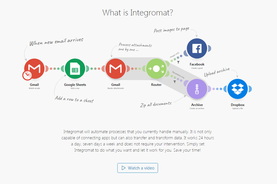
No WordPress page can go without a good cloud workflow automation – with all the plugins, apps and tools you already use, this one will make the process so much faster. All needed automation is created through a beautifully designed editor. You can choose from many pre-made templates that integrate perfectly with WordPress.

2. pCould

There are multiple dropbox alternatives on the internet – but if you’re a WordPress user and value security and speed, then this is the only option for you. Other than these two advantages of security and speed, the tool also lets you share your files with your colleagues which is highly convenient.

3. MaxTraffic

Sending web push notifications is one of the best strategies for bringing a customer back to a WordPress website. Keep your customers alert and waiting: send them notifications about new products and services, sales or upcoming events – make the visits to your website spike up.

4. Combin

If you have a plan to start a business, you probably already know, that after creating a website, a WordPress platform is not enough – you will have to do something with marketing and especially social media. Get real Instagram followers by using Combin – like, comment, and follow other users to attract their attention.

5. Focused Collection

Visual information is crucial for any website nowadays. To represent our brand, we often use stock photos – there is a wide selection of free and paid stock images around the web. The focused collection is something new and different – it has complete sets of pictures for different themes like animals, cities, education and more. Perfect for creating a strong image of the brand.

6. Word Counter

WordPress is an amazing platform for content creation – it has various content and SEO tools to help you out, but one important tool that you just cannot go without is a very precise word counter. This one has a minimalistic design, is easy to use and understand, and also has integrated social media standards for word count.

7. InvoiceNinja

After starting an online business you will have to step up your game and start working with your potential clients – collecting their emails by offering them something of value in return and reaching them with your news and sales. Proposals creation tool can help you reach your customer – the drag & drop tool offers great templates to make it look great. And later it can help you send the invoice from anywhere, after all the name is InvoiceNinja.

8. Magic Password

This WordPress Security Plugin can work wonders when it comes to remembering passwords and usernames. This plugin also protects you from brute-force attacks, phishing & keylogger attacks, and WordPress website takeover. The tool works by pairing your smartphone with your WordPress account and creating a specific code when you need to log in.

9. Omnisend

Omnisend is an ideal tool for WordPress ecommerce marketing automation if you want to run an e-shop. It can make the work with the website visitors so much easier: turn them into subscribers with signup boxes, popups, and landing pages. Afterward, start working your way up by converting your subscribers into shoppers and eventually – repeat buyers.

10. Salesmate

Salesmate is one of the best additional tools for WordPress – if you want to run an e-shop, it will work wonders by helping you plan and keep on track with your sales processes. It’s easily customizable and adjustable, therefore easy to use and integretable with more than 700 different apps.

SOS Children’s Villages Belgium: Really Ugly Sweater

Post pobrano z: SOS Children’s Villages Belgium: Really Ugly Sweater

Media
SOS Children’s Villages Belgium

There are ugly Christmas sweaters. And there’s the #reallyuglysweater. Take a closer look at it and you’ll see: the normally oh-so-peaceful crib is being bombed in the midst of a Syrian refugee camp. An ugly but very real scene for all those struggling in Syria on a daily basis. Gents created the fashion statement of the year to showcase the other side of the holidays and to ensure a truly merry Christmas for all children. One ugly sweater at a time. More than 10.000 eur was raised to support the work of SOS Children’s Villages in Syria.

Advertising Agency:Gents Agency, Gent, Belgium
Chief Executive Officer:Leen Van der Mijnsbrugge
Creative Director:Tim Helsen
Creative Strategy Director:Sander Vanermen
Senior Creative:Vincent Daenen
Creative Strategist:Janne Van Robays
Interactive Design Director:Simon Pertz
Senior Web Architect:Diederik Van Hoorebeke
Senior Interactive Designer:Thomas Heylen
Senior Designer:Martijn Leenaers
Account Director:Julie Bataillie
Account Manager:Albane Paret

Home Office: Ben, Aliya, Sonny

Post pobrano z: Home Office: Ben, Aliya, Sonny

Film
Home Office

Advertising Agency:FCB Inferno, London, United Kingdom
Executive Vice President:Sharon Jiggins
Creative Partner:Al Young
Chief Strategy Officer:Vicki Holgate
Creative Directors:Ben Edwards, Guys Hobbs
Account Director:Emily Whiteaway
Senior Account Manager:Jamie Tomkins
Account Manager:Lara Ashman
Producer:Charlie Coombes
Senior Project Manager:Tom Lawrence
Senior Strategist:Laura Pirkis
Strategist:Lucie Newlan
Lead Designer:Adam Booker
Account Executive:Sian Pearson
Artworkers:Rich Bagley, Steve Clark
Digital Designer:Chris Jordan
Director:James Burns
Production House:Archers Mark

Handicap International: #BodyCantWait

Post pobrano z: Handicap International: #BodyCantWait

Outdoor
Handicap International

Advertising Agency:Herezie Group, Paris, France
Chief Operating Officer:Pierre Callegari
Chief Executive Officer:Andrea Stillacci
Executive Creative Director:Baptiste Clinet
Creatives:Joseph Dubruque, Axel Didon, Raphael Stein
Art Director Assistant:Cyril Haoual
Tv Producer:Barbara Vaira
Account Director:Laurence Cornet
Account Manager:Marion Leroy
Pr:Anne Rabasse, Kim Ball
Production Company:La\Pac, Paris)
Producer:Anna Roudaut
Executive Producer:Chris Ellis
Directors:Guillaume Cagniard, Hossegor, Virgile Texier, Hossegor
DoP:Anaïs Andreassian
Steadycamer:Thomas Burgess
Camera Assistant:Xavier Vito
Model Maker:Bruno Villedieux
Music:Lorenzo Esposito Fornasari, Eraldo Bernocchi

BMW: X5 Experiment

Post pobrano z: BMW: X5 Experiment

Film
BMW

In a country that loves its bobsleigh, at a time when all eyes are on the Olympic contestants, we took four adventurous people on a truly epic ride. Virtual reality meets a comfy BMW X5, with a champion racing driver behind the wheel – to give passengers all the adrenaline of an Olympic bobsleigh run.

Advertising Agency:DDB, Latvia
Creative Director:Vairis Strazds
Account Director:Nora Kirta
Producer:Ance Jēkabsone
Copywriter:Marta Kukarane
Digital Strategy:Dāvis Freibergs
Video Editor:Aivars Katkovskis
Creative:Sintija Popena
Production:DDB Latvia, Robyworks, Kind.Lv

Compressive Images Revisited

Post pobrano z: Compressive Images Revisited

Tim Kadlec returns to the topic of how to make images on the web as performant as possible and looks at the technique called “Compressive Images” which is now not recommended for a bunch of reasons. Tim summarizes his point here:

By now the trade-off is pretty clear. Compressive images give us a reduced file size, but it greatly increases the memory footprint. Thanks to the standards that have been developed around responsive images, it’s a trade-off we no longer need to make.

If you’re interested in learning more then it’s hard not to recommend Jason Grigsby’s masterclass called Responsive Images 101, too.

Direct Link to ArticlePermalink

The post Compressive Images Revisited appeared first on CSS-Tricks.

How to Draw a Tree

Post pobrano z: How to Draw a Tree

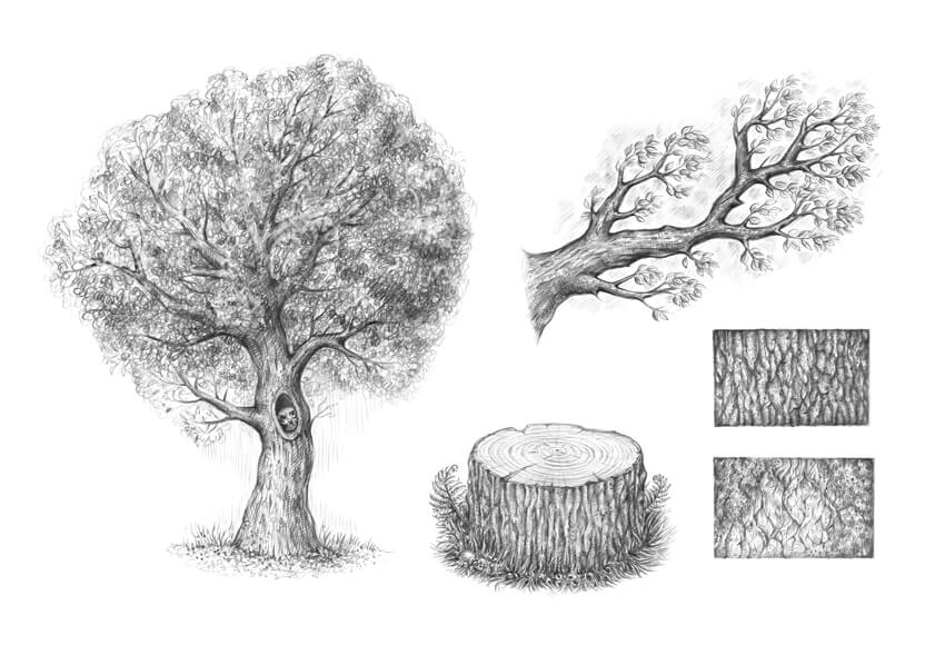
Final product image
What You’ll Be Creating

Trees are beautiful embodiments of nature’s abundance and variety. They can live for many years; the oldest tree ever discovered is approximately 5,000 years old. No wonder that artists of all skill levels are attracted to trees, trying to convey their charm and diversity. 

In this tutorial, I’ll show you how to draw a typical tree, using graphite pencils. But first, we need to observe some basic things, like constructing a branch with twigs, creating an illusion of foliage, and drawing the bark.

Let’s dive into the world of nature and have fun!

You may also be interested in these tutorials on drawing trees and leaves:

What You Will Need

You will need the following supplies to create this project:

  • an HB graphite pencil
  • a 3B graphite pencil
  • an eraser
  • drawing paper
The art supplies for this project

1. How to Draw Bark

Step 1

What is commonly called bark includes a number of different tissues that overlay the wood and serve as a protective barrier. For example, cork is an external tissue that is impermeable to water and gases.

Why do we start with this part of the tree? Bark is a concluding element that covers the shape of the trunk and branches. Knowing how to draw bark will speed up our process later on, when we gain an understanding of designing a tree from scratch.

Let’s draw just a sample of the tree bark in close-up; we’ll focus on its pattern and details. With an HB pencil, I draw a small rectangle and fill it with lines that imitate the bark’s pattern.

Don’t overthink this pattern in the early stages; just draw something resembling irregular rhombs.

Drawing the main contours of the pattern

Step 2

I add more details to the drawing, using the HB pencil. The groups of parallel hatches help to create the illusion of a three-dimensional surface.

Adding the details to the pattern

Step 3

With the 3B pencil, I darken the borders between the sections of bark. You can also use dots to make the texture more interesting.

Adding depth to the pattern

Step 4

With the 3B pencil, I decrease the contrast, covering the sample with a layer of soft, smooth hatching. Then I accentuate the shadows once again. This sample is complete!

Completing the sample

Step 5

Let’s create another sample of the bark texture; this time I draw larger shapes, using the HB pencil. I also add areas of moss and cover them with a layer of hatching.

Creating the pattern of lines

Step 6

With the HB pencil, I add some shadows to the moss and the bark.

Creating the shadows

Step 7

With the 3B pencil, I increase the contrast in the drawing, accentuating the borders between the sections and under the moss.

Increasing the contrast

Step 8

I add more details with dots and short hatches, using the 3B pencil. I also darken the perimeter of the sample to create an illusion of depth.

Completing the second sample

2. How to Draw a Branch

Step 1

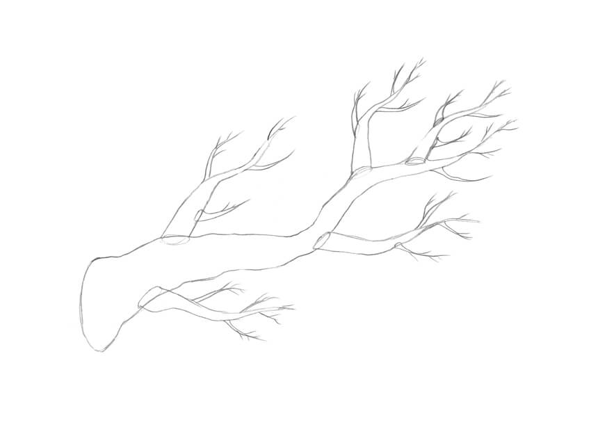
A branch is a woody element that is connected to the central trunk of a tree. Large branches are known as boughs, and small branches are known as twigs or sprigs.

Branches and twigs may be found in many different shapes and sizes; while branches can be nearly horizontal, vertical, or diagonal, the majority of trees have upwardly diagonal branches.

Let’s draw a standard branch; I mark its core line with the HB pencil. It’s also useful to mark the place where the branch connects to the trunk.

Drawing the core line of the branch

Step 2

I draw the form of the branch. Remember that it is a three-dimensional shape with a round foundation.

Adding the shape of the branch

Step 3

I erase the subsidiary lines and refine the contour of the branch.

Creating a new contour with an organic line

Step 4

I add the smaller branches. Feel free to add as many of them as you wish, and make them diverse.

Adding the smaller branches

Step 5

I add tiny twigs.

Adding the twigs

Step 6

I draw the leaves; they capture light energy and convert it into sugars by photosynthesis, providing the food for the tree’s growth and development.

Make sure that the leaves in your drawing have different sizes and directions. Usually, we don’t see each leaf as an individual element, but for the sake of our study let’s allow a hint of stylization.

Drawing the leaves

Step 7

I add the long lines and the groups of hatching, imitating the bark texture. It’s so great that we already know how to draw bark, isn’t it?

Creating the rough pattern of the bark

Step 8

With the 3B pencil, I darken the sides of the branch to make it three-dimensional. I also fill the space around the leaves with groups of hatches to create an illusion of depth.

Increasing the contrast and completing the drawing

3. How to Draw a Tree

Step 1

Now we are ready to draw the whole tree. I mark the foundation of the tree and add the core line.

Drawing the core line of the tree and its basis

Step 2

A tree usually has a wide foundation and a thin top. I construct the shape of the tree, creating the segments of the shape and joining them together with a pencil contour.

Drawing the shape of the tree

Step 3

I add the shapes of the branches; they differ in size and direction.

Adding the branches

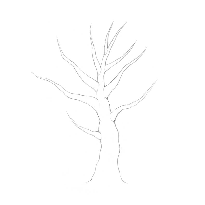
Step 4

I erase the subsidiary lines and refine the contour. When it comes to the natural objects, small imperfections are charming!

Refining the contour lines

Step 5

I add the smaller branches and twigs, based on the principles that we observed in the previous part of the tutorial.

Drawing the branches and twigs

Step 6

Since we are drawing a whole tree, there is no point in representing every single leaf. I add rough shapes of the leaves just to the lower branches and the bounds of the crown.

It’s important to keep the shapes sketchy; too many details will make your drawing look weird and unnatural.

Adding the shapes of the individual leaves

Step 7

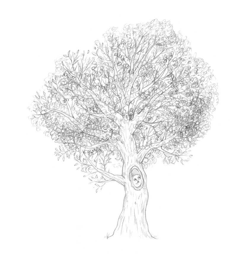
Let’s create an illusion of foliage. An easy way to draw masses of leaves is to fill the crown with scribble lines. You can find an example of this technique in the lower corner of the illustration below.

With the HB pencil, I cover the area of the crown with scribble-like lines, leaving some areas lighter and darkening the underside of the crown.

Creating an illusion of foliage

Step 8

It’s time to work on the trunk; it usually is darker than the foliage, so having the right contrast is vital.

With the HB pencil, I draw the rough pattern of the bark and mark the core shadows. Please note that we see this pattern from a distance, so having much detail here won’t be a help.

I also decided to bring in a cute addition: a hollow with an owl that is looking out. 

Working on the trunk

Step 9

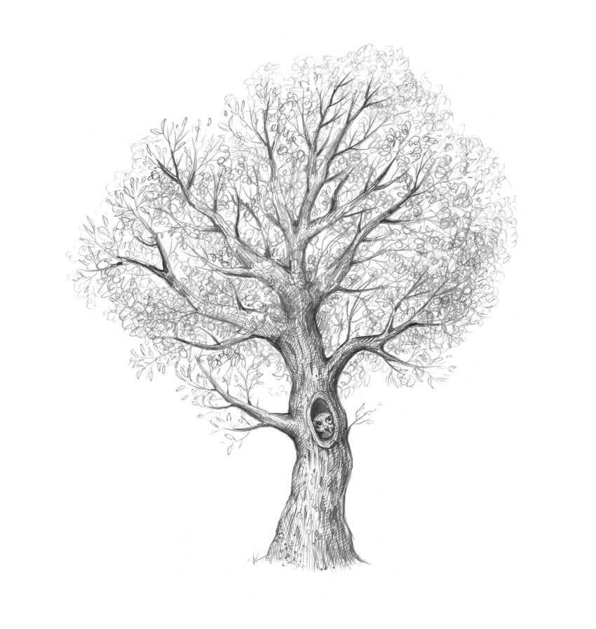
With the 3B pencil, I increase the contrast in the drawing. Feel free to make the sides of the tree and the visible parts of the branches really dark.

Darkening the trunk with a soft pencil

Step 10

With the 3B pencil, I darken the foliage, accentuating the lower part of the crown. The goal here is to achieve a contrasting yet harmonious look.

I complete the drawing by adding some grass near the base of the trunk.

Adding the details and completing the drawing

4. How to Draw a Tree Stump

Step 1

With the HB pencil, I draw the core line and the foundation of the stump.

Drawing the foundation and core line of the stump

Step 2

I add the top section of the stump. The core line may be a useful reference tool, but you don’t have to make this shape perfectly even.

Completing the shape of the stump

Step 3

I mark the texture of the bark, using the HB pencil.

Adding the texture of the bark

Step 4

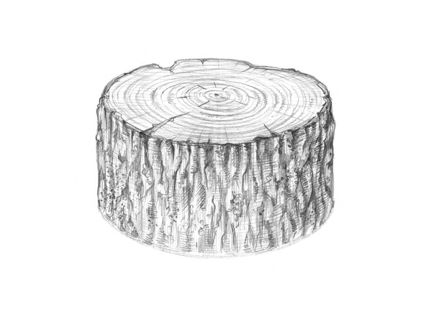
A transverse section through a tree trunk may show concentric circles of lighter and darker wood—the tree rings (also known as the annual growth rings). These circles usually have a regular shape, but sometimes, due to abnormal growth conditions, they turn into wavy joint lines.

I mark the center of the inner part of the trunk, and then draw circular shapes going from the section’s center to the periphery. I also add small cracks to make the drawing more credible.

Working on the top part of the stump

Step 5

With the HB pencil, I create the texture of the bark. I also add horizontal hatches to the top section of the stump to accentuate its flat plane.

Working on the texture

Step 6

I darken the sides of the stump, using the 3B pencil. It’s time to add details to the bark, like small islets of moss, and to vary the pattern of the growth rings.

The top plane of the stump may demonstrate interesting transitions from a darker core to a lighter periphery (which proceeds to a slightly darker area near the bark).

Making the shape three-dimensional

Step 7

The drawing of the stump itself is complete, but it doesn’t look believable. I add some grass and fern leaves to create a nice natural environment.

Completing the drawing

Your Drawings Are Complete

Congratulations—we’ve created four beautiful graphite pencil sketches! I hope you were inspired by the trees and enjoyed the process of drawing.

Let your creative journey be fruitful and full of joy!

The result of work

React Code Style Guide

Post pobrano z: React Code Style Guide

I’ve been having the time of my life with React lately. But on my journey, I’ve had a hard time finding good code style guidelines to keep the mix of JSX and JS clean and readable. I’ve been coming up with my own style guides that I’d love to share. Maybe these will be useful to you and, of course, feel free to share similar guidelines in the comment thread below.

Rule #1: Destructure your props

One of my favorite ES6 features is destructuring. It makes assigning object properties to variables feel like much less of a chore. Let’s take a look at an example.

Say we have a dog that we want to display as a div with a class named after its breed. Inside the div is a sentence that notes the dog’s color and tells us if it’s a good dog or bad dog.

class Dog extends Component {
  render () {
    return <div className={this.props.breed}>My {this.props.color} dog is {this.props.isGoodBoy ? "good" : "bad"}</div>;
  }
}

That technically does everything we want, but it just seems like quite a big block of code for what really is only three variables and one HTML tag.

We can break it out by assigning all of the properties of props to local variables.

let breed = this.props.breed;
let color = this.props.color;
let isGoodBoy = this.props.isGoodBoy;

Using ES6, we can put it in one clean statement like this:

let { breed, color, isGoodBoy } = this.props;

To keep everything clean, we put our ternary operator (more on that later) in its own variable as well, and voila.

class Dog extends Component {
  render () {
    let { breed, color, isGoodBoy } = this.props;
    let identifier = isGoodBoy ? "good" : "bad";
    return <div className={breed}>My {color} dog is {identifier}</div>;
  }
}

Much easier to read.

Rule #2: One tag, one line

Now, we’ve all had that moment where we want to take our entire function and make it a mash of operators and tiny parameter names to make some uglified, superfast, unreadable utility function. However, when you’re making a stateless Component in React, you can fairly easily do the same thing while remaining clean.

class Dog extends Component {
  render () {
    let { breed, color, goodOrBad } = this.props;
    return <div className={breed}>My {color} dog is {goodOrBad}</div>;
  }
}

vs.

let Dog = (breed, color, goodOrBad) => <div className={breed}>My {color} dog is {goodOrBad}</div>;

If all you’re doing is making a basic element and placing properties in an HTML tag, then don’t worry about making such a big deal of all the functions and wrappers to get an entirely separate class going. One line of code will do.

You can even get creative with some ES6 spread functions if you pass an object for your properties. Using this.props.content will automatically put the string between the open and close tag.

let propertiesList = {
  className: "my-favorite-component",
  id: "myFav",
  content: "Hello world!"
};
let SimpleDiv = props => <div {... props} />;

let jsxVersion = <SimpleDiv props={propertiesList} />;

When to use the spread function:

  • No ternary operators required
  • Only passing HTML tag attributes and content
  • Can be used repeatedly

When not to use the spread function:

  • Dynamic properties
  • Array or object properties are required
  • A render that would require nested tags

Rule #3: The rule of 3’s

If you have three or more properties, then put them on their own line both in the instance and in the render function.

This would be fine to have just one line of properties:

class GalleryImage extends Component {
  render () {
    let { imgSrc, title } = this.props;
    return (
      <figure>
        <img src={imgSrc} alt=React Code Style Guide />
        <figcaption>
          <p>Title: React Code Style Guide</p>
        </figcaption>
      </figure>
    );
  }
}

But consider this:

class GalleryImage extends Component {
  render () {
    let { imgSrc, title, artist, clas, thumbnail, breakpoint } = this.props;
    return (
      <figure className={clas}>
        <picture>
          <source media={`(min-width: ${breakpoint})`} srcset={imgSrc} />
          <img src={thumbnail} alt=React Code Style Guide />
        </picture>
        <figcaption>
          <p>Title: React Code Style Guide</p>
          <p>Artist: {artist}</p>
        </figcaption>
      </figure>
    );
  }
}

Or the render:

<GalleryImage imgSrc="./src/img/vangogh2.jpg" title="Starry Night" artist="Van Gogh" clas="portrait" thumbnail="./src/img/thumb/vangogh2.gif" breakpoint={320} />

It can get to be too much of a codeblock to read. Drop each property to the next line for a clean, readable look:

let { imgSrc,
      title,
      artist,
      clas,
      thumbnail,
      breakpoint } = this.props;

and:

<GalleryImage
  imgSrc="./src/img/vangogh2.jpg"
  title="Starry Night"
  artist="Van Gogh" 
  clas="landscape"
  thumbnail="./src/img/thumb/vangogh2.gif"
  breakpoint={320} />

Rule #4: Too many properties?

Property management is tricky at any level, but with ES6 destructuring and React’s state-based approach, there are quite a few ways to clean up the look of a lot of properties.

Let’s say we’re making a mapping application that has a list of saved addresses and a GPS coordinate for your current location.

The current user information of position and proximity to favorite address should be in the parent Component of App like this:

class App extends Component {
  constructor (props) {
    super(props);
    this.state = {
      userLat: 0,
      userLon: 0,
      isNearFavoriteAddress: false
    };
  }
}

So, when we make an address and we want it to note how close you are to the address, we’re passing at least two properties from App.

In App render ():

<Address
  ... // Information about the address
  currentLat={this.state.userLat}
  currentLong={this.state.userLon} />

In the render function for Address Component:

render () {
  let { houseNumber,
        streetName,
        streetDirection,
        city,
        state,
        zip,
        lat,
        lon,
        currentLat,
        currentLon } = this.props;
  return ( ... );
}

Already, you can see how this is getting unwieldy. If we take the two sets of information and break them out into their own objects, it becomes much more manageable.

In our App constructor ():

this.state = {
  userPos: {
    lat: 0,
    lon: 0
  },
  isNearFavoriteAddress: false
};

At some point before App render ():

let addressList = [];
addressList.push({
  houseNumber: "1234",
  streetName: "Street Rd",
  streetDirection: "N",
  city: "City",
  state: "ST",
  zip: "12345",
  lat: "019782309834",
  lon: "023845075757"
});

In App render ():

<Address addressInfo={addressList[0]} userPos={this.state.userPos} />

In the render function for Address Component

render () {
  let { addressInfo, userPos } = this.props;
  let { houseNumber,
        streetName,
        streetDirection,
        city,
        state,
        zip,
        lat,
        lon } = addressInfo;
  return ( ... );
}

Much, much cleaner. React also has some great ways to ensure that object properties exist and are of a certain type using PropTypes that we don’t normally have in JavaScript, which is just a great OOP thing anyway.

Rule #5: Dynamic renders – Mapping out arrays

Quite often in HTML, we’re writing the same basic pieces of code over and over, just with a few key distinctions. This is why React was created in the first place. You make an object with properties that return a complex, dynamic HTML block, without having to write each part of it repeatedly.

JavaScript already has a great way to do lists of like information: arrays!

React uses the .map() function to lay out arrays in order, using one parameter from the arrays as a key.

render () {
  let pokemon = [ "Pikachu", "Squirtle", "Bulbasaur", "Charizard" ];
  return (
    <ul>
      {pokemon.map(name => <li key={name}>{name}</li>)}
    </ul>
  );
}

You can even use our handy-dandy spread functions to throw a whole list of parameters in by an object using Object.keys() (keeping in mind that we still need a key).

render () {
  let pokemon = {
    "Pikachu": {
      type: "Electric",
      level: 10
    },
    "Squirtle": {
      type: "Water",
      level: 10
    },
    "Bulbasaur": {
      type: "Grass",
      level: 10
    },
    "Charizard": {
      type: "Fire",
      level: 10
    }
  };
  return (
    <ul>
      {Object.keys(pokemon).map(name => <Pokemon key={name} {... pokemon[name]} />)}
    </ul>
  );
}

Rule #6: Dynamic renders – React ternary operators

In React, you can use operators to do a conditional render just like a variable declaration. In Rule #1, we looked at this for stating whether our dog was good or bad. It’s not entirely necessary to create an entire line of code to decide a one-word difference in a sentence, but when it gets to be large code blocks, it’s difficult to find those little ?’s and :’s.

class SearchResult extends Component {
  render () {
    let { results } = this.props;
    return (
      <section className="search-results">
        {results.length > 0 &&
          results.map(index => <Result key={index} {... results[index] />)
        }
        {results.length === 0 &&
          <div className="no-results">No results</div>
        }
      </section>
    );
  }
}

Or, in true ternary fashion

class SearchResult extends Component {
  render () {
    let { results } = this.props;
    return (
      <section className="search-results">
        {results.length > 0
          ? results.map(index => <Result key={index} {... results[index] />)
          : <div className="no-results">No results</div>
        }
      </section>
    );
  }
}

Even with our tidy result mapping, you can see how the brackets are already nesting quite densely. Now, imagine if our render had more than just one line. It can pretty quickly get unreadable. Consider an alternative:

class SearchResult extends Component {
  render () {
    let { results } = this.props;
    let outputJSX;
    if (results.length > 0) {
      outputJSX = (
        <Fragment>
          {results.map(index => <Result key={index} {... results[index] />)}
        </Fragment>
      );
    } else {
      outputJSX = <div className="no-results">No results</div>;
    }
    return <section className="search-results">{output}</section>;
  }
}

Ultimately, the code length is about the same, but there is one key distinction: with the first example, we’re rapidly switching back and forth between two different syntaxes, making visual parsing taxing and difficult, whereas the second is simply plain JavaScript with value assignments in one, consistent language and a one-line function return in another.

The rule of thumb in this situation is that if the JavaScript you’re putting into your JSX object is more than two words (e.g. object.property), it should be done before the return call.

Wrap up

The combination of syntax can get messy, and these are the most obvious situations where I saw my code going off the rails. Here are the basic concepts that these all come from and can be applied to any situation that wasn’t covered here:

  • Use ES6 features. Seriously. There are a lot of fantastic features that can make your job easier, faster, and much less manual.
  • Only write JSX on the right side of an = or a return.
  • Sometimes you need JavaScript in your JSX. If your JavaScript doesn’t fit on one line (like a .map() function or ternary operator), then it should be done beforehand.
  • If your code starts looking like (<{`${()}`} />), then you’ve probably gone too far. Take the lowest level outside the current statement and do it before this one.

The post React Code Style Guide appeared first on CSS-Tricks.