Characters looking stiff? Illustrations repeating the same old poses? Animation looking boring? Fret not, I have a cure! Dynamic gesture drawing is a great way to really loosen up and make your work interesting and more importantly fun!
„A gesture drawing is work of art defined by rapid execution. Typical situations involve an artist drawing a series of poses taken by a model in a short amount of time…”
It’s an important skill to develop because you learn to capture motion very quickly, which is helpful for creating interesting and dynamic artwork. Gesture drawing can really help you capture a subtle motion, a look someone gives a loved one, or a fabulous action pose you see in a wrestling match that would work great in your superhero comic!
Gesture drawing does not always have to involve exciting, explosive poses like this image from PhotoDune.
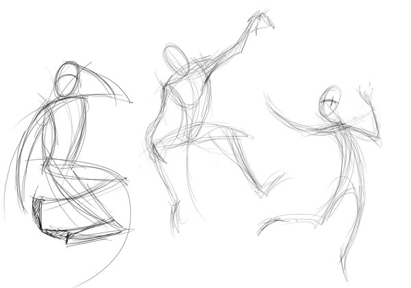
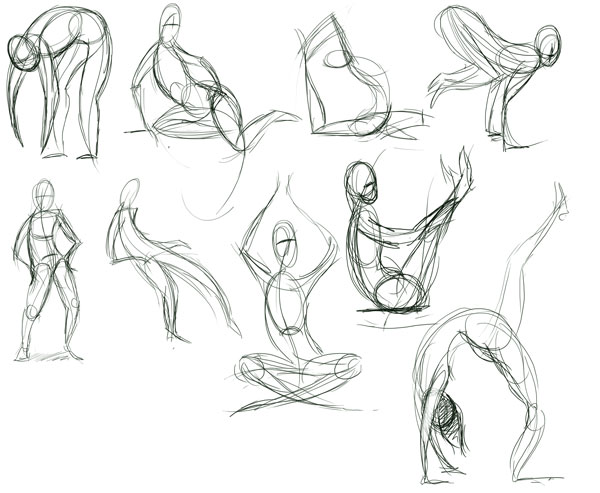
Gesture drawing captures the rhythm, the motion and the flow of an action. Even stationary poses can look dynamic. Remember these are not stick figures, these are action poses.
The Line of Action
The line of action is very important and is not necessarily the spine of the person or creature. It’s the shape the form takes. This is where my gesture drawings begin. Really look at your subject and redraw the line of action several times if need be. Here’s an example of the line of motion in these five teenagers.
Moving on from these lines of action you can rough in limbs, torso and head. Keep the lines fluid. Even jagged lines such as the legs in the central character are fluid. Remember, though, that smooth lines can show calm and flexibility, whereas jagged lines show tension.
How I Work
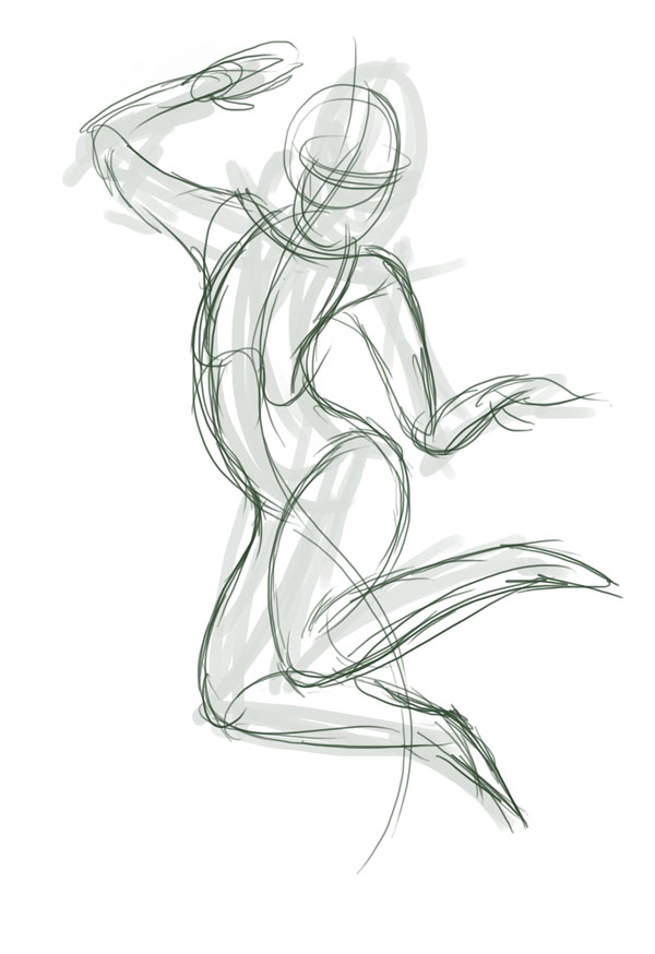
I start with a line of motion, and then plot out the legs. Working quickly helps me capture the motion. When working in a life drawing class I was trained to draw poses in 30 seconds to two minutes. As much info needs to be put down as possible.
Practice
You won’t always get it right first time, but that’s cool. These are not meant to be finished pieces.
Be scribbly, be quick! Remember to look at your work afterwards and see what you need to improve and what you’re doing right.
If you do find a dynamic pose that works well, then try working it up with some basic anatomy. This can be a great confidence booster.
Another use for these quick gesture drawings is working out a complex, long pose in a life drawing class. Not sure where some anatomy should go? Do a few rough gesture poses first. Not happy with how the model looks from your spot? Try walking round the model and other students (quietly, of course!) and rough out poses to find the best one. I am a big believer in planning out my artwork before I start—it might seem like a waste of time, but it will save you time later on in the piece.
Keep It Simple!
Start with a line of motion and use whatever shapes help. Sometimes I use bean shapes for the body, other times I use rectangles and triangles.
To show head direction, draw an oval with a horizontal contour line of where the eye line is and a vertical one for the nose.
How to Improve
It’s nothing more than Practice, Practice, Practice!
An option is going to life drawing classes. This isn’t always possible, but there is nothing like drawing from a model. At art college I loved life drawing classes—we had them every Friday. These ranged from long poses studying anatomy to 30‑second poses to study movement. In these the model would change pose, often with a prop such as a stick or perhaps a cloth. You never knew what you would get next! By the end of a morning session of a few hours I would have pages and pages of sketches. It helped my capturing of movement and gesture improve very quickly!
A fun way to practice is to watch films and pause scenes with some cool action and try to capture the pose. Try timing yourself.
Do you have a commute or some time on a lunch break with no access to life drawing classes? Try some observational drawing! Look out of the bus window and try to capture poses—this is good as you can’t sit and analyse the pose, go back and redraw.
Find a medium that works for you. When not working digitally I like to use brush pens. They do not have to be expensive—just plain children’s colouring pens are great. An advantage of having different colours is that you can have your line of motion in one colour and the pose in another.
Quick poses do not have to be humans either. Got a pet? Live near a farm? Apply the same principles to Tabby the cat or Daisy the cow.
Most importantly: keep it simple.
Remember these do not have to be anatomically perfect—it’s just a case of finding motion and fluidity.
Conclusion
I hope you have a lot of fun creating these sketches. Do not be precious about these. Use the cheapest media you can, like copier paper or news print, felt pens or charcoal. Make this a regular exercise, and even use it to warm up before a long day of drawing!
Looking for a poster mockup? How are you displaying your work? Do you include a realistic result when delivering your files to your clients? Are you taking your designs and showcases them in 3D, as they would be used in the real world, in your folio?
Clients often have a hard time visualizing how a digital design will look after being printed and displayed. And visitors to your portfolio will see your work in a more authentic light when you mock up a scene to depict it in. Whether you showcase your next design as hanging in an interior or with someone holding a poster on the street, a realistic scene can transform your work.
It doesn’t have to take a lot of time to mock up a professionally designed scene using Photoshop, though. If you use ready-made poster mockup templates, you can take advantage of high-quality scenes, already shot with the right lighting, with plenty of creative options, and set up with easily customizable Smart Objects.
We have a number of stylish PSD poster mockup sets on Envato Market (GraphicRiver). Here we showcase some of the best poster mockups, such as the trending best-sellers below:
Give your digital work a lifelike presentation, whether for your client work or to give your folio an authentic edge.
Unlimited Poster Mockups on Envato Elements
On Envato Elements, you can download as many items as you want from the fabulous collection of poster mockups, as well as getting unlimited fonts, icons, illustrations, and more—all for a single monthly fee.
For example, the pack of 8 Real Photo Poster Mockups contains a variety of photo backgrounds to display your poster at its best. They are high resolution (5472×3648 pixels) and very easy to use. Simply double-click on the Smart Object, paste your image, and you’re done!
If you’d prefer individual poster mockups rather than a subscription, read on for a great selection of realistic and creative templates.
15 Awesome Poster Mockup Templates
Here are 15 Photoshop poster mockup templates. These poster designs come in a variety of styles. You can use them to depict your work as printed and hung in a gallery, realistically displayed on the street, or showcased artistically on an interior wall.
If you want to display your work with a human touch, then use this PSD poster mockup template set showing a person holding your design. There are nine variations of posters being held in parks, interiors, in front of cityscapes, on the street, and more options to fit your design style.
Save time by using this poster mockup Photoshop set. In addition to the nine posters, there are four background extras and six photo backgrounds to work with. The layers are organized and set up with smart objects.
It works with Photoshop version CS4 or higher and exports at a high print resolution at 3700 pixels by 5000 pixels at 300 dpi. It’s designed with pro perspectives, realistic depth of field effects, and natural reflections. Get your work depicted realistically!
With these Photoshop poster mockup files, you can combine a variety of interior scenes with your artwork. Whether you’d like to wow your customer with a custom presentation or showcase your best work together, this set allows you to mix and match poster and wall art together. Work with unique PSD files, 30 ready-made compositions, included smart objects for easy use, and more.
If you need a clean poster mockup set with a number of minimal design options, then this is a great choice. It includes 10 pre-made 3D scenes at 4000 pixels by 2500 pixels resolution. This photorealistic group includes framed and unframed poster display options, both set hanging on walls and resting elegantly in corners. You’ll get a variety of print mockup styles to work with in this modern presentation bundle.
Showcase your next poster design in a realistic environment to make your work stand out.
These beautiful poster mockups are set in nighttime urban cityscapes. Each shot is clean and highly detailed, with popping colors and realistic lighting. The balance of each image is professionally edited to focus on your design.
The template set includes poster and billboard mockups, with 7 PSD high-resolution images. And they’re ready to customize quickly by simply replacing the included PSD Smart Objects.
Give your work a realistic 3D display with this Photoshop art mockup set. Use it to display your next digital work, whether for a new poster design or to display your original artwork. Take advantage of this set of eight interior designs, shot with realistic studio lighting and soft shadows. These interior and studio files are easy to work with as smart objects—just click and paste your work in, before exporting at high-res!
With eight PSD files in this poster mockup bundle, you can prep your designs and quickly get them off to your clients. The Photoshop files have a variety of framed styles and backgrounds to choose from. The photos and backgrounds are zoomed in and cropped, so the posters display your work clearly in high resolution without distraction.
This large set of hand-held poster mockups comes with a variety of options, such as binder and clip style choices, two different changeable backgrounds, multiple poster sizes, vertical and horizontal poster setups, and quick editing via Photoshop Smart Objects.
Designed by Elite Author GrafAS, this set has a clean, modern style. It keeps the focus on your artwork, while giving it a human touch. It’s 100% photorealistic and set with high-resolution optimization at 3000 pixels by 3000 pixels. Get your work added and exported fast!
This set of simple poster mockup templates has eight ready-made PSD file options, from rolled-up poster displays on neutral backgrounds to hanging posters with binder clips or even curling paper options. There are plenty of presentation options to choose from, and they’re easy to edit via smart objects!
This popular set of framed poster mockups is made by Elite Author Genetic96. It has high ratings, with five-star customer comments such as: “This looks like a fantastic photo frame mockup – possibly the best I have seen on here.” Use it with your choice of artwork!
It comes with 10 photorealistic template files and multiple frame sizes. It’s well organized, set up with professional layers and includes easy-to-edit smart objects. It comes with a number of special effects like glass, cables, and lighting, as well as professional perspectives, shadows, realistic depth, and more.
Render your poster designs in a realistic studio setting with this set of nine PSD template files (three variations and three various poster sizes). They’re beautifully shot and set up for quick customization. They have a modern look, with posters set on light rigging gear, held on metal poles with industrial grips, or hanging with cables. Add your design for a quick, professional presentation, and export at high resolution.
This creative set of minimal poster mockup PSD files offers a number of unique display options. Many of them are rather subtle and elegant, such as foil stamping styles, paper texture choices, global illumination, and movable objects and shadows. You can fully control how your work is displayed in this sophisticated set of poster designs. There are 10 Photoshop files included!
Use these 11 PSD files to mock up your artwork on a poster and render it realistically. There are a number of close-up interior scenes with framed posters resting on various types of shelves, with multiple styles of settings—each with a unique mix of items, backgrounds, and feel.
The files are crafted with professional techniques, such as smart reflections, glare, and refractions. This highly rated set has a ton of sales, five-star ratings, and great customer comments like “Fantastic work, highly recommended!”
If you need to display your work elegantly, with stylish poster mockup options, then this set of Photoshop designs is ready to work with. The poster template set comes with 10 pre-made PSD files, in high resolution.
They come with changeable backgrounds and are set up via smart objects that will automatically adjust perspective after you drop your artwork in. Then you can readily customize with advanced shadow controls. It includes simple and dynamic close-up options, as well as artistic interior scenes.
This popular set of PSD poster mockup files is designed by Elite Author Itscroma, and it has a really authentic touch. It includes multiple poster designs hanging in an art gallery interior, with onlookers appreciating and interacting with the designs. It looks as if your work is being adored and includes various angles of shots, adjustable light settings, and photorealistic results.
This is a beautiful set of poster mockups in Photoshop. You can save time and render quality results with these eight realistic-looking template files. Showcase your work as hanging in a modern building, which is great if your design complements the straight lines and dark walls of these architectural interior shots. Whether you work in vector, pixels, or another medium, this is a professional set of PSD poster mockups to display your work with.
Display your best designs and prints using this poster mockup available at Placeit. This poster mockup is not only visually appealing but also super easy to customize by simply uploading your file straight to the template. Make sure you check out the wide variety of poster mockups and even poster videos available over at Placeit.
5 Quick Poster Mockup Tips
A mockup is a great way to visualize your design with a realistic end result, without the need to actually print it out and deal with production costs. You also avoid the complication of having to take out your camera, set up the scene professionally, and shoot on site. Mockups yield quality results and save tons of time.
Here are a handful of quick tips on how to approach your poster mockups:
1. Know Your Audience and Message
The process starts with your audience. It’s important to first know who you’re aiming your poster mockup at and what it’s planned to be used for. Your goals are very different if you’re mocking up a piece for a client’s outdoor marketing campaign, versus needing to display your own work in its best light.
Taking that a step further is to know your message and what you want to communicate to your audience or buyers. If your work is intended to appeal to fellow artists for display in their studios (for example, if you’re selling digital art prints), then mock up your work as hung in a creative studio, which is where the work would be used by your audience.
Poster template mockups: studio wall art and minimal options compared.
2. Give Your Poster Display a Focus
Just as with your poster designs themselves, you want your work to have a focal point when displayed. You want your poster to stand out in the scene you mock up. You can crop tightly to a poster set simply against a minimal background or up close against the wood texture of an interior.
Alternatively, you’ll have to pay close attention when displaying multiple posters on a wall and make sure the designs work together and don’t clash. This is especially true when working with a PSD set like Art Wall and Poster Mock-up, as it requires you to think through how all the posters will interact with both each other and the artwork you can customize on the wall. Look to set it up with a complementary theme or else the design will get too busy quickly.
3. Balance the Elements in Your Composition
Keep in mind how your work will fit the style of the poster mockup you work with. An effective mockup should bring attention to your poster design and not distract from it. Take care not to overdo it. Often, keeping it simple is a better direction if you’re unsure. The Realistic PSD Poster Frame Mock-Up set is a neutral option that can work well for almost any design.
Color stands out on a neutral background. A centered poster design draws the eye immediately. A style that complements your design work, rather than contrasting with it, feels well thought out and will help your work to display professionally.
4. Consider How Your Mockup Interacts
You want the design elements in your poster to fit the scenes you render them in. Ideally, they should complement how they interact with each other.
Consider the environment you place your work in, such as how you can display your work as hanging in a modern building with the Photorealistic Gallery Poster Mock-Up Vol. 2 set. This is well on target if your design complements the hard lines and dark walls of these interior scenes. Or if urban energy works best with your design, then consider displaying it alongside the bright city lights and moving crowds within the night edition of Urban Poster / Billboard Mock-ups.
Poster template mockups: photorealistic gallery and urban night options compared.
Also, keep in mind how your mockup can interact with a human touch. One way to make your poster more appealing is to show someone holding it or interacting with it. Standing Poster Mockups or Hands Holding Posters – PSD Mock-up sets have a number of scenes showing someone holding a poster. Or consider something with crowds or even onlookers appreciating your artwork, such as with Creative Poster Exhibition Gallery Mock-Up.
5. Display Your Work With Creative Appeal
As a visual professional, you want your craft and graphic ideas to present with creative style. While you should look to level up the creativity of your poster mockups, keep in mind the tips above so that you don’t overdo it.
Don’t risk losing the audience appeal, muddying your target message, missing the intended goal of your presentation, or not getting the subtle details right that will make your mockup visually resonate. For more mockup display tips, visit this Envato Tuts+ article:
Showcase Your Work Realistically With a PSD Poster Mockup!
Your work deserves to be displayed authentically, as it would look in real life. People can relate to it more readily when it’s depicted in three dimensions. Your posters, design work, and digital art feel all the more real and touchable when presented in a realistic scene and in an environment that brings your ideas to life.
Grab a ready-made Photoshop poster mockup template to quickly render your work in an interior scene, showcase it outdoors on a weather-worn poster, or show a person holding it up proudly. Give your clients and portfolio visitors a lifelike feel for your work!
And if you need to mock up other products or artwork, we have a ton of PSD mockup templates to browse through on Envato Market. Find just the right one for your next design project.
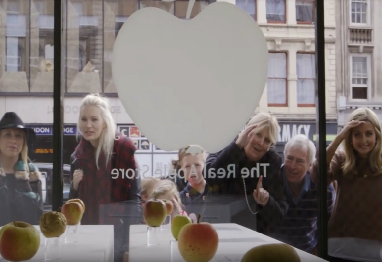
THE ORIGINAL? The Real Apple Store / Borough-Market – 2014
Watch the Case Study Film Source : Creative Criminals
Agency : Tin man London (United Kingdom)
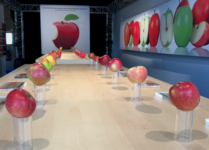
LESS ORIGINAL Laquenexy Fruit Gardens –2018 Watch the Video
Source : Creapills, Le Républicain Lorrrain Agency : Unknown ?, Moselle (France)
Need a
creative and cost-effective yet subtle way to advertise your business or spread
the word about your personal brand? If yes, explore the use of business cards
and how designing one to fit your specific needs can help boost your brand’s
recognizability and increase customer leads.
To make the
entire business card-making process easier, we have listed down the most
important elements that should be considered prior to using them to your
advantage. By considering each factor carefully, you are taking a small step
that will allow you to craft a business card that truly complements your brand.
Design Theme
Deciding on a
design theme for your business card is the first step in the card-making
process. This step should not be neglected because a business card theme will
act as the unifying element of the entire calling card.
To
illustrate, if you are a florist and you want to have a business card that will
match your business and occupation, it is best to choose a card design theme
that suits your flower shop business. In this case, following a flat minimalist
card design may work as your business card theme. On the other hand, having a
grunge neon color scheme and design theme may work against your personal brand
identity.
Your business
card theme or motif does not have to be fully formed from the get-go. Simply
deciding on a color palette or on one design element (like the use of a
specific font style) is enough. Give yourself (or your graphic artist) room to
further improve on your base theme choices as the card-making process goes on.
In fact, you may take design inspiration from various free graphic design and
editing sites like Canva.com and Template.net
all before you actually sit down and create an actual business card.
Paper Size and Type
The next step
to take before designing a business card is to find out your preferred paper
size and type. This is an important element that anyone looking for a business
card design should factor in order to create a more unified and impactful look
for their business cards.
Traditionally,
a business card measures 3.5 inches by 2 inches. But nowadays, more and more
people are considering other paper size options. For example, there are now square,
round, and even hexagonal business cards.
In relation
to the paper size, the type of paper to be used should also be considered. You
may choose from regular cardstock, glossy, matte, linen, kraft, and other
premium paper options.
Choose a
paper size and type that will best allow you to showcase your brand’s identity
without compromising your marketing budget.
Bleed
When printing
out any kind of graphic design project, designers need to designate a printing
bleed area on the document. The printing bleed refers to the printed area that
is intended to be cut off. This is the part of the printed business card is the
edge or corner of the card that may contain some design elements but will need
to be removed in order to make sure that all the cards will look exactly alike.
For those who
want to design their own business card, you should make sure that you have
created a bleed area on the card design template. Once the bleed area is placed
on your business card template, you are then free to add your other design
elements and print out the business card without having any issues with the
final business card design.
If you want
to make sure that the business card you are creating already contains a
built-in bleed area, you may use any free or premium business card templates
found at Template.net. This site is rich with printable graphic design project
templates that you can use.
Budget
Another step
that anyone looking to design their own business card should do and factor into
their pre-card-making process is to decide on and find out their marketing
budget. Remember that making business cards is often considered as an
advertising strategy. You will need money to fund the creation and printing of
these business cards.
For most
businesses, creating business cards can be a cost-effective alternative to
making other kinds of print advertising materials. However, freelancers and
individuals may find creating and printing business cards still a costly
endeavor.
Therefore, prior
to sitting down and designing what kind of business card you want, you still
need to create a budget plan that will match your funds and what you want your
completed business card to look like.
Printing Method and Techniques
Earlier, we
have discussed the importance of choosing the paper size and type for your
business card beforehand. This next step in the business card-making process is
related to that. Another crucial step that should be considered prior to
designing a business card is your preferred printing method.
The easiest
and perhaps most convenient method for printing business cards is by doing it
yourself and using your own home or office printer. However, the quality of the
business card printed this way will greatly vary due to the difference in the
printer, ink, and paper being used.
This is the
reason why a lot of people will prefer to use the services of a professional
printing shop. In these shops, people can choose from letterpress printing,
flexography, lithography, gravure printing, and a lot more. Choosing a printing
method also means that you get to decide if you want to have embossed,
debossed, varnished, foiled, laminated, die-cut, or lasered print finishes and
techniques.
Therefore,
prior to designing a business card, you need to know all these printing
techniques and methods and choose the one method that you like best. By doing
this, the rest of the entire card designing process will be easier and more
smooth-sailing.
Color Modes
The last step
to take before designing a business card is to know the difference between
different color modes. When creating any kind of printed media, the two main
color modes used are RGB and CMYK. RGB stands for Red, Green, Blue and it is
used in desktops, TVs, and cameras among others. CMYK stands for Cyan, Magenta,
Yellow, Key (black) and it is used by professional printers.
By knowing
what these two color modes are and how you can optimize your graphic design
project to match the CMYK color mode used in printing, you will have an easier
and quicker time in printing your business cards. Knowing how to convert RGB
into CMYK will also allow you to design your business cards that will translate
well from RGB to CMYK color schemes.
Get Ready to Design Your Business Cards!
You have now
reached the end of this short guide on the top steps to take before designing a
business card. Refer back to the guide as much as you need. And, hopefully, you
will master the art of business card design soon. For now, enjoy the
card-making process and have fun soaking your brain with all the design
lessons.
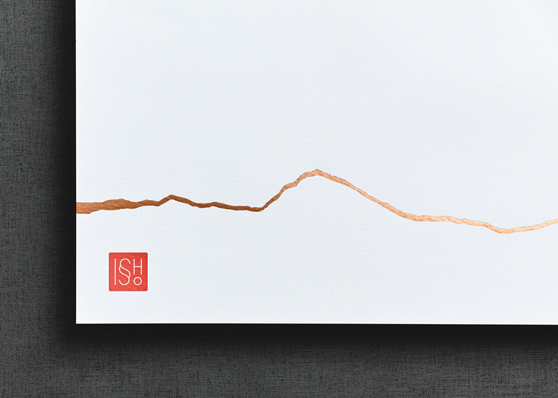
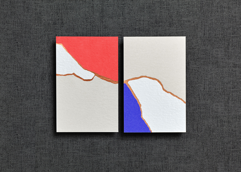
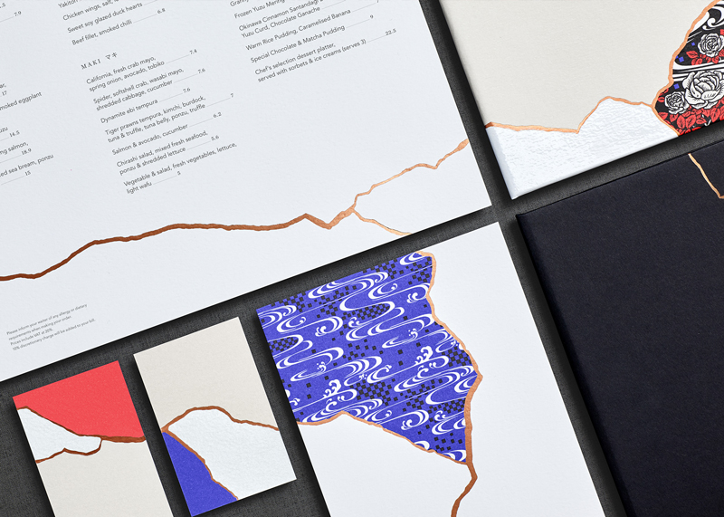
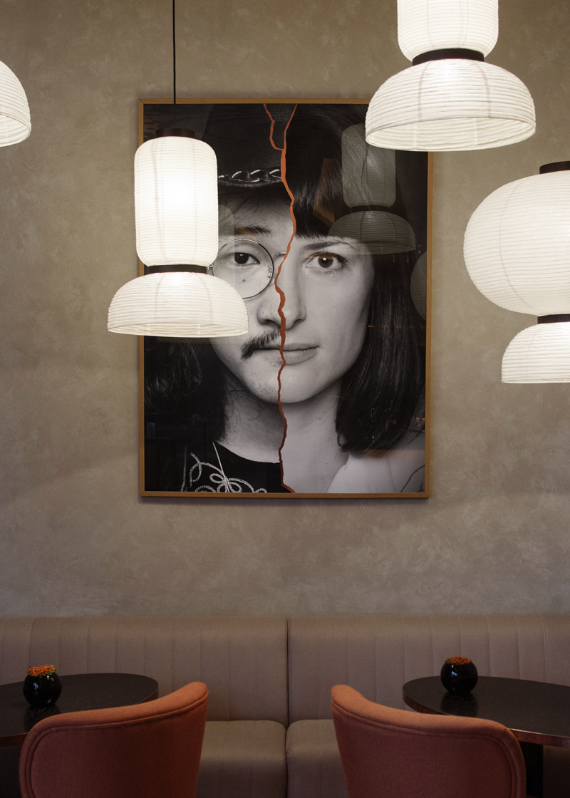
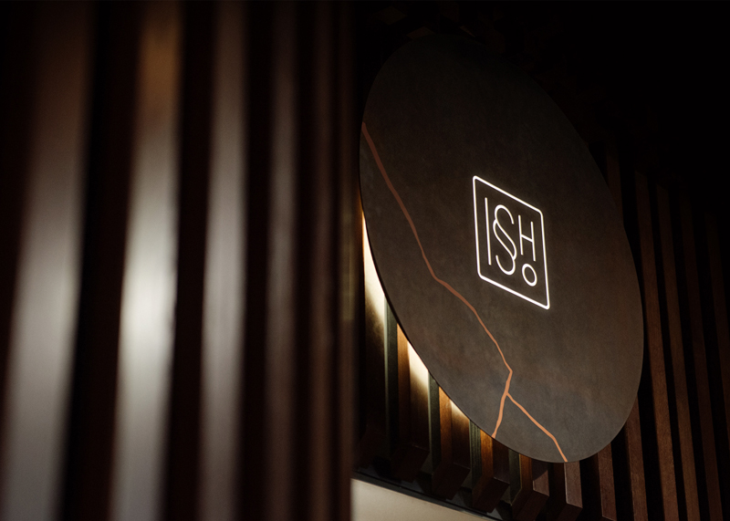
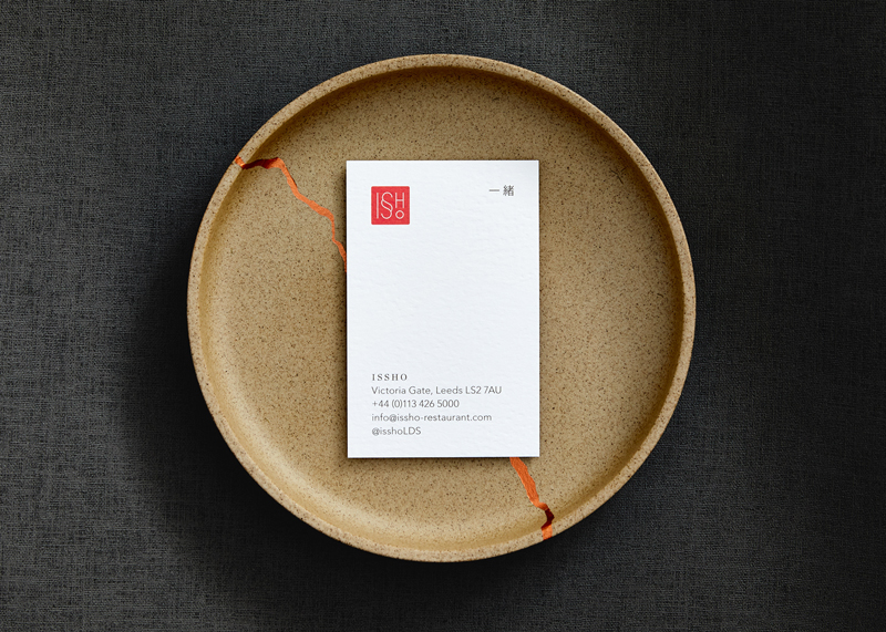
Issho is a Japanese restaurant based in England, in Leeds to be more accurate. In Japanese, the name of the place means “Togetherness”, a quite appropriate name for a place that bring people together.
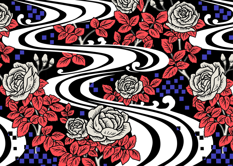
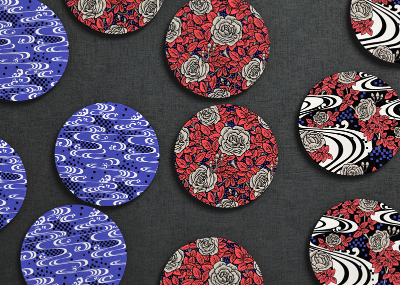
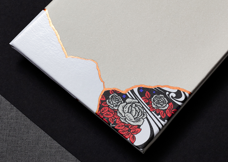
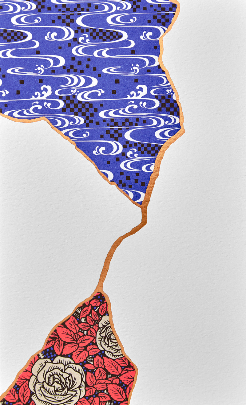
For their branding, the restaurant owners called Dutchscot, a London-based design consultancy. The designers opted for a concept based on the traditional Japanese art of Kintsugi, which is the art or repairing broken items with gold joints.
Issho is a Japanese restaurant based in England, in Leeds to be more accurate. In Japanese, the name of the place means “Togetherness”, a quite appropriate name for a place that bring people together.
For their branding, the restaurant owners called Dutchscot, a London-based design consultancy. The designers opted for a concept based on the traditional Japanese art of Kintsugi, which is the art or repairing broken items with gold joints.
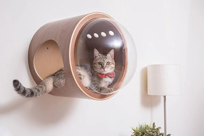
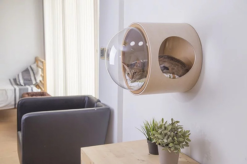
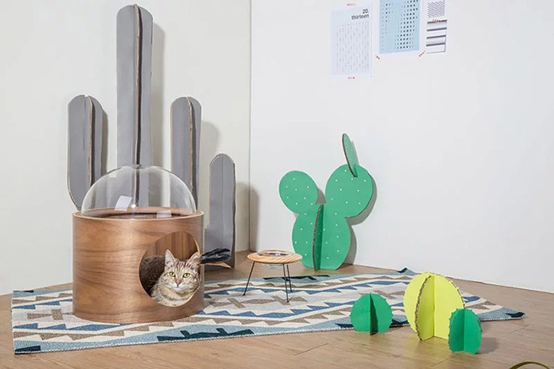
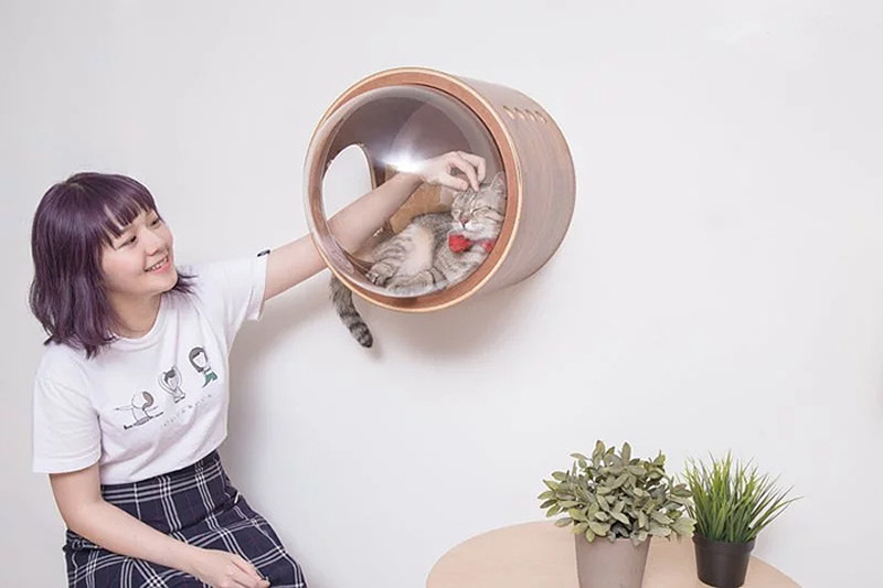
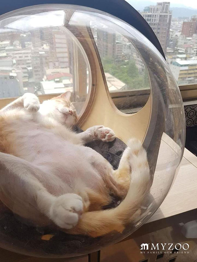
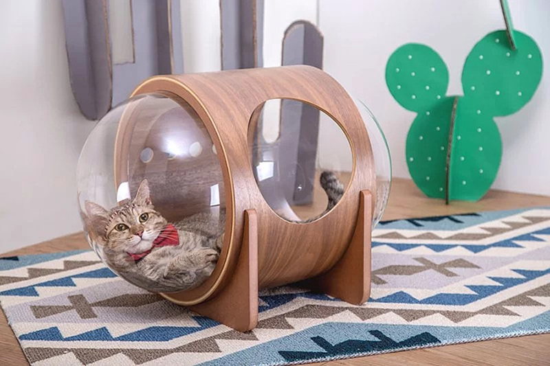
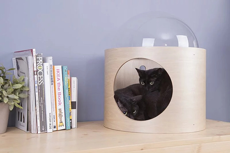
MyZoo Studio is a company that designs and sells creative furniture for our little furry friends. They produce all kinds of well-designed appliance, but it’s their spaceship-like cat bed that really caught my attention. It comes in various formats that can be hung on the wall or laid on the floor.
MyZoo Studio is a company that designs and sells creative furniture for our little furry friends. They produce all kinds of well-designed appliance, but it’s their spaceship-like cat bed that really caught my attention. It comes in various formats that can be hung on the wall or laid on the floor.
.email::before {
  content: attr(data-done) " Email: "; /* This gets inserted before the email address */
}
The property generally takes anything you drop in there. However, there are some invalid values it won’t accept. I heard from someone recently who was confused by this, so I had a little play with it myself and learned a few things.
This works fine:
/* Valid */
::after {
  content: "1";
}
…but this does not:
/* Invalid, not a string */
::after {
  content: 1;
}
I’m not entirely sure why, but I imagine it’s because 1 is a unit-less number (i.e. 1 vs. 1px) and not a string. You can’t trick it either! I tried to be clever like this:
But of course, you’d never use generated content for important information like a price, right?! (Please don’t. It’s not very accessible, nor is the text selectable.)
Even though you can get and display that number, it’s just a string. You can’t really do anything with it.
Heads up! Don’t try concatenating strings like you might in PHP or JavaScript:
/* These will break */
::after {
  content: "1" . "2" . "3";
  content: "1" + "2" + "3";

  /* Use spaces */
  content: "1" "2" "3";
  /* Or nothing */
  content: "1 2 3";
  /* The type of quote (single or double) doesn't matter, but content not coming back from attr() does need to be quoted. */
}
There is a thing in the spec for converting attributes into the actual type rather than treating them all like strings…
<wood length="12" />
wood {
  width: attr(length em); /* or other values like "number", "px", or "url" */
}
…but I’m fairly sure that isn’t working anywhere yet. Plus, it doesn’t help us with pseudo elements anyway, since strings already work and numbers don’t.
The person who reached out to me over email was specifically confused why they were unable to use calc() on content. I’m not sure I can help you do math in this situation, but it’s worth knowing that pseudo elements can be counters, and those counters can do their own limited form of math. For example, here’s a counter that starts at 12 and increments by -2 for each element at that level in the DOM.
The only other thing we haven’t mentioned here is that a pseudo element can be an image. For example:
p:before {
  content: url(image.jpg);
}
…but it’s weirdly limited. You can’t even resize the image. ¯\_(ツ)_/¯
Much more common is using an empty string for the value (content: "";) which can do things like clear floats but also be positioned, sized and have a background of its own.