If you ever
dreamed of having a job in the field of art, you might have been disappointed
by how hard it is to find a job. Being a
Designer and making cool designs for money is not the same as working as a
cashier in a grocery store because the specificity of tasks you perform is much
higher. It can simply be hard to fit your skill into
the needs of a particular employer, so clever people have developed Internet
platforms created for designers to find project jobs with ease.
If you feel extremely competent or passionate about design, this is the platform of choice. The website conducts ferocious screening procedures which leads to an extremely tight selection procedure that allows only a small portion of candidates to work on the platform. Understandably, your competitors will be experienced and qualified professionals, so be prepared for it. Thus, good portfolio examples are a must in using this platform. Obviously, such great complexity leads to great rewards, so claim them if you dare.
This website is a global job finding platform that offers the design category for its users. Here, you can find positions all over the world, which also includes long-lasting projects for long-term employment.
This is a convenient service for graphics designers, as it offers a part-by-part payment release system that allows to receive money as the project moves towards its completion. The downsides are that you have to pass a paid test upon signing up and pay an extra monthly fee to receive more bids. However, if you are ready to pay $10-30 per month to make over $1000, then it can be worth it. Platforms like Guru motivate people to be loyal to their platform by such slight paywalls, but you can always try and test your luck and skills on this platform before choosing another. Plus, if the number of competitors is cut by a paywall, you have an easier time competing with them.
Behance is one of the world’s most famous designer platforms. Made by Adobe, this website is fit to work with designers, which is why it offers a social element of displaying the works for others to like and share. So, it is interesting for designers to proactively create their portfolios and show it to others, which will lead to more projects. Magazine designs, street art from all around the world, and many other expressions of your art can be displayed and appreciated by users of the website. So, if you seek modern, social-fueled experience of a freelance designer, Behance might be your platform of choice.
This platform is specialized in finding long-term employees by big companies. If you do not want to be a freelancer, you can find a long-term job via this platform. Surely, freedom can be the most valuable asset for some, but stable employment can also be the goal people seek. With a user-friendly interface, Working Not Working offers convenient ways for employers to find talented people of art, not only designers.
Upwork is a platform known for its pairing system which connects the customer and the freelancer in minutes judging by certain criteria of skill, experience, complexity, and more. Even big businesses and enterprises use Upwork, so there is a chance not only to find small projects but a company to work for years.
As “.io” in the domain section of the address suggests, this website is gimmicky. It pushes a revolutionary idea of not standing between the customer and the designer. In short, there is no middleman and fees for using the service. As unbelievable as it might sound, it can be one of the most profitable platforms for both parties, as the prices do not have to be high to cover up the service fees. However, there is moderation and designers and freelancers have to be approved before they can find each other.
This platform offers the crowdfunding option for designers and other experts. It has no geographic restrictions, so the chances are that it fits anybody. So, you can present your ideas to the public and they can fund it if they deem it worthy and profitable for them. If the standard approaches of freelancing and working for a company do not fit your style, then it might make sense to go ahead and try to crowdfund your own project. Maybe then you will be the one looking for designers to work for your idea.
As could be
seen, there are plenty of platforms for designers to choose from. Edward
Nickelson, an HR from Assignment.Essayshark, says that the company was inspired by the designer
freelance websites. Contacts between skilled people and people in need of
skilled people is a basic function which is performed brilliantly by the
Internet. So, if you feel that you are truly interested in design, then you
should waste no more time and
go and try any platform on the list. Do not, however, limit yourself to the
list, as the crucial skill is to find the information by yourself, which I
think is why you came here to read this article.
If you ever
dreamed of having a job in the field of art, you might have been disappointed
by how hard it is to find a job. Being a
Designer and making cool designs for money is not the same as working as a
cashier in a grocery store because the specificity of tasks you perform is much
higher. It can simply be hard to fit your skill into
the needs of a particular employer, so clever people have developed Internet
platforms created for designers to find project jobs with ease.
If you feel extremely competent or passionate about design, this is the platform of choice. The website conducts ferocious screening procedures which leads to an extremely tight selection procedure that allows only a small portion of candidates to work on the platform. Understandably, your competitors will be experienced and qualified professionals, so be prepared for it. Thus, good portfolio examples are a must in using this platform. Obviously, such great complexity leads to great rewards, so claim them if you dare.
This website is a global job finding platform that offers the design category for its users. Here, you can find positions all over the world, which also includes long-lasting projects for long-term employment.
This is a convenient service for graphics designers, as it offers a part-by-part payment release system that allows to receive money as the project moves towards its completion. The downsides are that you have to pass a paid test upon signing up and pay an extra monthly fee to receive more bids. However, if you are ready to pay $10-30 per month to make over $1000, then it can be worth it. Platforms like Guru motivate people to be loyal to their platform by such slight paywalls, but you can always try and test your luck and skills on this platform before choosing another. Plus, if the number of competitors is cut by a paywall, you have an easier time competing with them.
Behance is one of the world’s most famous designer platforms. Made by Adobe, this website is fit to work with designers, which is why it offers a social element of displaying the works for others to like and share. So, it is interesting for designers to proactively create their portfolios and show it to others, which will lead to more projects. Magazine designs, street art from all around the world, and many other expressions of your art can be displayed and appreciated by users of the website. So, if you seek modern, social-fueled experience of a freelance designer, Behance might be your platform of choice.
This platform is specialized in finding long-term employees by big companies. If you do not want to be a freelancer, you can find a long-term job via this platform. Surely, freedom can be the most valuable asset for some, but stable employment can also be the goal people seek. With a user-friendly interface, Working Not Working offers convenient ways for employers to find talented people of art, not only designers.
Upwork is a platform known for its pairing system which connects the customer and the freelancer in minutes judging by certain criteria of skill, experience, complexity, and more. Even big businesses and enterprises use Upwork, so there is a chance not only to find small projects but a company to work for years.
As “.io” in the domain section of the address suggests, this website is gimmicky. It pushes a revolutionary idea of not standing between the customer and the designer. In short, there is no middleman and fees for using the service. As unbelievable as it might sound, it can be one of the most profitable platforms for both parties, as the prices do not have to be high to cover up the service fees. However, there is moderation and designers and freelancers have to be approved before they can find each other.
This platform offers the crowdfunding option for designers and other experts. It has no geographic restrictions, so the chances are that it fits anybody. So, you can present your ideas to the public and they can fund it if they deem it worthy and profitable for them. If the standard approaches of freelancing and working for a company do not fit your style, then it might make sense to go ahead and try to crowdfund your own project. Maybe then you will be the one looking for designers to work for your idea.
As could be
seen, there are plenty of platforms for designers to choose from. Edward
Nickelson, an HR from Assignment.Essayshark, says that the company was inspired by the designer
freelance websites. Contacts between skilled people and people in need of
skilled people is a basic function which is performed brilliantly by the
Internet. So, if you feel that you are truly interested in design, then you
should waste no more time and
go and try any platform on the list. Do not, however, limit yourself to the
list, as the crucial skill is to find the information by yourself, which I
think is why you came here to read this article.
It is technically true that anyone can cook. But there’s a difference between actually knowing how to prepare a delicious meal and hoping for the best as you throw a few ingredients in a pot. Just like web development, you might know the ingredients—<span>, background-color, .heading-1—but not everyone knows how to turn those ingredients into a beautiful, easy-to-use website.
Whenever you use HTML and CSS, you are designing—giving form and structure to content so it can be understood by someone else. People have been designing for centuries and have developed principles along the way that are applicable to digital interfaces today. These principles manifest in three key areas: how words are displayed (typography), how content is arranged (spacing), and how personalty is added (color). Let’s discover how to use each of these web design ingredients through the mindset of a developer with CSS properties and guidelines to take the guesswork out of web design.
Websites that are easy to read don’t happen by mistake. In fact, Taimur Abdaal wrote an entire article on the topic that’s chock-full of advice for developers working with type. We’re going to focus specifically on two fundamental principles of design that can help you display words in a more visually pleasing and easy-to-read way: repetition and hierarchy.
Use repetition for consistency and maintainability
Repetition comes fairly naturally on the web thanks to the importance of reusability in software. For example, CSS classes allow you to define a particular style for text and then reuse that style across the site. This results in repeating, consistent text styles for similar content which helps users navigate the site.
If, for example, you are working on styles for a new paragraph, first consider if there is existing content that has a similar style and try to use the same CSS class. If not, you can create a new class with a generic name that can be repeated elsewhere in your site. Think .paragraph--emphasize as opposed to .footer__paragraph--emphasize or .heading-1 as opposed to .hero__site-title. The first examples can be used across your site as opposed to the second which are scoped to specific components. You can even add a prefix like text- to indicate that the class is used specifically for text styles. This method will reduce the CSS file size and complexity while making it much easier to update global styles in the future.
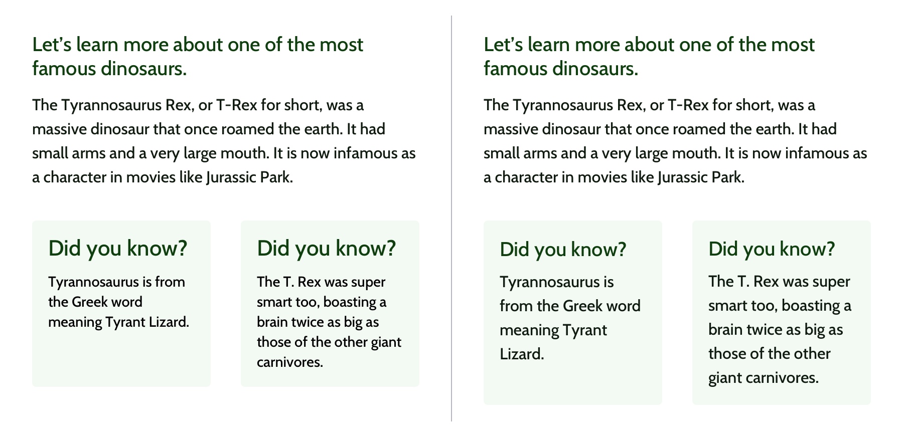
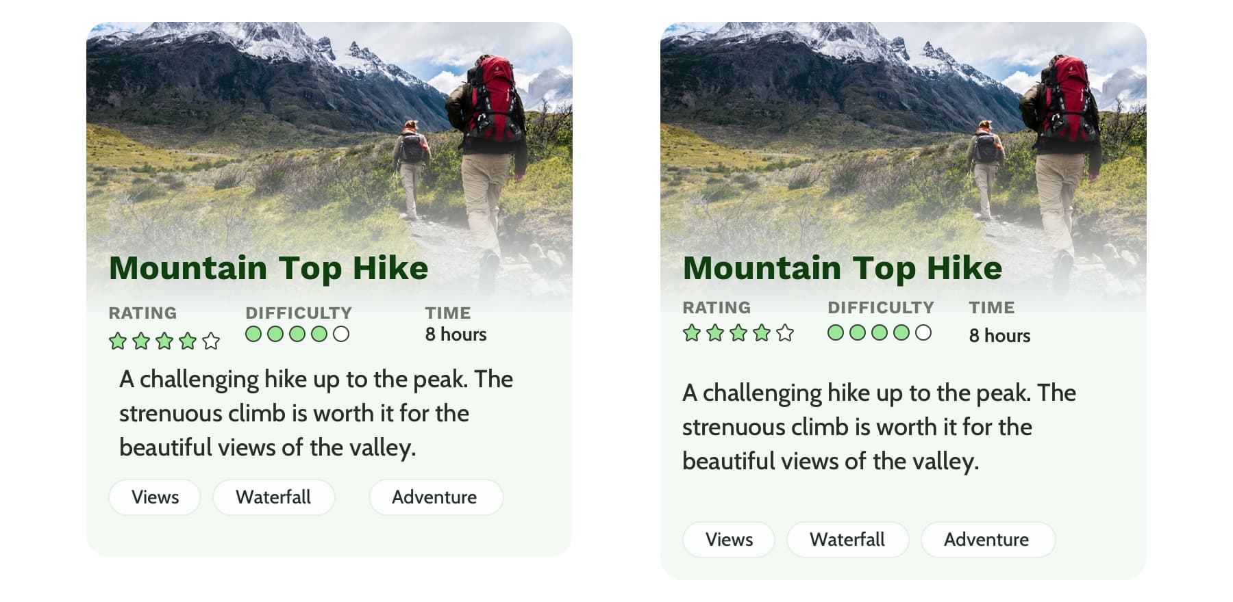
Left: The black text is similar but uses a slightly different font size and line height. Right: The black text uses the same styles and therefore can use the same CSS class. Reducing the amount of CSS needed and adding repetition and consistency.
In design, there are endless ways to experiment with styles. Designers can sometimes go a little crazy with their font styles by creating numerous slight variations of similar styles. However, in code, it’s valuable to restrict text styles to a minimum. Developers should urge designers to combine similar styles in order to reduce code weight and increase reusability and consistency.
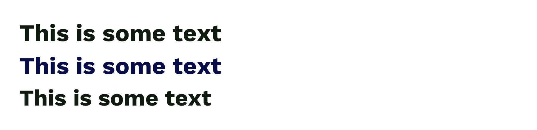
These headings look very similar but are slightly different and would require three separate CSS classes to style them. They could probably be combined into one and styled with a single class.
Hierarchy provides a clear visual order to content
Hierarchy is something you really only notice when it’s not there. In typography, hierarchy refers to the visual difference between various pieces of text. It’s the distinction between headings, paragraphs, links, and other text styles. This distinction is made by choosing different fonts, colors, size, capitalization, and other properties for each type of text content. Good hierarchy makes complex information easier to digest and guides users through your content.
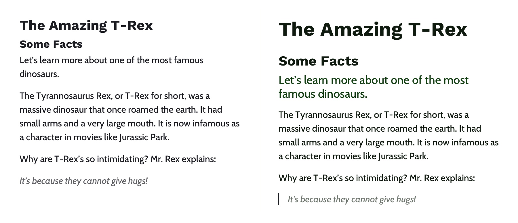
Left: Poor hierarchy. There’s not much differentiation in the size or color of the text to help users digest the content. Right: Better hierarchy that uses more variety in font size, color, and spacing to help users quickly navigate the content.
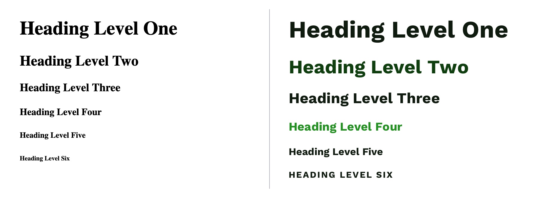
Out of the box, HTML provides some hierarchy (like how the font size of headings gets smaller as you go from <h1> to <h6>), but CSS opens the door for even more creativity. By giving <h1> tags an even larger font size, you can quickly establish greater difference in size between heading levels—and therefore more hierarchy. To create more variety, you can also change the color, text-align, and text-transform properties.
A comparison of the way HTML headings look without styles versus adding more contrast with CSS.
A note on choosing fonts
With typography, we need to make sure it is as easy to read as possible. The greatest overall factor in readability is the font you choose—which is a huge topic. There are many factors that determine how „readable” a font is. Some fonts are made specifically to be used as headings or short lines of text; these are called „display” fonts, and they often have more personality than fonts designed to be used for text. Unique flourishes and quirks make display fonts harder to read at small sizes and when part of a large paragraph. As a rule of thumb, use a more straightforward font for text and only use display fonts for headings.
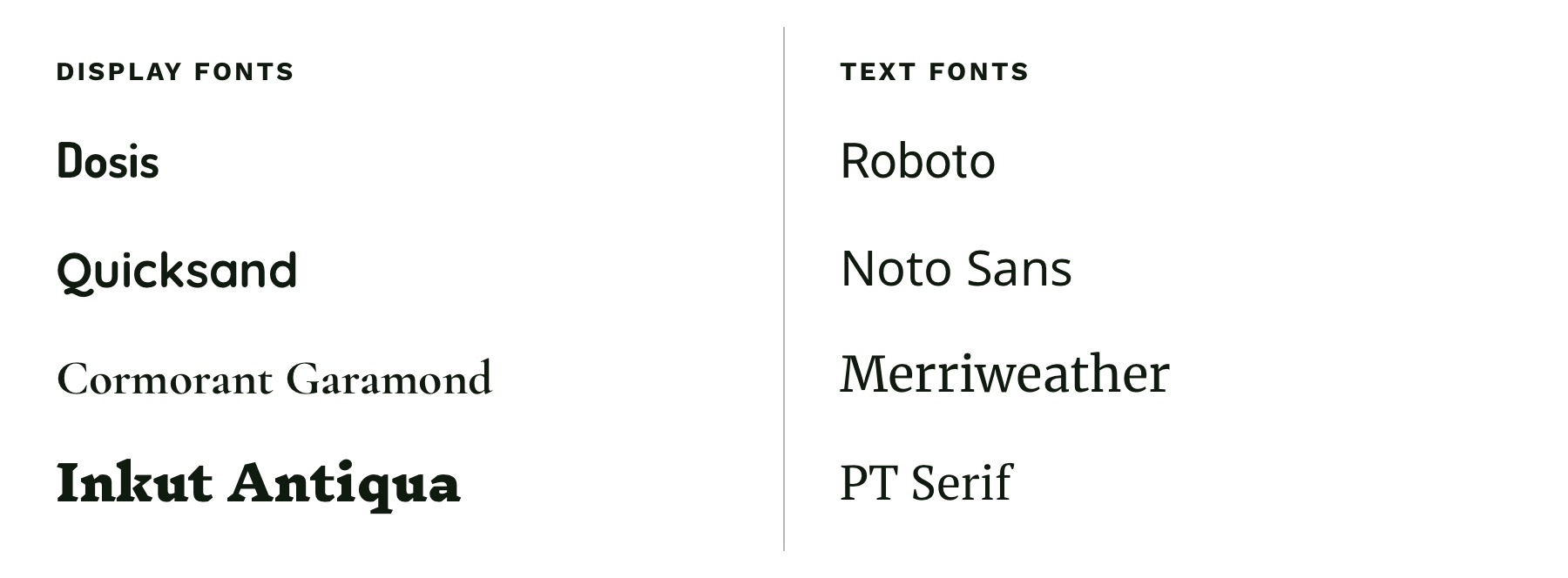
Left: Examples of display fonts that work better as headings. Right: Examples of text fonts that are more readable and can be used for headings, paragraphs, and any other text that needs to be easy to read.
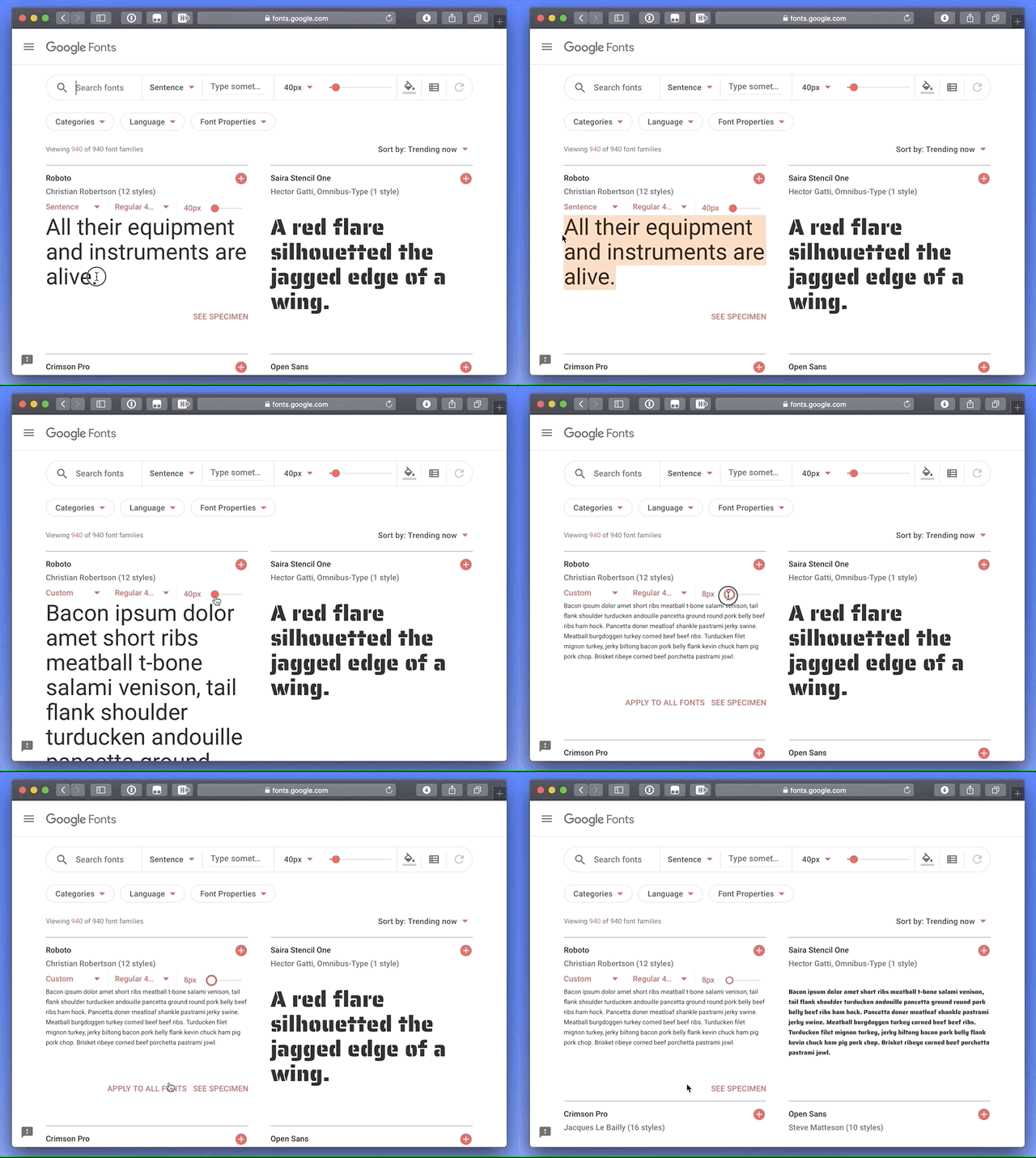
If you’re in a pinch and need a readable font, try Google Fonts. Add a paragraph of text to the preview field and size it roughly how it will display on your website. You can then narrow down your results to serif or sans-serif and scan the list of fonts for one that is easy to read. Roboto, Noto Sans, Merriweather, and PT Serif are all very readable options.
CSS properties for better readability
The main paragraph font-size should be between 16pxand 18px (1em and 1.25em) depending on the font you choose.
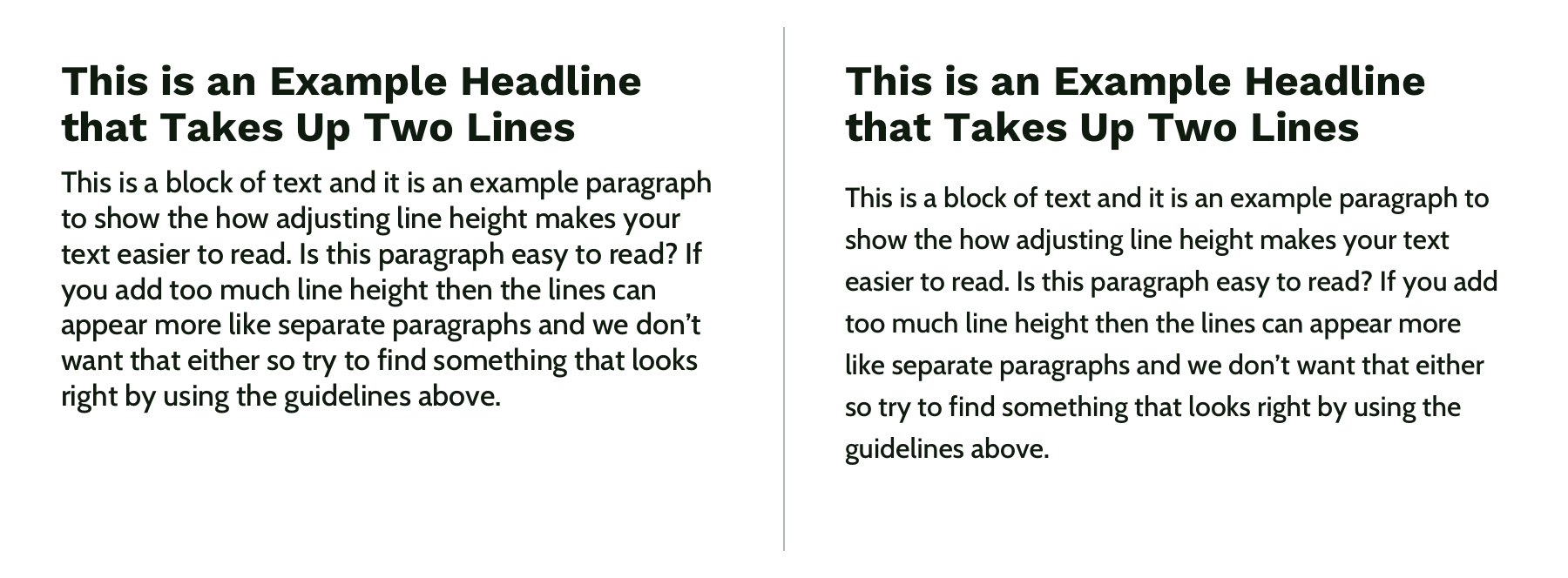
Manually set line-height (the vertical space between two lines of text) to make your text less cramped and easier to read. Start with line-height: 1.25 (that is 1.25 times the font-size) for headings and at least 1.5 for paragraphs (but no more than 1.9) and adjust from there. The longer the line of text, the larger the line-height should be. To keep your text flexible, avoid adding a unit to your line-height. Without a unit the line-height you set will be proportional to your font-size. For example, line-height: 1.5 and font-size: 18px would give you a line height of 27 pixels. If you changed your font size to font-size: 16px on smaller screens, the computed line height would then change to 24 pixels automatically.
Left: line-height is 1.1 for the heading and 1.2 for the paragraph, which is roughly the default setting. Right: line-height is 1.25 for the headings and 1.5 for the paragraph.
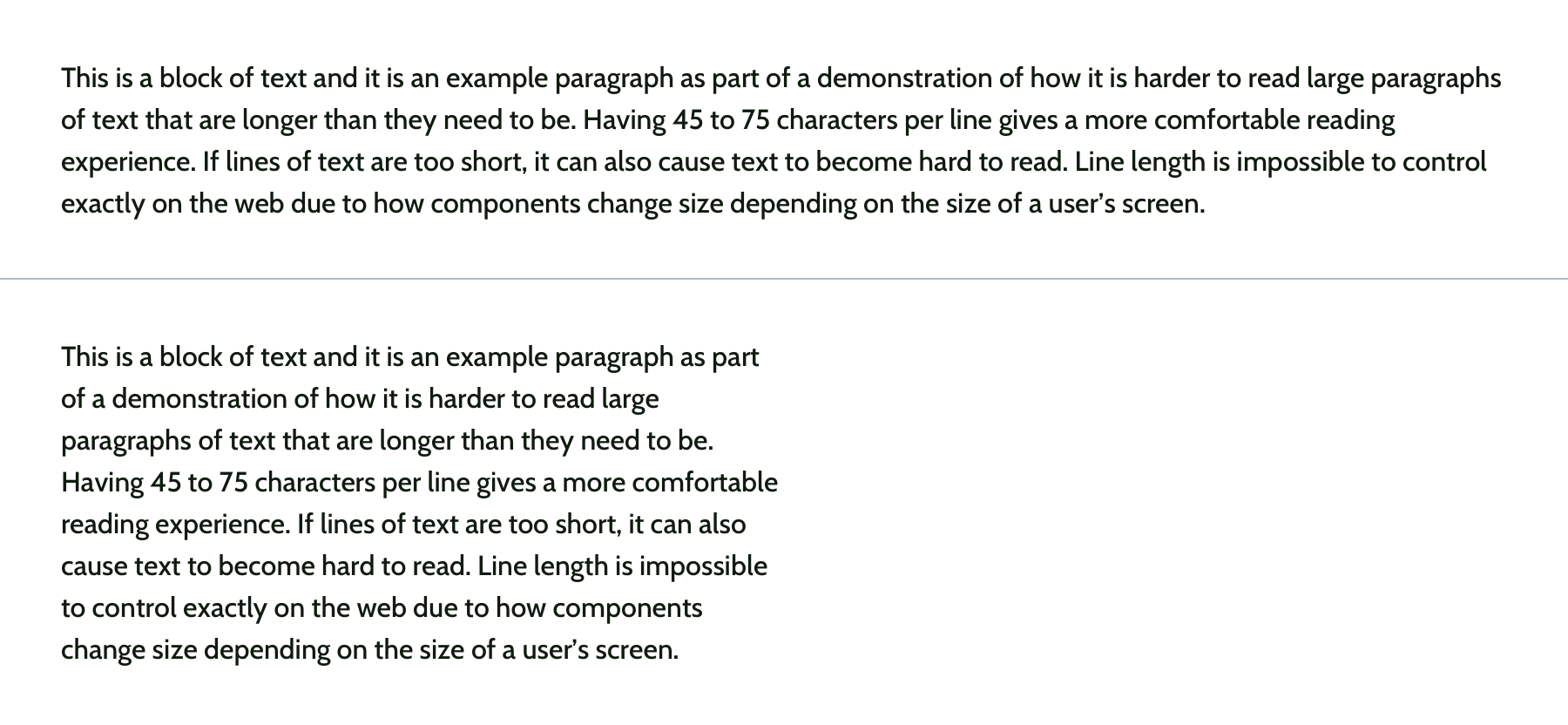
Pay attention to how many characters are in a line of text and aim for 45 and 75 characters long (including punctuation and spaces). Doing so reduces reading fatigue for your users by limiting the eye and head movement needed to follow a line of text. With the variable nature of the web, it’s impossible to completely control line length, but you can use max-width values and breakpoints to prevent lines of text from getting too long. Generally speaking, the shorter the line of text, the faster it will be to scan for quick reading. And don’t worry too much about counting the characters in every line. Once you do it a few times, you’ll develop a sense for what looks right.
Top: line length of around 125 characters. Bottom: line length of around 60 characters.
Spacing
After looking at typography, you can take a step back and examine the layout, or spacing, of your content. Movement and proximity are two design principles that relate to spacing.
Movement is about content flow
Movement refers to how your eye moves through the page or the flow of the page. You can use movement to direct a user’s eye in order to tell a story, point to a main action item, or encourage them to scroll. This is done by structuring the content within individual components and then arranging those components to form the layout of the page. By paying attention to how your eye moves through content, you can help users know where to look as they scan the page.
Unlike books, which tend to have very linear structure, websites can be more creative with their layout—in literally endless ways. It is important to make sure you are intentional with how you layout content and do so in a way which guides users through your content as easily as possible.
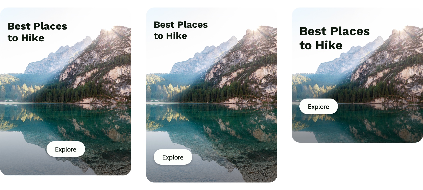
Three potential ways to arrange a heading, image, and button.
Consider these three examples above. Which is the easiest to follow? The arrangement on the left draws your eye off the screen to the left due to how the image is positioned which makes it hard to find the button. In the center option, it’s easy to skip over the headline because the image is too large in comparison. On the right, the heading draws your attention first and the image is composed so that it points to the main action item—the button.
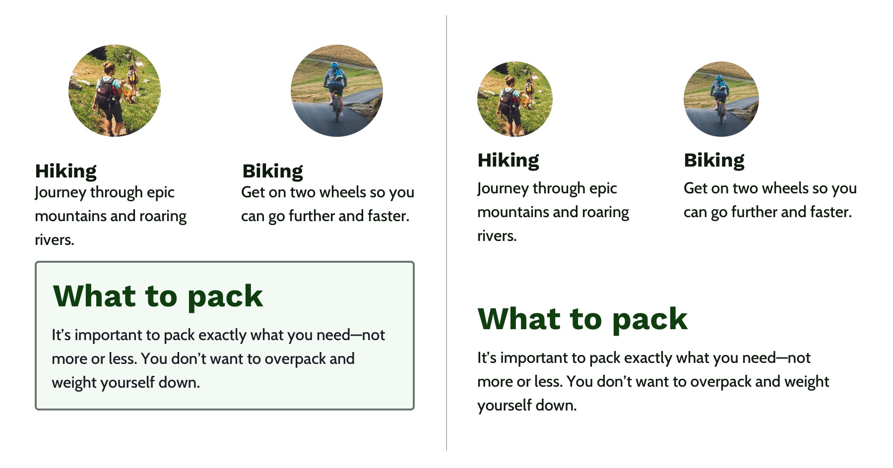
White space is a helpful tool for creating strong movement, but it’s easy to use too much or too little. Think about how you are using it to direct the user’s eye and divide your content. When used well, users won’t notice the whitespace itself but will be able to better focus on the content you are presenting. For example, you can use whitespace to separate content (instead of a colored box) which results in a less cluttered layout.
Left: Using a graphic element to separate content and aligning images in the center. Right: Using whitespace to separate content and aligning images on the left to let the whitespace flow better around groups of related content and create a cleaner layout.
Proximity establishes relationships
When objects are closer together, they are perceived as being related. By controlling spacing around elements, you can imply relationships between them. It can be helpful to create a system for spacing to help build consistency through repetition and avoid the use of random numbers. This system is based off the default browser font size (1rem or 16px) and uses distinct values that cover most scenarios:
0.25rem (4px)
0.5rem (8px)
1rem (16px)
2rem (32px)
4rem (64px)
You can use Sass or CSS variables so that the values are kept consistent across the project. A system might look like this—but use whatever you’re comfortable with because naming things is hard:
$space-sm
$space-med
$space-lg
$space-xl
$space-xxl
Left: A component with uneven spacing between elements. Right: A component that uses consistent spacing.
Color conveys personality and calls attention
Color greatly affects a website’s personality. When used well, it gives pages life and emotion; used poorly, it can distract from the content, or worse, make it inaccessible. Color goes hand in hand with most design principles. It can be used to create movement by directing users’ eyes and can be used to create emphasis by calling attention to the most important action items.
A note on choosing colors
With color, it can be hard to know where to start. To help, you can use a four-step process to guide your color choices and build a color palette for the site.
Step 1: Know your mood
You have to know the mood or attitude of your site and brand before choosing colors. Look at your content and decide what you are trying to communicate. Is it funny, informative, retro, loud, somber? Typically, you can boil down the mood of your site to a few adjectives. For example, you might summarize The North Face as adventurous and rugged while Apple would be minimalistic and beautiful.
Step 2: Find your main color
With your mood in mind, try to visualize a color that represents it. Start with the color’s saturation (how intense the color is) and brightness (how close the color is to white or black). If your mood is upbeat or flashy, a lighter (more saturated) color is probably best. If your mood is serious or reserved, a darker (less saturated) color is better.
Next, choose a hue. Hue refers to what most people think of as colors—where does is fall on the rotation of the color wheel? The hue of a color is what gives it the most meaning. People tend to associate hues with certain ideas. For instance, red is often associated with power or danger and green relates to money or nature. It can be helpful to look at similar websites or brands to see what colors they use—although you don’t need to follow their lead. Don’t be afraid to experiment!
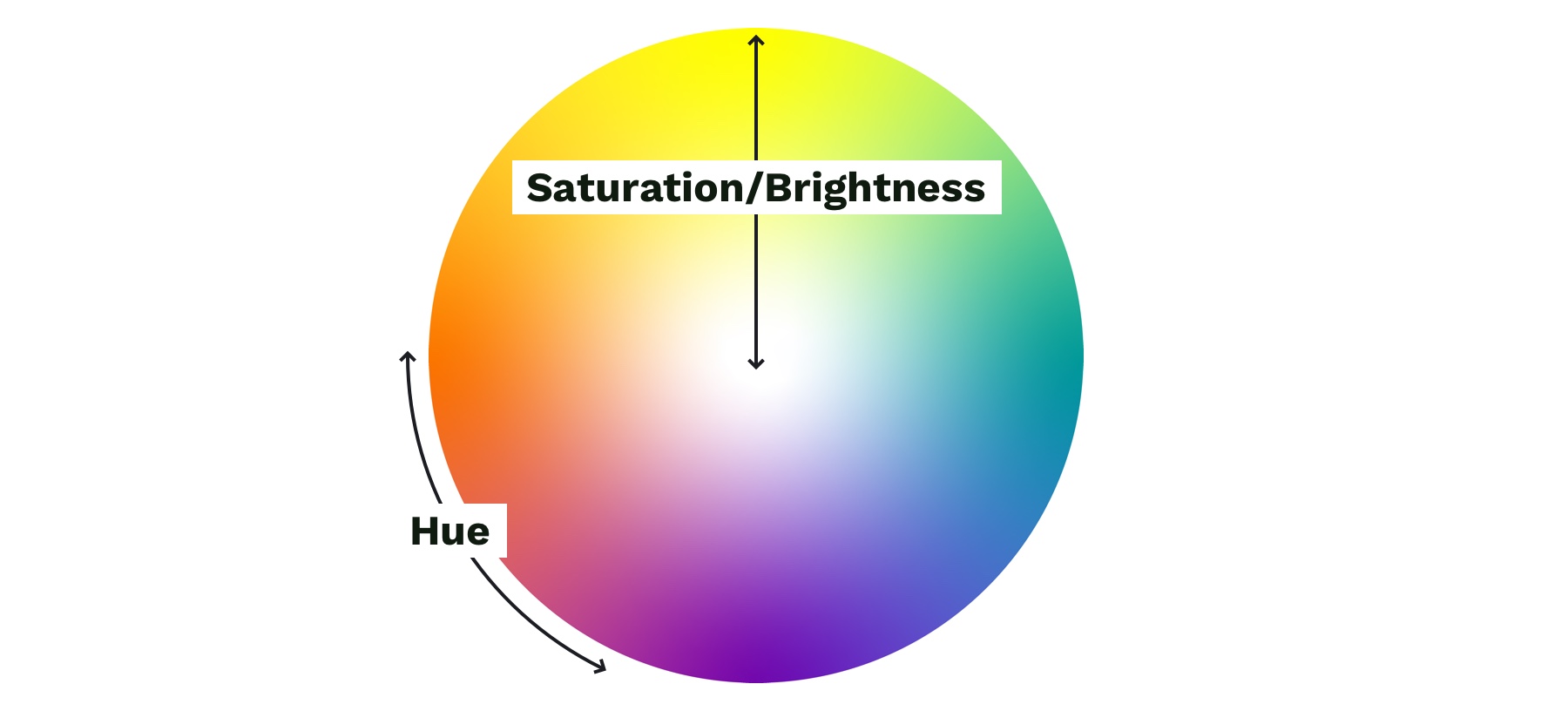
Color wheel showing saturation and brightness versus hue.
Step 3: Add supporting colors
Sometimes, two or three main colors are needed, but this is not necessary. Think about the colors of different brands. Some use a single color, and others have a main color and one or two that support it. Coca-Cola uses its distinct red. IKEA is mostly blue with some yellow. Tide is orange with some blue and yellow. Depending on your site’s mood, you might need a few colors. Try using a tool like Adobe Color or Coolors), both of which allow you to add a main color and then try different color relationships, like complementary or monochromatic, to quickly see if any work well.
Step 4: Expand your palette
Now that you’ve narrowed things down and found your main color(s), it’s time to expand your scope with a palette that gives your project versatility and constraint—here’s a methodology I’ve found helpful. Tints and shades are the trick here. Tints are made by mixing your main color(s) with white, and shades are made by mixing with black. You can quickly create an organized system with Sass color functions:
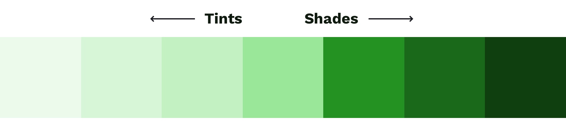
A palette of color options created with Sass color functions. Make sure to use percent values for the functions that create distinct colors—not too similar to the main color.
To round out your palette, you’ll need a few more colors, like a white and black. Try creating a „rich black” using a dark, almost black shade of your main color and, on the other end of the spectrum, pick a few light grays that are tinted with your main color. Tinting the white and black adds a little more personality to your page and helps create a cohesive look and feel.
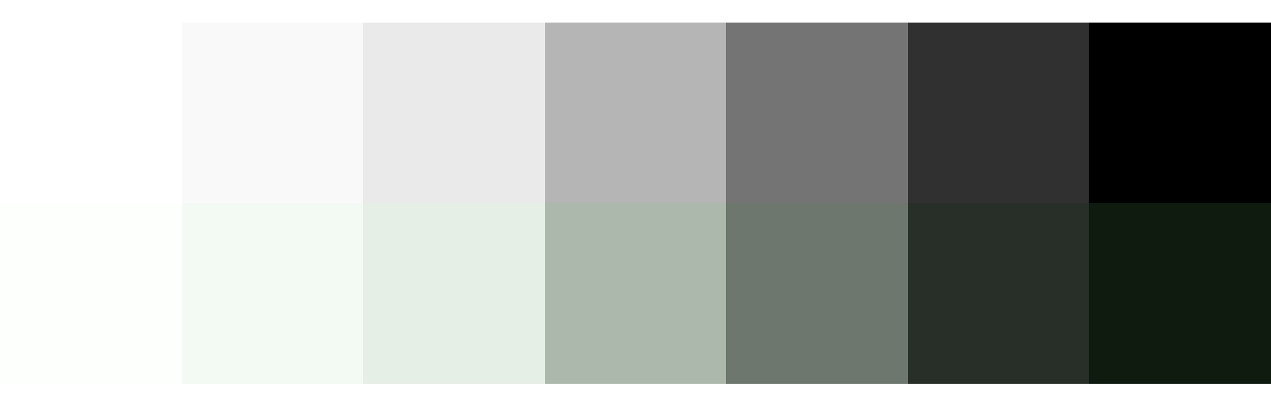
Top: Basic white, gray, and black. Bottom: Tinted white, grays, and black to match the main color.
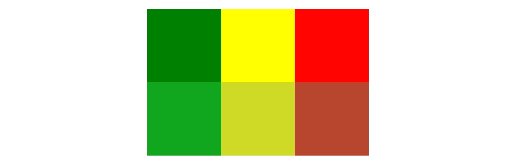
Last but not least, if you are working on an interactive product, you should add colors for success, warning, and error states. Typically a green, yellow, and red work for these but consider how you can adjust the hue to make them fit better with your palette. For example, if your mood is friendly and your base color is green, you might want to desaturate the error state colors to make the red feel less negative.
You can do this with the mix Sass color function by giving it your base color, the default error color, and the percentage of base color that you want to mix in with the error color. Adding desaturate functions helps tone down the colors:
Top: Default colors for success, warning, and error states. Bottom: Tinted and desaturated colors for the success, warning and error states.
When it comes to the web, there’s one color principle that you have to pay extra attention to: contrast. That’s what we’ll cover next.
Contrast
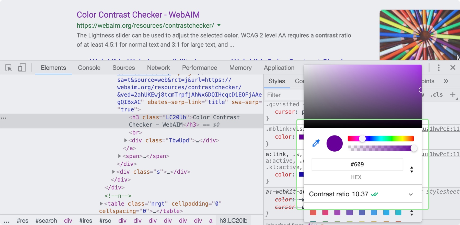
Color contrast—the difference in saturation, brightness, and hue between two colors—is an important design principle for ensuring the web is accessible to those with low vision or color blindness. By ensuring there is enough contrast between your text and whatever is behind it on your site will be more accessible for all sighted users. When looking at accessibility, be sure to follow the color contrast guidelines provided by W3C’s Web Content Accessibility Guidelines (WCAG). There are many tools that can help you follow these guidelines, including the inspect panel in Chrome’s dev tools.
By clicking on the color property in the Chrome Inspect tool, you can see the contrast ratio and whether it is passing.
Now, it’s time to put these principles to practice! You can use these processes and CSS tips to help take the guesswork out of design and create better solutions. Start with what you are familiar with, and eventually, the design principles mentioned here will become second nature.
It is technically true that anyone can cook. But there’s a difference between actually knowing how to prepare a delicious meal and hoping for the best as you throw a few ingredients in a pot. Just like web development, you might know the ingredients—<span>, background-color, .heading-1—but not everyone knows how to turn those ingredients into a beautiful, easy-to-use website.
Whenever you use HTML and CSS, you are designing—giving form and structure to content so it can be understood by someone else. People have been designing for centuries and have developed principles along the way that are applicable to digital interfaces today. These principles manifest in three key areas: how words are displayed (typography), how content is arranged (spacing), and how personalty is added (color). Let’s discover how to use each of these web design ingredients through the mindset of a developer with CSS properties and guidelines to take the guesswork out of web design.
Websites that are easy to read don’t happen by mistake. In fact, Taimur Abdaal wrote an entire article on the topic that’s chock-full of advice for developers working with type. We’re going to focus specifically on two fundamental principles of design that can help you display words in a more visually pleasing and easy-to-read way: repetition and hierarchy.
Use repetition for consistency and maintainability
Repetition comes fairly naturally on the web thanks to the importance of reusability in software. For example, CSS classes allow you to define a particular style for text and then reuse that style across the site. This results in repeating, consistent text styles for similar content which helps users navigate the site.
If, for example, you are working on styles for a new paragraph, first consider if there is existing content that has a similar style and try to use the same CSS class. If not, you can create a new class with a generic name that can be repeated elsewhere in your site. Think .paragraph--emphasize as opposed to .footer__paragraph--emphasize or .heading-1 as opposed to .hero__site-title. The first examples can be used across your site as opposed to the second which are scoped to specific components. You can even add a prefix like text- to indicate that the class is used specifically for text styles. This method will reduce the CSS file size and complexity while making it much easier to update global styles in the future.
Left: The black text is similar but uses a slightly different font size and line height. Right: The black text uses the same styles and therefore can use the same CSS class. Reducing the amount of CSS needed and adding repetition and consistency.
In design, there are endless ways to experiment with styles. Designers can sometimes go a little crazy with their font styles by creating numerous slight variations of similar styles. However, in code, it’s valuable to restrict text styles to a minimum. Developers should urge designers to combine similar styles in order to reduce code weight and increase reusability and consistency.
These headings look very similar but are slightly different and would require three separate CSS classes to style them. They could probably be combined into one and styled with a single class.
Hierarchy provides a clear visual order to content
Hierarchy is something you really only notice when it’s not there. In typography, hierarchy refers to the visual difference between various pieces of text. It’s the distinction between headings, paragraphs, links, and other text styles. This distinction is made by choosing different fonts, colors, size, capitalization, and other properties for each type of text content. Good hierarchy makes complex information easier to digest and guides users through your content.
Left: Poor hierarchy. There’s not much differentiation in the size or color of the text to help users digest the content. Right: Better hierarchy that uses more variety in font size, color, and spacing to help users quickly navigate the content.
Out of the box, HTML provides some hierarchy (like how the font size of headings gets smaller as you go from <h1> to <h6>), but CSS opens the door for even more creativity. By giving <h1> tags an even larger font size, you can quickly establish greater difference in size between heading levels—and therefore more hierarchy. To create more variety, you can also change the color, text-align, and text-transform properties.
A comparison of the way HTML headings look without styles versus adding more contrast with CSS.
A note on choosing fonts
With typography, we need to make sure it is as easy to read as possible. The greatest overall factor in readability is the font you choose—which is a huge topic. There are many factors that determine how „readable” a font is. Some fonts are made specifically to be used as headings or short lines of text; these are called „display” fonts, and they often have more personality than fonts designed to be used for text. Unique flourishes and quirks make display fonts harder to read at small sizes and when part of a large paragraph. As a rule of thumb, use a more straightforward font for text and only use display fonts for headings.
Left: Examples of display fonts that work better as headings. Right: Examples of text fonts that are more readable and can be used for headings, paragraphs, and any other text that needs to be easy to read.
If you’re in a pinch and need a readable font, try Google Fonts. Add a paragraph of text to the preview field and size it roughly how it will display on your website. You can then narrow down your results to serif or sans-serif and scan the list of fonts for one that is easy to read. Roboto, Noto Sans, Merriweather, and PT Serif are all very readable options.
CSS properties for better readability
The main paragraph font-size should be between 16pxand 18px (1em and 1.25em) depending on the font you choose.
Manually set line-height (the vertical space between two lines of text) to make your text less cramped and easier to read. Start with line-height: 1.25 (that is 1.25 times the font-size) for headings and at least 1.5 for paragraphs (but no more than 1.9) and adjust from there. The longer the line of text, the larger the line-height should be. To keep your text flexible, avoid adding a unit to your line-height. Without a unit the line-height you set will be proportional to your font-size. For example, line-height: 1.5 and font-size: 18px would give you a line height of 27 pixels. If you changed your font size to font-size: 16px on smaller screens, the computed line height would then change to 24 pixels automatically.
Left: line-height is 1.1 for the heading and 1.2 for the paragraph, which is roughly the default setting. Right: line-height is 1.25 for the headings and 1.5 for the paragraph.
Pay attention to how many characters are in a line of text and aim for 45 and 75 characters long (including punctuation and spaces). Doing so reduces reading fatigue for your users by limiting the eye and head movement needed to follow a line of text. With the variable nature of the web, it’s impossible to completely control line length, but you can use max-width values and breakpoints to prevent lines of text from getting too long. Generally speaking, the shorter the line of text, the faster it will be to scan for quick reading. And don’t worry too much about counting the characters in every line. Once you do it a few times, you’ll develop a sense for what looks right.
Top: line length of around 125 characters. Bottom: line length of around 60 characters.
Spacing
After looking at typography, you can take a step back and examine the layout, or spacing, of your content. Movement and proximity are two design principles that relate to spacing.
Movement is about content flow
Movement refers to how your eye moves through the page or the flow of the page. You can use movement to direct a user’s eye in order to tell a story, point to a main action item, or encourage them to scroll. This is done by structuring the content within individual components and then arranging those components to form the layout of the page. By paying attention to how your eye moves through content, you can help users know where to look as they scan the page.
Unlike books, which tend to have very linear structure, websites can be more creative with their layout—in literally endless ways. It is important to make sure you are intentional with how you layout content and do so in a way which guides users through your content as easily as possible.
Three potential ways to arrange a heading, image, and button.
Consider these three examples above. Which is the easiest to follow? The arrangement on the left draws your eye off the screen to the left due to how the image is positioned which makes it hard to find the button. In the center option, it’s easy to skip over the headline because the image is too large in comparison. On the right, the heading draws your attention first and the image is composed so that it points to the main action item—the button.
White space is a helpful tool for creating strong movement, but it’s easy to use too much or too little. Think about how you are using it to direct the user’s eye and divide your content. When used well, users won’t notice the whitespace itself but will be able to better focus on the content you are presenting. For example, you can use whitespace to separate content (instead of a colored box) which results in a less cluttered layout.
Left: Using a graphic element to separate content and aligning images in the center. Right: Using whitespace to separate content and aligning images on the left to let the whitespace flow better around groups of related content and create a cleaner layout.
Proximity establishes relationships
When objects are closer together, they are perceived as being related. By controlling spacing around elements, you can imply relationships between them. It can be helpful to create a system for spacing to help build consistency through repetition and avoid the use of random numbers. This system is based off the default browser font size (1rem or 16px) and uses distinct values that cover most scenarios:
0.25rem (4px)
0.5rem (8px)
1rem (16px)
2rem (32px)
4rem (64px)
You can use Sass or CSS variables so that the values are kept consistent across the project. A system might look like this—but use whatever you’re comfortable with because naming things is hard:
$space-sm
$space-med
$space-lg
$space-xl
$space-xxl
Left: A component with uneven spacing between elements. Right: A component that uses consistent spacing.
Color conveys personality and calls attention
Color greatly affects a website’s personality. When used well, it gives pages life and emotion; used poorly, it can distract from the content, or worse, make it inaccessible. Color goes hand in hand with most design principles. It can be used to create movement by directing users’ eyes and can be used to create emphasis by calling attention to the most important action items.
A note on choosing colors
With color, it can be hard to know where to start. To help, you can use a four-step process to guide your color choices and build a color palette for the site.
Step 1: Know your mood
You have to know the mood or attitude of your site and brand before choosing colors. Look at your content and decide what you are trying to communicate. Is it funny, informative, retro, loud, somber? Typically, you can boil down the mood of your site to a few adjectives. For example, you might summarize The North Face as adventurous and rugged while Apple would be minimalistic and beautiful.
Step 2: Find your main color
With your mood in mind, try to visualize a color that represents it. Start with the color’s saturation (how intense the color is) and brightness (how close the color is to white or black). If your mood is upbeat or flashy, a lighter (more saturated) color is probably best. If your mood is serious or reserved, a darker (less saturated) color is better.
Next, choose a hue. Hue refers to what most people think of as colors—where does is fall on the rotation of the color wheel? The hue of a color is what gives it the most meaning. People tend to associate hues with certain ideas. For instance, red is often associated with power or danger and green relates to money or nature. It can be helpful to look at similar websites or brands to see what colors they use—although you don’t need to follow their lead. Don’t be afraid to experiment!
Color wheel showing saturation and brightness versus hue.
Step 3: Add supporting colors
Sometimes, two or three main colors are needed, but this is not necessary. Think about the colors of different brands. Some use a single color, and others have a main color and one or two that support it. Coca-Cola uses its distinct red. IKEA is mostly blue with some yellow. Tide is orange with some blue and yellow. Depending on your site’s mood, you might need a few colors. Try using a tool like Adobe Color or Coolors), both of which allow you to add a main color and then try different color relationships, like complementary or monochromatic, to quickly see if any work well.
Step 4: Expand your palette
Now that you’ve narrowed things down and found your main color(s), it’s time to expand your scope with a palette that gives your project versatility and constraint—here’s a methodology I’ve found helpful. Tints and shades are the trick here. Tints are made by mixing your main color(s) with white, and shades are made by mixing with black. You can quickly create an organized system with Sass color functions:
A palette of color options created with Sass color functions. Make sure to use percent values for the functions that create distinct colors—not too similar to the main color.
To round out your palette, you’ll need a few more colors, like a white and black. Try creating a „rich black” using a dark, almost black shade of your main color and, on the other end of the spectrum, pick a few light grays that are tinted with your main color. Tinting the white and black adds a little more personality to your page and helps create a cohesive look and feel.
Top: Basic white, gray, and black. Bottom: Tinted white, grays, and black to match the main color.
Last but not least, if you are working on an interactive product, you should add colors for success, warning, and error states. Typically a green, yellow, and red work for these but consider how you can adjust the hue to make them fit better with your palette. For example, if your mood is friendly and your base color is green, you might want to desaturate the error state colors to make the red feel less negative.
You can do this with the mix Sass color function by giving it your base color, the default error color, and the percentage of base color that you want to mix in with the error color. Adding desaturate functions helps tone down the colors:
Top: Default colors for success, warning, and error states. Bottom: Tinted and desaturated colors for the success, warning and error states.
When it comes to the web, there’s one color principle that you have to pay extra attention to: contrast. That’s what we’ll cover next.
Contrast
Color contrast—the difference in saturation, brightness, and hue between two colors—is an important design principle for ensuring the web is accessible to those with low vision or color blindness. By ensuring there is enough contrast between your text and whatever is behind it on your site will be more accessible for all sighted users. When looking at accessibility, be sure to follow the color contrast guidelines provided by W3C’s Web Content Accessibility Guidelines (WCAG). There are many tools that can help you follow these guidelines, including the inspect panel in Chrome’s dev tools.
By clicking on the color property in the Chrome Inspect tool, you can see the contrast ratio and whether it is passing.
Now, it’s time to put these principles to practice! You can use these processes and CSS tips to help take the guesswork out of design and create better solutions. Start with what you are familiar with, and eventually, the design principles mentioned here will become second nature.
There was a fun article in The New York Times the other day describing the fancy way Elizabeth Warren and her staff let people take a selfie with Warren. But… the pictures aren’t actually selfies because they are taken by someone else. The article has his hilarious line of text that wiggles by on a curved line as you scroll down the page.
Let’s look at how they did it.
Movie:
The curved line is drawn in SVG as a <path>, and the <text> is set upon it by a <textPath>:
The movement trick happens by adjusting the startOffset attribute of the textPath element.
I’m not 100% sure how they did it, but we can do some quick hacky math by watching the scroll position of the page and setting that attribute in a way that makes it move about as fast and far as we want.
const textPath = document.querySelector("#text-path");

const h = document.documentElement,
      b = document.body,
      st = 'scrollTop',
      sh = 'scrollHeight';

document.addEventListener("scroll", e => {
  let percent = (h[st]||b[st]) / ((h[sh]||b[sh]) - h.clientHeight) * 100;
  textPath.setAttribute("startOffset", (-percent * 40) + 1200)
});
There was a fun article in The New York Times the other day describing the fancy way Elizabeth Warren and her staff let people take a selfie with Warren. But… the pictures aren’t actually selfies because they are taken by someone else. The article has his hilarious line of text that wiggles by on a curved line as you scroll down the page.
Let’s look at how they did it.
Movie:
The curved line is drawn in SVG as a <path>, and the <text> is set upon it by a <textPath>:
The movement trick happens by adjusting the startOffset attribute of the textPath element.
I’m not 100% sure how they did it, but we can do some quick hacky math by watching the scroll position of the page and setting that attribute in a way that makes it move about as fast and far as we want.
const textPath = document.querySelector("#text-path");

const h = document.documentElement,
      b = document.body,
      st = 'scrollTop',
      sh = 'scrollHeight';

document.addEventListener("scroll", e => {
  let percent = (h[st]||b[st]) / ((h[sh]||b[sh]) - h.clientHeight) * 100;
  textPath.setAttribute("startOffset", (-percent * 40) + 1200)
});
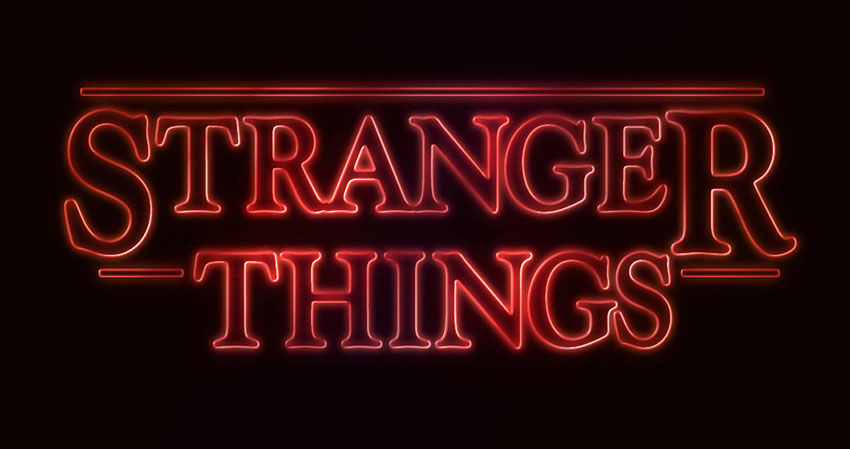
This very quick tutorial will show you an easy way to create a text effect inspired by the 'Stranger Things’ series, using only layer styles and some simple adjustments. Let’s get started!
This text effect was inspired by the many Layer Styles available on Envato Market. You can get a very similar style named Stranger Twins, which is available to download and use in Adobe Photoshop.
Tutorial Assets
The following assets were used during the production of this tutorial:
Create a new 1280 x 720px document, and fill the Background with the color #0c0101.
Step 2
Create the text in White using the font Indira K.
The original font used is Benguiat, but this is a free alternative that you can use instead.
Set the Size to a value around 141 pt, and check the Faux Bold and All Caps icons in the Character panel (Window > Character).
Step 3
Change the Tracking value to -100.
Step 4
Change the Vertical Scale to 115. This will stretch the text vertically.
2. Adjust the Bigger Letters
Step 1
Select (highlight) the first letter of your text, and change its Size to a value around 212 pt.
Step 2
Next, you’ll need to change the Baseline Shift value in order to move the big letter downwards, until its top is on the same level as the tops of the rest of the letters.
To do that, you can either enter numerical values, or scrub the Set the baseline shift icon to the left.
Step 3
Do the same for the last letter of the first line of text, or whatever other letters you like.
3. Adjust the Kerning
Step 1
Place the text cursor between the first two letters you have, and change the Kerning to a value you think looks good.
Step 2
Depending on your text and the result you’re looking for, adjust the Kerning for the rest of the letters you have. Not all the letters should be adjusted, just the ones you think need that.
Step 3
Once you’re done, change the text layer’s Fill value to 0.
4. Style the Text
Double-click the text layer to apply the following layer style:
Step 1
Add a Bevel and Emboss with these settings:
Style: Stroke Emboss
Depth: 220
Size: 3
Uncheck the Use Global Light box
Angle: 156
Altitude: 37
Gloss Contour: Cone – Inverted
Check the Anti-aliased box
Highlight Mode – Opacity: 35%
Shadow Mode – Opacity: 50%
Step 2
Add a Contour with these settings:
Contour: Cove – Deep
Check the Anti-aliased box.
Step 3
Add a Stroke with these settings:
Size: 3
Position: Inside
Color: #ce1725
Step 4
Add an Inner Glow with these settings:
Opacity: 50%
Noise: 5%
Color: #ea0f0f
Size: 17
Step 5
Add an Outer Glow with these settings:
Opacity: 50%
Noise: 5%
Color: #ea2314
Size: 12
Range: 60%
Step 6
This will style the text. Right-click the styled text layer, and choose Copy Layer Style.
5. Create the Rectangle Shapes
Step 1
Pick the Rounded Rectangle Tool, and set the Radius in the Options bar to 2. Click-drag to create a rectangle above the text, with a Height value around 7px.
Then, click-drag to create more rectangles at the beginning and end of the second line of text, or anywhere else you’d like to add them. Just make sure to maintain the same Height for all the rectangles you create.
Step 2
Change all the rectangle layers’ Fill value to 0.
6. Style the Rectangles
Right-click any of the rectangle layers you have, and choose Paste Layer Style. This will apply the same layer style copied from the text layer.
After that, double-click the styled rectangle layer to adjust some of the values:
Step 1
Add a Bevel and Emboss with these settings:
Size: 2
Step 2
Add a Stroke with these settings:
Size: 2
Position: Outside
Step 3
Add an Inner Glow with these settings:
Size: 5
Step 4
Add an Outer Glow with these settings:
Size: 17
Step 5
Right-click the styled rectangle layer, and choose Copy Layer Style.
Step 6
Select the other rectangle layers you have, right-click any of them, and choose Paste Layer Style.
Step 7
Place the text and rectangle layers in a group, and call it Text Effect.
7. Style the Group
Double-click the Text Effect group to apply the following layer style:
Step 1
Add a Gradient Overlay with these settings:
Check the Dither box
Blend Mode: Soft Light
Style: Reflected
Angle: 135
Create the Gradient fill using the colors #fbe7c2 to the left and #e69f99 to the right
Step 2
Add another Gradient Overlay effect with these settings:
Check the Dither box
Blend Mode: Overlay
Style: Reflected
Angle: 135
Use the faucet 10 gradient fill
Step 3
Add an Outer Glow with these settings:
Opacity: 20%
Color: #de1b22
Size: 34
Range: 60%
This will enhance the effect.
8. Add Some Light Spots
Step 1
Set the Foreground Color to #451d08, and then create a new layer on top of all layers, call it Light, and change its Blend Mode to Color Dodge.
Step 2
Pick the Brush Tool, and choose a big, soft, round tip. Then start clicking over some letters to brighten them up.
You can change the tip’s size, and play around with the Opacity value in the Options bar to control the intensity of the light spots you’re adding.
Step 3
Click the Create new fill or adjustment layer icon in the Layers panel, and choose Hue/Saturation.
Step 4
Change the Saturation value to 35, and the Lightness to 15, or any other values you like.
9. Adjust the Coloring
Step 1
Add a Gradient adjustment layer on top of the Text Effect group.
Create the gradient fill using the colors #5c456e to the right, #b26b73 in the center, and #fda982 to the left. Change the Style to Reflected, the Angle to 155, and the Scale to 55%.
Step 2
Change the Gradient layer’s Blend Mode to Color, and its Opacity to 35%.
Congratulations! You’re Done
In this tutorial, we created the text and modified it using the different Character panel options and settings. Then we styled the text, created the rectangles, and styled them as well.
After that, we grouped all the layers and added one more layer style. Finally, we added some light spots and a gradient adjustment layer to modify the coloring of the final result.
Please feel free to leave your comments, suggestions, and outcomes below.
This very quick tutorial will show you an easy way to create a text effect inspired by the 'Stranger Things’ series, using only layer styles and some simple adjustments. Let’s get started!
This text effect was inspired by the many Layer Styles available on Envato Market. You can get a very similar style named Stranger Twins, which is available to download and use in Adobe Photoshop.
Tutorial Assets
The following assets were used during the production of this tutorial:
Create a new 1280 x 720px document, and fill the Background with the color #0c0101.
Step 2
Create the text in White using the font Indira K.
The original font used is Benguiat, but this is a free alternative that you can use instead.
Set the Size to a value around 141 pt, and check the Faux Bold and All Caps icons in the Character panel (Window > Character).
Step 3
Change the Tracking value to -100.
Step 4
Change the Vertical Scale to 115. This will stretch the text vertically.
2. Adjust the Bigger Letters
Step 1
Select (highlight) the first letter of your text, and change its Size to a value around 212 pt.
Step 2
Next, you’ll need to change the Baseline Shift value in order to move the big letter downwards, until its top is on the same level as the tops of the rest of the letters.
To do that, you can either enter numerical values, or scrub the Set the baseline shift icon to the left.
Step 3
Do the same for the last letter of the first line of text, or whatever other letters you like.
3. Adjust the Kerning
Step 1
Place the text cursor between the first two letters you have, and change the Kerning to a value you think looks good.
Step 2
Depending on your text and the result you’re looking for, adjust the Kerning for the rest of the letters you have. Not all the letters should be adjusted, just the ones you think need that.
Step 3
Once you’re done, change the text layer’s Fill value to 0.
4. Style the Text
Double-click the text layer to apply the following layer style:
Step 1
Add a Bevel and Emboss with these settings:
Style: Stroke Emboss
Depth: 220
Size: 3
Uncheck the Use Global Light box
Angle: 156
Altitude: 37
Gloss Contour: Cone – Inverted
Check the Anti-aliased box
Highlight Mode – Opacity: 35%
Shadow Mode – Opacity: 50%
Step 2
Add a Contour with these settings:
Contour: Cove – Deep
Check the Anti-aliased box.
Step 3
Add a Stroke with these settings:
Size: 3
Position: Inside
Color: #ce1725
Step 4
Add an Inner Glow with these settings:
Opacity: 50%
Noise: 5%
Color: #ea0f0f
Size: 17
Step 5
Add an Outer Glow with these settings:
Opacity: 50%
Noise: 5%
Color: #ea2314
Size: 12
Range: 60%
Step 6
This will style the text. Right-click the styled text layer, and choose Copy Layer Style.
5. Create the Rectangle Shapes
Step 1
Pick the Rounded Rectangle Tool, and set the Radius in the Options bar to 2. Click-drag to create a rectangle above the text, with a Height value around 7px.
Then, click-drag to create more rectangles at the beginning and end of the second line of text, or anywhere else you’d like to add them. Just make sure to maintain the same Height for all the rectangles you create.
Step 2
Change all the rectangle layers’ Fill value to 0.
6. Style the Rectangles
Right-click any of the rectangle layers you have, and choose Paste Layer Style. This will apply the same layer style copied from the text layer.
After that, double-click the styled rectangle layer to adjust some of the values:
Step 1
Add a Bevel and Emboss with these settings:
Size: 2
Step 2
Add a Stroke with these settings:
Size: 2
Position: Outside
Step 3
Add an Inner Glow with these settings:
Size: 5
Step 4
Add an Outer Glow with these settings:
Size: 17
Step 5
Right-click the styled rectangle layer, and choose Copy Layer Style.
Step 6
Select the other rectangle layers you have, right-click any of them, and choose Paste Layer Style.
Step 7
Place the text and rectangle layers in a group, and call it Text Effect.
7. Style the Group
Double-click the Text Effect group to apply the following layer style:
Step 1
Add a Gradient Overlay with these settings:
Check the Dither box
Blend Mode: Soft Light
Style: Reflected
Angle: 135
Create the Gradient fill using the colors #fbe7c2 to the left and #e69f99 to the right
Step 2
Add another Gradient Overlay effect with these settings:
Check the Dither box
Blend Mode: Overlay
Style: Reflected
Angle: 135
Use the faucet 10 gradient fill
Step 3
Add an Outer Glow with these settings:
Opacity: 20%
Color: #de1b22
Size: 34
Range: 60%
This will enhance the effect.
8. Add Some Light Spots
Step 1
Set the Foreground Color to #451d08, and then create a new layer on top of all layers, call it Light, and change its Blend Mode to Color Dodge.
Step 2
Pick the Brush Tool, and choose a big, soft, round tip. Then start clicking over some letters to brighten them up.
You can change the tip’s size, and play around with the Opacity value in the Options bar to control the intensity of the light spots you’re adding.
Step 3
Click the Create new fill or adjustment layer icon in the Layers panel, and choose Hue/Saturation.
Step 4
Change the Saturation value to 35, and the Lightness to 15, or any other values you like.
9. Adjust the Coloring
Step 1
Add a Gradient adjustment layer on top of the Text Effect group.
Create the gradient fill using the colors #5c456e to the right, #b26b73 in the center, and #fda982 to the left. Change the Style to Reflected, the Angle to 155, and the Scale to 55%.
Step 2
Change the Gradient layer’s Blend Mode to Color, and its Opacity to 35%.
Congratulations! You’re Done
In this tutorial, we created the text and modified it using the different Character panel options and settings. Then we styled the text, created the rectangles, and styled them as well.
After that, we grouped all the layers and added one more layer style. Finally, we added some light spots and a gradient adjustment layer to modify the coloring of the final result.
Please feel free to leave your comments, suggestions, and outcomes below.
This very quick tutorial will show you an easy way to create a text effect inspired by the 'Stranger Things’ series, using only layer styles and some simple adjustments. Let’s get started!
This text effect was inspired by the many Layer Styles available on Envato Market. You can get a very similar style named Stranger Twins, which is available to download and use in Adobe Photoshop.
Tutorial Assets
The following assets were used during the production of this tutorial:
Create a new 1280 x 720px document, and fill the Background with the color #0c0101.
Step 2
Create the text in White using the font Indira K.
The original font used is Benguiat, but this is a free alternative that you can use instead.
Set the Size to a value around 141 pt, and check the Faux Bold and All Caps icons in the Character panel (Window > Character).
Step 3
Change the Tracking value to -100.
Step 4
Change the Vertical Scale to 115. This will stretch the text vertically.
2. Adjust the Bigger Letters
Step 1
Select (highlight) the first letter of your text, and change its Size to a value around 212 pt.
Step 2
Next, you’ll need to change the Baseline Shift value in order to move the big letter downwards, until its top is on the same level as the tops of the rest of the letters.
To do that, you can either enter numerical values, or scrub the Set the baseline shift icon to the left.
Step 3
Do the same for the last letter of the first line of text, or whatever other letters you like.
3. Adjust the Kerning
Step 1
Place the text cursor between the first two letters you have, and change the Kerning to a value you think looks good.
Step 2
Depending on your text and the result you’re looking for, adjust the Kerning for the rest of the letters you have. Not all the letters should be adjusted, just the ones you think need that.
Step 3
Once you’re done, change the text layer’s Fill value to 0.
4. Style the Text
Double-click the text layer to apply the following layer style:
Step 1
Add a Bevel and Emboss with these settings:
Style: Stroke Emboss
Depth: 220
Size: 3
Uncheck the Use Global Light box
Angle: 156
Altitude: 37
Gloss Contour: Cone – Inverted
Check the Anti-aliased box
Highlight Mode – Opacity: 35%
Shadow Mode – Opacity: 50%
Step 2
Add a Contour with these settings:
Contour: Cove – Deep
Check the Anti-aliased box.
Step 3
Add a Stroke with these settings:
Size: 3
Position: Inside
Color: #ce1725
Step 4
Add an Inner Glow with these settings:
Opacity: 50%
Noise: 5%
Color: #ea0f0f
Size: 17
Step 5
Add an Outer Glow with these settings:
Opacity: 50%
Noise: 5%
Color: #ea2314
Size: 12
Range: 60%
Step 6
This will style the text. Right-click the styled text layer, and choose Copy Layer Style.
5. Create the Rectangle Shapes
Step 1
Pick the Rounded Rectangle Tool, and set the Radius in the Options bar to 2. Click-drag to create a rectangle above the text, with a Height value around 7px.
Then, click-drag to create more rectangles at the beginning and end of the second line of text, or anywhere else you’d like to add them. Just make sure to maintain the same Height for all the rectangles you create.
Step 2
Change all the rectangle layers’ Fill value to 0.
6. Style the Rectangles
Right-click any of the rectangle layers you have, and choose Paste Layer Style. This will apply the same layer style copied from the text layer.
After that, double-click the styled rectangle layer to adjust some of the values:
Step 1
Add a Bevel and Emboss with these settings:
Size: 2
Step 2
Add a Stroke with these settings:
Size: 2
Position: Outside
Step 3
Add an Inner Glow with these settings:
Size: 5
Step 4
Add an Outer Glow with these settings:
Size: 17
Step 5
Right-click the styled rectangle layer, and choose Copy Layer Style.
Step 6
Select the other rectangle layers you have, right-click any of them, and choose Paste Layer Style.
Step 7
Place the text and rectangle layers in a group, and call it Text Effect.
7. Style the Group
Double-click the Text Effect group to apply the following layer style:
Step 1
Add a Gradient Overlay with these settings:
Check the Dither box
Blend Mode: Soft Light
Style: Reflected
Angle: 135
Create the Gradient fill using the colors #fbe7c2 to the left and #e69f99 to the right
Step 2
Add another Gradient Overlay effect with these settings:
Check the Dither box
Blend Mode: Overlay
Style: Reflected
Angle: 135
Use the faucet 10 gradient fill
Step 3
Add an Outer Glow with these settings:
Opacity: 20%
Color: #de1b22
Size: 34
Range: 60%
This will enhance the effect.
8. Add Some Light Spots
Step 1
Set the Foreground Color to #451d08, and then create a new layer on top of all layers, call it Light, and change its Blend Mode to Color Dodge.
Step 2
Pick the Brush Tool, and choose a big, soft, round tip. Then start clicking over some letters to brighten them up.
You can change the tip’s size, and play around with the Opacity value in the Options bar to control the intensity of the light spots you’re adding.
Step 3
Click the Create new fill or adjustment layer icon in the Layers panel, and choose Hue/Saturation.
Step 4
Change the Saturation value to 35, and the Lightness to 15, or any other values you like.
9. Adjust the Coloring
Step 1
Add a Gradient adjustment layer on top of the Text Effect group.
Create the gradient fill using the colors #5c456e to the right, #b26b73 in the center, and #fda982 to the left. Change the Style to Reflected, the Angle to 155, and the Scale to 55%.
Step 2
Change the Gradient layer’s Blend Mode to Color, and its Opacity to 35%.
Congratulations! You’re Done
In this tutorial, we created the text and modified it using the different Character panel options and settings. Then we styled the text, created the rectangles, and styled them as well.
After that, we grouped all the layers and added one more layer style. Finally, we added some light spots and a gradient adjustment layer to modify the coloring of the final result.
Please feel free to leave your comments, suggestions, and outcomes below.
This very quick tutorial will show you an easy way to create a text effect inspired by the 'Stranger Things’ series, using only layer styles and some simple adjustments. Let’s get started!
This text effect was inspired by the many Layer Styles available on Envato Market. You can get a very similar style named Stranger Twins, which is available to download and use in Adobe Photoshop.
Tutorial Assets
The following assets were used during the production of this tutorial:
Create a new 1280 x 720px document, and fill the Background with the color #0c0101.
Step 2
Create the text in White using the font Indira K.
The original font used is Benguiat, but this is a free alternative that you can use instead.
Set the Size to a value around 141 pt, and check the Faux Bold and All Caps icons in the Character panel (Window > Character).
Step 3
Change the Tracking value to -100.
Step 4
Change the Vertical Scale to 115. This will stretch the text vertically.
2. Adjust the Bigger Letters
Step 1
Select (highlight) the first letter of your text, and change its Size to a value around 212 pt.
Step 2
Next, you’ll need to change the Baseline Shift value in order to move the big letter downwards, until its top is on the same level as the tops of the rest of the letters.
To do that, you can either enter numerical values, or scrub the Set the baseline shift icon to the left.
Step 3
Do the same for the last letter of the first line of text, or whatever other letters you like.
3. Adjust the Kerning
Step 1
Place the text cursor between the first two letters you have, and change the Kerning to a value you think looks good.
Step 2
Depending on your text and the result you’re looking for, adjust the Kerning for the rest of the letters you have. Not all the letters should be adjusted, just the ones you think need that.
Step 3
Once you’re done, change the text layer’s Fill value to 0.
4. Style the Text
Double-click the text layer to apply the following layer style:
Step 1
Add a Bevel and Emboss with these settings:
Style: Stroke Emboss
Depth: 220
Size: 3
Uncheck the Use Global Light box
Angle: 156
Altitude: 37
Gloss Contour: Cone – Inverted
Check the Anti-aliased box
Highlight Mode – Opacity: 35%
Shadow Mode – Opacity: 50%
Step 2
Add a Contour with these settings:
Contour: Cove – Deep
Check the Anti-aliased box.
Step 3
Add a Stroke with these settings:
Size: 3
Position: Inside
Color: #ce1725
Step 4
Add an Inner Glow with these settings:
Opacity: 50%
Noise: 5%
Color: #ea0f0f
Size: 17
Step 5
Add an Outer Glow with these settings:
Opacity: 50%
Noise: 5%
Color: #ea2314
Size: 12
Range: 60%
Step 6
This will style the text. Right-click the styled text layer, and choose Copy Layer Style.
5. Create the Rectangle Shapes
Step 1
Pick the Rounded Rectangle Tool, and set the Radius in the Options bar to 2. Click-drag to create a rectangle above the text, with a Height value around 7px.
Then, click-drag to create more rectangles at the beginning and end of the second line of text, or anywhere else you’d like to add them. Just make sure to maintain the same Height for all the rectangles you create.
Step 2
Change all the rectangle layers’ Fill value to 0.
6. Style the Rectangles
Right-click any of the rectangle layers you have, and choose Paste Layer Style. This will apply the same layer style copied from the text layer.
After that, double-click the styled rectangle layer to adjust some of the values:
Step 1
Add a Bevel and Emboss with these settings:
Size: 2
Step 2
Add a Stroke with these settings:
Size: 2
Position: Outside
Step 3
Add an Inner Glow with these settings:
Size: 5
Step 4
Add an Outer Glow with these settings:
Size: 17
Step 5
Right-click the styled rectangle layer, and choose Copy Layer Style.
Step 6
Select the other rectangle layers you have, right-click any of them, and choose Paste Layer Style.
Step 7
Place the text and rectangle layers in a group, and call it Text Effect.
7. Style the Group
Double-click the Text Effect group to apply the following layer style:
Step 1
Add a Gradient Overlay with these settings:
Check the Dither box
Blend Mode: Soft Light
Style: Reflected
Angle: 135
Create the Gradient fill using the colors #fbe7c2 to the left and #e69f99 to the right
Step 2
Add another Gradient Overlay effect with these settings:
Check the Dither box
Blend Mode: Overlay
Style: Reflected
Angle: 135
Use the faucet 10 gradient fill
Step 3
Add an Outer Glow with these settings:
Opacity: 20%
Color: #de1b22
Size: 34
Range: 60%
This will enhance the effect.
8. Add Some Light Spots
Step 1
Set the Foreground Color to #451d08, and then create a new layer on top of all layers, call it Light, and change its Blend Mode to Color Dodge.
Step 2
Pick the Brush Tool, and choose a big, soft, round tip. Then start clicking over some letters to brighten them up.
You can change the tip’s size, and play around with the Opacity value in the Options bar to control the intensity of the light spots you’re adding.
Step 3
Click the Create new fill or adjustment layer icon in the Layers panel, and choose Hue/Saturation.
Step 4
Change the Saturation value to 35, and the Lightness to 15, or any other values you like.
9. Adjust the Coloring
Step 1
Add a Gradient adjustment layer on top of the Text Effect group.
Create the gradient fill using the colors #5c456e to the right, #b26b73 in the center, and #fda982 to the left. Change the Style to Reflected, the Angle to 155, and the Scale to 55%.
Step 2
Change the Gradient layer’s Blend Mode to Color, and its Opacity to 35%.
Congratulations! You’re Done
In this tutorial, we created the text and modified it using the different Character panel options and settings. Then we styled the text, created the rectangles, and styled them as well.
After that, we grouped all the layers and added one more layer style. Finally, we added some light spots and a gradient adjustment layer to modify the coloring of the final result.
Please feel free to leave your comments, suggestions, and outcomes below.
Agregator najlepszych postów o designie, webdesignie, cssie i Internecie