THE ORIGINAL? Air-Ink Markers by Tiger Beer – 2016 “ink made from air pollution.” Source : D&AD Graphite Pencil Agency : Marcel Sydney (Australia)
LESS ORIGINAL Climate Pen by Helsingin Sanomat –2019 “Pens filled with recycled carbon dioxide ink”
Source : Ad Forum,You Tube
Agency : TBWA\Helsinki (Finland)
Although it doesn’t pass from people to people, Alzheimer’s disease is truly becoming one of the epidemics of our time. If you have ever witnessed one of your loved ones experiencing it, you know how saddening it is to see old people with a lot of life stories forgetting everything.
The following ads were all part of campaigns around the world that tried to raise awareness about the disease.
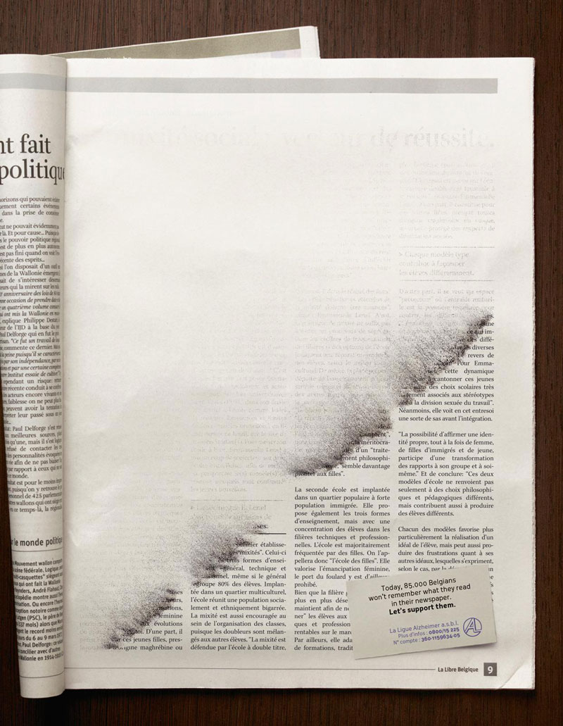
1. A Belgian Campaign
A great visualization of what it must feel to forget things so quickly.
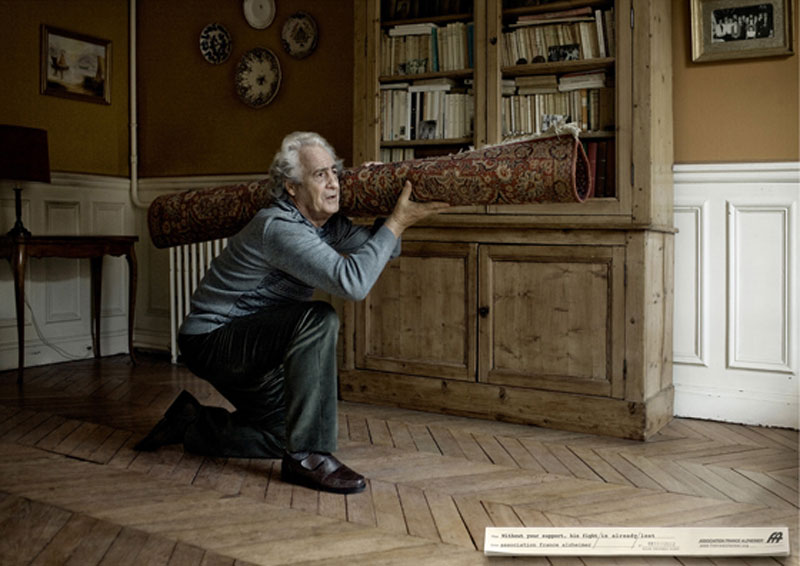
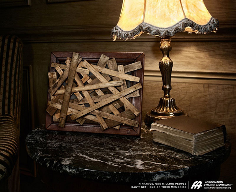
2. Alzheimer France Campaign
A campaign that reflects on the feeling of loss and the great memory mix-up that happens to Alzheimer’s disease victims.
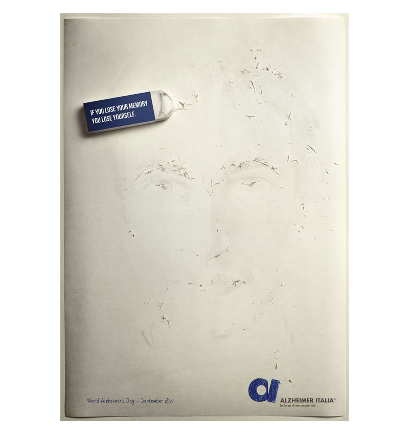
3. Alzheimer Italia Campaign
This campaign insists with a powerful visual on the loss of identity that comes with the loss of memory.
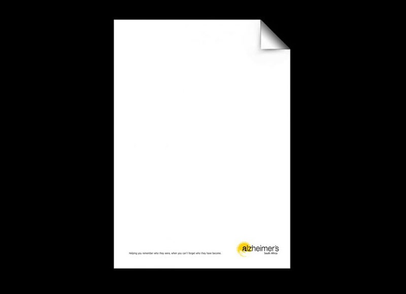
4. Alzheimer Blank Page
A simple, but efficient way to get the message across.
5. Alzheimer France Campaign
Another powerful campaign that shows one of the heartbreaking effects of the disease, the loss of connection to the loved ones.
Although it doesn’t pass from people to people, Alzheimer’s disease is truly becoming one of the epidemics of our time. If you have ever witnessed one of your loved ones experiencing it, you know how saddening it is to see old people with a lot of life stories forgetting everything.
The following ads were all part of campaigns around the world that tried to raise awareness about the disease.
1. A Belgian Campaign
A great visualization of what it must feel to forget things so quickly.
2. Alzheimer France Campaign
A campaign that reflects on the feeling of loss and the great memory mix-up that happens to Alzheimer’s disease victims.
3. Alzheimer Italia Campaign
This campaign insists with a powerful visual on the loss of identity that comes with the loss of memory.
4. Alzheimer Blank Page
A simple, but efficient way to get the message across.
5. Alzheimer France Campaign
Another powerful campaign that shows one of the heartbreaking effects of the disease, the loss of connection to the loved ones.
Although it doesn’t pass from people to people, Alzheimer’s disease is truly becoming one of the epidemics of our time. If you have ever witnessed one of your loved ones experiencing it, you know how saddening it is to see old people with a lot of life stories forgetting everything.
The following ads were all part of campaigns around the world that tried to raise awareness about the disease.
1. A Belgian Campaign
A great visualization of what it must feel to forget things so quickly.
2. Alzheimer France Campaign
A campaign that reflects on the feeling of loss and the great memory mix-up that happens to Alzheimer’s disease victims.
3. Alzheimer Italia Campaign
This campaign insists with a powerful visual on the loss of identity that comes with the loss of memory.
4. Alzheimer Blank Page
A simple, but efficient way to get the message across.
5. Alzheimer France Campaign
Another powerful campaign that shows one of the heartbreaking effects of the disease, the loss of connection to the loved ones.
Many of Designer Daily’s readers probably already know of Duolingo, an app that most of us install to try to learn a new language and give up after two weeks (in the best cases).
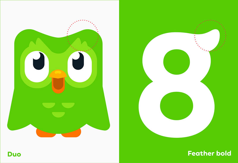
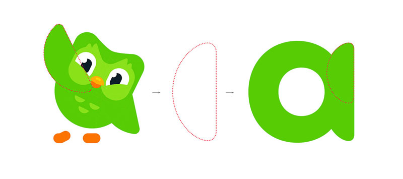
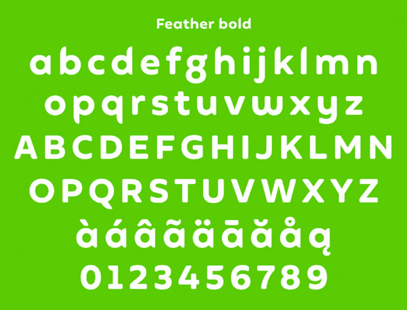
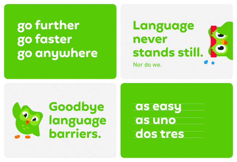
Recently, this very popular app underwent a rebranding that changed the face of its cute owl. Based on this illustration, a typeface was created to reinforce the look-and-feel of the visuals and unify communications of the brand.
This work was done by Johnson Banks, a branding agency based in the UK. The agency also worked on the tone of voice used in communications and renewed the graphics based on the revised core colors.
Many of Designer Daily’s readers probably already know of Duolingo, an app that most of us install to try to learn a new language and give up after two weeks (in the best cases).
Recently, this very popular app underwent a rebranding that changed the face of its cute owl. Based on this illustration, a typeface was created to reinforce the look-and-feel of the visuals and unify communications of the brand.
This work was done by Johnson Banks, a branding agency based in the UK. The agency also worked on the tone of voice used in communications and renewed the graphics based on the revised core colors.
Many of Designer Daily’s readers probably already know of Duolingo, an app that most of us install to try to learn a new language and give up after two weeks (in the best cases).
Recently, this very popular app underwent a rebranding that changed the face of its cute owl. Based on this illustration, a typeface was created to reinforce the look-and-feel of the visuals and unify communications of the brand.
This work was done by Johnson Banks, a branding agency based in the UK. The agency also worked on the tone of voice used in communications and renewed the graphics based on the revised core colors.
Every week, we’ll give you an overview of the best deals for designers, make sure you don’t miss any by subscribing to our deals feed. You can also follow the recently launched website Type Deals if you are looking for free fonts or font deals.
140 Design Templates for FREE
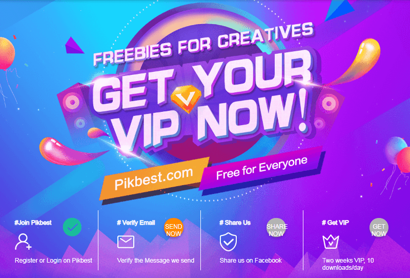
Introduce: With Pikbest you’ll get everything you need about design, they provide millions of editable and printable templates like PSD files, Posters, Presentation, Sound Effects and Video for commercial use. Sign up and you could download 140 Templates free for two weeks.
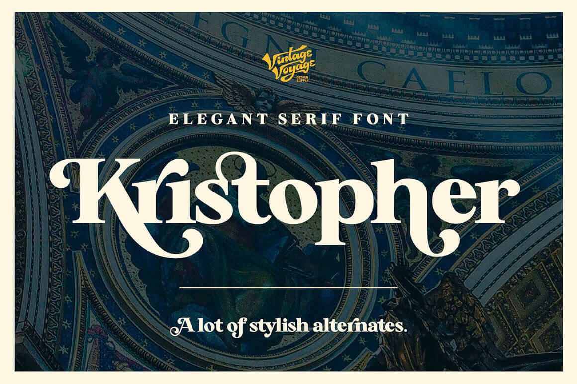
Classically conservative, Kristopher can also be a more playful and modern serif font. With more than 475 glyphs, 150+ alternates, 12 ligatures and multilingual support, you can easily use this flexible font for any project from magazine covers to art posters.
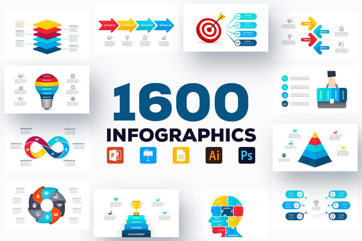
You’ll never need to worry about getting your point across again! Thanks to this collection of 1600 Infographics Templates, you can easily put together a colorful story through professional pictures and charts. Easily change up the text and any other details you’d like and you’ll quickly reach your audience in an entertaining and informative manner.
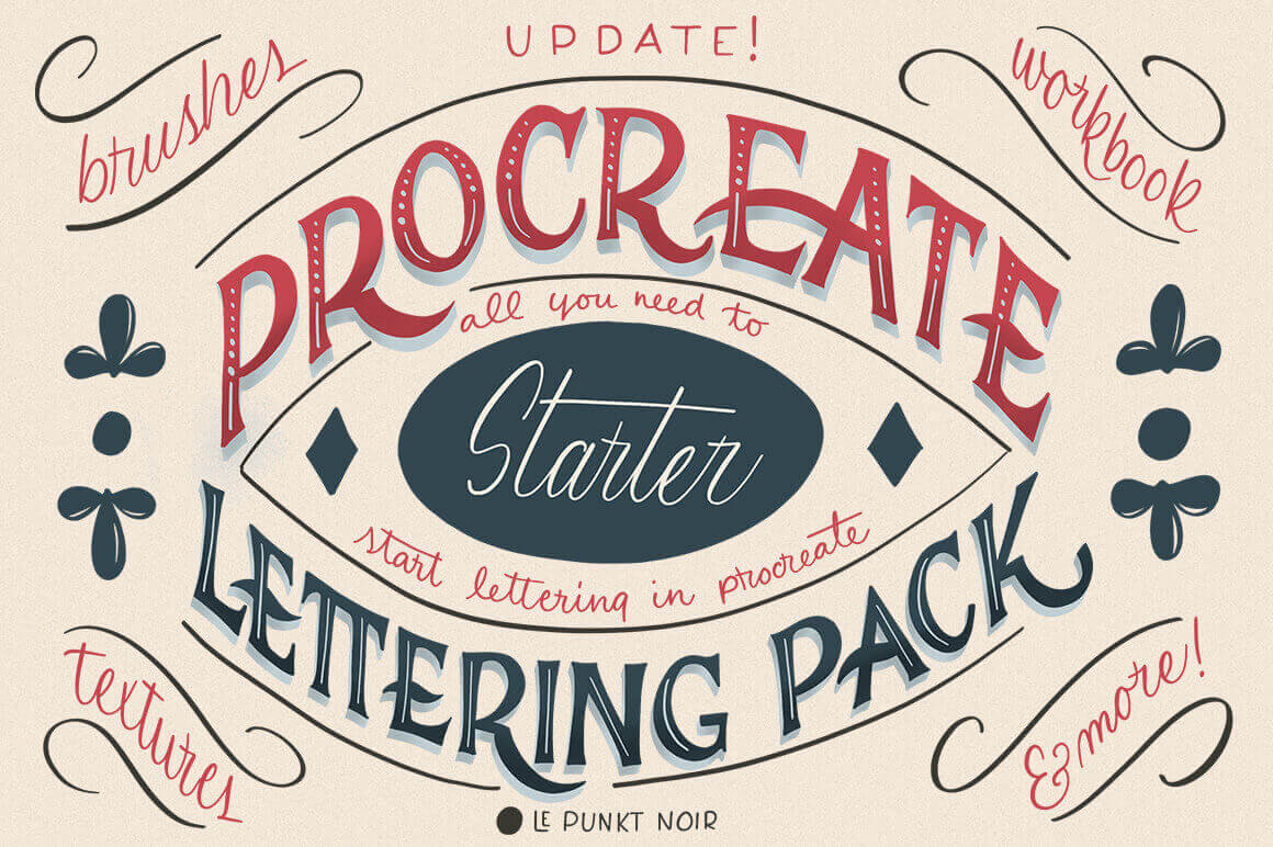
With the Procreate Lettering Starter Pack you’ll get everything you need to start lettering on an iPad. Besides 35 different brushes, 25+ textures, 5 images and 2 color palettes, you’ll get a super helpful 10-part workbook that takes you through every step of the lettering process from letter anatomy to color theory to printing.
Every week, we’ll give you an overview of the best deals for designers, make sure you don’t miss any by subscribing to our deals feed. You can also follow the recently launched website Type Deals if you are looking for free fonts or font deals.
140 Design Templates for FREE
Introduce: With Pikbest you’ll get everything you need about design, they provide millions of editable and printable templates like PSD files, Posters, Presentation, Sound Effects and Video for commercial use. Sign up and you could download 140 Templates free for two weeks.
Classically conservative, Kristopher can also be a more playful and modern serif font. With more than 475 glyphs, 150+ alternates, 12 ligatures and multilingual support, you can easily use this flexible font for any project from magazine covers to art posters.
You’ll never need to worry about getting your point across again! Thanks to this collection of 1600 Infographics Templates, you can easily put together a colorful story through professional pictures and charts. Easily change up the text and any other details you’d like and you’ll quickly reach your audience in an entertaining and informative manner.
With the Procreate Lettering Starter Pack you’ll get everything you need to start lettering on an iPad. Besides 35 different brushes, 25+ textures, 5 images and 2 color palettes, you’ll get a super helpful 10-part workbook that takes you through every step of the lettering process from letter anatomy to color theory to printing.
Andy covers a technique where a semantic <button> is used within a card component, but really, the whole card is clickable. The trick is to put a pseudo-element that goes beyond the button, covering the entire card. The tradeoff is that the pseudo-element sits on top of the text, so text selection is hampered a bit. I believe this is better than making the whole dang area a <button> because that would sacrifice semantics and likely cause extreme weirdness for assistive technology.
You could do the same thing if your situation requires an <a> link instead of a <button>, but if that’s the case, you actually can wrap the whole area in the link without much grief then wrap the part that appears to be a button in a span or something to make it look like a button.
This reminds me of the nested link problem: a large linked block that contains other different linked areas in it. Definitely can’t nest anchor links. Sara Soueidan had the best answer where the „covering” link is placed within the card and absolutely positioned to cover the area while other links inside could be be layered on top with z-index.