Andy covers a technique where a semantic <button> is used within a card component, but really, the whole card is clickable. The trick is to put a pseudo-element that goes beyond the button, covering the entire card. The tradeoff is that the pseudo-element sits on top of the text, so text selection is hampered a bit. I believe this is better than making the whole dang area a <button> because that would sacrifice semantics and likely cause extreme weirdness for assistive technology.
You could do the same thing if your situation requires an <a> link instead of a <button>, but if that’s the case, you actually can wrap the whole area in the link without much grief then wrap the part that appears to be a button in a span or something to make it look like a button.
This reminds me of the nested link problem: a large linked block that contains other different linked areas in it. Definitely can’t nest anchor links. Sara Soueidan had the best answer where the „covering” link is placed within the card and absolutely positioned to cover the area while other links inside could be be layered on top with z-index.
Most static site generators make installation easy, but each project still requires configuration after installation. When you build a lot of similar projects, you may duplicate effort during the setup phase. GitHub template repositories may save you a lot of time if you find yourself:
creating the same folder structures from previous projects,
copying and pasting config files from previous projects, and
copying and pasting boilerplate code from previous projects.
Unlike forking a repository, which allows you to use someone else’s code as a starting point, template repositories allow you to use your own code as a starting point, where each new project gets its own, independent Git history. Check it out!
Let’s take a look at how we can set up a convenient workflow. We’ll set up a boilerplate Eleventy project, turn it into a Git repository, host the repository on GitHub, and then configure that repository to be a template. Then, next time you have a static site project, you’ll be able to come back to the repository, click a button, and start working from an exact copy of your boilerplate.
Are you ready to try it out? Let’s set up our own static site using GitHub templates to see just how much templates can help streamline a static site project.
I’m using Eleventy as an example of a static site generator because it’s my personal go-to, but this process will work for Hugo, Jekyll, Nuxt, or any other flavor of static site generator you prefer.
We’re going to kick things off by running each of these in the command line:
cd ~
mkdir static-site-template
cd static-site-template
These three commands change directory into your home directory (~ in Unix-based systems), make a new directory called static-site-template, and then change directory into the static-site-template directory.
Next, we’ll initialize the Node project
In order to work with Eleventy, we need to install Node.js which allows your computer to run JavaScript code outside of a web browser.
Node.js comes with node package manager, or npm, which downloads node packages to your computer. Eleventy is a node package, so we can use npm to fetch it.
Assuming Node.js is installed, let’s head back to the command line and run:
npm init
This creates a file called package.json in the directory. npm will prompt you for a series of questions to fill out the metadata in your package.json. After answering the questions, the Node.js project is initialized.
Now we can install Eleventy
Initializing the project gave us a package.json file which lets npm install packages, run scripts, and do other tasks for us inside that project. npm uses package.json as an entry point in the project to figure out precisely how and what it should do when we give it commands.
We can tell npm to install Eleventy as a development dependency by running:
npm install -D @11ty/eleventy
This will add a devDependency entry to the package.json file and install the Eleventy package to a node_modules folder in the project.
The cool thing about the package.json file is that any other computer with Node.js and npm can read it and know to install Eleventy in the project node_modules directory without having to install it manually. See, we’re already streamlining things!
Configuring Eleventy
There are tons of ways to configure an Eleventy project. Flexibility is Eleventy’s strength. For the purposes of this tutorial, I’m going to demonstrate a configuration that provides:
A folder to cleanly separate website source code from overall project files
An HTML document for a single page website
CSS to style the document
JavaScript to add functionality to the document
Hop back in the command line. Inside the static-site-template folder, run these commands one by one (excluding the comments that appear after each # symbol):
mkdir src           # creates a directory for your website source code
mkdir src/css       # creates a directory for the website styles
mkdir src/js        # creates a directory for the website JavaScript
touch index.html    # creates the website HTML document
touch css/style.css # creates the website styles
touch js/main.js    # creates the website JavaScript
This creates the basic file structure that will inform the Eleventy build. However, if we run Eleventy right now, it won’t generate the website we want. We still have to configure Eleventy to understand that it should only use files in the src folder for building, and that the css and js folders should be processed with passthrough file copy.
You can give this information to Eleventy through a file called .eleventy.js in the root of the static-site-template folder. You can create that file by running this command inside the static-site-template folder:
touch .eleventy.js
Edit the file in your favorite text editor so that it contains this:
Lines 2 and 3 tell Eleventy to use passthrough file copy for CSS and JavaScript. Line 6 tells Eleventy to use only the src directory to build its output.
Eleventy will now give us the expected output we want. Let’s put that to the test by putting this In the command line:
npx @11ty/eleventy
The npx command allows npm to execute code from the project node_module directory without touching the global environment. You’ll see output like this:
Writing _site/index.html from ./src/index.html.
Copied 2 items and Processed 1 file in 0.04 seconds (v0.9.0)
The static-site-template folder should now have a new directory in it called _site. If you dig into that folder, you’ll find the css and js directories, along with the index.html file.
This _site folder is the final output from Eleventy. It is the entirety of the website, and you can host it on any static web host.
Without any content, styles, or scripts, the generated site isn’t very interesting:
Let’s create a boilerplate website
Next up, we’re going to put together the baseline for a super simple website we can use as the starting point for all projects moving forward.
It’s worth mentioning that Eleventy has a ton of boilerplate files for different types of projects. It’s totally fine to go with one of these though I often find I wind up needing to roll my own. So that’s what we’re doing here.
We may as well style things a tiny bit, so let’s add this to src/css/style.css:
body {
  font-family: sans-serif;
}
And we can confirm JavaScript is hooked up by adding this to src/js/main.js:
(function() {
  console.log('Invoke the static site template JavaScript!');
})();
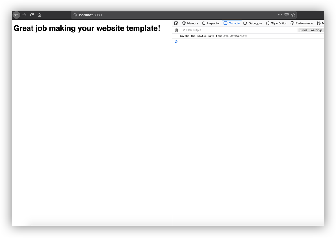
Want to see what we’ve got? Run npx @11ty/eleventy --serve in the command line. Eleventy will spin up a server with Browsersync and provide the local URL, which is probably something like localhost:8080.
Even the console tells us things are ready to go!
Let’s move this over to a GitHub repo
Git is the most commonly used version control system in software development. Most Unix-based computers come with it installed, and you can turn any directory into a Git repository by running this command:
git init
We should get a message like this:
Initialized empty Git repository in /path/to/static-site-template/.git/
That means a hidden .git folder was added inside the project directory, which allows the Git program to run commands against the project.
Before we start running a bunch of Git commands on the project, we need to tell Git about files we don’t want it to touch.
Inside the static-site-template directory, run:
touch .gitignore
Then open up that file in your favorite text editor. Add this content to the file:
_site/
node_modules/
This tells Git to ignore the node_modules directory and the _site directory. Committing every single Node.js module to the repo could make things really messy and tough to manage. All that information is already in package.json anyway.
Similarly, there’s no need to version control _site. Eleventy can generate it from the files in src, so no need to take up space in GitHub. It’s also possible that if we were to:
version control _site,
change files in src, or
forget to run Eleventy again,
then _site will reflect an older build of the website, and future developers (or a future version of yourself) may accidentally use an outdated version of the site.
Git is version control software, and GitHub is a Git repository host. There are other Git host providers like BitBucket or GitLab, but since we’re talking about a GitHub-specific feature (template repositories), we’ll push our work up to GitHub. If you don’t already have an account, go ahead and join GitHub. Once you have an account, create a GitHub repository and name it static-site-template.
GitHub will ask a few questions when setting up a new repository. One of those is whether we want to create a new repository on the command line or push an existing repository from the command line. Neither of these choices are exactly what we need. They assume we either don’t have anything at all, or we have been using Git locally already. The static-site-template project already exists, has a Git repository initialized, but doesn’t yet have any commits on it.
So let’s ignore the prompts and instead run the following commands in the command line. Make sure to have the URL GitHub provides in the command from line 3 handy:
This adds the entire static-site-template folder to the Git staging area. It commits it with the message „first commit,” adds a remote repository (the GitHub repository), and then pushes up the master branch to that repository.
Let’s template-ize this thing
OK, this is the crux of what we have been working toward. GitHub templates allows us to use the repository we’ve just created as the foundation for other projects in the future — without having to do all the work we’ve done to get here!
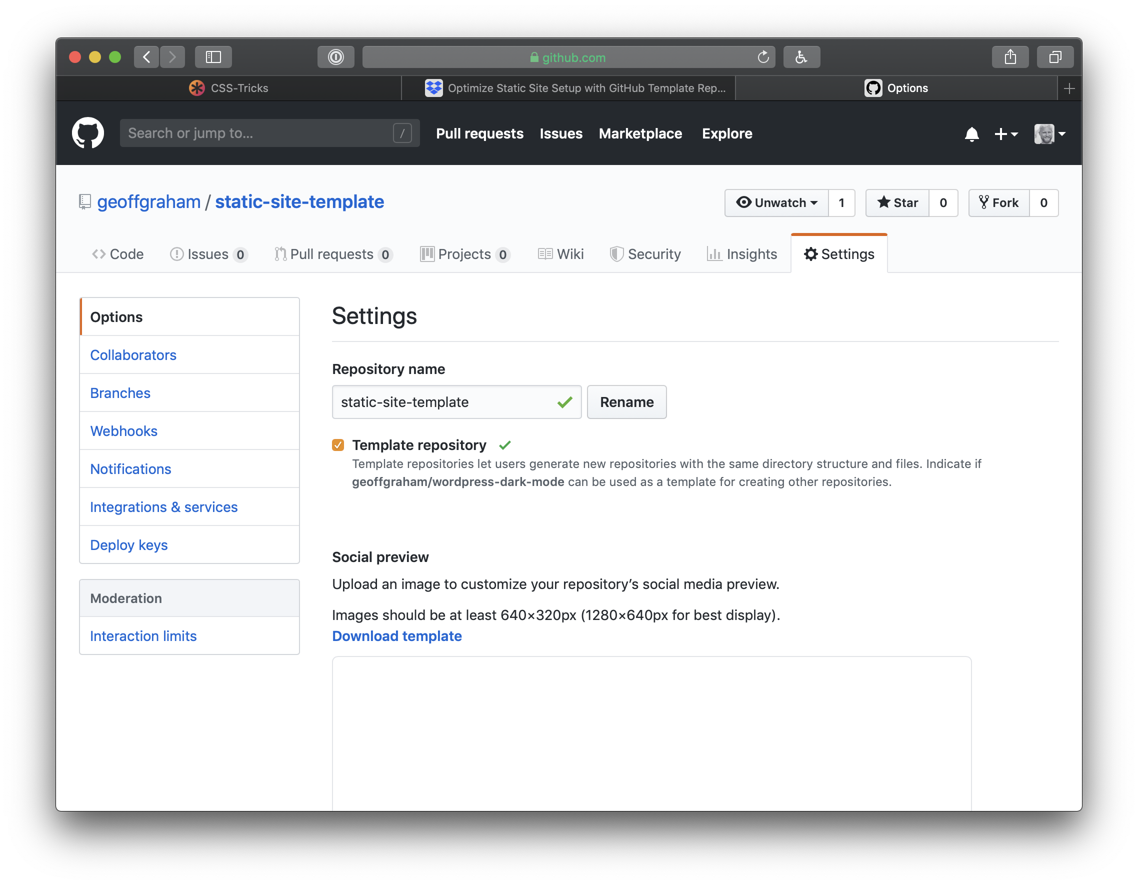
Click Settings on the GitHub landing page of the repository to get started. On the settings page, check the button for Template repository.
Now when we go back to the repository page, we’ll get a big green button that says Use this template. Click it and GitHub will create a new repository that’s a mirror of our new template. The new repository will start with the same files and folders as static-site-template. From there, download or clone that new repository to start a new project with all the base files and configuration we set up in the template project.
We can extend the template for future projects
Now that we have a template repository, we can use it for any new static site project that comes up. However, You may find that a new project has additional needs than what’s been set up in the template. For example, let’s say you need to tap into Eleventy’s templating engine or data processing power.
Go ahead and build on top of the template as you work on the new project. When you finish that project, identify pieces you want to reuse in future projects. Perhaps you figured out a cool hover effect on buttons. Or you built your own JavaScript carousel element. Or maybe you’re really proud of the document design and hierarchy of information.
If you think anything you did on a project might come up again on your next run, remove the project-specific details and add the new stuff to your template project. Push those changes up to GitHub, and the next time you use static-site-template to kick off a project, your reusable code will be available to you.
There are some limitations to this, of course
GitHub template repositories are a useful tool for avoiding repetitive setup on new web development projects. I find this especially useful for static site projects. These template repositories might not be as appropriate for more complex projects that require external services like databases with configuration that cannot be version-controlled in a single directory.
Template repositories allow you to ship reusable code you have written so you can solve a problem once and use that solution over and over again. But while your new solutions will carry over to future projects, they won’t be ported backwards to old projects.
This is a useful process for sites with very similar structure, styles, and functionality. Projects with wildly varied requirements may not benefit from this code-sharing, and you could end up bloating your project with unnecessary code.
Wrapping up
There you have it! You now have everything you need to not only start a static site project using Eleventy, but the power to re-purpose it on future projects. GitHub templates are so handy for kicking off projects quickly where we otherwise would have to re-build the same wheel over and over. Use them to your advantage and enjoy a jump start on your projects moving forward!
Here’s one of the best essays I’ve ever read about why progressive web apps are important, how they work, and what impact they have on a business:
PWAs are powerful, effective, fast and app-like.
It’s hard to imagine a mobile web property that could not be significantly improved via PWA implementation. They can also potentially eliminate the need for many “vanity” native apps that exist today.
My only small disagreement with this piece is their use of the term “mobile web.” I know it’s a tiny thing to get persnickety over but my hot take after reading it is this: it’s important to remember that progressive web apps are for everyone, desktop and mobile users alike. I think it’s important to reiterate that there is no mobile web. And that our goal is to be better than native.
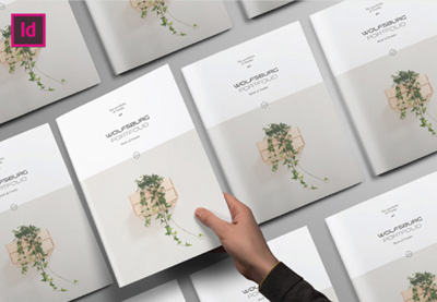
In this tutorial, we’ll create a clean, stylish InDesign portfolio template, suitable for architectural work, with lots of emphasis on imagery and geometry. These concepts will also apply to a variety of brochure design scenarios. So grab your favorite portfolio pieces, and let’s dig right in.
What You Will Need
You will need the following assets in order to complete this project:
First, let’s start up a New Document. We’ll need to decide the orientation and dimensions of our portfolio template.
Portfolios are particularly fun to design, because you often have a lot of freedom to decide on the best way to feature your work. You might choose to go with something traditional, or maybe you’ll go with a square shape or even a long format. Consider your options and what might be the best way to present your work.
In this example, we’re going to work in a square format, 10″ Wide by 10″ High.
Step 2
Before we finalize our document setup, let’s address a few additional attributes.
I set my Margins to 0.5″ on the Top, Bottom, and Outside. On the Inside, I set my Margins to 0.75″, just a little extra, to accommodate the space that may be lost between my pages.
Step 3
I also wanted to add a 0.125″ Bleed to my document.
If an image is „Full Bleed”, it generally means that the imagery/content goes to the edge of the page, without any border or „white space”. If we want something to be full bleed, we often have to extend our work to the bleed area, to allow for trimming when our work is printed and prepared.
Once you’re happy with your settings, click Create to accept and start up your document.
If you’ve made a mistake or you change your mind, don’t worry—you can always go back and change these settings via File > Document Setup.
2. How to Create Our Interior
Step 1
Let’s start creating our portfolio interior within a Master Page.
Master Pages are often used as a template of sorts—we can apply elements that we lay out in our Master Pages to the Active Pages in our document.
Master Pages are located within the top portion of the Pages panel. If you don’t see the Pages panel, you can open it up via Window > Pages.
Step 2
Go „inside” of A-Master, our first Master Page, by double-clicking on it. That’s where we’ll start laying out our composition.
Portfolio pages essentially need to show off our work—there needs to be an emphasis on the portfolio piece itself. However, we also want to do so in a visually engaging and interesting way.
Before I started placing imagery, I decided to „block out” my composition with gray rectangles, using the Rectangle Tool. The Fill is set to 25% gray. I find this to be a simple way to experiment with your composition or create a thumbnail.
Step 3
Once I had some rectangles placed, I created Guides, based on my layout elements. To do so, Click and Drag from the Document Rulers at the sides of your document.
These Guides are inspired by the gray rectangles I placed.
Step 4
Next, I started placing text based on the Guides I had created. Use the Text Tool to place text.
Keep in mind the text that you’d want featured in your portfolio. It’s generally a good idea to have the title of the piece, the date it was created, and a description. You might also want an artist’s statement of some kind, to further explain your process or intention.
Let’s start with our title. In terms of hierarchy, it should likely be the text with the most visual importance—so I’d like it to be rather large on the page.
Step 5
I decided to add supplemental text, under the title, using the Text Tool. This felt like a great place to have key information that the viewer would need to know right away—like a brief description of what it is and the date of creation.
Again, think about hierarchy. This is more supplemental type, so I made it smaller.
Step 6
Now, let’s add two spaces for some more supplemental type—this could be a great place for additional comments, insights, or statements on the work. Again, use the Text Tool. I wanted this type to be the smallest, because it is meant to be the most supplemental—it’s our body copy.
Step 7
To push the aesthetic further, I decided to add some lines using the Line Tool. Note that they are inspired by the existing layout elements.
The Guides, in the example below, have been Hidden (via View > Grids and Guides > Hide Guides) so it’s easier to see the lines.
Step 8
The footer area could include any supplemental information you like. In the case of my composition, I decided I wanted to stick with page numbers.
To insert page numbers, firstcreate a Text Box using the Text Tool.
Then, go to Type > Insert Special Character > Markers > Current Page Number.
You’ll notice that they read „A”—this is OK! Remember, we’re working in A-Master, a Master Page, so that technically is the page number.
I decided to make my page numbers large, but a light gray, so their low contrast helps keep them supplemental in the hierarchy.
Step 9
Finally, let’s insert some imagery. Select the Rectangle Frame that you want to place your imagery into. Then, go to File > Place, and select your image.
Double-click on the Rectangle Frame to toggle between selecting the frame itself and the contents inside it. You’ll know you’ve selected the contents when the border around it is in red.
Resize and adjust your imageryuntil you’re happy with how it’s cropped.
Step 10
Repeat this process for your other rectangle frames. You could use these spaces for close-ups or other shots of your work.
3. How to Apply Our Master Pages
Step 1
Now that we’ve created a layout within a Master Page, let’s apply our Master Pages to our Active Pages.
First, Create New Pages. Let’s make sure we havethree pages in our Pages panel. Click on the New Page icon in the Pages panel to create a new page.
Step 2
Notice that your pages have an „A” Icon on them. This means they are derived from our A-Master Page.
To further illustrate this idea, select thefirst page in your document. Then Select [None] in your list of Master Pages and drag it to your active page. You’ll notice that it goes blank—because, now, it isn’t derived from any Master Page.
Step 3
Let’s go to Page 2 and 3 of our document. You’ll notice that these two pages are derived from A-Master Page.
However, when you try to click on parts of your layout, nothing will happen. It’s all locked up.
To make edits locally, within individual pages, hold down Shift-Command (on Mac) or Shift-Control (on PC) while clicking on an element of your layout. This will make it editable.
Step 4
Let’s test this premise out by inserting new portfolio imagery into pages 4 and 5 of our portfolio.
First, create two New Pages.
Step 5
Then, select the image areas by holding down Shift-Command (on Mac) or Shift-Control (on PC) while clicking.
Double-Click to select the contents of the Rectangle Frame and Delete it.
Remember, we’re deleting the contents here—not the frame itself!
Step 6
Now, let’s insert our imagery. Select the rectangular frame. Go to File > Place, and then select your image file.
Now, you should have a new image in this rectangular frame—the one from our template has been replaced.
Step 7
Repeat this process in the other image areas in your layout. You could use the same image, close-up shots, or a different, applicable supplement here. Again, it’s up to you and what’s best for your portfolio presentation.
4. How to Create a Cover
Step 1
Now that we’ve created our interior pages and practiced editing them for different portfolio pieces, let’s make a cover for our work.
Before we begin, just a note—make sure to ask your printer about any questions or file requirements that might apply to your project. For example, your cover will vary from your interior, as it has a spine. Adapt your composition as needed.
Let’s start by creating a New Master Page. It should be called B-Master, and it will likely appear as a two-page spread by default.
Step 2
Delete one of the pages in B-Master, so you’re left with a one-page spread. This is going to be our front cover.
I wanted the front cover to feature some compelling imagery. A cover often has to compel the reader to open the book up—so it’s time to shine!
Place the imagery by going File > Place. Adjust the rectangle frame and Crop your work as desired.
Step 3
Then, I added a rectangle frame on top of the imagery with a White Fill.
To add transparency, select the rectangle frame and Right Click (on PC) or Control Click (on Mac). From the resulting dropdown menu, select Effects > Transparency.
I set my Transparency to 90%.
Step 4
Next, I added some type using the Text Tool and a line using the Line Tool.
You could place any type here that you find most appropriate—but feel free to follow my example on this! Remember, there’s no wrong answer—you know what’s best for your work! This is your time to shine.
Step 5
I decided I wanted the back cover to be more supplemental.
Create another New Master Page for the back cover. This one will be called C-Master.
Again, delete one of the pages in C-Master, so we have a one-page spread.
Step 6
Since this is the back of the booklet, I placed an imagebut left it small, and reused the contact info from the front cover, using the Text Tool.
My goal was to create something supplemental yet uniform with the rest of the book.
Step 7
Now, just like with our other Master Pages, we can apply B-Master and C-Master by clicking and dragging them to an active page.
Create a New Page, so our document ends with Page 6.
Page 1 and Page 6 are single pages—apply the front and back cover to these pages.
5. How to Use Your Template
Step 1
Now that we’re wrapping up our template, how do we use it?
You could save your work as an InDesign File (or indd file), but you could also save it as an InDesign Template file (or indt file).
When you go to save your work (by going File > Save), you can find these options under Format.
Step 2
What’s the difference? Unlike a „standard” InDesign file, an InDesign Template file can either be opened as an „original” (where you edit the template itself) or as a copy—where a new, untitled document is opened, based on your template.
See how that could come in handy?
And There You Have It!
Thanks so much for joining me on this InDesign portfolio walkthrough! Hopefully, you have some extra insight into how to create a portfolio or how to make a brochure design. I hope you found these techniques helpful—good luck with your portfolio, and your creative projects!
Looking for some extra inspiration, or even some extra help? Check out these InDesign templates—they’re ready to go, and they could make a great addition to anyone’s collection. Brochure templates can prove to be really versatile, too!
With 20 different pages, this InDesign template is not only a great fit for architectural work—its clean design could work for a multitude of varied projects, from illustration to graphic design. Check it out!
This beautiful, stylish magazine layout could be easily adapted for your portfolio or other print project. If you’re looking for layout inspiration or a jump start on your project, this could fit the bill.
I love the long, horizontal orientation featured in this portfolio booklet. There’s so much space here to showcase your work in a clean and well-organized way. As far as InDesign brochure templates go, this one is a winner.
Warm colors, transparencies, and clean design—this template is ready to use. Just drop in your content, and you’re ready to go—or use it as a springboard for a new take on this composition.
I love all the negative space in this portfolio design! It’s a classy, timeless look that would suit almost any kind of work—architectural or not! It’s large format, at 8.5″ x 11″, and includes 16 different pages.
If you enjoyed this tutorial, here are some others to check out!
In this tutorial, we’ll create a clean, stylish InDesign portfolio template, suitable for architectural work, with lots of emphasis on imagery and geometry. These concepts will also apply to a variety of brochure design scenarios. So grab your favorite portfolio pieces, and let’s dig right in.
What You Will Need
You will need the following assets in order to complete this project:
First, let’s start up a New Document. We’ll need to decide the orientation and dimensions of our portfolio template.
Portfolios are particularly fun to design, because you often have a lot of freedom to decide on the best way to feature your work. You might choose to go with something traditional, or maybe you’ll go with a square shape or even a long format. Consider your options and what might be the best way to present your work.
In this example, we’re going to work in a square format, 10″ Wide by 10″ High.
Step 2
Before we finalize our document setup, let’s address a few additional attributes.
I set my Margins to 0.5″ on the Top, Bottom, and Outside. On the Inside, I set my Margins to 0.75″, just a little extra, to accommodate the space that may be lost between my pages.
Step 3
I also wanted to add a 0.125″ Bleed to my document.
If an image is „Full Bleed”, it generally means that the imagery/content goes to the edge of the page, without any border or „white space”. If we want something to be full bleed, we often have to extend our work to the bleed area, to allow for trimming when our work is printed and prepared.
Once you’re happy with your settings, click Create to accept and start up your document.
If you’ve made a mistake or you change your mind, don’t worry—you can always go back and change these settings via File > Document Setup.
2. How to Create Our Interior
Step 1
Let’s start creating our portfolio interior within a Master Page.
Master Pages are often used as a template of sorts—we can apply elements that we lay out in our Master Pages to the Active Pages in our document.
Master Pages are located within the top portion of the Pages panel. If you don’t see the Pages panel, you can open it up via Window > Pages.
Step 2
Go „inside” of A-Master, our first Master Page, by double-clicking on it. That’s where we’ll start laying out our composition.
Portfolio pages essentially need to show off our work—there needs to be an emphasis on the portfolio piece itself. However, we also want to do so in a visually engaging and interesting way.
Before I started placing imagery, I decided to „block out” my composition with gray rectangles, using the Rectangle Tool. The Fill is set to 25% gray. I find this to be a simple way to experiment with your composition or create a thumbnail.
Step 3
Once I had some rectangles placed, I created Guides, based on my layout elements. To do so, Click and Drag from the Document Rulers at the sides of your document.
These Guides are inspired by the gray rectangles I placed.
Step 4
Next, I started placing text based on the Guides I had created. Use the Text Tool to place text.
Keep in mind the text that you’d want featured in your portfolio. It’s generally a good idea to have the title of the piece, the date it was created, and a description. You might also want an artist’s statement of some kind, to further explain your process or intention.
Let’s start with our title. In terms of hierarchy, it should likely be the text with the most visual importance—so I’d like it to be rather large on the page.
Step 5
I decided to add supplemental text, under the title, using the Text Tool. This felt like a great place to have key information that the viewer would need to know right away—like a brief description of what it is and the date of creation.
Again, think about hierarchy. This is more supplemental type, so I made it smaller.
Step 6
Now, let’s add two spaces for some more supplemental type—this could be a great place for additional comments, insights, or statements on the work. Again, use the Text Tool. I wanted this type to be the smallest, because it is meant to be the most supplemental—it’s our body copy.
Step 7
To push the aesthetic further, I decided to add some lines using the Line Tool. Note that they are inspired by the existing layout elements.
The Guides, in the example below, have been Hidden (via View > Grids and Guides > Hide Guides) so it’s easier to see the lines.
Step 8
The footer area could include any supplemental information you like. In the case of my composition, I decided I wanted to stick with page numbers.
To insert page numbers, firstcreate a Text Box using the Text Tool.
Then, go to Type > Insert Special Character > Markers > Current Page Number.
You’ll notice that they read „A”—this is OK! Remember, we’re working in A-Master, a Master Page, so that technically is the page number.
I decided to make my page numbers large, but a light gray, so their low contrast helps keep them supplemental in the hierarchy.
Step 9
Finally, let’s insert some imagery. Select the Rectangle Frame that you want to place your imagery into. Then, go to File > Place, and select your image.
Double-click on the Rectangle Frame to toggle between selecting the frame itself and the contents inside it. You’ll know you’ve selected the contents when the border around it is in red.
Resize and adjust your imageryuntil you’re happy with how it’s cropped.
Step 10
Repeat this process for your other rectangle frames. You could use these spaces for close-ups or other shots of your work.
3. How to Apply Our Master Pages
Step 1
Now that we’ve created a layout within a Master Page, let’s apply our Master Pages to our Active Pages.
First, Create New Pages. Let’s make sure we havethree pages in our Pages panel. Click on the New Page icon in the Pages panel to create a new page.
Step 2
Notice that your pages have an „A” Icon on them. This means they are derived from our A-Master Page.
To further illustrate this idea, select thefirst page in your document. Then Select [None] in your list of Master Pages and drag it to your active page. You’ll notice that it goes blank—because, now, it isn’t derived from any Master Page.
Step 3
Let’s go to Page 2 and 3 of our document. You’ll notice that these two pages are derived from A-Master Page.
However, when you try to click on parts of your layout, nothing will happen. It’s all locked up.
To make edits locally, within individual pages, hold down Shift-Command (on Mac) or Shift-Control (on PC) while clicking on an element of your layout. This will make it editable.
Step 4
Let’s test this premise out by inserting new portfolio imagery into pages 4 and 5 of our portfolio.
First, create two New Pages.
Step 5
Then, select the image areas by holding down Shift-Command (on Mac) or Shift-Control (on PC) while clicking.
Double-Click to select the contents of the Rectangle Frame and Delete it.
Remember, we’re deleting the contents here—not the frame itself!
Step 6
Now, let’s insert our imagery. Select the rectangular frame. Go to File > Place, and then select your image file.
Now, you should have a new image in this rectangular frame—the one from our template has been replaced.
Step 7
Repeat this process in the other image areas in your layout. You could use the same image, close-up shots, or a different, applicable supplement here. Again, it’s up to you and what’s best for your portfolio presentation.
4. How to Create a Cover
Step 1
Now that we’ve created our interior pages and practiced editing them for different portfolio pieces, let’s make a cover for our work.
Before we begin, just a note—make sure to ask your printer about any questions or file requirements that might apply to your project. For example, your cover will vary from your interior, as it has a spine. Adapt your composition as needed.
Let’s start by creating a New Master Page. It should be called B-Master, and it will likely appear as a two-page spread by default.
Step 2
Delete one of the pages in B-Master, so you’re left with a one-page spread. This is going to be our front cover.
I wanted the front cover to feature some compelling imagery. A cover often has to compel the reader to open the book up—so it’s time to shine!
Place the imagery by going File > Place. Adjust the rectangle frame and Crop your work as desired.
Step 3
Then, I added a rectangle frame on top of the imagery with a White Fill.
To add transparency, select the rectangle frame and Right Click (on PC) or Control Click (on Mac). From the resulting dropdown menu, select Effects > Transparency.
I set my Transparency to 90%.
Step 4
Next, I added some type using the Text Tool and a line using the Line Tool.
You could place any type here that you find most appropriate—but feel free to follow my example on this! Remember, there’s no wrong answer—you know what’s best for your work! This is your time to shine.
Step 5
I decided I wanted the back cover to be more supplemental.
Create another New Master Page for the back cover. This one will be called C-Master.
Again, delete one of the pages in C-Master, so we have a one-page spread.
Step 6
Since this is the back of the booklet, I placed an imagebut left it small, and reused the contact info from the front cover, using the Text Tool.
My goal was to create something supplemental yet uniform with the rest of the book.
Step 7
Now, just like with our other Master Pages, we can apply B-Master and C-Master by clicking and dragging them to an active page.
Create a New Page, so our document ends with Page 6.
Page 1 and Page 6 are single pages—apply the front and back cover to these pages.
5. How to Use Your Template
Step 1
Now that we’re wrapping up our template, how do we use it?
You could save your work as an InDesign File (or indd file), but you could also save it as an InDesign Template file (or indt file).
When you go to save your work (by going File > Save), you can find these options under Format.
Step 2
What’s the difference? Unlike a „standard” InDesign file, an InDesign Template file can either be opened as an „original” (where you edit the template itself) or as a copy—where a new, untitled document is opened, based on your template.
See how that could come in handy?
And There You Have It!
Thanks so much for joining me on this InDesign portfolio walkthrough! Hopefully, you have some extra insight into how to create a portfolio or how to make a brochure design. I hope you found these techniques helpful—good luck with your portfolio, and your creative projects!
Looking for some extra inspiration, or even some extra help? Check out these InDesign templates—they’re ready to go, and they could make a great addition to anyone’s collection. Brochure templates can prove to be really versatile, too!
With 20 different pages, this InDesign template is not only a great fit for architectural work—its clean design could work for a multitude of varied projects, from illustration to graphic design. Check it out!
This beautiful, stylish magazine layout could be easily adapted for your portfolio or other print project. If you’re looking for layout inspiration or a jump start on your project, this could fit the bill.
I love the long, horizontal orientation featured in this portfolio booklet. There’s so much space here to showcase your work in a clean and well-organized way. As far as InDesign brochure templates go, this one is a winner.
Warm colors, transparencies, and clean design—this template is ready to use. Just drop in your content, and you’re ready to go—or use it as a springboard for a new take on this composition.
I love all the negative space in this portfolio design! It’s a classy, timeless look that would suit almost any kind of work—architectural or not! It’s large format, at 8.5″ x 11″, and includes 16 different pages.
If you enjoyed this tutorial, here are some others to check out!
In this tutorial, we’ll create a clean, stylish InDesign portfolio template, suitable for architectural work, with lots of emphasis on imagery and geometry. These concepts will also apply to a variety of brochure design scenarios. So grab your favorite portfolio pieces, and let’s dig right in.
What You Will Need
You will need the following assets in order to complete this project:
First, let’s start up a New Document. We’ll need to decide the orientation and dimensions of our portfolio template.
Portfolios are particularly fun to design, because you often have a lot of freedom to decide on the best way to feature your work. You might choose to go with something traditional, or maybe you’ll go with a square shape or even a long format. Consider your options and what might be the best way to present your work.
In this example, we’re going to work in a square format, 10″ Wide by 10″ High.
Step 2
Before we finalize our document setup, let’s address a few additional attributes.
I set my Margins to 0.5″ on the Top, Bottom, and Outside. On the Inside, I set my Margins to 0.75″, just a little extra, to accommodate the space that may be lost between my pages.
Step 3
I also wanted to add a 0.125″ Bleed to my document.
If an image is „Full Bleed”, it generally means that the imagery/content goes to the edge of the page, without any border or „white space”. If we want something to be full bleed, we often have to extend our work to the bleed area, to allow for trimming when our work is printed and prepared.
Once you’re happy with your settings, click Create to accept and start up your document.
If you’ve made a mistake or you change your mind, don’t worry—you can always go back and change these settings via File > Document Setup.
2. How to Create Our Interior
Step 1
Let’s start creating our portfolio interior within a Master Page.
Master Pages are often used as a template of sorts—we can apply elements that we lay out in our Master Pages to the Active Pages in our document.
Master Pages are located within the top portion of the Pages panel. If you don’t see the Pages panel, you can open it up via Window > Pages.
Step 2
Go „inside” of A-Master, our first Master Page, by double-clicking on it. That’s where we’ll start laying out our composition.
Portfolio pages essentially need to show off our work—there needs to be an emphasis on the portfolio piece itself. However, we also want to do so in a visually engaging and interesting way.
Before I started placing imagery, I decided to „block out” my composition with gray rectangles, using the Rectangle Tool. The Fill is set to 25% gray. I find this to be a simple way to experiment with your composition or create a thumbnail.
Step 3
Once I had some rectangles placed, I created Guides, based on my layout elements. To do so, Click and Drag from the Document Rulers at the sides of your document.
These Guides are inspired by the gray rectangles I placed.
Step 4
Next, I started placing text based on the Guides I had created. Use the Text Tool to place text.
Keep in mind the text that you’d want featured in your portfolio. It’s generally a good idea to have the title of the piece, the date it was created, and a description. You might also want an artist’s statement of some kind, to further explain your process or intention.
Let’s start with our title. In terms of hierarchy, it should likely be the text with the most visual importance—so I’d like it to be rather large on the page.
Step 5
I decided to add supplemental text, under the title, using the Text Tool. This felt like a great place to have key information that the viewer would need to know right away—like a brief description of what it is and the date of creation.
Again, think about hierarchy. This is more supplemental type, so I made it smaller.
Step 6
Now, let’s add two spaces for some more supplemental type—this could be a great place for additional comments, insights, or statements on the work. Again, use the Text Tool. I wanted this type to be the smallest, because it is meant to be the most supplemental—it’s our body copy.
Step 7
To push the aesthetic further, I decided to add some lines using the Line Tool. Note that they are inspired by the existing layout elements.
The Guides, in the example below, have been Hidden (via View > Grids and Guides > Hide Guides) so it’s easier to see the lines.
Step 8
The footer area could include any supplemental information you like. In the case of my composition, I decided I wanted to stick with page numbers.
To insert page numbers, firstcreate a Text Box using the Text Tool.
Then, go to Type > Insert Special Character > Markers > Current Page Number.
You’ll notice that they read „A”—this is OK! Remember, we’re working in A-Master, a Master Page, so that technically is the page number.
I decided to make my page numbers large, but a light gray, so their low contrast helps keep them supplemental in the hierarchy.
Step 9
Finally, let’s insert some imagery. Select the Rectangle Frame that you want to place your imagery into. Then, go to File > Place, and select your image.
Double-click on the Rectangle Frame to toggle between selecting the frame itself and the contents inside it. You’ll know you’ve selected the contents when the border around it is in red.
Resize and adjust your imageryuntil you’re happy with how it’s cropped.
Step 10
Repeat this process for your other rectangle frames. You could use these spaces for close-ups or other shots of your work.
3. How to Apply Our Master Pages
Step 1
Now that we’ve created a layout within a Master Page, let’s apply our Master Pages to our Active Pages.
First, Create New Pages. Let’s make sure we havethree pages in our Pages panel. Click on the New Page icon in the Pages panel to create a new page.
Step 2
Notice that your pages have an „A” Icon on them. This means they are derived from our A-Master Page.
To further illustrate this idea, select thefirst page in your document. Then Select [None] in your list of Master Pages and drag it to your active page. You’ll notice that it goes blank—because, now, it isn’t derived from any Master Page.
Step 3
Let’s go to Page 2 and 3 of our document. You’ll notice that these two pages are derived from A-Master Page.
However, when you try to click on parts of your layout, nothing will happen. It’s all locked up.
To make edits locally, within individual pages, hold down Shift-Command (on Mac) or Shift-Control (on PC) while clicking on an element of your layout. This will make it editable.
Step 4
Let’s test this premise out by inserting new portfolio imagery into pages 4 and 5 of our portfolio.
First, create two New Pages.
Step 5
Then, select the image areas by holding down Shift-Command (on Mac) or Shift-Control (on PC) while clicking.
Double-Click to select the contents of the Rectangle Frame and Delete it.
Remember, we’re deleting the contents here—not the frame itself!
Step 6
Now, let’s insert our imagery. Select the rectangular frame. Go to File > Place, and then select your image file.
Now, you should have a new image in this rectangular frame—the one from our template has been replaced.
Step 7
Repeat this process in the other image areas in your layout. You could use the same image, close-up shots, or a different, applicable supplement here. Again, it’s up to you and what’s best for your portfolio presentation.
4. How to Create a Cover
Step 1
Now that we’ve created our interior pages and practiced editing them for different portfolio pieces, let’s make a cover for our work.
Before we begin, just a note—make sure to ask your printer about any questions or file requirements that might apply to your project. For example, your cover will vary from your interior, as it has a spine. Adapt your composition as needed.
Let’s start by creating a New Master Page. It should be called B-Master, and it will likely appear as a two-page spread by default.
Step 2
Delete one of the pages in B-Master, so you’re left with a one-page spread. This is going to be our front cover.
I wanted the front cover to feature some compelling imagery. A cover often has to compel the reader to open the book up—so it’s time to shine!
Place the imagery by going File > Place. Adjust the rectangle frame and Crop your work as desired.
Step 3
Then, I added a rectangle frame on top of the imagery with a White Fill.
To add transparency, select the rectangle frame and Right Click (on PC) or Control Click (on Mac). From the resulting dropdown menu, select Effects > Transparency.
I set my Transparency to 90%.
Step 4
Next, I added some type using the Text Tool and a line using the Line Tool.
You could place any type here that you find most appropriate—but feel free to follow my example on this! Remember, there’s no wrong answer—you know what’s best for your work! This is your time to shine.
Step 5
I decided I wanted the back cover to be more supplemental.
Create another New Master Page for the back cover. This one will be called C-Master.
Again, delete one of the pages in C-Master, so we have a one-page spread.
Step 6
Since this is the back of the booklet, I placed an imagebut left it small, and reused the contact info from the front cover, using the Text Tool.
My goal was to create something supplemental yet uniform with the rest of the book.
Step 7
Now, just like with our other Master Pages, we can apply B-Master and C-Master by clicking and dragging them to an active page.
Create a New Page, so our document ends with Page 6.
Page 1 and Page 6 are single pages—apply the front and back cover to these pages.
5. How to Use Your Template
Step 1
Now that we’re wrapping up our template, how do we use it?
You could save your work as an InDesign File (or indd file), but you could also save it as an InDesign Template file (or indt file).
When you go to save your work (by going File > Save), you can find these options under Format.
Step 2
What’s the difference? Unlike a „standard” InDesign file, an InDesign Template file can either be opened as an „original” (where you edit the template itself) or as a copy—where a new, untitled document is opened, based on your template.
See how that could come in handy?
And There You Have It!
Thanks so much for joining me on this InDesign portfolio walkthrough! Hopefully, you have some extra insight into how to create a portfolio or how to make a brochure design. I hope you found these techniques helpful—good luck with your portfolio, and your creative projects!
Looking for some extra inspiration, or even some extra help? Check out these InDesign templates—they’re ready to go, and they could make a great addition to anyone’s collection. Brochure templates can prove to be really versatile, too!
With 20 different pages, this InDesign template is not only a great fit for architectural work—its clean design could work for a multitude of varied projects, from illustration to graphic design. Check it out!
This beautiful, stylish magazine layout could be easily adapted for your portfolio or other print project. If you’re looking for layout inspiration or a jump start on your project, this could fit the bill.
I love the long, horizontal orientation featured in this portfolio booklet. There’s so much space here to showcase your work in a clean and well-organized way. As far as InDesign brochure templates go, this one is a winner.
Warm colors, transparencies, and clean design—this template is ready to use. Just drop in your content, and you’re ready to go—or use it as a springboard for a new take on this composition.
I love all the negative space in this portfolio design! It’s a classy, timeless look that would suit almost any kind of work—architectural or not! It’s large format, at 8.5″ x 11″, and includes 16 different pages.
If you enjoyed this tutorial, here are some others to check out!