The <canvas> element in HTML and Canvas API in JavaScript combine to form one of the main raster graphics and animation possibilities on the web. A common canvas use-case is programmatically generating images for websites, particularly games. That’s exactly what I’ve done in a website I built for playing Solitaire. The cards, including all their movement, is all done in canvas.
In this article, let’s look specifically at animation in canvas and techniques to make them look smoother. We’ll look specifically at easing transitions — like “ease-in” and “ease-out” — that do not come for free in canvas like they do in CSS.
Let’s start with a static canvas. I’ve drawn to the canvas a single playing card that I grabbed out of the DOM:
CodePen Embed Fallback
Let’s start with a basic animation: moving that playing card on the canvas. Even for fairly basic things like requires working from scratch in canvas, so we’ll have to start building out functions we can use.
First, we’ll create functions to help calculate X and Y coordinates:
function getX(params) {
  let distance = params.xTo - params.xFrom;
  let steps = params.frames;
  let progress = params.frame;
  return distance / steps * progress;
}


function getY(params) {
  let distance = params.yTo - params.yFrom;
  let steps = params.frames;
  let progress = params.frame;
  return distance / steps * progress;
}
This will help us update the position values as the image gets animated. Then we’ll keep re-rendering the canvas until the animation is complete. We do this by adding the following code to our addImage() method.
Now we have animation! We’re steadily incrementing by 1 unit each time, which we call a linear animation.
CodePen Embed Fallback
You can see how the shape moves from point A to point B in a linear fashion, maintaining the same consistent speed between points. It’s functional, but lacks realism. The start and stop is jarring.
What we want is for the object to accelerate (ease-in) and decelerate (ease-out), so it mimics what a real-world object would do when things like friction and gravity come into play.
A JavaScript easing function
We’ll achieve this with a “cubic” ease-in and ease-out transition. We’ve modified one of the equations found in Robert Penner’s Flash easing functions, to be suitable for what we want to do here.
Inserting this into our code, which is a cubic ease, we get a much smoother result. Notice how the card speeds towards the center of the space, then slows down as it reaches the end.
CodePen Embed Fallback
Advanced easing with JavaScript
We can get a slower acceleration with either a quadratic or sinusoidal ease.
Rolling your own easing functions can be fun, but what if you want more power and flexibility? You could continue writing custom code, or you could consider a more powerful library. Let’s turn to the GreenSock Animation Platform (GSAP) for that.
Animation becomes a lot easier to implement with GSAP. Take this example, where the card bounces at the end. Note that the GSAP library is included in the demo.
The gsap.to method is where all the magic happens. During the two-second duration, the position object is updated and, with every update, onUpdate is called triggering the canvas to be redrawn.
Still unsure about which animation style and method you should be using in canvas when it comes to easing? Here’s a Pen showing different easing animations, including what’s offered in GSAP.
CodePen Embed Fallback
Check out my Solitaire card game to see a live demo of the non-GSAP animations. In this case, I’ve added animations so that the cards in the game ease-out and ease-in when they move between piles.
In addition to creating motions, easing functions can be applied to any other attribute that has a from and to state, like changes in opacity, rotations, and scaling. I hope you’ll find many ways to use easing functions to make your application or game look smoother.
The <canvas> element in HTML and Canvas API in JavaScript combine to form one of the main raster graphics and animation possibilities on the web. A common canvas use-case is programmatically generating images for websites, particularly games. That’s exactly what I’ve done in a website I built for playing Solitaire. The cards, including all their movement, is all done in canvas.
In this article, let’s look specifically at animation in canvas and techniques to make them look smoother. We’ll look specifically at easing transitions — like “ease-in” and “ease-out” — that do not come for free in canvas like they do in CSS.
Let’s start with a static canvas. I’ve drawn to the canvas a single playing card that I grabbed out of the DOM:
CodePen Embed Fallback
Let’s start with a basic animation: moving that playing card on the canvas. Even for fairly basic things like requires working from scratch in canvas, so we’ll have to start building out functions we can use.
First, we’ll create functions to help calculate X and Y coordinates:
function getX(params) {
  let distance = params.xTo - params.xFrom;
  let steps = params.frames;
  let progress = params.frame;
  return distance / steps * progress;
}


function getY(params) {
  let distance = params.yTo - params.yFrom;
  let steps = params.frames;
  let progress = params.frame;
  return distance / steps * progress;
}
This will help us update the position values as the image gets animated. Then we’ll keep re-rendering the canvas until the animation is complete. We do this by adding the following code to our addImage() method.
Now we have animation! We’re steadily incrementing by 1 unit each time, which we call a linear animation.
CodePen Embed Fallback
You can see how the shape moves from point A to point B in a linear fashion, maintaining the same consistent speed between points. It’s functional, but lacks realism. The start and stop is jarring.
What we want is for the object to accelerate (ease-in) and decelerate (ease-out), so it mimics what a real-world object would do when things like friction and gravity come into play.
A JavaScript easing function
We’ll achieve this with a “cubic” ease-in and ease-out transition. We’ve modified one of the equations found in Robert Penner’s Flash easing functions, to be suitable for what we want to do here.
Inserting this into our code, which is a cubic ease, we get a much smoother result. Notice how the card speeds towards the center of the space, then slows down as it reaches the end.
CodePen Embed Fallback
Advanced easing with JavaScript
We can get a slower acceleration with either a quadratic or sinusoidal ease.
Rolling your own easing functions can be fun, but what if you want more power and flexibility? You could continue writing custom code, or you could consider a more powerful library. Let’s turn to the GreenSock Animation Platform (GSAP) for that.
Animation becomes a lot easier to implement with GSAP. Take this example, where the card bounces at the end. Note that the GSAP library is included in the demo.
The gsap.to method is where all the magic happens. During the two-second duration, the position object is updated and, with every update, onUpdate is called triggering the canvas to be redrawn.
Still unsure about which animation style and method you should be using in canvas when it comes to easing? Here’s a Pen showing different easing animations, including what’s offered in GSAP.
CodePen Embed Fallback
Check out my Solitaire card game to see a live demo of the non-GSAP animations. In this case, I’ve added animations so that the cards in the game ease-out and ease-in when they move between piles.
In addition to creating motions, easing functions can be applied to any other attribute that has a from and to state, like changes in opacity, rotations, and scaling. I hope you’ll find many ways to use easing functions to make your application or game look smoother.
I’d say 85% of my grid usage is in one of these two categories…
I just need some pretty basic (probably equal width) columns that ends up being something like like grid-template-columns: repeat(3, minmax(0, 1fr));to be safe.
Actually doing some real layout where five minutes in I realize I’d really like subgrid.
Subgrid? It’s a nice intuitive way to have a child element on the grid inherit relevant grid lines from the parent grid.
Here’s a great recent video from Rachel Andrew covering it. Last year, we linked up her talk on the same! It’s such a clutch feature and I wish we could rely on it cross-browser. Right now, Firefox is the only one that has it. (Chrome issue, Safari issue)
In my recent video, right about at 20 minutes, I realize subgrid would make even a fairly simple layout much nicer, like removing the need for variables or resorting to magic numbers.
The question of how and where to learn HTML & CSS is a highly reasonable thing to ask. The answer depends on all sorts of things: how serious you are, your current foundation, what other resources are available to you, what you hope to do with what you learn, and how much time you have, among probably a zillion other things.
Let’s look at a bunch of options and you can choose the ones that feel right to you.
You could read a book.
There are a ton of books out there that cover HTML and CSS (and often together). They probably all do a fine job. There’s no need to chronicle all the choices here. These two are my personal recommendations. You probably don’t even need both.
Frontend Masters has a very in-depth bootcamp they give away for free. It’s 21 hours of high-quality video learning! If it clicks with you, you can sign up for the more advanced paid courses.
freeCodeCamp
freeCodeCamp is also (wait for it) free and has a step-by-step process to it where you don’t just watch, there are tasks for you to complete.
Khan Academy
Khan Academy has an Intro to HTML/CSS: Making webpages course that’s packaged in a super cool format. It’s like video in that you get to hear the instructor talk you through the learning, but what you see is a real live text editor and real-live output. Sometimes the teacher is controlling the code, and then sometimes it breaks for challenges in which you take over and edit the code yourself.
Don’t Fear the Internet
Jessica Hische and Russ Maschmeyer’s Don’t Fear the Internet is an eight-part series that gets you going with HTML & CSS — it even delves into the all-important topic of typography.
Through short tutorial videos, you’ll learn how to take a basic WordPress blog and manipulate the CSS, HTML (and even some PHP!) to match your aesthetic.
We designed HTML & CSS Is Hard to be the only introduction to HTML and CSS that you’ll ever need. If you put in the effort to read every section and write every code snippet, this tutorial has the potential to replace hundreds or even thousand of dollars worth of online courses and live training.
Scrimba / Intro to HTML
Eric Tirado has an Intro to HTML course on Scrimba, which is also a neat platform in that Eric’s voice guides you through the course, but visually it’s a combination of slides with a real code editor and preview.
You could read through all the posts in our Beginner’s Guide.
We have a guide (a collection of articles, videos, and links) called Just Starting Out with CSS & HTML. I hope there is stuff in there that can help kickstart or augment your early learning because that’s the intent.
You could find and take a paid online course.
I often join gyms because the accountability of paying for something gets me to do it. I know I can do situps, pushups, and go for a jog for free, but the gym membership makes a thing of it. Well, same could be said about paying for a course on HTML and CSS.
These are broad generalizations, but good places to start:
If you wanna put even more skin in the game, you could consider literally going to school. If you don’t have a college degree, that’s an option, although you’ll be looking at a broad education rather than a ticket to leveling up your web design and development skills alone. I’m a fan of that just for the general mind-broadening it involves.
But assuming you’re going to go to a coding-specific school…
There are options that exist in single cities. I know someone who went to the All-Woman’s coding bootcamp Hackbright in San Francisco. There are places like Actualize in Chicago, Center Centre in Tennessee, and HackerYou in Toronto.
There are bigger outfits like, Flatiron school (with campuses all around the U.S.) and General Assembly (with campuses all around the world).
There are probably dozens — if not hundreds — more, so this is more to inform you of the possibility of schooling. You don’t even have to go to a physical school since plenty of these offer online courses, too (but with the advantage of live instruction and cohorts). For example, LambdaSchool has the novelty of being free to start and paid later in the form of letting them take a portion of your salary after you get a job in the industry.
You could practice on CodePen.
Not every second of your learning should be strictly following some course laid out by a book, class, or teacher. It wouldn’t even be that way if you tried. You might as well embrace that. If something tickles your muse, go play!
I hope CodePen is a rewarding place to do that, making it both easy and useful, while providing a place to connect with other folks in the field.
You could build a personal site and learn what you need to get it done.
That’s how absolutely countless developers have cut their teeth, including me. I wanted a personal website years ago, and I struggled through getting a self-hosted WordPress site online so I could have full control over everything and bend it to my will. Once you have an actual website online, and you know at least some people are seeing it, it gives you all the motivation in the world to keep going and evolve further.
Equally as common: build a website for your band. Or a friend, friend-of-a-friend, or the business of your mother’s business partner’s sister. When you have a real project (a real website on the live internet) you have that feet-in-the-fire feeling that you’re responsible for something real that real people are going to see and you have to get it done and do a good job. That works tremendously well for some people.
You will actually learn by doing a combination of all this stuff.
People are obsessed with asking musicians if they’re “self-taught”. Like, if they are, their amazingness triples because it means their creative genius was delivered by a lightning bolt at birth. They don’t need anyone else to learn; they merely look at those guitar strings or piano keys and know what to do.
And if they were taught by a teacher, then, well, that’s all out the door. If they are good at all, then it’s because the teacher delivered that to them.
Total nonsense.
People learn anything — music and web development included — inside a hurricane of influences. Let’s stick with music for a second. Learning to play comes in many forms. You learn by listening to music an awful lot. You can do fundamental practice, like finger exercises and going up and down scales. You can learn to transpose chords on a chalkboard. You can watch YouTube all day and night. You can sign up for online courses. You can go to local jams to watch and play along. You can join a band. You can take lessons from someone advertising on Craigslist. You can go to a local music school. You can read books about music.
You get the idea.
You can and will do all of that. With learning web design and development, getting anywhere will involve all sorts of ways. There’s no silver bullet. It takes bashing on it lots of different ways. There’s no requirement to sprinkle money on it, but you do need multiple angles, time, and motivation.
Here’s the plan! We’re going to build a styled select element. Not just the outside, but the inside too. Total styling control. Plus we’re going to make it accessible. We’re not going to try to replicate everything that the browser does by default with a native <select> element. We’re going to literally use a <select> element when any assistive tech is used. But when a mouse is being used, we’ll show the styled version and make it function as a select element.
That’s what I mean by “hybrid” selects: they are both a native <select> and a styled alternate select in one design pattern.
Custom selects (left) are often used in place of native selects (right) for aesthetics and design consistency.
Select, dropdown, navigation, menu… the name matters
While doing the research for this article, I thought about many names that get tossed around when talking about selects, the most common of which are “dropdown” and “menu.” There are two types of naming mistakes we could make: giving the same name to different things, or giving different names to the same thing. A select can suffer from both mistakes.
Before we move ahead, let me try to add clarity around using “dropdown” as a term. Here’s how I define the meaning of dropdown:
Dropdown: An interactive component that consists of a button that shows and hides a list of items, typically on mouse hover, click or tap. The list is not visible by default until the interaction starts. The list usually displays a block of content (i.e. options) on top of other content.
A lot of interfaces can look like a dropdown. But simply calling an element a “dropdown” is like using “fish” to describe an animal. What type of fish it is? A clownfish is not the same as a shark. The same goes for dropdowns.
Like there are different types of fish in the sea, there are different types of components that we might be talking about when we toss the word “dropdown” around:
Menu: A list of commands or actions that the user can perform within the page content.
Navigation: A list of links used for navigating through a website.
Select: A form control (<select>) that displays a list of options for the user to select within a form.
Deciding what type of dropdown we’re talking about can be a foggy task. Here are some examples from around the web that match how I would classify those three different types. This is based on my research and sometimes, when I can’t find a proper answer, intuition based on my experience.
Dropdown-land: Five scenarios where different dropdowns are used across the internet. Read the table below for a detailed description.
Diagram Label
Scenario
Dropdown Type
1
The dropdown expects a selected option to be submitted within a form context (e.g. Select Age)
Select
2
The dropdown does not need an active option (e.g. A list of actions: copy, paste and cut)
Menu
3
The selected option influences the content. (e.g. sorting list)
Menu or Select (more about it later)
4
The dropdown contains links to other pages. (e.g. A “meganav” with websites links)
The dropdown has content that is not a list. (e.g. a date picker)
Something else that should not be called dropdown
Not everyone perceives and interacts with the internet in the same way. Naming user interfaces and defining design patterns is a fundamental process, though one with a lot of room for personal interpretation. All of that variation is what drives the population of dropdown-land.
There is a dropdown type that is clearly a menu. Its usage is a hot topic in conversations about accessibility. I won’t talk much about it here, but let me just reinforce that the <menu> element is deprecated and no longer recommended. And here’s a detailed explanation about inclusive menus and menus buttons, including why ARIA menu role should not be used for site navigation.
We haven’t even touched on other elements that fall into a rather gray area that makes classifying dropdowns even murkier because of a lack of practical uses cases from the WCAG community.
Uff… that was a lot. Let’s forget about this dropdown-land mess and focus exclusively on the dropdown type that is clearly a <select> element.
Let’s talk about <select>
Styling form controls is an interesting journey. As MDN puts it, there’s the good, the bad, and the ugly. Good is stuff like <form> which is just a block-level element to style. Bad is stuff like checkboxes, which can be done but is somewhat cumbersome. <select> is definitely in ugly terrain.
I could finish the article right here with “Don’t use <select>, period.” But let’s face reality: a select is still our best solution in a number of circumstances. That might include scenarios where we’re working with a list that contains a lot of options, layouts that are tight on space, or simply a lack of time or budget to design and implement a great custom interactive component from scratch.
Custom <select> requirements
When we make the decision to create a custom select — even if it’s just a “simple” one — these are the requirements we generally have to work with:
There is a button that contains the current selected option.
Clicking the box toggles the visibility of the options list (also called listbox).
Clicking an option in the listbox updates the selected value. The button text changes and the listbox is closed.
Clicking outside the component closes the listbox.
The trigger contains a small triangle icon pointing downward to indicate there are options.
Something like this:
CodePen Embed Fallback
Some of you may be thinking this works and is good to go. But wait… does it work for everyone? Not everyone uses a mouse (or touch screen). Plus, a native <select> element comes with more features we get for free and aren’t included in those requirements, such as:
The checked option is perceivable for all users regardless of their visual abilities.
The component can interact with a keyboard in a predictable way across all browsers (e.g. using arrow keys to navigate, Enter to select, Esc to cancel, etc.).
Assistive technologies (e.g. screen readers) announce the element clearly to users, including its role, name and state.
The listbox position is adjusted. (i.e. does not get cut off of the screen).
The element respects the user’s operating system preferences (e.g high contrast, color scheme, motion, etc.).
This is where the majority of the custom selects fail in some way. Take a look at some of the major UI components libraries. I won’t mention any because the web is ephemeral, but go give it a try. You’ll likely notice that the select component in one framework behaves differently from another.
Here are additional characteristics to watch for:
Is a listbox option immediately activated on focus when navigating with a keyboard?
Can you use Enter and/or Space to select an option?
Does the Tab key jump go to the next option in the listbox, or jump to the next form control?
What happens when you reach the last option in the listbox using arrow keys? Does it simply stay at the last item, does it go back to the first option, or worst of all, does focus move to the next form control?
Is it possible to jump directly to the last item in the listbox using the Page Down key?
Is it possible to scroll through the listbox items if there are more than what is currently in view?
This is a small sample of the features included in a native <select> element.
Once we decide to create our own custom select, we are forcing people to use it in a certain way that may not be what they expect.
But it gets worse. Even the native <select>behaves differently across browsers and screen readers. Once we decide to create our own custom select, we are forcing people to use it in a certain way that may not be what they expect. That’s a dangerous decision and it’s in those details where the devil lives.
Building a “hybrid” select
When we build a simple custom select, we are making a trade-off without noticing it. Specifically, we sacrifice functionality to aesthetics. It should be the other way around.
What if we instead deliver a native select by default and replace it with a more aesthetically pleasing one if possible? That’s where the “hybrid” select idea comes into action. It’s “hybrid” because it consists of two selects, showing the appropriate one at the right moment:
A native select, visible and accessible by default
A custom select, hidden until it’s safe to be interacted with a mouse
Let’s start with markup. First, we’ll add a native <select> with <option> items before the custom selector for this to work. (I’ll explain why in just a bit.)
Any form control must have a descriptive label. We could use <label>, but that would focus the native select when the label is clicked. To prevent that behavior, we’ll use a <span> and connect it to the select using aria-labelledby.
Finally, we need to tell Assistive Technologies to ignore the custom select, using aria-hidden="true". That way, only the native select is announced by them, no matter what.
This takes us to styling, where we not only make things look pretty, but where we handle the switch from one select to the other. We need just a few new declarations to make all the magic happen.
First, both native and custom selects must have the same width and height. This ensures people don’t see major differences in the layout when a switch happens.
There are two selects, but only one can dictate the space that holds them. The other needs to be absolutely positioned to take it out of the document flow. Let’s do that to the custom select because it’s the “replacement” that’s used only if it can be. We’ll hide it by default so it can’t be reached by anyone just yet.
Here comes the “funny” part. We need to detect if someone is using a device where hover is part of the primary input, like a computer with a mouse. While we typically think of media queries for responsive breakpoints or checking feature support, we can use it to detect hover support too using @media query (hover :hover), which is supported by all major browsers. So, let’s use it to show the custom select only on devices that have hover:
Great, but what about people who use a keyboard to navigate even in devices that have hover? What we’ll do is hide the custom select when the native select is in focus. We can reach for an adjacent Sibling combinatioron (+). When the native select is in focus, hide the custom select next to it in the DOM order. (This is why the native select should be placed before the custom one.)
That’s it! The trick to switch between both selects is done! There are other CSS ways to do it, of course, but this works nicely.
Last, we need a sprinkle of JavaScript. Let’s add some event listeners:
One for click events that trigger the custom select to open and reveal the options
One to sync both selects values. When one select value is changed, the other select value updates as well
One for basic keyboard navigation controls, like navigation with Up and Down keys, selecting options with the Enter or Space keys, and closing the select with Esc
CodePen Embed Fallback
Usability testing
I conducted a very small usability test where I asked a few people with disabilities to try the hybrid select component. The following devices and tools were tested using the latest versions of Chrome (81), Firefox (76) and Safari (13):
Desktop device using mouse only
Desktop device using keyboard only
VoiceOver on MacOS using keyboard
NVDA on Windows using keyboard
VoiceOver on iPhone and iPad using Safari
All these tests worked as expected, but I believe this could have even more usability tests with more diverse people and tools. If you have access to other devices or tools — such as JAWS, Dragon, etc. — please tell me how the test goes.
An issue was found during testing. Specifically, the issue was with the VoiceOver setting “Mouse pointers: Moves Voice Over cursor.” If the user opens the select with a mouse, the custom select will be opened (instead of the native) and the user won’t experience the native select.
What I most like about this approach is how it uses the best of both worlds without compromising the core functionality:
Users on mobile and tablets get the native select, which generally offers a better user experience than a custom select, including performance benefits.
Keyboard users get to interact with the native select the way they would expect.
Assistive Technologies can interact with the native select like normal.
Mouse users get to interact with the enhanced custom select.
This approach provides essential native functionality for everyone without the extra huge code effort to implement all the native features.
Don’t get me wrong. This technique is not a one-size-fits-all solution. It may work for simple selects but probably won’t work for cases that involve complex interactions. In those cases, we’d need to use ARIA and JavaScript to complement the gaps and create a truly accessible custom select.
A note about selects that look like menus
Let’s take a look back at the third Dropdown-land scenario. If you recall, it’s a dropdown that always has a checked option (e.g. sorting some content). I classified it in the gray area, as either a menu or a select.
Here’s my line of thought: Years ago, this type of dropdown was implemented mostly using a native <select>. Nowadays, it is common to see it implemented from scratch with custom styles (accessible or not). What we end up with is a select element that looks like a menu.
A <select> is a type of menu. Both have similar semantics and behavior, especially in a scenario that involves a list of options where one is always checked. Now, let me mention the WCAG 3.2.2 On Input (Level A) criterion:
Changing the setting of any user interface component should not automatically cause a change of context unless the user has been advised of the behavior before using the component.
Let’s put this in practice. Imagine a sortable list of students. Visually, it may be obvious that sorting is immediate, but that’s not necessarily true for everyone. So, when using <select>, we risk failing the WCAG guideline because the page content changed, and ignificantly re-arranging the content of a page is considered a change of context.
To ensure the criterion success, we must warn the user about the action before they interact with the element, or include a <button> immediately after the select to confirm the change.
<label for="sortStudents">
  Sort students
  <!-- Warn the user about the change when a confirmation button is not present. -->
  <span class="visually-hidden">(Immediate effect upon selection)</span>
</label>
<select id="sortStudents"> ... </select>
That said, using a <select> or building a custom menu are both good approaches when it comes to simple menus that change the page content. Just remember that your decision will dictate the amount of work required to make the component fully accessible. This is a scenario where the hybrid select approach could be used.
Final words
This whole idea started as an innocent CSS trick but, after all of this research, I was reminded once more that creating unique experiences without compromising accessibility is not an easy task.
Building truly accessible select components (or any kind of dropdown) is harder than it looks. WCAG provides excellent guidance and best practices, but without specific examples and diverse practical uses cases, the guidelines are mostly aspirational. That’s not to mention the fact that ARIA support is tepid and that native <select> elements look and behave differently across browsers.
The “hybrid” select is just another attempt to create a good looking select while getting as many native features as possible. Don’t look at this technique experiment as an excuse to downplay accessibility, but rather as an attempt to serve both worlds. If you have the resources, time and the needed skills, please do it right and make sure to test it with different users before shipping your component to the world.
P.S. Remember to use a proper name when making a “dropdown” component. 😉
There are some neat interactive demos in here from Thiru Manikandan. There are a couple of very tricky things with z-index that never fail to confuse. In addition to things like requiring positioning and source order, the trickiest are the stacking contexts and parent/child relationships. z-index isn’t a flat playing field. Even if you put z-index: 2147483644¹ on an element, it’s possible nothing will happen because that element might be inside a parent element with its own stacking context and a lower z-index than a sibling or some higher-up level DOM element.
Just three shy of the maximum 2147483647. LOLZ. Hat tip to Dan Danney who mentioned seeing that in the wild recently.
The most important part of this methodology is the language itself: CSS. It’s key to note its existence in the name because some alternative approaches, such as BEM—which I have enjoyed for many years—can veer very far away from Cascading Style Sheets. I love CSS, though and think that its core capabilities are actually key to scalable CSS.
A favorite bit…
[…] a design system doesn’t just make you think at a micro-level, but also at a macro-level, because you have to make not just decisions about pixels, but also high-level organisation decisions which the design system helps to solve. Design system work is actually diplomacy work, a lot of the time.
This is often where I see narrow, component-only tunnel vision fall short and really, these approaches are less design systems, but more component libraries that solve a much narrower cohort of problems.
I like the idea of approaching CSS both from an inside-out philosophy — focusing on styling very small specific things then grouping them together to grow bigger thing — and from an outside-in philosophy — not forgetting that components need to be composed together sensibly.
Here’s a two-second review. If an element has an ID, you can link to it with natural browser behavior. It’s great if headings have them, because it’s often useful to link directly to a specific section of content.
<h3 id="step-2">Step 2</a>
Should I be so inclined, I could link right to this heading, be it from an URL, like https://my-website.com/#step-2, or an on-page link, like:
<a href="#step-2">Jump to Step 2</a>
So, it’s ideal if all headers have unique IDs.
I find it entirely too much work to manually add IDs to all my headers though. For years and years, I did it like this using jQuery on this very site (sue me):
// Adjust this for targetting the headers important to have IDs
const $headers = $(".article-content > h3");

$headers.each((i, el) => {
  const $el = $(el);

  // Probably a flexbox layout style page
  if ($el.has("a").length != 0) {
    return;
  }

  let idToLink = "";

  if ($el.attr("id") === undefined) {
    // give it ID
    idToLink = "article-header-id-" + i;
    $el.attr("id", idToLink);
  } else {
    // already has ID
    idToLink = $el.attr("id");
  }

  const $headerLink = $("<a />", {
    html: "#",
    class: "article-headline-link",
    href: "#" + idToLink
  });

  $el.addClass("has-header-link").prepend($headerLink);
});
That script goes one step further than just adding IDs (if it doesn’t already have one) by adding a # link right inside the heading that links to that heading. The point of that is to demonstrate that the headers have IDs, and makes it easy to do stuff like right-click copy-link. Here’s that demo, if you care to see it.
Problem! All the sudden this stopped working.
Not the script itself, that works fine. But the native browser behavior that allows the browser to jump down to the heading when the page loads is what’s busted. I imagine it’s a race condition:
The HTML arrives
The page starts to render
The browser is looking for the ID in the URL to scroll down to
It doesn’t find it…
Oh wait there it is!
Scroll there.
The Oh wait there it is! step is from the script executing and putting that ID on the heading. I really don’t blame browsers for not jumping to dynamically-inserted links. I’m surprised this worked for as long as it did.
It’s much better to have the IDs on the headings by the time the HTML arrives. This site is WordPress, so I knew I could do it with some kind of content filter. Turns out I didn’t even have to bother because, of course, there is a plugin for that: Karolína Vyskočilová‘s Add Anchor Links. Works great for me. It’s technique is that it adds the ID on the anchor link itself, which is also totally fine. I guess that’s another way of avoiding messing with existing IDs.
If I didn’t have WordPress, I would have found some other way to process the HTML server-side to make sure there is some kind of heading link happening somehow. There is always a way. In fact, if it was too weird or cumbersome or whatever to do during the build process or in a server-side filter, I would look at doing it in a service worker. I’ve been having fun playing with Cloudflare’s HTMLRewriter, which is totally capable of this.
A lot of websites (this one included) rely on advertising as an important revenue source. Those ad placements directly impact the interfaces we build and interact with every day. Building layouts with ads in them is a dance of handling them in fluid environments, and also balancing the need to showcase our content and highlight the ads to make sure they are effective.
In this post, I am going to share a few tips and ideas for integrating ad units into layouts. We’ll take a look at some placement options where we might consider or commonly expect to place advertisements in webpages, then move into styling strategies.
I might use some modern CSS properties along the way that are not fully supported in older browsers. Take a look at @supports if you wish to support old browsers in a progressive enhancement friendly way.
Common Digital Ad Placements
There are many, many different places we can drop ads onto a page and an infinite number of sizes and proportions we could use. That said, there are standard placements and sizes that are commonly used to help establish a baseline that can be used to set pricing and compare metrics across the industry. We’ll cover a few of them here, though you can see just how many options and variations are in the wild.
The Navigation Bar Placement
The space right above the main navigation of a site is often a great placement to put an advertisement. It’s great because — in many cases — navigation is at the top of the page, providing a prominent location that both lends itself to using a full-width layout and lots of user interaction. That’s often why we see other types of important content, like alerts and notifications, occupy this space.
The easiest way to do this is simply placing the ad element above the navigation and call it a day. But what if we want to “stick” the navigation to the top of the page once the ad scrolls out of view?
CodePen Embed Fallback
Here we’re using position: sticky to get that effect on the navigation. As documented by MDN, a sticky element is where:
The element is positioned according to the normal flow of the document, and then offset relative to its nearest scrolling ancestor (and containing block).
It might be tempting to use fixed positioning instead, but that removes the navigation from the normal document flow. As a result, it gets fixed to the top of the viewport and stays there as you scroll. That makes sticky a more viable method with a smoother user experience.
A fixed element literally stays put while it remains in view, while a sticky element is able to “stick” to the top when it reaches there, then “unstick” upon return.
Now, we could do the reverse where the ad is the sticky element instead of the navigation. That’s something you’ll need to weigh because hiding the navigation from view could be poor UX in certain designs, not to mention how persistent advertisements could interfere with the content itself. In other words, tread carefully.
The Header Placement
Displaying ads in the site header is another place we commonly bump into advertisements. There are two widely used patterns using the header placement. In advertising industry jargon, they’re referred to as:
Billboard: A rectangular ad that is presented as a main call-to-action These are typically 970⨉250. We could use the widest size there, 970px, to set the size of a site’s main content area.
Leaderboard: An ad that is wide, short, and often shares space with another element. These are typically 728⨉90.
The billboard spot, despite being large, is rarely used (estimated at only 2% of sites), but they do command higher rates The leaderboard is far and away the most widely used digital ad size, with a 2019 SEMrush study citing 36% of publishers using leaderboards and 57% of advertisers purchasing them.
CodePen Embed Fallback
The nice thing about a leaderboard is that, even if we use the same 970px container width that the billboard ad command, we still have enough room for another element, such as a logo. I tend to use flexbox to separate the site logo from the ad. I also give the container a fixed height that either equals or is greater than the 90px leaderboard height.
The mid pageunit ad (also known as medium rectangle) weighs in at 300⨉250 and is the top-performing ad unit — literally #1!
Google study of 2018 clickthrough rates (clicks per thousand views) compared for different ad placements. Google no longer provides these stats. (Source:Smart Insights)
Mid page units have influenced the design of sidebars on sites for a long time. Again, you can see an example right here on CSS-Tricks.
Crack that open in DevTools and you will see that it has a rendered width of exactly 300px.
If we aren’t displaying too many ads in the sidebar and want to draw more attention to them, we can try using the same sticky technique we did with the navigation placement:
There are two ways I tend to solve this issue. The first is to keep it simple and only make important ads sticky. It’s the same concept applied to the CSS-Tricks sidebar, the only difference is that JavaScript toggles the visibility:
The second is to use a JavaScript library that includes scrolling behavior that can be used to listen for when the user reaches the end of the sidebar before triggering the sticky positioning:
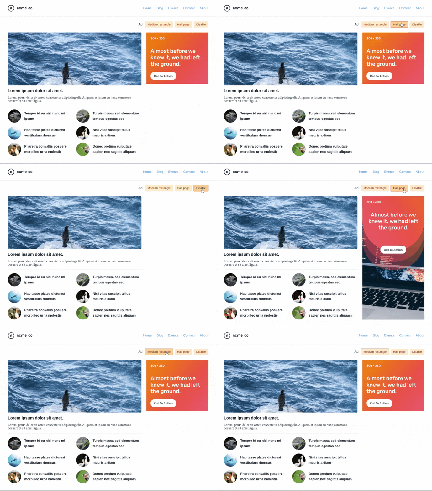
There are other considerations when working with ads in the sidebar. For example, let’s say the ad we get is smaller than expected or the script that serves the ads fails for some reason. This could result in dreaded whitespace and none of the approaches we’ve looked at so far would handle that.
Where’d the widget go? The disable button is a simulation for an ad blocker.
Here’s how I’ve tackled this issue in the past. First, our markup:
Then, we set the right measurements for the grid columns:
.header .container {
  display: grid;
  grid-template-columns: minmax(0, 1fr) 300px;
  grid-gap: 24px;
  min-height: 600px; /* Max height of the half-page ad */
}
Now let’s make the sidebar itself a flexible container that’s the exact width and height that we exact the ad to be, but hides any content that overflows it.
Finally, we can style the .aside-content element so that it is capable of vertical scrolling in the event that we need to display the widget:
.aside-content {
  overflow-y: auto;
}
Now, we’ve accounted for situations where the size of the ad changes on us or when we need fallback content.
No more whitespace, no matter what happens with our ad!
Styling Digital Ads
Now that we’ve looked at placements, let’s turn our attention to styling digital ads. It’s always a good idea to style ads, particularly for two reasons:
Styling ads can help them feel like a native part of a website.
Styling ads can make them more compelling to users.
Here are a few tips we can leverage to get the most from ads:
Use a flexible layout so things look good with or without ads. Let’s say an image doesn’t load for some reason or suddenly needs to be removed from the site. Rather than having to refactor a bunch of markup, it’s ideal to use modern CSS layout techniques, like flexbox and grid, that can adapt to content changes and reflow content, as needed.
Use styling that is consistent with the site design. Ads that look like they belong on a site are not only easier on the eye, but they leverage the trust that’s been established between the site and its readers. An ad that feels out of place not only runs the risk of looking spammy, but could compromise user trust as well.
Use a clear call to action. Ads should provoke action and that action should be easy to identify. Muddying the waters with overbearing graphics or too much text may negatively impact an ad’s overall performance.
Use accurate language. While we’re on the topic of content, make sure the ad delivers on its promises and sets good expectations for users. There’s nothing more annoying than expecting to get one thing when clicking on something only to be sold something else.
Use high-res images. Many ads rely on images to draw attention and emphasize content. When we’re working with ads that contain images, particularly smaller ad placements, it’s a good idea to use high-resolution images so they are crystal clear. The common way to do that is to make an image twice the size of the space to double its pixel density when it renders.
When working with custom ads where you have control over how they are implemented, like the ones here on CSS-Tricks, it’s a lot easier to adapt them to a specific layout and design. However, in cases where they are injected dynamically, say with a script, it might not be possible to wrap them in a div that can be used for styling; tactics like using ::before and ::after pseudo-elements as well as [attribute^=value] selectors are your friend in these situations.
Many advertising platforms will generate a unique ID for each ad unit which is great. They often start with the same prefix that we can use to target our styles:
[id^="prefix-"] {
  /* your style */
}
CodePen Embed Fallback
Handling Responsive Ads
Ad platforms that provide a script to inject ads will often handle responsive sizing by bundling their own styles and such. But, when that’s not the case, or when we have complete control over the ads, then accounting for how they display on different screen sizes is crucial. Proper responsive handling ensures that ads have a clear call-to-action at any screen size.
Flexbox, Grid and nth-child
One thing we can do is re-order where an ad displays. Again, flexbox and grid are great CSS techniques to lean on because they employ the order property, which can change the visual placement of the ad without affecting the order of the actual source code.
In this example, we will try to reorder our items so the ad is visible “above the fold,” which is a fancy way of saying somewhere at the top of the page before the user needs to start scrolling.
Here’s our markup:
<div class="items">
  <div class="ad">...</div>
  <div class="item">...</div>
  <div class="item">...</div>
  <!-- and so on... -->
</div>
We can use :nth-child to select one or more items based on their source order, according to a formula:
This selector will target the first n elements and set their order to a negative value. This allows the ad to dive between the items depending on the size of the viewport:
CodePen Embed Fallback
Handling Static Ads
Not all ads can be perfectly flexible… or are even designed to be that way. We can still sprinkle in some responsive behavior to ensure they still work with a layout at any given screen size.
For example, we can place the ad in a flexible container and hide the parts of the ad that overflow it.
Obviously, there’s a good deal of design strategy needed for something like this. Notice how the important ad content is flush to the left and the right is simply cut off.
Depending on whether the ad’s important content is on the left or right of the ad layout, we can justify the container content either to flex-start, flex-end, or even center, while hiding the overflowing portion.
.ad {
  display: flex;
  justify-content: flex-end; /* depending on the side your important content live */
  overflow: hidden;
}
CodePen Embed Fallback
Handling Responsive Images
While ads aren’t always made from static images, many of them are. This gives us an opportunity to put the <picture> tag to use, which gives us more flexibility to tell the browser to use specific images at specific viewport sizes in order to fill the space as nicely as possible.
<picture>
  <!-- Use the ad_728x90.jpg file at 768px and above  -->
  <source media="(min-width: 768px)" srcset="ad_728x90.jpg">
  <!-- The default file -->
  <img src="ad_300x250">
</picture>
CodePen Embed Fallback
We covered it a little earlier, but using high-resolution versions of an image creates a sharper image, especially on high-DPI screen. The <picture> element can help with that. It’s especially nice because it allows us to serve a more optimized image for low-resolution screens that are often associated with slower internet speeds.
Another thing you can do is using srcset to support multiple display resolutions which will allow the browser to choose the appropriate image resolution:
In the case of srcset, there’s no need to worry much about performance because the browser will only download the needed asset for a specific resolution.
Phew, there’s so much to consider when it comes to display advertising! Different types, different sizes, different variations, different layouts, different formats, different viewport sizes… and this is by no means a comprehensive guide to all-things-advertising.
But hopefully this helps you understand the elements that make for effective ads as a site publisher, especially if you are considering ads for your own site. What we’ve covered here should certainly get you started and help you make decisions to get the most from having ads on a site while maintaining a good user experience.
The HBO sitcom Silicon Valley hilariously followed Pied Piper, a team of developers with startup dreams to create a compression algorithm so powerful that high-quality streaming and file storage concerns would become a thing of the past.
In the show, Google is portrayed by the fictional company Hooli, which is after Pied Piper’s intellectual property. The funny thing is that, while being far from a startup, Google does indeed have a powerful compression engine in real life called Brotli.
This article is about my experience using Brotli at production scale. Despite being really expensive and a truly unfeasible method for on-the-fly compression, Brotli is actually very economical and saves cost on many fronts, especially when compared with gzip or lower compression levels of Brotli (which we’ll get into).
Brotli’s beginning…
In 2015, Google published a blog post announcing Brotli and released its source code on GitHub. The pair of developers who created Brotli also created Google’s Zopfli compression two years earlier. But where Zopfli leveraged existing compression techniques, Brotli was written from the ground-up and squarely focused on text compression to benefit static web assets, like HTML, CSS, JavaScript and even web fonts.
At that time, I was working as a freelance website performance consultant. I was really excited for the 20-26% improvement Brotli promised over Zopfli. Zopfli in itself is a dense implementation of the deflate compressor compared with zlib’s standard implementation, so the claim of up to 26% was quite impressive. And what’s zlib? It’s essentially the same as gzip.
So what we’re looking at is the next generation of Zopfli, which is an offshoot of zlib, which is essentially gzip.
A story of disappointment
It took a few months for major CDN players to support Brotli, but meanwhile it was seeing widespread adoption in tools, services, browsers and servers. However, the 26% dense compression that Brotli promised was never reflected in production. Some CDNs set a lower compression level internally while others supported Brotli at origin so that they only support it if it was enabled manually at the origin.
Server support for Brotli was pretty good, but to achieve high compression levels, it required rolling your own pre-compression code or using a server module to do it for you — which is not always an option, especially in the case of shared hosting services.
This was really disappointing for me. I wanted to compress every last possible byte for my clients’ websites in a drive to make them faster, but using pre-compression and allowing clients to update files on demand simultaneously was not always easy.
Taking matters into my own hands
I started building my own performance optimization service for my clients.
I had several tricks that could significantly speed up websites. The service categorized all the optimizations in three groups consisting of several “Content,” “Delivery,” and “Cache” optimizations. I had Brotli in mind for the content optimization part of the service for compressible resources.
Like other compression formats, Brotli comes in different levels of power. Brotli’s max level is exactly like the max volume of the guitar amps in This is Spinal Tap: it goes to 11.
Brotli:11, or Brotli compression level 11, can offer significant reduction in the size of compressible files, but has a substantial trade-off: it is painfully slow and not feasible for on demand compression the same way gzip is capable of doing it. It costs significantly more in terms of CPU time.
In my benchmarks, Brotli:11 takes several hundred milliseconds to compress a single minified jQuery file. So, the only way to offer Brotli:11 to my clients was to use it for pre-compression, leaving me to figure out a way to cache files at the server level. Luckily we already had that in place. The only problem was the fear that Brotli could kill all our processing resources.
Maybe that’s why Pied Piper had to continue rigging its servers for more power.
I put my fears aside and built Brotli:11 as a configurable server option. This way, clients could decide whether enabling it was worth the computing cost.
It’s slow, but gradually pays off
Among several other optimizations, the service for my clients also offers geographic content delivery; in other words, it has a built-in CDN.
Of the several tricks I tried when taking matters into my own hands, one was to combine public CDN (or open-source CDN) and private CDN on a single host so that websites can enjoy the benefits of shared browser cache of public resources without incurring separate DNS lookup and connection cost for that public host. I wanted to avoid this extra connection cost because it has significant impact for mobile users. Also, combining more and more resources on a single host can help get the most of HTTP/2 features, like multiplexing.
I enabled the public CDN and turned on Brotli:11 pre-compression for all compressible resources, including CSS, JavaScript, SVG, and TTF, among other types of files. The overhead of compression did indeed increase on first request of each resource — but after that, everything seemed to run smoothly. Brotli has over 90% browser support and pretty much all the requests hitting my service now use Brotli.
I was happy. Clients were happy. But I didn’t have numbers. I started analyzing the impact of enabling this high density compression on public resources. For this, I recorded file transfer sizes of several popular libraries — including jQuery, Bootstrap, React, and other frameworks — that used common compression methods implemented by other CDNs and found that Brotli:11 compression was saving around 21% compared to other compression formats.
It’s important to note that some of the other public CDNs I compared were already using Brotli, but at lower compression levels. So, the 21% extra compression was really satisfying for me. This number is based on a very small subset of libraries but is not incorrect by a big margin as I was seeing this much gain on all of the websites that I tested.
Here is a graphical representation of the savings.
You can see the raw data below..Note that the savings for CSS is much more prominent than what JavaScript gets.
Library
Original
Avg. of Common Compression (A)
Brotli:11 (B)
(A) / (B) – 1
Ant Design
1,938.99 KB
438.24 KB
362.82 KB
20.79%
Bootstrap
152.11 KB
24.20 KB
17.30 KB
39.88%
Bulma
186.13 KB
23.40 KB
19.30 KB
21.24%
D3.js
236.82 KB
74.51 KB
65.75 KB
13.32%
Font Awesome
1,104.04 KB
422.56 KB
331.12 KB
27.62%
jQuery
86.08 KB
30.31 KB
27.65 KB
9.62%
React
105.47 KB
33.33 KB
30.28 KB
10.07%
Semantic UI
613.78 KB
91.93 KB
78.25 KB
17.48%
three.js
562.75 KB
134.01 KB
114.44 KB
17.10%
Vue.js
91.48 KB
33.17 KB
30.58 KB
8.47%
The results are great, which is what I expected. But what about the overall impact of using Brotli:11 at scale? Turns out that using Brotli:11 for all public resources reduces cost all around:
The smaller file sizes are expected to result in lower TLS overhead. That said, it is not easily measurable, nor is it significant for my service because modern CPUs are very fast at encryption. Still, I believe there is some tiny and repeated saving on account of encryption for every request as smaller files encrypt faster.
It reduces the bandwidth cost. The 21% savings I got across the board is the case in point. And, remember, savings are not a one-time thing. Each request counts as cost, so the 21% savings is repeated time and again, creating a snowball savings for the cost of bandwidth.
We only cache hot files in memory at edge servers. Due to the widespread browser support for Brotli, these hot files are mostly encoded by Brotli and their small size lets us fit more of them in available memory.
Visitors, especially those on mobile devices, enjoy reduced data transfer. This results in less battery use and savings on data charges. That’s a huge win that gets passed on to the users of our clients!
This is all so good. The cost we save per request is not significant, but considering we have a near zero cache miss rate for public resources, we can easily amortize the initial high cost of compression in next several hundred requests. After that, we’re looking at a lifetime benefit of reduced overhead.
It doesn’t end there
With the mix of public and private CDNs that we introduced as part of our performance optimization service, we wanted to make sure that clients could set lower compression levels for resources that frequently change over time (like custom CSS and JavaScript) on the private CDN and automatically switch to the public CDN for open-source resources that change less often and have pre-configured Brotli:11. This way, our clients can still get a high compression ratio on resources that change less often while still enjoying good compression ratios with instant purge and updates for compressible resources.
This all is done smoothly and seamlessly using our integration tools. The added benefit of this approach for clients is that the bandwidth on the public CDN is totally free with unprecedented performance levels.
Try it yourself!
Testing on a common website, using aggressive compression can easily shave around 50 KB off the page load. If you want to play with the free public CDN and enjoy smaller CSS and JavaScript, you are welcome to use our PageCDN service. Here are some of the most used libraries for your use:
Our PHP library automatic switches between private and public CDN if you need it to. The same feature is implemented seamlessly in our WordPress plugin that automatically loads public resources over Public CDN. Both of these tools allow full access to the free public CDN. Libraries for JavaScript, Python. and Ruby are not yet available. If you contribute any such library to our Public CDN, I will be happy to list it in our docs.
Additionally, you can use our search tool to immediately find a corresponding resource on the public CDN by supplying a URL of a resource on your website. If none of these tools work for you, then you can check the relevant library page and pick the URLs you want.
Looking toward the future
We started by hosting only the most popular libraries in order to prevent malware spread. However, things are changing rapidly and we add new libraries as our users suggest them to us. You are welcome to suggest your favorite ones, too. If you still want to link to a public or private Github repo that is not yet available on our public CDN, you can use our private CDN to connect to a repo and import all new releases as they appear on GitHub and then apply your own aggressive optimizations before delivery.
What do you think?
Everything we covered here is solely based on my personal experience working with Brotli compression at CDN scale. It just happens to be an introduction to my public CDN as well. We are still a small service and our client websites are only in the hundreds. Still, at this scale the aggressive compression seems to pay off.
I achieved high quality results for my clients and now you can use this free service for your websites as well. And, if you like it, please leave feedback at my email and recommend it to others.