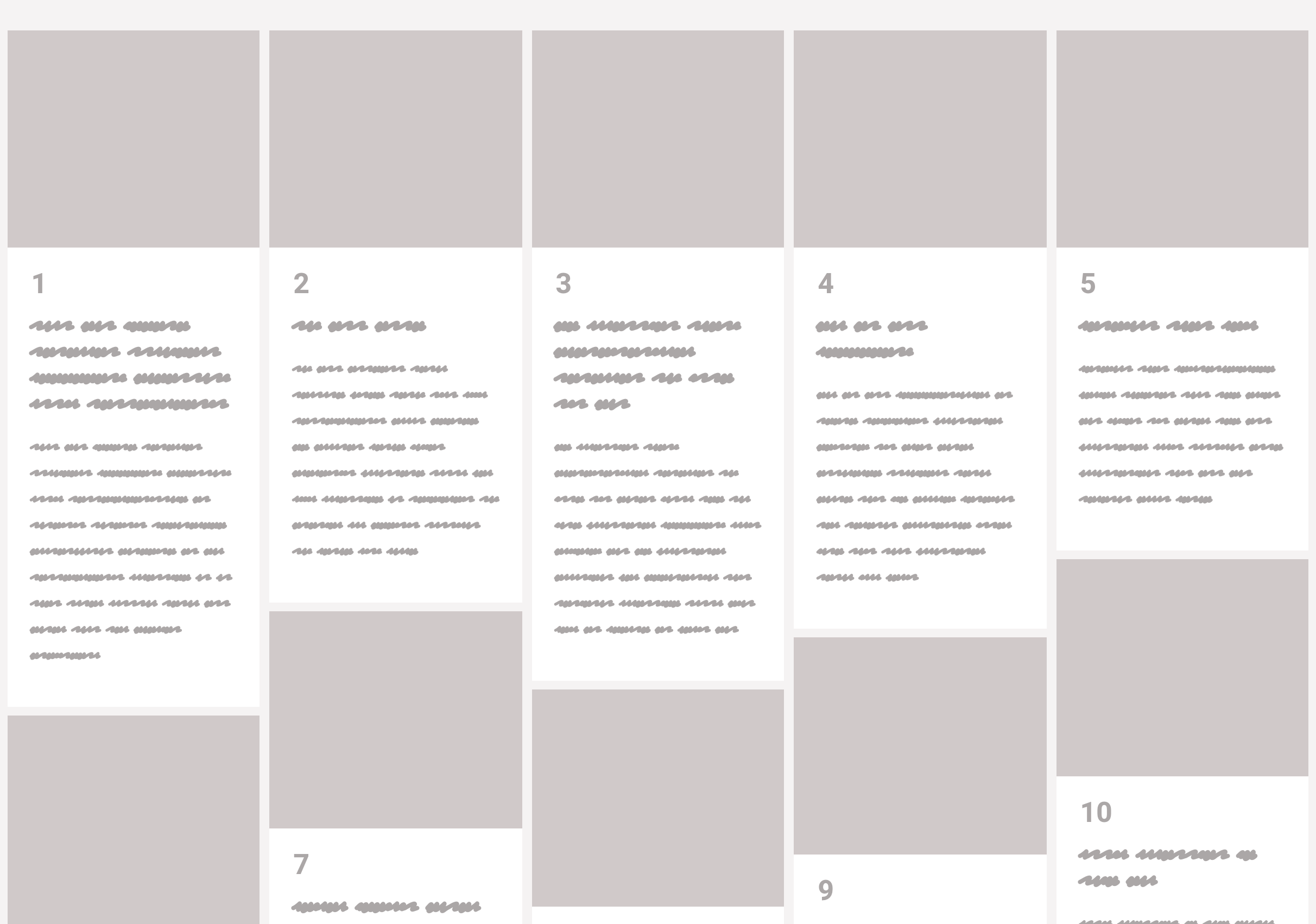
Masonry layout, on the web, is when items of an uneven size are laid out such that there aren’t uneven gaps. I would guess the term was coined (or at least popularized) for the web by David DeSandro because of his popular Masonry JavaScript library, which has been around since 2010.
JavaScript library. Nothing against JavaScript, but it’s understandable we might not want to lean on it for doing layout. Is there anything we can do in CSS directly these days? Sorta.
Flexbox can do vertical columns with ragged endings too
But it’s not quite as clever, because you’ll need to set a height of some kind to get it to wrap the columns. You’ll also have to be explicit about widths rather than having it decide columns for you.
But it’s doable and it does auto space the gaps if there is room.
If it’s just the uneven brick-like look you’re after, then horizontal masonry is way easier. You could probably even float stuff if you don’t care about the ragged edge. If you wanna keep it a block… flexbox with allowed flex-grow is the ticket.
CSS grid is very amazing and useful in a CSS developer’s everyday life, but it’s not really designed for masonry style layouts. CSS grid is about defining lines and placing things along those lines, where masonry is about letting elements end where they may, but still exerting some positional influence.
Balázs Sziklai has a nice example of auto-flowing grids that all stack together nicely, with pretty good horiziontal ordering:
But you can see how strict the lines are. There is a way though!
Grid + JavaScript-maniplated row spans
Andy Barefoot wrote up a great guide. The trick is setting up repeating grid rows that are fairly short, letting the elements fall into the grid horizontally as they may, then adjusting their heights to match the grid with some fairly light math to calculate how many rows they should span.
What people generally want is column-stacking (varied heights on elements), but with horizontal ordering. That last grid demo above handles it pretty well, but it’s not the only way.
Jesse Korzan tackled it with CSS columns. It needs JavaScript as well to get it done. In this case, it shifts the elements in the DOM to order them left-to-right while providing a horizontal stack using a CSS columns layout. This introduces a bit of an accessibility problem since the visual order (left-to-right) and source order (top-to-bottom) are super different & dash; though perhaps fixable with programmatic tabindex?
I’m a huge fan of CSS Grid and I use it on pretty much every project these days. However, there’s one part of it that makes things much more complicated than they really ought to be: the lack of subgrids. And in this post on the matter, Ken Bellows explains why they’d be so gosh darn useful:
But one thing still missing from the Level 1 spec is the ability to create a subgrid, a grid-item with its own grid that aligns in one or both dimensions with the parent grid. It was originally planned to be in Level 1, but the working group decided they needed more time to work out the details, so it was removed, and it will ship in CSS Grid Layout Module Level 2, which seems to be nearing completion.
There has been a lot of discussion over the last 2 years about the use cases for subgrid, how it should be implemented, and even some debate over whether you even need it. A lot of that discussion was centered around two other approaches that can handle many of the same problems as subgrid: nested grids and display: contents
I remember one of the very first websites I worked on was much like the demo that Ken uses as an example, but this was way back in 2012 and grid didn’t exist yet. Sadly, I had to write a lot more CSS than I felt was necessary to get elements in one div to line up with elements in another. Anyway, this article kinda riffs off of Rachel Andrew’s post about subgrid and what problems it would help solve which is definitely worth checking out, too.
Last year, the team here at CSS-Tricks compiled a list of our favorite posts, trends, topics, and resources from around the world of front-end development. We had a blast doing it and found it to be a nice recap of the industry as we saw it over the course of the year. Well, we’re doing it again this year!
With that, here’s everything that Sarah, Robin, Chris and I saw and enjoyed over the past year.
There are a few themes that cross languages, and one of them is good code review. Even though Nina Zakharenko gives talks and makes resources about Python, her talk about code review skills is especially notable because it applies across many disciplines. She’s got a great arc to this talk and I think her deck is an excellent resource, but you can take this a step even further and think critically about your own team, what works for it, and what practices might need to be reconsidered.
I also enjoyed this sarcastic tweet that brings up a good point:
When reviewing a PR, it’s essential that you leave a comment. Any comment. Even the PR looks great and you have no substantial feedback, find something trivial to nitpick or question. This communicates intelligence and mastery, and is widely appreciated by your colleagues.
I’ve been guilty myself of commenting on a really clean pull request just to say something, and it’s healthy for us as a community to revisit why we do things like this.
Sophie Alpert, manager of the React core team, also wrote a great post along these lines right at the end of the year called Why Review Code. It’s a good resource to turn to when you’d like to explain the need for code reviews in the development process.
The year of (creative) code
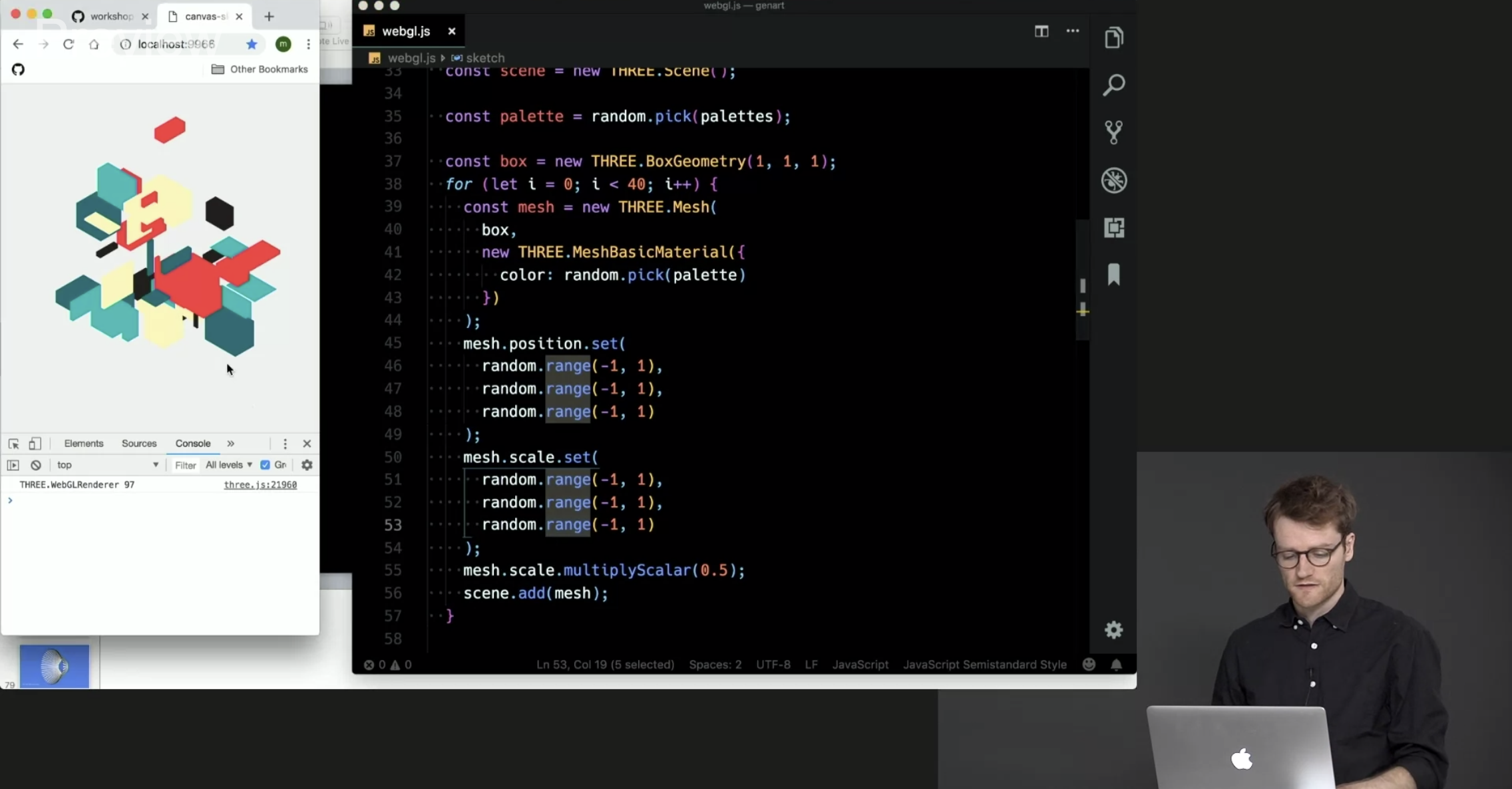
So many wonderful creative coding resources were made this year. Creative coding projects might seem frivolous but you can actually learn a ton from making and playing with them. Matt DesLauriers recently taught a course called Creative Coding with Canvas & WebGL for Frontend Masters that serves as a good example.
CodePen is always one of my favorite places to check out creative work because it provides a way to reverse-engineer the work of other people and learn from their source code. CodePen has also started coding challenges adding yet another way to motivate creative experiments and collective learning opportunities. Marie Mosley did a lot of work to make that happen and her work on CodePen’s great newsletter is equally awesome.
You should also consider checking out Monica Dinculescu’s work because she has been sharing some amazing work. There’s not one, not two, but three (!) that use machine learning alone. Go see all of her Glitch projects. And, for what it’s worth, Glitch is a great place to explore creative code and remix your own as well.
GitHub Actions
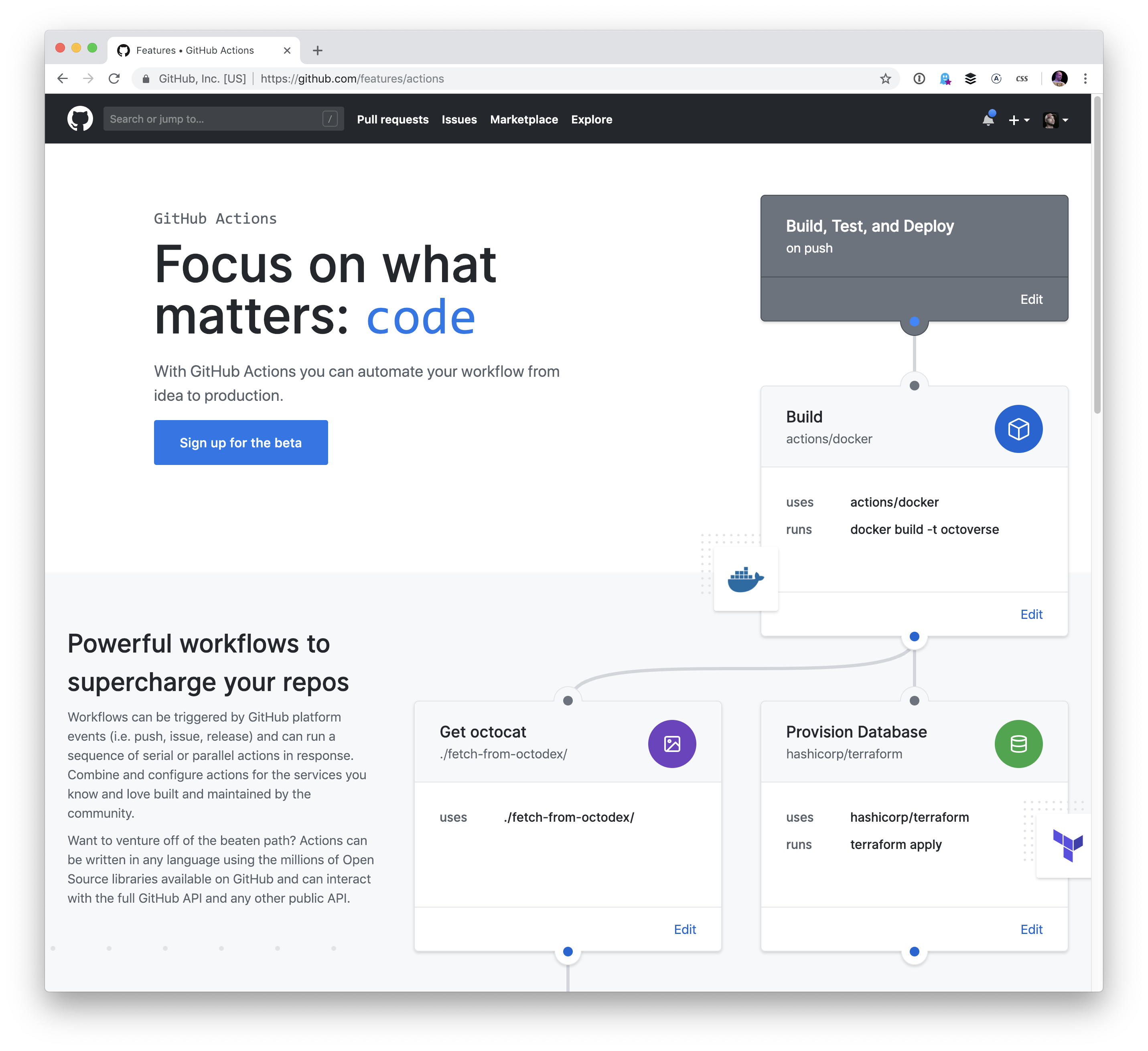
I think hands-down one of the most game-changing developments this year is GitHub Actions. The fact that you can manage all of your testing, deployments, and project issues as containers chained in a unified workflow is quite amazing.
Containers are a great for actions because of their flexibility — you’re not limited to a single kind of compute and so much is possible! I did a writeup about GitHub Actions covering the feature in full. And, if you’re digging into containers, you might find the dive repo helpful because it provides a way to explore a docker image and layer contents.
Actions are still in beta but you can request access — they’re slowly rolling out now.
UI property generators
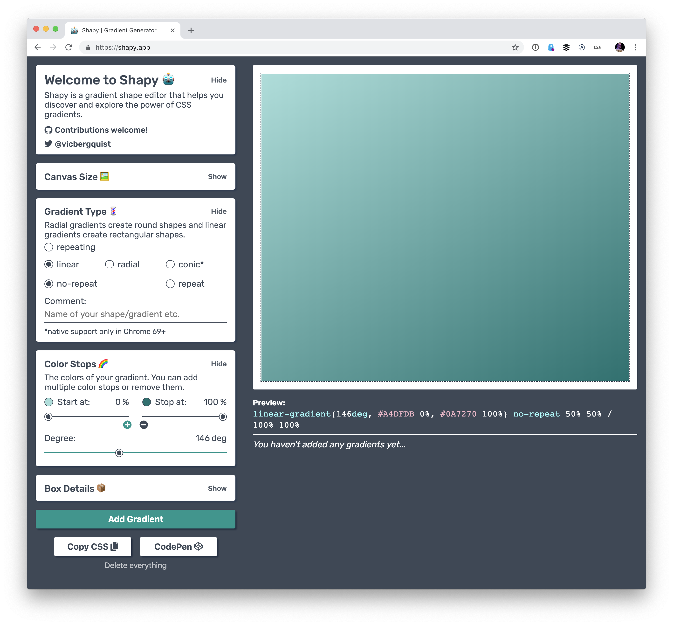
I really like that we’re automating some of the code that we need to make beautiful front-end experiences these days. In terms of color there’s color by Adobe, coolors, and uiGradients. There are even generators for other things, like gradients, clip-path, font pairings, and box-shadow. I am very much all for this. These are the kind of tools that speed up development and allow us to use advanced effects, no matter the skill level.
Ire has been writing a near constant stream of wondrous articles about front-end development on her blog, Bits of Code, over the past year, and it’s been super exciting to keep up with her work. It seems like she’s posting something I find useful almost every day, from basic stuff like when hover, focus and active states apply to accessibility tips like the aria-live attribute.
„The All Powerful Front-end Developer”
Chris gave a talk this year about the ways the role of front-end development are changing… and for the better. It was perhaps the most inspiring talk I saw this year. Talks about front-end stuff are sometimes pretty dry, but Chris does something else here. He covers a host of new tools we can use today to do things that previously required a ton of back-end skills. Chris even made a website all about these new tools which are often categorized as „Serverless.”
Even if none of these tools excite you, I would recommend checking out the talk – Chris’s enthusiasm is electric and made me want to pull up my sleeves and get to work on something fun, weird and exciting.
Future Fonts
The Future Fonts marketplace turned out to be a great place to find new and experimental typefaces this year. Obviously is a good example of that. But the difference between Future Fonts and other marketplaces is that you can buy fonts that are in beta and still currently under development. If you get in on the ground floor and buy a font for $10, then that shows the developer the interest in a particular font which may spur more features for it, like new weights, widths or even OpenType features.
It’s a great way to support type designers while getting a ton of neat and experimental typefaces at the same time.
React Conf 2018
The talks from React Conf 2018 will get you up to speed with the latest React news. It’s interesting to see how React Hooks let you „use state and other React features without writing a class.”
It’s also worth calling out that a lot of folks really improved our Guide to React here on CSS-Tricks so that it now contains a ton of advice about how to get started and how to level up on both basic and advanced practices.
The Victorian Internet
This is a weird recommendation because The Victorian Internet is a book and it wasn’t published this year. But! It’s certainly the best book I’ve read this year, even if it’s only tangentially related to web stuff. It made me realize that the internet we’re building today is one that’s much older than I first expected. The book focuses on the laying of the Transatlantic submarine cables, the design of codes and the codebreakers, fraudsters that used the telegraph to find their marks, and those that used it to find the person they’d marry. I really can’t recommend this book enough.
Figma
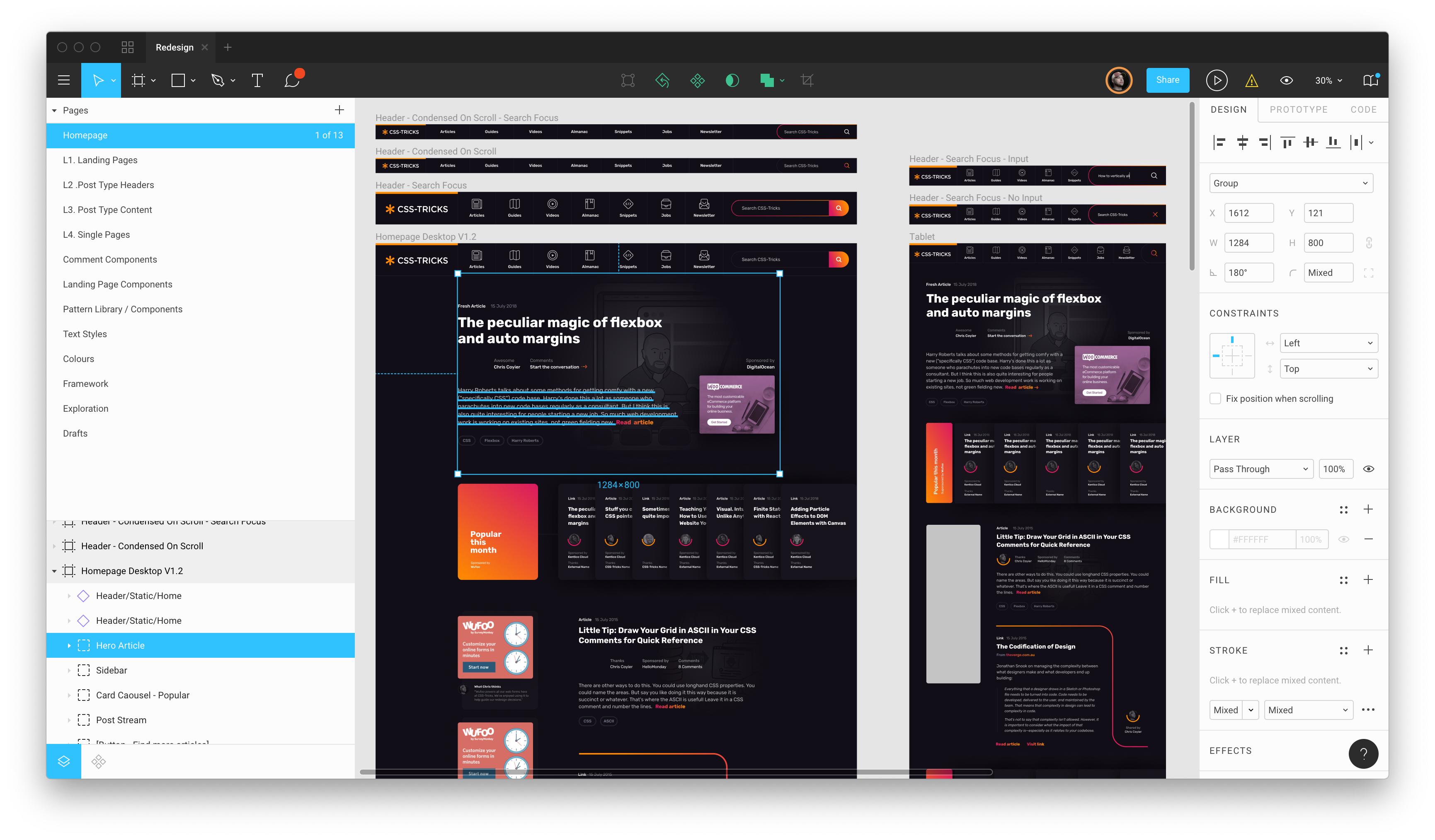
The browser-based design tool Figma continued to release a wave of new features that makes building design systems and UI kits easier than ever before. I’ve been doing a ton of experiments with it to see how it helps designers communicate, as well as how to build more resilient components. It’s super impressive to see how much the tools have improved over the past year and I’m excited to see it improve in the new year, too.
It seems there was a lot of chatter this year about the impact of third party scripts. Whether it’s the growing ubiquity of all-things-JavaScript or whatever, this topic covers a wide and interesting ground, including performance, security and even hard costs, to name a few.
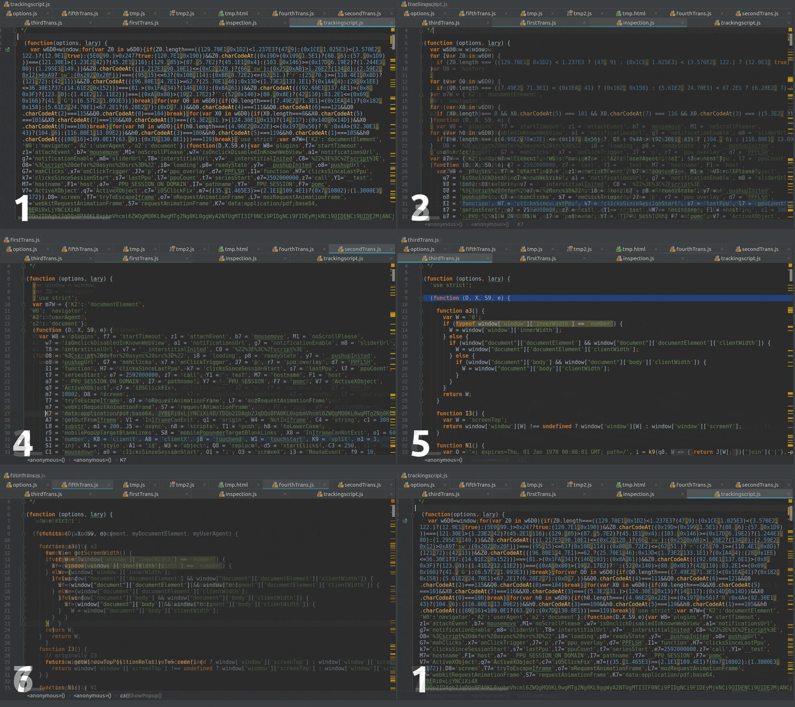
My personal favorite post about this was Paulo Mioni’s deep dive into the anatomy of a malicious script. Sure, the technical bits are a great learning opportunity, but what really makes this piece is the way it reads like a true crime novel.
Gutenberg, Gutenberg and more Gutenberg
There was so much noise leading up to the new WordPress editor that the release of WordPress 5.0 containing it felt anti-climactic. No one was hurt or injured amid plenty of concerns, though there is indeed room for improvement.
Lara Schneck and Andy Bell teamed up for a hefty seven-party series aimed at getting developers like us primed for the changes and it’s incredible. No stone is left unturned and it perfectly suitable for beginners and experts alike.
Solving real life issues with UX
I like to think that I care a lot about users in the work I do and that I do my best to empathize so that I can anticipate needs or feelings as they interact with the site or app. That said, my mind was blown away by a study Lucas Chae did on the search engine experience of people looking for a way to kill themselves. I mean, depression and suicide are topics that are near and dear to my heart, but I never thought about finding a practical solution for handling it in an online experience.
So, thanks for that, Lucas. It inspired me to piggyback on his recommendations with a few of my own. Hopefully, this is a conversation that goes well beyond 2018 and sparks meaningful change in this department.
The growing gig economy
Freelancing is one of my favorite things to talk about at great length with anyone and everyone who is willing to talk shop and that’s largely because I’ve learned a lot about it in the five years I’ve been in it.
But if you take my experience and quadruple it, then you get a treasure trove of wisdom like Adam Coti shared in his collection of freelancing lessons learned over 20 years of service.
Freelancing isn’t for everyone. Neither is remote work. Adam’s advice is what I wish I had going into this five years ago.
Browser ecology
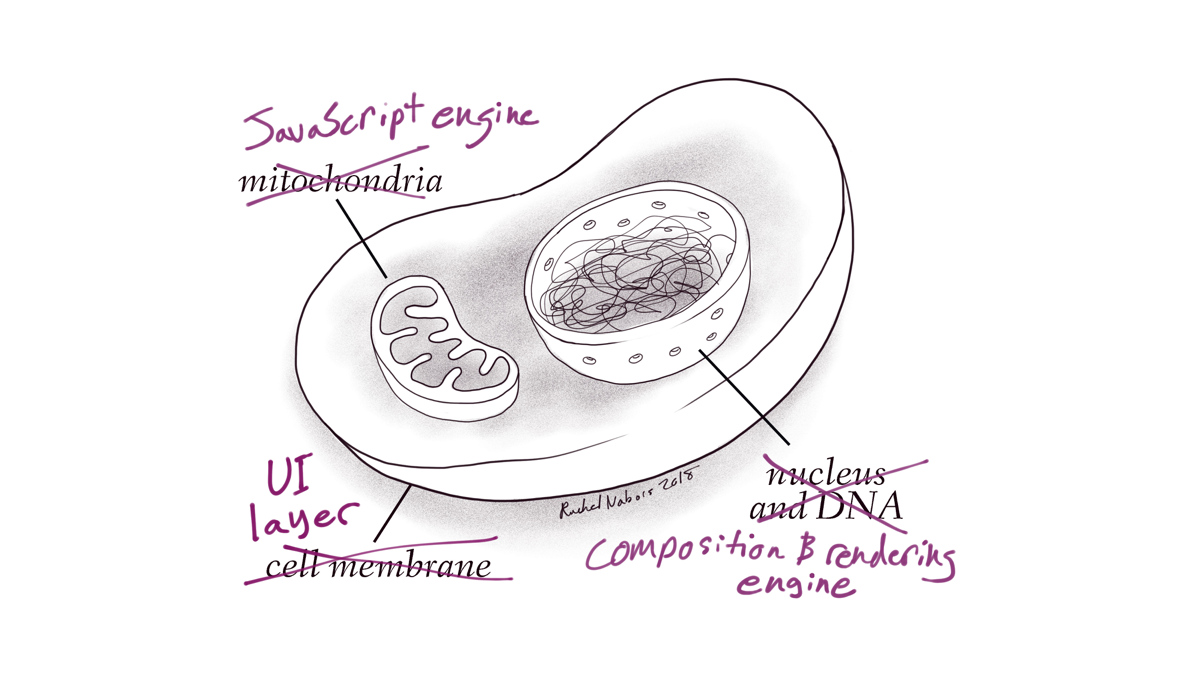
I absolutely love the way Rachel Nabors likens web browsers to a biological ecosystem. It’s a stellar analogy and leads into the long and winding history of browser evolution.
Speaking of history, Jason Hoffman’s telling of the history about browsers and web standards is equally interesting and a good chunk of context to carry in your back pocket.
These posts were timely because this year saw a lot of movement in the browser landscape. Microsoft is dropping EdgeHTML for Blink and Google ramped up its AMP product. 2018 felt like a dizzying year of significant changes for industry giants!
„Don’t tell me how to build a front end!” we, front-end developers, cry out. We are very powerful now. We like to bring our own front-end stack, then use your back-end data and APIs. As this is happening, we’re seeing healthy things happen like content management systems evolving to headless frameworks and focus on what they are best at: content management. We’re seeing performance and security improvements through the power of static and CDN-backed hosting. We’re seeing hosting and server usage cost reductions.
But we’re also seeing unhealthy things we need to work through, like front-end developers being spread too thin. We have JavaScript-focused engineers failing to write clean, extensible, performant, accessible markup and styles, and, on the flip side, we have UX-focused engineers feeling left out, left behind, or asked to do development work suddenly quite far away from their current expertise.
GraphQL
Speaking of powerful front-end developers, giving us front-end developers a well-oiled GraphQL setup is extremely empowering. No longer do we need to be roadblocked by waiting for an API to be finished or data to be massaged into some needed format. All the data you want is available at your fingertips, so go get and use it as you will. This makes building and iterating on the front end faster, easier, and more fun, which will lead us to building better products. Apollo GraphQL is the thing to look at here.
While front-end is having a massive love affair with JavaScript, there are plenty of front-end developers happily focused elsewhere
This is what I was getting at in my first section. There is a divide happening. It’s always been there, but with JavaScript being absolutely enormous right now and showing no signs of slowing down, people are starting to fall through the schism. Can I still be a front-end developer if I’m not deep into JavaScript? Of course. I’m not going to tell you that you shouldn’t learn JavaScript, because it’s pretty cool and powerful and you just might love it, but if you’re focused on UX, UI, animation, accessibility, semantics, layout, architecture, design patterns, illustration, copywriting, and any combination of that and whatever else, you’re still awesome and useful and always will be. Hugs. 🤗
Just look at the book Refactoring UI or the course Learn UI Design as proof there is lots to know about UI design and being great at it requires a lot of training, practice, and skill just like any other aspect of front-end development.
Shamelessly using grid and custom properties everywhere
I remember when I first learned flexbox, it was all I reached for to make layouts. I still love flexbox, but now that we have grid and the browser support is nearly just as good, I find myself reaching for grid even more. Not that it’s a competition; they are different tools useful in different situations. But admittedly, there were things I would have used flexbox for a year ago that I use grid for now and grid feels more intuitive and more like the right tool.
I’m still swooning over the amazing illustrations Lynn Fisher did for both our grid and flexbox guides.
Massive discussions around CSS-in-JS and approaches, like Tailwind
These discussions can get quite heated, but there is no ignoring the fact that the landscape of CSS-in-JS is huge, has a lot of fans, and seems to be hitting the right notes for a lot of folks. But it’s far from settled down. Libraries like Vue and Angular have their own framework-prescribed way of handling it, whereas React has literally dozens of options and a fast-moving landscape with libraries popping up and popular ones spinning down in favor of others. It does seem like the feature set is starting to settle down a little, so this next year will be interesting to watch.
Then there is the concept of atomic CSS on the other side of the spectrum, and interesting in that doesn’t seem to have slowed down at all either. Tailwind CSS is perhaps the hottest framework out there, gaining enough traction that Adam is going full time on it.
What could really shake this up is if the web platform itself decides to get into solving some of the problems that gave rise to these solutions. The shadow DOM already exists in Web Components Land, so perhaps there are answers there? Maybe the return of <style scoped>? Maybe new best practices will evolve that employ a single-stylesheet-per-component? Who knows.
I’ve heard of multiple agencies where design systems are literally what they make for their clients. Not websites, design systems. I get it. If you give a team a really powerful and flexible toolbox to build their own site with, they will do just that. Giving them some finished pages, as polished as they might be, leaves them needing to dissect those themselves and figure out how to extend and build upon them when that need inevitably arrives. I think it makes sense for agencies, or special teams, to focus on extensible component-driven libraries that are used to build sites.
Machine Learning
Stuff like this blows me away:
I made a music sequencer! In JavaScript! It even uses Machine Learning to try to match drums to a synth melody you create!
Having open source libraries that help with machine learning and that are actually accessible for regular ol’ developers to use is a big deal.
Stuff like this will have real world-bettering implications:
🔥 I think I used machine learning to be nice to people! In this proof of concept, I’m creating dynamic alt text for screenreaders with Azure’s Computer Vision API. 💫https://t.co/Y21AHbRT4Ypic.twitter.com/KDfPZ4Sue0
You gotta check out the Unicode Pattern work (more) that Yuan Chuan does. He even shared some of his work and how he does it right here on CSS-Tricks. And follow that name link to CodePen for even more. This <css-doodle> thing they have created is fantastic.
Last year, the team here at CSS-Tricks compiled a list of our favorite posts, trends, topics, and resources from around the world of front-end development. We had a blast doing it and found it to be a nice recap of the industry as we saw it over the course of the year. Well, we’re doing it again this year!
With that, here’s everything that Sarah, Robin, Chris and I saw and enjoyed over the past year.
There are a few themes that cross languages, and one of them is good code review. Even though Nina Zakharenko gives talks and makes resources about Python, her talk about code review skills is especially notable because it applies across many disciplines. She’s got a great arc to this talk and I think her deck is an excellent resource, but you can take this a step even further and think critically about your own team, what works for it, and what practices might need to be reconsidered.
I also enjoyed this sarcastic tweet that brings up a good point:
When reviewing a PR, it’s essential that you leave a comment. Any comment. Even the PR looks great and you have no substantial feedback, find something trivial to nitpick or question. This communicates intelligence and mastery, and is widely appreciated by your colleagues.
I’ve been guilty myself of commenting on a really clean pull request just to say something, and it’s healthy for us as a community to revisit why we do things like this.
Sophie Alpert, manager of the React core team, also wrote a great post along these lines right at the end of the year called Why Review Code. It’s a good resource to turn to when you’d like to explain the need for code reviews in the development process.
The year of (creative) code
So many wonderful creative coding resources were made this year. Creative coding projects might seem frivolous but you can actually learn a ton from making and playing with them. Matt DesLauriers recently taught a course called Creative Coding with Canvas & WebGL for Frontend Masters that serves as a good example.
CodePen is always one of my favorite places to check out creative work because it provides a way to reverse-engineer the work of other people and learn from their source code. CodePen has also started coding challenges adding yet another way to motivate creative experiments and collective learning opportunities. Marie Mosley did a lot of work to make that happen and her work on CodePen’s great newsletter is equally awesome.
You should also consider checking out Monica Dinculescu’s work because she has been sharing some amazing work. There’s not one, not two, but three (!) that use machine learning alone. Go see all of her Glitch projects. And, for what it’s worth, Glitch is a great place to explore creative code and remix your own as well.
GitHub Actions
I think hands-down one of the most game-changing developments this year is GitHub Actions. The fact that you can manage all of your testing, deployments, and project issues as containers chained in a unified workflow is quite amazing.
Containers are a great for actions because of their flexibility — you’re not limited to a single kind of compute and so much is possible! I did a writeup about GitHub Actions covering the feature in full. And, if you’re digging into containers, you might find the dive repo helpful because it provides a way to explore a docker image and layer contents.
Actions are still in beta but you can request access — they’re slowly rolling out now.
UI property generators
I really like that we’re automating some of the code that we need to make beautiful front-end experiences these days. In terms of color there’s color by Adobe, coolors, and uiGradients. There are even generators for other things, like gradients, clip-path, font pairings, and box-shadow. I am very much all for this. These are the kind of tools that speed up development and allow us to use advanced effects, no matter the skill level.
Ire has been writing a near constant stream of wondrous articles about front-end development on her blog, Bits of Code, over the past year, and it’s been super exciting to keep up with her work. It seems like she’s posting something I find useful almost every day, from basic stuff like when hover, focus and active states apply to accessibility tips like the aria-live attribute.
„The All Powerful Front-end Developer”
Chris gave a talk this year about the ways the role of front-end development are changing… and for the better. It was perhaps the most inspiring talk I saw this year. Talks about front-end stuff are sometimes pretty dry, but Chris does something else here. He covers a host of new tools we can use today to do things that previously required a ton of back-end skills. Chris even made a website all about these new tools which are often categorized as „Serverless.”
Even if none of these tools excite you, I would recommend checking out the talk – Chris’s enthusiasm is electric and made me want to pull up my sleeves and get to work on something fun, weird and exciting.
Future Fonts
The Future Fonts marketplace turned out to be a great place to find new and experimental typefaces this year. Obviously is a good example of that. But the difference between Future Fonts and other marketplaces is that you can buy fonts that are in beta and still currently under development. If you get in on the ground floor and buy a font for $10, then that shows the developer the interest in a particular font which may spur more features for it, like new weights, widths or even OpenType features.
It’s a great way to support type designers while getting a ton of neat and experimental typefaces at the same time.
React Conf 2018
The talks from React Conf 2018 will get you up to speed with the latest React news. It’s interesting to see how React Hooks let you „use state and other React features without writing a class.”
It’s also worth calling out that a lot of folks really improved our Guide to React here on CSS-Tricks so that it now contains a ton of advice about how to get started and how to level up on both basic and advanced practices.
The Victorian Internet
This is a weird recommendation because The Victorian Internet is a book and it wasn’t published this year. But! It’s certainly the best book I’ve read this year, even if it’s only tangentially related to web stuff. It made me realize that the internet we’re building today is one that’s much older than I first expected. The book focuses on the laying of the Transatlantic submarine cables, the design of codes and the codebreakers, fraudsters that used the telegraph to find their marks, and those that used it to find the person they’d marry. I really can’t recommend this book enough.
Figma
The browser-based design tool Figma continued to release a wave of new features that makes building design systems and UI kits easier than ever before. I’ve been doing a ton of experiments with it to see how it helps designers communicate, as well as how to build more resilient components. It’s super impressive to see how much the tools have improved over the past year and I’m excited to see it improve in the new year, too.
It seems there was a lot of chatter this year about the impact of third party scripts. Whether it’s the growing ubiquity of all-things-JavaScript or whatever, this topic covers a wide and interesting ground, including performance, security and even hard costs, to name a few.
My personal favorite post about this was Paulo Mioni’s deep dive into the anatomy of a malicious script. Sure, the technical bits are a great learning opportunity, but what really makes this piece is the way it reads like a true crime novel.
Gutenberg, Gutenberg and more Gutenberg
There was so much noise leading up to the new WordPress editor that the release of WordPress 5.0 containing it felt anti-climactic. No one was hurt or injured amid plenty of concerns, though there is indeed room for improvement.
Lara Schneck and Andy Bell teamed up for a hefty seven-party series aimed at getting developers like us primed for the changes and it’s incredible. No stone is left unturned and it perfectly suitable for beginners and experts alike.
Solving real life issues with UX
I like to think that I care a lot about users in the work I do and that I do my best to empathize so that I can anticipate needs or feelings as they interact with the site or app. That said, my mind was blown away by a study Lucas Chae did on the search engine experience of people looking for a way to kill themselves. I mean, depression and suicide are topics that are near and dear to my heart, but I never thought about finding a practical solution for handling it in an online experience.
So, thanks for that, Lucas. It inspired me to piggyback on his recommendations with a few of my own. Hopefully, this is a conversation that goes well beyond 2018 and sparks meaningful change in this department.
The growing gig economy
Freelancing is one of my favorite things to talk about at great length with anyone and everyone who is willing to talk shop and that’s largely because I’ve learned a lot about it in the five years I’ve been in it.
But if you take my experience and quadruple it, then you get a treasure trove of wisdom like Adam Coti shared in his collection of freelancing lessons learned over 20 years of service.
Freelancing isn’t for everyone. Neither is remote work. Adam’s advice is what I wish I had going into this five years ago.
Browser ecology
I absolutely love the way Rachel Nabors likens web browsers to a biological ecosystem. It’s a stellar analogy and leads into the long and winding history of browser evolution.
Speaking of history, Jason Hoffman’s telling of the history about browsers and web standards is equally interesting and a good chunk of context to carry in your back pocket.
These posts were timely because this year saw a lot of movement in the browser landscape. Microsoft is dropping EdgeHTML for Blink and Google ramped up its AMP product. 2018 felt like a dizzying year of significant changes for industry giants!
„Don’t tell me how to build a front end!” we, front-end developers, cry out. We are very powerful now. We like to bring our own front-end stack, then use your back-end data and APIs. As this is happening, we’re seeing healthy things happen like content management systems evolving to headless frameworks and focus on what they are best at: content management. We’re seeing performance and security improvements through the power of static and CDN-backed hosting. We’re seeing hosting and server usage cost reductions.
But we’re also seeing unhealthy things we need to work through, like front-end developers being spread too thin. We have JavaScript-focused engineers failing to write clean, extensible, performant, accessible markup and styles, and, on the flip side, we have UX-focused engineers feeling left out, left behind, or asked to do development work suddenly quite far away from their current expertise.
GraphQL
Speaking of powerful front-end developers, giving us front-end developers a well-oiled GraphQL setup is extremely empowering. No longer do we need to be roadblocked by waiting for an API to be finished or data to be massaged into some needed format. All the data you want is available at your fingertips, so go get and use it as you will. This makes building and iterating on the front end faster, easier, and more fun, which will lead us to building better products. Apollo GraphQL is the thing to look at here.
While front-end is having a massive love affair with JavaScript, there are plenty of front-end developers happily focused elsewhere
This is what I was getting at in my first section. There is a divide happening. It’s always been there, but with JavaScript being absolutely enormous right now and showing no signs of slowing down, people are starting to fall through the schism. Can I still be a front-end developer if I’m not deep into JavaScript? Of course. I’m not going to tell you that you shouldn’t learn JavaScript, because it’s pretty cool and powerful and you just might love it, but if you’re focused on UX, UI, animation, accessibility, semantics, layout, architecture, design patterns, illustration, copywriting, and any combination of that and whatever else, you’re still awesome and useful and always will be. Hugs. 🤗
Just look at the book Refactoring UI or the course Learn UI Design as proof there is lots to know about UI design and being great at it requires a lot of training, practice, and skill just like any other aspect of front-end development.
Shamelessly using grid and custom properties everywhere
I remember when I first learned flexbox, it was all I reached for to make layouts. I still love flexbox, but now that we have grid and the browser support is nearly just as good, I find myself reaching for grid even more. Not that it’s a competition; they are different tools useful in different situations. But admittedly, there were things I would have used flexbox for a year ago that I use grid for now and grid feels more intuitive and more like the right tool.
I’m still swooning over the amazing illustrations Lynn Fisher did for both our grid and flexbox guides.
Massive discussions around CSS-in-JS and approaches, like Tailwind
These discussions can get quite heated, but there is no ignoring the fact that the landscape of CSS-in-JS is huge, has a lot of fans, and seems to be hitting the right notes for a lot of folks. But it’s far from settled down. Libraries like Vue and Angular have their own framework-prescribed way of handling it, whereas React has literally dozens of options and a fast-moving landscape with libraries popping up and popular ones spinning down in favor of others. It does seem like the feature set is starting to settle down a little, so this next year will be interesting to watch.
Then there is the concept of atomic CSS on the other side of the spectrum, and interesting in that doesn’t seem to have slowed down at all either. Tailwind CSS is perhaps the hottest framework out there, gaining enough traction that Adam is going full time on it.
What could really shake this up is if the web platform itself decides to get into solving some of the problems that gave rise to these solutions. The shadow DOM already exists in Web Components Land, so perhaps there are answers there? Maybe the return of <style scoped>? Maybe new best practices will evolve that employ a single-stylesheet-per-component? Who knows.
I’ve heard of multiple agencies where design systems are literally what they make for their clients. Not websites, design systems. I get it. If you give a team a really powerful and flexible toolbox to build their own site with, they will do just that. Giving them some finished pages, as polished as they might be, leaves them needing to dissect those themselves and figure out how to extend and build upon them when that need inevitably arrives. I think it makes sense for agencies, or special teams, to focus on extensible component-driven libraries that are used to build sites.
Machine Learning
Stuff like this blows me away:
I made a music sequencer! In JavaScript! It even uses Machine Learning to try to match drums to a synth melody you create!
Having open source libraries that help with machine learning and that are actually accessible for regular ol’ developers to use is a big deal.
Stuff like this will have real world-bettering implications:
🔥 I think I used machine learning to be nice to people! In this proof of concept, I’m creating dynamic alt text for screenreaders with Azure’s Computer Vision API. 💫https://t.co/Y21AHbRT4Ypic.twitter.com/KDfPZ4Sue0
You gotta check out the Unicode Pattern work (more) that Yuan Chuan does. He even shared some of his work and how he does it right here on CSS-Tricks. And follow that name link to CodePen for even more. This <css-doodle> thing they have created is fantastic.
We’ve released the Most Hearted Pens, Posts, and Collections on CodePen for 2018! Just absolutely incredible work on here — it’s well worth exploring.
Remember CodePen has a three-tiered hearting system, so while the number next to the heart reflects the number of users who hearted the item, each of those could be worth 1, 2, or 3 hearts total. This list is a great place to find awesome people to follow on CodePen as well, and we’re working on ways to make following people a lot more interesting in 2019.
I recently attended and had the chance to speak at WordCamp US 2018 in Nashville. I had a great time. I love conferences that bring people together around a tight theme because it’s very likely you’ll have something to talk about with every person there. Plus, I rather like WordPress and its community. The vibe was very centered around Gutenberg, as it was released in WordPress 5.0 just as the conference started.
Matt’s State of the Word gets into all that:
I took the opportunity to give a brand new talk I’ve been working on I’ve called, “Thinking Like a Front-End Developer”:
There were loads of wonderful people there and loads of wonderful talks. Here’s a playlist!
I really enjoyed this post by Dan Abramov. He defines his work as a UI engineer and I especially like what he writes about his learning experience:
My biggest learning breakthroughs weren’t about a particular technology. Rather, I learned the most when I struggled to solve a particular UI problem. Sometimes, I would later discover libraries or patterns that helped me. In other cases, I’d come up with my own solutions (both good and bad ones).
It’s this combination of understanding the problems, experimenting with the solutions, and applying different strategies that led to the most rewarding learning experiences in my life. This post focuses on just the problems.
He then breaks those problems down into a dozen different areas: consistency, responsiveness, latency, navigation, staleness, entropy, priority, accessibility, internationalization, delivery, resilience, and abstraction. This is a pretty good list of what a front-end developer has to be concerned about on a day-to-day basis, but I also feel like this is perhaps the best description of what I believe my own skills are besides being “the person who cares about component design and CSS.”
I also love what Dan has to say about accessibility:
Inaccessible websites are not a niche problem. For example, in UK disability affects 1 in 5 people. (Here’s a nice infographic.) I’ve felt this personally too. Though I’m only 26, I struggle to read websites with thin fonts and low contrast. I try to use the trackpad less often, and I dread the day I’ll have to navigate poorly implemented websites by keyboard. We need to make our apps not horrible to people with difficulties — and the good news is that there’s a lot of low-hanging fruit. It starts with education and tooling. But we also need to make it easy for product developers to do the right thing. What can we do to make accessibility a default rather than an afterthought?
Anywho, we all want accessible interfaces so that every browser can access our work making use of beautiful and consistent mobile interactions, instantaneous performance, and a design system teams can utilize to click-clack components together with little-to-no effort. But these things are only possible if others recognize that UI and front-end development are a worthy fields.
This is the second post in a two-part series about creating a Gulp workflow for WordPress theme development. Part one focused on the initial installation, setup, and organization of Gulp in a WordPress theme project. This post goes deep into the tasks Gulp will run by breaking down what each task does and how to tailor them to streamline theme development.
Now that we spent the first part of this series setting up a WordPress theme project with Grunt installed in it, it’s time to dive into the tasks we want it to do for us as we develop the theme. We’re going to get our hands extremely dirty in this post, get ready to write some code!
Let’s start by compiling src/bundle.scss from Sass to CSS, then minifying the CSS output for production mode and putting the completed bundle.css file into the dist directory.
We’re going to use a couple of Gulp plugins to do the heavy lifting. We’ll use gulp-sass to compile things and gulp-clean-css to minify. Then, gulp-if will allow us to conditionally run functions which, In our case, will check if we are in production or development modes before those tasks run and then execute accordingly.
We can install all three plugins in one fell swoop:
Let’s make sure we have something in our bundle.scss file so we can test the tasks:
$colour: #f03;

body {
  background-color: $colour;
}
Alright, back to the Gulpfile to import the plugins and define the task that runs them:
import { src, dest } from 'gulp';
import yargs from 'yargs';
import sass from 'gulp-sass';
import cleanCss from 'gulp-clean-css';
import gulpif from 'gulp-if';
const PRODUCTION = yargs.argv.prod;

export const styles = () => {
  return src('src/scss/bundle.scss')
    .pipe(sass().on('error', sass.logError))
    .pipe(gulpif(PRODUCTION, cleanCss({compatibility:'ie8'})))
    .pipe(dest('dist/css'));
}
Let’s walk through this code to explain what’s happening.
The src and dest functions are imported from Gulp. src will read the file that you pass as an argument and return a node stream.
We pull in yargs to create our flag that separates tasks between the development and production modes.
The three plugins are called into action.
The PRODUCTION flag is defined and held in the prod command.
We define styles as the task name we will use to run these tasks in the command line.
We tell the task what file we want processed (bundle.scss) and where it lives (src/scss/bundle.scss).
We create „pipes” that serve as the plungs that run when the styles command is executed. Those pipes run in the order they are written: convert Sass to CSS, minify the CSS (if we’re in production), and place the resulting CSS file into the dist/css directory.
Go ahead. Run gulp styles in the command line and see that a new CSS file has been added to your CSS directory dist/css.
Now do gulp styles --prod. The same thing happens, but now that CSS file has been minified for production use.
Now, assuming you have a functioning WordPress theme with header.php and footer.php, the CSS file (as well as JavaScript files when we get to those tasks) can be safely enqueued, likely in your functions.php file:
That’s all good, but we can make our style command even better.
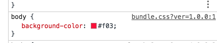
For example, try inspecting the body on the homepage with the WordPress theme active. The styles that we added should be there:
As you can see, it says that our style is coming from bundle.css, which is true. However, it would be much better if the name of the original SCSS file is displayed here instead for our development purposes — it makes it so much easier to locate code, particularly when we’re working with a ton of partials. This is where source maps come into play. That will detail the location of our styles in DevTools. To further illustrate this issue, let’s also add some SCSS inside src/scss/components/slider.scss and then import this file in bundle.scss.
//src/scss/components/slider.scss
body {
  background-color: aqua;
}
//src/scss/bundle.scss
@import './components/slider.scss';
$colour: #f03;
body {
  background-color: $colour;
}
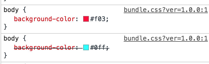
Run gulp styles again to recompile your files. Your inspector should then look like this:
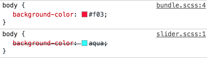
The DevTools inspector will show that both styles are coming from bundle.css. But we would like it to show the original file instead (i.e bundle.scss and slider.scss). So let’s add that to our wish list of improvements before we get to the code.
The other thing we’ll want is vendor prefixing to be handled for us. There’s nothing worse than having to write and manage all of those on our own, and Autoprefixer is the tool that can do it for us.
And, in order for Autoprefixer to work its magic, we’ll need the PostCSS plugin.
OK, that adds up to three more plugins and tasks we need to run. Let’s install all three:
So gulp-sourcemaps will obviously be used for sourcemaps. gulp-postcss and autoprefixer will be used to add autoprefixing to our CSS. postcss is a famous plugin for transforming CSS files and autoprefixer is just a plugin for postcss. You can read more about the other things that you can do with postcss here.
Now at the very top let’s import our plugins into the Gulpfile:
import postcss from 'gulp-postcss';
import sourcemaps from 'gulp-sourcemaps';
import autoprefixer from 'autoprefixer';
And then let’s update the task to use these plugins:
To use the the sourcemaps plugin we have to follow some steps:
First, we initialize the plugin using sourcemaps.init().
Next, pipe all the plugins that you would like to map.
Finally, Create the source map file by calling sourcemaps.write() just before writing the bundle to the destination.
Note that all the plugins piped between sourcemaps.init() and sourcemaps.write() should be compatible with gulp-sourcemaps. In our case, we are using sass(), postcss() and cleanCss() and all of them are compatible with sourcemaps.
Notice that we only run the Autoprefixer begind the production flag since there’s really no need for all those vendor prefixes during development.
Let’s run gulp styles now, without the production flag. Here’s the output in bundle.css:
body {
  background-color: aqua; }
body {
  background-color: #f03; }
/*#sourceMappingURL=data:application/json;charset=utf8;base64,eyJ2ZXJzaW9uIjozLCJmaWxlIjoiYnVuZGxlLmNzcyIsInNvdXJjZXMiOlsiYnVuZGxlLnNjc3MiLCJjb21wb25lbnRzL3NsaWRlci5zY3NzIl0sInNvdXJjZXNDb250ZW50IjpbIkBpbXBvcnQgJy4vY29tcG9uZW50cy9zbGlkZXIuc2Nzcyc7XG5cbiRjb2xvdXI6ICNmMDM7XG5ib2R5IHtcbiAgICBiYWNrZ3JvdW5kLWNvbG9yOiAkY29sb3VyO1xufVxuOjpwbGFjZWhvbGRlciB7XG4gICAgY29sb3I6IGdyYXk7XG59IiwiYm9keSB7XG4gICAgYmFja2dyb3VuZC1jb2xvcjogYXF1YTtcbn0iXSwibmFtZXMiOltdLCJtYXBwaW5ncyI6IkFDQUEsQUFBQSxJQUFJLENBQUM7RUFDRCxnQkFBZ0IsRUFBRSxJQUFJLEdBQ3pCOztBRENELEFBQUEsSUFBSSxDQUFDO0VBQ0QsZ0JBQWdCLEVBRlgsSUFBSSxHQUdaOztBQUNELEFBQUEsYUFBYSxDQUFDO0VBQ1YsS0FBSyxFQUFFLElBQUksR0FDZCJ9 */#
The extra text below is source maps. Now, when we inspect the site in DevTools, we see:
Nice! Now onto production mode:
gulp styles --prod
Check DevTools against style rules that require prefixing (e.g. display: grid;) and confirm those are all there. And make sure that your file is minified as well.
One final notice for this task. Let’s assume we want multiple CSS bundles: one for front-end styles and one for WordPress admin styles. We can create add a new admin.scss file in the src/scss directory and pass an array of paths in the Gulpfile:
Now we have bundle.css and admin.css in the dist/css directory. Just make sure to properly enqueue any new bundles that are separated out like this.
Creating the watch task
Alright, next up is the watch task, which makes our life so much easier by looking for files with saved changes, then executing tasks on our behalf without have to call them ourselves in the command line. How great is that?
Note that watch is unavailable as a name since we already have a variable using it.
Now let’s run gulp watchForChanges the command line will be on a constant, ongoing watch for changes in any .scss files inside the src/scss directory. And, when those changes happen, the styles task will run right away with no further action on our part.
Note that src/scss/**/*.scss is a glob pattern. That basically means that this string will match any .scss file inside the src/scss directory or any sub-folder in it. Right now, we are only watching for .scss files and running the styles task. Later, we’ll expand its scope to watch for other files as well.
Creating the images task
As we covered earlier, the images task will compress images in src/images and then move them to dist/images. Let’s install a gulp plugin that will be responsible for compressing images:
npm install --save-dev gulp-imagemin
Now, import this plugin at the top of the Gulpfile:
We give the src() function a glob that matches all .jpg, .jpeg, .png, .svg and .gif images in the src/images directory. Then, we run the imagemin plugin, but only for production. Compressing images can take some time and isn’t necessary during development, so we can leave it out of the development flow. Finally, we put the compressed versions of images in dist/images.
Now any images that we drop into src/images will be copied when we run gulp images. However, running gulp images --prod, will both compress and copy the image over.
Last thing we need to do is modify our watchForChanges task to include images in its watch:
Now, assuming the watchForChanges task is running, the images task will be run automatically whenever we add an image to the src/images folder. It does all the lifting for us!
Important: If the watchForChanges task is running and when the Gulpfile is modified, it will need to be stopped and restarted in order for the changes to take effect.
Creating the copy task
You probably have been in situations where you’ve created files, processed them, then needed to manually grab the production files and put them where they need to be. Well, as we saw in the images task, we can use the copy feature to do this for us and help prevent moving wrong files.
Try to read the array of paths supplied to src() carefully. We are telling Gulp to match all files and folders inside src (src/**/*), except the images, js and scss folders (!src/{images,js,scss}) and any of the files or sub-folders inside them (!src/{images,js,scss}/**/*).
We want our watch task to look for these changes as well, so we’ll add it to the mix:
Try adding any file or folder to the src directory and it should be copied over to the the /dist directory. If, however, we were to add a file or folder inside of /images, /js or /scss, it would be ignored since we already handle these folders in separate tasks.
We still have a problem here though. Try to delete the added file and it won’t happen. Our task only handles copying. This problem could also happen for our /images, /js and /scss, folders. If we have old images or JavaScript and CSS bundles that were removed from the src folder, then they won’t get removed from the dist folder. Therefore, it’s a good idea to completely clean the dist folder every time to start developing or building a theme. And that’s what we are going to do in the next task.
Composing tasks for developing and building
Let’s now install a package that will be responsible for deleting the dist folder. This package is called del:
Notice that del returns a promise. Thus, we don’t have to call the cb() function. Using the new JavaScript features allows us to refactor this to:
export const clean = () => del(['dist']);
The folder should be deleted now when running gulp clean. What we need to do next is delete the dist folder, run the images, copy and styles tasks, and finally watch for changes every time we start developing. This can be done by running gulp clean, gulp images, gulp styles, gulp copy and then gulp watch. But, of course, we will not do that manually. Gulp has a couple of functions that will help us compose tasks. So, let’s import these functions from Gulp:
import { src, dest, watch, series, parallel } from 'gulp';
series() will take some tasks as arguments and run them in series (one after another). And parallel() will take tasks as arguments and run them all at once. Let’s create two new tasks by composing the tasks that we already created:
Both tasks will do the exact same thing: clean the dist folder, then styles, images and copy will run in parallel one the cleaning is complete. We will start watching for changes as well for the dev (short for develop) task, after these parallel tasks. Additionally, we are also exporting dev as the default task.
Notice that when we run the build task, we want our files to be minified, images to be compressed, and so on. So, when we run this command, we will have to add the --prod flag. Since this can easily be forgotten when running the build task, we can use npm scripts to create aliases for the dev and build commands. Let’s go to package.json, and in the scripts field, we will probably find something like this:
"scripts": {
  "test": "echo "Error: no test specified" && exit 1"
}
This will allow us to run npm run start in the command line, which will go to the scripts field and find what command corresponds to start. In our case, start will run gulp and gulp will run the default gulp task, which is dev. Similarly, npm run build will run gulp build --prod. This way, we can completely forget about the --prod flag and also forget about running the Gulp tasks using the gulp command. Of course, our dev and build commands will do more than that later on, but for now, we have the foundation that we will work with throughout the rest of the tasks.
Creating the scripts task
As mentioned, in order to bundle our JavaScript files, we are going to need a module bundler. webpack is the most famous option out there, however it is not a Gulp plugin. Rather, it’s a plugin on its own that has a completely separate setup and configuration file. Luckily, there is a package called webpack-stream that helps us use webpack within a Gulp task. So, let’s install this package:
npm install --save-dev webpack-stream
webpack works with something called loaders. Loaders are responsible for transforming files in webpack. And to transform new Javascript versions into ES5, we will need a loader called babel-loader. We will also need @babel/preset-env but we already installed this earlier:
npm install --save-dev babel-loader
Let’s import webpack-stream at the top of the Gulpfile:
import webpack from 'webpack-stream';
Also, to test our task, lets add these lines in src/js/bundle.js and src/js/components/slider.js:
First, we specify bundle.js as our entry point in the src() function.
Then, we pipe the webpack plugin and specify some options for it.
The rules field in the module option lets webpack know what loaders to use in order to transform our files. In our case we need to transform JavaScript files using the babel-loader.
The mode option is either production or development. For development, webpack will not minify the output JavaScript bundle, but it will for production. Therefore, we don’t need a separate Gulp plugin to minify JavaScript because webpack can do that depending on our PRODUCTION constant.
The devtool option will add source maps, but not in production. In development, however, we will use inline-source-maps. This kind of source maps is the most accurate though it can be a bit slow to create. If you find it too slow, check the other options here. They won’t be as accurate as inline-source-maps but they can be pretty fast.
Finally, the output option can specify some information about the output file. In our case, we only need to change the filename. If we don’t specify the filename, webpack will generate a bundle with a hash as the filename. Read more about these options here.
Now we should be able to run gulp scripts and gulp scripts --prod and see a bundle.js file created in dist/js. Make sure that minification and source maps are working properly. Let’s now enqueue our JavaScript file in WordPress, which can be in the theme’s functions.php file, or wherever you write your functions.
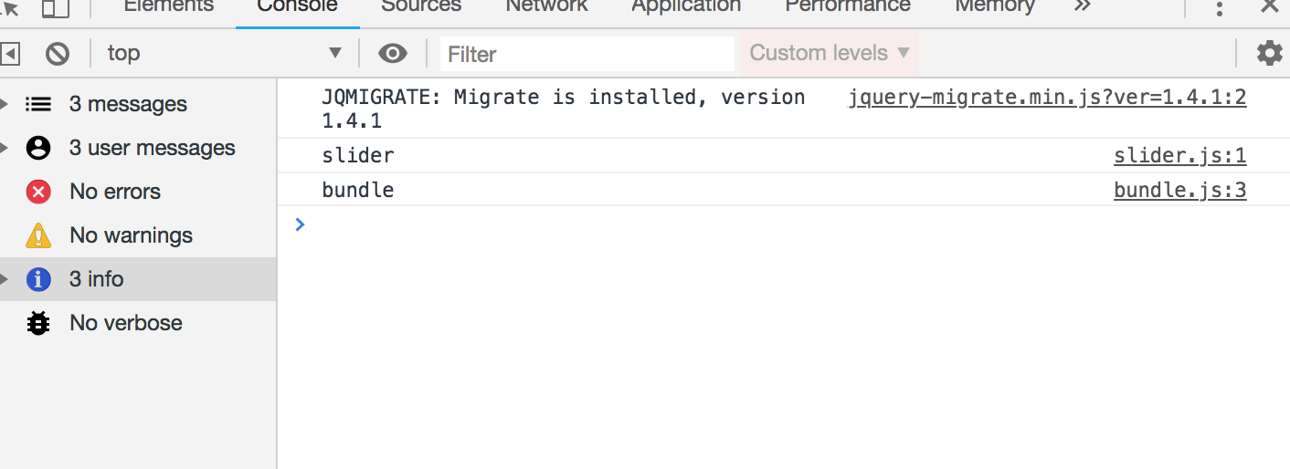
Now, looking at the console, let’s confirm that source maps are working correctly by checking the file that the console logs come from:
Without the source maps, both logs will appear coming from bundle.js.
What if we would like to create multiple JavaScript bundles the same way we do for the styles? Let’s create a file called admin.js in src/js. You might think that we can simply change the entry point in the src() to an array like so:
However, this will not work. webpack works a bit differently that normal Gulp plugins. What we did above will still create one file called bundle.js in the dist folder. webpack-stream provides a couple of solutions for creating multiple entry points. I chose to use the second solution since it will allow us to create multiple bundles by passing an array to the src() the same way we did for the styles. This will require us to install vinyl-named:
The only difference is that we now have an array in the src(). We then pipe the named plugin before webpack, which allows us to use a [name] placeholder in the output field’s filename instead of hardcoding the file name directly. After running the task, we get two bundles in dist/js.
Another feature that webpack provides is using libraries from external sources rather than bundling them into the final bundle. For example, let’s say your bundle needs to use jQuery. You can run npm install jquery --save and then import it to your bundle import $ from 'jquery'. However, this will increase the bundle size and, in some cases, you may already have jQuery loaded via a CDN or — in case of WordPress — it can exist as a dependency like so:
So, now WordPress will enqueue jQuery using a normal script tag. How can we then use it inside our bundle using import $ from'jquery'? The answer is by using webpack’s externals option. Let’s modify our scripts task to add it in:
In the externals option, jquery is the key that identifies the name of the library we want to import. In our case, it will be import $ from'jquery'. And the value jQuery is the name of a global variable where that the library lives. Now try to import $ from ‘jquery’ in the bundle and use jQuery using the $ — it should work perfectly.
Let’s watch for changes for JavaScript files as well:
Let’s now improve our watch task by installing Browsersync, a plugin that refreshes the browser each time tasks finish running.
npm install browser-sync gulp --save-dev
As usual, let’s import it:
import browserSync from "browser-sync";
Next, we will initialize a Browsersync server and write two new tasks:
const server = browserSync.create();
export const serve = done => {
  server.init({
    proxy: "http://localhost/yourFolderName" // put your local website link here
  });
  done();
};
export const reload = done => {
  server.reload();
  done();
};
In order to control the browser using Browsersync, we have to initialize a Browsersync server. This is different from a local server where WordPresss would typically live. the first task is serve, which starts the Browsersync server, and is pointed to our local WordPress server using the proxy option. The second task will simply reload the browser.
Now we need to run this server when we are developing our theme. We can add the serve task to the dev series tasks:
Now run npm start and the browser should open up a new URL that’s different than the original one. This URL is the one that Browsersync will refresh. Now let’s use the reload task to reload the browser once tasks are done:
As you can see, we added a new line to run the reload task every time a PHP file changes. We are also using series() to wait for our styles, images, scripts and copy tasks to finish before reloading the browser. Now, run npm start and change something in a Sass file. The browser should reload automatically and changes should be reflected after refresh once the tasks have finished running.
Don’t see CSS or JavaScript changes after refresh? Make sure caching is disabled in your browser’s inspector.
We can make even one more improvement to the styles tasks. Browsersync allows us to inject CSS directly to the page without even having to reload the browser. And this can be done by adding server.stream() at the very end of the styles task:
Make sure to stop watchForChanges if it’s already running and then run it again. Try to modify any file in the scss folder and the changes should appear immediately in the browser without even reloading.
Packaging the theme in a ZIP file
WordPress themes are generally packaged up as a ZIP file that can be installed directly in the WordPress admin. We can create a task that will take the required theme files and ZIP them up for us. To do that we need to install another Gulp plugin: gulp-zip.
npm install --save-dev gulp-zip
And, as always, import it at the top:
import zip from "gulp-zip";
Let’s also import the JSON object in the package.json file. We need that in order to grab the name of the package which is also the name of our theme:
We are passing the src() the files and folders that we need to compress, which is basically all files and folders (**/), except a few specific types of files, which are preceded by !. Next, we are piping the gulp-zip plugin and calling the file the name of the theme from the package.json file (info.name). The result is a fresh ZIP file an a new folder called bundled.
Try running gulp compress and make sure it all works. Open up the generated ZIP file and make sure that it only contains the files and folders needed to run the theme.
Normally, though, we only need to ZIP things up *after* the theme files have been built. So let’s add the compress task to the build task so it only runs when we need it:
Running npm run build should now run all of our tasks in production mode.
Replacing the placeholder prefix in the ZIP file
One step we need to do before zipping our files is to scan them and replace the themename placeholder with the theme name we plan to use. As you may have guessed, there is indeed a Gulp plugin that does that for us, called gulp-replace.
npm install --save-dev gulp-replace
Then import it:
import replace from "gulp-replace";
We want this task to run immediately before our files are zipped, so let’s modify the compress task by slotting it in the right place:
Try to building the theme now with npm run build and then unzip the file inside the bundled folder. Open any PHP file where the _themename placeholder may have been used and make sure it’s replaced with the actual theme name.
There is a gotcha to watch for that I noticed in the replace plugin as I was working with it. If there are ZIP files inside the theme (e.g. you are bundling WordPress plugins inside your theme), then they will get corrupted when they pass through the replace plugin. That can be resolved by ignoring ZIP files using a gulp-if statement:
Translation is a big thing in the WordPress community, so for our final task, we let’s scan through all of our PHP files and generate a POT file that gets used for translation. Luckily, we also have a gulp plugin for that:
Phew, that’s everything! I hope you learned something from this series and that it helps streamline your WordPress development flow. Let me know if you have any questions in the comments. If you are interested in a complete WordPress theme development course, make sure to check out my course on Udemy with a special discount for you. 😀
This is the second post in a two-part series about creating a Gulp workflow for WordPress theme development. Part one focused on the initial installation, setup, and organization of Gulp in a WordPress theme project. This post goes deep into the tasks Gulp will run by breaking down what each task does and how to tailor them to streamline theme development.
Now that we spent the first part of this series setting up a WordPress theme project with Grunt installed in it, it’s time to dive into the tasks we want it to do for us as we develop the theme. We’re going to get our hands extremely dirty in this post, get ready to write some code!
Let’s start by compiling src/bundle.scss from Sass to CSS, then minifying the CSS output for production mode and putting the completed bundle.css file into the dist directory.
We’re going to use a couple of Gulp plugins to do the heavy lifting. We’ll use gulp-sass to compile things and gulp-clean-css to minify. Then, gulp-if will allow us to conditionally run functions which, In our case, will check if we are in production or development modes before those tasks run and then execute accordingly.
We can install all three plugins in one fell swoop:
Let’s make sure we have something in our bundle.scss file so we can test the tasks:
$colour: #f03;

body {
  background-color: $colour;
}
Alright, back to the Gulpfile to import the plugins and define the task that runs them:
import { src, dest } from 'gulp';
import yargs from 'yargs';
import sass from 'gulp-sass';
import cleanCss from 'gulp-clean-css';
import gulpif from 'gulp-if';
const PRODUCTION = yargs.argv.prod;

export const styles = () => {
  return src('src/scss/bundle.scss')
    .pipe(sass().on('error', sass.logError))
    .pipe(gulpif(PRODUCTION, cleanCss({compatibility:'ie8'})))
    .pipe(dest('dist/css'));
}
Let’s walk through this code to explain what’s happening.
The src and dest functions are imported from Gulp. src will read the file that you pass as an argument and return a node stream.
We pull in yargs to create our flag that separates tasks between the development and production modes.
The three plugins are called into action.
The PRODUCTION flag is defined and held in the prod command.
We define styles as the task name we will use to run these tasks in the command line.
We tell the task what file we want processed (bundle.scss) and where it lives (src/scss/bundle.scss).
We create „pipes” that serve as the plungs that run when the styles command is executed. Those pipes run in the order they are written: convert Sass to CSS, minify the CSS (if we’re in production), and place the resulting CSS file into the dist/css directory.
Go ahead. Run gulp styles in the command line and see that a new CSS file has been added to your CSS directory dist/css.
Now do gulp styles --prod. The same thing happens, but now that CSS file has been minified for production use.
Now, assuming you have a functioning WordPress theme with header.php and footer.php, the CSS file (as well as JavaScript files when we get to those tasks) can be safely enqueued, likely in your functions.php file:
That’s all good, but we can make our style command even better.
For example, try inspecting the body on the homepage with the WordPress theme active. The styles that we added should be there:
As you can see, it says that our style is coming from bundle.css, which is true. However, it would be much better if the name of the original SCSS file is displayed here instead for our development purposes — it makes it so much easier to locate code, particularly when we’re working with a ton of partials. This is where source maps come into play. That will detail the location of our styles in DevTools. To further illustrate this issue, let’s also add some SCSS inside src/scss/components/slider.scss and then import this file in bundle.scss.
//src/scss/components/slider.scss
body {
  background-color: aqua;
}
//src/scss/bundle.scss
@import './components/slider.scss';
$colour: #f03;
body {
  background-color: $colour;
}
Run gulp styles again to recompile your files. Your inspector should then look like this:
The DevTools inspector will show that both styles are coming from bundle.css. But we would like it to show the original file instead (i.e bundle.scss and slider.scss). So let’s add that to our wish list of improvements before we get to the code.
The other thing we’ll want is vendor prefixing to be handled for us. There’s nothing worse than having to write and manage all of those on our own, and Autoprefixer is the tool that can do it for us.
And, in order for Autoprefixer to work its magic, we’ll need the PostCSS plugin.
OK, that adds up to three more plugins and tasks we need to run. Let’s install all three:
So gulp-sourcemaps will obviously be used for sourcemaps. gulp-postcss and autoprefixer will be used to add autoprefixing to our CSS. postcss is a famous plugin for transforming CSS files and autoprefixer is just a plugin for postcss. You can read more about the other things that you can do with postcss here.
Now at the very top let’s import our plugins into the Gulpfile:
import postcss from 'gulp-postcss';
import sourcemaps from 'gulp-sourcemaps';
import autoprefixer from 'autoprefixer';
And then let’s update the task to use these plugins:
To use the the sourcemaps plugin we have to follow some steps:
First, we initialize the plugin using sourcemaps.init().
Next, pipe all the plugins that you would like to map.
Finally, Create the source map file by calling sourcemaps.write() just before writing the bundle to the destination.
Note that all the plugins piped between sourcemaps.init() and sourcemaps.write() should be compatible with gulp-sourcemaps. In our case, we are using sass(), postcss() and cleanCss() and all of them are compatible with sourcemaps.
Notice that we only run the Autoprefixer begind the production flag since there’s really no need for all those vendor prefixes during development.
Let’s run gulp styles now, without the production flag. Here’s the output in bundle.css:
body {
  background-color: aqua; }
body {
  background-color: #f03; }
/*#sourceMappingURL=data:application/json;charset=utf8;base64,eyJ2ZXJzaW9uIjozLCJmaWxlIjoiYnVuZGxlLmNzcyIsInNvdXJjZXMiOlsiYnVuZGxlLnNjc3MiLCJjb21wb25lbnRzL3NsaWRlci5zY3NzIl0sInNvdXJjZXNDb250ZW50IjpbIkBpbXBvcnQgJy4vY29tcG9uZW50cy9zbGlkZXIuc2Nzcyc7XG5cbiRjb2xvdXI6ICNmMDM7XG5ib2R5IHtcbiAgICBiYWNrZ3JvdW5kLWNvbG9yOiAkY29sb3VyO1xufVxuOjpwbGFjZWhvbGRlciB7XG4gICAgY29sb3I6IGdyYXk7XG59IiwiYm9keSB7XG4gICAgYmFja2dyb3VuZC1jb2xvcjogYXF1YTtcbn0iXSwibmFtZXMiOltdLCJtYXBwaW5ncyI6IkFDQUEsQUFBQSxJQUFJLENBQUM7RUFDRCxnQkFBZ0IsRUFBRSxJQUFJLEdBQ3pCOztBRENELEFBQUEsSUFBSSxDQUFDO0VBQ0QsZ0JBQWdCLEVBRlgsSUFBSSxHQUdaOztBQUNELEFBQUEsYUFBYSxDQUFDO0VBQ1YsS0FBSyxFQUFFLElBQUksR0FDZCJ9 */#
The extra text below is source maps. Now, when we inspect the site in DevTools, we see:
Nice! Now onto production mode:
gulp styles --prod
Check DevTools against style rules that require prefixing (e.g. display: grid;) and confirm those are all there. And make sure that your file is minified as well.
One final notice for this task. Let’s assume we want multiple CSS bundles: one for front-end styles and one for WordPress admin styles. We can create add a new admin.scss file in the src/scss directory and pass an array of paths in the Gulpfile:
Now we have bundle.css and admin.css in the dist/css directory. Just make sure to properly enqueue any new bundles that are separated out like this.
Creating the watch task
Alright, next up is the watch task, which makes our life so much easier by looking for files with saved changes, then executing tasks on our behalf without have to call them ourselves in the command line. How great is that?
Note that watch is unavailable as a name since we already have a variable using it.
Now let’s run gulp watchForChanges the command line will be on a constant, ongoing watch for changes in any .scss files inside the src/scss directory. And, when those changes happen, the styles task will run right away with no further action on our part.
Note that src/scss/**/*.scss is a glob pattern. That basically means that this string will match any .scss file inside the src/scss directory or any sub-folder in it. Right now, we are only watching for .scss files and running the styles task. Later, we’ll expand its scope to watch for other files as well.
Creating the images task
As we covered earlier, the images task will compress images in src/images and then move them to dist/images. Let’s install a gulp plugin that will be responsible for compressing images:
npm install --save-dev gulp-imagemin
Now, import this plugin at the top of the Gulpfile:
We give the src() function a glob that matches all .jpg, .jpeg, .png, .svg and .gif images in the src/images directory. Then, we run the imagemin plugin, but only for production. Compressing images can take some time and isn’t necessary during development, so we can leave it out of the development flow. Finally, we put the compressed versions of images in dist/images.
Now any images that we drop into src/images will be copied when we run gulp images. However, running gulp images --prod, will both compress and copy the image over.
Last thing we need to do is modify our watchForChanges task to include images in its watch:
Now, assuming the watchForChanges task is running, the images task will be run automatically whenever we add an image to the src/images folder. It does all the lifting for us!
Important: If the watchForChanges task is running and when the Gulpfile is modified, it will need to be stopped and restarted in order for the changes to take effect.
Creating the copy task
You probably have been in situations where you’ve created files, processed them, then needed to manually grab the production files and put them where they need to be. Well, as we saw in the images task, we can use the copy feature to do this for us and help prevent moving wrong files.
Try to read the array of paths supplied to src() carefully. We are telling Gulp to match all files and folders inside src (src/**/*), except the images, js and scss folders (!src/{images,js,scss}) and any of the files or sub-folders inside them (!src/{images,js,scss}/**/*).
We want our watch task to look for these changes as well, so we’ll add it to the mix:
Try adding any file or folder to the src directory and it should be copied over to the the /dist directory. If, however, we were to add a file or folder inside of /images, /js or /scss, it would be ignored since we already handle these folders in separate tasks.
We still have a problem here though. Try to delete the added file and it won’t happen. Our task only handles copying. This problem could also happen for our /images, /js and /scss, folders. If we have old images or JavaScript and CSS bundles that were removed from the src folder, then they won’t get removed from the dist folder. Therefore, it’s a good idea to completely clean the dist folder every time to start developing or building a theme. And that’s what we are going to do in the next task.
Composing tasks for developing and building
Let’s now install a package that will be responsible for deleting the dist folder. This package is called del:
Notice that del returns a promise. Thus, we don’t have to call the cb() function. Using the new JavaScript features allows us to refactor this to:
export const clean = () => del(['dist']);
The folder should be deleted now when running gulp clean. What we need to do next is delete the dist folder, run the images, copy and styles tasks, and finally watch for changes every time we start developing. This can be done by running gulp clean, gulp images, gulp styles, gulp copy and then gulp watch. But, of course, we will not do that manually. Gulp has a couple of functions that will help us compose tasks. So, let’s import these functions from Gulp:
import { src, dest, watch, series, parallel } from 'gulp';
series() will take some tasks as arguments and run them in series (one after another). And parallel() will take tasks as arguments and run them all at once. Let’s create two new tasks by composing the tasks that we already created:
Both tasks will do the exact same thing: clean the dist folder, then styles, images and copy will run in parallel one the cleaning is complete. We will start watching for changes as well for the dev (short for develop) task, after these parallel tasks. Additionally, we are also exporting dev as the default task.
Notice that when we run the build task, we want our files to be minified, images to be compressed, and so on. So, when we run this command, we will have to add the --prod flag. Since this can easily be forgotten when running the build task, we can use npm scripts to create aliases for the dev and build commands. Let’s go to package.json, and in the scripts field, we will probably find something like this:
"scripts": {
  "test": "echo "Error: no test specified" && exit 1"
}
This will allow us to run npm run start in the command line, which will go to the scripts field and find what command corresponds to start. In our case, start will run gulp and gulp will run the default gulp task, which is dev. Similarly, npm run build will run gulp build --prod. This way, we can completely forget about the --prod flag and also forget about running the Gulp tasks using the gulp command. Of course, our dev and build commands will do more than that later on, but for now, we have the foundation that we will work with throughout the rest of the tasks.
Creating the scripts task
As mentioned, in order to bundle our JavaScript files, we are going to need a module bundler. webpack is the most famous option out there, however it is not a Gulp plugin. Rather, it’s a plugin on its own that has a completely separate setup and configuration file. Luckily, there is a package called webpack-stream that helps us use webpack within a Gulp task. So, let’s install this package:
npm install --save-dev webpack-stream
webpack works with something called loaders. Loaders are responsible for transforming files in webpack. And to transform new Javascript versions into ES5, we will need a loader called babel-loader. We will also need @babel/preset-env but we already installed this earlier:
npm install --save-dev babel-loader
Let’s import webpack-stream at the top of the Gulpfile:
import webpack from 'webpack-stream';
Also, to test our task, lets add these lines in src/js/bundle.js and src/js/components/slider.js:
First, we specify bundle.js as our entry point in the src() function.
Then, we pipe the webpack plugin and specify some options for it.
The rules field in the module option lets webpack know what loaders to use in order to transform our files. In our case we need to transform JavaScript files using the babel-loader.
The mode option is either production or development. For development, webpack will not minify the output JavaScript bundle, but it will for production. Therefore, we don’t need a separate Gulp plugin to minify JavaScript because webpack can do that depending on our PRODUCTION constant.
The devtool option will add source maps, but not in production. In development, however, we will use inline-source-maps. This kind of source maps is the most accurate though it can be a bit slow to create. If you find it too slow, check the other options here. They won’t be as accurate as inline-source-maps but they can be pretty fast.
Finally, the output option can specify some information about the output file. In our case, we only need to change the filename. If we don’t specify the filename, webpack will generate a bundle with a hash as the filename. Read more about these options here.
Now we should be able to run gulp scripts and gulp scripts --prod and see a bundle.js file created in dist/js. Make sure that minification and source maps are working properly. Let’s now enqueue our JavaScript file in WordPress, which can be in the theme’s functions.php file, or wherever you write your functions.
Now, looking at the console, let’s confirm that source maps are working correctly by checking the file that the console logs come from:
Without the source maps, both logs will appear coming from bundle.js.
What if we would like to create multiple JavaScript bundles the same way we do for the styles? Let’s create a file called admin.js in src/js. You might think that we can simply change the entry point in the src() to an array like so:
However, this will not work. webpack works a bit differently that normal Gulp plugins. What we did above will still create one file called bundle.js in the dist folder. webpack-stream provides a couple of solutions for creating multiple entry points. I chose to use the second solution since it will allow us to create multiple bundles by passing an array to the src() the same way we did for the styles. This will require us to install vinyl-named:
The only difference is that we now have an array in the src(). We then pipe the named plugin before webpack, which allows us to use a [name] placeholder in the output field’s filename instead of hardcoding the file name directly. After running the task, we get two bundles in dist/js.
Another feature that webpack provides is using libraries from external sources rather than bundling them into the final bundle. For example, let’s say your bundle needs to use jQuery. You can run npm install jquery --save and then import it to your bundle import $ from 'jquery'. However, this will increase the bundle size and, in some cases, you may already have jQuery loaded via a CDN or — in case of WordPress — it can exist as a dependency like so:
So, now WordPress will enqueue jQuery using a normal script tag. How can we then use it inside our bundle using import $ from'jquery'? The answer is by using webpack’s externals option. Let’s modify our scripts task to add it in:
In the externals option, jquery is the key that identifies the name of the library we want to import. In our case, it will be import $ from'jquery'. And the value jQuery is the name of a global variable where that the library lives. Now try to import $ from ‘jquery’ in the bundle and use jQuery using the $ — it should work perfectly.
Let’s watch for changes for JavaScript files as well:
Let’s now improve our watch task by installing Browsersync, a plugin that refreshes the browser each time tasks finish running.
npm install browser-sync gulp --save-dev
As usual, let’s import it:
import browserSync from "browser-sync";
Next, we will initialize a Browsersync server and write two new tasks:
const server = browserSync.create();
export const serve = done => {
  server.init({
    proxy: "http://localhost/yourFolderName" // put your local website link here
  });
  done();
};
export const reload = done => {
  server.reload();
  done();
};
In order to control the browser using Browsersync, we have to initialize a Browsersync server. This is different from a local server where WordPresss would typically live. the first task is serve, which starts the Browsersync server, and is pointed to our local WordPress server using the proxy option. The second task will simply reload the browser.
Now we need to run this server when we are developing our theme. We can add the serve task to the dev series tasks:
Now run npm start and the browser should open up a new URL that’s different than the original one. This URL is the one that Browsersync will refresh. Now let’s use the reload task to reload the browser once tasks are done:
As you can see, we added a new line to run the reload task every time a PHP file changes. We are also using series() to wait for our styles, images, scripts and copy tasks to finish before reloading the browser. Now, run npm start and change something in a Sass file. The browser should reload automatically and changes should be reflected after refresh once the tasks have finished running.
Don’t see CSS or JavaScript changes after refresh? Make sure caching is disabled in your browser’s inspector.
We can make even one more improvement to the styles tasks. Browsersync allows us to inject CSS directly to the page without even having to reload the browser. And this can be done by adding server.stream() at the very end of the styles task:
Make sure to stop watchForChanges if it’s already running and then run it again. Try to modify any file in the scss folder and the changes should appear immediately in the browser without even reloading.
Packaging the theme in a ZIP file
WordPress themes are generally packaged up as a ZIP file that can be installed directly in the WordPress admin. We can create a task that will take the required theme files and ZIP them up for us. To do that we need to install another Gulp plugin: gulp-zip.
npm install --save-dev gulp-zip
And, as always, import it at the top:
import zip from "gulp-zip";
Let’s also import the JSON object in the package.json file. We need that in order to grab the name of the package which is also the name of our theme:
We are passing the src() the files and folders that we need to compress, which is basically all files and folders (**/), except a few specific types of files, which are preceded by !. Next, we are piping the gulp-zip plugin and calling the file the name of the theme from the package.json file (info.name). The result is a fresh ZIP file an a new folder called bundled.
Try running gulp compress and make sure it all works. Open up the generated ZIP file and make sure that it only contains the files and folders needed to run the theme.
Normally, though, we only need to ZIP things up *after* the theme files have been built. So let’s add the compress task to the build task so it only runs when we need it:
Running npm run build should now run all of our tasks in production mode.
Replacing the placeholder prefix in the ZIP file
One step we need to do before zipping our files is to scan them and replace the themename placeholder with the theme name we plan to use. As you may have guessed, there is indeed a Gulp plugin that does that for us, called gulp-replace.
npm install --save-dev gulp-replace
Then import it:
import replace from "gulp-replace";
We want this task to run immediately before our files are zipped, so let’s modify the compress task by slotting it in the right place:
Try to building the theme now with npm run build and then unzip the file inside the bundled folder. Open any PHP file where the _themename placeholder may have been used and make sure it’s replaced with the actual theme name.
There is a gotcha to watch for that I noticed in the replace plugin as I was working with it. If there are ZIP files inside the theme (e.g. you are bundling WordPress plugins inside your theme), then they will get corrupted when they pass through the replace plugin. That can be resolved by ignoring ZIP files using a gulp-if statement:
Translation is a big thing in the WordPress community, so for our final task, we let’s scan through all of our PHP files and generate a POT file that gets used for translation. Luckily, we also have a gulp plugin for that:
Phew, that’s everything! I hope you learned something from this series and that it helps streamline your WordPress development flow. Let me know if you have any questions in the comments. If you are interested in a complete WordPress theme development course, make sure to check out my course on Udemy with a special discount for you. 😀
This is the first part of a two-part series on creating a Gulp workflow for WordPress theme development. This first part covers a lot of ground for the initial setup, including Gulp installation and an outline of the tasks we want it to run. If you’re interested in how the tasks are created, then stay tuned for part two.
Earlier this year, I created a course for building premium WordPress themes. During the process, I wanted to use a task runner to concatenate and minify JavaScript and CSS files. I ended up using that task runner to automate a lot of other tasks that made the theme much more efficient and scalable.
The two most popular task runners powered by Node are Gulp and Grunt. I went with Gulp after a good amount of research, it appeared to have an intuitive way to write tasks. It uses Node streams to manipulate files and JavaScript functions to write the tasks, whereas Grunt uses a configuration object to define tasks — which might be fine for some, but is something that made me a little uncomfortable. Also, Gulp is a bit faster that Grunt because of those Node streams and faster is always a good thing to me!
So, we’re going to set Gulp up to do a lot of the heavy lifting for WordPress theme development. We’ll cover the initial setup for now, but then go super in-depth on the tasks themselves in another post.
So, how can we use Gulp to power the tasks for a WordPress theme? First off, let’s assume our theme only contains the two files that WordPress requires for any theme: index.php and styles.css. Sure, most themes are likely to include many more files that this, but that’s not important right now.
Secondly, let’s assume that our primary goal is to create tasks that help manage our assets, like minify our CSS and JavaScript files, compile Sass to CSS, and transpile modern JavaScript syntax (e.g. ES6, ES7, etc..) into ES5 in order to support older browsers.
The only thing we’ve added on top of the two required files is a src directory where our original un-compiled assets will live.
Inside of that src directory, we have an images subdirectory as well as others for our JavaScript and Sass files. And from, there, the JavaScript and Sass subdirectories are organized into components that will be called from their respective bundle file. So, for example, bundle.js will import and include slider.js when our JavaScript tasks run so all our code is concatenated into a single file.
Identifying Gulp tasks
OK, next we want Gulp tasks to a create a new dist directory where all of our compiled, minified and concatenated versions of our assets will be distributed after the tasks have completed. Even though we’re calling this directory dist in this post because it is short for „distribution,” it could really be called anything, as long as Gulp knows what it is called. Regardless, these are the assets that will be distributed to end users. The src folder will only contain the files that we edit directly during development.
Identifying which Gulp tasks are the best fit for a project will depend on the project’s specific needs. Some tasks will be super helpful on some projects but completely irrelevant on others. I’ve identified the following for us to cover in this post. You’ll see that one or two are more useful in a WordPress context (e.g. the POT task) than others. Yet, most of these are broad enough that you’re likely to see them in many projects that use Gulp to process Sass, JavaScript and image assets.
Styles Task: This task is responsible for compiling the bundle.scss file in the scss subdirectory to bundle.css in a css directory located in the dist directory. This task will also minify the generated CSS file so that its is it’s smallest possible size when used in production.
We will talk about production vs. development modes during the article. Note that we will not create a task to concatenate CSS files. The bundle.scss file will act as an entry point for all . <code>scss files that we want to include. In other words; any Sass or CSS files you want to include in your project, just import them in the bundle.scss file using @import statements. For instance, in our example folder, we can use @import ./components/slider'; to import the slider.scss file. This way in our task we will have to compile and minify only one file (bundle.css).
Scripts Task: Similar to the Styles task, this task will transpile bundle.js from ES6 syntax to ES5, then minify the file for production.
We will only compile bundle.js. Any other JavaScript files we want to include will be done using ES6 import statements. But in order for those import statements to work on all browsers, we will need to use a module bundler. We’re going to use webpack as our bundler. If this is your first time working with it, this primer is a good place to get an overview of what it is and does.
Images Task: This task will simply copy images from src/images and send them to dist/images after the files have been compressed to their smallest size.
Copy Task: This task will be responsible for copying any other files or folders that are not in /src/images, /src/js or /src/scss and post them to the dist directory.
Remember. the src folder will contain the files that are only used during development and that will not be included in the final theme package. Thus, any assets other than our images, JavaScript and Sass files need to be copied posted to the dist folder. For instance, if we have a /src/fonts folder, we would want to copy the files in there into the dist directory so they get included in the final deliverable.
POT Task: As the name suggests, this task will scan all your theme’s PHP files and generate a .pot (i.e. translation) file from gettext calls in the files. This is the most WordPress-centric of all the tasks we’re covering here.
Watch Task: This task will literally watch for changes in your files. When a change is made, certain tasks will be triggered and executed, depending on the type of file that changed.
For instance, if we change a JavaScript file, then the Scripts task should do its magic and then it would be ideal if the browser refreshed for us automatically so we can see those changes. Further, If we change a PHP file, then let’s simply refresh the browser since PHP files don’t rely on any other tasks in our project. We’ll be using a Gulp plugin called Browsersync to handle browser refreshes, but we’ll get to that and other plugins a little later.
Compress Task: As you might expect, all the plugins that we use to write our tasks will be managed using npm. So, our theme folder will contain another folder, like node_modules, that in turn, contains files like package.json and other configuration files that define our project’s dependencies — and these files and folders are only needed during development. During production, we can take out the necessary files for our theme and leave the unneeded development files behind. That’s what this task will do; it will create a ZIP file that only contains the necessary files to run our theme.
As a bonus step for the compress task, if you are creating a theme that you intend to publish on WordPress.org or maybe on a website like ThemeForest, then you probably already know that all functions in your theme must be prefixed with a unique prefix:
function mythemename_enqueue_assets() {
  // function body
}
So, if you are creating a lot of themes. you’ll need to easily reuse functions in different themes but change the prefix to the name of the theme, to prevent conflicts. We can prefix our functions with a placeholder prefix and then replace all instances of that placeholder in the compress task. For instance, we can choose the string _themename as a place holder, and when we compress our theme we will replace all ‘_themename’ strings to the actual theme name:
function _themename_enqueue_assets() {
  // function body
}
This can also apply to anywhere we use the theme name for example in the text domain:
<?php _e('some string', '_themename'); ?>
Develop Task: This task does nothing new. It runs when as we develop our theme. It cleans the dist folder, runs the Styles, Scripts, Images and Copy tasks in development mode (i.e. without minifying any of the assets), then watches for file changes to refresh the browser for us.
Build Task: This task is intended to build our files for production. It will do all the same cleaning and tasks as the Develop task, but in production mode (i.e. minify the assets in the process) and generate a new POT file for translation updates. After it runs, our dist folder should contain the the files that are ready for distribution.
Bundle Task: This task will simply run the build task, will making sure that all the files in the dist folder are minified and ready for distribution. Then, it will run the Compress task, which bundles all of the production-ready files and folders into a ZIP file. We want a ZIP file because that is the format WordPress recognizes to extract and install a theme.
Here’s how our file structure looks after our tasks complete:
themefolder/
├── index.php
├── style.css
├── src/
└── dist/
    ├── images/
    │   └── cat.jpg // after compression
    ├── js/
    │   └── bundle.js // bundled with all imported files (minified in prodcution)
    └── scss/
        └── bundle.scss // bundled with all imported files (minified in production)
Now that we know what tasks we’re going to use on our project and that they do, let’s get into the process for installing Gulp into the project.
Installing Gulp
Before we install Gulp, we should make sure that we have Node and npm installed on our machines. We can do that by running these commands in the command line:
node --version
npm --version
…and, we should get some version number as seen here:
Now, let’s point the command line to the theme folder:
cd path/to/your/theme/folder
…and then run this command to initialize a new npm project:
npm init
This will prompt us with some options. The only important option in our case is the package name option. This is where the name of the theme can be provided — everything else can stay at their default setting. When choosing the theme name, make sure to only use lowercase characters and underscores while avoiding dashes and special characters since this theme name will be used to replace the functions placeholder that we mentioned earlier.
On to installing Gulp! First, we’ve got to install Gulp’s command line interface (gulp-cli) globally so we can use Gulp in the command line.
npm install --global gulp-cli
After that, we run this command in order to install Gulp itself in the theme directory:
npm install –save-dev gulp
The current stable release of Gulp is 3.9.1 at the time of this writing, but version 4.0 is already available in the project repository. The command above uses the @next which installs version 4.0. Removing that will install 3.9.1 (or whatever the current version is) instead.
To make sure everything is installed correctly, we’ll run this command:
gulp --version
Nice! Looks like we’re running version 4.0, which is the latest version at the time of this writing.
Writing Gulp tasks
Gulp tasks are defined in a a file in called gulpfile.js that we’ll need to create and place into the root of our theme.
Gulp is JavaScript at its core, so we can define a quick example task that logs something to the console.
var gulp = require('gulp');
gulp.task('hello', function() {
  console.log('First Task');
})
In this example, we’ve defined a new task by calling gulp.task. The first argument for this function is the task’s name (hello) and the second argument is the function we want to run when that name is entered into the command line which, in this case, should print „First Task” into the console.
Let’s do that now.
gulp hello
Here’s what we get:
As you can see, we do indeed get the console.log('First Task') output we want. However, we also get an error saying that our task did not complete. All Gulp tasks require telling Gulp where to end the task, and we do that by calling a function that is passed as the first argument in our task function like so:
Let’s try running gulp hello again and we should get the same output, but without the error this time.
There are some cases where we won’t have to call the cb() function, such as when a task returns a promise or a node stream. A node stream is what we will use in the tasks in this post, which means we will see it a lot throughout our article.
Here’s an example of a task that returns a promise. In this task, we won’t have to call the cb() function because gulp already knows that the task will end when the promise resolves or returns an error:
Now try and run ‘gulp promise’ and the task will complete without returning any errors.
Finally, it’s worth mentioning that Gulp accepts a default task that runs by typing gulp alone in the command line. All it takes is using „default” as the task name argument.
Now, typing gulp by itself in the command line will run the task.
Whew! Now we know the basics of writing Gulp tasks.
There is one more thing we can do to improve things and that’s enabling ES6 syntax in the Gulpfile. This will allow us to use features like destructuring, import statements, and arrow functions, among others.
Using ES6 in the Gulpfile
The first step to use ES6 syntax in the Gulpfile is to rename it from gulpfile.js to gulpfile.babel.js. As you may already know, Babel is the compiler that compiles ES6 to ES5.
So, let’s install Babel and some of its required packages by running:
After that, we have to create a file called .babelrc inside of our theme folder. This file will tell Babel which preset to use to compile our JavaScript. The contents of the .babelrc file will look like this:
{
  "presets": ["@babel/preset-env"]
}
Now we can use ES6 in our Gulpfile! Here’s how that would look if we were to re-write it:
As you can see, we are importing Gulp using import and not require. In fact, there’s no longer any need to import Gulp at all! I included the import statement anyway to show it can be used instead of require. We’re allowed to skip importing Gulp because we don’t have to call gulp.task — instead, we only need to export a function, and the name of this function will be the name of the task. Further, all that’s needed to define a default function is use export default. And notice those arrow functions, too! Everything is so much more concise.
Let’s move on and start coding the actual tasks.
Development vs. Production
As we covered earlier, we need to create two modes: development and production. The reason we need to delineate between the two is that some details in our tasks will be time and memory-consuming, which only make sense in a production environment. For instance, the styles task needs to minify the CSS. However, the minification can take both time and memory — and if that process runs every single time something changes during development, that is not only unnecessary, but is very inefficient. It’s ideal for tasks to be as fast as possible during development.
We need to set a flag that specifies whether a task should run in one mode or the other. We can use a package called yargs that allows us to define these types of arguments while running a command. So, let’s install it and put it to use:
npm install --save-dev yargs
Now, we can add arguments to our command like so:
gulp hello --prod=true
…and then retrieve these argument in the Gulpfile:
import yargs from 'yargs';
const PRODUCTION = yargs.argv.prod;

export const hello = (cb) => {
  console.log(PRODUCTION);
  cb();
}
Notice that the values we define in the command are available inside the yargs.argv object in the Gulpfile and in console.log(PRODUCTION). In our case this will output true, so PRODUCTION will be our flag that decides whether or not a function runs inside the tasks.
We’re all set up!
We covered a lot of ground here, but we now have everything we need to start writing tasks for our WordPress theme development. That just so happens to be the sole focus of the next part of this series, so stay tuned for tomorrow.