One thing that has long surprised (and saddened) me is that the clip-path property, as awesome as it is, only takes a few values. The circle() and ellipse() functions are nice, but hiding overflows and rounding with border-radius generally helps there already. Perhaps the most useful value is polygon() because it allows us to draw a shape out of straight lines at arbitrary points.
The sad part comes in when you find out that clip-path doesn’t accept path(). C’mon it’s got path in the name! The path syntax, which comes from SVG, is the ultimate syntax. It allows us to draw literally any shape.
More confusingly, there already is a path() function, which is what properties like offset-path take.
The talk goes into the shape-outside property and how it can’t use path(). It also goes into the fact that we can change the d property of a literal <path>.
I don’t really blame anyone, though. This is weird stuff and it’s being implemented by different teams, which inevitably results in different outcomes. Even the fact that SVG uses unit-less values in the <path> syntax is a little weird and an anomaly in CSS-land. How that behaves, how values with units behave, what comma-syntax is allowed and disallowed, and what the DOM returns when asked is plenty to make your head spin.
Anyway! Along comes Firefox with an implementation!
Does anyone know if clip-path: path() is behind a flag in chrome or something. Can't seem to find it, but they do support offset-path: path(), so figured they would support both.
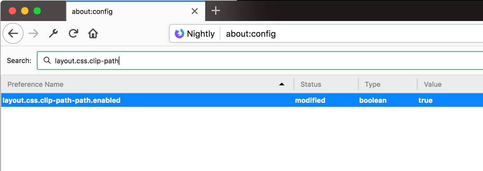
Here’s that flag in Firefox (layout.css.clip-path-path.enabled):
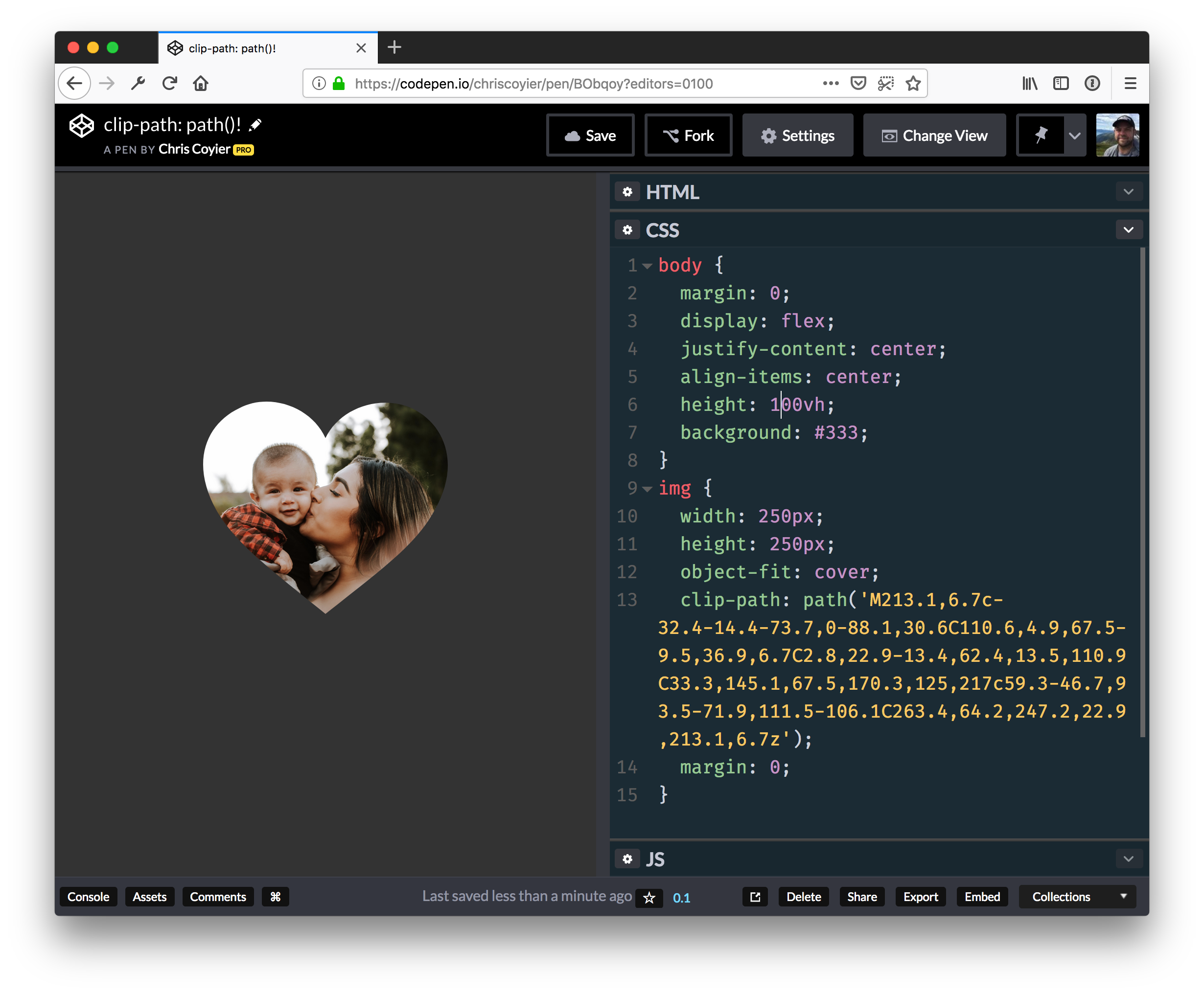
And here’s a demo… you’ll see a square in unsupported browsers and a heart in the ones that support clip-path: path(); — which is only Firefox Nightly with the flag turned on at the time of this writing.
Let’s say you need a gradient border around an element. My mind goes like this:
There is no simple obvious CSS API for this.
I’ll just make a wrapper element with a linear-gradient background, then an inner element will block out most of that background, except a thin line of padding around it.
If you hate the idea of a wrapping element, you could use a pseudo-element, as long as a negative z-index value is OK (it wouldn’t be if there was much nesting going on with parent elements with their own backgrounds).
Here’s a Stephen Shaw example of that, tackling border-radius in the process:
You could even place individual sides as skinny pseudo-element rectangles if you didn’t need all four sides.
But don’t totally forget about border-image, perhaps the most obtuse CSS property of all time. You can use it to get gradient borders even on individual sides:
Using both border-image and border-image-slice is probably the easiest possible syntax for a gradient border, it’s just incompatible with border-radius, unfortunately.
Let’s say you need a gradient border around an element. My mind goes like this:
There is no simple obvious CSS API for this.
I’ll just make a wrapper element with a linear-gradient background, then an inner element will block out most of that background, except a thin line of padding around it.
If you hate the idea of a wrapping element, you could use a pseudo-element, as long as a negative z-index value is OK (it wouldn’t be if there was much nesting going on with parent elements with their own backgrounds).
Here’s a Stephen Shaw example of that, tackling border-radius in the process:
You could even place individual sides as skinny pseudo-element rectangles if you didn’t need all four sides.
But don’t totally forget about border-image, perhaps the most obtuse CSS property of all time. You can use it to get gradient borders even on individual sides:
Using both border-image and border-image-slice is probably the easiest possible syntax for a gradient border, it’s just incompatible with border-radius, unfortunately.
With the except of some form elements, you’ve just set a font on every bit of text on a site! Nice! That’s probably what you were trying to do, because of the probably hundreds of elements all over your site, setting that font-family every time would be tedious and error-prone.
CSS is global by nature. On purpose!
I like how David Khourshid put it:
You ever stop and think about why CSS has a global scope? Maybe we want to use consistent typography, colors, sizing, spacing, layout, transitions, etc. and have our websites & apps feel like one cohesive unit?
Love the cascade, the cascade is your friend.
And yet. The global nature of CSS is perhaps the most-pointed-at anti-feature of CSS. Some people really don’t like it. We all know it’s very easy to write a single CSS rule that has implications all over a site, breaking things you really didn’t want to break.
Two CSS properties walk into a bar.
A barstool in a completely different bar falls over.
Scoped styles aren’t the only reason there is such interest and adoption in the landscape of tools that is CSS-in-JS, but it’s a big one. There are loads of sites that don’t directly author any CSS at all — even preprocessed styles — and go for a JavaScript library instead where styles are authored quite literally in JavaScript. There is a playground demonstrating the syntax of the various options. Here’s how styled-components works:
import React from 'react';
import styled from 'styled-components';

const Container = styled.main`
  display: flex;
  flex-direction: column;
  min-height: 100%;
  width: 100%;
  background-color: #f6f9fc;
`;

export default function Login() {
  return (
    <Container>
      ... Some stuff ....
    </Container>
  );
}
There are literally dozens of options, each doing things a bit differently while offering slightly different syntaxes and features. Vue even offers scoped CSS directly in .vue files:
Unfortunately, <style scoped> never quite made it as a native web platform feature. There is shadow DOM, though, where a style block can be injected in a template and those styles will be isolated from the rest of the page:
let myElement = document.querySelector('.my-element');

let shadow = myElement.attachShadow({
  mode: 'closed'
});
shadow.innerHTML = `
  <style>
    p {
      color: red;
    }
  </style>

  <p>Element with Shadow DOM</p>
`;
No styles will leak into or out of that shadow DOM boundary. That’s pretty cool for people seeking this kind of isolation, but it could be tricky. You’d likely have to architect the CSS to have certain global styles that can be imported with the shadow DOM’d web component so it can achieve some styling cohesion in your site. Personally, I wish it was possible to make the shadow DOM one-way permeable: styles can leak in, but styles defined inside can’t leak out.
CSS-in-JS stuff is only one way to scope styles. There are actually two sides to the spectrum. You could call CSS-in-JS total isolation, whereas you could author CSS directly with total abstraction:
Total abstraction might come from a project, like Tachyons, that gives you a fixed set of class names to use for styling (Tailwind is like a configurable version of that), or a programmatic tool (like Atomizer) that turns specially named HTML class attributes into a stylesheet with exactly what it needs.
Even adhering 100% to BEM across your entire site could be considered total CSS isolation, solving the problems that the global scope may bring.
When we write styles, we will always make a choice. Is this a global style? Am I, on purpose, leaking this style across the entire site? Or, am I writing CSS that is specific to this component? CSS will be split in half between these two. Component-specific styles will be scoped and bundled with the component and used as needed.
Best of both worlds, that.
Anyway, it’s tricky.
The problem is not CSS in JS.
It is CSS's global scope.
Solve the global scope, and CSS in JS will follow.
(I don't know if "follow" means disappear, being fully accepted, or getting a major overhaul.)
(For that matter, I don't know what "solving the global scope" means.)
With the except of some form elements, you’ve just set a font on every bit of text on a site! Nice! That’s probably what you were trying to do, because of the probably hundreds of elements all over your site, setting that font-family every time would be tedious and error-prone.
CSS is global by nature. On purpose!
I like how David Khourshid put it:
You ever stop and think about why CSS has a global scope? Maybe we want to use consistent typography, colors, sizing, spacing, layout, transitions, etc. and have our websites & apps feel like one cohesive unit?
Love the cascade, the cascade is your friend.
And yet. The global nature of CSS is perhaps the most-pointed-at anti-feature of CSS. Some people really don’t like it. We all know it’s very easy to write a single CSS rule that has implications all over a site, breaking things you really didn’t want to break.
Two CSS properties walk into a bar.
A barstool in a completely different bar falls over.
Scoped styles aren’t the only reason there is such interest and adoption in the landscape of tools that is CSS-in-JS, but it’s a big one. There are loads of sites that don’t directly author any CSS at all — even preprocessed styles — and go for a JavaScript library instead where styles are authored quite literally in JavaScript. There is a playground demonstrating the syntax of the various options. Here’s how styled-components works:
import React from 'react';
import styled from 'styled-components';

const Container = styled.main`
  display: flex;
  flex-direction: column;
  min-height: 100%;
  width: 100%;
  background-color: #f6f9fc;
`;

export default function Login() {
  return (
    <Container>
      ... Some stuff ....
    </Container>
  );
}
There are literally dozens of options, each doing things a bit differently while offering slightly different syntaxes and features. Vue even offers scoped CSS directly in .vue files:
Unfortunately, <style scoped> never quite made it as a native web platform feature. There is shadow DOM, though, where a style block can be injected in a template and those styles will be isolated from the rest of the page:
let myElement = document.querySelector('.my-element');

let shadow = myElement.attachShadow({
  mode: 'closed'
});
shadow.innerHTML = `
  <style>
    p {
      color: red;
    }
  </style>

  <p>Element with Shadow DOM</p>
`;
No styles will leak into or out of that shadow DOM boundary. That’s pretty cool for people seeking this kind of isolation, but it could be tricky. You’d likely have to architect the CSS to have certain global styles that can be imported with the shadow DOM’d web component so it can achieve some styling cohesion in your site. Personally, I wish it was possible to make the shadow DOM one-way permeable: styles can leak in, but styles defined inside can’t leak out.
CSS-in-JS stuff is only one way to scope styles. There are actually two sides to the spectrum. You could call CSS-in-JS total isolation, whereas you could author CSS directly with total abstraction:
Total abstraction might come from a project, like Tachyons, that gives you a fixed set of class names to use for styling (Tailwind is like a configurable version of that), or a programmatic tool (like Atomizer) that turns specially named HTML class attributes into a stylesheet with exactly what it needs.
Even adhering 100% to BEM across your entire site could be considered total CSS isolation, solving the problems that the global scope may bring.
When we write styles, we will always make a choice. Is this a global style? Am I, on purpose, leaking this style across the entire site? Or, am I writing CSS that is specific to this component? CSS will be split in half between these two. Component-specific styles will be scoped and bundled with the component and used as needed.
Best of both worlds, that.
Anyway, it’s tricky.
The problem is not CSS in JS.
It is CSS's global scope.
Solve the global scope, and CSS in JS will follow.
(I don't know if "follow" means disappear, being fully accepted, or getting a major overhaul.)
(For that matter, I don't know what "solving the global scope" means.)
Such a fragmented ecosystem was far from appealing. Which one should you pick, (if any)?
Contributing to Javascript fatigue — you need at most one. Also feel free to not learn any.
GitHub stars are one useful metric:
However, GitHub stars say nothing about a project’s trajectory — perhaps they were accumulated long ago and the repo has since fallen out of favor or is no longer maintained. Glamor has plenty of open issues, and hasn’t seen a commit in over a year. Its author advises:
…it mostly works, I’m not going to do any major changes… if you need something more modern, I’d recommend emotion, it mostly matches glamor’s api, and is actively maintained.
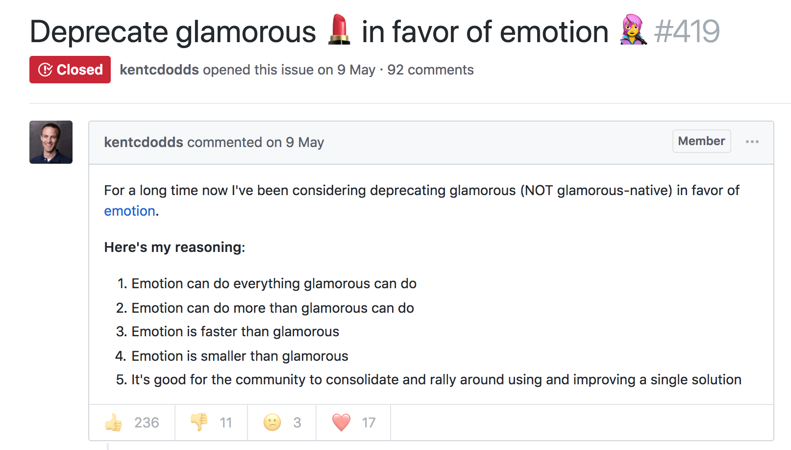
The similarly named Glamorous was recently deprecated with its author also recommending users switch to Emotion:
At the time, Emotion had some features that Styled Components didn’t. Since then, Styled Components has made some big announcements.
Styled Components sells itself as the CSS-in-JS library for people that *like* CSS. Styled Components gained popularity by utilizing tagged template literals — allowing developers to *just write CSS* in the same syntax they already know, but inside JavaScript files. While this has proven popular, some developers prefer to [write styles as JavaScript objects. Emotion offered flexibility — developers could choose how to write their styles. Styled Components eventually followed suit.
styled-components v3.3.0 is out with first-class object support! 😍
Lots of people have been asking for this, your wishes have been heard! Shoutout to @probablyup for taking care of this release.
The rival CSS-in-JS libraries have stolen from each other until landing upon the same feature set and the same syntax — Emotion and Styled Components have an almost identical API. What once felt like a total mess of competing methodologies and libraries now feels somewhat stable. Even if CSS-in-JS hasn’t standardized on a dependency, it now has standardized a way of doing things — they’re just implemented differently:
Internally, quite a bit. SC has a lot of complexity around organizing style tag order. Re css prop: SC requires Babel plugin and uses the entire SC custom component creation. Emotion will skip the custom component if it can and just renders the element with the className directly
Styled Components is by far the most popular CSS-in-JS library, but Emotion has seen a rapid increase in usage.
Both are used by some major companies. Styled Components are utilized by plenty of large companies, including Bloomberg, Atlassian, Reddit, Target, BBC News, The Huffington Post, Coinbase, Patreon, Vogue, Ticketmaster, Lego, InVision and Autodesk just to name a few.
Emotion boasts fewer recognizable names, but has been recently adopted by the New York Times.
Great article about the launch of our new Story designs on the NYT today. It mentions our Shared Components initiative – would have been impossible without Emotion / CSS-in-JS. Absolute game-changer. Living in the future. https://t.co/pZLDJjsbEr
While these libraries certainly do seem to be most popular amongst React users, they can be used with other frameworks. While they seem to have converged on the same features at last, it’s difficult to say whether this is the end point of CSS-in-JS, or whether we’ll see a continued evolution from here.
Such a fragmented ecosystem was far from appealing. Which one should you pick, (if any)?
Contributing to Javascript fatigue — you need at most one. Also feel free to not learn any.
GitHub stars are one useful metric:
However, GitHub stars say nothing about a project’s trajectory — perhaps they were accumulated long ago and the repo has since fallen out of favor or is no longer maintained. Glamor has plenty of open issues, and hasn’t seen a commit in over a year. Its author advises:
…it mostly works, I’m not going to do any major changes… if you need something more modern, I’d recommend emotion, it mostly matches glamor’s api, and is actively maintained.
The similarly named Glamorous was recently deprecated with its author also recommending users switch to Emotion:
At the time, Emotion had some features that Styled Components didn’t. Since then, Styled Components has made some big announcements.
Styled Components sells itself as the CSS-in-JS library for people that *like* CSS. Styled Components gained popularity by utilizing tagged template literals — allowing developers to *just write CSS* in the same syntax they already know, but inside JavaScript files. While this has proven popular, some developers prefer to [write styles as JavaScript objects. Emotion offered flexibility — developers could choose how to write their styles. Styled Components eventually followed suit.
styled-components v3.3.0 is out with first-class object support! 😍
Lots of people have been asking for this, your wishes have been heard! Shoutout to @probablyup for taking care of this release.
The rival CSS-in-JS libraries have stolen from each other until landing upon the same feature set and the same syntax — Emotion and Styled Components have an almost identical API. What once felt like a total mess of competing methodologies and libraries now feels somewhat stable. Even if CSS-in-JS hasn’t standardized on a dependency, it now has standardized a way of doing things — they’re just implemented differently:
Internally, quite a bit. SC has a lot of complexity around organizing style tag order. Re css prop: SC requires Babel plugin and uses the entire SC custom component creation. Emotion will skip the custom component if it can and just renders the element with the className directly
Styled Components is by far the most popular CSS-in-JS library, but Emotion has seen a rapid increase in usage.
Both are used by some major companies. Styled Components are utilized by plenty of large companies, including Bloomberg, Atlassian, Reddit, Target, BBC News, The Huffington Post, Coinbase, Patreon, Vogue, Ticketmaster, Lego, InVision and Autodesk just to name a few.
Emotion boasts fewer recognizable names, but has been recently adopted by the New York Times.
Great article about the launch of our new Story designs on the NYT today. It mentions our Shared Components initiative – would have been impossible without Emotion / CSS-in-JS. Absolute game-changer. Living in the future. https://t.co/pZLDJjsbEr
While these libraries certainly do seem to be most popular amongst React users, they can be used with other frameworks. While they seem to have converged on the same features at last, it’s difficult to say whether this is the end point of CSS-in-JS, or whether we’ll see a continued evolution from here.
I just read a nicely put together story about WooCommerce over on the CodeinWP blog. WooCommerce started life as WooThemes, sort of a „premium themes” business started by just a couple of fellas who had never even met in person. Two years and a few employees later they launch WooCommerce, and 2 years after that it hits a million downloads. A major success story, to be sure, but a collaborative and remote-work based one that wasn’t exactly overnight. Another 2 years and Automattic picks them up and the WooThemes part is spun down.
Now we’re 3-4 years into WooCommerce being an Automattic project and it’s looking at nearly 60 million downloads, 4 million of which are active. A number they are saying is about 30% of all eCommerce on the web. Daaaaang. I’ve used WooCommerce a number of times and it always does a great job for me.
You know how some sites and web apps have that neat native feel when transitioning between two pages or views? Sarah Drasner has shown some good examples and even a Vue library to boot.
These animations are the type of features that can turn a good user experience into a great one. But to achieve this in a React stack, it is necessary to couple crucial parts in your application: the routing logic and the animation tooling.
Let’s start with animations. We’ll be building with React, and there are great options out there for us to leverage. Notably, the react-transition-group is the official package that handles elements entering and leaving the DOM. Let’s explore some relatively straightforward patterns we can apply, even to existing components.
Transitions using react-transition-group
First, let’s get familiar with the react-transition-group library to examine how we can use it for elements entering and leaving the DOM.
Single components transitions
As a simple example of a use case, we can try to animate a modal or dialog — you know, the type of element that benefits from animations that allow it enter and leave smoothly.
A dialog component might look something like this:
Notice we are using the isOpen prop to determine whether the component is rendered or not. Thanks to the simplicity of the recently modified API provided by react-transition-group module, we can add a CSS-based transition to this component without much overhead.
First thing we need is to wrap the entire component in another TransitionGroup component. Inside, we keep the prop to mount or unmount the dialog, which we are wrapping in a CSSTransition.
Every time isOpen is modified, a sequence of class names changes will happen in the dialog’s root element.
If we set the classNames prop to "fade", then fade-enter will be added immediately before the element mounts and then fade-enter-active when the transition kicks off. We should see fade-enter-done when the transition finishes, based on the timeout that was set. Exactly the same will happen with the exit class name group at the time the element is about to unmount.
This way, we can simply define a set of CSS rules to declare our transitions.
If we want to orchestrate more complex animations using a JavaScript library, then we can use the Transition component instead.
This component doesn’t do anything for us like the CSSTransition did, but it does expose hooks on each transition cycle. We can pass methods to each hook to run calculations and animations.
Each hook passes the node to the callback as a first argument — this gives control for any mutation we want when the element mounts or unmounts.
Routing
The React ecosystem offers plenty of router options. I’m gonna use react-router-dom since it’s the most popular choice and because most React developers are familiar with the syntax.
Let’s start with a basic route definition:
import React, { Component } from 'react'
import { BrowserRouter, Switch, Route } from 'react-router-dom'
import Home from '../views/Home'
import Author from '../views/Author'
import About from '../views/About'
import Nav from '../components/Nav'

class App extends Component {
  render() {
    return (
      <BrowserRouter>
        <div className="app">
          <Switch>
            <Route exact path="/" component={Home}/>
            <Route path="/author" component={Author} />
            <Route path="/about" component={About} />
          </Switch>
        </div>
      </BrowserRouter>
    )
  }
}
We want three routes in this application: home, author and about.
The BrowserRouter component handles the browser’s history updates, while Switch decides which Route element to render depending on the path prop. Here’s that without any transitions:
Don’t worry, we’ll be adding in page transitions as we go.
Oil and water
While both react-transition-group and react-router-dom are great and handy packages for their intended uses, mixing them together can break their functionality.
For example, the Switch component in react-router-dom expects direct Route children and the TransitionGroup components in react-transition-group expect CSSTransition or Transition components to be direct children of it too. So, we’re unable to wrap them the way we did earlier.
We also cannot toggle views with the same boolean approach as before since it’s handled internally by the react-router-dom logic.
React keys to the rescue
Although the solution might not be as clean as our previous examples, it is possible to use the libraries together. The first thing we need to do is to move our routes declaration to a render prop.
Nothing has changed as far as functionality. The difference is that we are now in control of what gets rendered every time the location in the browser changes.
Also, react-router-dom provides a unique key in the location object every time this happens.
In case you are not familiar with them, React keys identify elements in the virtual DOM tree. Most times, we don’t need to indicate them since React will detect which part of the DOM should change and then patch it.
Constantly changing the key of an element — even when its children or props haven’t been modified — will force React to remove it from the DOM and remount it. This helps us emulate the boolean toggle approach we had before and it’s important for us here because we can place a single Transition element and reuse it for all of our view transitions, allowing us to mix routing and transition components.
Inside the animation function
Once the transition hooks are called on each location change, we can run a method and use any animation library to build more complex scenes for our transitions.
Our play function will build a GreenSock timeline here depending on the pathname, and we can set as many transitions as we want for each different routes.
Once the timeline is built for the current pathname, we play it.
Each timeline method digs into the DOM nodes of the view and animates them. You can use other animation libraries instead of GreenSock, but the important detail is that we build the timeline beforehand so that our main play method can decide which one should run for each route.
Success!
I’ve used this approach on lots of projects, and though it doesn’t present obvious performance issues for inner navigations, I did notice a concurrency issue between the browser’s initial DOM tree build and the first route animation. This caused a visual lag on the animation for the first load of the application.
To make sure animations are smooth in each stage of the application, there’s one last thing we can do.
Profiling the initial load
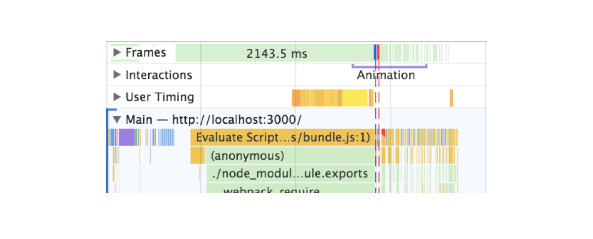
Here’s what I found when auditing the application in Chrome DevTools after a hard refresh:
You can see two lines: one blue and one red. Blue represents the load event and red the DOMContentLoaded. Both intersect the execution of the initial animations.
These lines are indicating that elements are animating while the browser hasn’t yet finished building the entire DOM tree or it’s parsing resources. Animations account for big performance hits. If we want anything else to happen, we’d have to wait for the browser to be ready with these heavy and important tasks before running our transitions.
After trying a lot of different approaches, the solution that actually worked was to move the animation after these events — simple as that. The issue is that we can’t rely on event listeners.
If for some reason, the event occurs before we declare the listener, the callback we pass will never run and this could lead to our animations never happening and an empty view.
Since this is a concurrency and asynchronous issue, I decided to rely on promises, but then the question became: how can promises and event listeners be used together?
By creating a promise that gets resolved when the event takes place. That’s how.
window.loadPromise = new Promise(resolve => {
  window.addEventListener(‘DOMContentLoaded’, resolve)
})
We can put this in the document head or just before the script tag that loads the application bundle. This will make sure the event never happens before the Promise is created.
Plus, doing this allows us to use the globally exposed loadPromise to any animation in our application. Let’s say that we don’t only want to animate the entry view but a cookie banner or the header of the application. We can simply call each of these animations after the promise has resolved using then along with our transitions.
window.loadPromise.then(() => timeline.play())
This approach is reusable across the entire codebase, eliminating the issue that would result when an event gets resolved before the animations run. It will defer them until the browser DOMContentLoaded event has passed.
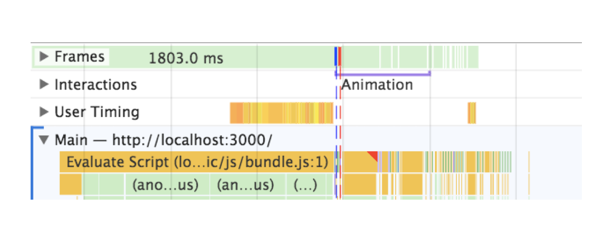
See now that the animation is not kicking off until the red line appears.
The difference is not only on the profiling report — it actually solves an issue we had in a real project.
Wrapping up
In order to act as reminders, I created a list of tips for me that you might find useful as you dig into view transitions in a project:
When an animation is happening nothing else should be happening. Run animations after all resources, fetching and business logic have completed.
No animation is better than crappy animations If you can’t achieve a good animation, then removing it is a fair sacrifice. The content is more important and showing it is the priority until a good animation solution is in place.
Test on slower and older devices. They will make it easier for you to catch spots with weak performance.
Profile and base your improvements in metrics. Instead of guessing as you go, like I did, see if you can spot where frames are being dropped or if something looks off and attack that issue first.
That’s it! Best of luck with animating view transitions. Please post a comment if this sparked any questions or if you have used transitions in your app that you’d like to share!
You know how some sites and web apps have that neat native feel when transitioning between two pages or views? Sarah Drasner has shown some good examples and even a Vue library to boot.
These animations are the type of features that can turn a good user experience into a great one. But to achieve this in a React stack, it is necessary to couple crucial parts in your application: the routing logic and the animation tooling.
Let’s start with animations. We’ll be building with React, and there are great options out there for us to leverage. Notably, the react-transition-group is the official package that handles elements entering and leaving the DOM. Let’s explore some relatively straightforward patterns we can apply, even to existing components.
Transitions using react-transition-group
First, let’s get familiar with the react-transition-group library to examine how we can use it for elements entering and leaving the DOM.
Single components transitions
As a simple example of a use case, we can try to animate a modal or dialog — you know, the type of element that benefits from animations that allow it enter and leave smoothly.
A dialog component might look something like this:
Notice we are using the isOpen prop to determine whether the component is rendered or not. Thanks to the simplicity of the recently modified API provided by react-transition-group module, we can add a CSS-based transition to this component without much overhead.
First thing we need is to wrap the entire component in another TransitionGroup component. Inside, we keep the prop to mount or unmount the dialog, which we are wrapping in a CSSTransition.
Every time isOpen is modified, a sequence of class names changes will happen in the dialog’s root element.
If we set the classNames prop to "fade", then fade-enter will be added immediately before the element mounts and then fade-enter-active when the transition kicks off. We should see fade-enter-done when the transition finishes, based on the timeout that was set. Exactly the same will happen with the exit class name group at the time the element is about to unmount.
This way, we can simply define a set of CSS rules to declare our transitions.
If we want to orchestrate more complex animations using a JavaScript library, then we can use the Transition component instead.
This component doesn’t do anything for us like the CSSTransition did, but it does expose hooks on each transition cycle. We can pass methods to each hook to run calculations and animations.
Each hook passes the node to the callback as a first argument — this gives control for any mutation we want when the element mounts or unmounts.
Routing
The React ecosystem offers plenty of router options. I’m gonna use react-router-dom since it’s the most popular choice and because most React developers are familiar with the syntax.
Let’s start with a basic route definition:
import React, { Component } from 'react'
import { BrowserRouter, Switch, Route } from 'react-router-dom'
import Home from '../views/Home'
import Author from '../views/Author'
import About from '../views/About'
import Nav from '../components/Nav'

class App extends Component {
  render() {
    return (
      <BrowserRouter>
        <div className="app">
          <Switch>
            <Route exact path="/" component={Home}/>
            <Route path="/author" component={Author} />
            <Route path="/about" component={About} />
          </Switch>
        </div>
      </BrowserRouter>
    )
  }
}
We want three routes in this application: home, author and about.
The BrowserRouter component handles the browser’s history updates, while Switch decides which Route element to render depending on the path prop. Here’s that without any transitions:
Don’t worry, we’ll be adding in page transitions as we go.
Oil and water
While both react-transition-group and react-router-dom are great and handy packages for their intended uses, mixing them together can break their functionality.
For example, the Switch component in react-router-dom expects direct Route children and the TransitionGroup components in react-transition-group expect CSSTransition or Transition components to be direct children of it too. So, we’re unable to wrap them the way we did earlier.
We also cannot toggle views with the same boolean approach as before since it’s handled internally by the react-router-dom logic.
React keys to the rescue
Although the solution might not be as clean as our previous examples, it is possible to use the libraries together. The first thing we need to do is to move our routes declaration to a render prop.
Nothing has changed as far as functionality. The difference is that we are now in control of what gets rendered every time the location in the browser changes.
Also, react-router-dom provides a unique key in the location object every time this happens.
In case you are not familiar with them, React keys identify elements in the virtual DOM tree. Most times, we don’t need to indicate them since React will detect which part of the DOM should change and then patch it.
Constantly changing the key of an element — even when its children or props haven’t been modified — will force React to remove it from the DOM and remount it. This helps us emulate the boolean toggle approach we had before and it’s important for us here because we can place a single Transition element and reuse it for all of our view transitions, allowing us to mix routing and transition components.
Inside the animation function
Once the transition hooks are called on each location change, we can run a method and use any animation library to build more complex scenes for our transitions.
Our play function will build a GreenSock timeline here depending on the pathname, and we can set as many transitions as we want for each different routes.
Once the timeline is built for the current pathname, we play it.
Each timeline method digs into the DOM nodes of the view and animates them. You can use other animation libraries instead of GreenSock, but the important detail is that we build the timeline beforehand so that our main play method can decide which one should run for each route.
Success!
I’ve used this approach on lots of projects, and though it doesn’t present obvious performance issues for inner navigations, I did notice a concurrency issue between the browser’s initial DOM tree build and the first route animation. This caused a visual lag on the animation for the first load of the application.
To make sure animations are smooth in each stage of the application, there’s one last thing we can do.
Profiling the initial load
Here’s what I found when auditing the application in Chrome DevTools after a hard refresh:
You can see two lines: one blue and one red. Blue represents the load event and red the DOMContentLoaded. Both intersect the execution of the initial animations.
These lines are indicating that elements are animating while the browser hasn’t yet finished building the entire DOM tree or it’s parsing resources. Animations account for big performance hits. If we want anything else to happen, we’d have to wait for the browser to be ready with these heavy and important tasks before running our transitions.
After trying a lot of different approaches, the solution that actually worked was to move the animation after these events — simple as that. The issue is that we can’t rely on event listeners.
If for some reason, the event occurs before we declare the listener, the callback we pass will never run and this could lead to our animations never happening and an empty view.
Since this is a concurrency and asynchronous issue, I decided to rely on promises, but then the question became: how can promises and event listeners be used together?
By creating a promise that gets resolved when the event takes place. That’s how.
window.loadPromise = new Promise(resolve => {
  window.addEventListener(‘DOMContentLoaded’, resolve)
})
We can put this in the document head or just before the script tag that loads the application bundle. This will make sure the event never happens before the Promise is created.
Plus, doing this allows us to use the globally exposed loadPromise to any animation in our application. Let’s say that we don’t only want to animate the entry view but a cookie banner or the header of the application. We can simply call each of these animations after the promise has resolved using then along with our transitions.
window.loadPromise.then(() => timeline.play())
This approach is reusable across the entire codebase, eliminating the issue that would result when an event gets resolved before the animations run. It will defer them until the browser DOMContentLoaded event has passed.
See now that the animation is not kicking off until the red line appears.
The difference is not only on the profiling report — it actually solves an issue we had in a real project.
Wrapping up
In order to act as reminders, I created a list of tips for me that you might find useful as you dig into view transitions in a project:
When an animation is happening nothing else should be happening. Run animations after all resources, fetching and business logic have completed.
No animation is better than crappy animations If you can’t achieve a good animation, then removing it is a fair sacrifice. The content is more important and showing it is the priority until a good animation solution is in place.
Test on slower and older devices. They will make it easier for you to catch spots with weak performance.
Profile and base your improvements in metrics. Instead of guessing as you go, like I did, see if you can spot where frames are being dropped or if something looks off and attack that issue first.
That’s it! Best of luck with animating view transitions. Please post a comment if this sparked any questions or if you have used transitions in your app that you’d like to share!