When you’re putting together a build process for a site, it’s so dang useful to look at other people’s processes. I ran across Andrew Welch’s „An Annotated webpack 4 Config for Frontend Web Development” the other day and was glad he blogged it. If I was kicking off a new site where I wanted a webpack build, then I’d almost certainly reference something like this rather than start from scratch. At the same time, it made me realize how build processes all have such different needs and how unique those needs are now from even a few years ago in the hay day of Grunt and Gulp build processes.
I was looking around for an annotated Gulp reference file and came across another one of Andrew’s articles — „A Gulp Workflow for Frontend Development Automation” — from just one year earlier! Here’s a simplified list of what he was doing with Gulp (which he explains in more detail in the post):
Compile Sass
Run Autoprefixer
Create Sourcemaps
Minify
Inject critical CSS and bits of scripts
Run Babel
Uglify
Do style injection/reloading
Run accessibility audit</li
Generate icon font
Optimize images
Speaking of Gulp and annotated build processes, I’m working on a CSS-Tricks redesign and, for various reasons, went with a Gulp build. Against my better judgment, I wrote it from scratch, and this is how far I’ve gotten. It doesn’t feel particularly robust or efficient, so rewrites and suggestions are welcome! And speaking of Gulp, here’s a recently-published boilerplate I wish I had seen before starting.
Now, a year later, here’s what the build process is being asked to do:
Run differently-configured web servers
Hot module replacement
Dynamic code splitting
Lazy loading
Make modern and legacy code bundles
Cache busting
Create service worker
Compile PostCSS
Optimize images / create .webp
Process .vue files
Run Tailwind and PurgeCSS
It’s funny how quickly things change. We’re still essentially asking for help compiling files and optimizing things, but the tools we use change, the code we write changes, the way we talk about development changes, the expectations of development changes, the best practices change… makes ya sweat. 😅
At Twitter I used the approach described here to publish the company’s SVG icon library in several different formats: optimized SVGs, plain JavaScript modules, React DOM components, and React Native components.
One thing different systems tend to share is some kind of build process to turn a folder full of SVG files into a more programmatically digestible format. For example, gulp-svg-sprite takes your folder of SVGs and creates a SVG sprite (chunk of <symbol>s) to use in that type of SVG icon system. Grunticon processes your folder of SVGs into a CSS file, and is capable of enhancing them into inline SVG. Gallagher’s script creates React components out of them, and like he said, that’s great for delivery to different targets as well as performance optimization, like code splitting.
This speaks to the versatility of SVG. It’s just markup, so it’s easy to work with.
Here are two ways to build a site (abstractly) that feel diametrically opposed to me:
Build a site as an SPA (Single Page App). The page loads a skeleton HTML page that executes JavaScript as quickly as it can. The JavaScript calls an API to get data, and then the page renders content. Navigation of the site is more API calls to get the data it needs and re-rendering.
Build a site as statically-generated. A build process runs in which the entire site is built out as static HTML files with all the content baked into them. JavaScript isn’t required at all for the site to work.
That feels just about as different as can be. But weirdly, they kinda aren’t:
They are both JAMstack. They can be hosted statically as neither of them needs backend languages running on the server they are hosted on.
They are both building content based on an API of data. It’s more obvious in the first one, but you can think of a static site generator as hitting an API of data as it runs and builds itself. It’s just that the API might be temporarily created from content files it finds on disk. Or it might be the exact same API used for the former site.
I admit I’m quite intrigued by frameworks that allow you write apps in web frameworks because they do magic to make them into native apps for you. There are loads of players here. You’ve got NativeScript, Cordova, PhoneGap, Tabris, React Native, and Flutter. For deskop apps, we’ve got Electron.
What’s interesting now is to see what’s important to these frameworks by honing in on their focus. Hummingbird is Flutter for the web. (There is a fun series on Flutter over on the Bendworks blog in addition to a post we published earlier this year.) The idea being you get super high performance ,thanks to the framework, and you’ve theoretically built one app that runs both on the web and natively. I don’t know of any real success stories I can point to, but it does seem like an awesome possibility.
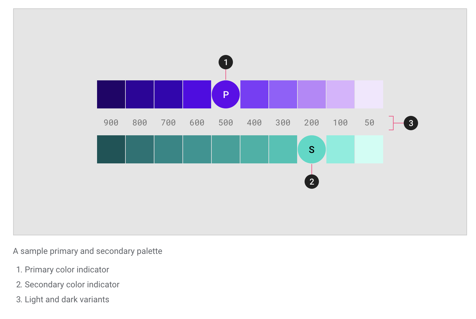
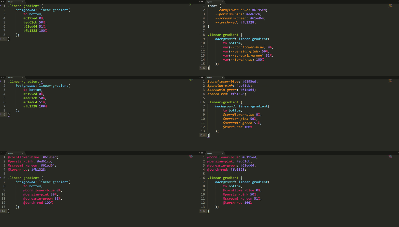
What naming scheme do you use for color variables? Have you succeeded at writing CSS that uses color variables in a manner agnostic to the colors they represent? I've tried all of the following, and I have yet to succeed at writing CSS that works well with any color scheme. ☹️
I remember the very first time I tried Sass on a project. The first thing I wanted to do was variablize my colors. From my naming-things-in-HTML skillz, I knew to avoid classes like .header-blue-left-bottom because the color and position of that element might change. It’s better for the to reflect it what it is than what it looks like.
So, I tried to make my colors semantic, in a sense — what they represent not what they literally are:
But I found that I absolutely never remembered them and had to constantly refer to where I defined them in order to use them. Later, in a „screw it” moment, I named colors more like…
I found that to be much more intuitive with little if any negative side effects. After all, this isn’t crossing the HTML-CSS boundary here; this is all within CSS and developer-only-facing, which puts more of a narrow scope on the problem.
In a similar fashion, I’ve tried keeping colors within a Sass map, like:
$colors: (
  light: #ccc,
  dark: #333
);
But the only vague goal there was to clean up the global namespace, which probably isn’t worth the hassle of needing to map-get all the time. Namespacing like $-c-orange is probably an easier approach if you need to do anything at all.
I’ve largely stuck with that just-use-color-names approach today in Sass. As the shift toward CSS custom properties happens, I think having a --c-orange and --c-gray-5 is similarly appropriate.
I’ve used that kind of thing for media query breakpoints before, as the numbering seems to make sense there (i.e. low numbers are smaller screens, big numbers are bigger screens). I could also see that being nice for tints or shades of the same color, but then why not regular numbers?
Another approach I’ve often seen is to combine named colors with abstracted names. Geoff does that and John Carroll lists that here:
How might you pick names for colors? You might get a kick out of what to call a sunny yellow versus a sunflower yellow, or you might just want some help. Here’s one project for that, and here’s another:
It’s not the <svg> itself that is interactive — it’s wrapped in a <button> for that.
The .svg-icon class has some nice trickery, like em-based sizing to match the size of the text it’s next to, and currentColor to match the color.
Since real text is next to it, the icon can be safely ignored via aria-hidden="true". If you need an icon-only button, you can wrap that text in an accessibily-friendly .visually-hidden class.
The focusable="false" attribute solves an IE 11 bug.
Compound components in React allow you to create components with some form of connected state that’s managed amongst themselves. A good example is the Form component in Semantic UI React.
To see how we can implement compound components in a real-life React application, we’ll build a compound (multi-part) form for login and sign up. The state will be saved in the form component and we’ll put React’s Context AP to use to pass that state and the method from the Context Provider to the component that needs them. The component that needs them? It will become a subscriber to Context Consumers.
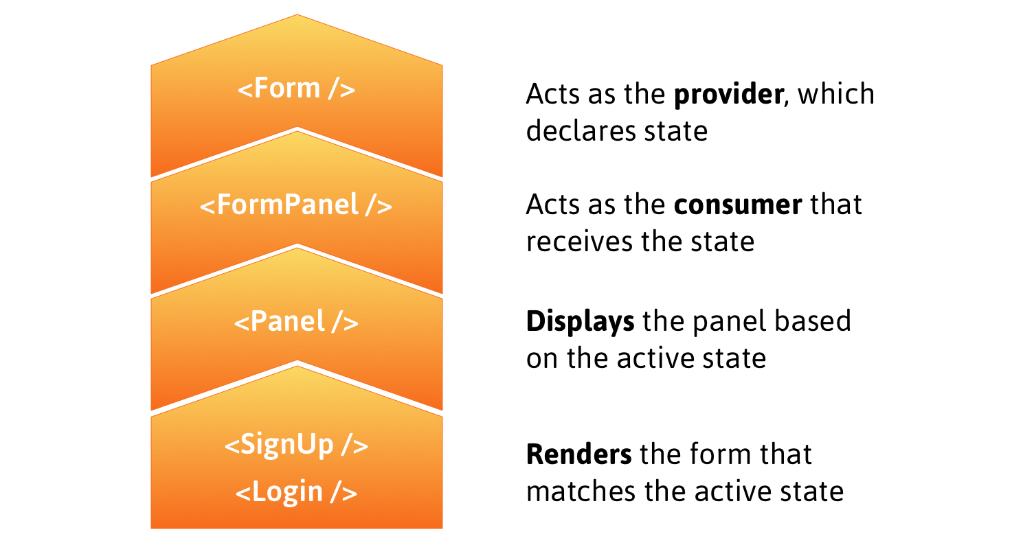
Here’s a rough outline that shows how the following steps fit together:
Before treading any further, you may want to brush up on the React Context API if you haven’t already. Neal Fennimore demonstrates the concept in this post and my primer on it is worth checking out as well.
Step 1: Creating context
First, let’s initialize a new context using the React Context API.
The provider, FormProvider, will hold the application state, making it available to components that subscribe to FormConsumer.
Step 2: Implement provider
One panel contains the form to log in and the other contains the form to sign up. In the provider, we want to declare the state, which determines the active panel, i.e. the form currently in display. We’ll also create a method to switch from one panel to another when a heading is clicked.
By default, the login panel will be shown to the user. When the signup panel is clicked, we want to make it the active panel by setting the state of activePanel to signup using the method handlePanelSwitch().
Step 3: Implement Consumers
We’ll use FormConsumer to make context available to the components that subscribe to it. That means the FormPanel component that handles displaying panels will look like this:
To understand what is happening, let’s understand the approach here. The login and signup panels will have unique IDs that get passed via props to the Panel component. When a panel is selected, we get the ID and and use it to set activePanel to swap forms. The FormPanel component also receives the name of the panel via the isActive prop and we then check to see if the returned value is true. If it is, then the panel is rendered!
To get the full context, here is how the App component looks:
You can see how the components are composed when activePanel matches isActive (which is supposed to return true). The component is rendered under those conditions.
With that done, the Login component looks like this:
Ultimately, we want to make the web experience better for many different audiences. People using Microsoft Edge (and potentially other browsers) will experience improved compatibility with all web sites, while getting the best-possible battery life and hardware integration on all kinds of Windows devices. Web developers will have a less-fragmented web platform to test their sites against, ensuring that there are fewer problems and increased satisfaction for users of their sites; and because we’ll continue to provide the Microsoft Edge service-driven understanding of legacy IE-only sites, Corporate IT will have improved compatibility for both old and new web apps in the browser that comes with Windows.
We are making this decision for the long term. We expect our engineers to learn and over time become experts in the Chromium project and grow into active and responsible members of the community. We are eager to increase our contributions to the Chromium project and will continue to maintain any contributions we make.
When seeking improvements in the web platform, our default position will be to contribute. We are focused on delivering a world class browser with Microsoft Edge through its differentiated user experience features and connected services, but where new platform capabilities are concerned, we will seek a ‘rising tide that floats all boats’. We will get started with bug fixes and meaningful contributions in such areas as ARM64 support, accessibility, security, touch input and power enhancements on Windows.
We recognize and will respect the architecture requirements and engineering approach that are intrinsic in web open-source projects and have made Chromium successful. There are many aspects that have governed Chromium OSS and other projects: multi-device support, multi-OS support, rigorous real-time engineering, etc. Although our company has historically had a focus on Windows PCs and we believe we can make contributions that improve browsers on Windows, we also understand that web OSS projects embrace a wide range of device-types, including Android, and that contributions must accommodate this device diversity. We will contribute in a way that is consistent with the architectural design that meets Chromium’s cross-platform and cross-device needs.
We believe the evolution of the open web is best served though the standards communities, and the open web benefits from open debate from a wide variety of perspectives. We will remain deeply and vigorously engaged in the standards discussions in the context of the W3C, ECMA and the WHATWG where the perspectives of vendors developing competing browsers and the larger web community can be heard and considered.
Nothing terribly surprising here. We’re doing this. We think it’ll be good for everybody. I’m slightly surprised they didn’t attempt to answer everyone’s main worry: is the web actually better off with less engine diversity? We’ll never know I guess.
I feel the same this year as I have in the past. Web standards, as an overall idea, has entirely taken hold and won the day. That’s worth celebrating, as the web would be kind of a joke without them. So now, our job is to uphold them. We need to cry foul when we see a browser go rogue and ship an API outside the standards process. That version of competition is what could lead the web back to a dark place where we’re creating browser-specific versions. That becomes painful, we stop doing it, and slowly, the web loses.